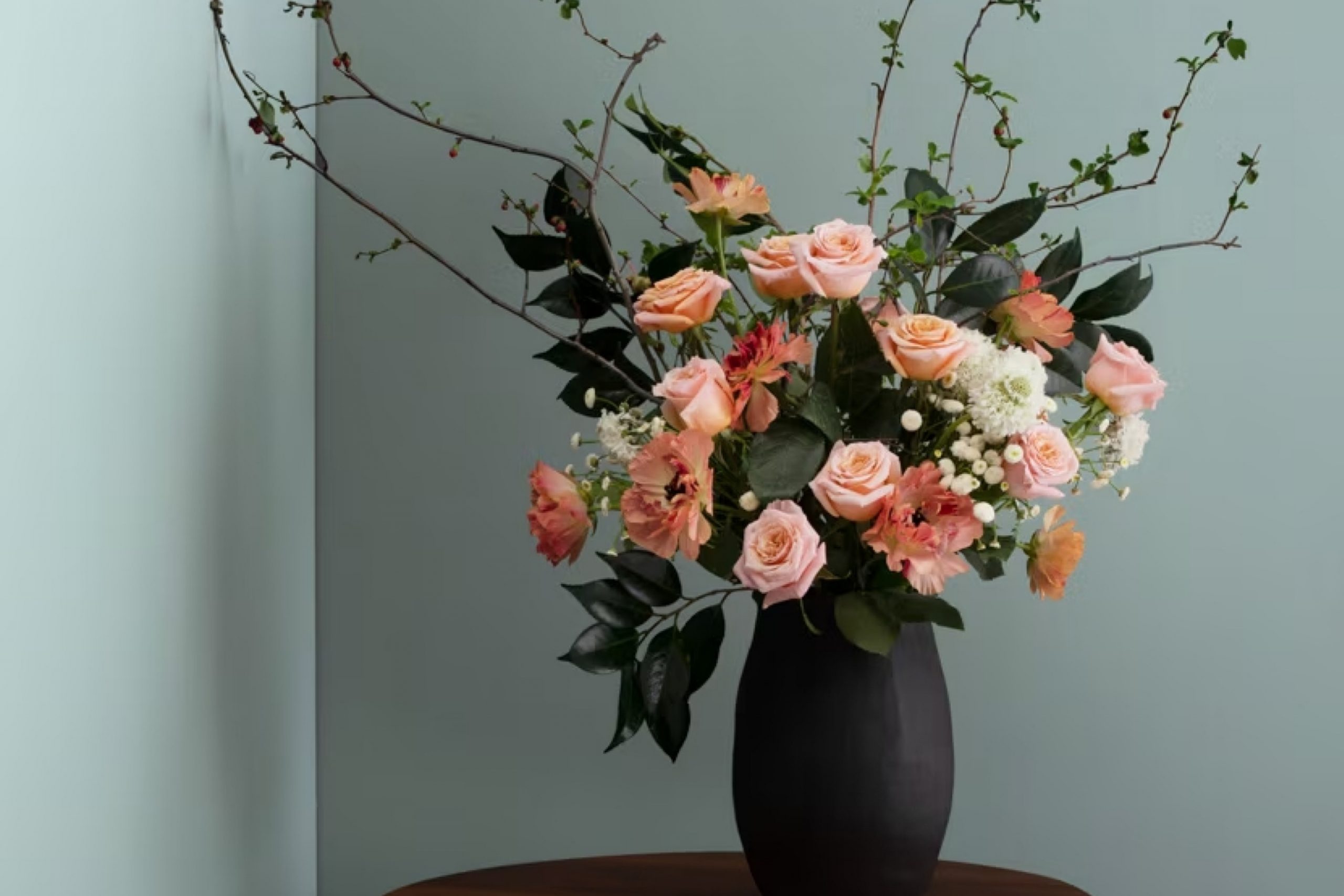
When I first came across 1565 Mount Saint Anne by Benjamin Moore, it really stood out to me! It’s one of those colors that’s soft and calm, but still has a little something special. It brings a peaceful, balanced feel to a room—great if you want a space that feels cozy and welcoming without being too plain.
Imagine a soft, misty morning in autumn, where the air is crisp and the sky carries hints of gray and blue. That’s what 1565 Mount Saint Anne captures perfectly—a blend of comfort and sophistication.
It offers a touch of coolness without feeling cold, making it versatile for various settings, whether used on walls, accents, or furniture.
Using Mount Saint Anne can revitalize an environment, creating a space that feels nurturing and peaceful. It pairs well with both natural elements and modern decor, allowing you to experiment with different looks. You can use it to highlight architectural features or create a soothing backdrop for everyday life.
It’s a choice that invites calmness and reflection, encouraging you to enjoy and appreciate the spaces you inhabit.
What Color Is Mount Saint Anne 1565 by Benjamin Moore?
Mount Saint Anne by Benjamin Moore is a soft, muted blue-gray color that evokes a calm, welcoming atmosphere. Its balanced blend of blue and gray makes it a versatile choice for many interior styles. The color lends itself well to coastal and contemporary themes, where its subtle undertones mirror the serene hues of the ocean or sky.
It’s equally fitting for farmhouse and Scandinavian designs, where it can complement natural wood elements and create a cozy, yet modern vibe.
In terms of materials, Mount Saint Anne pairs beautifully with light woods, white marble, and brushed metals. Its cool undertone works well alongside crisp white trim or cabinetry, giving the room a clean, fresh look. Additionally, the color complements soft textiles like linen or cotton, bringing warmth and texture to a space.
Mount Saint Anne is also an excellent background for accent colors like mustard, coral, or muted greens, adding a pop of color without clashing.
The gentle tone of Mount Saint Anne makes it suitable for any room, whether it’s a soothing bedroom retreat or a relaxed, inviting living space. Its versatility and subtle elegance make it a timeless choice, offering endless possibilities for stylish, understated interiors.
Is Mount Saint Anne 1565 by Benjamin Moore Warm or Cool color?
Mount Saint Anne by Benjamin Moore is a popular paint color that brings a calming and fresh feel to any space. It’s a soft, muted blue-gray that can make rooms feel both relaxed and stylish. This color can work well in many areas of a home, including bedrooms, bathrooms, or living rooms, adding a touch of cool elegance.
Because Mount Saint Anne is a neutral tone, it pairs beautifully with other colors. It can be matched with whites and creams for a more traditional look or combined with pops of bolder colors if you want some contrast.
This flexibility makes it an excellent choice for various decorating styles, whether you prefer modern or classic designs.
The paint’s soothing qualities make it a great option for those looking to create a peaceful atmosphere. Its versatility in matching other colors and fitting into different styles means it can easily match the personality and needs of any household.
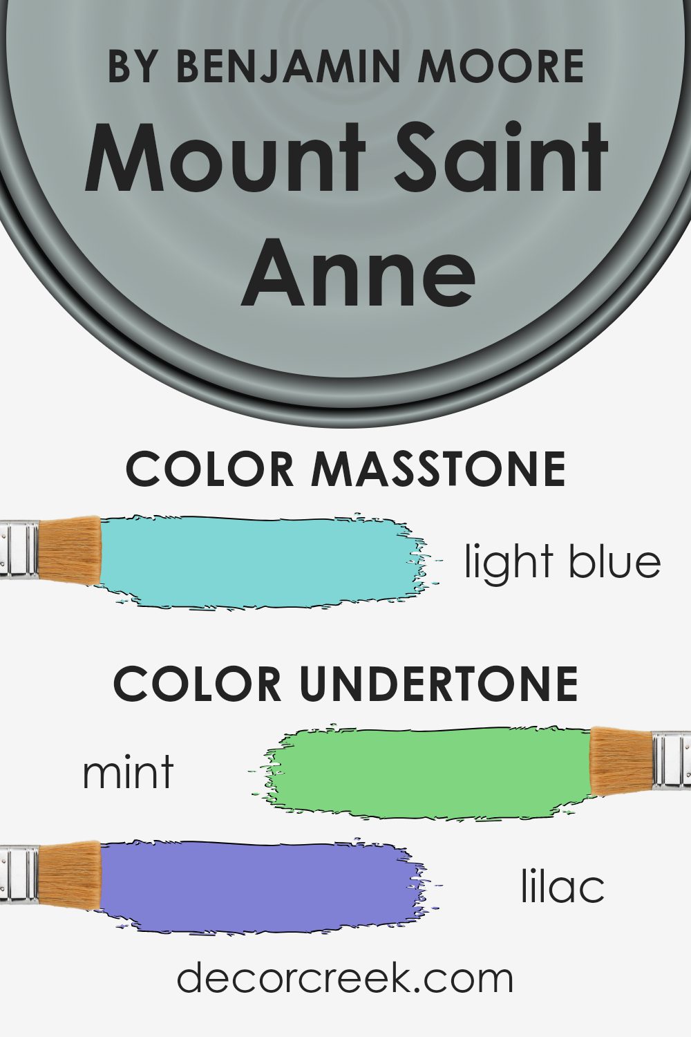
Undertones of Mount Saint Anne 1565 by Benjamin Moore
Mount Saint Anne by Benjamin Moore is a unique paint color that appears as a soft, muted gray-blue. The undertones within the color give it character and complexity. These undertones include mint, lilac, light gray, grey, pale yellow, light purple, pale pink, turquoise, light turquoise, blue, and dark turquoise. Each of these colors subtly shifts how we perceive Mount Saint Anne, adding different moods and nuances.
Undertones are important because they can change how a color looks under different lighting conditions or when placed against other colors. For example, in bright natural light, the blue and turquoise hints might be more visible, making the space feel airy.
In dim light, the gray and lilac undertones might come through more strongly, giving a cozy and calm atmosphere.
When used on interior walls, Mount Saint Anne can change the perception of a room depending on its surroundings.
The mint and pale yellow undertones bring a freshness and lightness, while the purple and pink undertones add warmth. The gray undertones provide a neutral base that makes it versatile for various settings.
Overall, these undertones allow Mount Saint Anne to adapt to different environments, creating a balanced and harmonious ambiance.
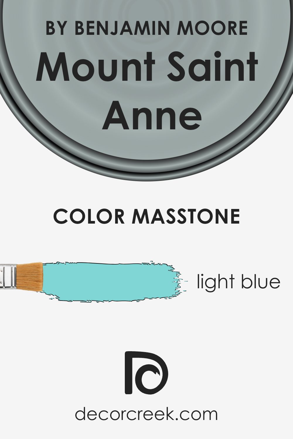
What is the Masstone of the Mount Saint Anne 1565 by Benjamin Moore?
Mount Saint Anne by Benjamin Moore is a soft, light blue color with a masstone of #80D5D5. This gentle shade of blue can work wonders in homes, creating a calming and refreshing atmosphere. It’s perfect for spaces where you want to promote relaxation and a sense of peace, like bedrooms or bathrooms.
The lightness of the color can make a room feel more open and airy, which is great for smaller spaces.
This color pairs well with neutrals like whites and grays, allowing it to stand out without being overpowering. It can also be used to complement natural wood tones, adding a soft touch to living rooms and kitchens. The versatility of this shade means it works well with both modern and traditional decor styles.
It’s a color that creates a simple yet pleasing look, bringing a fresh and clean feeling to any area of the home.
How Does Lighting Affect Mount Saint Anne 1565 by Benjamin Moore?
Lighting plays a significant role in how we perceive colors in a room. The same color can appear vastly different depending on the type and direction of light it receives. This is particularly true for paint colors like Mount Saint Anne by Benjamin Moore, which is a soft, muted blue with gray undertones.
In natural light, the color’s appearance changes throughout the day. In a north-facing room, which receives cooler and more consistent light, Mount Saint Anne can look a bit cooler and subdued.
The lack of direct sunlight means the gray undertones in the paint are more pronounced, giving it a more subtle and calm appearance.
In a south-facing room, the color benefits from warm, direct sunlight for most of the day, which enhances the blue tones and brings a brighter, more vibrant feel to the room. The increased light can make Mount Saint Anne look lighter and slightly warmer.
In east-facing rooms, the morning light is strong and warm, so Mount Saint Anne might appear brighter and more blue in the early part of the day. In the afternoon, as the light becomes indirect, the color might shift to appear softer and more muted.
West-facing rooms experience the opposite: in the morning, the light is cooler and can make the color appear more muted. In the afternoon and evening, as the sunlight intensifies and warms, Mount Saint Anne can take on a richer, more inviting blue tone.
Under artificial light, the type of bulb used significantly affects the color. Incandescent bulbs, which emit warm yellow light, can make Mount Saint Anne look warmer and more inviting. Cool white LEDs can bring out more of the gray tones, making the color appear cooler and more subdued.
Ultimately, the way Mount Saint Anne looks will vary depending on the light conditions, so it’s always a good idea to test paint samples in different parts of a room to see how it interacts with the existing light throughout the day.
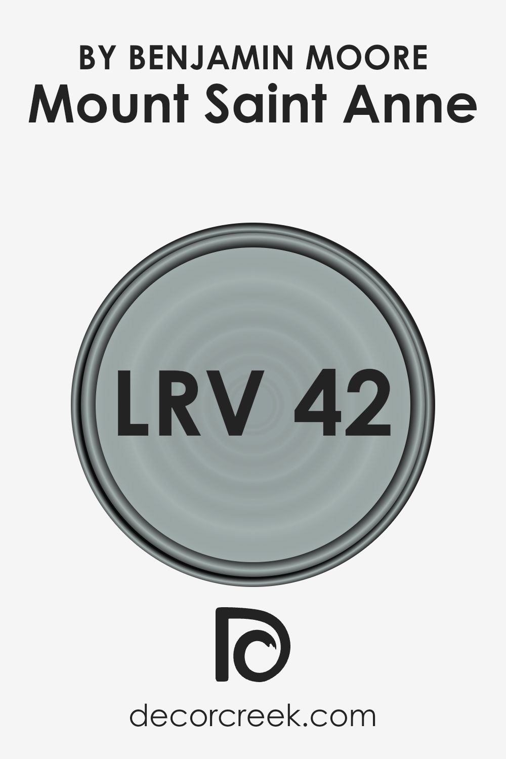
What is the LRV of Mount Saint Anne 1565 by Benjamin Moore?
Light Reflectance Value (LRV) is a measure that indicates how much light a color reflects. It is measured on a scale from 0 to 100, where 0 means the color absorbs all light (like black) and 100 means it reflects all light (like white). A higher LRV means a color will reflect more light, making the space feel brighter and possibly larger.
A lower LRV indicates the color absorbs more light, which can make a room feel cozier or more intimate. It plays a critical role in selecting colors for interior spaces or exteriors, as the amount of light reflected can dramatically change the perception of a room’s size and ambiance.
In the case of Mount Saint Anne by Benjamin Moore, which has an LRV of 41.9, this means it reflects a moderate amount of light. This makes it a mid-toned color, which can have a calming and balanced effect on a room. The color isn’t too dark to make the space feel closed-in, nor is it too light to create glare or wash out the walls.
It can work well in many different lighting conditions, although the feel of the color might change slightly throughout the day as the natural light shifts.
Overall, with an LRV of 41.9, Mount Saint Anne will give a space a comfortable and inviting atmosphere without being overwhelming.
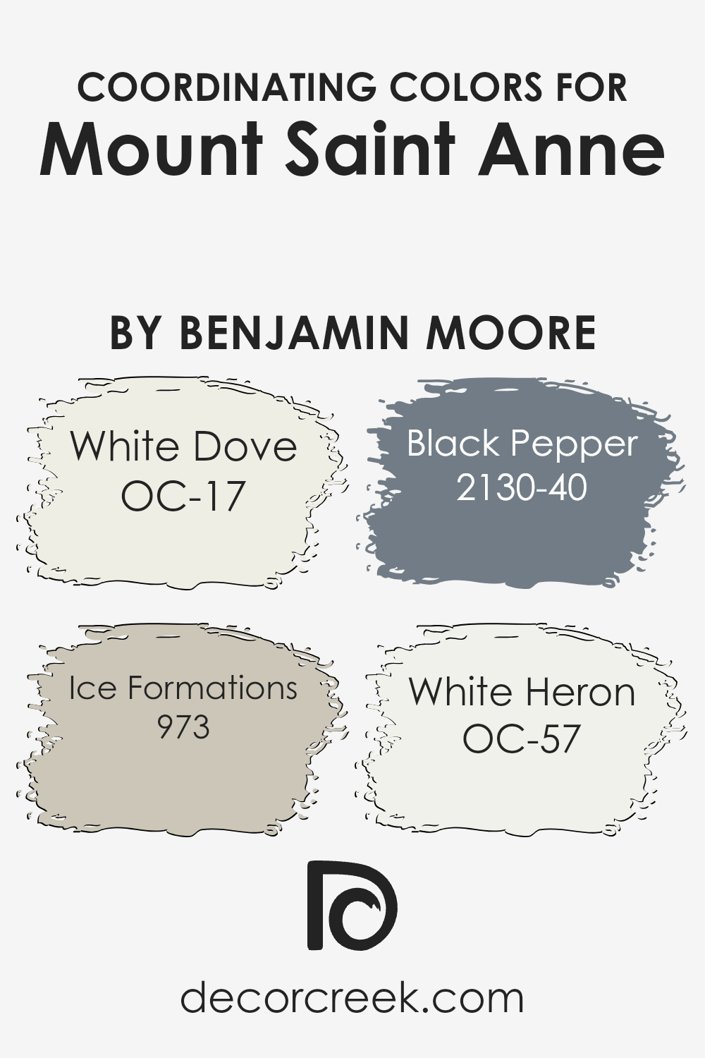
Coordinating Colors of Mount Saint Anne 1565 by Benjamin Moore
Coordinating colors are hues that complement and enhance each other, creating a harmonious look in a space. When selecting colors to coordinate with Mount Saint Anne by Benjamin Moore, options like White Dove, Ice Formations, Black Pepper, and White Heron offer an excellent palette.
These shades work together by balancing bold and subtle tones, providing variety and cohesion. White Dove, a warm and soft white, serves as a versatile backdrop that pairs well with almost any color, making rooms feel airy and open.
Ice Formations, a cool, muted gray, introduces a calming effect and adds depth without overwhelming a room.
Black Pepper, a rich, deep charcoal, brings contrast and helps to anchor the color scheme, adding a touch of drama and sophistication to any setting. Its boldness can be especially striking when used in accent walls or as a complement to lighter hues.
On the other hand, White Heron, a crisp and clean off-white, maintains brightness and purity while blending seamlessly with these colors.
Together, these coordinating colors foster a balanced environment, accentuating both lighter and darker elements within a space. They interact beautifully with Mount Saint Anne, offering a flexible and inviting color scheme for various design styles.
You can see recommended paint colors below:
- OC-17 White Dove
- 973 Ice Formations
- 2130-40 Black Pepper
- OC-57 White Heron
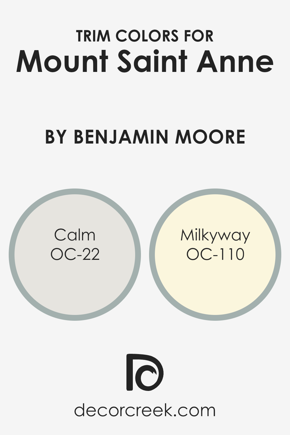
What are the Trim colors of Mount Saint Anne 1565 by Benjamin Moore?
Trim colors are the shades used for the finishing touches in a room, particularly on elements like baseboards, window frames, and door frames. They are key to highlighting architectural details and tying a room’s overall design together.
For a main color like Mount Saint Anne in the 1565 palette by Benjamin Moore, choosing the right trim color is crucial. Mount Saint Anne is a soft, muted blue with a hint of gray, which gives rooms a calming and welcoming atmosphere.
By pairing it with perfectly chosen trim colors, you ensure that the space feels cohesive and balanced, avoiding clashes or visual confusion.
Using Calm (OC-22) and Milkyway (OC-110) as trim colors can enhance the aesthetic. Calm is a gentle, light gray with warm undertones, offering a subtle contrast without overshadowing the main color. It blends well, adding a touch of elegance and clarity.
Milkyway, on the other hand, is a warm, creamy off-white. It adds a soft, inviting feel and works well for people looking to add warmth without losing brightness.
Using these trim colors around Mount Saint Anne will help highlight the walls and bring out their best features.
You can see recommended paint colors below:
- OC-22 Calm
- OC-110 Milkyway
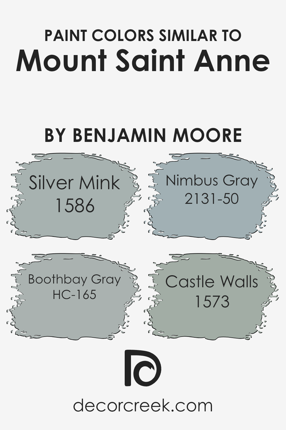
Colors Similar to Mount Saint Anne 1565 by Benjamin Moore
Using colors that are similar to Mount Saint Anne by Benjamin Moore, like Silver Mink, Boothbay Gray, Nimbus Gray, and Castle Walls, can create a harmonious and cohesive atmosphere in a space. These colors work together because they share subtle undertones and muted shades, which allow them to complement each other without clashing.
This type of color palette is often used in interior design to establish a calming, cohesive environment in a room. Similar colors can enhance each other’s beauty and create a sense of unity, making the space feel more thoughtfully designed.
Silver Mink is a gentle, soft gray with warm undertones, which adds a cozy and inviting feel. Boothbay Gray has a cooler, bluish tint, bringing a touch of elegance and calmness. Nimbus Gray, a mid-tone gray with a hint of blue, offers versatility and balance, making it a popular choice for various settings.
Castle Walls is a deeper gray with a slight green undertone, adding depth and interest. Together, these shades complement any room by creating a balanced look that is both sophisticated and approachable.
Incorporating these similar hues can immediately enhance and unify a living space, giving it a polished and well-coordinated appearance.
You can see recommended paint colors below:
- 1586 Silver Mink
- HC-165 Boothbay Gray
- 2131-50 Nimbus Gray
- 1573 Castle Walls
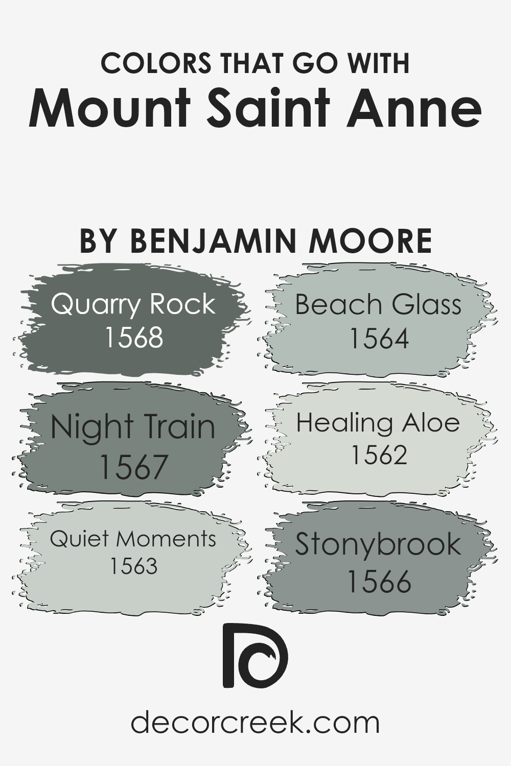
Colors that Go With Mount Saint Anne 1565 by Benjamin Moore
Colors that go with Mount Saint Anne 1565 by Benjamin Moore are important because they help create a harmonious and balanced space. Mount Saint Anne is a lovely shade of gray-blue that can complement various settings, making it versatile for both modern and classic designs.
When paired with the right colors, it can bring out its depth and character. These complementary shades not only enhance Mount Saint Anne but also create a seamless flow in any room, making the whole space feel coordinated and visually appealing.
Quarry Rock 1568 is a dark and rich gray, adding depth and contrast, perfect for accent walls or bold statement pieces. Night Train 1567 is a softer gray with a slightly warm undertone, bringing a gentle transition between darker and lighter hues. Quiet Moments 1563 offers a gentle blue-green tint, adding a touch of softness and calm to the room.
Beach Glass 1564 is a pale blue-green, light and airy, ideal for adding a touch of freshness. Healing Aloe 1562 carries a light, minty green hue, perfect for creating a soothing atmosphere.
Stonybrook 1566 has a gentle blend of gray and green, which can ground the color scheme, providing balance and quiet elegance. Each color has its unique charm, yet they all work beautifully with Mount Saint Anne to create a cohesive look.
You can see recommended paint colors below:
- 1568 Quarry Rock
- 1567 Night Train
- 1563 Quiet Moments
- 1564 Beach Glass
- 1562 Healing Aloe
- 1566 Stonybrook
How to Use Mount Saint Anne 1565 by Benjamin Moore In Your Home?
Mount Saint Anne by Benjamin Moore is a popular paint color known for its soft, muted blue-green hue. It brings a calm and refreshing atmosphere to any room, making it a versatile choice for various spaces in your home. In the living room, Mount Saint Anne can create a relaxing and inviting environment, perfect for unwinding after a long day.
It pairs well with neutral furniture and warm lighting, adding a touch of color without being overwhelming.
In the bedroom, this color can promote a restful ambiance, helping you to relax and get a good night’s sleep. It can be used on all walls for a cohesive look or as an accent wall to highlight certain furniture pieces. In the bathroom, the cool tones can make the space feel clean and fresh, complementing white or gray fixtures.
Pair it with natural materials, like wood or stone, for a balanced and harmonious feel throughout your home.
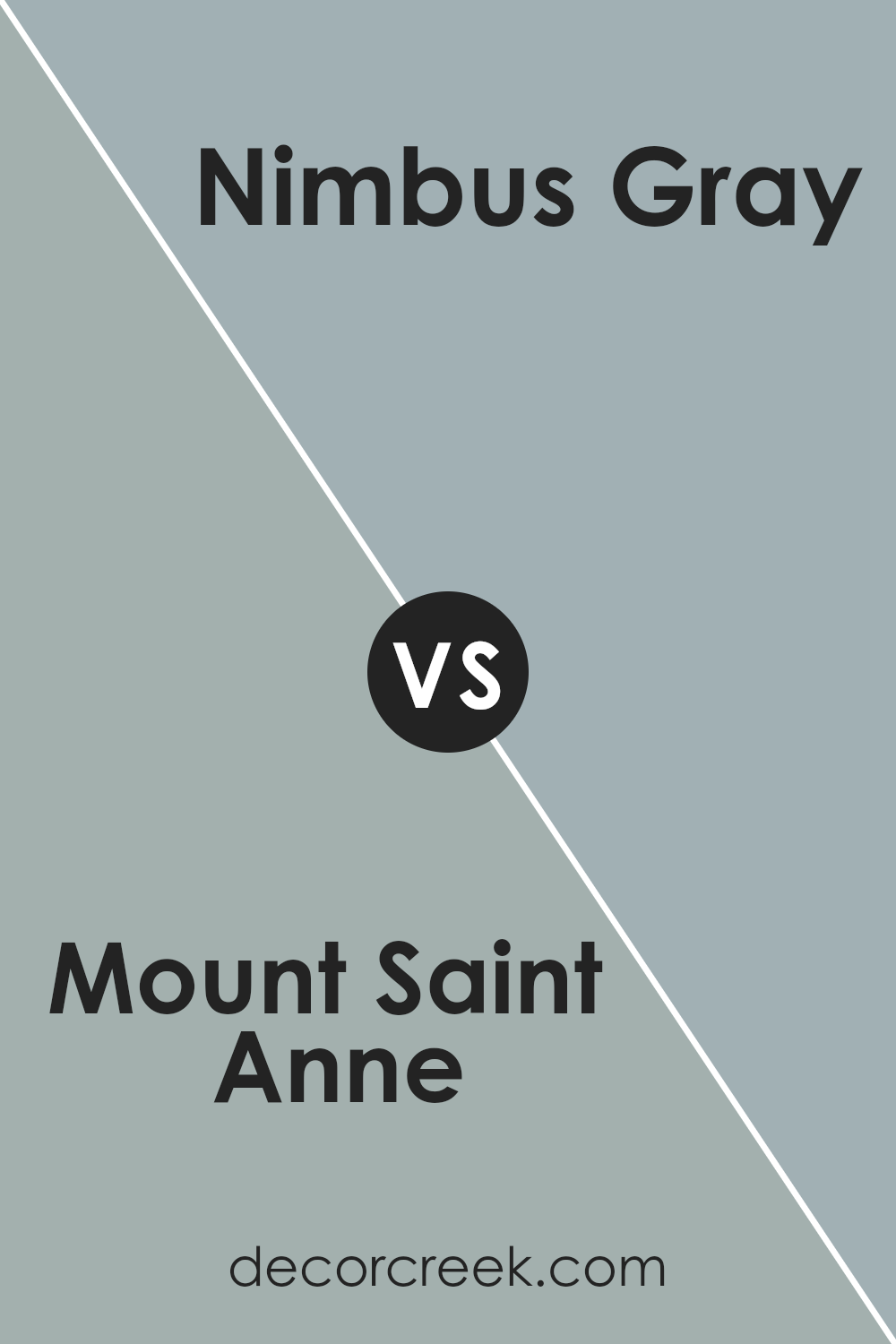
Mount Saint Anne 1565 by Benjamin Moore vs Nimbus Gray 2131-50 by Benjamin Moore
Mount Saint Anne by Benjamin Moore is a cool, soft blue-gray color. It has hints of both blue and gray, giving it a calm and balanced feel. This color works well in rooms where you want a bit of color without being too bold. It’s gentle and can create a peaceful atmosphere.
On the other hand, Nimbus Gray by Benjamin Moore is a slightly darker shade, with a strong gray base and subtle blue undertones. This makes it feel more grounded and sophisticated. Nimbus Gray can add depth to a room while still keeping things neutral.
When comparing the two, Mount Saint Anne is lighter and leans more towards blue, making it airy and fresh. Nimbus Gray is deeper with more gray, which can give a richer and more contemporary look. Both colors can be versatile, but Mount Saint Anne is great for lighter spaces, while Nimbus Gray suits those looking for a more defined and slightly darker option.
You can see recommended paint color below:
- 2131-50 Nimbus Gray
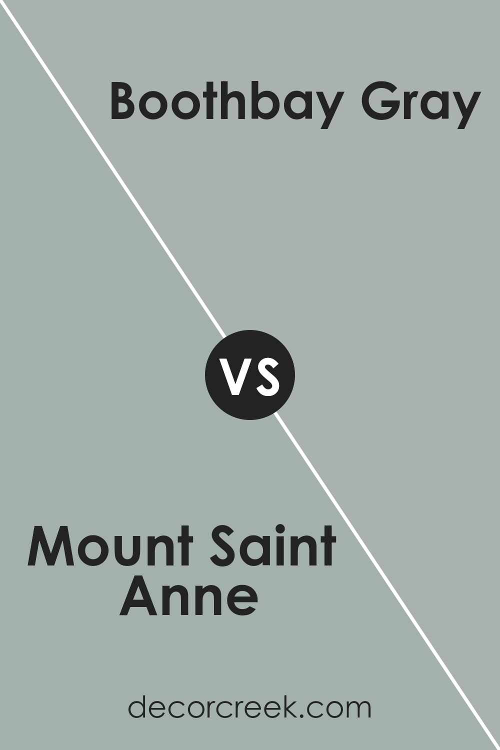
Mount Saint Anne 1565 by Benjamin Moore vs Boothbay Gray HC-165 by Benjamin Moore
Mount Saint Anne 1565 by Benjamin Moore is a subtle blue-gray color that brings to mind soft foggy mornings. It’s calming and pairs well with neutral and cool tones. It’s versatile, making it suitable for bedrooms or living spaces where you want to relax.
Boothbay Gray HC-165 is also a gray, but with a hint of blue-green, adding depth and character. It’s a bit darker and richer than Mount Saint Anne, so it stands out more but still feels balanced and not overly bold.
While both colors are in the same family, Mount Saint Anne leans more towards a pastel, airy feel, whereas Boothbay Gray has a stronger, more pronounced presence. Boothbay Gray can add more contrast and interest when used with whites and creams, while Mount Saint Anne offers a simple, soft backdrop. Both colors work well in a variety of settings and bring a touch of nature indoors.
You can see recommended paint color below:
Mount Saint Anne 1565 by Benjamin Moore vs Silver Mink 1586 by Benjamin Moore
Mount Saint Anne 1565 by Benjamin Moore is a soft, muted blue with a hint of gray. It’s a calming and versatile color that can work well in many settings. It brings a subtle, yet noticeable color to a room without being overpowering. This shade can make a space feel open and airy, while still offering a touch of color.
Silver Mink 1586 by Benjamin Moore, on the other hand, is a light gray with a slight hint of beige. This color has a warm undertone, making it feel cozy and inviting. It’s a more neutral color compared to Mount Saint Anne and pairs easily with a variety of other colors in a home.
While Mount Saint Anne leans towards a cool blue-gray, Silver Mink has a warmer presence due to its beige undertone. Both colors are subtle and elegant, but they offer different moods. Mount Saint Anne feels more refreshing, while Silver Mink feels more comforting.
You can see recommended paint color below:
- 1586 Silver Mink
Mount Saint Anne 1565 by Benjamin Moore vs Castle Walls 1573 by Benjamin Moore
Mount Saint Anne 1565 and Castle Walls 1573 by Benjamin Moore are both soft blue-gray shades, but they have distinct characteristics. Mount Saint Anne is a cool, muted blue with a hint of gray, creating a calm and soothing atmosphere. It’s versatile and works well in both modern and traditional settings.
On the other hand, Castle Walls leans more towards gray with a subtle blue undertone. It’s a slightly darker and more grounded color, offering a sense of coziness and depth to any room. This color is particularly suited for spaces where a neutral yet sophisticated ambiance is desired.
While both colors share blue and gray elements, Mount Saint Anne is lighter and more airy, perfect for spaces where you want a light and open feel. Meanwhile, Castle Walls provides a grounded and intimate vibe, complementing spaces where warmth and comfort are priorities. Both colors are excellent choices, depending on the mood you wish to create.
You can see recommended paint color below:
- 1573 Castle Walls
In the end, I think 1565 Mount Saint Anne by Benjamin Moore is a great choice for people who want a calm and gentle color in their homes. This shade, a soft and pleasant blue-green, reminds me of a peaceful sky or a gentle sea.
When I imagine it on the walls, I feel relaxed and happy. It’s not too bright or too dull—it’s just right and brings a nice balance to any room.
This color can work well in different rooms, like the bedroom, where you want to relax before sleeping, or in the living room, where families spend time together. It makes the space feel calm and welcoming. Even in a small room, it makes things feel bigger and fresher.
I love that kids and adults alike can appreciate it because it brings a sense of calm.
If someone wants a color that is friendly and feels like a gentle hug, 1565 Mount Saint Anne might be perfect. It’s easy to match with different things, like furniture and decorations, which makes it really useful.
Trying new colors can be fun, and this one seems like a safe choice that everyone can enjoy.
Ever wished paint sampling was as easy as sticking a sticker? Guess what? Now it is! Discover Samplize's unique Peel & Stick samples.
Get paint samples

