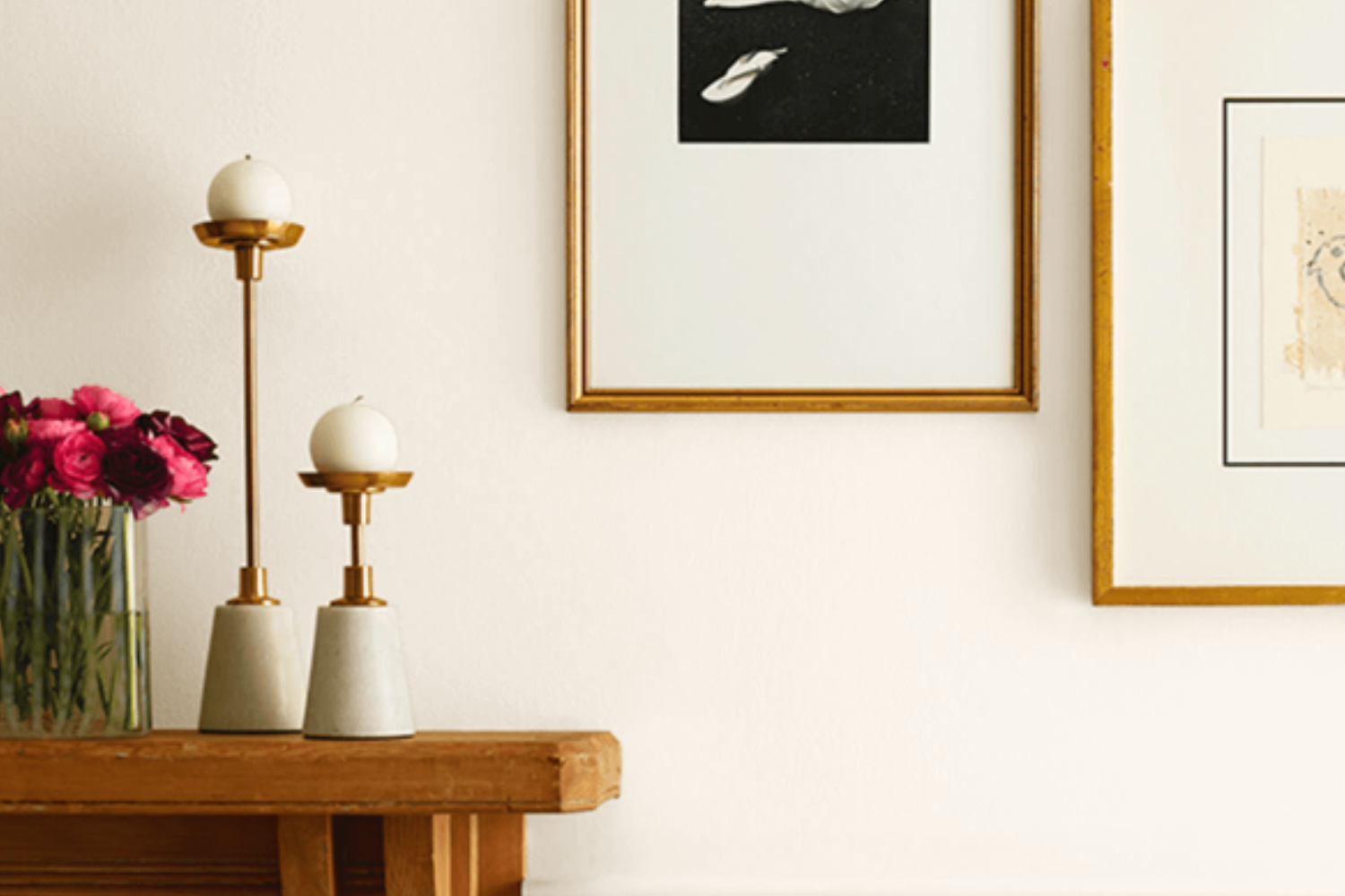
If you’re on the hunt for a paint color that breathes a sense of calm and simplicity into any room, then SW 7002 Downy by Sherwin Williams might just be what you need. This light and airy shade is a go-to for many homeowners and designers looking to create a serene and inviting atmosphere. Its subtle warmth makes it versatile enough to be used in a variety of spaces, from cozy bedrooms to bright kitchens.
Downy is not just another off-white; it carries a softness that can make a room feel more spacious and welcoming.
Whether you’re looking to refresh your walls, ceilings, or even cabinets, this color offers a gently nurturing presence. Its understated elegance allows it to pair beautifully with a wide range of decor styles and color schemes, making it an excellent choice for anyone wanting to add a touch of sophistication without overwhelming a space.
Choosing the right paint color can sometimes feel overwhelming, but with SW 7002 Downy, it’s hard to go wrong. It acts as a perfect backdrop for both bold statement pieces and minimalistic designs, offering a balance that can help bring your home’s aesthetic together. Whether you’re updating a single room or transforming your entire home, Downy provides a timeless canvas that can evolve with your style over time.
What Color Is Downy SW 7002 by Sherwin Williams?
The color Downy by Sherwin Williams is a soft, calming shade that brings a serene ambiance to any room. Its subtle warmth makes it incredibly versatile, fitting seamlessly into various decor styles. This light, airy hue resembles the gentle first light of dawn, offering a sense of peace and freshness.
This particular tone works exceptionally well in Scandinavian and minimalist interiors, where its simplicity can shine without competition.
The clean, uncluttered lines of these styles, combined with the softness of Downy, create a tranquil, open space. It’s also a perfect match for modern farmhouse and coastal designs, where its lightness can enhance the bright, breezy feel characteristic of these aesthetics.
When considering materials and textures to pair with Downy, think natural and light. Blonde woods like pine or oak add warmth without overpowering, while white or light gray textiles in linen or cotton maintain the airy feel. For a bit of contrast, incorporate accessories in muted blues or greens, which complement Downy without detracting from its gentle nature. Soft metal finishes, such as brushed nickel or aged brass, offer a subtle shine that enriches the overall look.
By thoughtfully choosing complementary colors and materials, you can create a soothing and inviting space with Downy that feels both modern and timeless.
Ever wished paint sampling was as easy as sticking a sticker? Guess what? Now it is! Discover Samplize's unique Peel & Stick samples.
Get paint samples

Is Downy SW 7002 by Sherwin Williams Warm or Cool color?
Downy SW 7002 by Sherin Williams is a soft, light gray paint color that brings a serene and peaceful feeling to any room. With its subtle warm undertones, it’s perfect for creating a cozy atmosphere in homes. This color works incredibly well in spaces that receive a lot of natural light, as it reflects the light beautifully, making the room look spacious and airy. Additionally, Downy is versatile, complementing a wide range of décor styles, from modern to traditional, adding a touch of elegance without overwhelming the space.
Homeowners love this shade because it serves as a neutral backdrop, allowing furniture and artwork to stand out.
Whether it’s used in bedrooms for a calming vibe, living rooms for a welcoming feel, or even bathrooms for a spa-like ambiance, this color adapts to the surroundings, enhancing the overall look of the home. Its gentle hue is also great for making small rooms appear larger, providing a simple yet effective way to refresh your home’s interior.
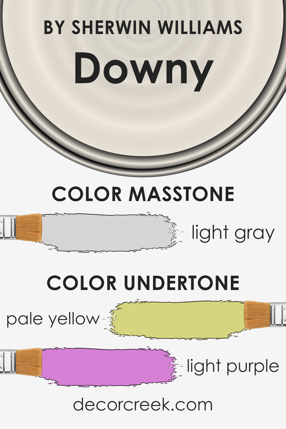
Undertones of Downy SW 7002 by Sherwin Williams
DownySW 7002 by Sherwin Williams is a unique paint color known for its subtlety and elegance. At its core, it carries hints of pale yellow and light purple, which might not be immediately noticeable but significantly influence how the color appears in different settings. These undertones play a crucial role in the color’s overall demeanor and how it interacts with various elements in a room.
Pale yellow undertones add a touch of warmth to the color, making spaces feel more inviting and cozy. This warmth ensures the color doesn’t appear too stark or cold, which is especially beneficial in rooms that receive less natural light. On the other hand, the light purple undertones introduce a hint of cool sophistication, adding depth and complexity.
This subtle blend prevents the color from appearing overly bright while maintaining a fresh and airy feel.
When applied to interior walls, these undertones interact with the room’s lighting, furnishings, and surrounding colors in interesting ways. For instance, in a room with ample natural light, the pale yellow undertones might become more pronounced, creating a serene and welcoming atmosphere. Conversely, in artificial lighting, the light purple undertones might stand out more, providing a tranquil and refined backdrop.
Understanding the influence of these undertones is crucial for anyone considering this paint for their interior spaces. They can subtly shift the ambiance of a room, affecting everything from mood to perceived space size. This nuanced interplay of color and light showcases the sophisticated versatility of DownySW 7002, making it a compelling choice for those looking to infuse their spaces with a nuanced layer of color.
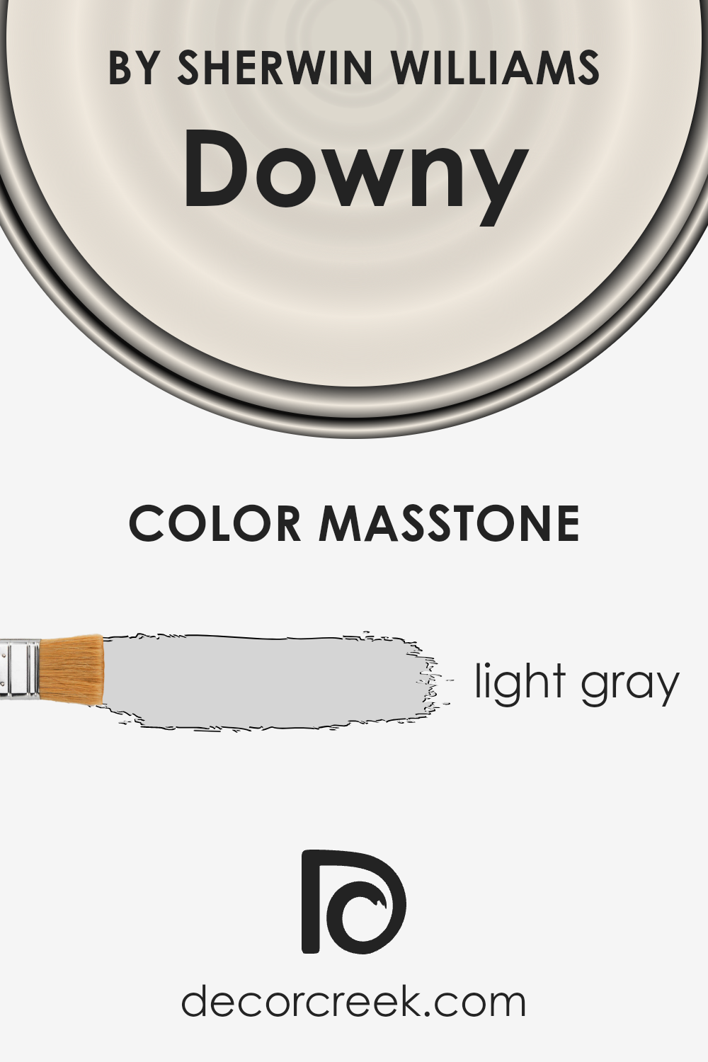
What is the Masstone of the Downy SW 7002 by Sherwin Williams?
Downy SW 7002 by Sherwin Williams has a masstone of light gray, which is a neutral, yet very versatile color tone. This soft hue, resembling the shade of morning mist, brings a serene and calming effect to any room. Its light gray character, marked by the hexadecimal code #D5D5D5, makes it a perfect backdrop for a wide range of home styles and decorations. This subtlety allows for freedom in pairing with both bright colors or staying within a monochrome theme.
In homes, this soothing shade can make spaces appear larger, as light colors reflect natural light better than darker ones. It’s an excellent choice for living rooms, bedrooms, or even kitchens, providing a clean, simplistic feel that’s easy on the eyes.
The light gray masstone of Downy ensures that it can seamlessly blend with various textures and materials, from modern metallic finishes to more rustic, wooden elements, making it a go-to color for creating a peaceful, cohesive space.
How Does Lighting Affect Downy SW 7002 by Sherwin Williams?
Lighting can significantly influence how we perceive colors, transforming the appearance of a paint color like Downy by Sherwin Williams depending on the type of light it’s exposed to. This color, which is a subtly warm and inviting neutral, can appear differently under artificial light compared to natural sunlight, and it even changes tones depending on the direction of the light in the room.
- In artificial light, the color tends to become warmer, making a room feel cozy and welcoming. If you’ve got LED or fluorescent lights, you might notice that Downy leans more towards its underlying warm tones, giving off a softer and more creamy appearance. This quality makes it a versatile choice for spaces lacking in natural light, as it prevents the room from feeling cold or stark.
- Under natural light, however, Downy can look significantly different as the quality and angle of sunlight shift throughout the day. Its true colors come out more vividly under natural illumination, showcasing the subtle nuances within this Sherwin Williams shade.
- In rooms facing north, which receive cooler, indirect light, Downy can appear slightly more muted and serene. This direction of light can amplify the paint’s subtle gray undertones, giving the room a tranquil and airy feel, perfect for creating a calm and focused space.
- South-facing rooms bathe in warm sunlight most of the day, which can bring out the creamy tones in Downy, making spaces feel brighter and more vibrant. The paint can help make the room feel more spacious and inviting, benefiting from the abundant natural light.
- East-facing rooms enjoy the morning light, meaning Downy will have a softer, warm glow in the mornings, transitioning to a cooler tone in the afternoon and evening as the sunlight fades. This natural shift highlights the paint’s versatility in adapting to different lighting conditions.
Finally, in west-facing rooms, the paint will experience the opposite effect, starting off cooler in the morning and warming up as the sun sets. The evening light can make Downy look especially warm and welcoming, perfect for rooms used more frequently during the second half of the day.
Understanding how Downy reacts to these various conditions can help in making informed decisions on where to apply this color to achieve the desired effect in your home.

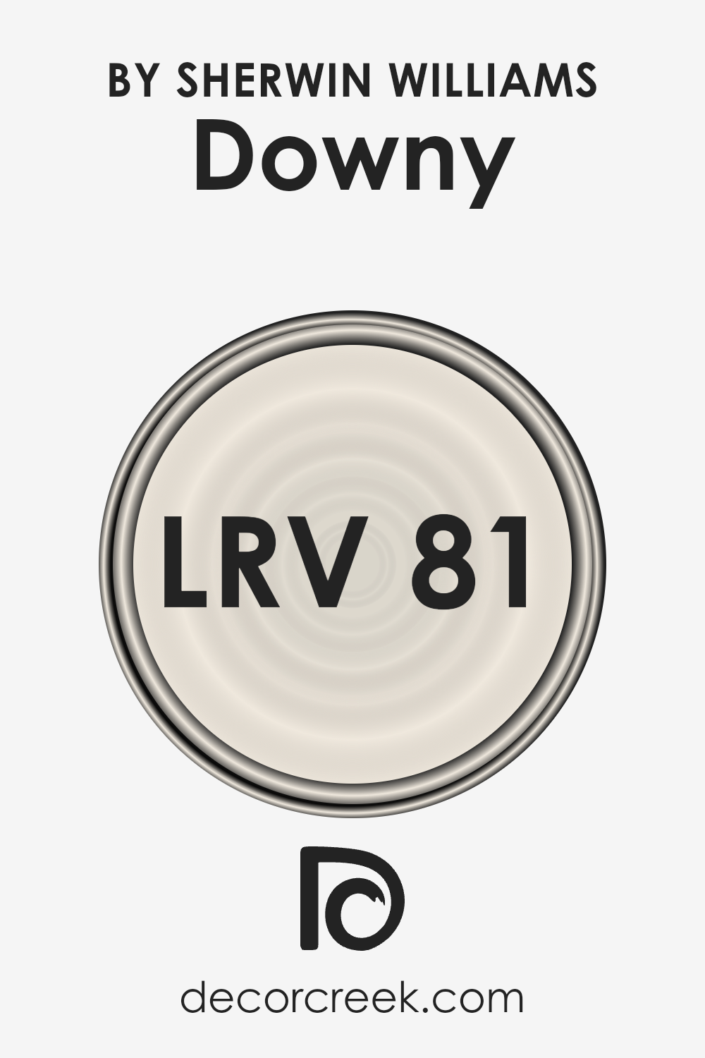
What is the LRV of Downy SW 7002 by Sherwin Williams?
This value helps in choosing paint colors for your spaces by giving you an idea of how light or dark a color will look once applied to the walls. It plays a crucial role in creating the desired ambiance in a room; lighter colors can make a room feel more spacious and brighter, while darker colors can make it feel cozier but smaller.
With an LRV of 81.187, the specific color mentioned reflects a significant amount of light, making it a light and airy choice suitable for creating a bright and welcoming space. This high LRV means the color can help in making a room appear larger and more open, especially beneficial in spaces with limited natural light. Even in a well-lit space, this choice will enhance the room’s brightness, pairing well with a wide range of decor due to its light and neutral nature. The LRV indicates that this particular color can significantly influence the perception of the room’s size and atmosphere, making it a versatile choice for many interior spaces.
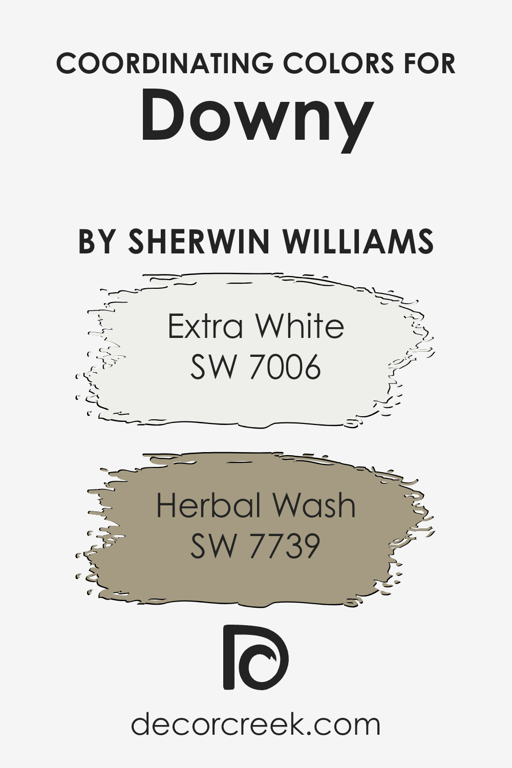
Coordinating Colors of Downy SW 7002 by Sherwin Williams
Coordinating colors are hues that complement each other when used together in a space, creating a harmonious and balanced look. These colors are selected based on how well they match or contrast with a base color, enhancing the overall aesthetic appeal of a room without overwhelming it. The key to successfully using coordinating colors is to find shades that share similar undertones or that are positioned opposite each other on the color wheel, ensuring they enrich the environment without clashing.
For the soft and subtle base color Downy by Sherwin Williams, the coordinating colors Extra White and Herbal Wash work wonderfully to create a fresh and inviting space. Extra White is a clean, crisp white that brings a sense of brightness and openness to a room.
It serves as an excellent backdrop or accent, allowing the gentleness of Downy to stand out while keeping the room feeling light and spacious. On the other hand, Herbal Wash is a unique green with depth and character. This color introduces a refreshing natural element when paired with Downy, creating a serene and comforting atmosphere.
It perfectly complements the softness of Downy by adding just the right touch of organic vibrancy, making any space feel more alive and connected to the outdoors. Together, these coordinating colors offer a palette that is both inviting and cohesive, enhancing the beauty of the base color while contributing to a well-rounded and pleasing interior design.
You can see recommended paint colors below:
- SW 7006 Extra White
- SW 7739 Herbal Wash
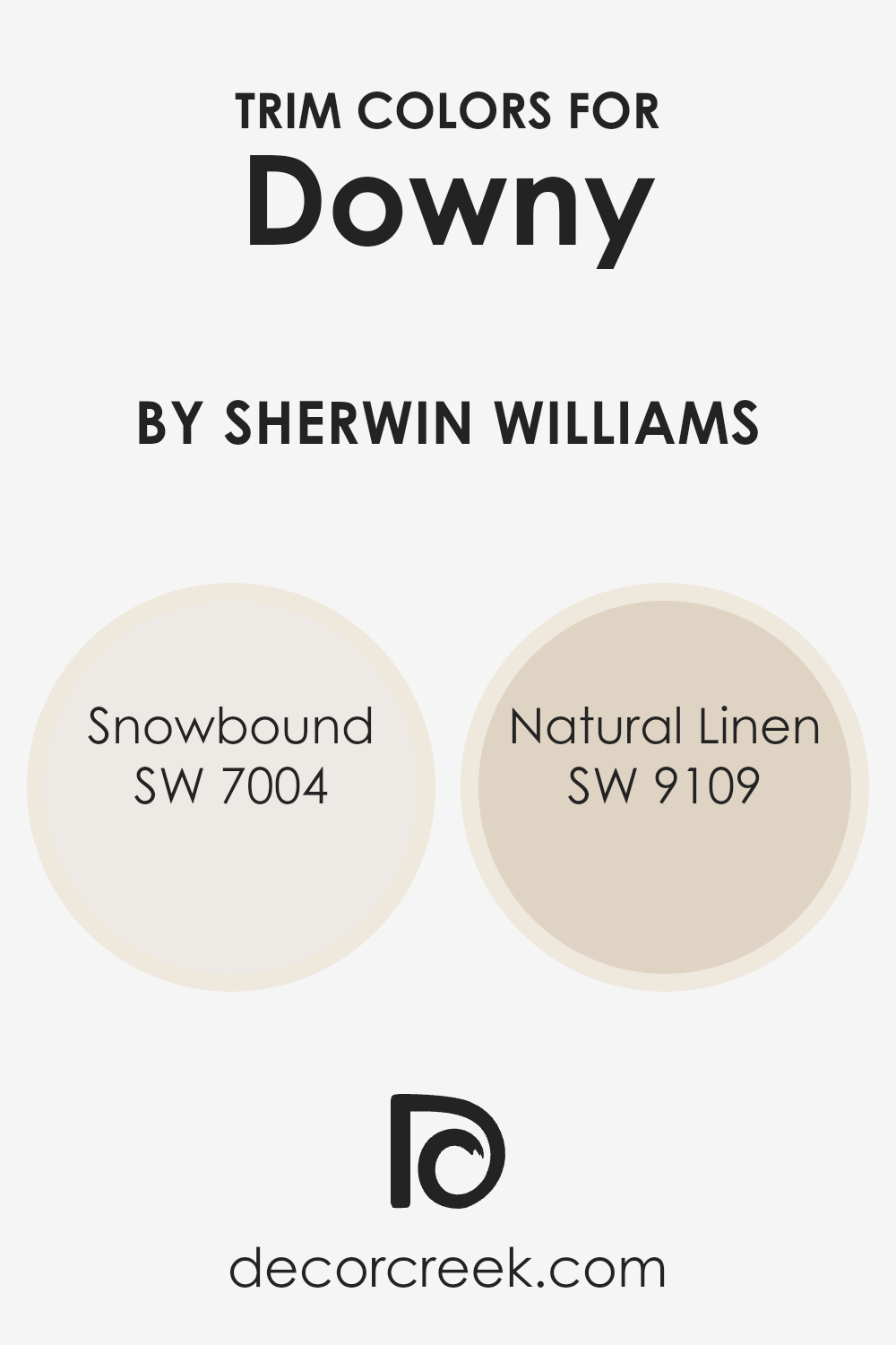
What are the Trim colors of Downy SW 7002 by Sherwin Williams?
Trim colors are specially chosen hues that are used on the borders and edges of rooms, such as window frames, door frames, and baseboards, to accentuate the architectural features of a space. When it comes to painting a room with Downy (SW 7002) by Sherwin Williams, selecting the right trim color can significantly impact the overall look and feel of the room.
It can highlight the room’s dimensions, add depth to the wall color, and enhance the decorative elements within the space. The choice of trim color can either subtly complement the primary paint color, making the room feel cohesive and harmonious, or create a striking contrast, adding a bold visual interest to the room.
For a room painted in Downy (SW 7002) by Sherwin Williams, using Snowbound (SW 7004) as a trim color offers a fresh, crisp contrast that can make the walls pop while keeping the overall aesthetic clean and bright. Snowbound is a light, neutral white with a hint of a warm undertone that ensures the space feels inviting without overwhelming the senses. On the other hand, opting for Natural Linen (SW 9109) as a trim color introduces a softer, more organic contrast.
This color, with its warm beige tone, adds a touch of earthiness to the room, complementing Downy’s soothing quality by bringing in an element of natural warmth, ensuring the space remains balanced and grounded. Both Snowbound and Natural Linin possess unique qualities that can enhance the room’s character when paired with Downy, making the choice of trim color a key element in the room’s overall design scheme.
You can see recommended paint colors below:
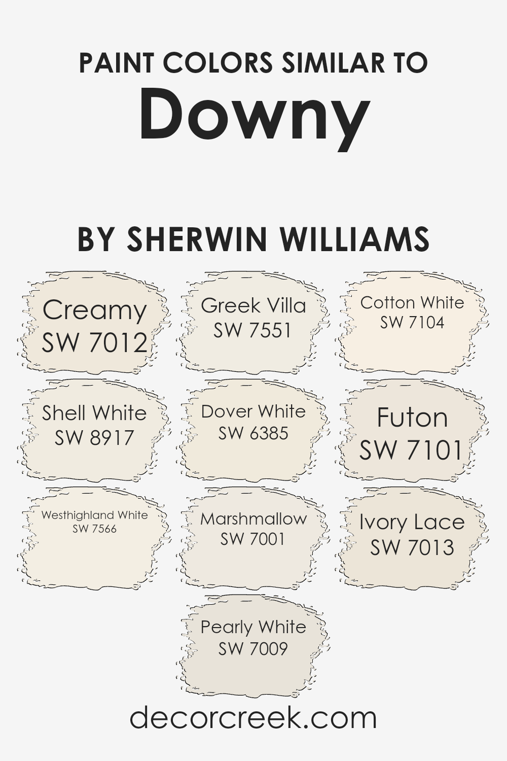
Colors Similar to Downy SW 7002 by Sherwin Williams
Understanding the importance of similar colors in a design context can greatly enhance the cohesion and aesthetic appeal of a space. When considering a base color such as Downy by Sherwin Williams, finding colors that harmonize well with it, such as Creamy or Shell White, can create a seamless transition between spaces or elements within a room. These colors, with their subtle differences, work together to build a palette that’s both versatile and visually soothing.
- Creamy is a warm, welcoming color that brings a soft richness to walls, acting as a perfect companion to the light and airy feel of Downy.
- Shell White adds a hint of elegance with its understated brightness, complementing the serene vibe.
- Westhighland White and Pearly White offer freshness and a clean backdrop, making them ideal for areas that receive plenty of natural light. Greek Villa and Dover White introduce a subtle hint of color, adding depth and interest without overwhelming the senses.
- Marshmallow, with its slightly sweet tone, enhances the cozy factor, while Cotton White and Futon lean towards a minimalist approach, offering a crisp and clear canvas.
- Lastly, Ivory Lace serves as the bridge between these colors, providing a delicate balance that ties the entire palette together, ensuring a cohesive look that’s both inviting and harmonious.
Understanding how these similar colors work can transform a space, making it feel thoughtfully curated and pleasantly connected.
You can see recommended paint colors below:
- SW 7012 Creamy
- SW 8917 Shell White
- SW 7566 Westhighland White
- SW 7009 Pearly White
- SW 7551 Greek Villa
- SW 6385 Dover White
- SW 7001 Marshmallow
- SW 7104 Cotton White
- SW 7101 Futon
- SW 7013 Ivory Lace
How to Use Downy SW 7002 by Sherwin Williams In Your Home?
Downy SW 7002 by Sherwin Williams is a subtle and soothing paint color that homeowners love. It offers a whisper-light touch of gray, giving any room a tranquil feeling. This color is perfect for creating a calm and relaxing atmosphere in your home. Its softness makes it an excellent choice for bedrooms, where a peaceful vibe is often desired. It’s also ideal for living rooms and bathrooms, providing a clean, airy look that’s not too stark.
Using Downy in your home means you can easily match it with a wide range of decor styles and colors.
It pairs beautifully with crisp whites for a fresh, modern feel, or with warm woods and soft textiles for a more cozy, inviting space. Because of its understated elegance, Downy can serve as a background for artwork, allowing pieces to stand out without competing for attention. Whether you’re giving your whole home a makeover or just refreshing a single room, this color provides a gentle, sophisticated backdrop that’s sure to enhance the space.
Downy SW 7002 by Sherwin Williams vs Creamy SW 7012 by Sherwin Williams
Downy and Creamy are two soothing colors from Sherwin Williams that share a subtle softness, yet they have their distinctive characteristics. Downy is a pale, airy gray that brings a sense of calm and understated elegance to any space. It’s like a gentle early morning mist, offering a cool and tranquil vibe.
On the other hand, Creamy is a soft, warm white with a hint of buttery undertone, inviting a cozy and comforting atmosphere. It’s more like a soft, warm glow, adding light and warmth to rooms. While Downy leans towards giving spaces a fresh, serene backdrop, Creamy adds a touch of warmth, making spaces feel more inviting and homely.
Both colors work beautifully in various settings, from modern to traditional, depending on the mood you want to create. Downy might be preferred for a sleek, minimalistic look, while Creamy could be the go-to for a more classic, cozy feel.
You can see recommended paint color below:
Downy SW 7002 by Sherwin Williams vs Futon SW 7101 by Sherwin Williams
Downy by Sherwin Williams is a subtle, light grayish hue that gives off a serene and airy feel. It’s the kind of color that can open up a space, making it appear larger and more welcoming. On the other hand, Futon by Sherwin Williams leans towards a warmer, cozier shade of gray, suggesting a sense of comfort and quiet sophistication.
While both colors share a base in the gray family, Downy stands out for its cool undertones, offering a breath of fresh air in a room. Futon, with its slightly warmer touch, brings a snug and inviting atmosphere. This slight difference in temperature between the two colors can greatly affect the mood of a space.
Downy is perfect for creating a tranquil, open space, while Futon is ideal for areas where a more intimate, cozy feel is desired. So, choosing between the two really comes down to the ambiance you want to create in your room.
You can see recommended paint color below:
- SW 7101 Futon
Downy SW 7002 by Sherwin Williams vs Westhighland White SW 7566 by Sherwin Williams
The two colors, Downy and Westhighland White, both by Sherwin Williams, share some similarities but also have distinct differences. Downy is a soft, warm, near-neutral paint that leans towards a comforting grey with a hint of beige. This makes it versatile for various spaces, offering a cozy backdrop that still feels light and airy.
On the other hand, Westhighland White is a brighter, crisper white with a creamy undertone, making it feel more inviting rather than stark. It’s ideal for spaces you want to appear more open and full of light, providing a fresh and clean look. While Downy might be better suited for creating a snug and serene environment, Westhighland White is perfect for achieving a brighter, more vibrant space.
Both colors offer a unique charm and can transform a room depending on the mood you wish to set, be it calming with Downy or energizing with Westhighland White.
You can see recommended paint color below:
Downy SW 7002 by Sherwin Williams vs Dover White SW 6385 by Sherwin Williams
Downy and Dover White, both from Sherwin Williams, have their unique shades that add distinctive vibes to spaces. Downy stands out with its soft, light gray tone, offering a fresh, clean look ideal for creating serene and airy environments. This subtle neutrality makes it incredibly adaptable, easily complementing both warm and cool color palettes, thereby enhancing various decor styles without overwhelming the senses.
On the other hand, Dover White radiates a warmer, inviting aura. Unlike the cooler hue of Downy, Dover White leans towards a creamy, soft white, producing a cozy and welcoming atmosphere. This color works wonders in spaces aiming for a bright, yet warm feel, particularly in areas that crave a touch of brightness without resorting to a stark, pure white.
Together, Downy and Dover White present a harmonious balance; one offers a neutral, calming foundation, while the other adds warmth and luminosity, making them a versatile duo for those looking to combine contemporary with comfort.
You can see recommended paint color below:
Downy SW 7002 by Sherwin Williams vs Ivory Lace SW 7013 by Sherwin Williams
Downy and Ivory Lace are both colors offered by Shermin Williams that create serene and welcoming spaces, but they have their unique characteristics. Downy is a soft, gentle gray with a hint of warmth, making it versatile for any room. It creates a soothing atmosphere that’s both elegant and understated.
On the other hand, Ivory Lace is a creamy off-white with a touch of beige, giving it a warmer and cozier feel compared to Downy. Ivory Lace can brighten up a space while still offering a comforting warmth, making it perfect for creating a snug and inviting environment. While Downy leans more towards a neutral, calm gray, Ivory Lace leans towards a light, warm beige.
Choosing between them depends on the mood you’re looking to create: Downy for a cool, serene backdrop, or Ivory Lace for a warm, welcoming glow. Both colors offer a beautiful canvas, but their differences lie in the warmth and mood they bring to a room.
You can see recommended paint color below:
- SW 7013 Ivory Lace
Downy SW 7002 by Sherwin Williams vs Shell White SW 8917 by Sherwin Williams
Downy and Shell White are two colors by Sherwin Williams that may seem similar at first glance but have their own unique traits. Downy is a soft, gentle hue that leans more towards a muted grey with a hint of warmth. This makes it incredibly versatile for spaces that aim for a tranquil and airy feel. It’s a color that quietly complements a wide range of decor without overwhelming the senses.
On the other hand, Shell White steps in with a creamier tone. It’s closer to a traditional white but with a touch of warmth that keeps it from feeling stark or cold. This warmth makes Shell White ideal for creating a cozy and inviting space. It serves as a perfect background for a room that seeks to be bright and welcoming.
In summary, Downy offers a cooler, more understated elegance with its grey undertones, while Shell White brings a warmer and cozier atmosphere with its creamy character. Both colors stand as excellent choices for those looking to freshen up their space with a subtle nod to sophistication.
You can see recommended paint color below:
- SW 8917 Shell White
Downy SW 7002 by Sherwin Williams vs Pearly White SW 7009 by Sherwin Williams
When looking at the colors Downy and Pearly White, both by Sherwin Williams, it’s interesting to note their subtle differences, despite their seemingly similar appearance at first glance. Downy has a serene, soft quality to it, leaning slightly towards a cooler hue. This gives it a calming effect, making it an excellent choice for creating a peaceful and tranquil environment. Its gentle tone can make small spaces appear more open and airy.
On the other hand, Pearly White carries a hint of warmth, radiating a cozy and welcoming vibe. It’s like the light, creamy color you might see on a pearl, hence its name. This color can add a touch of elegance and soft sophistication to any room, enhancing the space with its subtle charm.
Both colors are versatile and can blend well with various decor styles, from modern to classic. However, the choice between Downy’s cool tranquility and Pally White’s warm elegance would depend on the atmosphere one aims to achieve in a space. Each color, with its unique undertone, has the power to transform a room in its own way.
You can see recommended paint color below:
Downy SW 7002 by Sherwin Williams vs Greek Villa SW 7551 by Sherwin Williams
Downy and Greek Villa are two popular colors from Sherwin Williams. Downy is a soft, light greige – a mix between gray and beige that feels cozy and understated. It’s perfect for creating a soothing atmosphere in any room, giving off a gentle, calming vibe. Because of its unique blend, it works well in spaces that need a touch of warmth without the heaviness of darker colors.
On the other hand, Greek Villa is a warm white with a slight undertone of beige, making it richer than a pure white. It’s a go-to color for those wanting to brighten up their space while adding a hint of coziness. Greek Villa shines in well-lit areas, where its creamy nature becomes more apparent, offering a welcoming and soft ambiance.
Though both colors share a certain softness, Downy leans more towards a muted gray-beige, offering depth and neutrality. Greek Villa, with its creamy white presence, offers lightness and warmth. Both are excellent choices for creating inviting spaces, but your preference might depend on whether you favor a hint more of greige depth or creamy brightness.
You can see recommended paint color below:
Downy SW 7002 by Sherwin Williams vs Marshmallow SW 7001 by Sherwin Williams
Downy and Marshmallow by Sherwin Williams are two shades that share a subtle elegance, yet each offers a unique atmosphere. Downy is like a soft, light gray with a whisper of blue undertones. This color can create a serene and calming space, providing a gentle backdrop that complements a wide range of decor. It’s perfect for anyone looking to add a touch of sophistication without overwhelming a room with color.
On the other hand, Marshmallow is a warmer, creamier white. It has the ability to make a room feel cozy and inviting, bringing with it a brightness that can lift the spirits of anyone who enters. It’s an excellent choice for spaces where you want to introduce light and warmth, making it ideal for living areas, kitchens, and bathrooms.
When comparing Downy and Marshmallow, the main difference lies in their base tones – the cool, understated elegance of Downy versus the warm, welcoming embrace of Marshmallow. Each brings its own distinct vibe to a space, allowing you to choose based on the mood you wish to create.
You can see recommended paint color below:
Downy SW 7002 by Sherwin Williams vs Cotton White SW 7104 by Sherwin Williams
Downy by Sherwin Williams is a gentle and soft gray hue with a subtle green undertone. It’s a versatile color that offers a calming and serene feel to any space, making it perfect for creating a tranquil and restful environment. On the other hand, Cotton White by Sherwin Williams is a clean, crisp white that leans towards a pure and bright ambiance.
Unlike Downy, which introduces a hint of color and depth, Cotton White is straightforward and unambiguous, providing a classic backdrop that can either stand alone for a minimalist look or serve to highlight other colors and decor within a room.
When comparing the two, the main distinction is their temperature and depth. Downy brings warmth and complexity with its understated color, offering a cozy feel. Cotton White, however, is all about clarity and freshness, echoing the simplicity of its name. Both colors are beautiful in their right, but the choice between them depends on the atmosphere you’re aiming to achieve: comforting and layered with Downy or crisp and bright with Cotton White.
You can see recommended paint color below:
- SW 7104 Cotton White
Conclusion
Downy SW 7002 by Sherwin Williams is a soft and versatile paint color that offers a peaceful and calming effect, making it a perfect choice for any room seeking a serene atmosphere. Its light and airy qualities bring a sense of freshness and clarity, adapting well to different lighting conditions and complementing a wide range of decor styles.
This color stands out for its ability to create a cozy and inviting space, enhancing the visual comfort and aesthetic appeal of a room without overwhelming it with intensity.
Choosing Downy SW 7002 is a smart decision for anyone looking to refresh their space with a subtle and soothing hue. It easily pairs with both bold and muted colors, allowing for flexibility in design choices and room themes. This color demonstrates its versatility by fitting seamlessly into bedrooms, living rooms, and even kitchens, providing a gentle backdrop that elevates the overall feel of a home. Overall, its timeless quality makes it a go-to choice for those wanting to add a touch of elegance and tranquility to their living environment.
Ever wished paint sampling was as easy as sticking a sticker? Guess what? Now it is! Discover Samplize's unique Peel & Stick samples.
Get paint samples
