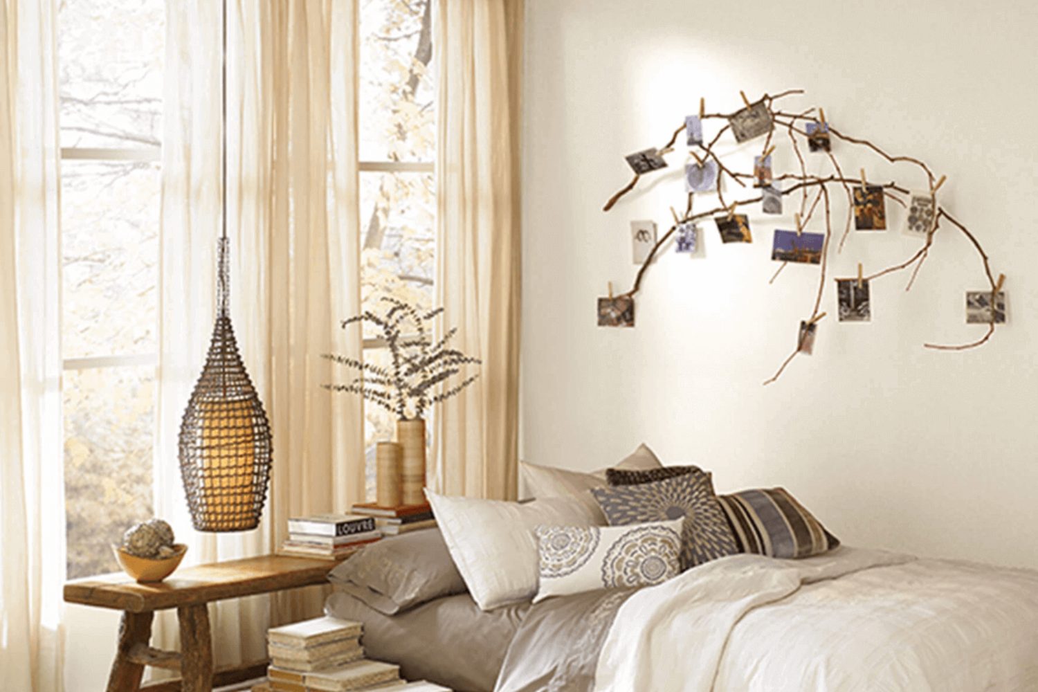
Looking for a paint color that brings a sense of calm and simplicity into your space? SW 7568 Neutral Ground by Sherwin Williams might just be the perfect choice for you. This paint shade is like a quiet whisper in a room, offering a serene backdrop that complements various decor styles and preferences. Neutral Ground stands out in its ability to provide a soft, minimalistic look without making the space feel empty or cold.
This versatile color works wonders in areas where you want a neutral palette that’s easy on the eyes and blends seamlessly with other colors, whether it be bold hues or other subtle tones. It’s particularly effective in rooms that are flooded with natural light, as it captures and softens the brightness without diminishing its warmth and energy.
Choosing Neutral Ground for your walls means selecting a color that acts as a gentle anchor for your furnishings and accessories. It’s an excellent choice for anyone looking to refresh their home’s look with a color that’s both timeless and modern. Whether you’re updating a cozy living space, a busy kitchen, or a peaceful bedroom, SW 7568 Neutral Ground offers a harmonious balance that’s hard to beat. It’s a color that truly transforms a house into a home, making every room feel more inviting and restful.
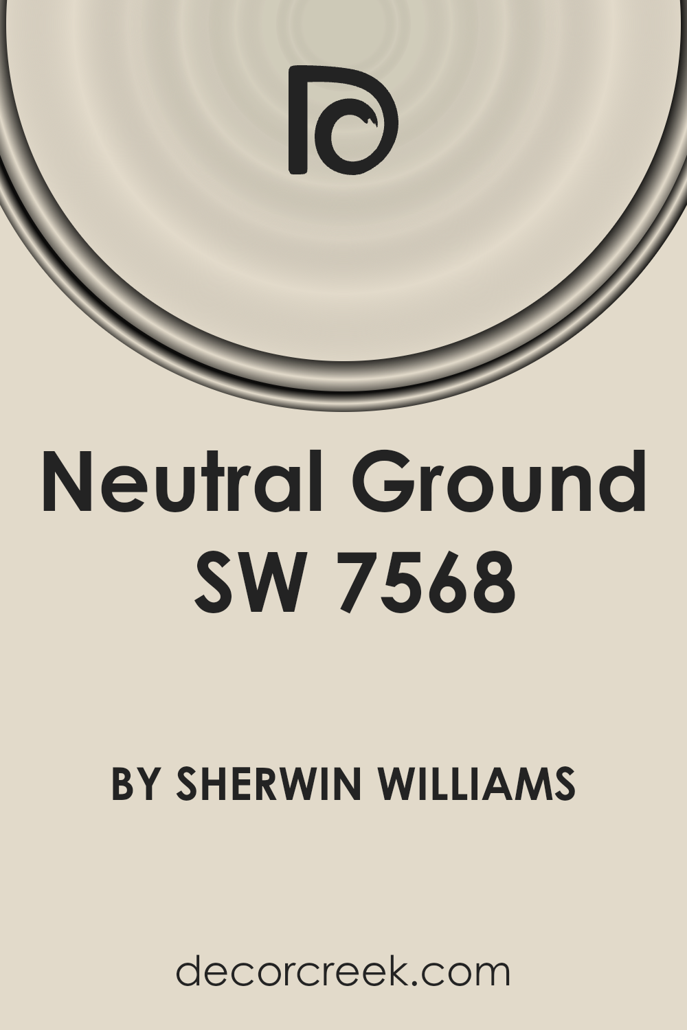
What Color Is Neutral Ground SW 7568 by Sherwin Williams?
Neutral Ground by Sherwin Williams is a gentle and sophisticated hue that brings warmth and versatility to any space. This color stands out for its amazing ability to blend seamlessly into various decor styles and settings. With its understated elegance, it serves as an ideal backdrop for rooms that aim for a calm and inviting atmosphere.
This paint color is a perfect match for interior styles that prioritize comfort and simplicity, such as modern minimalist, Scandinavian, and contemporary rustic. Its subtle warmth makes it an excellent choice for living rooms, bedrooms, and home offices, creating a serene environment conducive to relaxation and focus.
When it comes to pairing with materials and textures, Neutral Ground shines alongside natural wood, adding a touch of earthiness that enhances the room’s overall organic feel.
It also pairs beautifully with soft textiles like cotton or linen, contributing to a cozy and comfortable vibe. For a slightly more sophisticated look, incorporating elements of brushed metal or glass can add a layer of contrast and interest, making the space more dynamic.
In essence, Neutral Ground is a versatile color that works harmoniously with a wide range of materials and textures, making it a go-to choice for those looking to create a space that feels both welcoming and stylish.
Is Neutral Ground SW 7568 by Sherwin Williams Warm or Cool color?
Neutral Ground SW 7568 by Sherwin Williams is a soft and inviting color that brings warmth and balance to any room in a home. Its understated elegance makes it a versatile choice, fitting seamlessly into various decor styles, from modern minimalist to rustic charm.
This paint color acts like a blank canvas, allowing furniture and art to stand out, yet it provides enough warmth to ensure spaces feel cozy and welcoming. It’s like the perfect backdrop; it doesn’t scream for attention but quietly supports the overall aesthetics of the room.
Since Neutral Ground has a subtle undertone, it adapts well under different lighting conditions, showing a pleasant softness in bright daylight and a cozy warmth in artificial light.
This adaptability makes it a great pick for common areas, bedrooms, or even home offices, essentially anywhere you want a calm and restorative feel. Pairing it with bold colors or textures can add depth and interest, while keeping it with other neutrals can create a serene and harmonious space. It’s a color that truly offers flexibility, making your home look put together without much effort.
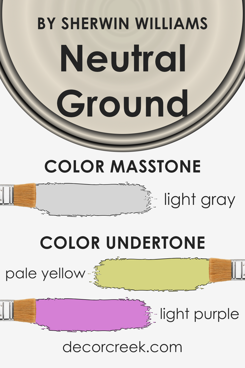
Undertones of Neutral Ground SW 7568 by Sherwin Williams
Neutral Ground by Sherwin Williams is a versatile paint color that seems simple at first glance but carries complex undertones that can subtly influence how it looks in different settings. One of the notable undertones of this color is a pale yellow. This hint of yellow gives the color a warm, inviting feel. It means that in spaces with natural light, Neutral Ground will have a soft, cozy glow, making the room feel more welcoming and comfortable.
Another undertone present in this paint color is light purple. This might seem surprising, but this touch of purple can add a layer of depth and sophistication to the color. In spaces with cooler light or less natural light, this undertone might become more apparent, adding a unique character to the room without overwhelming it.
The interplay of these undertones—pale yellow and light purple—makes Neutral Ground a dynamic choice for interior walls. Depending on the room’s lighting and the colors around it, Neutral Ground can shift and change. In bright, sunny rooms, the yellow undertones will make the walls feel warm and cheerful.
In rooms with cooler light or during the evening, the purple undertones might emerge, giving the space a calming and refined atmosphere.
Understanding these undertones helps when deciding on interior paint colors because they affect how the color interacts with light, as well as with other colors in the room. This knowledge can assist in achieving the desired mood or feeling in a space. Neutral Ground, with its subtle complexity, offers a backdrop that can complement a wide range of decors, making it a popular choice for creating inviting and adaptable interior spaces.
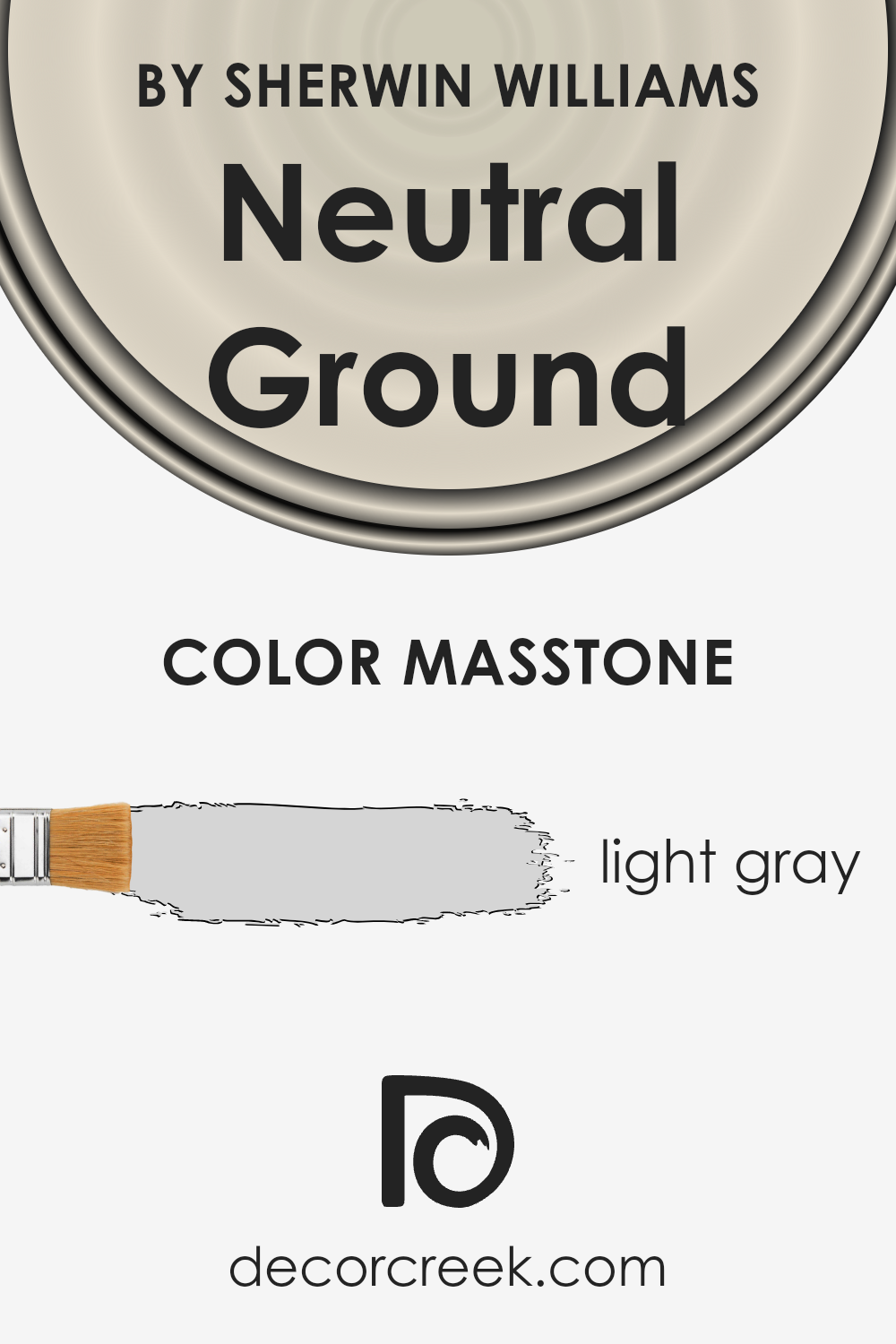
What is the Masstone of the Neutral Ground SW 7568 by Sherwin Williams?
Neutral Ground SW 7568 by Sherwin Williams has a masstone of light gray, with a hex code of #D5D5D5. This specific tone of gray brings a calm and clean atmosphere to any room in the house. Being a light gray, it’s versatile, meaning it can easily fit with a wide range of color schemes and design styles. Whether your home has a modern, minimalist vibe or a cozy, traditional feel, this paint can complement your decor seamlessly.
Since it’s a neutral color, it doesn’t overpower the space. Instead, it provides a subtle backdrop that allows your furniture and accessories to stand out. It’s excellent for making small spaces appear larger and brighter because light colors reflect light, enhancing the sense of space.
Additionally, being a light and neutral shade, it has a timeless quality. It won’t go out of style, making it a smart choice for those looking to add lasting appeal to their home. This paint color can transform a room into a peaceful sanctuary, offering a serene environment that’s perfect for relaxation.
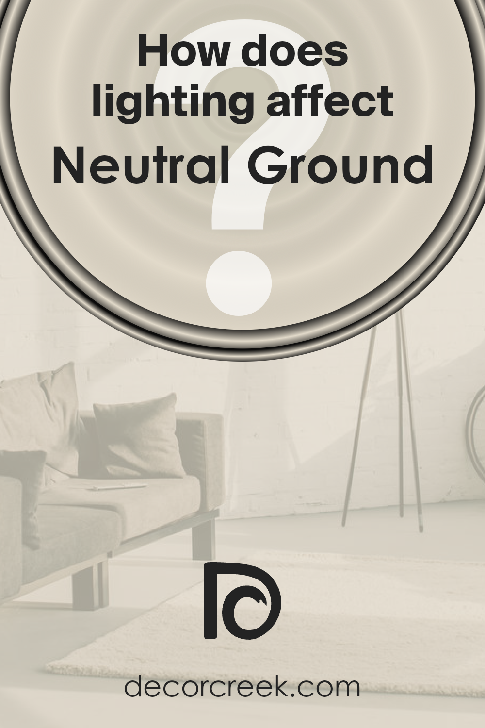
How Does Lighting Affect Neutral Ground SW 7568 by Sherwin Williams?
Lighting plays a crucial role in how we perceive colors, significantly impacting their appearance and the ambiance they create in a space. The color Neutral Ground, a subtle and versatile shade, offers an excellent example of this effect. Its perception can vastly change depending on whether it is viewed under artificial or natural light, as well as the orientation of the room in which it is used.
- In artificial light, colors can look different based on the type of bulbs used. Some bulbs emit a warm, yellowish glow, while others provide a cooler, bluer light. Neutral Ground, under warm artificial lighting, tends to appear softer and more inviting, enhancing cozy and relaxed feelings in a room. On the other hand, in cooler artificial light, this color might look more crisp and neutral, making it suitable for a modern and minimalist aesthetic.
- Natural light brings out the truest version of colors, but the direction of the light source also affects how a color appears. In north-faced rooms, which receive less direct sunlight, Neutral Ground may take on a cooler, more muted tone. This could make the room feel calm and serene, ideal for spaces where focus and tranquility are desired.
- South-faced rooms, showered in abundant sunlight, will reveal a warmer and brighter aspect of Neutral Ground. The ample natural light can make the color feel more lively and welcoming, perfect for creating a cheerful and energetic space.
- East-faced rooms get plenty of morning light, making colors like Neutral Ground look warm and vibrant in the morning, then gradually cooler throughout the day. This daily transformation can add a dynamic feel to the space, making it perfect for rooms used mostly in the morning.
Conversely, in west-faced rooms, the color will experience the opposite effect. It starts cooler in the morning and becomes warmer and richer toward the evening as the sun sets. This makes it ideal for living spaces that are used more in the afternoon and evening.
Understanding how lighting affects colors like Neutral Ground can help in making informed decisions about paint choices and room orientations, ensuring that spaces not only look beautiful but also serve their intended purpose well under different lighting conditions.
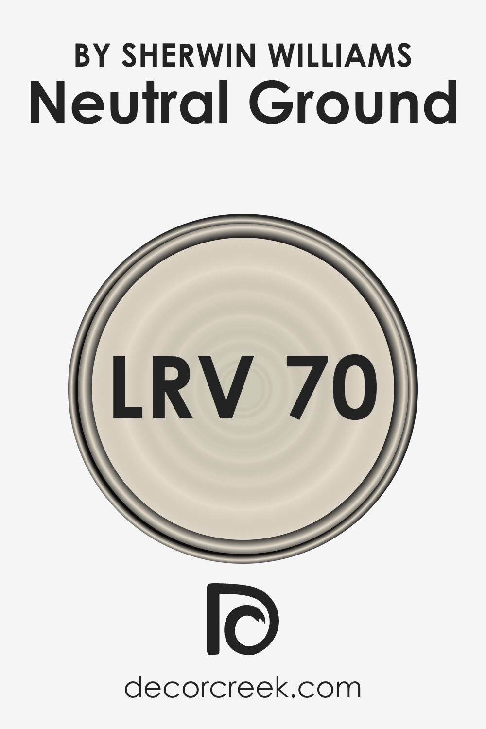
What is the LRV of Neutral Ground SW 7568 by Sherwin Williams?
For the color Neutral Ground with an LRV of 70.47, it’s on the lighter side of the scale, meaning it will reflect a good amount of light without overwhelming the space. This makes it a great choice for almost any room, especially ones that might not get a ton of natural light, because it can help make the space feel brighter and more airy. Since it’s not close to white, it will bring a warm and subtle ambiance to the room, adding character without darkening the space.
This LRV value indicates that Neutral Ground is versatile, working well in various lighting conditions, and can help create a welcoming atmosphere.
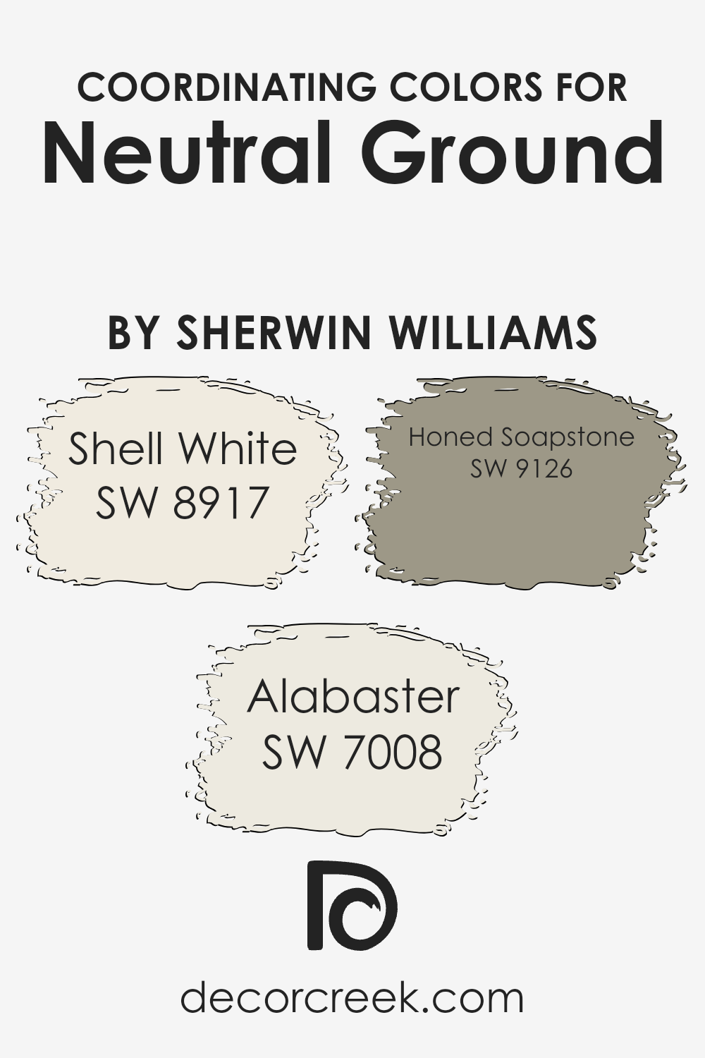
Coordinating Colors of Neutral Ground SW 7568 by Sherwin Williams
Coordinating colors are essentially shades that complement each other well and are used together to create aesthetically pleasing color schemes. These colors harmonize seamlessly, enhancing the overall look and feel of a space without overwhelming it with too much contrast.
The idea is to achieve a balanced and cohesive palette that brings out the best in each hue, making any interior space more inviting and visually interesting. When it comes to choosing coordinating colors for Neutral Ground by Sherwin Williams, a selection of complementary shades can elevate the design and atmosphere of a room to the next level.
Shell White, with its soft, warm undertones, acts as a perfect complement to Neutral Ground, making spaces feel brighter and more spacious. Its subtle elegance adds a touch of sophistication without overpowering the room’s aesthetic. Alabaster, another coordinating color, brings a sense of calm and serenity with its light, creamy essence.
This color pairs beautifully with Neutral Ground, creating a soft, inviting ambiance that’s both cozy and chic. Honed Soapstone stands out with its deeper, rich tone, offering a stunning contrast that grounds the lighter shades. This color adds depth and interest, making the overall color scheme more dynamic and engaging. Together, these coordinating colors work in harmony to enhance the beauty and charm of any space adorned with Neutral Ground.
You can see recommended paint colors below:
- SW 8917 Shell White
- SW 7008 Alabaster
- SW 9126 Honed Soapstone
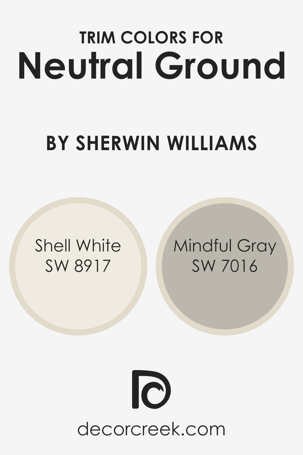
What are the Trim colors of Neutral Ground SW 7568 by Sherwin Williams?
Trim colors are essentially the contrasting or complementary hues used on the edges, frames, and borders of walls, doors, and windows, which help to accentuate and define the overall look of a room. When it comes to a neutral and versatile color like Neutral Ground by Sherwin Williams, selecting the right trim color becomes crucial.
It’s because the correct trim can enhance the understated elegance of Neutral Ground, making the walls appear more pronounced and the entire space cohesively designed. Used thoughtfully, trim colors can also bring a sense of structure and polish to a room, providing clear visual boundaries that frame the spaces beautifully.
For Neutral Ground by Sherwin Williams, Shell White (SW 8917) and Mindful Gray (SW 7016) are excellent choices for trim colors. Shell White offers a soft, clean look that gently complements the warm undertones of Neutral Ground, adding a subtle brightness to the room without overwhelming it.
It’s like a breath of fresh air that subtly lifts the ambiance, making spaces feel open and serene. On the other hand, Mindful Gray provides a slightly deeper contrast, creating a sophisticated and grounded look. Its balanced mix of gray brings forward a modern edge that can seamlessly tie together the walls and flooring, all while adding depth and character to the space. Together, these trim colors can enormously enrich the aesthetic appeal of Neutral Ground, presenting an inviting and refined atmosphere.
You can see recommended paint colors below:
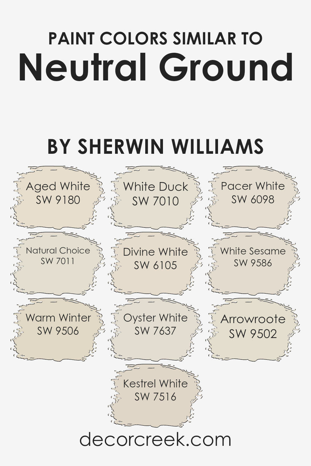
Colors Similar to Neutral Ground SW 7568 by Sherwin Williams
Similar colors serve an essential role in design and decor, especially when working with a baseline like Neutral Ground by Sherwin Williams. These hues are perfect for creating a harmonious, cohesive look in any space.
Their similarity allows for subtle variations in color that can add depth and sophistication without overwhelming the eye. By staying within a close color palette, you achieve a seamless transition from room to room, ensuring that each area feels connected yet distinct.
- Aged White (SW 9180) brings a slightly aged, warm tone that’s comforting and inviting, perfect for living spaces that seek a touch of coziness.
- Natural Choice (SW 7011), on the other hand, is a bit lighter, offering a fresh, airy feel that’s ideal for creating an open, spacious atmosphere.
- Warm Winter (SW 9506) adds a hint of welcoming warmth, making it suitable for areas where you want to encourage relaxation and conversation.
- Kestrel White (SW 7516) strikes a balance between warm and cool, versatile enough for any light condition.
- White Duck (SW 7010) is a neutral option with a subtle depth, blending well in spaces that aim for a grounded look.
- Divine White (SW 6105) has a touch of creaminess, perfect for adding a soft, elegant touch to any room.
- Oyster White (SW 7637) offers a hint of gray, for those looking to introduce a modern yet timeless vibe.
- Pacer White (SW 6098) is slightly brighter, suitable for illuminating darker spaces.
- White Sesame (SW 9586) and Arrowroot (SW 9502) both offer unique takes on neutrality; the former with a touch of earthiness and the latter with a delicate whisper of color, ideal for achieving a minimalist aesthetic.
Together, these similar colors provide a palette that’s versatile, cohesive, and incredibly effective for creating beautiful, integrated spaces.
You can see recommended paint colors below:
- SW 9180 Aged White
- SW 7011 Natural Choice
- SW 9506 Warm Winter
- SW 7516 Kestrel White
- SW 7010 White Duck
- SW 6105 Divine White
- SW 7637 Oyster White
- SW 6098 Pacer White
- SW 9586 White Sesame
- SW 9502 Arrowroote
How to Use Neutral Ground SW 7568 by Sherwin Williams In Your Home?
Neutral Ground SW 7568 by Sherwin Williams is a soft, warm beige paint color that offers a versatile backdrop for any room in your home. Its understated elegance makes it perfect for creating a cozy and inviting atmosphere. Whether you’re looking to paint your living room, bedroom, or even your kitchen, this shade adapts easily to different lighting conditions and complements a wide range of furnishings and decor styles.
One of the best ways to use Neutral Ground in your home is by applying it to walls as a main color. It works well in spaces where you want to enhance natural light or make a small room feel more spacious. Additionally, it pairs beautifully with both bold and muted accent colors, allowing you to personalize your space with ease.
For homeowners wanting to create a seamless look throughout their home, Neutral Ground can also be used on trim, doors, and ceilings. Its flexibility means you can create a cohesive look without the space feeling monotonous. This color is a great choice for anyone looking to refresh their home with a warm, neutral palette that feels both modern and timeless.
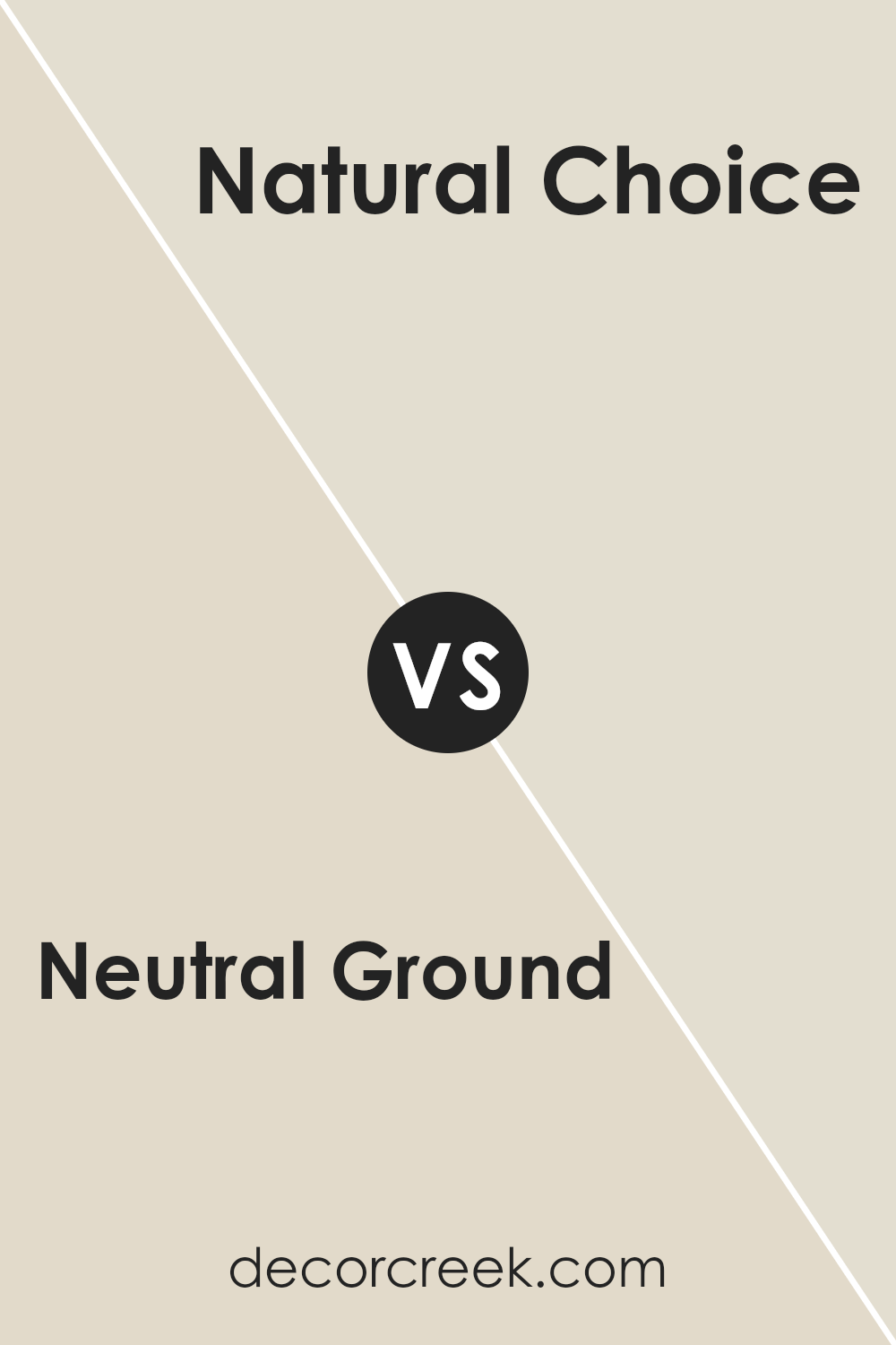
Neutral Ground SW 7568 by Sherwin Williams vs Natural Choice SW 7011 by Sherwin Williams
Neutral Ground and Natural Choice are two paints from Sherin Williams. Both bring a calm and soothing vibe to any space, but they have their unique touches. Neutral Ground stands out with its warm undertone, making rooms feel cozy and inviting. It’s like a soft hug for your walls, perfect for spaces where you want to relax. On the other hand, Natural Choice goes in a slightly different direction.
It has a cooler tone, providing a clean and airy feel. It’s ideal for anyone aiming to create a serene and open atmosphere. While both colors share a subtle elegance, their key difference lies in the temperature of their undertones—warm for Neutral Ground and cooler for Natural Choice. They can complement each other well in different rooms or as part of a cohesive color scheme throughout a home.
You can see recommended paint color below:
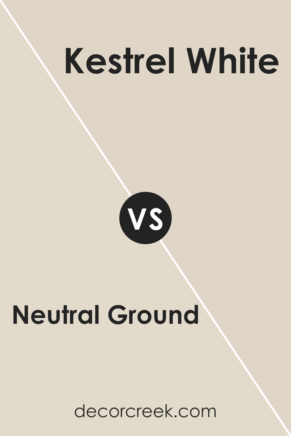
Neutral Ground SW 7568 by Sherwin Williams vs Kestrel White SW 7516 by Sherwin Williams
Comparing Neutral Ground and Kestrel White, both from Sherwin Williams, reveals a subtle but significant contrast in their tones and vibes. Neutral Ground is like a cozy blanket, offering a warm and comforting presence in a space. Its light beige quality blends seamlessly into various decor styles, making it a versatile choice for any room.
On the other hand, Kestrel White leans towards a softer, slightly cooler hue. It’s akin to the gentle first light of dawn, bringing a serene and calming atmosphere wherever it’s applied. While Neutral Ground carries a hint of earthiness, Kestrel White offers a touch of airy lightness, making spaces feel more open and refreshing.
Both colors are fantastic picks for creating inviting, pleasant environments, yet the choice between them depends on the mood you’re aiming to achieve: cozy warmth with Neutral Ground or soothing freshness with Kestrel White.
You can see recommended paint color below:
- SW 7516 Kestrel White
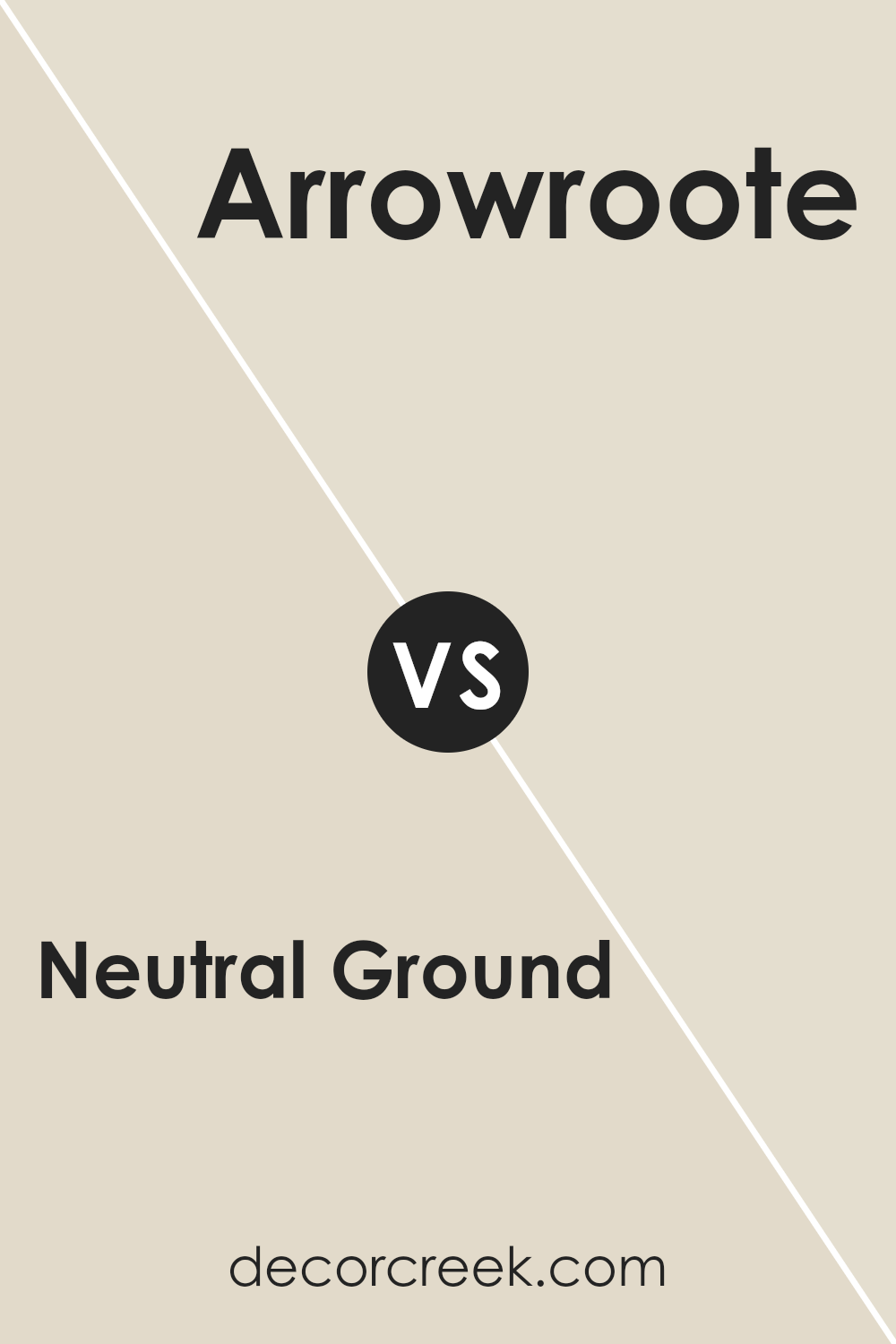
Neutral Ground SW 7568 by Sherwin Williams vs Arrowroote SW 9502 by Sherwin Williams
Neutral Ground and Arrowroot by Sherin Williams are two different colors that bring their unique vibes to spaces. Neutral Ground stands out as a light, warm beige that offers a comfortable and calming atmosphere. It’s like a soft, cozy blanket in color form, making any room feel welcoming and serene.
On the other hand, Arrowroot is a gentle, muted yellow with a hint of green. It brings a subtle touch of nature indoors, giving spaces a fresh and slightly earthy feel. While Neutral Ground acts as a classic, understated backdrop that can pair easily with other colors, Arrowroot adds a whisper of liveliness and soft color, perfect for creating a light, airy environment.
Both colors work well in various settings, from modern to traditional, but they evoke different moods. Neutral Ground leans towards a neutral, cozy feel, while Arrowroot offers a hint of energy and natural elegance.
You can see recommended paint color below:
- SW 9502 Arrowroote
Neutral Ground SW 7568 by Sherwin Williams vs Warm Winter SW 9506 by Sherwin Williams
Neutral Ground and Warm Winter, both from Sherwin Williams, are like two sides of a coin when it comes to their vibes and feels in a space. Neutral Ground is a soft, warm beige that acts like a cozy blanket on your walls. It’s the kind of color that plays well with almost anything, making it ideal for any room. Think of it as a gentle hug; it’s comforting and easy to get along with.
On the other hand, Warm Winter is also a warm hue but with a deeper, more pronounced presence. It has a richness to it, bringing in a sense of sophistication and depth to spaces. While Neutral Ground is like a soft, daylight glow, Warm Winter is the evening’s cozy candlelight.
Both colors bring warmth to a room, but where Neutral Ground keeps things light and airy, Warm Winter adds a touch of drama and elegance. They can work beautifully together, offering a balanced blend of lightness and depth to interiors.
You can see recommended paint color below:
- SW 9506 Warm Winter
Neutral Ground SW 7568 by Sherwin Williams vs Divine White SW 6105 by Sherwin Williams
Neutral Ground and Divine White are both colors offered by Sherwin Williams, but they bring different tones to a space. Neutral Ground is a soft, warm beige with a touch of gray. It provides a cozy and inviting feel to any room, making it an excellent base for a variety of decor styles.
On the other hand, Divine White is a lighter, creamier hue compared to Neutral Ground. It offers a subtler warmth, leaning more towards a soft off-white with a very faint, warm undertone. This color is perfect for creating a bright, airy, and spacious feeling in smaller or darker rooms.
While both colors are versatile and can complement a wide range of decor, Neutral Ground adds a bit more warmth and depth to spaces, whereas Divine White is ideal for those looking to achieve a lighter, fresher ambiance. Choosing between them depends on the desired effect in the room—cozy and grounded with Neutral Ground or bright and light with Divine White.
You can see recommended paint color below:
Neutral Ground SW 7568 by Sherwin Williams vs Aged White SW 9180 by Sherwin Williams
Neutral Ground and Aged White are two colors from Sherwin-Williams that offer unique vibes for any space. Neutral Ground has a soft, warm beige tone that provides a versatile background. It’s light enough to make small rooms feel bigger, yet has just enough color to add warmth to any area.
On the other hand, Aged White leans into a slightly creamier, more off-white shade. This color has a hint of yellow, giving it a cozy and welcoming feel without being too bright or overpowering. While Neutral Ground acts as a perfect neutral base that can complement a wide array of decor styles and colors, Aged White brings in a touch of warmth, ideal for creating a relaxed, homey atmosphere.
Both colors offer a subtle elegance that can enhance the aesthetic of your home, but the choice between them depends on the mood you want to set. Aged White, with its creamier tone, tends to add a softer, more comforting feel, whereas Neutral Ground offers a clean, minimalist backdrop.
You can see recommended paint color below:
Neutral Ground SW 7568 by Sherwin Williams vs Oyster White SW 7637 by Sherwin Williams
Neutral Ground and Oyster White are two colors from Sherwin Williams that offer subtle and serene vibes for any space. Neutral Ground stands out as a soft, warm beige that brings a cozy, inviting feel to rooms. It’s like a gentle hug for your walls, creating a calm and comfortable atmosphere. This shade works well in spaces where you want to relax and unwind, blending smoothly with various decor styles.
On the other hand, Oyster White has a slightly cooler tone, leaning more towards a light, creamy gray. It’s perfect for those who prefer a hint of sophistication without going too bold. Oyster White offers a fresh and clean look, making spaces feel more open and airy. It’s particularly good in areas with lots of natural light, as this highlights its subtle gray undertones.
Both Neutral Ground and Oyster Android White are versatile, but their differences in warmth and undertones can significantly affect the mood of a room. Choosing between them depends on whether you’re drawn to a warmer, cozier beige or a cleaner, slightly cooler neutral.
You can see recommended paint color below:
Neutral Ground SW 7568 by Sherwin Williams vs Pacer White SW 6098 by Sherwin Williams
Neutral Ground and Pacer White are two shades from Sherwin Williams that beautifully cater to spaces looking for a serene and subtle ambiance. Neutral Ground is a soft, warm beige that brings a cozy feeling to any room. Its earthy undertones make it incredibly versatile, fitting seamlessly into a variety of decor styles. Whether you’re looking to create a relaxed living room or a comforting bedroom, this color sets a soothing backdrop.
On the other hand, Pacer White has a slightly cooler vibe. While it’s still in the neutral family, it leans towards a lighter, more airy feel. This color is excellent for spaces aiming for a crisp, clean look. It reflects more light, making it a perfect choice for smaller rooms or areas with limited natural light, giving the illusion of a more spacious area.
Both colors offer a great base for layering with other shades, but Neutral Ground offers warmth and depth, whereas Pacer White provides a brighter, more refreshing feel.
You can see recommended paint color below:
- SW 6098 Pacer White
Neutral Ground SW 7568 by Sherwin Williams vs White Sesame SW 9586 by Sherwin Williams
Neutral Ground and White Sesamic from Sherwin Williams are two colors that bring their unique vibes to spaces, but in very different ways. Neutral Ground has a soft, warm feel to it, making spaces feel cozy and inviting. It’s like a gentle hug for your walls, providing a calm backdrop that’s easy to blend with a variety of decor styles and colors. Imagine it in a sunny living room or a serene bedroom, where its subtle warmth can really shine.
On the other hand, White Sesame offers a brighter, crisper look. It’s more vibrant than Neutral Ground, acting almost like a breath of fresh air in a room. White Sesamic is great for making small spaces appear bigger or for adding a fresh, clean look to a kitchen or bathroom. It pairs well with bold colors, serving as a neutral canvas that lets other elements of the room stand out.
When choosing between the two, consider the mood you want to set and the size of your space. Neutral Ground works wonders in creating a cozy atmosphere, while White Sesame is perfect for brightening up a space and giving it a more open feel.
You can see recommended paint color below:
- SW 9586 White Sesame
Neutral Ground SW 7568 by Sherwin Williams vs White Duck SW 7010 by Sherwin Williams
Neutral Ground and White Duck are both popular shades by Sherwin Williams that share a cozy and welcoming vibe, yet they each bring a distinct character to a space. Neutral Ground is a soft, warm beige that has a slightly earthy undertone, making it a perfect choice for those who want a room that feels inviting and grounded. Its subtle warmth allows it to blend seamlessly with various decor elements, creating a cohesive and calming environment.
On the other hand, White Duck has a lighter, almost creamy appearance. This color leans towards a very light beige or off-white, offering a hint of warmth without overwhelming a space. It’s excellent for brightening up rooms while maintaining a soft, inviting atmosphere.
Both colors work well in spaces where you aim for a neutral backdrop with a touch of warmth. However, Neutral Ground, being a tad darker, brings a cozy depth to rooms, making it ideal for living areas and bedrooms. White Duck, with its lighter tone, is perfect for creating a subtle, airy feel, especially suited for kitchens and bathrooms. Choosing between them depends on the specific mood and lightness you want to achieve in your space.
You can see recommended paint color below:
- SW 7010 White Duck
Conclusion
Neutral Ground SW 7568 by Sherwin Williams is a versatile paint color that has garnered attention for its ability to create a serene and balanced ambiance in any room. This subtle shade serves as a perfect backdrop, allowing other elements in the decor to stand out while maintaining a cohesive look.
Its understated elegance makes it a popular choice for those seeking to achieve a sophisticated yet understated aesthetic in their living spaces.
The adaptability of Neutral Ground makes it suitable for various applications, whether it’s to bring a sense of calm to a bedroom or to offer a neutral base for a more eclectic living area. Homeowners appreciate how this color works harmoniously with different styles and colors, enabling them to update their interiors without the need for drastic changes.
Overall, Neutral Ground by Sherwin Williams proves to be a timeless option for anyone looking to inject a tranquil and refined vibe into their home.

Ever wished paint sampling was as easy as sticking a sticker? Guess what? Now it is! Discover Samplize's unique Peel & Stick samples.
Get paint samples

