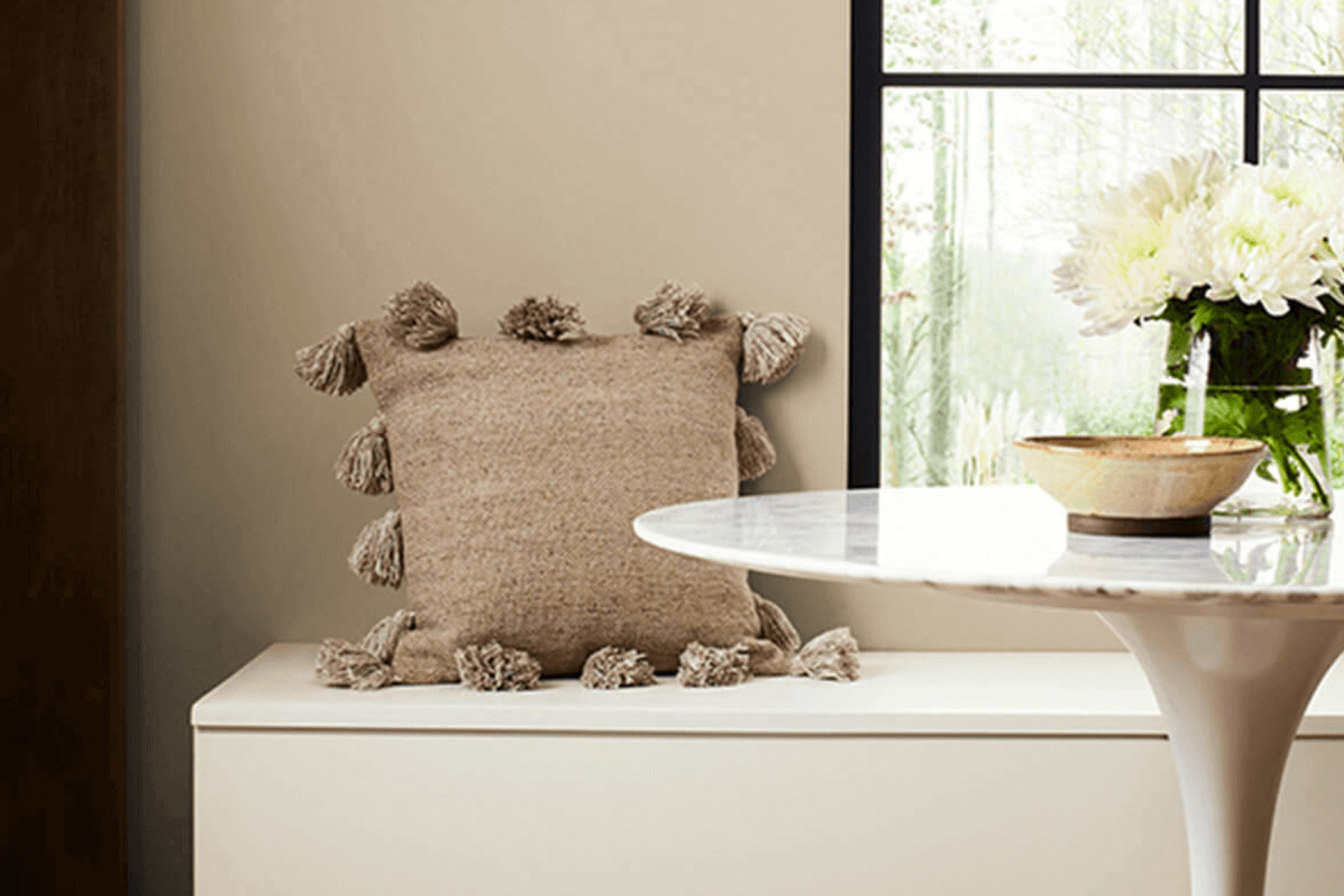
When I think about colors that bring a sense of warmth and comfort, SW 7533 Khaki Shade by Sherwin Williams immediately comes to mind. It strikes the perfect balance between neutral and inviting, making it an ideal choice for any room. The subtle earthy tone of this color adds a touch of elegance without overpowering the room.
I love how adaptable this shade is. It works wonders in both modern and traditional settings, and it pairs well with a wide range of other colors and textures. Whether you want to create a cozy atmosphere in a living room or add a calming touch to a bedroom, Khaki Shade has you covered.
What I appreciate most about SW 7533 is its ability to adapt to different lighting conditions. During the day, it looks warm and inviting, while in the evening, it takes on a more subdued and relaxed appearance. It has this unique quality of making areas feel both grounded and airy.
If you’re considering a new color for your home, Khaki Shade offers a classic option that won’t go out of style. It provides the perfect backdrop for your favorite furniture and decor, allowing you to personalize your room with ease.
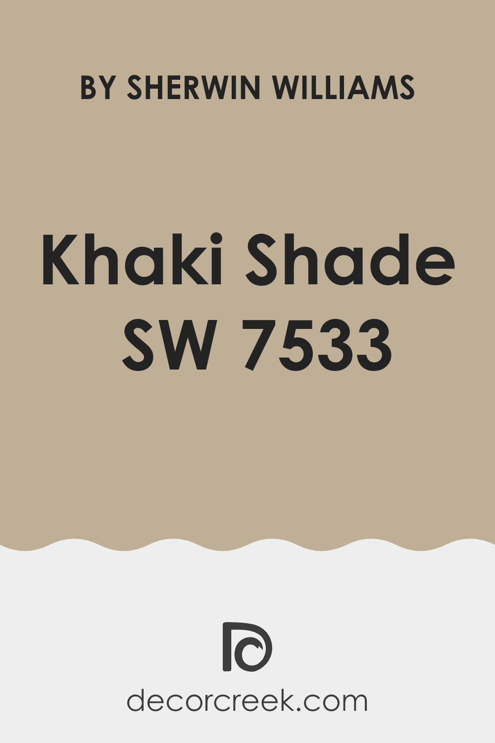
What Color Is Khaki Shade SW 7533 by Sherwin Williams?
Khaki Shade SW 7533 by Sherwin Williams is a warm, muted beige with subtle green undertones, creating a comforting and adaptable color. It’s like a soft, earthy backdrop that pairs well with various interior styles, making it an easy choice for many homes. This hue works particularly well in rustic and farmhouse settings, where its natural feel complements wood and organic materials. In a coastal-themed interior, it evokes the sandy shores by the sea, enhancing the breezy and relaxed vibe with light blues and whites.
This color also suits mid-century modern areas and complements the iconic furniture and clean lines through its muted nature. Pairing Khaki Shade with natural materials like wood, linen, and woven textures can enhance its warm and welcoming effect. It matches wonderfully with leather and metal elements, too, providing a striking contrast while maintaining a balanced look.
For a cozy yet fresh atmosphere, combine it with soft textiles like wool and cotton. Accent pieces in darker hues, such as navy or charcoal, can also add depth and interest.
Whether it’s living rooms, bedrooms, or even kitchens, Khaki Shade creates an inviting environment that feels both classic and adaptable.
Is Khaki Shade SW 7533 by Sherwin Williams Warm or Cool color?
Khaki Shade SW 7533 by Sherwin Williams is an adaptable and warm neutral color that can add a cozy feel to any home. This shade is a soft, muted blend of brown and green tones, which makes it a perfect backdrop for various interior design styles.
Because of its earthy undertones, Khaki Shade creates a welcoming and calming environment. It works well in living rooms, bedrooms, and dining areas, offering a grounded and stable ambiance. The subtle color of Khaki Shade pairs wonderfully with both light and dark furnishings, allowing homeowners to experiment with different decor pieces without clashing.
It complements natural materials like wood and stone, enhancing their textures and warmth. Its understated nature can help balance bolder colors in a room, offering a neutral base that doesn’t overwhelm the senses. Whether used on walls or as an accent, Khaki Shade brings a sense of comfort and harmony to home interiors.
Undertones of Khaki Shade SW 7533 by Sherwin Williams
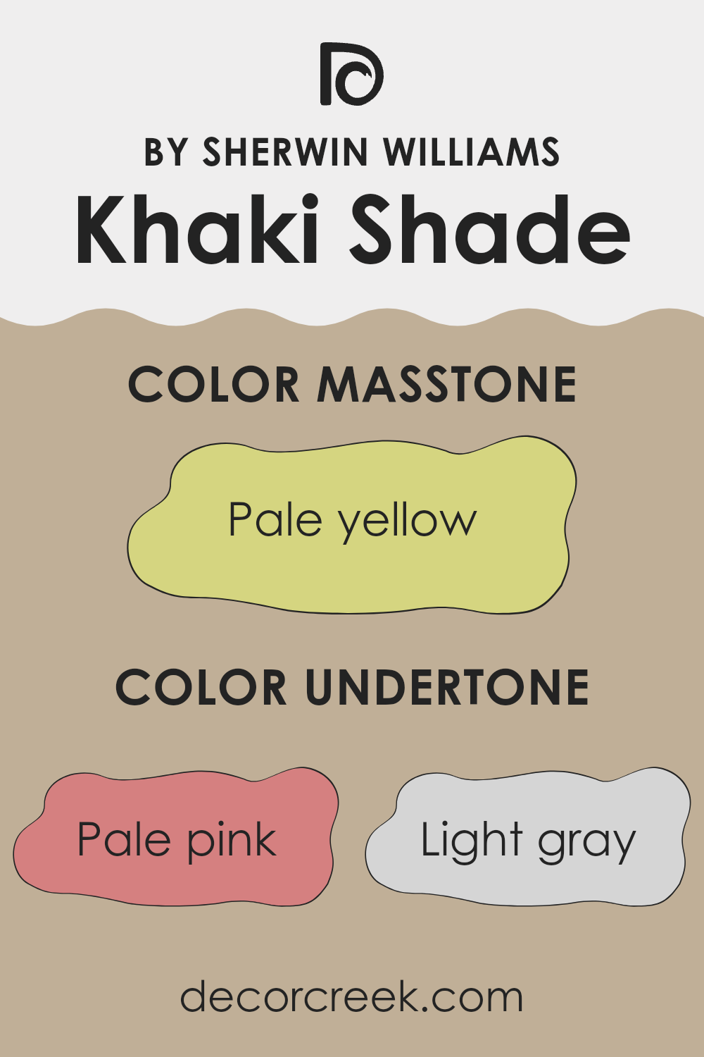
Khaki Shade by Sherwin Williams is an adaptable color, often appearing neutral at first glance. However, the hidden undertones play a significant role in shaping how we perceive it. This paint has undertones of pale pink, light gray, mint, light purple, gray, light blue, lilac, yellow, orange, light green, and olive. These undertones can subtly alter the color’s appearance, depending on lighting and surrounding elements.
The undertones can make Khaki Shade appear warmer or cooler. For instance, the pale pink and orange undertones add warmth, making the color feel cozy and inviting. On the other hand, the light gray, light blue, and lilac undertones introduce a cooler touch, creating a calm and collected ambiance. When used on interior walls, these undertones can make Khaki Shade adapt to various settings.
In a room with lots of natural light, the yellow and light green undertones can make the walls appear sunnier, while in low light, the gray and olive undertones might make the color feel more subdued. The interplay of these undertones ensures that Khaki Shade is dynamic, lending a unique character to any room without overpowering it. This balance of warm and cool undertones helps create a harmonious atmosphere.
What is the Masstone of the Khaki Shade SW 7533 by Sherwin Williams?
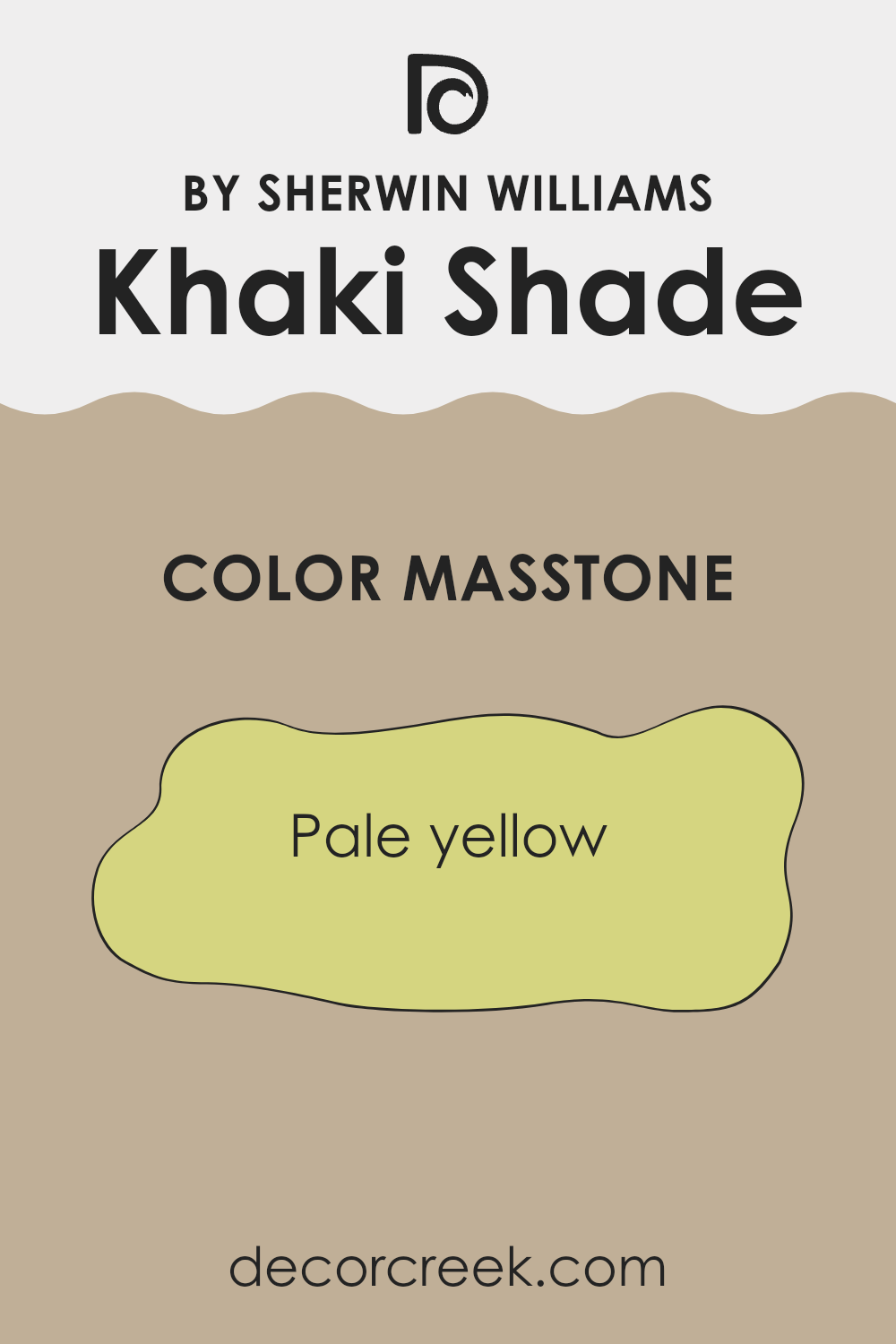
Khaki Shade by Sherwin Williams is an adaptable color with a masstone of pale yellow (#D5D580). This gives the color a warm, welcoming feel in home settings. The pale yellow undertone provides a subtle brightness that can make rooms feel more spacious and lively.
It’s a great choice for living rooms or kitchens, as it adds a cheerful touch without being overpowering. Khaki Shade works well with both neutral and bold colors, allowing for adaptable decorating options.
When paired with darker accents, it can create a cozy atmosphere, while pairing it with lighter colors can enhance its bright and airy quality. This color is ideal for those who want to add a hint of color to their room without going too bold. It complements wood tones beautifully, making it suitable for homes with natural wood elements. Overall, this shade offers warmth and versatility for various home styles.
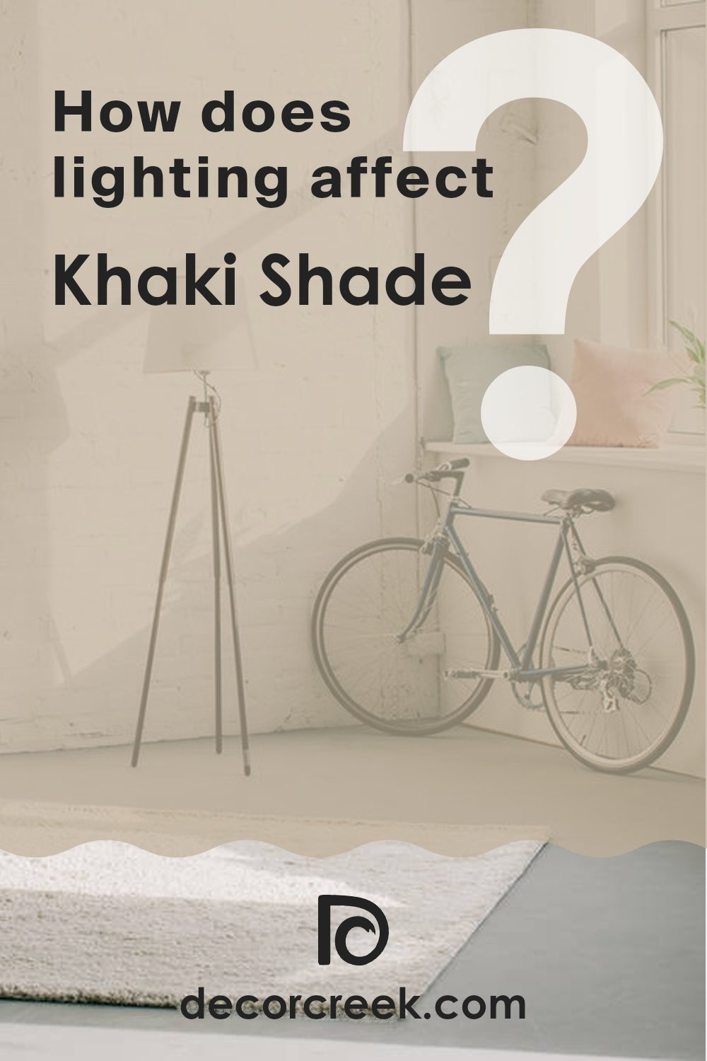
How Does Lighting Affect Khaki Shade SW 7533 by Sherwin Williams?
Lighting can greatly affect how we see and perceive colors. The type and direction of light can change the appearance of a color, making it look different than it does on a paint chip or in the store.
Khaki Shade by Sherwin Williams is a warm, neutral color that can vary in appearance depending on its environment. In natural light, the color often appears soft and muted, enhancing its earthy tones. However, under artificial light, it might look warmer or have different hues depending on whether the light is incandescent, fluorescent, or LED.
In north-facing rooms, Khaki Shade might seem cooler or slightly grayer due to the consistent, indirect light that’s common in these rooms. North light is known for being more diffused and soft, not bringing out the warmth of colors as much.
South-facing rooms get bright, direct sunlight, especially in the afternoons. In these rooms, Khaki Shade can appear lighter and warmer. The intense natural light enhances its warmth and depth, potentially accentuating any yellow or brown undertones.
East-facing rooms benefit from morning sunlight, which is cooler and gentle. In these rooms, Khaki Shade may look a bit cooler in the morning and warmer as the day progresses and artificial lighting takes over.
West-facing rooms receive the warm, rich glow of the setting sun, which can make Khaki Shade look rich and cozy in the late afternoon and evening. However, in the morning, these rooms might be shadowy and make the color appear more muted until the light shifts.
It’s important to test paint samples on your walls and observe them throughout the day to see how changes in light affect the color. This way, you’ll know exactly how Khaki Shade will look at different times and under various lighting conditions in your home.
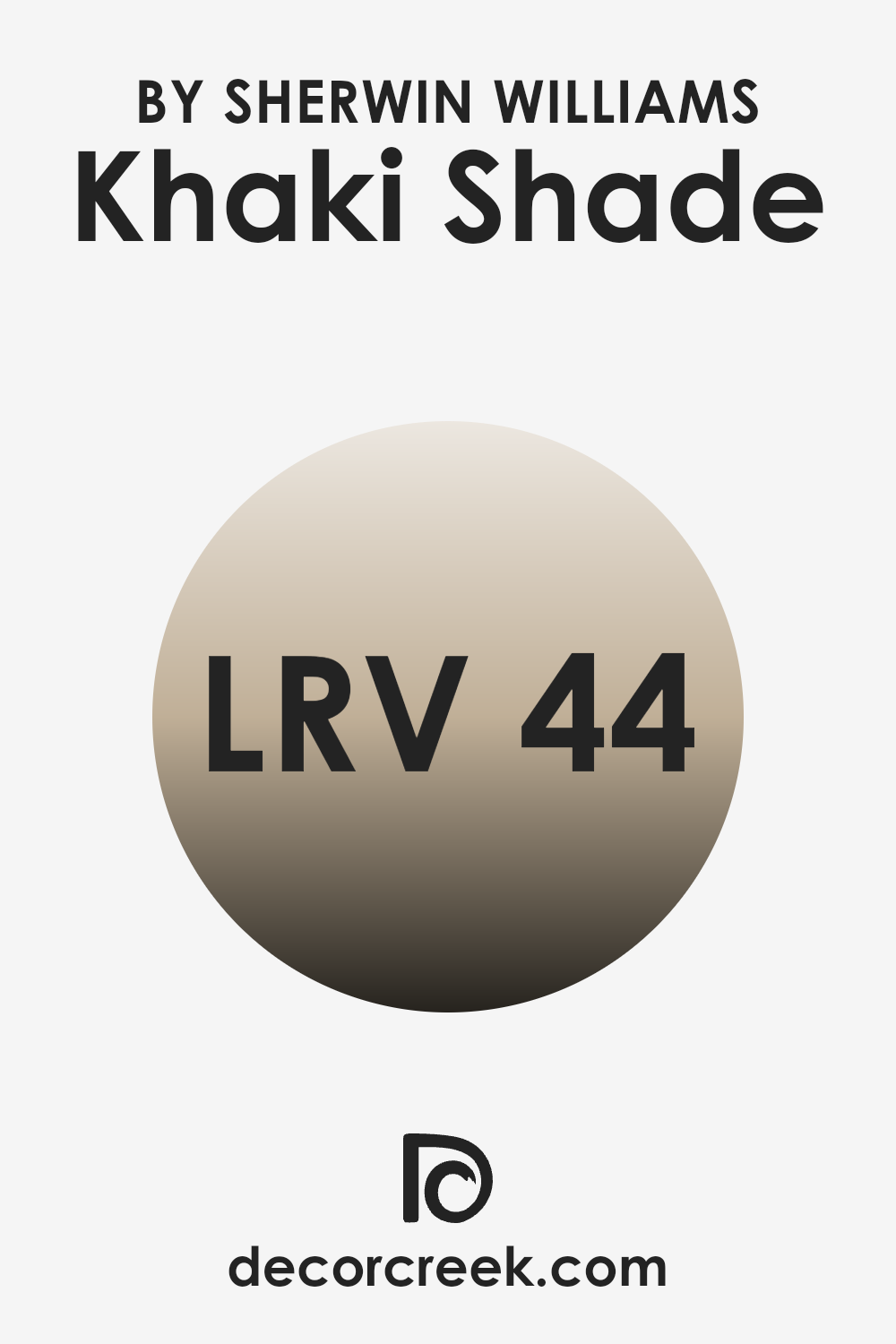
What is the LRV of Khaki Shade SW 7533 by Sherwin Williams?
LRV, or Light Reflectance Value, is a numerical measurement that indicates how much light a color reflects from and absorbs into a surface. The scale ranges from 0 to 100, where 0 represents absolute black, absorbing all light, and 100 represents absolute white, reflecting all light. LRV is important because it helps you understand how a color will behave in different lighting conditions.
A color with a low LRV will absorb more light, making a room feel cozier and more intimate, whereas a color with a high LRV will reflect more light, potentially making a room feel brighter and more open. Painters, designers, and architects often consider LRV when choosing colors to create the desired atmosphere in a room.
For the Khaki Shade with an LRV of 44.316, this means it sits right in the middle of the LRV scale. It doesn’t reflect too much light nor absorb too much, making it a balanced choice for various rooms. With this LRV, the Khaki Shade will bring a moderate amount of warmth to a room without making it feel too dark or too light. It’s an adaptable color that can work well in both small and large areas.
In a brightly lit room, it will hold its color without being washed out, while in a dimmer setting, it will still retain its integrity without making the room feel too enclosed.
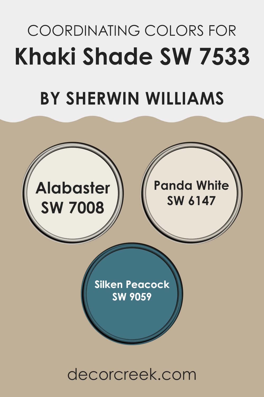
Coordinating Colors of Khaki Shade SW 7533 by Sherwin Williams
Coordinating colors are select paint hues that complement each other and create a harmonious look when used together in a room. If your primary wall color is Khaki Shade, you can choose coordinating colors to either highlight that shade or bring balance to your room. The idea is to choose colors that work well with Khaki Shade, creating a seamless and pleasing aesthetic throughout your room.
For instance, a creamy white like Alabaster provides a clean, crisp contrast that helps Khaki Shade stand out, while Panda White offers a warmer tone that softly blends with the khaki color, creating a snug and inviting atmosphere.
Silken Peacock brings a refreshing pop of color into the mix, adding a hint of personality and energy that stands out against the more neutral backdrop of Khaki Shade. Alabaster is a soft, warm white that brightens up the room without overpowering the senses. Meanwhile, Panda White is a gentle off-white that can blend effortlessly into almost any decor while adding a touch of warmth.
Silken Peacock introduces a bold, beautiful, deep blue-green that can bring a sense of depth and interest perfect for an accent wall or decorative elements. Together, these colors work to create a balanced and inviting home environment.
You can see recommended paint colors below:
- SW 7008 Alabaster
- SW 6147 Panda White
- SW 9059 Silken Peacock
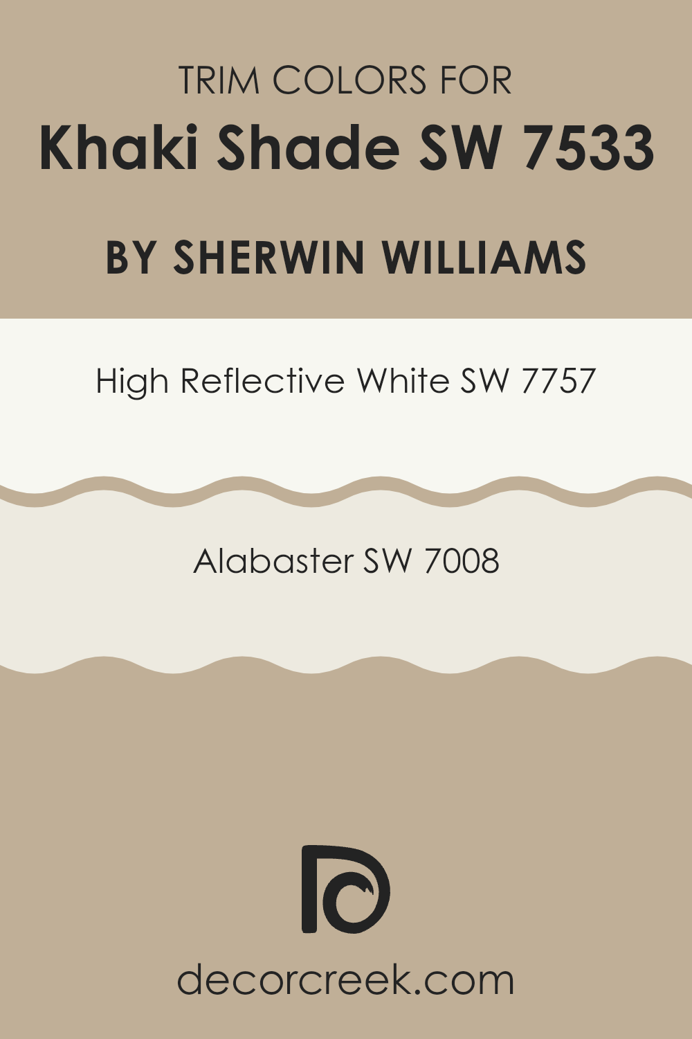
What are the Trim colors of Khaki Shade SW 7533 by Sherwin Williams?
Trim colors are the hues used to paint the moldings, frames, and edges in a room, serving as the finishing touch that can pull an entire color scheme together. For a shade like Khaki Shade by Sherwin Williams, choosing the right trim color is essential to both highlight the main wall color and create a crisp, clean contrast.
Khaki Shade is a warm, earthy tone, making it tranquil and balanced, and it pairs well with trim colors that either blend smoothly or stand out sharply. Using trim effectively can emphasize the architectural details in a room and enhance the design without overpowering it.
High Reflective White, with its pure, bright nature, is an excellent choice for trim when paired with Khaki Shade. It offers a sharp contrast, adding brightness and making the edges of the room pop. On the other hand, Alabaster, a softer white with warm undertones, complements Khaki Shade’s warmth while still providing enough contrast to define areas and details.
Together, these trim colors can either enhance the brightness and clarity of a room or highlight its subtle warmth, depending on the desired atmosphere.
You can see recommended paint colors below:
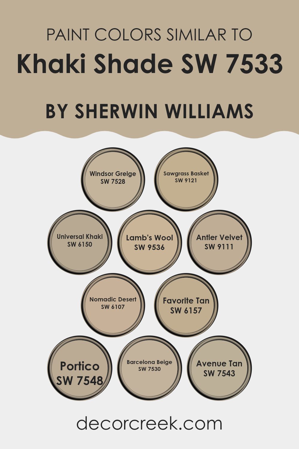
Colors Similar to Khaki Shade SW 7533 by Sherwin Williams
Similar colors to Sherwin Williams’ Khaki Shade, like Windsor Greige, Sawgrass Basket, and Universal Khaki, benefit a room by creating a harmonious and cohesive look. These colors share a warm, earthy tone that brings a sense of comfort and balance to a room. Windsor Greige offers a gentle warmth with a hint of gray, which makes it flexible for any setting. Sawgrass Basket blends a touch of green into its beige base, adding a natural, organic feel. Universal Khaki is a classic shade that provides a classic backdrop without being too strong.
Lamb’s Wool captures a soft, neutral tone reminiscent of its namesake, while Antler Velvet brings in a rich, deeper hue, perfect for adding depth to any room. Nomadic Desert offers a sandy, sun-bleached look that evokes a sense of adventure. Favorite Tan provides a consistent, solid hue that acts as an excellent middle ground for any color scheme.
Portico gives a slightly darker shade, perfect for cozy corners. Barcelona Beige stands out with its inviting, warm undertone, creating a welcoming environment. Finally, Avenue Tan ties everything together with its subtle beige tone that works well in various rooms, making a home feel unified and welcoming. These similar colors enhance areas by offering visual unity and subtle variety.
You can see recommended paint colors below:
- SW 7528 Windsor Greige
- SW 9121 Sawgrass Basket
- SW 6150 Universal Khaki
- SW 9536 Lamb’s Wool
- SW 9111 Antler Velvet
- SW 6107 Nomadic Desert
- SW 6157 Favorite Tan
- SW 7548 Portico
- SW 7530 Barcelona Beige
- SW 7543 Avenue Tan
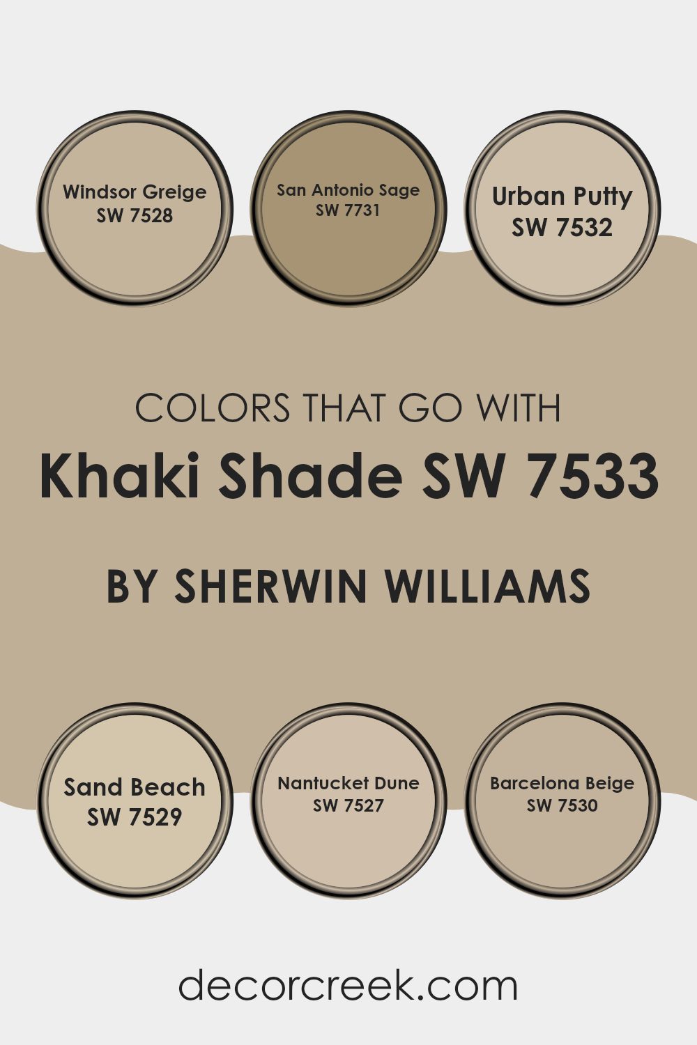
Colors that Go With Khaki Shade SW 7533 by Sherwin Williams
Choosing colors that complement Khaki Shade SW 7533 by Sherwin Williams is crucial because they help create a cohesive and harmonious look. When paired correctly, these colors enhance each other’s strengths, adding depth and interest to a room without overpowering it. SW 7528 Windsor Greige, for example, offers a warm, adaptable backdrop that pairs beautifully with Khaki Shade, bringing out its earth-toned qualities.
SW 7731 San Antonio Sage introduces a hint of nature with its soft, muted green, providing a subtle contrast that can refresh any room. SW 7532 Urban Putty, with its understated beige tone, seamlessly blends with Khaki Shade to create an inviting and cozy atmosphere.
Meanwhile, SW 7529 Sand Beach, with its light and airy feel, brightens the room and complements Khaki Shade’s grounded nature. On the other hand, SW 7527 Nantucket Dune lends an elegant and soft neutral touch that gently balances the overall color palette. Lastly, SW 7530 Barcelona Beige adds a touch of warmth with its sun-kissed, beige nuances, enriching the Khaki Shade and making it more vibrant. Crafting the right color combination with Khaki Shade has the power to pull together an inviting and charming room.
You can see recommended paint colors below:
- SW 7528 Windsor Greige
- SW 7731 San Antonio Sage
- SW 7532 Urban Putty
- SW 7529 Sand Beach
- SW 7527 Nantucket Dune
- SW 7530 Barcelona Beige
How to Use Khaki Shade SW 7533 by Sherwin Williams In Your Home?
Khaki Shade SW 7533 by Sherwin Williams is an adaptable, warm neutral paint color. This shade blends well with a variety of decor styles, making it a great choice for any room in your home. Its earthy tones create a cozy and inviting atmosphere, perfect for living rooms or bedrooms where you want a comforting vibe.
In a living room, you can pair Khaki Shade with cream or off-white trim and furnishings for a classic look. Adding accent pieces in darker shades like deep greens or browns can enhance its warmth. In the kitchen, Khaki Shade can pair beautifully with wooden cabinets and stainless steel fixtures, bringing a balanced feel of modern and rustic.
For bedrooms, consider using it on all walls for a restful backdrop, allowing colorful bedding or artwork to stand out. Its neutral quality also makes it suitable for hallways, providing a seamless flow between rooms.
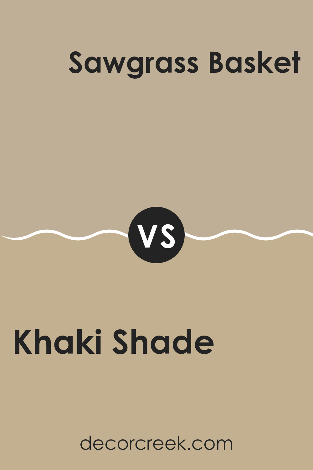
Khaki Shade SW 7533 by Sherwin Williams vs Sawgrass Basket SW 9121 by Sherwin Williams
Khaki Shade SW 7533 by Sherwin Williams is a warm, earthy color with a hint of brown and green. It gives a cozy and inviting feel and works well in living rooms where you want a grounded and natural vibe. It’s adaptable and pairs nicely with neutral tones, creating a welcoming atmosphere.
On the other hand, Sawgrass Basket SW 9121 is a lighter, more muted green-beige. This color brings a subtle freshness and is great for areas where you want a soft, calming effect. It’s less intense than Khaki Shade and can make a room feel airy and open.
While both colors have green undertones, Khaki Shade is richer and more robust, suitable for cozy areas, whereas Sawgrass Basket offers a softer, more subdued look, ideal for creating a light and relaxing environment. Pairing them together can balance a room, using Khaki Shade as an accent and Sawgrass Basket as the main color for a harmonious look.
You can see recommended paint color below:
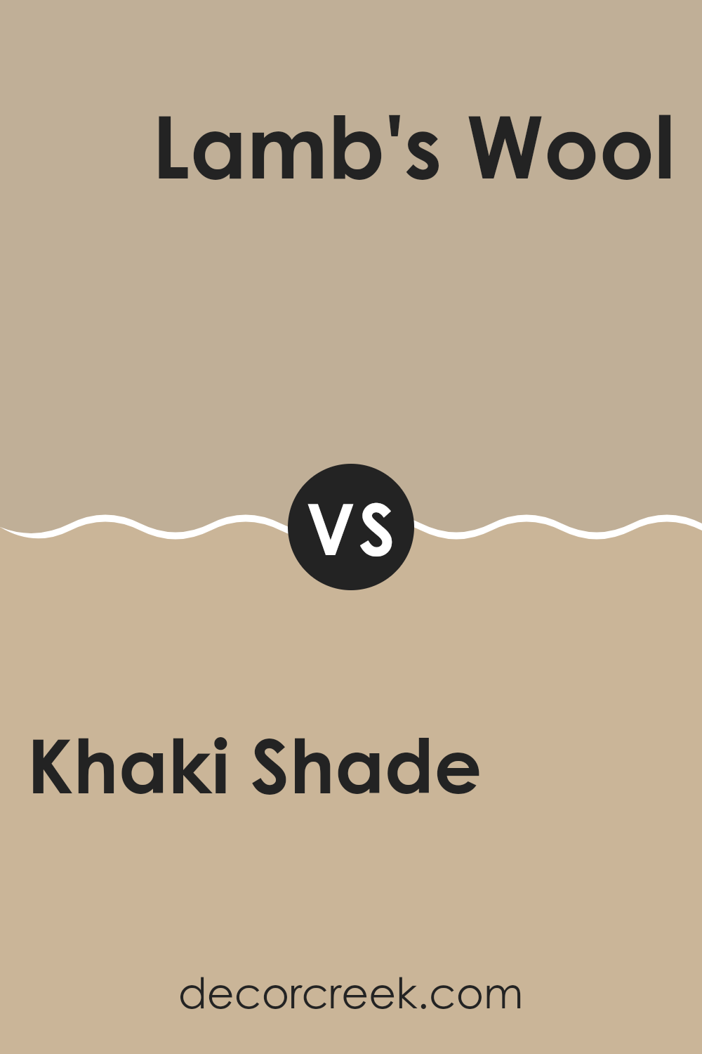
Khaki Shade SW 7533 by Sherwin Williams vs Lamb’s Wool SW 9536 by Sherwin Williams
Khaki Shade SW 7533 by Sherwin Williams is a warm, earthy color that has a brownish-green tone, reminiscent of the classic khaki material used in clothing. It’s an adaptable and neutral shade that can bring a touch of nature indoors. This color works well in living rooms or bedrooms, adding a cozy and grounded feel.
On the other hand, Lamb’s Wool SW 9536 by Sherwin Williams is a light and soft beige. It’s a lighter neutral that exudes a gentle and airy vibe, making rooms feel open and inviting. Lamb’s Wool is perfect for creating a calm and light environment, whether used in a bedroom, kitchen, or hallway.
When comparing the two, Khaki Shade offers more warmth and depth, while Lamb’s Wool provides a brighter and more refreshing look. Both are neutral options, but their distinct undertones make them suitable for different atmospheres in a home.
You can see recommended paint color below:
Khaki Shade SW 7533 by Sherwin Williams vs Nomadic Desert SW 6107 by Sherwin Williams
Khaki Shade SW 7533 and Nomadic Desert SW 6107 are two warm, earthy tones from Sherwin Williams, each bringing a unique vibe to a room. Khaki Shade is a light, muted brown with a hint of green, giving it a natural and grounded appearance. It’s adaptable and can complement both modern and traditional decor.
Nomadic Desert, on the other hand, is a deeper tan color, carrying a slightly richer feel. It leans more towards a sandy beige, offering a cozy and comfortable ambiance. This shade works well in areas where you want to create a warm and inviting atmosphere.
While Khaki Shade is perfect for those looking for a subtle, understated background, Nomadic Desert brings more warmth and depth. Both colors are excellent choices for living areas or bedrooms, and their natural tones make them easy to pair with other colors in your home.
You can see recommended paint color below:
Khaki Shade SW 7533 by Sherwin Williams vs Portico SW 7548 by Sherwin Williams
Khaki Shade SW 7533 by Sherwin-Williams is a warm, earthy tone that evokes a feeling of comfort and coziness. It’s a muted, beige color with a hint of green, making it adaptable for various design styles. This color works well in living rooms and bedrooms, as it creates a welcoming atmosphere without being overpowering.
On the other hand, Portico SW 7548 by Sherwin-Williams is a slightly deeper and cooler color. It has a grayish undertone, giving it a more neutral and subtle appearance compared to Khaki Shade. Portico is a great choice for areas where a calm and balanced look is desired, such as offices or bathrooms.
Both colors are neutral and adaptable, but Khaki Shade has more warmth, while Portico has a cooler, more understated presence. They can complement each other well in a design scheme, adding depth and variety to a room’s color palette.
You can see recommended paint color below:
- SW 7548 Portico
Khaki Shade SW 7533 by Sherwin Williams vs Windsor Greige SW 7528 by Sherwin Williams
Khaki Shade SW 7533 by Sherwin Williams is a warm, earthy tone that resembles a muted brown with green undertones. It offers a comfortable, grounded feel that’s great for natural-themed settings. It’s highly adaptable, making it suitable for various areas, particularly when a soft, neutral backdrop is desired.
Windsor Greige SW 7528, on the other hand, is a mix of gray and beige, providing a more modern and adaptable look. It is lighter and has a cooler feel compared to Khaki Shade. This gives it a subtle elegance that can easily blend into contemporary areas.
In comparison, Khaki Shade leans warmer and earthier, while Windsor Greige is cooler and more refined. If you’re aiming for warmth and coziness, Khaki Shade might be the right choice. For a cleaner and more polished appearance, Windsor Greige would be more fitting. Both colors serve as excellent neutral bases, but their distinct undertones set them apart.
You can see recommended paint color below:
- SW 7528 Windsor Greige
Khaki Shade SW 7533 by Sherwin Williams vs Favorite Tan SW 6157 by Sherwin Williams
Khaki Shade SW 7533 and Favorite Tan SW 6157 are two neutral colors from Sherwin Williams that bring warmth to any room. Khaki Shade has a muted, earthy tone that sits between beige and olive, giving it a subtle greenish tint. This makes it adaptable for various settings, providing a natural, calming background. It’s great if you’re aiming for a cozy, grounded ambiance.
On the other hand, Favorite Tan is a warmer, lighter shade with more of a golden undertone. It leans slightly more towards a traditional tan and can create an inviting, comfortable atmosphere. Its warmth makes it perfect for rooms that receive a lot of light, enhancing their coziness without overpowering the senses.
Both colors are excellent choices for those looking for neutral walls, but Khaki Shade brings a hint of earthiness, while Favorite Tan offers a classic, welcoming feel.
You can see recommended paint color below:
- SW 6157 Favorite Tan
Khaki Shade SW 7533 by Sherwin Williams vs Barcelona Beige SW 7530 by Sherwin Williams
Khaki Shade SW 7533 and Barcelona Beige SW 7530 by Sherwin Williams are both neutral colors, but they have distinct differences. Khaki Shade is a warm, earthy tone with a hint of green, giving it a natural and grounded feel. It’s great for creating a cozy and inviting atmosphere, making it ideal for living rooms or areas where comfort is key.
On the other hand, Barcelona Beige is a soft, warm beige with subtle yellow undertones. It leans more towards a classic neutral, offering a clean and understated backdrop for any setting. This color works well in areas where you want a light and airy feel, such as bedrooms or dining areas.
While both colors are warm neutrals, Khaki Shade adds a touch of green, giving it a unique character, whereas Barcelona Beige maintains a more traditional, adaptable beige look. Each adds its own charm to a room, depending on the desired mood and style.
You can see recommended paint color below:
Khaki Shade SW 7533 by Sherwin Williams vs Antler Velvet SW 9111 by Sherwin Williams
Khaki Shade SW 7533 and Antler Velvet SW 9111 by Sherwin Williams are two distinct colors that offer different moods. Khaki Shade is a neutral tone that combines elements of brown and beige, providing a warm, muted base perfect for adaptable use in interior rooms. It’s a color that feels grounded and works well in various settings due to its subtlety.
On the other hand, Antler Velvet is a deeper, richer brown with more pronounced warmth. This color can add a touch of coziness and works well in areas where you want a more intimate and comfortable feel. It pairs beautifully with natural textures and materials, creating a rustic or inviting atmosphere.
While both colors share warm undertones, Khaki Shade is more understated and flexible, ideal for backgrounds, whereas Antler Velvet commands a bit more attention and is suitable for accent walls or areas that benefit from a richer color presence.
You can see recommended paint color below:
- SW 9111 Antler Velvet
Khaki Shade SW 7533 by Sherwin Williams vs Avenue Tan SW 7543 by Sherwin Williams
Khaki Shade SW 7533 and Avenue Tan SW 7543 are both warm, neutral colors by Sherwin Williams, but they have distinct differences. Khaki Shade is a soft, earthy tone with green undertones, giving it a natural, calming appearance. It’s ideal for bringing a subtle touch of the outdoors inside.
On the other hand, Avenue Tan is slightly darker and leans more towards a rich beige with brown undertones. It offers a cozy, inviting feel, perfect for creating a welcoming atmosphere. While Khaki Shade suggest a lighter touch and is excellent for rooms where you want to maintain a fresh, airy feeling, Avenue Tan provides more depth and warmth to a room.
Both colors work well as backgrounds that complement various styles and decors, but Avenue Tan might be more suitable for areas where you want a bit more warmth and coziness. Together, they can offer a balanced, harmonious look in your home.
You can see recommended paint color below:
- SW 7543 Avenue Tan
Khaki Shade SW 7533 by Sherwin Williams vs Universal Khaki SW 6150 by Sherwin Williams
Khaki Shade (SW 7533) by Sherwin Williams is a warm, earthy color with a hint of green. It provides a cozy and inviting feel, making it suitable for living rooms where a comfortable atmosphere is desired. On the other hand, Universal Khaki (SW 6150) is a bit more neutral and muted in tone, with subtle hints of both gray and beige.
This makes it extremely adaptable, effortlessly blending into various color schemes while maintaining an elegant look. While both colors belong to the khaki family, Khaki Shade leans more towards a classic, rustic vibe, perfect for adding warmth.
In contrast, Universal Khaki’s cooler undertones lend it a more modern and refined appearance, ideal for creating understated elegance. Both colors have their charm, but the choice between them depends on whether you want to emphasize warmth and comfort or achieve a balanced, neutral backdrop.
You can see recommended paint color below:
After learning about SW 7533 Khaki Shade by Sherwin Williams, I really think this color can make a room look warm and inviting. It’s like a soft, gentle hug for your walls that doesn’t shout at you. Instead, it’s peaceful and friendly, like a nice sweater on a cool day. This shade of khaki mixes well with many other colors, like browns, creams, and even some bolder shades if you like a bit of fun.
Imagine you want your room to feel cozy, like when you wrap yourself in a blanket to read your favorite book. Khaki Shade can help get that feeling because it isn’t too bright or too dark. It’s right in the middle! It works nicely in different rooms, whether it’s the living room, bedroom, or even the kitchen where you might enjoy family meals.
What’s also neat is how this color makes things feel very calm. You know when you relax with your favorite toy or game and everything just feels right? That’s what Khaki Shade does for a room. It makes everything feel in balance.
So, if you’re thinking of changing up your wall colors, this might be a really good choice to think about because it’s friendly and works well in lots of places.
Ever wished paint sampling was as easy as sticking a sticker? Guess what? Now it is! Discover Samplize's unique Peel & Stick samples.
Get paint samples

