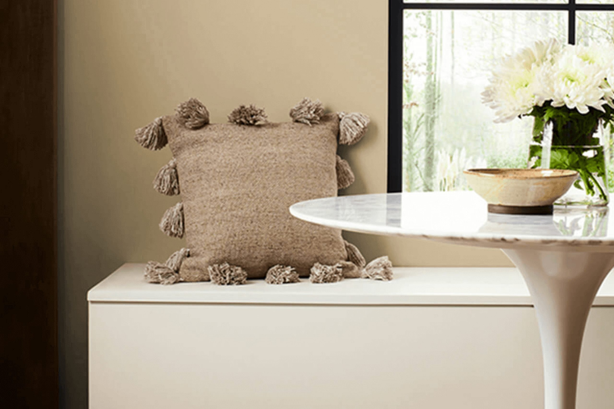
If you’re planning a home update or just want to refresh a room, take a look at the rich, welcoming hue of SW 9121 Sawgrass Basket by Sherwin Williams. I stumbled upon this color while searching for a warm, neutral palette that could create a cozy, inviting atmosphere in any living room.
It strikes a lovely balance between depth and subtlety, making it easy to use across different decor styles — whether your look leans rustic, modern, or traditional.This shade has an earthy charm that brings a sense of calmness without being too overpowering.
Sawgrass Basket works beautifully to highlight architectural features or could be used on all four walls for a more immersive experience. I’ve noticed it pairs wonderfully with soft whites, deep blues, or even metallic accents, providing numerous styling opportunities.
It’s a color that supports a variety of textures and furniture styles, making it an excellent choice for anyone looking to breathe new life into their home.
What Color Is Sawgrass Basket SW 9121 by Sherwin Williams?
Sawgrass Basket by Sherwin Williams is a warm beige that brings a cozy and welcoming vibe to any room. This color has a hint of softness that makes it very adaptable, fitting into a variety of decorating styles. Its earthy tone makes it particularly great for interiors that aim to feel grounded and soothing.
This color works best in interior styles like rustic, traditional, and casual country. It pairs well with natural materials like wood, linen, and cotton, enhancing the warmth of the room. Sawgrass Basket goes beautifully with textured materials such as wicker, knits, and woven fabrics, adding to its cozy appeal.
In a living room, combining this paint with dark wooden furniture and cream textiles creates a classic, cozy environment. In a bedroom, it pairs perfectly with layers of soft bedding and natural wood bedside tables for a relaxed, comfortable atmosphere.
Sawgrass Basket also works well with stone elements, such as a fireplace or stone accents in a kitchen, providing a seamless blend with the natural components. Metal accents in bronze or gold can add a touch of warmth and charm to a room decorated with this color. This shade can help create a cozy, welcoming room for families or anyone wanting to add a bit of warmth to their home.
Is Sawgrass Basket SW 9121 by Sherwin Williams Warm or Cool color?
Sawgrass Basket by Sherwin Williams is a warm, inviting color that adds a cozy feel to any room. This shade, which has a natural, earthy tone, is perfect for creating a welcoming atmosphere in homes. It works well in living areas and bedrooms where comfort is key.
Since it’s a neutral color, it pairs easily with many others — from bold and bright to soft and subtle — which makes it easy to use in all kinds of interiors. This adaptability allows homeowners to use it as either a main color on walls or as an accent to highlight specific areas.
The warmth of Sawgrass Basket helps to soften the appearance of a room, making it ideal for places where people gather, creating a relaxed environment. It’s particularly effective in homes that get a lot of natural light, as it enhances the light’s golden quality, giving rooms a sunlit glow throughout the day.
Undertones of Sawgrass Basket SW 9121 by Sherwin Williams
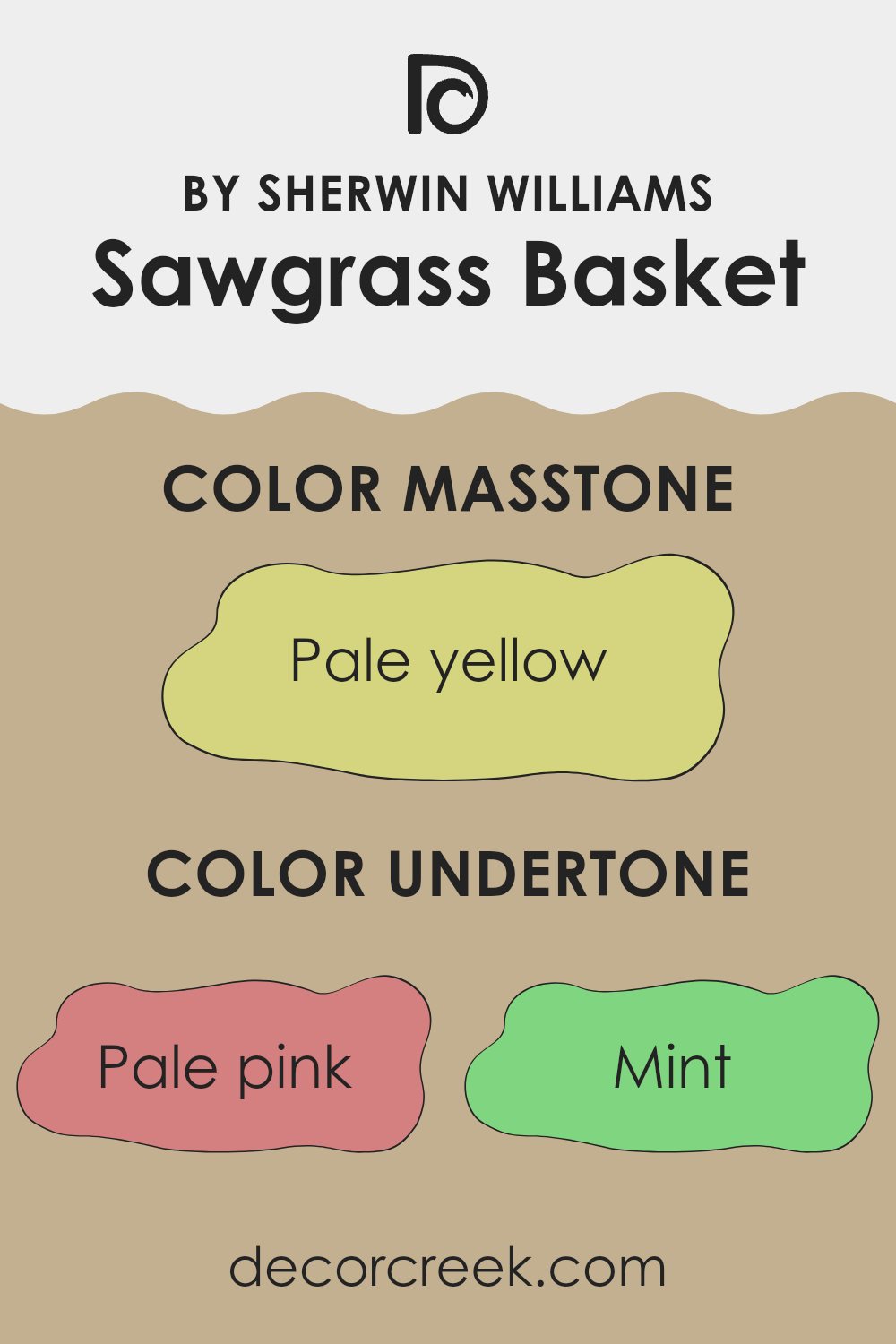
Sawgrass Basket by Sherwin Williams is a unique color because it includes a variety of undertones. These undertones are subtle hues mixed into the color which can affect how it appears on your walls under different lighting conditions. They are pale pink, mint, light gray, grey, light purple, light blue, lilac, yellow, orange, light green, and olive. Each of these undertones plays a role in influencing the main color’s perception.
When light hits the paint, different undertones may be more visible, which can slightly change the color’s appearance. For example, in a sunlit room, the yellow or orange undertones might make the walls look warmer, while in a room with less natural light, the gray or light purple undertones could give a cooler feel to the room.
These undertones can also impact how the color coordinates with furniture and decor. If your room has lots of greens and blues, the mint and light blue undertones in Sawgrass Basket might highlight those elements. Similarly, if your room has wooden elements or earth tones, the olive and orange undertones can complement these features nicely.
Overall, the choice of this color can make the room feel cozy and welcoming due to its complex mix of undertones. Understanding these undertones helps in picking the right accessories and decorations to create a harmonious look in your living room.
What is the Masstone of the Sawgrass Basket SW 9121 by Sherwin Williams?
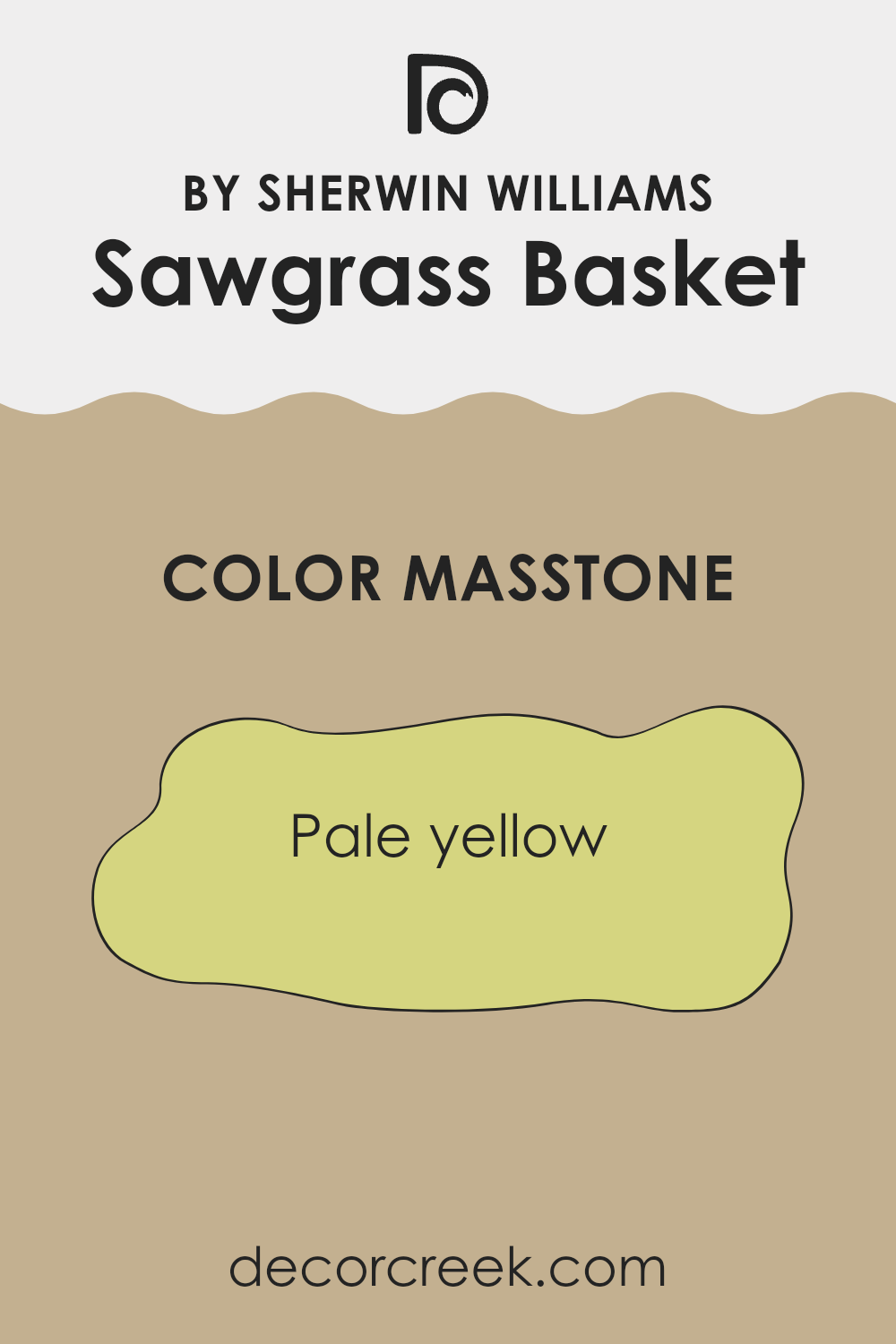
The color Sawgrass Basket SW 9121 by Sherwin Williams has a masstone of pale yellow, appearing as a soft, cheerful hue that brightens up interiors effortlessly. This shade of yellow brings a light and airy feel to any room, making it ideal for creating a welcoming atmosphere.
Because it is not overly bright or overpowering, it pairs well with various colors and can easily adapt to different decorating styles, from modern to rustic. In living rooms and kitchens, this pale yellow infuses warmth and can make small interiors seem larger and more open.
In bedrooms, its gentle tone helps create a calm environment conducive to relaxation. Additionally, this color works well both as a main wall shade and as an accent. It pairs nicely with darker tones, adding a soft contrast that’s easy on the eyes. Overall, Sawgrass Basket is a practical choice for homeowners looking to add a touch of brightness while maintaining a soft and friendly vibe.
How Does Lighting Affect Sawgrass Basket SW 9121 by Sherwin Williams?
Lighting significantly influences how we perceive colors. The color around us can look different depending on whether it is illuminated by natural sunlight or artificial light sources such as incandescent or LED bulbs. For instance, colors can appear lighter and more vivid under bright natural light, while they might seem more muted under artificial lighting.
Take the color Sawgrass Basket SW 9121 by Sherwin Williams as an example. In natural light, this hue, which is a soft and warm tan, reflects light beautifully, making interiors feel airy and open. In contrast, under artificial light, especially warmer tones like yellow or soft white, it can appear richer and slightly darker, enhancing a cozy and inviting atmosphere.
The orientation of a room also plays a crucial role in how this color is perceived. In north-facing rooms, which receive less direct sunlight and tend to have cooler light, Sawgrass Basket might look more subdued and slightly cooler in tone. This can make the room feel calm but could require additional lighting to warm up the room.
In south-faced rooms, where there is an abundance of natural light throughout the day, this color will look warmer and more vibrant, potentially drawing out the yellower undertones of the tan, and making the room feel cheerful and welcoming.
For east-facing rooms, morning light can make Sawgrass Basket look very warm and bright, creating a refreshing feel in the morning, but it might appear less intense and cooler in the evening. Conversely in west-faced rooms, the color will experience the opposite effect; it may start off cooler in the morning and become warmly lit by the evening sunlight.
Understanding these dynamics can help in making informed decisions when choosing paint colors, ensuring that they complement the room’s lighting conditions for the desired effect.
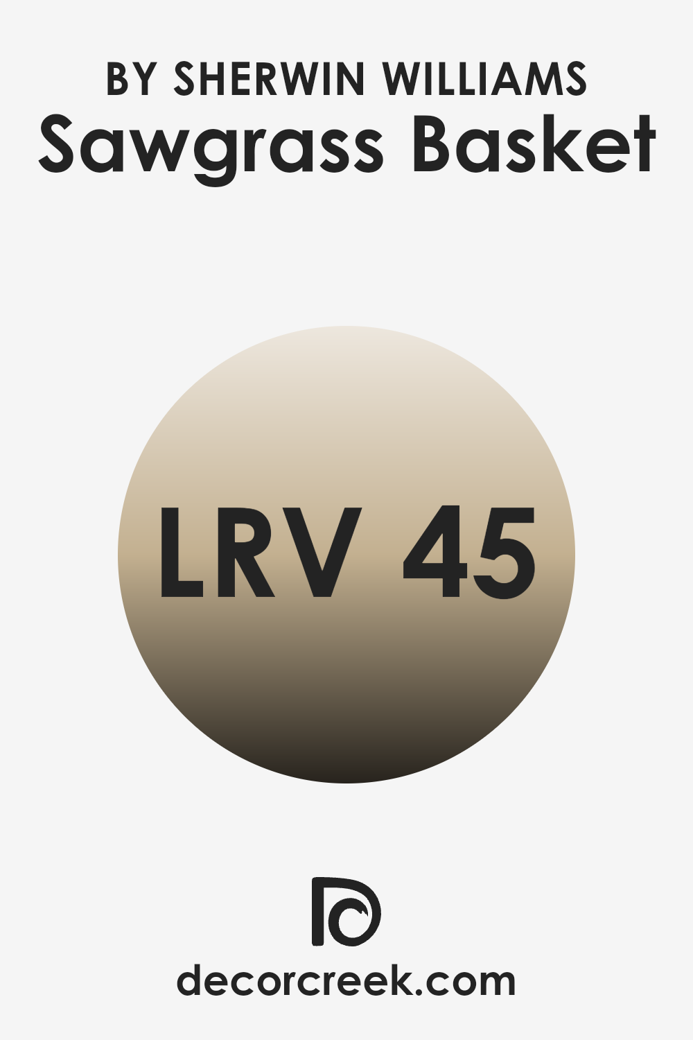
What is the LRV of Sawgrass Basket SW 9121 by Sherwin Williams?
LRV stands for Light Reflectance Value, which is a measure of how much light a paint color reflects back into the room compared to the amount of light that hits it. It’s an important factor in design, as it helps determine how bright or dark a room will appear once the walls are painted. If a paint has a high LRV, it means it reflects more light, making the room feel lighter and potentially making the room appear larger.
On the contrary, a lower LRV means that the paint absorbs more light, which can make a room look cozier but smaller and darker. For the color in question with an LRV of approximately 44.783, it falls into the mid-range category.
This means it neither reflects light powerfully nor absorbs it heavily. Such a level of reflectance provides a balance, ideal for interiors where neither a too bright nor too dim atmosphere is desired. It helps the room feel well-lit and balanced — not too bright and not too dark — which makes it easy to use in many different interiors. This can be particularly useful in living areas or bedrooms where a moderate ambiance is often sought.
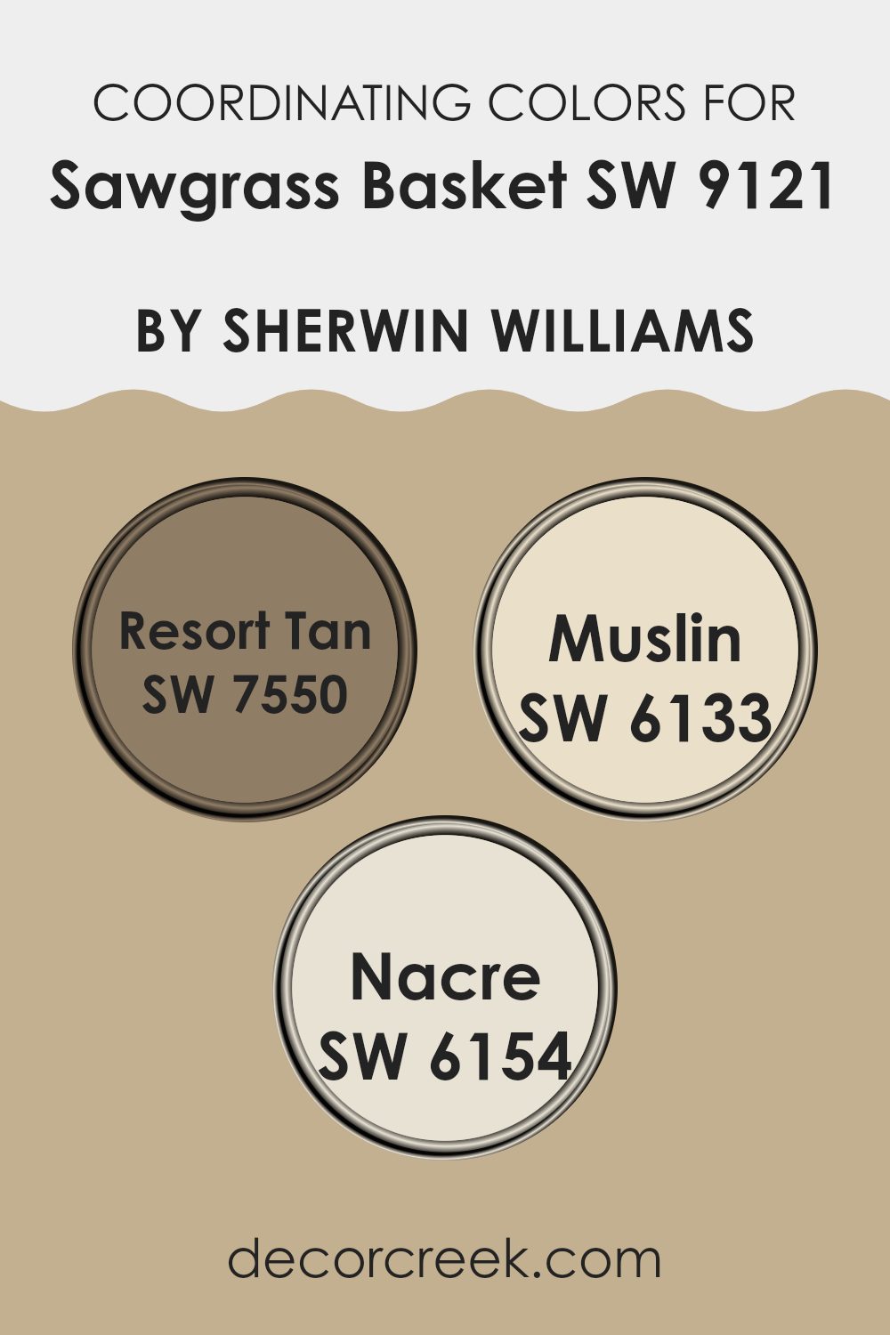
Coordinating Colors of Sawgrass Basket SW 9121 by Sherwin Williams
Coordinating colors are essentially hues that complement each other when used together, either in home decor, art, or fashion. They are selected based on their ability to harmonize and create a balanced visual appeal. A great example of this is how certain colors coordinate with the warm, muted green of Sawgrass Basket by Sherwin Williams. These coordinating hues enhance the primary color while ensuring the overall look remains pleasing and cohesive.
Resort Tan is a soft, welcoming shade that resembles the warm, sandy beaches, making it a perfect complement to natural tones. Its understated elegance allows it to blend smoothly with other colors without overpowering them, making it ideal as a coordinating color.
Similarly, Muslin is a lighter, neutral shade that offers a subtle contrast, brightening spots without distraction, making it great for creating a calm and collected atmosphere. Lastly, Nacre adds a touch of creamy richness to the mix, providing depth and warmth, which helps in softening any harshness in the overall color scheme, contributing to a seamless aesthetic flow throughout the room. Together, these colors work alongside Sawgrass Basket to emphasize comfort and natural harmony in design.
You can see recommended paint colors below:
- SW 7550 Resort Tan
- SW 6133 Muslin
- SW 6154 Nacre
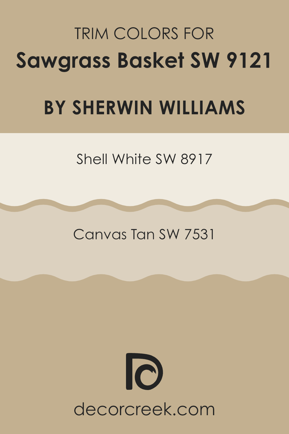
What are the Trim colors of Sawgrass Basket SW 9121 by Sherwin Williams?
Trim colors, such as SW 8917 Shell White and SW 7531 Canvas Tan, are essential in painting because they help create clean, defined lines that highlight the architectural features of interiors. By using a trim color like Shell White or Canvas Tan against a color such as Sawgrass Basket, the different elements like door frames, window sills, and baseboards stand out, adding depth and structure to the room. This contrasting scheme not only defines the spots more crisply but also adds an elegant finish that enhances the overall appeal of the room.
Shell White is a gentle and light shade that brings a fresh and airy feel to any sections. It pairs beautifully as a trim color with the slightly darker hues of Sawgrass Basket, providing a subtle contrast that brightens up the area.
On the other hand, Canvas Tan offers a warmer and more neutral tone that complements the richer shades of Sawgrass Basket superbly. This combination creates a cozy and inviting atmosphere, which is perfect for spots meant for relaxation and comfort.
You can see recommended paint colors below:
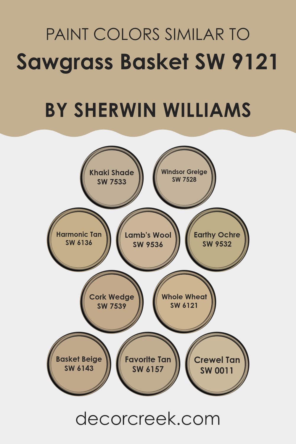
Colors Similar to Sawgrass Basket SW 9121 by Sherwin Williams
Using similar colors in decorating helps create a harmonious, pulled-together look that feels balanced and easy on the eyes — without too much contrast. Colors like SW 7533 – Khaki Shade, a muted green with earthy tones, and SW 7528 – Windsor Greige, a soft blend of gray and beige, provide subtle variations that maintain a tranquil atmosphere.
Soft tones such as SW 6136 – Harmonic Tan and SW 9536 – Lamb’s Wool, a light and cozy tan, contribute to a seamless color flow, ensuring visual comfort. Additionally, SW 9532 – Earthy Ochre adds a touch of warm earthiness that complements wood furnishings and natural textures.
Further deepening the palette, SW 7539 – Cork Wedge brings in a richer, deeper hue that works well with a variety of decors, while SW 6121 – Whole Wheat is a warm, inviting color that pairs beautifully with darker accents. SW 6143 – Basket Beige is particularly effective at creating a soft backdrop that allows furniture and art to stand out.
For a slightly darker shade, SW 6157 – Favorite Tan offers a dusky tan that provides depth and warmth. Lastly, SW 0011 – Crewel Tan presents a distinctive tone that works well as an accent or main color, giving flexibility in design choices. These similar colors come together to form a palette that’s easy to work with and visually pleasing
You can see recommended paint colors below:
- SW 7533 Khaki Shade
- SW 7528 Windsor Greige
- SW 6136 Harmonic Tan
- SW 9536 Lamb’s Wool
- SW 9532 Earthy Ochre
- SW 7539 Cork Wedge
- SW 6121 Whole Wheat
- SW 6143 Basket Beige
- SW 6157 Favorite Tan
- SW 0011 Crewel Tan
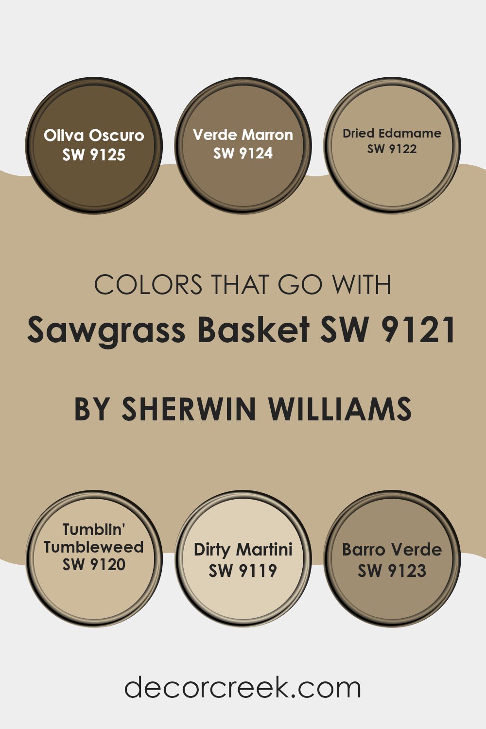
Colors that Go With Sawgrass Basket SW 9121 by Sherwin Williams
When coordinating colors with a primary hue like Sawgrass Basket SW 9121 by Sherwin Williams, it’s vital to consider complementary shades that enhance and balance the sections. Colors like SW 9125 – Oliva Oscuro, and its supporting palette, play an essential role in achieving a harmonious look. These colors ensure that the design is cohesive and visually interesting, by creating a subtle or striking contrast depending on the desired effect.
Oliva Oscuro is a rich, deep olive green that gives a grounded, earthy feel, perfect for creating a cozy environment. Close in tone but lighter, Verde Marron offers a muted, forest green shade, lending a natural, calming touch to interiors. Another excellent companion, Dried Edamame, is a soft, sage-like hue that injects a fresh and organic aesthetic into any sections.
Moving to the warmer end of the spectrum, Tumblin’ Tumbleweed brings a gentle, sandy beige that works well in providing a light, neutral background. In a similar vein but with a hint of color, Dirty Martini is a gray-green that blends neutrality with gentle depth — great for adding quiet, stylish accents. Lastly, Barro Verde presents a unique mix of gray and green, offering a subtle color infusion that complements the rustic charm of Sawgrass Basket beautifully. Together, these shades create a palette that’s easy to style in different ways throughout the home..
You can see recommended paint colors below:
- SW 9125 Oliva Oscuro
- SW 9124 Verde Marron
- SW 9122 Dried Edamame
- SW 9120 Tumblin’ Tumbleweed
- SW 9119 Dirty Martini
- SW 9123 Barro Verde
How to Use Sawgrass Basket SW 9121 by Sherwin Williams In Your Home?
Sawgrass Basket SW 9121 by Sherwin Williams is a warm, nature-inspired beige that brings a cozy and inviting feeling to any room. This color is perfect for someone looking to create a comforting and relaxing atmosphere in their home.
It works beautifully in living rooms or bedrooms where a soft and neutral backdrop can make the section feel more welcoming. Furthermore, since it’s such an easy shade to work with, you can use it in different ways — whether you paint all the walls for a soft, unified feel or just one wall to make a gentle focal point
It pairs well with darker furniture and bright accents, giving you flexibility in choosing decor. Overall, Sawgrass Basket offers a simple and effective way to add a touch of warmth to any indoor environment.
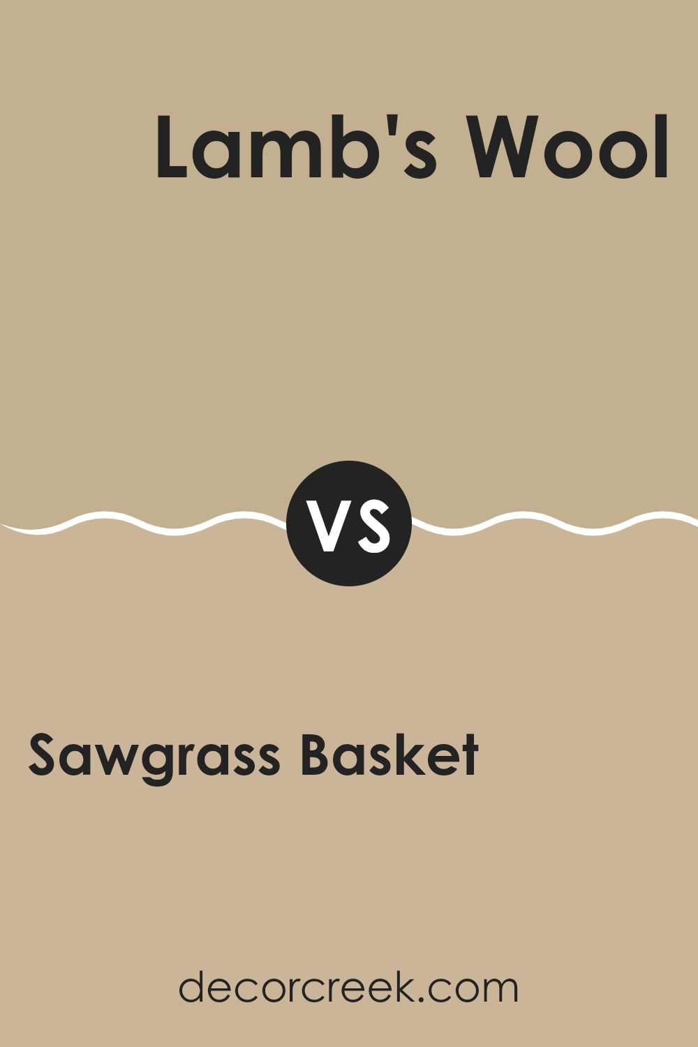
Sawgrass Basket SW 9121 by Sherwin Williams vs Lamb’s Wool SW 9536 by Sherwin Williams
Sawgrass Basket and Lamb’s Wool are two appealing paint colors from Sherwin Williams. Sawgrass Basket is a deeper, earthy tone that resembles the color of dried grass or a natural woven basket. It provides a warm and cozy feeling, making it great for spots where you want a comforting and welcoming atmosphere.
On the other hand, Lamb’s Wool is a much lighter, soft beige color that leans towards a creamy white. This color is perfect for making a room feel brighter and more spacious. Lamb’s Wool can complement larger areas and works well in rooms that get a lot of natural light.
Both colors offer a sense of homeliness and can easily pair with a variety of decor styles. While Sawgrass Basket might suit accent walls or smaller spots to create a snug vibe, Lamb’s Wool works beautifully as a neutral backdrop for vibrant decorations or furnishings.
You can see recommended paint color below:
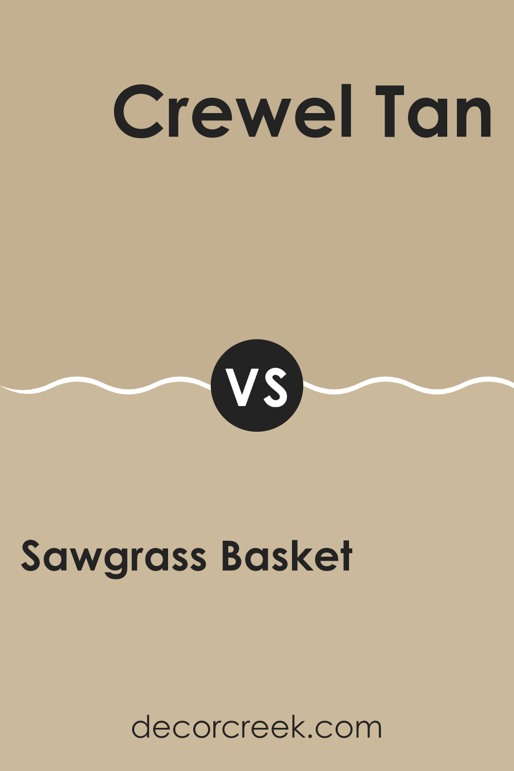
Sawgrass Basket SW 9121 by Sherwin Williams vs Crewel Tan SW 0011 by Sherwin Williams
Sawgrass Basket and Crewel Tan by Sherwin Williams are two distinct shades, each bringing their unique ambiance to a section. Sawgrass Basket is a soft, subtle green that provides a calm and soothing effect, ideal for creating a relaxed environment. It leans toward a natural appearance, reminiscent of a quiet, lush woodland which makes it great for spots where a touch of nature is desired.
On the other hand, Crewel Tan exhibits a warm, earthy beige tone that offers a welcoming and cozy feel. This color is perfect for creating a comfortable and inviting atmosphere, making it ideal for living rooms and common areas where people gather.
When used together, these colors can complement each other effectively. The warm beige of Crewel Tan can counterbalance the cooler tones of Sawgrass Basket, creating a balanced and harmonious look. Whether you’re aiming for a backdrop that is cozy or slightly more refreshing, pairing these two can achieve a beautiful, restful aesthetic.
You can see recommended paint color below:
- SW 0011 Crewel Tan
Sawgrass Basket SW 9121 by Sherwin Williams vs Windsor Greige SW 7528 by Sherwin Williams
Sawgrass Basket and Windsor Greige are two distinct colors from Sherwin Williams that offer unique vibes for home decor. Sawgrass Basket is a warm green hue that brings a cozy, earthy feel to a room. It adds a touch of nature and is soft enough to blend well with other colors. On the other hand, Windsor Greige is a cooler, neutral beige with gray undertones.
This color is perfect for creating a calm, understated look that pairs easily with different furnishings and styles. While Sawgrass Basket injects warmth and a natural touch, Windsor Greige maintains a neutral background, providing a clean and subtle canvas.
These differences make Sawgrass Basket suited for sections where you want a hint of color without overpowering, whereas Windsor Greige could be better for larger areas or combining with bold colored accents. Both colors have their unique charm and can effectively be used depending on the desired mood and room functionality.
You can see recommended paint color below:
- SW 7528 Windsor Greige
Sawgrass Basket SW 9121 by Sherwin Williams vs Earthy Ochre SW 9532 by Sherwin Williams
Sawgrass Basket and Earthy Ochre are two distinct paint colors by Sherwin Williams. Sawgrass Basket carries a subtle green tone, hinting at the muted shades seen in natural woven materials. It is soothing and pairs well with natural wooden textures, making it ideal for sections where you want a touch of nature’s calm.
On the other hand, Earthy Ochre is a deeper, warm color resembling the rich, fertile earth. It offers a feeling of warmth and coziness, perfect for inviting sections. This color complements areas with lots of plants or warm-toned decor, enhancing a rustic or grounded aesthetic.
Both colors provide unique vibes: Sawgrass Basket leans towards a fresh, airy feel, while Earthy Ochre goes for warmth and depth. Depending on the room’s purpose and the ambiance you want, you might choose the refreshing touch of Sawgrass Basket for a breezy bedroom or the enveloping warmth of Earthy Ochre for a cozy living section.
You can see recommended paint color below:
Sawgrass Basket SW 9121 by Sherwin Williams vs Harmonic Tan SW 6136 by Sherwin Williams
The color Sawgrass Basket by Sherwin Williams is a warm, creamy beige that gives off a cozy and comforting vibe to any room. It’s a light neutral shade that pairs easily with various furnishings and decor styles, making it very adaptable for living sections or bedrooms.
On the other hand, Harmonic Tan is a slightly darker tone of tan with a richer, warmer base. This color brings a stronger feel of warmth and homeliness compared to Sawgrass Basket, making it ideal for creating a welcoming atmosphere in family rooms or dining areas.
Both colors work well in different settings, but Sawgrass Basket is lighter and more subtle, which makes it a good option for smaller rooms to help them feel more open. In contrast, Harmonic Tan, with its deeper tan shade, works well in larger sections or rooms that get a lot of natural light. Each color offers a unique way to enhance the interior with their gentle, neutral palettes.
You can see recommended paint color below:
Sawgrass Basket SW 9121 by Sherwin Williams vs Khaki Shade SW 7533 by Sherwin Williams
Sawgrass Basket and Khaki Shade, both from Sherwin Williams, present interesting yet distinct options for home interiors. Sawgrass Basket leans towards a muted green with heavy earthy undertones, giving a natural and grounding feel to sections. It reflects the hues of lush vegetation and can bring a subtle hint of nature indoors.
In contrast, Khaki Shade stands out as a true, deeper khaki color with brown and subtle yellow tones. It offers a traditional look that feels classic and blends easily with wooden furnishings, adding warmth to rooms filled with natural light.
Both colors are easy to work with, but each one suits a different design goal. Sawgrass Basket may be the preferable choice for those leaning towards a more plant-inspired or organic vibe. On the other hand, Khaki Shade could be the go-to for someone looking for a classic and cozy ambiance. They can complement each other in a section that aims for a balance between earthy and traditional themes.
You can see recommended paint color below:
- SW 7533 Khaki Shade
Sawgrass Basket SW 9121 by Sherwin Williams vs Basket Beige SW 6143 by Sherwin Williams
Sawgrass Basket and Basket Beige are two distinct paint colors by Sherwin Williams, each offering its unique shade. Sawgrass Basket is a deeper, more saturated color, leaning towards a earthy, green tone. This makes it a great choice for rooms where you want to bring in a natural, grounding feel without making the section too dark.
On the other hand, Basket Beige is a much lighter, neutral beige that works well as a soft backdrop in any room. It’s soft enough to be used extensively, even in smaller sections, without making the area feel cramped or too bright.
In terms of complementing decor, Sawgrass Basket pairs well with rich woods and darker furniture, giving a cozy, enveloped feel. Basket Beige works well with almost any color scheme, supporting bolder colors or simple, minimalist designs. Both colors offer a fresh but warm atmosphere, each in their own unique way.
You can see recommended paint color below:
- SW 6143 Basket Beige
Sawgrass Basket SW 9121 by Sherwin Williams vs Favorite Tan SW 6157 by Sherwin Williams
Sawgrass Basket and Favorite Tan, both by Sherwin Williams, are unique shades that cater to different moods and styles in home decor. Sawgrass Basket is a deep, muted green with earthy undertones, creating a cozy and natural feel in a room.
It can make parts of the home feel grounded and calm, and it pairs well with wood finishes and natural fibers. On the other hand, Favorite Tan is a warmer, beige color that gives a room a soft, welcoming vibe. This neutral color pairs easily with all kinds of decor — from bright accents to deeper, darker tones
While Sawgrass Basket is perfect for bringing a touch of nature indoors, Favorite Tan is ideal for those looking for a gentle, soothing atmosphere in their living parts of the home. Together, they can be used to achieve a balanced and harmonious look.
You can see recommended paint color below:
- SW 6157 Favorite Tan
Sawgrass Basket SW 9121 by Sherwin Williams vs Cork Wedge SW 7539 by Sherwin Williams
Sawgrass Basket and Cork Wedge are two distinct colors from Sherwin Williams that offer unique vibes for interior parts of the home. Sawgrass Basket is a gentle, muted green that brings a calm and comfortable atmosphere. It’s light enough to make a room feel airy yet has enough depth to add character. On the other hand, Cork Wedge is a warm, mid-tone brown.
This color provides a cozy and welcoming feeling, making it ideal for parts of the home where you want to feel relaxed, like living rooms or bedrooms. While Sawgrass Basket reflects a more natural, earthy tone, Cork Wedge radiates warmth and a sense of steadiness.
These colors could work beautifully together, with Sawgrass Basket offering a fresh, natural touch and Cork Wedge grounding the section in warmth. They cater to different preferences but share the ability to create inviting and comfortable environments.
You can see recommended paint color below:
- SW 7539 Cork Wedge
Sawgrass Basket SW 9121 by Sherwin Williams vs Whole Wheat SW 6121 by Sherwin Williams
Sawgrass Basket and Whole Wheat by Sherwin Williams are two warm, earthy colors with subtle differences in their tones. Sawgrass Basket is a soft, muted green with a hint of gray, giving it a natural and calming feel that resembles the hues of dried grass or a woven basket. This color is great for creating a cozy and inviting atmosphere in a room.
On the other hand, Whole Wheat is a warm beige that leans towards a golden yellow, resembling the color of wheat fields. It offers a sunny and cheerful vibe, making it ideal for rooms where you want a welcoming and bright look.
Both colors work well in parts of the home that aim for a rustic or natural aesthetic, but Sawgrass Basket’s green-gray tones provide a cooler touch compared to the warmer, sunnier feel of Whole Wheat. These colors can be used together to complement each other in a room, bringing the outdoors inside in a harmonious way.
You can see recommended paint color below:
- SW 6121 Whole Wheat
After learning about SW 9121 Sawgrass Basket by Sherwin Williams, I feel quite impressed. This paint color is like a warm, cozy hug because it makes any room feel welcoming and calm. Just like the name suggests, it reminds me of a basket made from sawgrass, with its gentle brown tone that can fit into any room without being too loud or too quiet.
I think it’s perfect for rooms where you want to relax or play, like a living room or a bedroom, because it has a friendly and soft color that makes you feel at ease. Also, since it goes well with many other colors, you can use it with your favorite decorations, whether they are bright and colorful, or more calm and soft.
This color proves you don’t need to pick something bold to make a room feel special. Sometimes, a simple and gentle color like Sawgrass Basket is just right to make a room feel like a cozy little nest.
So, whether you’re painting a new playroom or giving your bedroom a new look, SW 9121 Sawgrass Basket is a great choice that makes everything feel just right.
Ever wished paint sampling was as easy as sticking a sticker? Guess what? Now it is! Discover Samplize's unique Peel & Stick samples.
Get paint samples

