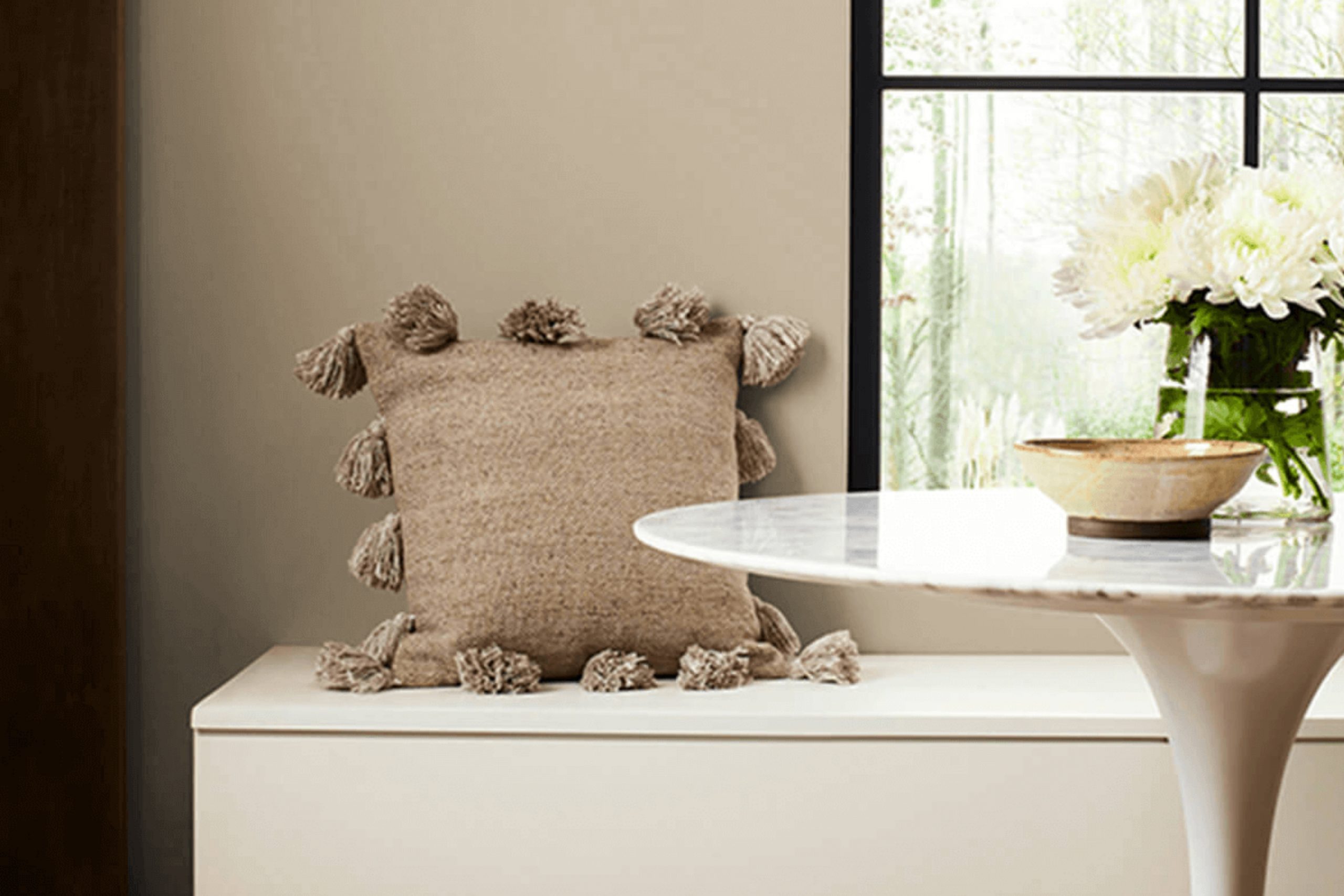
SW 6150 Universal Khaki by Sherwin Williams is a warm, easygoing color that brings a cozy feel without being too much. It has that soft, natural look that makes any room feel calm and pulled together.
It’s a kind of beige that doesn’t lean too heavily into yellow or gray, making it superbly balanced and easy to integrate into various decor styles and color schemes. Whether you’re painting a bedroom, living room, or even exterior surfaces, Universal Khaki adapts effortlessly.
It pairs beautifully with rich woods, offering an earthy, grounded aesthetic, and also complements metallic accents and white trim for a more refined look.
The versatility of this shade allows you to create a cozy atmosphere or a chic, modern vibe depending on your furniture and decor choices. It could be the perfect backdrop for your next project!
What Color Is Universal Khaki SW 6150 by Sherwin Williams?
Universal Khaki is a warm and versatile neutral paint color that offers a cozy feel to any room. With its soothing beige tones and a hint of gray, this color creates a welcoming atmosphere that’s ideal for various living spaces. The beauty of Universal Khaki lies in its adaptability, seamlessly blending with multiple interior design styles including traditional, rustic, and modern minimalist.
The understated elegance of Universal Khaki makes it a popular choice for living rooms and bedrooms where a calm, inviting ambiance is desired. In spaces like kitchens and bathrooms, it can add a gentle warmth, especially when paired with crisp whites or rich wood finishes.
When considering the best materials and textures to pair with Universal Khaki, consider natural wood, which complements its earthy vibe. Textiles in cotton or linen in muted colors like soft blues, greens, or even simple creams can enhance the relaxed feel. Metals like bronze or copper also work well with this shade, adding a touch of rustic charm without overwhelming the space.
Universal Khaki is also a practical choice as it hides minor imperfections on walls and is easy to maintain. It’s a solid pick for anyone looking to create a cozy, understated look in their home.
Is Universal Khaki SW 6150 by Sherwin Williams Warm or Cool color?
Universal Khaki by Sherwin Williams is a popular paint color that brings a warm and inviting feel to any home. It’s a balanced shade, not too light or too dark, which makes it versatile for use in various spaces like living rooms, bedrooms, or kitchens. This shade pairs well with both bold and subtle colors, allowing for a range of decorating themes from modern to rustic.
When applied to walls, Universal Khaki brings a cozy warmth that makes spaces feel more comfortable and welcoming. It’s an excellent background color, helping furniture and art pieces to really stand out. In natural light, this color gets a soft glow, enhancing the room’s overall atmosphere, while under artificial lighting, it maintains its richness without turning dull.
This color is also great for hiding imperfections on walls, making it a practical choice as well. It can make smaller rooms appear larger and give a neat finish to the interiors. Overall, Universal Khaki is a dependable and adaptable choice for creating a pleasant home environment.
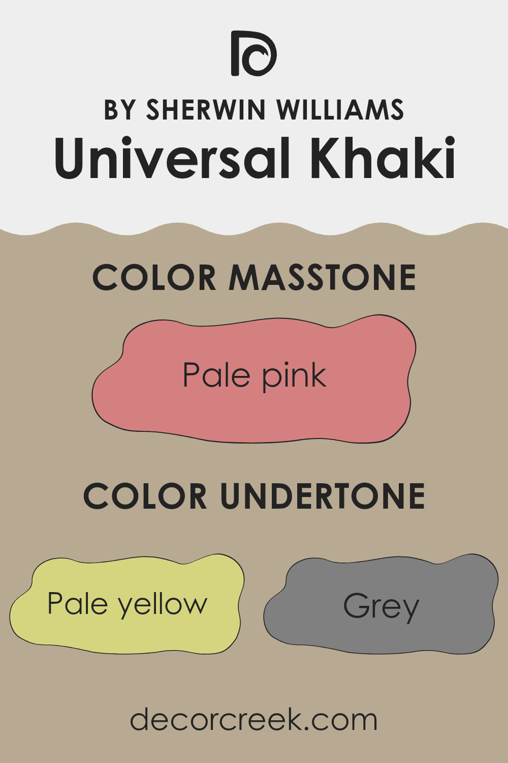
Undertones of Universal Khaki SW 6150 by Sherwin Williams
Universal Khaki is a versatile paint color known for its adaptability on walls, blending seamlessly with most decors. The secret to its wide-ranging appeal lies in its complex undertone profile. Undertones are subtle colors that influence the base color, affecting how we perceive the overall hue depending on lighting and surrounding elements.
This particular shade carries undertones of a diverse spectrum, from pale yellow and light gray to more distinct hints like mint and light purple. Undertones like pale yellow and light gray add a warm, welcoming glow, making spaces feel cozy yet bright. However, the mint and light purple can introduce a cooler, more refreshing feel, providing a balance that adapts well to different styles and furnishings.
When applied to interior walls, Universal Khaki presents a chameleon-like ability to shift its appearance. In a room with ample sunlight, the pale yellow and orange undertones might become more pronounced, giving the room a cheerful, sunlit ambiance. Conversely, in spaces with less natural light, the gray and light purple undertones might dominate, lending a more subdued, calm aesthetic.
Moreover, this color’s versatility means it can pair well with many decor elements. Whether your furniture is rich and dark, or light and airy, Universal Khaki adjusts its look subtly to match. This ability to harmonize with different lighting conditions and decor styles makes it a go-to choice for anyone looking to refresh their walls without committing to a drastic color change.
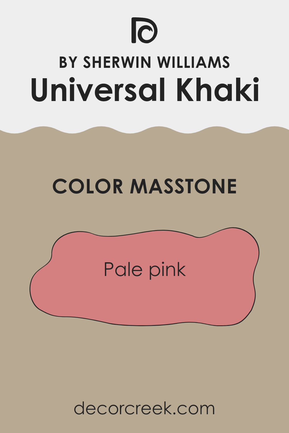
What is the Masstone of the Universal Khaki SW 6150 by Sherwin Williams?
Universal Khaki SW 6150 by Sherwin Williams has a masstone that appears as pale pink, specifically close to the shade #D58080. This unique hue brings a soft and gentle feel to any room, making it a favored choice for spaces that benefit from a calm, cozy atmosphere. Pale pink tones like this can make small rooms seem more open and welcoming, while adding a touch of warmth to larger spaces.
When used in homes, this color works particularly well in bedrooms and living rooms, where a softer color palette can help create a relaxing environment. It pairs beautifully with creams, soft whites, and earthy browns, offering a versatile foundation for a variety of decorating styles.
From modern to rustic, this subtle pink impacts a space in a gentle way, providing a neutral backdrop that complements a wide range of furniture and accent pieces. This color also works well with natural light, reflecting it in a way that amplifies a sense of space and airiness. It’s an ideal pick for anyone looking to refresh their home with a light, inviting color.
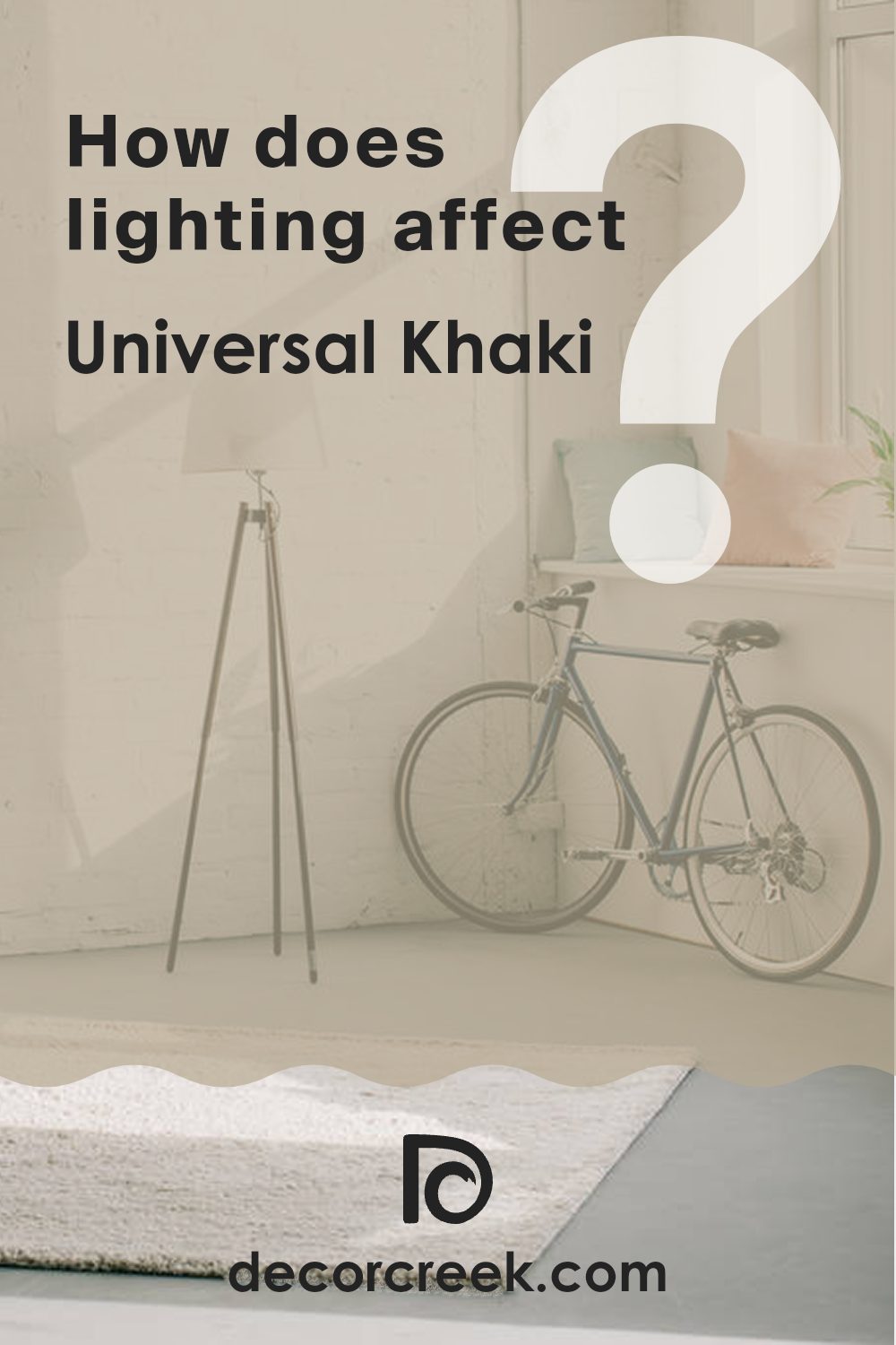
How Does Lighting Affect Universal Khaki SW 6150 by Sherwin Williams?
Lighting plays a crucial role in how we perceive colors. The same paint, such as Universal Khaki, can appear differently under various lighting conditions due to changes in light intensity and color temperature.
In artificial light, the appearance of Universal Khaki can vary substantially depending on the type of bulb used.
For instance, under warm, yellow-toned light bulbs, this color will likely look softer and more muted, enhancing its cozy and welcoming qualities. In contrast, cooler, bluish artificial light can make it appear slightly sharper and more modern, as it brings out the grey tones in the paint.
In natural light, Universal Khaki changes throughout the day as the quality of light shifts. Morning light tends to be cooler, casting a crisper look, while the color might look warmer and richer as the light becomes yellower towards the evening.
The orientation of a room relative to the sun’s path significantly affects how Universal Khaki looks. In north-facing rooms, which receive less direct sunlight and are often lit with cooler, indirect light, Universal Khaki may appear as a true, soft khaki without much variation. It provides a steady and gentle background that’s easy to match with decor.
South-facing rooms, blessed with abundant bright and warm light most of the day, will see Universal Khaki take on a brighter, warmer tone, enhancing its underlying beige and creating a cheerful atmosphere.
In east-facing rooms, where sunlight is bright and warm in the mornings and dimmer later in the day, Universal Khaki will have a vibrant, lively look in the morning that transitions to a softer and more shadowy hue in the afternoon.
West-facing rooms receive intense evening light, which makes Universal Khaki glow warmly in the evenings, offering a welcoming and cozy feel that’s perfect for relaxing at the end of the day.
These effects show that even a single color like Universal Khaki can have several personalities, all depending on the lighting context where it is used.
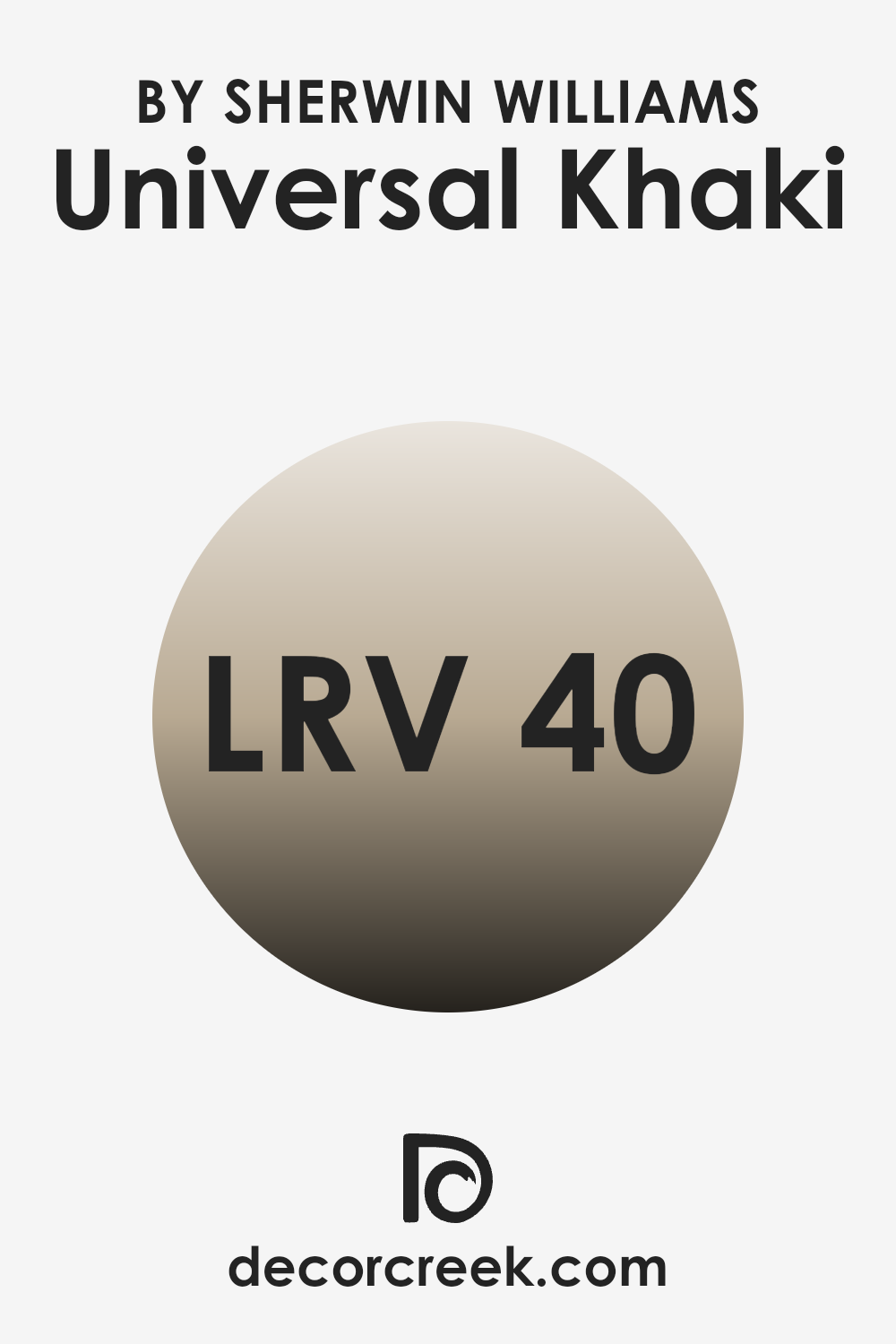
What is the LRV of Universal Khaki SW 6150 by Sherwin Williams?
LRV, or Light Reflectance Value, is a measure used to describe how much light a paint color reflects or absorbs when light hits it. This value is given on a scale where higher numbers mean the color reflects more light and lower numbers mean it absorbs more light. This number is crucial when picking paint because it helps you understand how light or dark a color will look once it’s on your walls.
A lighter color, with a higher LRV, makes a room feel more open and airy because it reflects more light around the space. On the other hand, darker colors, with lower LRVs, can make a room feel smaller and cozier because they absorb more light.
Considering Universal Khaki has an LRV of around 40, it sits in the middle range where it’s neither too dark nor too light. This balance means it can add warmth to a room without making it feel closed in. The color will moderately reflect some light, helping to brighten the room a bit, but it will also absorb some light, which can enhance a cozy atmosphere. This makes it a versatile option that can work well in various spaces and lighting conditions, contributing to a welcoming environment without overpowering with brightness or heaviness.
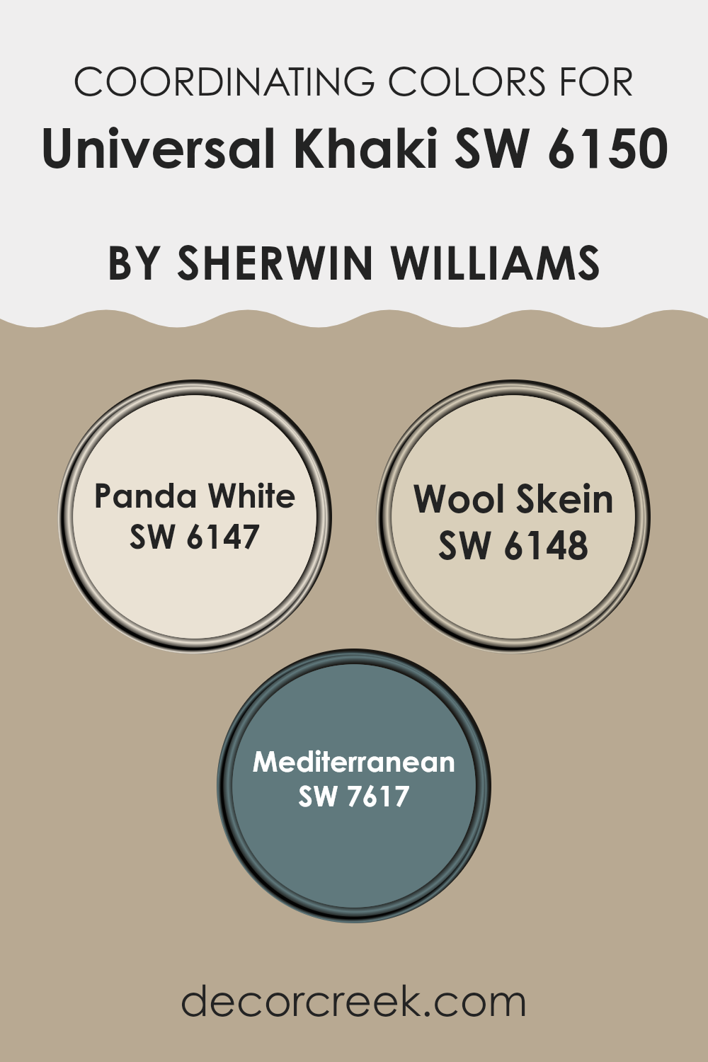
Coordinating Colors of Universal Khaki SW 6150 by Sherwin Williams
Coordinating colors work together in harmony to enhance the overall appearance of a space, providing balance and visual interest. Typically, a main color is chosen, and coordinating colors are selected to complement and highlight this primary shade, creating a cohesive look. Universal Khaki, a versatile and warm neutral, pairs well with colors that both contrast and blend smoothly.
Panda White is a light, creamy white that offers a soft contrast to the deeper tones of Universal Khaki, highlighting architectural details or trim with a clean, fresh look. Wool Skein, another coordinating shade, is a subtle, muted yellow with warm undertones that complement the earthiness of Universal Khaki, ideal for adjoining walls or fabrics, helping to create a relaxed and welcoming atmosphere.
Mediterranean is a bold and vibrant blue that provides a striking contrast, perfect for accent walls or decorative elements, adding a pop of color and energy that stands out against the more subdued tones of Universal Khaki. These colors together allow for a range of aesthetic styles, from cozy and warm to vibrant and energetic, depending on how they are utilized in a room.
You can see recommended paint colors below:
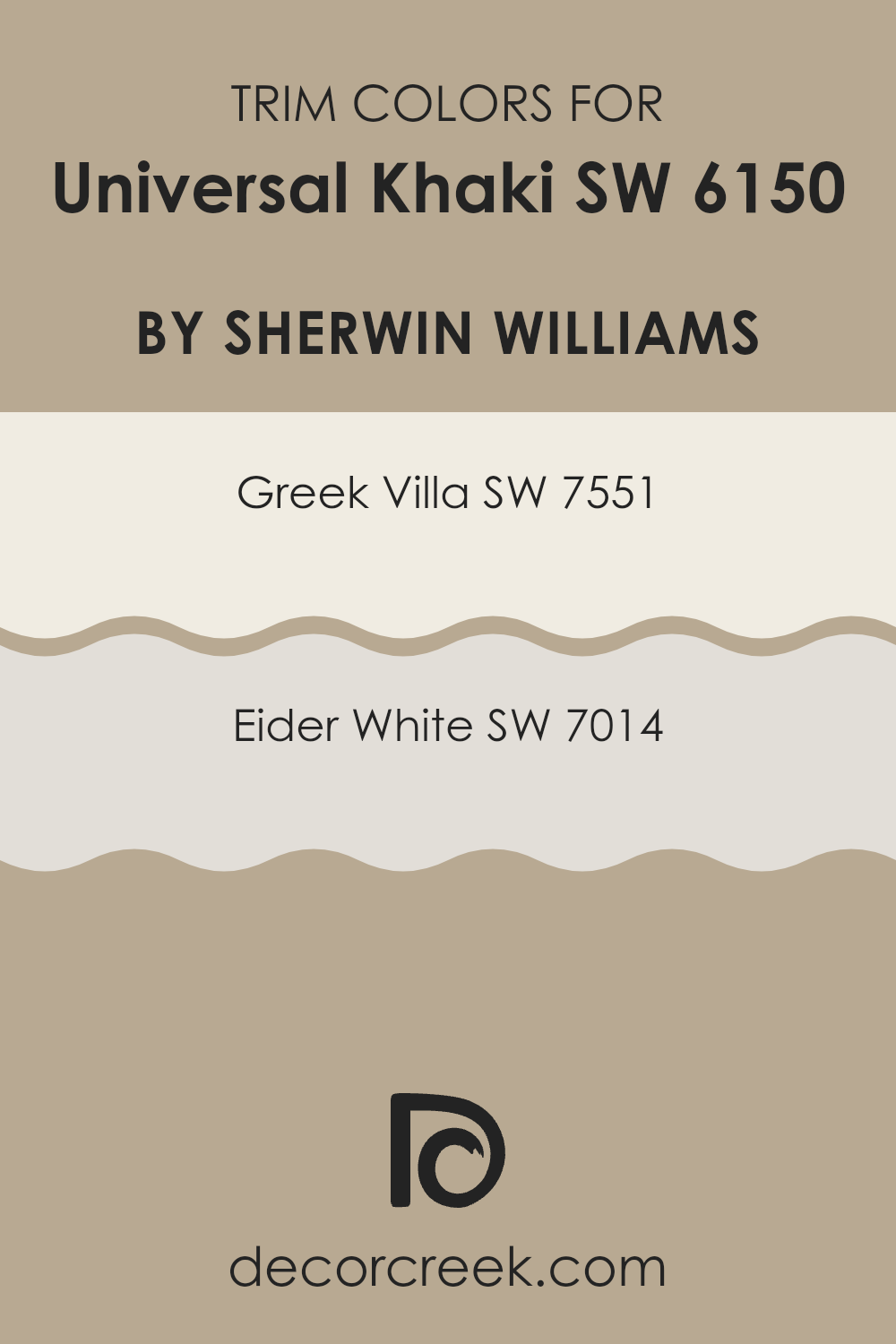
What are the Trim colors of Universal Khaki SW 6150 by Sherwin Williams?
Trim colors are selected to complement or contrast with the main color of a wall, enhancing the overall aesthetic of a room. When paired with Universal Khaki, a versatile and warm neutral paint, trim colors like Greek Villa SW 7551 and Eider White SW 7014 play a crucial role.
These lighter trim colors can frame Universal Khaki beautifully, creating a crisp, clean look that highlights architectural features and shapes the spatial perception of the room. The right trim colors ensure that transitions between walls, ceilings, and floors are smooth and pleasing to the eye, pulling together the look of a space in an understated yet effective way.
Greek Villa SW 7551 is a soft, off-white shade with a subtle warmth that prevents it from appearing too stark against a richer hue like Universal Khaki. This color makes it an excellent choice for trim, as it provides a gentle contrast that enhances but does not compete with the deeper wall color.
On the other hand, Eider White SW 7014 offers a slightly cooler tone, presenting a faint grayish tint that can add a fresh and modern edge to the traditional warmth of Universal Khaki. This shade is ideal for creating a more defined boundary that adds visual interest and depth to a room.
You can see recommended paint colors below:
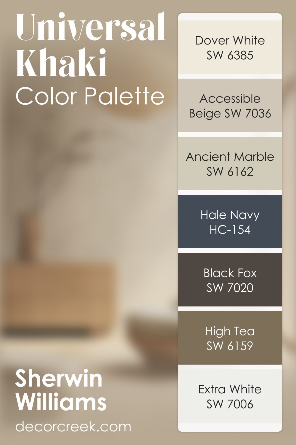
Universal Khaki SW 6150 by Sherwin Williams Color Palette
When I work with Universal Khaki, I always feel a gentle warmth settle into the room. It has this soft, grounded character that makes everything around it feel more welcoming. I like pairing it with Dover White or Extra White when I want a calm, bright mood that still feels inviting. Accessible Beige and Ancient Marble sit beautifully beside it, adding quiet layers that feel natural and easy on the eyes.
When I want contrast that feels steady and bold, Black Fox becomes the anchor. It gives Universal Khaki a sense of depth without feeling harsh. Hale Navy brings a confident, stylish touch, and it’s one of my favorite ways to give the palette some fresh energy. High Tea adds a comforting earthy note that ties everything together with a warm, lived-in feeling.
This palette works so well because each color adds something helpful—light, coziness, balance, or a gentle touch of drama. Universal Khaki sits right in the middle, keeping everything feeling soft, easy, and beautifully grounded.
Colors Similar to Universal Khaki SW 6150 by Sherwin Williams
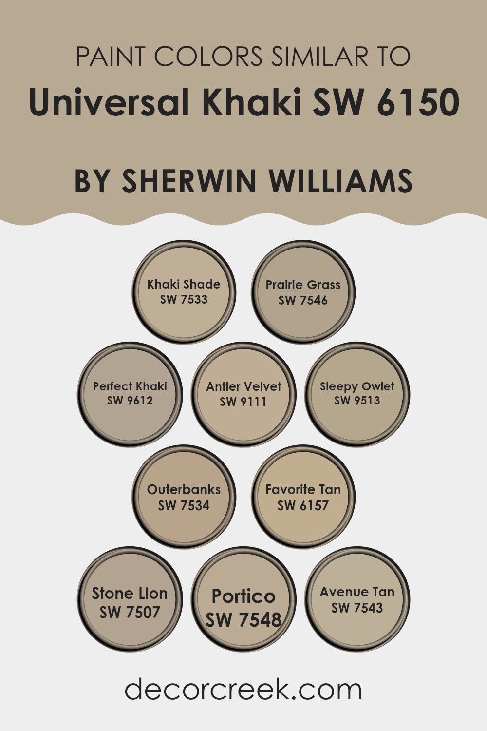
In home decor and painting, the use of similar colors can provide a cohesive and harmonious aesthetic to any space. Colors like SW 7533 Khaki Shade, SW 7546 Prairie Grass, and SW 9612 Perfect Khaki are closely related to Universal Khaki and offer subtle variations that can enhance different elements of a room without creating a stark contrast.
This approach allows for a seamless color flow from one room to another or within a single area, where each shade complements the others. It’s ideal for creating a unified look that still allows for some diversity in design choices.
For instance, SW 9111 Antler Velvet has a warmer undertone that brings a cozy, welcoming feel, while SW 9513 Sleepy Owlet leans towards a softer, muted gray that’s perfect for spaces that aim for a gentle, calm atmosphere. Colors like SW 7534 Outerbanks and SW 6157 Favorite Tan bring in a touch of earthiness, ideal for enhancing natural elements like wooden furniture or flooring. Then you have shades like SW 7507 Stone Lion and SW 7548 Portico, which edge towards a sandy, neutral palette, great for those who prefer understated elegance.
Lastly, SW 7543 Avenue Tan provides a deeper, richer hue, suitable for adding a bit of grounding to a predominantly light room. These similar hues can work together to create a subtle yet impactful visual experience, perfect for achieving a balanced and inviting home environment.
You can see recommended paint colors below:
- SW 7533 Khaki Shade
- SW 7546 Prairie Grass
- SW 9612 Perfect Khaki
- SW 9111 Antler Velvet
- SW 9513 Sleepy Owlet
- SW 7534 Outerbanks
- SW 6157 Favorite Tan
- SW 7507 Stone Lion
- SW 7548 Portico
- SW 7543 Avenue Tan
Colors that Go With Universal Khaki SW 6150 by Sherwin Williams
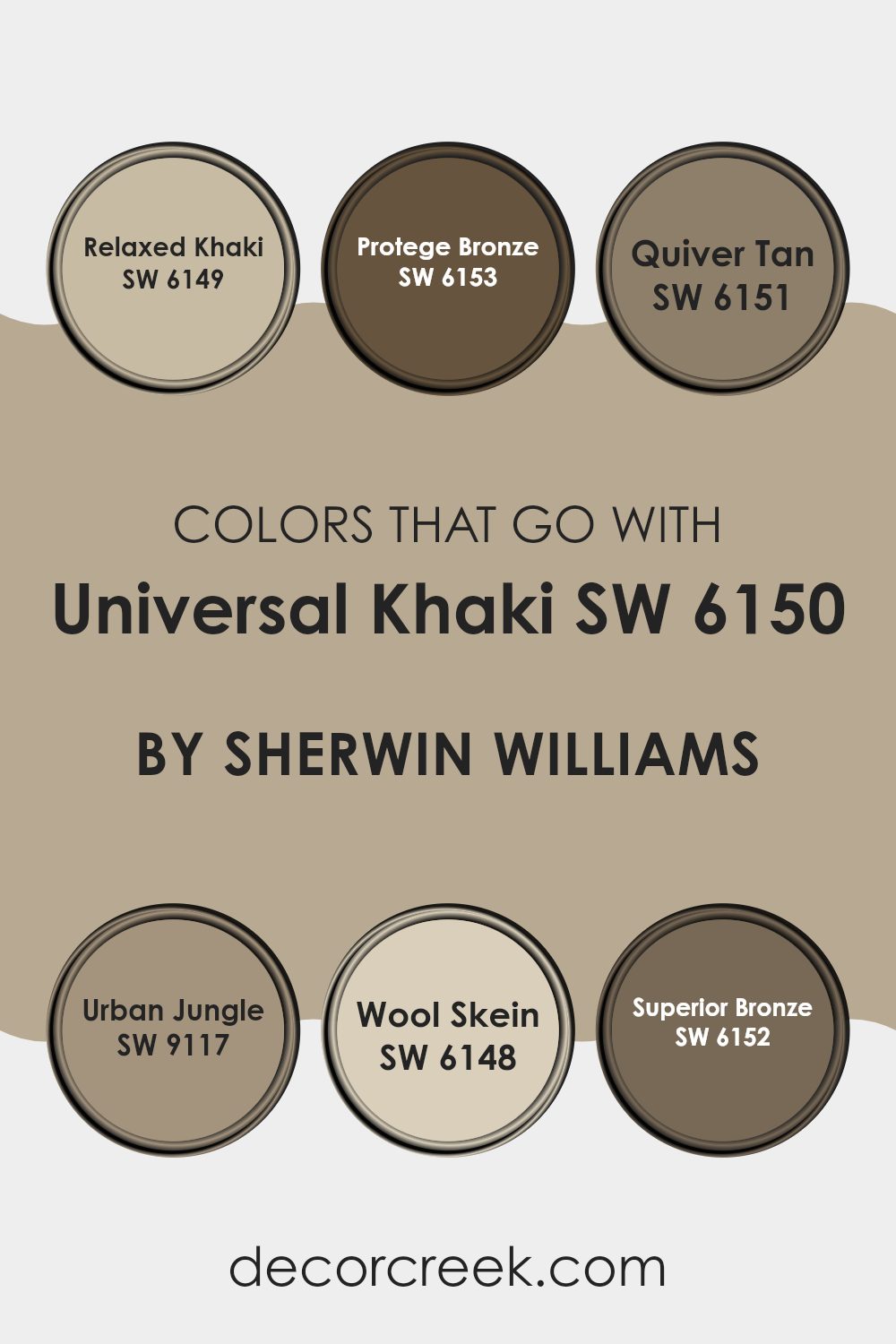
Choosing the right colors to pair with Universal Khaki SW 6150 by Sherwin Williams is crucial for creating a harmonious and pleasing look in any space. Universal Khaki is a versatile shade that serves as a neutral backdrop, making it essential to select complementary colors that enhance its warmth and welcoming nature. Colors like Relaxed Khaki, Protege Bronze, Quiver Tan, Urban Jungle, Wool Skein, and Superior Bronze each play a unique role in achieving a cohesive design.
Relaxed Khaki SW 6149 is slightly lighter than Universal Khaki, providing a subtle contrast that’s perfect for creating a soft, cohesive look. It works well in spaces where you want to maintain a light and airy feel. Protege Bronze SW 6153, on the other hand, is a deeper, warm brown that adds a robust and earthy touch, ideal for adding depth and interest to rooms.
Quiver Tan SW 6151 is a calm beige that offers a slight hint of color, which helps in softening the overall appearance and making the space more inviting. Pairing Urban Jungle SW 9117, which is a rich, earth-toned green, introduces a refreshing splash of nature-inspired color that contrasts beautifully against the khaki background. Wool Skein SW 6148 is a gentle yellowish-beige, illuminating and enlarging smaller spaces without overpowering them.
Finally, Superior Bronze SW 6152 is a dark, cozy brown that can be used for highlighting architectural features or for crafting an accent wall that adds warmth to the setting. Using these complementary colors with Universal Khaki ensures that every room feels balanced and aesthetically pleasing, making the environment more enjoyable for everyone.
You can see recommended paint colors below:
- SW 6149 Relaxed Khaki
- SW 6153 Protege Bronze
- SW 6151 Quiver Tan
- SW 9117 Urban Jungle
- SW 6148 Wool Skein
- SW 6152 Superior Bronze
Universal Khaki SW 6150 by Sherwin Williams Color Palette
When I work with Universal Khaki, I always feel a gentle warmth settle into the room. It has this soft, grounded character that makes everything around it feel more welcoming. I like pairing it with Dover White or Extra White when I want a calm, bright mood that still feels inviting. Accessible Beige and Ancient Marble sit beautifully beside it, adding quiet layers that feel natural and easy on the eyes.
When I want contrast that feels steady and bold, Black Fox becomes the anchor.
It gives Universal Khaki a sense of depth without feeling harsh. Hale Navy brings a confident, stylish touch, and it’s one of my favorite ways to give the palette some fresh energy. High Tea adds a comforting earthy note that ties everything together with a warm, lived-in feeling.
This palette works so well because each color adds something helpful—light, coziness, balance, or a gentle touch of drama. Universal Khaki sits right in the middle, keeping everything feeling soft, easy, and beautifully grounded.
How to Use Universal Khaki SW 6150 by Sherwin Williams In Your Home?
Universal Khaki by Sherwin Williams is a warm, neutral paint color that brings a cozy and inviting feel to any room. This shade of khaki works beautifully in living rooms, bedrooms, or even kitchens, creating a welcoming atmosphere without overpowering the space. It’s especially great for those looking to refresh their home with a modern yet timeless look.
You can pair Universal Khaki with white trim for a clean, classic appearance. It also matches well with dark wood furniture, adding a nice contrast and enhancing the natural elements in your home. If you’re into a bit of color, try incorporating blues or greens through accessories like pillows or curtains to add a subtle yet interesting pop.
This color can also be a great choice for exterior use, such as on siding or trims. It pairs nicely with natural surroundings, making it perfect for homes with outdoor living spaces. Whether you’re painting a room or updating the outside, Universal Khaki offers a versatile option that’s easy to work with.
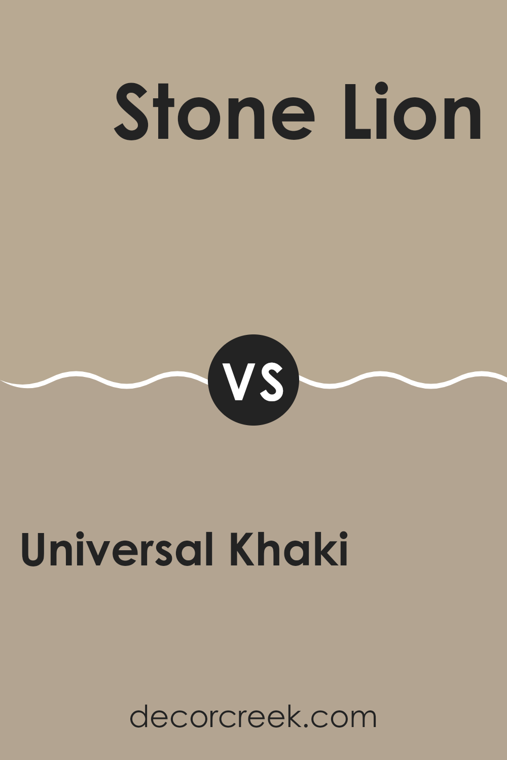
Universal Khaki SW 6150 by Sherwin Williams vs Stone Lion SW 7507 by Sherwin Williams
Universal Khaki and Stone Lion, both by Sherwin Williams, are two neutral shades that provide a warm backdrop for various decorating styles. Universal Khaki has a lighter, softer appearance making it ideal for creating a cozy and welcoming atmosphere in rooms like living areas and bedrooms. Its subtle green undertones give it a fresh, earthy feel.
On the other hand, Stone Lion has a deeper, grayer tone which offers a stronger presence. This color works great in spaces where you want a bit more definition or contrast, such as in hallways or as an accent wall. Because of its richer hue, Stone Lion can help in defining spaces and making them feel more grounded.
Both colors pair well with a wide range of decor and can provide a seamless transition from one room to another. Whether you choose the lighter Universal Khaki or the moodier Stone Lion, both hues can effectively enhance the aesthetic appeal of your home with their timeless appeal.
You can see recommended paint color below:
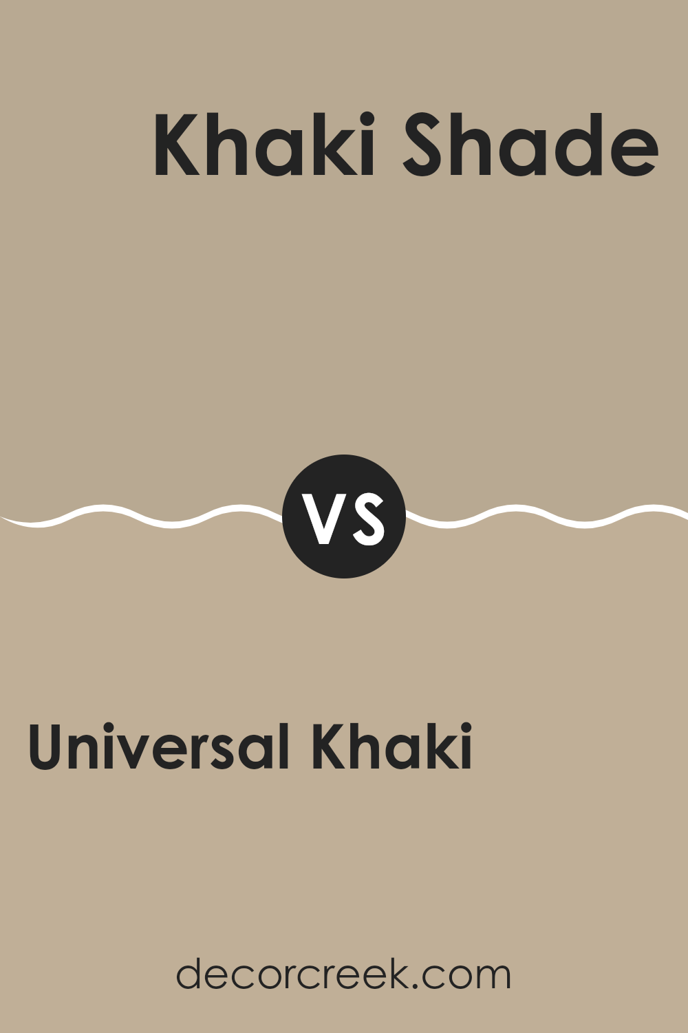
Universal Khaki SW 6150 by Sherwin Williams vs Khaki Shade SW 7533 by Sherwin Williams
Universal Khaki and Khaki Shade are two colors from Sherwin Williams that share a similar base but vary in depth and tone. Universal Khaki is a lighter, more neutral khaki, offering a soft backdrop that works well in many spaces. It gives a clean and airy feel, making it suitable for living rooms or bedrooms where you want a subtle yаet warm atmosphere.
On the other hand, Khaki Shade is a darker and richer tone. It provides a stronger presence due to its deeper color, which can make a room feel cozier and more enclosed. This shade is ideal for creating a focal point in a space or for use in areas where you desire a more pronounced color impact, like in a study or dining room.
Both colors complement a range of decor styles and pair well with various furniture finishes, making them versatile choices for interior design. However, the choice between them depends on the desired effect in a room — light and subtle or dark and cozy.
You can see recommended paint color below:
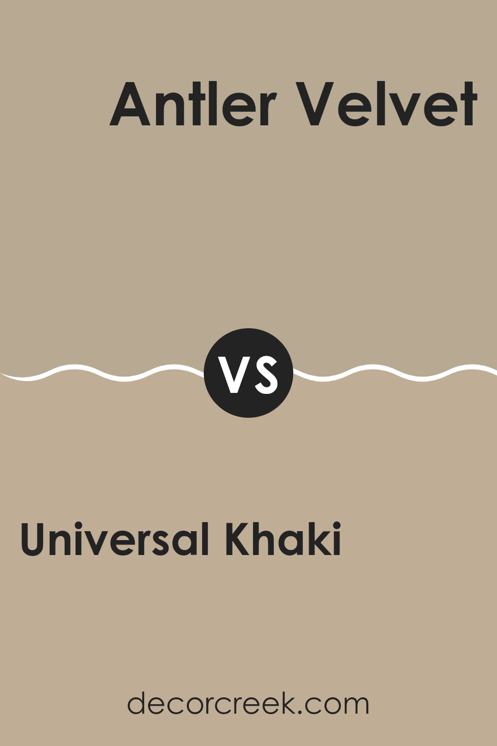
Universal Khaki SW 6150 by Sherwin Williams vs Antler Velvet SW 9111 by Sherwin Williams
Universal Khaki and Antler Velvet are two distinct colors by Sherwin Williams, each bringing its own unique vibe to a space. Universal Khaki is a warm, welcoming beige that’s deep enough to add character yet neutral enough to serve as a versatile backdrop in any room. It pairs well with a wide range of decor, making it a reliable choice for living areas, bedrooms, and even exteriors.
On the other hand, Antler Velvet is a softer, more muted gray with subtle brown undertones. This color is perfect for those looking to create a cozy, understated environment. It’s especially effective in spaces where you want to promote a gentle, calming atmosphere without the starkness that some grays can bring.
Comparing the two, Universal Khaki leans towards a bolder, more definitive presence due to its deeper tone, while Antler Velvet offers a lighter, more restrained look that can help smaller or darker rooms feel more spacious and inviting. Both colors reflect natural elements but in different tones and moods.
You can see recommended paint color below:
- SW 9111 Antler Velvet
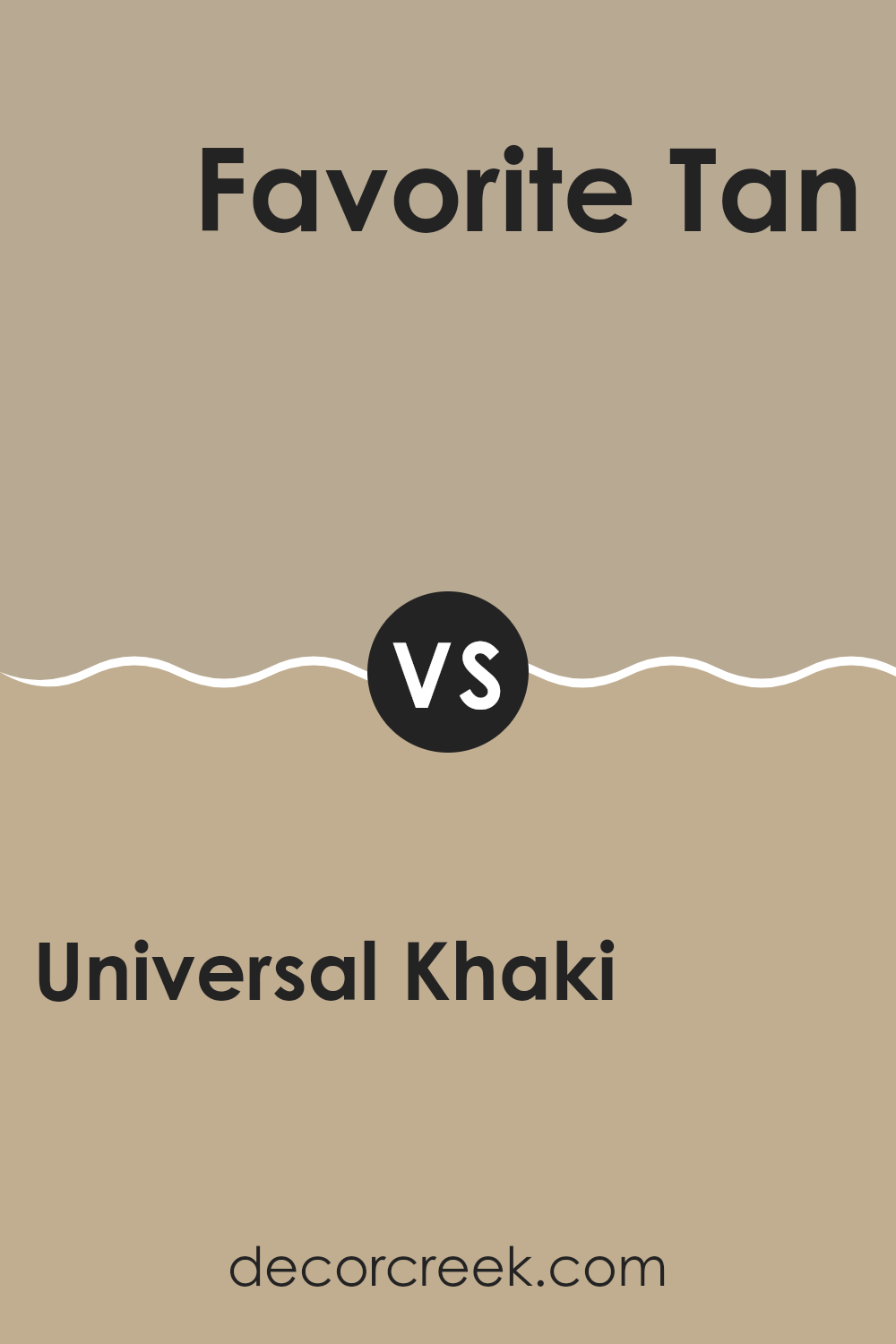
Universal Khaki SW 6150 by Sherwin Williams vs Favorite Tan SW 6157 by Sherwin Williams
Universal Khaki and Favorite Tan are two paint colors from Sherwin Williams that offer subtly different options for a room. Universal Khaki has a slightly darker, grayish-beige tone that can give a warm, cozy feel to spaces. This color is great for creating a solid, comforting background that works well in various areas such as living rooms or bedrooms.
On the other hand, Favorite Tan is a lighter shade that leans more towards a creamy beige. It has a welcoming, soft appeal that brightens up spaces and makes them feel more open and airy. This shade is particularly suitable for smaller rooms or spaces without much natural light, as it can help make the area feel larger.
Both colors are neutral, making them versatile choices that can pair well with various furniture styles and decor elements. Whether one chooses Universal Khaki for its rich depth or Favorite Tan for its light, friendly vibe, both colors offer unique ways to enhance the aesthetic of a room.
You can see recommended paint color below:
- SW 6157 Favorite Tan
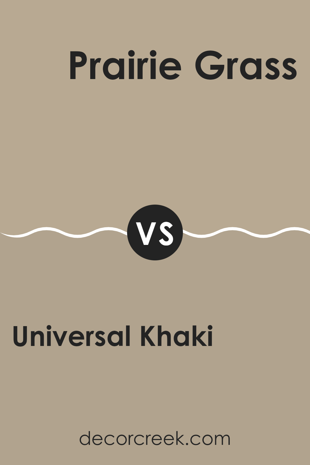
Universal Khaki SW 6150 by Sherwin Williams vs Prairie Grass SW 7546 by Sherwin Williams
Universal Khaki and Prairie Grass by Sherwin Williams are two distinct colors that offer unique qualities for decorating. Universal Khaki is a soft, warm beige with sandy tones. It provides a neutral backdrop, making it easy to pair with various decor styles and colors. Its subtle warmth creates a cozy and welcoming atmosphere in any room.
On the other hand, Prairie Grass is a deeper, muted green with a hint of gray. This color can add a touch of earthiness and calm to your space. It’s particularly good for creating a natural feel, bringing an essence of the outdoors into your home. While both colors are inspired by natural elements, Prairie Grass is darker and richer, giving it the ability to anchor a space or highlight specific areas.
These colors can work well together, balancing the warmth of Universal Khaki with the more grounding Prairie Grass. They suit those looking to integrate natural colors in a simplistic yet effective way.
You can see recommended paint color below:
Universal Khaki SW 6150 by Sherwin Williams vs Sleepy Owlet SW 9513 by Sherwin Williams
Universal Khaki is a warm, neutral shade that brings a cozy and comforting feel to any space. Its earthy tones make it a versatile choice, suitable for living rooms, bedrooms, and even kitchens. It pairs well with a variety of colors and can create a soothing atmosphere in your home.
Sleepy Owlet, on the other hand, is much lighter and has a soft, almost pale quality to it. This color is ideal for creating a gentle and inviting environment. It’s perfect for spaces where you want to relax, such as bedrooms and bathrooms. Because of its lighter tone, Sleepy Owlet can make small rooms appear larger and more open.
Both Universal Khaki and Sleepy Owlet are great options for adding warmth to your home, but they serve different purposes based on their intensity and depth. Universal Khaki, being darker, can anchor a room, while Sleepy Owlet, being lighter, can brighten it.
You can see recommended paint color below:
Universal Khaki SW 6150 by Sherwin Williams vs Outerbanks SW 7534 by Sherwin Williams
Universal Khaki and Outerbanks, both by Sherwin Williams, are two engaging neutral shades that complement a variety of spaces and styles. Universal Khaki has a warm, inviting tone that works well in almost any room, providing a soft, beige backdrop that feels cozy and welcoming. It’s lighter and has a slight yellow undertone, making it bright enough to enhance small spaces or dimly lit rooms.
On the other hand, Outerbanks is a darker, richer color with a grayish-brown undertone. This color offers a grounding effect, making it perfect for creating a strong presence in a space without overpowering it. Outerbanks can also help in making large rooms feel more intimate and cozier.
Both colors are versatile, but their different undertones and depths can influence the mood and perception of a space. While Universal Khaki adds lightness and a sense of openness, Outerbanks offers depth and warmth, making it ideal for more formal or snug settings.
You can see recommended paint color below:
- SW 7534 Outerbanks
Universal Khaki SW 6150 by Sherwin Williams vs Avenue Tan SW 7543 by Sherwin Williams
Universal Khaki and Avenue Tan are both warm, versatile paint colors from Sherwin Williams, yet they have distinct tones that set them apart. Universal Khaki has a deeper, earthier feel, leaning more towards a beige with a hint of gray.
It gives a comforting and stable look, ideal for creating a cozy and inviting atmosphere in living spaces. Avenue Tan, on the other hand, is lighter and has a more neutral tan shade. This color works beautifully to brighten up a room while maintaining a relaxed, welcoming vibe.
Both colors are quite adaptable and can easily complement various decor styles and color schemes. Universal Khaki works well in spaces where you want a bit more warmth and depth, making rooms feel more grounded. Avenue Tan is perfect for those seeking a lighter, fresher look, helping spaces feel more open and airy. Whether you’re painting a busy family room or a quiet study, both colors offer a lovely backdrop that’s both stylish and easy to work with.
You can see recommended paint color below:
- SW 7543 Avenue Tan
Universal Khaki SW 6150 by Sherwin Williams vs Perfect Khaki SW 9612 by Sherwin Williams
Universal Khaki and Perfect Khaki by Sherwin Williams are both neutral shades that lend a calm and cozy feel to any space. Universal Khaki has a slightly warmer tone, making it feel a bit more inviting and homely. It has a touch of yellow, which adds a subtle warmth that works well in living areas and bedrooms where a soft, welcoming ambiance is desired.
On the other hand, Perfect Khaki is cooler and leans towards a more modern look. It has a grayish undertone, giving it a fresher appearance that is versatile for use in both traditional and contemporary settings. This color is excellent for those looking to give their space a clean, crisp feel without going too bright or overwhelming.
Both colors are quite adaptable and can easily pair with various decor styles and furnishings, making them reliable choices for those updating their interiors. Whether one chooses the warmth of Universal Khaki or the cool subtlety of Perfect Khaki largely depends on personal preference and the specific vibe they want to achieve in their space.
You can see recommended paint color below:
Universal Khaki SW 6150 by Sherwin Williams vs Portico SW 7548 by Sherwin Williams
Universal Khaki and Portico by Sherwin Williams are both neutral colors, but they offer different vibes for interior spaces. Universal Khaki is a warmer tone, with a base that hints at yellow and green, making it cozy and inviting. It’s perfect for living areas and bedrooms where a subtle, soft backdrop is desired.
On the other hand, Portico is a bit lighter and cooler compared to Universal Khaki. It has a touch of gray that gives it a fresh and modern feel. Portico works well in spaces that need a bright and airy look, such as kitchens and bathrooms.
While both colors are versatile and can complement various decor styles, the choice between them depends on the mood you want to set for your room. Universal Khaki adds warmth,suitable for a relaxed, comfortable setting. Portico, being lighter and cooler, offers a crisp, clean appearance that can make small spaces appear larger.
You can see recommended paint color below:
- SW 7548 Portico
This color works well with lots of other colors. You can pair it with bright colors like blue or green for a happy, lively vibe, or with dark colors like brown or black for a cozy, comforting feel. It’s also great because it doesn’t go out of style. It looks just as good today as it will years from now, so you don’t have to worry about your room looking old-fashioned.
Also, I found out that it’s easy to find decorations and furniture that match with Universal Khaki. Since it’s a calm color, it lets other colors or fun patterns stand out. You can have a lot of fun decorating your space without making it look too busy.
All in all, I think SW 6150 Universal Khaki by Sherwin Williams is an awesome choice if you want a paint color that makes your room feel warm and friendly, and works well with lots of different decorating styles. It seems like a color that would make all kinds of different rooms look nice and inviting.
Ever wished paint sampling was as easy as sticking a sticker? Guess what? Now it is! Discover Samplize's unique Peel & Stick samples.
Get paint samples

