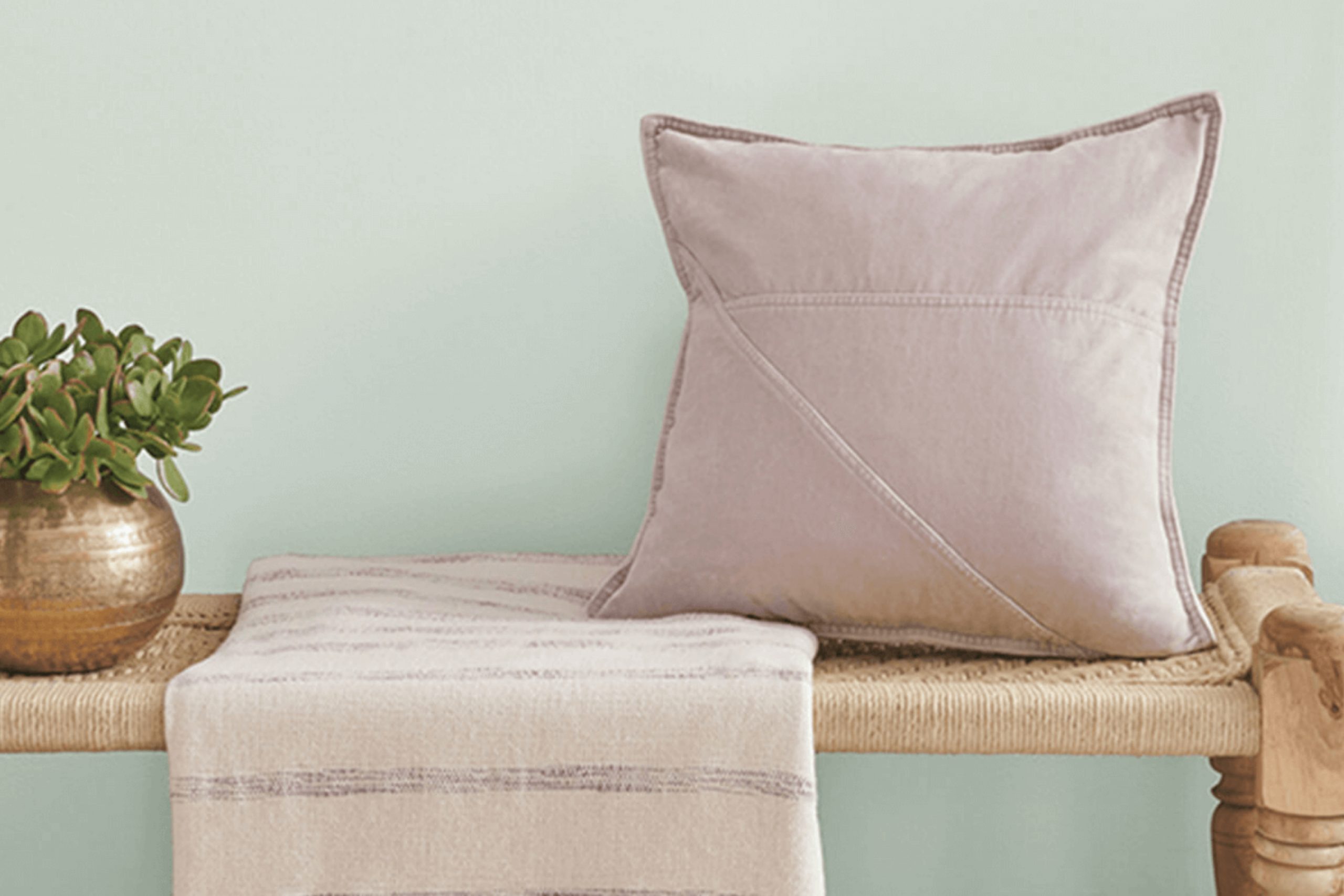
SW 9677 Kingston by Sherwin Williams offers a fresh approach to any room. It brings a unique sense of warmth and richness that draws you in right away. The color isn’t just a backdrop; it becomes part of the room’s personality, adding depth without overpowering You can feel its inviting presence as soon as you walk into the room.
Kingston and classic, providing a flexible option that complements a wide range of styles
Imagine using it in a living room where it adds a cozy, welcoming vibe or in a bedroom where it creates a calm, restful atmosphere.This color has a subtle sophistication that allows it to work beautifully on its own or in harmony with other colors. In any setting, it adds a touch of elegance.
What I love most is how adaptable Kingston is. It suits traditional homes as effortlessly as it does contemporary ones. The color seems to change with the light, offering a dynamic experience throughout the day.
Whether you want to create a comfortable family room or a peaceful retreat, SW 9677 Kingston brings a sense of ease and warmth to any environment.
What Color Is Kingston SW 9677 by Sherwin Williams?
KingstonSW 9677 by Sherwin Williams is a gentle, muted green that brings a fresh yet calm feeling to part of the home. This color has a soft, earthy undertone, making it a flexible choice for many settings. It works wonderfully in interior styles that favor natural elements, such as modern farmhouse, coastal, or transitional designs.
The subtlety of this shade allows it to complement other colors effortlessly, making it a great backdrop without overpowering the room.
In terms of materials, Kingston pairs beautifully with natural wood tones, enhancing the organic vibe. Whether it’s light oak flooring or darker walnut furniture, this color highlights the richness of wood. For textiles, consider incorporating linen or cotton fabrics in light, neutral tones like cream or beige to maintain a soothing atmosphere. Accents in gold or bronze provide a lovely contrast and add warmth to the room.
Textures like woven baskets, jute rugs, or even rattan furniture can enhance the natural aesthetic when paired with Kingston.
This color also harmonizes with stone surfaces, whether it’s a marble countertop or a slate floor, introducing a balanced and welcoming ambiance. Overall, Kingston by Sherwin Williams offers a flexible color choice that can tie various elements together in a room.
Is Kingston SW 9677 by Sherwin Williams Warm or Cool color?
Kingston SW 9677 by Sherwin Williams is a flexible shade of green that brings a refreshing and calm vibe to any room. Its soft, muted tone makes it suitable for various styles, from modern to traditional. This color can create a warm and inviting atmosphere, making it perfect for living rooms, bedrooms, or any room where relaxation is important.
It pairs well with neutral colors like whites and grays, highlighting its soothing nature without overpowering the room. KingstonSW 9677 can also complement natural materials such as wood, enhancing the cozy feel of a home.
In kitchens, this shade can make the room feel clean and vibrant, especially when paired with sleek white cabinetry.
This color works beautifully with gold or brass accents, adding a touch of warmth. Ultimately, KingstonSW 9677 is a great choice for anyone looking to add a gentle, refreshing touch to their home decor.
What is the Masstone of the Kingston SW 9677 by Sherwin Williams?
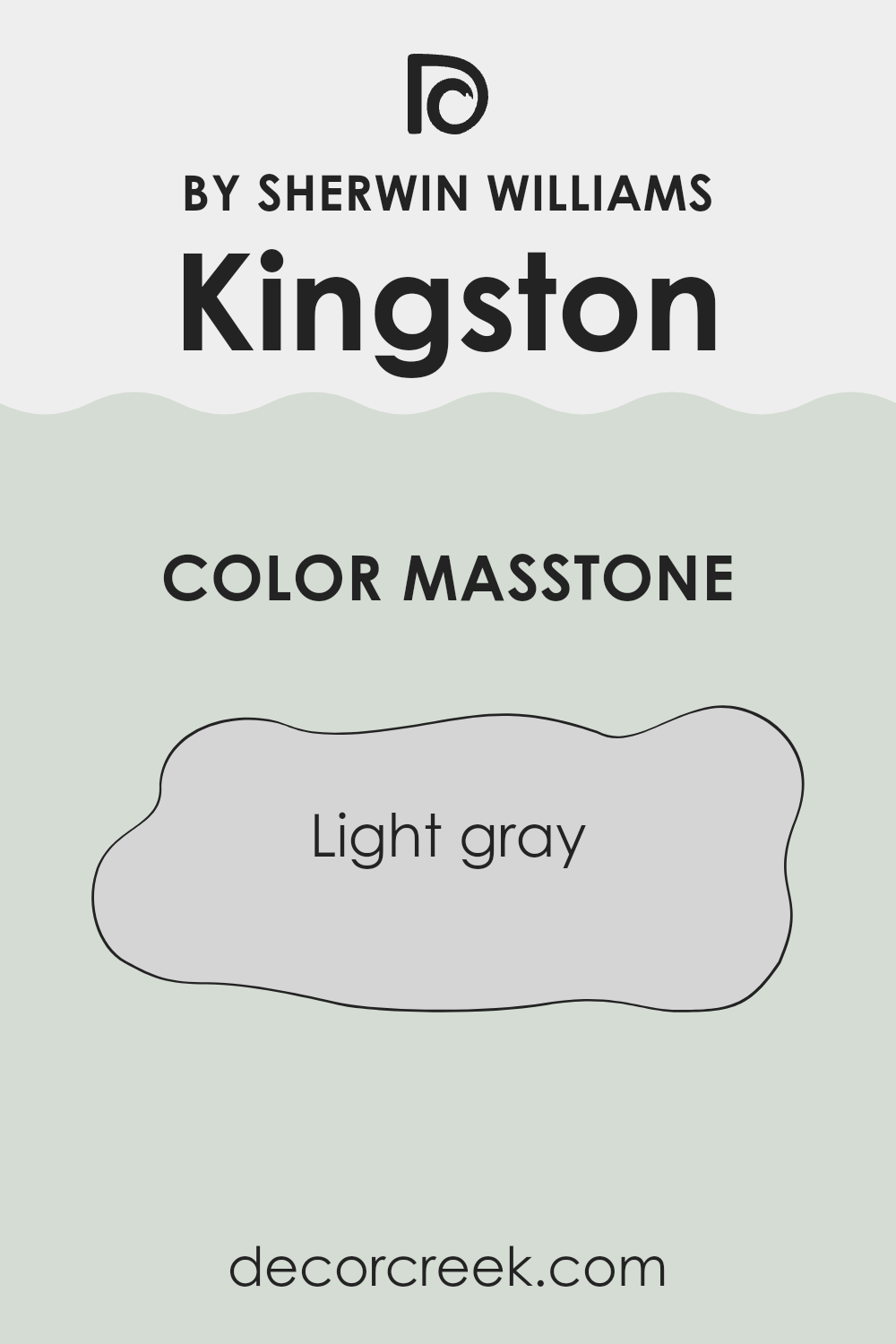
Kingston SW 9677 by Sherwin Williams is a light gray color with a masstone that carries a soft, neutral appearance. This shade works well in homes due to its ability to complement a variety of styles and furnishings. Light gray is adaptable, making it suitable for both modern and traditional areas. Its neutral tone helps create a balanced and calm environment without overpowering other elements in a room.
In living rooms or bedrooms, this color can make interiors feel open and airy, especially if combined with natural light. It acts as a subtle backdrop that allows brighter accents or decor to stand out. In kitchens or bathrooms, light gray provides a clean, fresh look, pairing well with stainless steel, white tiles, or wooden finishes.
Overall, Kingston’s light gray tone offers flexibility, allowing homeowners to easily update a room’s appearance by changing accessories or artwork without needing to repaint.
How Does Lighting Affect Kingston SW 9677 by Sherwin Williams?
Lighting plays a crucial role in how we perceive colors. The color of a paint can look very different under various lighting conditions. Natural light changes throughout the day and differs by direction, affecting how paint colors appear in a room. Artificial lighting, such as LED, fluorescent, or incandescent lights, also alters color appearance, often depending on their color temperature and brightness.
When it comes to the paint color Kingston SW 9677 by Sherwin Williams, it’s important to understand how it behaves under different lighting conditions.
In natural light, particularly in north-facing rooms, which generally have cooler and muted light, Kingston can appear more subdued and cool. This can make the color look slightly darker or grayer than it would in other conditions.
In contrast, south-facing rooms receive more direct sunlight, especially during midday. This abundant natural light can warm up and brighten Kingston, making it appear livelier and more vibrant.
East-facing rooms get the best natural light in the morning. As the sun rises, the light is warmer, but it becomes cooler as the day progresses. Kingston SW 9677 will look brighter in the morning light, possibly with a hint of warmth, while appearing more neutral later in the day.
West-facing rooms benefit from warm and strong sunlight in the late afternoon and evening. Under these conditions, Kingston SW 9677 might reflect warmer tones in the late afternoon sun, potentially appearing richer.
Under artificial light, the color can change again. Cool white LEDs might make Kingston look more muted, while warm lights like incandescent bulbs can enhance any warmer tones in the paint. Understanding these lighting impacts can help in choosing the right placement for Kingston within a home or room, ensuring it consistently meets the desired aesthetic.

What is the LRV of Kingston SW 9677 by Sherwin Williams?
LRV stands for Light Reflectance Value, which is a measure of how much light a color reflects. It’s a scale that goes from 0 to 100, where 0 means the color absorbs all light (pure black), and 100 means it reflects all light (pure white).
When you’re picking a paint color, LRV helps you understand how bright or dark a color will look in a room. A higher LRV means the color reflects more light, making a room feel brighter and more open.
Conversely, a lower LRV means the color absorbs more light, which can make a room feel cozier and more intimate.
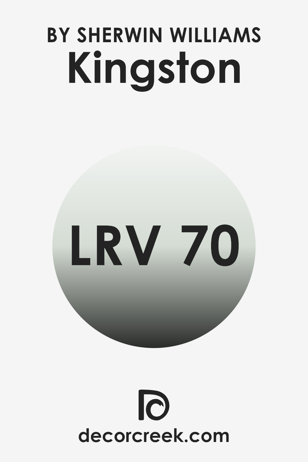
With an LRV of 69.967, Kingston SW 9677 is a color that reflects quite a bit of light. feel larger and more airy. It’s a good choice for rooms that you want to feel bright and inviting.
Because it reflects light so well, this color will also be affected by the lighting in your room. In natural light, it will appear even brighter, while in dimmer lighting, it may take on a softer, more muted tone.
Overall, this LRV value makes it a flexible choice for various rooms, helping to enhance the sense of openness and light.
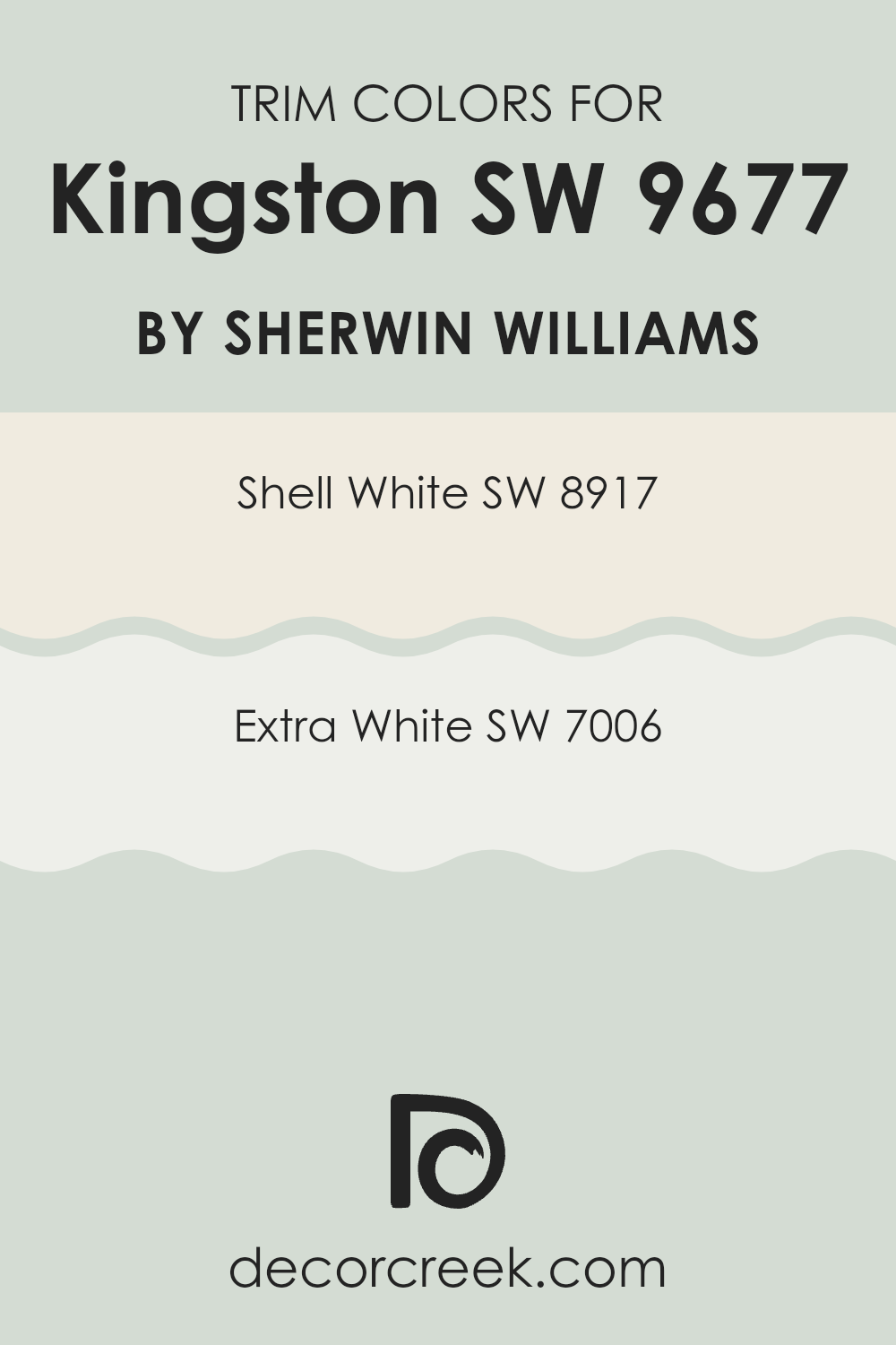
What are the Trim colors of Kingston SW 9677 by Sherwin Williams?
Trim colors are paint colors used on the edges and borders, like door frames, window sills, and baseboards, to provide a finishing touch to a room. They act as accents that contrast or highlight the main wall color, which in this case is KingstonSW 9677 by Sherwin Williams.
Using proper trim colors can make an entire room look more polished and complete. Trim colors can also help draw attention to architectural details or add a crisp, clean feel when paired with certain wall colors. They allow for visual breaks that can make a room look and feel more balanced.
Shell White, SW 8917, is a soft, creamy white with a touch of warmth that pairs well with various colors. It adds an inviting and cozy feeling, perfect for enhancing warmth in a room. Extra White, SW 7006, is a bright, clean white that offers a fresh and modern look. It creates a sharp contrast against deeper tones, making it ideal for highlighting trims and features.
Both these colors are suited for complementing the tones of KingstonSW 9677, providing a pleasant and cohesive aesthetic to any room setting.
You can see recommended paint colors below:
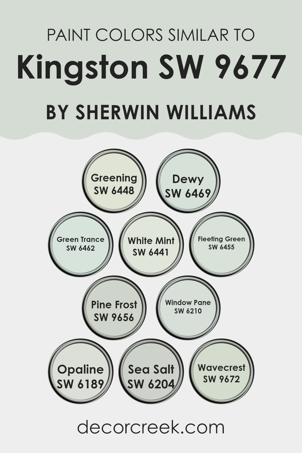
Colors Similar to Kingston SW 9677 by Sherwin Williams
Colors play a crucial role in design and aesthetics, often setting the mood and tone of the room. Similar colors to Kingston 9677 by Sherwin Williams, like SW 6448 – Greening and SW 6469 – Dewy, help create a harmonious look. Greening is a lively, verdant shade that brings a fresh, natural feeling to any room.
Dewy, on the other hand, is a softer green with a hint of blue, reminiscent of the gentle morning mist. These hues work well together, providing a cohesive, balanced atmosphere.
Other similar colors, such as SW 6462 – Green Trance and SW 6441 – White Mint, continue this theme. Green Trance offers a delicate, pastel green that’s perfect for bringing softness to room. White Mint is a clean, crisp hue adding an airy lightness.
SW 6455 – Fleeting Green and SW 9656 – Pine Frost contribute a sense of stability and coolness, with Fleeting Green being a fresh, subtle green and Pine Frost offering a pale, icy touch.
SW 6210 – Window Pane and SW 6189 – Opaline present light, peaceful options that blend easily, while SW 6204 – Sea Salt and SW 9672 – Wavecrest add a slightly blue, calm touch.
Together, these colors create a calm, cohesive palette that is perfect for a peaceful environment.
You can see recommended paint colors below:
- SW 6448 Greening
- SW 6469 Dewy
- SW 6462 Green Trance
- SW 6441 White Mint
- SW 6455 Fleeting Green
- SW 9656 Pine Frost
- SW 6210 Window Pane
- SW 6189 Opaline
- SW 6204 Sea Salt
- SW 9672 Wavecrest
How to Use Kingston SW 9677 by Sherwin Williams In Your Home?
Kingston SW 9677 by Sherwin Williams is a warm and inviting color that can add a cozy touch to any home. This soft, neutral shade of beige works well in various rooms, creating a calm and comfortable atmosphere. You can use this color in living rooms to make them feel more welcoming. It pairs nicely with both light and dark furnishings, making it adaptable for different design styles.
In the bedroom, Kingston can help create a relaxing environment that promotes rest. It complements most bedding colors and adds a subtle backdrop that doesn’t overwhelm the room. For a personal touch, you can accentuate this color with pillows or artwork in shades of blue or green.
In smaller rooms like a home office or hallway, Kingston can brighten the area without making it feel stark. The warm undertone invites a sense of coziness, making it pleasant to spend time in any room painted with this hue.
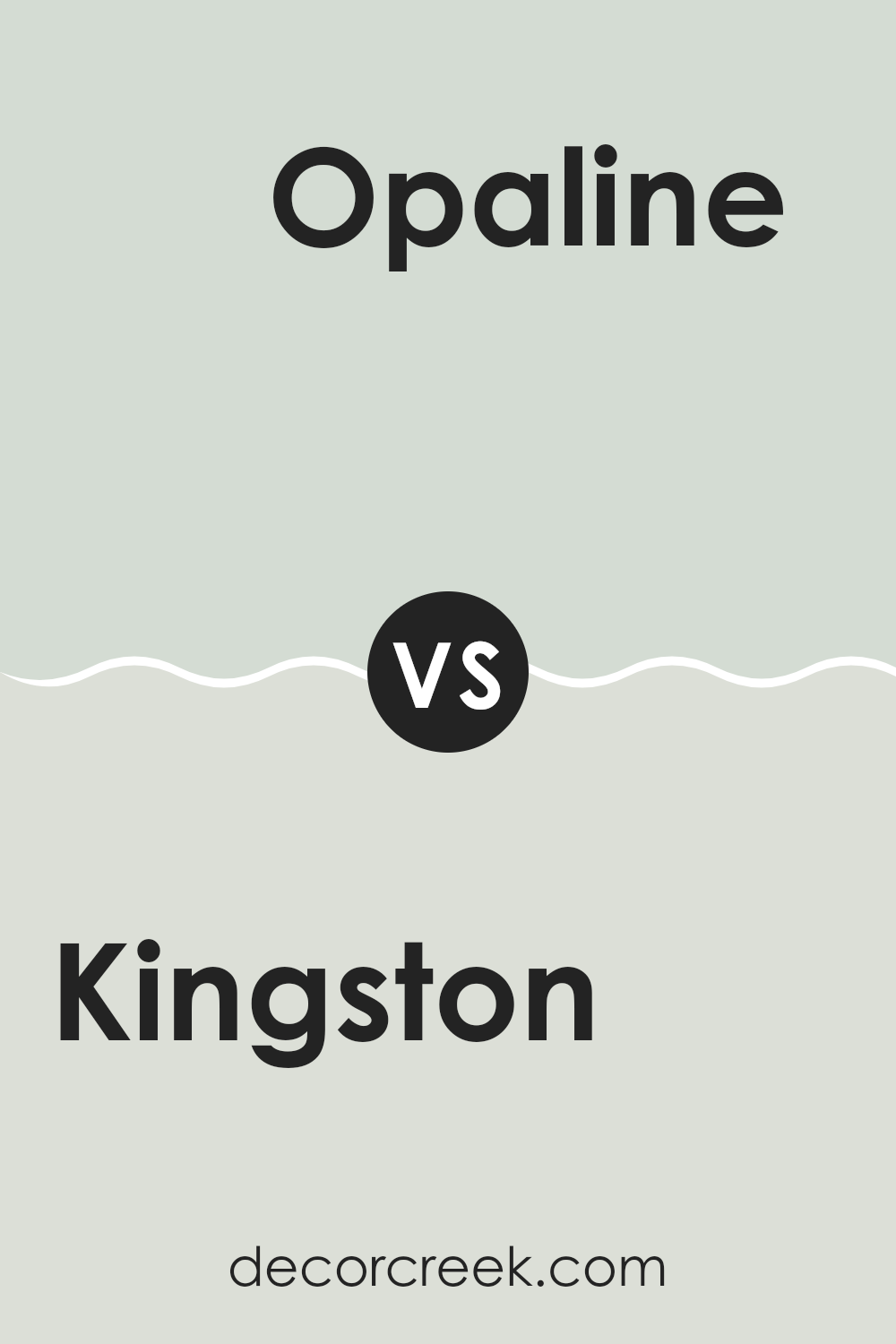
Kingston SW 9677 by Sherwin Williams vs Opaline SW 6189 by Sherwin Williams
Kingston (SW 9677) by Sherwin Williams is a lively green with a hint of yellow, bringing a fresh and natural feel to any room. It’s a bright, cheerful shade that can energize a room and is a great choice for areas where you want an uplifting vibe, such as kitchens or children’s playrooms.
Opaline (SW 6189), on the other hand, is a soft, muted green with more gray undertones. It provides a more relaxed atmosphere, making it suitable for bedrooms or living rooms where a calm environment is desired.
While Kingston is bold and vibrant, Opaline offers a more understated look.
When comparing the two, Kingston will stand out more and be a centerpiece, while Opaline will blend in more seamlessly with other decor, offering a gentle and soothing background. Both colors can work well in different ways, depending on the mood you’re trying to create.
You can see recommended paint color below:
- SW 6189 Opaline
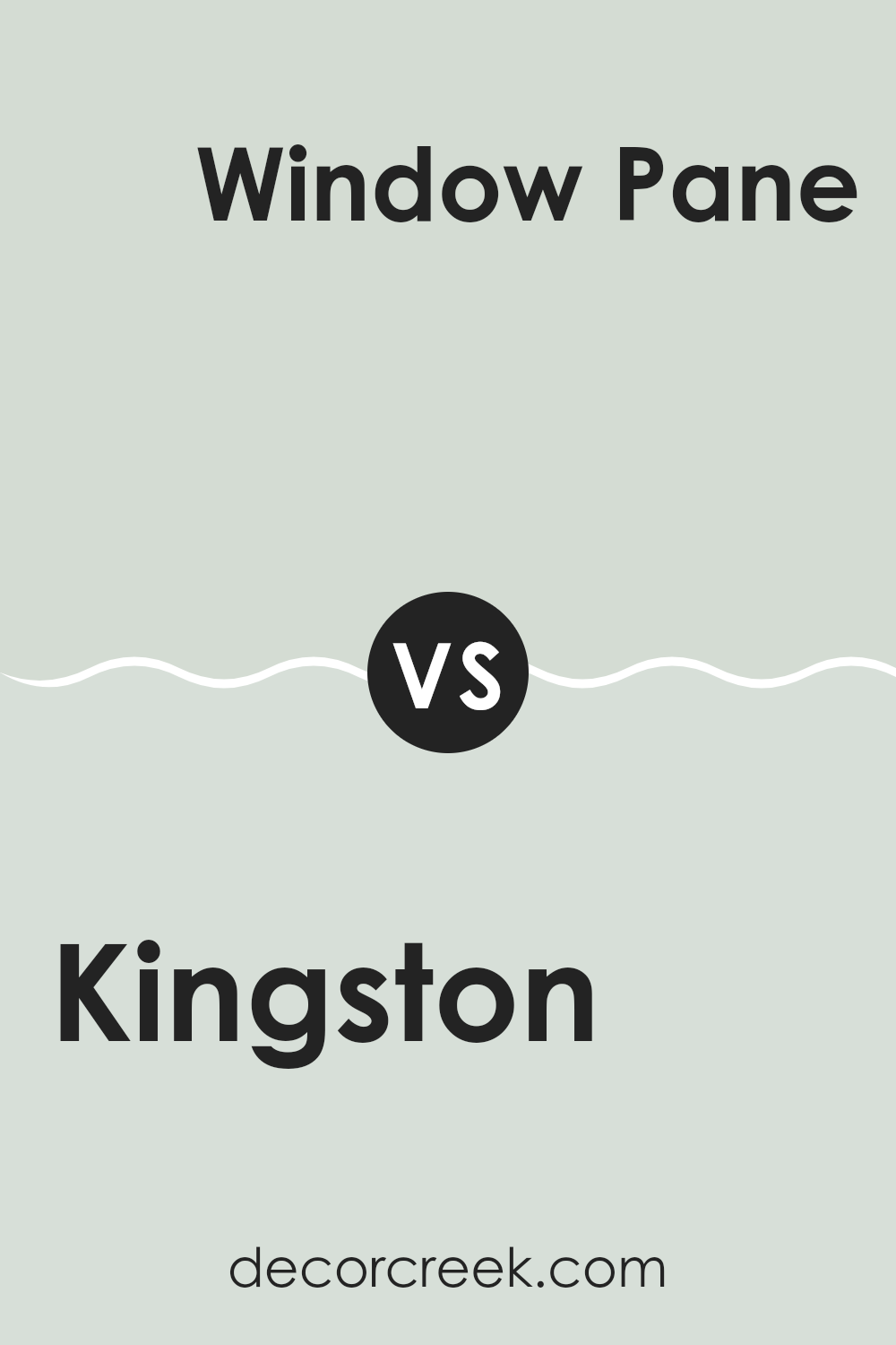
Kingston SW 9677 by Sherwin Williams vs Window Pane SW 6210 by Sherwin Williams
Kingston SW 9677 by Sherwin Williams is a soft, muted green that brings a gentle, natural feel to room. It has an earthy quality that makes rooms feel calm and inviting. This color can create a relaxing environment, thanks to its subtle, soothing nature. It’s perfect for rooms where you want to promote restfulness and comfort.
In contrast, Window Pane SW 6210 is a light, airy blue-green with a fresh, clean appeal. It brings a crisp and revitalizing look to any room. This color works well in roomswhere you want to add a bit of brightness and lightness, making the room feel open and refreshing.
While both colors are soft and calming, Kingston has more of a grounding effect due to its earthy green tone, whereas Window Pane brings a breath of fresh air with its lighter, more vibrant hue. Both can create peaceful rooms but offer different moods.
You can see recommended paint color below:
Kingston SW 9677 by Sherwin Williams vs Green Trance SW 6462 by Sherwin Williams
Kingston by Sherwin Williams offers a soothing and gentle shade. It creates a calming environment that feels light and airy. It’s great for rooms where you want relaxation and peace. On the other hand, Green Trance is also a calming choice but with more energy due to its brighter and more vivid green tone.
While Kingston leans towards a neutral, almost beige-green, Green Trance is distinctly green, making it more lively. Both colors fit well in rooms aimed at comfort but produce different moods. Kingston is more understated and subtle, perfect for a minimalistic approach.
Green Trance, however, brings a bit more color and freshness. So, if you prefer a more neutral and gentle look, Kingston might be the better choice. If you want a bit more color without being overpowering, Green Trance could be the winner
You can see recommended paint color below:
Kingston SW 9677 by Sherwin Williams vs Wavecrest SW 9672 by Sherwin Williams
Kingston SW 9677 and Wavecrest SW 9672 are two beautiful colors by Sherwin Williams that can enhance any room. Kingston is a soft, light shade that resembles a muted pastel with hints of warmth. It’s perfect for creating a calm and welcoming atmosphere without being too intense.
On the other hand, Wavecrest is a gentle, cooler tone with a slight blue undertone. It feels fresh and clean, making it ideal for bathrooms or kitchens where a crisp look is desired. When comparing the two, Kingston has a warmer vibe, while Wavecrest leans towards a refreshing, coastal feel.
Both colors are flexible and can be used in various settings, but the choice between them depends on whether you prefer the warmth and coziness of Kingston or the cool and clean vibe of Wavecrest. Either option can beautifully complement other design elements in your home.
You can see recommended paint color below:
- SW 9672 Wavecrest
Kingston SW 9677 by Sherwin Williams vs White Mint SW 6441 by Sherwin Williams
Kingston and White Mint are two shades by Sherwin Williams that can create distinct looks in room. Kingston is a soft, earthy green that brings a natural and calm feel to a room. It’s subtle and works well in rooms where you want a gentle, relaxing atmosphere. On the other hand, White Mint is a light, fresh, and minty color that brightens up a room. It has a slight hint of blue, adding a crisp, airy feel.
When compared, Kingston offers warmth and depth, ideal for creating a cozy but not overpowering environment. Meanwhile, White Mint is more vibrant and refreshing, perfect for rooms that need a bit of lightness and openness.
Pairing these colors can bring a nice contrast; Kingston can ground a room, while White Mint can add a bit of cheeriness and brightness, making them complementary.
You can see recommended paint color below:
Kingston SW 9677 by Sherwin Williams vs Sea Salt SW 6204 by Sherwin Williams
Kingston SW 9677 by Sherwin Williams is a gentle and fresh green with a hint of mint, offering a light and airy feel. It works well in areas where you want a touch of color without overpowering the senses. This color brings a sense of calm and freshness, making it ideal for bedrooms or living areas.
Sea Salt SW 6204, another color by Sherwin Williams, leans more toward a soft gray-green. It’s a flexible color that changes with the lighting, sometimes appearing more gray or more green.
Sea Salt adds a soothing, coastal feel to any room, making it perfect for bathrooms or bedrooms where a relaxing atmosphere is desired.
Both colors are subtle, but Kingston offers more of a minty vibe, while Sea Salt provides a more muted, ocean-inspired look.
Together, they can complement each other well, with Kingston as an accent and Sea Salt for larger areas.
You can see recommended paint color below:
Kingston SW 9677 by Sherwin Williams vs Pine Frost SW 9656 by Sherwin Williams
Kingston SW 9677 and Pine Frost SW 9656 by Sherwin Williams are both peaceful and inviting colors, but they bring different feelings to room. Kingston is a soft green shade that feels very fresh and airy. It can make a room feel open and connected with nature, bringing a sense of calmness and relaxation.
Pine Frost, on the other hand, is a light blue-green color. Its cooler tones give a refreshing and crisp sensation, resembling a gentle breeze on a cool day.
While Kingston creates a warm and comforting atmosphere, Pine Frost leans towards a cooler and more refreshing vibe. Both colors are flexible and can be used in various settings, but Kingston might suit an area aimed at warmth and coziness, whereas Pine Frost can uplift a room with its clean and airy feelingEach has its unique charm, making them great choices depending on the mood you want.
You can see recommended paint color below:
Kingston SW 9677 by Sherwin Williams vs Dewy SW 6469 by Sherwin Williams
Kingston SW 9677 and Dewy SW 6469 are both soothing colors that can be used in a variety of settings, but they have distinct characteristics. Kingston is a soft, neutral shade that feels calm and warm. It’s flexible and blends well with many different interior styles, providing a nice backdrop that doesn’t overpower a room.
On the other hand, Dewy is a gentle green with a fresh, natural vibe. It has more of a crisp edge compared to Kingston, which gives it a livelier feel. Dewy brings a touch of nature indoors, making it perfect for rooms where you want to feel energized yet relaxed.
Both colors can work well in similar areas like bedrooms or living rooms, but Kingston leans more towards a subtle, earthy tone, whereas Dewy brings a bit of the outdoors inside with its green hue. Choosing between them depends on whether you want a more neutral or nature-inspired look.
You can see recommended paint color below:
- SW 6469 Dewy
Kingston SW 9677 by Sherwin Williams vs Greening SW 6448 by Sherwin Williams
Kingston SW 9677 is a soft, pale green that resembles the fresh buds of spring. It’s gentle and light, creating a calm and airy feel in any room. Kingston is flexible and works well in both large, open areas and smaller, cozy rooms. It brings a subtle hint of color without dominating the senses.
On the other hand, Greening SW 6448 is a deeper, richer green that’s closer to nature. It’s vibrant and full of life, channeling the essence of lush forests or a verdant garden. Greening stands out more and can make a bold statement in a room, adding a sense of energy and vitality.
When comparing these two, Kingston offers a more subdued and calming effect, while Greening is bolder and more lively. Choosing between them depends on whether you want a quiet, understated room or something with a bit more character and energy.
You can see recommended paint color below:
- SW 6448 Greening
Kingston SW 9677 by Sherwin Williams vs Fleeting Green SW 6455 by Sherwin Williams
Kingston SW 9677 and Fleeting Green SW 6455 by Sherwin Williams are two different yet beautiful shades of green. Kingston is a muted, earthy green that feels grounded and calming. It’s a flexible color that pairs well with natural wood tones and neutral shades, making it a great choice for cozy areas or rooms where you want to relax.
On the other hand, Fleeting Green is a lighter, fresher shade. It has a lively and bright quality that can energize room. It’s perfect for adding a splash of freshness and works well in bathrooms or kitchens where you might want a more vibrant feel.
Both colors bring the feeling of nature indoors but in distinct ways. Kingston offers a more subdued, relaxed atmosphere, while Fleeting Green brings in a touch of liveliness and renewal. Choosing between them depends on whether you want a warm, cozy setting or a fresh, invigorating room.
You can see recommended paint color below:
- SW 6455 Fleeting Green
In conclusion, SW 9677 Kingston by Sherwin Williams is an amazing paint color that brings a happy, fresh feeling to any room. It’s like bringing a piece of the ocean or sky into your home. When I first saw Kingston, it reminded me of a bright sunny day at the beach.
This color is really great because it makes small rooms feel bigger and brighter. It’s perfect for a bedroom where you want to feel relaxed and cozy.
When you wake up, it will make you feel like it’s a sunny day every day. It is also a fun choice for living rooms, where family and friends gather, because it creates a happy and friendly place.
One of the best things about Kingston is that it goes well with many other colors. You can add bright yellow or green for a cheerful look, or pair it with white and gray for a more calming feeling. It’s like having a color that can change depending on what you want.
Overall, SW 9677 Kingston is a fantastic choice that can make any room come alive while making people feel cheerful and comfortable. I really love how this color can change the feel of a home, making it special and inviting. It’s like having a little bit of sunshine indoors!
Ever wished paint sampling was as easy as sticking a sticker? Guess what? Now it is! Discover Samplize's unique Peel & Stick samples.
Get paint samples

