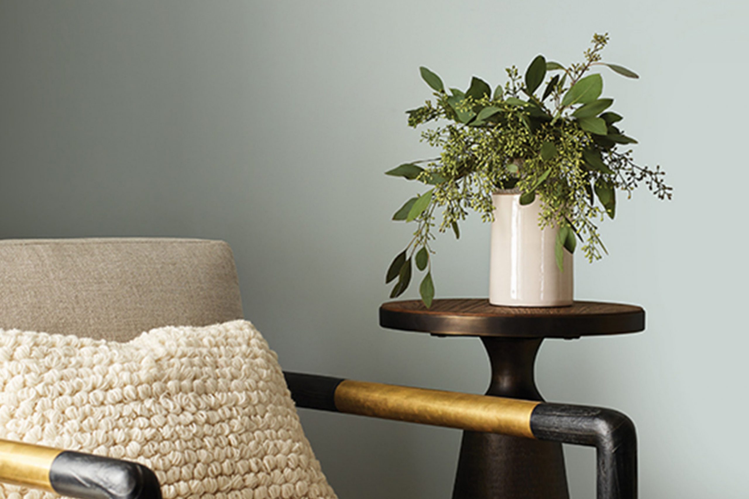
When you’re looking to refresh a room with a feeling of wintery elegance, SW 9656 Pine Frost by Sherwin Williams might just be the perfect choice. This color has a gentle balance between being cool and inviting, with its soft green hue reminiscent of a frosty pine forest early in the morning.
As a muted yet fresh color, Pine Frost provides a unique alternative to traditional neutrals, bringing a subtle hint of nature indoors. Whether you’re looking to paint an entire room, add an accent wall, or simply refresh old furniture, this shade offers versatility and a serene backdrop for both modern and traditional styles.
In the following paragraphs, I’ll share my personal experiences with Pine Frost, including tips on best applications and complementary colors, to help you make the most out of this serene shade.
What Color Is Pine Frost SW 9656 by Sherwin Williams?
Pine Frost by Sherwin Williams is a fresh, light green color that boasts subtle blue undertones. This unique shade is reminiscent of early spring foliage or the lively tint of pine needles dusted with frost. Its lightness brings a breezy, airy feel to any space, making it perfect for creating a lively and inviting atmosphere without overwhelming the senses.
Pine Frost works wonderfully in several interior styles, especially in coastal, modern farmhouse, and Scandinavian designs. These styles often favor clean, bright spaces, and Pine Frost complements them by adding a touch of natural vibrancy without clashing with other design elements.
When it comes to pairing materials and textures, Pine Frost goes well with natural wood tones, from light beech to richer walnut. These combinations can evoke the feeling of being in a peaceful, forested retreat. Soft, plush textures like wool or cotton in neutral colors also work well alongside Pine Frost, as they help to soften the room’s look while maintaining a cozy, comfortable feel. For a more dynamic look, consider using metallic finishes like brushed nickel or matte black, which provide a modern contrast to Pine Frost’s light and airy hue.
By using Pine Frost, you can easily refresh your space, giving it a lively yet comfortable feel that suits various tastes and styles.
Is Pine Frost SW 9656 by Sherwin Williams Warm or Cool color?
Pine Frost by Sherwin Williams is a soft and muted green shade that works well in homes looking to create a soothing and fresh environment. This color can easily blend with natural materials like wood and stone, making it a great choice for living rooms and bedrooms where a calm atmosphere is desired.
Its light green tone can make small spaces appear larger and more open, while still bringing a touch of nature indoors. This color is also versatile enough to be paired with both dark and light furniture, offering flexibility in home decor. Pine Frost is particularly effective in places that receive a lot of natural light, where its subtle green hues can be fully appreciated.
It’s an ideal choice for anyone who wants to keep their home feeling airy and light without being too bold or overpowering.
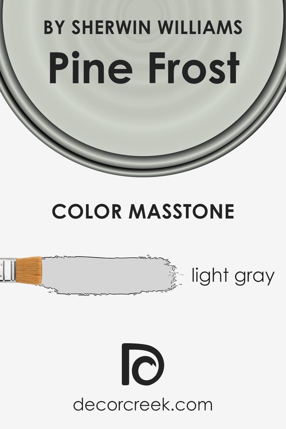
What is the Masstone of the Pine Frost SW 9656 by Sherwin Williams?
Pine Frost, a light gray shade (#D5D5D5), brings a soft and neutral tone that works well in various home settings. Since it doesn’t overpower, it makes rooms look larger and airier, making it ideal for small spaces.
This light gray can also serve as a backdrop, allowing furniture and decor to stand out, which is great for highlighting statement pieces or colorful artwork. Additionally, it helps maintain a clean and orderly appearance in a home, as it hides small imperfections better than darker colors and doesn’t show wear easily.
It’s versatile enough to work in any room, from kitchens to bedrooms, and can adapt to both modern and traditional styles. This adaptability makes it a practical choice for many homeowners looking to add a fresh look without committing to bold colors.
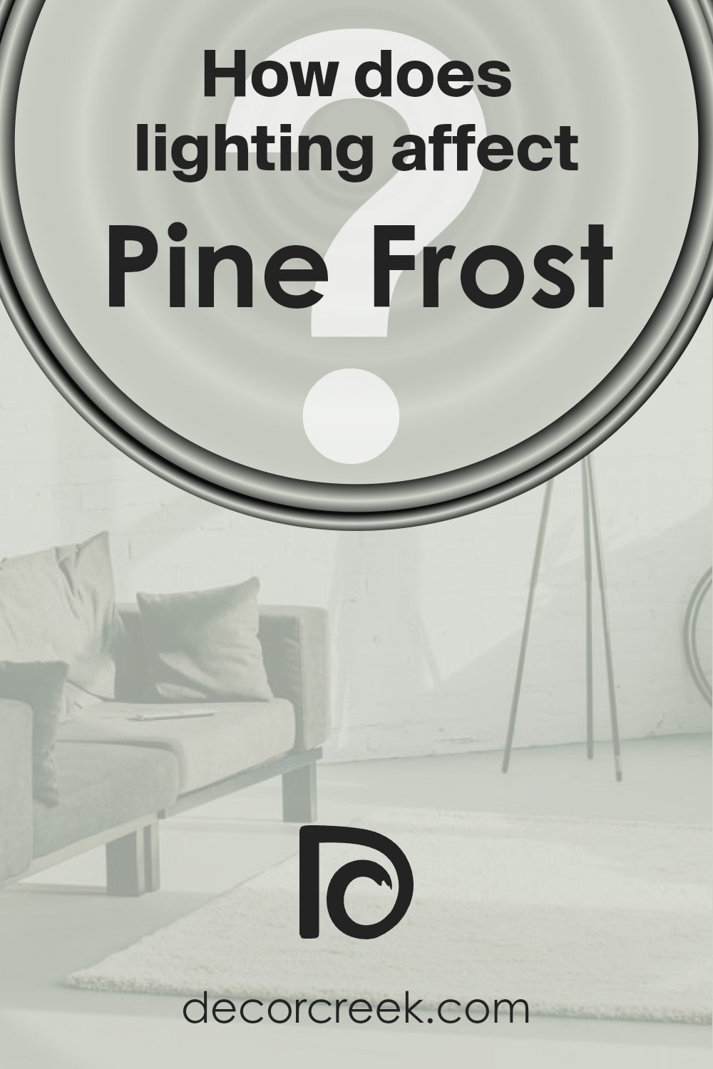
How Does Lighting Affect Pine Frost SW 9656 by Sherwin Williams?
Lighting has a significant impact on how we perceive colors. The type of light, whether natural or artificial, can change how a color looks on your walls. Each light source brings out different undertones in a color and can make it appear differently at various times of the day or in different settings.
For instance, the color Pine Frost, a light and airy shade, reacts diversely under different lighting conditions. In natural light, this color tends to look bright and vibrant because natural light is usually more balanced, providing a true representation of the color. This makes Pine Frost an excellent choice for rooms that receive a lot of daylight.
In artificial lighting, the appearance of Pine Frost can vary based on the type of bulbs used. Warmer bulbs may bring out creamy undertones, making the room feel cozy, while cooler bulbs could highlight bluish tones, giving the walls a crisper look.
Different room orientations also affect how Pine Frost looks:
- North-Faced Rooms: These rooms get less direct sunlight, which can make colors appear cooler. Pine Frost might look more subdued and slightly cooler in tone in a north-facing room.
- South-Faced Rooms: These rooms benefit from abundant sunlight most of the day, which can amplify the vibrancy of Pine Frost, making walls feel lively and bright.
- East-Faced Rooms: These rooms get plenty of morning light. Pine Frost will appear softer and more delicate in the morning, gradually returning to its natural light color as the day progresses.
- West-Faced Rooms: In these rooms, the color will experience the warm, intense late afternoon sunlight which can make Pine Frost glow warmly in the evenings.
Overall, the color Pine Frost is versatile and reacts dynamically to various lighting conditions, making it a flexible choice for many spaces. Choosing the right lighting can enhance its beauty, making your space more enjoyable.
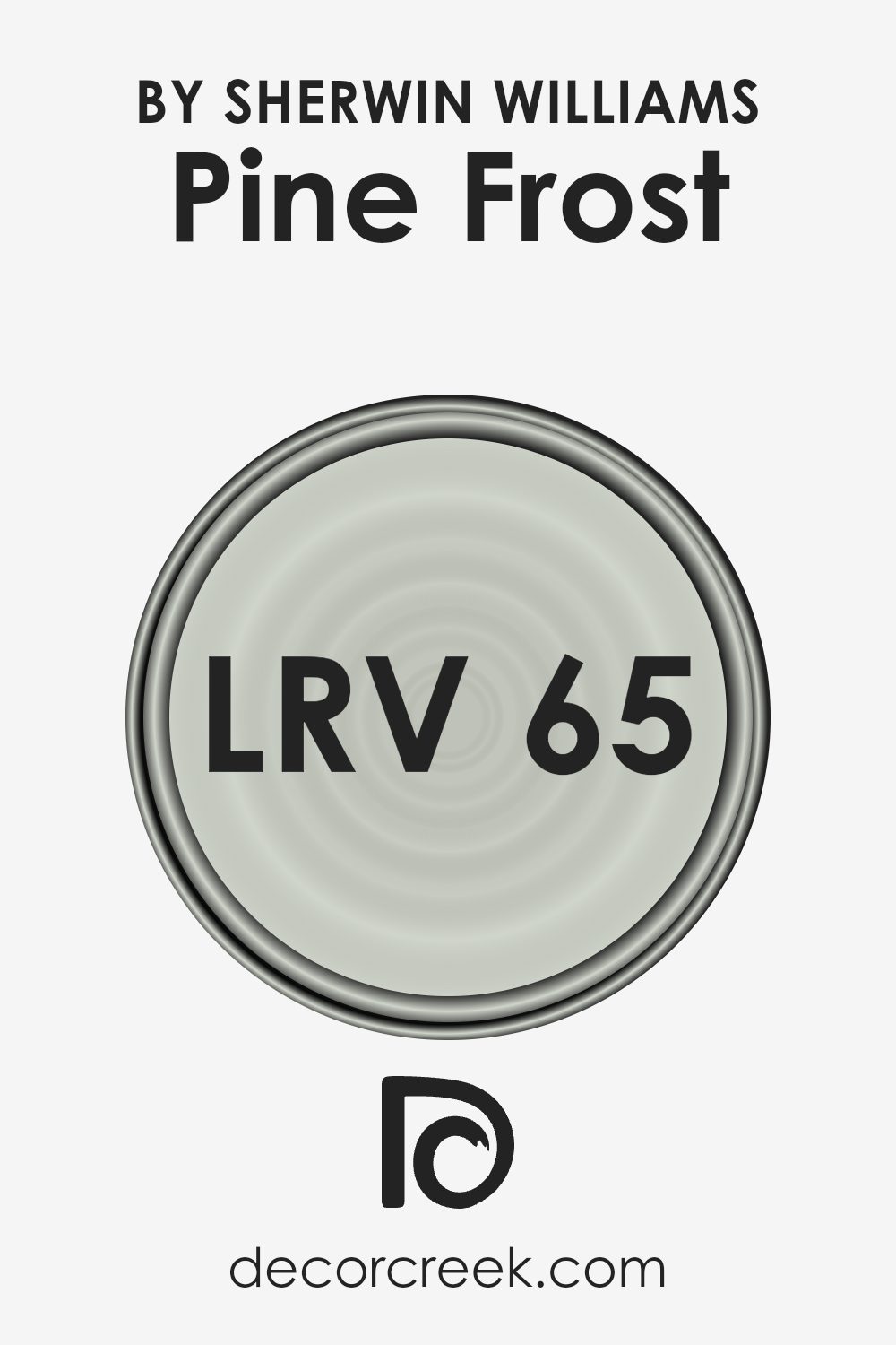
What is the LRV of Pine Frost SW 9656 by Sherwin Williams?
LRV stands for Light Reflectance Value, which is a measure used to determine how much light a paint color will reflect back into a room versus absorbing it. This measurement is expressed as a percentage on a scale where dark colors have lower values and lighter colors have higher values, indicating how much light they reflect.
LRV is crucial for selecting colors because it helps you understand how light or dark a color will look once applied to your walls. For instance, a higher LRV means the color will reflect more light, making a room feel brighter and more open, whereas a lower LRV means the color will absorb more light, which can make a space feel cozier and smaller.
Considering the LRV of Pine Frost at 65.148, this color would reflect a decent amount of light back into the room, making it a good choice for spaces that need to feel more open and airy. This particular value indicates that the color is on the lighter side but still possesses enough depth to provide some warmth and character to the space.
In rooms that may not receive a lot of natural sunlight or are smaller in size, using this color could help in making the area appear bigger and more inviting. By reflecting a fair amount of light, Pine Frost can help in brightening a room while still adding a subtle hint of color to the walls.
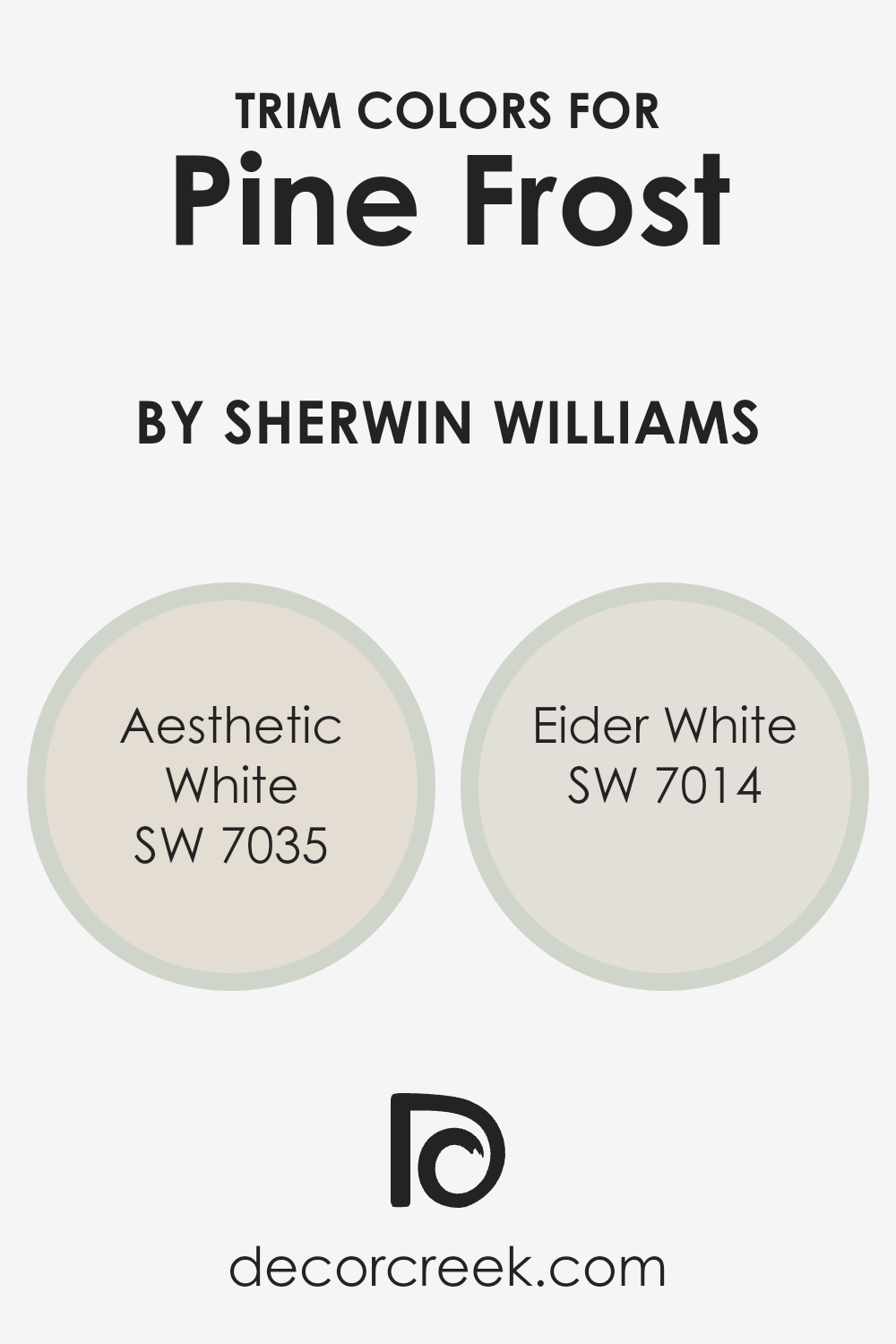
What are the Trim colors of Pine Frost SW 9656 by Sherwin Williams?
Trim colors are used to highlight or complement the main color on walls, doors, windows, and other architectural features. By selecting the right trim colors, you can enhance the overall appearance and create a subtle but effective contrast or continuity in your space. For a fresh, clean color like Pine Frost by Sherwin Williams, choosing the right trim colors is crucial to achieve a cohesive and appealing aesthetic. SW 7035 – Aesthetic White and SW 7014 – Eider White are excellent choices as trim colors with Pine Frost due to their light and neutral tones which align well with the crispness of Pine Frost without overpowering it.
SW 7035 – Aesthetic White offers a slightly off-white tone that provides a gentle contrast, perfect for softening the edges and making a space feel more welcoming. Its warmth works well in balancing the coolness of Pine Frost, bringing a harmonious vibe into the room.
On the other hand, SW 7014 – Eider White presents a greyish-white hue that aligns more closely with the modern aesthetics, giving a slightly sharper contrast against Pine Frost while still maintaining a unified look. Both colors are versatile and can be used across different styles and spaces, enhancing the overall appeal by creating a neat and finished look.
You can see recommended paint colors below:
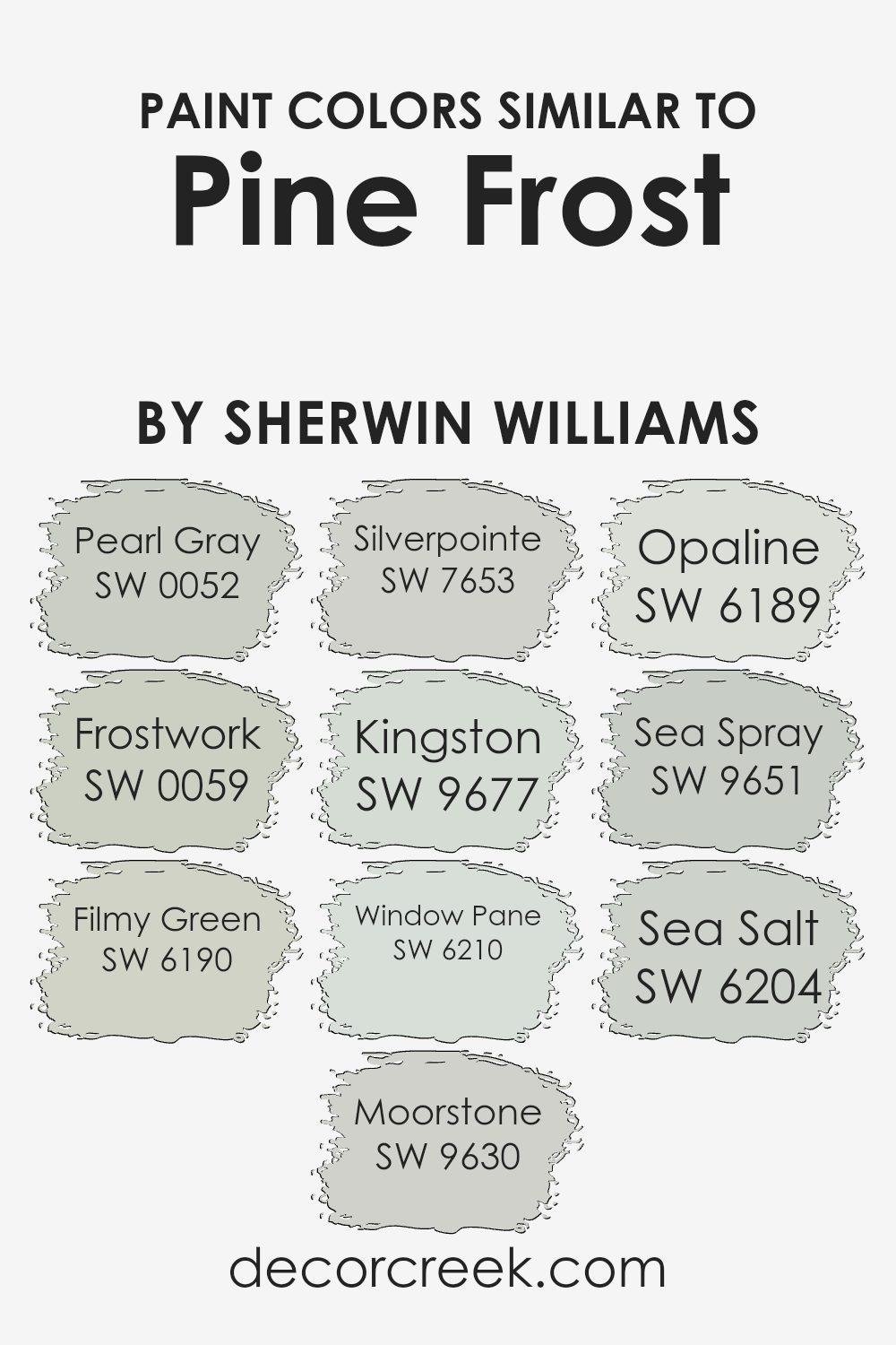
Colors Similar to Pine Frost SW 9656 by Sherwin Williams
Selecting similar colors for a space can create a sense of harmony and coherence in interior design. When colors closely relate, like shades inspired by Pine Frost, they seamlessly blend to produce an environment that’s soothing and pleasing on the eyes. For example, colors like Pearl Gray bring a subtle neutrality reminiscent of a cloudy sky, setting a calm backdrop. Frostwork adds a slightly lighter touch, infusing a whisper of gentle gray that enhances spaces by giving them a fresher feel.
Filmy Green, with its soft, muted tone, offers a hint of nature and pairs beautifully with earthier colors like Moorstone, which lends a grounded, sturdy essence similar to that of wet stones. Silverpointe is another great companion, providing a light gray with a touch of silver, perfect for a cool undercurrent in a room.
Kingston introduces a deeper gray, adding depth and a touch of drama without overwhelming. Window Pane, by comparison, offers a clear, crisp greenish tone, refreshing a space without effort. Opaline, a very soft green, gives off a near-imperceptible warmth, ideal for creating a soft, welcoming ambiance.
Sea Spray and Sea Salt, meanwhile, evoke the feeling of a breezy ocean side morning, with their light and airy blue-green shades, perfect for enhancing the feeling of light in any room.
Together, these shades complement Pine Frost and increase the design possibilities, allowing for a variety of thematic approaches and mood settings.
You can see recommended paint colors below:
- SW 0052 Pearl Gray
- SW 0059 Frostwork
- SW 6190 Filmy Green
- SW 9630 Moorstone
- SW 7653 Silverpointe
- SW 9677 Kingston
- SW 6210 Window Pane
- SW 6189 Opaline
- SW 9651 Sea Spray
- SW 6204 Sea Salt
How to Use Pine Frost SW 9656 by Sherwin Williams In Your Home?
Pine Frost SW 9656 by Sherwin-Williams is a calming shade of green that brings the feeling of a peaceful forest into your home. It’s a versatile color that can be used in various ways to freshen up your living space. For example, you can paint your bedroom walls with Pine Frost to create a cozy and relaxing environment that makes you feel close to nature. It’s also a great choice for bathrooms, as the color pairs well with white trim or fixtures, giving the space a clean and refreshing look.
In the living room, consider using Pine Frost for an accent wall to add a splash of color without overwhelming the room. This shade also works well in the kitchen, perhaps on cabinets or an island, where it can give the space a unique and inviting atmosphere.
Overall, Pine Frost is a great choice if you want to introduce a natural, calming color into your home. It helps set a peaceful mood and looks good in many different rooms.
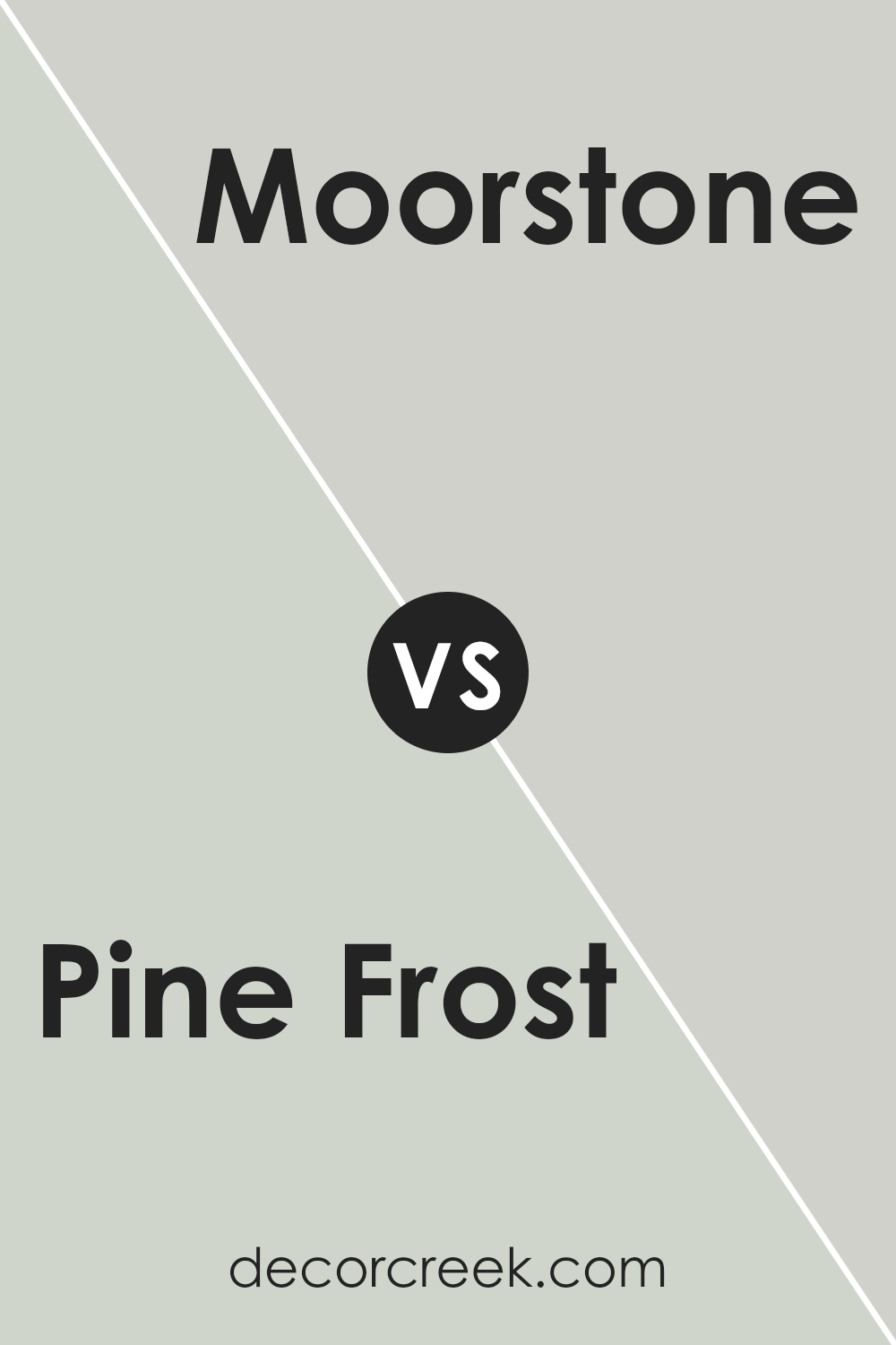
Pine Frost SW 9656 by Sherwin Williams vs Moorstone SW 9630 by Sherwin Williams
Pine Frost and Moorstone are both unique colors from Sherwin Williams. Pine Frost is a light, crisp green that has a refreshing and calm feel. It resembles the subtle hues of early winter frost on pine needles, providing a clean and airy vibe to any space. This color is particularly good for creating a bright and inviting atmosphere.
On the other hand, Moorstone is a much darker, neutral shade. It’s a muted grey with hints of earthy brown, making it a versatile option for areas where a more understated and grounding color is desired. This color works well in settings where you want to add depth or underscore other design elements without overwhelming them.
Both colors offer their distinct characteristics: Pine Frost breathes life and light into a room, while Moorstone offers a strong, quiet background. Their uses can vary greatly depending on the mood or style you’re aiming to achieve in your decorating projects.
You can see recommended paint color below:
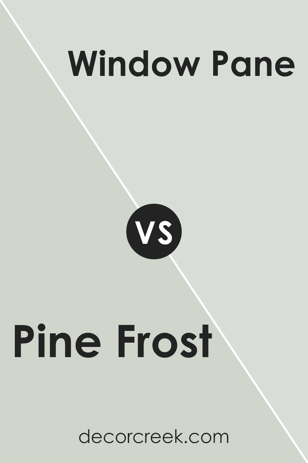
Pine Frost SW 9656 by Sherwin Williams vs Window Pane SW 6210 by Sherwin Williams
Pine Frost and Window Pane are two different paint colors you might consider for your space. Pine Frost is a soft, light green with a slightly muted tone, giving it a fresh and calm look. It’s a color that doesn’t shout for attention but quietly anchors a room with an airy feel.
On the other hand, Window Pane is a cooler, very pale blue that almost leans towards a neutral tone. This color is perfect if you want a hint of color while staying close to a traditional white. It reflects light beautifully, making a room look larger and more open. When comparing these two, Pine Frost offers a hint of earthy green for a natural touch, whereas Window Pane provides a subtle splash of blue for a clean and light effect.
Both colors are gentle, but they bring different vibes — earthy versus airy — depending on what feel you want in your space.
You can see recommended paint color below:
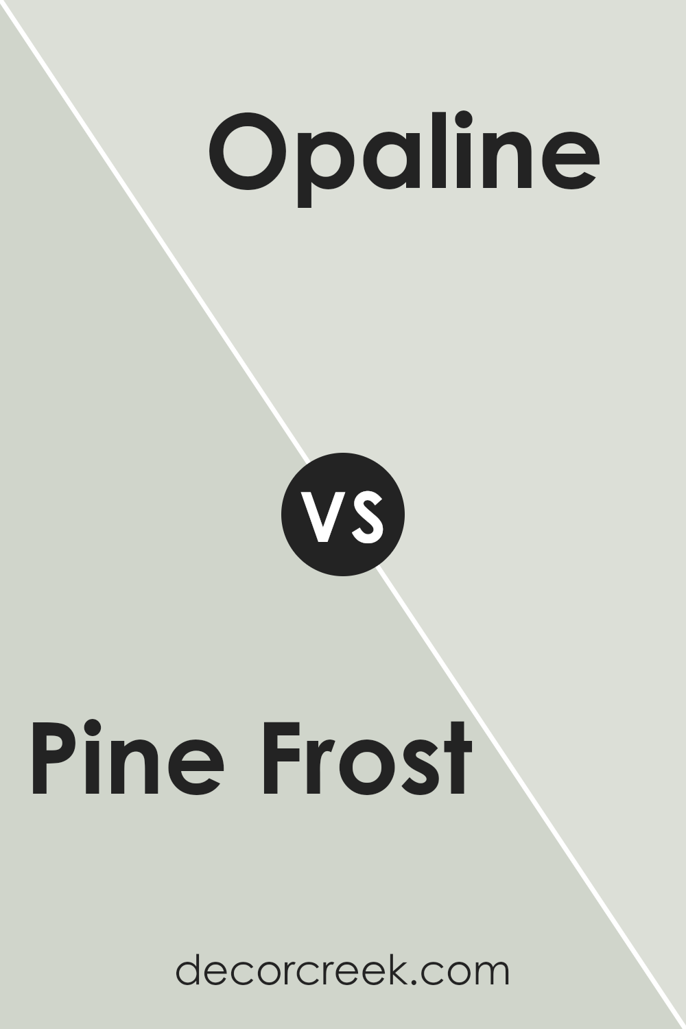
Pine Frost SW 9656 by Sherwin Williams vs Opaline SW 6189 by Sherwin Williams
Pine Frost and Opaline are two shades from Sherwin Williams, each bringing their own unique appeal. Pine Frost is a crisp green, reminiscent of early morning frost on pine needles, giving a fresh and lively feel to spaces. This color is perfect for areas where a touch of nature is desired to create a lively and refreshing atmosphere.
On the other hand, Opaline is a soft, pale green with a hint of gray, delivering a subtle and soothing presence. It has a lightness that can brighten a room while keeping the mood gentle and relaxed. Opaline works well in spaces meant for calm and gentle reflection, such as bedrooms or quiet reading corners.
While both colors share a green base, Pine Frost swings towards a vibrant energy, and Opaline leans into a peaceful softness. Choosing between them depends on whether you want the dynamism of a forest in spring with Pine Frost or the muted calm of a cloudy day with Opaline.
You can see recommended paint color below:
- SW 6189 Opaline
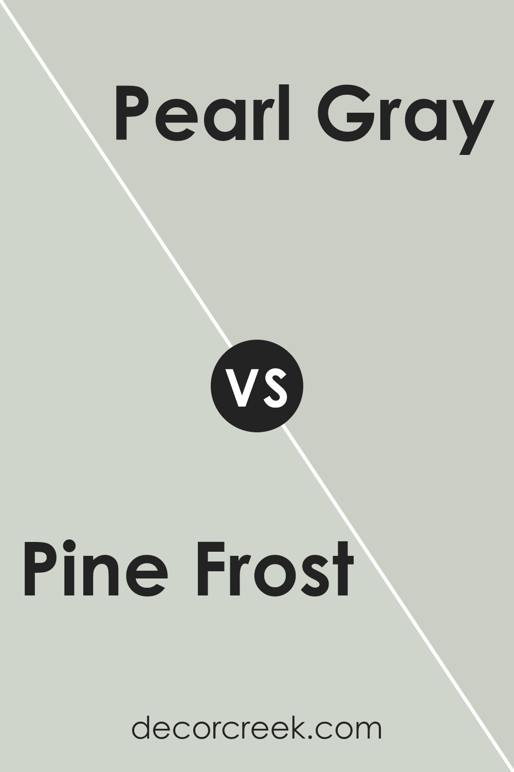
Pine Frost SW 9656 by Sherwin Williams vs Pearl Gray SW 0052 by Sherwin Williams
Pine Frost by Sherwin Williams is a light green hue that brings a refreshing and gentle feel to spaces. Its subtlety makes it a great option for creating a relaxed atmosphere in areas like bedrooms and living rooms. On the other hand, Pearl Gray is a soft neutral gray with a warm undertone, promising a cozy and inviting environment. This gray is versatile and pairs well with various decor styles, making it suitable for many different rooms including kitchens and bathrooms.
When comparing the two, Pine Frost injects more color and energy into a space due to its green tone. It’s perfect for those who enjoy a touch of nature and a lively but still calming color palette.
Pearl Gray, however, is more understated and timeless, providing a solid foundation for any color scheme, and works well in spaces where you want an enduring look without the brightness of more pronounced colors. Both colors are light and airy, providing rooms with a sense of increased space and light.
You can see recommended paint color below:
- SW 0052 Pearl Gray
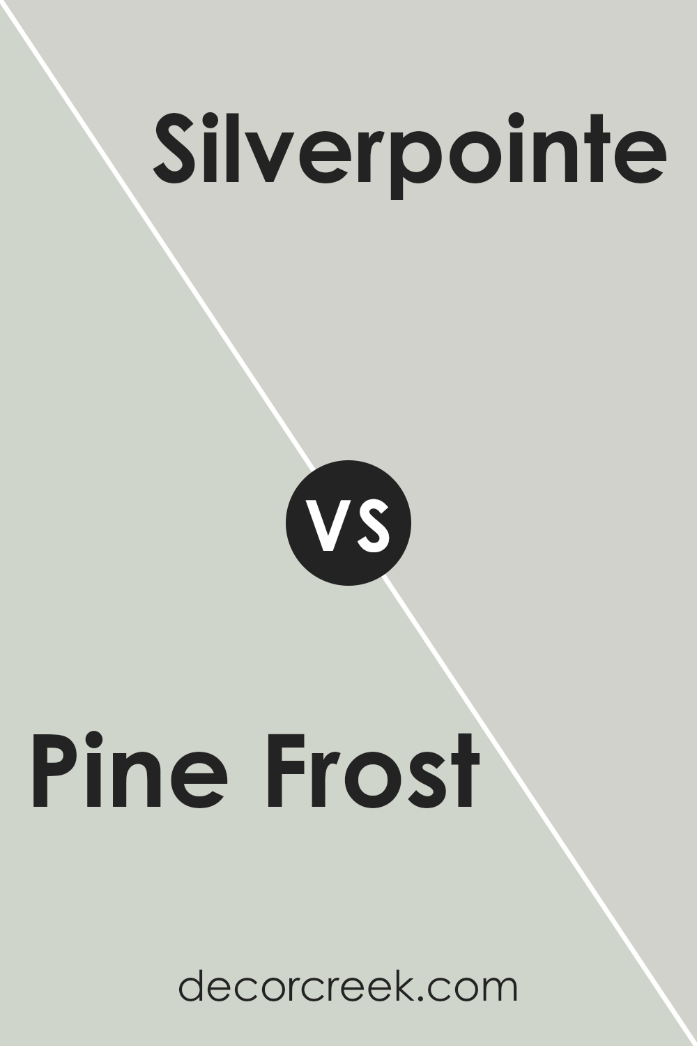
Pine Frost SW 9656 by Sherwin Williams vs Silverpointe SW 7653 by Sherwin Williams
Pine Frost and Silverpointe are two colors by Sherwin Williams that both bring their unique vibe to a space. Pine Frost is a lighter, cooler green that has a subtle hint of freshness, similar to early morning frost on pine leaves. It gives a room a clean and airy feel, making it perfect for spaces where you want a touch of natural elements without overwhelming green tones.
On the other hand, Silverpointe is a soft gray shade that leans slightly towards the cooler end of the spectrum. This color is versatile and unassuming, making it an excellent choice for modern homes looking for a neutral backdrop. It pairs well with a wide range of decor styles and adds a polished look without being too bold.
While both colors are light and can help make a small room look bigger, Pine Frost adds a gentle whisper of color, and Silverpointe offers a sleek, minimalistic charm. They could even work well together in different areas of a home for those who enjoy a subtle contrast.
You can see recommended paint color below:
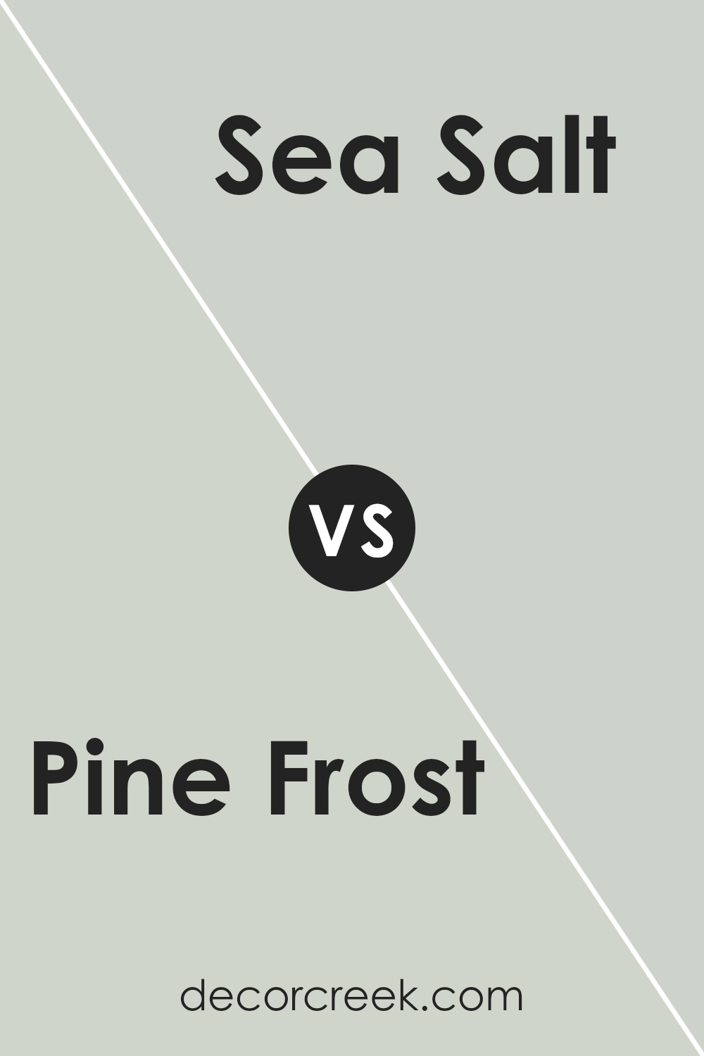
Pine Frost SW 9656 by Sherwin Williams vs Sea Salt SW 6204 by Sherwin Williams
Pine Frost and Sea Salt by Sherwin Williams are both soft and subtle colors, but they have distinct tones and moods. Pine Frost is a cooler, light green with a hint of gray. It brings to mind the fresh, crisp feel of a wintry forest. This color can make a room feel calm and refreshed.
On the other hand, Sea Salt is a lighter shade that blends green and gray in a way that leans slightly towards blue. It tends to give spaces a breezy, open feeling, similar to a calm day at the beach. It’s quite versatile and works well in many different settings, potentially making a room look bright and airy.
While Pine Frost feels more like a quiet, frosty morning, Sea Salt evokes a clean, gentle ocean breeze. Both colors are great for creating a relaxed environment, but your choice might depend on whether you prefer a hint of the forest or the sea in your decor.
You can see recommended paint color below:
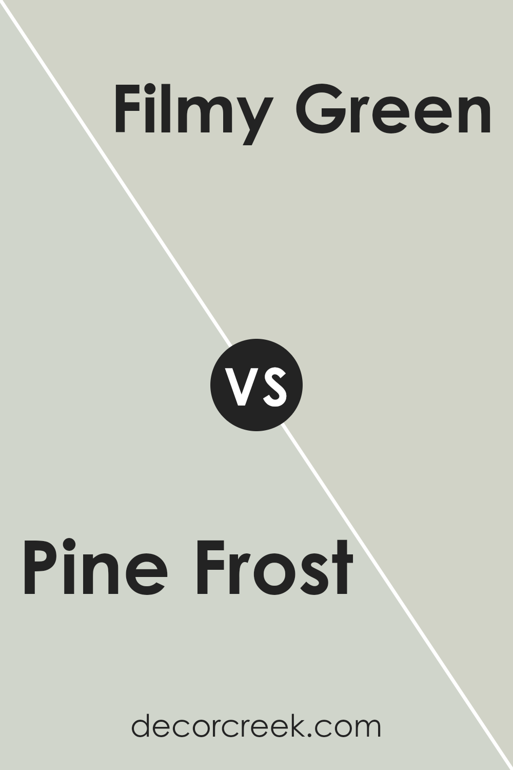
Pine Frost SW 9656 by Sherwin Williams vs Filmy Green SW 6190 by Sherwin Williams
Pine Frost and Filmy Green, both by Sherwin Williams, are subtle and calming shades of green, but they have distinct differences in tone and feel. Pine Frost is a lighter and cooler shade that gives off a fresh and airy vibe.
It’s almost like the color of frost on pine needles, making it ideal for a crisp, clean look in any room. On the other hand, Filmy Green is a bit darker and warmer. This color has a more muted, understated quality, resembling a thin, soft film or a gentle moss covering.
While Pine Frost might be more suited for spaces that need a bright and invigorating touch, Filmy Green works well in areas where a cozy, gentle ambiance is desired. Both colors can refresh a space, but your choice depends on the mood you want to set.
You can see recommended paint color below:
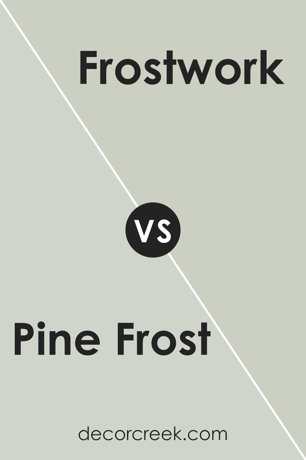
Pine Frost SW 9656 by Sherwin Williams vs Frostwork SW 0059 by Sherwin Williams
Pine Frost and Frostwork by Sherwin Williams are two unique colors that offer interesting contrasts. Pine Frost is a cool, slightly muted green that gives off a fresh and natural feel. It’s great for creating a calm and inviting atmosphere, much like a quiet, snowy forest. This color is ideal for spaces where you want to promote relaxation and a connection to nature.
On the other hand, Frostwork leans more towards a light, silvery gray with a subtle bluish undertone. It’s a clean and neutral choice that pairs well with a variety of decorating styles, making it very flexible for use in any room. Frostwork is particularly useful for adding a bright and airy feel to a space, making small rooms appear bigger and more open.
Both colors are cool and light, but Pine Frost has a touch of green that adds a lively natural vibe, while Frostwork is a softer, more understated option that blends easily into existing styles and palettes.
You can see recommended paint color below:
- SW 0059 Frostwork
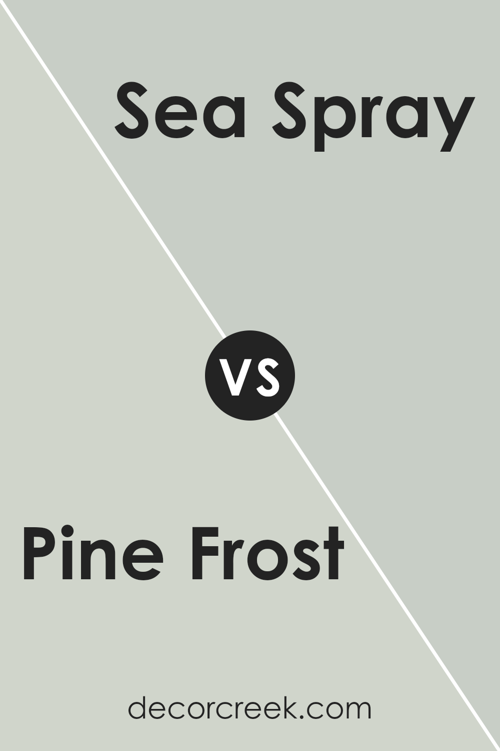
Pine Frost SW 9656 by Sherwin Williams vs Sea Spray SW 9651 by Sherwin Williams
“Pine Frost” and “Sea Spray” are two paints by Sherwin Williams that each bring their own unique vibe to a space. “Pine Frost” is a cool, gentle green that leans a bit towards gray. This color evokes the calmness of a frosty pine forest and works well in rooms where you want a touch of nature without overwhelming green tones. It’s particularly great for a subtle, calming effect in places like bedrooms or bathrooms.
On the other hand, “Sea Spray” is a lighter and airier color, reminiscent of the ocean’s mist. It has a soothing blue-green hue that’s a bit brighter than “Pine Frost.” This makes “Sea Spray” perfect for spaces where you want to add a fresh, lively feel. It’s ideal for kitchens, bathrooms, or any area where you want a splash of cheerful color to brighten the room.
Both colors work beautifully in their own right, offering distinct vibes – “Pine Frost” being more subdued and earthy, while “Sea Spray” brings a brighter, more refreshing touch.
You can see recommended paint color below:
- SW 9651 Sea Spray
Pine Frost SW 9656 by Sherwin Williams vs Kingston SW 9677 by Sherwin Williams
Pine Frost and Kingston, both by Sherwin Williams, are unique shades that cater to different tastes and styles in home décor. Pine Frost is a cool, light green with a hint of grey. This color is subtly fresh, resembling the soft hues of early winter frost on pine needles, making it ideal for creating a calm and soothing atmosphere. It works well in spaces that aim for a gentle, refreshing vibe.
On the other hand, Kingston is a deep, rich green with a more pronounced intensity. This shade is perfect for adding depth and a touch of nature to any room. It evokes the dense foliage of a lush forest, suitable for those wanting to make a bolder statement. Kingston could be the go-to for larger rooms or as an accent wall, providing a dramatic yet cozy backdrop.
Together, these colors offer choices between understated elegance and striking richness, both inspired by natural elements and adaptable to various interior styles.
You can see recommended paint color below:
- SW 9677 Kingston
In conclusion, SW 9656 Pine Frost by Sherwin Williams is a really interesting paint color. It’s very light, almost like a mix of soft white and gentle green, like the first light frost on pine trees in early winter. This color has a peaceful feeling to it, making it great for rooms where you want to feel relaxed and calm, like bedrooms or a quiet reading corner.
When using Pine Frost, it’s cool hue pairs nicely with darker greens, grays, and even some blues, giving a lot of options for decorating. Furniture in natural wood tones also looks lovely with this color, adding warmth to the coolness of Pine Frost.
Pine Frost is also good at making small rooms look a bit bigger because of its light and airy feel. It reflects light well, which can brighten up a room that doesn’t get much natural sunlight.
Overall, SW 9656 Pine Frost by Sherwin Williams is a pretty and practical choice if you want to make a room feel calm and cheerful. It’s easy to use with many other colors and styles, which makes it not just pretty but useful too! It’s definitely a paint color that could make anyone feel happier in their home.
Ever wished paint sampling was as easy as sticking a sticker? Guess what? Now it is! Discover Samplize's unique Peel & Stick samples.
Get paint samples

