As you consider refreshing your place, you might be drawn to the soothing yet lively hue of SW 6745 Lark Green by Sherwin Williams. This color offers a blend of vibrancy and calm that can rejuvenate any room. When used in your home, Lark Green can add a touch of nature’s freshness to your surroundings, making it ideal for creating a relaxed atmosphere whether in a bedroom, kitchen, or living area.
Painting your walls with SW 6745 Lark Green is a good way to add some life to a dull room without making it too bold or too bright. This shade of green strikes a nice balance, providing enough color to make a statement while maintaining an air of serenity.
It pairs beautifully with natural elements and materials like wood and stone, enhancing the organic feel of your decor.
So, if you’re looking to refresh your living place with a color that is both energizing and peaceful, SW 6745 Lark Green might just be the perfect pick for you.
Think how this color could freshen up the room and make your home feel lighter and more open.

What Color Is Lark Green SW 6745 by Sherwin Williams?
Lark Green by Sherwin Williams is a vibrant, eye-catching hue that brings a touch of nature indoors. This lively color is reminiscent of lush foliage in the peak of summer, offering a fresh and inviting atmosphere to any room. With its energetic and cheerful essence, Lark Green works exceptionally well in interior styles that lean towards the contemporary or eclectic. It’s a fantastic choice for accent walls in living areas or in kitchens to add a burst of freshness.
In terms of pairing with materials and textures, Lark Green complements natural wood tones beautifully, from light beech to darker walnut, enhancing the organic feel of the place. It also looks striking against white trim or paired with modern metallic finishes like brushed nickel and chrome, adding a crisp, modern edge.
For fabrics, go with soft patterns or light textures — they add interest without taking attention away from the color.Linens, soft wools, and cotton in neutral shades work wonderfully. This color works well in different rooms and fits with many styles. In a home office, it can add a lively backdrop, stimulating creativity and energy. In a bathroom, paired with creamy ceramics and soft towels, it can create a refreshing sanctuary.
Whether you want to create a statement with furniture or walls, Lark Green adds a lively and fresh charm to your decor.
Is Lark Green SW 6745 by Sherwin Williams Warm or Cool color?
Lark Green SW 6745 by Sherwin Williams is a vibrant and fresh shade of green that can bring a lively touch to any room in the house. This color is especially great for place where you want to add a splash of nature-inspired energy, making it perfect for kitchens or sunrooms.
The brightness of Lark Green helps in making small rooms appear bigger and more open, as it reflects light well. It’s a flexible shade that goes well with both dark and light furniture, making it easy to style your room.
In bedrooms, using this color can create a cheerful and inviting atmosphere, while in living areas, it can foster a fun and relaxed setting. Overall, Lark Green is a great pick if you want to add a bit of fresh color to your home without going too bold. Its refreshing hue is sure to enhance the home’s overall aesthetic and can be enjoyed in various decorative styles.
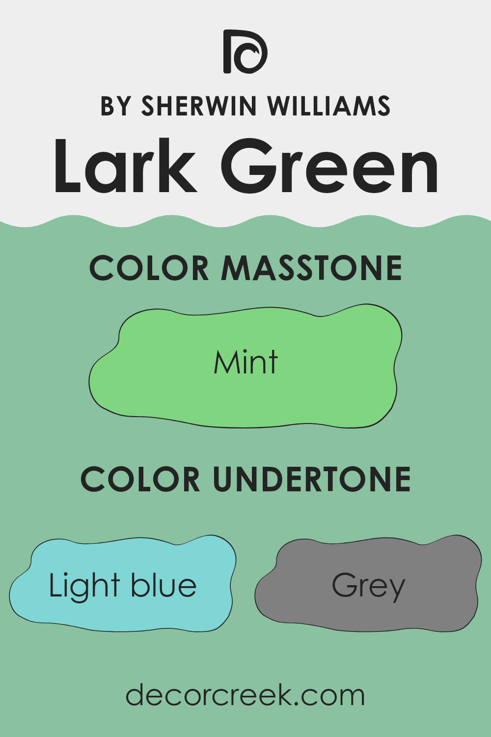
Undertones of Lark Green SW 6745 by Sherwin Williams
Lark Green has a rich mix of undertones that gives it character, making it a one-of-a-kind choice for walls. The presence of multiple undertones like light blue, grey, and pale yellow adds depth and complexity to the color. These undertones can subtly influence the color’s appearance under different lighting conditions.
For instance, in a room with plenty of natural light, the light blue and pale yellow undertones might make the color appear brighter and more vibrant. In contrast, in a place with less natural light, the grey undertones could make the color look more muted and subdued. This shifting perception can dramatically affect the mood and atmosphere of a room.
Light turquoise and light green undertones contribute a fresh and lively feel, which is excellent for creating an inviting place. Applying Lark Green on interior walls can vary the room’s energy and mood. The blend of undertones like lilac, olive, and light purple provides a hint of warmth and earthiness, which can make large interiors feel cozier. Colors like pale pink and turquoise can introduce a soft, playful quality to the area.
In summary, the many undertones in Lark Green make it a dynamic choice for walls, adapting subtly to changes in light and room function, thus affecting the overall aesthetic and feel of the place. This adaptability makes it a practical and appealing choice for many different interior styles and place.
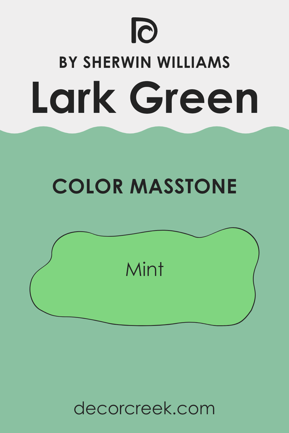
What is the Masstone of the Lark Green SW 6745 by Sherwin Williams?
Lark Green, recognized by its masstone Mint (#80D580), offers a fresh and vibrant shade that brightens any room. This color has a crisp, spring-like quality that infuses place with a sense of renewal and freshness. When used in homes, Mint can help make smaller place appear larger and more open, thanks to its light and airy feel.
It works exceptionally well in areas that receive a lot of natural light, enhancing the room’s overall brightness and creating a lively atmosphere. Mint works nicely with both soft neutrals and bold colors, so you can use it in many styles and rooms
Whether you’re painting a bedroom to create a refreshing waking environment or a living room needing a touch of vitality, this shade can effectively meet those needs. Additionally, its calming nature makes it suitable for busy place like kitchens and bathrooms, where it can promote a clean and welcoming vibe.
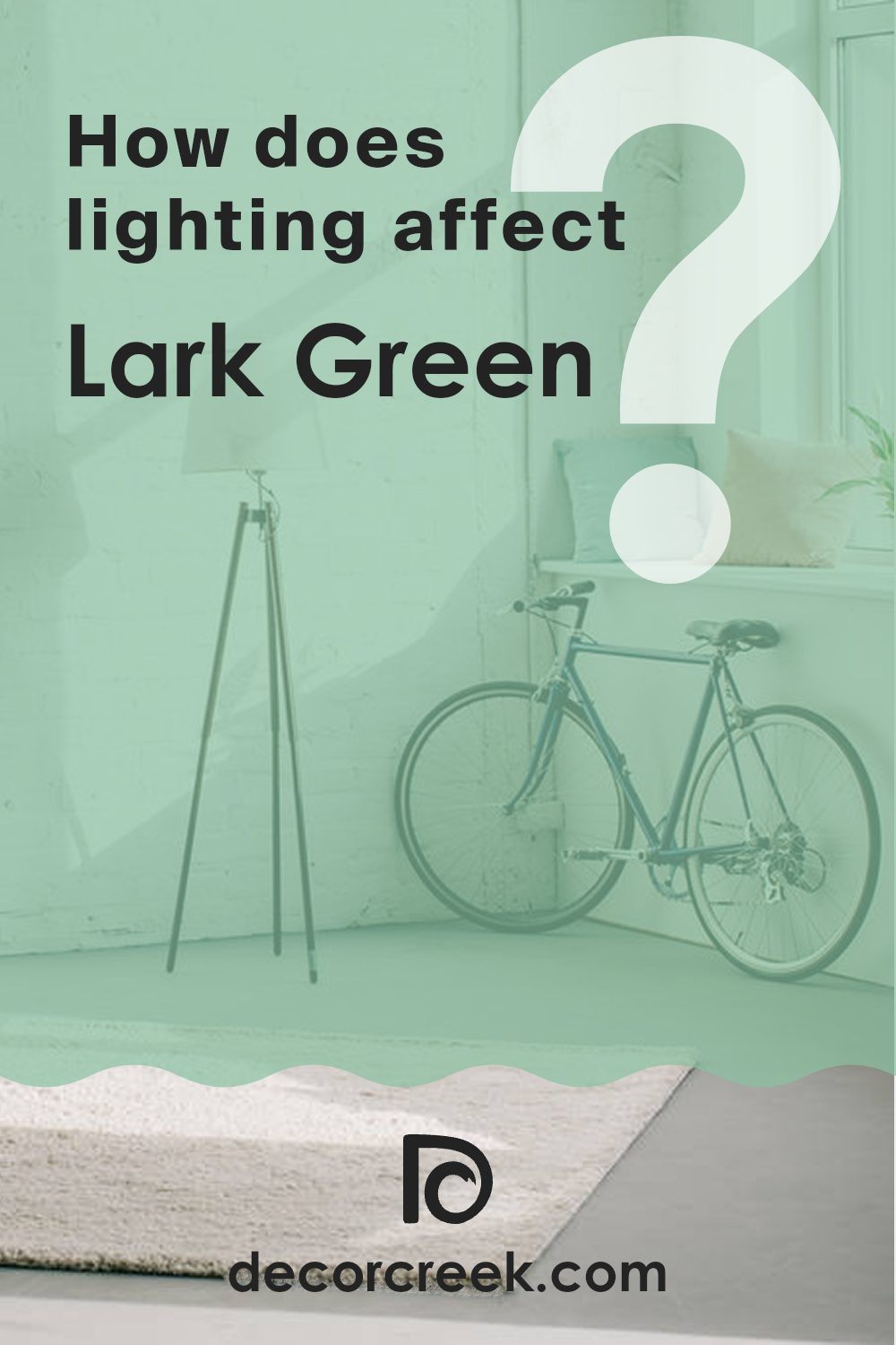
How Does Lighting Affect Lark Green SW 6745 by Sherwin Williams?
Lighting plays a crucial role in how we perceive colors; it can make a significant difference in their appearance. The type of light, whether it’s natural sunlight or artificial lighting, impacts the way colors look in a room. For instance, consider a shade like Lark Green.
Under artificial light, Lark Green may appear slightly darker than in natural light. In artificial lighting, especially with warm bulbs, Lark Green might shift towards a cozier and more muted green, losing a bit of its vibrancy. Cooler LED lights, on the other hand, might keep it closer to its true color, maintaining its lively green hue.
In natural light, Lark Green shines differently as the day progresses. Natural light enhances this green, making it look vibrant and fresh, especially under the clear sky of a sunny day. However, on a cloudy day, Lark Green might look less lively and more subdued.
The orientation of the room also affects how Lark Green comes across. In north-facing rooms, which get less direct sunlight and tend to have cooler light, Lark Green can look more muted and subtle. These rooms don’t always showcase the vibrant potential of this shade.
South-facing rooms are blessed with plenty of natural light throughout the day, which can make Lark Green look bright and vivid. The ample sunlight can bring out the cheerful nature of the green, making it an excellent choice for lively place.
East-facing rooms get the morning sunlight, which is warm and soft. This morning light can make Lark Green appear bright and fresh in the morning, gradually shifting to a softer tone as the day progresses.
In west-facing rooms, the afternoon and evening light, which tends to be warm and golden, might make Lark Green look richer and slightly more intense. This lighting condition suits those who prefer a warmer ambiance by the end of the day.
Understanding how Lark Green reacts under different lighting conditions can help in making informed decisions about paint choices based on the room’s orientation and the type of lighting available.
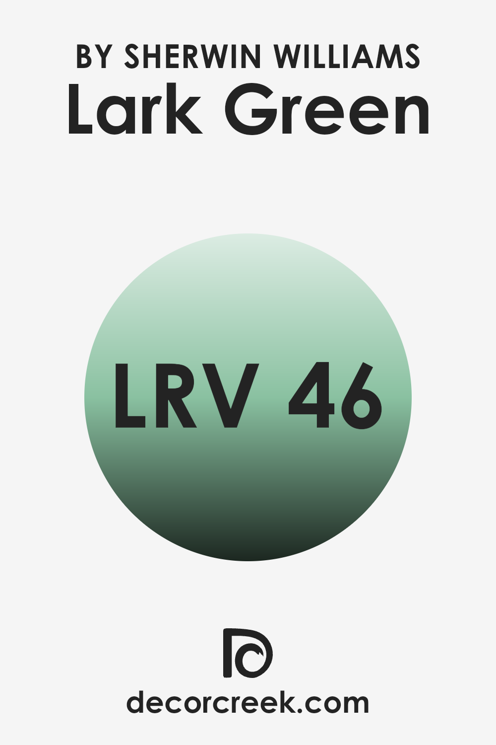
What is the LRV of Lark Green SW 6745 by Sherwin Williams?
LRV, or Light Reflectance Value, measures the percentage of light a paint color reflects back into a room. It’s a useful metric when you’re deciding on paint colors because it directly affects how light or dark a color appears once it’s on your walls.
A higher LRV means the color reflects more light, making a room look brighter and more open. Conversely, a lower LRV means the color absorbs more light, which can make a place appear smaller or cozier.
In the case of Lark Green with an LRV of roughly 46, this color is in the middle range for light reflectance. This means it neither reflects a lot of light nor absorbs it heavily. As a result, in a well-lit room, Lark Green will appear vibrant and lively, while in a less lit place, it may seem more subdued and moodier. Its balanced reflectance lets it work in many rooms, gently shifting with the light throughout the day
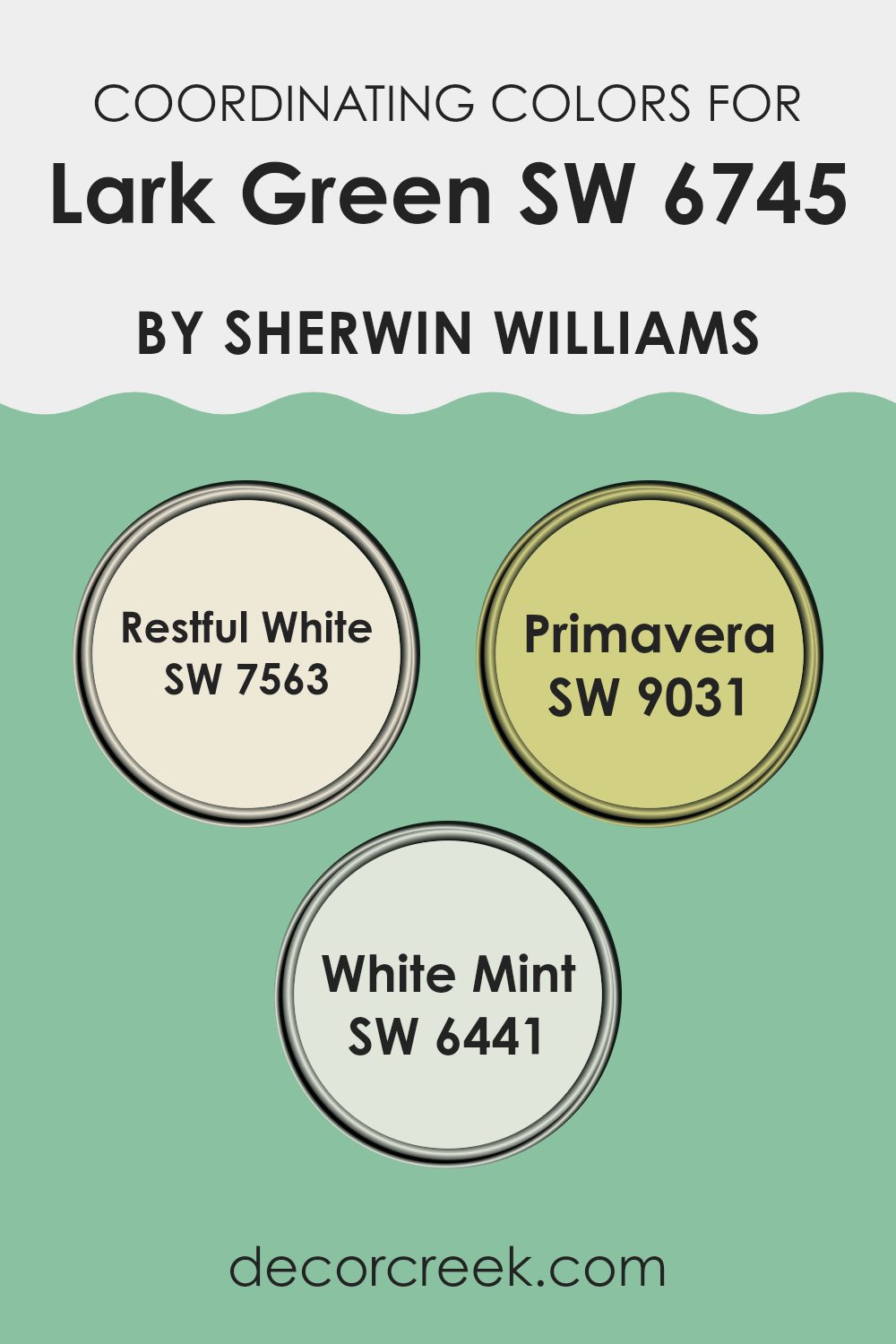
Coordinating Colors of Lark Green SW 6745 by Sherwin Williams
Coordinating colors are hues that complement each other and create a harmonious look when used together in decorating place. For example, Lark Green from Sherwin Williams has a vibrant, spring-like tone that can be nicely balanced with colors such as Restful White, Primavera, and White Mint. These coordinating colors work well together because they share cool undertones that blend smoothly, making it easy to achieve a cohesive design.
Restful White is a soothing, pale hue perfect for creating a light and airy feel in a place, making it a great counterpoint to the more vivid Lark Green. Primavera is slightly more vibrant, with a soft green that echoes the freshness of spring, providing a gentle contrast that’s both refreshing and appealing.
Lastly, White Mint has a soft green tint that’s close to neutral. It brings just enough color to brighten the room without taking over. These colors, when combined with Lark Green, offer a refreshing palette that’s ideal for those looking to create a fresh, inviting atmosphere in their homes.
You can see recommended paint colors below:
- SW 7563 Restful White
- SW 9031 Primavera
- SW 6441 White Mint
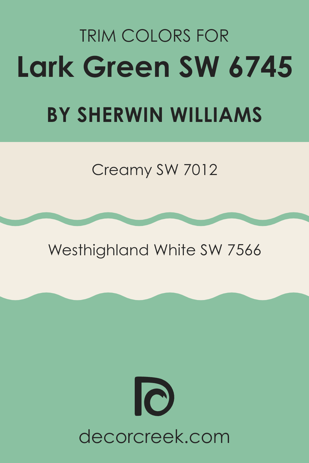
What are the Trim colors of Lark Green SW 6745 by Sherwin Williams?
Trim colors are selected to enhance and define the architectural features of a room like door frames, window frames, and moldings. They can also be used to highlight the transition between different materials or surfaces. For a vivid color like Lark Green by Sherwin Williams, choosing the right trim color is crucial to accenting its vibrant tone without overpowering it.
Colors like Creamy (SW 7012) and Westhighland White (SW 7566) are excellent choices because they have a subtle yet clean brightness that complements deeper, dramatic wall colors without competing for attention.
Creamy (SW 7012) is a soft, warm beige with a smooth and inviting appearance that pairs well with richer, deeper colors to create a balanced look. Westhighland White (SW 7566), on the other hand, is a crisp, pure white that offers a sharp contrast, making it ideal for use in place that need a clear definition around trim and other architectural features. Both these colors work nicely to frame and support the strong presence of Lark Green in a place, ensuring that the walls stand out beautifully while the trim neatly defines the perimeters with grace.
You can see recommended paint colors below:
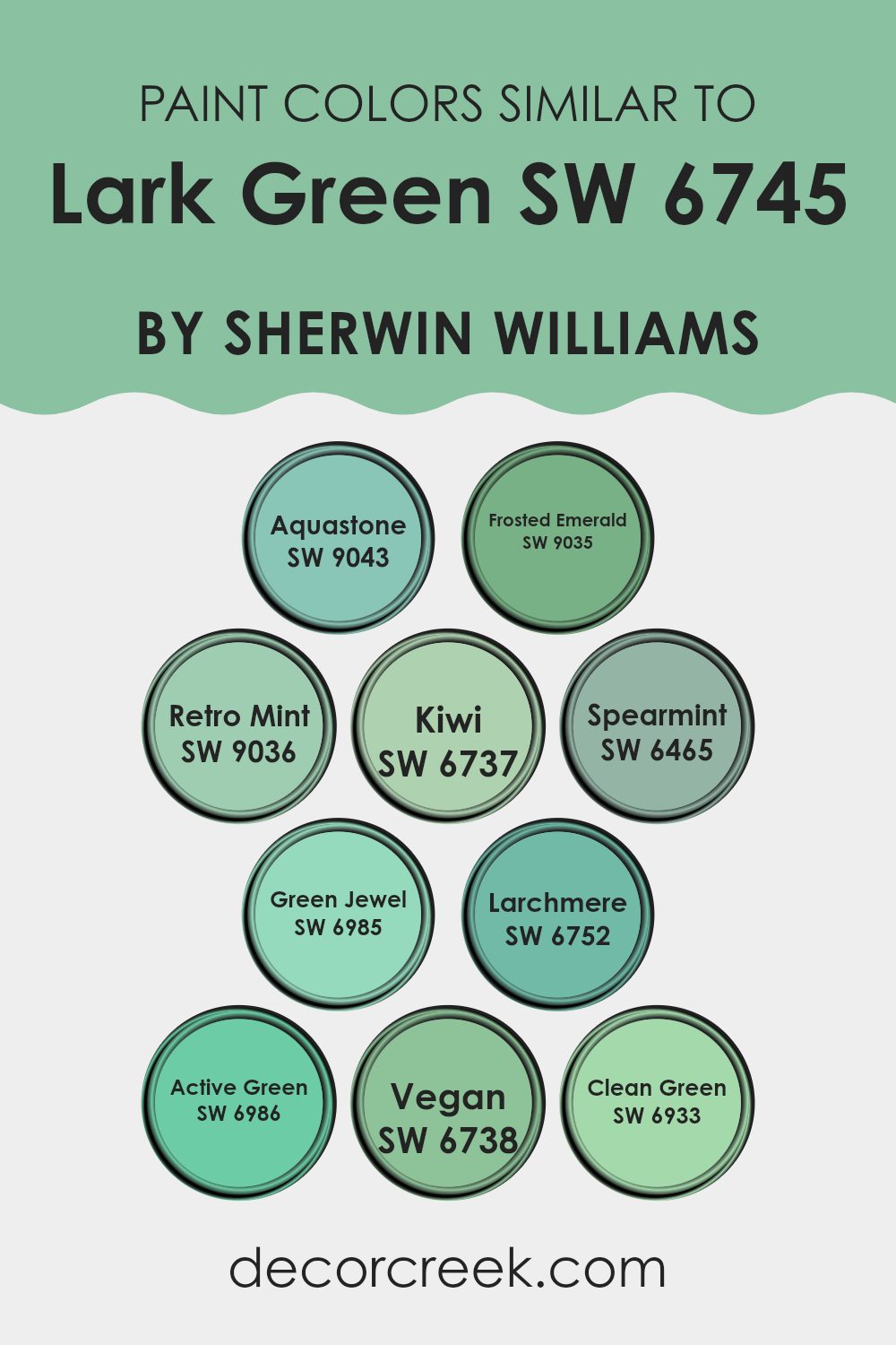
Colors Similar to Lark Green SW 6745 by Sherwin Williams
Using similar colors in home decor can create a harmonious and appealing aesthetic. When colors like Lark Green SW 6745 by Sherwin Williams are paired with coordinating shades such as Aquastone SW 9043, a soft and muted teal, or Frosted Emerald SW 9035, which is a deeper, more intense version of a classic emerald, they help establish a smooth visual flow in a place.
Retro Mint SW 9036 brings a playful, vintage touch with its lighter, pastel tone, perfect for a fresh and airy feel. Kiwi SW 6737 brings a bold pop of green — lively and bright — perfect for rooms that could use a bit more energy.
Spearmint SW 6465 leans towards a cooler, refreshing hue, suitable for creating a calm and inviting atmosphere. For those looking for a jewel tone, Green Jewel SW 6985 presents a rich, luxurious green, great for adding depth and elegance.
Larchmere SW 6752 offers a more grounded, earthy green which works well in naturalistic or subdued decor schemes. Active Green SW 6986 has a bold, energetic quality that can invigorate a room’s palette. Vegan SW 6738 provides a soft, almost sage-like option, subtle and soothing for any room.
Lastly, Clean Green SW 6933 infuses a crisp, invigorating freshness, akin to the rejuvenating feel of spring foliage, perfect for place intended to feel fresh and alive. These similar green shades comfortably tie together the visual elements of a room, promoting a cohesive and inviting environment.
You can see recommended paint colors below:
- SW 9043 Aquastone
- SW 9035 Frosted Emerald
- SW 9036 Retro Mint
- SW 6737 Kiwi
- SW 6465 Spearmint
- SW 6985 Green Jewel
- SW 6752 Larchmere
- SW 6986 Active Green
- SW 6738 Vegan
- SW 6933 Clean Green
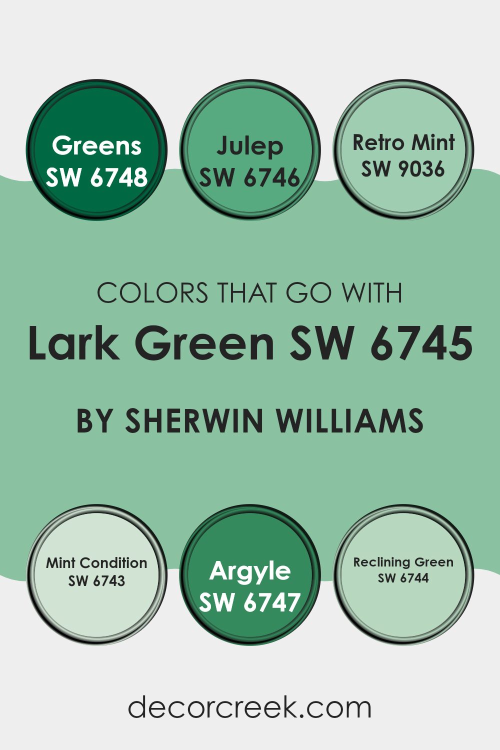
Colors that Go With Lark Green SW 6745 by Sherwin Williams
Choosing the right colors to pair with Lark Green SW 6745 by Sherwin Williams can greatly enhance the aesthetic and mood of any place . Lark Green is a vibrant shade that can act as a statement hue, so it’s crucial to select complementary colors that harmonize without competing for attention. Such color combinations ensure a balanced and inviting atmosphere. For example, pairing it with shades like Julep or Retro Mint can either soften its look or make it stand out a bit more — all without feeling too intense.
Start with Julep, a playful and light green shade, which can lighten the mood and couple nicely with the deeper tones of Lark Green, providing a refreshing contrast perfect for nurseries or casual living rooms.
Retro Mint has an almost nostalgic feel that pairs beautifully with Lark Green, instilling a gentle, yet lively vibe ideal for retro-inspired theme place or creative areas. Mint Condition, a crisp and bright green hue, works well to create a lively and fresh look when used next to Lark Green, particularly in kitchens or bathrooms. Argyle is slightly richer and offers a smart visual anchor that can give depth to living rooms or dining areas when combined with the brighter Lark Green.
Reclining Green, slightly subdued and soft, offers a restful pairing option that complements without overpowering, making it perfect for bedrooms or rooms meant for relaxation. These thoughtfully chosen shades interact with Lark Green in unique ways to create environments that are both functional and stylish, bringing the best qualities of each color to the forefront.You can see recommended paint colors below:
- SW 6748 Greens
- SW 6746 Julep
- SW 9036 Retro Mint
- SW 6743 Mint Condition
- SW 6747 Argyle
- SW 6744 Reclining Green
How to Use Lark Green SW 6745 by Sherwin Williams In Your Home?
Lark Green SW 6745 by Sherwin Williams is a vibrant and fresh shade of green that can add a lively and welcoming touch to any home. Its natural tone makes it a great choice for those wanting to bring a bit of the outdoors inside. You can use this color in various ways to enhance your home.
For instance, painting an accent wall in Lark Green can turn it into a focal point in the living room or bedroom, adding a bit of energy and personality without making the room feel too busy.This shade also works well in kitchens and bathrooms, where it pairs nicely with white cabinets or fixtures, giving a clean and fresh look.
For a more subtle effect, consider using Lark Green for smaller elements like a door or a piece of furniture. This not only introduces a pop of color but also keeps the room feeling light and airy. Whatever the use, Lark Green brings a fresh vibe to any room.
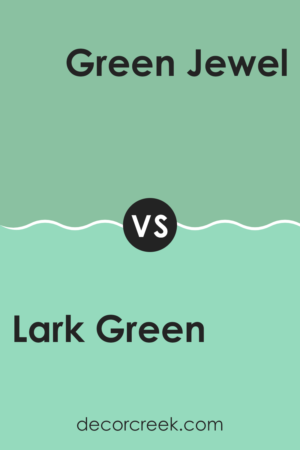
Lark Green SW 6745 by Sherwin Williams vs Green Jewel SW 6985 by Sherwin Williams
Lark Green and Green Jewel, both by Sherwin Williams, offer distinct hues for various decorating tastes. Lark Green is lighter and softer, making it perfect for creating a calm and inviting atmosphere. Its mellow tone works great in rooms like living rooms or bedrooms where a gentle touch of color is desired.
On the other hand, Green Jewel has a much deeper and richer tone. This vibrant color suits areas of a home or office that benefit from a bold statement, such as an accent wall or a striking backdrop in a creative rooms.
In summary, if you’re looking for a subtle, airy feel, Lark Green is the way to go. For a more dramatic and eye-catching effect, Green Jewel is the better choice. Both colors offer unique possibilities depending on the mood you want to set in your rooms.
You can see recommended paint color below:
- SW 6985 Green Jewel
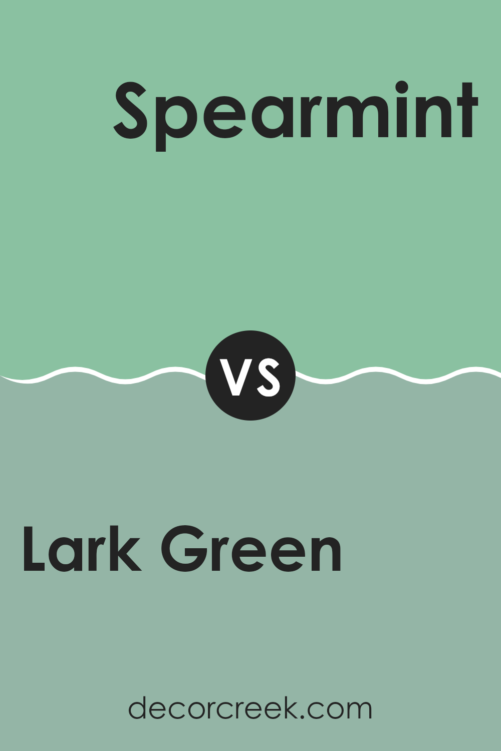
Lark Green SW 6745 by Sherwin Williams vs Spearmint SW 6465 by Sherwin Williams
Lark Green and Spearmint, both by Sherwin Williams, are distinct green hues with their own unique appeal. Lark Green is a darker, more subdued shade that adds a sense of depth and stability to a rooms. It leans towards an earthy tone, making it perfect for creating a cozy, welcoming atmosphere in rooms like living areas or studies.
On the other hand, Spearmint is a lighter, fresher green. It has a vibrant, lively feel to it, reminiscent of spring and renewal. This color works wonderfully in rooms that benefit from a bright and airy vibe, such as kitchens and bathrooms.
Both colors offer a natural touch, but their impact is different. Lark Green tends to anchor a room and can be paired with warm tones for a rustic look. Spearmint, with its crispness, works well with lighter colors, enhancing openness and light. Depending on what mood or style you want to achieve, each has its strengths.
You can see recommended paint color below:
- SW 6465 Spearmint
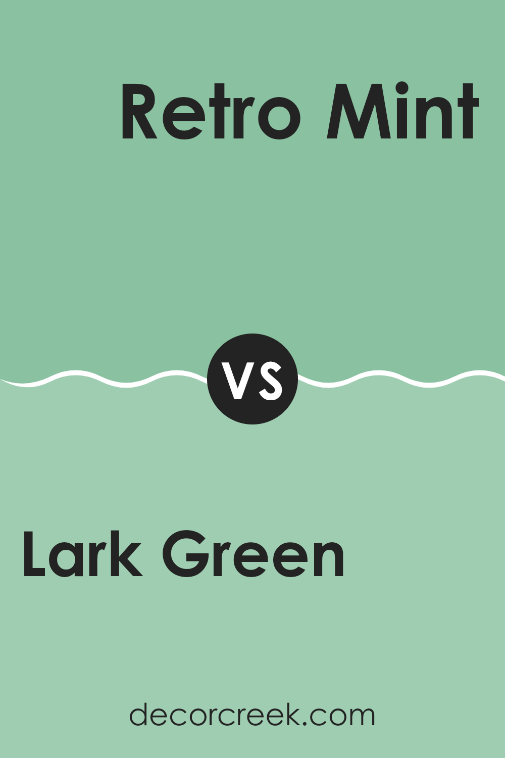
Lark Green SW 6745 by Sherwin Williams vs Retro Mint SW 9036 by Sherwin Williams
Lark Green and Retro Mint are two unique shades offered by Sherwin Williams. Lark Green is a vibrant, bold green that stands out with its richness and depth, bringing a lively and fresh atmosphere to any room. Its deep hues can make smaller areas feel cozy while adding a statement to larger rooms.
On the other hand, Retro Mint has a lighter, more playful tone. This color is softer and leans towards a pastel mint, giving rooms a cheerful and light-hearted vibe. It works exceptionally well in creating a relaxed and inviting environment, perfect for places where you want to instill a sense of calm without using overly subdued colors.
Both colors are great for adding personality to a room, but their effects are quite different. Lark Green tends to draw more attention and can dominate a rooms, while Retro Mint is more understated, providing a subtle enhancement to the overall aesthetic. Depending on the mood you want to set, either shade can be a perfect choice.
You can see recommended paint color below:
Lark Green SW 6745 by Sherwin Williams vs Vegan SW 6738 by Sherwin Williams
Lark Green and Vegan by Sherwin Williams are both vibrant colors with distinct tones. Lark Green is a bright, cheerful green with a hint of blue, giving it a fresh and lively feel. It’s a great choice for rooms where you want a bit of energy but still want things to feel calm.
On the other hand, Vegan is a deeper, more saturated green. It has a lush, rich quality that feels more grounded and nature-inspired. While Lark Green is lighter and tends to brighten up interiors, Vegan offers a more intense and cozy atmosphere, making it ideal for creating a feeling of warmth in a room.
Both colors are great choices if you’re looking to bring elements of the outdoors into your room, but your choice would depend on the kind of mood and impact you want to achieve.
You can see recommended paint color below:
- SW 6738 Vegan

Lark Green SW 6745 by Sherwin Williams vs Kiwi SW 6737 by Sherwin Williams
Lark Green and Kiwi are both vibrant colors offered by Sherwin Williams, but they cater to different tastes and settings due to their tones and brightness. Lark Green is a deeper shade of green, resembling the lush greenery seen in dense forests.
It exudes a calming but rich presence, making it ideal for rooms saces where a grounded, nature-inspired vibe is desired. On the other hand, Kiwi is a much lighter and brighter shade of green. It has a fresh and energetic feel, perfect for adding a lively touch to any area.
Kiwi tends to bring a playful and refreshing atmosphere, which can liven up a room especially well in creative rooms or children’s rooms. When choosing between these two, consider the mood you want to set: relaxed and earthy with Lark Green, or vibrant and cheerful with Kiwi.
You can see recommended paint color below:
- SW 6737 Kiwi
Lark Green SW 6745 by Sherwin Williams vs Clean Green SW 6933 by Sherwin Williams
Main color – Lark Green and the second color – Clean Green are both vibrant choices for any interior. Lark Green has a more subdued, nature-inspired tone, reminiscent of forest foliage, providing a calming influence in larger rooms. Its slightly muted hue makes it flexible for combining with other colors, fitting well in living areas or bedrooms where a gentle yet colorful backdrop is desired.
Clean Green, on the other hand, stands out with its bright, energetic green that captures the essence of freshly cut grass or spring leaves. This shade is particularly striking and would work well in areas intended to spark creativity and vibrancy, such as a children’s playroom or a creative studio.
While both colors share a base in green, Lark Green leans towards a softer and more traditional look, whereas Clean Green offers a punchier, more dynamic vibe. Each brings its unique atmosphere to interiors, suitable for different purposes and tastes.
You can see recommended paint color below:
- SW 6933 Clean Green
Lark Green SW 6745 by Sherwin Williams vs Aquastone SW 9043 by Sherwin Williams
Lark Green and Aquastone by Sherwin Williams are two distinct colors suitable for various decor styles. Lark Green is a vibrant, somewhat deep green with a touch of brightness that adds energy to a interior. It’s great for creating a lively and refreshing atmosphere in a room. This color works well in living areas, kitchens, or any place requiring a dash of vitality.
On the other hand, Aquastone is a lighter, cooler shade of green with a noticeable blue undertone, giving it a calm and gentle feel. It’s excellent for bedrooms or bathrooms where a soft and peaceful mood is ideal. This color might remind you of the sea and is perfect for rooms intended to be relaxing retreats.
Both colors offer unique vibes: Lark Green brings zest and liveliness, while Aquastone provides a soothing and gentle environment. Their differences in shade and mood make them suitable for specific purposes in home decor.
You can see recommended paint color below:
- SW 9043 Aquastone
Lark Green SW 6745 by Sherwin Williams vs Active Green SW 6986 by Sherwin Williams
Lark Green is a fresh, bright shade that feels lively and vibrant. It brings a hint of nature indoors, almost reminiscent of spring leaves or a grassy meadow on a sunny day. This color works well in rooms where you want to bring a bit of cheer and energy without it feeling too strong.
Active Green, on the other hand, is deeper and richer. It has the boldness of a forest canopy or a well-tended garden, making it a strong choice for areas where you want to make a statement or inject some vitality. This color works well in larger rooms or as an accent wall, where it can draw the eye without feeling too intense.
Together, these greens offer a nice contrast – Lark Green with its lighter, more playful tone, and Active Green with its depth and boldness. Each can set a different mood and can be used to complement various design styles and preferences. Depending on what atmosphere you’re aiming to create, either could be the perfect choice.
You can see recommended paint color below:
- SW 6986 Active Green
Lark Green SW 6745 by Sherwin Williams vs Larchmere SW 6752 by Sherwin Williams
Lark Green and Larchmere are both engaging colors from Sherwin Williams, each bringing its own unique vibe to rooms. Lark Green is a rich, deep green with a hint of brightness that makes it stand out. It’s perfect for creating a cozy, welcoming feel in a room, suitable for rooms where you want to feel relaxed yet connected to the outdoors.
On the other hand, Larchmere is a vibrant aqua shade that feels fresh and lively. It has a playful quality that can brighten up any area, making it ideal for rooms that need a touch of cheerfulness. This color works well in bathrooms, kitchens, or any spot where you want to add a splash of energy.
Though both are greens, Lark Green leans towards a more traditional green palette, while Larchmere steps slightly out of the box with its blue-green hue, offering a more refreshing and energetic vibe. Whether you’re looking for something grounded or something that pops, these colors cover different aspects of the green spectrum.
You can see recommended paint color below:
- SW 6752 Larchmere
Lark Green SW 6745 by Sherwin Williams vs Frosted Emerald SW 9035 by Sherwin Williams
Lark Green and Frosted Emerald are both green hues from Sherwin Williams, but they offer different vibes due to their tones. Lark Green is a brighter, more vibrant shade that resembles the fresh, lively color of spring leaves. It has a lively and refreshing feel, making it great for interiors where you want to add a punch of cheerful color.
On the other hand, Frosted Emerald has a deeper, richer tone, similar to the color of a dense, evergreen forest. Its richness gives it a more subdued and cozy feel, making it ideal for areas where a calm and relaxing atmosphere is desired.
In terms of use, Lark Green could brighten up a kitchen or playroom, while Frosted Emerald might be more suited for a study or bedroom, providing a soothing backdrop. Both colors can refresh a interior but in distinctively different ways – Lark Green brings energy, and Frosted Emerald offers depth.
You can see recommended paint color below:
- SW 9035 Frosted Emerald
In wrapping up, SW 6745 Lark Green by Sherwin Williams turns out to be a fantastic paint choice for those looking to give their rooms a touch of nature and brightness. This shade of green isn’t too loud; instead, it brings a calm and cozy feel that makes living interiors feel like a peaceful spot in a sunny park.
Whether used in a bedroom, living room, or even the kitchen, Lark Green adds a fresh vibe without taking over. It’s a color that mixes well with lots of other colors. Whites and beiges go especially well with it, helping to keep things light and airy.
For anyone thinking about redoing a room and hoping to bring in some freshness, Lark Green might just be the perfect pick. It’s like having a little piece of the outdoors inside your house, making every room feel alive and inviting. So, if you’re looking to liven up your home with a new paint color, consider SW 6745 Lark Green – it could be just what your home needs.
Ever wished paint sampling was as easy as sticking a sticker? Guess what? Now it is! Discover Samplize's unique Peel & Stick samples.
Get paint samples

