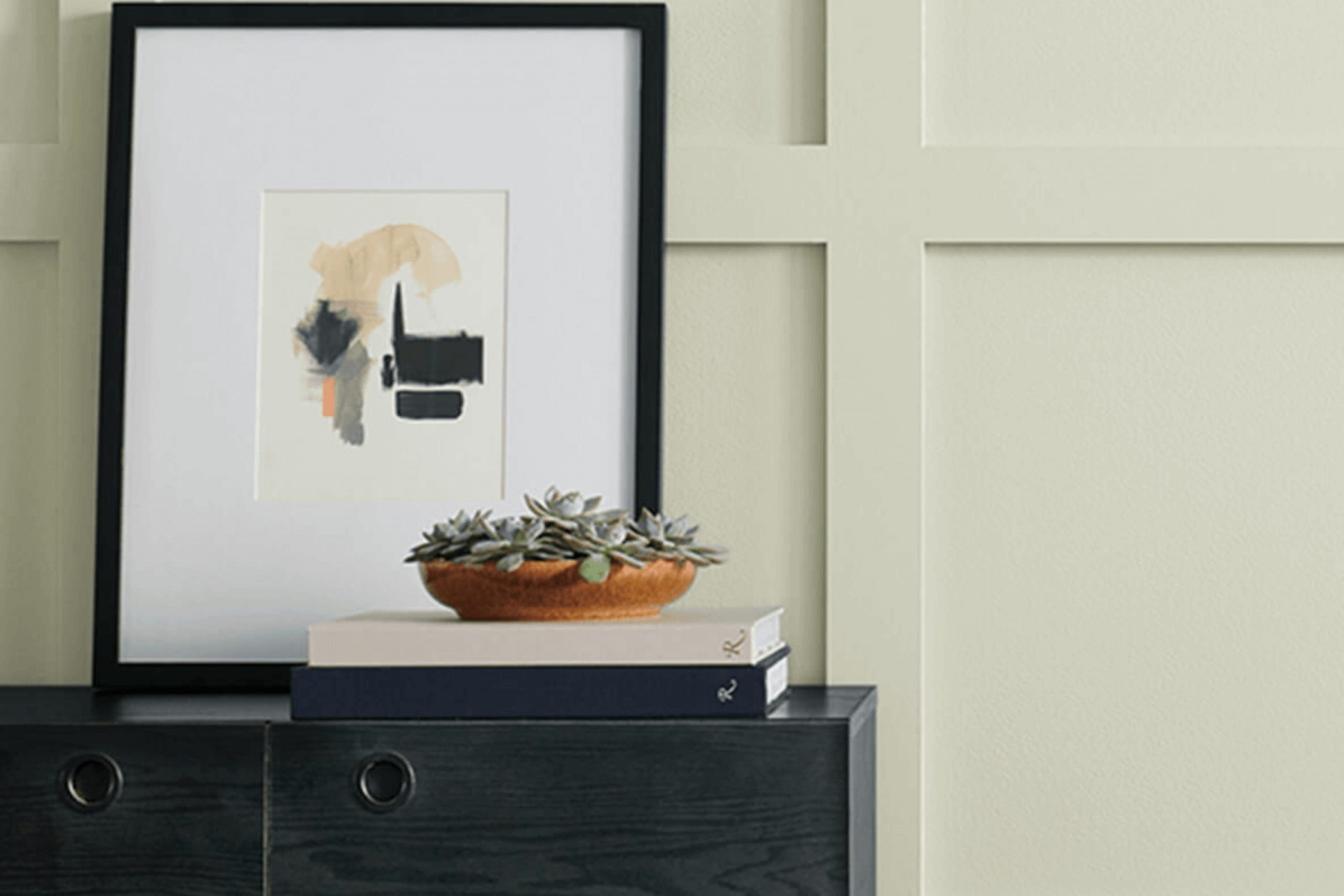
Choosing the right paint color for your home can feel like a daunting task, especially with so many shades on the market. However, if you’re considering Sherwin Williams’ SW 6176 Liveable Green, you’re on the right track to creating a calming and refreshing room. This shade of green is subtle yet impactful, changing your room into a peaceful and inviting environment without being too intense.
As you prepare to decide whether Liveable Green is the perfect choice for your walls, it’s essential to consider the specific qualities of this color and how they align with your décor goals. Liveable Green offers a balanced blend of warmth and vibrancy, making it adaptable for various rooms, whether it’s your kitchen, bathroom, or a cozy reading nook.
Moreover, it’s critical to think about the lighting in your room as it can significantly affect how this color will appear at different times of the day.
SW 6176 Liveable Green interacts beautifully with natural light, but it’s equally elegant under artificial lighting, ensuring your room always looks its best.
Is Liveable Green SW 6176 Right for My Home?
Liveable Green by Sherwin Williams is a soft and subtle shade that perfectly balances between a true green and a light gray. This color has a calming effect, making it ideal for creating a cozy and welcoming environment in any home. I find that its muted undertones allow it to adapt well to various lighting conditions, appearing more green or more gray depending on the natural light available.
I’ve noticed that Liveable Green pairs beautifully with natural materials like wood and stone, enhancing their organic qualities without creating an intense feeling. When it comes to textures, linen and cotton fabrics look fantastic against this backdrop, contributing to a relaxed and comfortable atmosphere. Leather also works surprisingly well, adding a touch of warmth and luxury to the understated elegance of the green.
As for interior styles, this color is incredibly adaptable. It fits perfectly in modern farmhouses where its earthy tone complements rustic elements. Scandinavian interiors also benefit from its light and airy feel, while traditional rooms can use this color to add a fresh but enduring touch.
I love using this color in living rooms, bedrooms, and bathrooms where its soothing presence creates a peaceful retreat.
decorcreek.com
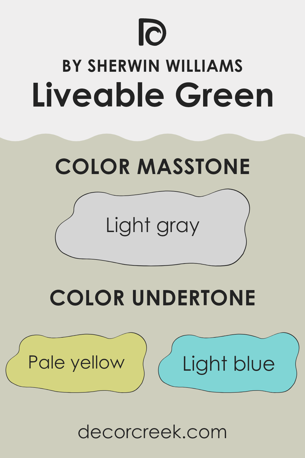
What are the right undertones of Liveable Green SW 6176 ?
Liveable Green SW 6176 is a subtle, soothing paint color by Sherwin Williams that changes its appearance based on the lighting and surrounding colors due to its various undertones. Undertones in a paint color are subtle hints of other colors that can alter its overall look and feel. Liveable Green has undertones of pale yellow, light blue, light purple, mint, pale pink, lilac, and gray. Each of these undertones can subtly influence the color’s appearance in different conditions.
For example, in a room with lots of natural light, the pale yellow undertone might make Liveable Green seem warmer and more welcoming. On the other hand, in a room with cooler, artificial lighting, the light blue or grey undertones could appear more dominant, giving the walls a crisper, more refreshed look.
The combination of these undertones means that Liveable Green is very adaptable. It can look great in any room, whether it’s a bedroom where soft, calm colors are usually preferred, or a living room where you might want a fresher, inviting atmosphere. The variety of undertones also allows this color to coordinate well with many different decor styles and colors, meaning that it can easily fit into most color schemes without clashing.
Understanding how these undertones work can help you decide where to use this color in your home and what lighting and decor will best enhance its unique qualities. This makes choosing the right color for your walls less stressful and more enjoyable.
decorcreek.com
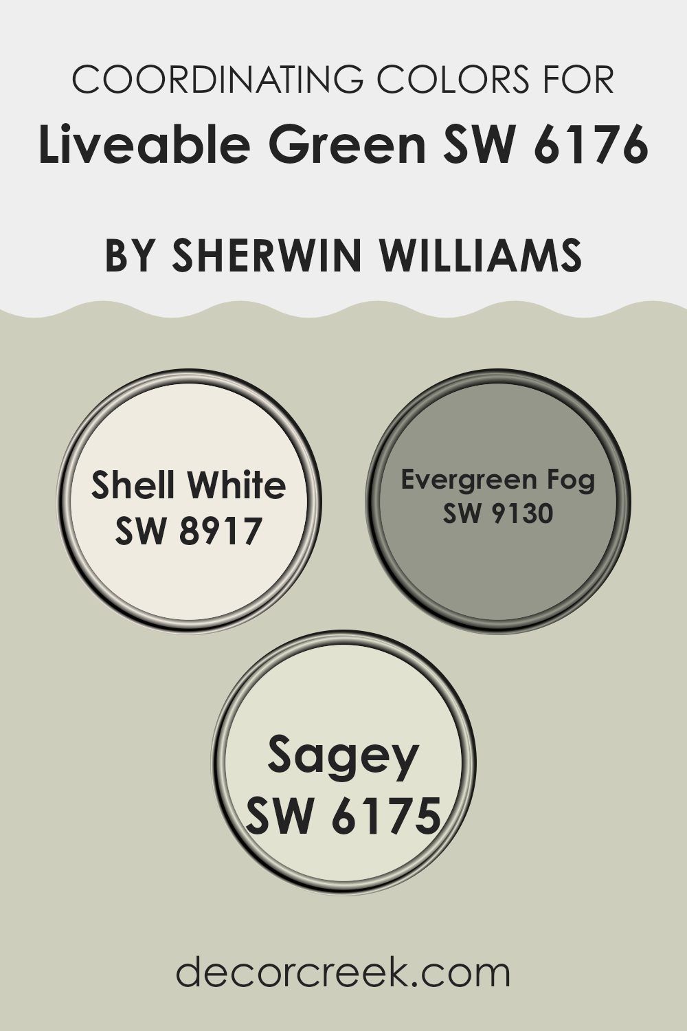
Best Coordinating Colors to use with Liveable Green SW 6176 by Sherwin Williams this year.
Coordinating colors are those that harmonize well with a primary color, enhancing the overall aesthetic of a room without creating an intense feeling. When using a nature-inspired hue like Liveable Green from Sherwin Williams, choosing the right coordinating colors can create a seamless and balanced look. Coordinating colors work by either complementing or offering a subtle contrast to the main color, which helps to create a cohesive interior design scheme.
One coordinating color for Liveable Green is Shell White (SW 8917), a soft and muted white with a touch of warmth. This color is perfect for trim, ceilings, and woodwork when Liveable Green is the primary wall color, providing a crisp but gentle boundary that highlights the room’s features without creating a sharp contrast.
Another harmonious shade is Evergreen Fog (SW 9130), a deeper and slightly grayish green that enriches the environment when paired with Liveable Green. It’s ideal for accent walls or furniture, adding depth and interest to the setting. Additionally, Sagey (SW 6175) works beautifully with Liveable Green by offering a lighter, dustier variation of green.
This color is great for adjacent rooms or as an accented backdrop for decorative elements, allowing for a flowing transition throughout the home. Together, these coordinating colors create a welcoming and cohesive palette that enhances the natural charm of Liveable Green.
You can see recommended paint colors below:
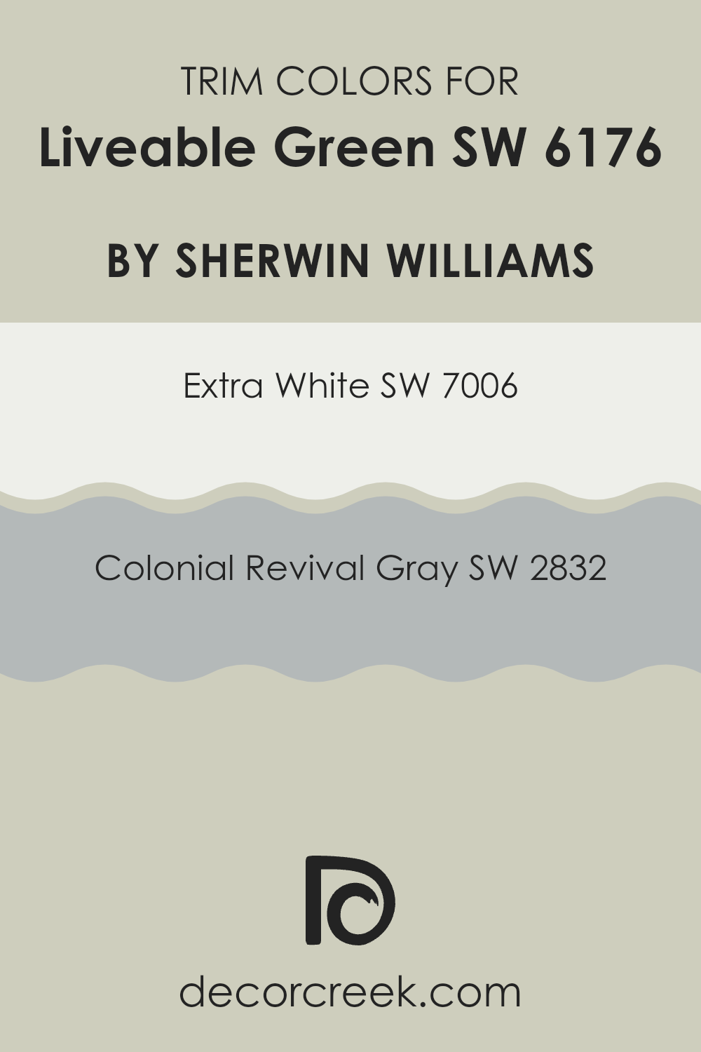
Trendy Trim Colors of Liveable Green SW 6176 by Sherwin Williams to use this year.
Trim colors are used to highlight and accentuate the architectural features of a room, creating distinct boundaries and enhancing the overall appeal of the room. When paired with Liveable Green by Sherwin Williams, choosing the right trim colors can significantly enhance the visual aesthetics.
For example, using a color like Extra White SW 7006 or Colonial Revival Gray SW 2832 as a trim can create a clean and defined look that complements Liveable Green’s subtle and soothing nature.
Extra White SW 7006 provides a crisp and fresh appearance, making it an ideal choice for trim, as it offers a vivid contrast against the softer hue of Liveable Green. This sharp distinction helps in making the wall color stand out and adds a refreshing brightness to the room.
On the other hand, Colonial Revival Gray SW 2832 offers a slight deviation from pure white with its light gray tone, providing a softer edge that bridges the transition between the wall color and the trim. This choice can add a subtle distinction without the starkness of a pure white, promoting a harmonious integration of colors within the room.
You can see recommended paint colors below:
- SW 7006 Extra White
- SW 2832 Colonial Revival Gray
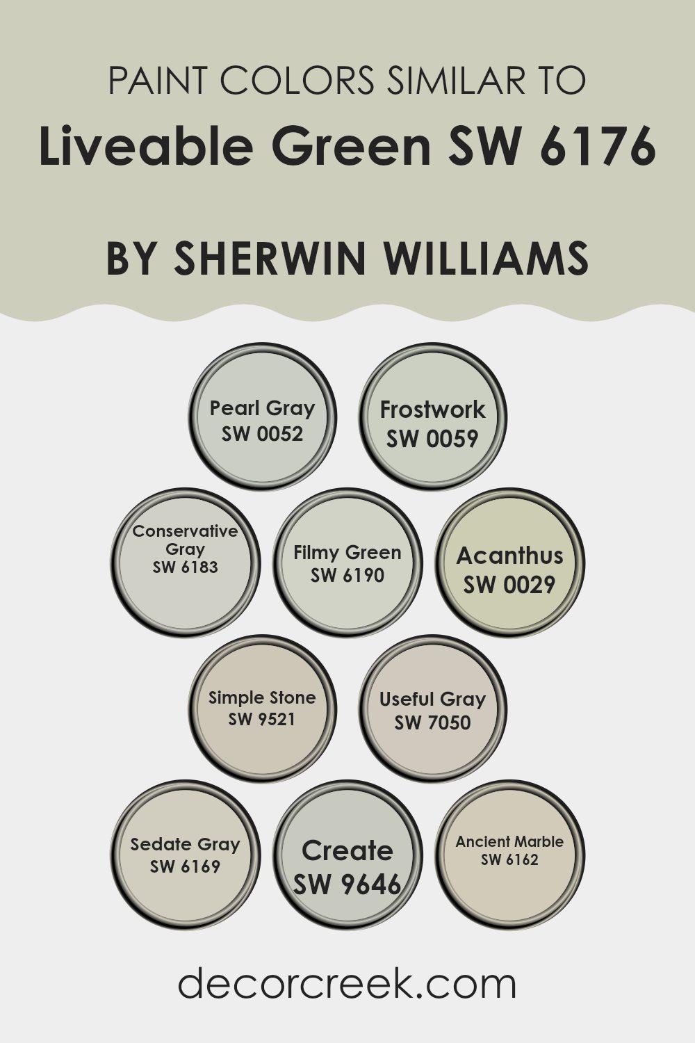
Evergreen Colors Similar to Liveable Green SW 6176 by Sherwin Williams
In interior design, choosing similar colors can create a cohesive and soothing atmosphere, making any room feel more put together. Colors that are alike in tone, like those similar to Liveable Green by Sherwin Williams, help unify a room without sharp contrasts, allowing the eye to move smoothly from one area to another.
For example, Pearl Gray offers a soft, muted gray that blends subtly into a room, providing a gentle backdrop. Frostwork has a slightly cooler edge, bringing a freshness to rooms that need a touch of clarity without feeling too bright.
Conservative Gray is another understated option that draws on deeper, more grounded gray tones, perfect for creating a soothing, yet present, ambiance. Filmy Green is close in spirit to Liveable Green, with a touch more subtlety, ideal for reflecting nature indoors without becoming too vibrant.
Acanthus steps slightly into the realm of greens with a dusky, herbal quality, great for accenting areas that benefit from a touch of earthiness. Simple Stone offers a clean, almost ethereal feel to walls, reflecting light gently and enhancing the room. Useful Gray steps back into the gray spectrum with a balanced, neutral warmth, adaptable across all types of rooms.
Sedate Gray, true to its name, provides a calm, soft presence, acting almost as a shadow, elegant yet understated. Create, while close in palette, introduces a slightly more pronounced tone that can highlight areas needing subtle definition.
Lastly, Ancient Marble offers a hint of green and gray, reminiscent of mineral tones, perfect for bringing a natural but gentle contrast to rooms. These colors, harmoniously aligned, ensure the design feels intentional and fluid, enhancing the overall peaceful quality of the environment.
You can see recommended paint colors below:
- SW 0052 Pearl Gray
- SW 0059 Frostwork
- SW 6183 Conservative Gray
- SW 6190 Filmy Green
- SW 0029 Acanthus
- SW 9521 Simple Stone
- SW 7050 Useful Gray
- SW 6169 Sedate Gray
- SW 9646 Create
- SW 6162 Ancient Marble
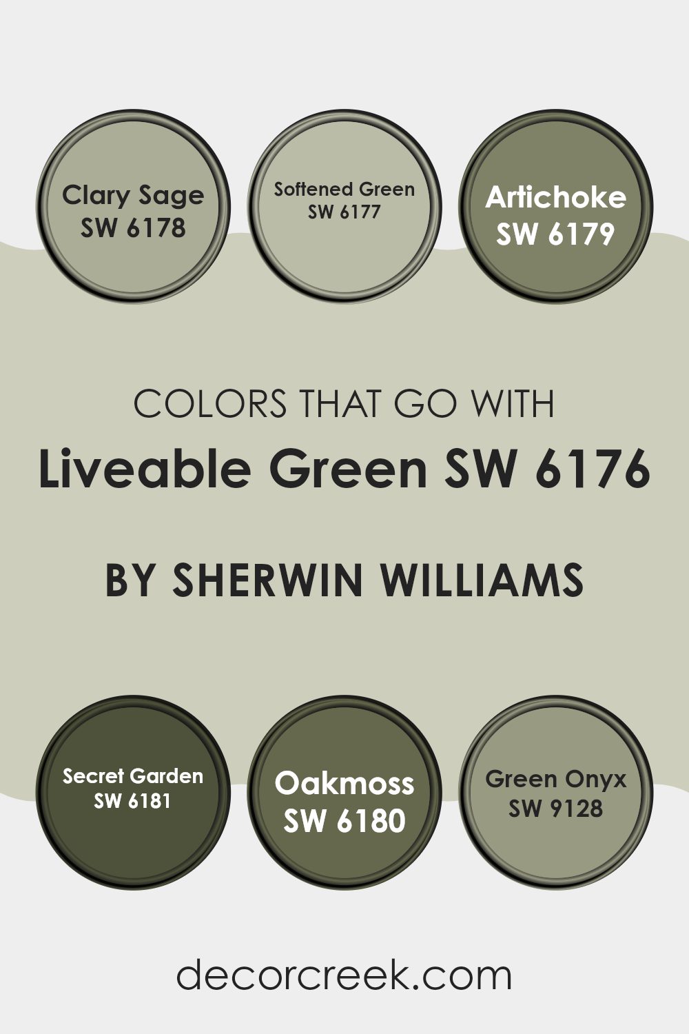
Colors that Go With Liveable Green SW 6176 by Sherwin Williams
Choosing complementary colors for Liveable Green SW 6176 by Sherwin Williams is crucial because it ensures that the overall aesthetic is harmonious and appealing. These colors create a cohesive look that can enhance the ambiance of any room.
Liveable Green serves as an adaptable base, and when paired with colors like Clary Sage, Softened Green, Artichoke, Secret Garden, Oakmoss, and Green Onyx, it forms a palette that is both balanced and pleasing to the eye. These combinations can either calm or energize a room depending on their application. For instance, using accents in Artichoke can add richness, while touches of Softened Green can keep the atmosphere light and airy.
Clary Sage SW 6178 adds a slightly dustier hue compared to Liveable Green, offering subtle depth and a touch of maturity to rooms. Softened Green SW 6177 is lighter and brings a refreshing feel, making it perfect for creating a relaxed vibe. Artichoke SW 6179 has a deeper, earthy quality that pairs well with natural materials like wood or stone.
Secret Garden SW 6181 is a dark, lush green that provides a strong visual anchor, ideal for focal points in a room. Oakmoss SW 6180 leans towards a grayish tone, useful for those seeking a more muted yet grounding color.
Lastly, Green Onyx SW 9128 has a unique vibrancy that injects a dose of energy into any room, making it an excellent choice for accents. Choosing the right colors to pair with Liveable Green can create a customized room that fits personal tastes and enhances the living experience.
You can see recommended paint colors below:
- SW 6178 Clary Sage
- SW 6177 Softened Green
- SW 6179 Artichoke
- SW 6181 Secret Garden
- SW 6180 Oakmoss
- SW 9128 Green Onyx
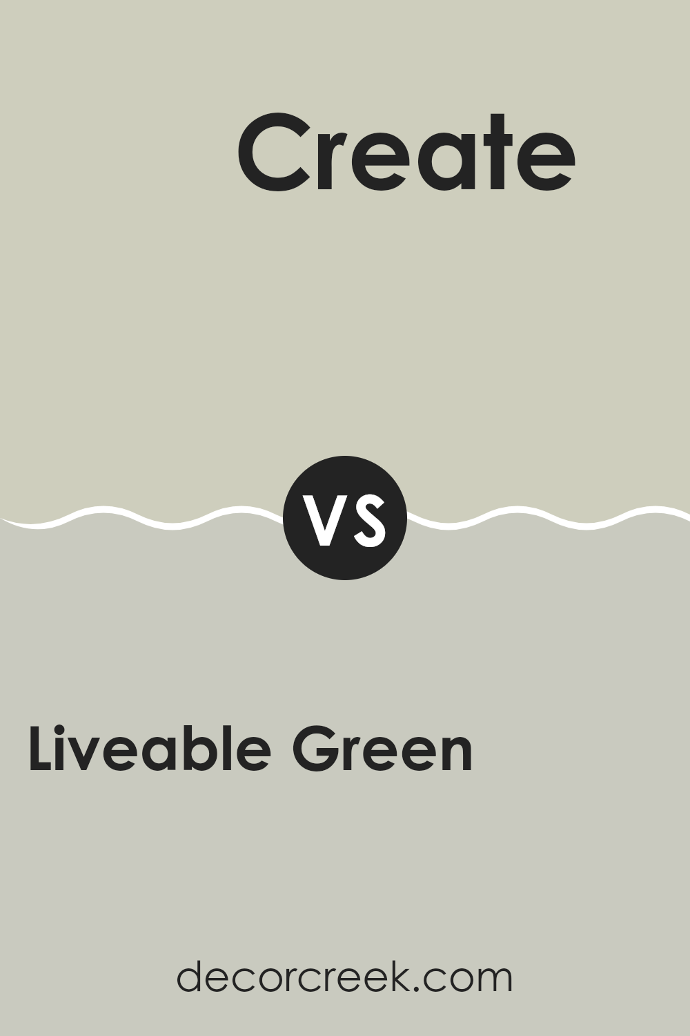
Liveable Green SW 6176 by Sherwin Williams vs Create SW 9646 by Sherwin Williams
Liveable Green is a soothing, soft green with subtle gray undertones that give it a neutral feel. It’s an adaptable color that works well in various rooms, making rooms feel fresh and airy without being too bright.
On the other hand, Create is a deeper, more saturated blue-green that adds a bit of drama and personality to rooms. It’s a color that makes a stronger statement but still maintains a sense of calm.
While Liveable Green is more about blending into a design with its understated elegance, Create stands out more, drawing attention and adding depth. Both colors can refresh a room, but the choice between them depends on whether you prefer a lighter, more neutral background or a more vivid, eye-catching hue.
You can see recommended paint color below:
- SW 9646 Create
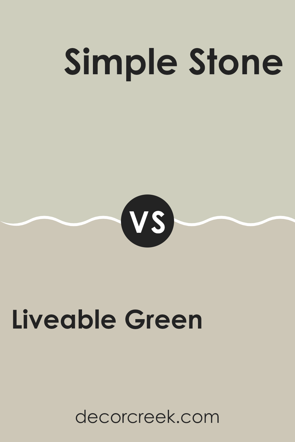
Liveable Green SW 6176 by Sherwin Williams vs Simple Stone SW 9521 by Sherwin Williams
Liveable Green and Simple Stone are two distinct paint colors by Sherwin Williams. Liveable Green has a soft, muted green tone that gives a fresh and calm feeling to any room. It pairs well with natural elements and light woods, creating a cozy, homey vibe.
On the other hand, Simple Stone carries a subtle gray hue, an adaptable choice that works well in various rooms. It offers a clean and contemporary look, easily matching with both bright and dark colors. When used together, these colors can create a balanced and harmonious environment.
Liveable Green adds a touch of nature-inspired freshness, while Simple Stone provides a solid, understated background. Each color stands well on its own but together they complement each other, making them suitable for those looking to design a room that feels both welcoming and stylish.
You can see recommended paint color below:
- SW 9521 Simple Stone
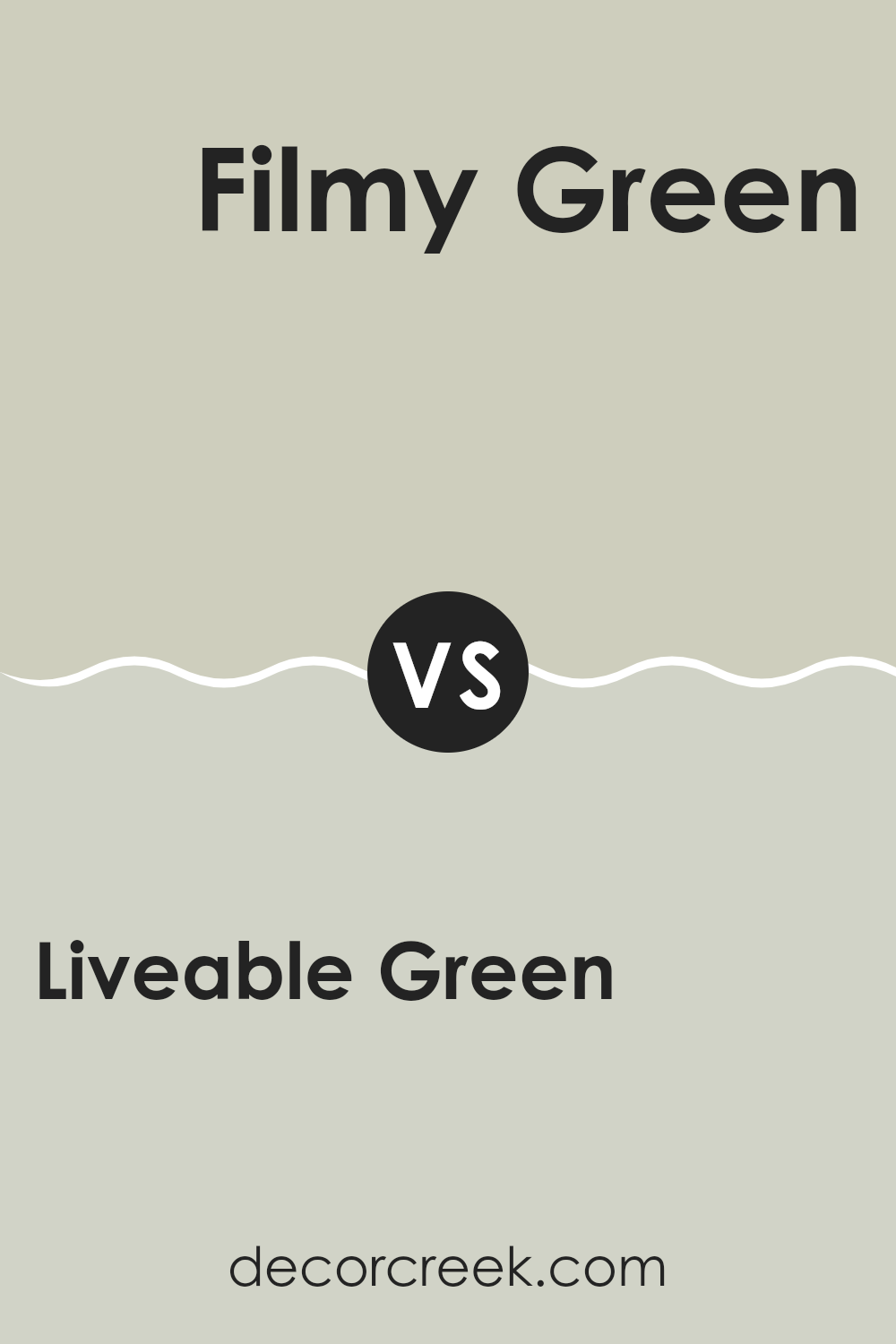
Liveable Green SW 6176 by Sherwin Williams vs Filmy Green SW 6190 by Sherwin Williams
Liveable Green and Filmy Green by Sherwin Williams are both soft, muted green hues, but they have distinct differences. Liveable Green has a slightly warmer tone, making it feel inviting and cozy in a room. It pairs well with natural wood and light fabrics, giving rooms a fresh, clean look.
On the other hand, Filmy Green leans a bit more towards gray, offering a cooler, more neutral appearance. This makes it a great choice for modern rooms that aim for a subtle touch of color without creating an intense feeling.
It works well with both dark and light accents, giving decorators a flexible palette to work with. In comparing the two, Liveable Green offers a warmer, more earthy vibe, while Filmy Green provides a cooler, understated elegance. Both can effectively enhance living rooms depending on the desired atmosphere and accompanying decor.
You can see recommended paint color below:
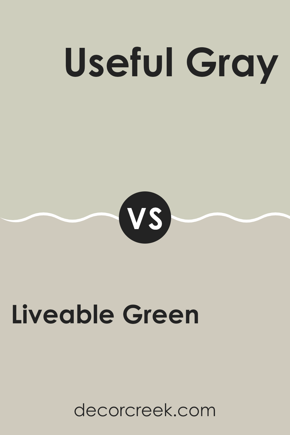
Liveable Green SW 6176 by Sherwin Williams vs Useful Gray SW 7050 by Sherwin Williams
Liveable Green and Useful Gray are two popular Sherwin Williams colors often chosen for their adaptability and neutral appeal. Liveable Green is a soft, muted green with a calming presence, making it great for any room that aims for a natural, fresh look. It pairs beautifully with wooden furnishings and natural fibers, enhancing a room with a subtle touch of nature.
On the other hand, Useful Gray is a gentle gray that leans slightly warm. This color is straightforward and neutral, perfect for rooms where you want a modern, clean look without making the room feel cold or impersonal. Useful Gray works well in high-traffic areas or rooms that receive a lot of different decorating styles over time.
Although both colors provide a soothing background, Liveable Green injects a touch of the outdoors, while Useful Gray offers a smooth, understated canvas that complements various décor elements. Whether choosing for a specific theme or adaptable backdrop, both colors offer unique but equally attractive ways to enhance home interiors.
You can see recommended paint color below:
- SW 7050 Useful Gray
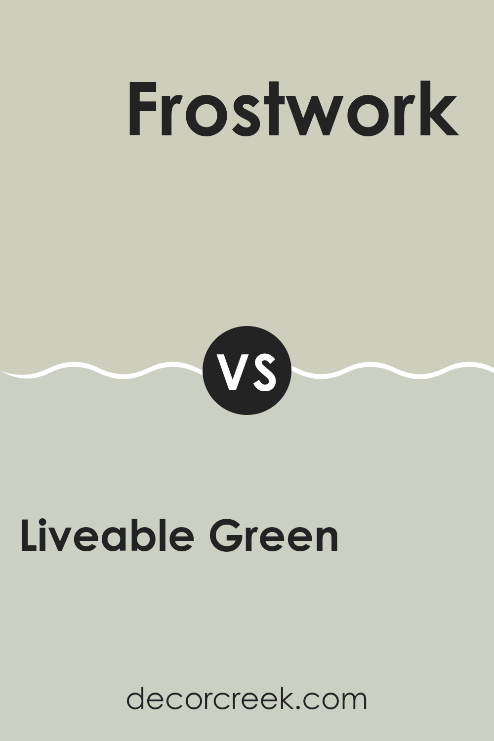
Liveable Green SW 6176 by Sherwin Williams vs Frostwork SW 0059 by Sherwin Williams
Liveable Green and Frostwork are two distinct colors by Sherwin Williams, each offering a unique vibe to any room. Liveable Green is a soft, muted green with a hint of gray, creating a cozy and inviting atmosphere. This shade is perfect for anyone looking to bring a touch of nature into their home, providing a calm and comforting feeling in rooms like the living room or bedroom.
In contrast, Frostwork is a light silver with a cool blue undertone, giving it a fresh and airy feel. This color is great for rooms that need a bit of brightness, making small rooms appear larger and more open. It works well in kitchens or bathrooms where a clean, crisp look is desired.
Both colors have their charm and utility, depending on the mood you want to set and the room you are decorating. Liveable Green leans towards warmth and earthiness, while Frostwork offers a calm, refreshing touch.
You can see recommended paint color below:
- SW 0059 Frostwork
Liveable Green SW 6176 by Sherwin Williams vs Conservative Gray SW 6183 by Sherwin Williams
Liveable Green by Sherwin Williams is a soft, muted green with a distinct earthy feel. It brings a natural, calming atmosphere to any room, making rooms feel more open and fresh. This color works well in areas where you want to relax, like bedrooms or living rooms.
Conservative Gray, also by Sherwin Williams, is a subtle gray with cool undertones. It provides a neutral backdrop that is adaptable and easy to pair with various decor styles. This shade is particularly effective in creating a clean and uncluttered look, suitable for modern rooms or offices where you need a touch of professionalism.
Both colors are understated and provide a soothing environment, but they serve different moods and themes. Liveable Green leans towards a more organic and earthy vibe, enhancing rooms with a hint of nature. On the other hand, Conservative Gray offers a more formal and polished look, perfect for contemporary settings. Each shade has its unique charm, and choosing between them depends on the desired feel and function of the room.
You can see recommended paint color below:
- SW 6183 Conservative Gray
Liveable Green SW 6176 by Sherwin Williams vs Ancient Marble SW 6162 by Sherwin Williams
Liveable Green by Sherwin Williams is a soft, muted green with a distinct earthy feel. It brings a natural, calming atmosphere to any room, making rooms feel more open and fresh. This color works well in areas where you want to relax, like bedrooms or living rooms.
Conservative Gray, also by Sherwin Williams, is a subtle gray with cool undertones. It provides a neutral backdrop that is adaptable and easy to pair with various decor styles. This shade is particularly effective in creating a clean and uncluttered look, suitable for modern rooms or offices where you need a touch of professionalism.
Both colors are understated and provide a soothing environment, but they serve different moods and themes. Liveable Green leans towards a more organic and earthy vibe, enhancing rooms with a hint of nature. On the other hand, Conservative Gray offers a more formal and polished look, perfect for contemporary settings. Each shade has its unique charm, and choosing between them depends on the desired feel and function of the room.
You can see recommended paint color below:
- SW 6162 Ancient Marble
Liveable Green SW 6176 by Sherwin Williams vs Sedate Gray SW 6169 by Sherwin Williams
Liveable Green and Sedate Gray are both colors from Sherwin Williams, but they evoke different feelings due to their tones. Liveable Green is a soft and subtle green shade that gives a room a fresh and clean look. It’s perfect for rooms where you want a touch of nature without creating an intense feeling. This color pairs well with natural materials like wood and stone to create a cozy, inviting environment.
On the other hand, Sedate Gray is a muted gray that offers a modern and understated look. It works well in various parts of the home, providing a neutral backdrop that makes other colors shine. Sedate Gray is adaptable and complements modern decor, making rooms look polished and well put together.
Both colors are great for anyone aiming to achieve a calm and pleasant atmosphere in their home. Liveable Green leans towards a more natural vibe, while Sedate Gray offers a sleek, contemporary feel, proving that both can create relaxing environments in their own unique ways.
You can see recommended paint color below:
- SW 6169 Sedate Gray

Liveable Green SW 6176 by Sherwin Williams vs Acanthus SW 0029 by Sherwin Williams
Liveable Green and Acanthus, both from Sherwin Williams, offer distinct vibes for any room. Liveable Green is a soft, soothing green with a hint of gray. It’s light enough to make a room feel open and airy, but with enough color to add personality without creating an intense feeling. It’s an excellent option for creating a relaxed, welcoming atmosphere in places like living rooms or bedrooms.
On the other hand, Acanthus is a deeper, more traditional green with a touch of gray. This color is richer and tends to draw more attention, making it ideal for an accent wall or for rooms where a stronger color presence is desired. It pairs well with natural wood and classic decor, providing a grounded, polished feel to a room.
Together, these two colors could work well in a single home, with Liveable Green in larger, brighter rooms and Acanthus in smaller or accent areas. Each offers a unique way to bring the beauty of green into your home.
You can see recommended paint color below:
- SW 0029 Acanthus
Liveable Green SW 6176 by Sherwin Williams vs Pearl Gray SW 0052 by Sherwin Williams
Liveable Green and Pearl Gray are two distinct colors by Sherwin Williams. Liveable Green is a soft, muted green that brings a fresh and calming feeling into any room. It’s an adaptable shade that works well in many parts of a home such as living rooms or bedrooms, providing a touch of nature without creating an intense feeling.
On the other hand, Pearl Gray is a gentle gray with warm undertones that makes it an excellent choice for creating a cozy and welcoming atmosphere. It’s lighter and softer compared to typical grays, making it great for rooms that need a subtle touch of elegance without going too dark.
Both colors are quite neutral, making them easy to integrate into various decor styles. Liveable Green has an earthy vibe, adding a bit of life and energy to a room, while Pearl Gray offers a clean and understated backdrop that is easy to match with different furnishings and accents. Each brings its own unique mood, with Green leaning towards a more natural feel and gray providing a classic backdrop.
You can see recommended paint color below:
- SW 0052 Pearl Gray
In wrapping up my thoughts on SW 6176 Livable Green by Sherwin Williams, I’ve really come to appreciate what a friendly and soft color it is. This shade of green feels just right for any room, making it a cozy spot for reading, playing, or just chilling out. What stands out most is how this color seems to bring a bit of the outside indoors, in a very gentle way, reminding me of a calm day in the park.
Choosing the right paint can sometimes feel like a big deal because you want to make sure everything looks good. Luckily, Livable Green is a color that works well with many different styles and furniture colors.
If you’re thinking about giving your room a fresh new look, this color could be a perfect choice. It’s simple, pretty, and has a way of making the room feel just right, whether you’re playing with your toys, doing homework, or having a snack.
So, if you ever find yourself wondering what new paint to use for your room, think about Livable Green. It’s a color that seems to make everything a bit nicer and cozier, just like a favorite blanket or a hug from a friend.
decorcreek.com
Ever wished paint sampling was as easy as sticking a sticker? Guess what? Now it is! Discover Samplize's unique Peel & Stick samples.
Get paint samples

