When you bring SW 6180 Oakmoss into your area, you immediately feel a sense of grounded sophistication. This rich, earthy green offers a perfect blend of depth and flexibility, making it a wonderful choice for those who appreciate the beauty of nature. You get a color that feels warm and inviting, yet strong and reassuring.
As you look at Oakmoss, you can’t help but notice how it subtly changes throughout the day, adapting to the light in your room. In the morning, it may appear fresh and invigorating, while in the evening, it takes on a more intimate, cozy tone. This adaptability makes Oakmoss not just a color, but a true companion to your living rooms.
You’ll find that Oakmoss pairs wonderfully with natural materials such as wood and stone, enhancing their textures and bringing out their best qualities. It acts as a beautiful backdrop for both traditional and modern styles, offering a touch of elegance without overpowering the room.
What’s truly remarkable about Oakmoss is its ability to blend with various color palettes. Whether you prefer bold, vibrant shades or soft, muted tones, Oakmoss complements them effortlessly, making your décor choices feel intentional and harmonious. You’ll appreciate how this color creates an area that feels both contemporary and classic.

What Color Is Oakmoss SW 6180 by Sherwin Williams?
Oakmoss by Sherwin Williams is a rich, earthy green with a hint of warmth. This color is flexible and can work as a bold main color or as an accent to add depth. Oakmoss provides a comfortable, natural vibe, making it ideal for areas where you want to create a cozy and inviting atmosphere.
This shade pairs beautifully with wood tones, making it a great choice for rustic or farmhouse interiors. It also complements materials like leather, wool, and linen, enhancing its warm and welcoming feel. In a modern or bohemian setting, Oakmoss can be paired with natural textures like jute, rattan, or woven fabrics to add character and warmth.
For a touch of contrast, combine Oakmoss with light neutrals such as cream or beige, which will highlight its depth. In more adventurous schemes, pair it with bold colors like mustard yellow or deep navy for a striking look. Oakmoss also works well in traditional settings, adding a touch of nature to classic wood furniture and vintage pieces.
Overall, Oakmoss is a flexible and adaptable color, suitable for a variety of styles and materials. Whether used in a living room, bedroom, or cozy reading nook, it brings a sense of warmth and comfort to any room.
Is Oakmoss SW 6180 by Sherwin Williams Warm or Cool color?
Oakmoss SW 6180 by Sherwin Williams is a deep, earthy green that brings a sense of nature into the home. This shade offers a grounded and cozy atmosphere, making it a great choice for living rooms or bedrooms. It pairs well with neutral colors like beige, cream, or soft greys, creating a balanced and relaxing environment.
Because Oakmoss is a rich color, it works well in larger rooms where it can make a bold statement without overpowering the area. In smaller spots, it’s best used as an accent wall or in combination with lighter shades to prevent it from feeling too dark.
This color also works beautifully with natural materials like wood or stone, enhancing their textures and adding warmth to the overall design. Whether used sparingly or as a main color, Oakmoss brings a touch of nature’s beauty indoors and creates a comfortable and inviting environment.
Undertones of Oakmoss SW 6180 by Sherwin Williams
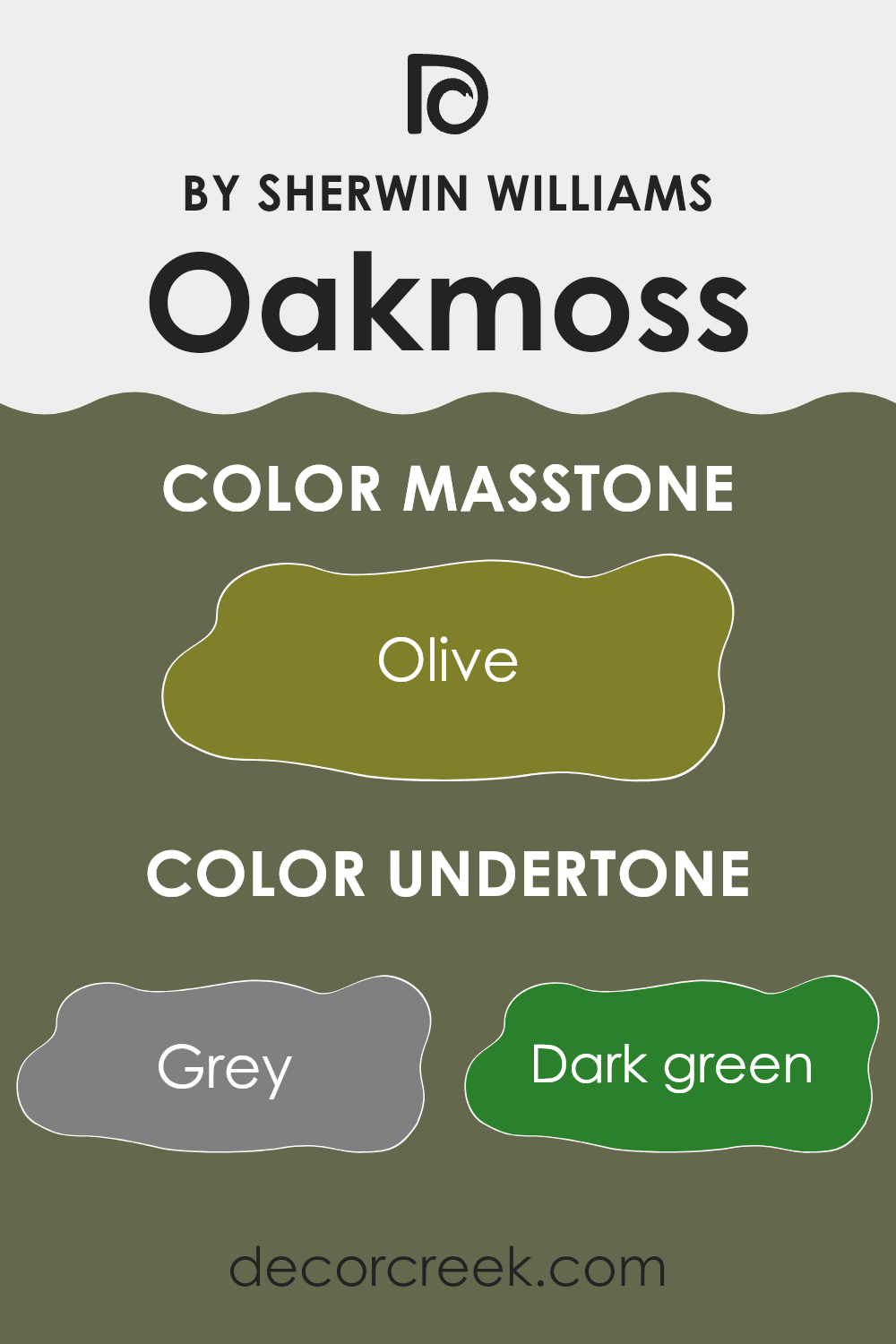
Oakmoss by Sherwin Williams is a complex color that features a variety of undertones, making it interesting and adaptable. The undertones present in this color include grey, dark green, brown, dark turquoise, purple, dark grey, navy, light green, orange, mint, pale pink, green, red, light turquoise, pink, yellow, and pale yellow. These undertones affect how Oakmoss looks in different lighting conditions and contexts.
When applied on interior walls, the grey and dark grey undertones lend a cool, calming effect, while the dark green and brown give it an earthy, natural vibe. The hints of navy and dark turquoise add depth and formality, while the light green and mint may introduce a fresh, lively feel. Subtle traces of orange and red can warm up the color, making it more inviting, especially in muted lighting.
Meanwhile, the lighter undertones like pale pink, light turquoise, yellow, and pale yellow might emerge in brighter lighting, enhancing the warmth and vitality of the area. Overall, these undertones work together to ensure that Oakmoss can fit well in various settings, whether you’re aiming for a cozy, relaxed atmosphere or a more dynamic, energetic environment. The color can appear differently throughout the day, depending on the light, which makes it a flexible choice for interiors.
What is the Masstone of the Oakmoss SW 6180 by Sherwin Williams?
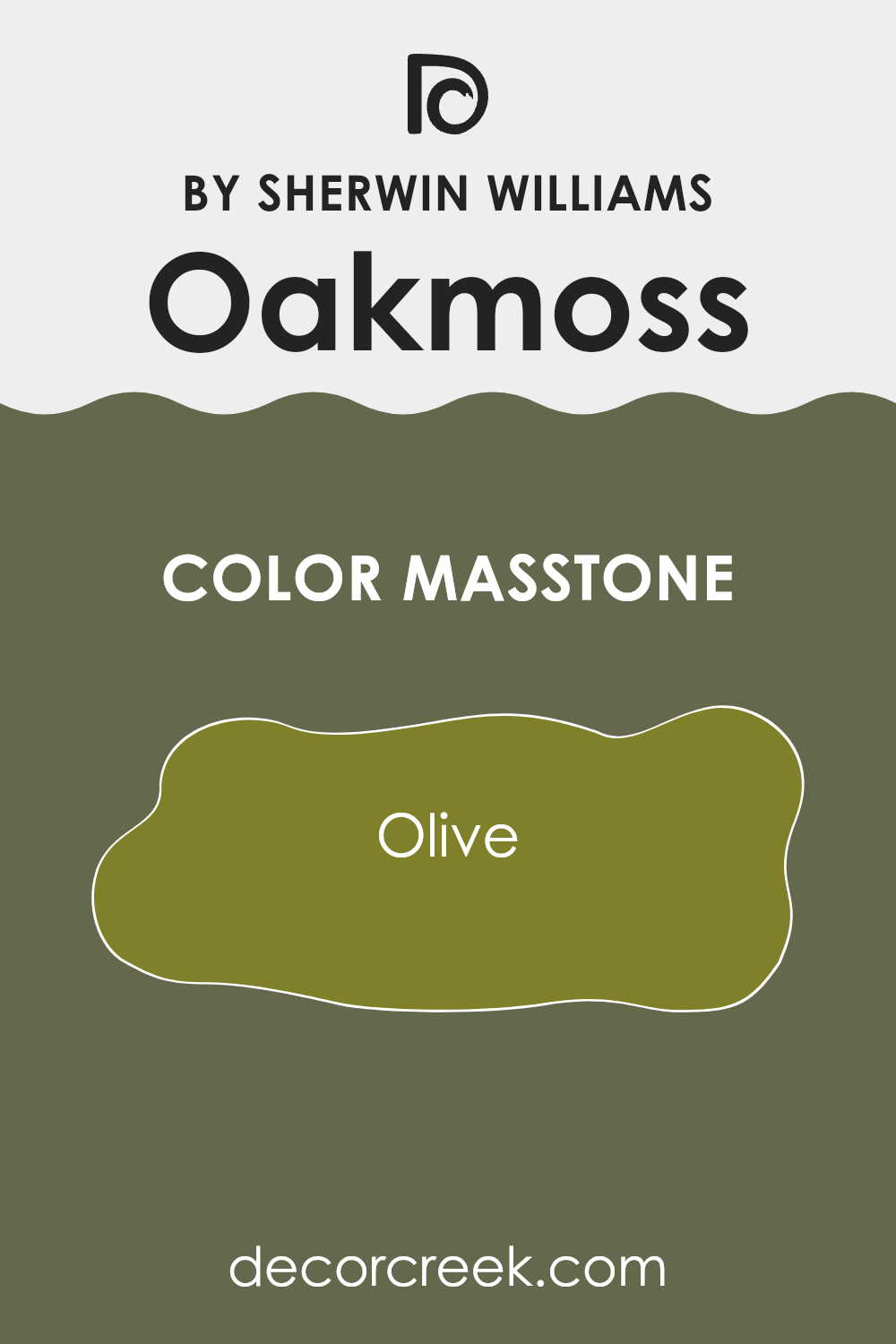
Oakmoss by Sherwin Williams is a warm, earthy green with a masstone of olive (#80802B). This rich, natural shade brings a touch of the outdoors inside, creating a cozy and inviting atmosphere. Its soothing green hue makes it ideal for living rooms, dining areas, or bedrooms, where it can encourage relaxation and comfort.
Oakmoss can also act as a neutral backdrop, allowing other colors in the room to shine. When paired with natural materials such as wood or stone, it enhances the organic feel of the area. This olive-based color works well in both traditional and modern settings, offering flexibility in design choices.
It complements neutral tones like beige and cream, as well as deeper shades like navy or charcoal. If you’re looking to incorporate a natural, calming feel into your home, Oakmoss is a great option for adding warmth and depth to any room.
How Does Lighting Affect Oakmoss SW 6180 by Sherwin Williams?
Lighting plays an important role in how colors are perceived in an area. Different light sources can change the way a color appears, which is why a color might look different in various rooms or at different times of the day.
Oakmoss (SW 6180) by Sherwin Williams is a deep green with earthy undertones. Under natural light, this color showcases its true shades. In a room with plenty of sunlight, Oakmoss appears rich and vibrant. The natural light enhances its green notes, making it feel more lively.
In artificial lighting, the color can change quite a bit. With warm, yellow-toned bulbs, Oakmoss may appear cozier and slightly warmer, emphasizing its earthy undertones. On the other hand, cool, white bulbs might make it look a bit more subdued and grayish, as the cool tones play down its warmth.
The orientation of a room affects colors too. In north-facing rooms, which often get cooler and softer light, Oakmoss can seem darker and more muted. These rooms add a hint of gray to any color, including Oakmoss, making it look deeper and more neutral.
In south-facing rooms, sunlight is stronger and tends to be warmer, which makes Oakmoss look brighter and more inviting. It captures the warmth of the light, and its green tones stand out, making the room feel cozy and enveloping.
East-facing rooms receive their strongest light in the morning. Throughout the day, as the light turns cooler, Oakmoss can shift from being bright and fresh in morning light to appearing slightly more muted in the afternoon.
West-facing rooms get the afternoon sun, which is warm and golden. Here, Oakmoss can look very inviting and rich as the warm light highlights its earthy tones later in the day, creating a comforting atmosphere.
Overall, Oakmoss’s appearance will shift noticeably depending on both the light source and room orientation.

What is the LRV of Oakmoss SW 6180 by Sherwin Williams?
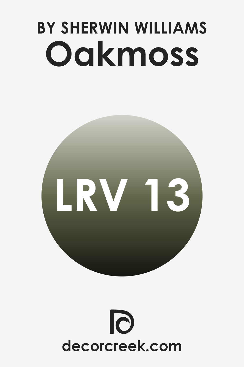
LRV, or Light Reflectance Value, is a measurement used to understand how much light a color reflects. It is measured on a scale from 0 to 100, where 0 means the color absorbs all light and appears completely black, while 100 means it reflects all light and appears completely white. When you consider painting a room, the LRV helps figure out how light or dark the room will feel.
Higher LRV colors will reflect more light, making a room feel brighter and more spacious. Lower LRV colors, on the other hand, absorb more light, making areas feel cozier or smaller. This is important to think about, especially when choosing a color for rooms that don’t have much natural light.
For the color Oakmoss by Sherwin Williams, with an LRV of 13.17, it means the color is quite dark and will absorb a lot of light. This particular shade will give rooms a warm, intimate atmosphere. In areas with limited natural light, it may appear even darker, so it’s ideal for large, open rooms or areas where you want a snug feel. If you choose this color for a wall, understand it will add depth and create a strong, dramatic look, possibly grounding a room. To balance out its rich tone, you could pair it with lighter furnishings or accents to prevent a room from feeling too enclosed.
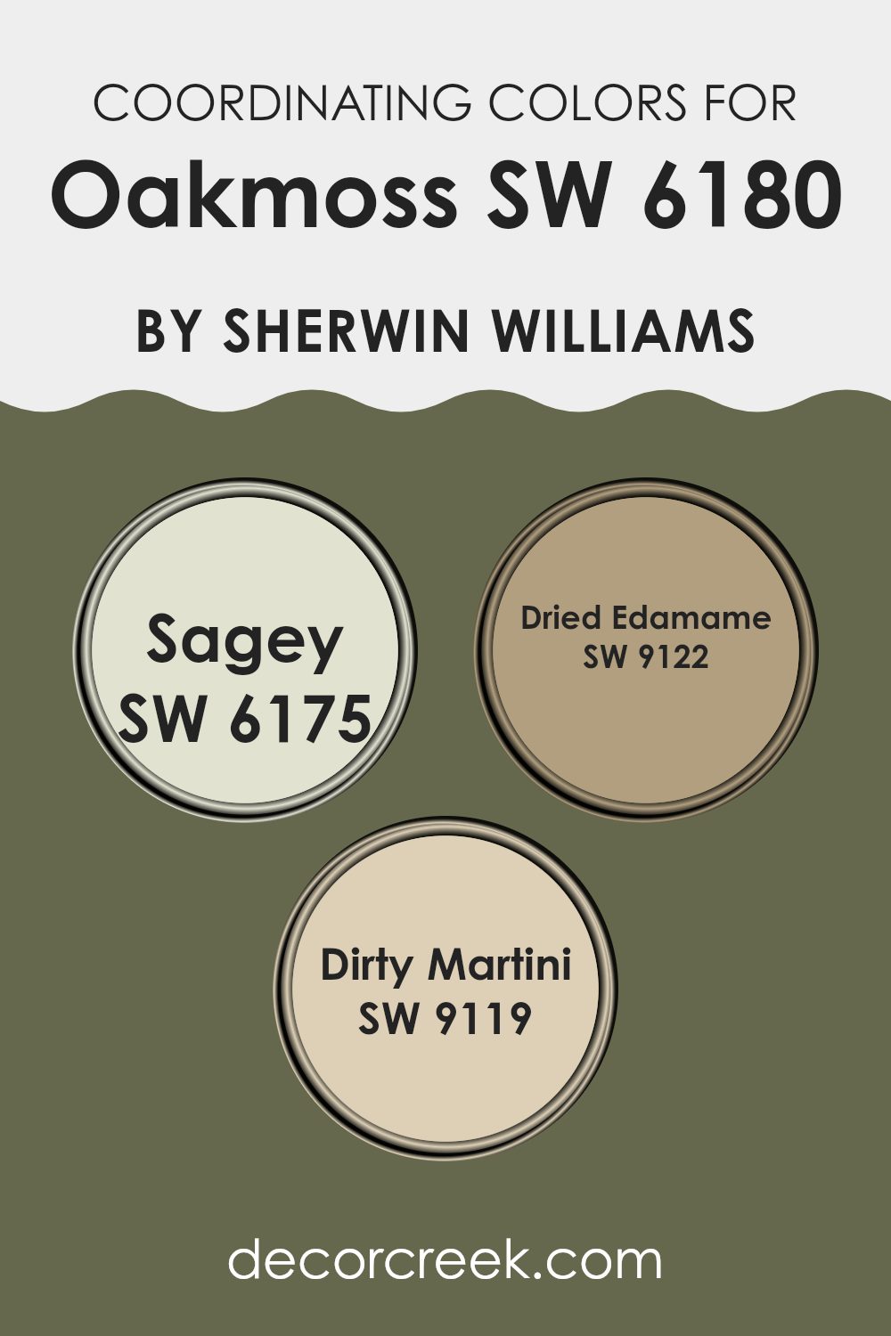
Coordinating Colors of Oakmoss SW 6180 by Sherwin Williams
Coordinating colors are colors that work well together to create a harmonious look. They often have similar undertones or complementary contrasts, making them easy to pair in design. When it comes to Oakmoss by Sherwin Williams, the colors Sagey, Dried Edamame, and Dirty Martini serve as excellent coordinating choices.
These colors, when used together, can bring out the best in each other and create a balanced, cohesive aesthetic in any room. Oakmoss itself is a deep, earthy green that provides a rich background, and its coordinating colors can help highlight this characteristic in many home styles.
Sagey is a gentle shade of green with gray undertones, creating a soft and relaxed feel. It’s perfect for adding subtle color without overpowering an area. Dried Edamame offers a slightly more vibrant green with a hint of warmth, making any room feel fresh and inviting.
Lastly, Dirty Martini is a refined, muted olive tone that brings a hint of gray, offering an elegant look. Together, these colors complement Oakmoss beautifully, enhancing its depth and creating an inviting, well-rounded color palette. This combination can easily be used for walls, trims, or accents, providing a stylish and natural appearance to your living area.
You can see recommended paint colors below:
- SW 6175 Sagey
- SW 9122 Dried Edamame
- SW 9119 Dirty Martini
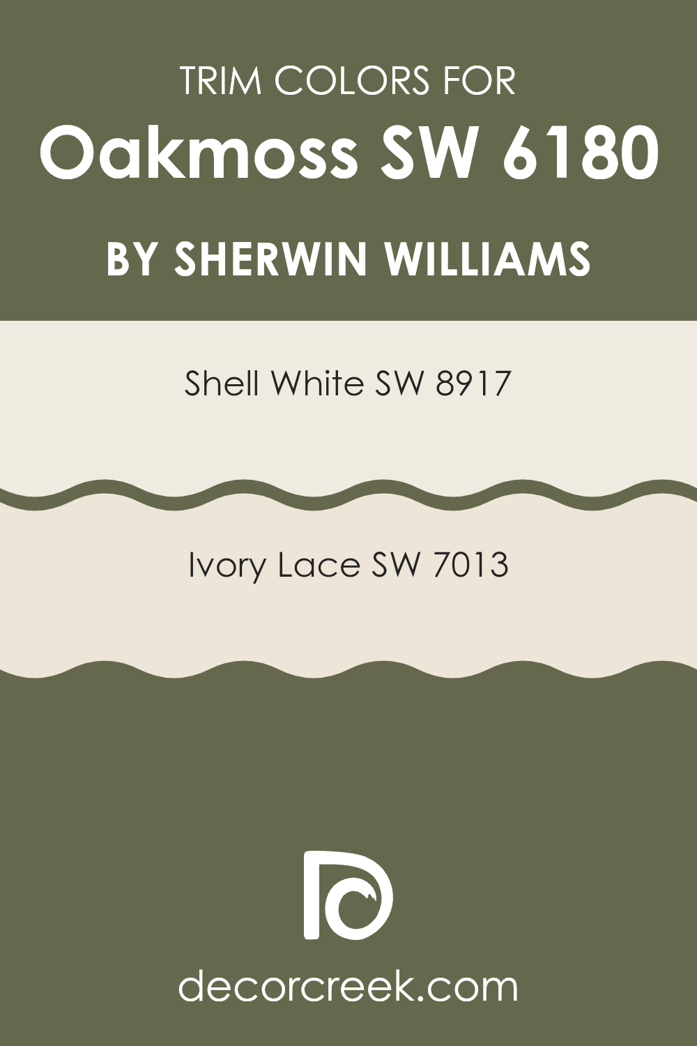
What are the Trim colors of Oakmoss SW 6180 by Sherwin Williams?
Trim colors refer to the paint colors used for the edges and details of walls, windows, doors, and other architectural features. They help define and highlight the main wall color, adding visual interest and creating contrast or harmony in a room. For Oakmoss by Sherwin Williams, a rich and deep green, choosing the right trim colors is vital. It ensures that the room has a balanced and cohesive look.
When paired with Oakmoss, trim colors like Shell White and Ivory Lace can make the green pop while keeping the overall feel calm and inviting. These light neutral tones work well to lighten up the area, complementing the deep color without overpowering it.
Shell White (SW 8917) is a soft, creamy color that brings warmth and brightness to a room. It provides a gentle contrast against Oakmoss, making it a great choice for trim. Ivory Lace (SW 7013), on the other hand, is a subtle off-white with a hint of warmth that adds a touch of elegance to the room. It enhances the green without clashing, offering a subtle and refined edge to the overall palette. These trim colors not only highlight Oakmoss but also create a unified look, ensuring the area feels complete and well-designed.
You can see recommended paint colors below:
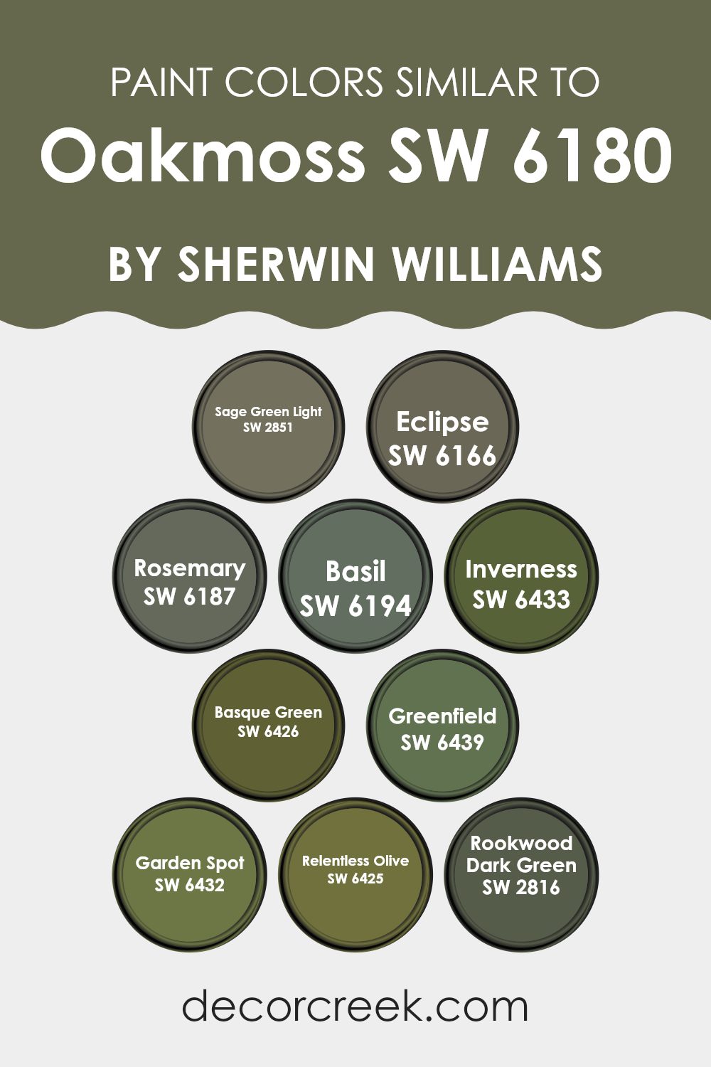
Colors Similar to Oakmoss SW 6180 by Sherwin Williams
Similar colors are important because they create a harmonious and cohesive look in any area. When colors are alike, like those in the same green family as Oakmoss by Sherwin Williams, they can work together to create a soothing and balanced environment. These colors complement each other without clashing, making them ideal for creating seamless transitions between walls, furnishings, and decor.
For example, Sage Green Light offers a soft, muted green that adds a gentle touch to any room, while Eclipse brings a darker, moody green that can add depth and richness. Rosemary, with its gray-green hue, serves as a perfect backdrop that is neither too bold nor too subtle.
Basil introduces a refreshing yet calm green, bridging the gap between vividness and subtlety. Inverness takes a slightly brighter approach, providing a lively but still natural vibe. Basque Green presents a darker, earthy tone that can ground any area, while Greenfield offers a warmer, yellow-green that adds a hint of brightness.
Garden Spot carries a fresh, vibrant energy, whereas Relentless Olive brings a strong, earthy presence, perfect for adding warmth. Rookwood Dark Green rounds out the palette with a deep, historic green that adds character and a sense of lasting charm. Together, these similar colors create a visually appealing palette that enriches any living area.
You can see recommended paint colors below:
- SW 2851 Sage Green Light
- SW 6166 Eclipse
- SW 6187 Rosemary
- SW 6194 Basil
- SW 6433 Inverness
- SW 6426 Basque Green
- SW 6439 Greenfield
- SW 6432 Garden Spot
- SW 6425 Relentless Olive
- SW 2816 Rookwood Dark Green
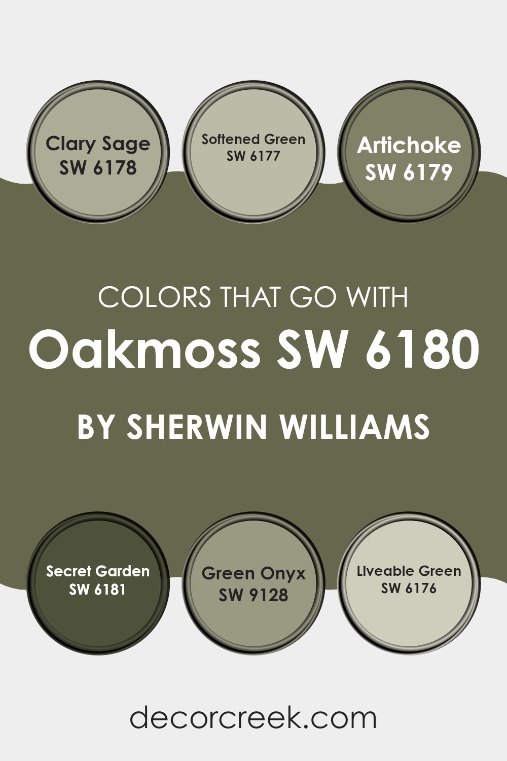
Colors that Go With Oakmoss SW 6180 by Sherwin Williams
Choosing colors that complement Oakmoss SW 6180 by Sherwin Williams is important because it helps create a harmonious and balanced look in an area. Oakmoss is a rich, earthy green that can create a cozy and inviting atmosphere, and selecting the right companion colors enhances its appeal.
For instance, SW 6178 – Clary Sage is a soft, muted green that pairs wonderfully with Oakmoss, offering a gentle contrast while maintaining a soothing vibe. SW 6177 – Softened Green is slightly lighter, bringing a touch of airiness and light to the palette without clashing with Oakmoss’s natural depth.
SW 6179 – Artichoke is a deeper green that works in tandem with Oakmoss to create a more grounded and intimate feel, perfect for rooms where warmth and coziness are desired. Meanwhile, SW 6181 – Secret Garden is a darker shade that can add a touch of drama when paired with Oakmoss, ideal for accent walls or statement pieces.
SW 9128 – Green Onyx introduces a subtle hint of gray that harmonizes with the earthy tones of Oakmoss, adding a modern edge. Lastly, SW 6176 – Liveable Green complements Oakmoss by adding a brighter, livelier touch, balancing the darker undertones and keeping areas looking fresh and inviting.
You can see recommended paint colors below:
- SW 6178 Clary Sage
- SW 6177 Softened Green
- SW 6179 Artichoke
- SW 6181 Secret Garden
- SW 9128 Green Onyx
- SW 6176 Liveable Green
How to Use Oakmoss SW 6180 by Sherwin Williams In Your Home?
Oakmoss SW 6180 by Sherwin Williams is a rich, earthy green paint color that brings nature indoors. It is a deep, grounding shade that can make a room feel cozy and inviting. You can use Oakmoss in various ways to add warmth and character to your home.
Consider using it in a living room as an accent wall to create a focal point without overpowering the area. It pairs well with neutral colors like beige, cream, or soft whites, which helps to balance its depth. In a bedroom, Oakmoss can create a calming, restful environment when used as the main wall color or as part of an accent design behind the bed.
It works beautifully with wooden furniture and natural materials, which enhance its organic feel. You could also apply Oakmoss in small areas like a powder room for a touch of drama or on kitchen cabinets for a bold, yet grounded, look.
Oakmoss SW 6180 by Sherwin Williams vs Garden Spot SW 6432 by Sherwin Williams
Oakmoss SW 6180 and Garden Spot SW 6432 by Sherwin Williams are two shades of green that offer distinct vibes. Both colors are earthy, yet they have unique features that set them apart.
Oakmoss SW 6180 is a muted, mossy green. It carries a sense of calm and is ideal for those who want a nature-inspired feel without being too bold. This color has an earthy undertone, making it suitable for cozy areas like living rooms or studies.
On the other hand, Garden Spot SW 6432 is a brighter, more lively green. It has a fresh and vibrant feel, reminiscent of a lush garden or new growth. This shade can energize an area and is excellent for places where you want an uplifting atmosphere, such as kitchens or bathrooms.
Both colors can bring a touch of the outdoors inside, but Oakmoss is more understated, while Garden Spot brings more energy and light.
You can see recommended paint color below:
- SW 6432 Garden Spot
Oakmoss SW 6180 by Sherwin Williams vs Rosemary SW 6187 by Sherwin Williams
Oakmoss (SW 6180) and Rosemary (SW 6187) by Sherwin Williams are two different shades of green that create distinct feelings. Oakmoss is a deep, earthy green that brings a sense of richness and nature into an area.
It evokes images of forest floors and lush landscapes, making it feel grounded and cozy. On the other hand, Rosemary is a lighter, more subtle green with a hint of gray. This color feels fresh and airy, like a gentle herb garden. It is softer and more understated compared to the boldness of Oakmoss.
While Oakmoss can dominate a room with its intensity and depth, Rosemary often provides a gentle, soothing backdrop that can complement various decor styles. Together, these colors can create a harmonious nature-inspired environment, with Rosemary providing balance to the more intense Oakmoss. Both shades offer unique qualities that can enhance home décors differently.
You can see recommended paint color below:
Oakmoss SW 6180 by Sherwin Williams vs Inverness SW 6433 by Sherwin Williams
Oakmoss (SW 6180) by Sherwin Williams is a rich, earthy green that carries a touch of yellow, making it warm and inviting. It has a depth that can create a cozy atmosphere, almost reminiscent of a forest floor or lush moss. Its muted undertone makes it flexible for both traditional and modern areas.
In contrast, Inverness (SW 6433) is a fresher shade of green with stronger yellow undertones. This color feels lighter and more vibrant compared to Oakmoss. Inverness can brighten up an area and has an energetic feel to it. It might remind one of new leaves in spring, making it a lively option for rooms that could use a splash of color.
While both are green, Oakmoss offers a grounded and warm depth, suitable for cozy areas, whereas Inverness provides a bright and uplifting energy, perfect for places that need a touch of liveliness.
You can see recommended paint color below:
- SW 6433 Inverness
Oakmoss SW 6180 by Sherwin Williams vs Sage Green Light SW 2851 by Sherwin Williams
Oakmoss (SW 6180) and Sage Green Light (SW 2851) by Sherwin Williams are two distinct shades of green. Oakmoss is a rich, deep green with earthy undertones. It has a robust and cozy feel, making it suitable for adding warmth to larger areas or creating an intimate atmosphere in a small room.
On the other hand, Sage Green Light is a softer and lighter green. It feels fresh and airy, lending itself well to areas where you want a clean and calming vibe. This shade works well in kitchens, bathrooms, or any room where a touch of nature and lightness is desired.
While both are green, Oakmoss carries a darker, more intense presence, whereas Sage Green Light brings a subtle, gentle touch. Choosing between these colors depends on whether you want a bold statement or a soothing effect in your area. Each has its charm, making them flexible for various home settings.
You can see recommended paint color below:
Oakmoss SW 6180 by Sherwin Williams vs Greenfield SW 6439 by Sherwin Williams
Oakmoss SW 6180 and Greenfield SW 6439 by Sherwin Williams are two green shades with distinct personalities. Oakmoss is a muted, earthy green with a hint of gray, bringing warmth and a calming, rustic feel.
It’s flexible for living rooms or bedrooms, creating a cozy and inviting atmosphere. Greenfield, on the other hand, is a brighter, more vivid green, reminiscent of fresh leaves. It adds energy and cheer to areas, making it great for kitchens or playrooms where you want a lively feel.
While Oakmoss pairs well with warm neutrals and wood tones, Greenfield works beautifully with crisp whites for a refreshing contrast. Both colors bring nature indoors, but Oakmoss leans towards a grounded, soothing vibe, while Greenfield injects a sense of freshness and vitality. Choosing between them depends on whether you want a peaceful retreat or a lively, energetic area.
You can see recommended paint color below:
- SW 6439 Greenfield
Oakmoss SW 6180 by Sherwin Williams vs Basil SW 6194 by Sherwin Williams
Oakmoss and Basil are two popular colors from Sherwin Williams, each bringing a unique feel to areas. Oakmoss SW 6180 is a muted, earthy green that evokes a sense of nature and stability.
It’s a flexible color that works well in various settings, from living rooms to bedrooms, where a calm and organic touch is desired. Basil SW 6194, on the other hand, is a slightly bolder green with a hint of warmth. While it also draws inspiration from nature, it offers a bit more vibrancy compared to Oakmoss.
Basil can add energy and freshness to an area, making it suitable for kitchens or dining areas. Both colors can complement natural materials and pair well with whites and neutrals. However, Oakmoss is better for those seeking subtlety, while Basil might appeal to those who want a livelier atmosphere.
You can see recommended paint color below:
Oakmoss SW 6180 by Sherwin Williams vs Basque Green SW 6426 by Sherwin Williams
Oakmoss (SW 6180) by Sherwin Williams is a rich, earthy green with hints of brown and gray, giving it a muted and natural look. It’s a flexible color that brings a sense of warmth and coziness to any area, making it ideal for creating a comfortable atmosphere. Oakmoss pairs well with neutral tones and other natural colors, enhancing its soothing effect.
Basque Green (SW 6426), on the other hand, is a brighter and more vibrant green. It has a lively, fresh appearance, with a touch of yellow undertone that makes it feel energetic and welcoming. This color brightens up areas and adds a cheerful touch, making it a great choice for areas where you want to introduce a lively vibe.
While Oakmoss is more subdued and calming, Basque Green brings more energy and brightness, even though both can be used in natural, earthy settings.
You can see recommended paint color below:
- SW 6426 Basque Green
Oakmoss SW 6180 by Sherwin Williams vs Rookwood Dark Green SW 2816 by Sherwin Williams
Oakmoss (SW 6180) by Sherwin Williams is a muted, earthy green that brings a sense of nature indoors. It’s soft and subtle, with a hint of gray, making it flexible for many areas. This color feels warm and comfortable, perfect for creating a cozy and inviting atmosphere.
On the other hand, Rookwood Dark Green (SW 2816) is a richer, more saturated green. It’s deep and almost forest-like, with a classic and bold look. This color can add drama and sophistication to a room, making it stand out as an accent or feature wall.
Both colors connect with nature, but Oakmoss is more muted and gentle, while Rookwood Dark Green is intense and striking. Oakmoss is ideal for a relaxed vibe, whereas Rookwood Dark Green is perfect for a more dramatic effect. Together, they can complement each other beautifully, offering depth and interest to a room.
You can see recommended paint color below:
- SW 2816 Rookwood Dark Green
Oakmoss SW 6180 by Sherwin Williams vs Relentless Olive SW 6425 by Sherwin Williams
Oakmoss (SW 6180) and Relentless Olive (SW 6425) by Sherwin Williams are rich, earthy colors that bring warmth to any area. Oakmoss is a deep, muted green with gray undertones, offering a natural and calming vibe. It’s flexible, working well in both contemporary and traditional settings, and pairs nicely with neutrals and other nature-inspired colors.
Relentless Olive, on the other hand, is a bolder choice. It’s a vibrant olive green with yellow undertones, adding energy to a room. This color is more adventurous and less neutral than Oakmoss, making a statement in any area. It pairs beautifully with warm woods and off-whites, as well as with bold accents like deep reds or navy blues.
Both colors bring the essence of the outdoors inside, but Oakmoss leans towards subtlety and calm, while Relentless Olive infuses a room with lively and bold character.
You can see recommended paint color below:
- SW 6425 Relentless Olive
Oakmoss SW 6180 by Sherwin Williams vs Eclipse SW 6166 by Sherwin Williams
Oakmoss SW 6180 and Eclipse SW 6166 are two distinct colors by Sherwin Williams. Oakmoss is a warm, rich green that feels earthy and grounded. It brings a sense of nature indoors, often making an area feel cozy and inviting. It’s a flexible color that pairs well with neutrals and browns, adding a touch of natural warmth to any room.
On the other hand, Eclipse is a deep, muted taupe with gray undertones. It creates a more subtle and refined feel. This neutral shade works well as a backdrop for both bright and muted accents, making it a flexible choice for various styles. It’s less about bringing nature in and more about creating a modern and understated elegance.
Together, these colors can complement each other, with Oakmoss adding vibrancy and warmth, while Eclipse provides a grounding, neutral balance. Their different tones allow them to be used in many design schemes.
You can see recommended paint color below:
- SW 6166 Eclipse
In thinking about SW 6180 Oakmoss by Sherwin Williams, I find myself looking at a color full of nature and calmness. Oakmoss is a warm green, reminding me of lush forests and tall trees. It’s like having a piece of nature right inside a room. It brings feelings of comfort and sitting in a quiet park.
When I imagine a room painted in Oakmoss, it’s easy to think of different styles. Whether it’s a living room that feels cool and cozy or a kitchen that seems inviting and pleasant, Oakmoss seems to fit right in. It’s simple yet gives a room a touch of the outdoors.
I think Oakmoss also works nicely with many other colors. Pair it with soft whites for a fresh look or rich browns for a warmer feel. It is like a good friend getting along well with others.
In using Oakmoss, I don’t feel overwhelmed, and it never seems too much. It’s kind of like wearing your favorite sweater—always comforting and never too bright or boring. So, when choosing a color, I think about the calm and friendly feeling Oakmoss brings. It’s a shade that makes any room feel cozy, like home.
Choosing Oakmoss is like choosing a gentle hug for your walls, bringing the touch of the green outdoor world inside.
Ever wished paint sampling was as easy as sticking a sticker? Guess what? Now it is! Discover Samplize's unique Peel & Stick samples.
Get paint samples

