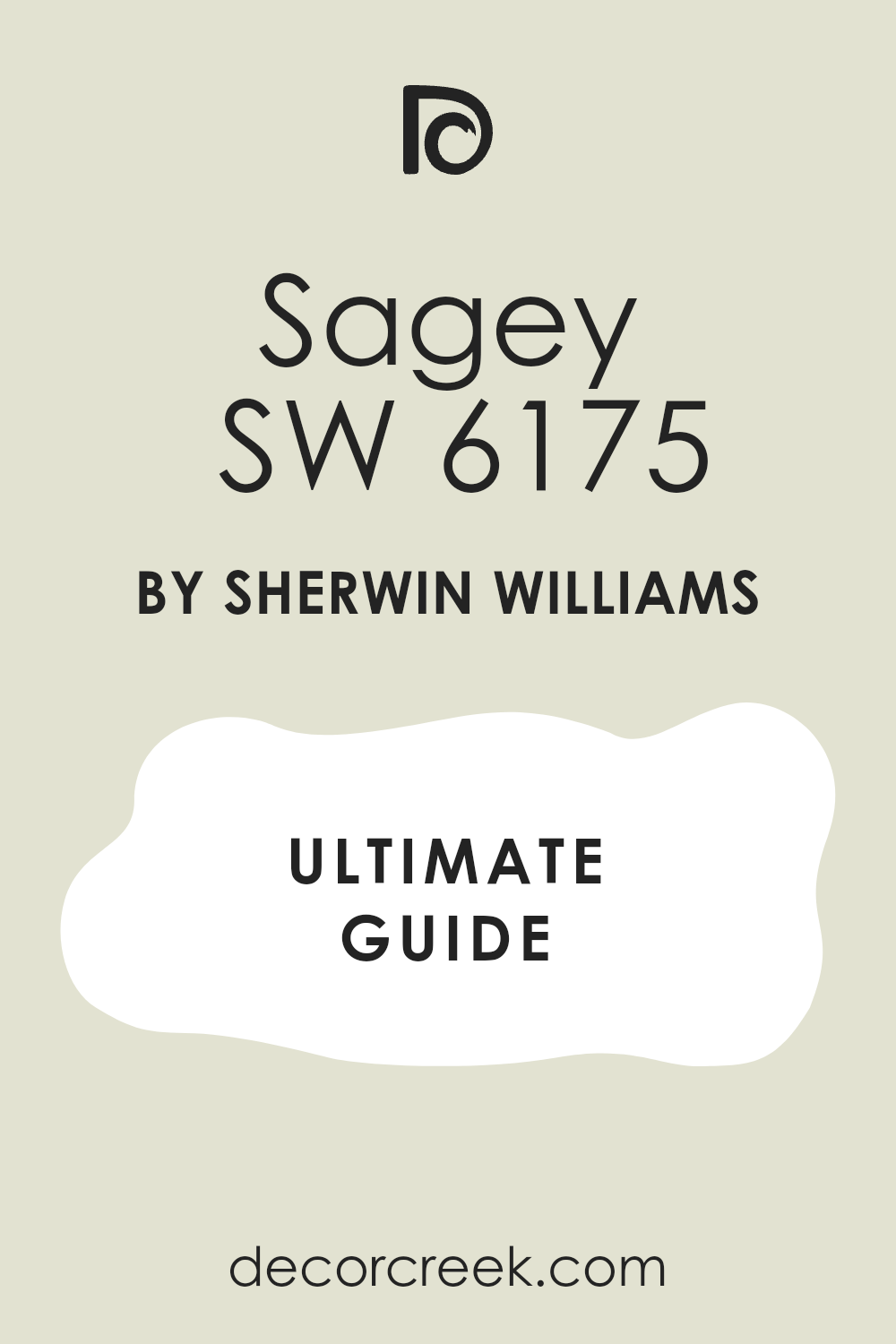
When you first encounter SW 6175 Sagey by Sherwin Williams, it feels like stepping into a peaceful and inviting environment. This color brings a gentle, natural vibe to any room, reminiscent of a quiet walk through a lush, green garden. Sagey is a muted green with gray undertones, making it flexible and easy to use in various design styles.
What makes this color special is its ability to evoke a sense of calm and balance. It doesn’t demand attention like bold colors do, yet it gently changes the feel of a room, lending it a sense of harmony and relaxation. Whether you’re thinking about refreshing your living room, bedroom, or even your kitchen, Sagey provides a soothing backdrop that fits well with both contemporary and traditional decor.
Incorporating SW 6175 Sagey into your home can make for a refreshing update, as it pairs well with natural materials like wood and stone, as well as with neutral colors and soft textiles. This flexible shade offers lasting appeal, creating an inviting atmosphere that you and your guests will enjoy.
Let Sagey by Sherwin Williams craft a peaceful retreat in your home, balancing modern elegance with organic warmth.
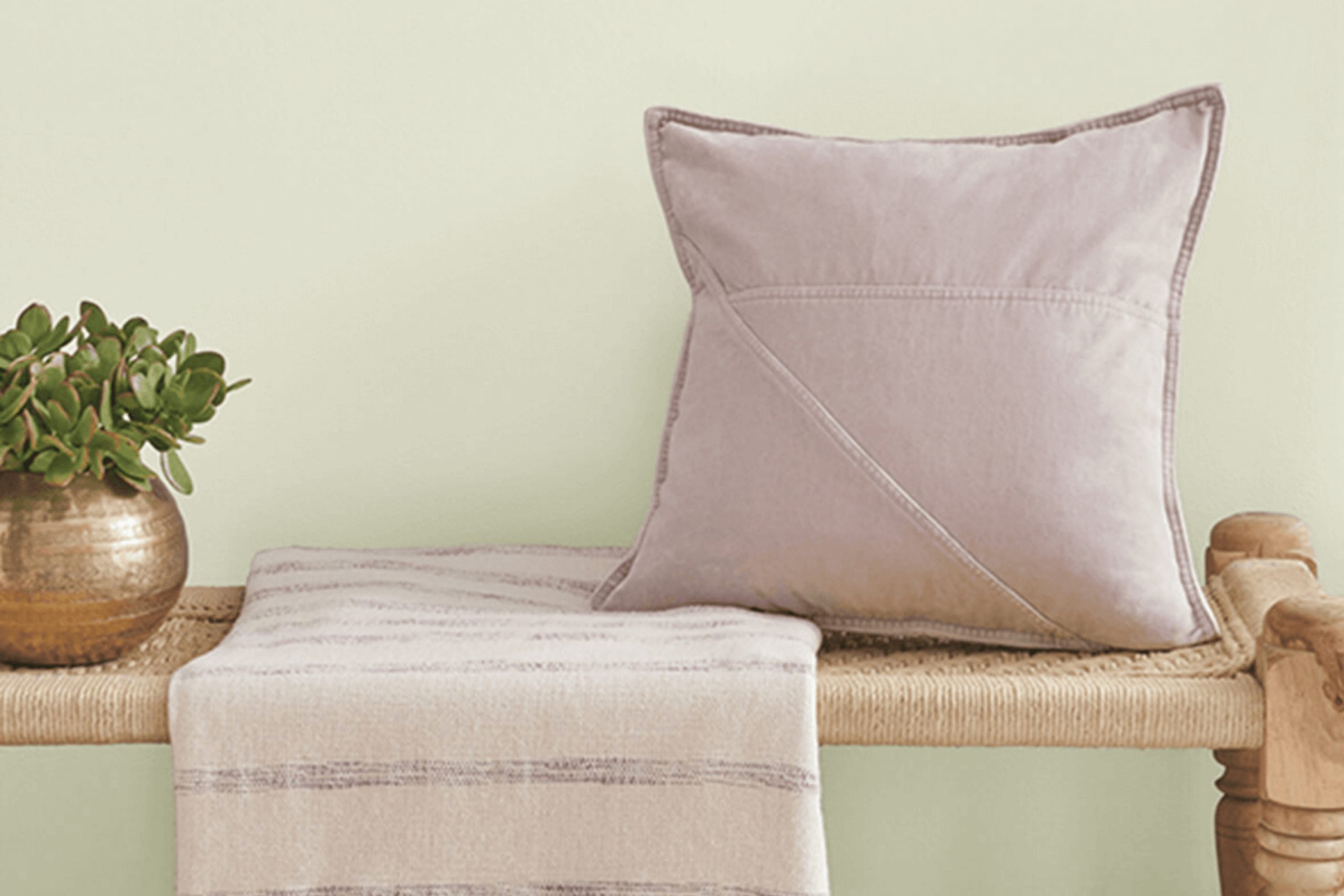
What Color Is Sagey SW 6175 by Sherwin Williams?
Sagey SW 6175 by Sherwin Williams is a soft, muted green that feels natural and understated. It brings a touch of nature indoors, reminiscent of lush gardens and quiet outdoor areas. This color has a gentle and calming quality, making it an ideal choice for rooms where you want a relaxing atmosphere, like bedrooms or living rooms.
Sagey works exceptionally well in interiors with a natural or rustic style, complementing wood textures and earthy materials. It’s a perfect backdrop for rooms featuring wooden furniture, wicker baskets, and leafy plants. The color pairs nicely with linen fabrics, jute rugs, and soft wool throws, enhancing the cozy and approachable feeling in a room.
In modern or Scandinavian-inspired interiors, Sagey can soften sharp lines and add a gentle hint of color without taking away from the simplicity these styles often highlight. It pairs beautifully with light-colored woods and white or cream accents, adding depth and warmth to the room.
For a more eclectic look, mix Sagey with bolder colors like mustard or deep navy in accessories or artwork. Metals like brass or gold make elegant companions to this green, providing a touch of contrast and character. Whether in a cottage-style home or a more contemporary setup, Sagey offers a flexible and inviting paint choice.
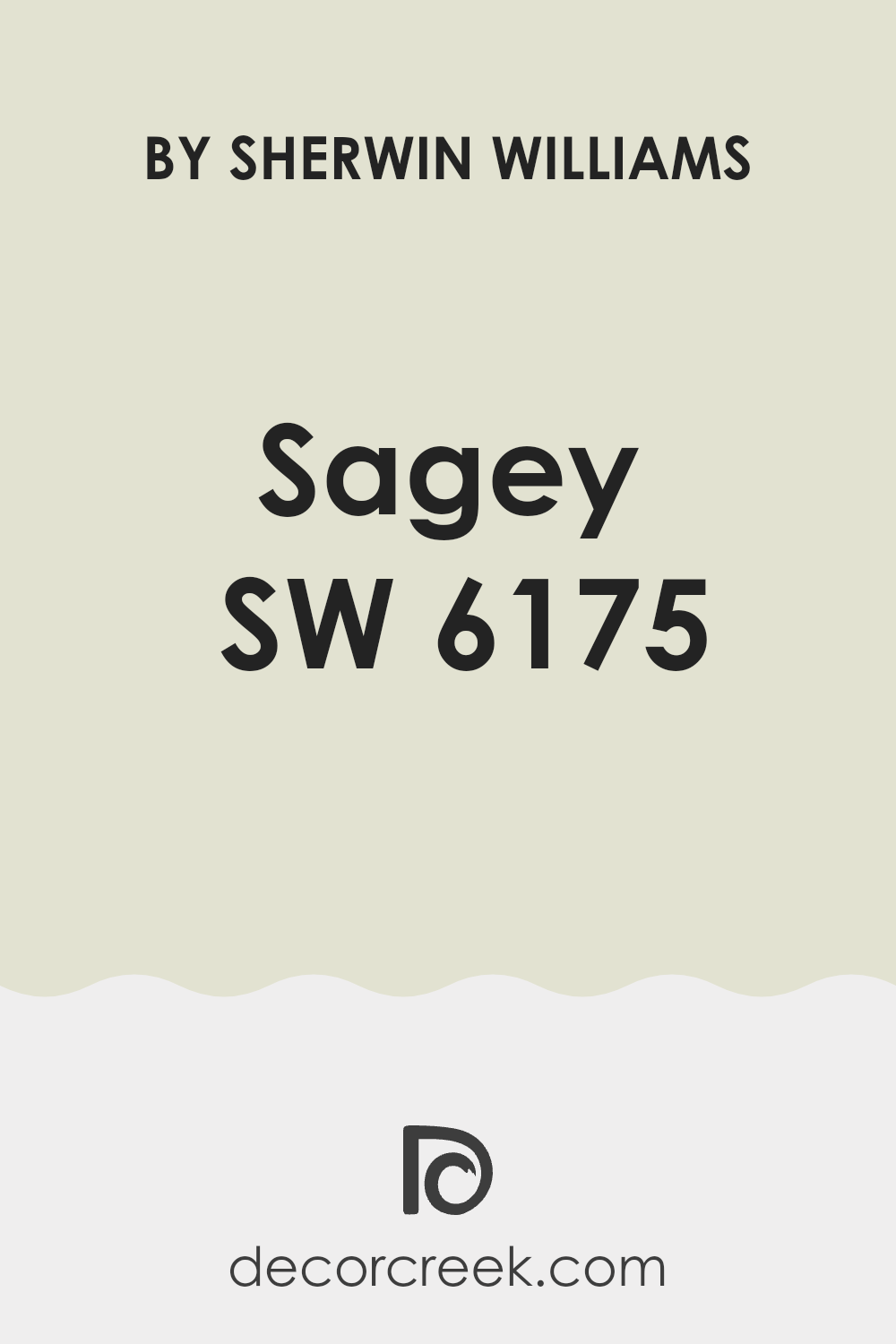
Is Sagey SW 6175 by Sherwin Williams Warm or Cool color?
Sagey SW 6175 by Sherwin Williams is a soft green paint that brings a natural and calming feel to any room. This color is popular in home design because it is flexible and works well with a variety of other colors and styles. Whether used in a living room, bedroom, or kitchen, Sagey can make a room feel more inviting and comfortable.
One of the strengths of Sagey is its ability to act as a neutral backdrop. It pairs nicely with both warm and cool colors, allowing homeowners to mix and match decor items without conflict. This shade of green also brings the essence of nature indoors, which can make a room feel fresh and lively without feeling too bold.
When applied to walls, Sagey SW 6175 can brighten darker areas or enhance natural light. It’s a great choice for those who want a peaceful and welcoming environment in their home.
Undertones of Sagey SW 6175 by Sherwin Williams
Sagey by Sherwin Williams is a muted green that carries a mix of undertones subtly influencing how we perceive it. Undertones are the lighter colors mixed into a paint, creating depth and complexity. These underlying shades can shift how a main color appears, especially under different lighting conditions. In general, undertones can make a color appear warmer, cooler, softer, or more vibrant depending on the surrounding elements and lighting.
For Sagey, the undertones include hints of pale yellow, light blue, and mint, which give it a warmer base. This makes the color feel welcoming and balanced on walls. The pale yellow and mint undertones contribute to a sense of calmness, while the light blue undertones can bring a refreshing touch. The presence of subdued purple and lilac adds an elusive depth, while pale pink warms the overall tone slightly.
The grey undertone softens it, preventing the green from feeling too strong. Using Sagey indoors, these undertones work together to create a soothing environment. The color adjusts well to different rooms, looking cozy in warm light and more crisp and refreshing in cooler light. This flexibility makes it a favorite for places where people want a gentle yet lively color.
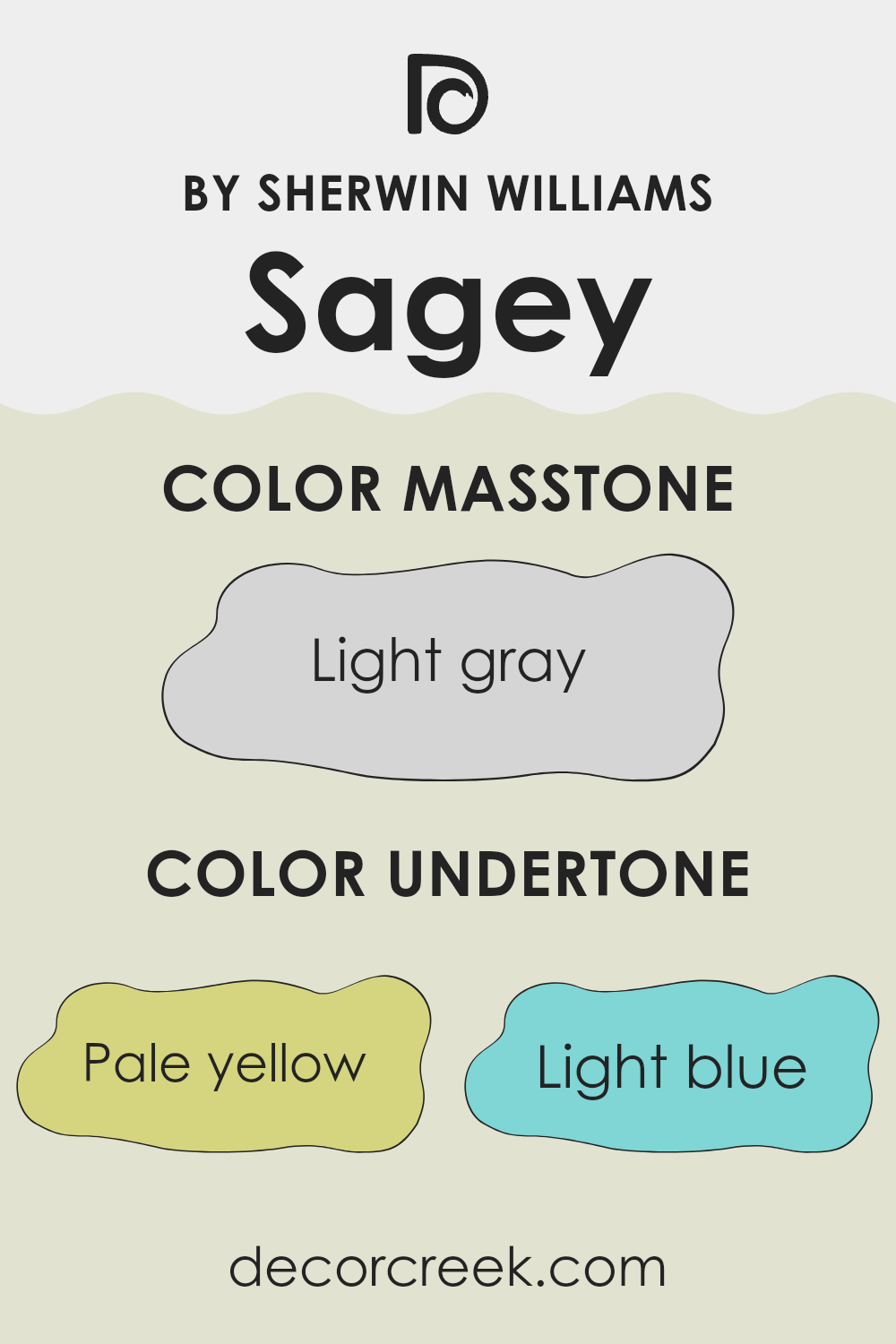
What is the Masstone of the Sagey SW 6175 by Sherwin Williams?
Sagey SW 6175 by Sherwin Williams is a light gray-green color that can bring a fresh, modern feel to home interiors. This flexible shade works well in different rooms due to its balanced tone. Light gray-green provides a soft backdrop, allowing other elements in a room to stand out without taking over. It pairs well with both warm and cool palettes, making it a popular choice among homeowners.
In living rooms, Sagey can create a calm and relaxed atmosphere, helping other decor pieces, like colorful cushions or artwork, to shine. In kitchens, this light gray hue pairs well with stainless steel appliances and natural wood finishes, offering a clean and stylish look.
In bedrooms, it can make the area feel airy and spacious, while in bathrooms, it can reflect light, making the room feel brighter. Overall, Sagey SW 6175’s light gray masstone adjusts well to different styles and preferences, ensuring a lasting appeal.
How Does Lighting Affect Sagey SW 6175 by Sherwin Williams?
Lighting significantly impacts how we perceive colors, and this is especially true for paint colors like Sagey SW 6175 by Sherwin Williams. Natural and artificial lighting conditions can change how this color looks in a room.
Under artificial light, colors can appear differently depending on the type of bulb used. Incandescent lights tend to cast a warm yellow glow, which can make Sagey SW 6175 appear more yellow-green. Fluorescent lights may give a cooler tone, possibly highlighting more of the gray undertones in the color. LED lighting varies widely, but it often displays colors more accurately, though the intensity and shade of the LED light will still affect perception.
Natural light changes throughout the day and varies based on the room’s orientation. In north-facing rooms, the light tends to be cooler and more subdued, which may cause Sagey SW 6175 to appear slightly more muted and grayer. In these conditions, the color might look less vibrant but still calm and understated.
South-facing rooms receive ample sunlight, which is generally warm and bright throughout the day. This type of light will likely make Sagey SW 6175 appear lighter and bring out its green hues, making the room feel more lively while still maintaining a peaceful ambiance.
East-facing rooms get bright, warm light in the morning but then cooler, softer light later in the day. Sagey SW 6175 in such rooms may look more vibrant in the morning with a warmer feel, and more muted in the afternoons.
In west-facing rooms, the light is typically warm and intense in the late afternoon and early evening. During these times, Sagey SW 6175 might look richer and more saturated. However, in the mornings, the light is cooler, and the color may seem softer and less intense.
Overall, Sagey SW 6175’s appearance can vary greatly based on lighting, so it’s wise to test the paint in the specific conditions of your room before making a final decision.

What is the LRV of Sagey SW 6175 by Sherwin Williams?
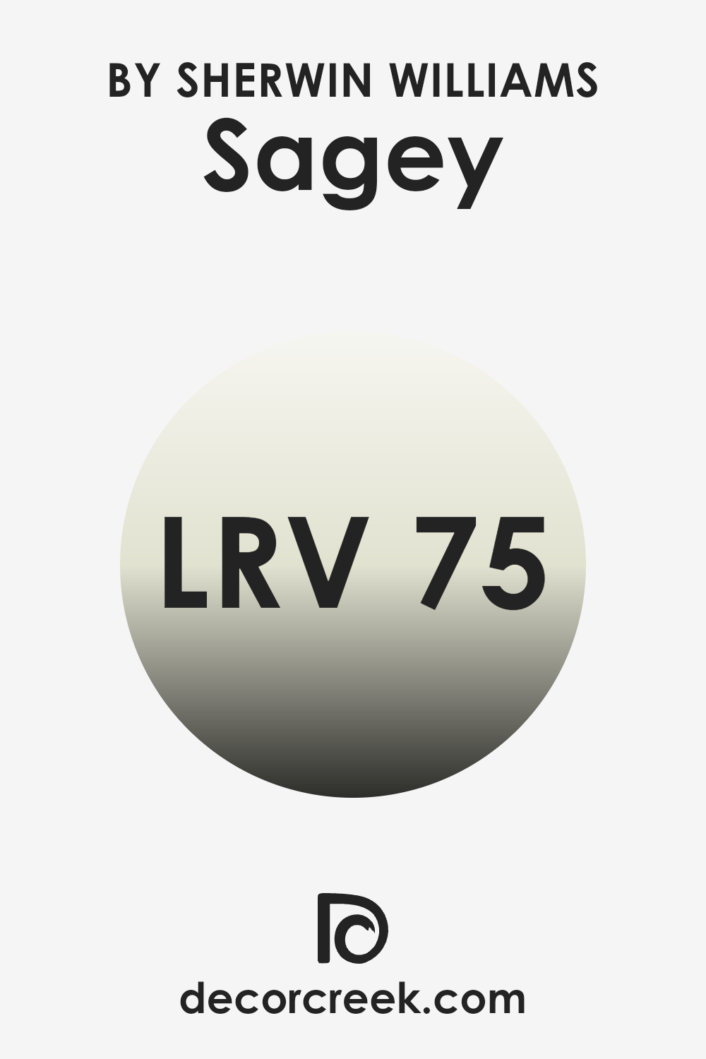
LRV, or Light Reflectance Value, is a measurement that helps us understand how much light a color reflects. It’s represented on a scale from 0 to 100, where 0 means the color absorbs all light (and appears black) and 100 means it reflects all light (and appears white). When you apply paint to a wall, the LRV can affect how bright or dark a room feels.
A high LRV means the color will reflect more light, making a room feel brighter and more open. Conversely, a low LRV means the color will absorb more light, which can make a room feel cozier or sometimes more closed in.
For the color Sagey by Sherwin Williams, with an LRV of 74.89, it sits on the higher end of the scale. This means it’s pretty reflective and will make a room feel light and airy. If you paint a room in this shade, it is likely to feel bright and lively since the color bounces a good amount of light back into the room.
It’s a good choice if you want to maintain a fresh and open atmosphere, allowing the room to feel more expansive. The LRV suggests it will work well in rooms that don’t get a lot of natural light, as it can help maximize whatever light is available.
Coordinating Colors of Sagey SW 6175 by Sherwin Williams
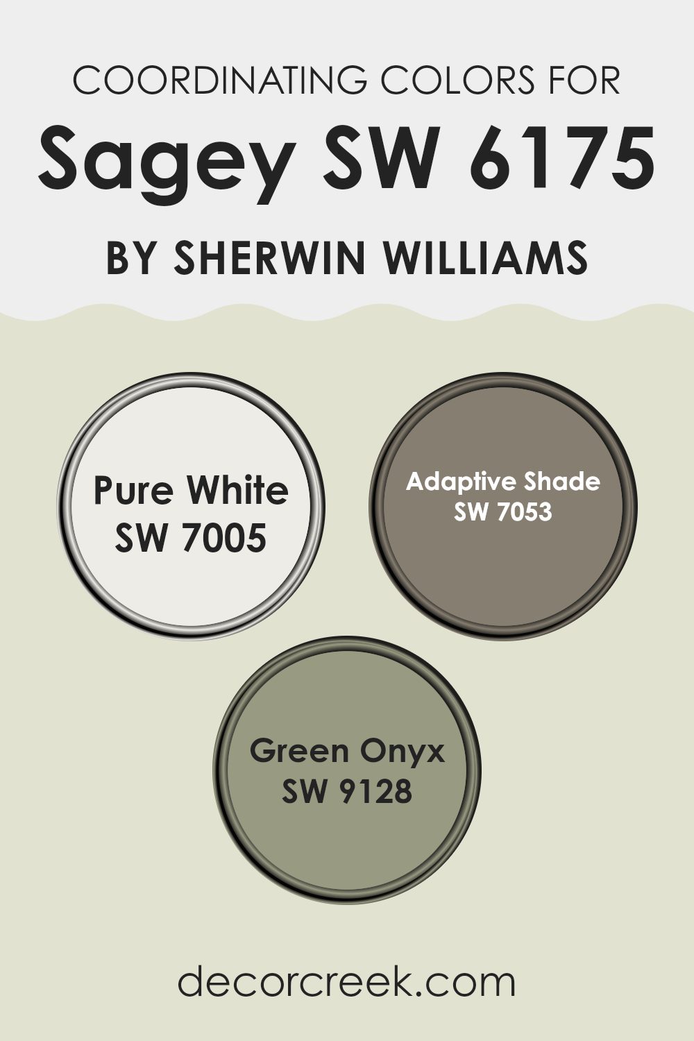
Coordinating colors refer to shades that work well together, creating a balanced and visually appealing look when used in the same room. When paired with Sagey by Sherwin Williams, these colors can help create a cozy and inviting atmosphere.
The key is to select shades that complement each other without overpowering. For example, Pure White is a crisp, clean shade that acts as a perfect backdrop, allowing Sagey’s soft, nature-inspired hue to stand out. Pure White offers brightness and simplicity, which enhance any primary color by providing a clean visual break.
Adaptive Shade, on the other hand, is a warm, earthy tone that introduces depth and richness. Its soft warmth pairs well with the gentle sage green, adding a comfortable feel to the room. Meanwhile, Green Onyx is a deeper, more intense green that brings a touch of elegance and character to any area.
It works beautifully alongside Sagey, as it maintains the natural theme while adding a touch of boldness. By using Pure White, Adaptive Shade, and Green Onyx as coordinating colors with Sagey, you can create a balanced palette that’s both refreshing and welcoming, perfect for a room that feels like home.
You can see recommended paint colors below:
- SW 7005 Pure White (CHECK A SAMPLE)
- SW 7053 Adaptive Shade (CHECK A SAMPLE)
- SW 9128 Green Onyx (CHECK A SAMPLE)
What are the Trim colors of Sagey SW 6175 by Sherwin Williams?
Trim colors play a crucial role in enhancing the overall appearance of a room. They add contrast and definition, helping specific elements stand out and creating a polished look. For a color like Sagey SW 6175 by Sherwin Williams, choosing the right trim colors can really make a difference.
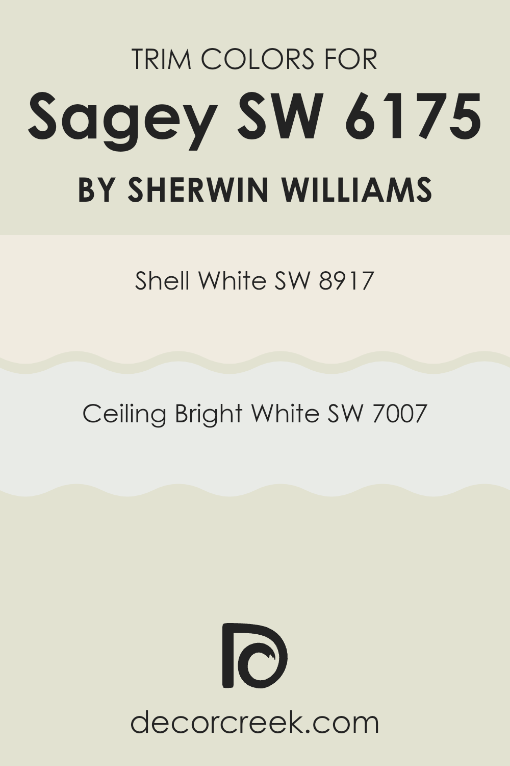
Sagey is a soft, muted green that evokes a sense of calm and nature. To complement this shade, using SW 8917 Shell White for trim creates a smooth and warm transition. Shell White is a gentle, creamy white that adds warmth without overpowering the room, making it perfect for rooms that benefit from a touch of coziness.
On the other hand, SW 7007 Ceiling Bright White is an excellent choice for a crisper, more modern look. This is a clean and fresh white with a true brightness that helps rooms feel larger and more open. It provides a clear contrast against Sagey, making your green walls stand out as the main feature in the room.
Trim colors like Shell White and Ceiling Bright White are important because they provide a backdrop that enhances the main wall colors. They offer subtle, yet powerful ways to emphasize the beauty of your chosen wall color, allowing the room to feel cohesive and well-designed.
You can see recommended paint colors below:
Colors Similar to Sagey SW 6175 by Sherwin Williams
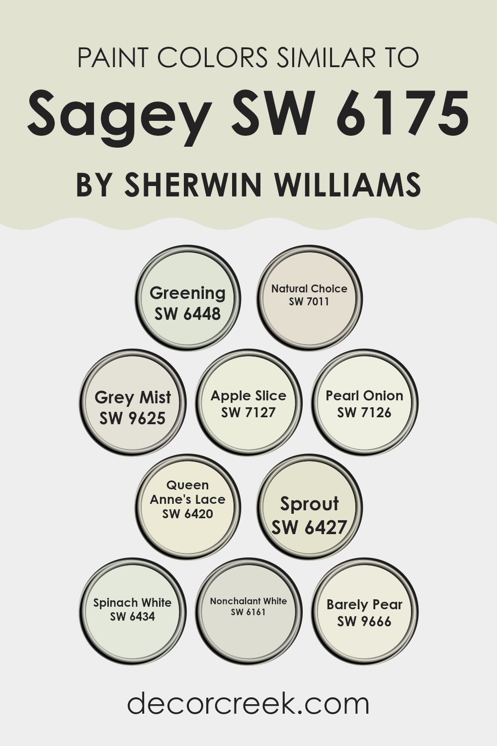
Similar colors can have a significant impact on the feel and design of a room. They provide a harmonious look and create a seamless flow from one area to another. Take for instance the colors inspired by Sagey by Sherwin Williams. Greening brings the freshness of a lush garden, adding a revitalizing touch to any room.
Natural Choice is a soft, creamy hue that provides a comforting and clean backdrop. Grey Mist offers a gentle, muted tone that complements a variety of styles. Apple Slice is a vibrant, lively shade that can brighten up rooms, exuding energy and warmth.
Pearl Onion is a more subtle color, slightly off-white, adding a simple elegance to walls without feeling too strong. Queen Anne’s Lace gives off an airy, light vibe, like a walk through a quiet meadow. Sprout, with its soft green undertones, offers a gentle and growing sense of life.
Spinach White is a muted hue that balances well with stronger colors, maintaining a neutral environment. Nonchalant White delivers a touch that feels pure and uncluttered. Barely Pear hints at the fresh and playful side of green, perfect for adding a bit of fun to a neutral palette. Together, these colors create a rich tapestry, enhancing the room through their subtle similarities.
You can see recommended paint colors below:
- SW 6448 Greening
- SW 7011 Natural Choice (CHECK A SAMPLE)
- SW 9625 Grey Mist (CHECK A SAMPLE)
- SW 7127 Apple Slice
- SW 7126 Pearl Onion
- SW 6420 Queen Anne’s Lace (CHECK A SAMPLE)
- SW 6427 Sprout (CHECK A SAMPLE)
- SW 6434 Spinach White (CHECK A SAMPLE)
- SW 6161 Nonchalant White (CHECK A SAMPLE)
- SW 9666 Barely Pear (CHECK A SAMPLE)
Colors that Go With Sagey SW 6175 by Sherwin Williams
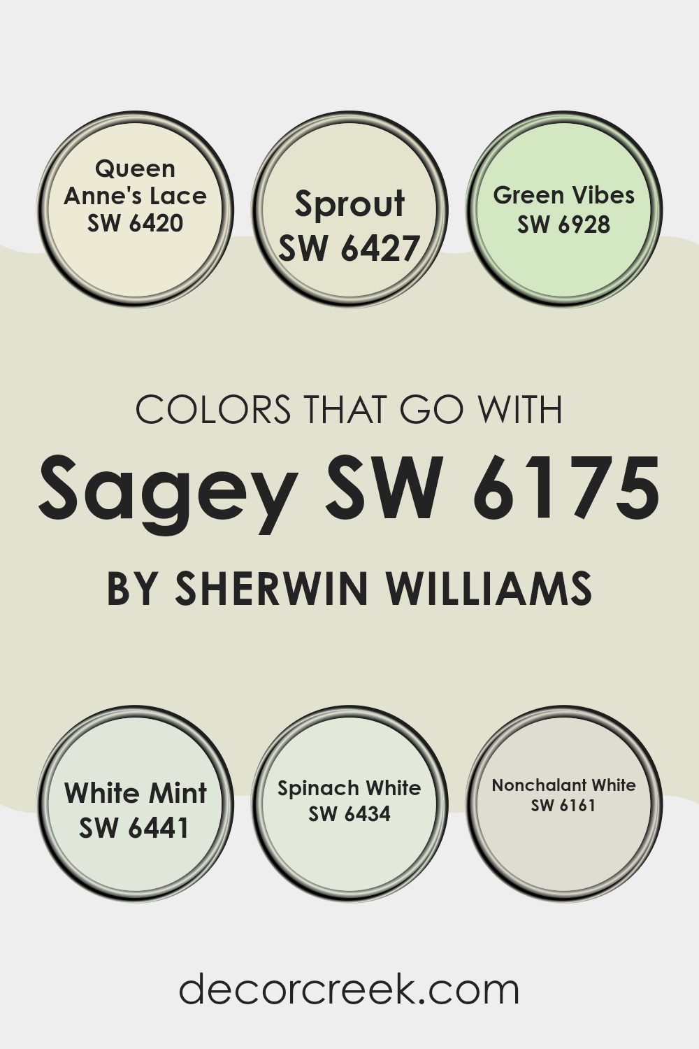
Sagey SW 6175 by Sherwin Williams is a calm, muted green that brings a sense of peace to a room. Finding colors that pair well with Sagey can enhance the feeling of the area and create a more balanced setting. Colors like SW 6420 – Queen Anne’s Lace and SW 6427 – Sprout work well with Sagey’s gentle tone. Queen Anne’s Lace is a soft, creamy white that offers a light, airy contrast, while Sprout is a fresh, light green that complements Sagey’s earthiness without taking over.
Additionally, adding SW 6928 – Green Vibes and SW 6441 – White Mint to the mix can bring a light, refreshing energy to the room. Green Vibes is a bright and cheerful green, perfect for adding a pop of color, while White Mint provides a crisp, clean feel.
Meanwhile, SW 6434 – Spinach White, a soft, pale green, acts as a gentle bridge between Sagey and stronger colors. Finally, incorporating SW 6161 – Nonchalant White, a subtle off-white, can tie everything together with its warm undertones, helping the room feel cohesive and welcoming. Together, these colors create an appealing harmony with Sagey, enhancing the room’s mood without clashing or feeling too bold.
You can see recommended paint colors below:
- SW 6420 Queen Anne’s Lace (CHECK A SAMPLE)
- SW 6427 Sprout (CHECK A SAMPLE)
- SW 6928 Green Vibes (CHECK A SAMPLE)
- SW 6441 White Mint (CHECK A SAMPLE)
- SW 6434 Spinach White (CHECK A SAMPLE)
- SW 6161 Nonchalant White (CHECK A SAMPLE)
How to Use Sagey SW 6175 by Sherwin Williams In Your Home?
Sagey SW 6175 by Sherwin Williams is a soft, muted green that can add a gentle touch to any room. This color is ideal for those who want a quiet hint of nature in their home without it feeling too strong.
In the living room, Sagey can be used on the walls to create a calming backdrop for furniture and artwork. Pairing it with neutral colors like beige or cream can maintain a light, airy feel. In the kitchen, Sagey might complement natural wood cabinets and stainless steel appliances, offering a fresh yet cozy atmosphere.
For a bedroom, using Sagey on an accent wall can provide a peaceful environment suited for relaxation and rest. Accessories like rugs, cushions, or curtains in similar soft tones can enhance the overall look. Sagey is flexible enough to work well in a variety of rooms, adding a touch of calm wherever it’s used.
Sagey SW 6175 by Sherwin Williams vs Nonchalant White SW 6161 by Sherwin Williams
Sagey SW 6175 and Nonchalant White SW 6161 by Sherwin Williams offer two distinct moods for a room. Sagey is a muted green with subtle earthy undertones, offering a natural and calming vibe. It works well in rooms where you want to bring a bit of the outside in, providing a gentle, nature-inspired feel.
Nonchalant White, on the other hand, is a soft, off-white shade with a hint of warmth. It provides a clean and airy backdrop, ideal for making a room feel more open and light. This color is flexible and can complement various styles, from modern to traditional.
While Sagey adds a touch of color and warmth, Nonchalant White makes a room feel larger and brighter. Using them together can create a balanced look, where Sagey adds interest and Nonchalant White keeps the room feeling fresh and open.
You can see recommended paint color below:
- SW 6161 Nonchalant White (CHECK A SAMPLE)
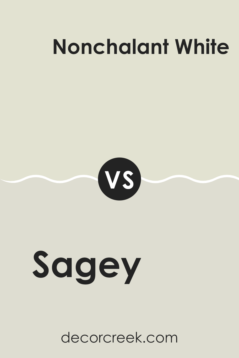
Sagey SW 6175 by Sherwin Williams vs Spinach White SW 6434 by Sherwin Williams
Sagey SW 6175 and Spinach White SW 6434 are two distinct colors by Sherwin Williams that offer different vibes. Sagey is a muted, soft green with gray undertones. It creates a calm and relaxing atmosphere, perfect for rooms where you want a gentle hint of nature without feeling too strong.
On the other hand, Spinach White is a lighter, more refreshing shade. It has a slight green tint but leans more towards a pastel. This color is great for brightening up rooms and giving them a fresh, airy feel. While Sagey provides a cozy and grounded environment, Spinach White brings a sense of openness and lightness.
Both colors can work well in various rooms, but Sagey might be more suitable for living rooms or bedrooms where relaxation is key. Spinach White can be perfect for kitchens or bathrooms to keep things looking clean and bright.
You can see recommended paint color below:
- SW 6434 Spinach White (CHECK A SAMPLE)
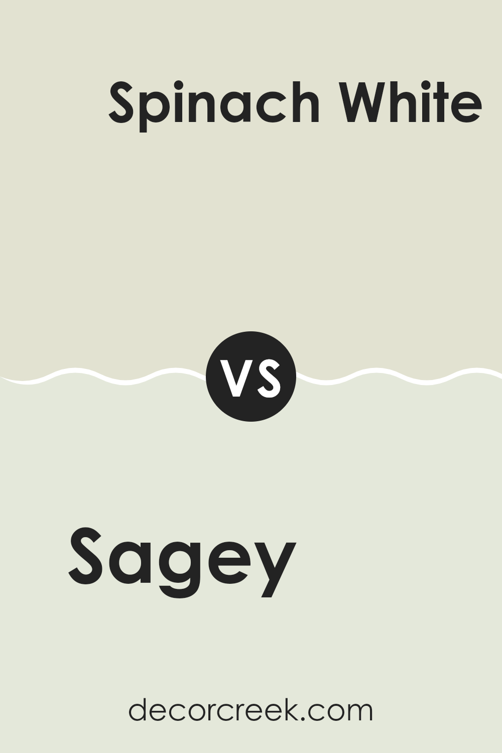
Sagey SW 6175 by Sherwin Williams vs Natural Choice SW 7011 by Sherwin Williams
Sagey (SW 6175) and Natural Choice (SW 7011) from Sherwin Williams are two distinct paint colors that can create different moods in a room. Sagey is a muted green with gray undertones. It brings a calm and restful atmosphere to any area, making it perfect for bedrooms or living rooms. This color has an earthy feel, which can make a room feel fresh and connected to nature.
On the other hand, Natural Choice is a soft and warm off-white. It has a subtle touch of creaminess, which gives rooms a cozy and inviting feel. It’s flexible and can be used in many settings, providing a clean and airy backdrop that pairs well with a wide range of colors.
While Sagey adds a touch of nature and grounded comfort, Natural Choice provides warmth and brightness. Both colors work well depending on the ambiance you desire, whether it’s a grounded or open and light-filled feel.
You can see recommended paint color below:
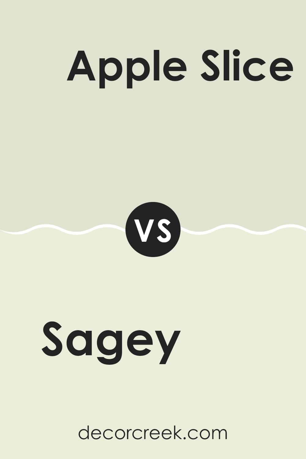
Sagey SW 6175 by Sherwin Williams vs Apple Slice SW 7127 by Sherwin Williams
Sagey (SW 6175) by Sherwin Williams is a soft, muted green that brings a sense of calm and relaxation. It has gray undertones, making it flexible and easy to pair with other colors. Sagey is great for living rooms, bedrooms, or any room where you want a calming atmosphere.
On the other hand, Apple Slice (SW 7127) is a much brighter and cheerful green. It has a lively and fresh feel, reminiscent of a crisp apple. This color is perfect for adding energy to a room and works well in kitchens, bathrooms, or playrooms where a vibrant and lively feel is desired.
Both colors are greens, but Sagey offers a gentle and subdued presence, while Apple Slice is bold and energizing. They each have their place in home design, depending on whether you want a soothing setting or a room full of energy.
You can see recommended paint color below:
- SW 7127 Apple Slice
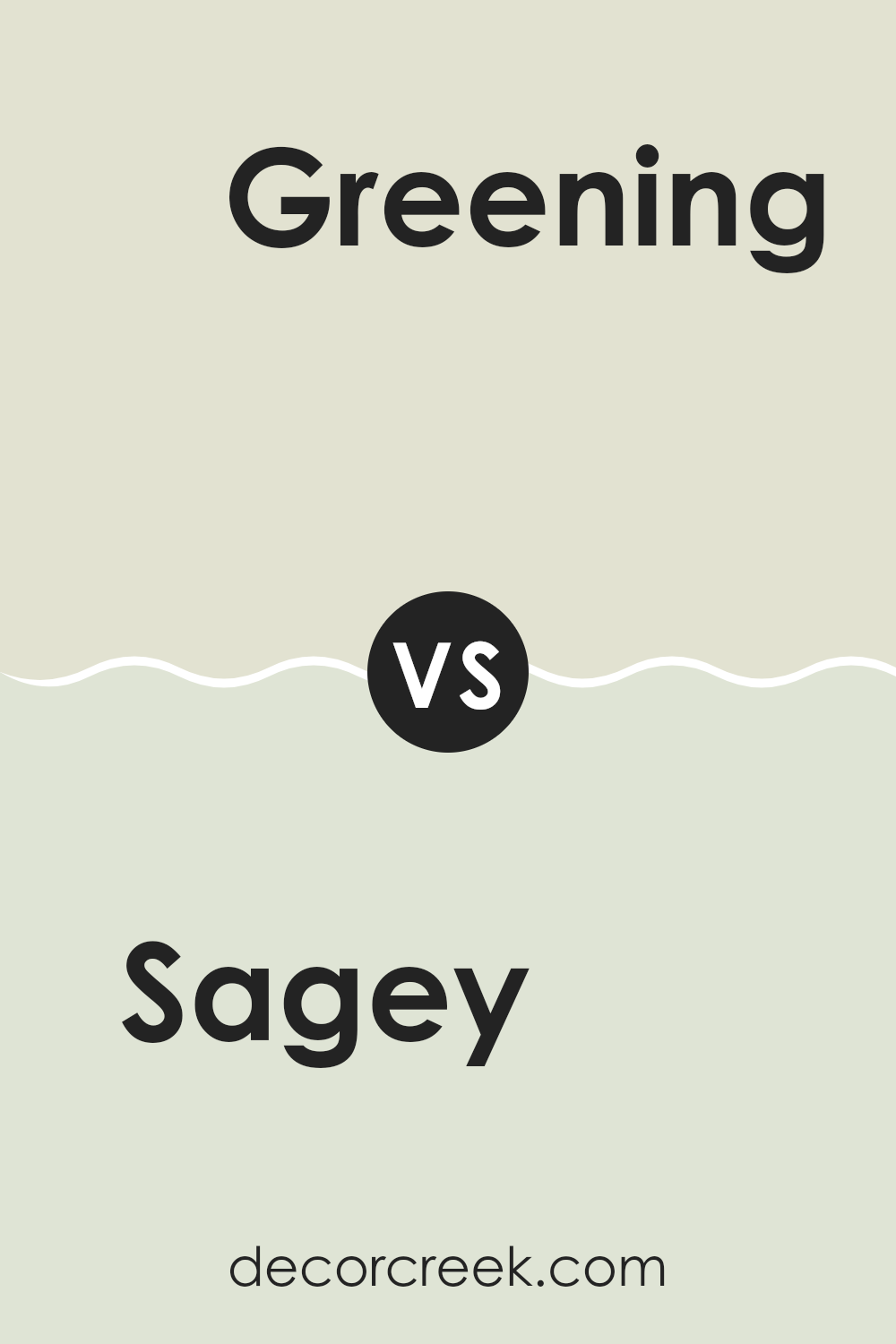
Sagey SW 6175 by Sherwin Williams vs Greening SW 6448 by Sherwin Williams
Sagey (SW 6175) and Greening (SW 6448) are two lovely shades of green by Sherwin Williams. Sagey is a soft, muted green with a bit of gray, giving it a calm and gentle feel. It’s great for creating a relaxed setting and pairs well with natural materials and neutral colors.
In contrast, Greening is a more vibrant and lively green. It has a fresher, brighter quality that can energize a room. This color works well if you want to add a touch of nature’s zest to your decor. Greening is perfect for rooms where you want to feel a boost of energy and positivity.
Both colors bring a touch of nature into your home, but Sagey is more subdued while Greening stands out with its brightness. Depending on the mood you want in your room—calm or energized—one of these greens might be the right choice for you.
You can see recommended paint color below:
- SW 6448 Greening
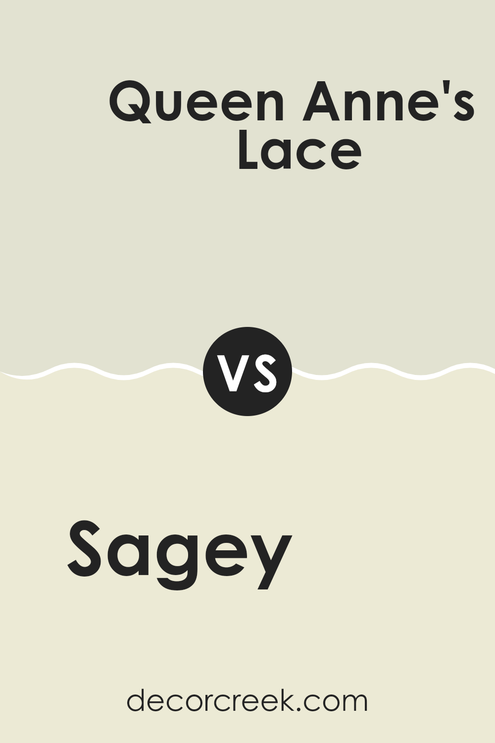
Sagey SW 6175 by Sherwin Williams vs Queen Anne’s Lace SW 6420 by Sherwin Williams
Sagey (SW 6175) from Sherwin Williams is a soft, muted green that brings a touch of nature indoors. It’s a calming color that works well for creating a relaxed atmosphere in any room. Sagey is flexible and can complement a variety of other colors and furnishings, making it a popular choice for living rooms, bedrooms, and kitchens.
On the other hand, Queen Anne’s Lace (SW 6420) is a light, creamy off-white with a hint of warmth. This color is bright and fresh, often used to make a room feel more open and airy. It’s perfect for rooms where you want to maintain a light and clean look, such as bathrooms or hallways.
When paired together, Sagey and Queen Anne’s Lace can create a balanced and harmonious look. Sagey brings a touch of nature and depth, while Queen Anne’s Lace keeps the room feeling light and welcoming.
You can see recommended paint color below:
- SW 6420 Queen Anne’s Lace (CHECK A SAMPLE)
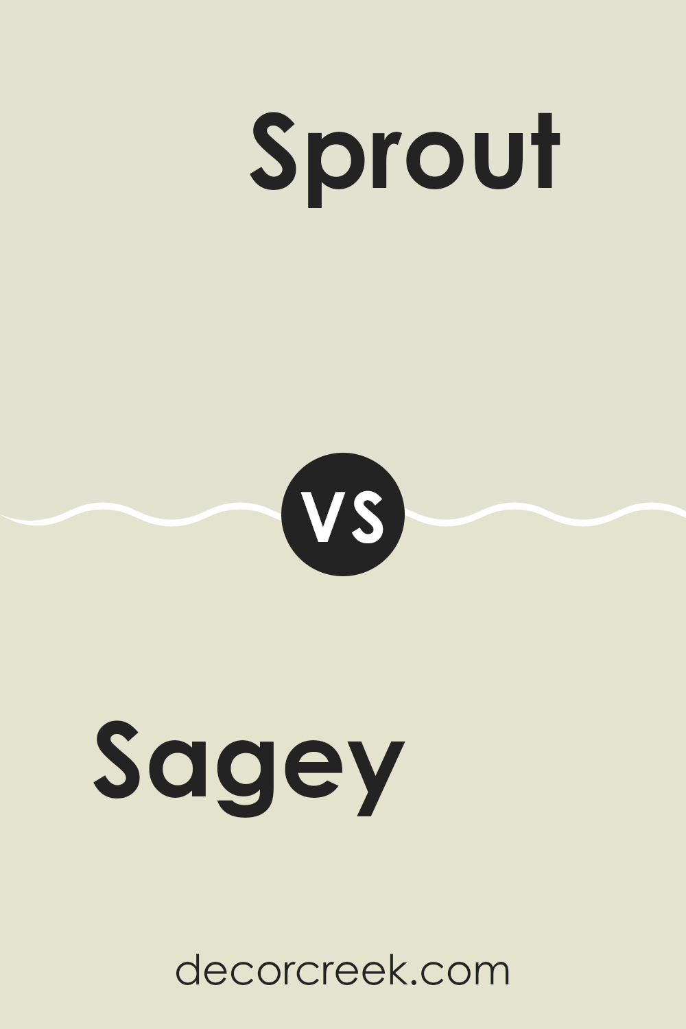
Sagey SW 6175 by Sherwin Williams vs Sprout SW 6427 by Sherwin Williams
Sagey SW 6175 by Sherwin Williams is a soft, muted green that offers a calm and balanced vibe. It has subtle gray undertones that even out the green, making it easy to use in different rooms. This color gives a soothing and earthy feel, working well in both modern and traditional settings.
On the other hand, Sprout SW 6427 is a brighter, more vibrant green with yellow undertones. It feels fresh and lively, bringing a sense of energy and nature to a room. This shade can be uplifting and adds a touch of playfulness.
While both colors are green, Sagey is more subdued and calming, perfect for larger areas where you want a peaceful atmosphere. Sprout, being more vivid and cheerful, is great for accents or spots where you want to create a lively mood. Both colors can work well together, with Sagey as a base and Sprout as an accent to enhance rooms.
You can see recommended paint color below:
- SW 6427 Sprout (CHECK A SAMPLE)
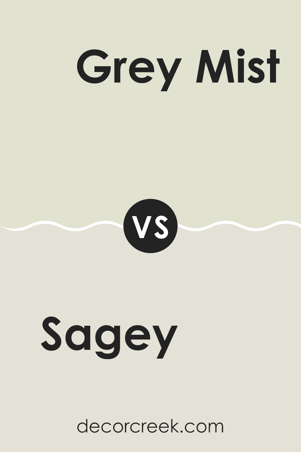
Sagey SW 6175 by Sherwin Williams vs Grey Mist SW 9625 by Sherwin Williams
Sagey and Grey Mist are two beautiful colors from Sherwin Williams. Sagey is a soft green that’s warm and earthy, making it ideal for creating a welcoming and comfortable room. It has an organic feel, perfect for a natural look. In contrast, Grey Mist is a light, neutral grey that offers a clean and modern feel. It’s flexible and pairs well with many other colors.
When you put these two side by side, Sagey brings an inviting and cozy atmosphere, while Grey Mist provides a sleek and subtle backdrop. Sagey works well in living rooms or rooms where you want a touch of nature, while Grey Mist suits contemporary designs or minimalistic areas.
Both colors can complement each other, with Sagey adding a pop of color when used alongside the more subdued Grey Mist. Combining these hues can create a balanced and harmonious aesthetic in your home.
You can see recommended paint color below:
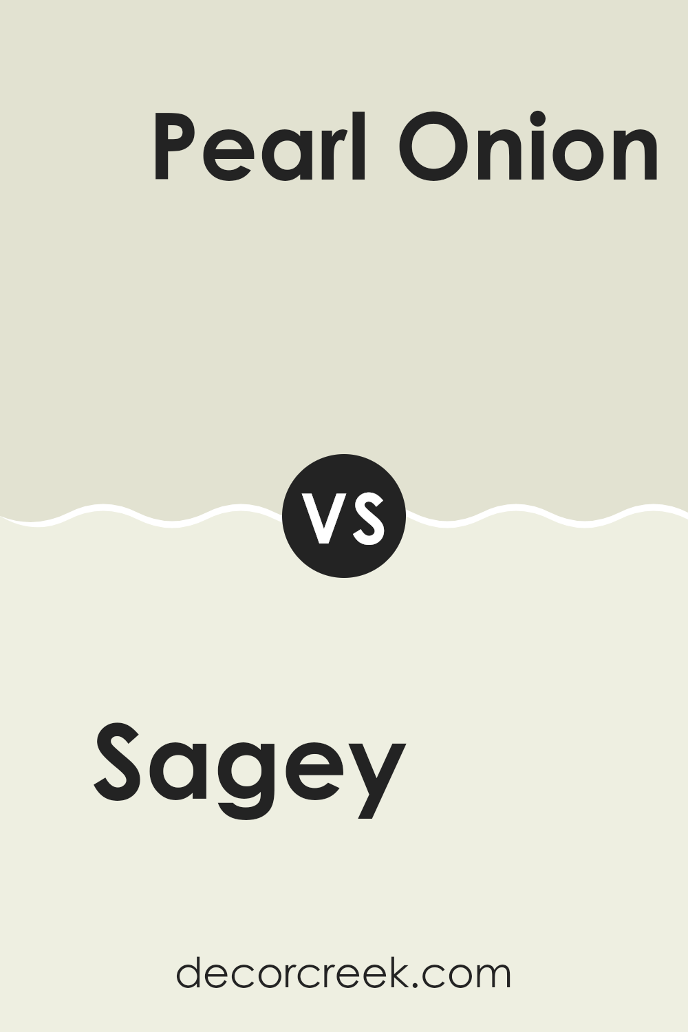
Sagey SW 6175 by Sherwin Williams vs Pearl Onion SW 7126 by Sherwin Williams
Sagey (SW 6175) and Pearl Onion (SW 7126) are two colors from Sherwin Williams that offer unique vibes. Sagey is a muted, calming green that resembles the soft tones of nature. It’s perfect for creating a cozy, inviting room and works well in living areas or bedrooms.
On the other hand, Pearl Onion is a warm, off-white shade with subtle yellow undertones. It feels bright and airy, making it ideal for smaller rooms or areas you want to feel more open, like kitchens or bathrooms.
When paired together, Sagey brings a touch of nature indoors, while Pearl Onion provides a light, neutral background. This combination can offer a balanced look, where the green adds interest without feeling too strong. Both colors are flexible and can be used to create a warm and welcoming environment in any home. They’re perfect for people looking to add a sense of comfort and warmth.
You can see recommended paint color below:
- SW 7126 Pearl Onion
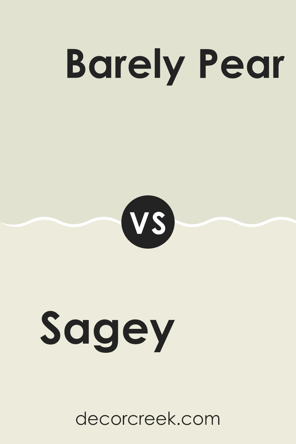
Sagey SW 6175 by Sherwin Williams vs Barely Pear SW 9666 by Sherwin Williams
Sagey SW 6175 and Barely Pear SW 9666 by Sherwin Williams are two distinct colors. Sagey is a muted green with gray undertones, giving it a soothing and natural feel. It’s flexible and works well in different rooms, offering a relaxed and earthy vibe.
In contrast, Barely Pear is a gentle, light green with a hint of warmth. It’s brighter than Sagey, bringing a soft, refreshing touch to a room. While Sagey can create a calm, grounded atmosphere, Barely Pear adds a light and airy mood.
These colors complement each other well; Sagey can be used for more substantial pieces like walls, while Barely Pear could add accent touches. They both bring nature indoors, but with different levels of intensity and warmth. Sagey feels more subdued and elegant, whereas Barely Pear feels fresh and inviting.
You can see recommended paint color below:
- SW 9666 Barely Pear (CHECK A SAMPLE)
When I think about SW 6175 Sagey by Sherwin Williams, I imagine it as a gentle and friendly color. It reminds me of a soft, grayish-green that brings a calm feeling to any room. It’s like the color of leaves after a light rain, or the soft green grass on a spring day.
I believe this color can make a room feel cozy and welcoming. It’s perfect for places where people gather, like the living room or kitchen. It gives a sense of being in nature, without being too bright or loud.
When I used this color in my home, it felt like the walls were wrapping me in a comforting hug. It’s easy to pair with other colors too. You can add white furniture to make it look clean and fresh, or mix with darker colors for a warmer feel.
Overall, SW 6175 Sagey is a color that makes me feel happy and relaxed. It’s like having a little piece of nature inside my home. I love how it suits different areas and different styles, making it a pleasant choice for anyone looking to paint with a shade that is both gentle and charming.
Ever wished paint sampling was as easy as sticking a sticker? Guess what? Now it is! Discover Samplize's unique Peel & Stick samples.
Get paint samples


