Choosing a paint color for a room in your home can sometimes feel a bit daunting with all the options available today. However, when you come across a shade like 1541 London Fog by Benjamin Moore, it feels like you’ve found something special.
I want to share some insights about this particular color because it’s become a favorite of mine. London Fog offers a perfect balance of warmth and sophistication that can complement any space’s aesthetic without overwhelming it.
Its versatility is impressive; it seems to work effortlessly in a variety of settings, from bedrooms and bathrooms to living areas and kitchens. Whether you are just refreshing your walls or giving a room an entirely new look, London Fog provides a subtle, inviting backdrop. It adapts well to different lighting conditions, maintaining its beauty throughout the day.
If you’re looking for a neutral color that adds depth and character to your room, then you might really appreciate what London Fog has to offer.

What Color Is London Fog 1541 by Benjamin Moore?
London Fog, a Benjamin Moore paint color, offers a subtle, adaptable shade of gray that blends well with various interior design themes. This versatile color can be described as a soft, warm gray with undertones that provide a cozy yet fresh feeling, making it an ideal backdrop for many decorating styles. It is particularly effective in spaces aiming for a modern, minimalist, or even rustic look due to its neutral tone.
In terms of matching, London Fog pairs excellently with natural materials such as wood, which can enhance its warmth, and with metals like brushed nickel or stainless steel, adding a clean, crisp edge to an interior. For textiles, consider soft, fluffy textures like wool or cotton in whites and creams to create a comfortable, inviting space.
Alternatively, leather furniture and accessories can bring a touch of luxury without overpowering the room.
This color works exceptionally well in living rooms, bedrooms, and kitchens where its calming effect can be fully appreciated.
It serves as an excellent canvas, allowing furniture and art to stand out, enhancing the overall aesthetic of any room. Whether used as a main color or as an accent, London Fog creates a flexible foundation that supports a wide range of design choices.
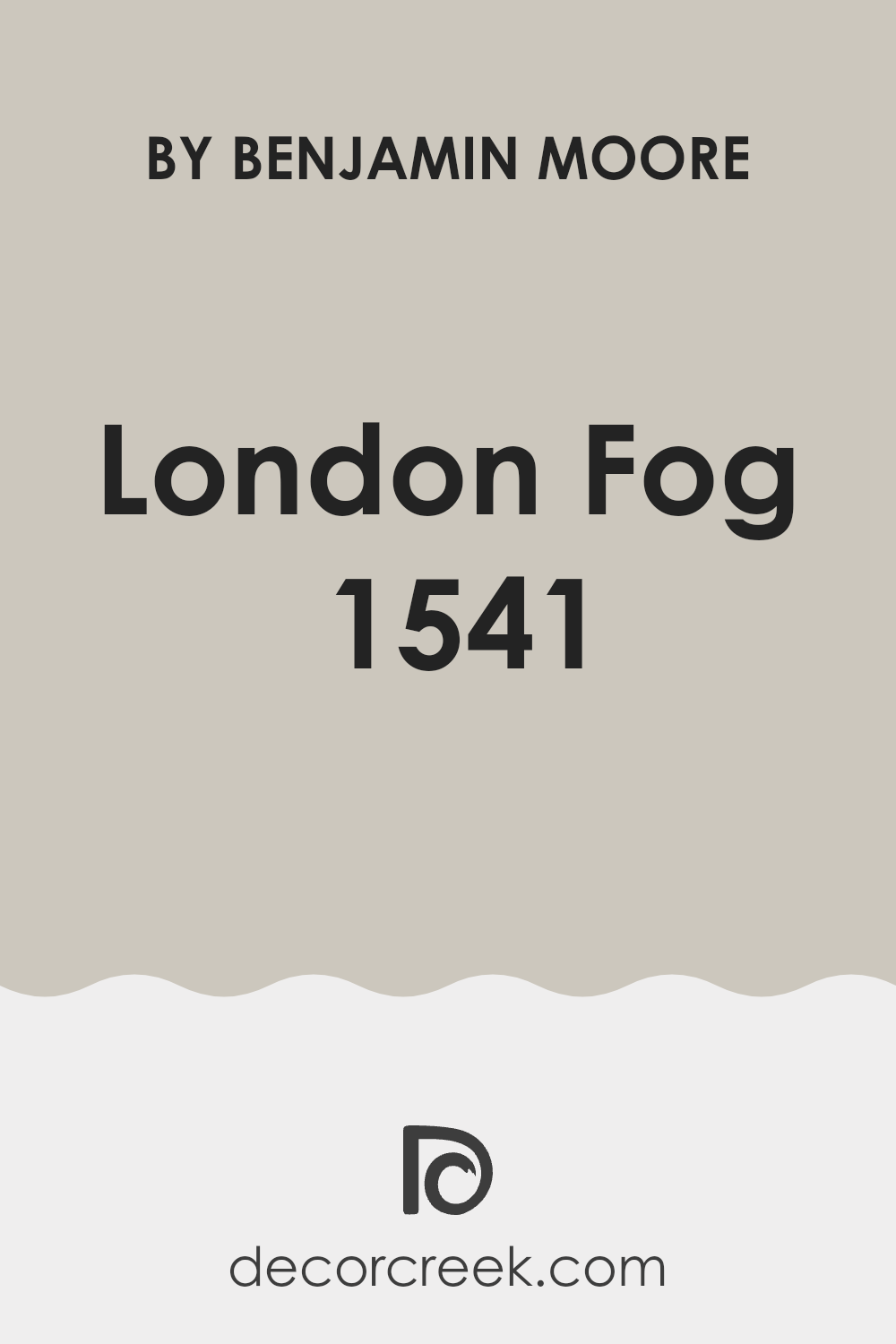
Is London Fog 1541 by Benjamin Moore Warm or Cool color?
London Fog 1541 by Benjamin Moore is a versatile gray paint color with a warm undertone, making it a perfect choice for many homes. This color works well in various spaces due to its neutral tone, which can subtly enhance the room without dominating it.
Its warmth makes it inviting, ideal for living rooms or bedrooms where you want a cozy atmosphere. London Fog 1541 pairs nicely with both dark and light furniture, offering flexibility in decorating styles. Whether you have modern, minimalist pieces or more traditional decor, this color provides a smooth, clean backdrop.
For those looking to refresh their walls without going too bold, it is a practical choice, blending well with existing elements in a room. It’s particularly effective in spaces with limited natural light, as its warm tones help make the room feel brighter and more welcoming. Overall, it’s a great option for anyone looking to give their home a fresh, calm look.
Undertones of London Fog 1541 by Benjamin Moore
London Fog by Benjamin Moore is a versatile color that can subtly change its appearance depending on the lighting and surrounding elements in a room. This happens because of the color’s undertones. Undertones are subtle colors that influence the main hue and can make the wall paint look different under various lighting conditions.
In the case of London Fog, the undertones are pale yellow, light purple, light blue, pale pink, mint, lilac, and grey. These undertones can make the color appear cooler or warmer. For example, the pale yellow and mint undertones might make the paint look warmer in sunlight, giving a room a cozy feel.
Meanwhile, the light purple and lilac undertones can give it a cooler impression under LED lights, providing a subtle, fresh look.
On interior walls, this mix of undertones means London Fog can adapt well to different room colors and decorations.
In a room with lots of natural light, the warmer undertones might stand out, making the space feel more welcoming. In a room with less natural light or cooler artificial light, the cooler undertones might be more noticeable, giving the space a calm and gentle ambiance.
These undertones help London Fog fit into many styles and spaces, making it a good choice for those wanting flexibility and a shade that adjusts with their decor and lighting changes. This adaptability makes it an ideal choice for living spaces, bedrooms, and even kitchens where conditions can change throughout the day.
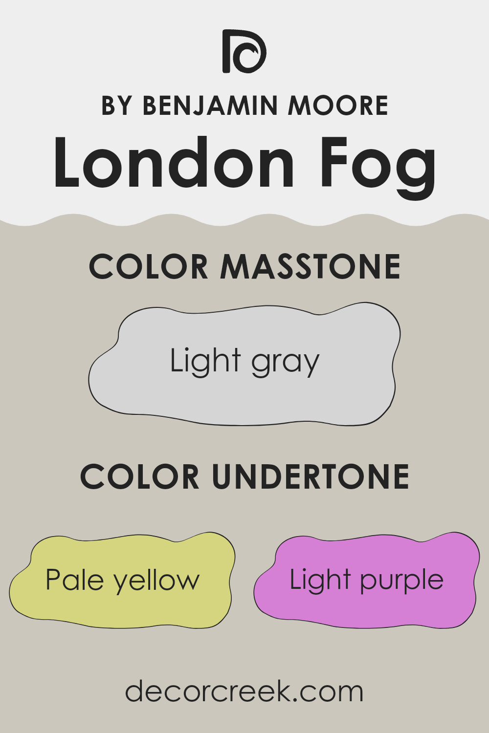
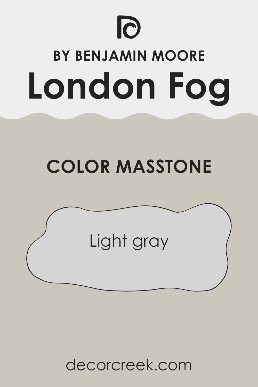
What is the Masstone of the London Fog 1541 by Benjamin Moore?
London Fog 1541 by Benjamin Moore, identified by the masstone light gray, is a favorite for its neutral and versatile shade. This color has a calming effect that makes any room appear more open and airy, creating a subtle backdrop that complements various decor styles. Its light gray hue, coded as #D5D5D5, is effectively bright enough to add light to darker rooms but still soft enough to maintain a cozy feel.
This particular shade of gray works well in homes because it pairs easily with brighter colors or can stand alone for a minimalist look. It’s especially useful in spaces like living rooms and bedrooms where you want a gentle color that doesn’t overpower the space.
Furthermore, maintaining walls with London Fog is convenient as it tends to hide minor imperfections and is less prone to showing smudges or dirt compared to darker colors. Thus, it’s not just pretty to look at; it’s also a practical choice for busy homes.
How Does Lighting Affect London Fog 1541 by Benjamin Moore?
Lighting plays a crucial role in how we perceive colors. The same shade can appear differently depending on the type of light it’s under. This is particularly true for paints, such as the color “London Fog” by Benjamin Moore.
In artificial light, such as that from light bulbs, “London Fog” might look slightly warmer or take on a cozier feel. Warmer bulbs can bring out a subtle creaminess, while cooler bulbs might make it look more muted and subdued. It’s a versatile color that adapts well but maintains its distinctive tone which keeps the room grounded.
Natural light has a whole different impact on “London Fog”. As the sun moves or weather changes, so too will the appearance of this color. On a sunny day, it might look bright and airy, whereas on a cloudy day, it could come across as cooler and more reserved.
When considering room orientation:
- North-facing rooms: These rooms usually get less direct sunlight, which can make “London Fog” appear slightly shadowsome and cooler. This can be ideal for creating a calm, quiet aesthetic in spaces like bedrooms or study rooms.
- South-facing rooms: These get a lot of sunlight, making “London Fog” look lighter and more vibrant. This can be great for living spaces or kitchens where a lively, bright atmosphere is welcome.
- East-facing rooms: In these rooms, “London Fog” will catch the morning sun. The color will look warm and welcoming in the morning, turning more neutral as the day progresses. This dynamic change can add a unique charm to spaces used mainly in the morning or during the day.
- West-facing rooms: Here, the color will change with the sunset light, potentially casting ambery tones later in the day. It’s perfect for rooms used later in the day, as it adapts from a neutral tone in the afternoon to a warmer vibe by evening.
In every setting, “London Fog” retains its adaptability, changing subtly with the lighting but always contributing to a pleasant environment. Whether used in personal spaces like bedrooms or common areas, it shows a wide range of moods depending on the lighting and room orientation.
What is the LRV of London Fog 1541 by Benjamin Moore?
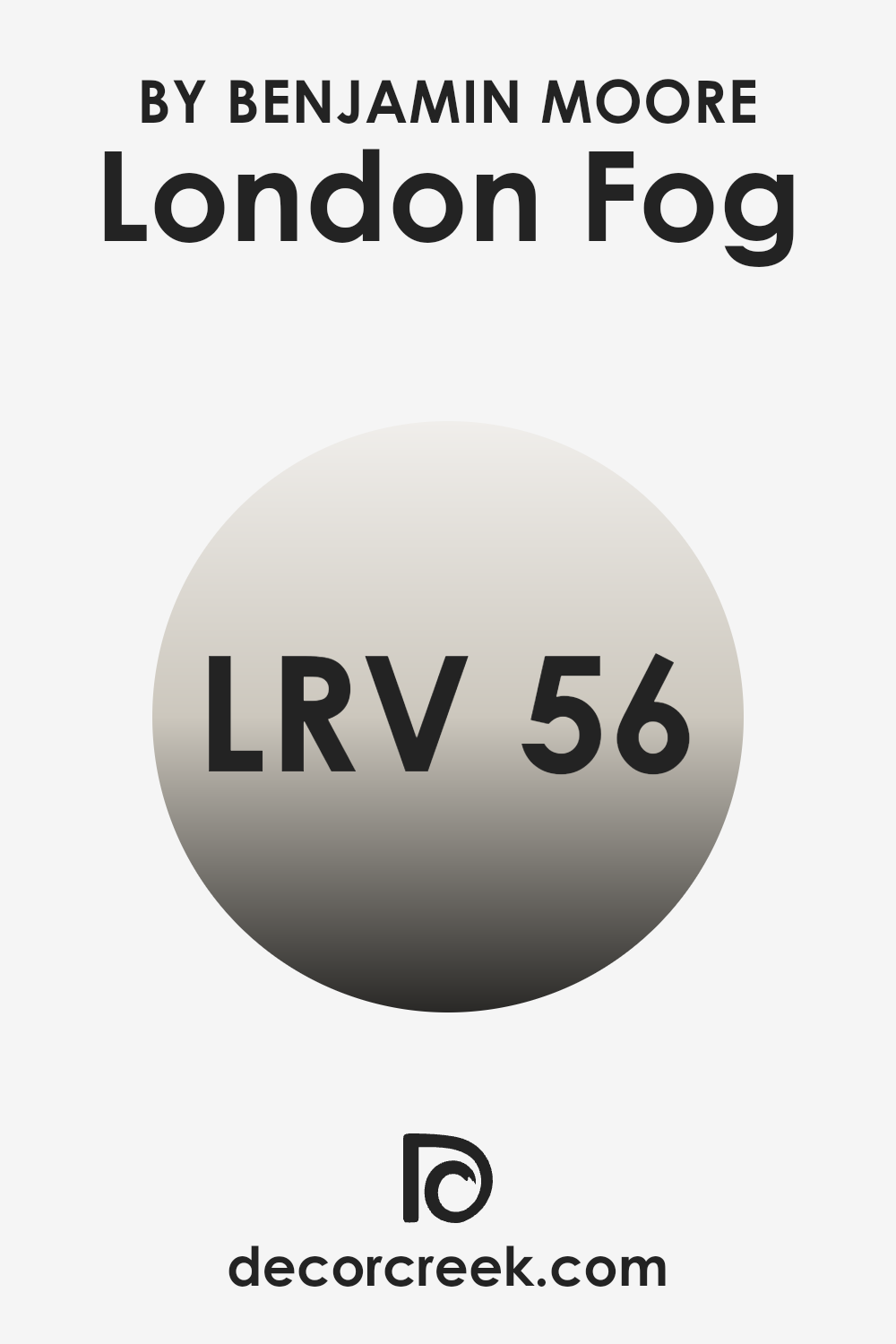
Light Reflectance Value (LRV) is a measure of the amount of visible and usable light that gets reflected from a painted surface when light shines on it. The scale for measuring LRV ranges from 0 to 100, where the lowest number indicates that the color absorbs more light, making it look darker, and the highest number means it reflects more light, appearing lighter.
This value helps in deciding how a paint color will look in a specific interior space and how it might change under different lighting conditions. Higher LRV colors can make a room feel more open and airy, while lower LRV colors can give a room a cozier feel.
In the case of London Fog, with an LRV of 56.44, it falls in the mid-range category, meaning it neither reflects an excessive amount of light nor does it absorb too much. This balance makes it a versatile choice for painting walls because it maintains a distinct presence without overwhelming a space.
Its moderate LRV allows it to adapt well to various lighting conditions, generally maintaining its true color whether in a brightly lit or dimly illuminated room. Thus, this shade can be effectively used in many different areas of a home, from well-lit kitchens to darker hallways, providing a neutral backdrop that complements various decor styles.
Coordinating Colors of London Fog 1541 by Benjamin Moore
Coordinating colors are hues that complement each other and work in harmony when used together in a space. These colors not assigned by chance; they come from mixing aspects of the base color with additional undertones that can enhance the feeling and aesthetics of a room. For example, a principal shade like London Fog can have a collection of coordinating colors that either contrast beautifully or blend subtly with its smoky hue. Effective use of coordinating colors can either create a vibrant look or a gently unified appearance, depending on how they are utilized in the décor.
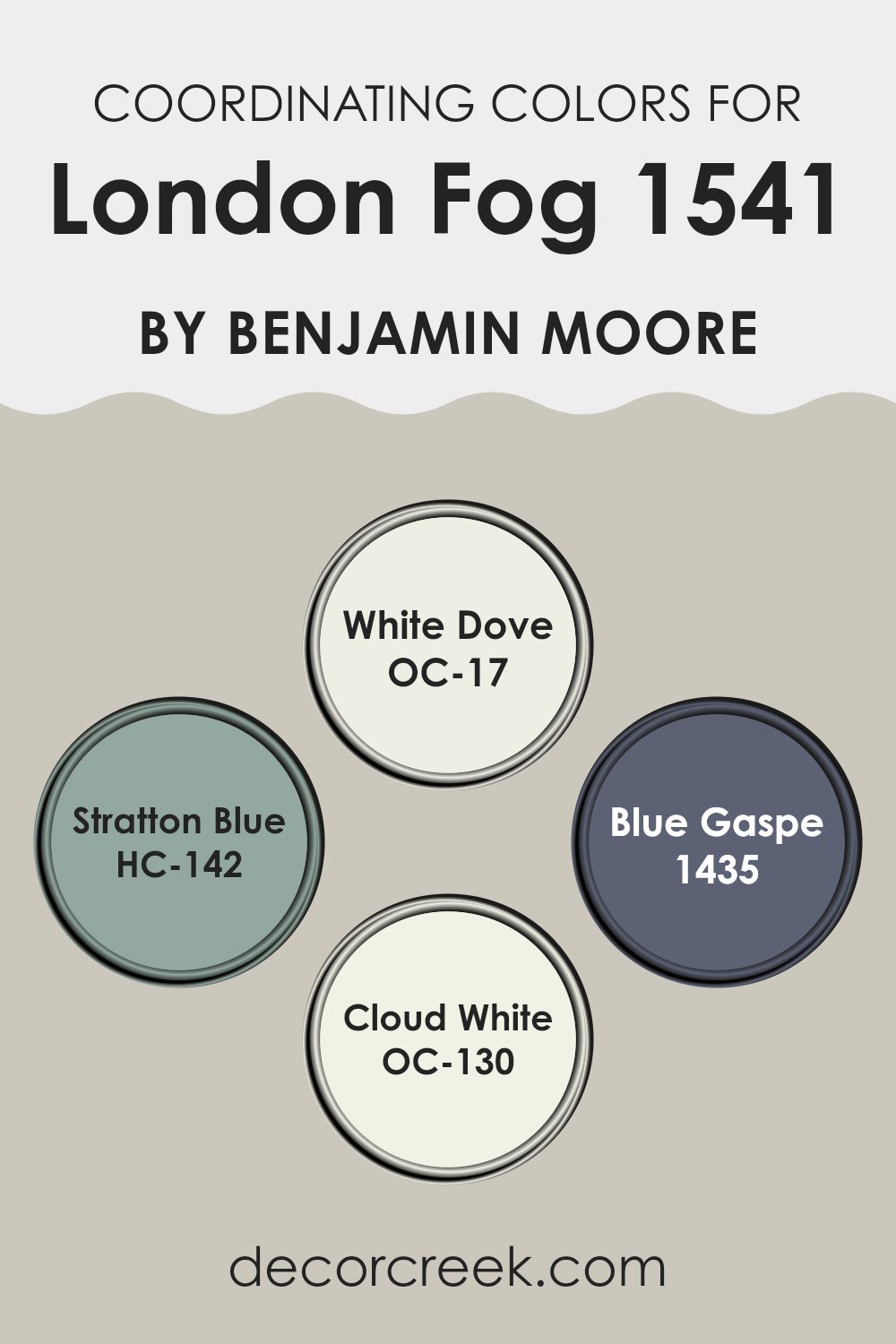
London Fog from Benjamin Moore works seamlessly with coordinating colors such as OC-17 – White Dove, HC-142 – Stratton Blue, 1435 – Blue Gaspe, and OC-130 – Cloud White. White Dove is a soft, warm white that provides a clean and gentle backdrop, allowing the depth of London Fog to stand out.
Stratton Blue is a rich, muted blue, adding a depth that complements the more understated London Fog. Blue Gaspe is a brighter shade of blue that offers a refreshing pop of color, which can bring vitality to a palette based around London Fog. Lastly, Cloud White is similar to White Dove but with a slightly crisper feel, making it ideal for trim or ceilings to provide a crisp finish.
Combining these colors can bring balance and harmony to any space, allowing each color to play its part without overpowering the others.
You can see recommended paint colors below:
- OC-17 White Dove (CHECK A SAMPLE)
- HC-142 Stratton Blue (CHECK A SAMPLE)
- 1435 Blue Gaspe (CHECK A SAMPLE)
- OC-130 Cloud White
What are the Trim colors of London Fog 1541 by Benjamin Moore?
Trim colors are the shades used to accentuate and highlight architectural elements such as door frames, window sills, and crown moldings. The selection of a complementary trim color can subtly enhance the main color of a room or exterior, ensuring that the architectural features stand out and providing aesthetic cohesion to a space.
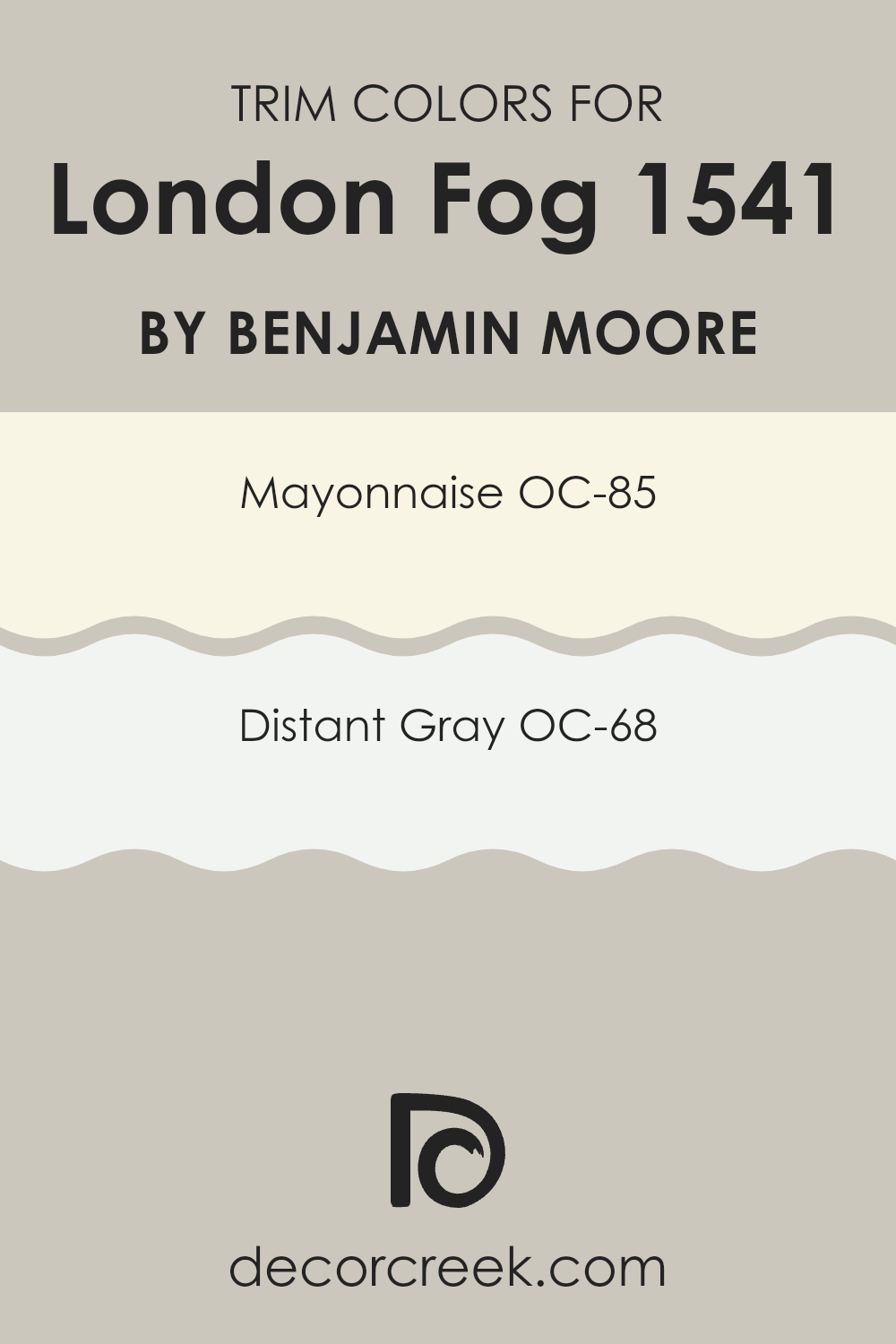
For instance, pairing a neutral main color such as London Fog by Benjamin Moore with appropriately chosen trim colors creates a polished, finished look. Using OC-85 – Mayonnaise as a trim color offers a creamy, warm white that can soften the edges of a room painted in the cooler tone of London Fog.
It adds a gentle contrast that’s pleasing to the eye without being too stark. OC-68 – Distant Gray is another excellent trim choice, providing a clean, airy feel. As a light gray, it maintains a sense of continuity with London Fog yet brings a lighter touch that defines boundaries clearly and beautifully.
You can see recommended paint colors below:
- OC-85 Mayonnaise
- OC-68 Distant Gray
Colors Similar to London Fog 1541 by Benjamin Moore
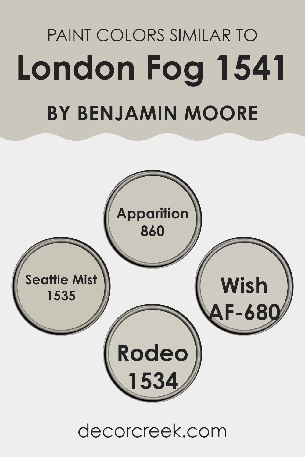
Using similar colors can enhance the aesthetic of any space by creating a seamless, harmonious look. When colors like London Fog 1541 by Benjamin Moore are paired with hues like 860 – Apparition, 1535 – Seattle Mist, AF-680 – Wish, or 1534 – Rodeo, they contribute to a unified and cohesive environment. These subtle variations in tone help in achieving a visually appealing balance, especially in interiors where you want to maintain a gentle, flowing ambiance without overwhelming contrasts.
London Fog 1541 is a versatile neutral, presenting a soft blend of grey and beige that lends a calm and collected atmosphere to any room. Apparition 860, a slightly cooler grey, mirrors the mistiness of an early morning haze, offering a gentle depth to spaces.
Seattle Mist 1535, meanwhile, shifts slightly towards a warmer tone, infusing spaces with a subtle warmth reminiscent of a tranquil dawn. Wish AF-680 provides an almost ethereal quality, a very light grey that nearly whispers its presence, perfect for a minimalist or airy setting.
Finally, Rodeo 1534 drifts towards a deeper, earthier grey, providing a stronger accent without aggression, ideal for highlighting architectural features or furniture pieces.
Together, these colors ensure fluidity and elegance, enabling a space to feel both styled and comfortable.
You can see recommended paint colors below:
- 860 Apparition (CHECK A SAMPLE)
- 1535 Seattle Mist (CHECK A SAMPLE)
- AF-680 Wish (CHECK A SAMPLE)
- 1534 Rodeo (CHECK A SAMPLE)
Colors that Go With London Fog 1541 by Benjamin Moore
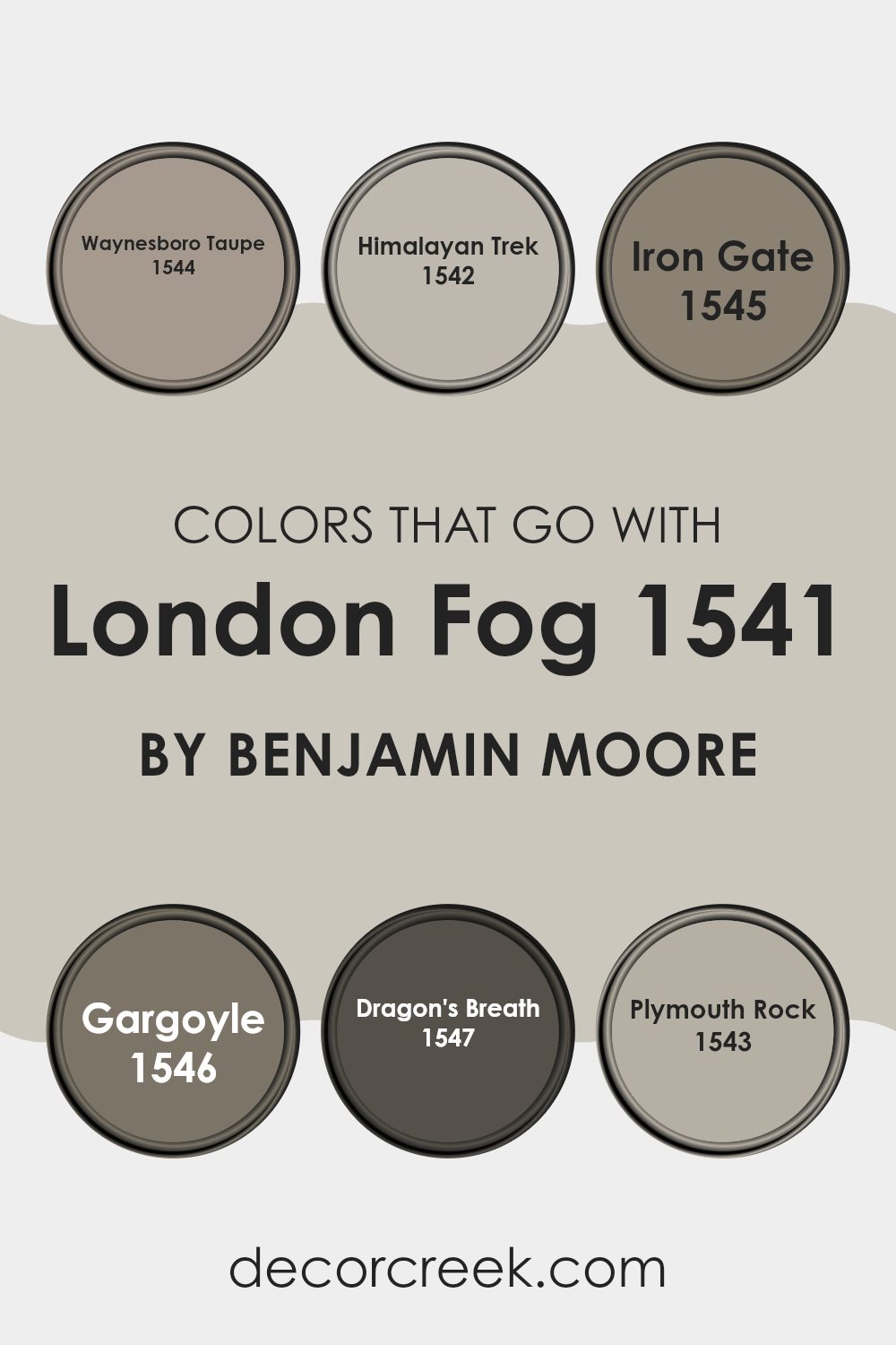
Choosing the right complementing colors for London Fog 1541 by Benjamin Moore is essential for creating a harmonious and appealing ambiance in any space. These colors, including Waynesboro Taupe, Himalayan Trek, Iron Gate, Gargoyle, Dragon’s Breath, and Plymouth Rock, work together to enhance the soft, subtle base of London Fog, offering a range of possibilities for interior design.
When paired correctly, these hues can balance each other out, providing a smooth transition between spaces or adding the right amount of contrast to make features stand out. Waynesboro Taupe is a warm, earthy color that gives a cozy feel to any room, making it perfect for living areas and bedrooms where a touch of comfort is desired.
Himalayan Trek is a slightly deeper beige that acts as a fantastic backdrop, allowing furniture and decor to pop. Iron Gate is a stronger, darker gray that can help highlight focal points such as fireplaces or accent walls. Gargoyle is a robust, charcoal gray, excellent for creating drama or grounding lighter colors.
Dragon’s Breath, a rich, deep brown, adds a sense of drama and depth, ideal for creating a striking entrance or cozy den.
Lastly, Plymouth Rock is a soft, medium gray that provides a neutral base, complementing the lighter undertones of London Fog nicely. When these colors are used thoughtfully together, they can effectively set the style and mood of a home while maintaining a fluidity that ties different rooms together seamlessly.
You can see recommended paint colors below:
- 1544 Waynesboro Taupe (CHECK A SAMPLE)
- 1542 Himalayan Trek (CHECK A SAMPLE)
- 1545 Iron Gate (CHECK A SAMPLE)
- 1546 Gargoyle (CHECK A SAMPLE)
- 1547 Dragon’s Breath (CHECK A SAMPLE)
- 1543 Plymouth Rock (CHECK A SAMPLE)
London Fog 1541 by Benjamin Moore Color Palette
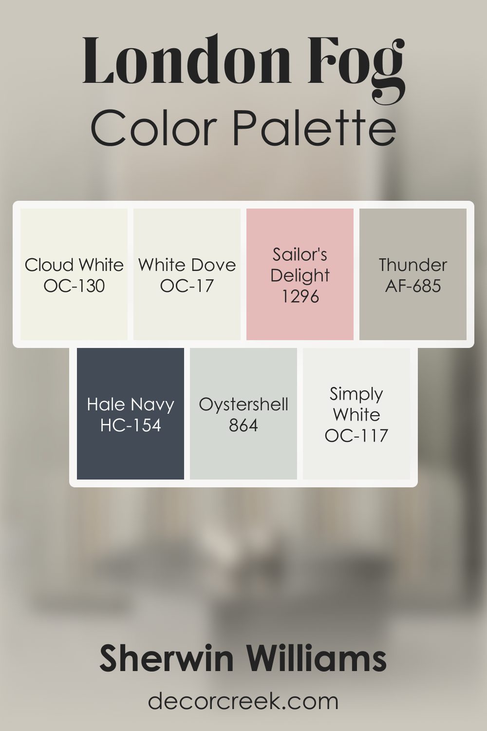
London Fog brings a soft, grounded warmth that feels familiar and comforting, and this palette enhances its gentle charm. Cloud White, White Dove, and Simply White brighten the palette with clean, friendly light, supporting London Fog’s warm base with a soft glow.
Thunder and Oyster Shell add natural, earthy transitions that deepen the palette in a warm and welcoming way.
Hale Navy introduces a strong, steady accent that gives the palette structure and direction, while Sailor’s Delight adds a soft, cheerful touch that brings personality without overpowering the calm atmosphere.
Together, these shades create a palette full of warmth, ease, and friendly contrast—ideal for interiors that feel restful, cozy, and grounded.
How to Use London Fog 1541 by Benjamin Moore In Your Home?
London Fog 1541 by Benjamin Moore is a versatile gray paint that works wonderfully in various spaces within your home. This shade is soft enough to act as a neutral backdrop, allowing your furniture and decor to stand out, yet distinct enough to add a touch of character to any room. It’s perfect for those looking to refresh their living room, as it pairs well with both bright and dark colors, enhancing other design elements without overpowering them.
In the bedroom, London Fog can create a cozy and calm atmosphere, making it a good choice for walls or even the ceiling. The color is also ideal for kitchens and bathrooms, where it can help make the space feel open and clean. Combining London Fog with white trims can highlight architectural details in your home, giving a crisp and finished look.
Whether you want to paint an entire room or just an accent wall, London Fog adds a nice touch of modernity and warmth to your living space.
London Fog 1541 by Benjamin Moore vs Apparition 860 by Benjamin Moore
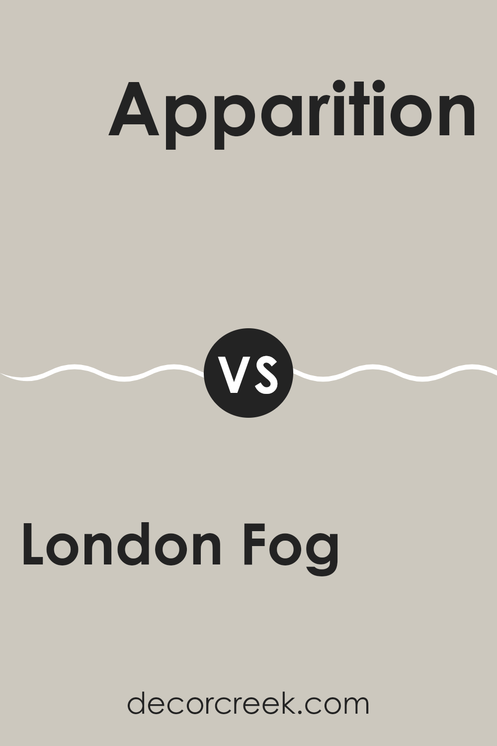
The London Fog color, from Benjamin Moore, is a warm and soft grey that feels cozy and welcoming. The subtle mix of grey and beige in this color, often called “greige,” makes it highly versatile and ideal for many different spaces, providing a gentle background shade that pairs nicely with a wide range of decor.
On the other hand, Apparition by Benjamin Moore leans more exclusively towards the grey side, delivering a cooler tone that gives a sleek and clean look. This shade is lighter than London Fog and lacks the beige undertone, making it perfect for those who prefer a more classic, pure grey. It can give rooms a fresh, open feel and works well in spaces that get plenty of natural light.
While both colors are similar in their neutrality, London Fog offers warmth and coziness whereas Apparition provides a crisper, brighter atmosphere. This makes them both excellent choices depending on what kind of mood or feel you want to achieve in your space. Whether you go soft and warm or crisp and bright, both colors have their unique strengths.
You can see recommended paint color below:
- 860 Apparition (CHECK A SAMPLE)
London Fog 1541 by Benjamin Moore vs Wish AF-680 by Benjamin Moore
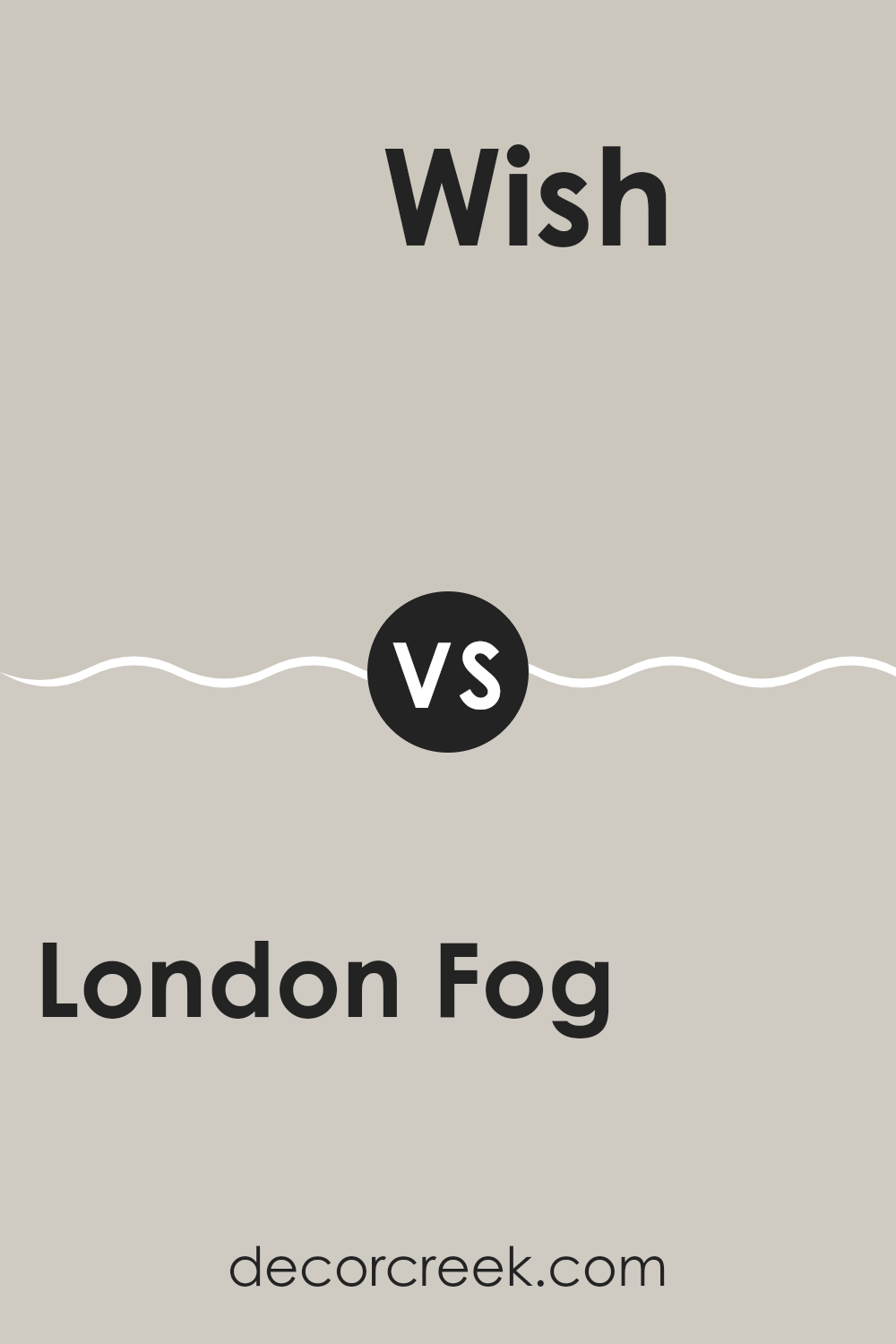
London Fog and Wish, both by Benjamin Moore, offer subtle yet distinct tones that can enhance any space. London Fog is a gentle gray with soft blue undertones, giving it a cool and calm appearance. This makes it a great choice for areas where you want a neutral background with a hint of character.
In contrast, Wish is a lighter, more neutral gray that leans slightly towards taupe. This warmer gray is versatile and works well in spaces where you want to create a cozy and inviting atmosphere without going too dark.
While London Fog provides a slightly moodier feel due to its deeper tones, Wish offers a lighter and softer approach, making it ideal for smaller rooms or spaces with limited natural light. Both colors are practical for various decorating styles and can be paired easily with different decor elements.
You can see recommended paint color below:
- AF-680 Wish (CHECK A SAMPLE)
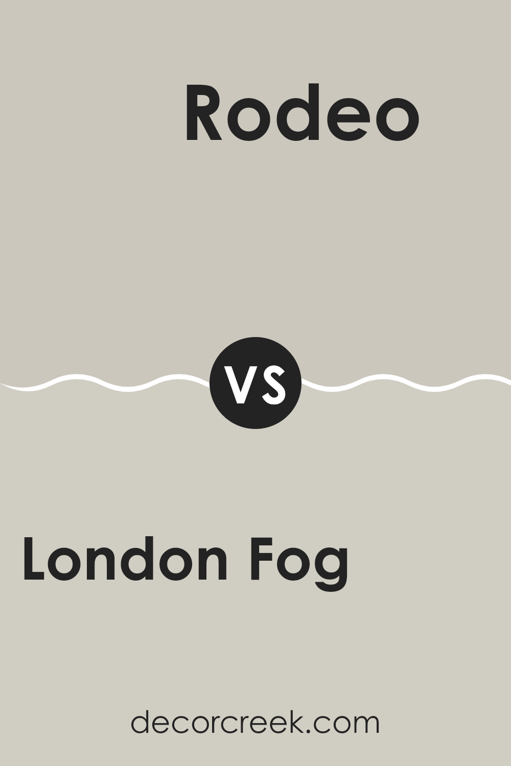
London Fog 1541 by Benjamin Moore vs Rodeo 1534 by Benjamin Moore
London Fog 1541 is a soft, neutral gray color with a warm undertone, making it versatile for various spaces. This color brings a cozy and welcoming feel to rooms, fitting well in living areas and bedrooms where comfort is key. On the other hand, Rodeo 1534 is slightly darker and leans more towards a taupe gray.
It has a hint of brown, which makes it warmer and more inviting than the more balanced gray of London Fog. Rodeo’s richness works well in spaces that aim for a more grounded, cozy atmosphere.
It’s excellent for creating a snug environment, especially in settings that benefit from a subtle, yet warm color palette. Overall, while both colors offer warmth, Rodeo provides a deeper, earthier tone compared to the lighter and more neutral shade of London Fog.
You can see recommended paint color below:
- 1534 Rodeo (CHECK A SAMPLE)
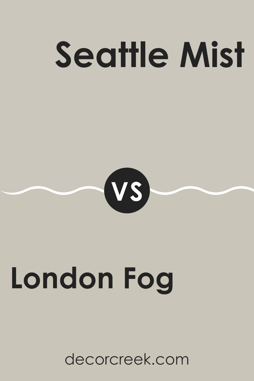
London Fog 1541 by Benjamin Moore vs Seattle Mist 1535 by Benjamin Moore
London Fog and Seattle Mist are two paint colors from Benjamin Moore that offer subtle variations in hue to enhance any room. London Fog is a bit darker, providing a cozy and inviting atmosphere with its warm, grey tone. It leans towards a neutral base with hints of earthen colors, making it ideal for spaces meant for relaxation or quiet gatherings.
On the other hand, Seattle Mist is lighter, offering a fresher, airier feel. It has a cooler undertone compared to London Fog, which makes it well-suited for smaller spaces or areas with less natural light, as it helps to make the space seem larger and more open.
Both colors are versatile and can easily pair with a variety of decor styles and other colors. Whether choosing London Fog for its warmth or Seattle Mist for a brighter touch, both bring a subtle, understated charm to interiors.
You can see recommended paint color below:
- 1535 Seattle Mist (CHECK A SAMPLE)
Conclusion
After looking at all the details about the 1541 London Fog paint color by Benjamin Moore, I think it’s pretty awesome. This color is like a calm gray, not too dark or light, making it perfect for any room in your house. You could use it in the living room or your bedroom, and it will make the place feel nice and cozy. It’s not loud like bright colors, so it doesn’t take all the attention, but it also makes sure your room doesn’t look boring.
London Fog is kind of like having a soft blanket; it makes everything feel just right. It’s easy to match with different stuff you might already have like your couch, your bed, or even some cool posters. Plus, cleaning up walls painted with this color isn’t hard, which is great if you end up making a little mess.
In conclusion, if you’re thinking about giving your room a new look, this color is a solid choice. It works with everything, it’s easy to live with, and it sort of gives your room a gentle hug with its warm, soft look. So, I’d say go for it if you want a change that feels just right and makes your room look great.
Ever wished paint sampling was as easy as sticking a sticker? Guess what? Now it is! Discover Samplize's unique Peel & Stick samples.
Get paint samples


