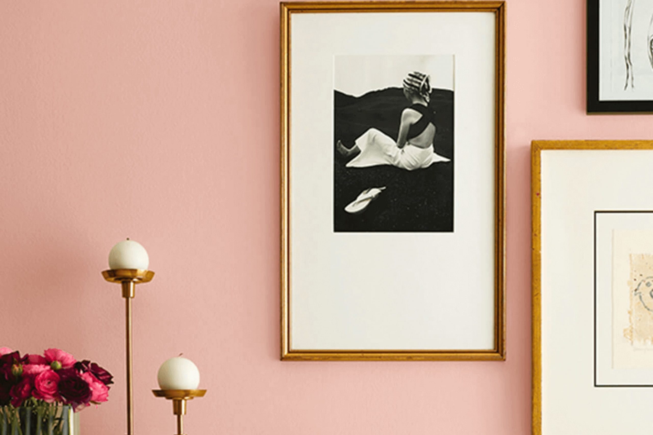
I recently had the pleasure of painting a room with Sherwin Williams’ SW 6324 Mellow Coral, and I must say, the outcome was truly delightful. If you are searching for a color that brings warmth and a subtle vibrancy to any room, Mellow Coral might just be the perfect choice for you. This shade has a unique charm, capable of making a room feel welcoming and alive without feeling too intense.
Whether you’re looking to freshen up your living room, bedroom, or even your kitchen, Mellow Coral offers a flexible palette that pairs beautifully with soft neutrals or can stand out against darker furniture and decor. I found it particularly effective in settings that get a good amount of natural light, as the sunlight brings out the rich undertones of the color, creating a glowing effect that enhances the entire room.
Additionally, its calming quality makes it an ideal backdrop for both daily activities and relaxation.
Through my own experience and some research, I’ve gathered some insights and tips on how to best incorporate SW 6324 Mellow Coral into your home, which I’m excited to share with you.
What Color Is Mellow Coral SW 6324 by Sherwin Williams?
Mellow Coral is a soft, inviting shade that brings warmth to any room. It is a subtle mix of pink and orange that creates a cozy, cheerful atmosphere. This color is perfect for those looking to add a gentle splash of color without feeling too intense. The flexibility of Mellow Coral makes it easy to incorporate into various interior styles, especially in Scandinavian design where it can add warmth to minimalist decor, or in a bohemian setting where it complements rich, earthy textures.
Mellow Coral works beautifully in living rooms, bedrooms, and even kitchens, creating a friendly and welcoming room. It pairs well with natural materials such as light woods, linen, and woven textures, which help balance its warmth. For a fresh, modern look, combine it with marble or metallic finishes like brass or copper.
Soft furnishings in Mellow Coral, like cushions or curtains, can be matched with neutral walls to create a subtle yet striking effect. In rooms with ample natural light, this color appears more vibrant, enhancing the room’s overall energy. Ideal for creating a cheerful and cozy environment, Mellow Coral is a fantastic choice for anyone looking to add a touch of warmth and personality to their home.
Is Mellow Coral SW 6324 by Sherwin Williams Warm or Cool color?
Mellow Coral by Sherwin Williams is a warm and inviting shade that brings a cozy and cheerful vibe to any room. This particular color has a gentle orange tone with hints of pink, making it soft enough to feel calming yet vibrant enough to add a bit of life and energy to a room.
It works well in living rooms and bedrooms where you want to create a friendly and welcoming atmosphere. Perfect for complementing natural light, Mellow Coral can make small rooms feel more open and larger while giving a sunny glow to areas that don’t get much light.
In home decoration, using this color with neutral tones like whites or light greys helps balance its warmth. Furniture in earthy or wooden tones also looks great against this backdrop, making it flexible for different home styles. This color can refresh old rooms without feeling too intense, ideal for those looking to update their homes without drastic changes.
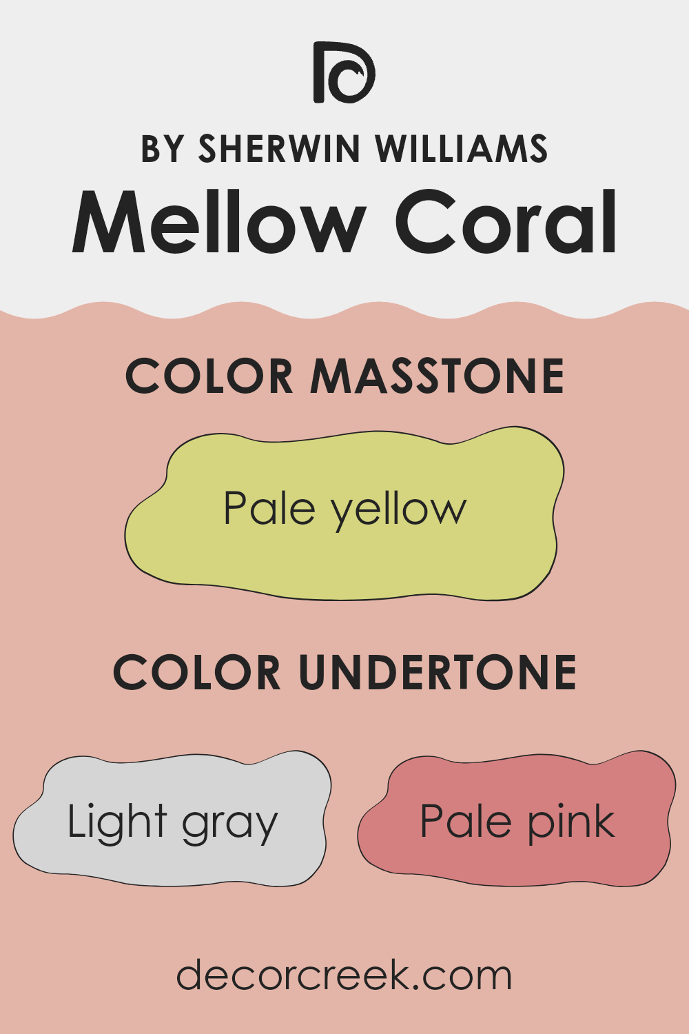
Undertones of Mellow Coral SW 6324 by Sherwin Williams
Mellow Coral is a unique paint color that contains a mixture of subtle undertones, ranging from light grays to soft pinks and even hints of mint and light blue. Understanding undertones is crucial because they can significantly influence how a color appears in different settings and lighting conditions. For instance, light gray and pale pink undertones can make Mellow Coral feel warmer and more inviting, while light purple and lilac undertones add a touch of softness, making the color appear more gentle.
In the case of Mellow Coral, these undertones can change the perception of the room depending on the lighting. Natural light can bring out the pale pink and light purple, creating a soft, cozy feel. Artificial lighting, on the other hand, might highlight the mint and light blue undertones, giving the room a fresher look.
When used on interior walls, undertones like pale pink and light purple can make a room feel relaxing and welcoming. However, undertones like mint and light blue might make the color look slightly cooler, which is something to consider based on the desired mood and function of the room. Choosing furnishings and decor that complement these undertones can help harmonize the room and enhance the overall aesthetic.
This approach allows for a thoughtful, balanced interior that truly feels like home.
decorcreek.com
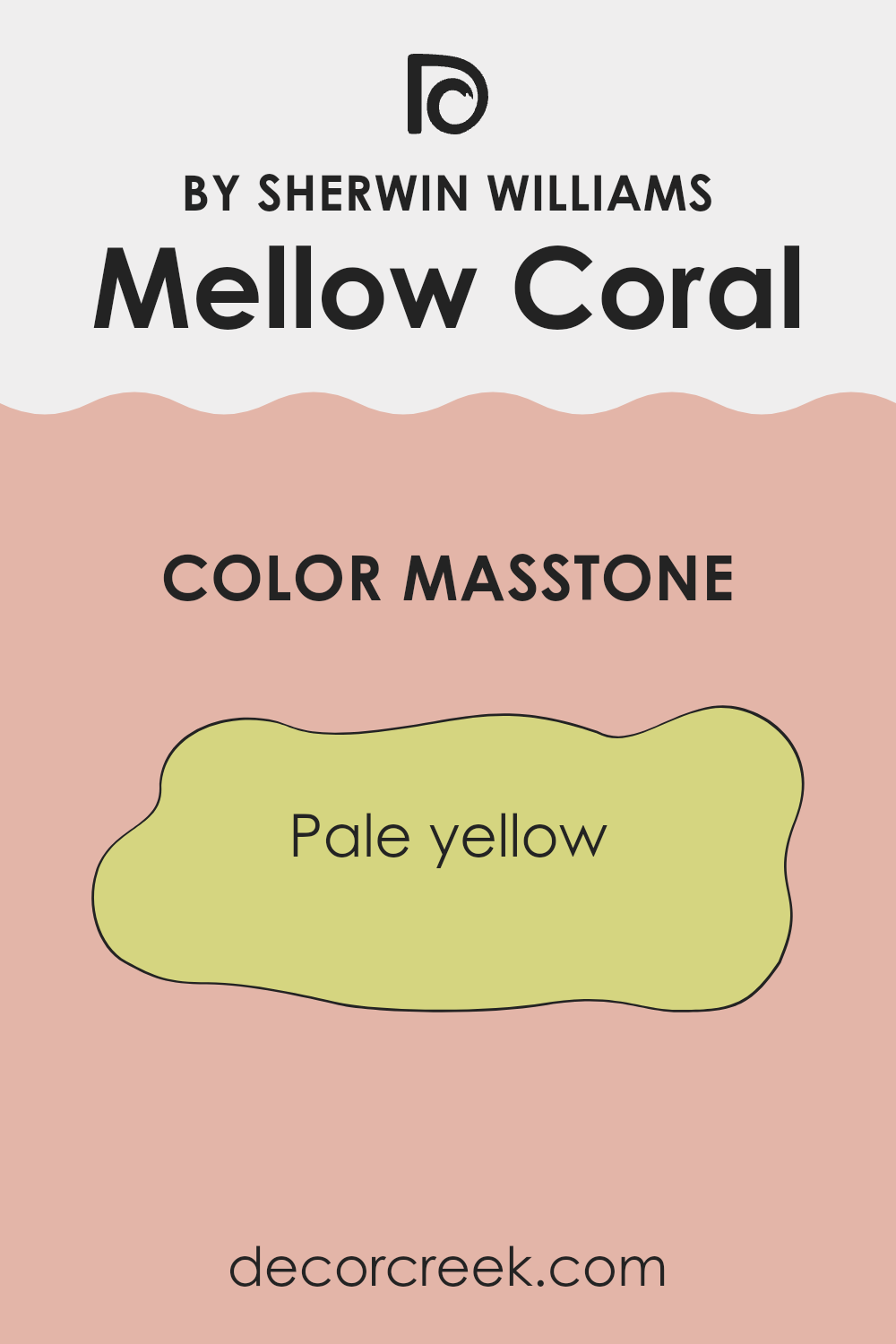
What is the Masstone of the Mellow Coral SW 6324 by Sherwin Williams?
Mellow Coral SW 6324 has a masstone, or main color appearance, of pale yellow, which is noticeable in its code #D5D580. This gentle, subtle pale yellow shade has a calming effect, making it a great choice for home interiors where a light and airy feeling is desired.
Because of its pale yellow tone, it can help brighten up rooms that don’t get a lot of natural sunlight, turning them into more inviting areas. This color is adaptable enough to work in different rooms, such as kitchens and living rooms, where it adds a touch of warmth without feeling too intense.
It pairs well with soft whites or cool blues, providing a lovely contrast. Additionally, its lightness allows it to act as a neutral base, meaning it can support a range of decor styles and color schemes. This makes Mellow Coral an easy go-to color for those who want to freshen up their home in a subtle yet effective way.
How Does Lighting Affect Mellow Coral SW 6324 by Sherwin Williams?
Lighting plays a crucial role in how we perceive colors in a room. The type of light and its direction can significantly alter the appearance of color on walls and other surfaces. For example, the color Mellow Coral by Sherwin Williams can look quite different under various lighting conditions.
In artificial light, Mellow Coral tends to appear warmer and more vibrant. This is because most artificial lighting, like incandescent bulbs, enhances the red and orange tones, making the color feel more cozy and inviting. In natural light, the true color is more evident, but it still depends on the direction the light comes from.
In rooms facing north, light is typically cooler and more consistent throughout the day. This cool light can make Mellow Coral seem slightly muted, with its peachy tones becoming more subdued and less bright. This can give a calm feel to the room, which is great for areas meant for relaxation.
South-facing rooms, however, get plenty of bright, warm sunlight throughout the day. This enhances the warmth of Mellow Coral, making it look brighter and more cheerful. It’s an excellent choice for living areas where a sunny, lively ambiance is desired.
East-facing rooms receive light in the morning when the sun is rising. This means Mellow Coral will look very warm and welcoming in the morning, with a gentle glow that gradually fades as the day progresses. It creates a perfect mood in bedrooms where a cheerful morning vibe might be appreciated.
Lastly, in west-facing rooms, the color will experience the opposite effect compared to east-facing rooms. The morning will start with a more muted version of Mellow Coral, becoming dramatically warmer and more vivid during the sunset. This dynamic change can make west-facing rooms exciting, with the walls appearing to shift in tone as the day ends.
Overall, Mellow Coral’s adaptability under different lighting conditions makes it a flexible color choice for many rooms, enhancing the mood based on the natural cycle of light.
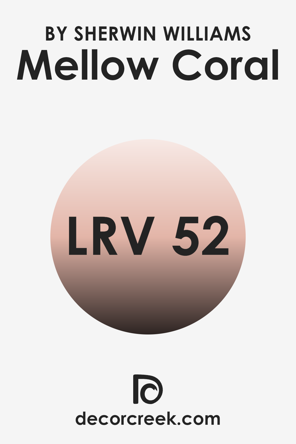
What is the LRV of Mellow Coral SW 6324 by Sherwin Williams?
LRV stands for Light Reflectance Value, which is a measure of the amount of light a paint color reflects or absorbs when it’s on your walls. This value is rated on a scale where lower numbers mean the paint absorbs more light, making the room feel cozier or smaller, while higher numbers indicate that more light is reflected, generally making the area appear brighter and larger.
This measurement is particularly useful when choosing paint colors as it helps predict how the color will look under different lighting conditions and how it may change the perception of the room’s size and illumination.
For the paint color with an LRV of around 52, like the one mentioned, it’s a mid-range value indicating that the color is somewhat balanced in terms of reflecting and absorbing light. This means it won’t make a room feel as expansive as a color with a higher LRV, nor will it make it feel particularly enclosed like a darker shade would. In practical terms, this LRV will lend the color a flexible appearance, capable of adjusting to various lighting conditions without drastically changing its character.
This balance is ideal for those who want a hint of warmth but also require sufficient reflectivity to keep their area feeling moderately airy and open.
decorcreek.com
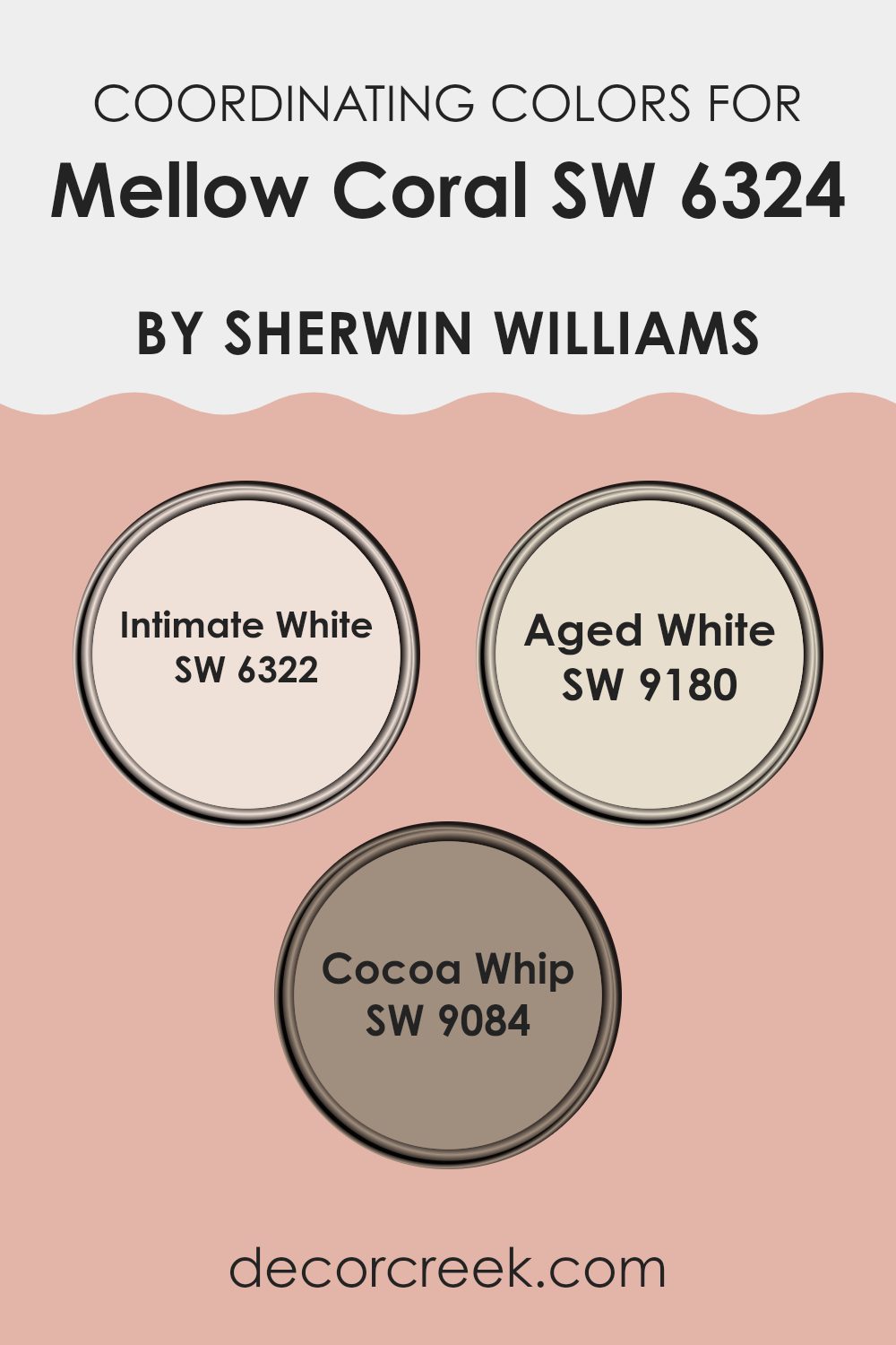
Coordinating Colors of Mellow Coral SW 6324 by Sherwin Williams
Coordinating colors are hues that complement and balance each other when used together in decor, ensuring that the overall aesthetic is harmonious and pleasing to the eye. For instance, if you’re working with a warm, inviting tone like Mellow Coral, selecting coordinating colors carefully can enhance its beauty without feeling too intense. These additional shades should ideally highlight the primary color’s attributes while creating a cohesive look that feels intentional and well-planned.
For example, Intimate White is a subtle off-white with a touch of warmth, making it a perfect backdrop that allows a color like Mellow Coral to really stand out without clashing. It’s soft enough to use extensively, perhaps on walls or larger areas, supporting bolder colors without competing for attention.
Aged White, on the other hand, has a slightly deeper, creamy quality that brings a sense of depth and warmth, perfect for creating a cozy, inviting atmosphere alongside Mellow Coral. Cocoa Whip adds a different dimension to this palette, offering a rich taupe that grounds the brighter tones and connects them to natural elements like wood or leather. Each of these colors works together, providing a balanced, attractive color scheme that enhances the overall appeal of a room.
You can see recommended paint colors below:
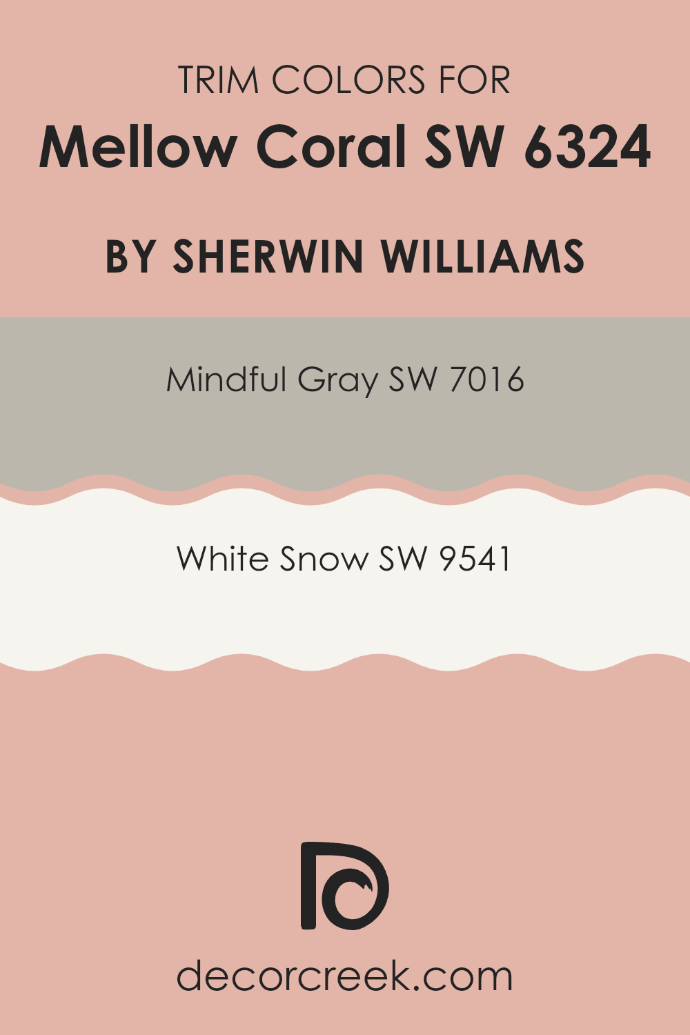
What are the Trim colors of Mellow Coral SW 6324 by Sherwin Williams?
Trim colors play a crucial role in enhancing the overall appeal and distinction of a painted room, especially when paired with a vibrant wall color like Mellow Coral by Sherwin Williams.
By using trim colors such as Mindful Gray and White Snow, you provide a frame that complements and contrasts the primary color, thereby highlighting architectural details and lending a polished finish to the room. This is important because it helps create a visually balanced and harmonious room where the wall color doesn’t feel too intense but instead stands out with a clear outline provided by the trim.
Mindful Gray by Sherwin Williams is a neutral shade that offers subtle balance, sitting perfectly between light and dark. This color works easily as a soft backdrop that allows Mellow Coral to stand out vibrantly. White Snow, on the other hand, is a crisp white that provides a clean and fresh look. It acts as a bright contrast to Mellow Coral, making any room feel open and airy while ensuring that the warmth of Mellow Coral remains inviting and eye-catching.
You can see recommended paint colors below:
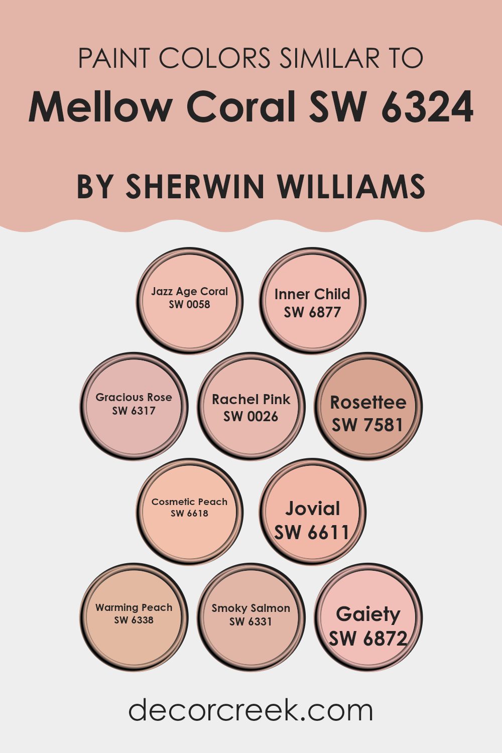
Colors Similar to Mellow Coral SW 6324 by Sherwin Williams
Understanding the importance of similar colors, such as shades related to Mellow Coral by Sherwin Williams, is essential in creating harmonious and visually appealing color schemes. These similar hues, ranging from soft pinks to vibrant corals, work together by sharing a common foundation in their color family, which allows for a cohesive look that’s pleasing to the eye.
This is especially useful in interior design, where using shades like Jazz Age Coral, a lively yet gentle color, can bring warmth and a touch of playfulness to a room. Meanwhile, Inner Child adds a cheerful splash, brightening up any room with its sunny coral tone.
Similar shades like Gracious Rose offer a subtler, more subdued touch that complements the bolder corals nicely, providing a refined but approachable atmosphere. Rachel Pink is notably softer, perfect for creating a gentle, inviting room. In contrast, Rosette lends a deeper, rosier hue that gives a sense of richness.
Colors like Cosmetic Peach and Jovial bring out an airy, light-hearted presence, ideal for rooms meant to uplift and soothe. Warming Peach, living up to its name, introduces a soft, nurturing ambiance, while Smoky Salmon presents a muted approach, excellent for blending with brighter tones. Gaiety stands out as a spirited and vivid option, capable of injecting a burst of energy into any design palette. Together, these colors form a flexible palette that can enhance the aesthetic of any interior room, creating environments that are both beautiful and functional.
You can see recommended paint colors below:
- SW 0058 Jazz Age Coral
- SW 6877 Inner Child
- SW 6317 Gracious Rose
- SW 0026 Rachel Pink
- SW 7581 Rosettee
- SW 6618 Cosmetic Peach
- SW 6611 Jovial
- SW 6338 Warming Peach
- SW 6331 Smoky Salmon
- SW 6872 Gaiety
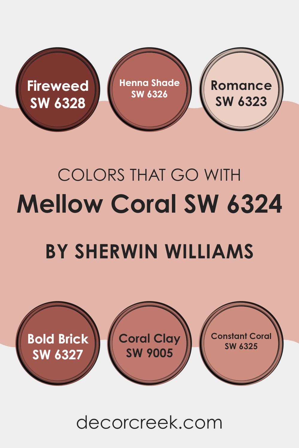
Colors that Go With Mellow Coral SW 6324 by Sherwin Williams
Understanding how colors that complement Mellow Coral SW 6324 by Sherwin Williams work together is crucial for creating beautiful and harmonious rooms. These complementary colors help balance the visual impact of Mellow Coral, ensuring that it shines without feeling too intense in a room.
For example, colors like Fireweed SW 6328—a dynamic red with a hint of earthiness—and Henna Shade SW 6326, a deeper, muted red, pair nicely with Mellow Coral, providing a warm and inviting atmosphere. Romance SW 6323 adds a soft, pinkish touch that gently contrasts with Mellow Coral, while Bold Brick SW 6327 offers a strong, traditional red that anchors the lighter coral with a dependable base tone.
Similarly, Coral Clay SW 9005 brings a dusty rose tone that complements the peachy hue of Mellow Coral, creating a subtle yet enriching color scheme. Constant Coral SW 6325 sits alongside Mellow Coral beautifully, as it closely resembles Mellow Coral but with slightly reduced vibrancy, allowing for a cohesive yet varied appearance. These colors all work together to add depth and interest to a design, allowing Mellow Coral to stand out as a fresh, inviting choice for any living area. By thoughtfully combining these colors, you can achieve a delightful visual flow that enhances both the function and aesthetic of a room.
You can see recommended paint colors below:
- SW 6328 Fireweed
- SW 6326 Henna Shade
- SW 6323 Romance
- SW 6327 Bold Brick
- SW 9005 Coral Clay
- SW 6325 Constant Coral
How to Use Mellow Coral SW 6324 by Sherwin Williams In Your Home?
Mellow Coral by Sherwin Williams is a soft, appealing shade of orange with a pinkish touch that adds a warm and inviting vibe to any room. It’s perfect for adding a gentle pop of color without feeling too intense in the area.
Consider painting an accent wall in a living room or dining area to create a cozy, welcoming atmosphere. This color also works beautifully in a bathroom or bedroom, providing a soothing backdrop that’s still cheerful and bright.
For those looking to refresh their kitchen, Mellow Coral can be used on cabinets or a kitchen island for a fun twist that is still easy on the eyes. Pair it with neutral tones like whites, greys, or light woods to keep the room balanced and airy. Accessories like cushions, vases, or curtains in Mellow Coral can also bring life to a more neutral room, making it flexible for different decorating styles. This color is great for anyone wanting to add a warm, personal touch to their home.
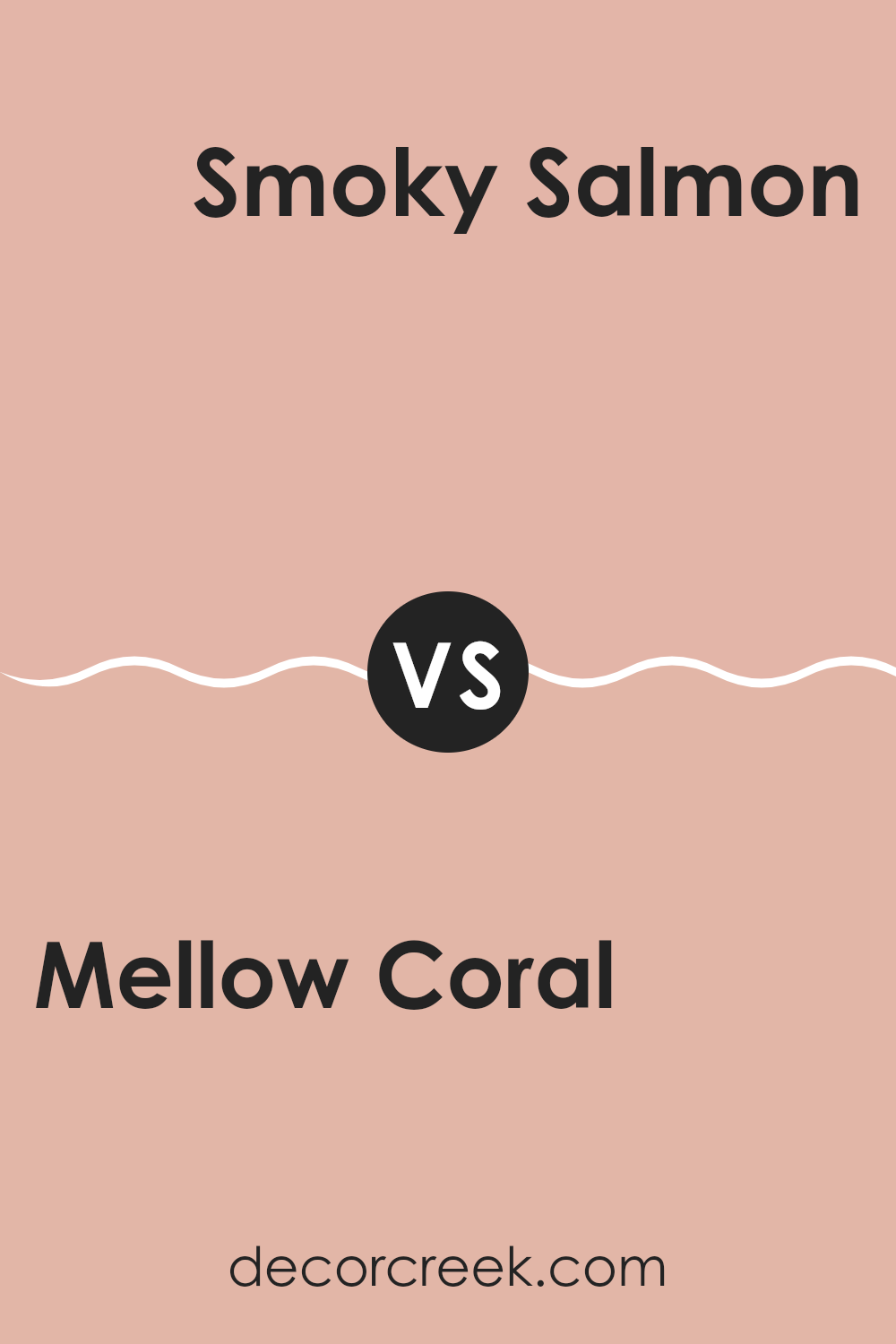
Mellow Coral SW 6324 by Sherwin Williams vs Smoky Salmon SW 6331 by Sherwin Williams
Mellow Coral and Smoky Salmon are both warm, inviting colors with subtle differences. Mellow Coral has a gentle, soft feel with a peachy tone that works well in rooms where a cozy, approachable atmosphere is desired. It’s light and airy, making it an excellent choice for living rooms or bedrooms that get a lot of natural light.
On the other hand, Smoky Salmon leans toward a deeper, richer hue that contains a touch more red. This color offers a sense of warmth and comfort but with a slightly more pronounced presence. It’s ideal for areas where you want to make a statement without feeling too intense, such as an accent wall or a dining room.
Despite their differences, both colors create a warm, welcoming vibe and can work beautifully when paired together, especially in a room that aims for a harmonious yet visually interesting palette.
You can see recommended paint color below:
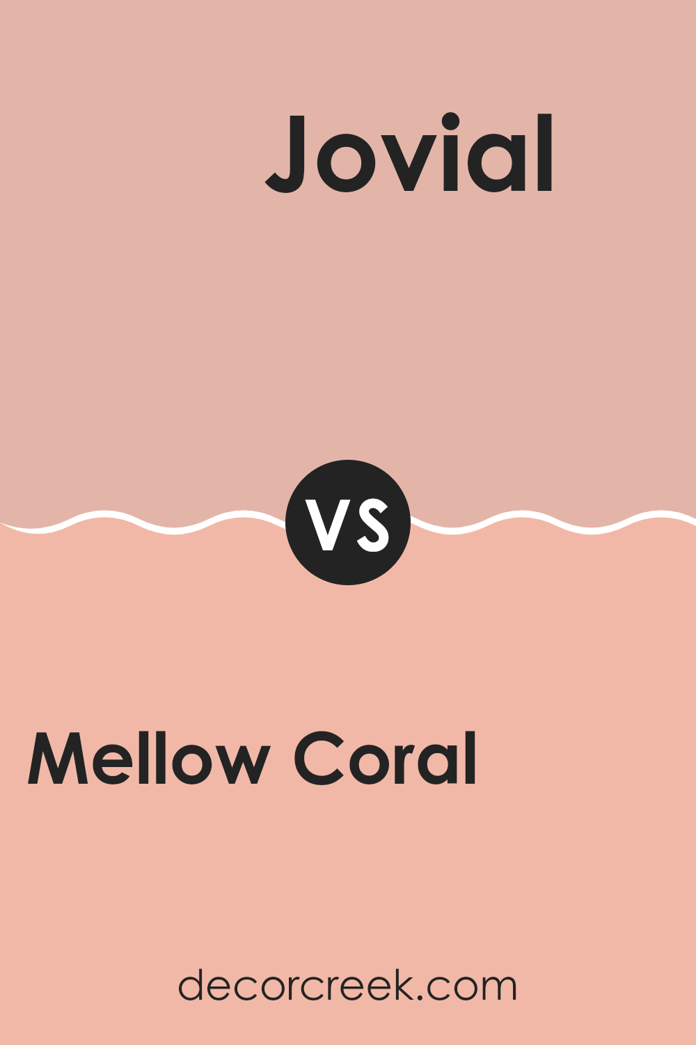
Mellow Coral SW 6324 by Sherwin Williams vs Jovial SW 6611 by Sherwin Williams
Mellow Coral and Jovial by Sherwin Williams are both warm, inviting colors, but they carry different energies for interior rooms. Mellow Coral is a subdued, soft coral shade that brings a gentle, welcoming vibe. It’s perfect for creating a cozy, calming atmosphere in a room. On the other hand, Jovial is a brighter, more vivid shade of coral. It’s livelier and can add a more energetic and cheerful touch to a room.
Mellow Coral works well in areas where you want a relaxing feel, like bedrooms or living rooms. It pairs nicely with neutral and earth tones, adding just enough color to warm up the room without feeling too intense. Jovial, with its brighter presence, is great for areas where you want to make a statement or add some positivity, like playrooms or kitchens.
Overall, while both colors share a coral base, Mellow Coral offers a more muted, subtle warmth, whereas Jovial provides a bolder, more dynamic impact. They can both brighten a room, but the effect and mood they set are clearly different.
You can see recommended paint color below:
- SW 6611 Jovial
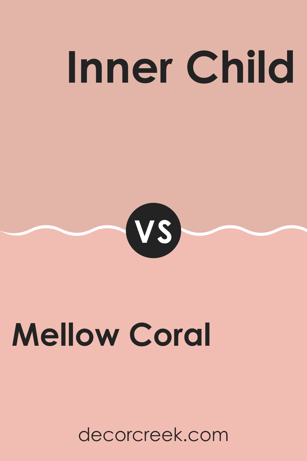
Mellow Coral SW 6324 by Sherwin Williams vs Inner Child SW 6877 by Sherwin Williams
Mellow Coral is a soft, gentle orange with a pinkish tone that brings a warm and welcoming vibe to any room. It’s subtle enough not to feel too intense in a room yet provides a cozy, inviting atmosphere. This color works well in living areas and bedrooms where you want to add a touch of softness and warmth.
On the other hand, Inner Child is a vibrant, bright green that is energetic and lively. It’s perfect for rooms where you want to add brightness and fun, such as playrooms or creative rooms. This shade can really make a room feel alive and is great for sparking creativity and joy.
Both colors have their unique charm. Mellow Coral is more about warmth and comfort, making rooms feel homey, while Inner Child adds a pop of energy and cheerfulness, perfect for dynamic, lively environments. Choosing between them depends on the mood and function you want for your room.
You can see recommended paint color below:
- SW 6877 Inner Child
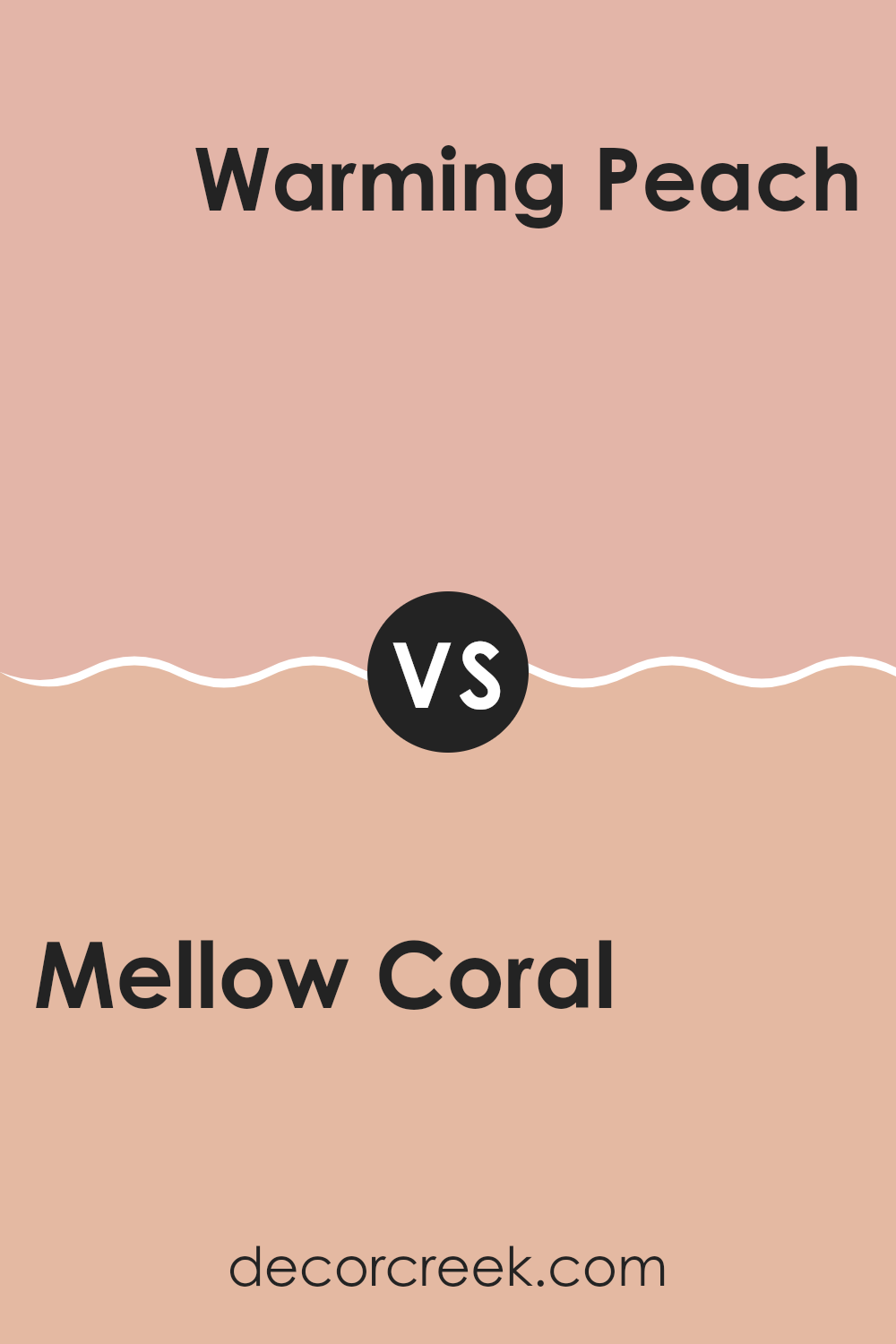
Mellow Coral SW 6324 by Sherwin Williams vs Warming Peach SW 6338 by Sherwin Williams
Mellow Coral and Warming Peach are both inviting, warm colors that brighten any room with a cheerful touch. Mellow Coral has a soft, rosy tone that brings a sense of gentle warmth to a room. It’s a bit subtler and can suit a variety of decorating styles without feeling too intense.
On the other hand, Warming Peach is a more vibrant option, projecting a stronger presence with its richer, more pronounced peach hue. It tends to stand out more, making it a great choice for rooms where you want to add a splash of energy.
Both colors work well in living areas or bedrooms where you want to create a cozy, welcoming atmosphere. They pair nicely with neutrals such as whites and light grays, which can help balance their warmth. Whether you choose the understated charm of Mellow Coral or the lively vibe of Warming Peach, both lend a friendly, inviting touch to any décor.
You can see recommended paint color below:
- SW 6338 Warming Peach
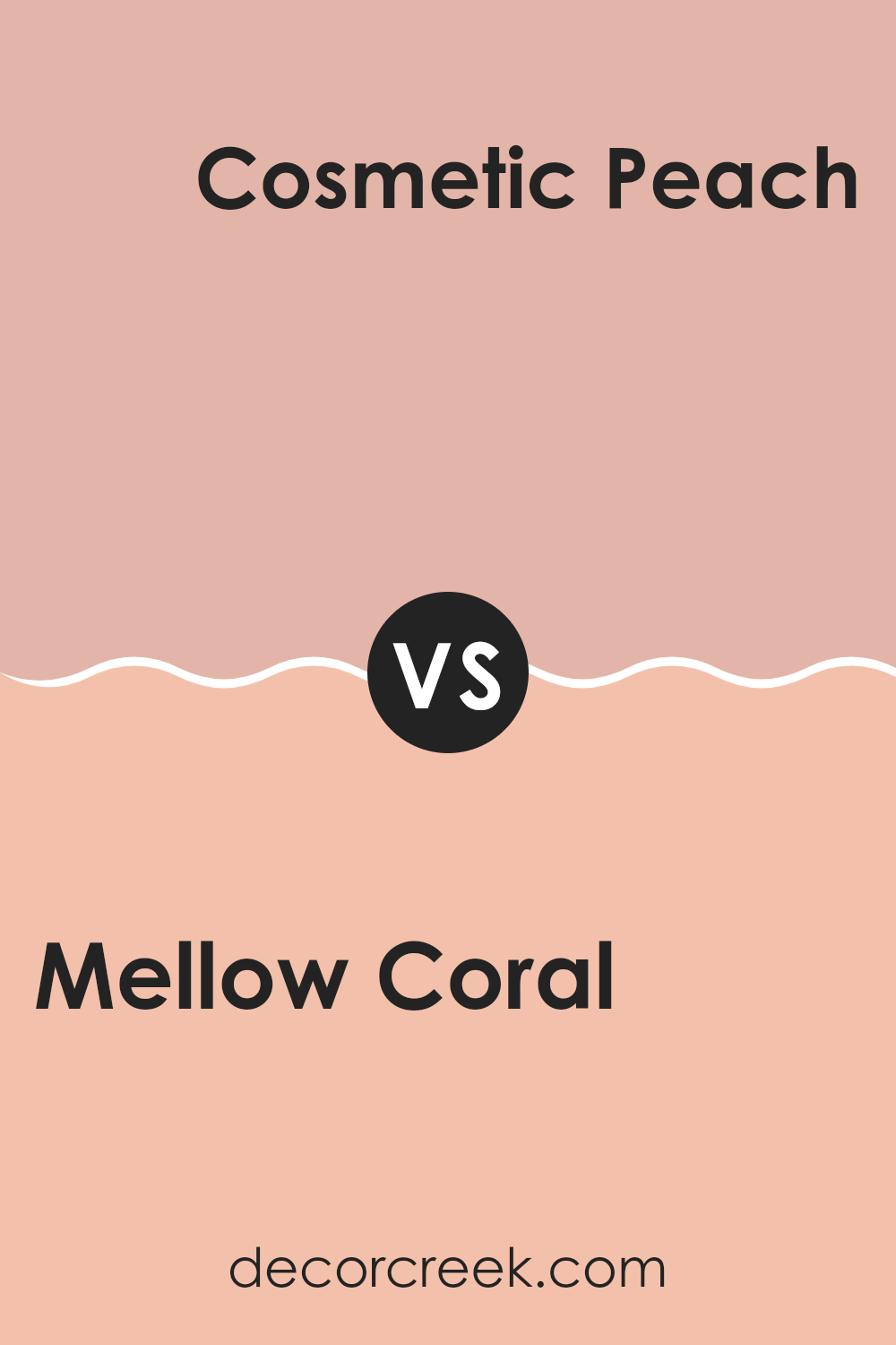
Mellow Coral SW 6324 by Sherwin Williams vs Cosmetic Peach SW 6618 by Sherwin Williams
Mellow Coral and Cosmetic Peach are two warm and inviting colors from Sherwin Williams. Mellow Coral has a soothing, soft orange tone with a pinkish touch that gives it a gentle and welcoming feel. It’s a flexible color that pairs well with both light and dark shades, making it perfect for living rooms or bedrooms where a cozy atmosphere is desired.
On the other hand, Cosmetic Peach is slightly lighter and has a creamier base, which offers a subtle, peachy glow. This color is great for rooms that need a touch of warmth without feeling too intense, such as bathrooms or small sitting areas. It brings a fresh and airy feel, enhancing natural light in the room.
Both colors are excellent choices for creating a friendly and comfortable home environment. Mellow Coral provides a bit more depth and warmth, while Cosmetic Peach is ideal for lighter, brighter rooms. Together, they can create a harmonious palette for anyone looking to add a touch of warmth to their home.
You can see recommended paint color below:
- SW 6618 Cosmetic Peach
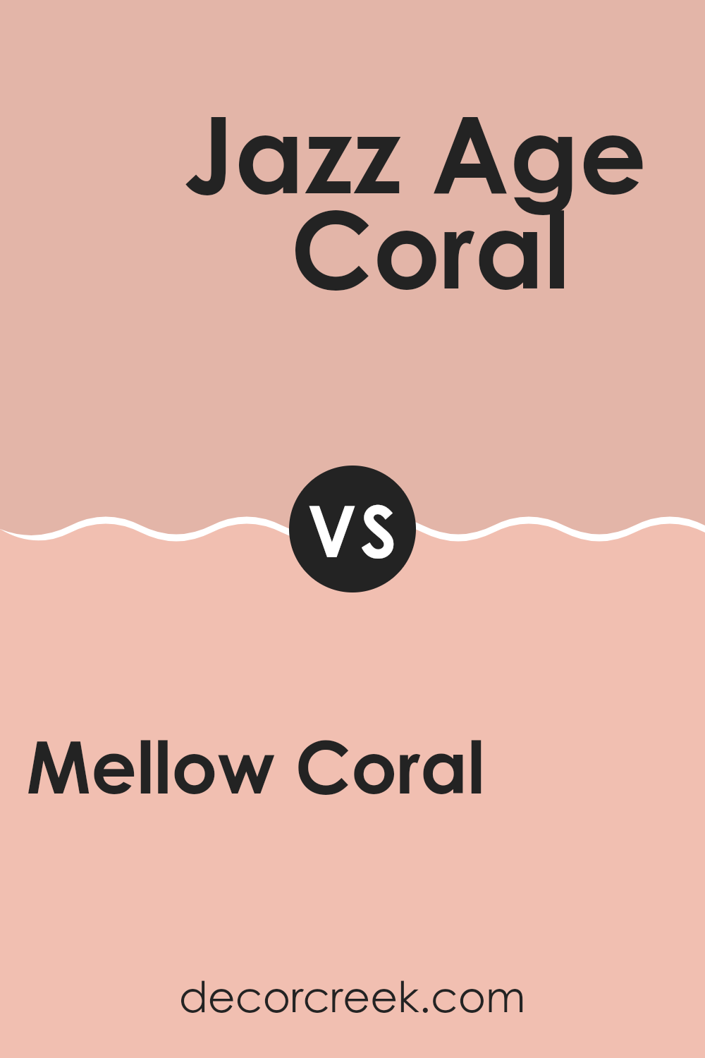
Mellow Coral SW 6324 by Sherwin Williams vs Jazz Age Coral SW 0058 by Sherwin Williams
Mellow Coral and Jazz Age Coral, both from Sherwin Williams, are warm, inviting shades, but they present unique tones that could set a different mood in a room. Mellow Coral is a soft, gentle orange with a calming pink undertone, perfect for creating a cozy and welcoming atmosphere. It pairs well with neutral and earthy accents, making it adaptable for living rooms and bedrooms.
On the other hand, Jazz Age Coral has a more vibrant, energetic feel. This color leans more toward a lively pink with a hint of orange, making it stand out more and infuse rooms with a cheerful vibe. It’s an excellent choice for areas where you want to add a splash of brightness, such as a kitchen or a playful living area.
Both colors offer warmth, but Mellow Coral is subtler, whereas Jazz Age Coral provides a more dynamic punch, adding life and energy to any room.
You can see recommended paint color below:
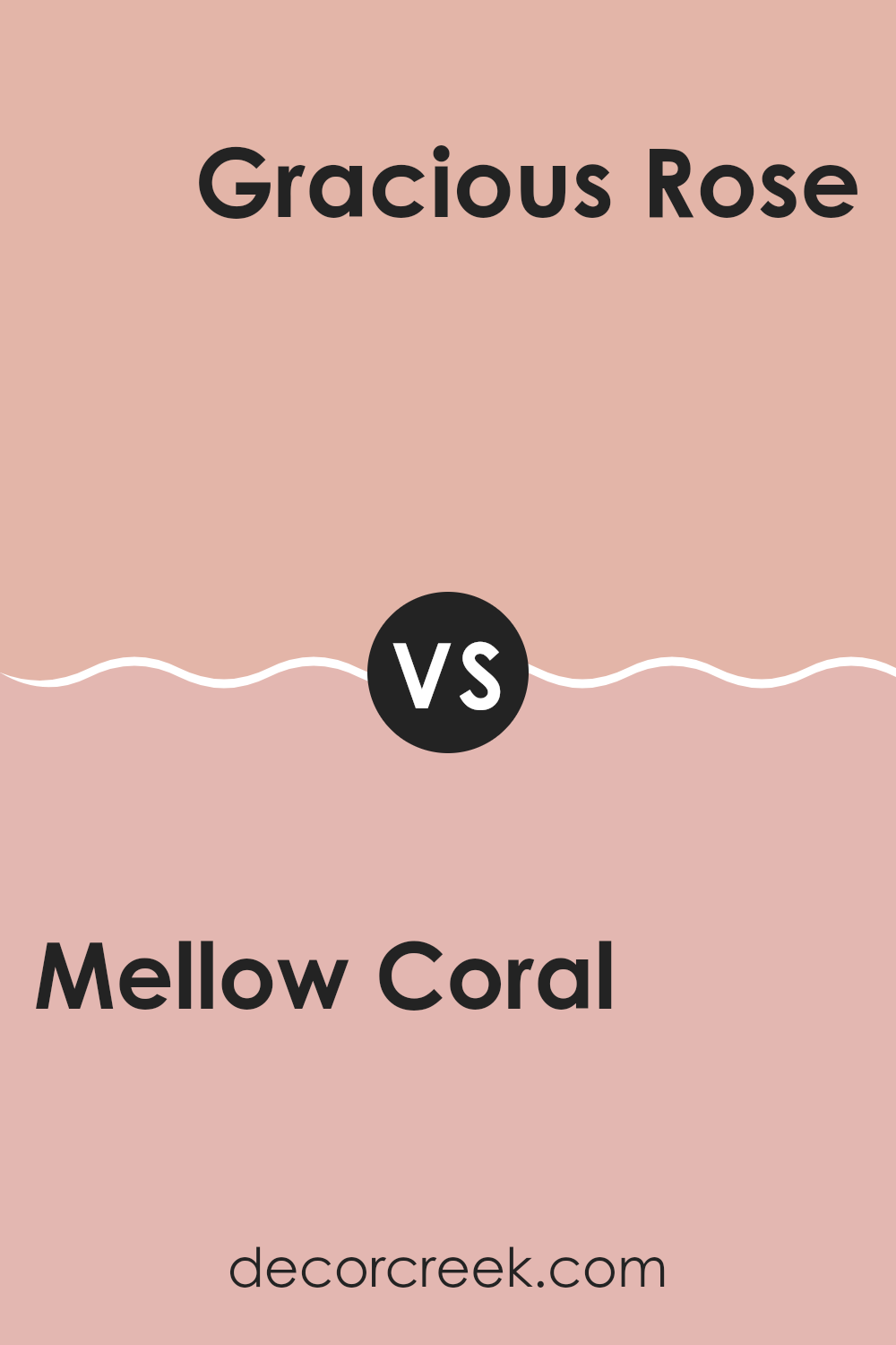
Mellow Coral SW 6324 by Sherwin Williams vs Gracious Rose SW 6317 by Sherwin Williams
The main color, Mellow Coral, is a soft, inviting shade that leans toward a peachy tone. It has a warm and cozy feeling that makes it great for rooms where you want a friendly atmosphere. It can gently brighten a room and is flexible enough to be used in many areas, including living rooms and bedrooms.
On the other hand, Gracious Rose has a deeper, pinkish hue which gives it a more pronounced presence. This color is slightly richer and can add a touch of charm to rooms that need a bit more personality. It works well in areas where you want to create a slightly more intimate or cheerful setting.
Overall, while both colors provide warmth, Mellow Coral offers a subtler approach, promoting a light and airy feel. Gracious Rose, meanwhile, provides a bolder statement, suitable for creating focal points in a room. Both can significantly enhance a room, depending on the ambience you aim to achieve.
You can see recommended paint color below:
- SW 6317 Gracious Rose
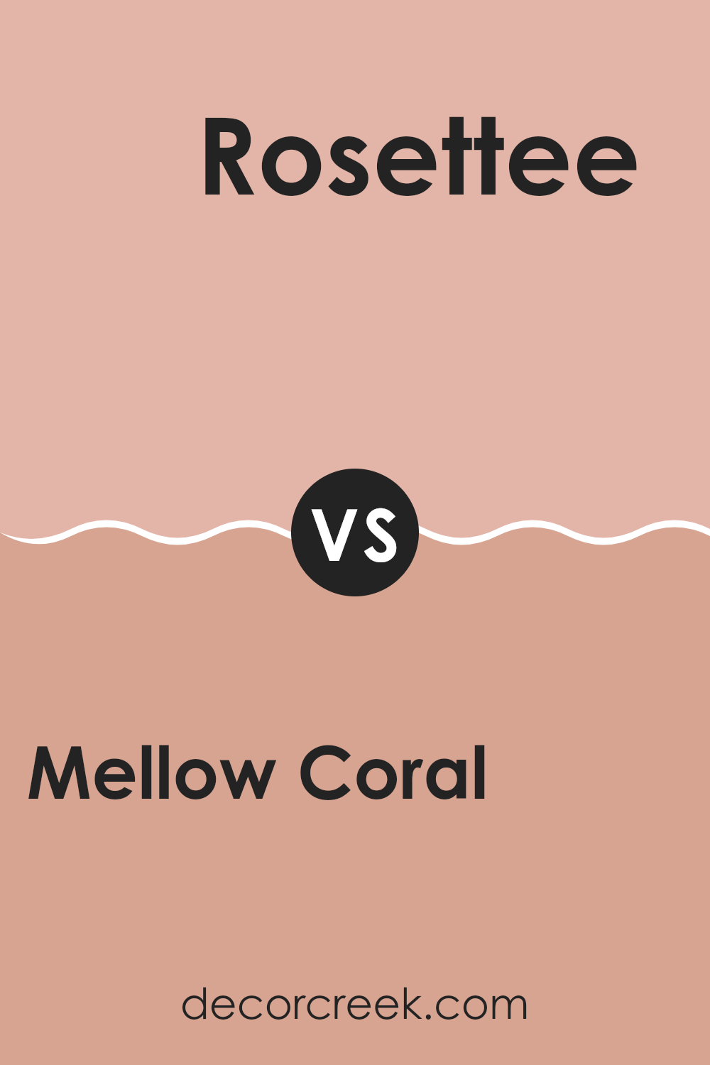
Mellow Coral SW 6324 by Sherwin Williams vs Rosettee SW 7581 by Sherwin Williams
Mellow Coral is a gentle peachy-pink color that creates a soft, inviting vibe in any room, especially when paired with neutral colors like white or light gray. It isn’t too bright, making it a good choice if you want a pop of color without feeling too intense.
On the other hand, Rosettee is a deep, muted rose shade that adds a more traditional and subtle touch of color. It’s darker and less vibrant than Mellow Coral, providing a sense of warmth and coziness. This color works well in rooms that aim for a more reserved but still warm appearance.
These two colors could work beautifully together for a room that uses Rosettee as an accent wall and Mellow Coral for the surrounding walls. This combination would allow for a room that feels both cozy and airy at the same time. Both colors convey warmth and are flexible enough to be used in various settings, from casual to formal.
You can see recommended paint color below:
- SW 7581 Rosettee
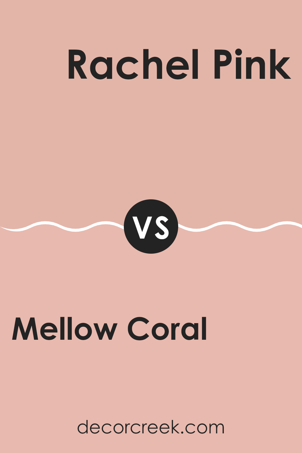
Mellow Coral SW 6324 by Sherwin Williams vs Rachel Pink SW 0026 by Sherwin Williams
Mellow Coral is a warm and inviting shade that brings a cozy and slightly vibrant feel to any room. It’s like a soft hug from a beloved old sweater, radiating subtle energy without feeling too intense in the room. This color works well in living areas or bedrooms where you want a touch of cheerfulness blended with comfort.
On the other hand, Rachel Pink is a delicate and light pink that offers a more tender and romantic touch. It creates a soft, airy feel, making it perfect for nurseries or for adding a pinch of sweetness to a reading nook. Rachel Pink is quieter in mood compared to Mellow Coral, providing a gentle backdrop rather than making a lively statement.
Together, these colors can complement each other beautifully, with Mellow Coral adding warmth and Rachel Pink bringing in a sense of gentle lightness. Whether used separately or together, each color has its unique charm to enhance a home’s decor.
You can see recommended paint color below:
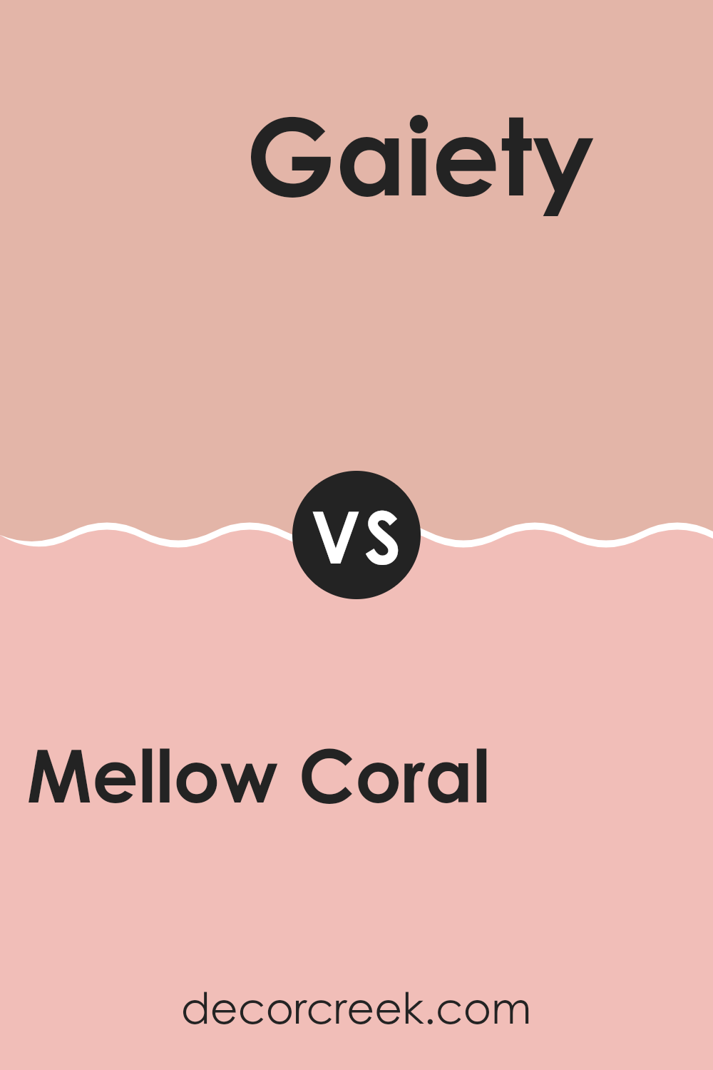
Mellow Coral SW 6324 by Sherwin Williams vs Gaiety SW 6872 by Sherwin Williams
Main Color (Mellow Coral) and Second Color (Gaiety) from Sherwin Williams each bring their own unique presence to a room. Mellow Coral is a soft, gentle shade, much like a cozy sunset. It is warm and inviting, making it a perfect option for living rooms or bedrooms where a calming touch is desired. This color has a relaxed influence which ties nicely with many decor styles.
On the other hand, Gaiety is a vibrant, lively pink that injects fun and energy into any area. It’s a bold choice, great for rooms like a kid’s room, a craft area, or any spot in the house that benefits from a splash of brightness. This color stands out and can be a great accent wall or a centerpiece for lively themes.
Both colors have their strengths, with Mellow Coral offering warmth and softness, whereas Gaiety provides a striking dash of energy. Choosing between them depends on the mood and function you want for your room.
You can see recommended paint color below:
- SW 6872 Gaiety
As I wrap up my thoughts on SW 6324 Mellow Coral by Sherwin Williams, I’ve really grown to appreciate this unique color. Mellow Coral isn’t just a simple shade; it’s like a warm, sunny day that makes you feel cozy and happy. It has a gentle orange-pink touch that can brighten up any room without being too loud or bright. It’s a great choice for anyone looking to add a splash of cheerfulness to their home.
In trying it in different rooms, I noticed that Mellow Coral works wonderfully in areas like a living room or a bedroom, giving a calm yet joyful look. It pairs beautifully with light colors like soft whites or can even match nicely with darker greens for a more exciting contrast. This color specifically speaks to those who want their home to feel warm and welcoming.
If you’re thinking about giving your home a fresh, new look, you might really like Mellow Coral. It’s fun, friendly, and has a way of making any room feel more open and inviting. It’s not just another pink or orange, but a perfect blend that brings the best of both.
So, if you’re ready for a change, consider this lovely shade for your walls. It might just make your home feel just right.
Ever wished paint sampling was as easy as sticking a sticker? Guess what? Now it is! Discover Samplize's unique Peel & Stick samples.
Get paint samples

