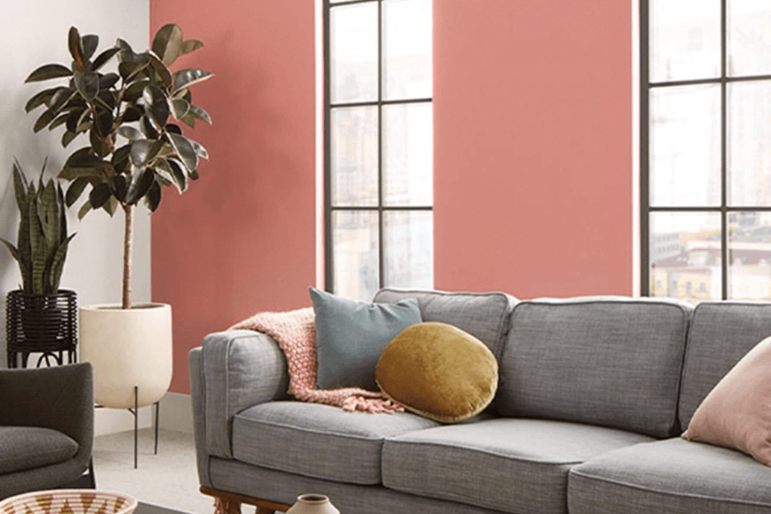
If you’re considering a fresh paint color for your area, let me introduce you to SW 9005 Coral Clay by Sherwin Williams. As someone who appreciates the subtle way colors influence a room, I found Coral Clay to be a wonderfully warm and welcoming hue. Its earthy, pinkish tone brings a cozy, yet polished vibe to any area, making it particularly ideal for living areas and bedrooms where comfort is key.
When selecting paint, it’s helpful to understand how a color behaves in different lights, and Coral Clay is no exception. During the day, it exudes a gentle warmth that seems to make rooms more inviting. By night, it shifts subtly, maintaining its warmth but with a quieter presence, lending a soothing feel that’s perfect for winding down.
The adaptability of Coral Clay from Sherwin Williams also makes it an excellent choice if you’re looking to create a backdrop that complements a variety of decor styles and color palettes.
Whether you pair it with bold colors or soft neutrals, it holds its own without being excessive, supporting other elements rather than competing with them.
What Color Is Coral Clay SW 9005 by Sherwin Williams?
Coral Clay is a warm, inviting hue reminiscent of earthy elements. This color carries a natural softness which makes it adaptable and appealing, ideal for creating a cozy yet fresh atmosphere in any room. With its subtle reddish undertones, it brings a gentle vibrancy that enhances the feeling of warmth in an area.
Coral Clay is especially well-suited for interior styles such as rustic, coastal, and contemporary. In a rustic setting, it pairs beautifully with raw materials like unfinished wood, adding a touch of warmth to the natural textures. For a coastal vibe, it complements light, breezy fabrics and woven textures, evoking a soft, beachy feel. In more modern and contemporary interiors, Coral Clay works well with sleek, polished surfaces to create a balance between modern edge and traditional comfort.
Materials that pair nicely with Coral Clay include soft linens, creamy leather, and natural woods. These textures help to ground the color and prevent it from being excessive in an area. Additionally, accents in bronze or gold can enhance its warm tones, providing a chic and inviting finish.
Overall, Coral Clay is an adaptable color choice that can create a cozy, welcoming environment regardless of the style or materials chosen to accompany it. Its ability to pair well with various textures and styles makes it a reliable option for anyone looking to refresh their interior.
Is Coral Clay SW 9005 by Sherwin Williams Warm or Cool color?
Coral Clay by Sherwin Williams is a warm, welcoming shade that combines the earthiness of red with soft orange undertones. This color adds a cozy and inviting atmosphere to any room, making it perfect for living areas and bedrooms where comfort is a key element.
Because it has a balanced intensity, it pairs well with neutral tones like whites and grays, which can help to highlight its richness without overpowering the area. This flexibility means Coral Clay can be used for walls, accents, or even furniture, offering flexibility in design choices.
In homes, this color works particularly well in areas with natural light, as the sunlight enhances its depth and warm undertones, creating a vibrant and cheerful environment. Overall, Coral Clay is an excellent choice for anyone looking to add a touch of warmth and personality to their living area.
Undertones of Coral Clay SW 9005 by Sherwin Williams
Coral Clay is a unique paint color that can change its appearance based on the light in a room and the colors around it. This is because of undertones, which are subtle hues mixed into the main color. Knowing the undertones in a paint like Coral Clay helps you understand how it will look once applied on your walls.
Coral Clay has a mix of many undertones such as grey, orange, pink, and more. These undertones can make the color appear differently under various lighting conditions or when paired with other colors in your decor. For example, grey and light grey undertones might make the color appear softer in cool lighting, while orange or pink can give it a warm glow in sunlight.
For interior walls, Coral Clay’s blend of undertones, including lighter shades like pale yellow and light green, can help in creating a warm and inviting atmosphere in a room. The hints of colors like olive and brown give it an earthy feel, making it a good choice for areas where you want a touch of nature. Meanwhile, its cooler undertones such as lilac and light blue can help balance warmer furniture pieces.
Since Coral Clay has a variety of undertones, it’s adaptable and can work well in many different kinds of rooms. Whether you are looking for a cozy feeling in a bedroom or a welcoming vibe in the living room, understanding its undertones helps in manipulating the area visually. This color, with its dynamic character, offers plenty of possibilities for interior design.
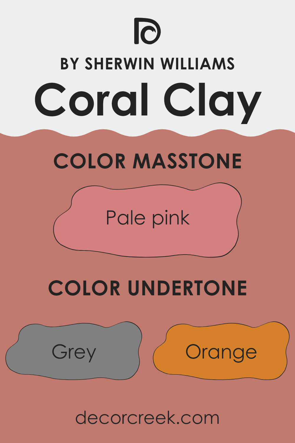
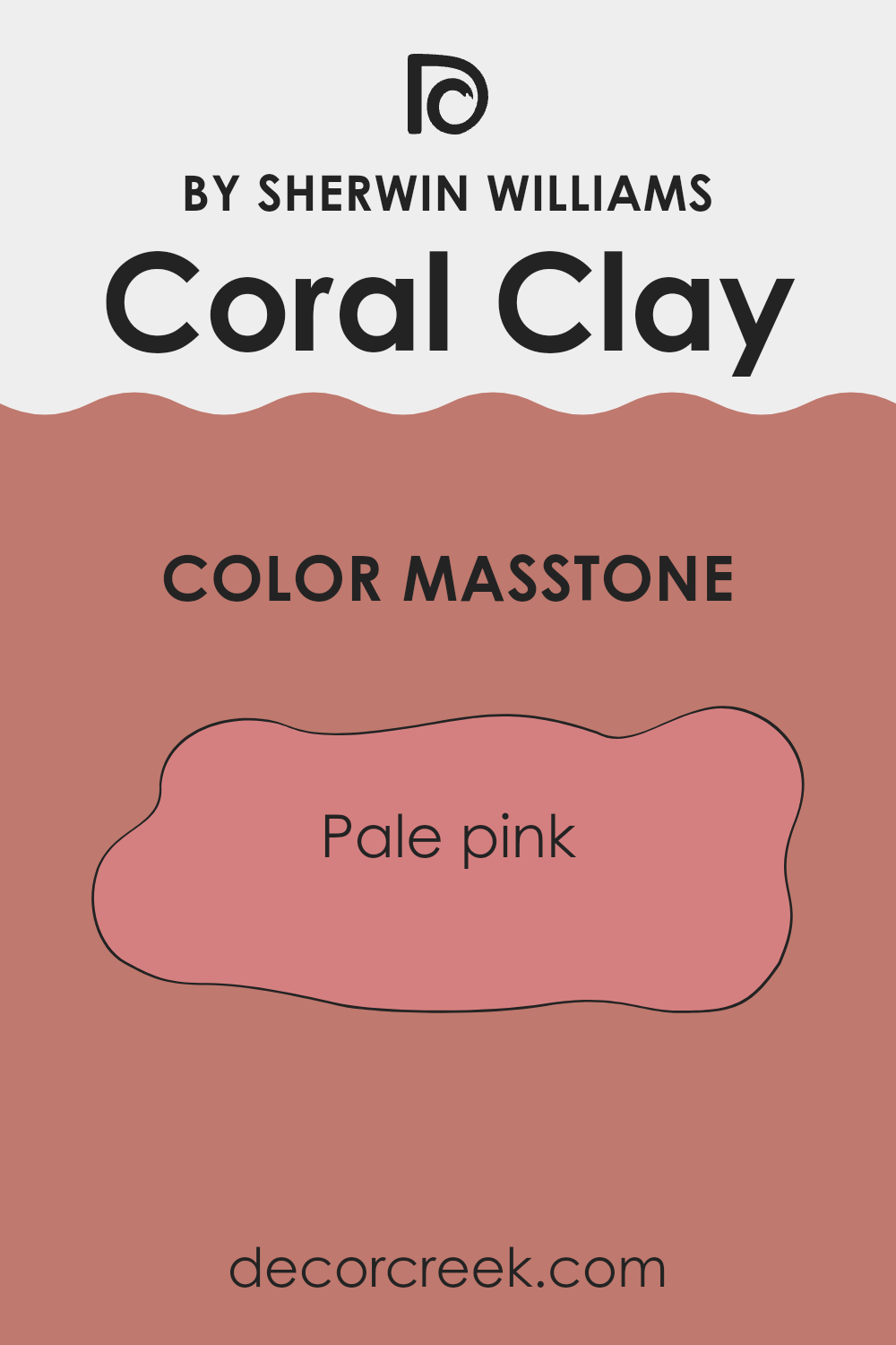
What is the Masstone of the Coral Clay SW 9005 by Sherwin Williams?
Coral Clay SW 9005 by Sherwin Williams has a masstone that appears as pale pink, which offers a soft and inviting atmosphere when used in home interiors. This gentle shade of pink brings a warm, cozy feel to areas without feeling too bright or overpowering.
It is adaptable and works well in places like living rooms or bedrooms where you want to create a peaceful, calming environment. The subtle nature of the color makes it easy to pair with a variety of decor styles and other colors, from neutral shades to more vivid hues.
This flexibility allows homeowners to incorporate it without having to drastically change existing decor. It’s an ideal choice for anyone looking to add a touch of gentle warmth to their home. The color’s light tone can also help smaller rooms appear more spacious and open, enhancing the overall feel of an area.
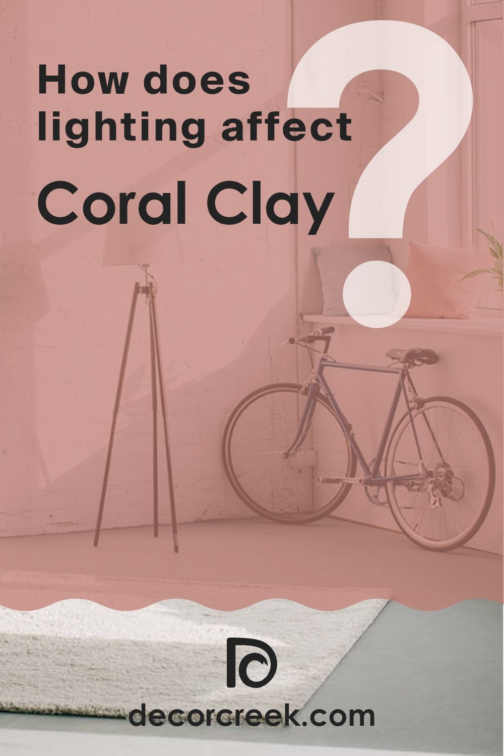
How Does Lighting Affect Coral Clay SW 9005 by Sherwin Williams?
Lighting plays a crucial role in how we perceive colors in our surroundings. The same paint color can appear different depending on the type of light shining on it—whether it’s natural daylight or various kinds of artificial lighting.
Taking the color Coral Clay as an example, in natural light, it exhibits a warm and inviting hue, which can make a room feel cozy and comfortable. This color tends to look softer and more muted under the soft, diffuse light of a cloudy day, while it might appear brighter and more vibrant when illuminated by direct sunlight.
In artificial light, the perception of Coral Clay can vary significantly. Under fluorescent lighting, the color may lose some of its warmth, appearing slightly duller and less lively. On the other hand, incandescent lighting can enhance its warm tones, making it feel richer and more welcoming.
The orientation of a room also impacts how Coral Clay looks throughout the day. In north-facing rooms, which receive less direct sunlight, this color can feel cooler and less dynamic. North-facing light is typically more even throughout the day but doesn’t bring out the warm undertones as efficiently.
South-facing rooms are bathed in plentiful light for most of the day, which can make Coral Clay look very vibrant and warm, enhancing its inviting nature. This is ideal for creating a lively and cheerful area.
In east-facing rooms, the morning light can make Coral Clay look particularly bright and fresh. As the day progresses, the intensity and warmth of the color may fade as the natural light diminishes.
West-facing rooms will have the opposite effect, with the stronger afternoon and evening light warming up the color significantly. This makes the area feel cozy and warm towards the end of the day.
Thus, when deciding on a paint color like Coral Clay, it’s important to consider the room’s lighting to ensure that the color behaves as desired across different times of the day and under varying lighting conditions.
decorcreek.com
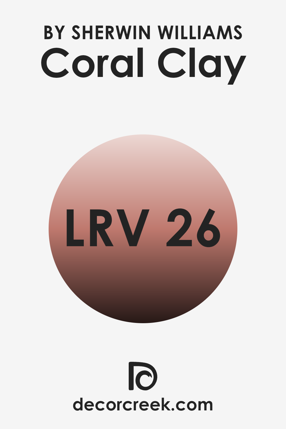
What is the LRV of Coral Clay SW 9005 by Sherwin Williams?
LRV stands for Light Reflectance Value, a measurement that indicates the amount of visible light that a color reflects or absorbs. Essentially, this value helps determine how light or dark a color will appear when painted on a wall.
It’s expressed on a scale where lower numbers mean the color absorbs more light and appears darker, whereas higher numbers indicate that the color reflects more light and looks lighter. This is important when choosing paint colors because it impacts how bright or cozy an area feels, depending on how much natural or artificial light it receives.
For Coral Clay with an LRV of 25.997, this means it is on the darker side, absorbing more light than it reflects. In rooms with less natural light, this color might make the area feel smaller or more enclosed, but it could add a warm, comforting vibe to well-lit rooms. It’s ideal for creating a cozy atmosphere in areas like bedrooms or living areas, where a bit of depth and warmth can enhance the overall aesthetic. When considering this shade, lighting should be a key consideration, as different types and amounts of light can significantly affect how the color is perceived.
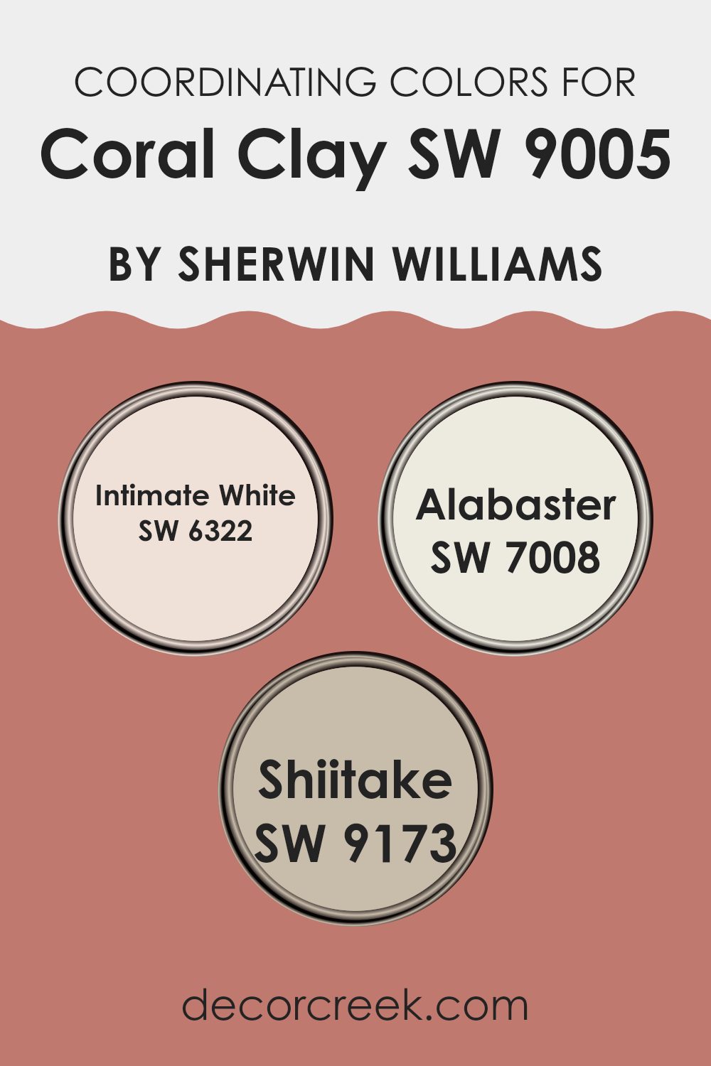
Coordinating Colors of Coral Clay SW 9005 by Sherwin Williams
Coordinating colors are hues that complement each other and create a harmonious aesthetic when used together within an area. When selecting coordinating colors, considering those that enhance the dominant shade without being excessive is essential. For instance, Coral Clay by Sherwin Williams pairs beautifully with soothing neutrals like Intimate White, Alabaster, and Shiitake. These combinations can help achieve a balanced and visually appealing look in any room.
Intimate White is a soft and gentle hue, providing a subtle whisper of color that can lighten an area while adding warmth. It works harmoniously with the vibrant Coral Clay to create a nurturing environment that still feels airy and open. Alabaster, another coordinating color, is a pristine white that offers a crisp contrast, making areas appear brighter and more spacious.
It pairs well with Coral Clay by providing a refreshing backdrop that allows richer colors to stand out. Meanwhile, Shiitake carries earthy undertones that bring a grounding effect. This muted beige adds depth and complements the lively Coral Clay, resulting in a cohesive and inviting palette. Together, these colors work seamlessly to enhance the beauty of the main shade while creating a comfortable and stylish atmosphere.
You can see recommended paint colors below:
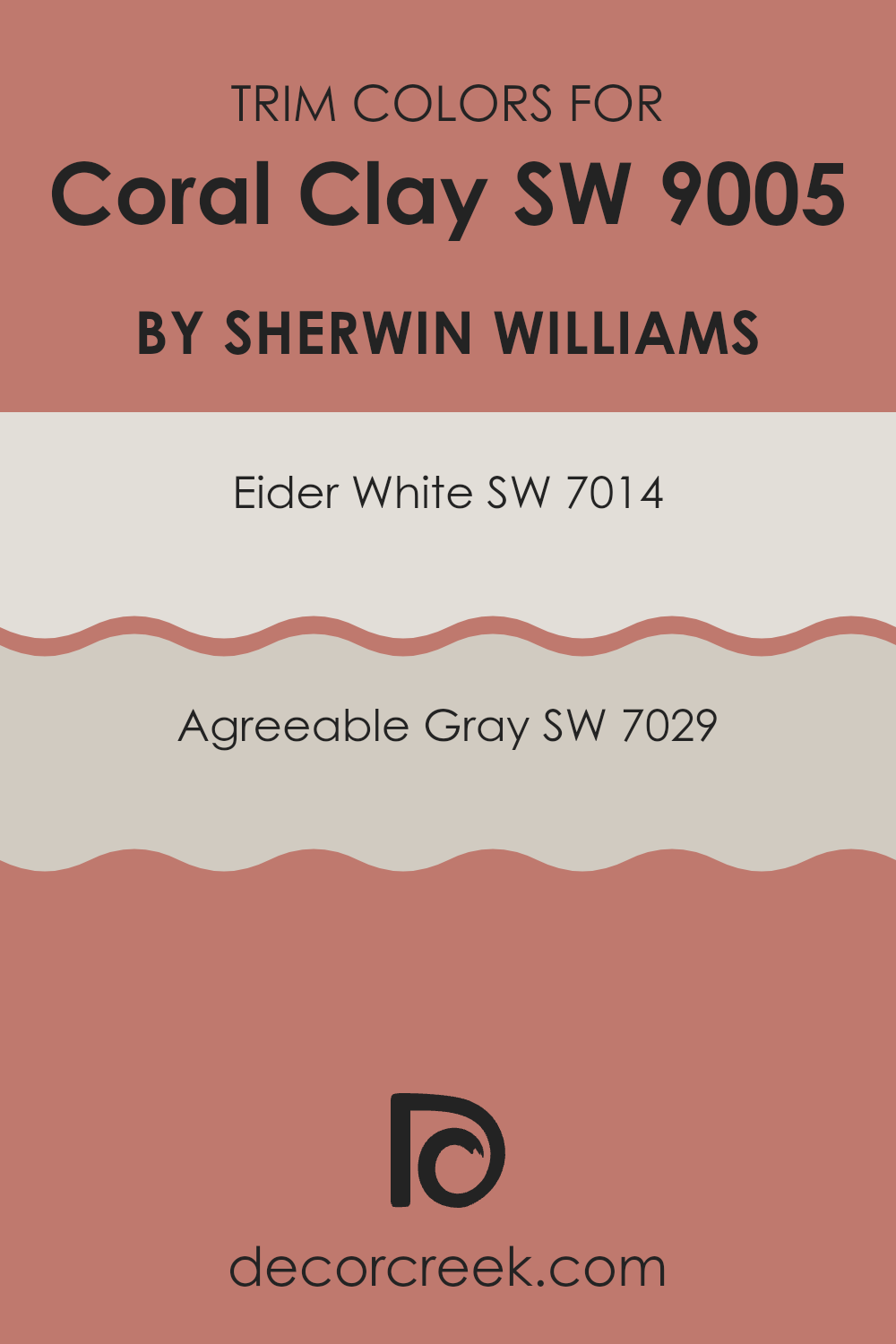
What are the Trim colors of Coral Clay SW 9005 by Sherwin Williams?
Trim colors are an integral aspect of interior design, serving as accents that frame and complement the primary colors used on walls, such as Coral Clay by Sherwin Williams.
By carefully selecting trim colors, you can enhance architectural features and create a coherent aesthetic that flows throughout the area. Using colors like Eider White and Agreeable Gray as trims can subtly highlight the warmth and inviting nature of Coral Clay, facilitating a more polished and cohesive look within a room.
Eider White SW 7014 is a gentle off-white shade that brings a fresh and clean look to trims, providing a soft contrast that isn’t too stark against the richer tone of Coral Clay. Agreeable Gray SW 7029, on the other hand, is a mild, neutral gray that offers flexibility and a hint of warmth. This color works seamlessly with Coral Clay, enhancing the overall warmth of the room without overpowering the primary hue, maintaining a harmonious color palette throughout the area.
You can see recommended paint colors below:
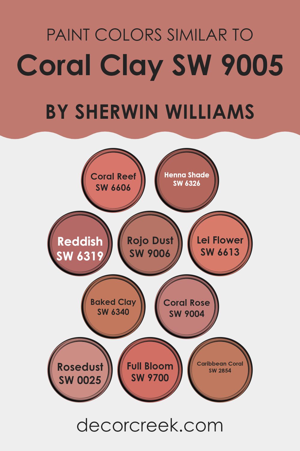
Colors Similar to Coral Clay SW 9005 by Sherwin Williams
Choosing similar paint colors can help achieve a cohesive and harmonized look in any area, especially when dealing with a unique color like Coral Clay by Sherwin Williams. Similar colors, such as those in the Coral Clay palette, bring a sense of unity and flow to an environment, making transitions between rooms or décor elements seamless and aesthetically pleasing. These complementary shades, while distinct, share common undertones that help them work well together, creating a polished yet approachable atmosphere.
For instance, Coral Reef offers a vibrant, yet slightly softer hue that can brighten an area without being excessive. Henna Shade brings a richer, more earthy tone, perfect for adding warmth to a room. Reddish presents a muted red that works well in cozy, intimate settings, while Rojo Dust softens the intensity with its dusky red, making it ideal for creating subtle accents.
Lei Flower introduces a playful, floral-inspired pink that injects a bit of fun. Baked Clay and Coral Rose each provide variations of deep, warm terra cotta, excellent for grounding an area with a touch of natural elegance. Rosedust offers a soft, muted pink reminiscent of a calming sunset. Full Bloom is a bold, more saturated color, adding a punch of vivacity wherever applied. Lastly, Caribbean Coral offers a tropical flair with its energetic and sunny character, perfect for invigorating any area. Together, these colors offer adaptable options that can either enhance Coral Clay’s natural beauty or stand out on their own in a design.
You can see recommended paint colors below:
- SW 6606 Coral Reef
- SW 6326 Henna Shade
- SW 6319 Reddish
- SW 9006 Rojo Dust
- SW 6613 Lei Flower
- SW 6340 Baked Clay
- SW 9004 Coral Rose
- SW 0025 Rosedust
- SW 9700 Full Bloom
- SW 2854 Caribbean Coral
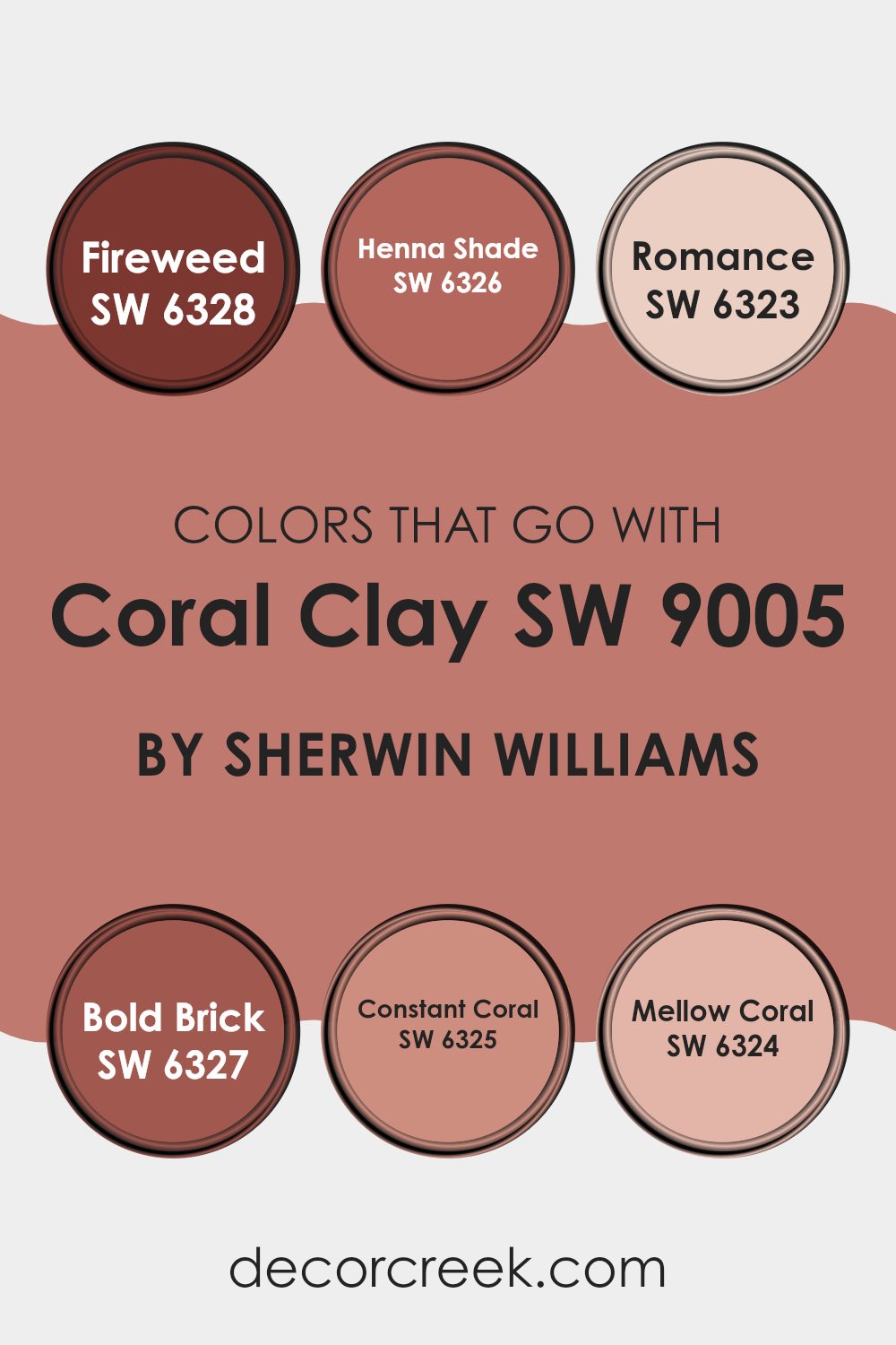
Colors that Go With Coral Clay SW 9005 by Sherwin Williams
When choosing colors to complement Coral Clay SW 9005 by Sherwin-Williams, it’s vital to consider hues that create a harmonious balance. This ensures that the area feels coherent and aesthetically pleasing. Colors like SW 6328 – Fireweed, a deep and vibrant reddish hue, enrich the warmth of Coral Clay. Alongside, SW 6326 – Henna Shade offers a darker, earthy red that grounds the pairing, making the combination feel cozy and inviting.
Adding colors such as SW 6323 – Romance, a soft and light pink, introduces a gentle contrast that lightens the overall mood without clashing. For a bolder approach, SW 6327 – Bold Brick, with its rich, deep red, intensifies the visual interest and depth of the area. Lighter, yet still warm, SW 6325 – Constant Coral echoes the peachy tones of Coral Clay, enhancing the room’s warmth.
Lastly, SW 6324 – Mellow Coral provides a subdued, softer counterpart to Coral Clay, ensuring the area remains light and airy. In summary, selecting the right colors to go with Coral Clay not only makes the area visually appealing but also creates a cohesive atmosphere that is pleasant to be in.
You can see recommended paint colors below:
- SW 6328 Fireweed
- SW 6326 Henna Shade
- SW 6323 Romance
- SW 6327 Bold Brick
- SW 6325 Constant Coral
- SW 6324 Mellow Coral
How to Use Coral Clay SW 9005 by Sherwin Williams In Your Home?
Coral Clay SW 9005 by Sherwin-Williams is a warm, inviting paint color that falls within the realm of earthy tones. It’s a balance of terracotta and deep pink, making it suitable for creating a cozy, welcoming area in any room. This color works exceptionally well in living rooms and bedrooms, adding depth and warmth to walls. It pairs beautifully with neutral colors like soft whites or grays, giving a modern yet enduring look.
For those looking to refresh their kitchen or bathroom, Coral Clay provides a unique alternative to traditional colors. Applying this shade to cabinets or as an accent wall can add a subtle pop of color without becoming too much for the senses. It works great with natural elements like wooden furniture or green plants, enhancing an organic, natural vibe.
Moreover, Coral Clay can also be used in smaller doses, such as for painting doors, trims, or even furniture pieces. This approach allows you to sprinkle a bit of warmth into areas without committing to painting entire walls. Coral Clay is adaptable, comforting, and easily suitable for various home styles, making it a practical choice for your decorating needs.
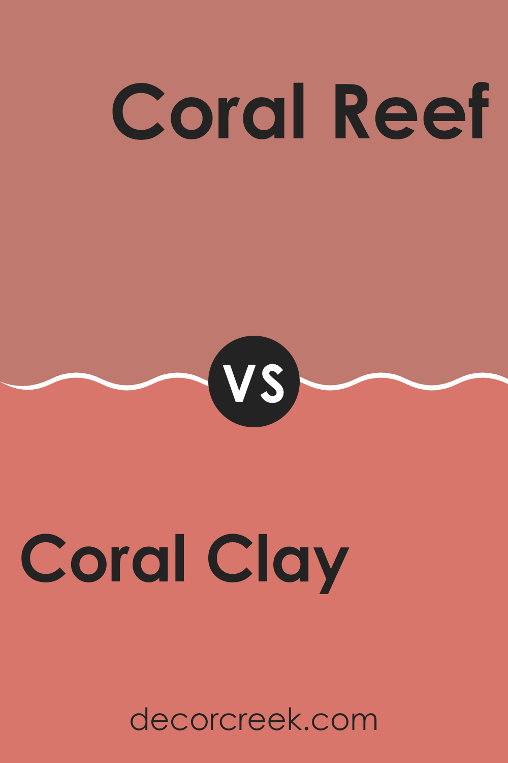
Coral Clay SW 9005 by Sherwin Williams vs Coral Reef SW 6606 by Sherwin Williams
Coral Clay and Coral Reef by Sherwin Williams offer contrasting shades of coral. Coral Clay is subtler with soft, muted tones that give a gentle warmth. This shade works well in areas where a calm, soothing touch is desired without being excessive. It’s adaptable for living rooms or bedrooms, blending nicely with creams and soft browns.
On the other hand, Coral Reef is a vibrant and energetic color. It stands out with its boldness and can make a statement in any area. This shade is perfect for those looking to add a splash of excitement and cheerfulness to their environment. It pairs well with bright whites or contrasting dark colors, ideal for accent walls or decorative highlights.
Both colors represent different moods and atmospheres, with Coral Clay providing a soft backdrop and Coral Reef bringing dynamic energy to a room.
You can see recommended paint color below:
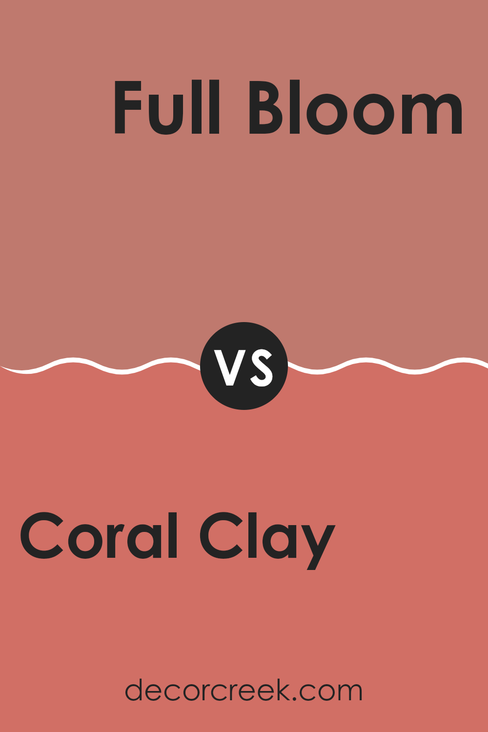
Coral Clay SW 9005 by Sherwin Williams vs Full Bloom SW 9700 by Sherwin Williams
Coral Clay and Full Bloom, both by Sherwin Williams, offer distinct visual experiences for any area. Coral Clay is a muted, earthy tone that brings a sense of warmth and coziness. It’s an adaptable color that pairs well with both vibrant and subtle hues, making it ideal for living rooms or bedrooms where a soothing effect is desired.
Full Bloom, on the other hand, is a vibrant and cheerful pink. This color is bolder and stands out more, perfect for areas where you want to add a pop of energy and brightness, like a kitchen or a children’s playroom.
While both colors bring their unique vibes to a room, Coral Clay tends to lean towards a more subdued and natural palette, whereas Full Bloom leans towards being lively and energetic. These characteristics make each suitable for different uses depending on the atmosphere you want to create.
You can see recommended paint color below:
- SW 9700 Full Bloom
Coral Clay SW 9005 by Sherwin Williams vs Lei Flower SW 6613 by Sherwin Williams
Coral Clay and Lei Flower, both from Sherwin Williams, present a charming palette that highlights their unique tones. Coral Clay is a soft, muted shade that leans towards a peachy terracotta. It’s warm and gentle, perfect for creating a cozy and welcoming atmosphere in any area. It pairs well with natural elements and can soften areas that receive a lot of sunlight.
In contrast, Lei Flower is a vibrant pink with a floral brightness that can instantly lighten up an area. It’s more energetic and playful than Coral Clay, making it a great choice for areas where you want to add a splash of cheerfulness and warmth.
While Coral Clay offers a subdued and earthy feel, Lei Flower brings a more lively and joyful energy. Depending on your mood and the function of your area, each color has its appeal. Coral Clay works well for a calm, grounded vibe, whereas Lei Flower is ideal for creating an area filled with positivity and liveliness.
You can see recommended paint color below:
Coral Clay SW 9005 by Sherwin Williams vs Rosedust SW 0025 by Sherwin Williams
The two colors, Coral Clay and Rosedust from Sherwin Williams, offer a warm atmosphere but differ slightly in their tones. Coral Clay is a soft, muted shade that leans towards a peachy terracotta, giving off a cozy and welcoming feel.
It’s an adaptable color that can add a subtle hint of earthiness to a room. On the other hand, Rosedust has a more subdued, dusky pink hue that suggests a vintage charm. It’s less vibrant than Coral Clay, which makes it great for creating a gentle and understated background in any area.
While both hues can create a comforting environment, Coral Clay provides a bit more warmth due to its orange undertones, whereas Rosedust lends a softer, more nostalgic touch with its pinker notes. These differences make each color well-suited for different decorative styles and personal tastes.
You can see recommended paint color below:
Coral Clay SW 9005 by Sherwin Williams vs Caribbean Coral SW 2854 by Sherwin Williams
The two paint colors, Coral Clay and Caribbean Coral, both by Sherwin Williams, offer unique shades suitable for different decorating styles. Coral Clay is a muted, earthy hue that leans more towards a beige with subtle pinkish undertones. This color is great for rooms where you want a calm, cozy feel because it’s soft and not too bright, which makes it easy to match with a wide range of décor.
On the other hand, Caribbean Coral is a much more vibrant shade. It stands out with its brighter, more vivid coral tones that can make an area lively and cheerful. If you’re aiming to bring a fresh and energetic vibe to your room, this color can do the trick. Its bolder presence works well in areas like a home office or a dining area where you might want to add some fun bursts of color.
Overall, Coral Clay works best for subtle elegance, while Caribbean Coral is perfect for making a stronger statement.
You can see recommended paint color below:
- SW 2854 Caribbean Coral
Coral Clay SW 9005 by Sherwin Williams vs Baked Clay SW 6340 by Sherwin Williams
Coral Clay and Baked Clay by Sherwin Williams are both warm, inviting colors, but they have unique differences.
Coral Clay is a soft, subtle hue that blends pink and orange tones, creating a gentle and welcoming vibe that’s perfect for living areas wanting a touch of warmth without being too bold. On the other hand, Baked Clay has a stronger presence, featuring deeper, earthier tones that resemble red clay.
This color is richer and more robust, making it ideal for areas where you want to add some drama or anchor the area with a strong, warm color. Both colors can add a cozy feel to any room, but Coral Clay offers a lighter touch, while Baked Clay commands more attention with its depth.
You can see recommended paint color below:
Coral Clay SW 9005 by Sherwin Williams vs Rojo Dust SW 9006 by Sherwin Williams
Coral Clay and Rojo Dust, both by Sherwin Williams, offer distinct tones that can add unique character to an area. Coral Clay is a soft, muted shade with a blend of pink and orange hues that gives a warm and welcoming feel. It’s an adaptable color that works well in living areas and bedrooms where a cozy atmosphere is desired.
Rojo Dust, on the other hand, is a deeper, more subdued color that leans towards a dusty rose or terracotta. It’s less vibrant than Coral Clay but offers a rich depth, making it ideal for creating a statement in areas like dining rooms or entryways.
Both colors bring warmth but in different intensities. While Coral Clay provides a lighter, airier vibe, Rojo Dust offers a stronger, earthier presence. Depending on the mood you want to set and the lighting in your room, either could be a great choice. Their earthy tones also make them easy to pair with natural materials like wood or stone.
You can see recommended paint color below:
- SW 9006 Rojo Dust
Coral Clay SW 9005 by Sherwin Williams vs Henna Shade SW 6326 by Sherwin Williams
Coral Clay and Henna Shade are two distinct colors by Sherwin Williams. Coral Clay is a warm, muted shade that blends pink and orange tones. This color is soft and welcoming, providing a cheerful yet calm atmosphere to any room. It’s great for areas where you want a hint of color that isn’t too bold.
On the other hand, Henna Shade is a deeper, more intense color. It has a rich, red-brown hue that mimics the natural color of henna. This shade is bolder and can create a strong statement in an area. It’s perfect for accent walls or places where you want to add some drama and warmth.
Comparing the two, Coral Clay is lighter and more understated, ideal for a gentle, cozy feel. Henna Shade, with its richer and darker tones, offers a more striking and warm presence. Depending on the mood and style you wish to achieve, each color has its unique charm and effect.
You can see recommended paint color below:
Coral Clay SW 9005 by Sherwin Williams vs Coral Rose SW 9004 by Sherwin Williams
Coral Clay and Coral Rose are two beautiful colors from Sherwin Williams. Coral Clay is a muted, earthy color with warm undertones. It feels soft and subtle, making it perfect for creating a cozy, welcoming environment in any room.
On the other hand, Coral Rose has a more vibrant look. It’s a lively color that pops more than Coral Clay. This makes it a good choice for areas where you want to add energy and cheerfulness. Both colors share a coral base, but their different intensities and vibes can affect the mood of an area.
Coral Clay works well where you want a gentle, soothing effect, while Coral Rose is better for an area needing a bright, peppy feel. Together or separately, both shades can make your home look wonderful, depending on how you decide to use them.
You can see recommended paint color below:
- SW 9004 Coral Rose
Coral Clay SW 9005 by Sherwin Williams vs Reddish SW 6319 by Sherwin Williams
Coral Clay and Reddish are two distinctive colors from Sherwin Williams, each carrying its own unique vibe and charm. Coral Clay is a gentle, warm hue that resembles the soft blend of pink and orange, much like the natural color of clay that has a touch of coral. This color is light and airy, making it a perfect choice for creating a cozy, welcoming atmosphere in areas like living rooms or bedrooms.
On the other hand, Reddish is a deeper, more pronounced shade that leans towards a rustic red with hints of brown. This makes it a bolder choice, ideal for those who want to add a dash of warmth and richness to their area. Reddish works well in dining areas or places where you want to make a strong, yet warm impression.
Both colors offer a way to warm up a room, but while Coral Clay whispers calmness and light, Reddish speaks a bit louder, bringing depth and intensity to the surroundings. Depending on the mood you want to set, each has its merits, with Coral Clay providing a subtle lift and Reddish adding a robust character.
You can see recommended paint color below:
- SW 6319 Reddish
In conclusion, SW 9005 Coral Clay by Sherwin Williams is a wonderful choice if you’re thinking about adding a fresh splash of color to your room. This shade is a happy mix between pink and orange, and it feels very warm and inviting, almost like the color you see in the sky when the sun starts to set.
I think it is perfect for making any room feel cheerful, whether it is your living room, where you hang out and watch TV, or your bedroom, where you need a cozy and comforting atmosphere to relax. Plus, it’s not too bright or too dull, which means it can fit right in with different styles and other colors you might already have in your home.
Remember, if you are wondering if this color will look good in your area, you can always try painting a small part of the wall first to see how it looks throughout the day as the light changes. This way, you make sure you really like it before you paint the whole room. Painting can be a fun activity, and using Coral Clay can definitely make the place feel warm and lively. So, if you’re looking to brighten up your area, this color might just be the right pick!

Ever wished paint sampling was as easy as sticking a sticker? Guess what? Now it is! Discover Samplize's unique Peel & Stick samples.
Get paint samples

