Welcome to our overview of SW 7001 Marshmallow by Sherwin Williams, a paint color that’s as sweet and inviting as its name suggests. When it comes to choosing the perfect shade of white for your space, Marshmallow offers a unique blend of warmth and brightness, making it a go-to option for those looking to freshen up their interiors without overwhelming the senses.
Marshmallow stands out in the Sherwin Williams collection as a versatile choice that pairs well with a wide range of decor styles, from minimalist and modern to cozy and traditional. Its subtle undertones mean it adapts well to different lighting conditions, casting a soft, flattering glow that can make any room feel more welcoming and spacious.
Whether you’re planning to refresh your living room, bedroom, or even your kitchen cabinets, Marshmallow offers a timeless appeal that works beautifully in various applications. It’s not just about the color itself, but how it complements other elements in your space, from furniture and fabrics to artwork and accessories.
In this article, we’ll explore the qualities that make Marshmallow by Sherwin Williams a popular choice among homeowners and interior designers alike. We’ll also provide tips on how to best use this color in your decorating projects to achieve a look that’s both beautiful and uniquely yours.
Stay tuned for a journey through the soft, serene world of Marshmallow, a shade that truly transforms spaces into havens of light and comfort.
What Color Is Marshmallow SW 7001 by Sherwin Williams?
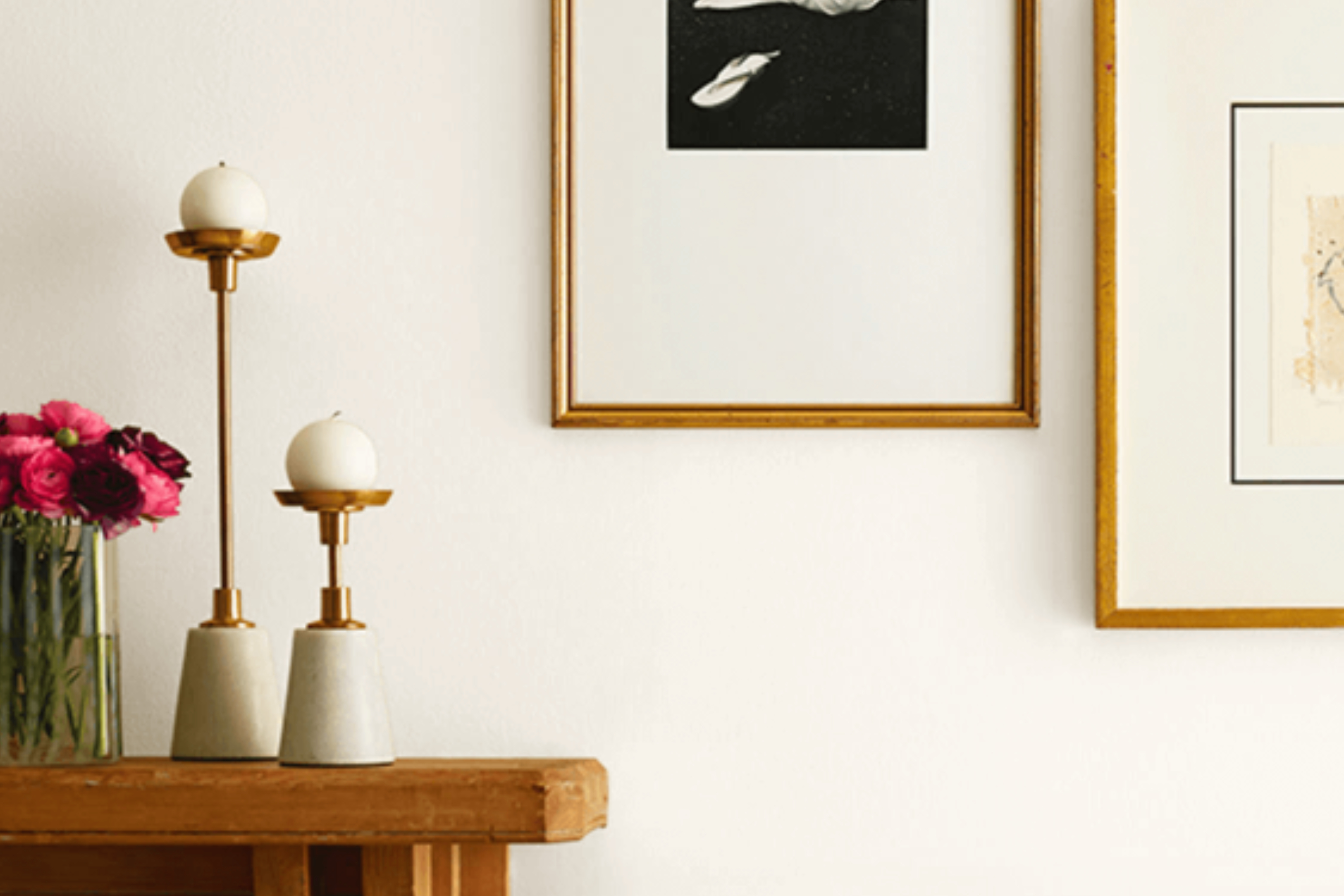
Marshmallow by Sherwin Williams is a soft, warm white color that brings a cozy and inviting atmosphere to any space. This shade has a subtle, creamy undertone which makes it incredibly versatile and easy to pair with various decor styles and color palettes.
Unlike a stark white, Marshmallow adds a touch of warmth that can make a room feel more welcoming and comfortable.
This color works exceptionally well in interior styles that prioritize comfort and simplicity, such as Scandinavian, modern farmhouse, and shabby chic. Its understated elegance also makes it a perfect pick for more classic and traditional settings. Marshmallow’s soothing presence can act as a serene backdrop, allowing furniture and decor to stand out without overwhelming the senses.
When it comes to pairing Marshmallow with materials and textures, its warm undertones complement natural wood beautifully, enhancing the wood’s richness without creating a stark contrast. Soft, plush fabrics like cotton and linen in muted colors create a layered, cozy look.
For a touch of glamour, this color also pairs nicely with metallic elements like gold or brass, adding a subtle shine that enriches its warmth. Smooth ceramics and textured glass pieces can also complement Marshmallow’s creamy hue, adding depth and interest to the space.
This color is a great foundation for creating inviting, harmonious rooms filled with character.
Ever wished paint sampling was as easy as sticking a sticker? Guess what? Now it is! Discover Samplize's unique Peel & Stick samples.
Get paint samples

Is Marshmallow SW 7001 by Sherwin Williams Warm or Cool color?
Marshmallow SW 7001 by Sherwin Williams is a popular paint color choice for homeowners looking to add a warm and welcoming feel to their spaces. This shade of white has a softness to it that makes rooms feel cozy and inviting.
Unlike stark whites, Marshmallow has a creamy undertone that plays nicely with natural light, giving a room a gentle glow rather than a harsh brightness.
This particular color is versatile, meaning it can work well in almost any room of the house. In living rooms, it creates a calm and relaxing atmosphere. In kitchens, it can make the space appear larger and cleaner without feeling sterile.
For bedrooms, it adds a soft backdrop that complements a wide range of bedding and furniture styles.
Additionally, Marshmallow is great for pairing with other colors. Whether you’re looking at bold accents or more subdued tones, this color provides a neutral starting point. It supports a variety of decor styles from modern to rustic, making it a convenient choice for homeowners planning to refresh their spaces without committing to a strong color theme.
This flexibility and warmth make Marshmallow by Sherwin Williams a go-to paint color for creating inviting homes.
Undertones of Marshmallow SW 7001 by Sherwin Williams
The color Marshmallow by Sherwin Williams is a fascinating shade, often seen as simply white at first glance. But, when we look closer, we discover it has subtle undertones of pale yellow and light purple. These undertones are not immediately noticeable but play a crucial role in how we perceive the color.
Undertones affect our perception of color more than we might realize. They can make a color feel warmer or cooler, even changing how it looks in different lighting. For instance, the pale yellow undertone in this paint adds a subtle warmth, making the white feel inviting rather than stark or cold.
On the other hand, the light purple undertone brings a hint of coolness and sophistication.
When applied to interior walls, the effect of these undertones becomes even more pronounced. In natural light, the pale yellow can make a room feel sunnier and more cheerful, even if it’s not directly lit. In artificial lighting, the light purple can add a touch of elegance and depth, preventing the space from feeling flat.
The balance of these undertones ensures that the color can complement a wide range of decor styles and color schemes, making the walls feel both cozy and stylish. This subtle interplay of warmth and sophistication is what makes Marshmallow by Sherwin Williams a versatile and appealing choice for interior spaces.
What is the Masstone of the Marshmallow SW 7001 by Sherwin Williams?
MarshmallowSW 7001 by Sherwin Williams has a masstone of light gray (#D5D5D5), making it a versatile choice for home interiors. This subtle hue works wonders by creating a calm and soothing backdrop, perfect for any room in the house. Since it’s a light gray, it reflects a significant amount of light, helping to make spaces appear brighter and more spacious. This quality is particularly valuable in smaller rooms or areas with limited natural light, as it can help overcome the feeling of being cramped or dull.
The neutrality of this color means it pairs beautifully with a wide array of decor styles and color schemes. Whether you’re going for a modern, minimalist look or something more traditional and cozy, this shade can support both bold statement pieces and more understated furnishings.
It acts as a quiet foundation, allowing other elements in the room to stand out without overwhelming the space. The light gray masstone of MarshmallowSW 7001 is essentially a chameleon, adapting effortlessly to its surroundings and enhancing the overall aesthetic of a home.
How Does Lighting Affect Marshmallow SW 7001 by Sherwin Williams?
Lighting plays a crucial role in how we perceive colors in our environment. The same color can look dramatically different under various light conditions due to how light interacts with surfaces and how our eyes perceive these interactions. When it comes to understanding this effect, let’s take a look at a specific paint color as an example.
- Consider a light color, like a soft, creamy white. In artificial light, depending on the type of bulb (warm or cool), this creamy white can either take on a warmer, cozier feel or appear brighter and more sterile. Artificial light can significantly influence the mood of a room depending on the chosen hue of this light color.
- In natural light, the appearance of this creamy white evolves throughout the day. Morning light, which is generally cooler, can make it appear more crisp and clean. As the day progresses and the quality of light changes, the same white can adopt a softer, warmer quality, especially in the late afternoon when the sunlight becomes golden.
The orientation of a room also affects how this color looks:
- North-facing rooms: Light in these rooms tends to be cooler and more consistent throughout the day. Here, the creamy white may appear more muted and can sometimes take on a slightly grayish tone, maintaining a clean and subtle look.
- South-facing rooms: These rooms enjoy a warm, bright light for most of the day. Our chosen color will look brighter and warmer here, enhancing the room’s airy and welcoming feel.
- East-facing rooms: Morning light is bright and warm, making the creamy white feel vibrant and fresh in the morning. As the day progresses, the light dims, and the color can appear softer and more serene.
- West-facing rooms: Light in these rooms grows warmer and more intense in the afternoon to evening. The creamy white will reflect these changes, appearing more dynamic and warmer towards the end of the day, creating a cozy atmosphere.
In summary, the interaction between light and color is dynamic and can transform the ambiance of a space. The way a light color like this creamy white is perceived is heavily influenced by both the type of light it is exposed to and the direction from which the light enters the room.
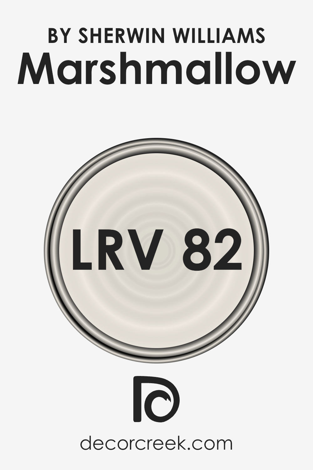
What is the LRV of Marshmallow SW 7001 by Sherwin Williams?
LRV stands for Light Reflectance Value, which is a measurement used to determine how much light a paint color will reflect when it’s applied on walls. It’s a scale that runs from 0 to 100, where 0 means the color absorbs all the light (think of a deep, dark black) and 100 reflects all the light (imagine a bright, pure white). LRV is crucial because it helps homeowners and designers decide how light or dark a space will appear once it’s painted.
A higher LRV means the room will likely feel brighter and more open, as the walls will reflect more light. Conversely, a lower LRV can make a space feel cozier or smaller since the walls absorb more light.
With an LRV of 81.726, Marshmallow falls into the category of colors that are highly reflective and can significantly brighten up a space. This means that when applied to walls, it will reflect a substantial amount of light, making the room feel airy and spacious.
This is particularly beneficial for smaller rooms or spaces with limited natural light, as it can help make the area feel larger and more welcoming. However, the effect of this light reflection also depends on the room’s lighting conditions. In a brightly lit room, Marshmallow will appear more vibrant and enhance the light, whereas in a room with less natural light, it can still help in making the space feel lighter than it actually is.
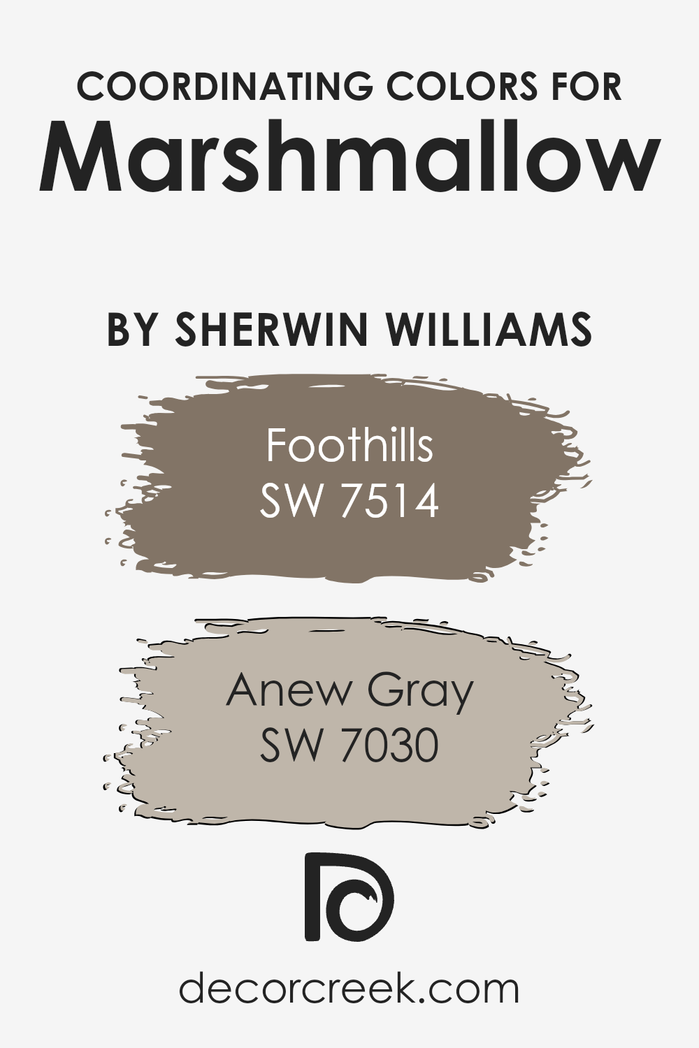
Coordinating Colors of Marshmallow SW 7001 by Sherwin Williams
Coordinating colors are hues that complement each other on your color scheme, enhancing the overall aesthetic appeal of a space. When you choose a primary paint color like Marshmallow by Sherwin Williams, it’s essential to select coordinating colors that harmonize with it to create a cohesive look.
Coordinating colors can be used for walls, trim, accent pieces, and decor to add depth and character to your rooms. They work by balancing the visual temperature and mood of the space, ensuring that none of the colors overwhelm the others, but rather, they work together to produce an inviting and well-designed atmosphere.
For instance, Foothills is a rich, warm brown that exudes a sense of comfort and stability. It’s an excellent choice for creating a cozy and grounding effect in a room, making it a perfect complement to the soft, creamy tones of Marshmalloo. Anew Gray, on the other hand, is a versatile, mid-tone gray with a warm undertone that brings a modern and serene feel.
It matches well with the lighter Marshmallow, providing a subtle contrast that enhances the space without dominating it. Together, these coordinating colors create a harmonious palette that can beautifully transform any space, making it more visually appealing and balanced.
You can see recommended paint colors below:
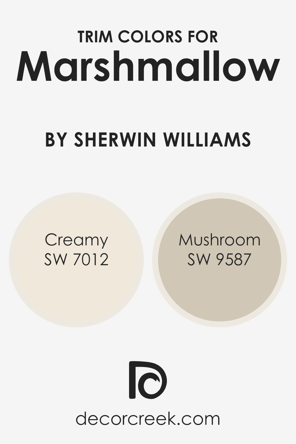
What are the Trim colors of Marshmallow SW 7001 by Sherwin Williams?
Trim colors play a vital role in enhancing the overall aesthetic appeal of a space, especially when paired with a main color like Marshmallow by Sherwin Williams. The trim color can define and accentuate architectural details, frame walls, and highlight the unique features of a room, making it look more cohesive and polished.
By carefully selecting trim colors, homeowners can create a contrast that adds depth and character or choose a harmonious shade for a more subtle transition. This approach allows the main color to stand out, giving the room a finished look that reflects attention to detail and design intention.
Creamy (SW 7012) is a soft, warm white with a subtle yellow undertone, providing a gentle contrast against the crispness of Marshmallow, making spaces feel inviting and cozy.
It’s perfect for creating a seamless look that’s both elegant and welcoming. Mushroom (SW 9587), on the other hand, is a rich, earthy beige that offers a stronger contrast, grounding the space with its natural, soothing tones. This color brings a sense of warmth and sophistication, ideal for highlighting the architecture and adding depth to the visual appeal of the room.
Together, these trim colors complement Marshmallow, enhancing the ambiance of a space with their distinctive yet harmonious appeal.
You can see recommended paint colors below:
- SW 7012 Creamy
- SW 9587 Mushroom
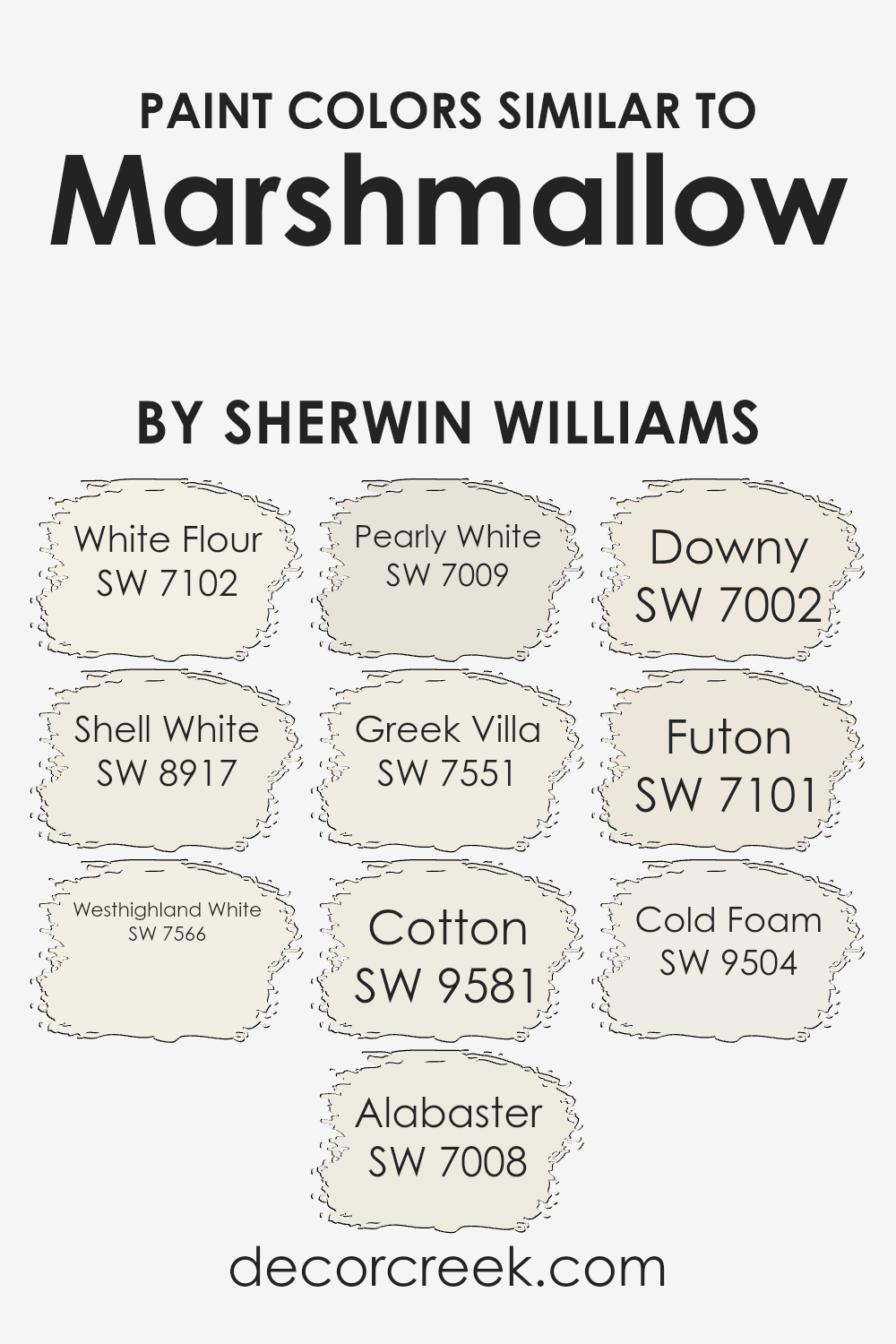
Colors Similar to Marshmallow SW 7001 by Sherwin Williams
Similar colors play a critical role in design and decor, offering subtle variations that can enhance the atmosphere of any space. These variations can create depth, highlight architectural features, or harmonize a room’s aesthetic without the stark contrasts that come with mixing widely different hues.
Colors like White Flour and Shell White provide a soft, creamy backdrop, ideal for spaces that aim for a light, airy feel. Both have undertones that add warmth, making them versatile for use in various settings, be it a cozy living room or a bright, inviting kitchen.
On the other hand, Westhighland White and Alabaster offer a hint of richness, giving rooms a more grounded, comforting ambiance. They work well in spaces that need a touch of coziness without veering into darker color territories. Pearly White and Greek Villa lend an almost ethereal quality, perfect for creating a serene and tranquil environment.
Their subtle nuances can play off natural light beautifully, changing subtly with the day’s progression. Cotton, Downy, Futon, and Cold Foam further expand on the theme of tranquility, each bringing their own unique shade to the palette.
These colors, while similar, provide designers and homeowners the flexibility to fine-tune the mood and style of a room, ensuring a tailored look that feels both cohesive and distinct.
You can see recommended paint colors below:
- SW 7102 White Flour
- SW 8917 Shell White
- SW 7566 Westhighland White
- SW 7008 Alabaster
- SW 7009 Pearly White
- SW 7551 Greek Villa
- SW 9581 Cotton
- SW 7002 Downy
- SW 7101 Futon
- SW 9504 Cold Foam
How to Use Marshmallow SW 7001 by Sherwin Williams In Your Home?
Marshmallow by Sherwin Williams is a beautifully gentle white paint color that can add a fresh and airy feel to any room in your home. Its softness makes it perfect for creating a soothing and peaceful environment, ideal for spaces where you want to relax and unwind.
Whether you’re painting walls in your bedroom to foster a restful sleep or applying it to your living room walls to make the space feel more open and inviting, Marshmallow can do the trick.
This color is also incredibly versatile. It can serve as a simple, clean background for bold and vibrant colors, allowing your furniture and decor to really stand out. Or, if you prefer a more minimalist look, pairing it with similar neutral tones can create a subtle, cohesive look throughout your home.
Adding Marshmallow to your home isn’t just about changing a wall color; it’s about creating a mood. In rooms with plenty of natural light, it reflects beautifully, enhancing brightness. In dimmer spaces, it can help make the area feel larger and more welcoming. Plus, its timeless elegance means it won’t quickly go out of style, making it a great choice for anyone looking to refresh their home’s look.
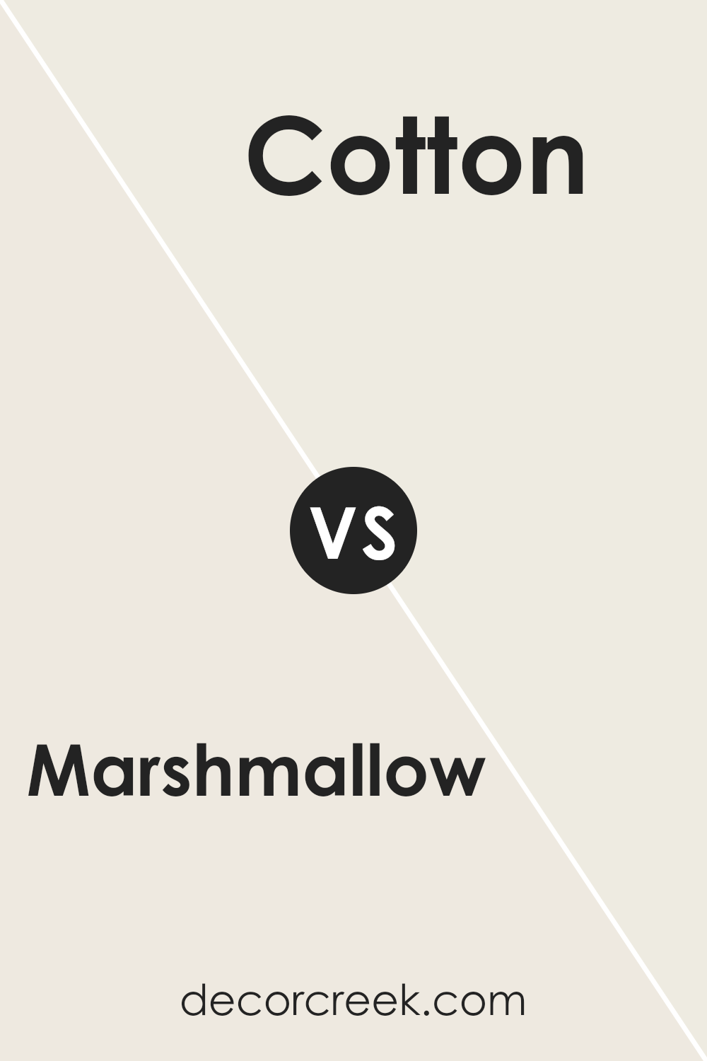
Marshmallow SW 7001 by Sherwin Williams vs Cotton SW 9581 by Sherwin Williams
Marshmallow and Cotton are both light shades that give off a calm, peaceful vibe, perfect for creating serene spaces. Marshmallow leans towards a warm, off-white hue, bringing a cozy, inviting feel to any room.
It’s the kind of color that makes a space feel like a snug retreat, perfect for places where you want to relax. On the other hand, Cotton is closer to a pure white, offering a crisp, clean look. It’s great for making small rooms appear larger and brighter, as it reflects light well. While both colors are excellent for achieving a minimalist aesthetic, Marshmallow adds warmth to a space, making it feel more like home, whereas Cotton provides a more straightforward, fresh ambiance.
Choosing between them depends on whether you prefer a hint of warmth or a cleaner, sharper white.
You can see recommended paint color below:
- SW 9581 Cotton
Marshmallow SW 7001 by Sherwin Williams vs Downy SW 7002 by Sherwin Williams
Marshmallow and Downy, both from Sherwin Williams, are close relatives in the world of paint colors, but they have their own unique characteristics. Marshmallow is like a soft, fluffy cloud in the sky – very light, with a subtle hint of warmth that makes any room feel welcoming and cozy. It’s the kind of color that can brighten up a space subtly without overwhelming it.
On the other hand, Downy steps in with a slightly deeper tone, reminiscent of the soft shadow that might dance on that same cloud as the day progresses. It still keeps to a neutral palette but offers a tad more depth, making it perfect for someone looking to add a bit of sophistication without straying too far from the softness of Marshmallow.
When comparing the two, think of Marshmallow as the lightest, airiest part of a daybreak, while Downy is the gentle hue that follows, offering a whisper more of the day’s promise without losing the soft serenity.
You can see recommended paint color below:
Marshmallow SW 7001 by Sherwin Williams vs Westhighland White SW 7566 by Sherwin Williams
Marshmallow and Westhighland White, both from Sherwin Williams, are like close relatives in the vast family of whites, each bearing its unique traits. Marshmallow is a soft, creamy white that offers a whisper of warmth, making spaces feel cosy and welcoming without overwhelming them with color.
It’s like the gentle light of early morning, subtle and soothing. On the other hand, Westhighland White steps in with a tad more brightness, leaning towards a classic, crisp white look. It’s akin to daylight at noon, clear and vibrant, making it perfect for spaces that aim for a fresh, airy feel.
Both colors are versatile, able to blend seamlessly with various decor styles and color schemes.
The choice between them hinges on the desired mood and lighting of a space; Marshmallow brings a soft, comforting glow, while Westhighland White adds a brighter, more energizing touch.
You can see recommended paint color below:
Marshmallow SW 7001 by Sherwin Williams vs Cold Foam SW 9504 by Sherwin Williams
Comparing Marshmallow and Cold Foam, two paints from Sherwin Williams, shows some interesting differences. Marshmallow is a soft, gentle shade that leans towards a warm, inviting off-white. It’s the kind of color that makes a room feel cozy and welcoming without overpowering it with too much brightness. On the other hand, Cold Foam is cooler and has a bit of a modern edge. It’s still in the light range but brings a fresher feel that can make spaces appear more spacious and airy.
When you put them side by side, you’ll notice Marshmallow offers a nurturing warmth, making it perfect for living areas or bedrooms where you want a calm, soothing atmosphere. Cold Foam, however, suits areas where you want a clean, crisp look—like kitchens or modern bathrooms. It reflects light in a way that can help small spaces seem bigger.
Choosing between them depends on the vibe you’re aiming for. Marshmallow is great for a comforting, homey feel, while Cold Foam works well if you’re aiming for a sleek, contemporary look.
You can see recommended paint color below:
- SW 9504 Cold Foam
Marshmallow SW 7001 by Sherwin Williams vs Greek Villa SW 7551 by Sherwin Williams
Marshmallow and Greek Villa, both from Sherwin Williams, are popular for their warm and welcoming tones. Marshmallow is a soft, creamy white. It gives a room a cozy and gentle feel, perfect for creating a peaceful space. Its subtle warmth means it pairs well with a wide range of colors, from soft pastels to rich, dark hues.
On the other hand, Greek Villa has a slightly warmer undertone, leaning towards a hint of beige. This makes it a great choice for those wanting a white that still feels warm and inviting without becoming too yellow. Greek Villa brings a bit of sunniness to spaces, making rooms feel more open and airy.
Both colors are excellent for making rooms feel larger and brighter. The main difference lies in their undertones and warmth. Marshmallow is cooler, offering a more neutral backdrop, while Greek Villa adds a touch of warmth, inviting a more lived-in feel. Depending on the mood you want to create, both are versatile choices for any home.
You can see recommended paint color below:
Marshmallow SW 7001 by Sherwin Williams vs Pearly White SW 7009 by Sherwin Williams
Marshmallow and Pearly White by Sherwin Williams are two beautiful shades that might seem quite similar at first glance, but they have their unique characteristics. Marshmallow is a soft, delicate white with a hint of warmth.
This makes it a cozy option for anyone looking to create a snug and inviting space. It’s like wrapping a room in a gentle hug, perfect for creating a calming retreat.
On the other hand, Pearly White steps in with a bit more sophistication due to its slightly cooler undertone. It’s still warm, but it leans more towards a neutral palette, offering a hint of elegance and a touch of refinement.
Pearly White suits spaces that aim for a chic yet understated look, making it versatile for various decor styles.
In summary, while both colors provide a beautiful backdrop for any room, Marshmallow leans towards cozy warmth, perfect for a comforting atmosphere. Pearly White, however, straddles the line between warmth and neutrality, offering elegance and flexibility. Choosing between them depends on the ambience you’re aiming to create.
You can see recommended paint color below:
Marshmallow SW 7001 by Sherwin Williams vs Futon SW 7101 by Sherwin Williams
Marshmallow (SW 7001) and Futon (SW 7101) are two unique shades offered by Sherwin Williams. Marshmallow presents as a soft, warm, and gentle off-white color. It’s like the comforting lightness of an actual marshmallow, making spaces feel open, airy, and inviting without being too stark or clinical. This color works great in various settings, adding a subtle warmth that’s flexible and easy to pair with other colors.
On the other hand, Futon is a bit deeper and carries a neutral, cozy gray tone. It’s like the color of a comfortable, well-loved linen sofa – inviting and versatile. Futon offers a slightly more anchored and sophisticated feel compared to Marshmallow, providing a solid foundation for any room.
It serves as a great backdrop for bolder colors or can stand alone for a minimalist aesthetic.
Together, these colors can create a serene and harmonious palette, with Marshmallow brightening spaces and Futon adding depth and comfort. They’re perfect for those looking to achieve a balance between warmth and sophistication in their decor.
You can see recommended paint color below:
- SW 7101 Futon
Marshmallow SW 7001 by Sherwin Williams vs Shell White SW 8917 by Sherwin Williams
Marshmallow and Shell White, both by Sherwin Williams, are lovely, subtle hues, perfect for those seeking a soft, inviting ambiance in their spaces. At first glance, these two might seem quite similar, but there are subtle differences that set them apart.
Marshmallow is a warm, creamy white with a touch of coziness that can make a room feel welcoming and comfortable. It has an inviting richness, offering a hint of depth that works beautifully in spaces where a gentle, soothing atmosphere is desired.
On the other hand, Shell White leans more towards a neutral, pure white with a very slight undertone that keeps it from feeling too cold. It’s a bit cleaner and crisper compared to Marshmallow, making it a great choice for those who prefer a more straightforward, fresh look in their decor.
In summary, if you’re after a warmer, cozier white, Marshmallow is the way to go. If you prefer something a bit brighter and cleaner, Shell White might be more your style. Both colors present lovely options for creating serene, inviting spaces.
You can see recommended paint color below:
- SW 8917 Shell White
Marshmallow SW 7001 by Sherwin Williams vs White Flour SW 7102 by Sherwin Williams
Marshmallow and White Flour are two colors from Sherwin Williams that have their own unique vibes. Marshmallow has a warm undertone, making it cozy and soft, perfect for creating a snug and inviting atmosphere in any room.
It’s the kind of color that gently wraps you up, like being in a fluffy cloud. On the other hand, White Flour is brighter with a cleaner look. It’s more of a pure white that brings a fresh and airy feel to spaces. If you’re aiming for a room that looks more open and has a crisp, modern vibe, White Flour is your go-to. Comparing these two, Marshmallow offers warmth and a sense of comfort, making it ideal for living rooms or bedrooms where you want to relax.
White Flour, with its freshness, suits areas like kitchens or bathrooms, where a clean and sharp look is often desired. Both colors are beautiful in their own right; it just depends on the mood you’re going for in your space!
You can see recommended paint color below:
- SW 7102 White Flour
Marshmallow SW 7001 by Sherwin Williams vs Alabaster SW 7008 by Sherwin Williams
Marshmallow and Alabaster by Sherwin Williams are two popular shades often chosen for their soft, nearly white appearance. Marshmallow is a gentle white with a hint of warmth, creating a cozy and inviting atmosphere. It’s like the softness of actual marshmallows, offering a subtle hint of creaminess that makes spaces feel more comfortable and less stark.
On the other hand, Alabaster has been a favorite for its neutral base with a touch of warmth, yet it leans more towards a true white compared to Marshmallow. It’s known for its ability to brighten spaces while maintaining a warm, welcoming vibe. Alabaster can make rooms look bigger and more open, making it an excellent choice for smaller or darker spaces.
Although both colors are quite similar, the main difference lies in their undertones and warmth. Marshmallow offers a slightly creamier, warmer feel, perfect for those looking for a cozy white.
Alabaster, meanwhile, serves well in spaces where a clean, fresh look is desired, with just a whisper of warmth to keep it from feeling cold. Both choices are great for creating serene and light-filled rooms, but your preference for warmth or neutrality will guide your choice between these two.
You can see recommended paint color below:
Conclusion
Marshmallow by Sherwin Williams is a versatile and beautiful paint color that can enhance any space. It offers a gentle and soft backdrop, ideal for creating a serene and inviting atmosphere. Whether used in a living room, bedroom, or even a kitchen, this color complements a wide range of decor styles, from modern to traditional.
Its light and airy quality can make small rooms feel more spacious and brighten up dimly lit areas, making it a popular choice for homeowners looking to refresh their interiors.
This color stands out for its ability to blend seamlessly with other hues, serving as a perfect canvas for bold accents or a cohesive look with softer tones. It’s not just about the aesthetic appeal; Marshmallow also has practical advantages. Its neutral character makes it a long-lasting choice that won’t easily go out of style, ensuring your space looks fresh and up-to-date for years to come.
For those looking to revamp their home with a color that is both stylish and adaptable, Marshmallow by Sherwin Williams is a fantastic option.
Ever wished paint sampling was as easy as sticking a sticker? Guess what? Now it is! Discover Samplize's unique Peel & Stick samples.
Get paint samples
