I recently came across SW 9508 Natural Wool by Sherwin Williams and instantly appreciated its subtle charm. This shade of paint has a quiet elegance, perfect for creating a cozy and inviting atmosphere in any room. Its warm tones remind me of soft, well-worn fabric, making it an ideal choice if you’re looking to infuse a sense of comfort and serenity into your living space.
When you apply SW 9508 Natural Wool to your walls, it operates as a versatile backdrop, blending seamlessly with various decor styles, from rustic to modern. What I particularly enjoy about this color is how it acts as a neutral base, allowing other colors in the room to pop, while still maintaining a soothing presence on its own.
If you’re considering a color that provides both warmth and flexibility, SW 9508 Natural Wool is a contender worthy of your consideration.
It’s more than just a paint color; it’s a step towards creating a home that feels both welcoming and stylish.
What Color Is Natural Wool SW 9508 by Sherwin Williams?
Natural Wool by Sherwin Williams is a warm and inviting beige that adds a cozy feel to any room. This versatile color works brilliantly in a variety of interior styles, particularly rustic, modern farmhouse, and Scandinavian-inspired themes. Its subtle undertones make it easy to integrate into spaces that aim for a clean, calm, and welcoming environment.
When it comes to pairing materials, Natural Wool blends beautifully with natural wood tones, from light oaks to rich walnuts, enhancing the organic warmth of the wood. It also pairs well with textured fabrics like linen or wool, adding to the cozy vibe of the décor.
Metal accents in copper or bronze can complement this color nicely, providing a touch of elegance without overwhelming the soft nature of the base tone. This paint color is also an excellent choice for rooms that get a lot of natural light, as it reflects light gently, helping to make the space feel larger and more open.
In smaller or dimly lit areas, it works just as well by providing a subtle warmth that can make the space feel more inviting and comfortable. Whether used on all walls in a room or just one as an accent, Natural Wool offers a fresh and clean foundation for a variety of decors.
Is Natural Wool SW 9508 by Sherwin Williams Warm or Cool color?
Natural Wool by Sherwin Williams is a soft and warm neutral paint color that can bring a cozy atmosphere to any room in a house. This shade is versatile, which means it easily complements a wide range of decor styles and other colors, from bright and bold to more subdued tones.
The lightness of Natural Wool makes it ideal for small spaces, as it helps make them appear larger and more open. In larger rooms, it offers a soothing backdrop that can make the space feel more inviting and comfortable.
Using Natural Wool on walls can also help enhance natural light, as its reflective qualities brighten up spaces that don’t get much sunlight. It’s particularly effective in living rooms, bedrooms, and kitchens where you want a neutral base that allows other elements, like furniture and artwork, to stand out. Overall, Natural Wool is a flexible color choice that works well in many different home environments.
Undertones of Natural Wool SW 9508 by Sherwin Williams
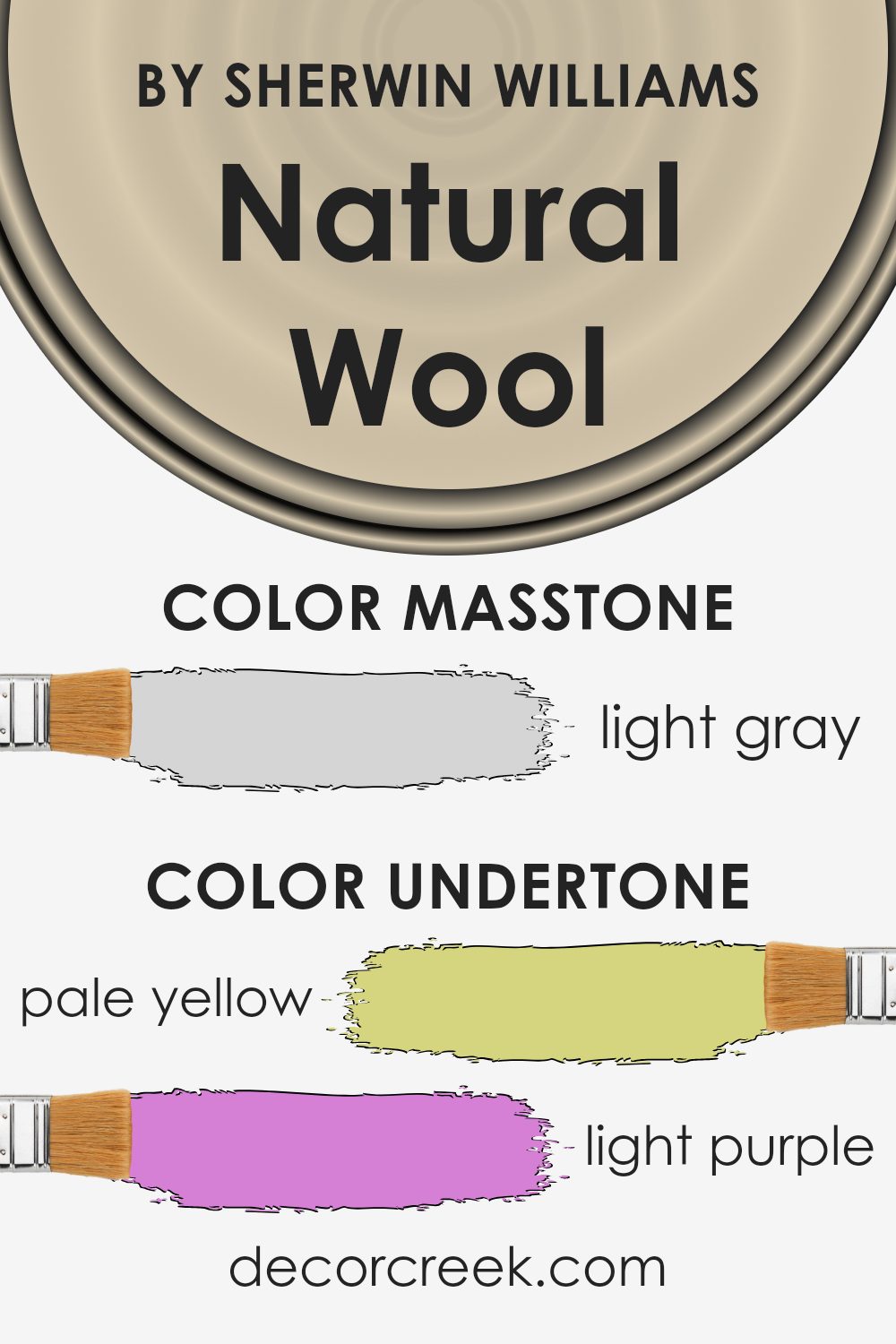
Natural Wool is a unique paint color because its subtle undertones influence how it appears in different lighting conditions and settings. Generally, an undertone is a hint of color present within the main hue, affecting the overall sense of the color subtly, yet significantly.
Natural Wool has a complex mix of undertones including pale yellow, light purple, pale pink, light blue, mint, lilac, and grey. Each of these undertones contributes to how this color interacts with its surroundings.
For instance, in a brightly lit room with lots of natural sunlight, the pale yellow and light blue undertones might become more noticeable, giving the walls a fresher, more invigorating look. Alternatively, in a space with less natural light, the grey and light purple undertones might stand out, giving the room a softer and cozier feel.
When you use Natural Wool on interior walls, these undertones play a critical role in the ambiance of the room. It means that the color can look slightly different from one wall to another, depending on the light conditions and even the colors of the furnishings and decor around it.
This versatility makes Natural Wool a practical choice for many spaces, as it can adapt to various styles and lighting scenarios, creating a subtle background that complements a wide range of designs and decorations.
What is the Masstone of the Natural Wool SW 9508 by Sherwin Williams?
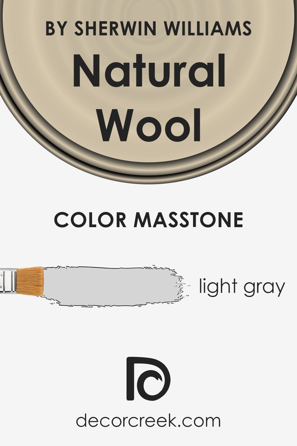
Natural Wool SW 9508 by Sherwin Williams has a masstone of light gray, designated by the color code #D5D5D5. This light gray shade is versatile and effortlessly blends with various styles and other colors in a home.
Its neutral tone makes it ideal for large spaces like living rooms and bedrooms as it can help make these areas look more spacious and inviting. The light gray color also has a calming effect, providing a subtle backdrop that complements bolder colors in furniture or decor items.
, this shade is practical for high-traffic areas since it can easily mask small marks or dirt, reducing the appearance of wear and tear over time. Whether you’re looking to create a minimalist aesthetic or just want a color that ties different room elements together, Natural Wool’s light gray can be a smart choice.
How Does Lighting Affect Natural Wool SW 9508 by Sherwin Williams?
Lighting plays a crucial role in how we perceive colors. Depending on the type of light—natural or artificial—the same color can look different. For example, a paint color like Natural Wool (SW 9508) by Sherwin Williams can appear to change its shade and intensity depending on the light source.
In artificial light, such as that from LED or incandescent bulbs, Natural Wool may have a warmer, creamier appearance. This is because most artificial lighting tends to have a yellow or warm tone, which adds a cozy feeling to the color. In a room lit with fluorescent lights, which are cooler, the color might look slightly more gray and subdued.
In natural light, the appearance of Natural Wool depends largely on the direction the room faces:
– North-facing rooms : These rooms get less direct sunlight throughout the day, resulting in cooler, more consistent light. Here, Natural Wool might appear more muted and slightly greyer, maintaining a calm and neutral aesthetic.
– South-facing rooms: These rooms are bathed in a lot of natural sunlight, which can bring out the warmth and depth in the color, making it look brighter and more vibrant. This warmer light tends to enhance the richer undertones of the color.
– East-facing rooms: With morning light, east-facing rooms have a bright and warm light early in the day, which makes Natural Wool look soft and welcoming. As the day progresses, the light dims, and the color can take on a more neutral appearance.
– West-facing rooms: These rooms get the most intense light in the late afternoon, which can make the color appear bolder and more dynamic. At sunset, when the light is at its warmest, the color may appear richer and fuller.
Understanding these differences in light can help you choose where and how to use a particular color like Natural Wool effectively in your home, be it for creating a cozy nook or making a room feel more spacious and airy.
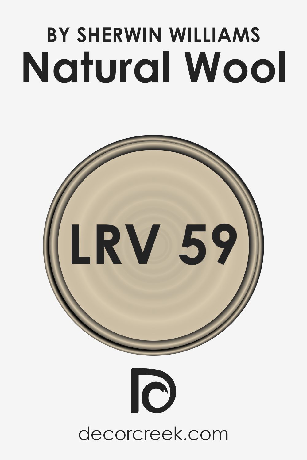
What is the LRV of Natural Wool SW 9508 by Sherwin Williams?
LRV stands for Light Reflectance Value, which is a measure of the percentage of light a paint color reflects. Imagine a scale where absolute black reflects no light and pure white reflects all light. LRV helps in assessing how light or dark a color will look once applied to a room’s walls and how much it will reflect the ambient light.
Higher LRV values indicate colors that are lighter and reflect more light, making rooms feel airier and larger. Conversely, colors with lower LRV values absorb more light, which can make a space feel cozier but smaller.
The LRV of the Natural Wool from Sherwin Williams is 59.43, which is moderately high. This means it will reflect a fair amount of light, contributing to making a space feel more open and bright, even under limited lighting conditions.
This shade of paint is especially useful in spaces that don’t receive a lot of natural sunlight, as it can help make the area feel brighter and more welcoming. It also provides a neutral backdrop, meaning it won’t overpower your decor but instead will complement most furniture and accent pieces.
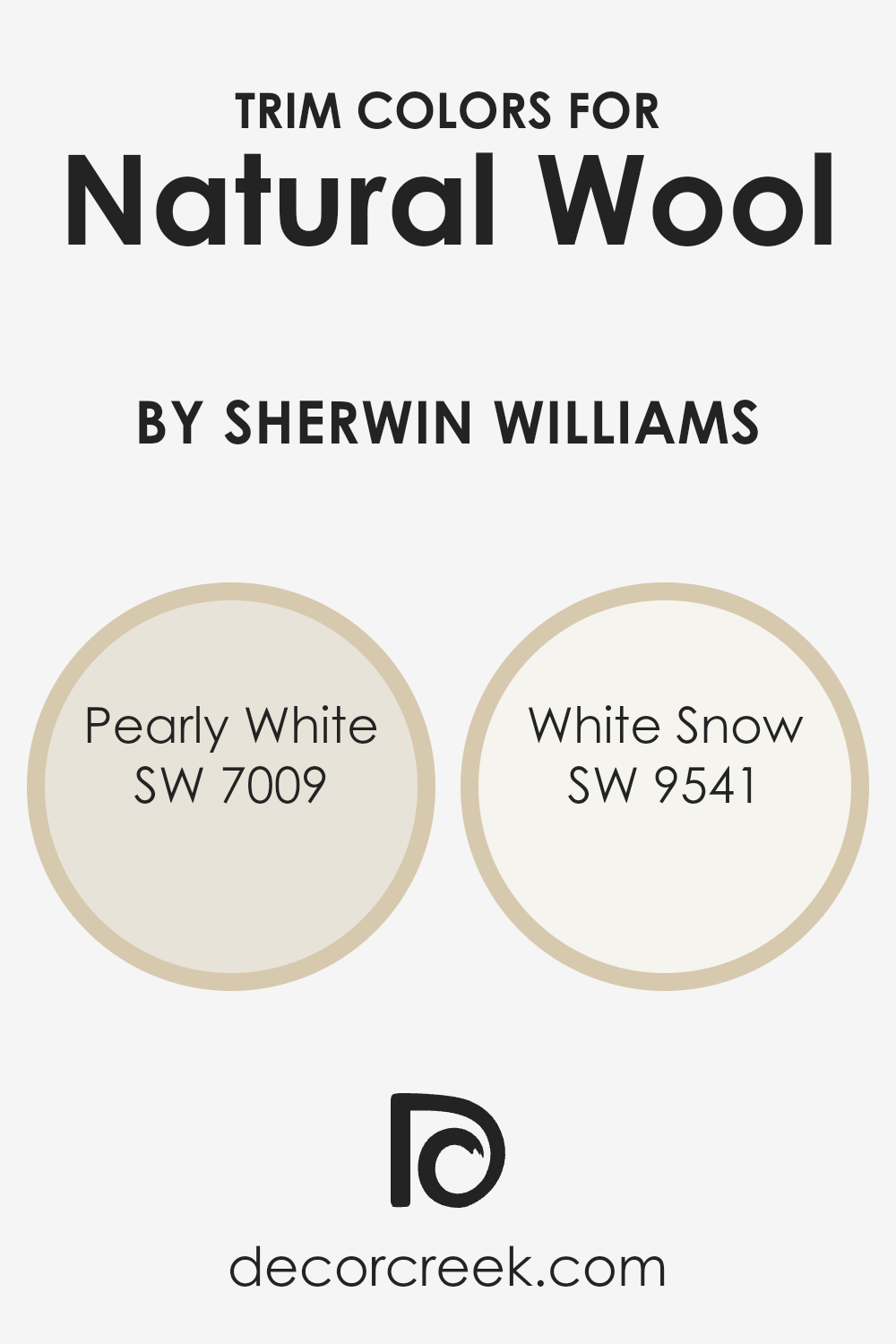
What are the Trim colors of Natural Wool SW 9508 by Sherwin Williams?
Trim colors are crucial in defining and accentuating the architectural details of a room, providing a visual frame that can add a polished finish to the overall appearance. For a versatile shade like Natural Wool by Sherwin Williams, choosing appropriate trim colors can create a clean and defined look.
The selected trim colors, such as Pearly White and White Snow, stand out against the denser tone of Natural Wool, ensuring that the room’s edges, corners, and transitions are clearly visible and neatly presented.
Pearly White (SW 7009) is a soft and light hue that adds a gentle brightness around doors, windows, and baseboards, acting as a subtle highlight without overpowering the room’s main color. On the other hand, White Snow (SW 9541) offers a crisp and fresh appearance, making it ideal for those looking to add a brighter contrast that draws the eye without dominating the space.
Both of these colors work harmoniously with Natural Wool, enhancing its warmth and making the space feel well-coordinated and inviting.
You can see recommended paint colors below:
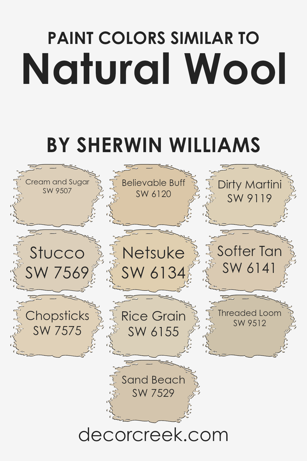
Colors Similar to Natural Wool SW 9508 by Sherwin Williams
When decorating or painting, choosing similar colors can significantly enhance the aesthetic coherence and harmony of a space. Similar shades, like those close to Natural Wool by Sherwin Williams, create a seamless visual flow, making a room feel larger and more connected.
Colors such as Cream and Sugar offer a delicate beige tone, providing a soft, mild backdrop perfect for a calming environment. Meanwhile, Stucco is slightly darker, presenting a warm, cozy taupe that complements wooden furnishings beautifully.
Chopsticks adds a touch of earthy depth with its muted brown, ideal for spaces that aim for a grounded feel. Sand Beach lightens the mood slightly with its gentle golden beige hue, great for injecting subtle warmth into a room.
Believable Buff, a reliable and light tan, works well in areas that receive ample sunlight, reflecting light beautifully to brighten up the space. Netsuke, on the other hand, has a hint of gray, which offers a modern twist to neutral palettes. Rice Grain provides a creamy, soft touch that is versatile in various decorating styles, enhancing other surrounding color elements.
Dirty Martini is a grayish olive that adds an understated uniqueness to any room without overwhelming the senses. Softer Tan is reminiscent of sandy shores, easy to pair with other natural tones for a balanced look. Lastly, Threaded Loom echoes the rustic charm of a woven fabric, creating a subtle yet textured feel in spaces that need a touch of complexity without going too dark. Together, these colors work in harmony to create inviting, comfortable environments.
You can see recommended paint colors below:
- SW 9507 Cream and Sugar
- SW 7569 Stucco
- SW 7575 Chopsticks
- SW 7529 Sand Beach
- SW 6120 Believable Buff
- SW 6134 Netsuke
- SW 6155 Rice Grain
- SW 9119 Dirty Martini
- SW 6141 Softer Tan
- SW 9512 Threaded Loom
How to Use Natural Wool SW 9508 by Sherwin Williams In Your Home?
Natural Wool by Sherwin Williams is a soft and warm paint color that can make any room in your home feel more welcoming and cozy. It’s a versatile shade that works well in living rooms, bedrooms, or even kitchens, adding a subtle touch of elegance without being too overpowering. This color pairs beautifully with both dark and light furniture, making it easy to integrate into your existing decor.
Using Natural Wool in a small space like a bathroom can make the area appear larger and more open, while in a busy space like a family room, it can create a calming background that allows your furnishings and decor to stand out. It’s also an excellent choice for hallways or entryways where you want a neutral color that ties different rooms together smoothly.
For those who like DIY projects, this paint is user-friendly, covering well and drying to a durable finish that withstands daily wear and tear. Whether you’re painting a whole room or just an accent wall, Natural Wool offers a timeless look that you’ll enjoy for years to come.
Natural Wool SW 9508 by Sherwin Williams vs Cream and Sugar SW 9507 by Sherwin Williams
Natural Wool and Cream and Sugar, both by Sherwin Williams, share a subtle presence but stand out due to their distinct tones. Natural Wool offers a cozy, warm beige hue, akin to a soft, knitted sweater. It’s ideal for creating a welcoming and comforting atmosphere in any room.
On the other hand, Cream and Sugar is lighter, bringing a creamy, soft off-white to spaces that need a gentle touch of brightness. While both colors provide a neutral palette, Cream and Sugar is slightly cooler compared to the warmer undertones of Natural Wool.
This makes Cream and Sugar a great choice for those looking to brighten a space subtly without the starkness of pure white, whereas Natural Wool fits beautifully in areas where warmth and depth are desired. These colors can work wonderfully together in a color scheme, offering a balanced and harmonious look.
You can see recommended paint color below:
Natural Wool SW 9508 by Sherwin Williams vs Netsuke SW 6134 by Sherwin Williams
Natural Wool and Netsuke are two shades by Sherwin Williams that offer a gentle, quiet backdrop for any room. Natural Wool is a muted beige with a warm, welcoming feel. It provides a subtle, neutral base that works well in spaces where you want a hint of coziness without overwhelming the senses. On the other hand, Netsuke presents a slightly lighter tone that leans towards a sandy color. It’s ideal for brightening up a room while maintaining a soft, understated look.
When comparing the two, Natural Wool brings more warmth due to its deeper beige tone, making it great for areas like living rooms or bedrooms where a touch of warmth is desirable. Netsuke, with its lighter approach, is perfect for smaller spaces or rooms that get less light, as it can make them appear more spacious and airy.
Both colors are versatile and can easily blend with various decor styles, from modern to classic, providing a calm and cozy atmosphere without being too bold or flashy.
You can see recommended paint color below:
- SW 6134 Netsuke
Natural Wool SW 9508 by Sherwin Williams vs Softer Tan SW 6141 by Sherwin Williams
Natural Wool and Softer Tan are two warm hues from Sherwin Williams that both bring cozy vibes to a space. Natural Wool is a light beige that mimics the soft, undyed color of sheep’s wool. It’s very neutral, making it super versatile for any room, blending well with other colors.
Softer Tan, on the other hand, leans a bit darker and warmer. It has a golden undertone that adds a welcoming, comforting feel, perfect for living areas or bedrooms where you want a cozy atmosphere.
Both colors are subtle, yet they create distinctly different moods; Natural Wool offers a lighter, airier feel, while Softer Tan provides a soothing warmth. When choosing between them, think about the amount of natural light in your room and the overall mood you want to achieve.
You can see recommended paint color below:
Natural Wool SW 9508 by Sherwin Williams vs Stucco SW 7569 by Sherwin Williams
The main color *Natural Wool* by Sherwin Williams is a warm, neutral beige that brings a cozy and comfortable feel to any space. This color has a soft, welcoming vibe that works well in living rooms or bedrooms as it pairs easily with various decor styles and colors.
On the other hand, *Stucco* by Sherwin Williams is a deeper, dustier beige with a hint of grey. This shade is perfect for those who prefer a slightly more muted color that still maintains warmth. It’s ideal for adding depth to a room without overpowering it with a darker color.
Both colors provide a natural, earthy base that can lend a calm and inviting atmosphere to interior spaces. Whether you choose the lighter *Natural Wool* or the moodier *Stucco*, each offers a versatile backdrop for both modern and traditional homes.
You can see recommended paint color below:
- SW 7569 Stucco
Natural Wool SW 9508 by Sherwin Williams vs Dirty Martini SW 9119 by Sherwin Williams
Comparing Natural Wool and Dirty Martini, you’ll notice that Natural Wool is a soft, warm shade, resembling the color of unbleached sheep’s wool. This color is cozy and can make a room feel welcoming and calm. It is light enough to make small spaces appear larger and can easily blend with most decor styles.
On the other hand, Dirty Martini has a more distinct personality. This color is a muted olive green that can add a touch of earthy richness to a room. It’s not too bold, but has enough depth to make a statement. Dirty Martini works well in spaces where you want to add a bit of color without overwhelming the senses.
It pairs nicely with natural materials like wood and stone. When used together, these colors create a balanced and harmonious look. Natural Wool provides a neutral backdrop, allowing Dirty Martini to stand out as an accent without clashing. This combination can work well in a variety of settings, from modern to rustic.
You can see recommended paint color below:
- SW 9119 Dirty Martini
Natural Wool SW 9508 by Sherwin Williams vs Sand Beach SW 7529 by Sherwin Williams
Natural Wool and Sand Beach are two paint colors created by Sherwin Williams, offering unique yet harmonious tones for any space. Natural Wool is a light, creamy beige that provides a soft, subtle backdrop. This color projects a clean and airy feel, making it perfect for those who prefer a minimalist and unfussy look. It works well in spaces designed for relaxation and calmness.
On the other hand, Sand Beach presents a slightly deeper tan shade. This color pulls in a bit warmer tones compared to Natural Wool, adding a cozy warmth to any room. It’s an excellent choice for areas where a comforting and welcoming feel is desired, such as living rooms or bedrooms.
Both colors offer flexibility in terms of decor and pair well with a wide range of complementary shades. Whether you prefer the lighter touch of Natural Wool or the warmer embrace of Sand Beach, each brings its own unique style to the environment.
You can see recommended paint color below:
- SW 7529 Sand Beach
Natural Wool SW 9508 by Sherwin Williams vs Believable Buff SW 6120 by Sherwin Williams
Natural Wool and Believable Buff are two inviting shades from Sherwin Williams, each bringing its unique warmth to spaces. Natural Wool has a soft, beige tone that gives a subtle, cozy feel to rooms. It’s a flexible color that works well in various settings, helping other elements in the space stand out.
Believable Buff, on the other hand, is a warmer, deeper hue compared to Natural Wool. This color leans more towards a creamy, rich tan that can enhance a room, giving it a welcoming and homely vibe. Believable Buff is perfect for those looking to add a bit more warmth and depth to their interiors.
When comparing the two, Natural Wool is better for those seeking a gentle and understated backdrop, while Believable Buff is ideal for creating a slightly more pronounced and hearty atmosphere in a space. Both colors can easily mix with diverse decor styles, making them versatile choices for home interiors.
You can see recommended paint color below:
Natural Wool SW 9508 by Sherwin Williams vs Chopsticks SW 7575 by Sherwin Williams
Natural Wool and Chopsticks are two paint colors from Sherwin Williams that offer subtle yet distinct atmospheres for any space. Natural Wool is a soft and light beige that creates a cozy and inviting feel in a room. It’s a versatile color that works well in various settings, making spaces feel warmer and more welcoming without overpowering the area.
On the other hand, Chopsticks is a shade darker than Natural Wool. It’s also a neutral, but with a hint of gray, giving it a slightly cooler tone. This color is excellent for those who prefer a more understated look but still want a hint of warmth.
It pairs well with a wide range of decor styles and adds a touch of elegance to any room without being too bold. Both colors are great choices for creating a gentle, neutral backdrop in your home. They offer a clean palette that can easily support different kinds of furniture and decorations, allowing for personal customization.
You can see recommended paint color below:
Natural Wool SW 9508 by Sherwin Williams vs Threaded Loom SW 9512 by Sherwin Williams
The two colors from Sherwin Williams, Natural Wool and Threaded Loom, offer distinct but harmonious tones for interior spaces. Natural Wool is a soft, light beige that gives a room a warm and inviting feel, akin to the color of undyed sheep’s wool. This neutral shade works well in nearly any space, offering a clean, calming background.
On the other hand, Threaded Loom is a deeper, gray-infused beige. This color is slightly cooler compared to Natural Wool, providing a modern touch with its understated elegance. It’s perfect for adding depth to a room without overwhelming it with darkness.
Both colors pair well together, allowing for a balanced and cohesive look. Natural Wool is ideal for larger surfaces like walls, while Threaded Loom can serve as an excellent accent for trim, doors, or even a feature wall. This combination ensures a comfortable, yet stylish ambiance.
You can see recommended paint color below:
- SW 9512 Threaded Loom
Natural Wool SW 9508 by Sherwin Williams vs Rice Grain SW 6155 by Sherwin Williams
Natural Wool and Rice Grain are both warm, inviting colors by Sherwin Williams that work wonderfully in creating cozy, welcoming spaces. Natural Wool is a soft, beige hue with a slight grayish tint. This makes it a versatile choice, almost like a neutral backdrop that can easily blend with various decors and styles. It has the ability to make a room feel light and airy yet well-grounded.
On the other hand, Rice Grain is slightly darker, leaning toward a creamy beige with subtle green undertones. This shade adds a bit more warmth to spaces compared to Natural Wool, offering a gentle hint of color that is still easy to match with different textures and furniture.
Rice Grain can make a room feel warmer and is excellent for adding a touch of coziness to dim or north-facing rooms where light is minimal. Both colors work well in many areas of a home, from living rooms to bedrooms, providing a calm, warm atmosphere.
You can see recommended paint color below:
- SW 6155 Rice Grain
Conclusion
After learning all about SW 9508 Natural Wool by Sherwin Williams, I feel really sure about one thing: this paint color is a fantastic choice for making any room feel warm and welcoming. SW 9508 Natural Wool has a soft and cozy look, kinda like the color of fluffy sheep. This is great because it means the color can fit in with lots of different room styles and décor without clashing.
It’s gentle enough to be used in big areas like living rooms or bedrooms without making the space feel crowded or too bright. Plus, it’s a kind of color that doesn’t get old; you won’t get tired of seeing it every day.
Whether you want a relaxing vibe in your bedroom or a friendly feel in your living room, this color will do the job well. I also found out that it pairs really well with other colors. You can mix it with dark blues, greens, or even browns for a beautiful look. This makes it easy to use when you want to freshen up your room without changing everything.
In summary, SW 9508 Natural Wool by Sherwin Williams is a super choice if you’re looking to paint your room with something that feels warm, soft, and can easily match different things you might already have. It’s just like picking a cozy sweater that feels right, no matter what you wear it with.
Ever wished paint sampling was as easy as sticking a sticker? Guess what? Now it is! Discover Samplize's unique Peel & Stick samples.
Get paint samples

