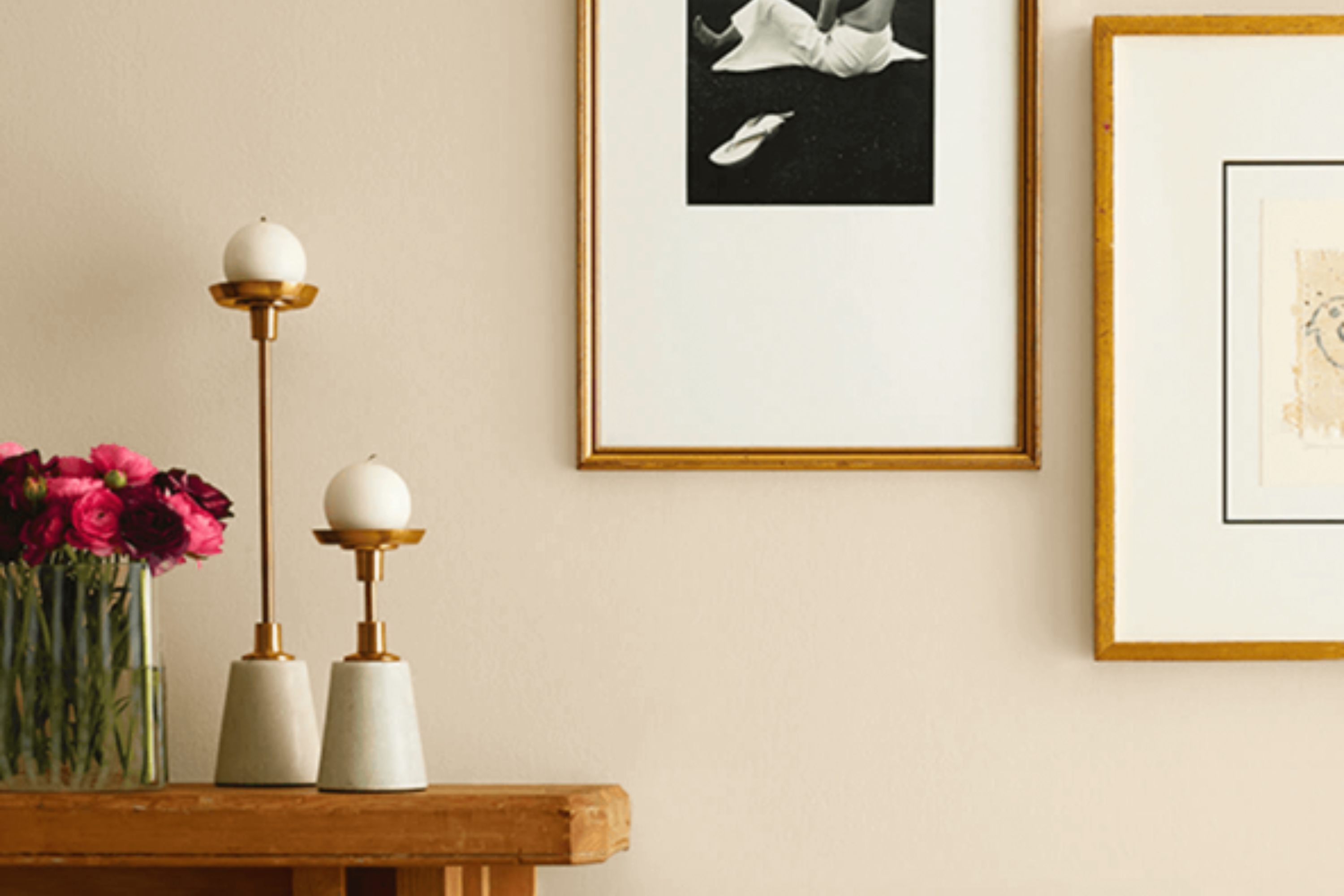
If you’re on the hunt for a paint color that brings warmth and versatility to any room in your home, then SW 6141 Softer Tan by Sherwin Williams might just be what you’re looking for. This paint color is a beautiful, warm neutral that can easily fit a wide range of decorating styles and spaces. Whether you’re refreshing your living room, bedroom, or even your kitchen, Softer Tan adds a cozy, welcoming vibe without overpowering the space.
Softer Tan is one of those rare hues that works well in both well-lit and dimly lit rooms, adapting subtly to changes in lighting throughout the day. Its soft, earthy tones make it a perfect choice for creating a serene and comfortable atmosphere in your home.
This makes it a great backdrop for both bold and muted color palettes, allowing your furniture and decor to stand out without competing with the walls for attention.
Whether you’re giving your space a complete makeover or just adding a few new touches, SW 6141 Softer Tan by Sherwin Williams is a fantastic choice. Its flexibility and warm tone not only make it easy to work with but also ensure that your home feels inviting and lived-in. Let’s take a closer look at how Softer Tan can transform your space into a cozy haven.
What Color Is Softer Tan SW 6141 by Sherwin Williams?
Softer Tan by Sherwin Williams is a warm, inviting neutral that adds a cozy ambiance to any space. It’s a versatile shade with the perfect balance between a light tan and a creamy beige, making it an ideal backdrop for various design styles. Unlike stark white, Softer Tan offers warmth and character, creating a welcoming atmosphere in homes.
This color works beautifully in traditional, farmhouse, and even modern interiors, thanks to its understated elegance. Its neutral tone makes it an excellent choice for living rooms, bedrooms, and kitchens, where it brings a sense of calmness and serenity. Softer Tan pairs wonderfully with a wide range of materials and textures, enhancing the warmth and depth of natural wood, adding softness to metal finishes, and complementing both smooth and textured fabrics like linen and cotton.
Incorporating Softer Tan in an interior space offers endless possibilities. It serves as a stunning canvas for bolder accents or can stand alone for a minimalist aesthetic. For a cohesive look, combine it with other earthy tones or contrast it with crisp whites for a fresh, airy feel. Accessories in rich blues or greens can also bring a pop of color without overwhelming the tranquil vibe Softer Tan provides. With its flexibility and timeless appeal, Softer Tan is a go-to color for creating inviting, stylish spaces that feel like home.
Ever wished paint sampling was as easy as sticking a sticker? Guess what? Now it is! Discover Samplize's unique Peel & Stick samples.
Get paint samples

Is Softer Tan SW 6141 by Sherwin Williams Warm or Cool color?
Softer Tan SW 6141 by Sherwin Williams is a warm and welcoming color that brings a cozy and comfortable feel to any room it’s used in. This particular shade of tan has a unique ability to create a soft, inviting atmosphere, making it perfect for living areas, bedrooms, and even kitchens.
One of the best things about Softer Tan is how versatile it is. It pairs beautifully with a wide range of colors, from bright and bold to subtle and soft, allowing for endless design possibilities. Whether you’re going for a modern, minimalist look or something more rustic and traditional, this color can easily adapt to your style.
In homes, Softer Tan works wonders by adding depth and warmth to spaces without overpowering them. It’s excellent for rooms that get a lot of natural light, as it can help enhance the brightness while adding a touch of coziness.
Even in smaller spaces, it can help create the illusion of more room because of its light-reflecting properties. Overall, Softer Tan is a fantastic choice for anyone looking to add a gentle, warming touch to their home without going too bold or over the top.
Undertones of Softer Tan SW 6141 by Sherwin Williams
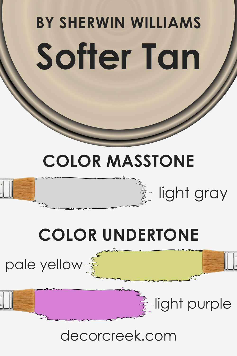
Softer Tan is a unique paint color that might look simple at first glance, but it has a lot more going on once you take a closer look. The secret behind its appeal lies in its undertones, which are subtle hints of color that influence the overall look. In the case of Softer Tan, the undertones are pale yellow and light purple. These undertones play a big role in how we perceive the color.
Undertones can make a single color look different under various lighting conditions. For instance, pale yellow undertones can give a warm, cozy feel to a room, making spaces feel more inviting. On the other hand, light purple undertones can add a subtle hint of sophistication and depth. They can also affect how other colors in the room look and feel.
When Softer Tan is used on interior walls, its undertones influence the atmosphere of the space. The pale yellow undertone brings warmth, making the room seem more welcoming. It’s perfect for living rooms or bedrooms where you want to create a cozy vibe. The light purple undertone adds a level of elegance and ensures the space doesn’t look flat or dull.
In natural light, the color may lean more towards its yellow undertone, creating a sunny ambiance, while artificial lighting might bring out the cooler purple undertone, providing balance.
In conclusion, the appealing complexity of Softer Tan comes from its unique undertones. They enhance the color, affecting the mood and style of any room. Whether it’s adding warmth or a touch of elegance, the undertones ensure that this color stands out as an excellent choice for creating attractive interior spaces.
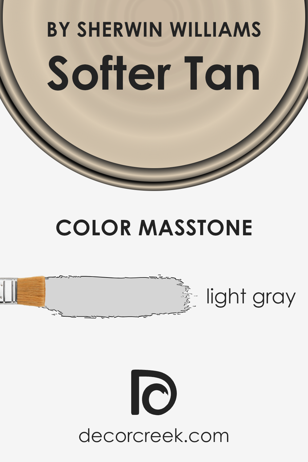
What is the Masstone of the Softer Tan SW 6141 by Sherwin Williams?
Softer Tan SW 6141 by Sherwin Williams has a masstone, or main color appearance, of light gray, coded as #D5D5D5. This specific shade of gray adds a subtle and soothing touch to any space. Its light tone brings a sense of calm and openness, making rooms look more spacious and inviting. Being a neutral color, it pairs well with almost any decor style or color scheme, from vibrant and bold to soft and subtle, offering great versatility in home design.
The light gray tone of Softer Tan can also enhance natural light in a room, reflecting it to brighten spaces naturally. This can make it an excellent choice for areas of the home that could use a little extra light without relying heavily on artificial sources.
Its ability to blend with other colors and materials makes it a go-to choice for walls, as it provides a clean and unobtrusive backdrop that allows furniture and art to stand out.
In summary, the light gray masstone of Softer Tan provides a fresh, versatile base that can easily adapt to any home style, making spaces feel more open, bright, and welcoming.
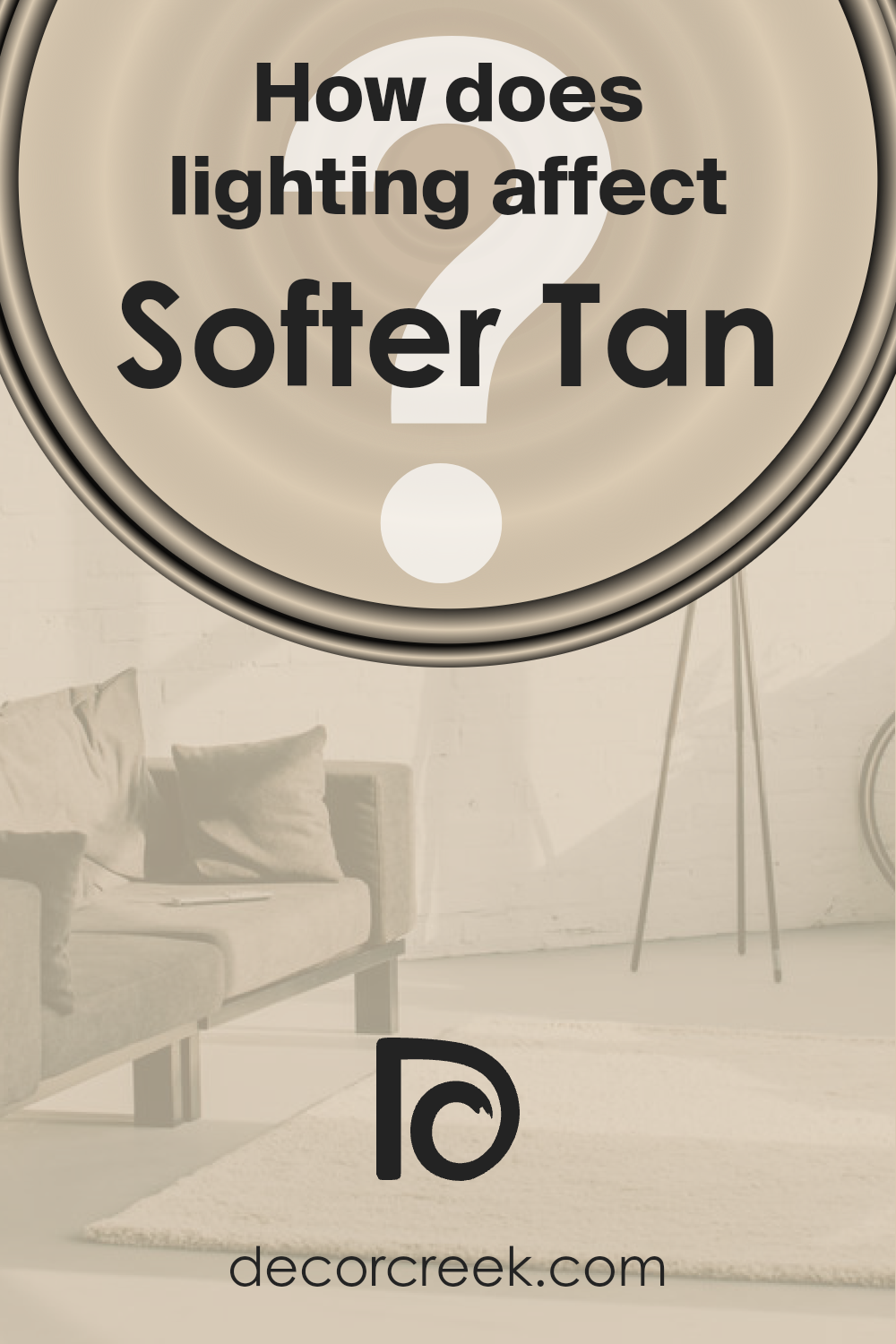
How Does Lighting Affect Softer Tan SW 6141 by Sherwin Williams?
Lighting plays a crucial role in how we perceive colors in our surroundings. The way a color appears can dramatically change under different lighting conditions due to the light’s intensity, direction, and color temperature. This is an important aspect to consider when choosing paint colors for a room, as the chosen hue might look different throughout the day or under artificial light compared to the swatch you fell in love with at the store.
Take the color Softer Tan, for example. In natural light, this warm, neutral shade exhibits a cozy and inviting quality, making spaces feel welcoming and serene. Under artificial light, the specifics of the lighting setup come into play.
LED bulbs with a cooler temperature can make Softer Tan appear more muted and less warm, whereas warm, incandescent bulbs enhance its creamy and soothing properties, casting a more intimate ambiance over the room.
In rooms facing different directions, the appearance of Softer Tan varies significantly. In north-facing rooms, which receive less direct sunlight and tend to have cooler, bluer light, Softer Tan can look more subdued and cooler, potentially losing some of its warmth. It’s great for creating a soft, tranquil atmosphere without overwhelming the space.
- South-facing rooms bask in abundant natural light for most of the day, which can amplify the warmth and richness of Softer Tan, making it appear more vibrant and lively. It’s an excellent choice for spaces where a sunny, cheerful vibe is desired.
- East-facing rooms enjoy bright morning light, which can make Softer Tan look especially warm and welcoming in the morning, gradually transitioning to a softer tone as the day progresses and the natural light diminishes.
- In west-facing rooms, the color experiences the opposite effect; it starts softer in the morning and becomes warmly lit with a golden hue by afternoon and evening as the sun sets, highlighting the cozy and comforting aspects of the color.
Understanding how lighting affects colors like Softer Tan can help you predict how the color will behave in your space at different times of the day and under various lighting conditions, ensuring you achieve the desired mood and atmosphere in your home.
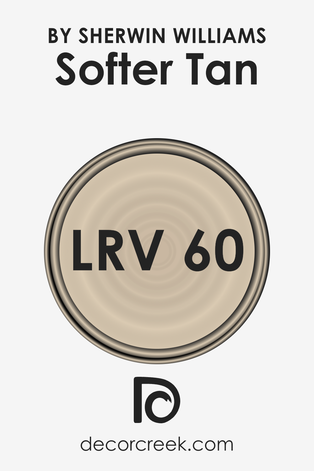
What is the LRV of Softer Tan SW 6141 by Sherwin Williams?
LRV stands for Light Reflectance Value, which is basically a measure of how much light a color reflects compared to how much it absorbs. Think of it like this: on a scale from 0 to 100, 0 means the color is as dark as it can get (like a black hole that sucks up all the light), and 100 means the color is super bright and reflects all the light back (like a mirror or a shiny white surface). This number helps you understand how light or dark a color will appear once it’s up on your walls. It’s a handy guide for deciding how a paint color might make a room feel – whether it will brighten up a dark space or make a well-lit room feel more cozy.
Now, when it comes to Softer Tan with an LRV of 60.204, this means it’s on the lighter side of the scale but not at the extreme end. It’s a nice, moderate choice. Because this color reflects a good bit of light without being overwhelmingly bright, it has the potential to make rooms feel airy and open without feeling stark or cold. This particular LRV value indicates that Softer Tan is versatile enough to work well in a variety of spaces, enhancing natural light in dim rooms while not overpowering in brightly lit areas. It’s a gentle, welcoming shade that can bring warmth and light to walls, catering to a balanced and inviting atmosphere in your space.
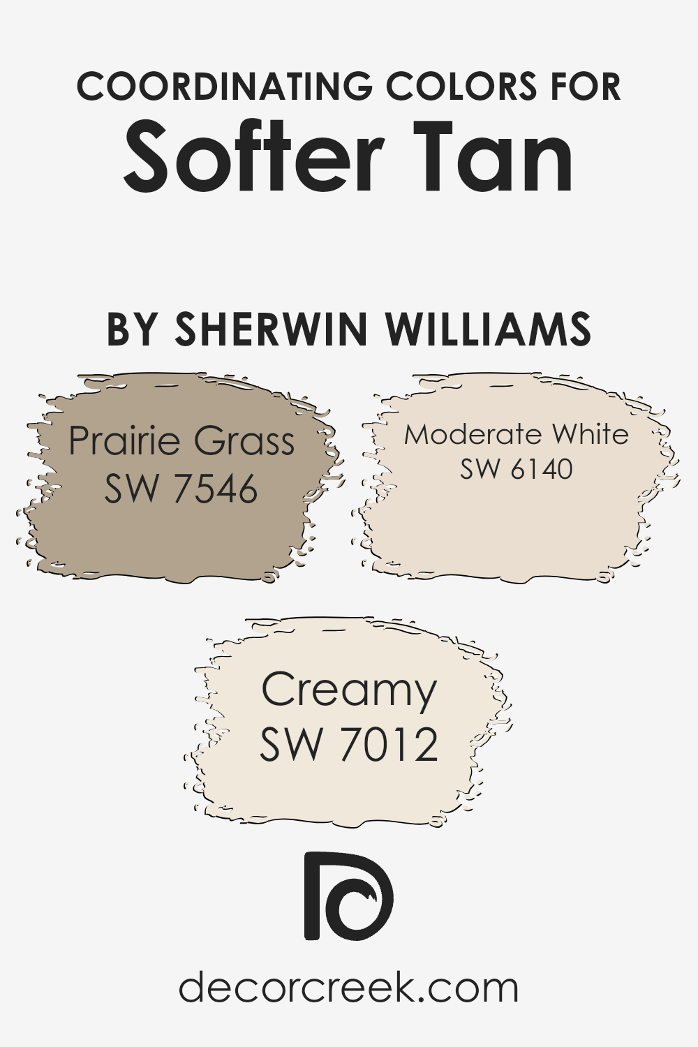
Coordinating Colors of Softer Tan SW 6141 by Sherwin Williams
Coordinating colors are selected hues that work harmoniously with a primary color to create a visually appealing palette. When choosing coordinating colors for a specific shade, like Softer Tan, it’s important to consider how these colors complement or contrast beautifully with the main hue to achieve a balanced and cohesive look.
These coordinating colors can enhance the overall aesthetic by adding depth, contrast, and interest to any space, making them ideal for interior design and home decor projects. By carefully selecting shades that coordinate well, you can ensure that the colors in your space feel unified and thoughtfully curated.
Among the coordinating colors for Softer Tan, Prairie Grass offers a subdued, earthy green tone that echoes the natural world, providing a grounded and serene touch to environments.
This hue works well to bring a soft whisper of color into spaces that aim for a calm and collected ambiance. Creamy, on the other hand, is a gentle off-white that adds lightness and a feeling of spaciousness, making it perfect for creating a cozy and welcoming atmosphere. Lastly, Moderate White has a warm undertone that complements Softer Tan beautifully, offering a subtle contrast without overwhelming the senses. This particular shade is excellent for adding a refined and elegant touch to any room, balancing the warmth of Softer Tan with its own soft luminosity.
Together, these colors contribute to a harmonious palette that enriches the base color and brings sophistication to space.
You can see recommended paint colors below:
- SW 7546 Prairie Grass
- SW 7012 Creamy
- SW 6140 Moderate White
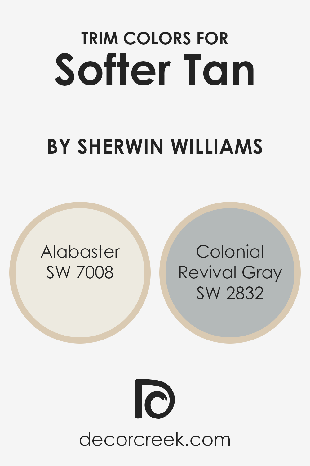
What are the Trim colors of Softer Tan SW 6141 by Sherwin Williams?
Trim colors are those additional hues used alongside a primary wall color to enhance the visual appeal and architectural features of a room. When it comes to a warm and welcoming shade like Softer Tan by Sherwin Williams, choosing the right trim colors can make all the difference.
These hues help to outline door frames, window sills, and baseboards, creating a beautiful contrast that can highlight the room’s best features. By selecting suitable trim colors, you can bring balance and harmony to the space, ensuring that the wall color does not overwhelm but rather complements the room’s overall ambiance.
Alabaster, a creamy and soft white with a touch of warmth, works beautifully as a trim color alongside Softer Tan. Its subtly elegant presence can brighten up spaces and create a smooth transition between the wall color and the trim, adding a touch of sophistication without overpowering the room.
Colonial Revival Gray, on the other hand, offers a timeless appeal with its gentle gray tone that carries just enough depth to stand out against Softer Tan. This color is perfect for adding a bit of contrast and depth to the room, ensuring that the architectural features are pronounced but still harmoniously blend with the overall design scheme.
You can see recommended paint colors below:
- SW 7008 Alabaster
- SW 2832 Colonial Revival Gray
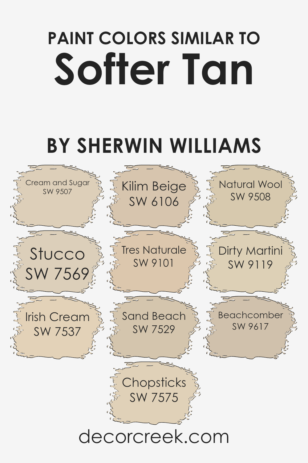
Colors Similar to Softer Tan SW 6141 by Sherwin Williams
Choosing similar colors to a base tone, such as Softer Tan, is essential in creating a harmonious and visually appealing space. These colors work together because they share a similar saturation and lightness, making the transition between them smooth and pleasing to the eye. This unity in color variation can enhance the aesthetic of a room, making it appear more cohesive and thoughtfully designed.
By incorporating shades like Cream and Sugar, a warm, inviting off-white, or Stucco, which brings a subtle earthiness, one can achieve a sophisticated yet comforting atmosphere. Irish Cream adds a hint of richness with its creamy, beige essence, while Chopsticks introduces a slightly deeper, muted brown, grounding the space with its natural tones.
Kilim Beige and Tres Naturale extend the palette with their sandy warmth, evoking a sense of calm and versatility. Sand Beach and Natural Wool offer soft, neutral backgrounds that allow for flexibility in decorating with colors and textures.
Meanwhile, Dirty Martini adds a unique, olive twist, providing an unexpected pop of color that still aligns with the earthy, warm palette. Lastly, Beachcomber’s light, sandy touch ties these colors together, promoting a serene and welcoming environment. Utilizing these similar colors enables the creation of a space that feels cohesive, balanced, and tailored to personal style.
You can see recommended paint colors below:
- SW 9507 Cream and Sugar
- SW 7569 Stucco
- SW 7537 Irish Cream
- SW 7575 Chopsticks
- SW 6106 Kilim Beige
- SW 9101 Tres Naturale
- SW 7529 Sand Beach
- SW 9508 Natural Wool
- SW 9119 Dirty Martini
- SW 9617 Beachcomber
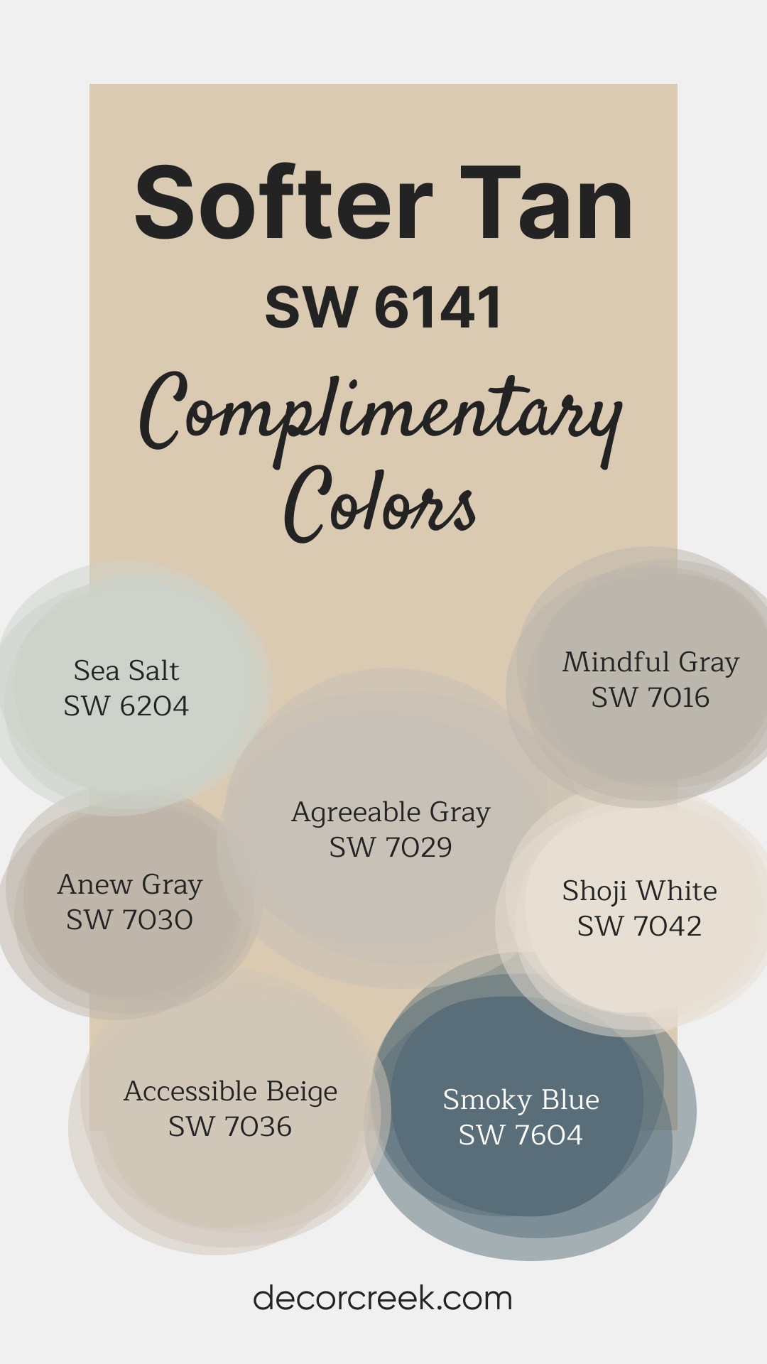
Complimentary Colors for Softer Tan SW 6141 Paint Color by Sherwin Williams
Sherwin Williams offers a stunning selection of paint colors that effortlessly enhance your home. Softer Tan SW 6141 adds a cozy touch with its golden undertones, while Smoky Blue SW 7604 introduces a serene and sophisticated vibe. Shoji White SW 7042 is a perfect light shade that pairs well with Accessible Beige SW 7036 for a balanced and cohesive look. Mindful Gray SW 7016 is a soft, modern gray that complements many styles, while Sea Salt SW 6204 brings a gentle pop of color inspired by nature.
Anew Gray SW 7030 and Agreeable Gray SW 7029 are neutral favorites, offering versatility and timeless appeal. These shades adapt beautifully to different lighting, making them easy to incorporate into your living spaces. Whether you prefer warm tones or cooler hues, these paint colors bring a fresh and polished feel to your home.
How to Use Softer Tan SW 6141 by Sherwin Williams In Your Home?
Softer Tan by Sherwin Williams is a warm and inviting paint color that can make any space in your house feel cozy and welcoming. This hue is a beautiful choice for those looking to add a touch of warmth to their rooms without overpowering them with a too-dark shade. Its versatility allows it to blend well with various decor styles, from modern to traditional.
In your home, you can use Softer Tan in a number of ways. For a start, it’s great for living rooms or bedrooms, creating a soothing atmosphere that’s perfect for relaxing. Its warm undertones make it an excellent choice for areas with natural light, enhancing the brightness of the room.
For a harmonious look, pair it with crisp white trim or use it as a background for showcasing artwork or photos.
Kitchens and dining areas can also benefit from Softer Tan, giving these spaces a friendly and inviting vibe. It works well with wood cabinets and natural stone countertops, tying together different elements for a cohesive look.
Remember, this versatile color can help soften sharp angles and bring out the best in your furnishings, making your home feel more put together.
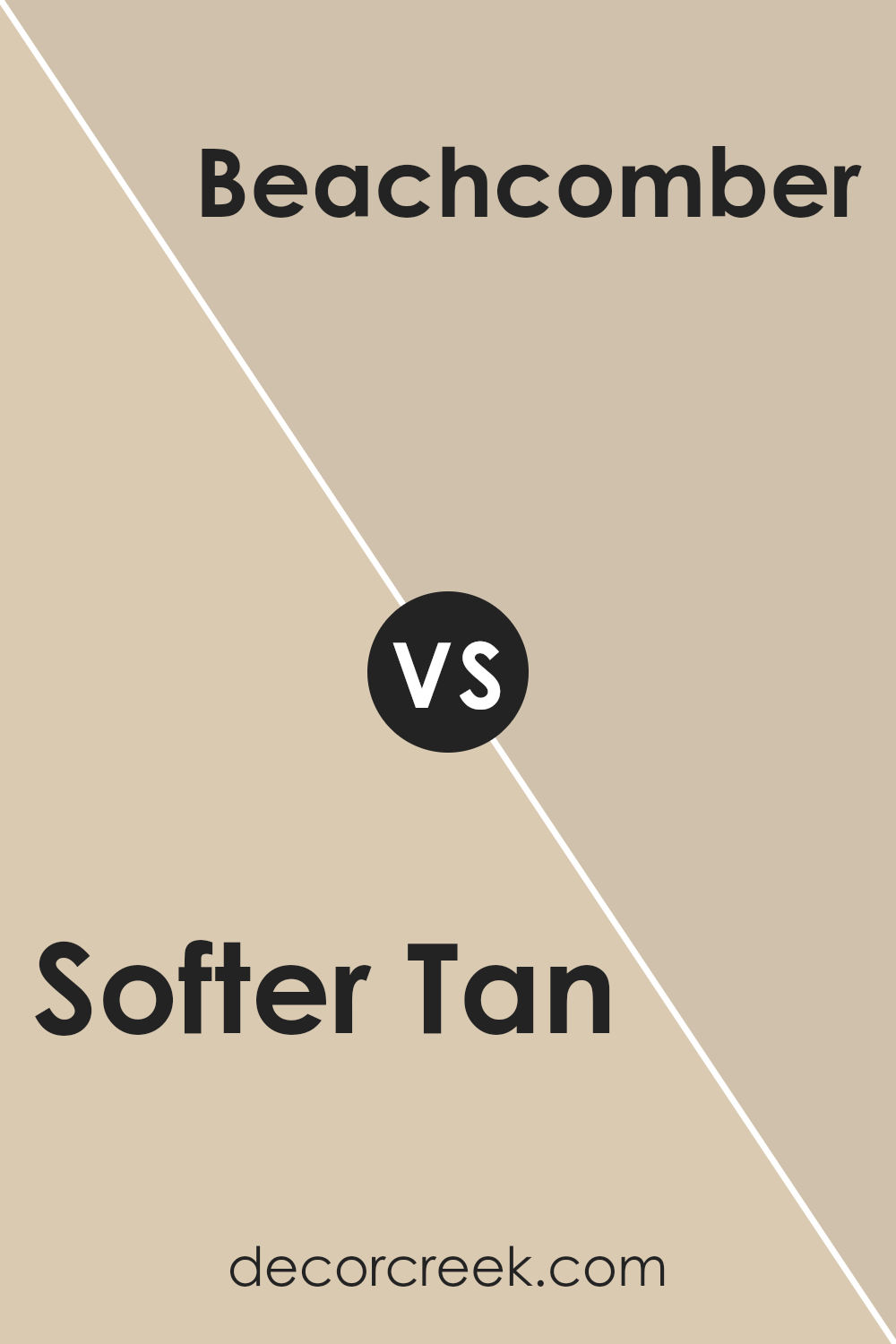
Softer Tan SW 6141 by Sherwin Williams vs Beachcomber SW 9617 by Sherwin Williams
Softer Tan and Beachcomber are both colors by Sherwin Williams, but they bring different moods to a space. Softer Tan is like a warm, gentle hug for your walls. It has a welcoming vibe that makes any room feel cozy and inviting. Its subtle warmth works well in many settings, making spaces feel more comfortable and homely.
On the other hand, Beachcomber offers a fresh breath of air. It’s lighter, reminding you of sandy beaches and relaxed days by the sea. This color adds a hint of brightness without overwhelming a room, perfect for creating a serene and calm atmosphere.
While both colors share an affinity for bringing warmth and comfort to interiors, Softer Tan leans towards a more traditional warmth, whereas Beachcomber steps into the realm of brightness and airiness. Choosing between them depends on whether you’re going for a cozier, enveloping feel or a light, fresh vibe.
You can see recommended paint color below:
- SW 9617 Beachcomber
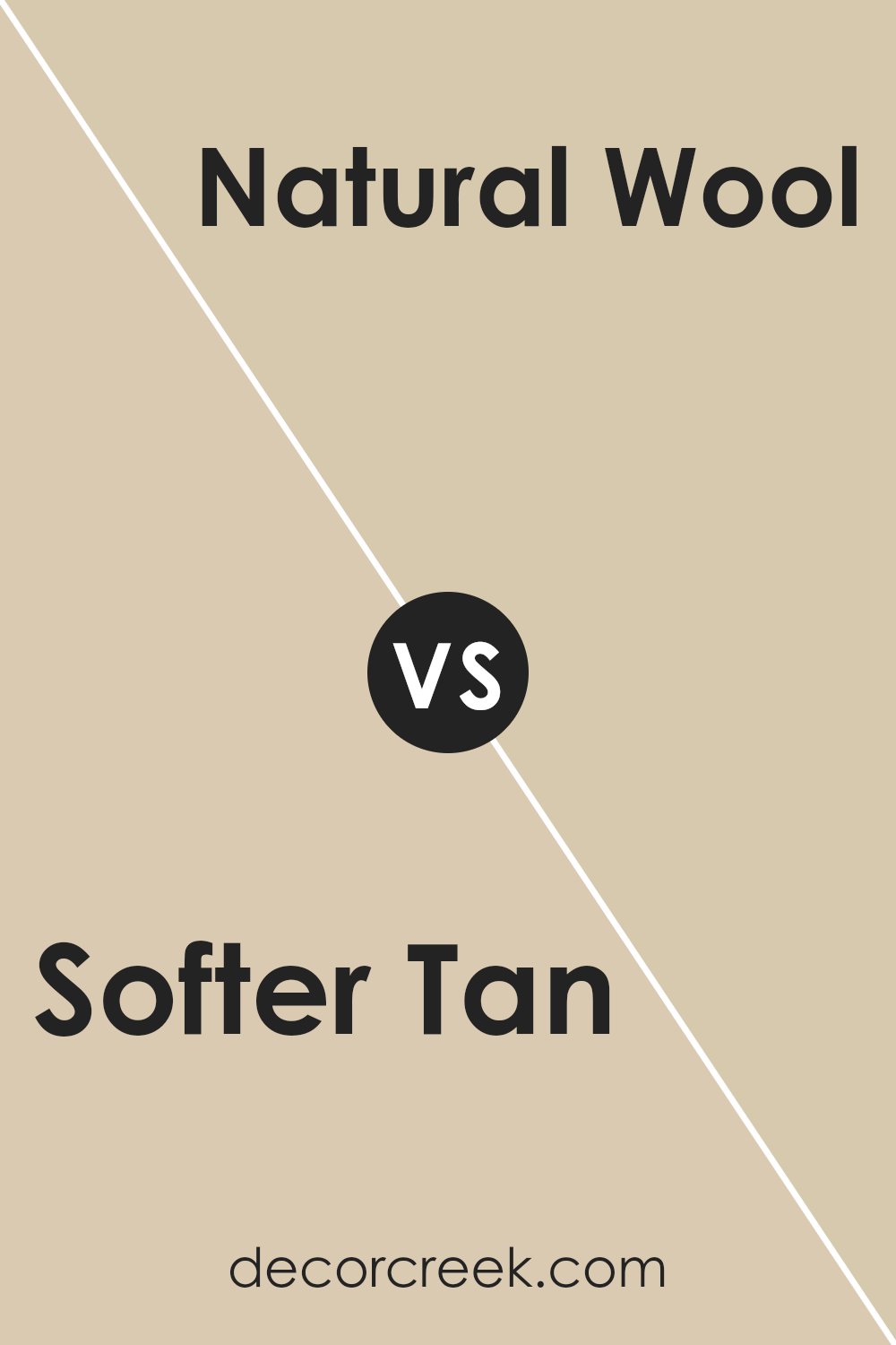
Softer Tan SW 6141 by Sherwin Williams vs Natural Wool SW 9508 by Sherwin Williams
Softer Tan and Natural Wool by Sherwin Williams are two unique but somewhat similar shades that bring warmth and comfort to any space. Softer Tan is a gentle, welcoming beige that feels cozy and airy. It has a lightness that can make rooms feel more spacious and relaxed. On the other hand, Natural Wool leans slightly cooler than Softer Tan. It’s a soft, muted neutral that resembles the natural color of wool, giving a calming effect to interiors. While Softer Tan radiates a bit more warmth and can pair well with a variety of decor styles, adding a sunny touch to spaces, Natural Wool offers a subdued elegance, perfect for creating a serene, understated look. Both colors work beautifully in spaces that aim for a natural, soothing vibe, but your choice might depend on whether you prefer the slightly warmer, more inviting feel of Softer Tan or the cooler, tranquil ambiance that Natural Wool presents.
You can see recommended paint color below:
- SW 9508 Natural Wool
Softer Tan SW 6141 by Sherwin Williams vs Stucco SW 7569 by Sherwin Williams
Softer Tan and Stucco by Sherwin Williams are two beautiful colors that add warmth and elegance to any space. Softer Tan is a light, creamy beige that brings a gentle, calming feel to a room. It’s like a warm hug that makes the space feel cozy and inviting.
On the other hand, Stucco is a bit darker, leaning more towards a muted, earthy beige with a hint of gray. This color adds a subtle depth and sophistication to the walls, providing a solid foundation for various decor styles.
When comparing these two, Softer Tan is the lighter option that brightens up a room, making small spaces appear larger and more airy. Stucco, due to its deeper tone, is excellent for creating a more grounded, intimate ambiance. Both colors are versatile, working well with different lighting conditions and complementing a wide range of furniture colors. Whether you choose Softer Tan for a lighter, breezier feel or Stucco for a richer, earthier vibe, both colors offer a beautiful backdrop for living spaces.
You can see recommended paint color below:
- SW 7569 Stucco
Softer Tan SW 6141 by Sherwin Williams vs Chopsticks SW 7575 by Sherwin Williams
Softer Tan and Chopstick, both from Sherwin Williams, offer unique shades for spaces looking for a touch of warmth. Softer Tan is a warmer, lighter color that brings a cozy, inviting feel to any room. It’s the kind of color that reminds you of soft, sandy beaches and can brighten up spaces while still retaining a sense of calm.
On the other hand, Chopsticks leans towards a darker, more muted tone. It brings an earthy, grounded feel to environments, perfect for creating a sense of stability and warmth. While both colors share a base warmth, Softer Tan offers a lighter, breezier atmosphere, making spaces feel more open and airy.
Chopsticks, with its deeper tone, is ideal for adding depth and sophistication. Choosing between them depends on the mood you want to set: light and airy with Softer Tan, or rich and grounded with Chopsticks.
You can see recommended paint color below:
- SW 7575 Chopsticks
Softer Tan SW 6141 by Sherwin Williams vs Sand Beach SW 7529 by Sherwin Williams
Comparing Softer Tan and Sand Beach, both from Sherwing Williams, shows us two inviting yet distinct shades. Softer Tan leans towards a warm, welcoming beige with hints of cream, making spaces feel cozy and light. It’s a color that can make a room feel brighter without overwhelming it with too much yellow or gold, perfect for anyone wanting a gentle, natural look in their home.
On the other hand, Sand Beach offers a slightly different vibe. This color is a tad darker and brings a richer, earthy tone that resembles the natural color of sandy beaches. It’s great for adding a bit of warmth to a space while still keeping things neutral.
Sand Beach might be the go-to for areas where you want a bit more depth and coziness without going too dark.
Both colors are versatile and can easily complement a variety of decor styles and themes, but they cater to slightly different tastes and atmospheres in a living space. Softer Tan is ideal for creating a light, airy feel, whereas Sand Beach works wonders for those seeking a warmer, more grounded ambiance.
You can see recommended paint color below:
- SW 7529 Sand Beach
Softer Tan SW 6141 by Sherwin Williams vs Tres Naturale SW 9101 by Sherwin Williams
Softer Tan and Tres Naturale by Sherwin Williams are both warm, inviting colors, but they bring distinct vibes to a space. Softer Tan leans more toward a cozy, comforting beige. It’s light and airy, making it perfect for creating a snug, welcoming feel in a room. This color shines best in areas where you want a touch of warmth without overwhelming the space.
On the other hand, Tres Naturale takes the warmth up a notch. It’s closer to a natural wood tone, evoking the sense of earthiness and grounding. This color is ideal for spaces where you want to add a bit of nature’s calm and steadiness. It’s slightly darker than Softer Tan, giving a more pronounced nod to the outdoors.
Both colors work well in a variety of settings, but your choice between them might come down to the specific mood you’re aiming for. Softer Tan is great for a gentle, soft look, while Tres Naturale offers a bit more depth and connection to the natural world.
You can see recommended paint color below:
- SW 9101 Tres Naturale
Softer Tan SW 6141 by Sherwin Williams vs Kilim Beige SW 6106 by Sherwin Williams
Softer Tan and Kilim Beige by Sherwin Williams are two popular choices for those looking to bring a warm, neutral vibe into their spaces. Softer Tan, as its name suggests, offers a lighter, airier feel. It has a calm and welcoming energy, perfect for creating a soft, cozy atmosphere in any room. It’s like the comforting warmth of a sandy beach at sunrise, gentle and soothing.
On the other hand, Kilim Beige steps in with a slightly richer tone. It carries a bit more depth, akin to the color of a well-loved parchment or a vintage book. This makes Kilim Beige ideal for those wanting to add a touch of warmth and classic elegance to their surroundings.
While both colors share a beige family resemblance, Softer Tan leans towards a more subdued, lighter palette, whereas Kilim Beige offers a tad more saturation, giving a room a bit more weight and grounding.
This slight variance in tone allows them to cater to different tastes and uses, from creating an illusion of space to adding a cozy, inviting layer to a room.
You can see recommended paint color below:
Softer Tan SW 6141 by Sherwin Williams vs Irish Cream SW 7537 by Sherwin Williams
“Softer Tan” and “Irish Cream” by Sherwin Williams are both warm, welcoming colors that can make a space feel cozy and inviting. “Softer Tan” is a gentle, muted shade of tan that strikes a balance between being a light neutral and adding a hint of warmth to the walls. It’s versatile, fitting in with many décor styles and spaces, from living rooms to bedrooms.
On the other hand, “Irish Cream” is a creamier, slightly lighter hue that leans more towards a soft beige with a touch of warmth. It’s great for creating an airy and open feel in a room, making spaces seem larger and more luminous.
While “Softer Tan” can add a bit of earthy warmth, “Irish Cream” provides a subtle brightness, acting almost like a blank canvas that allows furniture and decorations to really stand out.
Both colors are excellent choices for those looking to create a peaceful, warm ambiance in their home. However, the choice between them might come down to personal preference regarding the depth of color and the specific atmosphere you want to achieve in your space.
You can see recommended paint color below:
- SW 7537 Irish Cream
Softer Tan SW 6141 by Sherwin Williams vs Dirty Martini SW 9119 by Sherwin Williams
Softer Tan is a cozy and warm color, a bit like a light caramel. It adds a gentle, inviting vibe to any room, making spaces feel more open and comfy. On the other hand, Dirty Martini carries a unique blend of green and gray, offering a more earthy and grounded feeling.
While Softer Tan brings in warmth and a sense of brightness, Dirty Martini gives off a cooler and more neutral touch, making it great for a modern or nature-inspired look. Both colors work well in different settings: Softer Tan is perfect for creating a snug, welcoming atmosphere, whereas Dirty Martini fits nicely in areas where you want a touch of sophistication without going too bold.
Imagine Softer Tan in a sunlit living room, and Dirty Martini in a chic, stylish study. They serve different moods but both add significant style and character to spaces.
You can see recommended paint color below:
- SW 9119 Dirty Martini
Softer Tan SW 6141 by Sherwin Williams vs Cream and Sugar SW 9507 by Sherwin Williams
Softer Tan and Cream and Sugar are two colors from Sherwin Williams that both bring warmth to any room, but they have their unique tones. Softer Tan is a warm, beige color with a cozy feel. It’s perfect for creating a comfortable and inviting space, as it pairs well with a wide range of decor styles and colors.
On the other hand, Cream and Sugar is a lighter, creamier shade that radiates a soft, serene vibe. It’s great for making small rooms appear larger and brighter. While Softer Tan adds depth to a space with its richer tan undertones, Cream and Sugar keeps things light and airy. In essence, if you’re looking for a color that offers warmth with a bit more body, Softer Tan is the way to go.
For those seeking a delicate, crisp backdrop that brightens up the room, Cream and Sugar is the choice. Each color has its charm, making spaces welcoming in their way.
You can see recommended paint color below:
Conclusion
Concluding, Softer Tan by Sherwin Williams is a versatile and warm color that allows for easy integration into various home decors. Its subtle elegance can enhance spaces by adding a cozy and inviting atmosphere without overwhelming the senses. This makes it an excellent choice for individuals looking to create a serene and welcoming environment in their homes.
Additionally, its adaptability in pairing with a wide range of colors and materials offers endless possibilities for personalization and creativity in decorating.
Moreover, Softer Tan’s ability to reflect natural light beautifully while maintaining its warmth makes it a go-to option for those seeking to add depth and richness to their rooms. Its understated beauty is particularly effective in spaces where a calming and neutral backdrop is desired, facilitating a timeless aesthetic that can evolve with changing trends and personal tastes.
Whether used in large areas or as an accent, Softer Tan proves to be a practical yet stylish choice that resonates with a wide audience, affirming its popularity and enduring appeal.
Ever wished paint sampling was as easy as sticking a sticker? Guess what? Now it is! Discover Samplize's unique Peel & Stick samples.
Get paint samples
