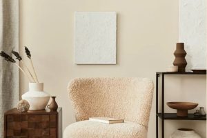
In the diverse palette of home decor, every shade plays a pivotal role in shaping the ambiance and mood of a space. Among them, the soft, inviting tone of SW 9507 Cream and Sugar by Sherwin Williams holds a special place for those aiming to infuse their homes with warmth and a welcoming air.
This particular hue is a masterful blend that falls somewhere between the lightest café au lait and the subtlest ivory, making it a versatile choice for any part of the home.
The charm of Cream and Sugar lies in its ability to harmonize with a wide range of color schemes and decor styles, from the rustic charm of a country cottage to the sleek lines of a modern urban apartment.
Its creamy richness adds depth and texture without overwhelming, offering a backdrop that can make both vibrant colors pop and softer hues feel cozier. Sherwin Williams has crafted this color with an innate flexibility that encourages creativity and personal expression.
Whether you’re looking to breathe new life into a living room, create a serene bedroom retreat, or even design a welcoming entryway, SW 9507 Cream and Sugar offers a perfect canvas. Its timeless elegance ensures that your space not only feels inviting today but remains stylish and warm for years to come.

What Color Is Cream and Sugar SW 9507 by Sherwin Williams?
The color “Cream and Sugar” offers a warm, inviting ambiance that adeptly harmonizes with a plethora of interior styles and materials. Reminiscent of the soft, comforting shade of light cream swirling into a morning coffee, this nuanced hue adds subtle sophistication and a cozy feel to any room.
Its inherent warmth makes it a perfect candidate for creating serene and welcoming spaces, playing beautifully against both natural light and artificial illumination to produce an almost luminous glow.
“Cream and Sugar” is remarkably versatile, easily finding its place within a range of interior design aesthetics from the rustic charm of farmhouse chic to the clean lines of modern minimalism. Its understated elegance makes it an ideal backdrop for both bold accents and a palette of similarly soft tones, allowing for a multitude of design explorations.
When it comes to pairing with materials, “Cream and Sugar” shines alongside natural wood finishes, from the palest ash to richer walnuts, highlighting their grain and texture. It also complements metallic accents, especially in matte brass or copper, adding a touch of glamour.
In spaces with this beautiful hue, fabrics like linen and cotton in neutral colors enhance the inviting, comfortable atmosphere, while adding layers of texture can create a more dynamic, visually interesting space.
In essence, “Cream and Sugar” serves as a versatile foundation that can elevate and adapt to various styles, materials, and textures, ensuring a timeless appeal in any interior space.
Ever wished paint sampling was as easy as sticking a sticker? Guess what? Now it is! Discover Samplize's unique Peel & Stick samples.
Get paint samples

Is Cream and Sugar SW 9507 by Sherwin Williams Warm or Cool color?
Cream and Sugar by Sherwin Williams is a warm, inviting shade that effortlessly brings a cozy and comforting atmosphere to any home. This particular color is reminiscent of the soft, soothing tones of a well-creamed coffee, blending an understated elegance with a welcoming homeliness.
Its light, creamy hue offers versatility, making it an excellent choice for various spaces, from kitchens and living rooms to bedrooms and bathrooms. The subtlety of Cream and Sugar allows it to serve as a neutral backdrop, supporting a wide range of decor styles, from traditional to contemporary, without overpowering the details and accents in a room.
This shade works wonders in homes by enhancing natural light, giving spaces a brighter, airy feel while maintaining warmth. It pairs splendidly with both bold and soft color palettes, allowing for personal creativity in designing a space. In homes with less natural light, Cream and Sugar can help counteract the lack of brightness and visually open up the space.
Additionally, its timeless nature means it can adapt well to changing decor trends, making it a practical and stylish choice for homeowners looking for longevity in their color selections. Its ability to evoke warmth and comfort while remaining elegant and versatile makes it a favored choice for creating inviting, stylish interiors.
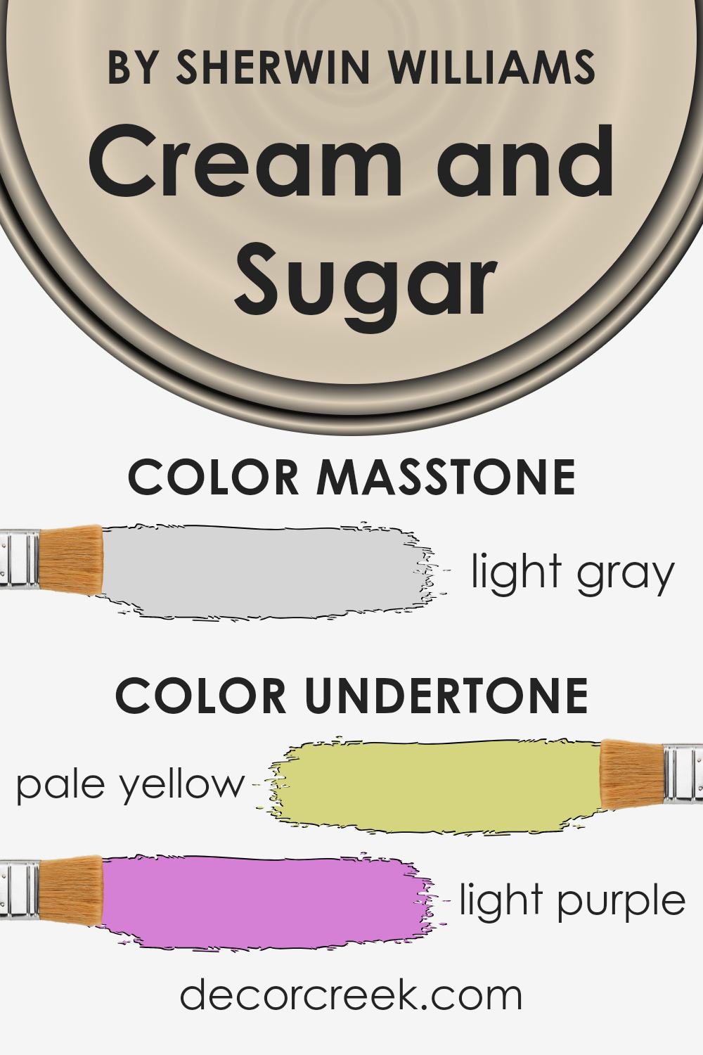
Undertones of Cream and Sugar SW 9507 by Sherwin Williams
Cream and Sugar by Sherwin Williams is a subtle, sophisticated paint color that harmoniously blends into various interior design schemes. Its beauty lies in the unique undertones that it possesses, which greatly influence how the color is perceived in different lighting conditions and settings.
The undertones of pale yellow and light purple play a crucial role in the overall appearance of this paint color. Pale yellow brings a soft, warm glow to spaces, infusing them with a sense of brightness and coziness.
It’s this yellow undertone that gives rooms a welcoming, sunny ambiance, even in spaces that might not receive an abundance of natural light.
On the other hand, the light purple undertone adds depth and complexity to the color. Instead of a flat, one-dimensional appearance, this subtle hint of purple introduces an element of sophistication and tranquility, creating spaces that feel both elegant and comforting.
When applied to interior walls, these undertones contribute to the color’s chameleon-like ability to adapt to different interior lighting conditions, furnishings, and decor styles. In natural daylight, the pale yellow may appear more pronounced, bringing a vibrant yet soft energy to the room.
In artificial light, the light purple undertone might emerge more, lending a subtle richness and making the space feel more intimate.
Understanding and considering the undertones of Cream and Sugar is essential for homeowners and interior designers. It ensures that when used on walls, the color complements the room’s lighting, enhances the chosen decor, and ultimately achieves the desired mood and effect.
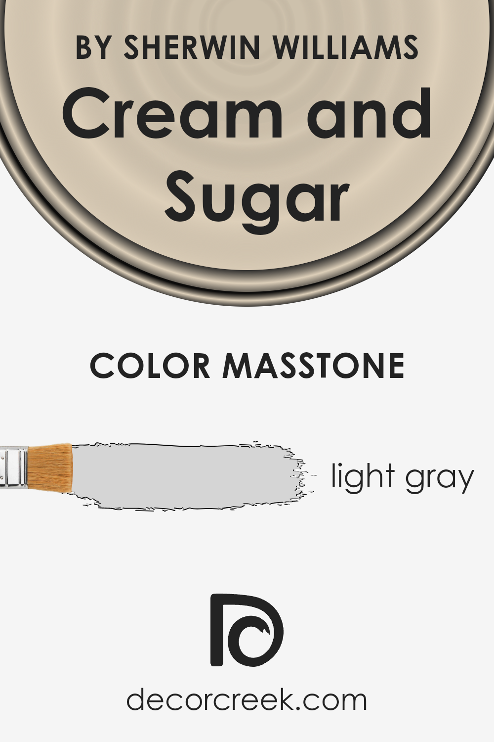
What is the Masstone of the Cream and Sugar SW 9507 by Sherwin Williams?
Cream and SugarSW 9507 by Sherwin Williams presents a serene masstone of light gray, identifiable by its resemblance to the hex code #D5D5D5. This particular shade embodies a versatile and calming presence in any home, functioning beautifully across various design aesthetics.
The light gray masstone of this color brings a subtle warmth and sophistication, making it an excellent choice for creating a serene and inviting atmosphere.
In interior spaces, this nuanced hue adapts gracefully, acting as a neutral backdrop that complements both vibrant accents and muted tones. Its light gray essence captures natural light in a manner that enhances the sense of space, making rooms appear more open and airy.
Furthermore, its understated elegance elevates the perception of texture and materiality within a room, allowing furniture and decor to stand out without overwhelming the senses.
The ability of this soft, light gray to blend seamlessly with different styles and palettes ensures that it remains a timeless choice for homeowners seeking to achieve a balance between contemporary chic and classic comfort.
Integrating this color into the home invites a layer of tranquility and refined taste, demonstrating how the right hue can transform the living experience.
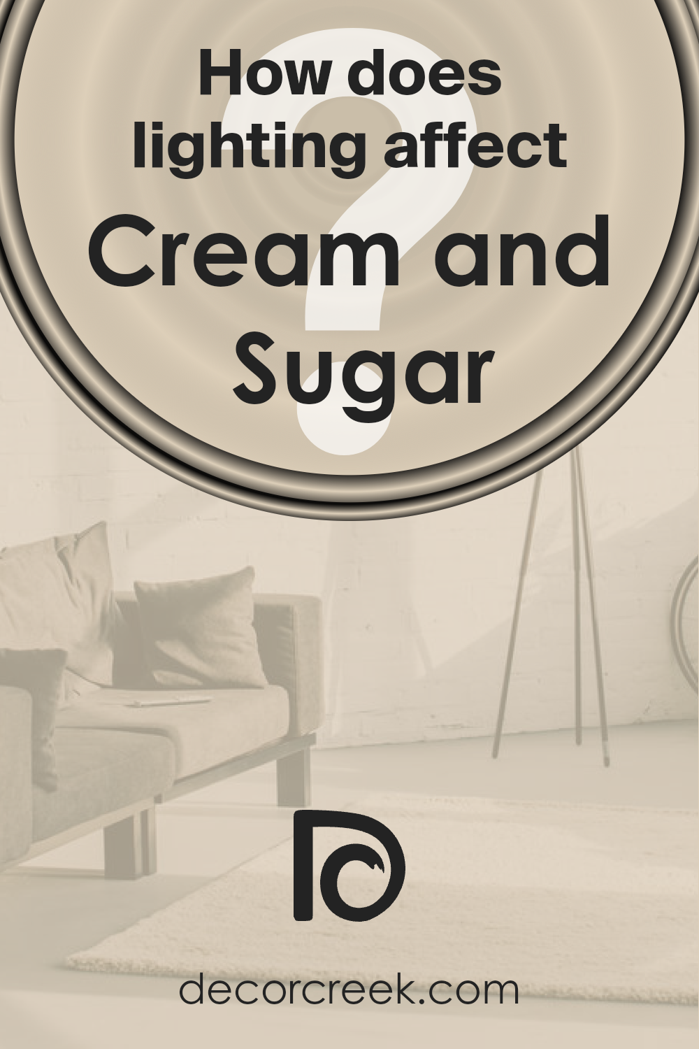
How Does Lighting Affect Cream and Sugar SW 9507 by Sherwin Williams?
Lighting plays a critical role in how we perceive color, transforming the appearance and mood that a color evokes in any given space. The interplay between light and color is complex, as different kinds of light can dramatically alter the perception of color in an interior environment.
This phenomenon becomes particularly evident with nuanced colors such as a warm, inviting neutral hue like Cream and Sugar by a renowned paint company.
In artificial light, the warm, soft undertones of this color can be either enhanced or muted, depending on the type of artificial lighting used. Incandescent lighting, with its yellow-red spectrum, tends to amplify the warm tones, making the color appear cozier and more inviting.
In contrast, fluorescent lighting leans towards the blue end of the spectrum, potentially casting a slightly cooler, more muted effect over the color, which might make it appear less vibrant.
When it comes to natural light, the color’s true character shines vividly, yet its perception changes throughout the day with the altering angle of the sun. In north-faced rooms that receive less direct sunlight, the color can manifest as a more subdued, cooler version of itself, retaining a sense of calm and tranquility.
This subtle shift emphasizes its elegant understated quality without losing warmth.
South-faced rooms bask in an abundance of light for most of the day, allowing the color to display its depth and warmth fully. Here, it exudes a bright, welcoming vibe, making spaces feel cheerful and lively. The ample sunlight accentuates its creamy aspect, enhancing the sense of space and light.
In east-faced rooms, morning light can make the color appear soft and slightly warm, bringing a serene start to the day. As the sun moves, the color may lose some of its warmth but still maintains a pleasant neutrality, suitable for rooms used predominantly in the morning.
Conversely, in west-faced rooms, the color undergoes a transformative shift from a cooler, neutral tone in the morning to a rich, warmly-lit hue by the afternoon and evening, courtesy of the intense, warm light of sunsets.
This variation plays well into creating spaces that feel dynamic and nurturing, especially in living spaces designed for relaxation and unwinding in the evening.
Thus, the color adapts to its surroundings in a chameleon-like fashion, influenced significantly by the direction of light and the type of light it’s exposed to, demonstrating the profound impact light has on color perception.
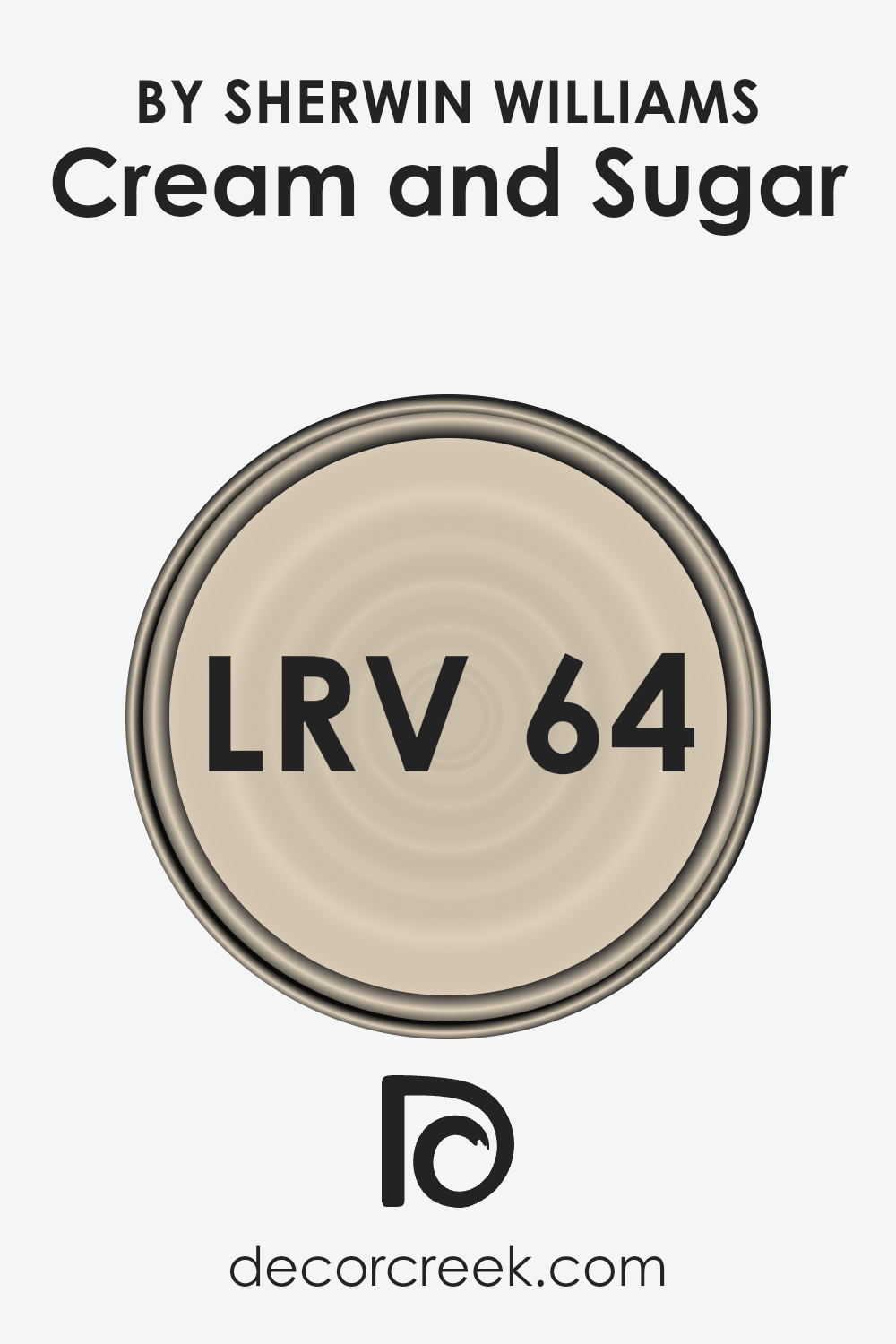
What is the LRV of Cream and Sugar SW 9507 by Sherwin Williams?
Light Reflectance Value (LRV) is a measure that indicates the amount of visible and usable light that a color reflects or absorbs. This scale runs from 0 to 100, with 0 being completely black, absorbing all light, and 100 being pure white, reflecting all light back.
LRV is a pivotal factor to consider when choosing paint colors for a space because it impacts the brightness and the overall ambiance. A higher LRV means the color will reflect more light, making spaces appear larger and more illuminated.
Conversely, colors with lower LRVs will absorb more light, which can make a room feel cozier but potentially darker and smaller.
Understanding LRV helps in making informed decisions about paint colors to ensure they complement the room’s natural lighting and desired aesthetic.
Regarding the color with an LRV of 63.724, it falls into the medium to high range of the LRV scale. This particular light reflectance value suggests that the color is capable of reflecting a significant amount of light, without being overly bright or stark.
In spaces with this color on the walls, the effect would be a balance between warmth and brightness, making it versatile for various lighting conditions and room sizes. It can help in making a room feel more spacious and airy while still offering a sense of warmth and coziness due to its creamy, inviting tone.
This LRV level is ideal for environments aiming for a soft, welcoming atmosphere without the sharp contrast that much lighter colors might introduce.
LRV – what does it mean? Read This Before Finding Your Perfect Paint Color
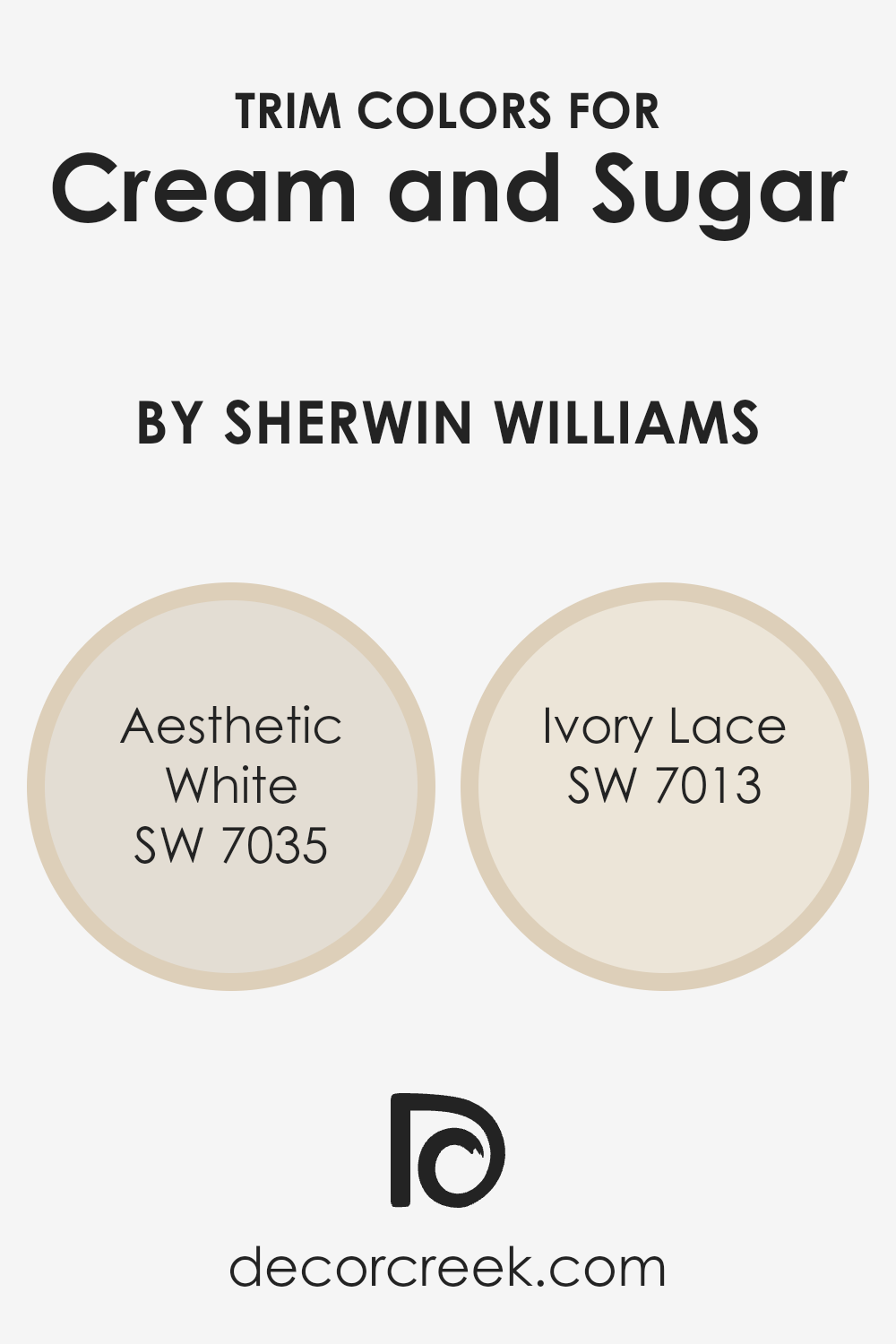
What are the Trim colors of Cream and Sugar SW 9507 by Sherwin Williams?
Trim colors serve a vital role in interior and exterior design, acting as defining accents that enhance the aesthetic appeal of a space. Particularly when considering a base color like Cream and Sugar by Sherwin Williams, selecting the right trim color can profoundly impact the room’s overall ambiance.
The trim, which includes elements such as door frames, window frames, and skirting boards, when painted in a complementary shade, can make these features pop, adding depth and character.
It also serves to create a cohesive look, tying different aspects of the room’s design together.
Choosing Aesthetic White (SW 7035) as a trim color with Cream and Sugar creates a subtle and harmonious contrast that brightens the space without overwhelming it, giving it a refined and versatile appeal. The soft, warm undertones of Aesthetic White gently complement Cream and Sugar, making the space feel welcoming and balanced.
On the other hand, Ivory Lace (SW 7013) introduces a slightly more pronounced distinction against Cream and Sugar, offering a touch of timeless elegance. Its creamy texture enriches the environment, providing depth and warmth that invite a serene and cozy atmosphere.
Both choices underscore the importance of selecting the right trim colors to enhance the beauty and feel of a room.
You can see recommended paint colors below:
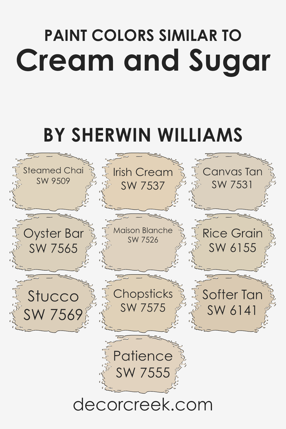
Colors Similar to Cream and Sugar SW 9507 by Sherwin Williams
Similar colors play a crucial role in design and decoration, providing a subtle yet impactful way to create harmony and cohesion in any space. When working with shades like those akin to Cream and Sugar by Sherwin Williams, one finds a palette that’s soothing, versatile, and remarkably adaptable to various styles and settings.
These hues, ranging from the warmth of Steamed Chai, a cozy embrace of light brown with a whisper of cinnamon, to the cool depth of Oyster Bar, which marries the softness of grey with the earthiness of taupe, offer a spectrum of options that blend seamlessly with each other.
Stucco introduces a touch of sun-kissed clay, reminiscent of traditional Mediterranean villas, while Patience serves as a soft backdrop, a gentle off-white with just a hint of warmth, ideal for spaces seeking a calm and collected atmosphere.
Further along the spectrum, Irish Cream adds a dollop of richness, its creamy complexion bringing to mind a frothy delight, whereas Maison Blanche is the quintessence of understated elegance, a neutral white that’s both fresh and inviting.
Chopsticks veers into the realm of muted naturals, a subtle beige that echoes the simplicity and serenity of Asian-inspired designs. Canvas Tan offers a slightly sunnier disposition, a hint of golden sunlight captured in paint, complementing spaces with its bright yet soft presence.
Moving into the heartier tones, Rice Grain and Softer Tan introduce a more pronounced warmth, infusing spaces with a comforting, enveloping feel, making rooms feel more intimate and welcoming.
Each of these colors, while maintaining individuality, shares a common thread with Cream and Sugar – the ability to create spaces that are cohesive, serene, and timelessly styled, demonstrating the power and importance of similar color choices in achieving a harmonious aesthetic.
You can see recommended paint colors below:
- SW 9509 Steamed Chai
- SW 7565 Oyster Bar
- SW 7569 Stucco
- SW 7555 Patience
- SW 7537 Irish Cream
- SW 7526 Maison Blanche
- SW 7575 Chopsticks
- SW 7531 Canvas Tan
- SW 6155 Rice Grain
- SW 6141 Softer Tan
How to Use Cream and Sugar SW 9507 by Sherwin Williams In Your Home?
Cream and Sugar by Sherwin Williams is a warm, inviting paint color that embodies a sense of calm and comfort. Its subtle, creamy hue makes it an ideal choice for creating a cozy and welcoming atmosphere in any home.
This versatile shade works beautifully in living areas, bedrooms, and kitchens, adding a soft, neutral backdrop that pairs effortlessly with a wide range of decor styles, from contemporary to traditional.
Homeowners can use Cream and Sugar to paint entire rooms, creating a serene and unified look that enhances natural light and adds spaciousness. Alternatively, it can be used as an accent color, complementing deeper tones or adding contrast to bright and bold decor elements.
Its gentle presence makes it a perfect choice for wall colors, but it can also be applied to cabinetry or furniture for a subtle touch of warmth.
Additionally, Cream and Sugar’s soothing palette serves as an excellent foundation for layering textures and materials, such as wood, metal, and textiles, allowing personal tastes to shine through.
Whether aiming for a minimalist aesthetic or a rich, layered approach, incorporating Cream and Sugar into your home can achieve a balance of elegance and comfort.
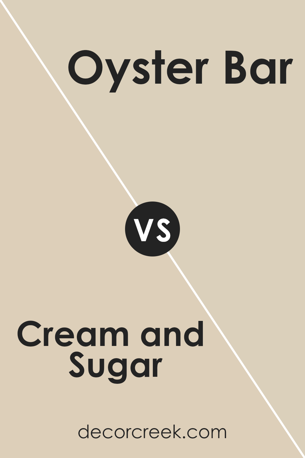
Cream and Sugar SW 9507 by Sherwin Williams vs Oyster Bar SW 7565 by Sherwin Williams
Cream and Sugar is a warm, inviting color that brings a sense of lightness and calm to any space. It is a soft hue, verging on the lighter end of the spectrum, that provides a perfect backdrop for a cozy, serene environment.
Its gentle nature makes it an excellent choice for creating a subtle yet impactful ambiance in rooms meant for relaxation and comfort.
On the other hand, Oyster Bar adopts a more subdued, muted tone. It is a nuanced blend that strikes a balance between gray and beige, often referred to as “greige.” This color exudes sophistication and versatility, making it an ideal candidate for spaces that aim for a neutral, but deeply layered aesthetic.
Its earthy quality allows it to stand as both a compelling neutral and a statement in its own right, adaptable to a variety of decorating motifs.
Together, Cream and Sugar and Oyster Bar present an elegant pairing; the former adds a touch of warmth and softness, while the latter grounds the space with its depth and complexity.
You can see recommended paint color below:
Cream and Sugar SW 9507 by Sherwin Williams vs Patience SW 7555 by Sherwin Williams
The main color, Cream and Sugar, presents a warm, inviting tone, reminiscent of the creamy blend found in your morning coffee. It exudes a soft, cozy vibe, creating a welcoming atmosphere in any living space.
This shade is versatile, effortlessly complementing a wide range of decor styles, from rustic farmhouse to modern minimalism. Its subtle richness allows it to act as either a harmonious background or a delicate standalone accent.
In contrast, Patience leans more towards a sophisticated, neutral palette. This hue embodies a serene and tranquil essence, echoing the quietude of a misty morning.
Its understated elegance is perfect for spaces aiming for a refined yet comforting ambience.
Patience serves as a timeless backdrop, supporting a diversity of interior themes, by enhancing natural light and adding depth to the room’s aesthetics.
While both colors share an inherent warmth, Cream and Sugar offers a more pronounced coziness, whereas Patience invites a serene, polished feel. Each brings its unique character to interiors, either by enveloping spaces in a soft embrace or by imparting a tranquil sophistication.
You can see recommended paint color below:
Cream and Sugar SW 9507 by Sherwin Williams vs Maison Blanche SW 7526 by Sherwin Williams
Cream and Sugar and Maison Blanche , both from Sherwin Williams, are two neutral hues that offer distinct undertones and atmospheres for a space. Cream and Sugar presents as a warm, inviting off-white with a hint of a creamy, beige undertone that creates a cozy and comforting ambiance.
This color is perfect for creating a soft, welcoming environment, making spaces feel light yet grounded. Its warmth makes it particularly suitable for living rooms or bedrooms, providing a soothing backdrop.
On the other hand, Maison Blanche is a sophisticated, taupe-like off-white. It leans towards a cooler palette compared to Cream and Sugar, featuring gray undertones that offer a subtle, elegant neutrality.
This color is incredibly versatile, easily fitting into contemporary or traditional designs, and provides a tranquil, serene setting. Maison Blanche works well in spaces that benefit from a clean, minimalistic look, like bathrooms or modern kitchens, offering a crisp but inviting feel.
While both colors are neutrals, Cream and Sugar adds warmth and softness, ideal for creating a cozy, inviting atmosphere. Maison Blanche, with its cooler, more refined gray undertones, is perfect for achieving a chic, serene environment.
You can see recommended paint color below:
Cream and Sugar SW 9507 by Sherwin Williams vs Chopsticks SW 7575 by Sherwin Williams
Cream and Sugar is a warm, inviting hue that offers a gentle embrace in any space it adorns. This color, rich in its subtlety, casts a soft, almost ethereal glow, making rooms feel cozy and welcoming. Its lightness brings a sense of openness and airiness, making it an ideal choice for creating a tranquil and serene ambiance.
It pairs beautifully with a wide range of decor, adding a touch of understated elegance.
Chopsticks , on the other hand, is a deeper, earthier tone that grounds spaces with its solid presence. This color speaks more of stability and strength, providing a robust backdrop that complements a variety of textures and shades.
Its versatility lies in its ability to stand strong as a primary color or serve as a complementary neutral, bringing warmth and depth to interiors. Chopsticks evoke a natural, comfortable feel, making any room feel more intimate and secure.
Together, these colors offer a harmonious balance, with Cream and Sugar brightening and softening, while Chopsticks adds depth and definition, creating a sophisticated palette that can elevate any design scheme.
You can see recommended paint color below:
Cream and Sugar SW 9507 by Sherwin Williams vs Stucco SW 7569 by Sherwin Williams
Cream and Sugar is a warm, inviting hue that exudes a soft, creamy elegance with its light, almost ethereal quality. It presents a subtle brightness, making it perfect for creating a cozy and soothing ambience in any space. This color embodies a gentle charm, offering a delicate backdrop that pairs well with a wide range of decor styles, from traditional to contemporary.
Its understated nature allows for versatile application, enhancing natural light in a room without overwhelming with color intensity.
In contrast, Stucco carries a deeper, richer tone, reminiscent of traditional earthen materials. This color provides a solid, grounding effect, imparting a sense of stability and warmth.
It echoes the organic textures found in natural landscapes, making it ideal for adding depth and character to a room.
Despite its more pronounced presence, Stucco maintains a neutral palette, facilitating easy integration with various color schemes and design elements. Its robustness complements the light airiness of Cream and Sugar, offering a beautiful balance between light and shadow, softness and strength.
You can see recommended paint color below:
Cream and Sugar SW 9507 by Sherwin Williams vs Softer Tan SW 6141 by Sherwin Williams
Cream and Sugar is a warm, inviting hue that hovers at the brink of off-white with a subtle beige undertone, offering a cozy, soft backdrop to any room. Its lightness reflects a considerable amount of natural light, making spaces appear larger and more open.
This paint color is particularly suited for creating a tranquil environment, ideal for living areas, bedrooms, or even a home office where serene backdrop is desired.
In contrast, Softer Tan is a notch deeper, leaning towards a classic tan that embodies a richer, earthier tone compared to Cream and Sugar. This color brings a sense of warmth and grounding without overwhelming a space.
It’s a versatile choice that blends well with a wide array of decor, from rustic to modern. Softer Tan works particularly well in areas where a more pronounced, yet still neutral, color is needed to bring depth and warmth.
While both colors share a warmth that’s welcoming, Cream and Sugar offers a lighter, almost ethereal quality, whereas Softer Tan anchors spaces with its earthy robustness.
Considering their nuances, the choice between them hinges on the desired effect – be it elevating a room with airy lightness or injecting a space with a touch of grounded warmth.
You can see recommended paint color below:
Cream and Sugar SW 9507 by Sherwin Williams vs Rice Grain SW 6155 by Sherwin Williams
Cream and Sugar and Rice Grain , both by Sherwin Williams, present subtle yet distinct differences that cater to varied aesthetic preferences. Cream and Sugar is a soft, warm hue that evokes a sense of calmness and serenity, perfect for creating a cozy and inviting space.
Its lightness brings an airy feel, making it ideal for small rooms or spaces seeking to amplify natural light. On the other hand, Rice Grain offers a slightly deeper, earthier tone.
This color, while still warm, leans towards a more neutral palette, grounding a room with its richer undertones.
It provides a sophisticated backdrop, suitable for spaces aiming for a touch of elegance without overpowering. Both colors work well in a variety of settings, from traditional to contemporary, and can complement wood finishes and natural materials.
Choosing between them depends on the desired mood and effect: Cream and Sugar for light and uplift, Rice Grain for depth and warmth.
You can see recommended paint color below:
- SW 6155 Rice Grain
Cream and Sugar SW 9507 by Sherwin Williams vs Canvas Tan SW 7531 by Sherwin Williams
Cream and Sugar and Canvas Tan , both by Sherwin Williams, offer distinct yet subtly nuanced color experiences that cater to a wide range of design preferences. Cream and Sugar, as its name suggests, presents a smooth, soothing off-white hue reminiscent of the gentle blend of cream into coffee.
Its lightness brings an airy quality to spaces, illuminating areas with its soft, warm undertones. On the other hand, Canvas Tan steps into the realm of neutrals with a slightly deeper, more pronounced earthiness.
This color carries a solid tan base that echoes the natural, unbleached texture of canvas material, providing a sturdy, neutral background that complements a variety of decor elements.
While Cream and Sugar lends itself to creating a serene, comforting atmosphere with its delicate charm, Canvas Tan offers a sense of groundedness, making spaces feel anchored yet expansive.
Both colors, though differing in depth and warmth, share the ability to enhance spaces with their versatile and inviting qualities.
You can see recommended paint color below:
Cream and Sugar SW 9507 by Sherwin Williams vs Irish Cream SW 7537 by Sherwin Williams
Cream and Sugar and Irish Cream , both by Sherwin Williams, present an interesting comparison in the realm of warm, inviting neutrals. Cream and Sugar is a softer, lighter color, evoking a sense of airy openness and delicate warmth.
Its subtle, almost ethereal quality makes it an excellent choice for creating a serene and cozy atmosphere, especially in spaces that benefit from a gentle, nurturing ambiance.
Irish Cream, on the other hand, brings a deeper, richer tone to the palette. Its warm, creamy base is tinged with a hint more saturation, offering a cozier and more enveloping feel.
This color suggests stability and comfort, making it ideal for areas in a home that are meant to be welcoming and snug.
Together, these two hues complement each other beautifully, with Cream and Sugar serving as a refreshing, light backdrop that could enhance the depth and warmth of Irish Cream accents. Whether used in conjunction or separately, both colors promise to add a touch of comforting elegance to any interior.
You can see recommended paint color below:
Cream and Sugar SW 9507 by Sherwin Williams vs Steamed Chai SW 9509 by Sherwin Williams
Cream and Sugar is a warm, inviting hue that evokes the softness of early morning light, with a comfortable, understated elegance. Its subtle, creamy tone makes it a perfect choice for creating a cozy and welcoming ambiance in any space.
This color carries a lightness that can brighten rooms while maintaining a soft, neutral palette, offering a versatile backdrop for a variety of decor styles.
Steamed Chai , on the other hand, introduces a deeper, richer warmth into the atmosphere. This color draws inspiration from the earthy tones of spiced tea, offering a comforting and grounding effect.
Steamed Chai presents a slightly more pronounced presence on walls, contributing to a snug and intimate feel.
Its depth adds character and coziness to spaces, making it ideal for creating accent walls or cozy nooks.
Both colors share a warm base, making them complementary choices for layered interior schemes. However, Cream and Sugar offers a lighter, airier feel, while Steamed Chai provides depth and warmth, making each suited for different applications depending on the desired ambiance.
You can see recommended paint color below:
Concluding, the color “Cream and Sugar” by a renowned paint brand offers an essence of warmth and sophistication, making it a versatile choice for various spaces. Its soft, neutral palette brings forth a sense of comfort and elegance, seamlessly blending with a range of interior decor styles.
From creating a cozy, inviting atmosphere in living areas to offering a serene backdrop in bedrooms, this hue is a testament to the timeless appeal of subtle, understated elegance.
Its adaptability in both contemporary and traditional settings underscores its popularity among homeowners and designers alike, solidifying its standing as a go-to choice for those looking to infuse their spaces with a touch of refined simplicity.
Moreover, the color’s natural affinity with light plays a pivotal role in enhancing the spatial qualities of a room, making it appear more spacious and airy. This characteristic is especially beneficial in smaller spaces, where the goal is to create an illusion of openness.
The paint’s high-quality finish ensures a lasting impact, resisting the wear and tear of daily life while maintaining its charming hue. As a testament to its broad appeal, it has been successfully incorporated in various design projects, ranging from residential to commercial, underlining its flexibility and wide-ranging applicability.
In essence, “Cream and Sugar” stands as a sophisticated, timeless color choice that promises to elevate any interior with its welcoming warmth and refined elegance.
Ever wished paint sampling was as easy as sticking a sticker? Guess what? Now it is! Discover Samplize's unique Peel & Stick samples.
Get paint samples