This particular color is a part of Sherwin Williams’ diverse range, known for its quality and depth of choice when it comes to paint. SW 9535 Nettle is a subtle, sophisticated green that echoes the serene hues found in a lush garden or a quiet, verdant forest.
It’s not just any green; it’s a nuanced shade that captures the essence of natural nettle plants, evoking a sense of calm and connection to the natural world.
This color is versatile, making it an excellent choice for various applications, from creating a tranquil retreat in a bedroom to providing a refreshing backdrop in a living room or kitchen. Its adaptability extends to complementing a wide range of decor styles, from modern and minimalistic to rustic and traditional.
Choosing Nettle for your space can also contribute to a room’s ambiance, influencing mood and emotions through its calming presence.
Beyond its aesthetic appeal, Sherwin Williams’ paint quality ensures durability and a lasting vibrancy of color, making SW 9535 Nettle a choice that combines both beauty and practicality for any interior project.

What Color Is Nettle SW 9535 by Sherwin Williams
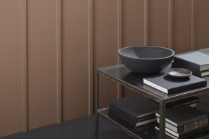
Nettle by Sherwin Williams is a sophisticated and versatile hue that exudes a sense of calm and tranquility. This color has a unique blend that sits harmoniously between green and gray, making it an excellent choice for those looking to introduce a subtle touch of nature into their interiors while maintaining a contemporary vibe.
Its muted tones are reflective of lush foliage during a misty morning, providing a serene backdrop that fosters relaxation and contemplation.
This adaptable shade can seamlessly integrate into a variety of interior styles. For a modern and minimalistic look, Nettle pairs beautifully with sleek materials like polished concrete, stainless steel, and glass, accentuating the clean lines and simplicity of the space.
In a more traditional setting, it works splendidly alongside rich woods, leather, and textured fabrics, enhancing the warmth and depth of the room.
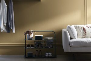
The color also lends itself well to the rustic charm of farmhouse aesthetics when combined with natural stone, distressed wood, and woven materials, adding to the cozy and inviting atmosphere.
Nettle’s understated elegance makes it an excellent choice for living spaces, bedrooms, and even home offices, creating a soothing environment that promotes relaxation and focus.
Its versatility in pairing with various materials and textures allows it to adapt to any design vision, making it a timeless choice for any interior.
Ever wished paint sampling was as easy as sticking a sticker? Guess what? Now it is! Discover Samplize's unique Peel & Stick samples.
Get paint samples

Is Nettle SW 9535 by Sherwin Williams Warm or Cool color?
Nettle by Sherwin Williams is a versatile paint color that brings a calm and soothing energy to any space in the home. Its unique hue, a blend of earthy green with subtle gray undertones, offers a perfect balance between warmth and coolness, making it adaptable to a variety of decorating styles and preferences.
This color has the power to transform a room into a serene retreat, reminiscent of the natural world, encouraging relaxation and reflection.
What makes Nettle especially appealing for home interiors is its ability to complement both natural and artificial light. During the day, it can enhance the brightness of a space without overwhelming it, reflecting the sunlight in a way that adds depth and dimension.
In the evening, under artificial lighting, it retains its warmth, creating a cozy and inviting atmosphere that’s ideal for gathering spaces like living rooms or dining areas.
Furthermore, Nettle serves as a fantastic backdrop for furniture and decor. It pairs beautifully with light woods and metallic finishes, bringing out their textures and colors.
Whether aiming for a minimalist look or a more eclectic vibe, this color supports a wide range of decorative possibilities, making it a superb choice for homeowners looking to inject personality into their spaces without committing to a bold or bright color. By introducing Nettle into a home, one can achieve a balanced and harmonious environment that’s both stylish and comfortable.
Undertones of Nettle SW 9535 by Sherwin Williams
Nettle, a sophisticated hue from the Sherwin-Williams collection, carries nuanced undertones that subtly influence its perception and application in interior spaces. The undertones of a color profoundly affect how it is seen and felt in different settings and lighting conditions. Specifically, the brown and dark green undertones of Nettle add depth and complexity to its base green, enriching the color’s versatility and warmth.
Brown undertones bring a sense of earthiness and grounding, enhancing the coziness of living areas and bedrooms. This warmth makes the color more approachable and adaptable, allowing it to complement wood furnishings and natural textures gracefully.
On the other hand, the dark green undertones imbue Nettle with vibrancy and life, echoing the natural world and promoting a sense of relaxation and rejuvenation. This balance between earthiness and vitality makes Nettle a captivating choice for interior walls, capable of creating environments that are both soothing and engaging.
When applied to interior walls, the intricate blend of undertones in Nettle reacts dynamically with both artificial and natural light, shifting subtly throughout the day. In sunlit rooms, the green vibrancy gently pushes to the forefront, promoting airy and lively atmospheres.
In contrast, under softer, artificial lighting, the brown undertones can emerge more prominently, lending spaces a snug, enveloping feel. This chameleon-like quality ensures that spaces painted with Nettle remain dynamic and mood-enhancing, adapting to various uses and times of day, thereby crafting living spaces that are truly multifaceted.
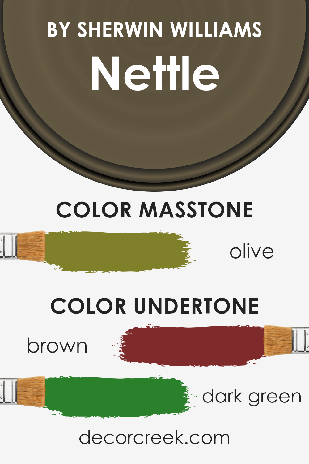
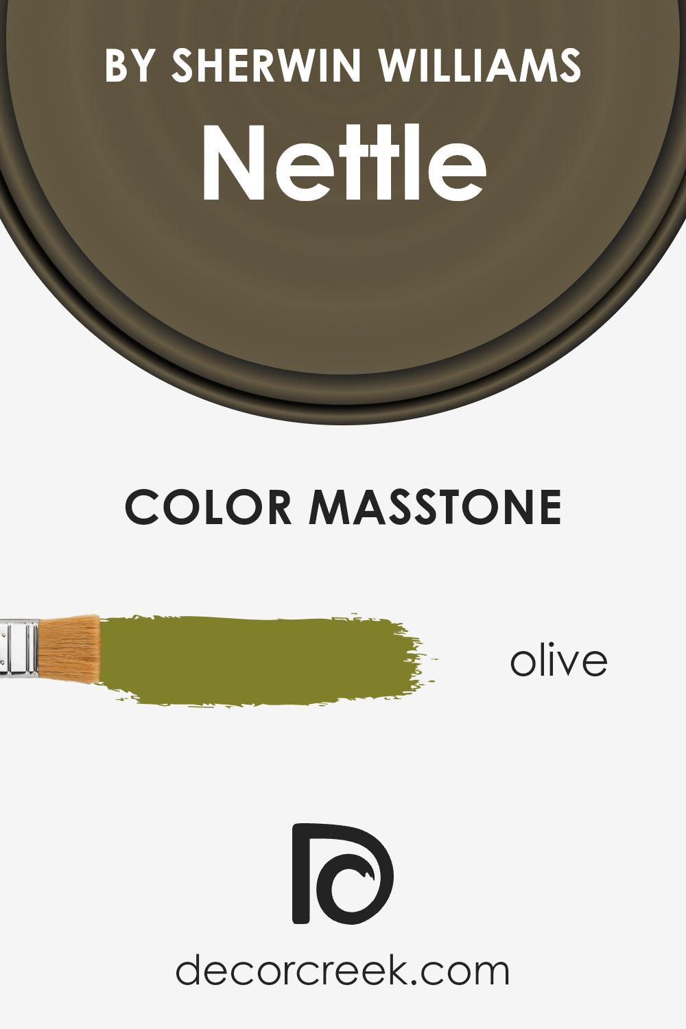
What is the Masstone of the Nettle SW 9535 by Sherwin Williams?
NettleSW 9535 by Sherwin Williams boasts a masstone of Olive (#80802B), a shade reminiscent of natural greenery and earthen landscapes, which brings a calm, grounding presence into a home. This particular hue taps into the inherent serenity and versatility of olive, making it an excellent choice for creating a cozy, warm, and inviting atmosphere in various spaces.
The natural aspect of this color means it’s fantastic for connecting indoor spaces with the outdoors, making it particularly effective in rooms with ample natural light or in homes that aim to achieve a seamless blend with nature.
The Olive masstone of NettleSW 9535 offers a unique blend of sophistication and organic beauty. It pairs well with both rustic and modern decor, acting as a versatile backdrop that can highlight natural wood elements, metallic finishes, or bold textile patterns.
In living rooms, it fosters a sense of comfort and relaxation, whereas in bedrooms, it encourages rest and rejuvenation. Its earthy quality also promotes concentration and calm in home offices or study areas, making it a multifunctional choice suitable for a wide array of interior design styles.
How Does Lighting Affect Nettle SW 9535 by Sherwin Williams
Lighting plays a crucial role in the perception of colors. The color and intensity of light can significantly affect how we see and experience color in our environment. Every color reacts differently under various lighting conditions due to the light’s temperature, ranging from cool to warm, and its intensity.
Understanding this interaction is essential in fields such as interior design, painting, and photography, where accurate color representation is paramount.
Taking a specific color, such as a green hue from Sherwin Williams, as an example, we can explore how it responds to different lighting conditions. Under artificial light, the quality and type of bulb—whether LED, fluorescent, or incandescent—can alter its appearance.
LED lights, which often have a cooler temperature, can make the color appear sharper and more vivid, enhancing its green tones. In contrast, incandescent lighting, known for its warm glow, can soften the color, giving it a cozier and slightly yellower appearance.
Natural light brings its dynamics into play, changing throughout the day and depending on the weather conditions. Morning light is generally cooler, which might highlight the lively aspects of the green, making it appear more vibrant. As the day progresses towards noon, the sunlight becomes more neutral, allowing the color to show its true character.
Towards the evening, the setting sun introduces a warmer tone that can enrich the green, adding depth and warmth.
The direction a room faces significantly influences how this color is perceived due to the varying qualities of natural light throughout the day. In north-faced rooms, the light is typically cooler and more consistent, which means the color may maintain a more consistent and true appearance throughout the day.
South-faced rooms, blessed with abundant, warmer light, can make the green appear more lively and dynamic, enhancing its warmer undertones.
East-faced rooms enjoy the morning sunlight, which can make the green appear fresh and vibrant in the mornings, transitioning to a softer tone as natural light diminishes in the afternoon. Conversely, west-faced rooms receive the intense evening sun, which can illuminate the color with a warm, golden glow by the end of the day, possibly highlighting its warmer tones and making the space feel cozy and inviting.
In summary, the perception of colors like the green hue from Sherwin Williams is deeply impacted by lighting conditions. The interplay between the color and the light source, whether artificial or natural, and the direction of the room, can alter its appearance and the ambiance it creates within a space.

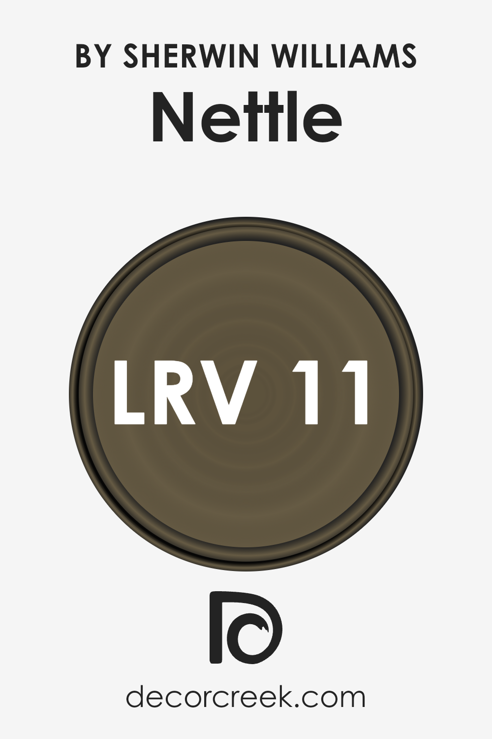
What is the LRV of Nettle SW 9535 by Sherwin Williams
Light Reflectance Value (LRV) is a critical measure used to understand how light or dark a color appears when applied to walls or other surfaces. It is a scale that ranges from 0 to 100, with 0 being perfectly black (absorbing all light) and 100 being perfectly white (reflecting all light).
This measure helps in selecting paint colors by predicting how they will look under different lighting conditions.
Essentially, the higher the LRV, the more light the color reflects, making a room feel brighter and more spacious. Conversely, lower LRVs mean the color absorbs more light, which can create a cozy or more intimate space but may also make a small room feel even smaller.
In the case of the paint color Nettle with an LRV of 10.643, it falls on the lower end of the LRV scale, indicating that it is a darker hue. This means it will absorb a significant amount of light rather than reflecting it.
In practical terms, when used on walls, it can bring depth and intimacy to a space, lending it a rich, enveloping feel.
However, due to its low LRV, care should be taken in smaller or poorly lit rooms where the use of this color could make the space feel cramped or overly dark. To counterbalance this effect, strategic lighting and the use of lighter-colored furnishings or accents can help mitigate the potential for the color to overly dominate a room.
LRV – what does it mean? Read This Before Finding Your Perfect Paint Color
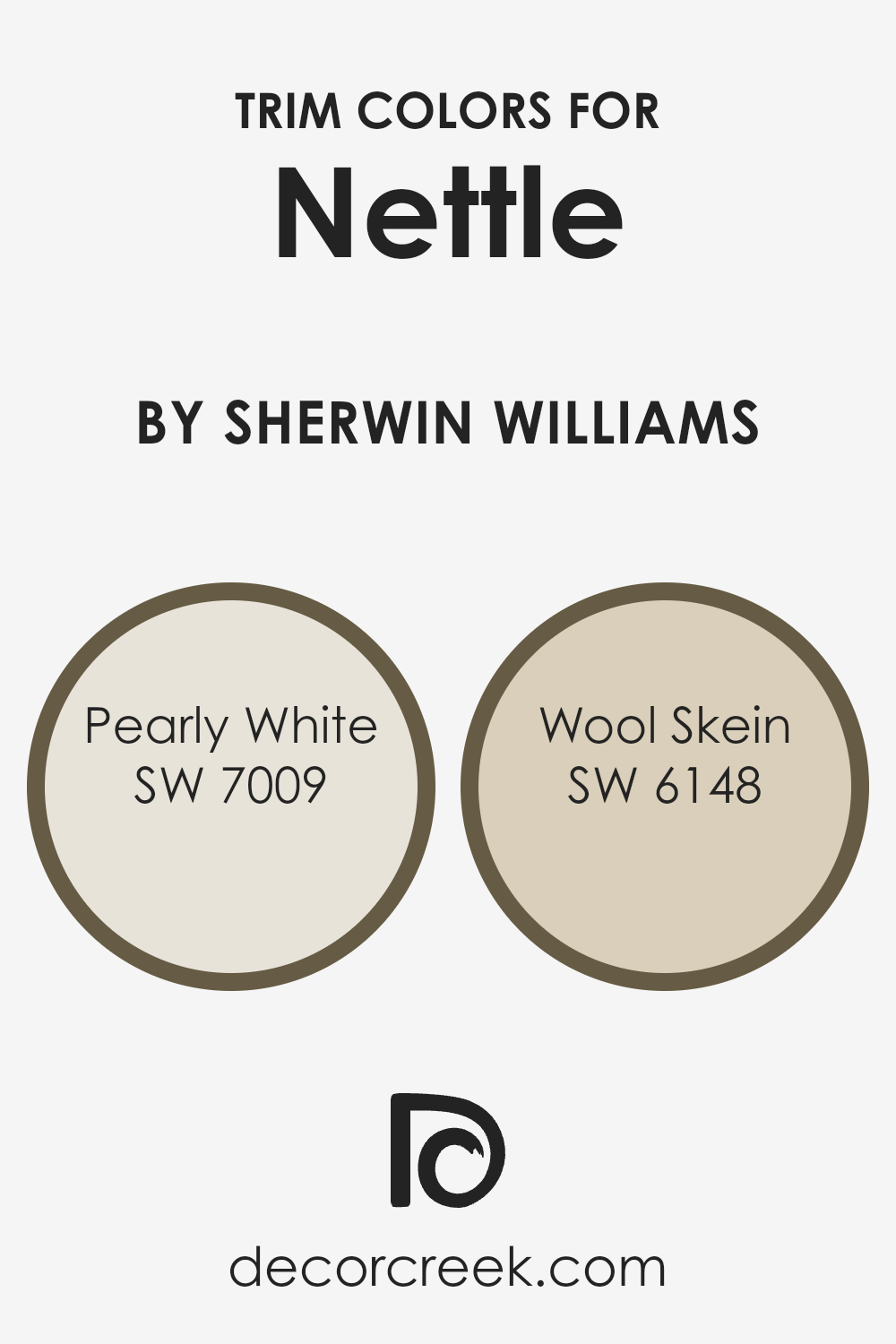
What are the Trim colors of Nettle SW 9535 by Sherwin Williams
Trim colors, particularly in the context of interior design or painting, play a crucial role in defining and accentuating the architectural features of a space. When considering a color like Nettle SW 9535 by Sherwin Williams, which carries a natural and refreshing vibe, choosing the right trim colors becomes an essential step in achieving a cohesive and aesthetically pleasing look.
Trim colors are applied to elements such as door frames, baseboards, moldings, and window frames, helping to frame the wall color, add depth, and enhance the overall character of a room. A carefully selected trim color can also influence the perception of the room’s size and shape by creating contrasts that define and articulate space.
Choosing a trim color like Pearly White SW 7009, a soft and inviting shade, offers a subtle contrast to the vibrant tones of Nettle, thus providing a smooth transition between the wall and the trim. This color echoes the lighter tones in Nettle, promoting a harmonious blend that enriches the room’s ambiance with a gentle and refined touch.
On the other hand, Wool Skein SW 6148, with its warm and earthy undertones, bridges the gap between the natural essence of Nettle and the desire for a cozy, grounded atmosphere. It suggests an understated elegance that complements the room’s aesthetic, ensuring that the transitions across different surfaces contribute to a well-rounded and inviting space.
Together, these trim colors amplify the beauty of Nettle SW 9535, underlining the importance of choosing the right hues to achieve the desired impact in any interior space.
You can see recommended paint colors below:
- SW 7009 Pearly White
- SW 6148 Wool Skein
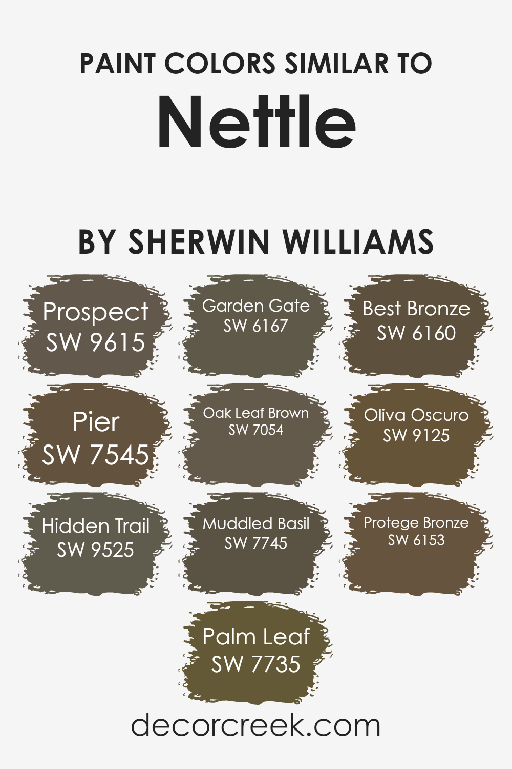
Colors Similar to Nettle SW 9535 by Sherwin Williams
In the world of interior design and home decoration, the choice of color palette can dramatically affect the mood and aesthetics of a space. Similar colors to Nettle by Sherwin Williams, such as those within its color family, play a crucial role in creating a unified and harmonious look.
These hues, while distinct, share underlying tones that allow them to complement each other beautifully, providing depth and layers to the design without overwhelming the senses.
By incorporating shades like Prospect, Pier, Hidden Trail, Palm Leaf, and Garden Gate, designers and homeowners can craft spaces that feel cohesive and thoughtfully curated. These colors work together by subtly varying in saturation and lightness, allowing for a fluid transition between areas in a home or across a single room, enhancing the visual flow and making the environment more inviting and comfortable.
The importance of selecting similar colors also lies in their ability to evoke specific atmospheres. For instance, colors like Oak Leaf Brown, Muddled Basil, Best Bronze, Oliva Oscuro, and Protege Bronze, while similar, each bring their own unique essence to a space.
Oak Leaf Brown adds warmth emulating the coziness of autumn, whereas Muddled Basil introduces a soft, earthy quality reminiscent of a serene garden. Best Bronze and Oliva Oscuro offer deeper, richer tones that anchor a room, providing sophistication and elegance.
Protege Bronze, with its lighter touch, bridges the gap between the darker shades and the rest of the palette, ensuring a balanced visual experience.
Together, these similar hues enable a designer to fine-tune the ambiance of a space, tailoring it to the desired mood and functionality, all the while maintaining a seamless aesthetic continuity.
You can see recommended paint colors below:
- SW 9615 Prospect
- SW 7545 Pier
- SW 9525 Hidden Trail
- SW 9525 Palm Leaf
- SW 6167 Garden Gate
- SW 7054 Oak Leaf Brown
- SW 7745 Muddled Basil
- SW 6160 Best Bronze
- SW 9125 Oliva Oscuro
- SW 6153 Protege Bronze
How to Use Nettle SW 9535 by Sherwin Williams In Your Home?
Nettle, a unique and versatile paint color from Sherwin Williams, possesses the ability to breathe life into any space within a home. This subtle yet captivating hue can be described as a gentle vestige of green, intermingling with soft, earthy undertones, creating a sense of calm and tranquility. Its muted elegance makes it an excellent choice for those seeking a touch of nature’s serenity without overwhelming a room with vibrant colors.
Incorporating Nettle into your home offers a myriad of possibilities, from creating a serene and inviting living room atmosphere to crafting a peaceful bedroom retreat where relaxation takes precedence. Its adaptability allows it to pair beautifully with natural materials such as wood, stone, and linen, enhancing the overall warmth and comfort of your home.
Furthermore, Nettle serves as an excellent backdrop for art and decorative elements, allowing them to stand out without competing with the wall color.
Given its soothing qualities, Nettle is particularly well-suited for areas of the home dedicated to rest and relaxation. Whether applied as a main color scheme or used for accent walls, trim, or cabinetry, it adds a subtle layer of sophistication and depth, making your home a more inviting and harmonious space.
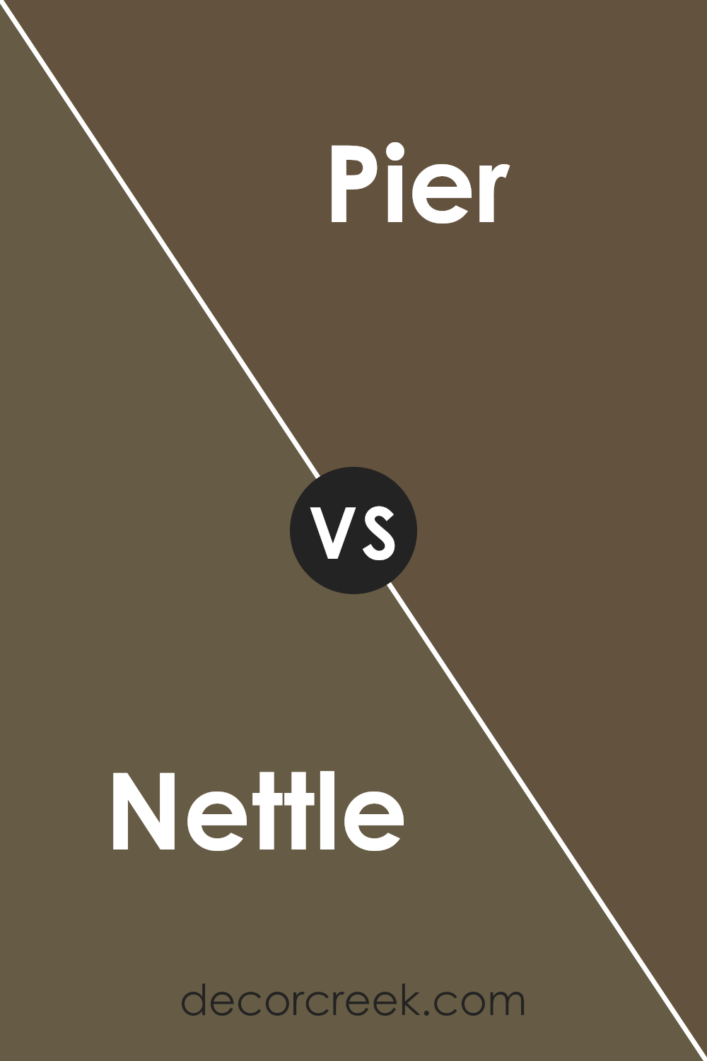
Nettle SW 9535 by Sherwin Williams vs Pier SW 7545 by Sherwin Williams
Nettle and Pier , both by Sherwin Williams, present a study in nuanced contrast within the realm of interior and exterior paint choices. Nettle, with its serene and earthy tones, evokes a sense of calm and grounding, akin to the natural foliage it’s named after.
This color tends to bring warmth and a comfortable, inviting atmosphere to spaces, making it ideal for living areas or bedrooms where relaxation is key. Its greenish undertones can subtly influence a room, marrying well with both natural light and wooden furnishings.
On the other hand, Pier offers a different vibe. This color leans towards the neutral spectrum, with a sandy warmth that suggests openness and light. It’s versatile, making it a perfect candidate for creating an airy and bright feel in any space. Pier’s understated elegance allows it to serve as a beautiful backdrop to bolder accents or stand alone for a minimalistic look.
Though both colors rely on their inherent warmth to create inviting spaces, Nettle brings a depth through its subtle green, while Pier focuses on neutrality and flexibility, making it a go-to for those seeking a modern, clean palette.
You can see recommended paint color below:
- SW 7545 Pier
Nettle SW 9535 by Sherwin Williams vs Prospect SW 9615 by Sherwin Williams
Nettle and Prospect , both from Sherwin Williams, present a captivating palette for interior design. Nettle introduces a muted, earthy green that evokes the essence of tranquil forests and fresh foliage. It’s a color that brings the calming nuances of nature indoors, creating serene and restful environments. This hue especially favors spaces aiming for a grounded, organic aesthetic.
In contrast, Prospect ventures into the cooler spectrum with its subtle bluish-gray. It mirrors early morning skies and the calm of twilight hours, offering a versatile backdrop that complements both contemporary and traditional decor. Prospect serves as a sophisticated neutral, capable of enhancing spaciousness while providing a soothing ambiance.
When comparing these two, the key difference lies in their underlying tones and the atmospheres they create. Nettle, with its green base, leans towards warmth and organic vibrancy, ideal for spaces meant to rejuvenate and energize. Prospect, on the other hand, offers a tranquil retreat, echoing the serenity of secluded landscapes.
Together, they could curate a harmonious balance, suggesting a dialogue between the comfort of the familiar and the tranquility of the unknown.
You can see recommended paint color below:
- SW 9615 Prospect

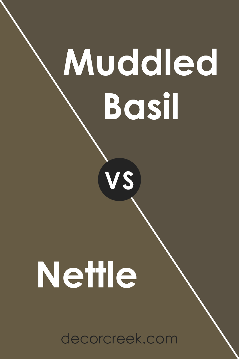
Nettle SW 9535 by Sherwin Williams vs Muddled Basil SW 7745 by Sherwin Williams
Nettle SW 9535 and Muddled Basil SW 7745 , both from Sherwin Williams, present a fascinating study in nature-inspired hues, though each with its unique charm and application potential. Nettle, on one hand, brings a soft, serene, and slightly muted green that recalls the understated elegance of a well-tended garden at dawn.
Its lightness and subtleness make it a versatile choice, capable of adding a fresh, airy feel to spaces without overwhelming them with color.
In contrast, Muddled Basil leans into the depth and richness of green, embodying the dense foliage of a forest underbrush or the aromatic vibrancy of freshly crushed herbs. This color offers a bolder statement, more suited to creating focal points or adding a dramatic touch to an interior.
It has the power to envelop a room in warmth and depth, making it ideal for spaces designed for comfort and contemplation.
Together, these colors illustrate the spectrum of natural greens available from Sherwin Williams, offering designers and homeowners alike the opportunity to tailor their space with either a hint of nature’s calm or its more profound, invigorating aspects.
You can see recommended paint color below:
- SW 7745 Muddled Basil
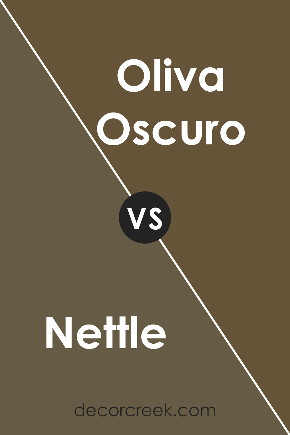
Nettle SW 9535 by Sherwin Williams vs Oliva Oscuro SW 9125 by Sherwin Williams
Nettle and Oliva Oscuro , both from Sherwin Williams, present a captivating study in the nuanced world of green hues. Nettle embodies a soft, airy green that seems to whisper of early spring foliage and fresh beginnings. Its lightness carries a subtle vitality, making it an excellent choice for spaces seeking a touch of serenity without sacrificing liveliness.
In contrast, Oliva Oscuro delves deeper into the green spectrum, conjuring images of dense, shadowed foliage and the richness of mature olive groves at dusk. This darker, more intense color provides depth and sophistication, offering a strong statement in design that anchors spaces with its robust character.
While Nettle flirts with the brighter, more rejuvenating aspects of green, Oliva Oscuro embraces the color’s deeper, more complex persona. Together, these shades illustrate the versatility of green: from the hopeful lightness of Nettle to the profound, earthy tones of Oliva Oscuro.
Each offers unique possibilities for creating ambiance and mood in a space, whether aiming for a refreshingly light atmosphere or a setting of mature elegance.
You can see recommended paint color below:
- SW 9125 Oliva Oscuro
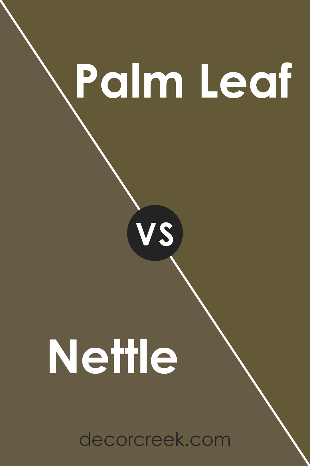
Nettle SW 9535 by Sherwin Williams vs Palm Leaf SW 7735 by Sherwin Williams
Nettle SW 9535 and Palm Leaf SW 7735 , both by Sherwin Williams, present a fascinating duo within the green palette, each encapsulating a distinct mood and application. Nettle, with its muted, subtle hue, leans towards a soft, sage-like green.
It’s a color that whispers tranquility and is versatile enough to blend seamlessly into spaces that aim for a calm and soothing atmosphere. This subdued nature makes Nettle an excellent choice for creating a restful environment, be it in bedrooms or living areas where a gentle touch of nature is desired.
Palm Leaf, on the other hand, exhibits a bolder, more vibrant character. Its richer green tone is reminiscent of lush foliage under bright sunlight, offering a lively and invigorating energy.
This color thrives in spaces where a statement is desired, bringing in vibrancy and a dose of freshness reminiscent of the outdoors. It pairs well with both bright and neutral shades, allowing for dynamic and flexible design schemes.
Together, Nettle and Palm Leaf showcase the versatility of green hues, from the serene to the vivacious, proving their worth in a broad spectrum of design applications.
You can see recommended paint color below:
- SW 7735 Palm Leaf
Nettle SW 9535 by Sherwin Williams vs Protege Bronze SW 6153 by Sherwin Williams
Nettle and Protégé Bronze , while both originating from the diverse palette of Sherwin Williams, present a captivating study in contrasting hues and atmospheres. Nettle, with its subtle, soft green undertones, evokes a sense of freshness, renewal, and natural tranquility.
It mirrors the quietude of a lush forest, bringing a serene, calming influence into any space. Its lightness and gentle vibrancy make it an excellent choice for creating a bright, airy environment, where the mind can relax and rejuvenate.
On the other hand, Protégé Bronze ushers in warmth with its rich, deep bronze tone. This color encapsulates the essence of vintage elegance and rustic charm. It’s reminiscent of the earth’s natural terracotta — warm, welcoming, and grounding.
Protégé Bronze provides a cozy, enveloping ambiance, making it ideal for spaces where comfort and warmth are paramount. It pairs well with a variety of textures and materials, enhancing the sense of depth and sophistication in a room.
Together, Nettle and Protégé Bronze embody the beauty of nature’s contrasts — the cool, refreshing shades of greenery against the warm, comforting embrace of the earth. Each brings its unique character to the palette, offering versatile options for diverse aesthetic ambitions and moods.
You can see recommended paint color below:
- SW 6153 Protege Bronze
Nettle SW 9535 by Sherwin Williams vs Oak Leaf Brown SW 7054 by Sherwin Williams
Nettle and Oak Leaf Brown , both Sherwin Williams paints, offer distinct tones that cater to different aesthetic appeals. Nettle, a muted sage green, exudes an earthy tranquility. This versatile shade brings a sense of calm and connection to nature, making spaces feel fresh and open. Its subdued quality allows for easy pairing with both vibrant and neutral palettes, enhancing the room’s natural light.
On the other hand, Oak Leaf Brown embodies a warmer, deeper hue. This rich, medium brown bears a comforting essence, reminiscent of the natural wood tones found in oak leaves during autumn. Its depth adds a cozy, enveloping feel, creating inviting and grounded spaces.
This color is ideal for areas where warmth and solidity are desired, complementing spaces with natural materials and textures.
While both colors draw inspiration from nature, Nettle’s light, airy vibe contrasts with Oak Leaf Brown’s denser, warmer presence. The choice between them depends on the desired ambiance: Nettle for a refreshing, serene environment, and Oak Leaf Brown for a snug, secure atmosphere.
You can see recommended paint color below:
- SW 7054 Oak Leaf Brown
Nettle SW 9535 by Sherwin Williams vs Best Bronze SW 6160 by Sherwin Williams
Nettle and Best Bronze , two distinct hues offered by Sherwin Williams, evoke unique atmospheres and aesthetics. Nettle is a serene and subtle color, with a green-gray undertone that brings a calming, natural essence into spaces.
This color resembles the soft, muted tones of a shaded garden, offering a refreshing and restorative ambiance. It’s perfect for creating a tranquil retreat in any room, blending seamlessly with both modern and traditional decor.
In contrast, Best Bronze exudes warmth, sophistication, and a touch of opulence. It’s a rich, deep hue that captures the essence of aged metal, adding depth and character to any space.
Ideal for accent walls, exteriors, or decorative details, Best Bronze brings a luxurious and inviting feel. Its warm undertones make it versatile for companion decor elements, creating a cohesive look that’s both welcoming and grounded.
Together, Nettle and Best Bronze can complement each other beautifully, with Nettle providing a cool, refreshing backdrop to the warm, engaging presence of Best Bronze. Their combination can create a balanced and harmonious space, highlighting each color’s unique charm.
You can see recommended paint color below:
- SW 6160 Best Bronze

Nettle SW 9535 by Sherwin Williams vs Hidden Trail SW 9525 by Sherwin Williams
Nettle and Hidden Trail , both from Sherwin-Williams, offer distinct palettes that cater to varying aesthetic preferences. Nettle presents as a soft, serene green with subtle undertones that suggest a connection to the natural world, embodying the freshness of spring foliage.
It’s a color that radiates tranquility and renewal, making it ideal for spaces meant to evoke calmness and rejuvenation.
On the other hand, Hidden Trail provides a deeper, earthier hue that leans towards a muted brown with hints of green, closely resembling the forest floor or a well-trodden path in the wilderness. This color exudes warmth and comfort, promoting a cozy and inviting atmosphere.
It’s perfect for creating a snug, intimate environment, offering a strong foundation for decor that aims for a more grounded, organic feel.
While Nettle brings a light, airy quality to interiors, highlighting spaciousness and light, Hidden Trail offers depth and solidity, anchoring spaces with its robust character. Choosing between them depends on the desired mood and theme of the room – Nettle for brightness and openness, Hidden Trail for warmth and intimacy.
You can see recommended paint color below:
- SW 9525 Hidden Trail
Nettle SW 9535 by Sherwin Williams vs Garden Gate SW 6167 by Sherwin Williams
Nettle and Garden Gate are two distinct colors offered by Sherwin Williams that cater to a variety of aesthetic preferences. Nettle is a gentle, soft green hue that exudes an aura of tranquility and natural charm. It’s a color that brings to mind the lush foliage of early spring, providing a rejuvenating and calming presence in any space.
Its lightness and subtle vibrancy make it versatile, suitable for creating a serene backdrop or a refreshing accent in both modern and traditional settings.
In contrast, Garden Gate stands on the deeper end of the spectrum. It’s a rich, dark gray-green, reminiscent of the shaded areas in a dense, old garden. This color offers a more sophisticated and grounding effect, perfect for those aiming to imbue their spaces with a sense of stability and elegance.
It serves well in creating dramatic accents or cozy, enveloping environments, making it ideal for studies, bedrooms, or living areas looking for a touch of refinement.
Though both colors draw inspiration from nature, Nettle appeals to those seeking lightness and uplift, while Garden Gate caters to a preference for depth and sophistication. Their versatility in design reflects Sherwin Williams’ dedication to offering hues that complement a wide range of individual tastes and styles.
You can see recommended paint color below:
- SW 6167 Garden Gate
Conclusion
The article encapsulates the appeal of Nettle SW 9535 by Sherwin Williams, placing a strong emphasis on its versatile nature and the transformative power it holds within interior spaces. Characterized by its serene and organic tone, Nettle stands out as an ideal choice for those seeking to create a calming sanctuary within their homes.
Its subtle green hue, reminiscent of natural foliage, has the unique ability to harmonize with various decor styles, ranging from minimalist to rustic, thereby offering a refreshing backdrop that promotes tranquility and comfort.
The analysis further delves into the psychological benefits associated with this color, highlighting how its use can positively impact one’s mood and overall sense of wellbeing.
Moreover, the article thoroughly examines the practical advantages of incorporating Nettle into different rooms, showcasing its prowess in enhancing spatial aesthetics without overwhelming the senses. Whether applied as a primary color scheme or as an accent to complement other shades, Nettle proves to be remarkably adaptable, bringing a sense of freshness and vitality wherever it is used.
Design experts cited within the piece advocate for its application not just for its aesthetic appeal but also for its capability to connect indoor environments with the outside world, blurring the lines between nature and the built environment.
This comprehensive overview of Nettle by Sherwin Williams underlines its growing popularity among homeowners and designers alike, predicting its continued relevance in contemporary home design trends.
Ever wished paint sampling was as easy as sticking a sticker? Guess what? Now it is! Discover Samplize's unique Peel & Stick samples.
Get paint samples