In the vast spectrum of colors that we use to paint our homes, Carob AF-160 stands out as a unique shade that combines depth, warmth, and versatility. This color is part of the Benjamin Moore Affinity Collection, a curated selection designed to evoke a sense of harmony and balance in any space it graces.
Carob AF-160’s richness makes it a favorite among interior designers and homeowners alike. In this comprehensive guide, we’ll explore the intricacies of this color, its undertones, coordinating colors, and how lighting and LRV values affect its appearance on walls.
We’ll also discuss the importance of trim colors and provide insights into colors that pair well with Carob AF-160, as well as similar shades within the Benjamin Moore palette.
What Color Is Carob AF-160?
Carob AF-160 is a color that captures the eye with a deep, sophisticated richness reminiscent of the edible carob pods after which it is named. It is a brown hue that carries an organic feel, combining earthiness with a certain robustness that can anchor a room or serve as a striking accent.
With its grounding quality, Carob AF-160 is versatile, making it an ideal choice for various interior styles—particularly those that draw inspiration from nature, such as rustic, bohemian, and even modern farmhouse decors.
The color thrives in spaces that aim to create a cozy, inviting atmosphere. In terms of materials, Carob AF-160 pairs exceptionally well with natural textures like wood, stone, and leather, enhancing their inherent qualities. Linen and cotton fabrics also work well with this shade, offering a tactile contrast to its smoothness.
Metals, particularly brass and copper, can introduce a reflective contrast that highlights Carob AF-160’s depth even further. When considering Carob AF-160 for your interior, think of it as a backdrop that allows other elements to shine while also holding its own as a dominant color force.
Ever wished paint sampling was as easy as sticking a sticker? Guess what? Now it is! Discover Samplize's unique Peel & Stick samples.
Get paint samples

Is It a Warm Or Cool Color?
Carob AF-160 falls definitively into the category of warm colors. Its base, rich with earthy brown tones, exudes a warmth that can make expansive rooms feel more intimate and welcoming. Warm colors are known to stimulate conversation and can create a cozy ambiance, which makes Carob AF-160 a suitable choice for living rooms and dining areas where people gather.
In homes, the warmth of Carob AF-160 adds a sense of comfort and can be particularly appealing in spaces that crave a sense of enclosure and privacy. It radiates an enveloping warmth that works well in bedrooms or studies, promoting a calming and focused environment.
This inherent warmth allows Carob AF-160 to harmonize with a variety of decor elements, ensuring that spaces feel put-together and thoughtfully designed.
Undertones of Carob AF-160
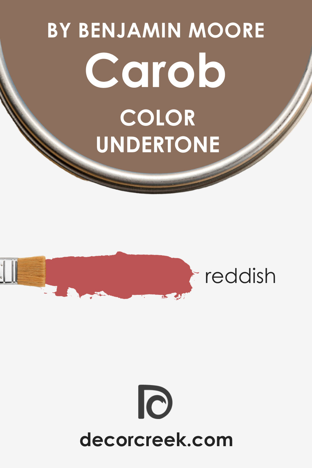
The undertones of a color are subtle hues that emerge under different lighting conditions and when juxtaposed with other colors. Carob AF-160 harbors a complex array of undertones, primarily rich and reddish, which can surface more prominently in certain lights, adding depth and complexity to the color. These undertones can make a color appear more dynamic and engaging, influencing how we perceive and feel about the space.
In interior walls, Carob AF-160’s undertones play a crucial role. When the light hits the walls, these hidden hues can become more pronounced, sometimes giving the walls a glowing, almost burnished quality. This is especially true during the golden hours of sunrise and sunset, when the natural reddish tones within Carob AF-160 can be coaxed out, adding an almost velvety texture to the walls.
The understanding of these undertones is key to choosing complementary colors and ensuring that the color behaves as expected in your desired space.
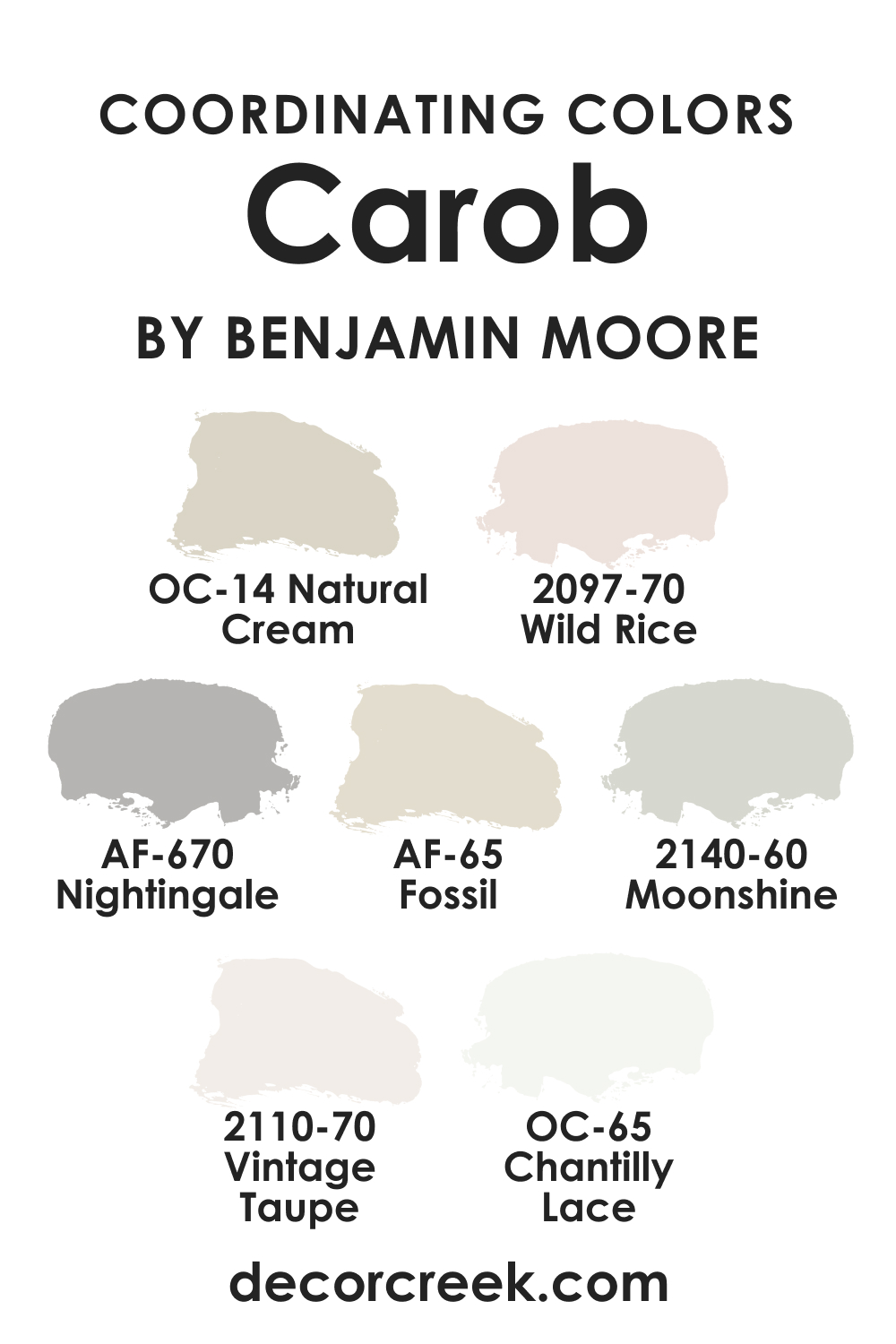
Coordinating Colors of Carob AF-160
Coordinating colors are hues that work in harmony with a primary color to create a cohesive look. These colors can either contrast or complement, balancing the color palette of a room. For Carob AF-160, a palette that includes BM 2097-70 Wild Rice, BM 2110-70 Vintage Taupe, AF-65 Fossil, and AF-670 Nightingale is ideal for creating a sophisticated and balanced look.
- BM 2097-70 Wild Rice : A gentle off-white with a touch of beige, adding a soft contrast to Carob AF-160.
- BM 2110-70 Vintage Taupe : A pale, neutral taupe that provides a subtle layer of complexity.
- AF-65 Fossil : A warm, light gray that can brighten spaces without overwhelming the primary color.
- AF-670 Nightingale : A muted, grayish-blue offering depth and a serene contrast to the warmth of Carob AF-160.
Additional coordinating colors include:
- OC-65 Chantilly Lace : A crisp, clean white that brings out the rich depth of Carob AF-160.
- OC-14 Natural Cream : A soft, creamy hue that harmonizes with Carob AF-160’s earthy nature.
- BM 2140-60 Moonshine : A faint, cool gray that offers a contemporary counterpoint to Carob AF-160’s warmth.
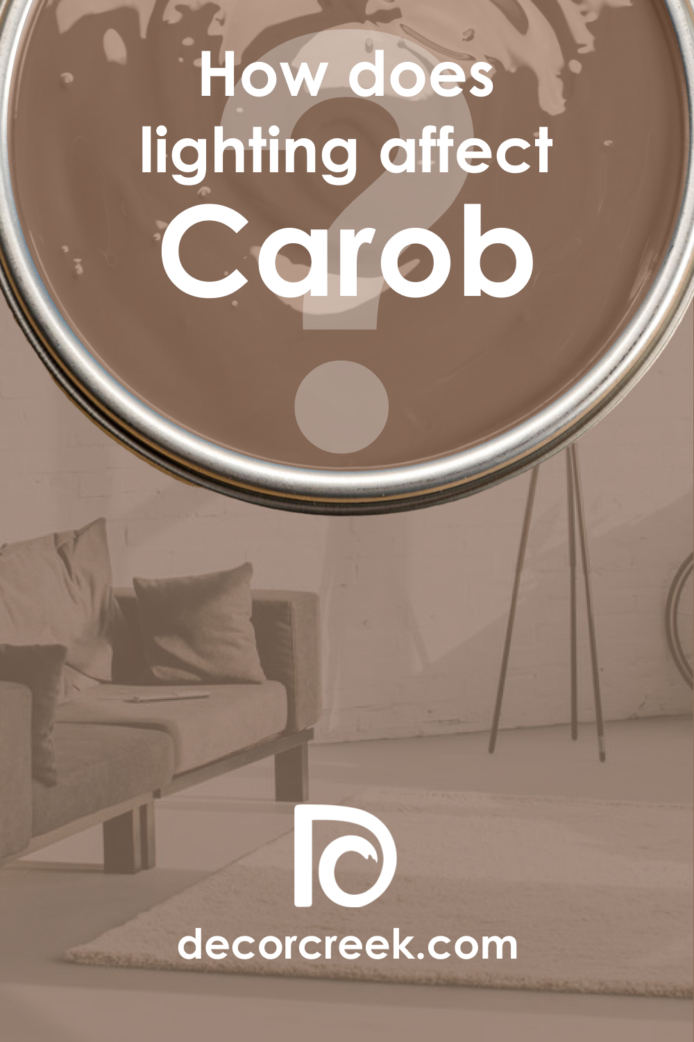
How Does Lighting Affect Carob AF-160?
Lighting can significantly affect how we perceive the color of our walls, as it can alter the appearance of colors throughout the day. Carob AF-160, with its low light reflectance value (LRV), is particularly susceptible to these changes. In artificial light, Carob AF-160 may appear warmer and more encompassing, creating an intimate and cozy atmosphere. Conversely, in natural light, especially in a room with ample sunlight, the color can exhibit a softer warmth and reveal more of its undertones.
In north-facing rooms, which tend to have cooler, indirect light, Carob AF-160 may appear slightly more muted, emphasizing its earthy quality. In south-facing rooms, the ample sunlight can bring out the warmth and richness of the color, making it feel more alive and dynamic.
East-facing rooms receive warm morning light, which can make Carob AF-160 glow warmly in the morning, while in west-facing rooms, the color can feel rich and deep in the afternoon as the light intensifies. Each orientation brings out a different facet of Carob AF-160, showcasing its complex nature and how it interacts with the light sources available.
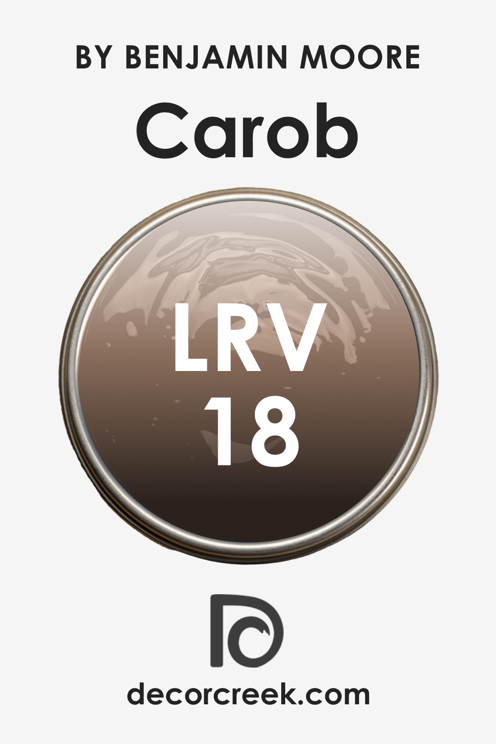
LRV of Carob AF-160
Light Reflectance Value (LRV) is a measure of the amount of light a color reflects, expressed on a scale from 0 (absolute black, absorbing all light) to 100 (pure white, reflecting all light). With an LRV of 18, Carob AF-160 is on the lower end of the scale, which means it does not reflect much light, attributing to its depth and intensity. This lower reflectance can make spaces appear smaller or more enclosed, which can be used to great effect in creating an intimate setting.
The LRV value of Carob AF-160 suggests that it is best used in spaces where a sense of coziness is desired, or where the room is sufficiently large to handle the absorbing qualities of the color. In smaller spaces, Carob AF-160 may be better as an accent, as its low LRV can make the area feel cramped if used extensively.
The choice of lighting becomes crucial with such a low LRV color, as strategic illumination can enhance the space without losing the richness of the hue.
LRV – what does it mean? Read This Before Finding Your Perfect Paint Color
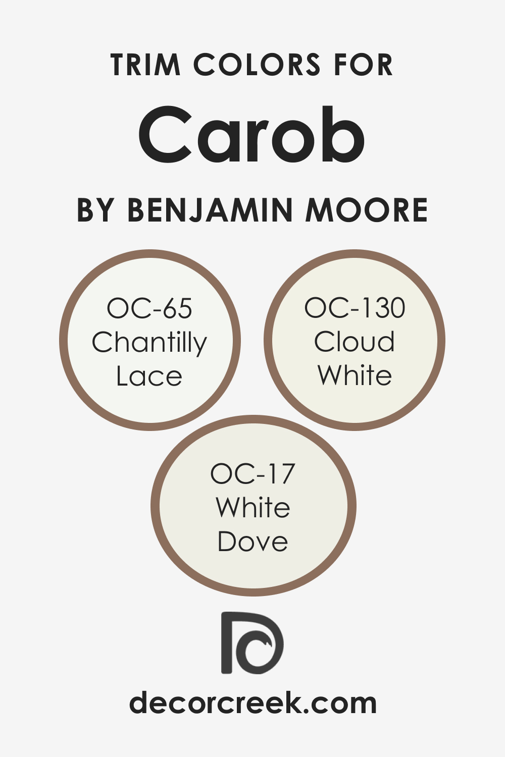
Trim Colors of Carob AF-160
Trim colors are the accents used on moldings, door frames, and window frames that highlight the architectural features of a room. They are essential in defining spaces, creating visual lines, and bringing out the primary wall colors. For Carob AF-160, shades of white trim can provide a crisp contrast that accentuates its depth. Whites with subtle undertones that complement Carob AF-160, such as:
- OC-65 Chantilly Lace : A pure white with no discernible undertones, offering a sharp contrast.
- OC-17 White Dove : A soft and warm white that harmonizes with Carob AF-160’s warmth.
- OC-130 Cloud White : A creamy white with a hint of yellow, creating a subtle and soothing transition.
These whites work well by providing a break in the color, creating a visual hierarchy, and enhancing the overall aesthetic of the room.
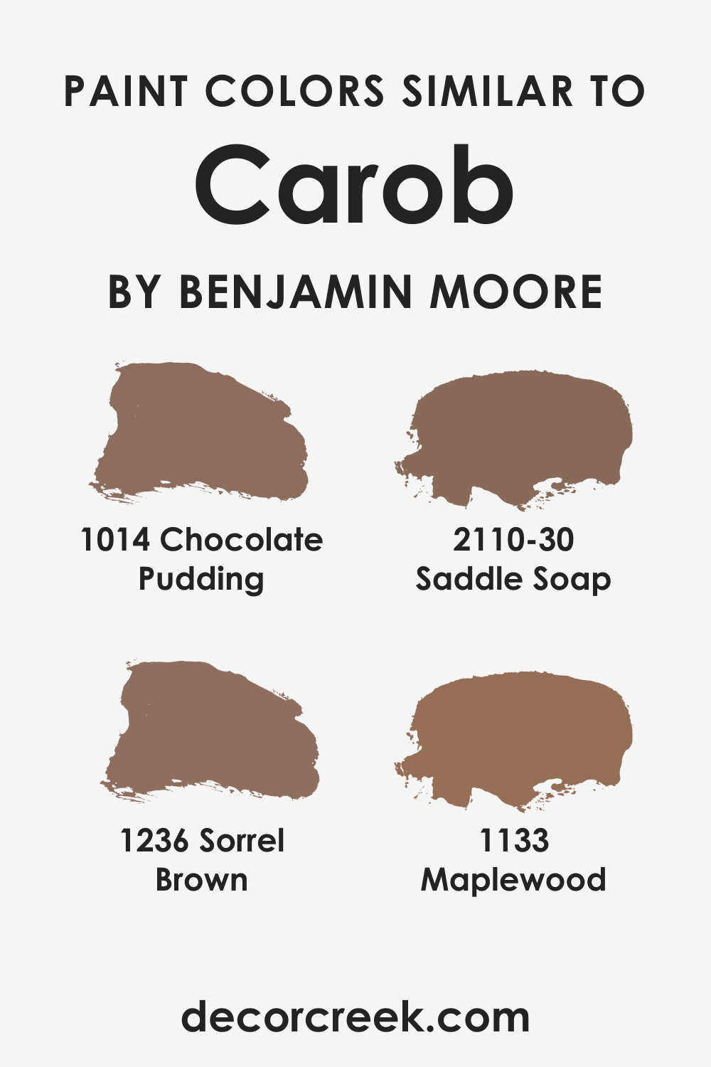
Colors Similar to Carob AF-160
Understanding similar colors is important for creating a color scheme, especially if the preferred color is not available, or you are seeking a slight variation. Similar colors to Carob AF-160 include:
- BM 1014 Chocolate Pudding : A rich, deep brown with a comforting, chocolatey appeal.
- BM 2110-30 Saddle Soap : A warm, mid-tone brown with a reddish undertone that feels inviting.
- BM 1236 Sorrel Brown : A soft, earthy brown with a subtle green undertone that provides a natural feel.
- BM 1133 Maplewood : A muted, reddish-brown reminiscent of aged wood, with a timeless charm.
Each color echoes the essence of Carob AF-160 but offers slight variations that could better suit individual tastes or specific design requirements.
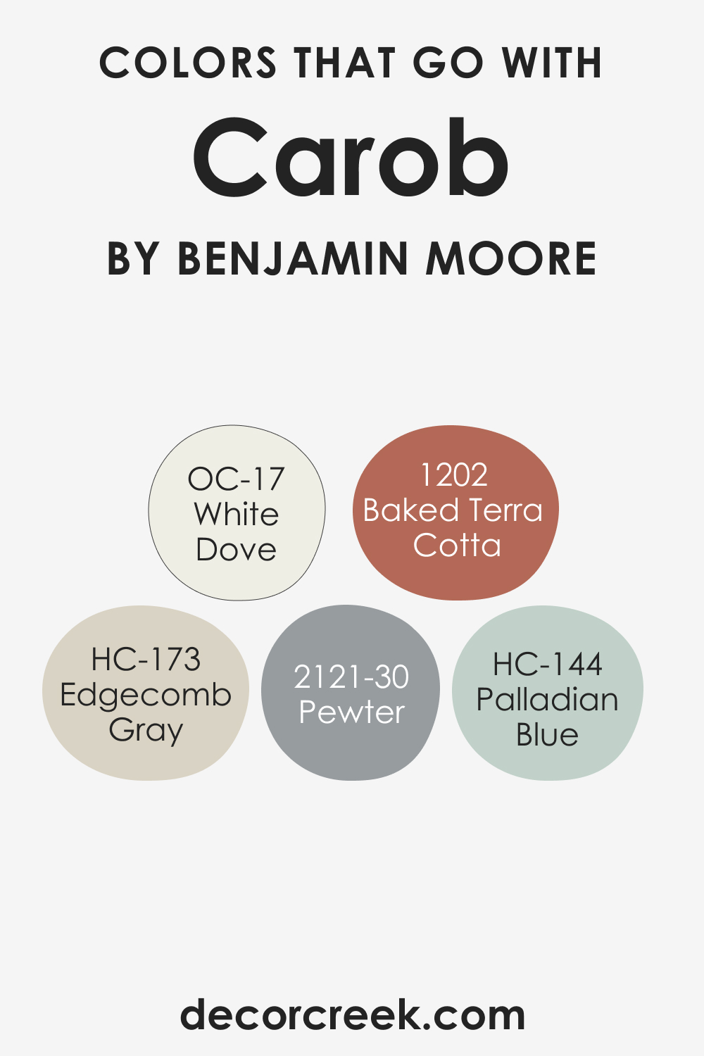
Colors That Go With Carob AF-160
Creating a cohesive color palette within a room is not just about individual color preferences, but about crafting an environment where each hue complements the other, enhancing the overall aesthetic and ambiance of the space. The right combination can affect mood, perceived temperature, and even the size and shape of the room.
With Carob AF-160’s rich depth, it’s crucial to select accompanying colors that harmonize without overwhelming, promoting a balanced and inviting interior.
Benjamin Moore offers a selection of colors that synergize well with Carob AF-160, each contributing to a harmonious and layered look. When paired wisely, these colors can bring out the best in Carob AF-160, allowing it to stand out as a statement shade or blend in as a subtle background.
Here are five Benjamin Moore colors that complement Carob AF-160 beautifully:
- OC-17 White Dove : A versatile, soft white with a hint of warmth, perfect for trim or cabinetry to provide a gentle contrast to the earthy Carob AF-160.
- HC-173 Edgecomb Gray : A light gray with warm undertones, it works as a neutral backdrop, ensuring that Carob AF-160 remains the focal point.
- BM 2121-30 Pewter : A deeper gray with blue-green undertones, providing a sophisticated complement to the richness of Carob AF-160.
- HC-144 Palladian Blue : A light, airy blue with a touch of green, it offers a refreshing contrast to the warmth of Carob AF-160, suitable for an accent wall or decor.
- BM 1202 Baked Terra Cotta : An earthy, reddish-brown that pairs beautifully with Carob AF-160 for a nature-inspired palette, echoing the hues of the natural world.
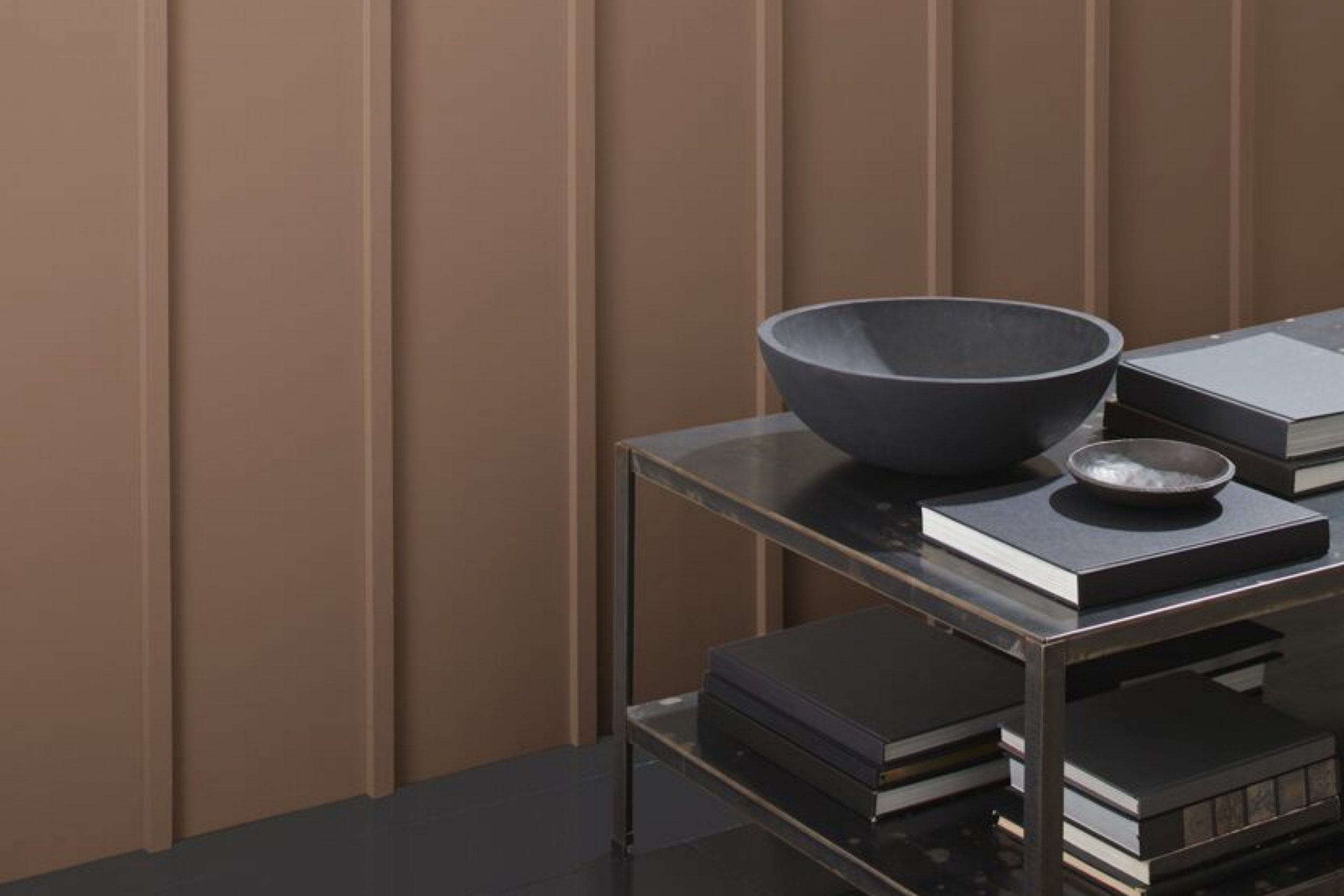
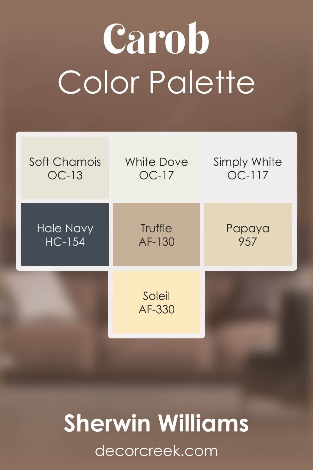
Carob AF-160 by Benjamin Moore Color Palette
Carob brings warm, earthy richness that feels grounded, comforting, and full of natural depth. This palette builds on that warmth with gentle whites, glowing neutrals, and rich accent tones. White Dove and Simply White brighten the palette with clean, soft light that keeps Carob from feeling too heavy.
Soft Chamois introduces a warm, creamy tone that blends naturally with Carob, creating smooth transitions that add comfort and ease.
Soleil brings a warm golden energy that adds cheerfulness and helps the palette feel lively without losing balance.
Truffle deepens the warmth with rich earthy notes that complete the palette’s natural foundation.
Hale Navy adds a cool contrasting layer that strengthens the palette with depth and clarity.
Papaya brings a soft, friendly burst of warmth that creates a pleasant lift and adds a hint of brightness. Together, these shades form a warm, inviting palette full of natural charm and expressive character—ideal for living spaces, cozy corners, and earthy, comfort-inspired rooms.
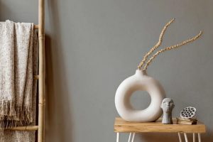
How to Use Carob AF-160 In Your Home?
Carob AF-160 is a rich, deep hue that can bring warmth and sophistication to any space. In the bedroom, it creates a cocooning effect, promoting rest and relaxation when applied on an accent wall or through textiles. For bathrooms, it adds an unexpected depth, especially when contrasted with crisp white fixtures and soft lighting. In living areas, Carob AF-160 can be utilized for a dramatic backdrop, complementing modern furnishings and art.
Its versatile nature suits various styles, from rustic to contemporary, allowing for creative application in rooms like the kitchen, where it can be a striking color for cabinets, delivering a luxurious finish. Lastly, for exteriors, Carob AF-160 offers a stately presence, especially when paired with natural stone or warm wood accents, enhancing curb appeal.
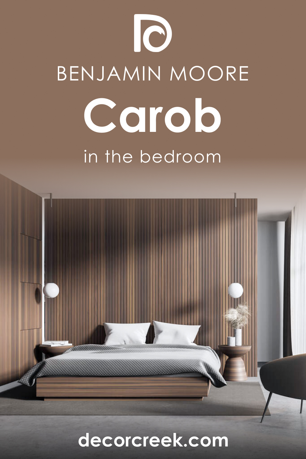
How to Use Carob AF-160 in the Bedroom?
Transform your bedroom into a sanctuary with Carob AF-160. The enveloping nature of this color can make large bedrooms feel cozier and more intimate when used on all walls. For a subtler approach, painting just the headboard wall can anchor the sleeping area. Complement it with light-colored linens and soft textures to balance its depth. In a minimalist or Scandinavian-style bedroom, let Carob AF-160 serve as a statement piece through décor items like lamps or cushions against a neutral palette, grounding the space with its earthy tones.
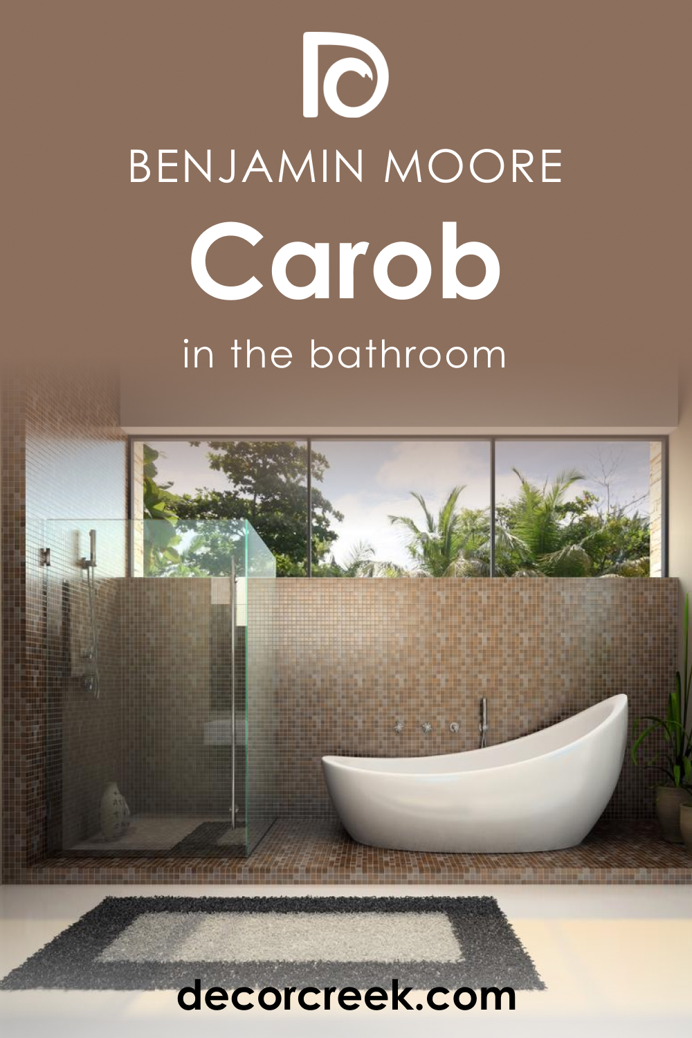
How to Use Carob AF-160 in the Bathroom?
Carob AF-160 can turn any bathroom into a spa-like retreat. When applied to one or all of the walls, it provides a rich contrast to white tiles and sanitaryware, offering a luxurious touch. Use it in a traditional bathroom to enhance wooden vanities and bronze fixtures for a classic look.
For a contemporary twist, pair it with sleek, black accents. Reflective surfaces and mirrors can help balance the darkness of Carob AF-160, ensuring the space retains a fresh and open feel.
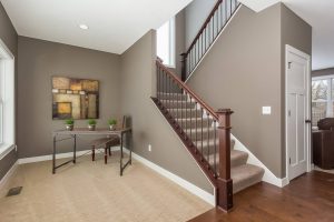
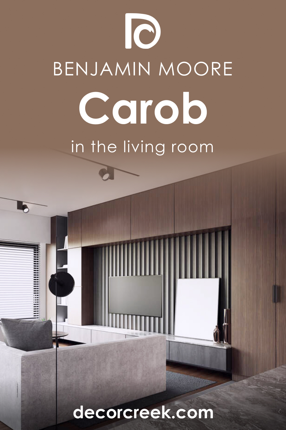
How to Use Carob AF-160 in the Living Room?
In the living room, Carob AF-160 can create a striking feature wall, especially behind a fireplace or shelving, drawing the eye and adding depth. In a room with ample natural light, this hue can warm the space without overpowering. It’s also suitable for a monochromatic scheme, paired with textured fabrics like velvet or linen in similar tones, to add interest without color contrast. For a classic look, Carob AF-160 can ground a room with heavy crown molding or detailed wainscoting, where it pairs well with traditional furniture and rich leathers.
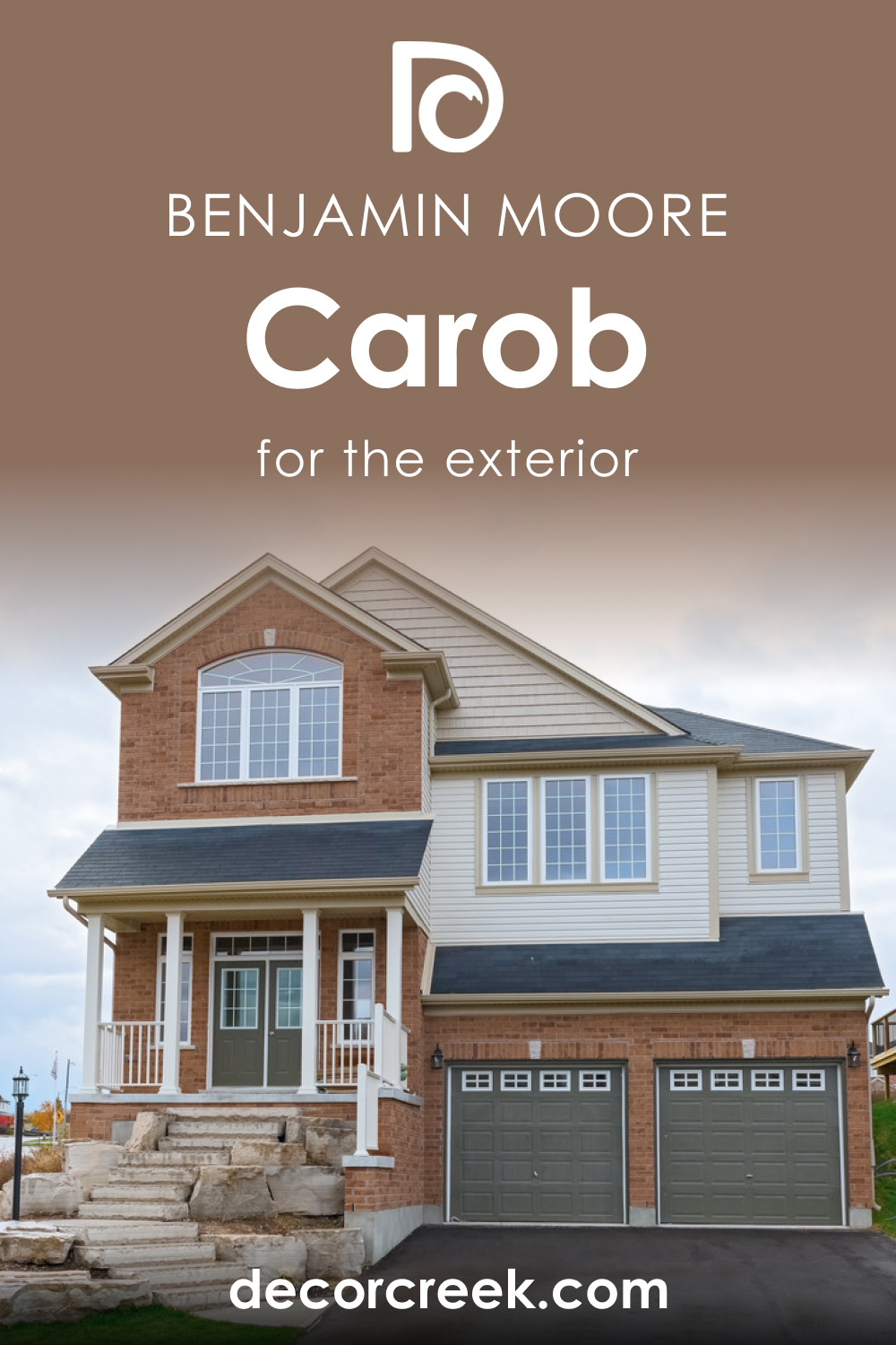
How to Use Carob AF-160 for an Exterior?
Carob AF-160 exudes elegance on home exteriors. It’s an excellent choice for front doors, shutters, or trim, providing a rich contrast to lighter siding or brickwork. In wooded or landscaped areas, it harmonizes with the environment, bringing out the greens and browns of the outdoor space.
On a modern home, Carob AF-160 can accentuate clean lines and architectural details. For traditional homes, it adds a timeless touch, especially when combined with natural stone elements and wrought iron hardware.
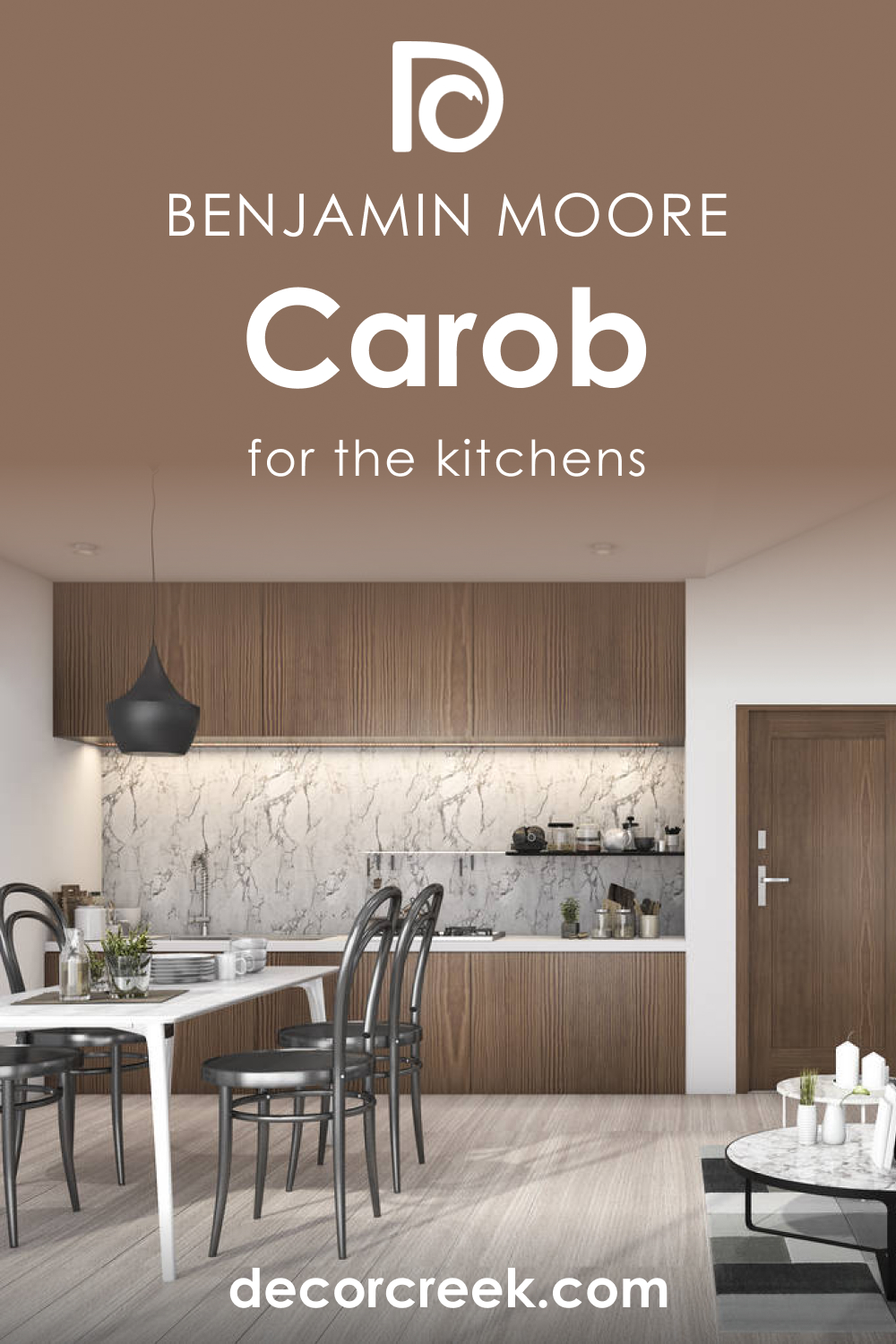
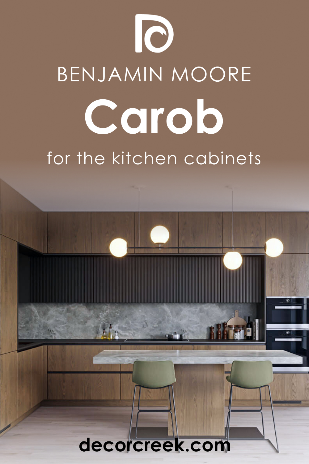
How to Use Carob AF-160 in the Kitchen?
Embrace the warmth of Carob AF-160 in the kitchen by incorporating it as an accent color on a feature wall, which can become a backdrop for open shelves or artworks. For a bolder statement, consider it on a central kitchen island, paired with marble or wooden countertops, to make it the heart of the home. Its earthy quality complements natural materials and adds depth to a space that’s often filled with hard, reflective surfaces, making the kitchen feel more welcoming.
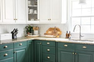
How to Use Carob AF-160 on the Kitchen Cabinets?
Carob AF-160 can bring a sense of luxury and drama when used on kitchen cabinets. It’s particularly striking on lower cabinets or an island, creating a grounding effect, while upper cabinets in a lighter shade maintain a bright and airy atmosphere. This color pairs beautifully with brass or gold hardware, which adds a touch of glamour to the space.
For a cohesive look, incorporate Carob AF-160 in adjacent dining areas, such as in the upholstery of dining chairs or a buffet table, tying the spaces together with this rich, inviting shade.
Comparing Carob AF-160 With Other Colors
Comparing colors is a fundamental step in design because it allows for a visual understanding of how different hues interact with one another. It aids in achieving the desired mood, style, and continuity in a space. By comparing colors, designers can determine contrast, harmony, and balance within a palette.
Moreover, it’s crucial for understanding how a color can change perception when placed alongside others, how it may affect the size and brightness of a room, and how well it coordinates with existing elements like furniture and artwork.
Carob AF-160 vs. BM 2110-60 Pampas Grass
Carob AF-160 and Pampas Grass by Benjamin Moore are like night and day in their presence within a room. While Carob AF-160 is a deep, rich tone that commands attention and brings warmth, Pampas Grass is a pale, sandy hue, evoking the open and airy feel of a beachside retreat. Pampas Grass offers a lightness that can make a space feel more expansive and is an excellent choice for those seeking a neutral backdrop that is both versatile and understated.
In contrast, Carob AF-160 can make a large room feel more intimate and enveloping. When these two are paired, the lighter Pampas Grass can help to soften the intensity of Carob AF-160, providing a balanced and modern look.
Carob AF-160 vs. BM 1010 Rose Dust
Carob AF-160 stands as a bold, earthy color, while Rose Dust by Benjamin Moore offers a soft, blush-toned alternative. Rose Dust brings a romantic and delicate touch to interiors, often used to create a soothing and feminine ambiance. When compared to the grounding Carob AF-160, Rose Dust can act as a gentle counterpoint, offering lightness and a subtle color that can visually enlarge a space.
In a room where Carob AF-160 serves as the dominant color, introducing Rose Dust can add a layer of complexity and warmth without overwhelming the senses, perfect for a tranquil bedroom or a relaxing living area.
Carob AF-160 vs. BM 2106-50 Driftscape Tan
Driftscape Tan is a mid-tone beige that provides a serene and natural look, which can complement the deeper and more dramatic Carob AF-160. This comparison is a classic example of how contrasting values in color can create an engaging palette. Driftscape Tan can serve as a neutral foundation in a space, offering a restful and calming effect, which can be particularly useful in areas where you seek tranquility. Carob AF-160, with its rich undertones, can then be used as an accent, adding depth and focus to a room. This combination can work well in any space where the goal is to have a balance of warmth and light.
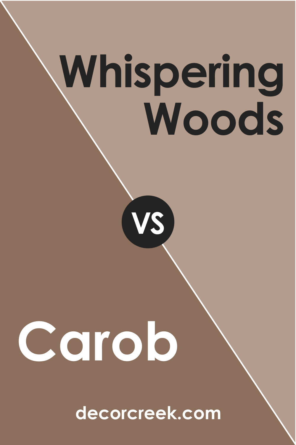
Carob AF-160 vs. BM 1012 Whispering Woods
Whispering Woods is a light taupe that whispers elegance and understated sophistication. It shares a certain earthiness with Carob AF-160 but is much lighter, creating a soft backdrop that allows Carob AF-160 to truly stand out.
Whispering Woods is the kind of color that can help to expand a space and provide a gentle transition from the deep and robust Carob AF-160 to a more muted palette. It’s perfect for those looking to incorporate the grounding nature of Carob AF-160 without making the space feel too dark or heavy.
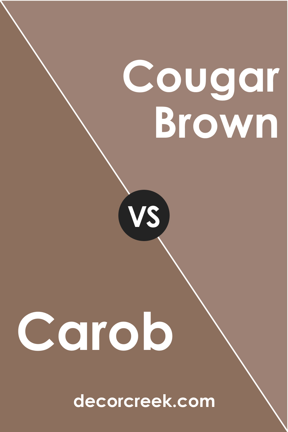
Carob AF-160 vs. BM 2106-40 Cougar Brown
Cougar Brown and Carob AF-160 share a deep connection through their brown color family, but Cougar Brown presents itself as a less intense, more muted brown. It has the ability to warm up a space without the depth and saturation of Carob AF-160.
In a direct comparison, Cougar Brown might serve as a mid-tone option, providing a softer look in a space that still values the richness of earthy tones. It can act as a transitional color between the strong character of Carob AF-160 and lighter tones in the room.
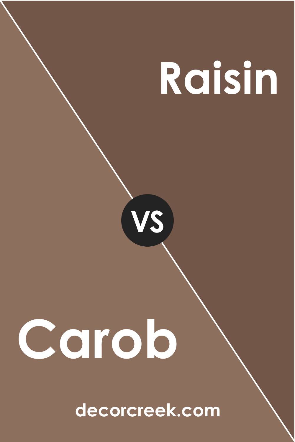
Carob AF-160 vs. BM 1237 Raisin
Raisin by Benjamin Moore introduces a unique blend of purple and brown, offering a complex and intriguing color that stands out with an almost vinous quality. Next to the deep chocolate undertones of Carob AF-160, Raisin brings a subtle, plummy warmth to the palette. It is still within the realm of natural, earthy tones but adds a hint of color that can enliven a space.
This combination can create a rich and luxurious feel, suitable for a study or dining room that aims to make a statement.
Conclusion
Comparing colors like Carob AF-160 with other hues from Benjamin Moore’s palette reveals the impact that color relationships have on interior design. Understanding these relationships is crucial in creating spaces that are not only visually appealing but also psychologically comforting. The right color combination can set the tone for a room, define its purpose, and express the homeowner’s personality.
By thoughtfully pairing Carob AF-160 with complementary colors, one can craft an environment that is harmonious, balanced, and aligned with their aesthetic preferences.
Whether seeking a contrast with Pampas Grass or a subtle blend with Whispering Woods, each comparison offers a unique way to experience and enjoy the depth and versatility of Carob AF-160.