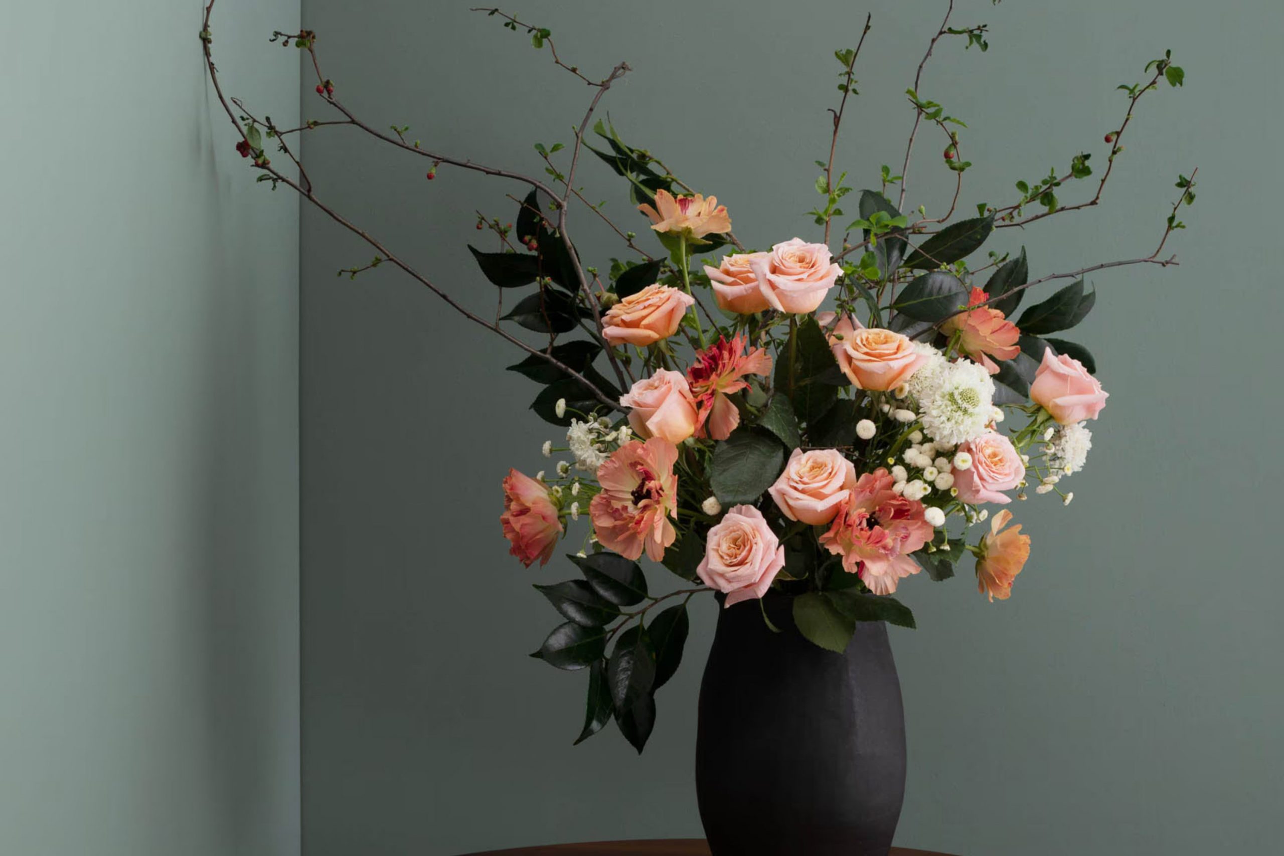
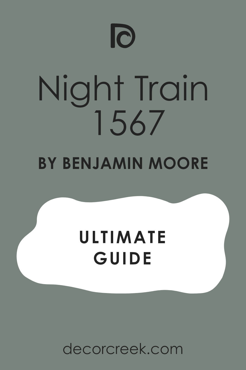
When you first encounter the color 1567 Night Train by Benjamin Moore, you may feel like you have stumbled upon a peaceful secret. This unique shade of gray carries a hint of blue, making it an ideal choice if you’re looking for a color that adds a calm and soothing presence to any room.
It’s a color that subtly shifts with the changing light, from a soft, airy feel during the day to a cozy, enveloping atmosphere at night. Whether you’re thinking about refreshing your living room, bedroom, or even your kitchen, 1567 Night Train offers a flexible backdrop that complements various decor styles and color palettes.
Its ability to pair well with both warm and cool tones allows you to mix and match your furniture and accessories without the color overpowering the room.
So, if you’re ready to give your room a gentle yet noticeable update, consider this inviting shade that promises to enhance without dominating.
What Color Is Night Train 1567 by Benjamin Moore?
Night Train (1567) by Benjamin Moore is a deep, rich gray that almost whispers of a subtle blue undercurrent. This flexible color holds a cool tone, making it an ideal choice for creating a calm, composed environment in any room. Due to its nuanced hue, Night Train pairs exceptionally well with a variety of interior design styles, including modern minimalist, traditional, and even industrial.
In minimalist settings, this color works beautifully to set a clean, crisp background that highlights simplicity and precision. In more traditional rooms, Night Train adds a touch of modern freshness without clashing with classic elements. In industrial-style interiors, it complements exposed metal features and raw materials like brick and concrete, enhancing the rough textures with its smooth tone.
When considering materials and textures, Night Train coordinates well with natural wood, adding warmth to its cooler undertone. It also looks stunning when paired with metallic finishes such as brushed nickel or stainless steel, which bring out its subtle blue leanings. For textiles, consider soft, plush fabrics like velvet or wool in lighter shades to create contrast and add a touch of coziness to the sleek color backdrop.
This color is ideal for those looking to create a refined yet welcoming room without overpowering the senses.
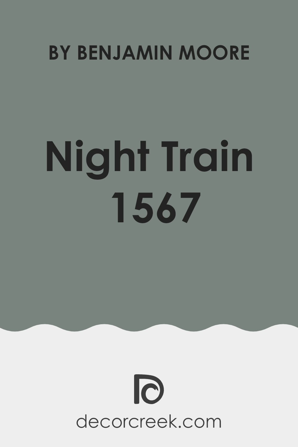
Is Night Train 1567 by Benjamin Moore Warm or Cool color?
Night Train 1567 by Benjamin Moore is a unique and flexible paint color. It’s a deep, smoky gray that can add depth and character to a room without overpowering it. This shade works well in various home settings because it acts as a neutral backdrop.
It pairs nicely with brighter colors, making them pop, or it can be used alone for a more muted, classic look. In living rooms, Night Train 1567 creates a cozy atmosphere, making the room feel more inviting and comfortable.
In bedrooms, it offers a soothing vibe, which is great for relaxing. This color also has a practical side; it hides imperfections well and doesn’t show dirt easily, making it a good choice for high-traffic areas like hallways and family rooms. Overall, Night Train 1567 is adaptable and practical, suitable for anyone looking to add a touch of elegance without going too bold.
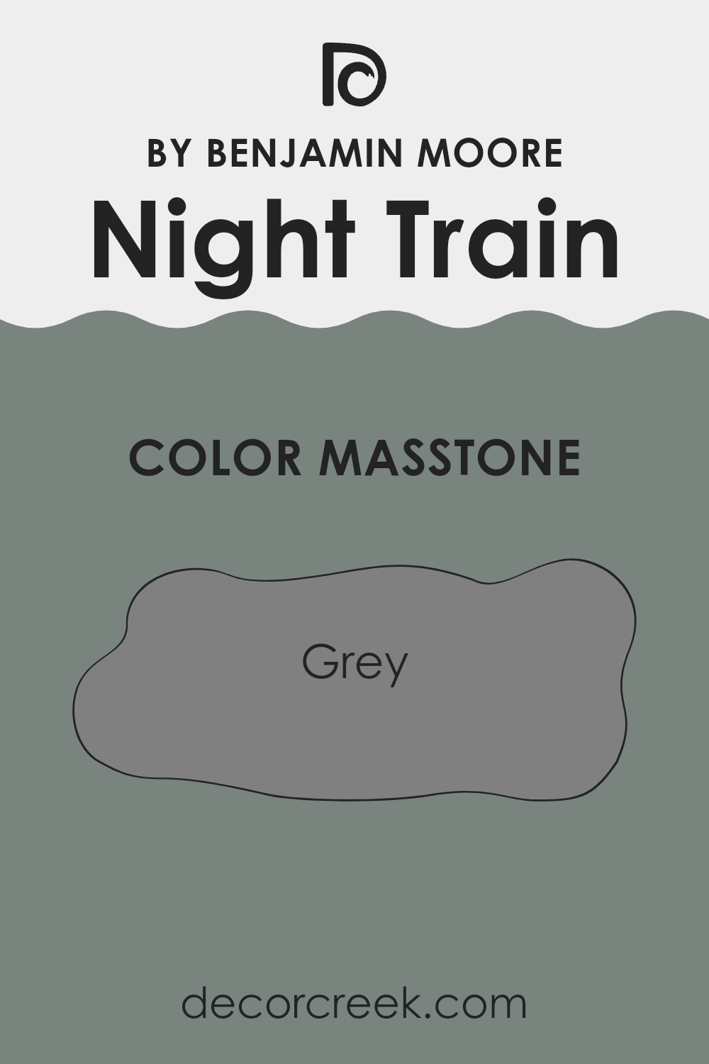
What is the Masstone of the Night Train 1567 by Benjamin Moore?
Night Train 1567 by Benjamin Moore is a unique grey color that brings a balanced and soothing feel to any room. When applied to walls, its masstone, Grey(#808080), offers a flexible backdrop that works well with various decor styles and color schemes.
This neutrality means it can fit seamlessly into rooms that serve different purposes, whether it’s a busy kitchen or a quiet study. The color’s even tone helps to hide imperfections on walls and can make small rooms appear larger by reflecting light subtly, rather than absorbing it.
Grey is also known for its ability to match with other colors, making this shade a practical choice for those looking to mix and match furniture and accessories. In homes, Night Train 1567 creates a calm atmosphere, perfect for relaxing and for rooms where focus is needed. It’s a dependable color that doesn’t overpower, making it ideal for creating a tidy, cohesive look in a home.
How Does Lighting Affect Night Train 1567 by Benjamin Moore?
Lighting has a profound effect on how colors appear in different settings. The color Night Train (1567) by Benjamin Moore is no exception. This unique hue can appear differently depending on whether the light is natural or artificial, as well as the room’s orientation.
In natural light, this color can change throughout the day. In rooms facing north, which often receive less direct sunlight, Night Train can look cooler and more muted, giving the room a calm, subdued feel. In contrast, south-facing rooms bathe in abundant sunlight, making Night Train appear brighter and more vivid, which can enhance the energy of the room.
For east-facing rooms that get plenty of morning light, this color will appear warmer and lighter early in the day but may shift towards cooler tones in the afternoon as the natural light diminishes. West-facing rooms receive intense evening light, which can make Night Train look exceptionally vibrant and dynamic in the late afternoon and evening.
When it comes to artificial lighting, the type of light bulb used can significantly impact how this color is perceived. Incandescent bulbs, which emit a warmer, yellow-toned light, will soften the color and bring out warmer tones in Night Train, making it feel cozier. Fluorescent lighting, on the other hand, has a cooler, bluish cast and can make Night Train look more restrained and more formal.
Overall, Night Train is a flexible color that can complement a variety of rooms and styles, depending on the lighting conditions. In areas with controlled lighting, this color can be adjusted to fit the desired mood and aesthetic of a room, making it a practical choice for both personal and professional interiors.
What is the LRV of Night Train 1567 by Benjamin Moore?
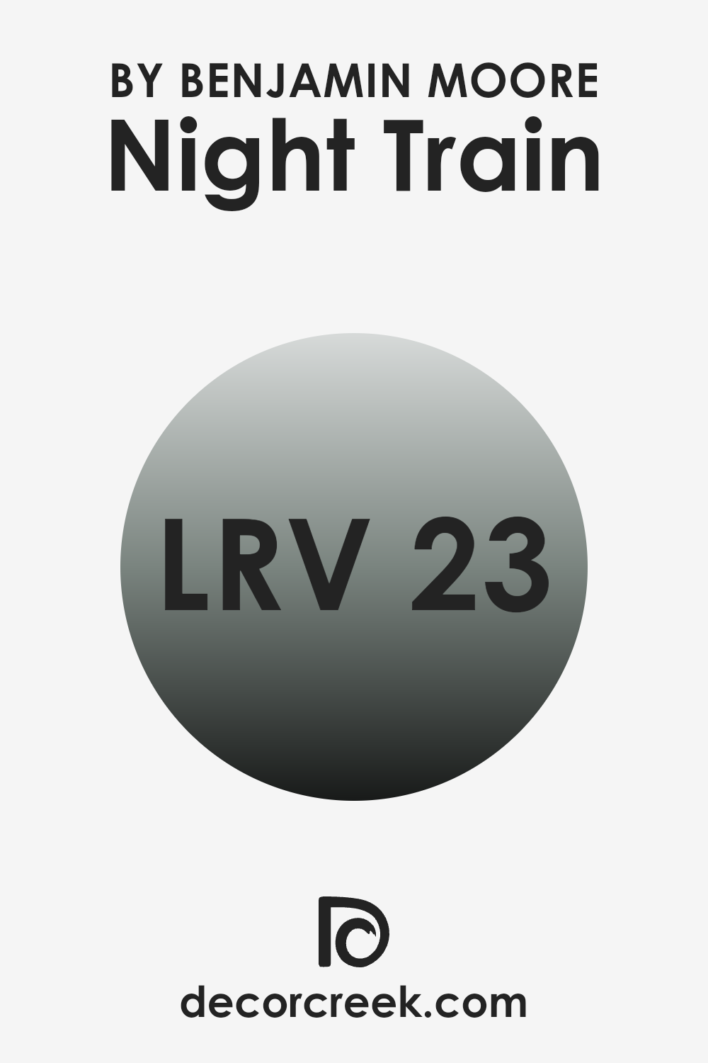
LRV stands for Light Reflectance Value, and it is a measure of how much light a paint color reflects back into a room, as opposed to absorbing it. This value can range from 1 to 100, with 1 being very dark and 100 being very light. Essentially, the LRV helps you understand how light or dark a color will look once it’s on your walls. Paint colors with a higher LRV make rooms feel brighter because they reflect more light.
On the other hand, colors with a lower LRV absorb more light, which can make a room appear cozier but also smaller and darker, especially in areas with limited natural light.
The LRV of 22.8 for the color under discussion means that it is on the darker side, reflecting only about 22.8 percent of the light. This makes it a better choice for creating a more intimate and enclosed feeling in a room. It’s especially effective in larger or well-lit areas where you want to prevent the room from feeling too vast.
However, in a small room or an area with minimal natural light, using a color with an LRV as low as 22.8 might make the room feel cramped and gloomy. Thus, it’s crucial to consider room size, lighting, and the atmosphere you want to create before deciding on this type of darker hue.
Coordinating Colors of Night Train 1567 by Benjamin Moore
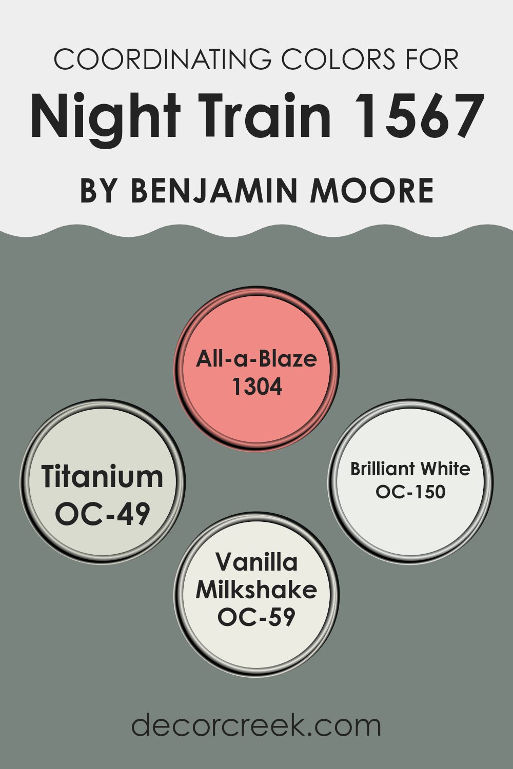
Coordinating colors are selected shades that harmonize with a main color to enhance the aesthetic appeal of a room. For instance, colors chosen to coordinate with Night Train by Benjamin Moore, a deep, subtle gray, create a balanced and visually appealing palette. These coordinating colors can complement, contrast, or accentuate the main hue, depending on their undertones and saturation levels.
Starting off, we have All-a-Blaze, a vivid, fiery terra cotta that offers a warm contrast to the cooler gray of Night Train. This color brings a lively burst that can add character to accents and features within a room, energizing rooms that primarily utilize the more subdued main color.
Titanium, meanwhile, is a soft, cloudy gray that blends seamlessly with Night Train, offering a slight contrast that’s ideal for creating a nuanced, multi-layered look. Brilliant White is as pure and crisp as it sounds, providing a clean, sharp break in color that can help in defining rooms or highlighting architectural details.
Lastly, Vanilla Milkshake offers a creamy, off-white tone that softens and complements the coolness of Night Train, ideal for creating a gentle and inviting atmosphere, which can work beautifully on walls or trim. Each of these colors works together to support a cohesive design scheme that enhances the main color while adding its unique flair.
You can see recommended paint colors below:
- 1304 All-a-Blaze (CHECK A SAMPLE)
- OC-49 Titanium
- OC-150 Brilliant White (CHECK A SAMPLE)
- OC-59 Vanilla Milkshake
What are the Trim colors of Night Train 1567 by Benjamin Moore?
Trim colors are specific shades used on the architectural elements of a room, like door frames, window frames, and moldings, to enhance the overall aesthetic of the room. When painting in a shade such as Night Train 1567 by Benjamin Moore, selecting the right trim colors is crucial because they can either subtly complement the main color or create a striking contrast, effectively framing the room and giving it a polished look.
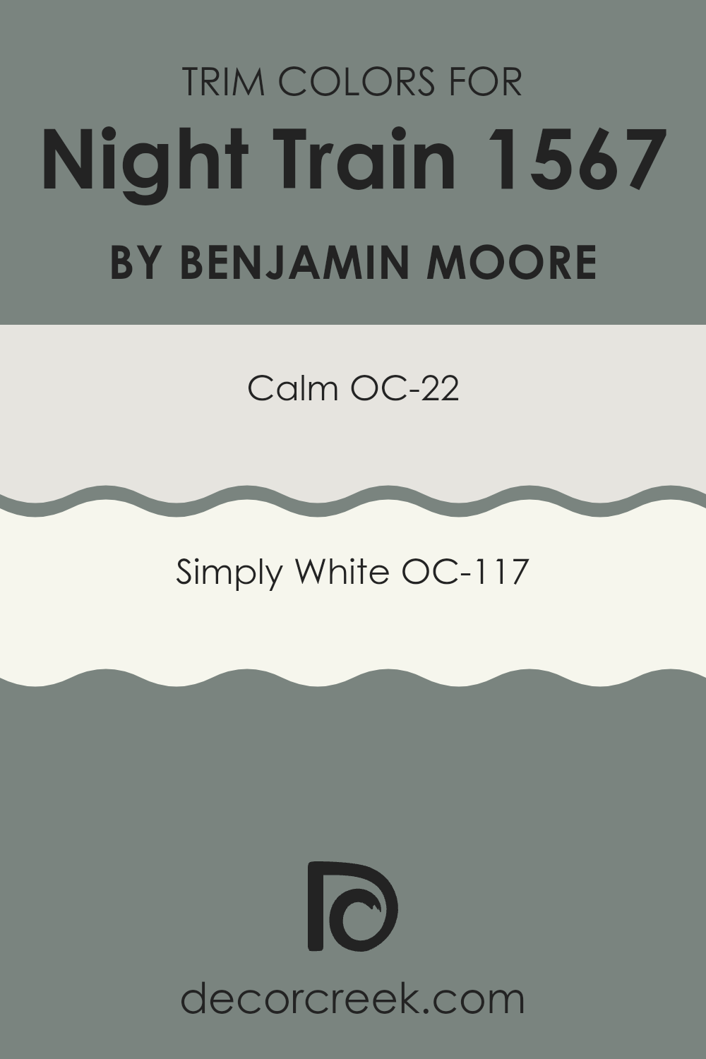
For Night Train 1567, a deep and rich tone, using lighter trim colors like OC-22 Calm and OC-117 Simply White can provide a beautiful contrast that highlights the architectural features without overpowering the main color.
OC-22 Calm is a soft and muted white with a hint of gray that brings a gentle and clean edge to trim, blending seamlessly with darker tones like Night Train 1567 to enhance the area without causing a harsh visual break.
OC-117 Simply White, on the other hand, is a bright and crisp white that offers a more pronounced contrast, making the trim more noticeable and defining the boundaries in the room more clearly. Both colors are excellent choices for trim, depending on the desired level of contrast and effect you want to achieve in complementing Night Train 1567.
You can see recommended paint colors below:
Colors Similar to Night Train 1567 by Benjamin Moore
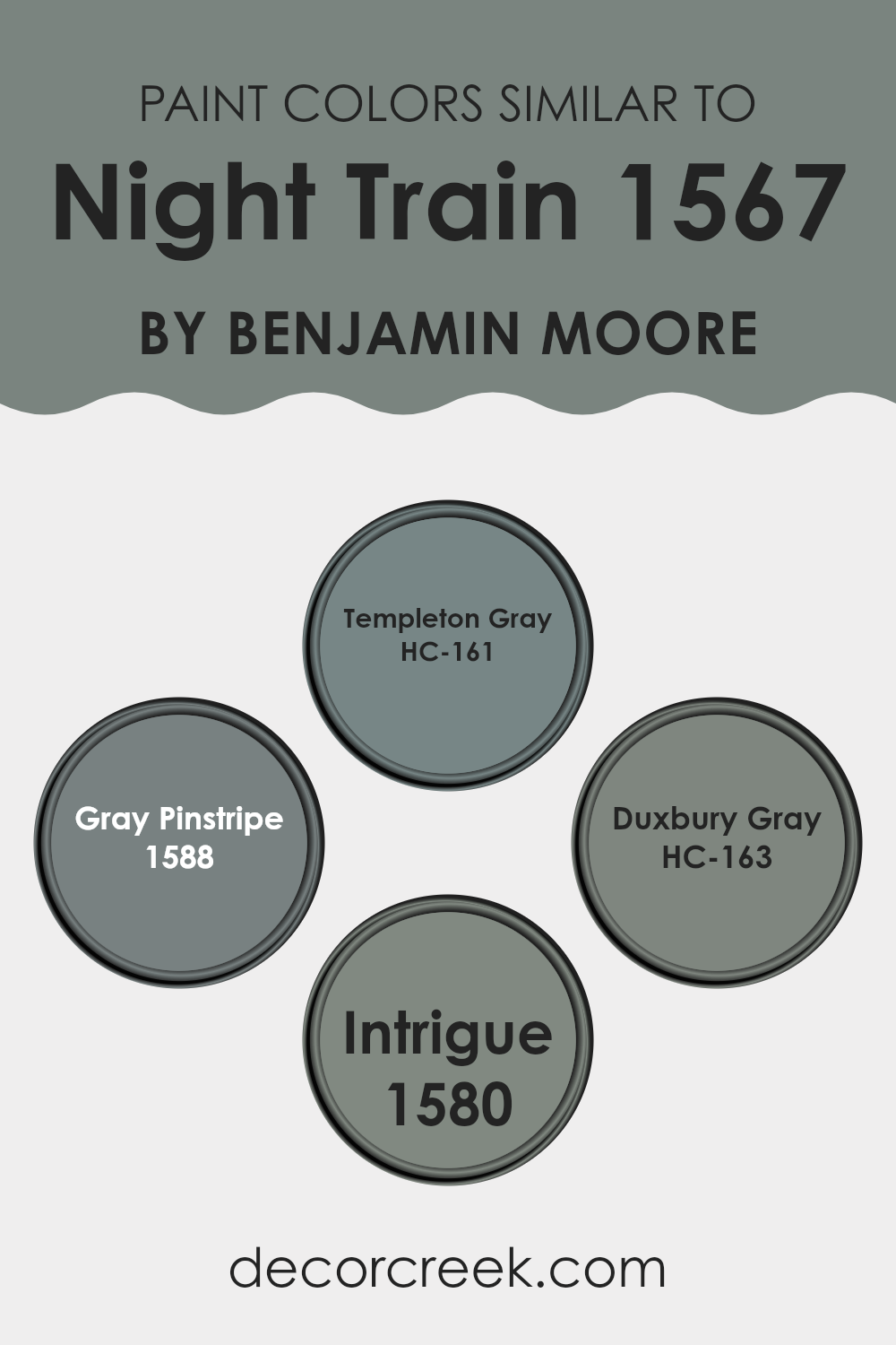
Choosing similar colors for a room can create a cohesive and harmonious aesthetic. When colors like HC-161 Templeton Gray, 1588 Gray Pinstripe, HC-163 Duxbury Gray, and 1580 Intrigue are used together, they provide a subtle variety while maintaining a unified look. This is particularly effective in achieving a balanced yet nuanced atmosphere.
These shades are all in the gray family, making them adaptable for combining with other hues while keeping the overall mood calm and aligned.
HC-161 Templeton Gray is a medium gray that offers a neutral backdrop, suitable for many decorating styles. It’s like a solid middle ground, neither too dark nor too light, which makes it a good base color. The color 1588 Gray Pinstripe is slightly lighter with a hint of blue undertones, providing a cool, fresh feel to the room.
HC-163 Duxbury Gray presents a deeper, more muted tone that adds depth and is ideal for accent walls or furniture. Lastly, 1580 Intrigue is unique with its subtle green undertones, offering a refreshing twist to the typical gray palette. This selection of colors allows for creative freedom while ensuring the room feels connected and pleasant.
You can see recommended paint colors below:
- HC-161 Templeton Gray (CHECK A SAMPLE)
- 1588 Gray Pinstripe (CHECK A SAMPLE)
- HC-163 Duxbury Gray (CHECK A SAMPLE)
- 1580 Intrigue (CHECK A SAMPLE)
Colors that Go With Night Train 1567 by Benjamin Moore
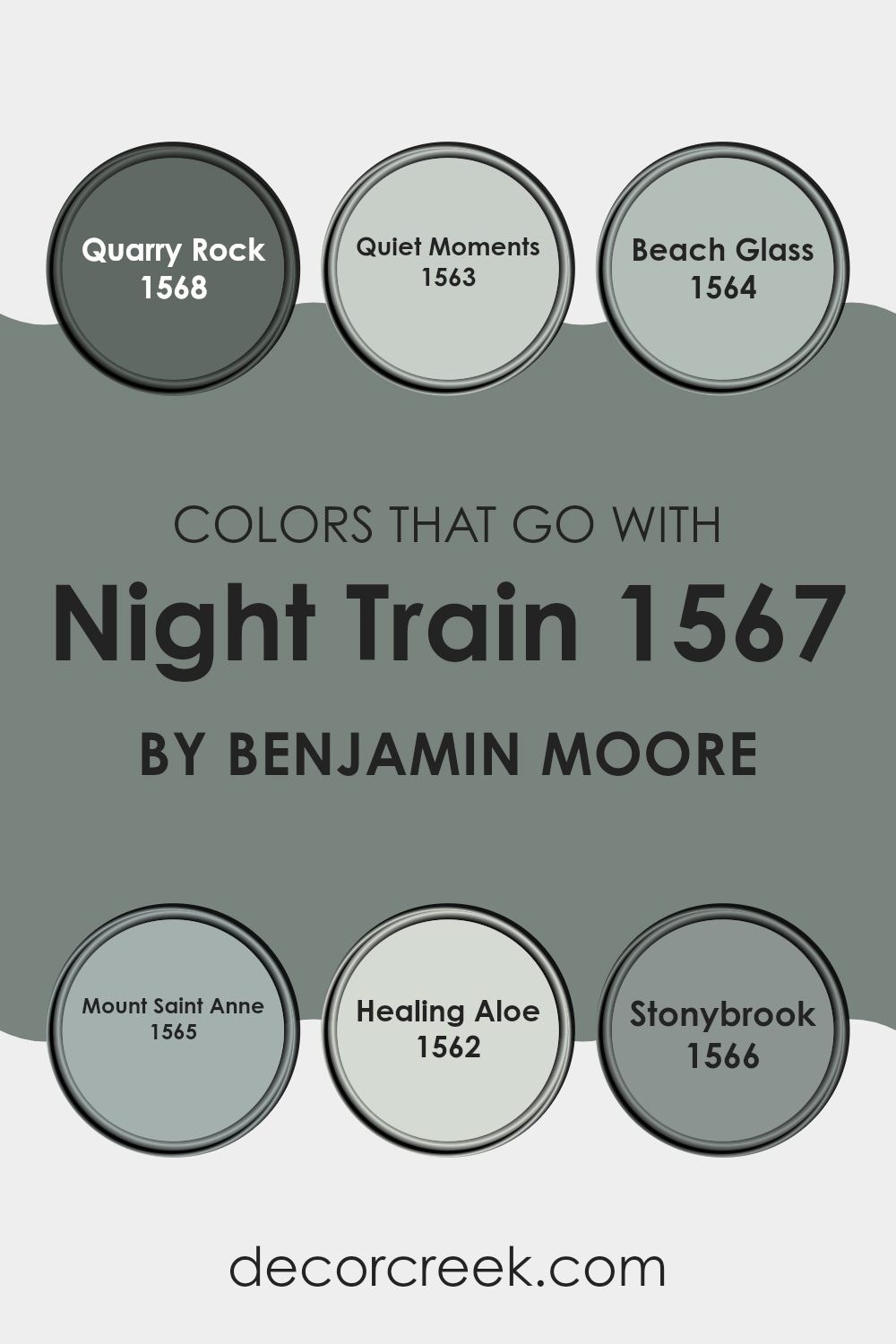
When decorating a room, choosing the right complementary colors for the main shade like Night Train 1567 by Benjamin Moore is crucial. Such colors can influence the mood and atmosphere of a room tremendously. For instance, Quarry Rock 1568 works perfectly to create a harmonious look.
This dark gray provides a solid and grounding effect, which balances the softer tone of Night Train. Quiet Moments 1563, on the other hand, is a gentle gray with a hint of blue, bringing a refreshing and light touch to the environment, which helps in making small rooms appear larger and more open.
Moving to a slightly different palette, Beach Glass 1564 offers a muted teal shade that injects a subtle vibrancy into the room, working well in areas that need a dynamic but not overpowering character. Mount Saint Anne 1565 blends blue and green for a more profound effect, making it ideal for feature walls or furniture pieces that demand attention without dominating. Healing Aloe 1562 is a soft, milky green that provides a calm, soothing feel, perfect for bedrooms or bathrooms where relaxation is key.
Lastly, Stonybrook 1566 is a unique green-blue that has a natural depth, enabling it to stand as a focal point or as a complementing background. Each of these colors works in tandem to enhance the aesthetic appeal and create a cohesive look around the foundational tone of Night Train 1567.
You can see recommended paint colors below:
- 1568 Quarry Rock (CHECK A SAMPLE)
- 1563 Quiet Moments (CHECK A SAMPLE)
- 1564 Beach Glass (CHECK A SAMPLE)
- 1565 Mount Saint Anne (CHECK A SAMPLE)
- 1562 Healing Aloe (CHECK A SAMPLE)
- 1566 Stonybrook (CHECK A SAMPLE)
How to Use Night Train 1567 by Benjamin Moore In Your Home?
Night Train 1567 by Benjamin Moore is a flexible paint color that offers a subtle and welcoming shade of gray tinged with green. This color works well in many rooms of a house because it’s soft enough to use on all four walls without making the room feel closed off or too dark.
It’s a great choice for bedrooms or living areas where a calm, cozy atmosphere is desired. Night Train 1567 can also be used for accent walls or in hallways to add a touch of depth to neutral color schemes.
In the kitchen, applying this color on cabinets can refresh the look without being too bold. It pairs nicely with natural woods and lighter countertops, bringing a fresh but grounded feel to the room. In a home office, using Night Train 1567 can help make the room look more polished and put together, which is perfect for anyone looking for a professional yet comfortable environment to work in.
Night Train 1567 by Benjamin Moore vs Intrigue 1580 by Benjamin Moore
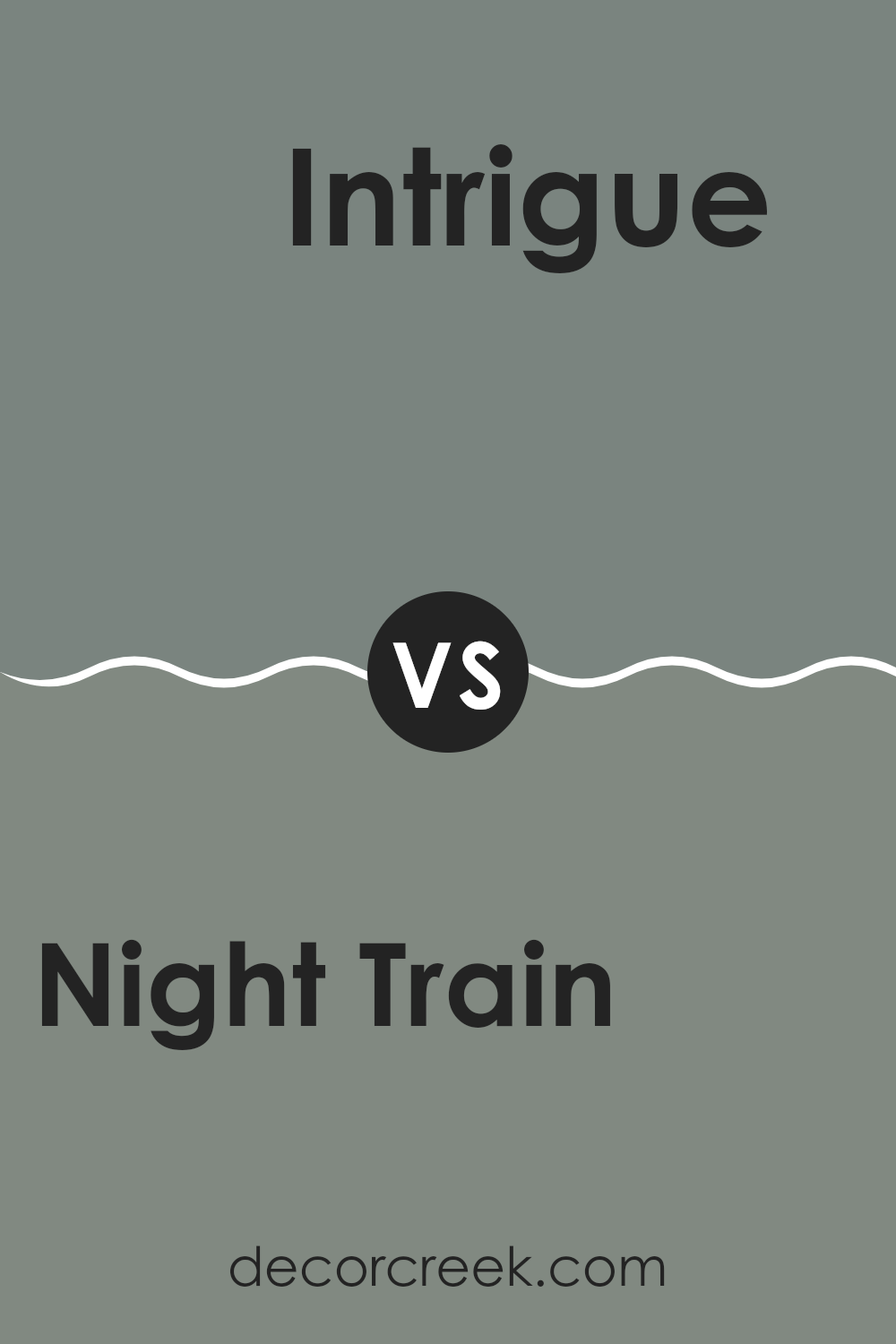
Night Train 1567 and Intrigue 1580 by Benjamin Moore are both unique shades that can give very different moods to a room. Night Train is a darker gray with a strong blue undertone. It gives off a calm and steady feel, making it great for a cozy and peaceful atmosphere in a bedroom or living area.
Intrigue, on the other hand, is a somewhat lighter color that leans toward a green-gray. It feels fresh and lively, which can make a room feel more open and inviting. This shade works well in areas that get a lot of natural light, as the light highlights its subtle green tones.
Both colors pair well with white trim or light wood furniture, but the effect is very different. Where Night Train can create a more enclosed, comforting feel due to its darker tone, Intrigue tends to open up a room and adds energy with its lighter, softer hue.
You can see recommended paint color below:
Night Train 1567 by Benjamin Moore vs Duxbury Gray HC-163 by Benjamin Moore
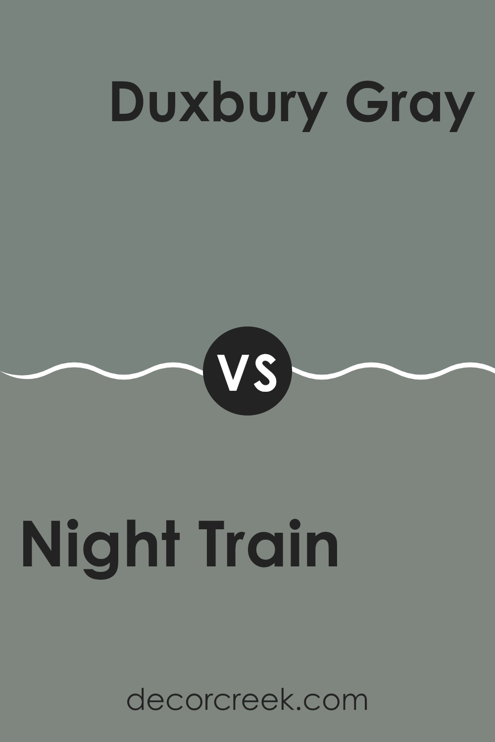
Night Train and Duxbury Gray are both paint colors from Benjamin Moore. Night Train has a deep, almost charcoal gray tone, which can lend a strong and classy look to walls. It’s a perfect choice for rooms where you want a bold backdrop.
In contrast, Duxbury Gray is lighter, leaning toward a soft, warm gray with some green undertones. This color can make rooms feel more open and relaxed, and it works well in places that get a lot of natural light or in smaller rooms that you want to appear bigger.
Both colors are flexible and can be used in various settings like bedrooms, living areas, or offices. Depending on the mood you’re going for and how much natural light your room gets, you can choose the color that best fits your needs. Night Train is ideal for creating a striking statement, while Duxbury Gray is great for a more subtle, cozy atmosphere.
You can see recommended paint color below:
- HC-163 Duxbury Gray (CHECK A SAMPLE)
Night Train 1567 by Benjamin Moore vs Templeton Gray HC-161 by Benjamin Moore
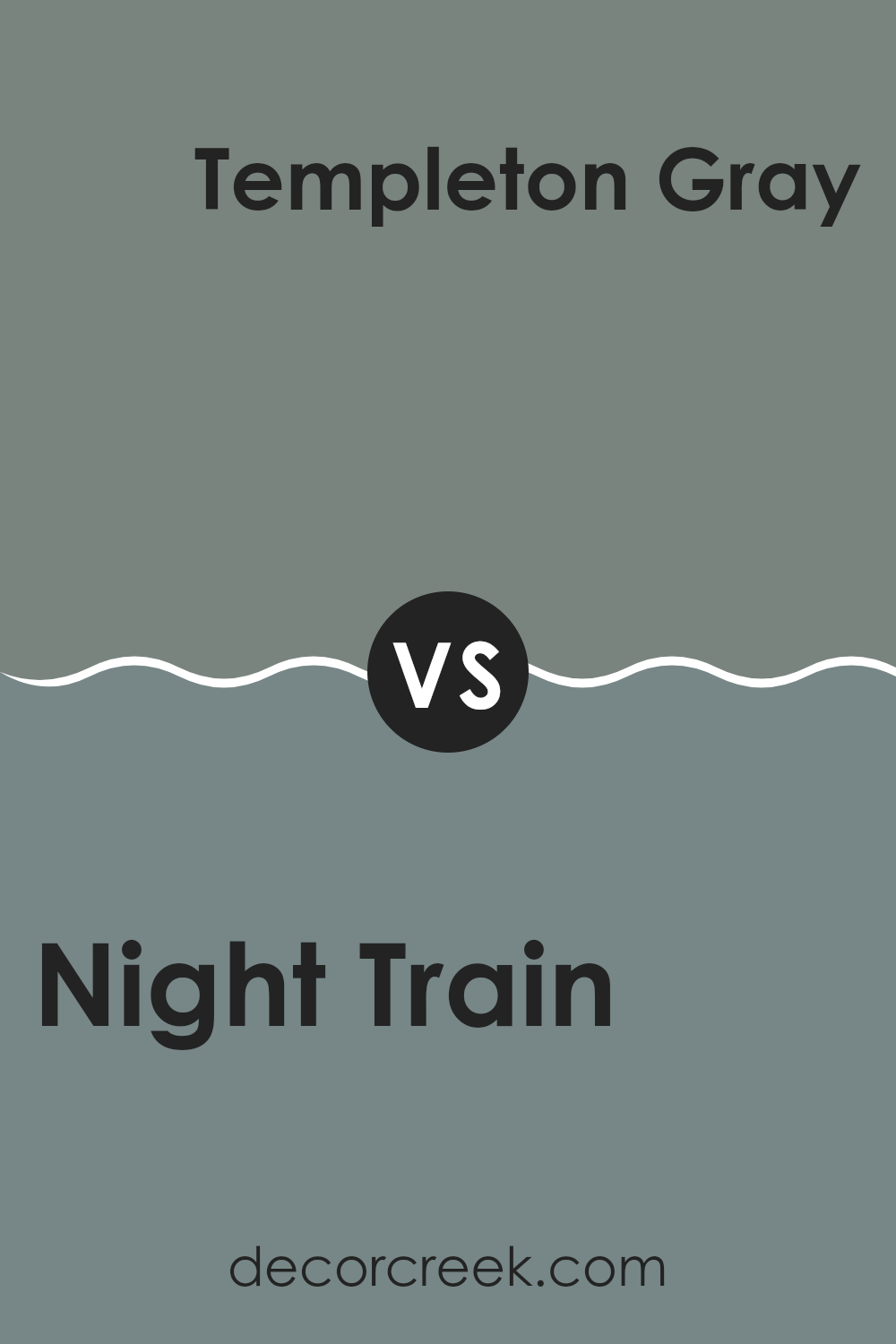
The main color, Night Train, is a deep, neutral gray that gives off a calm and stable vibe. It works well in various rooms, creating a grounded feel. This color is flexible and can complement brighter shades or serve as a strong backdrop for lighter decor.
On the other hand, Templeton Gray is a bit lighter than Night Train, with subtle blue undertones that add a hint of freshness without being too vibrant. This makes it ideal for someone looking to add a gentle color splash to their room without overpowering other design elements.
While both colors share a gray base, Night Train leans toward a purer gray scale, offering a more traditional look, whereas Templeton Gray’s blue hints could provide a slightly more modern touch with its cool subtlety. These shades both work well in modern homes, but your choice might depend on the mood you want to set: steadier with Night Train or slightly livelier with Templeton Gray.
You can see recommended paint color below:
- HC-161 Templeton Gray (CHECK A SAMPLE)
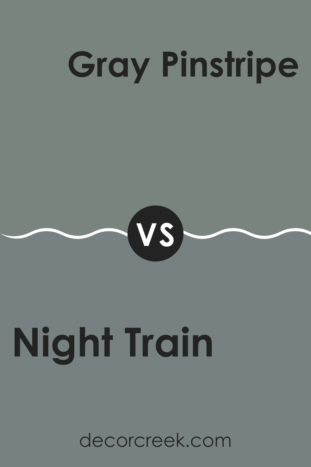
Night Train 1567 by Benjamin Moore vs Gray Pinstripe 1588 by Benjamin Moore
Night Train and Gray Pinstripe are two colors from Benjamin Moore that each bring their own distinct mood to a room. Night Train is a deeper, darker gray that feels bold and grounded. It’s a great choice if you want to make a strong statement or create a cozy, secure atmosphere. On the other hand, Gray Pinstripe is a bit lighter, leaning more toward a mid-tone gray.
This shade is highly adaptable—it can work well in almost any room, blending in smoothly without making the area feel too tight or crowded. Both colors fit beautifully in modern decor schemes and can be used throughout the home, from kitchens to bedrooms.
Night Train may be better suited for larger rooms or areas where you want a sense of depth and stability, while Gray Pinstripe is ideal for smaller rooms or areas where you want to keep things bright and open. Combining these colors through accents and furnishings can also help create a balanced, harmonious look.
You can see recommended paint color below:
- 1588 Gray Pinstripe (CHECK A SAMPLE)
As I finish reading “1567 Night Train” by Benjamin Moore, I feel like I’ve been on a journey with the colors and ideas presented in the writing. The color “Night Train” itself comes across as a calming and gentle gray that seems perfect for rooms where you want to feel relaxed and cozy. Besides suggesting where to use this soothing color, Benjamin Moore also shares ideas on pairing it with other shades that can make any room look beautiful and inviting.
What impressed me most was how well the color could work in different areas of a home, like the living room or bedroom. It’s not just a backdrop but becomes part of the room’s personality, adding depth and character. Whether you’re picking colors for a new home or just wanting to refresh an old room, “Night Train” feels like a smart choice because it is easy on the eyes and fits well with many styles and furniture pieces.
In conclusion, this article by Benjamin Moore isn’t just describing a paint color — it’s offering a way to make our homes more beautiful and comfortable. It’s a reminder of how much the right color can do in turning a house into a home. I’m excited to try “Night Train” in my own home and see how it enhances the look and feel of the rooms.
Ever wished paint sampling was as easy as sticking a sticker? Guess what? Now it is! Discover Samplize's unique Peel & Stick samples.
Get paint samples


