As I searched for the perfect paint color to refresh my living room, SW 9520 Nocturne by Sherwin Williams caught my attention. The shade is a deep, moody color that seems perfect for creating a cozy and inviting atmosphere.
I was looking for something that would not only enrich the space but also offer a sense of calm and refinement. In my exploration, I learned that SW 9520 Nocturne is not just a plain dark hue; it has subtle undertones that add a unique character and depth, which change depending on the lighting.
Choosing the right color for a room can be a bit tricky, especially when you’re aiming for a specific mood. I wanted something that would pair well with both my modern furniture and the more traditional elements in my room.
I also needed a color that could hold its charm during the day and look equally soothing at night. From what I discovered, Nocturne could be the sophisticated yet bold statement I was hoping to make. In the following sections, I’ll share more about how the color behaves in different settings, what other colors it goes well with, and tips for applying it to get the best results.
What Color Is Nocturne SW 9520 by Sherwin Williams?
Nocturne Blue by Sherwin Williams is a rich, deep blue shade that brings to mind the quiet calm of a night sky. This color has a timeless charm, carrying both depth and intensity, which allows it to make a bold statement in any space. Its saturation makes it an ideal choice for those looking to add a sense of stability and depth to their rooms.
This beautiful dark blue works exceptionally well in traditional, modern, and even industrial interior styles due to its versatility. It complements a wide array of materials and textures. In a traditional setting, pairing it with luxurious velvets or silks adds an air of elegance.
For a modern touch, think of combining Nocturne Blue with sleek metals like brushed nickel or stainless steel. It also pairs wonderfully with natural elements such as exposed wood or leather, enhancing the organic, grounded feel of industrial and rustic decors.
Nocturne Blue is particularly effective in creating a striking backdrop for artwork or as an accent wall color. It can also be used in bedrooms or reading nooks to establish a cozy, enveloping atmosphere. When used in larger areas, incorporating lighter furniture and décor pieces can balance its depth, ensuring the space maintains a lively, inviting feel.
Is Nocturne SW 9520 by Sherwin Williams Warm or Cool color?
Nocturne by Sherwin Williams is a rich, deep navy blue that brings a sense of calm and coziness to any room. This color is versatile enough to work in various areas of a home, from creating a cozy nook in a bedroom to adding a touch of drama to a dining room.
Because it’s such a dark shade, it can help make large, bright spaces feel more enclosed and comfortable. Nocturne also pairs well with a wide range of other colors—from crisp whites to soft grays, and even bold hues like mustard or burgundy—allowing for various decorating styles.
It’s especially effective in rooms that need a focal point or where you want to highlight artwork or furniture pieces. In living areas, it can help create a relaxing atmosphere that encourages family and guests to sit back and unwind. Overall, this color is a great choice if you’re looking to add depth and interest to your home decor.
Undertones of Nocturne SW 9520 by Sherwin Williams
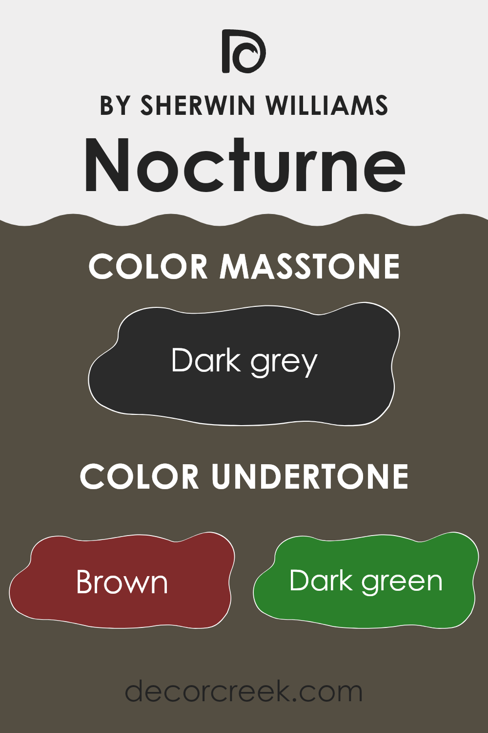
NocturneSW 9520 is a unique shade that can appear differently based on its undertones and the lighting in a room. Understanding undertones helps in predicting how paint will look once applied to walls. For NocturneSW 9520, the undertones consist of brown, dark green, olive, navy, purple, dark turquoise, and grey. Each of these affects the perception of the color.
Undertones are subtle colors that influence a main color. NocturneSW 9520’s undertones work together to create a depth that toggles between warmth and coolness. In dim light, brown and olive undertones might make the color appear warmer, cozy, and welcoming. Navy and purple undertones add a dash of coolness that gives the walls a calming effect, useful for creating a relaxed atmosphere in bedrooms or living areas.
When used on interior walls, these undertones blend to adapt to different furnishings and lighting conditions, making NocturneSW 9520 a versatile choice for decorating. In natural light, dark turbine and grey can surface, providing a sophisticated look without using complex language. This versatility means that the color can fit various room settings and styles, from modern to rustic.
Overall, NocturneSW 9520 offers an adaptable backdrop that reacts to its environment, influenced heavily by its rich array of undertones. This interaction between light and color makes NocturneSW 9520 a practical choice for those looking to paint their interiors with a lasting, dynamic shade.
What is the Masstone of the Nocturne SW 9520 by Sherwin Williams?
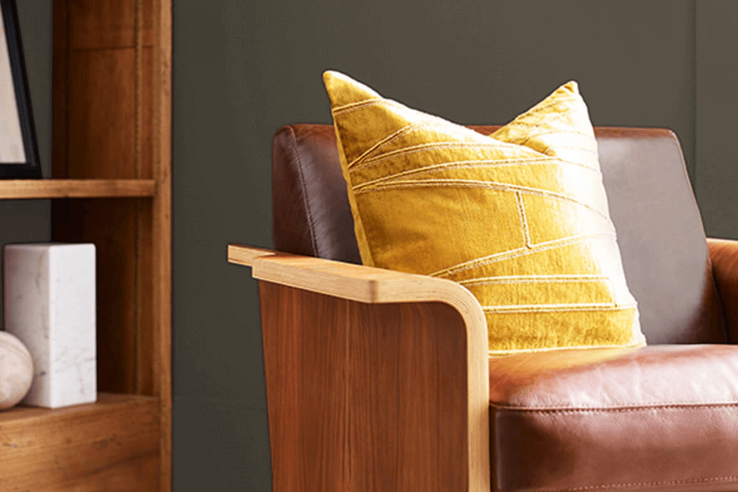
Nocturne by Sherwin Williams is a dark grey color with a deep, almost charcoal hue. This rich shade works exceptionally well in homes because it offers a strong and bold backdrop that can highlight other colors or decor elements.
When used in a room, it can make bright colors like blues, pinks, or yellows really pop, providing a nice contrast. Additionally, because it’s such a deep gray, it hides marks and smudges better than lighter colors, making it a practical choice for high-traffic areas or homes with kids and pets.
This color is versatile and can be used in various settings, from cozy living rooms to sleek modern kitchens. It pairs well with both modern and traditional decor, giving homeowners the flexibility to use it in many ways through their space.

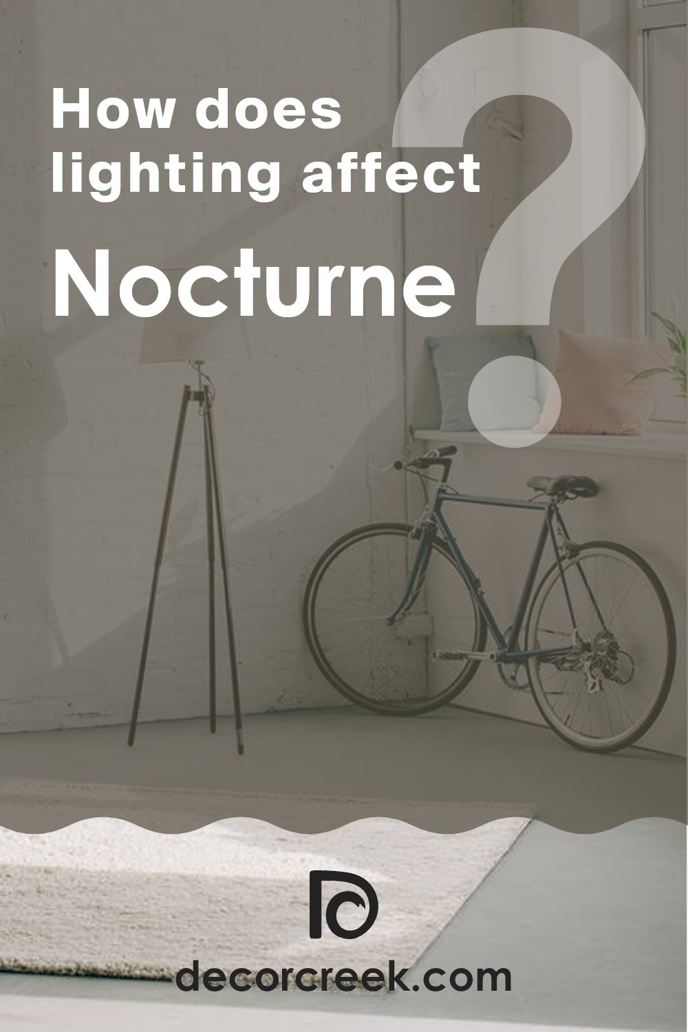
How Does Lighting Affect Nocturne SW 9520 by Sherwin Williams?
Lighting plays a crucial role in how we perceive colors. The same paint can appear differently under various lighting conditions: natural sunlight, fluorescent lights, or LED bulbs.
When considering a specific color like Nocturne by Sherwin Williams, it’s essential to understand its behavior under different lighting. Under artificial light, such as LED or fluorescent lights, this deep color might look richer and more intense. Artificial light, especially warm-toned bulbs, can add a cozy, inviting glow to the color, accentuating its depth.
In natural light, Nocturne might display different nuances depending on the time of day and the weather. On sunny days, natural light can make this dark color appear slightly lighter and reveal subtle undertones that aren’t as visible at night.
The orientation of rooms also affects how Nocturne appears. In north-facing rooms, which receive less direct sunlight and tend to have cooler light, this color can appear true to its form, but slightly darker and more muted. The lack of abundant natural light means it relies heavily on artificial lighting, which can make the room feel smaller if poorly lit.
In south-facing rooms, on the other hand, abundant sunlight can make Nocturne look lighter and slightly warmer throughout the day. These rooms can handle the depth of such a dark color without feeling cramped because the natural light opens up the space.
East-facing rooms get a lot of sunlight in the morning, which means Nocturne will look brighter and warmer in the mornings but will return to its deeper, darker tone in the evening as natural light fades.
West-facing rooms bring a similar effect in reverse; the color appears darker in the morning and warmer and brighter in the late afternoon and evening when these rooms catch the sun.
Overall, when using a color like Nocturne, it’s helpful to test it in your specific space with your lighting to truly see how it will come alive on your walls.
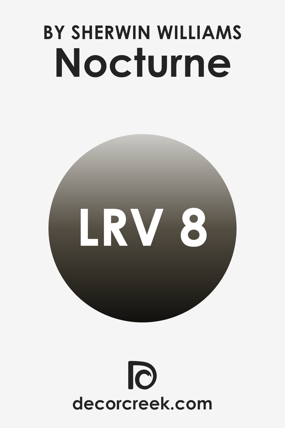
What is the LRV of Nocturne SW 9520 by Sherwin Williams?
LRV stands for Light Reflectance Value, which is a measure used to describe the percentage of light a paint color reflects or absorbs when it’s applied to a wall. It’s a practical way to gauge how light or dark a color will look in a space. Lighter colors have higher LRVs and tend to reflect more light, making a room feel brighter and more open.
Conversely, darker colors have lower LRVs, absorb more light, and can make a room feel cozier but smaller. For example, the color with an LRV of 7.766 is considered quite dark. This means it absorbs more light than it reflects, which could make a small room feel even smaller and darker.
However, in a well-lit or large space, this same color can add a sense of depth and drama, creating a striking contrast with lighter colors or decor elements. Thus, choosing a color with such a low LRV should be done thoughtfully, considering the amount of natural or artificial light your room receives and the atmosphere you want to create.
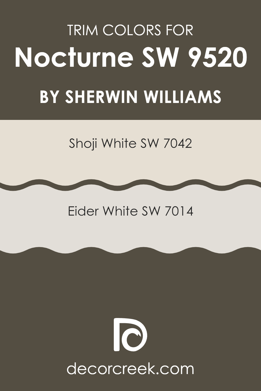
What are the Trim colors of Nocturne SW 9520 by Sherwin Williams?
Trim colors are specific shades used on the architectural elements like door frames, window frames, and skirting boards, distinct from the main wall color to enhance the overall look of a room. Choosing the right trim color can significantly impact the aesthetic appeal of a space, framing the walls beautifully and creating a polished, finished look.
For a dramatic yet balanced color like Nocturne SW 9520 by Sherwin Williams, trim colors such as SW 7042 – Shoji White and SW 7014 – Eider White are excellent choices. These lighter trim colors can help outline and highlight the darker shade of Nocturne, adding contrast and depth to the room.
Shoji White SW 7042 is a warm, soft white with subtle beige undertones that can lend a cozy, inviting feel to any space as a trim. Its gentle hue complements the boldness of Nocturne, ensuring the darker walls are neatly framed without stark contrasts. Eider White SW 7014, on the other hand, is a lighter gray-white with a hint of pink, providing a subtle, fresh contrast to deeper wall colors. This shade works well as a trim, bringing a light, airy quality that balances the depth of darker tones effectively.
You can see recommended paint colors below:
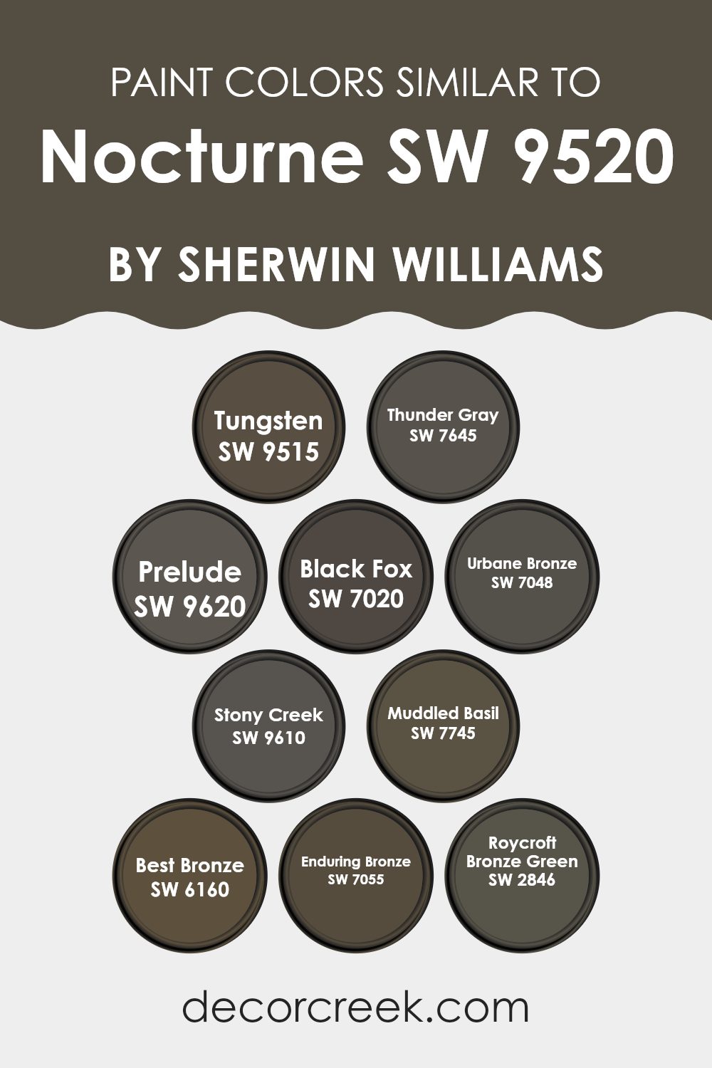
Colors Similar to Nocturne SW 9520 by Sherwin Williams
Choosing colors that harmonize well can truly enhance the ambiance of any space, and focusing on shades similar to a specific color can help create a cohesive and appealing look. When considering colors akin to Nocturne SW 9520 by Sherwin Williams, shades such as Tungsten SW 9515 and Thunder Gray SW 7645 offer a subtle variance while maintaining a sense of continuity. These grays provide a stable, grounding effect perfect for creating a restful atmosphere.
Similarly, Prelude SW 9620 and Black Fox SW 7020 lend a deeper, more intense contrast but still echo the foundational hues of Nocturne, enabling an elegant yet grounded color palette. Urbane Bronze SW 7048 and Stony Creek SW 9610 blend in well by adding a metallic depth that can make spaces feel more defined without disrupting the overall unity.
To introduce some dynamism without straying too far from the theme, colors like Muddled Basil SW 7745 and Best Bronze SW 6160 infuse a touch of nature-inspired freshness and warmth respectively. Enduring Bronze SW 7055 and Roycroft Bronze Green SW 2846, while maintaining the bronze theme, invite a greener, more organic feel into the mix.
These shades all work beautifully with Nocturne, as their gentle variations help keep the decor visually interesting yet harmonious. Through this cohesive palette, any room can achieve a balanced and aesthetically pleasing look that feels both put-together and naturally flowing.
You can see recommended paint colors below:
- SW 9515 Tungsten
- SW 7645 Thunder Gray
- SW 9620 Prelude
- SW 7020 Black Fox
- SW 7048 Urbane Bronze
- SW 9610 Stony Creek
- SW 7745 Muddled Basil
- SW 6160 Best Bronze
- SW 7055 Enduring Bronze
- SW 2846 Roycroft Bronze Green
How to Use Nocturne SW 9520 by Sherwin Williams In Your Home?
Nocturne SW 9520 by Sherwin Williams is a deep, rich blue paint color that can add a touch of drama and elegance to any room. It’s perfect for making a statement in spaces like living rooms or dining areas. If you want to add a cozy, intimate feel, consider using this shade in a bedroom or reading nook.
Since it’s a darker color, it works well on accent walls to highlight specific areas without overwhelming the entire room.You can also use Nocturne SW 9520 in your bathroom to create a relaxing, spa-like atmosphere.
Pair it with lighter tones like whites or soft grays and silver fixtures to keep the space balanced and inviting. If you enjoy a cohesive home decor style, think about incorporating this color through smaller elements like pillows, throws, or even a painted piece of furniture. This allows you to enjoy the beauty of Nocturne SW 9520 without the commitment of painting a whole room.
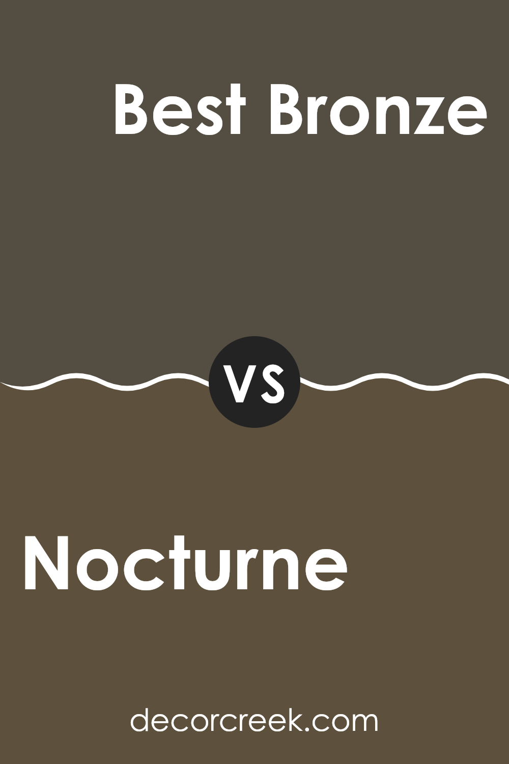
Nocturne SW 9520 by Sherwin Williams vs Best Bronze SW 6160 by Sherwin Williams
The main color, Nocturne, is a dark, deep blue that gives off a strong and grounded feel. It’s almost like looking at the sky on a clear, starry night. On the other hand, Best Bronze is a warm, medium brown shade that brings to mind images of autumn leaves or rich earth.
These colors are quite different in mood; Nocturne leans towards a bold and classic look, while Best Bronze provides a warmer and more natural feel. They both have their own unique appeal, with Nocturne being more dramatic and Best Bronze being cozier.
Together, these colors could complement each other well if used in the same space—Nocturne could provide striking accents alongside the more subdued Best Bronze, creating a balanced and inviting environment.
You can see recommended paint color below:
- SW 6160 Best Bronze
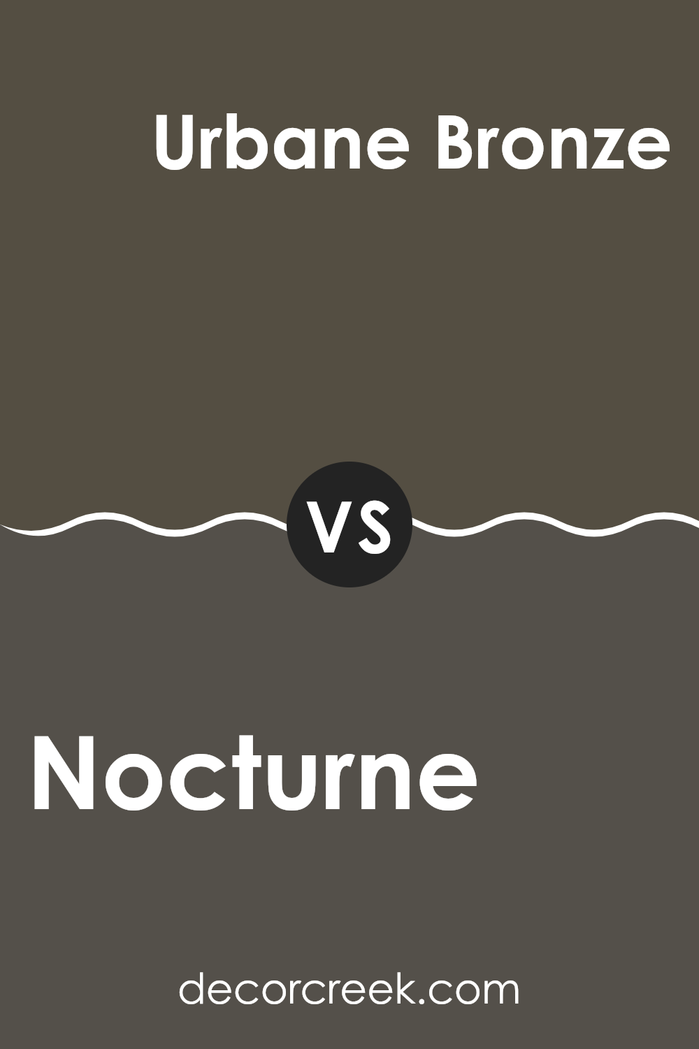
Nocturne SW 9520 by Sherwin Williams vs Urbane Bronze SW 7048 by Sherwin Williams
Nocturne and Urbane Bronze, both from Sherwin Williams, offer distinct vibes for different decorating needs. Nocturne is a dark, almost black color with subtle blue undertones, giving it a cool, deep feel that’s perfect for creating a striking accent in a room.
On the other hand, Urbane Bronze is a warm, dark gray-brown. This color brings a cozy, grounding effect, making it ideal for spaces where you want to feel relaxed and secure, like living rooms or bedrooms.
While Nocturne leans more towards a bold, dramatic flair, Urbane Bronze offers a sense of warmth and comfort. Both colors work well as base tones but serve different moods and atmospheres within the spaces they occupy.
You can see recommended paint color below:
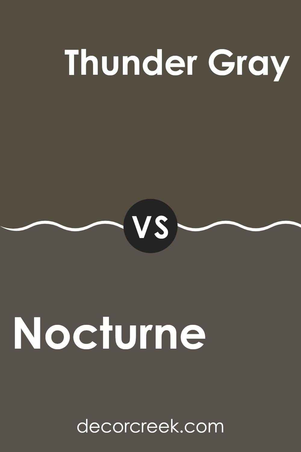
Nocturne SW 9520 by Sherwin Williams vs Thunder Gray SW 7645 by Sherwin Williams
Nocturne by Sherwin Williams is a deep, dark blue that almost appears black under some lighting conditions. This makes it a strong choice for creating a bold statement in a room, especially when used on accent walls or in spaces where a touch of drama is desired.
On the other hand, Thunder Gray by Sherwin Williams is a mid-tone gray with a slight blue undertone. This color is versatile and more subdued compared to Nocturne, making it easier to use across larger areas without overwhelming the space.
Thunder Gray works well in various settings, offering a neutral backdrop that complements both bright and muted color schemes. In summary, while Nocturne adds a dramatic flair with its deep blue tones, Thunder Gray provides a more balanced and neutral option suitable for various decorating styles.
You can see recommended paint color below:
- SW 7645 Thunder Gray
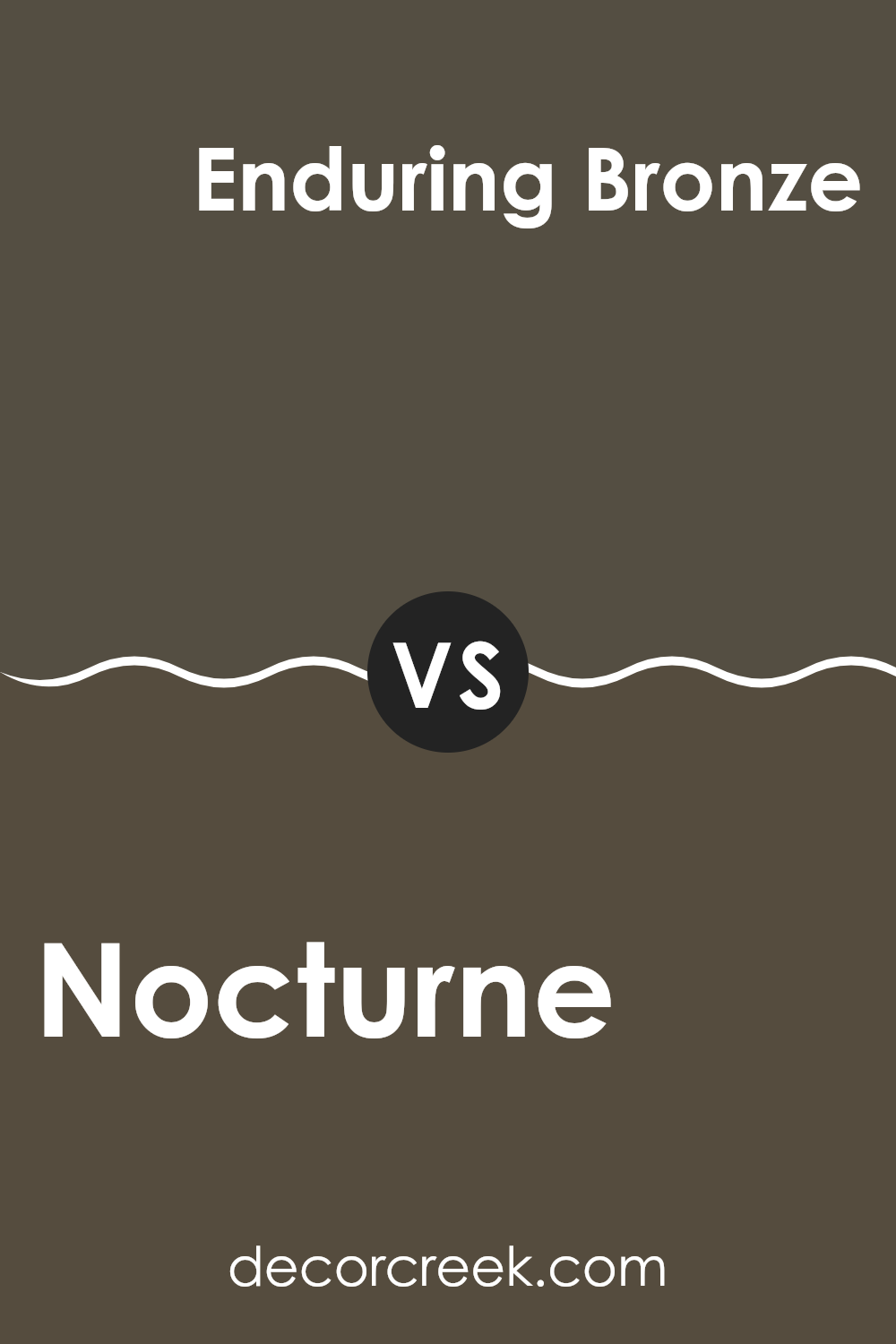
Nocturne SW 9520 by Sherwin Williams vs Enduring Bronze SW 7055 by Sherwin Williams
Nocturne and Enduring Bronze, both by Sherwin Williams, are distinctive in their appeal and usage. Nocturne is a deep, rich blue with a hint of mystery, perfect for creating a strong, cozy atmosphere in a room. It pairs well with bright whites or soft neutrals for a striking contrast.
On the other hand, Enduring Bronze is a warm, earthy brown tone that offers a sense of warmth and comfort. This color works well in spaces where you want to add a touch of coziness and grounding, such as living rooms and bedrooms.
Both colors provide a unique vibe: Nocturne leans towards a bold, dramatic look while Enduring Bronze brings a comforting, inviting feel. Depending on the room’s purpose and the mood you want to set, either color could be the perfect choice. They also pair well together, with Enduring Bronze complementing the depth of Nocturne, ideal for sophisticated yet cozy designs.
You can see recommended paint color below:
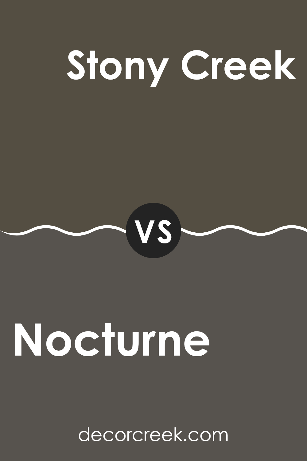
Nocturne SW 9520 by Sherwin Williams vs Stony Creek SW 9610 by Sherwin Williams
Nocturne and Stony Creek are two paint colors from Sherwin Williams. Nocturne is a deep, almost black blue that offers a bold look. It’s perfect if you want to make a strong statement in a room or on an accent wall. This color can give a feeling of depth and can make other colors, like white trim, really pop.
On the other hand, Stony Creek is a greenish-gray color. It’s much lighter than Nocturne and lends a softer, more neutral backdrop to spaces. This color works well in many areas of a home because it blends nicely with different decor styles and brings a calm and collected atmosphere.
Both colors offer unique attributes, with Nocturne leaning towards a dramatic flair and Stony Creek providing a more laid-back and adaptable option. Whether you choose one over the other depends on the mood and style you’re looking to achieve in your space.
You can see recommended paint color below:
Nocturne SW 9520 by Sherwin Williams vs Tungsten SW 9515 by Sherwin Williams
Nocturne and Tungsten, both by Sherwin Williams, are distinct yet complimentary colors. Nocturne is a deep, dark teal that almost looks like a forest green at night. It has a rich and moody vibe that can make any space feel more cozy and grounded.
On the other hand, Tungsten is a softer, muted gray with a hint of warm purple undertones. It’s less intense and more neutral, making it a versatile choice for any decor. When used together, Nocturne can act as an assertive accent on a wall or in accessories, while Tungsten serves as a calming backdrop, providing a subtle contrast that isn’t too overwhelming.
These colors can set a peaceful yet interesting mood in a room, whether in a home or office setting. Together, they offer a perfect balance of depth and lightness, suitable for anyone looking to create a stylish yet understated environment.
You can see recommended paint color below:

Nocturne SW 9520 by Sherwin Williams vs Black Fox SW 7020 by Sherwin Williams
Nocturne and Black Fox, both from Sherwin Williams, are shades of dark paint but they offer distinct vibes because of their unique undertones and depth. Nocturne is a very deep, near-black color that carries a subtle nuance of navy, giving it a cooler feel. This touch of blue adds a bit of softness, making it a great choice if you want something less harsh than true black. It”s ideal for creating a cozy, yet slightly moody atmosphere.
On the other hand, Black Fox has a warmer undertone, leaning more towards a dark charcoal or chocolatey brown. This quality makes it slightly lighter than Nocturne and it provides a warm and inviting feeling without going too deep into a stark black territory.
Perfect for adding warmth to a space, Black Fox works well in areas where you want depth and richness but not the starkness of a colder black. Choosing between them would depend on whether you want the cooler hints of blue (Nocturne) or the welcoming, warm browns (Black Fox).
You can see recommended paint color below:
Nocturne SW 9520 by Sherwin Williams vs Muddled Basil SW 7745 by Sherwin Williams
Nocturne SW 9520 and Muddled Basil SW 7745 from Sherwin Williams are two distinct colors, each offering its unique vibe. Nocturne is a deep, rich navy blue that has a strong presence and brings about a bold look in any space.
It’s great for creating a striking accent wall or adding depth when used on cabinets or furniture. On the other hand, Muddled Basil is a dark, earthy green shade that feels more natural and grounding.
This color works well in spaces where you want to add a touch of the outdoors or create a cozy, welcoming atmosphere. Together, these colors could complement each other in a space that balances boldness and earthiness, suitable for someone looking to blend a modern look with natural elements.
You can see recommended paint color below:
- SW 7745 Muddled Basil
Nocturne SW 9520 by Sherwin Williams vs Roycroft Bronze Green SW 2846 by Sherwin Williams
Nocturne SW 9520 and Roycroft Bronze Green SW 2846 are both colors by Sherwin Williams but they have distinct tones. Nocturne is a very deep blue, almost black, that’s great for creating a bold statement in a room. It’s ideal if you want a dramatic or cozy feel, lending a strong backdrop to any decor.
On the other hand, Roycroft Bronze Green is more of a muted forest green with subtle bronze undertones. It gives off a grounded and calm feeling, making it perfect for spaces where you want to promote a relaxed environment. It pairs well with natural materials and earthy colors.
Using these colors in different rooms can set various moods and accents depending on what you’re going for. Whether it’s the striking deepness of Nocturne for a chic look or the softer, nature-inspired Roycroft Bronze Green for calmness, both colors offer unique aesthetics.
You can see recommended paint color below:
- SW 2846 Roycroft Bronze Green
Nocturne SW 9520 by Sherwin Williams vs Prelude SW 9620 by Sherwin Williams
Nocturne SW 9520 and Prelude SW 9620, both by Sherwin Williams, offer distinct shades that can significantly influence the atmosphere of a room. The main color, Nocturne, is a deep, dark charcoal hue that brings a bold and strong feeling to spaces. It can make large rooms feel cozier and is perfect for creating a dramatic accent wall. This color pairs well with bright whites or metallic accents for a modern look.
On the other hand, Prelude is a lighter, soft gray shade. This color has a more relaxed vibe and is versatile enough to be used in any room without overwhelming the space. It works well as a base color that can be combined with brighter colors for a lively environment or with other neutrals for a more subdued setting.
In essence, while Nocturne provides a commanding presence with its darker tone, Prelude offers a gentle backdrop suitable for various decorating styles. Whether you choose one or the other depends on the mood you want to set in your space.
You can see recommended paint color below:
Conclusion
This color can be a great choice if you want to give a room a big change without using bright or loud colors. It can make your furniture and decorations really pop out, especially light-colored ones, like whites or yellows. And, it works well in places where you relax like bedrooms or living rooms, making them feel safe and snug.
Overall, using SW 9520 Nocturne in a room can make a big difference. It’s like when you put on your favorite dark-colored jacket; it makes you feel good and looks nice without being too flashy. If you’re thinking about painting a room and you like the idea of a cozy, mysterious spot in your home, Nocturne might just be the perfect color to try. It’s a small change that can make your room look and feel very different in a good way.
Ever wished paint sampling was as easy as sticking a sticker? Guess what? Now it is! Discover Samplize's unique Peel & Stick samples.
Get paint samples

