Imagine a shade that brings the cozy aura of your favorite coffee shop or a lazy Sunday morning into your home. SW 9501 Oat Milk offers a creamy, soft hue that can seamlessly blend or stand out as a gentle focal point, depending on how you pair it in your space.
I found myself drawn to its versatility. Whether I wanted to create a serene living room or a soothing bedroom, Oat Milk provided the perfect backdrop. It has a natural ability to complement a wide range of colors, from earthy tones to bold accents.
This quality made it an easy choice for someone like me, who enjoys changing things up without committing to anything overly bold or daring.
In my experience, the color manages to enhance natural light, giving rooms a bright, airy feel even on the cloudiest days. It’s like inviting a little bit of the outdoors inside, without bringing in the unpredictable elements.
For anyone looking to add a touch of warmth and understated elegance to their space, SW 9501 Oat Milk might just be the answer.

What Color Is Oat Milk SW 9501 by Sherwin Williams?
Oat Milk by Sherwin Williams is a soft, warm off-white color with a hint of beige. It creates a cozy and inviting atmosphere, making it a great choice for various interior styles. This gentle hue works especially well in minimalist, Scandinavian, and farmhouse designs where subtle, neutral tones are needed to create a calm and comfortable space.
In minimalist homes, Oat Milk serves as a perfect backdrop, letting simple lines and clean spaces stand out. In Scandinavian interiors, it complements light wood tones and natural fabrics, enhancing the airy and bright aesthetic.
Meanwhile, in a farmhouse setting, this color reflects a sense of warmth and homeliness, pairing well with rustic finishes and vintage furniture.
Oat Milk pairs exceptionally well with natural materials like wood, cotton, and linen, emphasizing comfort and a connection with nature. Its warm undertone also blends beautifully with textures like matte ceramics, woven baskets, and soft wool throws.
This shade can work alongside deeper earth tones such as taupe or terracotta to add depth or with crisp whites and light grays for a more contemporary look. Whether used on walls, cabinetry, or trim, Oat Milk offers a versatile option that can enhance the comfort and livability of any room.
Is Oat Milk SW 9501 by Sherwin Williams Warm or Cool color?
Oat Milk SW 9501 by Sherwin Williams is a light, warm off-white color that brings a cozy and inviting atmosphere to a home. Its soft, creamy tones make it an excellent choice for creating a calm and comfortable environment. Because it’s a neutral color, it works well in almost any room, including living rooms, bedrooms, and kitchens.
Oat Milk pairs nicely with both muted and vibrant colors. It serves as a versatile backdrop that can complement other shades without overwhelming them. For a modern look, pair it with darker grays or blacks for contrast. If you prefer a more traditional feel, combine it with soft blues, greens, or pinks.
Natural light enhances Oat Milk’s warmth, making spaces feel open and airy. In darker rooms, artificial lighting helps maintain its inviting nature. Overall, Oat Milk SW 9501 is a flexible and pleasing color that can adapt to various styles and lighting conditions in a home.
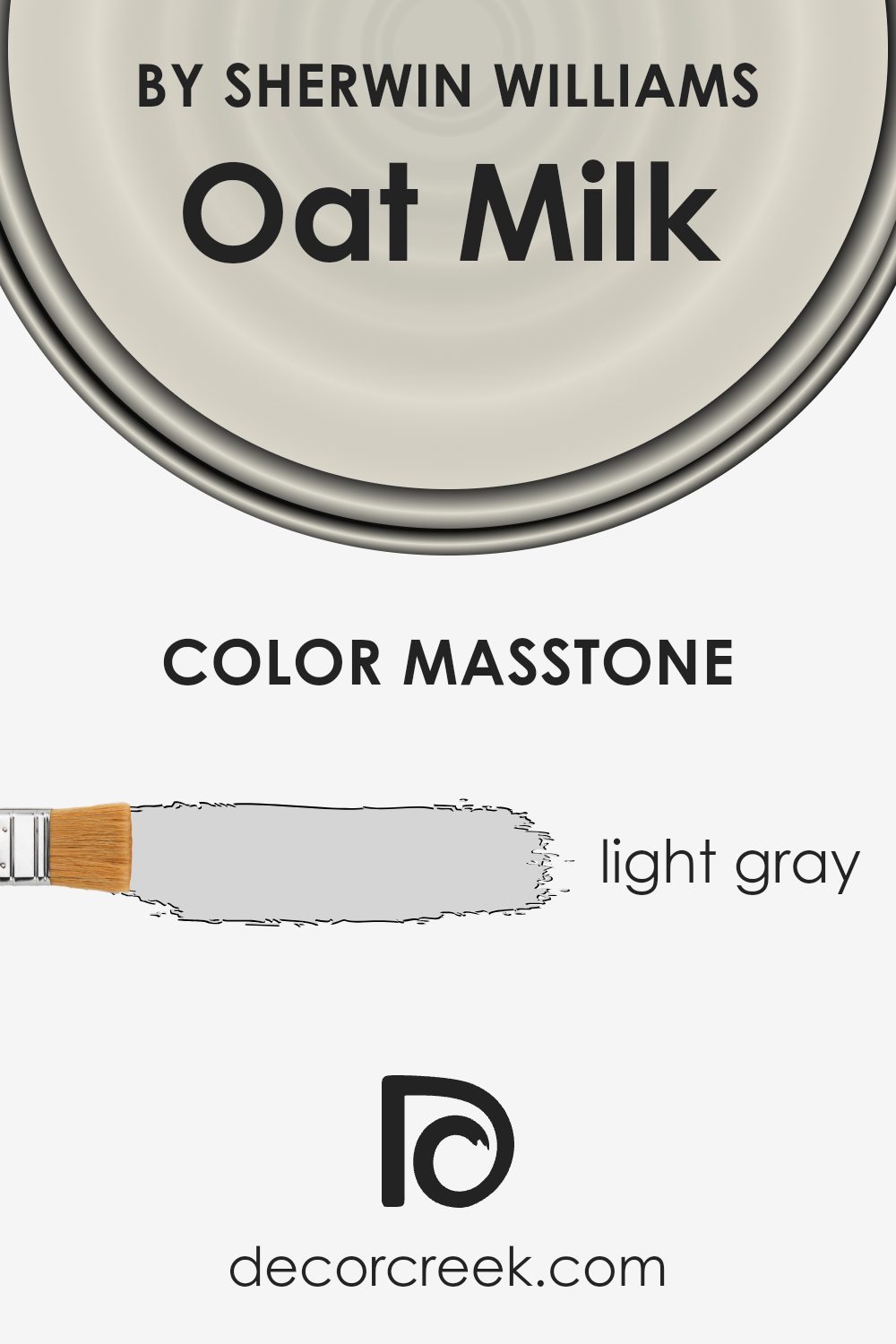
What is the Masstone of the Oat Milk SW 9501 by Sherwin Williams?
Oat Milk (SW 9501) by Sherwin Williams is a light gray color, given by its masstone of #D5D5D5. This shade provides a soft and neutral backdrop that can blend well into any room. It doesn’t overpower a space, making it a versatile choice for various design styles. The light gray tone brings a sense of calm and simplicity, which can help create a relaxing atmosphere in living rooms, bedrooms, or even kitchens.
It reflects light well, which can make smaller rooms feel more open and airy. Oat Milk pairs nicely with both warm and cool colors, allowing homeowners to easily combine it with different accents and furniture. This adaptability means it can work well in modern, minimalist spaces as well as more traditional settings.
Overall, its gentle tone makes it a practical and stylish option for walls and interiors, providing a fresh yet understated look.
How Does Lighting Affect Oat Milk SW 9501 by Sherwin Williams?
Lighting plays a significant role in how we perceive colors. Natural and artificial light can change the way paint colors appear in a room. Oat Milk SW 9501 by Sherwin Williams is a warm, neutral color that may vary greatly under different lighting conditions.
In natural light, the appearance of Oat Milk can change depending on the direction from which the light enters the room. In a north-facing room, the light is often cooler and indirect, which might make Oat Milk appear more muted or slightly grayish.
This is because north-facing rooms get the least direct sunlight, so the warm tones in the paint might not stand out as much.
In contrast, south-facing rooms generally receive the most consistent and direct sunlight throughout the day. This abundant natural light can bring out the warmth in Oat Milk, making the room feel cozier and brighter. The color may appear more cream-like, emphasizing its soft, welcoming look.
East-facing rooms get bright morning sunlight, which is warm and yellowish. In the mornings, Oat Milk could look brighter and more vibrant, with its warm undertones more noticeable. However, as the sun moves and the light becomes less direct, the color may appear more subdued.
West-facing rooms experience the opposite: minimal direct sunlight in the morning but a warm, golden light in the afternoon and evening. During these hours, Oat Milk might look richer and warmer, enhancing the cozy atmosphere as the day progresses.
Under artificial lighting, the type of bulbs can also impact how Oat Milk looks. Incandescent lighting tends to cast a warm glow, which can enhance the color’s warmth, while fluorescent lighting might make it appear cooler and more neutral. LED lights, depending on their temperature, can show Oat Milk anywhere on the spectrum from warm to neutral.
In summary, the color and mood that Oat Milk SW 9501 conveys in a space can vary significantly with changes in both natural and artificial light.

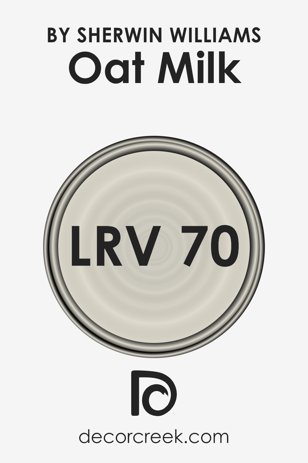
What is the LRV of Oat Milk SW 9501 by Sherwin Williams?
LRV stands for Light Reflectance Value, which is a measure of how much light a color reflects. The scale ranges from 0 to 100, where 0 represents absolute black, which absorbs all light, and 100 represents pure white, which reflects all light. LRV is important when choosing colors for a room because it affects how bright and spacious the room will feel.
Colors with a high LRV will reflect more light, making spaces feel larger and more open. Conversely, colors with low LRV absorb more light, making spaces feel cozier and more enclosed.
With an LRV of 70.325, the color Oat Milk by Sherwin Williams is on the lighter side of the spectrum. This means it reflects a lot of light and will make a room appear brighter and more airy. It’s a great choice for spaces that you want to feel open and inviting, as it can enhance natural light and create a soft, welcoming atmosphere. This makes it particularly suitable for living rooms, kitchens, or any area where you want to maximize light and create a sense of spaciousness.
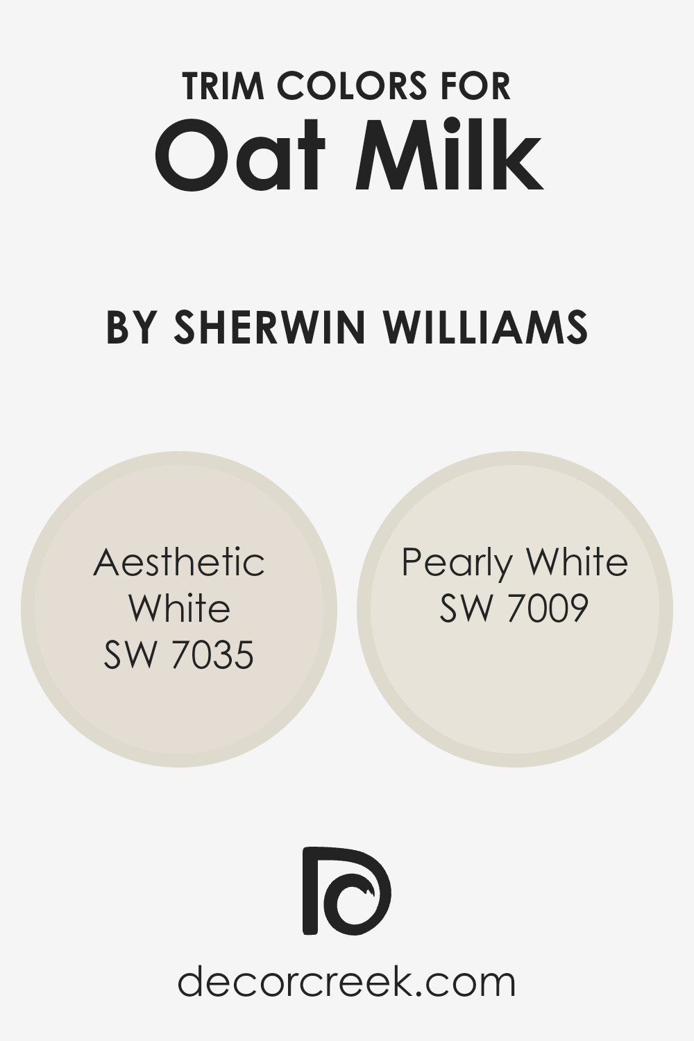
What are the Trim colors of Oat Milk SW 9501 by Sherwin Williams?
Trim colors are the shades used to highlight borders, edges, and other architectural details of a room or building, essentially giving it a refined finish. They play a crucial role in design by accentuating the main color while maintaining the overall aesthetic balance.
When designing a space with Oat Milk by Sherwin Williams, choosing the right trim colors enhances its warm, soft tones and adds a sense of completeness to the room. By selecting trim colors like Aesthetic White and Pearly White, the creamy, inviting nature of Oat Milk is given a subtle framework that complements its gentle appeal.
Aesthetic White, with its soft, warm undertones, serves as a fantastic pairing for Oat Milk. It provides a barely-there contrast that is pleasing to the eye without overpowering the main color. On the other hand, Pearly White is a more neutral shade with hints of gray, offering a crisper touch to the trim that stands out subtly against the warmth of Oat Milk.
Together, using these trim colors can make a room feel both cozy and well-defined, giving each space a touch of elegance and simplicity that enhances its overall look.
You can see recommended paint colors below:
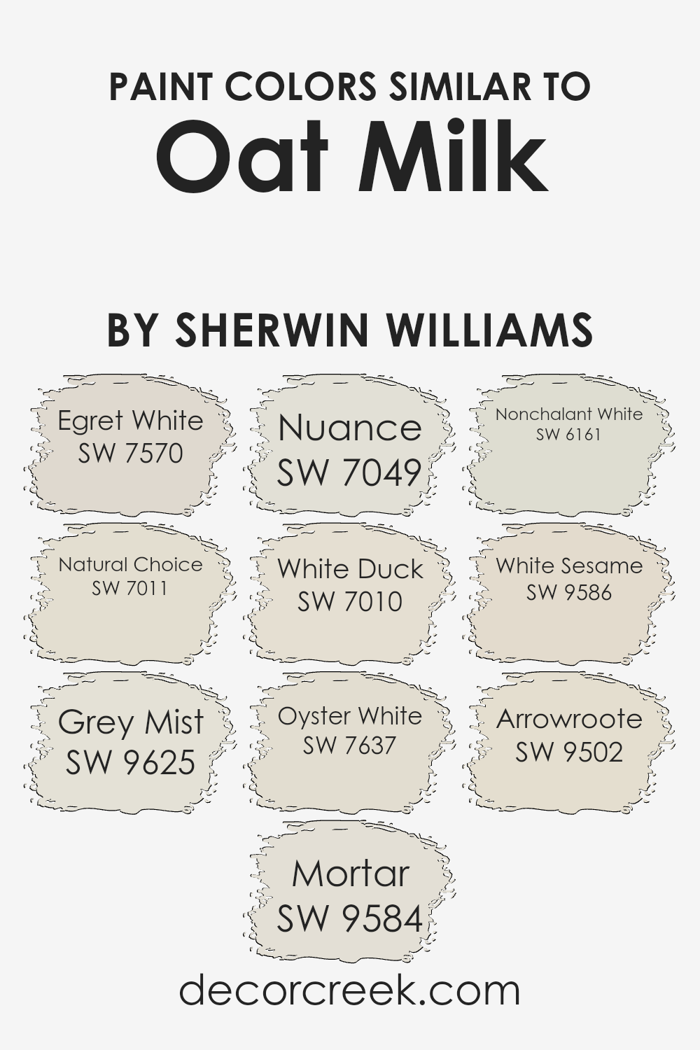
Colors Similar to Oat Milk SW 9501 by Sherwin Williams
Similar colors are important in design because they create a cohesive and harmonious look. When you use colors that are close to each other on the color wheel, they work together naturally and create a sense of unity. For instance, colors similar to Sherwin-Williams’ Oat Milk, like Egret White, White Sesame, and White Duck, all have soft undertones that blend seamlessly, creating a warm and inviting atmosphere.
Each color has its unique touch but shares an overall softness that makes them work well together. Grey Mist and Oyster White offer a gentle contrast with their subtle gray hues, adding depth without dramatic change, which is perfect for understated elegance.
Natural Choice and Nonchalant White bring a touch of warmth, offering slightly creamier tones that can offset starker whites or cooler grays in the mix. Nuance and Mortar add a whisper of shadow, with Mortar being a touch deeper, which can help ground a space while maintaining the lightness one might seek. Arrowroot adds a faint earthy tint, providing a subtle variation that complements the other tones.
By using these colors, you create a palette that’s easy on the eyes and brings about a calm and inviting feel to any space.
You can see recommended paint colors below:
- SW 7570 Egret White
- SW 7011 Natural Choice
- SW 9625 Grey Mist
- SW 9584 Mortar
- SW 7049 Nuance
- SW 7010 White Duck
- SW 7637 Oyster White
- SW 6161 Nonchalant White
- SW 9586 White Sesame
- SW 9502 Arrowroote
How to Use Oat Milk SW 9501 by Sherwin Williams In Your Home?
Oat Milk SW 9501 by Sherwin Williams is a warm, creamy beige that can bring a cozy feeling to any home. Its soft, neutral tone makes it versatile and easy to use in various rooms. In the living room, this shade can provide a welcoming backdrop for your furniture and decor, allowing bolder colors to stand out against it.
You can also use Oat Milk on bedroom walls for a calm and peaceful atmosphere that promotes relaxation. In the kitchen, this color complements natural wood tones and metal accents, creating a warm environment that’s perfect for gatherings.
Pair it with crisp white trim to highlight architectural details or add contrast with dark-colored fixtures and furnishings. Because of its neutral quality, Oat Milk works well with a range of styles, from modern to traditional, making it an excellent choice for those who want a versatile and inviting palette for their home.
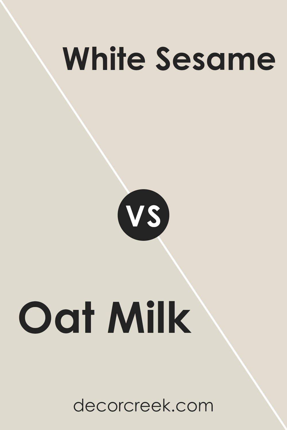
Oat Milk SW 9501 by Sherwin Williams vs White Sesame SW 9586 by Sherwin Williams
Oat Milk (SW 9501) and White Sesame (SW 9586) by Sherwin Williams are two soft, neutral colors that suit a variety of home settings. Oat Milk is a warm, creamy beige with subtle undertones, which makes spaces feel cozy and inviting. It’s perfect for living rooms or bedrooms where a comforting atmosphere is desired.
On the other hand, White Sesame is a cooler, off-white shade with a hint of gray, giving it a more modern and clean feel. It’s an excellent choice for kitchens or bathrooms where a crisp look is preferred.
While both colors are versatile, Oat Milk leans toward a warmer palette that pairs well with earthy tones, while White Sesame fits nicely with more contemporary, cool-toned decors. Ultimately, the choice between these colors depends on the mood and style you wish to create in your space.
You can see recommended paint color below:
- SW 9586 White Sesame
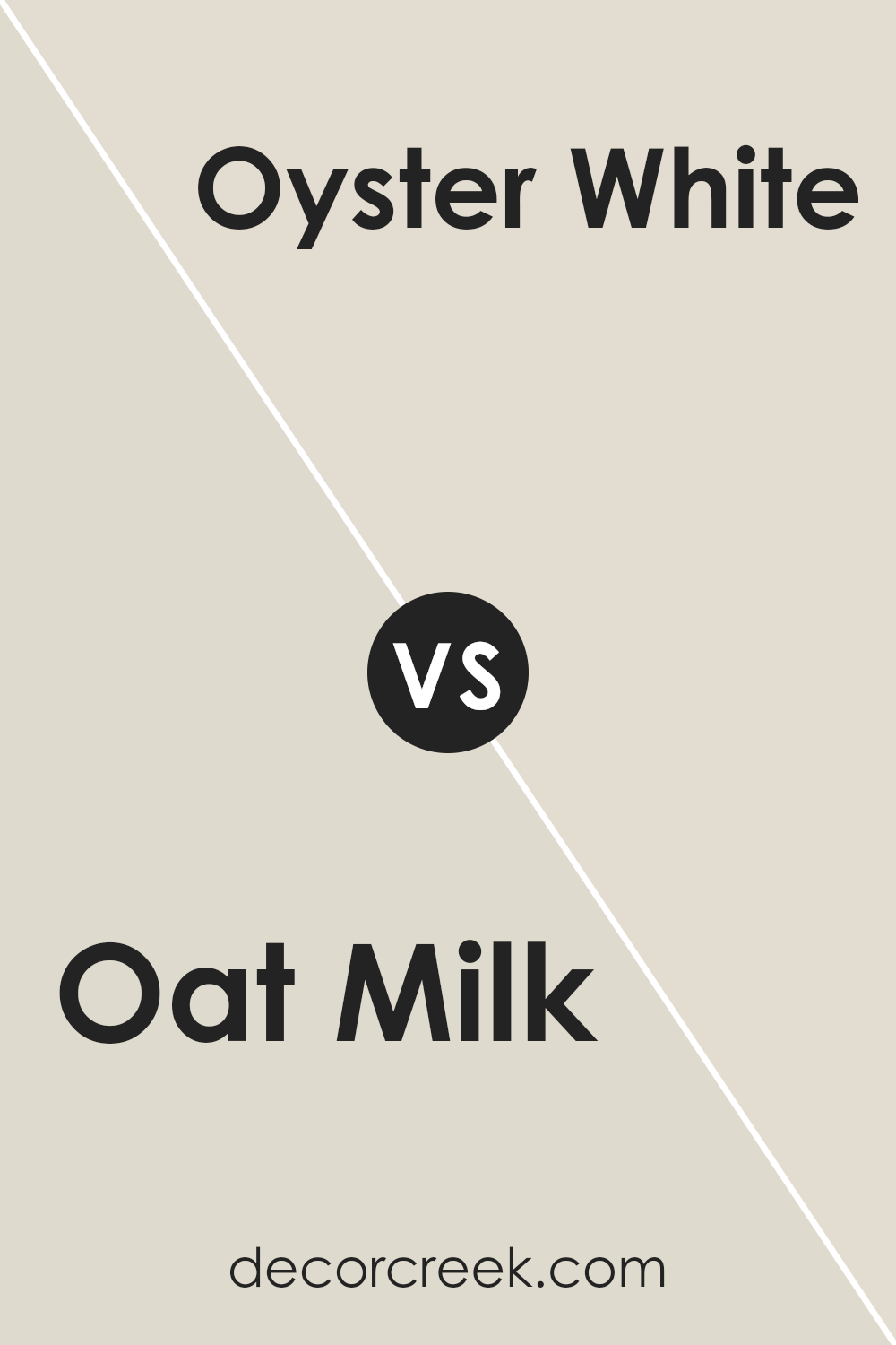
Oat Milk SW 9501 by Sherwin Williams vs Oyster White SW 7637 by Sherwin Williams
Oat Milk SW 9501 and Oyster White SW 7637 by Sherwin Williams are two neutral paint colors with distinct characteristics. Oat Milk is a warm, creamy shade with subtle beige undertones, giving spaces a cozy and inviting feel. It works well with both warm and cool color accents, making it versatile for various rooms.
On the other hand, Oyster White is a cooler, off-white color with gray undertones, offering a more modern and clean look. It’s a great choice for spaces where you want a more understated background, allowing other design elements to stand out.
While Oat Milk creates a welcoming and snug atmosphere, Oyster White provides a more crisp and contemporary vibe. Both colors bring their own charm to a space, depending on the ambiance you wish to achieve. Oat Milk suits traditional or rustic decor, whereas Oyster White complements minimalist or modern styles.
You can see recommended paint color below:
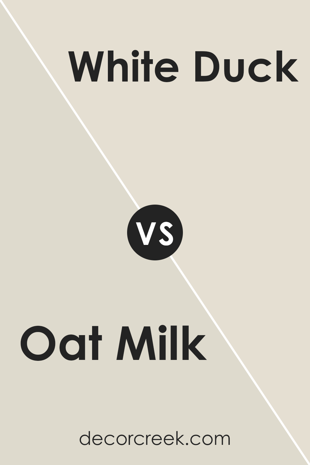
Oat Milk SW 9501 by Sherwin Williams vs White Duck SW 7010 by Sherwin Williams
Oat Milk (SW 9501) and White Duck (SW 7010) by Sherwin Williams are both warm, soft neutrals, but they have distinct differences. Oat Milk is a creamy, light beige with subtle yellow undertones. It’s cozy and inviting, making it perfect for creating a warm atmosphere in a room. In contrast, White Duck is a muted off-white with a slight greige tint, balancing between gray and beige. This gives White Duck a more subdued and versatile look, suitable for many styles.
Oat Milk works well in spaces where you want a hint of warmth, while White Duck offers a slightly cooler feel without being stark or sterile. Both colors are great for creating a neutral backdrop, but Oat Milk feels a bit cozier, and White Duck provides a more modern and understated look.
They both complement various decor styles, providing a gentle, natural vibe.
You can see recommended paint color below:
Oat Milk SW 9501 by Sherwin Williams vs Nuance SW 7049 by Sherwin Williams
Oat Milk SW 9501 by Sherwin Williams is a gentle, creamy shade that leans more toward a warm, off-white hue with subtle beige undertones. It creates a cozy and inviting atmosphere, making spaces feel soft and comforting.
On the other hand, Nuance SW 7049 by Sherwin Williams is a more complex color, combining soft gray with a hint of green, giving it a cooler tone. This color makes rooms look calm and sophisticated, with a slightly modern twist.
When comparing the two, Oat Milk is warmer and more traditional, great for spaces where you want a comforting, homey vibe. Nuance, with its cooler tones, offers a clean and fresh feel, working well in spaces seeking a modern and polished look. Both colors are versatile, but they set different moods: Oat Milk is inviting and warm, while Nuance is sleek and soothing.
You can see recommended paint color below:
- SW 7049 Nuance
Oat Milk SW 9501 by Sherwin Williams vs Grey Mist SW 9625 by Sherwin Williams
Oat Milk and Grey Mist by Sherwin Williams are both versatile, neutral paint colors, but they give off different vibes. Oat Milk is a warm, creamy off-white that brings a cozy and soft feel to a space. It’s great for creating a welcoming and inviting atmosphere, making it ideal for living rooms or bedrooms where comfort is key.
On the other hand, Grey Mist is a light, cool gray shade that offers a more modern and clean look. This color is perfect for spaces where you want a calm and airy feel, such as bathrooms or kitchens. Grey Mist’s subtle coolness makes it a good backdrop for brighter accents, allowing them to stand out without overwhelming the space.
Both colors can work well in various settings, but Oat Milk adds warmth and comfort, while Grey Mist gives a fresh and modern touch. Choosing between them depends on the mood and style you want to create.
You can see recommended paint color below:
Oat Milk SW 9501 by Sherwin Williams vs Arrowroote SW 9502 by Sherwin Williams
Oat Milk SW 9501 and Arrowroot SW 9502 by Sherwin Williams are both soft, neutral shades that bring warmth and subtlety to any space. Oat Milk is a light, creamy beige with a slightly warm undertone that creates a cozy, inviting feel. It’s versatile and works well as a main wall color, adding depth without overwhelming a room.
On the other hand, Arrowroot is slightly darker and has a touch more gray, lending a bit of an earthy tone. This makes it ideal for creating a natural, grounded atmosphere. Arrowroot can be used for accent walls or in areas where a bit more contrast is desired compared to the more neutral Oat Milk.
Both colors complement each other beautifully and can be paired together for a harmonious look. Oat Milk brightens spaces, while Arrowroot adds subtle moodiness, allowing for a balanced, warm aesthetic in any home.
You can see recommended paint color below:
- SW 9502 Arrowroote
Oat Milk SW 9501 by Sherwin Williams vs Nonchalant White SW 6161 by Sherwin Williams
Oat Milk SW 9501 and Nonchalant White SW 6161 are two distinct off-white colors from Sherwin Williams. Oat Milk is a warm, creamy hue that adds a cozy feel to any space. It has soft yellow undertones, making it an inviting and comforting choice for living areas or bedrooms.
On the other hand, Nonchalant White is cooler with subtle gray undertones, offering a more neutral and modern look. It tends to blend well with cooler color palettes, making it ideal for kitchens or bathrooms where you may want a fresh, clean feel.
While Oat Milk’s warmth may add a touch of intimacy, Nonchalant White’s coolness offers a crisp, airy vibe. Choosing between them comes down to the mood you want to create—either warm and snug with Oat Milk or modern and fresh with Nonchalant White. Both are versatile and can complement various styles and decors.
You can see recommended paint color below:
- SW 6161 Nonchalant White
Oat Milk SW 9501 by Sherwin Williams vs Mortar SW 9584 by Sherwin Williams
Oat Milk and Mortar are two distinctive colors by Sherwin Williams that bring different vibes to a space. Oat Milk is a soft, creamy white with warm undertones, making it a versatile choice that adds warmth and coziness to a room. It’s excellent for creating a light, airy feel and pairs well with various design styles, from modern to classic.
On the other hand, Mortar is a deeper, more muted shade of gray. It provides a strong, stable background, adding a touch of sophistication and depth to any environment. Mortar’s cooler tones make it an excellent choice for contemporary or industrial-themed spaces.
When combined, Oat Milk and Mortar offer a balanced contrast. Oat Milk can brighten a space and make it feel more open, while Mortar provides grounding and contrast. Together, they create a harmonious look that blends warmth and strength, perfect for a balanced and inviting home.
You can see recommended paint color below:
- SW 9584 Mortar
Oat Milk SW 9501 by Sherwin Williams vs Egret White SW 7570 by Sherwin Williams
Oat Milk SW 9501 and Egret White SW 7570 are both subtle, neutral colors by Sherwin Williams, but they have distinct differences. Oat Milk is a soft, warm off-white with creamy undertones. Its gentle warmth makes spaces feel cozy and inviting. It’s versatile and works well in various settings, from living rooms to bedrooms, where a touch of warmth is desired without overwhelming the space.
On the other hand, Egret White is a slightly cooler, greige tone. It has a subtle gray undertone, which can give rooms a more modern and slightly cooler feel compared to Oat Milk. This color might be chosen for a more contemporary or minimalist setting, where a hint of gray is desired.
Both colors provide a neutral backdrop suitable for many decor styles, but Oat Milk leans warmer and softer, while Egret White offers a slightly cooler, more sophisticated vibe. Choosing between them depends on whether you want a cozy warmth or a refined, neutral grayish tint.
You can see recommended paint color below:
Oat Milk SW 9501 by Sherwin Williams vs Natural Choice SW 7011 by Sherwin Williams
Oat Milk SW 9501 and Natural Choice SW 7011 by Sherwin Williams are both soft, neutral colors. Oat Milk SW 9501 is a light, creamy beige with a hint of warmth. It has a subtle softness that can create a cozy and inviting atmosphere. This color is versatile, making it suitable for various spaces, from living rooms to bedrooms.
Natural Choice SW 7011 is another warm neutral, but it leans slightly more toward a creamy off-white. It is a bit lighter than Oat Milk and can provide a crisp, clean backdrop that works well in any room. Natural Choice can make spaces feel bright and airy, often complementing modern and traditional styles alike.
Both colors provide a gentle warmth, but Oat Milk is slightly darker and more beige, while Natural Choice has a lighter, more off-white appearance. Choosing between them depends on the amount of lightness or warmth you want in your space.
You can see recommended paint color below:
Conclusion
When I think about Sherwin Williams’ SW 9501 Oat Milk, I picture a warm and cozy color that feels like a hug. It’s a soft shade that makes any room feel welcoming and comfy. Imagine sitting in a room painted with this color—it’s like being wrapped in a cozy blanket, making everything around feel calm and inviting.
SW 9501 Oat Milk is a light, sandy beige with a hint of warmth. It makes me think of a sunny day in late spring when everything feels fresh and clean. It’s a color that isn’t too bold or bright, but it isn’t dull, either. It feels just right, like when you finally find a pair of jeans that fit perfectly.
Whether for a bedroom, living room, or even a kitchen, this shade works nicely everywhere. It’s like when you listen to your favorite song—it just makes everything better no matter where you are. I like how it pairs with different colors too. You can add blues or greens, and it looks great.
In the end, choosing SW 9501 Oat Milk feels like picking comfort and happiness for your walls. It’s the kind of color that makes people smile and feel at home. If you’re curious about making your room feel warm and friendly, this shade might be your new best friend.

Ever wished paint sampling was as easy as sticking a sticker? Guess what? Now it is! Discover Samplize's unique Peel & Stick samples.
Get paint samples

