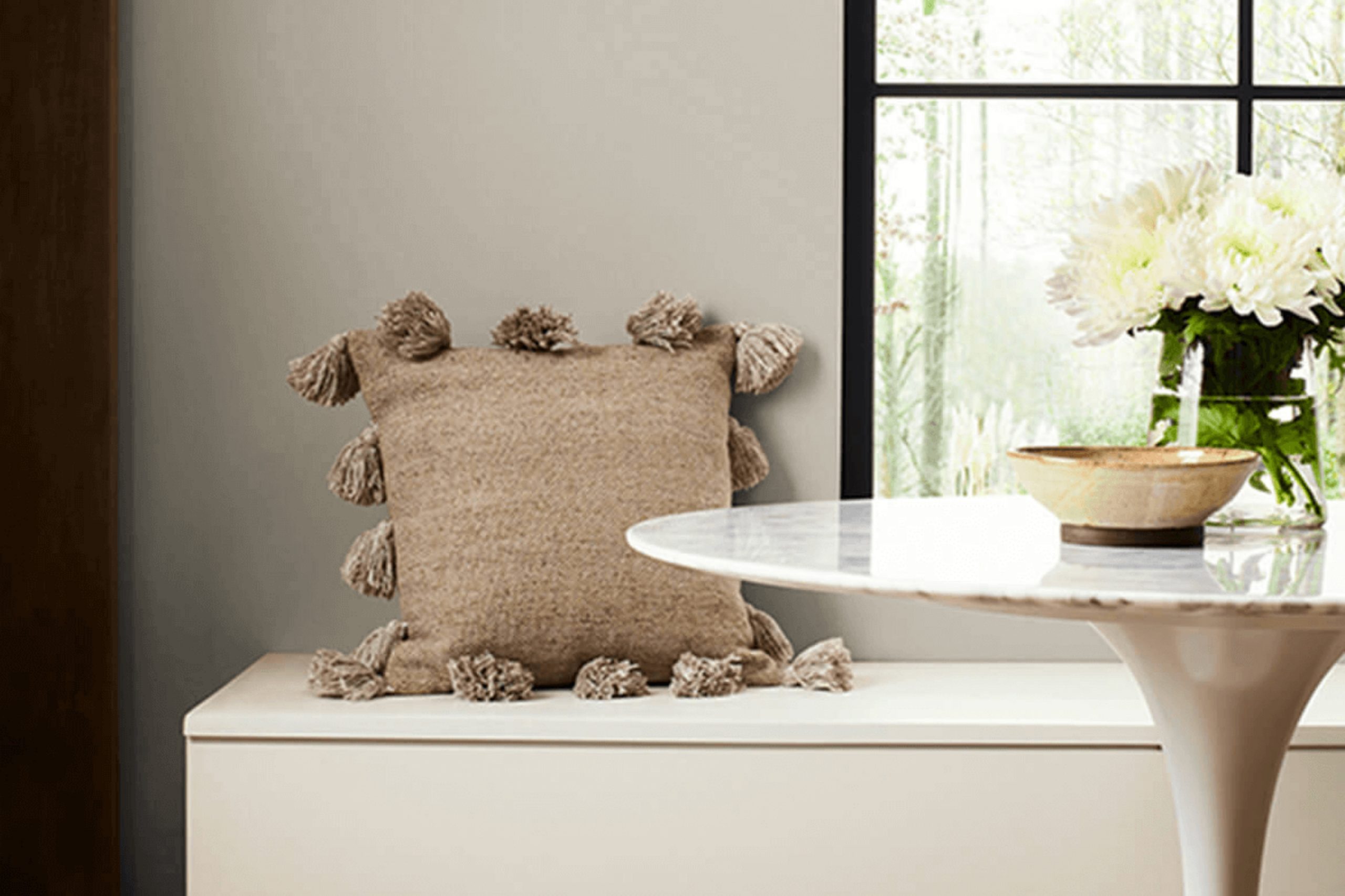
When you choose SW 9596 Pachyderm by Sherwin Williams for your room, you’re inviting a sense of warmth and comfort into your environment. This flexible shade offers a gentle, soothing presence that works beautifully in a variety of rooms. Whether you’re updating a busy living area or enhancing the feel of a peaceful bedroom, Pachyderm adds a touch of subtle refinement that can complement any style.
Its soft, earthy tone creates a welcoming atmosphere, making it easy for you to feel at home. Imagine using Pachyderm as a backdrop for your family photos or favorite artworks—its understated elegance allows other elements in the room to shine. The color’s neutrality provides a calming effect, grounding the room and making it feel more cohesive.
As you plan your interior design, you’ll find Pachyderm harmonizes well with both bold accents and subdued details. It’s a color that doesn’t demand attention but enriches the overall aesthetic of your home.
Whether paired with darker hues for contrast or lighter tones for harmony, Pachyderm offers endless possibilities for creating a room that reflects your personal taste and style.
What Color Is Pachyderm SW 9596 by Sherwin Williams?
Pachyderm SW 9596 by Sherwin Williams is a soft, earthy taupe that brings warmth and a sense of calm to any room. Its subtle blend of gray and brown tones makes it an incredibly flexible color choice for interiors. This gentle shade strikes a perfect balance, acting as a rich neutral backdrop that enhances other elements in your room without feeling too bold.
Pachyderm fits well into a range of interior styles, including modern, minimalist, rustic, and traditional settings. It is a great option for living rooms, bedrooms, or even kitchens, as it adds a cozy, inviting feel.
When it comes to pairing Pachyderm with materials and textures, it works beautifully with natural elements like wood and stone, accentuating their organic qualities. Light oak or walnut wood furniture looks stunning against its muted hue. Soft, textured fabrics such as linen or cotton in cushions, curtains, or upholstery enhance its warmth and add depth to the room. Additionally, metallic accents in gold, bronze, or brushed nickel can provide a touch of elegance and contrast.
Overall, Pachyderm SW 9596 by Sherwin Williams creates a harmonious atmosphere, offering a flexible, warm foundation for a variety of interior designs and decor elements.
Is Pachyderm SW 9596 by Sherwin Williams Warm or Cool color?
Pachyderm, identified as SW 9596 by Sherwin Williams, is a soft gray-beige color, often described as a greige. It creates a warm and inviting atmosphere in homes. The color’s neutrality allows it to blend well with various design styles, from modern to traditional, making it a flexible choice for different rooms.
When used on walls, Pachyderm can make rooms feel spacious yet cozy, enhancing natural light without feeling too strong. It works well as a base color, providing a subtle backdrop that lets other interior elements stand out. Pairing it with white trims creates a clean, fresh look, while combining it with darker accents adds depth and interest.
Pachyderm’s understated elegance makes it suitable for living rooms, bedrooms, and even kitchens. It harmonizes well with natural materials like wood and stone, complementing a variety of textures and finishes. This adaptability ensures that Pachyderm remains a popular and practical color choice in many homes.
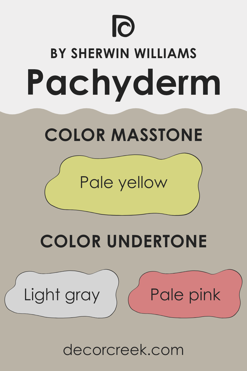
Undertones of Pachyderm SW 9596 by Sherwin Williams
Mindful Gray introduces a calming presence, blending effortlessly with Pachyderm, while Requisite Gray adds a soft, relaxed feel to the palette. Whisper, with its light and airy tone, brings gentle brightness, ideal for making a room feel more open. Analytical Gray offers a quiet balance, grounding the other shades with its neutral yet welcoming touch.
The color Pachyderm is primarily seen as a neutral shade, but the variety of undertones gives it more depth and complexity. In a well-lit room, for example, the light blue and mint undertones can give the paint a cooler appearance, adding a sense of calm and openness to the room. In contrast, under warm lighting, the orange and yellow undertones might become more prominent, giving the paint a warmer and cozier feel.
How we perceive color is often influenced by the lighting and surrounding colors. The subtle purples and lilacs can sometimes add a soft, slightly refined feel, whereas the greens and olive touches might introduce a hint of natural freshness.
Meanwhile, the underlying gray tones provide a stable and balanced base, making Pachyderm a flexible choice for many interiors. Depending on the accents and furnishings present in the room, these undertones can offer different moods and highlight the paint uniquely. These variations make Pachyderm an adaptable paint choice, working well in a range of settings.
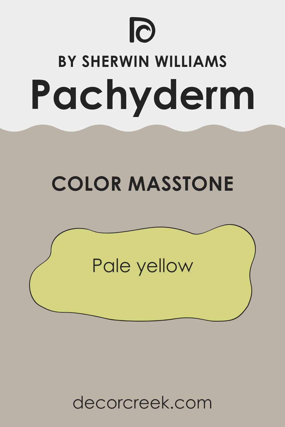
What is the Masstone of the Pachyderm SW 9596 by Sherwin Williams?
Pale yellow, like Sherwin Williams’ Pachyderm SW 9596, can bring a cheerful and sunny vibe to any room. This soft shade of yellow feels light and airy, making rooms seem larger and more open. It reflects natural light well, which can brighten up a dark room or hallway.
In living rooms or kitchens, this color creates a welcoming and warm atmosphere, perfect for gatherings or family time. It can also be a great choice for bathrooms or bedrooms, adding a subtle hint of color without feeling too bold.
Pairing it with white trim or light-colored furniture enhances its brightness, while using it alongside darker colors can create a balanced contrast. Overall, Pachyderm SW 9596 is flexible and works well if you’re aiming for a friendly and inviting room. Its gentle hue is suitable for both modern and traditional home styles, seamlessly fitting in various design schemes.
How Does Lighting Affect Pachyderm SW 9596 by Sherwin Williams?
Lighting plays a crucial role in how we perceive colors in a room. The type of light, its intensity, and the direction from which it comes can all change the way a color appears on a wall. For example, the color Pachyderm SW 9596 by Sherwin Williams can look different depending on whether it’s illuminated by natural or artificial light.
In natural light, Pachyderm appears as a warm, earthy gray. The amount and direction of the light can affect its appearance significantly. In a north-facing room, the light is usually cooler and softer throughout the day. Therefore, colors tend to look a bit muted and grayer. Pachyderm in such rooms can appear slightly cooler and darker, emphasizing its neutral tones.
In south-facing rooms, where there is plenty of direct sunlight, colors can appear warmer and more vibrant. Pachyderm will likely seem lighter and warmer, showing off some of its earthy undertones more strongly.
East-facing rooms receive bright, direct light in the morning and softer, indirect light later in the day. In the morning, Pachyderm may look brighter and more lively. As the day progresses, it might take on a calmer and more neutral tone as the intensity of the light diminishes.
West-facing rooms enjoy sunlight later in the day, especially in the afternoon and evening. In these rooms, the color might look rich and warm in the afternoon, with some of its depth intensified by the setting sun.
Under artificial lighting, especially with incandescent bulbs, Pachyderm can look warmer and potentially darker since these lights often add a warm, yellow-orange hue to colors. LED or fluorescent lights, which can be cooler, might make the color appear more neutral or slightly cooler.
Understanding how different lighting conditions affect a color like Pachyderm can help in making informed decisions when choosing paint for various rooms.
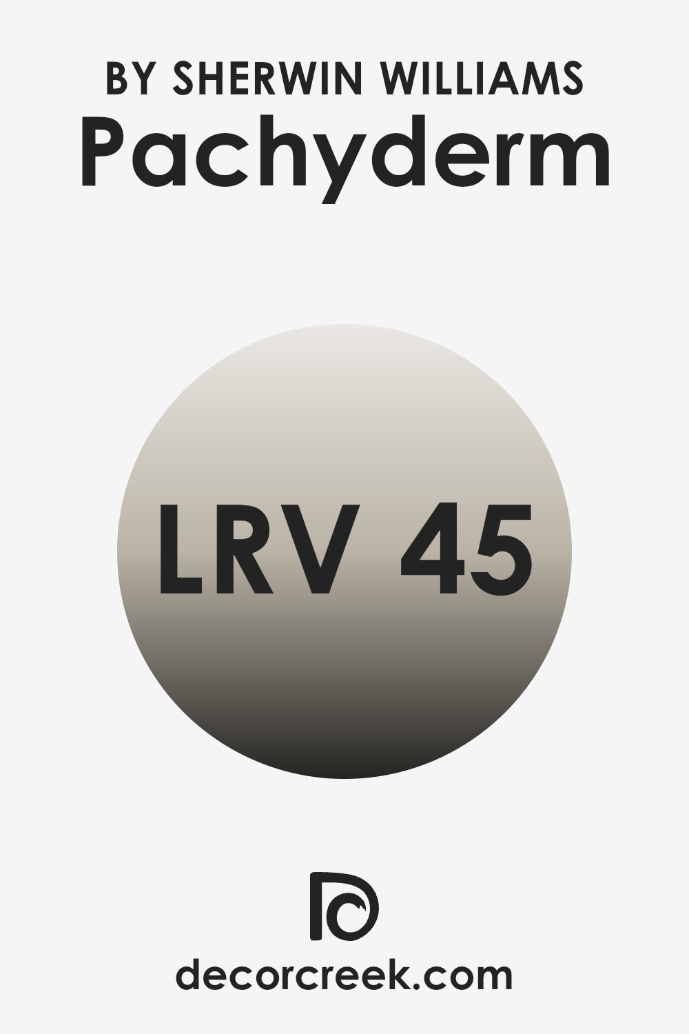
What is the LRV of Pachyderm SW 9596 by Sherwin Williams?
Light Reflectance Value, or LRV, is a measurement that indicates how much light a color will reflect. This scale runs from 0 to 100, with 0 representing absolute black, which reflects no light, and 100 representing pure white, which reflects all light.
Understanding LRV is important when choosing paint colors because it affects how bright or dark a room will feel. Colors with high LRV will reflect more light and make a room feel brighter and more open. Conversely, colors with a low LRV absorb more light, making a room feel warmer and cozier.
Pachyderm by Sherwin Williams has an LRV of 45.22, placing it in the mid-range of the scale. This means it reflects a moderate amount of light, neither too light nor too dark. In a room, this color will appear balanced, creating a comfortable and stable atmosphere.
It’s not overly bright to the point of feeling sterile, nor is it so dark that it might make the room feel small or cramped. This balance makes it a flexible choice, suitable for a variety of rooms and lighting conditions, without making the space feel too bold or too dim.
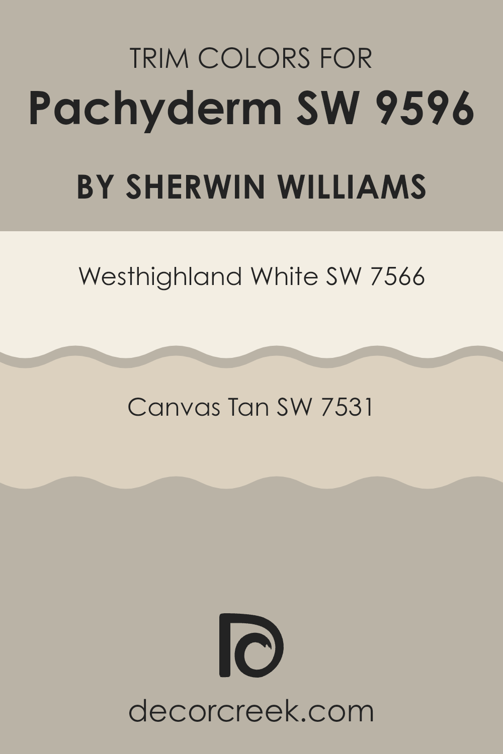
What are the Trim colors of Pachyderm SW 9596 by Sherwin Williams?
Trim colors are the colors used on the edges or frames of a room or building, like moldings, baseboards, or window sills. These colors help define the room and add contrast or harmony to the main wall color. For someone choosing a trim color to go with a bold choice like Pachyderm SW 9596, it’s important to pick something that enhances and complements the overall look without taking attention away from the main color.
Trim colors can subtly change the mood and appearance of a room. Choosing the right trim color will frame the Pachyderm’s soft elegance, accentuating its warm gray tone while providing a pleasant transition between surfaces like walls and ceilings.
Westhighland White (SW 7566) is a soft, creamy white that adds a touch of warmth without being too stark. It can help to keep rooms feeling light and airy, providing a gentle transition that harmonizes well with Pachyderm’s neutral tone.
On the other hand, Canvas Tan (SW 7531) is a warm beige with a slight hint of yellow, bringing a cozy, inviting feel to any room. It offers a bit more depth than a standard white while still maintaining an understated elegance. Both these trim color options are excellent choices for providing that finishing touch, ensuring the design feels complete and cohesive.
You can see recommended paint colors below:
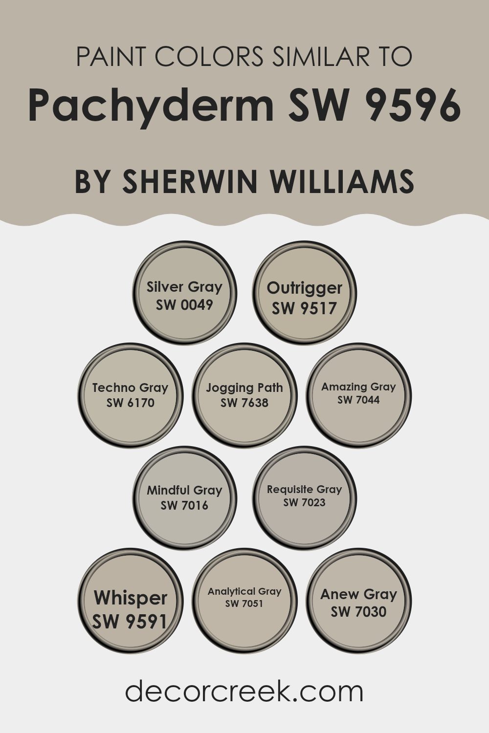
Colors Similar to Pachyderm SW 9596 by Sherwin Williams
When choosing colors to complement Pachyderm by Sherwin-Williams, the goal is to find hues that blend smoothly with its soft and subtle tone. Similar colors create a cohesive and pleasing palette, making any room feel balanced and inviting. For instance, Silver Gray offers a cool undertone that pairs seamlessly with Pachyderm, adding a touch of elegance to any room.
Outrigger enhances the room with a slightly darker shade, creating depth and interest. Techno Gray blends its modern vibe with Pachyderm, offering a fresh yet lasting look. Jogging Path brings in warmth, complementing the base color with its earthy feel. Amazing Gray adds a classic touch with its neutral balance, perfect for creating a cozy atmosphere.
Mindful Gray introduces a soothing presence, harmonizing wonderfully with Pachyderm, while Requisite Gray lends a gentle vibe to the palette. Whisper, with its light and airy tone, adds a soft brightness, perfect for visually opening up a room. Analytical Gray subtly balances the surrounding colors with its neutral yet inviting feel.
Lastly, Anew Gray offers a hint of taupe, marrying traditional and contemporary styles effortlessly. Together, these colors offer a broad yet cohesive range, ideal for creating a harmonious and inviting environment, letting Pachyderm be the backdrop for comfort and style.
You can see recommended paint colors below:
- SW 0049 Silver Gray
- SW 9517 Outrigger
- SW 6170 Techno Gray
- SW 7638 Jogging Path
- SW 7044 Amazing Gray
- SW 7016 Mindful Gray
- SW 7023 Requisite Gray
- SW 9591 Whisper
- SW 7051 Analytical Gray
- SW 7030 Anew Gray
How to Use Pachyderm SW 9596 by Sherwin Williams In Your Home?
Pachyderm SW 9596 by Sherwin Williams is a warm, earthy paint color that brings a sense of comfort and stability to any room. Its gentle, neutral tones make it a flexible choice for various rooms in your home.
You can use Pachyderm in the living room to create a cozy, inviting atmosphere that encourages relaxation and conversation. It’s also a great option for the bedroom, where it can help create a calm and restful environment. In the kitchen, Pachyderm pairs well with natural wood finishes and warm metals, giving the a cozy, organic feel.
This color works well with a variety of design styles, from modern to traditional. Because Pachyderm is a neutral color, it complements many other colors, allowing you to accessorize with vibrant cushions, throws, and artwork. It’s also a good choice for open floor plans, providing a seamless background that ties the different areas of your home together.
Pachyderm SW 9596 by Sherwin Williams vs Techno Gray SW 6170 by Sherwin Williams
Pachyderm SW 9596 and Techno Gray SW 6170, both by Sherwin Williams, are two distinct yet harmonious colors. Pachyderm is a warm, earthy brown with a touch of gray, which provides a cozy and inviting backdrop.
It feels rich and natural, making rooms feel grounded and comfortable. On the other hand, Techno Gray is a cool, muted gray with green undertones. It has a modern, fresh vibe that can lighten up a room and make it feel more spacious.
When used together, Pachyderm can add warmth and depth to a room, while Techno Gray offers a touch of cool contrast, preventing the room from feeling too heavy. These colors blend well, with Pachyderm enhancing the cozy aspect of a room and Techno Gray adding a hint of modern style and refinement. The combination can create a balanced and lasting look suitable for various styles and settings.
You can see recommended paint color below:
- SW 6170 Techno Gray
Pachyderm SW 9596 by Sherwin Williams vs Outrigger SW 9517 by Sherwin Williams
Pachyderm SW 9596 and Outrigger SW 9517 are two interesting colors by Sherwin Williams. Pachyderm is a soft, warm neutral with a slight taupe undertone. It creates a cozy and comforting atmosphere that’s perfect for living rooms or bedrooms. The subtlety of Pachyderm makes it flexible and understated, complementing various design styles and color palettes.
On the other hand, Outrigger SW 9517 is a richer, deeper shade with a more muted brown tone. It’s a bit bolder than Pachyderm and adds depth to any room. Because of its darker hue, Outrigger is a great choice for creating an accent wall or for use in rooms where you want to make a statement without feeling too bold.
Both colors work well with natural elements and can blend seamlessly with wood and other earthy materials. Pachyderm is more subdued, while Outrigger offers a stronger presence.
You can see recommended paint color below:
Pachyderm SW 9596 by Sherwin Williams vs Jogging Path SW 7638 by Sherwin Williams
Pachyderm (SW 9596) and Jogging Path (SW 7638) are two lovely colors by Sherwin Williams, each offering a distinct feel for any room. Pachyderm is a deep, warm gray that carries subtle brown undertones, giving it a cozy and grounded appearance. It’s a flexible color that can be used in many settings, from living rooms to bedrooms, and pairs well with both neutral and bold accents.
On the other hand, Jogging Path is a lighter, softer gray with a slight green undertone. It brings a fresh and airy vibe, making it perfect for rooms where you want a light and calming atmosphere. This color works great in kitchens or bathrooms, creating a clean and spacious look.
While Pachyderm adds warmth and depth, Jogging Path offers lightness and calmness. Together, they can create a balanced and harmonious environment, ideal for those looking to mix deeper and lighter shades in their home.
You can see recommended paint color below:
Pachyderm SW 9596 by Sherwin Williams vs Mindful Gray SW 7016 by Sherwin Williams
Pachyderm and Mindful Gray are two popular paint colors from Sherwin Williams, each bringing its own unique vibe to a room. Pachyderm is a warm, earthy tone, resembling taupe with a hint of warmth. Its comforting and neutral shade makes it a flexible choice for creating cozy and inviting rooms, suitable for living rooms or bedrooms aiming for a snug atmosphere.
On the other hand, Mindful Gray is a cooler, more balanced gray. It’s light yet substantial, providing an airy feel that can brighten rooms while maintaining a sense of calm. This color works well in rooms like kitchens or bathrooms, where a clean and fresh look is desired.
While both colors are neutral, Pachyderm leans towards warmth, making it feel more intimate, whereas Mindful Gray offers a cooler, more open feel. Choosing between them depends on whether you prefer a warm and cozy environment or a cool and airy one.
You can see recommended paint color below:
Pachyderm SW 9596 by Sherwin Williams vs Requisite Gray SW 7023 by Sherwin Williams
Pachyderm SW 9596 by Sherwin Williams is a rich, deep taupe that provides a warm, earthy feel to any room. It has hints of gray and brown, which makes it flexible and suitable for creating a cozy environment. This color can add a touch of elegance and depth, making rooms feel inviting and comfortable.
On the other hand, Requisite Gray SW 7023 is a medium gray with beige undertones. It is a soft, neutral shade that is less intense than Pachyderm. Requisite Gray works well as a background color, providing a light and airy atmosphere. It is great for those who prefer a subtle and calm setting.
When comparing these two colors, Pachyderm has a bolder presence due to its darker tone, while Requisite Gray offers a lighter, more subdued option ideal for those seeking neutrality and versatility in various settings. Both colors work well with different design styles but serve distinct purposes based on their depth and undertones.
You can see recommended paint color below:
Pachyderm SW 9596 by Sherwin Williams vs Anew Gray SW 7030 by Sherwin Williams
Pachyderm SW 9596 and Anew Gray SW 7030 by Sherwin Williams are two distinct colors with unique qualities. Pachyderm is a deep, earthy shade with gray and brown undertones, creating a bold and grounding presence in a room. It’s perfect for making a strong statement when used on walls or as an accent color.
In contrast, Anew Gray is a warmer, softer color. With its balanced mix of gray and beige tones, it offers a more neutral and adaptable option. Anew Gray can easily complement a variety of other colors, making it a great choice for creating a cozy and welcoming atmosphere without feeling too bold.
While Pachyderm has a more intense and dramatic feel, Anew Gray provides a calm and flexible backdrop. Choosing between these colors depends on whether you want a bold feature or a neutral, easygoing look in your home. Each brings its own character and charm to a room.
You can see recommended paint color below:
Pachyderm SW 9596 by Sherwin Williams vs Analytical Gray SW 7051 by Sherwin Williams
Pachyderm SW 9596 and Analytical Gray SW 7051 are two popular paint colors by Sherwin Williams, each with its own unique vibe. Pachyderm is a warm gray with subtle brown undertones, giving it a cozy and earthy feel. It’s a flexible color that can create a welcoming atmosphere, making it ideal for living rooms or bedrooms where comfort is key.
On the other hand, Analytical Gray is a neutral gray with a touch of warmth, but it leans slightly cooler than Pachyderm. This makes it a great choice for those looking for a more modern or clean look. Analytical Gray works well in rooms where you want a light, airy feel, such as kitchens or bathrooms.
Both colors are excellent options for different design goals. Pachyderm brings a sense of warmth and coziness, while Analytical Gray offers a fresh and modern aesthetic.
You can see recommended paint color below:
Pachyderm SW 9596 by Sherwin Williams vs Silver Gray SW 0049 by Sherwin Williams
Pachyderm and Silver Gray from Sherwin Williams offer distinct moods. Pachyderm is a warm, earthy tone with hints of brown and gray, perfect for creating a cozy and grounded atmosphere. It works well in living rooms or bedrooms, adding a touch of warmth and comfort to any room.
In contrast, Silver Gray is a cooler, lighter shade with a soft touch of blue. This color provides a more airy and refreshing feel, ideal for creating a calm and relaxed environment. It suits rooms like bathrooms or kitchens, where a lighter mood is desired.
While Pachyderm brings warmth and a sense of coziness, Silver Gray introduces a soothing and refreshing vibe. Both colors can complement a variety of rooms, but choosing between them depends on whether you prefer a warm and inviting setting or a cooler, airy feel. Consider the natural light in your room, as it will influence how each color is perceived.
You can see recommended paint color below:
Pachyderm SW 9596 by Sherwin Williams vs Whisper SW 9591 by Sherwin Williams
Pachyderm and Whisper are two different paint colors from Sherwin Williams that provide distinct vibes. Pachyderm is a deeper, more muted tone with earthy undertones, offering a sense of warmth and coziness. It’s a flexible choice for rooms where you want to create an inviting and grounded atmosphere.
In contrast, Whisper is lighter and softer, with subtle hints that suggest calmness and simplicity. It provides a neutral backdrop that can make a room feel open and airy, making it ideal for areas where you want to encourage a peaceful environment.
While Pachyderm lends a rich and substantial feel to a room, Whisper offers more of a gentle refresh. These shades can complement each other when used together, with Pachyderm providing depth and Whisper adding lightness. Depending on the mood you aim to create, each color offers a unique touch.
You can see recommended paint color below:
Pachyderm SW 9596 by Sherwin Williams vs Amazing Gray SW 7044 by Sherwin Williams
Pachyderm (SW 9596) and Amazing Gray (SW 7044) by Sherwin Williams are two distinct but adaptable colors. Pachyderm is a soft, muted gray with a slightly warm undertone, making it feel cozy and inviting. It’s a subtle neutral, ideal for creating a calm and comfortable atmosphere in any room.
On the other hand, Amazing Gray, as its name suggests, is a deeper, richer gray with a more pronounced warmth. It has a hint of beige, which makes it appear more traditional and suitable for larger rooms. Both colors work well with various styles, from modern to classic.
Pachyderm is perfect for those who prefer a lighter, more understated palette, while Amazing Gray offers a bolder and more grounded feel. Pairing them together can create a balanced and harmonious look, with Amazing Gray adding depth and Pachyderm providing lightness. Both are excellent options for any home setting.
You can see recommended paint color below:
After thinking about SW 9596 Pachyderm by Sherwin Williams, I see how special this color is. It’s a soft, warm shade that isn’t too bright or too dull; it’s just right. It reminds me of the color of an elephant, kind of gentle and peaceful.
When I imagine using this color in a room, I think it would make a room feel cozy and welcoming. It’s like bringing a hug into the room. It would look great in a living room where people gather and chat or in a bedroom where you want to relax and sleep.
What I like most is that this color can fit nicely with other colors. Whether you like bright colors or more neutral tones, SW 9596 Pachyderm pairs well with them. This means it won’t clash, and you can try different looks if you want.
Thinking about this color, I realize it could make a great choice for painting not just walls but also furniture or even a door. It’s like giving your home a new sweater that’s comfortable and warm.
Overall, SW 9596 Pachyderm feels like a very friendly and inviting color. If I were to pick this for my home, I believe it would help create a warm and happy place where everyone feels comfortable.
Ever wished paint sampling was as easy as sticking a sticker? Guess what? Now it is! Discover Samplize's unique Peel & Stick samples.
Get paint samples

