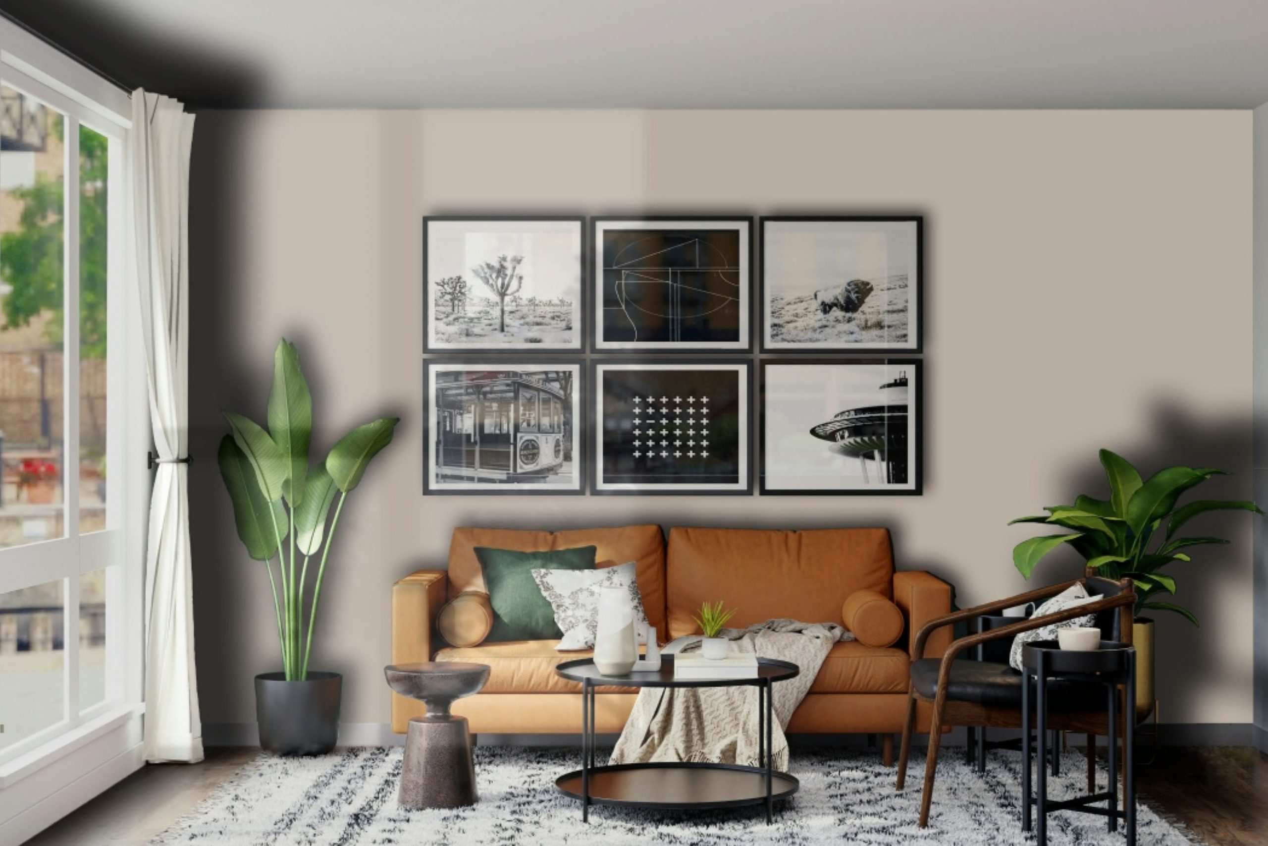
Introducing SW 6073 Perfect Greige by Sherwin Williams, a color that strikes an exquisite balance between gray and beige, creating a warm, sophisticated backdrop for any room in your home. This versatile shade has the incredible ability to blend in seamlessly with a wide range of decor styles and color palettes, making it a go-to choice for designers and homeowners alike who are looking to add a touch of understated elegance to their spaces.
Perfect Greige stands out for its adaptability – it can brighten up a room by reflecting light, yet it also has enough depth to make a statement on its own. Whether you’re updating a cozy living room, a serene bedroom, or even a welcoming kitchen, this color provides a solid foundation that can be built upon with different textures and accent colors. Its neutral tone serves as an ideal backdrop, allowing furniture and artwork to shine, without overwhelming the senses.
If you’re on the hunt for a paint color that combines warmth with sophistication, SW 6073 Perfect Greige by Sherwin Williams is worth considering. Not only does it create a welcoming atmosphere, but it also brings a modern touch to any space. Join countless others who have found this color to be the perfect match for their homes.
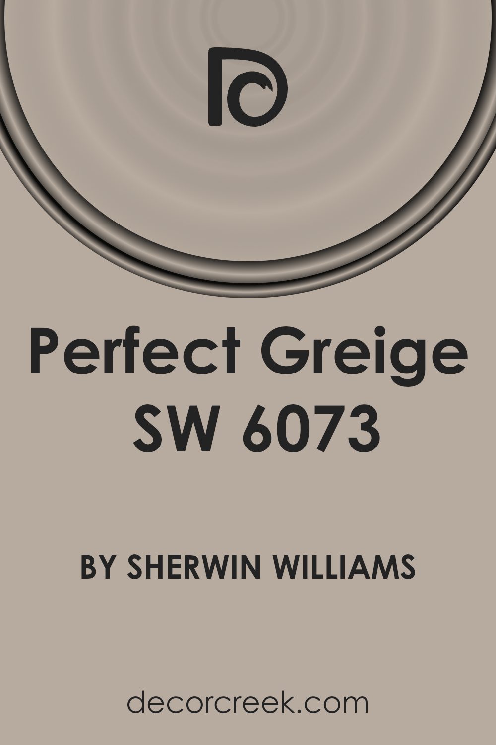
What Color Is Perfect Greige SW 6073 by Sherwin Williams?
Perfect Greige is a unique and versatile color from Sherwin Williams that strikes a beautiful balance between gray and beige. This warm, sophisticated hue blends the best of both worlds by offering a hint of coziness attributed to beige, with the sleek, modern edge of gray. It’s a go-to choice for those looking to achieve a timeless interior that stands the test of various decor trends.
This shade is exceptionally adaptable, making it suitable for various interior styles, from modern minimalist to rustic charm and everything in between. The muted yet inviting nature of Perfect Greige allows it to fit seamlessly into spaces, promoting a sense of calm and elegance. This color works wonders in areas with ample natural light, as well as in dimmer, more intimate settings, reflecting and absorbing light in ways that enrich its undertones.
In terms of pairing with materials and textures, Perfect Greige complements a broad spectrum. It looks stunning against the rich, natural grains of wood, whether it’s a polished oak floor or rustic pine furniture. Metals, too, from brushed nickel to matte black finishes, enhance its versatility and appeal. For textiles, consider soft, plush fabrics like velvet or linen in both neutral and bold colors to create a layered, inviting space. Its neutrality means it’s a great backdrop for vibrant artworks or statement pieces, allowing them to stand out without clashing.
Ultimately, Perfect Greige is a sophisticated and adaptable color choice that can help create a warm, inviting, and stylish home, regardless of the interior style you’re aiming for.
Is Perfect Greige SW 6073 by Sherwin Williams Warm or Cool color?
Perfect Greige by Sherwin Williams is a unique shade that beautifully combines gray and beige. This color has a warm depth to it, allowing it to create a cozy yet sophisticated atmosphere in any room. Its versatility is key – it can seamlessly adapt to different lighting conditions and complement a wide range of decor styles. Whether your home boasts a modern, minimalist look or a more classic, traditional vibe, Perfect Greige acts as a neutral backdrop, enhancing the other colors and design elements in the space.
Because of its balanced tone, Perfect Greige is especially good for open-plan homes. It can help to unify different living areas without making the space feel monotonous.
In rooms with plenty of natural light, it leans more towards a soft, warm beige, adding a bright and airy feel. In spaces with less light, it brings a richer, cozier gray tone to the forefront. This adaptability makes Perfect Greige a smart choice for anyone looking to add a touch of sophistication and warmth to their home.
Undertones of Perfect Greige SW 6073 by Sherwin Williams
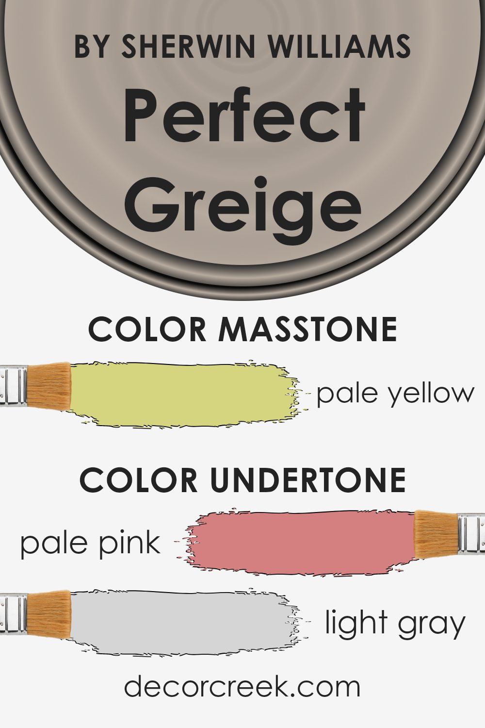
Perfect Greige is a unique paint color that blends the warmth of beige with the cool calmness of grey. It’s a versatile choice that can fit into various interior styles, but what really sets it apart are its undertones. Undertones are subtle colors that influence the main hue, affecting how we perceive the color under different lighting conditions.
In the case of this particular shade, it carries a wide range of undertones from pale pink, light gray, and light purple to mint, grey, and light blue. Also present are hints of lilac, yellow, orange, light green, and olive. These undertones add depth and complexity, making the color more rich and dynamic.
Depending on the light, time of day, and other colors in the room, these undertones might come forward, making the paint appear slightly different. This chameleon-like characteristic means Perfect Greige can complement a wide range of décor preferences and themes, from modern to rustic.
On interior walls, the variety of undertones in Perfect Greige offers an exciting opportunity to play with décor and accents. For instance, light-filled rooms might highlight the cooler lilac and light blue undertones, providing a serene and calming atmosphere. In contrast, spaces with less natural light might draw out the warmth of the beige, creating a cozy and welcoming feeling.
This means that choosing fabrics, furniture, and decorative elements can bring out different aspects of the paint color. In essence, the undertones allow for flexibility and creativity in interior design, ensuring that rooms can easily adapt to changing tastes or needs without a complete redesign.
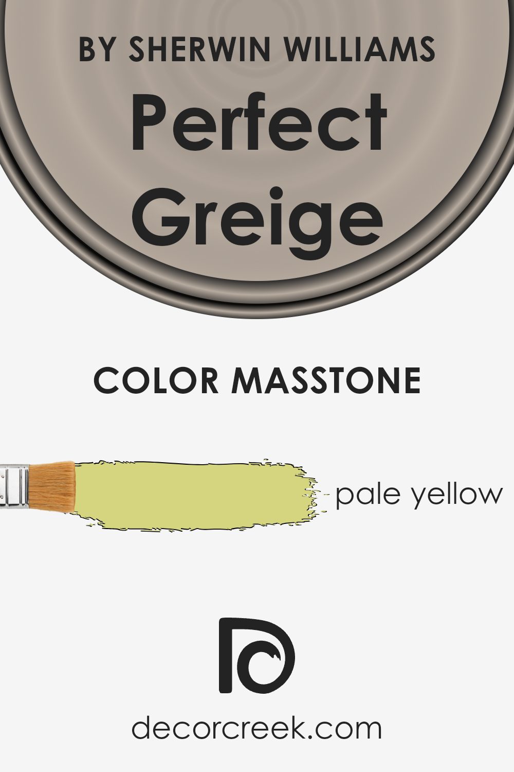
What is the Masstone of the Perfect Greige SW 6073 by Sherwin Williams?
Perfect Greige SW 6073, with its unique masstone of Pale Yellow (#D5D580), offers a subtle yet distinctive charm that can transform any space in your home. This pale yellow undertone brings a warm and welcoming feel, making it an excellent choice for those looking to create a cozy and inviting atmosphere.
It’s particularly effective in spaces that receive less natural light, as the lightness of the yellow can help to brighten the area, giving the illusion of more space and light.
Moreover, its versatility allows it to pair beautifully with a wide range of colors, from soft neutrals to more vibrant hues, enabling you to create a variety of looks and styles in your home. Whether used in living rooms, bedrooms, or kitchens, its subtle warmth adds a touch of sophistication and elegance, enhancing the overall aesthetic of your living space.
How Does Lighting Affect Perfect Greige SW 6073 by Sherwin Williams?
The way colors appear can significantly change under different lighting conditions. This is particularly true for paint colors, among which “Perfect Greige” is a popular choice for its versatility. Understanding how lighting affects this shade will help you make the most of its application in any space.
In artificial light, whether it’s from LED bulbs or incandescent lamps, the warm or cool undertones of these lights can shift the appearance of “Perfect Greige”. Under warm lighting, this color might appear more welcoming and cozy, enhancing its beige components. In contrast, cool lighting can bring forward the grey aspects, giving the space a more modern and crisp vibe.
Natural light brings its dynamics based on the direction of the room’s windows. In north-faced rooms that receive less direct sunlight, “Perfect Greige” can lean towards its cooler, grey side, providing a serene and calm atmosphere. This soft light won’t wash out the color, retaining its depth and sophistication.
South-faced rooms bask in abundant sunlight for the most part of the day, which can warm up “Perfect Greige”, accentuating its beige undertones and making the room feel brighter and more inviting. The natural brightness enhances the warmth of the color, making it perfect for living spaces.
East-faced rooms see the most of the morning light, which is generally softer and warmer. Here, “Perfect Greige” can look exceptionally vibrant in the morning, with a soft, warm glow that transitions throughout the day as the light fades, becoming more neutral and balanced.
In west-faced rooms, the situation reverses from east-faced ones. As the sun sets, the intense, warm light of the afternoon can illuminate “Perfect Greige” with a golden hue in the later parts of the day, creating a cozy and warm atmosphere, perfect for relaxing evenings.
In summary, “Perfect Greige” offers flexibility that can adapt to various lighting conditions, making it a versatile choice for any room. Whether it’s the warmth of the southern light or the coolness of northern exposure, this color gracefully reflects and absorbs light, shifting its tone accordingly and complementing any space beautifully.

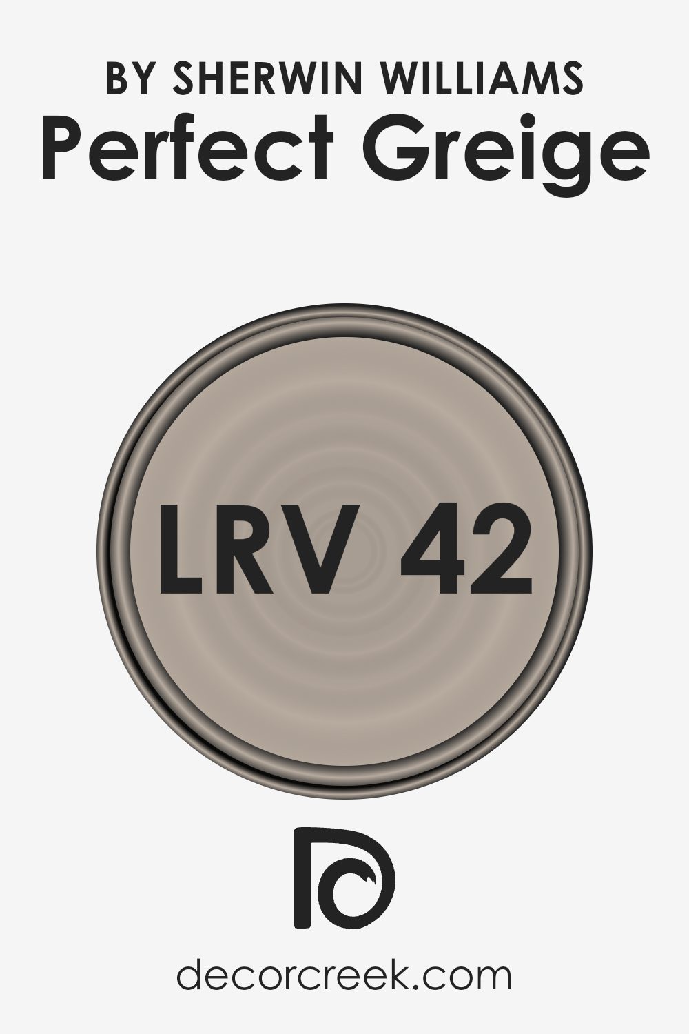
What is the LRV of Perfect Greige SW 6073 by Sherwin Williams?
LRV stands for Light Reflectance Value, which is a measure ranging from 0 to 100 that tells us how much light a color reflects when it’s painted on the walls. A color with an LRV of 0 would be pure black, absorbing all light, while a color with an LRV of 100 would be pure white, reflecting all light back.
This value is important because it helps people understand how light or dark a paint color will look in their space once applied. Higher LRV colors make rooms feel airier and larger, as they reflect more light around the space. Lower LRV colors, conversely, create a cozier, more enclosed feel because they absorb more light.
For the color in question, with an LRV of 41.654, it falls into the mid-range of the light reflectance scale. This means it won’t brighten a room like a high-LRV color would, nor will it absorb light like a dark color. Instead, it strikes a balance, offering a warm, subtle backdrop that complements a variety of lighting conditions and decor styles.
In a naturally lit room, this particular shade can provide a soothing, neutral canvas that’s versatile and welcoming.
However, in spaces with less natural light, it might appear slightly darker, emphasizing its cozy qualities without making the space feel small or cramped.
Understanding the LRV helps in deciding if this color will suit your room’s light conditions and the mood you’re aiming to create.
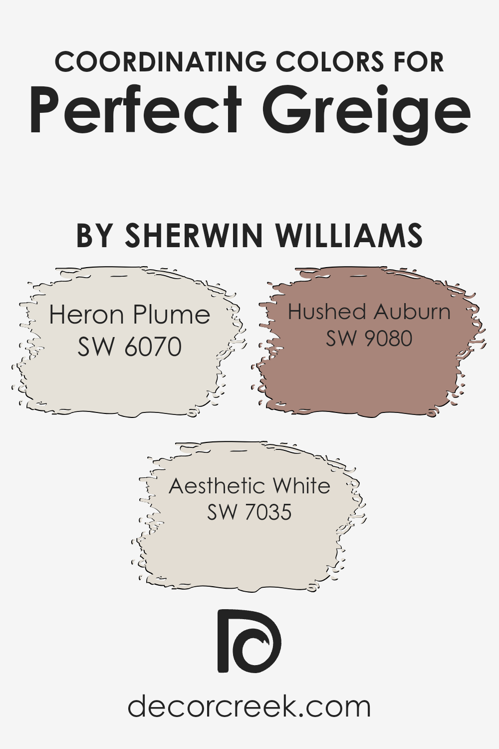
Coordinating Colors of Perfect Greige SW 6073 by Sherwin Williams
Coordinating colors are hues that complement each other well and create a harmonious look when used together in interior design or fashion. Essentially, these colors work in tandem to enhance the overall aesthetic appeal of a space, without competing for attention. This concept is particularly useful when you’re looking to achieve a balanced and cohesive color scheme in your home or wardrobe. For instance, Perfect Greige by Sherwin Williams, with its warm blend of gray and beige, serves as a versatile base that pairs beautifully with a variety of coordinating colors to either warm up a room or introduce subtle contrasts.
A great example of a coordinating color is Heron Plume, a soft and airy shade that brings a sense of openness and light to any space, making it feel more inviting and relaxed. Its subtle warmth complements the neutrality of Perfect Greige, creating a serene and comfortable atmosphere.
Another coordinating color, Aesthetic White, offers a slightly nuanced approach, lending a crisp and clean backdrop that highlights the elegant simplicity of Perfect Greige. This combination is ideal for those looking to achieve a refined yet welcoming space. Hushed Auburn, on the other hand, introduces a deeper, richer tone that contrasts beautifully with Perfect Greige’s muted calmness.
This pairing is perfect for adding a touch of sophistication and depth to a room, crafting an environment that feels both cozy and thoughtfully curated.
You can see recommended paint colors below:
- SW 6070 Heron Plume
- SW 7035 Aesthetic White
- SW 9080 Hushed Auburn
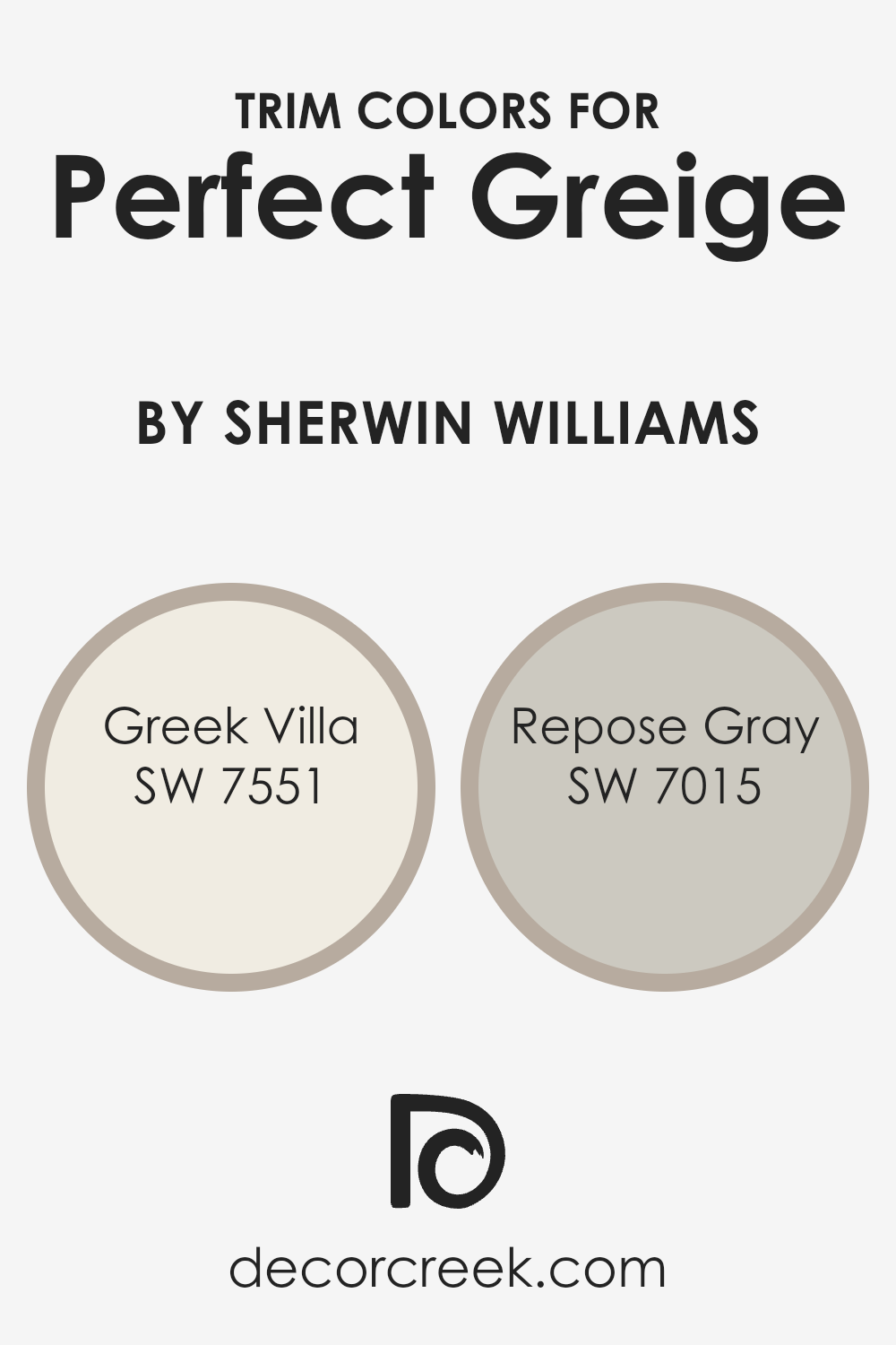
What are the Trim colors of Perfect Greige SW 6073 by Sherwin Williams?
Trim colors, essentially, are shades used on the borders or edges of walls, door frames, window frames, and skirting boards, providing a crisp finishing touch to a room. They play a crucial role in framing and accentuating the main wall color, elevating the overall aesthetic of a space.
For a versatile and balanced hue like Perfect Greige by Sherwin Williams, selecting the right trim color is key to either subtly complementing its warmth and depth or adding a striking contrast to highlight its neutral base. The choice of trim color can profoundly affect how the main wall color is perceived, enhancing its natural undertones and contributing to the room’s ambiance.
Greek Villa (SW 7551) is a soft, off-white with a warm undertone that offers a serene and inviting contrast when used as a trim color against Perfect Greige, bringing out the cozy warmth of the greige without overwhelming it. It’s akin to the gentle caress of morning sunlight against the subtle earthiness of a stone path, softening the transition between wall and trim.
Repose Gray (SW 7015), on the other hand, is a light to mid-tone gray with a gentle warmth that when paired as a trim, subtly defines the boundaries of Perfect Greige, enriching the space with a soothing harmony.
This combination creates an understated yet elegant backdrop, allowing furniture and decor to stand out. Both choices offer a way to neatly tie a room’s color scheme together, whether aiming for a soft, seamless blend or a slightly more defined, yet harmonious, contrast.
You can see recommended paint colors below:
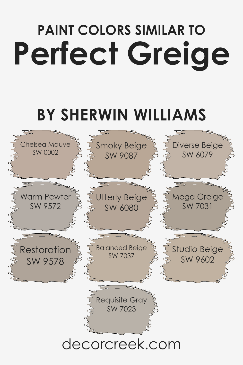
Colors Similar to Perfect Greige SW 6073 by Sherwin Williams
Similar colors play a crucial role in interior design and decoration, offering subtle variations that can significantly affect the atmosphere of a room. Choosing colors that harmonize with Perfect Greige by Sherwin Williams creates a cohesive and sophisticated look. Chelsea Mauve is a soft, muted pink with a touch of grey, adding a warm and inviting feel, while Warm Pewter has a deeper, richer tone that envelops spaces in comfort.
Restoration offers a unique blend of grey and beige, perfect for adding depth and interest. Requisite Gray is a light, versatile grey that works beautifully in spaces seeking a soft, neutral backdrop.
Smoky Beige introduces a whisper of grey into a classic beige, offering a hint of sophistication to any room. Utterly Beige leans towards a warmer, cozier beige, ideal for creating a welcoming environment. Balanced Beige has a remarkable quality of adjusting its warmth under different lighting conditions, making it incredibly versatile.
Diverse Beige brings in a slightly richer tone, providing a sturdy foundation for decor. Mega Greige, as the name suggests, is a bolder step into the mixture of grey and beige, making a statement without overwhelming. Lastly, Studio Beige rounds out the selection with its understated elegance, perfect for those looking to achieve a modern yet timeless look.
Each of these colors, while similar, holds unique characteristics that can enhance and compliment spaces when used thoughtfully alongside or in place of Perfect Greige.
You can see recommended paint colors below:
- SW 0002 Chelsea Mauve
- SW 9572 Warm Pewter
- SW 9578 Restoration
- SW 7023 Requisite Gray
- SW 9087 Smoky Beige
- SW 6080 Utterly Beige
- SW 7037 Balanced Beige
- SW 6079 Diverse Beige
- SW 7031 Mega Greige
- SW 9602 Studio Beige
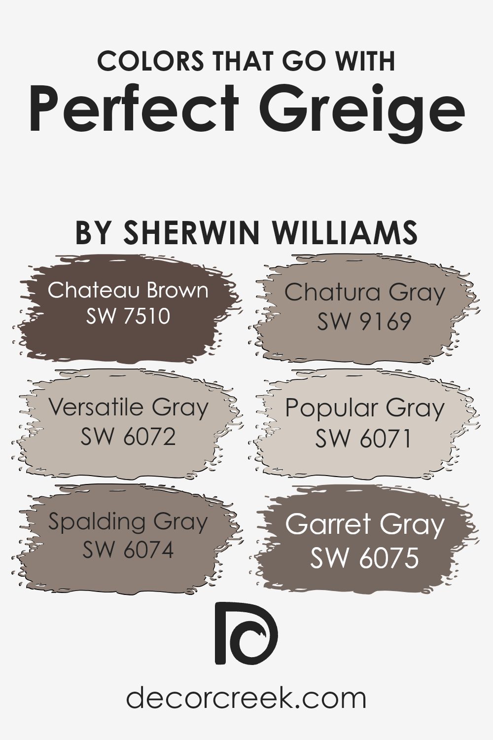
Colors that Go With Perfect Greige SW 6073 by Sherwin Williams
Choosing the right colors that complement Perfect Greige SW 6073 by Sherwin Williams is crucial for creating a harmonious and appealing space. Perfect Greige is a unique blend that strikes a balance between gray and beige, offering a warm, versatile backdrop for a range of coordinating colors.
When paired with the right shades, such as SW 7510 – Chateau Brown, SW 6072 – Versatile Gray, or SW 6074 – Spalding Gray, it can enhance the coziness of a room, add depth, or bring a sophisticated contrast. Colors like SW 9169 – Chatura Gray, SW 6071 – Popular Gray, and SW 6075 – Garret Gray, work seamlessly with Perfect Greige to create a cohesive look throughout your home.
These combinations can unify spaces with differing themes or functions, enhancing the flow and overall aesthetic of your interior design.
For instance, Chateau Brown adds a rich, earthy element that grounds spaces with a touch of nature-inspired warmth, making it ideal for living areas or bedrooms seeking a cozy ambiance. Versatile Gray, as the name suggests, is a flexible shade that can adapt to various decor styles, providing a subtle contrast to Perfect Greige without overwhelming the senses.
Spalding Gray offers a deeper hue that can bring elegance and a sense of drama to any room, perfect for accent walls or furniture pieces. Chatura Gray presents a cooler tone that injects a modern, sleek look, ideal for contemporary spaces. Popular Gray is a lighter companion that illuminates and expands the visual space, giving rooms a fresh, airy feel.
Lastly, Garret Gray anchors the palette with its robust depth, perfect for creating focal points or lending gravitas to a room’s design. Through these carefully selected companions for Perfect Greige, you can craft a space that feels both cohesive and stylish.
You can see recommended paint colors below:
- SW 7510 Chateau Brown
- SW 6072 Versatile Gray
- SW 6074 Spalding Gray
- SW 9169 Chatura Gray
- SW 6071 Popular Gray
- SW 6075 Garret Gray
How to Use Perfect Greige SW 6073 by Sherwin Williams In Your Home?
Perfect Greige SW 6073 by Sherwin Williams is a beautiful paint color that can add a touch of elegance and warmth to any room in your home. This color is a mix of gray and beige, offering the perfect balance for those who can’t decide between the two. Its versatility makes it suitable for every room, from your living room to the bedroom, bringing a cozy and inviting feel.
You can use Perfect Greige to create a neutral backdrop that allows your furniture and decor to stand out. It’s particularly useful in rooms that don’t get a lot of natural light, as it can brighten up the space while still adding depth and interest. This color pairs well with white trims, adding a crisp, clean look to the edges of your room. Also, because it’s a neutral color, it works well with almost any other color, giving you lots of flexibility in choosing accent colors for decorations and furniture.
Whether you’re redecorating your whole house or just looking to update a single room, Perfect Greige offers a timeless look that can adapt to different styles and preferences, making your house feel more like a home.
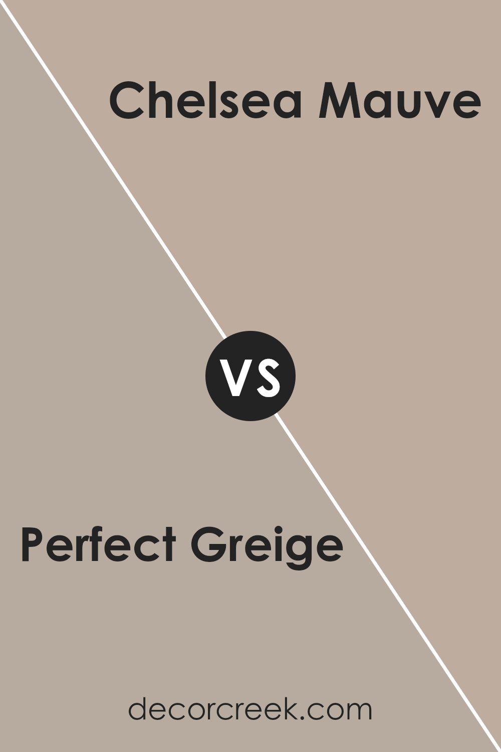
Perfect Greige SW 6073 by Sherwin Williams vs Chelsea Mauve SW 0002 by Sherwin Williams
Perfect Greige and Chelsea Mauve are two colors by Sherwin Williams that offer distinct vibes to any space. Perfect Greige is a balanced blend of gray and beige, presenting a warm and inviting neutral tone. It’s incredibly versatile, making it a great choice for those looking to add sophistication without overwhelming a room with color.
On the other hand, Chelsea Mauve leans towards a soft, dusky pink hue that brings a subtle touch of warmth and elegance. This color is perfect for creating a soothing, serene atmosphere, ideal for bedrooms or spaces where you want to relax. Both shades are understated yet impactful in their own ways, with Perfect Greige providing a solid foundation for various decor styles, while Chelsea Mauve adds a gentle hint of color.
Choosing between them depends on the mood you’re aiming to achieve: cozy and adaptable with Perfect Greige, or softly vibrant with Chelsea Mauve.
You can see recommended paint color below:
- SW 0002 Chelsea Mauve
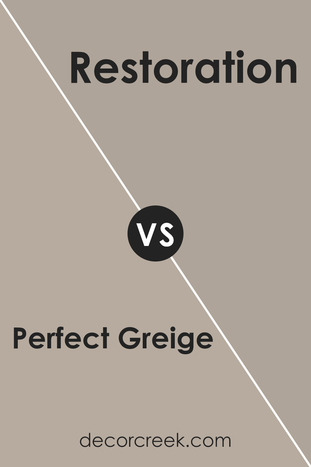
Perfect Greige SW 6073 by Sherwin Williams vs Restoration SW 9578 by Sherwin Williams
Perfect Greige and Restoration by Sherwin Williams are two distinct colors that bring their unique vibes to spaces. Perfect Greige is this cozy blend of gray and beige, giving off a warm, inviting feel without going too dark or too light. It’s like the Goldilocks of neutral colors – just right for almost any room, making spaces feel open yet homey.
On the flip side, Restoration steps in with a deeper, cooler tone. It leans more towards the gray side, offering a modern and somewhat more sophisticated edge. It’s the kind of color that can make a statement without overwhelming a room, adding depth and character.
While both colors are versatile, Perfect Greige tends to add warmth, making it ideal for living areas and bedrooms where a snug atmosphere is welcome. Restoration, however, offers a bit of boldness that works great in spaces seeking a contemporary twist. Choosing between them depends on whether you’re after a cozy warmth or a sleek chill.
You can see recommended paint color below:
- SW 9578 Restoration
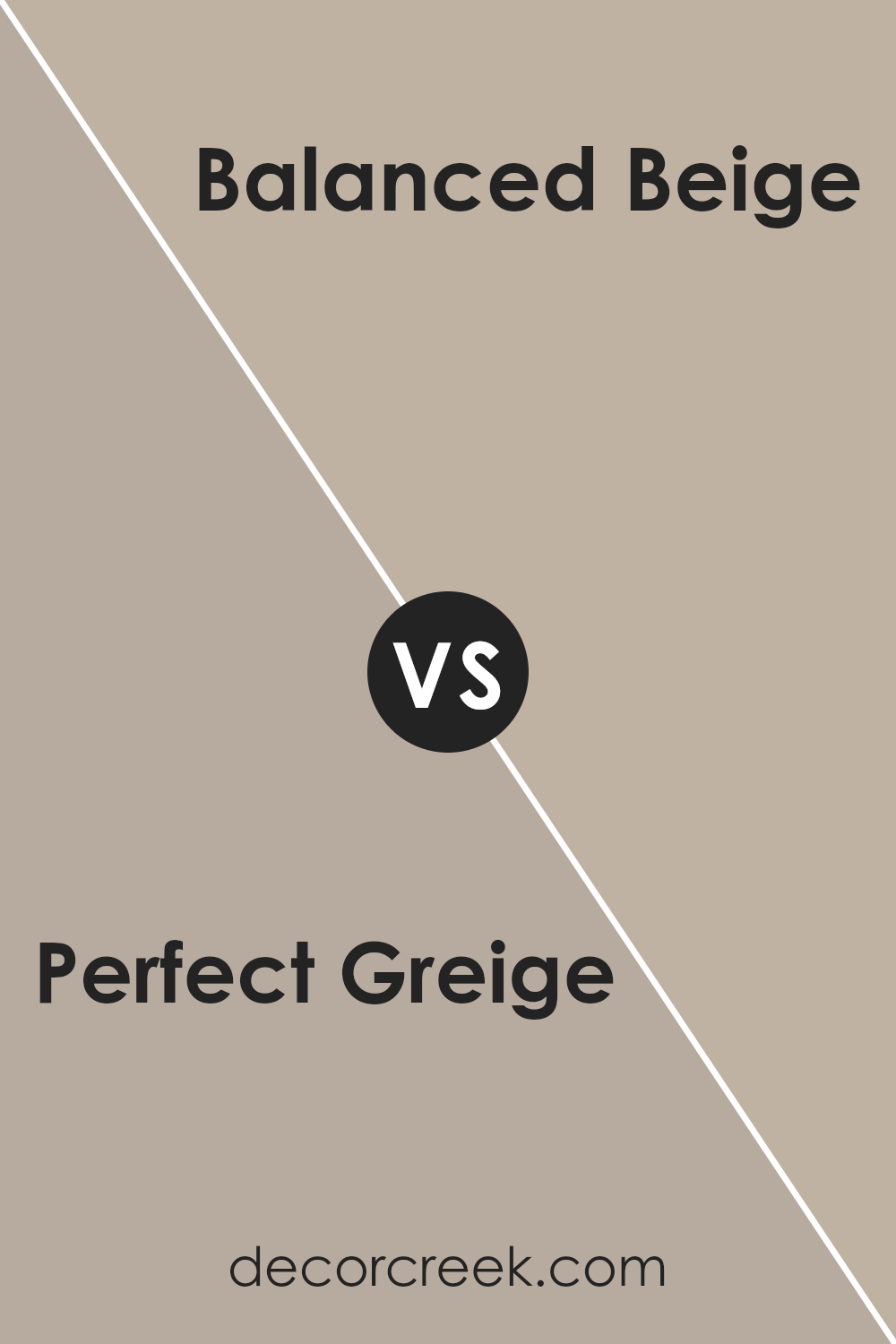
Perfect Greige SW 6073 by Sherwin Williams vs Balanced Beige SW 7037 by Sherwin Williams
Perfect Greige and Balanced Beige are two popular shades from Sherwin Williams that offer a modern twist on traditional neutrals. Perfect Greige is a blend that straddles the line between gray and beige, providing a warm, inviting feel without leaning too heavily towards either color. Its versatility makes it a great choice for rooms that need a cozy yet sophisticated backdrop.
Balanced Beige, on the other hand, is a lighter shade that leans more towards the beige side, offering a soft, neutral canvas that’s incredibly easy to pair with both light and dark accents. It creates a serene and welcoming environment, ideal for spaces where you want to promote relaxation and calm.
While both colors are grounded in beige, Perfect Greige brings in more depth with its gray undertones, making it suit well for those seeking a richer neutral. Balanced Beige offers a cleaner, crisper feel, perfect for those who prefer their neutrals to have a more traditional beige aesthetic.
You can see recommended paint color below:
Perfect Greige SW 6073 by Sherwin Williams vs Utterly Beige SW 6080 by Sherwin Williams
Perfect Greige and Utterly Beige, both by Sherwin Williams, have unique tones that make them standout choices for various spaces. Perfect Greige straddles the line between gray and beige, offering a warm yet neutral backdrop. This color is versatile, fitting well in rooms that get lots of light or those on the dimmer side, adapting to bring a cozy, sophisticated vibe.
On the other hand, Utterly Beige leans more towards a pure, warmer beige, giving off an inviting and soft essence. It’s perfect for creating a serene and welcoming atmosphere without overwhelming the senses. While Perfect Greige can come across as more refined and contemporary due to its gray undertones, Utterly Beige offers a classic and timeless feel, reminiscent of traditional decor.
Both colors are excellent choices for those looking to add subtle elegance to their space, with Perfect Greige adding a modern twist, and Utterly Beige, a more classic touch.
You can see recommended paint color below:
- SW 6080 Utterly Beige
Perfect Greige SW 6073 by Sherwin Williams vs Requisite Gray SW 7023 by Sherwin Williams
Perfect Greige and Requisite Gray are two popular colors from Sherwin Williams, but they bring different vibes to the table. Perfect Greige is a unique blend, feeling both cozy and sophisticated. It’s like a warm hug from a room, making spaces feel inviting without being too dark. It perfectly balances gray and beige, creating a neutral backdrop that works well with a wide range of decor.
Requisite Gray, on the other hand, leans more towards the gray side. It’s a bit cooler, offering a sleek and modern look that can make rooms feel spacious and airy. Despite its cooler tone, it’s still warm enough to prevent spaces from feeling too stark or cold. It’s an excellent choice for those wanting a more contemporary feel without sacrificing warmth.
Both colors are versatile, but your choice depends on the atmosphere you’re aiming for. Perfect Greige brings a warm, cozy feel, making it ideal for living rooms or bedrooms, while Requisite Gray offers a crisp, modern edge, perfect for kitchens or bathrooms.
You can see recommended paint color below:
- SW 7023 Requisite Gray
Perfect Greige SW 6073 by Sherwin Williams vs Mega Greige SW 7031 by Sherwin Williams
Perfect Greige and Mega Greige are two popular colors by Sherwin Williams, each offering a unique take on the blend of gray and beige, known as “greige.” Perfect Greige stands out for its balanced mix, leaning slightly toward a lighter, softer feel. It’s a versatile color that can illuminate spaces with a touch of warmth while maintaining a neutral backdrop.
On the other hand, Mega Greige brings a deeper, more pronounced hue. This color is richer and darker, making it ideal for adding a bit of drama or cozying up a larger room without overwhelming the senses. While both colors share a greige base, Perfect Greige is better for those looking for a lighter, airier feel, and Mega Greige suits spaces that can handle a bolder statement.
In comparison, the choice between them depends on the desired effect in a room—airy and bright with Perfect Greige or more grounded and enveloping with Mega Greige.
You can see recommended paint color below:
Perfect Greige SW 6073 by Sherwin Williams vs Warm Pewter SW 9572 by Sherwin Williams
Perfect Greige and Warm Pewter, both by Sherwin Williams, are interesting colors to compare. Perfect Greige is a unique blend of gray and beige, creating a cozy, neutral backdrop for any room. It’s a versatile color that works well with various decor styles, from modern to traditional, providing a warm and inviting atmosphere.
On the other hand, Warm Pewter leans more towards the gray side, offering a slightly cooler tone than Perfect Greige. Despite its cooler undertone, Warm Pewter still adds warmth to spaces, making it a great choice for those looking to achieve a balanced, sophisticated look.
Both colors are great for creating a serene and welcoming environment, but Perfect Greige offers a bit more warmth due to its beige undertones, while Warm Pewter provides a cleaner, more modern vibe with its grayish hue. Choosing between them depends on the desired balance between warmth and modernity in a space.
You can see recommended paint color below:
- SW 9572 Warm Pewter
Perfect Greige SW 6073 by Sherwin Williams vs Diverse Beige SW 6079 by Sherwin Williams
Perfect Greige and Diverse Beige by Sherwin Williams are two popular colors, but they bring different vibes to a space. Perfect Greige is a unique mix of gray and beige, offering a neutral backdrop that works well in both bright and dim rooms. It’s like the ideal middle ground, not too dark, not too light, making it a great choice for a cozy yet modern look.
On the other hand, Diverse Beige leans more toward a warm beige tone. It gives off a welcoming and comfortable feel, perfect for creating a softer, homier atmosphere in any room. While still neutral, Diverse Beige brings a bit more warmth to the table compared to the cooler, more balanced tone of Perfect Greige.
Both colors are incredibly versatile, but your choice might depend on the mood you want to set. For a sleek, contemporary vibe, Perfect Greige is your go-to. If you’re aiming for a snug, inviting space, Diverse Beige will deliver that warmth you’re craving.
You can see recommended paint color below:
- SW 6079 Diverse Beige
Perfect Greige SW 6073 by Sherwin Williams vs Smoky Beige SW 9087 by Sherwin Williams
Perfect Greige and Smoky Beige are two colors by Sherwin Williams that have a subtle yet distinct difference. Perfect Greige is a blend that strikes a balance between gray and beige, creating a warm, inviting neutral that can adapt well to various lighting and decorating styles. It’s a versatile color that can act as a cozy backdrop in any room, offering a slightly richer and deeper tone compared to classic beige or pure gray.
On the other hand, Smoky Beige has a softer, more muted presence. It leans more towards the beige spectrum but with a soft, smoky quality that brings a tranquil and soothing vibe to spaces. While also neutral, Smoky Beige is lighter and can make rooms feel more open and airy compared to Perfect Greige. It’s ideal for creating a serene space with a hint of warmth.
Both colors offer a beautiful base for any room, but Perfect Greige brings a bit more depth and warmth, while Smoky Beige offers a lighter, calming feel. Whether you choose one over the other depends on the mood and atmosphere you want to create in your space.
You can see recommended paint color below:
- SW 9087 Smoky Beige
Perfect Greige SW 6073 by Sherwin Williams vs Studio Beige SW 9602 by Sherwin Williams
Perfect Greige and Studio Beige are both colors by Sherwin Williams, each offering a unique vibe for walls. Perfect Greige is like a cozy middle ground between gray and beige, blending the best of both to create a warm, inviting atmosphere. It’s the kind of color that’s really versatile, making it a solid pick for almost any room, whether you’re aiming for a modern look or something more timeless.
On the other hand, Studio Beige leans more towards the beige family, bringing a touch of warmth that’s both subtle and comforting. It’s excellent for creating a soft, welcoming space that feels airy and light. While it shares some of the warmth with Perfect Greige, Studio Beige is lighter, making it perfect for smaller rooms or spaces where you want to maximize the feeling of brightness.
Both colors offer a great foundation for decorating, allowing for a wide range of accent colors to match. Whether you’re going for a laid-back, cozy feel with Perfect Greige or a brighter, more open vibe with Studio Beige, each color has its charm to make your space feel just right.
You can see recommended paint color below:
- SW 9602 Studio Beige
Conclusion
In summary, Perfect Greige by Sherwin Williams stands out as a versatile and stylish paint color that brings a balanced blend of gray and beige into any space. Its unique ability to adapt to different lighting conditions and complement a variety of decor styles makes it a go-to choice for homeowners and designers alike.
This color offers a warm, inviting atmosphere while maintaining a sense of sophistication and modernity, making it ideal for those looking to achieve a cozy yet contemporary look in their homes or offices.
Furthermore, the popularity of Perfect Greige is not just due to its aesthetic appeal but also because of its practicality. It works wonders in creating an illusion of space, making smaller rooms feel larger and more open. Whether it’s applied in living areas, bedrooms, or offices, this color delivers a timeless elegance that can refresh and uplift any environment.
It’s a testament to Sherwin Williams’ commitment to offering high-quality, trendsetting paint options that cater to the evolving tastes and needs of customers.
Ever wished paint sampling was as easy as sticking a sticker? Guess what? Now it is! Discover Samplize's unique Peel & Stick samples.
Get paint samples

