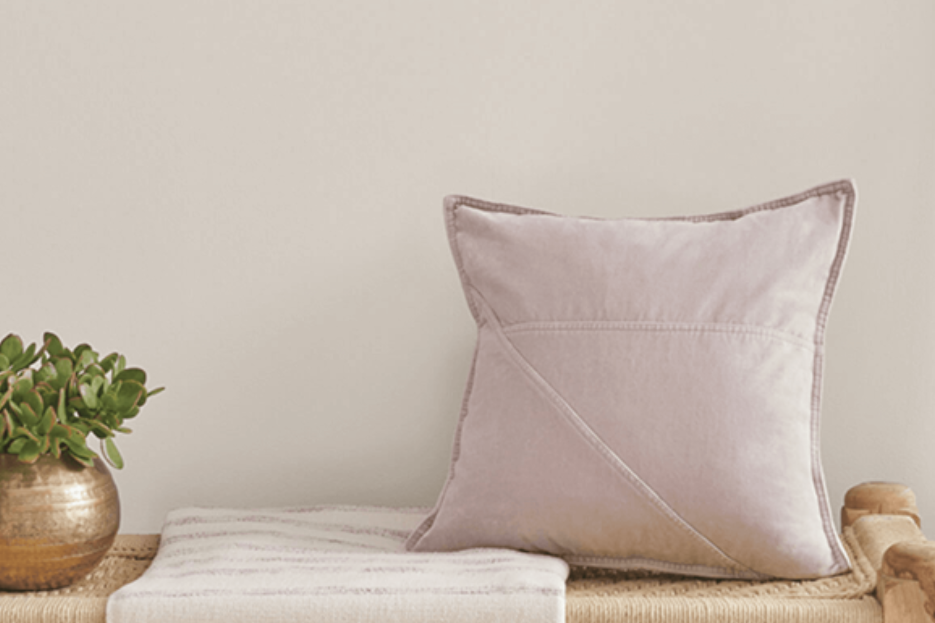
Introducing SW 6071 Popular Gray by Sherwin-Williams, a paint color that’s making waves for its universal appeal and versatility. This shade of gray is a top pick for homeowners and decorators alike, bringing a fresh and modern update to any space.
Whether you’re looking to refresh your living room, bedroom, or even the exterior of your home, Popular Gray offers a perfect balance between warmth and sophistication. Unlike some grays that can lean too cold or too industrial, SW 6071 strikes just the right note, making it suitable for a variety of decorating styles, from contemporary to traditional.
One of the reasons Popular Gray stands out is its adaptability. It pairs beautifully with a wide range of colors, from soft pastels to bold hues, allowing for endless creative possibilities in your home decor.
Its understated elegance also means that it can seamlessly blend with different textures and materials, enhancing the overall look and feel of a room without overwhelming it.
Whether you’re planning a complete home makeover or simply looking to update a single room, SW 6071 Popular Gray by Sherwin-Williams is a choice worth considering. It’s not just a trend, but a timeless selection that can transform your space with its inviting warmth and stylish flair.
What Color Is Popular Gray SW 6071 by Sherwin Williams?
Popular Gray by Sherwin Williams is a sophisticated yet gentle hue that plays beautifully with natural light. This versatile color has a warm undertone, making it inviting and cozy for any space. Its balanced mix of gray with subtle hints of beige allows it to act as a neutral canvas, creating a serene and welcoming atmosphere. This adaptability means it can seamlessly integrate into various interior styles, from modern minimalist to rustic farmhouse and everything in between.
When it comes to interior design, Popular Gray shines in environments that favor simplicity and elegance. It works exceptionally well in living rooms, bedrooms, and kitchens, where its soft warmth enhances the sense of comfort and relaxation.
This color pairs splendidly with natural materials like wood, stone, and metals, bringing out their textures and adding depth to the décor. In terms of textiles, it goes well with linen, wool, and soft cotton, reinforcing a sense of calm and serenity.
The beauty of Popular Gray lies in its ability to serve as a backdrop for both bold statements and subtle accents. It supports a range of color palettes, from soft pastels to rich, vibrant hues, allowing personalization and creativity in your space. Whether you’re looking to create a peaceful retreat or a lively gathering place, Popular Gray provides a foundation that can adapt to your evolving tastes and styles.
Ever wished paint sampling was as easy as sticking a sticker? Guess what? Now it is! Discover Samplize's unique Peel & Stick samples.
Get paint samples

Is Popular Gray SW 6071 by Sherwin Williams Warm or Cool color?
Popular Gray SW 6071 by Sherwin Williams is a versatile color that has become a go-to choice for many homeowners. This warm hue balances the line between gray and beige, giving rooms a cozy and welcoming feel. Its adaptability means it works well in various settings, from modern to traditional décor.
The beauty of Popular Gray lies in its ability to complement a wide range of colors. It pairs seamlessly with bold shades, acting as a neutral backdrop that allows other colors to stand out. At the same time, when used with softer, lighter tones, it contributes to a serene and harmonious space.
This flexibility makes it perfect for living rooms, bedrooms, and even kitchens, where the right ambiance is crucial.
Lighting plays a significant role in how Popular Gray appears in a home. In well-lit spaces, it can look more beige, bringing a warm and inviting atmosphere. In rooms with less natural light, it might appear more as a true gray, adding a sleek and sophisticated vibe. This chameleon-like quality ensures it fits the mood and style of each room just right, making it a popular choice for those looking to refresh their homes.
Undertones of Popular Gray SW 6071 by Sherwin Williams
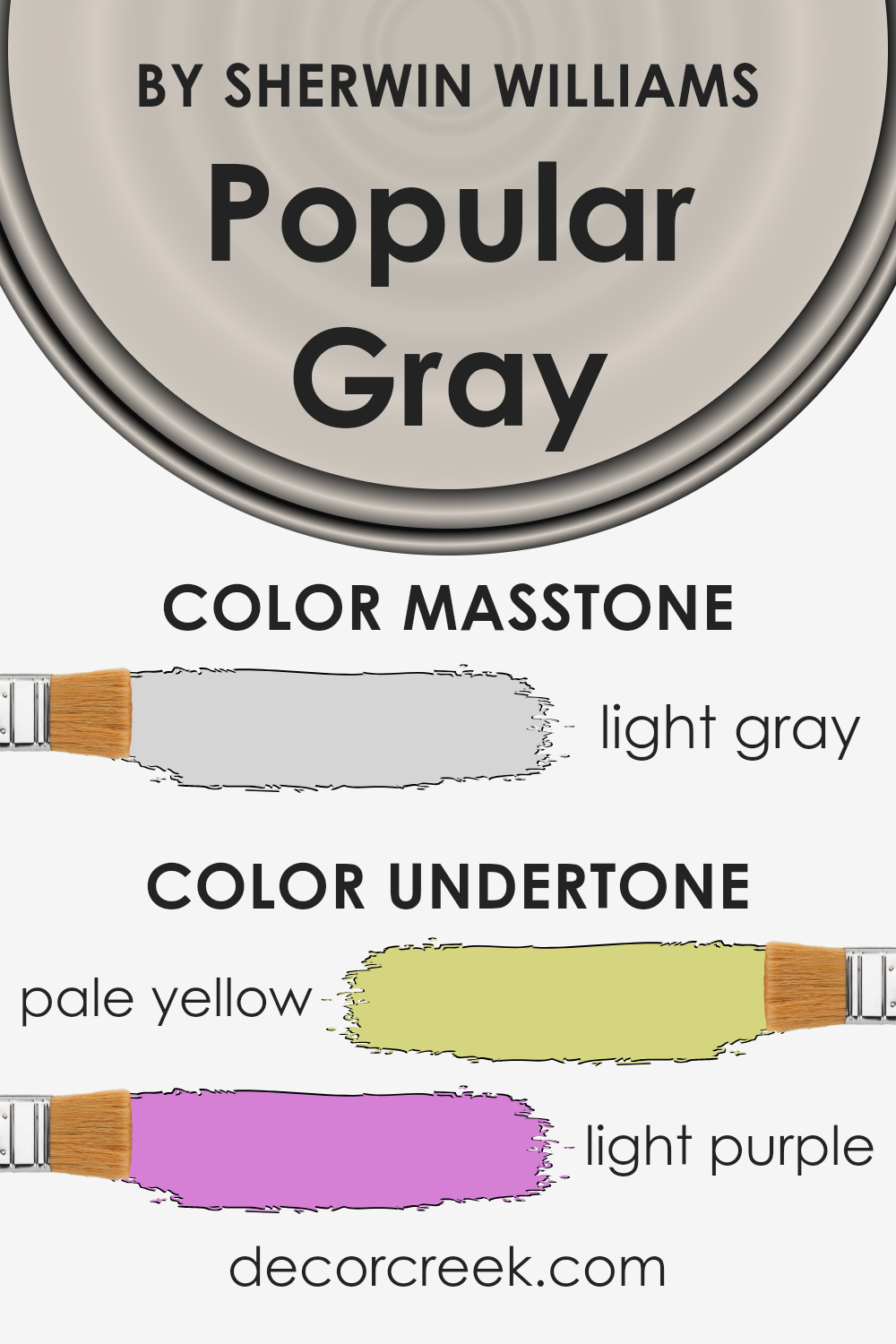
Popular Gray by Sherwin Williams is a beautiful color that brings a warm and inviting atmosphere to any room. This color may seem simple at first glance, but when you take a closer look, you’ll discover it has subtle undertones of pale yellow and light purple. These undertones are not always immediately noticeable, but they play a significant role in how we perceive the color.
The undertones of a color are like a secret ingredient that can change the overall impression of the color. They can make a color feel warmer or cooler and can affect how the paint looks under different lighting conditions.
For Popular Gray, the pale yellow undertone adds a touch of warmth, making the space feel cozy and welcoming. On the other hand, the light purple undertone brings a soft, subtle depth that can enhance the sophistication of a room.
When applied to interior walls, Popular Gray transforms the space depending on the lighting and the colors around it. In natural light, the pale yellow undertone might become more pronounced, creating a bright and airy feel. In artificial light, the light purple undertone might come forward, adding a layer of richness and complexity.
Together, these undertones ensure that walls painted with Popular Gray are never just gray; they’re alive with subtle, nuanced hues that respond dynamically to their surroundings. This makes Popular Gray an incredibly versatile paint color that can fit a wide range of design styles and preferences.
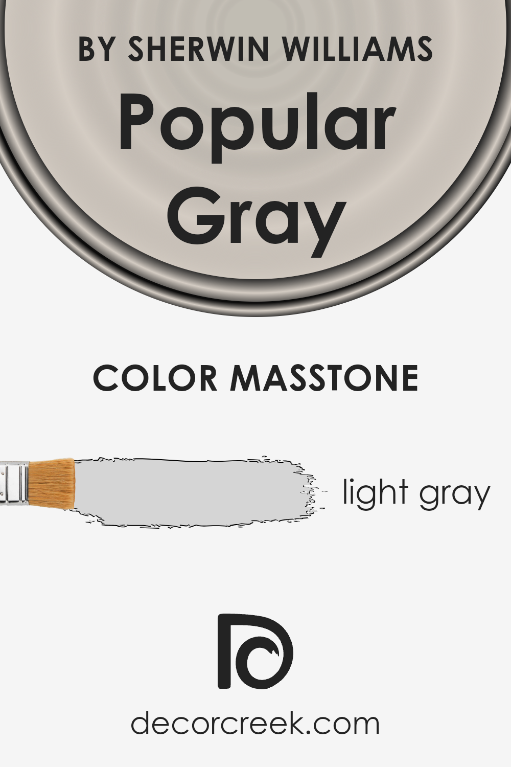
What is the Masstone of the Popular Gray SW 6071 by Sherwin Williams?
Popular Gray SW 6071 by Sherwin Williams is a beautiful light gray color with a masstone, or main tone, of light gray (#D5D5D5). This soft and subtle shade brings a calming and soothing atmosphere to any room in the home. Its lightness makes it incredibly versatile, fitting well with a wide range of decor styles and color schemes.
Whether you’re sprucing up a cozy bedroom, refreshing a living area, or giving your kitchen a modern touch, this color is a go-to choice for creating a serene and welcoming space.
The beauty of this light gray lies in its ability to brighten up spaces while maintaining a warm undertone, making rooms feel larger and more open without feeling cold or impersonal. It’s the perfect backdrop for both bold accents and more muted palettes, allowing for endless creative possibilities. Whether paired with vibrant colors or soft neutrals, it effortlessly complements and brings together different elements in a room, enhancing the overall aesthetic appeal.
How Does Lighting Affect Popular Gray SW 6071 by Sherwin Williams?
Lighting plays a crucial role in how we perceive colors. This is because light sources vary in their color temperatures, influencing the appearance of colors in our environment. The color Popular Gray by Sherwin Williams is a great example to explore how different lighting conditions affect the perception of color in a room.
- In artificial light, the appearance of Popular Gray can change based on the type of bulbs used. Warm white bulbs can make it look cozier and slightly more beige, adding warmth to the space. Cool white or daylight bulbs, on the other hand, can bring out the gray tones more, giving it a crisper look. This means the same wall can shift in color from morning to evening, depending on the artificial light used.
- In natural light, this color also changes throughout the day and depending on the orientation of the room. North-faced rooms receive less direct sunlight, which can make Popular Gray appear cooler and more muted. This means in rooms facing north, the color might look more like a true gray, creating a serene and calming atmosphere.
- South-faced rooms get a lot of sunlight, bathing the room in warm light for most of the day. Here, Popular Gray can take on a warmer hue, feeling more inviting and cozy. It might even look a bit lighter or have subtle beige undertones in strong sunlight.
- East-faced rooms get bright morning light, which is cooler. Here, Popular Gray can look crisp and fresh in the morning, then transition to a cooler, more shadowed gray as the day goes on since the direct sunlight moves away.
- West-faced rooms receive the evening light, which is warmer. In these rooms, Popular Gray can glow warmly in the late afternoon and evening, offering a soothing and warm backdrop that complements sunset colors.
In summary, Popular Gray’s appearance is greatly influenced by the lighting conditions, whether artificial or natural, and the direction the room faces. This makes it a versatile color that can adapt to various environments and lighting setups, offering different ambiances throughout the day and night.
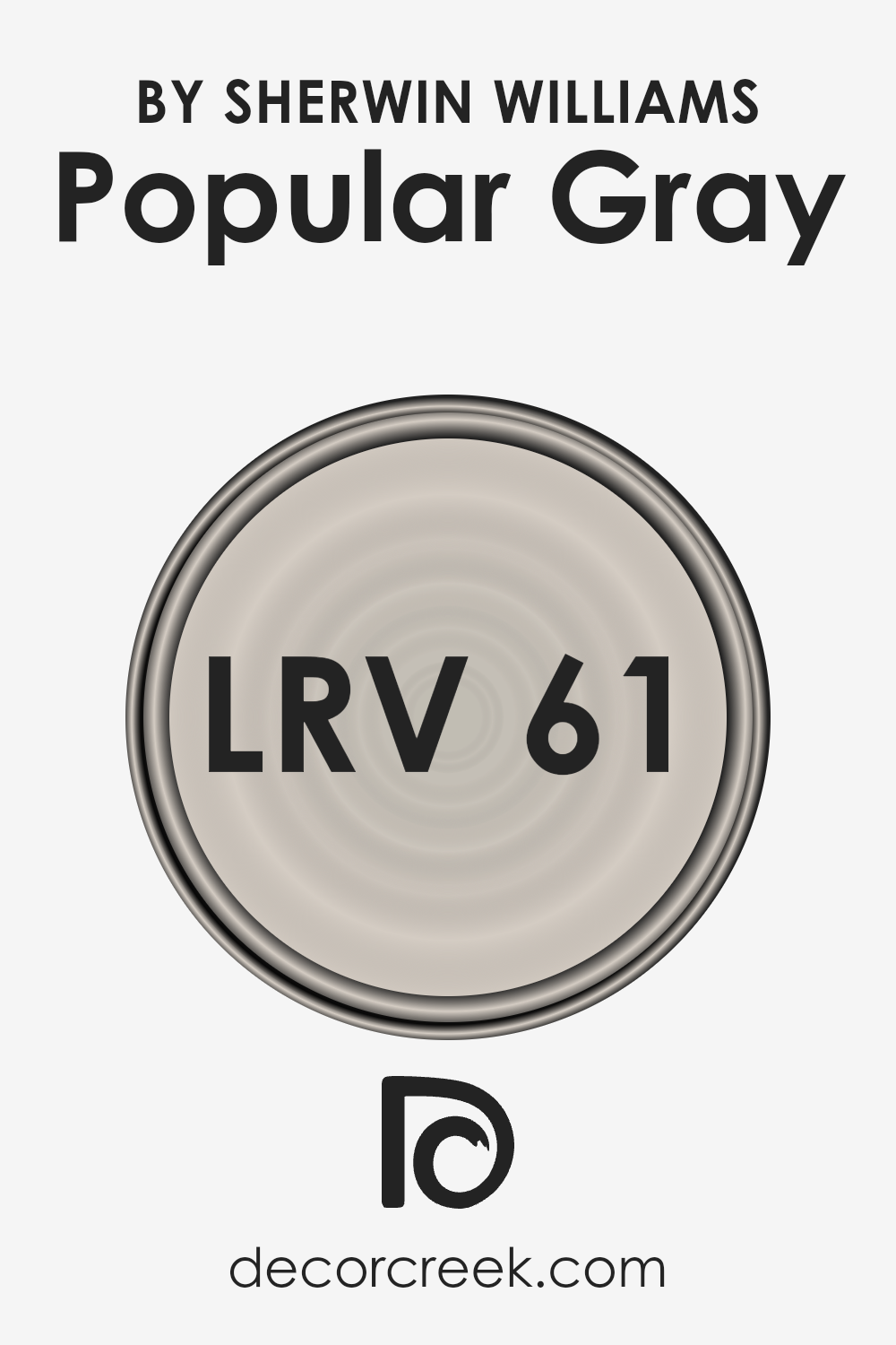
What is the LRV of Popular Gray SW 6071 by Sherwin Williams?
LRV stands for Light Reflectance Value, which is a measure of the percentage of light a paint color reflects from its surface. This measurement ranges from 0, which is absolute black and absorbs all light, to 100, pure white, reflecting all light back into the room.
The LRV helps people understand how light or dark a color will look once applied to walls and how it may change under different lighting conditions throughout the day. A color with a higher LRV will make a room feel more open and brighter, while a color with a lower LRV can make a space feel more cozy and intimate.
For the color with an LRV of 61.114, like the popular gray you’re interested in, it falls on the lighter side of the scale, meaning it’s designed to reflect a good amount of light without being overly bright or stark.
This particular value suggests that the color will help to make a room feel airy and spacious, yet still offer enough warmth to ensure the space feels welcoming. In well-lit areas, it will appear lighter and more subtle, but in rooms with less natural light, the color can show a bit more of its depth, providing a versatile option for different spaces in a home.
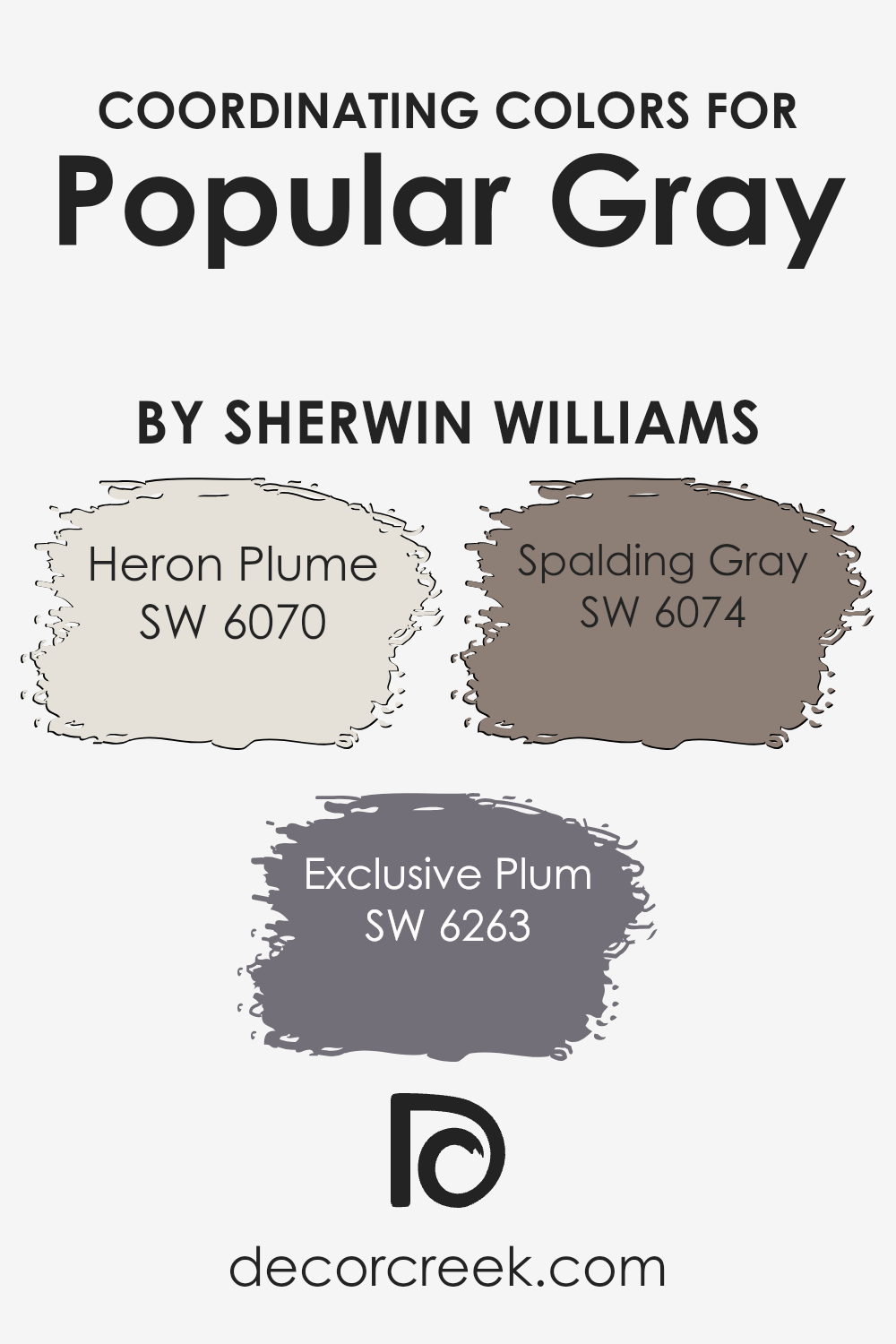
Coordinating Colors of Popular Gray SW 6071 by Sherwin Williams
Coordinating colors are hues that complement each other when used together in an interior design or art project, creating a harmonious and appealing visual experience. They work by balancing out the visual weight of a space or artwork, making sure no single color overwhelms the others.
These colors can enhance the features of the main color, in this case, Popular Gray by Sherwin Williams, allowing for a well-rounded and cohesive aesthetic.
Heron Plume SW 6070 is a soft, almost ethereal shade that breathes light into spaces, acting as a subtle background that allows other colors to shine without competing for attention. It’s the kind of color that brings a calming sense of brightness, perfect for creating a serene and inviting atmosphere.
On the other hand, Exclusive Plum SW 6263 offers a rich and deep contrast, providing a luxurious and sophisticated undertone that can make a statement without overpowering a room. It’s ideal for adding depth and interest.
Finally, Spalding Gray SW 6074 strikes a balance between light and dark, offering a medium tone that complements both the lighter Heron Plume and the darker Exclusive Plum. Its versatility bridges the gap between the contrasting shades, making it an essential part of creating a cohesive look.
You can see recommended paint colors below:
- SW 6070 Heron Plume
- SW 6263 Exclusive Plum
- SW 6074 Spalding Gray
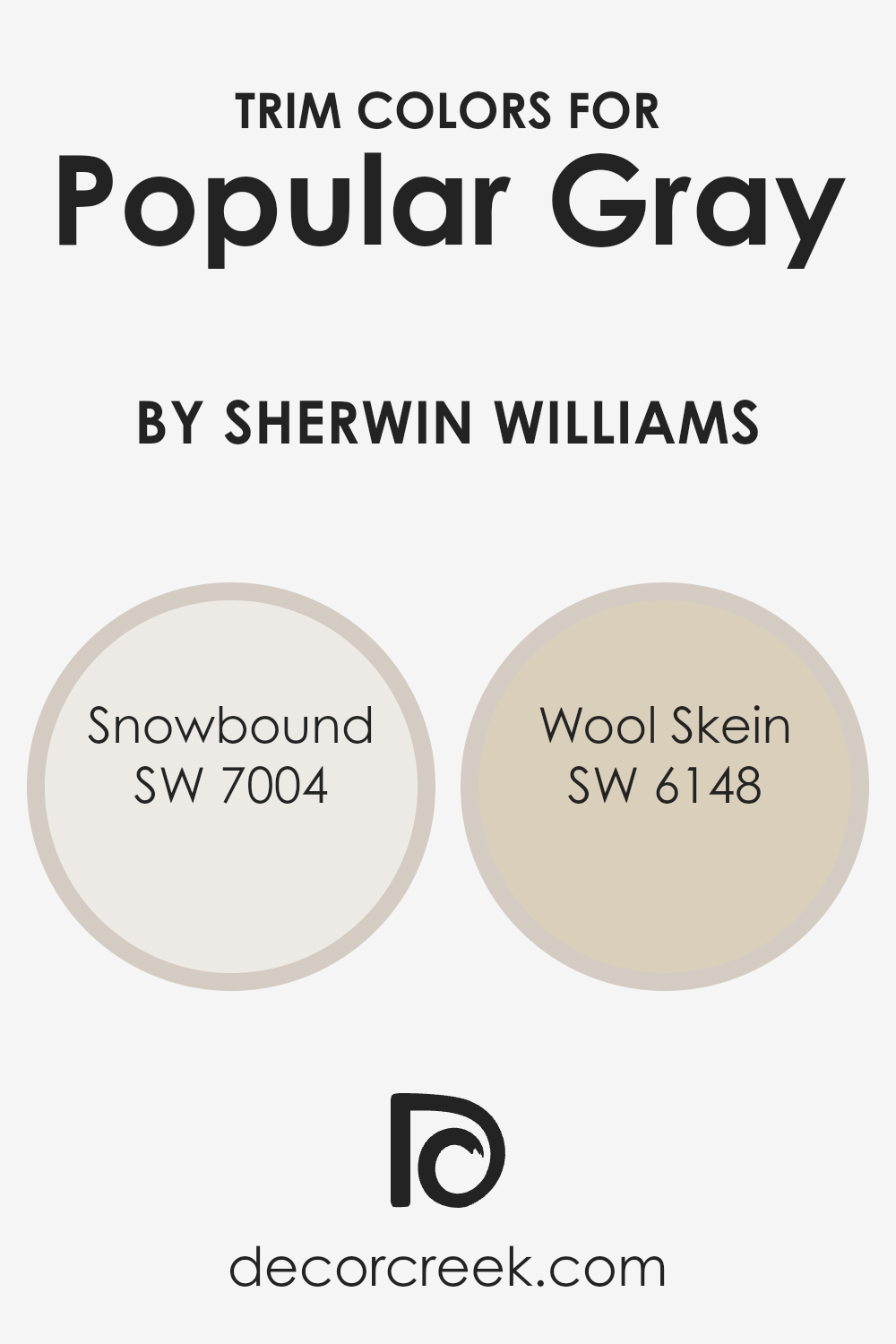
What are the Trim colors of Popular Gray SW 6071 by Sherwin Williams?
Trim colors are those selected to complement or contrast with a main wall color, helping to outline and define the architectural details of a room, like crown moldings, skirting boards, window frames, and door frames.
With a versatile shade like Sherwin Williams’ Popular Gray, choosing the right trim color can enhance the overall aesthetic of a space, providing a polished and cohesive look.
Trim colors can either subtly blend with the main color for a refined effect or stand out to highlight the room’s features, depending on the desired outcome.
Snowbound (SW 7004) by Sherwin Williams is a clean, bright white with a hint of warmth, making it an excellent choice for trim, offering a crisp contrast that can make the gray tones of Popular Gray appear more grounded and balanced.
On the other hand, Wool Skein (SW 6148) is a soft, neutral beige with warm undertones, providing a more seamless transition between the wall and trim for a subtle, sophisticated look. Utilizing either Snowbound or Wool Skein as a trim color with Popular Gray can help to create a desired atmosphere, from striking and dynamic to calm and cohesive, significantly affecting the perceived space and color harmony in the room.
You can see recommended paint colors below:
- SW 7004 Snowbound
- SW 6148 Wool Skein
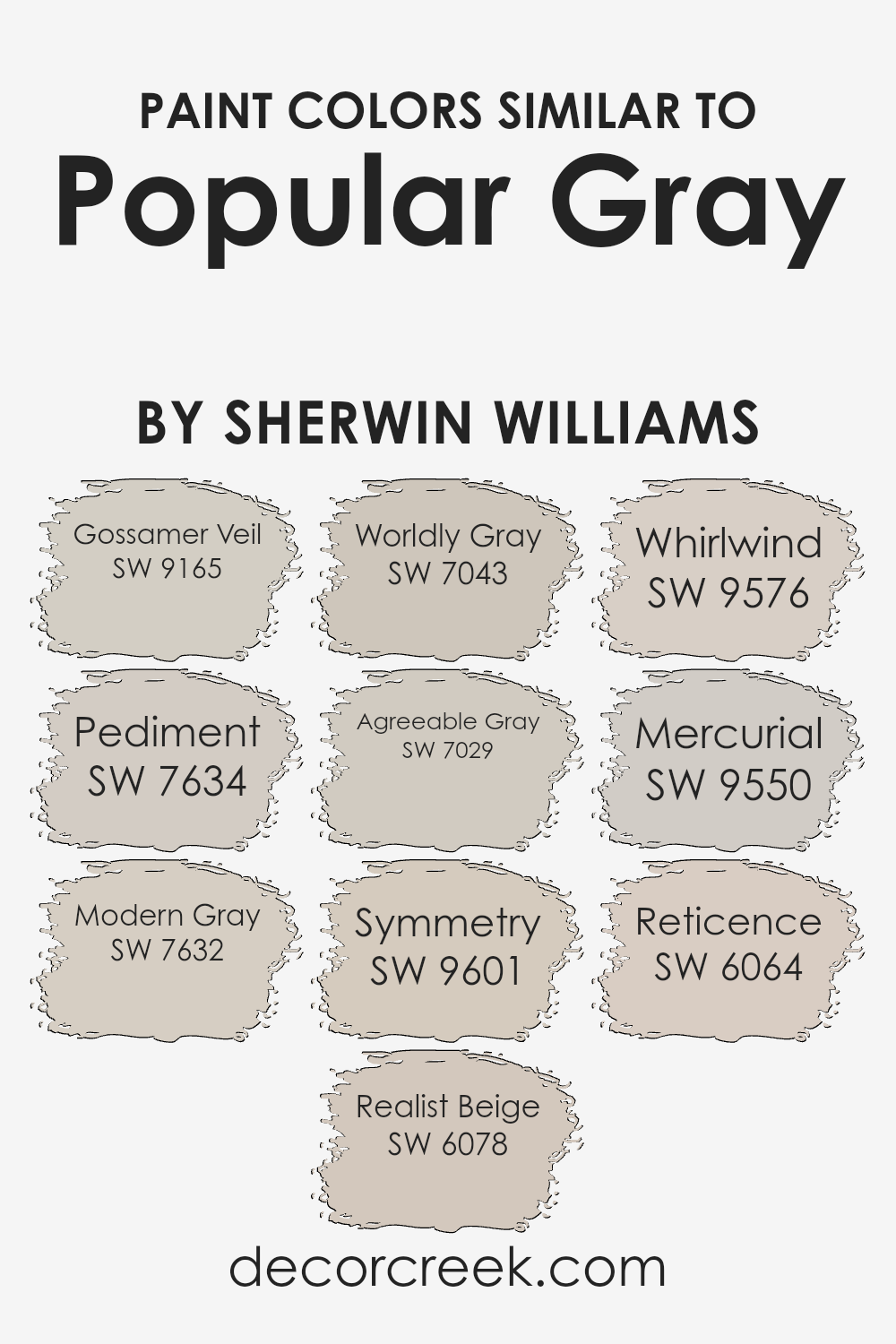
Colors Similar to Popular Gray SW 6071 by Sherwin Williams
Similar colors are vital in design because they create a seamless, cohesive look, helping spaces feel more unified and harmonious. When working with shades like Gossamer Veil or Pediment, one can effortlessly blend elements of a room, allowing for a subtle yet sophisticated contrast.
These shades, closely related to the neutral and versatile hues of Sherwin Williams, like Modern Gray and Realist Beige, offer a balanced backdrop that can be either calming or warm depending on the lighting and accessories. Colors like Worldly Gray and Agreeable Gray further this effect, providing a perfect middle ground that is neither too stark nor too deep, making them ideal for a wide range of spaces and design senses.
On the lighter end, Symmetry brings a soft, airy feel, making it excellent for creating a serene, peaceful environment. Whirlwind and Mercurial, while being slightly cooler, offer a refreshing twist to spaces without overwhelming with color.
For those who prefer something with a bit of warmth, Reticence is a beautiful option that can make a room feel inviting and cozy. Each of these Sherwin Williams colors, from the lightest hue to the more pronounced, works in tandem to enhance the aesthetic appeal of an interior, ensuring that every element in the space contributes to a beautifully curated look.
By carefully selecting similar colors, one can achieve a sophisticated and intentional design that feels both cohesive and distinct.
You can see recommended paint colors below:
- SW 9165 Gossamer Veil
- SW 7634 Pediment
- SW 7632 Modern Gray
- SW 6078 Realist Beige
- SW 7043 Worldly Gray
- SW 7029 Agreeable Gray
- SW 9601 Symmetry
- SW 9576 Whirlwind
- SW 9550 Mercurial
- SW 6064 Reticence
How to Use Popular Gray SW 6071 by Sherwin Williams In Your Home?
Popular Gray SW 6071 by Sherwin Williams is a soft and warm gray paint color loved by many for its versatility. It provides a cozy yet elegant look to any room, making it perfect for various spaces in the home.
Imagine using it in your living room or bedroom; it can serve as a soothing backdrop, enhancing your furniture and decor without overwhelming them. Due to its neutral tone, combining it with other colors is easy, whether you’re looking for a harmonious blend with similar neutrals or wanting to create a contrast with bolder hues.
In the bathroom or kitchen, Popular Gray adds a clean and inviting vibe. Its ability to reflect light beautifully makes small spaces appear larger, which is a handy trick for making compact rooms feel more spacious.
Whether you’re painting the walls, cabinets, or just a single accent wall, this color can help unify the elements of your room seamlessly. It’s an excellent choice for anyone looking to refresh their home with a modern and timeless color.
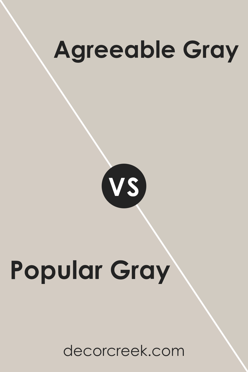
Popular Gray SW 6071 by Sherwin Williams vs Agreeable Gray SW 7029 by Sherwin Williams
Popular Gray and Agreeable Gray by Sherwin Williams are two well-liked neutral shades, but they do have some distinct differences. Popular Gray leans more towards a beige tone, giving it a warm and cozy vibe.
It’s perfect for spaces where you want a soft, inviting atmosphere. On the other hand, Agreeable Gray has a greige base, which is a mix of gray and beige. This color tends to be more versatile, easily fitting with various decor styles and spaces. It’s a bit lighter than Popular Gray, making small rooms appear more spacious.
Agreeable Gray is also known for its ability to adapt to different lighting conditions, looking great in both natural and artificial light. Choosing between them depends on the mood you want to create. For a warmer, snug feel, go with Popular Safe. If you prefer a more adaptable, airy space, Agreeable Gray is the way to go.
You can see recommended paint color below:
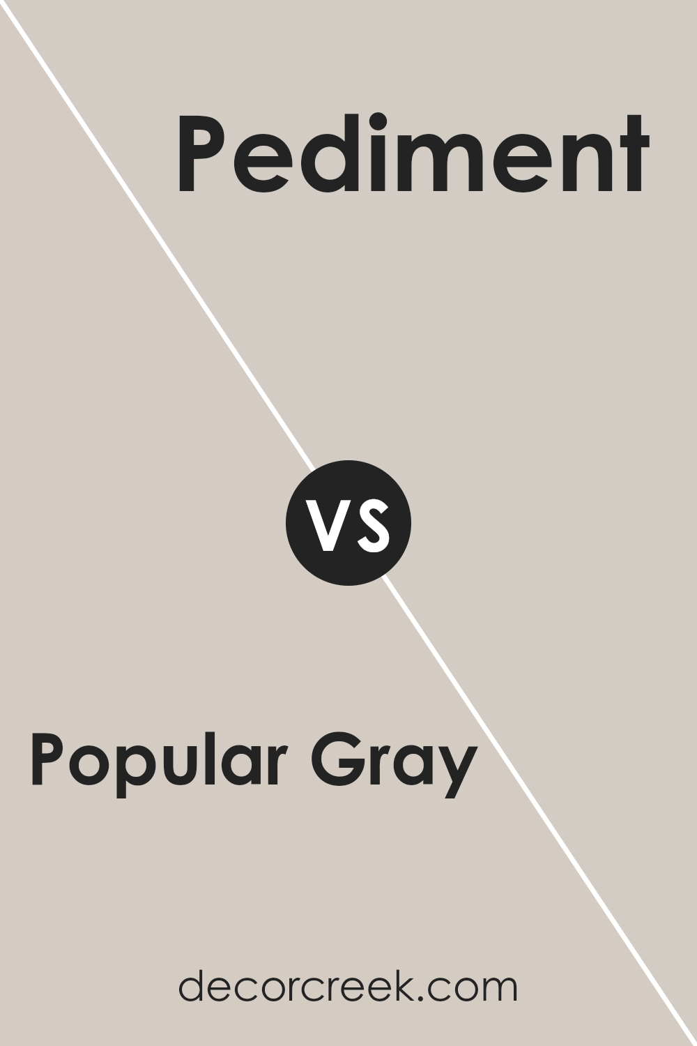
Popular Gray SW 6071 by Sherwin Williams vs Pediment SW 7634 by Sherwin Williams
Popular Gray and Pediment, both by Sherwin Williams, are two neutral shades that have their unique tones and moods. Popular Gray is a warm gray with a subtle beige undertone, making it incredibly versatile for any space. It’s like a cozy blanket, offering comfort and a soft backdrop that’s easy to blend with other colors.
On the other hand, Pediment has a cooler tone, leaning towards a lighter, dustier gray with hints of taupe. This gives it a serene and calming effect, perfect for creating a tranquil and airy space. While Popular Grave can bring warmth and a welcoming feel to a room, Pediment is excellent for achieving a more understated, sophisticated look.
Both colors are quite adaptable but serve different aesthetic purposes based on their undertones and lightness. Whether you’re looking for a cozy, inviting atmosphere or a calm, refined setting, these colors offer beautiful options.
You can see recommended paint color below:
- SW 7634 Pediment
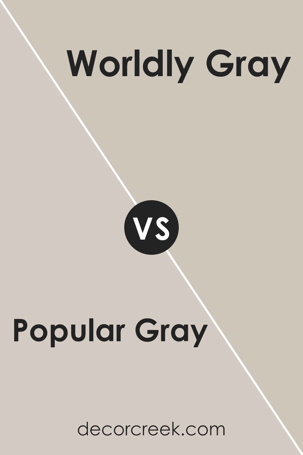
Popular Gray SW 6071 by Sherwin Williams vs Worldly Gray SW 7043 by Sherwin Williams
Popular Gray and Worldly Gray by Sherwin Williams are both elegant, neutral paint colors, but they bring different vibes to a space. Popular Gray leans towards a warm, inviting tone. It’s like a soft hug for your walls, creating a cozy atmosphere that feels welcoming and friendly. This color works great in living rooms or bedrooms, where comfort is key.
Worldly Gray, on the other hand, is cooler and more subdued. It has a sophistication to it, offering a balance that’s neither too warm nor too cold. This shade is perfect for creating a serene, calm environment. Think of it as a blank canvas that’s versatile enough to complement various decor styles, making it ideal for offices or modern living spaces.
When comparing these two, the choice comes down to the mood you want to set. Popular Gray adds warmth and coziness, while Worldly Gray offers a neutral backdrop with a hint of elegance. Both colors are highly adaptable, but their subtle differences can greatly affect the feel of a room.
You can see recommended paint color below:
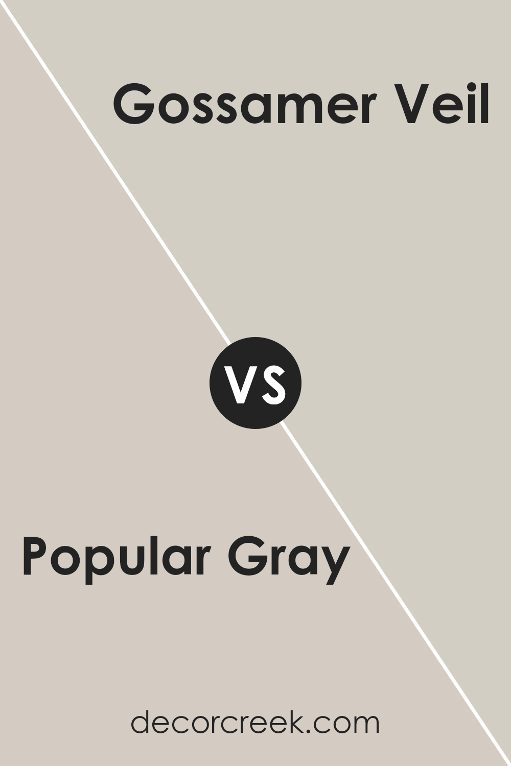
Popular Gray SW 6071 by Sherwin Williams vs Gossamer Veil SW 9165 by Sherwin Williams
Popular Gray and Gossamer Veil are both colors by Sherwin Williams, offering a serene and sophisticated palette for walls. Popular Gray is a warm hue with a blend of gray and beige, sometimes called “greige,” that brings a cozy and inviting atmosphere to spaces. This color has a bit of depth, making it perfect for adding character to rooms without overwhelming them with darkness.
Gossamer Veil, on the other hand, is a lighter shade. It’s a soft, subtle gray with hints of warm undertones, creating a calm and peaceful ambiance. This color is excellent for making small rooms appear larger and brighter.
While both colors offer a neutral base, Popular Gray adds more warmth due to its beige undertones, making it suitable for spaces where you want a touch of coziness. Gossamer Veil, with its lighter and airy feel, is ideal for achieving a minimalist and open look. Whether used together or separately, both colors provide a versatile backdrop for decor, fitting a wide range of design styles from modern to traditional.
You can see recommended paint color below:
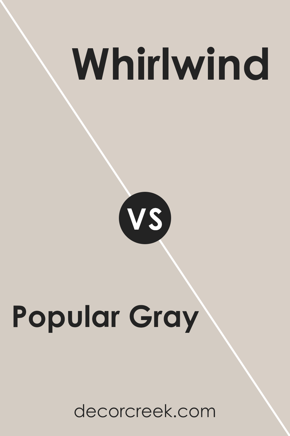
Popular Gray SW 6071 by Sherwin Williams vs Whirlwind SW 9576 by Sherwin Williams
Popular Gray and Whirlwind are two distinct colors from Sherwin Williams that bring their unique flair to any space. Popular Gray is a warm, welcoming shade that effortlessly adds a cozy, subtle elegance to rooms. Its soft, inviting tone makes it perfect for creating a comfortable atmosphere that feels like home. This color blends well with various decor styles, making it a versatile choice for any space.
On the other hand, Whirlwind is a cooler, more neutral gray that offers a fresh, modern vibe. It’s a light shade that can make small spaces appear larger and brighter. Whirlwind is ideal for those looking to achieve a sleek, contemporary look without overwhelming the room with too strong a color.
Comparing the two, Popular Gray leans towards a warmer, more beige-infused gray, offering a sense of warmth and comfort, while Whirlwind presents a crisp, clean appearance that can refresh and modernize a space.
Both colors provide a beautiful backdrop for different styles and preferences, with Popular Gray suiting cozy, homey environments, and Whirlimage_new having an edge for modern, airy settings.
You can see recommended paint color below:
- SW 9576 Whirlwind
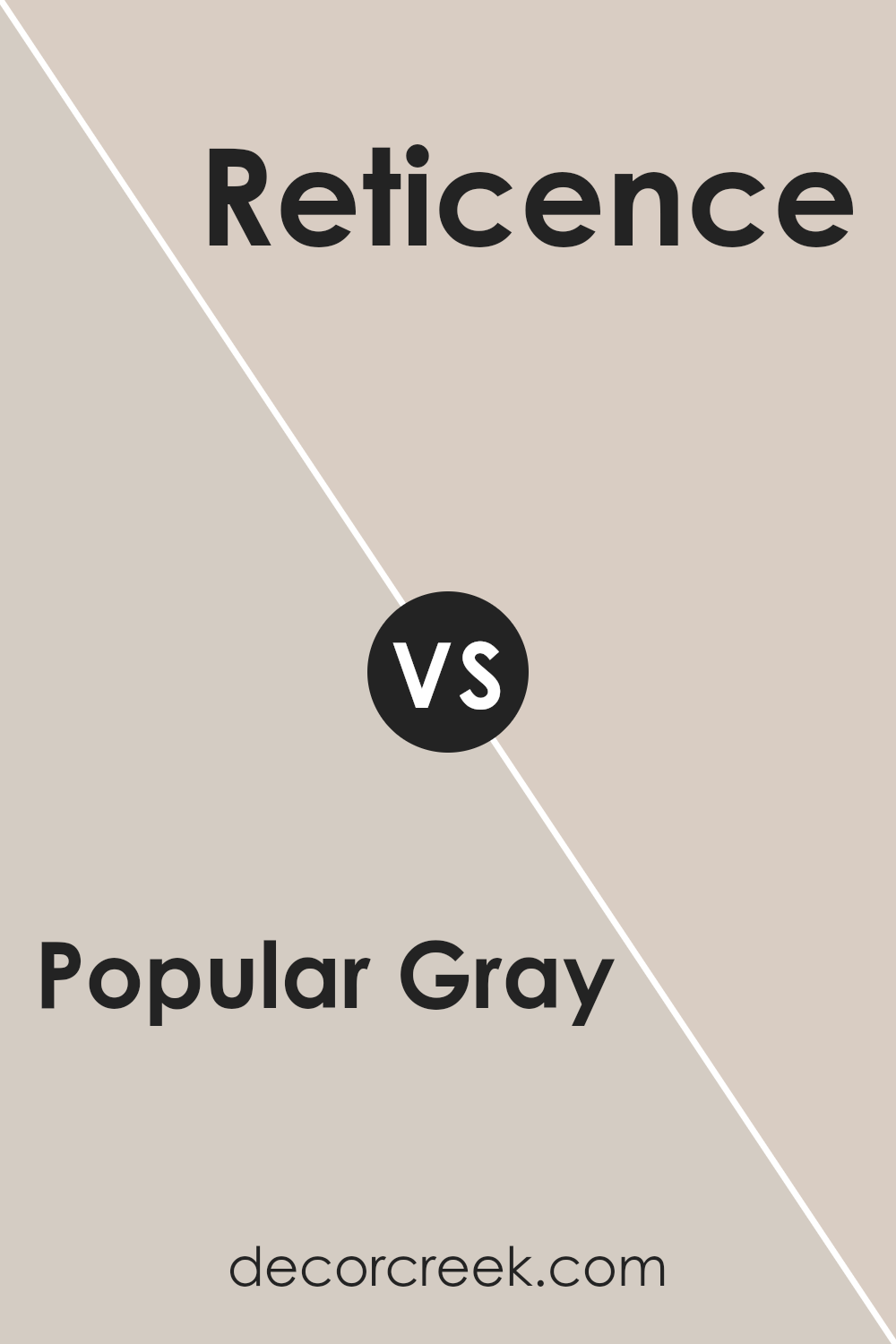
Popular Gray SW 6071 by Sherwin Williams vs Reticence SW 6064 by Sherwin Williams
Popular Gray and Reticence, both by Sherwin Williams, are distinctive yet harmonious shades that can beautifully complement various spaces. Popular Gray is a warm, welcoming color with a soft blend of beige and gray tones. It exudes a cozy, neutral ambiance that makes it versatile for any room, acting as a perfect backdrop for both bold and muted decor styles.
On the other hand, Reticence steps into the room with a cooler tone, offering a subtle hint of green mixed with gray. This color brings a serene and calming influence, making it ideal for creating a tranquil space. It pairs well with natural materials and can give a more refined look without overwhelming the senses.
While both colors share the convenience of neutrality, they each bring their unique mood to the environment. Popular Gray leans towards a warmer, inviting feel, suitable for living areas and bedrooms that seek a touch of coziness. Reticence, with its cooler, understated elegance, is perfect for areas where a calm and peaceful atmosphere is desired.
Together or apart, these colors offer great flexibility in design, allowing for personal creativity to shine.
You can see recommended paint color below:
- SW 6064 Reticence
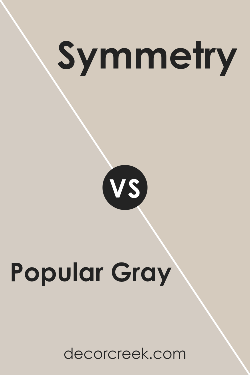
Popular Gray SW 6071 by Sherwin Williams vs Symmetry SW 9601 by Sherwin Williams
The main color, Popular Gray, and the second color, Symmetry, both by Sherwin Williams, offer unique tones for any space. Popular Gray has a warm, welcoming presence, making it a great choice for those who want a cozy vibe in their rooms. It leans towards a classic, neutral gray that can easily blend with various decor styles and colors, giving off a soft, soothing atmosphere.
On the other hand, Symmetry presents a more definite statement. While still maintaining a sense of calm, it has a distinctly richer tone, veering towards a deeper, more pronounced color that can add a touch of elegance and sophistication to any area.
This color is perfect for creating striking contrasts, especially when paired with lighter shades or used in a space that benefits from a bold, yet refined, aesthetic.
Both colors have their charm and can transform a space depending on the desired mood and style. Popular Gray is ideal for those seeking a gentle, neutral backdrop, while Symmetry suits those looking to add a bit more drama and depth to their environment.
You can see recommended paint color below:
- SW 9601 Symmetry
Popular Gray SW 6071 by Sherwin Williams vs Mercurial SW 9550 by Sherwin Williams
Popular Gray and Mercurial are two distinct colors from Sherwin Williams, each with its own unique vibe. Popular Gray is like that cozy gray sweater you love – warm, comforting, and easy to get along with. I
t’s a light to medium shade of gray that feels welcoming and versatile, fitting in just about anywhere in your home, from living rooms to bedrooms. It pairs beautifully with a wide range of decor, making it a go-to choice for those looking to create a soothing and neutral backdrop.
On the other hand, Mercurial has a bit more drama up its sleeve. It’s a deeper, more intense color that leans towards the darker end of the spectrum. Think of the mysterious depths of an evening sky just before it slips into night. Mercurial brings a sense of sophistication and depth to spaces, perfect for making a statement or adding contrast to lighter hues.
While Popular Gray whispers calm and comfort, Mercurial speaks in richer, more profound tones, offering a bolder option for those looking to add a punch of character to their spaces. Both colors have their charm and can drastically alter the mood of a room, depending on what you’re aiming for.
You can see recommended paint color below:
- SW 9550 Mercurial
Popular Gray SW 6071 by Sherwin Williams vs Realist Beige SW 6078 by Sherwin Williams
Let’s talk about two colors from Sherwin Williams: Popular Gray and Realist Beige. At first glance, you might think they’re quite similar, but let’s get into the details. Popular Gray is like a cozy, soft blanket, with a hint of warmth that makes any room feel welcoming. It’s not too dark or too light, landing right in that perfect middle ground. This makes it super versatile for decorating.
On the other side, we have Realist Beige. This color leans more towards a classic beige look. It brings a natural, earthy feel to a space, giving off a calm and soothing vibe. Realist Beige is great for those who love a more traditional look but still want their space to feel open and airy.
In summary, if you’re aiming for a bit more of a modern twist that’s still super cozy, go for Popular Gray. But, if your style leans towards the timeless and you love that natural, earthy look, Realist Beige is your friend. Both colors are beautiful in their own right, it just depends on the vibe you’re going for!
You can see recommended paint color below:
- SW 6078 Realist Beige
Popular Gray SW 6071 by Sherwin Williams vs Modern Gray SW 7632 by Sherwin Williams
Main Color, Popular Gray, and the Second Color, Modern Gray, are both paints from Sherwin Williams, offering subtle differences to suit varied tastes and design needs. Popular Gray leans toward a warm, welcoming feel with its slightly more beige undertone, making spaces cozy yet bright. It’s the kind of color that effortlessly fits with a wide range of decor, enhancing the light in rooms with its soft, inviting hue.
Modern Gray, on the other hand, is a bit cooler, thanks to its understated silver undertones. This gives it a sleek, contemporary look that’s perfect for modern spaces. It’s great for adding a touch of elegance without overwhelming a room with a strong color statement.
Despite its name suggesting a stark modernity, it actually offers a gentle, sophisticated backdrop that works in any setting looking for a fresh, updated look.
Though both colors share the term “gray” in their names, their differing undertones set them apart, making Popular Gray a warmer, more versatile option, and Modern Gray a cooler, chic choice. Each brings its own unique vibe to spaces, making the choice between them more about personal preference and the specific atmosphere one aims to create.
You can see recommended paint color below:
Conclusion
In conclusion, Popular Gray by Sherwin Williams is a versatile color that has gained a lot of appreciation for its ability to blend seamlessly into various decorating styles and spaces.
Its neutral tone strikes the perfect balance between warm and cool, making it an exceptional choice for those looking to create a serene and inviting atmosphere in their homes. The color’s adaptability means it can be easily paired with different textures and colors, enhancing the aesthetic appeal of any room without overwhelming it.
The value of Popular Gray also lies in its ability to elevate the look and feel of a space, whether it’s used on walls, furniture, or accent pieces. Homeowners and interior designers alike have found this color to be a reliable option for achieving a modern, cohesive look that remains timeless.
Furthermore, its popularity attests to its effectiveness in complementing natural light and making spaces appear more open and airy. This has made it a go-to choice for anyone looking to refresh their living environment with a touch of sophistication and understated elegance.
Ever wished paint sampling was as easy as sticking a sticker? Guess what? Now it is! Discover Samplize's unique Peel & Stick samples.
Get paint samples
