Before you decide on SW 6208 Pewter Green by Sherwin Williams for your next project, there are a few things you should consider. As someone who has used this color in various settings, I want to share my insights to help you make an informed decision.
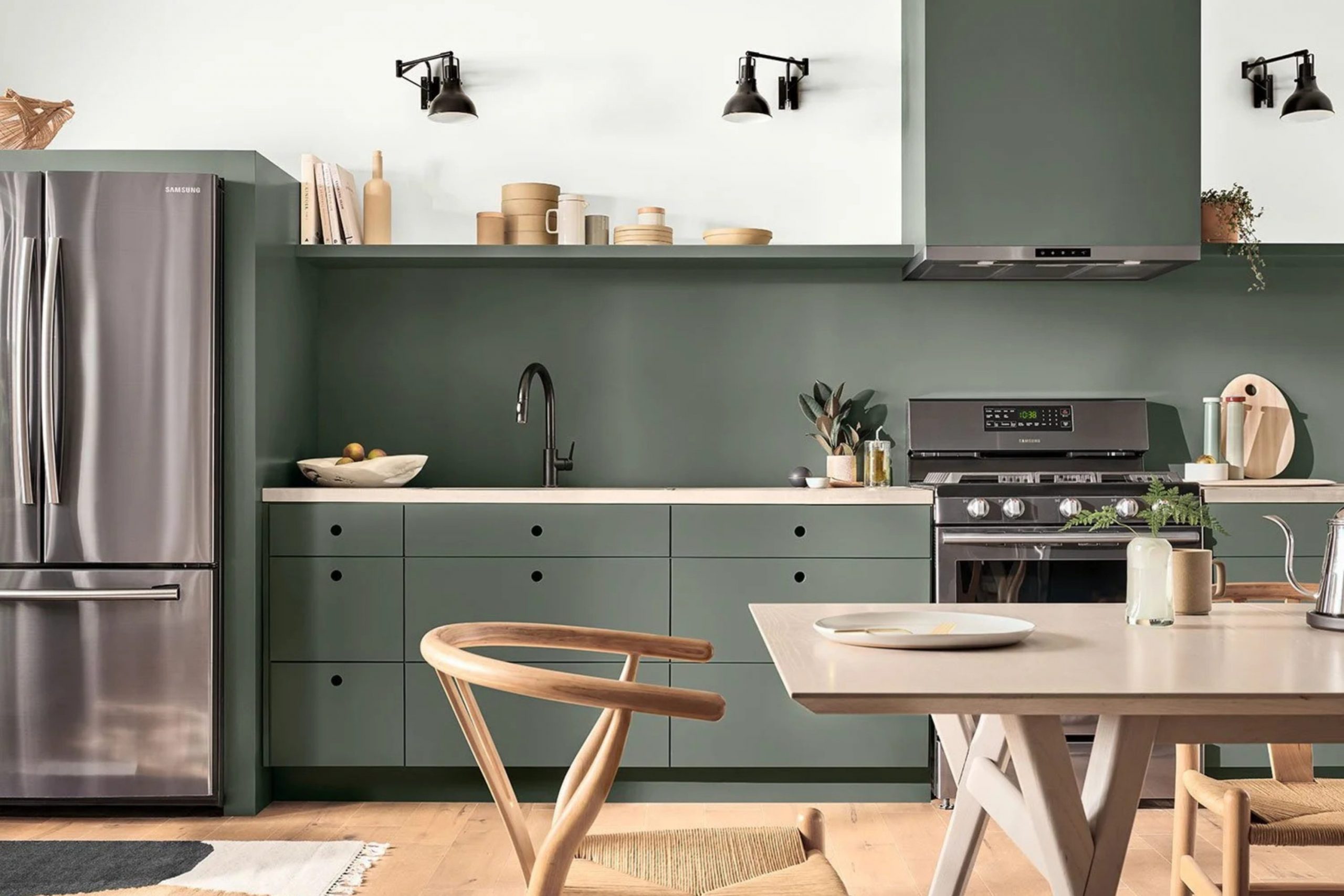
First, Pewter Green is a rich, deep shade that can significantly impact a room. Its adaptable nature is notable; it works well in bedrooms, living areas, and even kitchens, offering an elegant backdrop that complements various decor styles.
This shade carries an organic feel that pairs beautifully with natural materials like wood and stone. However, you need to be mindful of the lighting in your room. Pewter Green can appear quite different under natural light compared to artificial lighting, where it tends to look darker.
Choosing the right finish is also crucial. A matte or eggshell finish can soften the intensity of Pewter Green, while a gloss finish might highlight its depth further. Always test a sample in your room and observe it at different times of the day.
By doing so, you ensure that the color aligns with your vision and behaves as you expect in your unique environment.
Is Pewter Green SW 6208 Right for My Home?
Pewter Green is a color that carries a sense of depth and nature into any room. It’s a rich, dark green hue that reminds me of a dense forest just after it rains. It has a calming effect that makes it perfect for areas where I want to feel relaxed and connected to the outside world.
I find that Pewter Green works really well in traditional, rustic, or even modern interior styles. It’s adaptable enough to act as a subtle backdrop or as a striking feature, depending on how I use it in my decor. In a traditional setting, it brings a sense of grounded elegance, while in a modern room, it provides a striking contrast to minimalist elements.
When it comes to pairing materials, Pewter Green looks fabulous with natural wood, which complements its earthy vibe. Textures like linen or wool in neutral shades also go really well with this color, adding warmth to the coolness of the green. Incorporating metals like brass or copper can introduce a nice touch of glamour, making the color stand out even more.
Overall, Pewter Green is a wonderful choice if you’re looking for a color that brings the outdoors in, creating a cozy, inviting room. It’s a color I find truly refreshing and adaptable for various interior designs.
decorcreek.com
What are the right undertones of Pewter Green SW 6208 ?
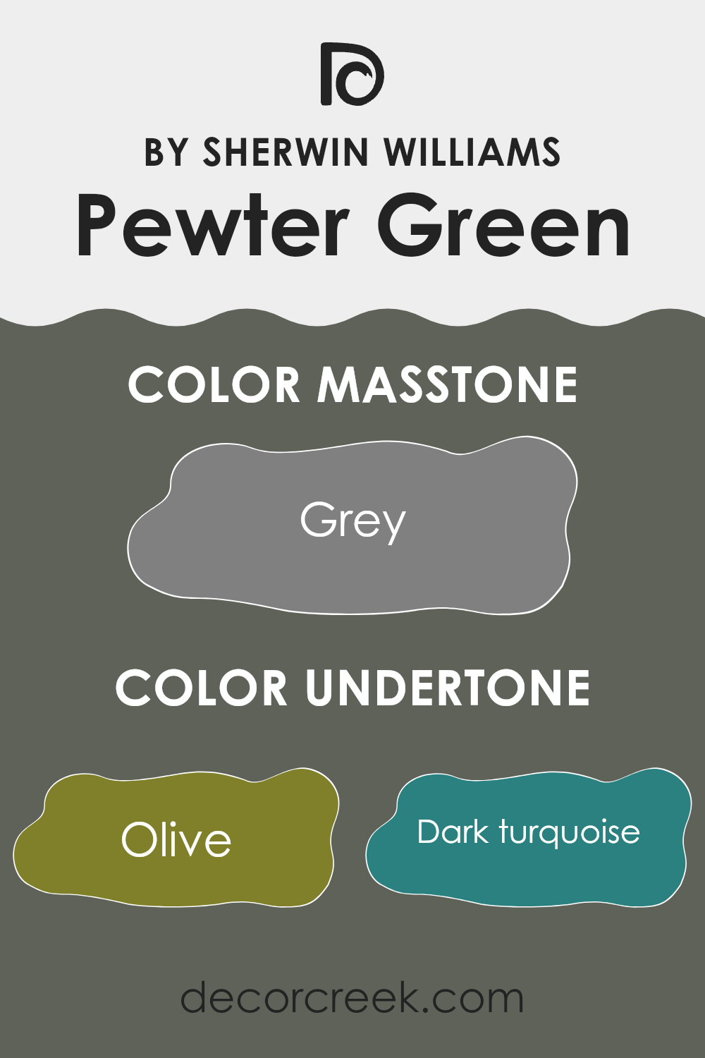
Pewter Green is a unique shade that brings a complex mix of undertones to any room where it’s applied. Understanding undertones can greatly impact how we perceive a color. Essentially, undertones are subtle hues that, although not immediately obvious, influence a color’s overall character. They can make a color appear cooler or warmer, depending on the lighting and surrounding colors.
The variety of undertones in Pewter Green, such as olive, dark turquoise, and purple, add depth and allow this color to adjust subtly to different settings and decor. For instance, in a room with ample natural light, the lighter undertones like mint or pale pink might become more noticeable, giving the walls a more lively feel. In contrast, in a room with less light, darker undertones like dark green or navy may become predominant, offering a more grounded and calming atmosphere.
When painted on interior walls, Pewter Green can offer a rich backdrop, making it ideal for areas aiming for a blend of natural tones with a hint of elegance. The presence of green and brown undertones helps in maintaining a connection to natural elements, making it suitable for living areas or studies. Meanwhile, the subtle infusions of colors like light turquoise or lilac can soften the look, making the room more inviting.
Overall, the undertones in Pewter Green make it an adaptable choice for interior walls, offering a balanced backdrop that can pair well with a variety of furniture styles and room themes. Whether you aim to create a retreat-like feel in a bedroom or a dynamic living area, the undertones of this color can help achieve the desired ambiance.
decorcreek.com
Best Coordinating Colors to use with Pewter Green SW 6208 by Sherwin Williams this year.
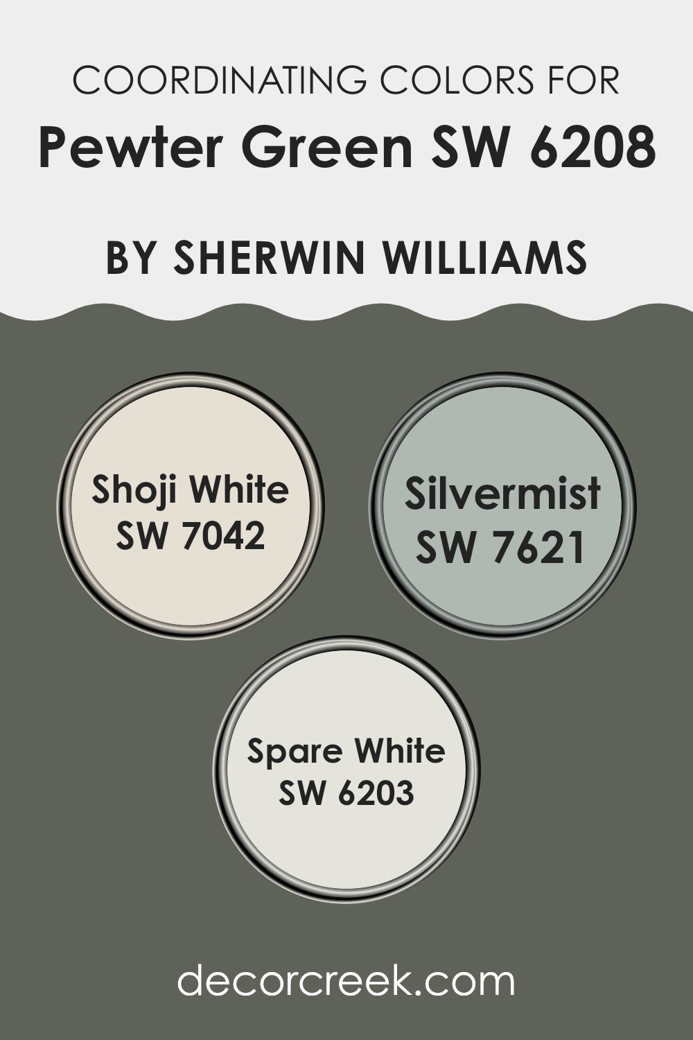
Coordinating colors are those that harmoniously complement each other when used together in interior or exterior design. Choosing the right coordinating colors can enhance the aesthetic of a room by creating balance and unity. For instance, when you use a strong hue like the deep, dark green of Pewter Green from Sherwin Williams as your base color, it’s effective to pair it with lighter or softer tones that can balance its intensity.
One such coordinating color is Shoji White, which is a subtle off-white with a warm undertone that brings a sense of brightness and light to any room. It’s the kind of color that can make dark colors like Pewter Green feel less intense, by providing a fresh contrast.
Another complementary color is Silvermist, which offers a calming blend of blue and gray tones. This color can add a touch of color to a room while still keeping things calm and understated, making it an excellent companion to more intense hues. Lastly, Spare White has a clean, crisp vibe, almost like freshly laundered linens. It is light and clear without being stark, making it another excellent choice to pair with deeper, more pronounced colors like Pewter Green for a balanced look. By choosing the right coordinating colors, you can create a cohesive and inviting room.
You can see recommended paint colors below:
- SW 7042 Shoji White
- SW 7621 Silvermist
- SW 6203 Spare White
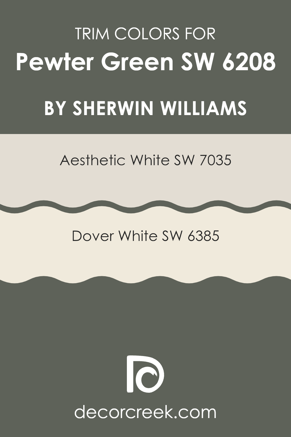
Trendy Trim Colors of Pewter Green SW 6208 by Sherwin Williams to use this year.
Trim colors, such as SW 7035 – Aesthetic White and SW 6385 – Dover White, play an important role in enhancing the appearance of a room painted with Pewter Green by Sherwin Williams.
The right trim color can frame the wall color, creating a clean and distinguished boundary that not only defines the room but also highlights architectural details. By choosing a complementing trim color, you can ensure that Pewter Green stands out nicely, providing a balanced and well-coordinated look.
Aesthetic White is a soft and neutral white that offers a gentle contrast to the deeper tones of Pewter Green, creating a subtle yet effective differentiation without feeling too intense against the primary color. Dover White has a warmer tone, adding a touch of warmth to the coolness of Pewter Green, thereby softening the overall aesthetic and making the room feel welcoming. Both colors are adaptable and can effectively enhance the welcoming and calm atmosphere established by Pewter Green, making them excellent choices for trim.
You can see recommended paint colors below:
- SW 7035 Aesthetic White
- SW 6385 Dover White
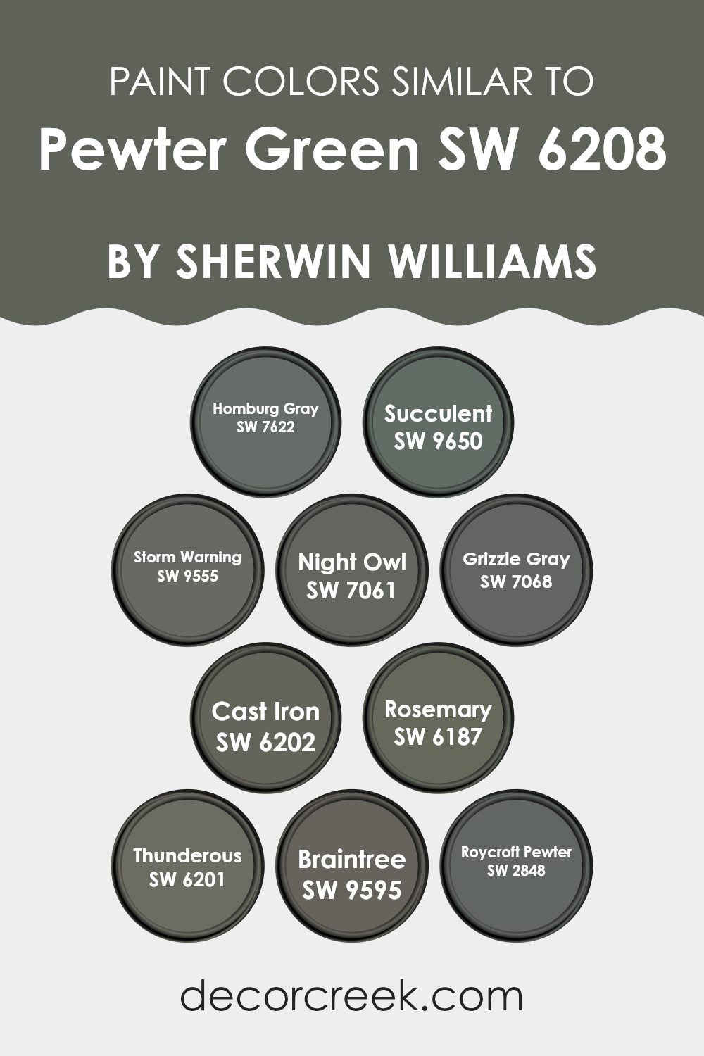
Evergreen Colors Similar to Pewter Green SW 6208 by Sherwin Williams
Similar colors are important in design because they help create a cohesive and harmonious look in any room. These colors can be subtle variations of each other, which allows for a blend that is pleasing to the eye without causing abrupt transitions or stark contrasts. For instance, colors similar to Pewter Green by Sherwin Williams each bring their own unique vibe while maintaining a balanced palette.
Starting with Homburg Gray, it introduces a stately gray with a hint of warmth that pairs well in rooms seeking a grounded feel. Moving to Succulent, this color gives off a moody green-gray tone that echoes the depth of an overcast sky, perfect for adding a bit of mystery to a room. Storm Warning shifts slightly to a darker, brooding gray-green that resembles a stormy ocean, ideal for adding drama.
Night Owl is another beautiful choice, darker and leaning toward a charcoaled green that evokes the quiet calm of a nocturnal landscape. Grizzle Gray eases back into a lighter, cooler gray that is adaptable in numerous settings. Next, we find Cast Iron, a bold, almost black shade that makes a strong statement with its deep hue.
Rosemary enriches the palette with its herbal green essence that resonates with natural tones. Thunderous offers a more muted approach with its mix of gray and stormy blue, giving off a muted but powerful presence. Braintree is a subtle blend, reminiscent of an aged metal, providing an understated elegance.
Lastly, Roycroft Pewter echoes historical roots with its traditional pewter tone, making it an excellent choice for classic designs. Each of these colors, while distinct, complements Pewter Green by offering a range of atmospheres from dark and intense to soft and subdued, allowing for a tailored aesthetic that can adjust to various styles and preferences.
You can see recommended paint colors below:
- SW 7622 Homburg Gray
- SW 9650 Succulent
- SW 9555 Storm Warning
- SW 7061 Night Owl
- SW 7068 Grizzle Gray
- SW 6202 Cast Iron
- SW 6187 Rosemary
- SW 6201 Thunderous
- SW 9595 Braintree
- SW 2848 Roycroft Pewter
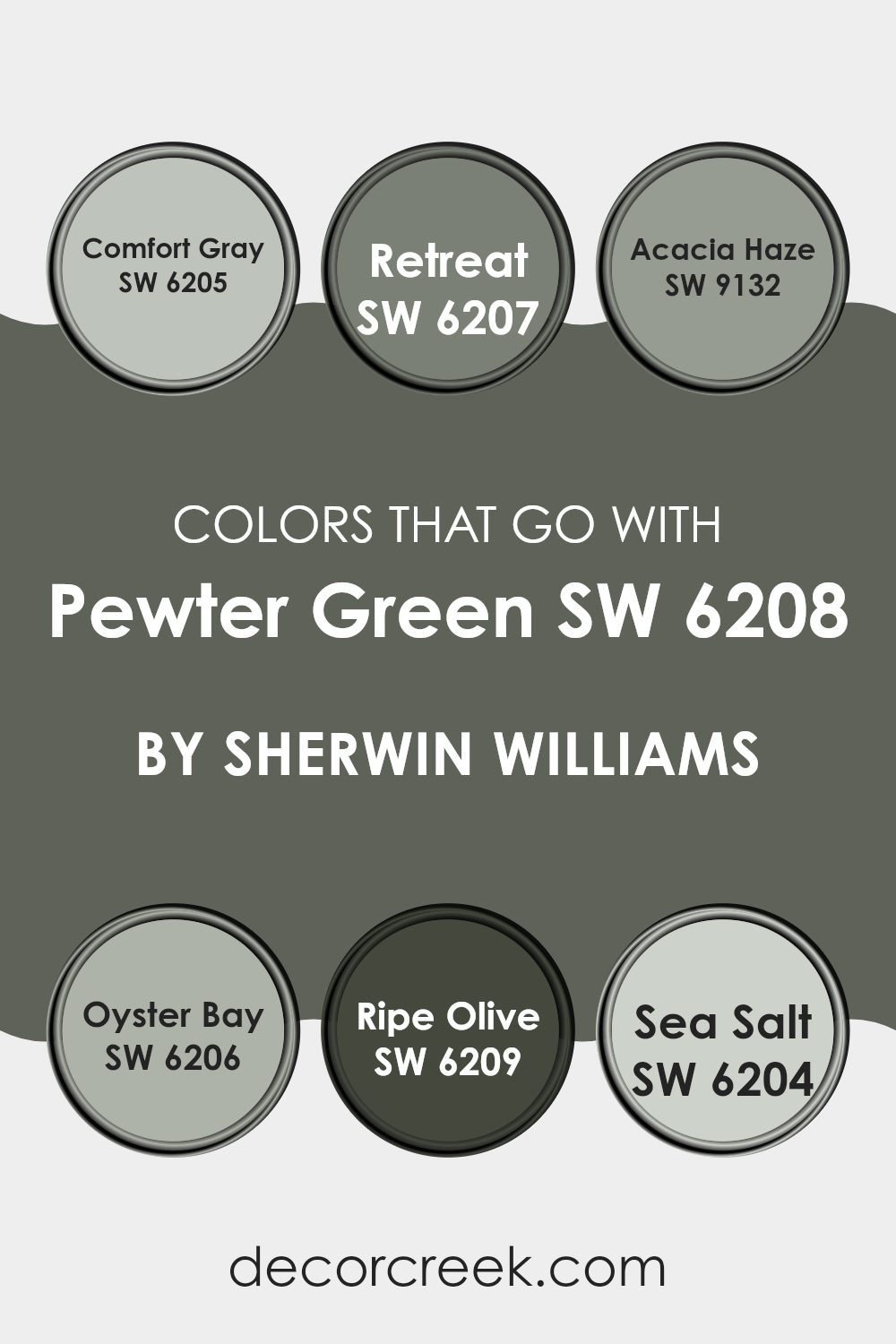
Colors that Go With Pewter Green SW 6208 by Sherwin Williams
Choosing the right colors to complement Pewter Green SW 6208 by Sherwin Williams is crucial for creating a harmonious and inviting atmosphere in any room. Pewter Green is a deep, muted green with gray undertones that offers a grounding presence, making it an ideal backdrop for various interior styles and settings.
When paired with colors like Comfort Gray, Retreat, Acacia Haze, Oyster Bay, Ripe Olive, and Sea Salt, Pewter Green can truly shine, allowing its unique tones to stand out while also connecting with other elements in the room.
Comfort Gray SW 6205 is a soft, warm gray that provides a gentle contrast to the more dominant Pewter Green, creating a calming environment. Retreat SW 6207 is deeper, leaning towards green and gray, enriching the room and providing a natural feel when placed next to Pewter Green.
Acacia Haze SW 9132 has a greenish-gray tinge, which works seamlessly with Pewter Green for a coherent, layered look. Oyster Bay SW 6206, with its lighter green shade, presents a refreshing lift that balances out the solidity of Pewter Green. Ripe Olive SW 6209 is a robust, darker green that deepens the color scheme, enhancing the room’s overall depth and character.
Lastly, Sea Salt SW 6204, a pale gray-green, adds a breath of fresh air and lightens the room without creating a sharp contrast. Each of these colors not only complements Pewter Green but also contributes to a welcoming and comfortable ambiance, making them essential for a well-rounded color palette.
You can see recommended paint colors below:
- SW 6205 Comfort Gray
- SW 6207 Retreat
- SW 9132 Acacia Haze
- SW 6206 Oyster Bay
- SW 6209 Ripe Olive
- SW 6204 Sea Salt
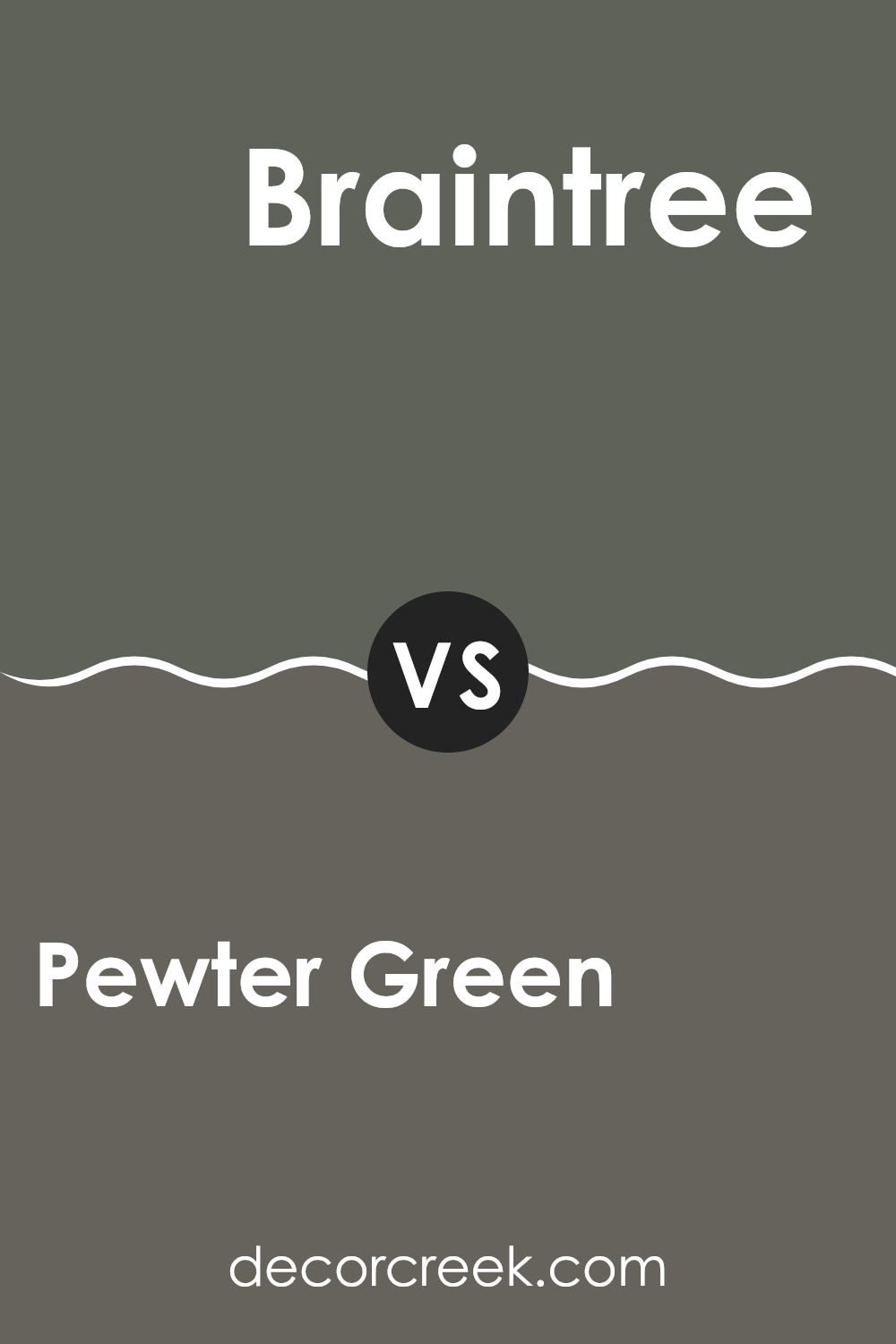
Pewter Green SW 6208 by Sherwin Williams vs Braintree SW 9595 by Sherwin Williams
Pewter Green is a dark, muted shade of green with a hint of grey, giving it an earthy feel that works well in rooms that aim for a more grounded and natural atmosphere. On the other hand, Braintree is considerably lighter and leans towards a neutral taupe with subtle green undertones.
This color is softer and more adaptable for various settings, providing a gentle backdrop that complements a wide range of decor styles. While Pewter Green sets a more defined and moody tone, perfect for creating a focal point or anchoring a room with its depth, Braintree offers an airy, lighter feel, making rooms appear larger and more open.
Both colors can beautifully coordinate in a single room, with Pewter Green handling the accent or statement roles and Braintree serving as a calming counterbalance.
You can see recommended paint color below:
- SW 9595 Braintree
Pewter Green SW 6208 by Sherwin Williams vs Storm Warning SW 9555 by Sherwin Williams
Pewter Green and Storm Warning by Sherwin Williams are both dark, rich greens, but they have different tones and moods. Pewter Green is a deep, grayish-green that brings to mind the color of weathered metal.
It’s a strong color that works well in rooms where you want a touch of nature that’s grounded and muted. On the other hand, Storm Warning leans closer to a true dark green with a slight hint of blue, giving it a cooler feel.
This color could remind someone of a dark forest during a storm, offering a dramatic and bold look that’s perfect for an accent wall or a room needing a bit of intensity. Both colors are great for adding depth to a room, but Pewter Green offers a softer, earthier vibe while Storm Warning provides a cooler, more striking appearance.
You can see recommended paint color below:
- SW 9555 Storm Warning
Pewter Green SW 6208 by Sherwin Williams vs Grizzle Gray SW 7068 by Sherwin Williams
Pewter Green and Grizzle Gray, both by Sherwin Williams, are two distinct colors that bring unique vibes to any room. Pewter Green is a deep, dark green with a hint of gray, creating a solid, earthy feel.
It’s perfect for adding a touch of nature-inspired depth to rooms without feeling too intense with its bold hue. On the other hand, Grizzle Gray stands as a true gray that carries a hint of blue undertones, offering a cooler, more neutral look.
This color is great for those looking for a modern and clean appearance, as it pairs well with a wide range of decor styles. Both colors work well in rooms that benefit from a muted, yet impactful color presence, providing a subtle backdrop that complements various textures and furnishings. While Pewter Green leans towards a naturalistic tone, Grizzle Gray offers a fresher, crisper approach.
You can see recommended paint color below:
- SW 7068 Grizzle Gray
Pewter Green SW 6208 by Sherwin Williams vs Succulent SW 9650 by Sherwin Williams
Pewter Green is a rich, intense color that leans heavily on gray with hints of deep green, giving it a muted yet distinct appearance. It’s a strong choice for rooms where you want to introduce depth and a touch of nature without making the room feel too bright.
On the other hand, Succulent is a much lighter and airy shade. This color is reminiscent of the pale green you see in certain succulent plants, providing a soft, refreshing vibe. It brings a sense of calmness and light to any room, making rooms feel more open and lively.
When comparing the two, Pewter Green offers a deeper, more grounded feel, which works well in formal areas or places intended for relaxation and reflection. Succulent, with its gentle hue, is ideal for rooms that aim to be soothing and inviting, perfect for bedrooms or bathrooms that benefit from a lighter touch. These two colors suit different moods and settings, each bringing its unique character to the environment.
You can see recommended paint color below:
Pewter Green SW 6208 by Sherwin Williams vs Rosemary SW 6187 by Sherwin Williams
Pewter Green and Rosemary by Sherwin Williams are two distinct shades that offer unique atmospheres to any room. Pewter Green presents as a deep, dark green with a hint of grey, making it a perfect choice for those looking to create a cozy and grounding environment. It pairs well with natural elements and metallics, adding a touch of elegance without feeling too intense.
On the other hand, Rosemary is a softer, more herbal green that carries a lighter and more refreshing tone. This color is ideal for rooms where you want to introduce a calm and inviting vibe, like bedrooms or home offices. It works beautifully with light woods and neutral colors to maintain a relaxed and airy feel.
Both colors have their charms and serve different purposes depending on the mood and style you’re aiming for in your decorating projects. Whether you prefer the richer depths of Pewter Green or the gentle touch of Rosemary, each provides a beautiful backdrop for a variety of decor styles.
You can see recommended paint color below:
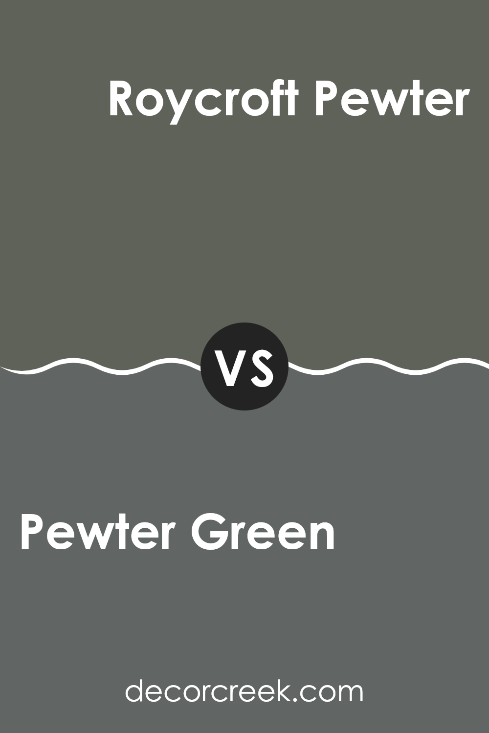
Pewter Green SW 6208 by Sherwin Williams vs Roycroft Pewter SW 2848 by Sherwin Williams
Pewter Green and Roycroft Pewter are both colors by Sherwin Williams, each bringing its unique shade to the palette. Pewter Green leans towards a deep, dark green with a hint of gray, creating an earthy and grounding effect. It’s great for rooms where you want to establish a sense of nature-infused calmness without losing a touch of urbanity.
On the other hand, Roycroft Pewter offers a heavier gray inflection, standing out with its more pronounced reflectance of classic pewter metal. This color is more subdued compared to Pewter Green, leaning more towards a traditional gray but with a warm undertone. It works well in areas where a calming yet neutral backdrop is desired.
Both colors share a muted elegance, but Pewter Green adds more vibrancy with its green tones, while Roycroft Pewter stays closer to a neutral gray, offering adaptability across various decorating styles. These distinct hues suit different tastes, making them suitable for contrasting atmospheres or complementary themes in home decor.
You can see recommended paint color below:
- SW 2848 Roycroft Pewter
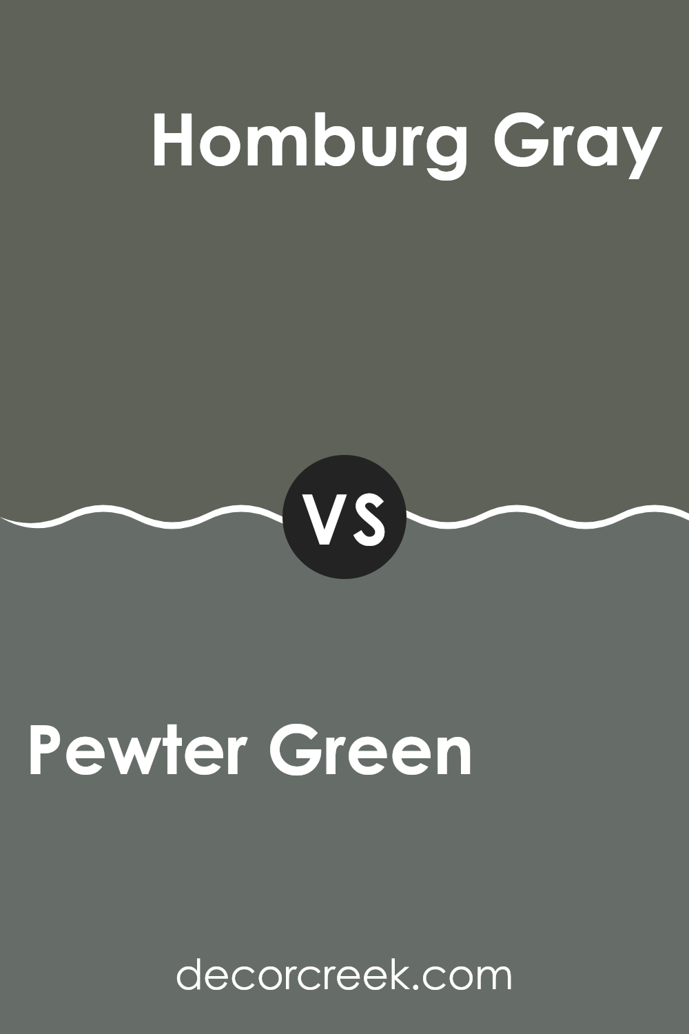
Pewter Green SW 6208 by Sherwin Williams vs Homburg Gray SW 7622 by Sherwin Williams
Pewter Green and Homburg Gray, both by Sherwin Williams, offer unique shades that can significantly influence the mood and style of a room. Pewter Green presents as a deep, dark green with hints of gray, making it ideal for creating a cozy, grounded atmosphere in a room. It’s especially fitting for rooms that benefit from a touch of nature-inspired tones, such as studies or bedrooms.
On the other hand, Homburg Gray leans more towards a traditional gray but with subtle undertones of green and blue, giving it a cooler feel compared to Pewter Green. This makes Homburg Gray adaptable for various rooms, particularly modern and minimalistic interiors. It can help make smaller rooms appear more open and cleaner.
While both colors are fairly muted and neutral, Pewter Green serves well in adding depth and warmth, whereas Homburg Gray provides a crisp, more open feel. Choosing between them would depend on the specific ambiance you’re aiming to achieve in your room.
You can see recommended paint color below:
- SW 7622 Homburg Gray
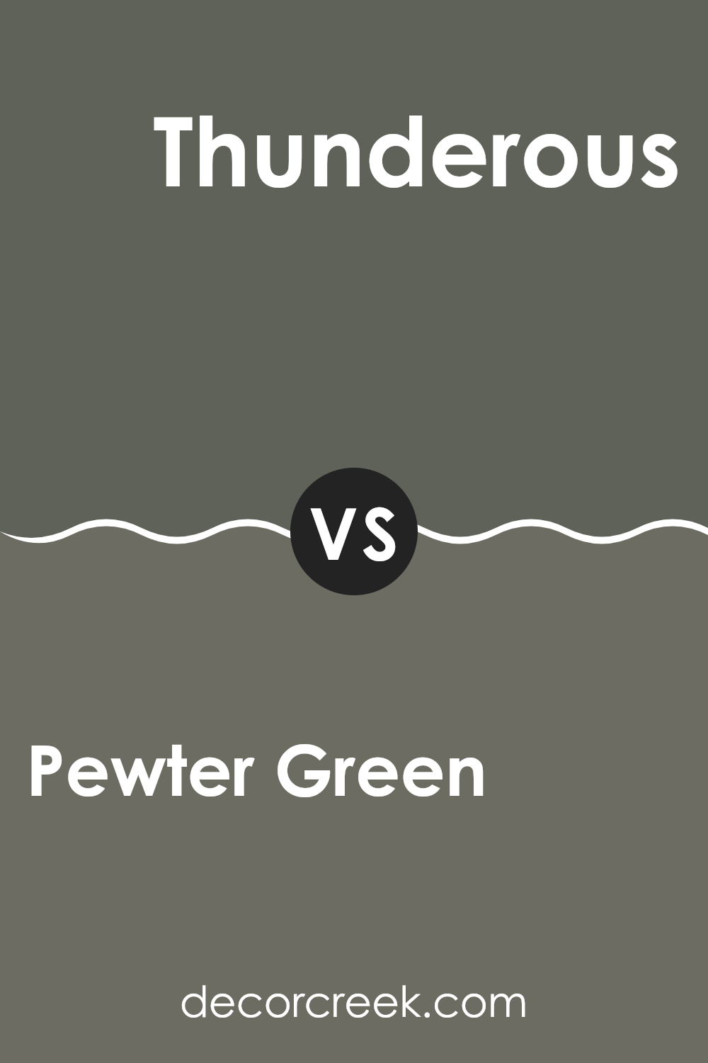
Pewter Green SW 6208 by Sherwin Williams vs Thunderous SW 6201 by Sherwin Williams
Pewter Green and Thunderous, both by Sherwin Williams, are distinct yet subtly related shades. Pewter Green is a deep, dark green with gray undertones, giving it a strong and muted vibe. This color tends to lend a grounded, earthy feel to rooms, making it well-suited for areas where a touch of nature’s calm is desired without excessive brightness.
On the other hand, Thunderous is a softer gray shade with slight blue undertones. It is lighter than Pewter Green, providing a more neutral backdrop that is adaptable for various decor styles. While Pewter Green brings in more depth and character due to its richer hue, Thunderous offers a more laid-back and understated charm that can easily blend with different color palettes.
Choosing between these two would depend on the mood and functionality of the room you’re decorating. Pewter Green works well in rooms designed for focus and grounding, like studies or bedrooms, whereas Thunderous is ideal for open areas that benefit from a light, airy feel.
You can see recommended paint color below:
- SW 6201 Thunderous
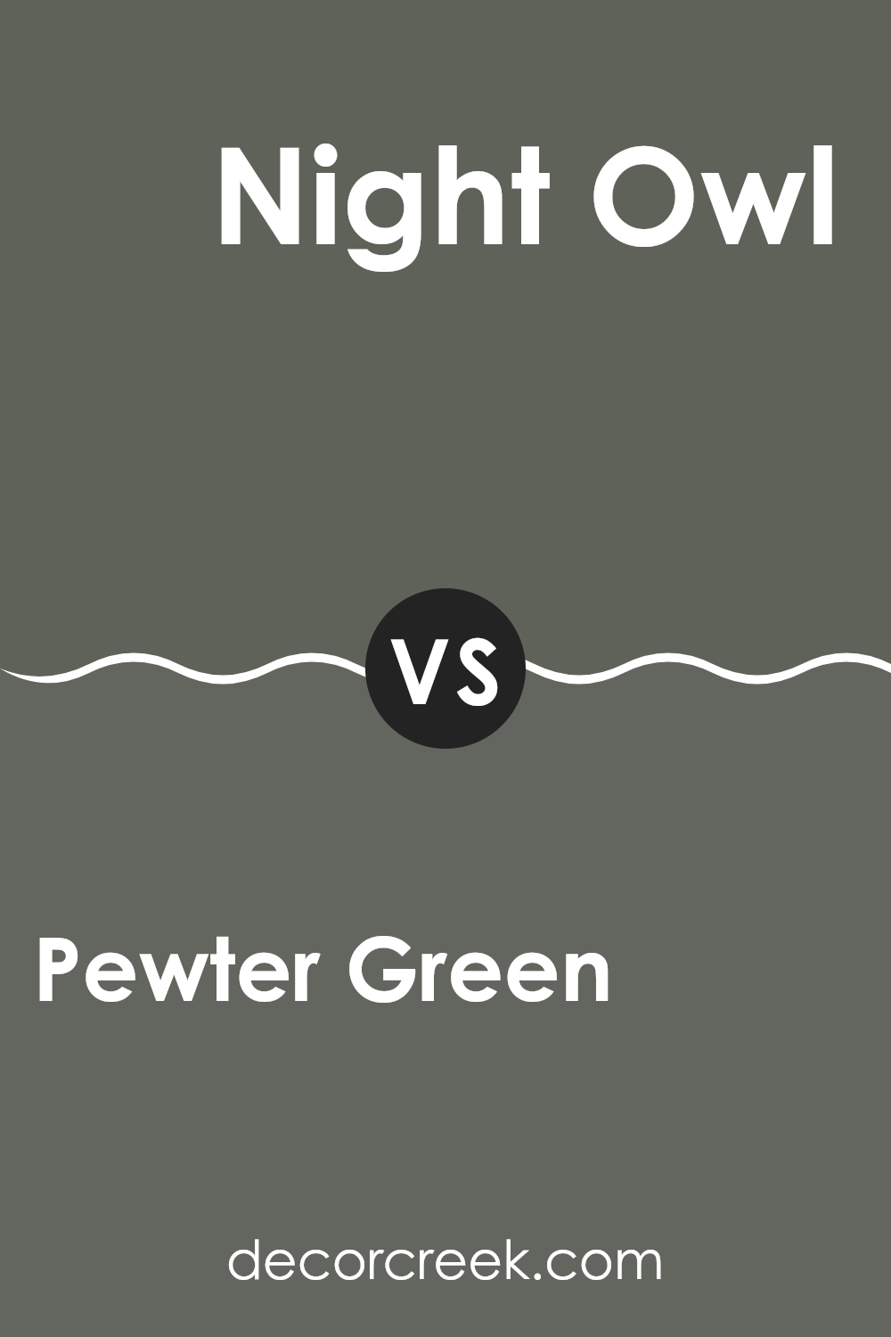
Pewter Green SW 6208 by Sherwin Williams vs Night Owl SW 7061 by Sherwin Williams
Pewter Green and Night Owl are both stylish paint colors from Sherwin Williams, but they bring different vibes to a room. Pewter Green is a deep, dark green with gray undertones, giving it a bold and grounded feel. This color works well in areas where you want to add a touch of nature with a modern twist, like in living rooms or bedrooms. It pairs nicely with light woods and metallic accents.
On the other hand, Night Owl is a softer, muted gray with hints of green. It’s lighter than Pewter Green, making it more adaptable and easier to match with a variety of decor styles and colors. Night Owl is ideal for those who prefer a subtler look that still has character. It’s excellent for creating a cozy atmosphere in rooms like kitchens or offices.
Overall, Pewter Green makes a stronger statement with its darker, richer tone, whereas Night Owl offers adaptability and a gentle, welcoming feel. Both colors can beautifully enhance a room, depending on the desired effect.
You can see recommended paint color below:
Pewter Green SW 6208 by Sherwin Williams vs Cast Iron SW 6202 by Sherwin Williams
Pewter Green and Cast Iron, both by Sherwin Williams, are unique shades that offer distinct vibes for any room. Pewter Green is a deep, muted green with gray undertones, giving it a calm, grounding feel. It’s perfect for creating a cozy, subtle atmosphere in rooms like the living room or bedroom.
On the other hand, Cast Iron is a dark gray that leans towards a classic charcoal. It can provide a strong, bold presence in a room, making it ideal for accent walls or areas where you want to make a statement without excessive brightness.
While both colors are dark, Pewter Green offers a hint of nature and softness due to its green undertones, whereas Cast Iron offers a more straightforward, stark gray appeal. Choosing between them depends on whether you prefer the soft complexity of green or the clean simplicity of gray.
You can see recommended paint color below:
- SW 6202 Cast Iron
Wrapping up thoughts about SW 6208 Pewter Green by Sherwin Williams, I found this color to be a unique choice that can add a lot of charm to any room. Pewter Green is like a deep, calm green that looks somewhat gray. This color really stands out because it’s not the usual bright or light green you might see more often. It’s darker and can make a room feel cozy, kind of like being in a peaceful forest.
When painted on walls, Pewter Green looks very elegant. It goes well with many decorations and furniture styles, from modern to more traditional looks. It’s particularly striking in rooms that get lots of natural light or even in smaller spots like a reading corner, giving those areas a comforting and secure feeling. Plus, it works great in many parts of the home, from the living room to a bedroom or even a kitchen.
This color, SW 6208 Pewter Green, could be just right for someone looking to add some quiet, classy charm without making a room feel too bright or flashy. It’s simple to see why it might just be the perfect pick for giving a home a touch of special calm and comfort.
decorcreek.com
Ever wished paint sampling was as easy as sticking a sticker? Guess what? Now it is! Discover Samplize's unique Peel & Stick samples.
Get paint samples

