As you consider repainting an area in your home, picking the right color can feel stressful with so many options out there. Let me introduce you to SW 7042 Shoji White by Sherwin Williams, a color that might just be what you’re looking for.
This shade is not purely white; instead, it brings a soft, warm tone that creates a cozy, inviting atmosphere without being too stark or clinical. It works beautifully in different rooms, whether you’re aiming to add a subtle elegance to your living room or a calming mood to your bedroom.
Shoji White adapts well with different lighting conditions, which makes it a flexible choice for any part of your house.
Let’s take a closer look at some of the essential aspects you should consider about this color to determine if it’s the perfect fit for your decorating plans.
Is Shoji White SW 7042 Right for My Home?
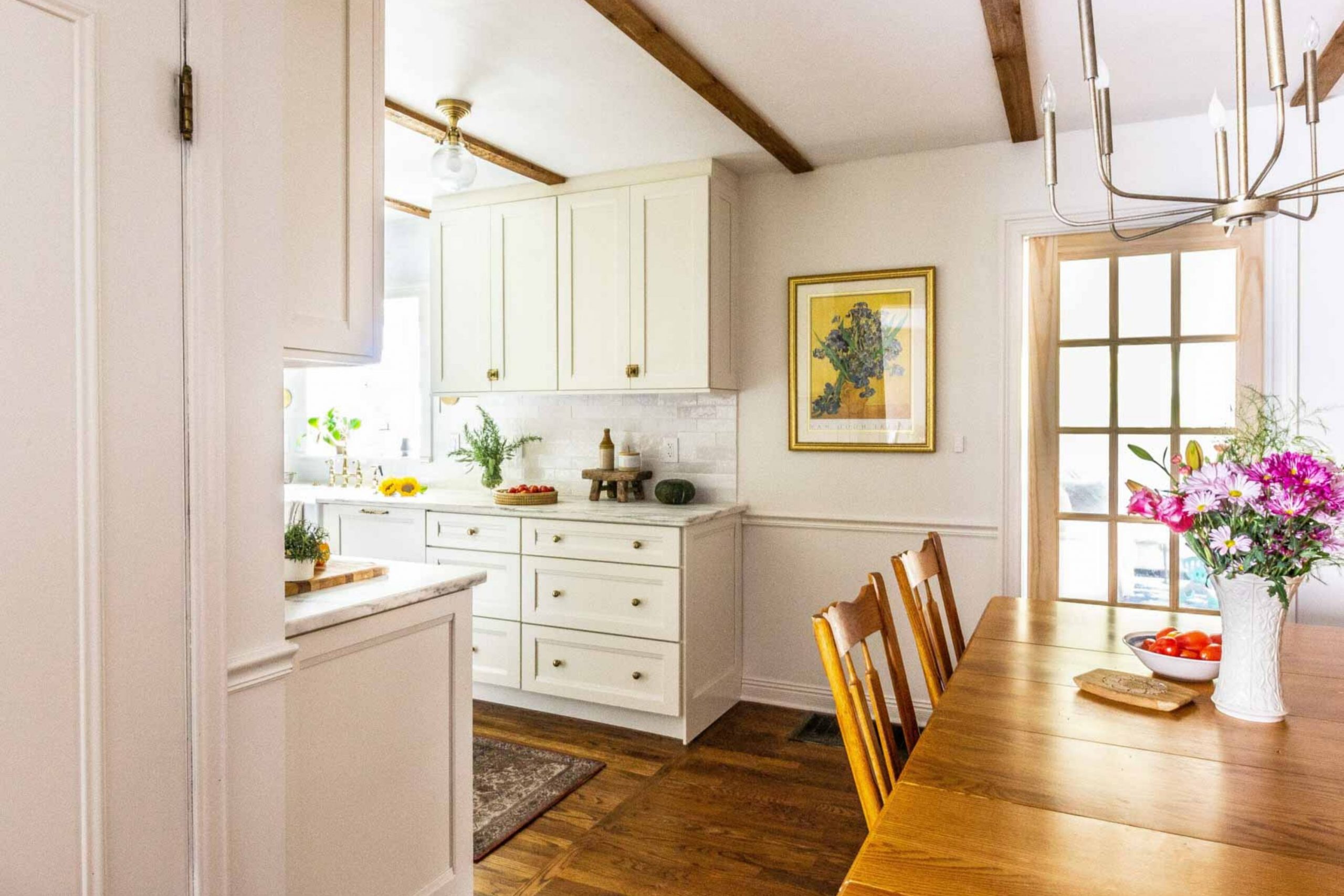
As I review my options for giving my living room a fresh coat of paint, I’ve fallen in love with a color called Shoji White. This is not just any white; it has a subtle, warm undertone that makes it feel inviting and cozy yet incredibly fresh. Think of it as that gentle morning light filling up a room, soft and comforting.
What I really appreciate about Shoji White is how adaptable it is. It’s perfect for a variety of interior styles, especially those leaning towards modern minimalism, farmhouse chic, or even a more traditional look. It acts like a canvas, allowing other elements in the room to shine without overpowering them.
I’ve noticed that this color pairs wonderfully well with natural materials and textures. For example, a hardwood floor in a deep walnut finish or exposed wooden beams can look stunning against the soft backdrop of Shoji White. It also complements woven textures like jute or linen beautifully, adding depth and interest to the room.
For metals, brushed nickel or aged brass fixtures add a refined touch without feeling too harsh. Whether it’s through frame accents, lighting fixtures, or decor pieces, this color helps to create a cohesive look that feels both grounded and airy. In summary, Shoji White is a flexible, warm white that works wonderfully in many homes, making rooms feel welcoming and beautifully lit.

decorcreek.com
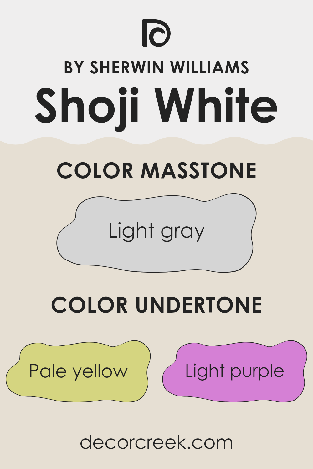
What are the right undertones of Shoji White SW 7042 ?
Shoji White is a unique paint color that changes subtly depending on the lighting and surrounding colors. This paint has a variety of undertones – pale yellow, light purple, light blue, pale pink, mint, lilac, and grey.
Undertones are like hidden colors within the main paint color. They influence how we see the color, especially in different lights or next to other colors. For instance, in bright sunlight, a paint’s yellow undertones might make the wall look warmer, while grey undertones could give a cooler feel on a cloudy day.
The complexity of Shoji White’s undertones means it can easily adapt to different rooms and decor styles. On interior walls, the presence of such diverse undertones allows this color to interact interestingly with both natural and artificial light. Early in the morning or late in the afternoon, the walls might lean towards a warmer glow due to pale yellow and pink, while during midday, they could appear more neutral or cool because of the light blue and grey influences.
Overall, Shoji White offers a flexible backdrop for rooms. Whether you’re aiming for a cozy, welcoming feel or a cleaner, more defined look, this color can fit both bills, adapting to furniture and decoration styles ranging from modern to classic.
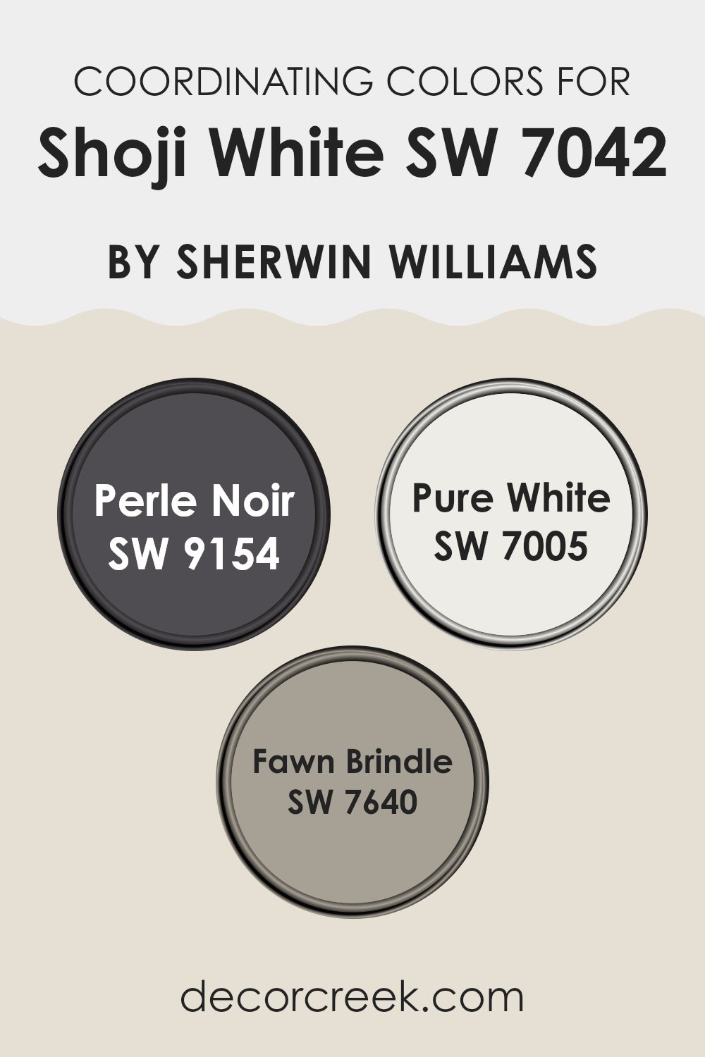
Best Coordinating Colors to use with Shoji White SW 7042 by Sherwin Williams this year.
Coordinating colors are hues that complement each other and work together to create a balanced and pleasing visual experience. Typically, they are selected to balance or enhance the main color used in a room.
In the case of Shoji White, a soft and neutral shade, its coordinating colors include Perle Noir, Pure White, and Fawn Brindle, each selected to either contrast or closely align with its subtle tones. This dynamic allows for flexibility in design, letting decorators create either a bold contrast or a seamless blend within an interior area.
Perle Noir is a deep, almost black shade that provides a striking contrast to the lighter Shoji White, making it ideal for accents like trim or doors to add a touch of drama and depth. Pure White, on the other hand, is a very clean and crisp white that offers a minimalistic look. It pairs perfectly with Shoji White for a seamless and cohesive appearance, especially in rooms striving for a bright and airy feel. Fawn Brindle is a warm gray with undertones that make it particularly adaptable; it complements Shoji White by adding warmth and complexity to the palette, ideal for creating a cozy atmosphere in rooms.
You can see recommended paint colors below:
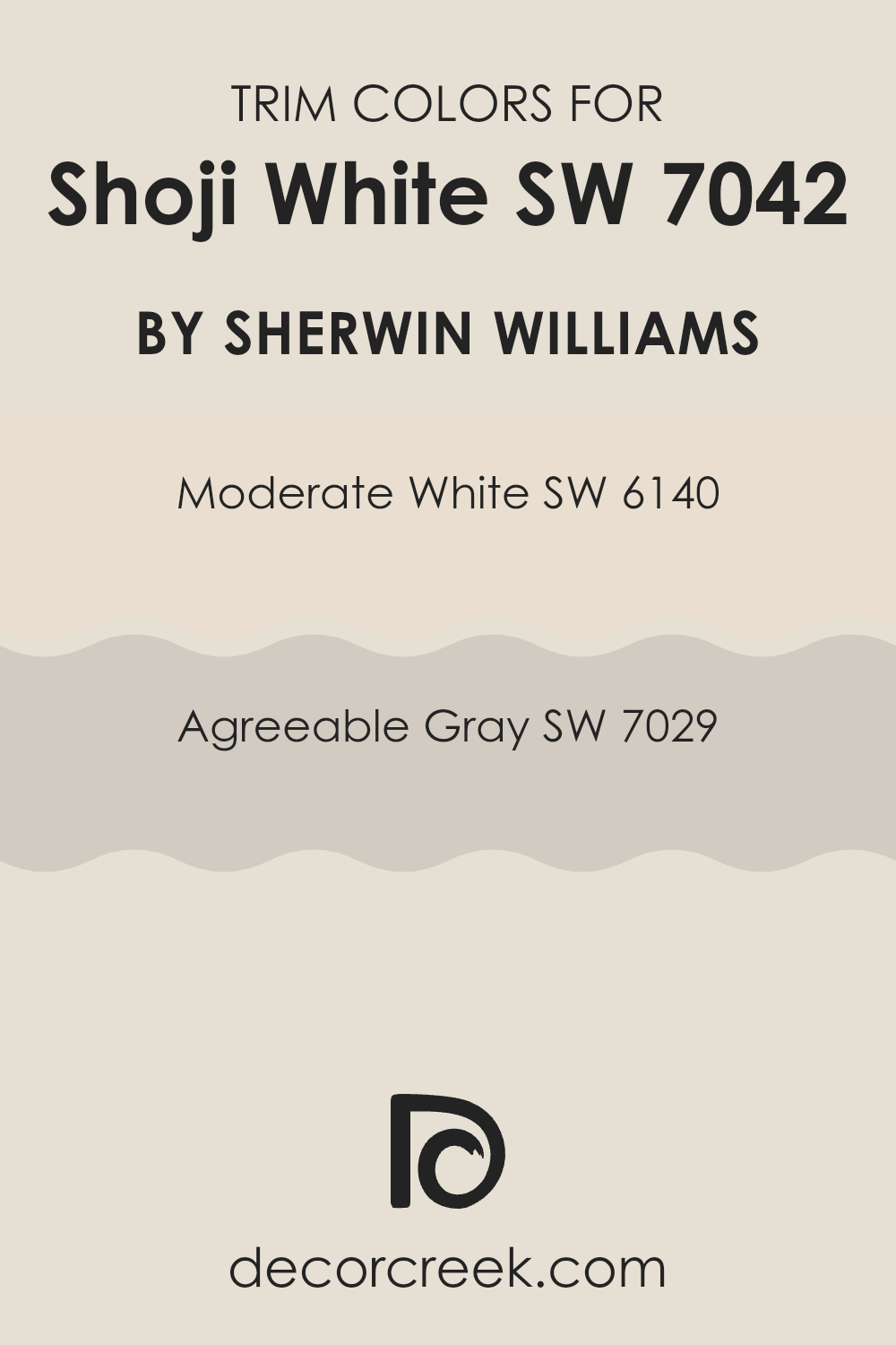
Trendy Trim Colors of Shoji White SW 7042 by Sherwin Williams to use this year.
Trim colors are essential accents in interior design, providing a visual frame that enhances wall colors and adds depth and definition to a room. When used with a gentle hue like Shoji White by Sherwin Williams, choosing the right trim color can highlight the walls’ softness and create a clean, cohesive look. The choice of trim colors can either softly support the main color or create a striking contrast, depending on the desired aesthetic effect.
Moderate White SW 6140 is a gentle cream shade that subtly complements Shoji White, providing a slight contrast while maintaining a balanced overall feel. This makes it an ideal choice for those who prefer a smooth transition between the wall and trim.
On the other hand, Agreeable Gray SW 7029 offers a slightly bolder contrast, as it is a soft gray that can create a gentle but visible separation from Shoji White. This color enhances the room’s dimensions and sharpens architectural details effectively, making it great for adding subtle visual interest without overpowering the main color.
You can see recommended paint colors below:
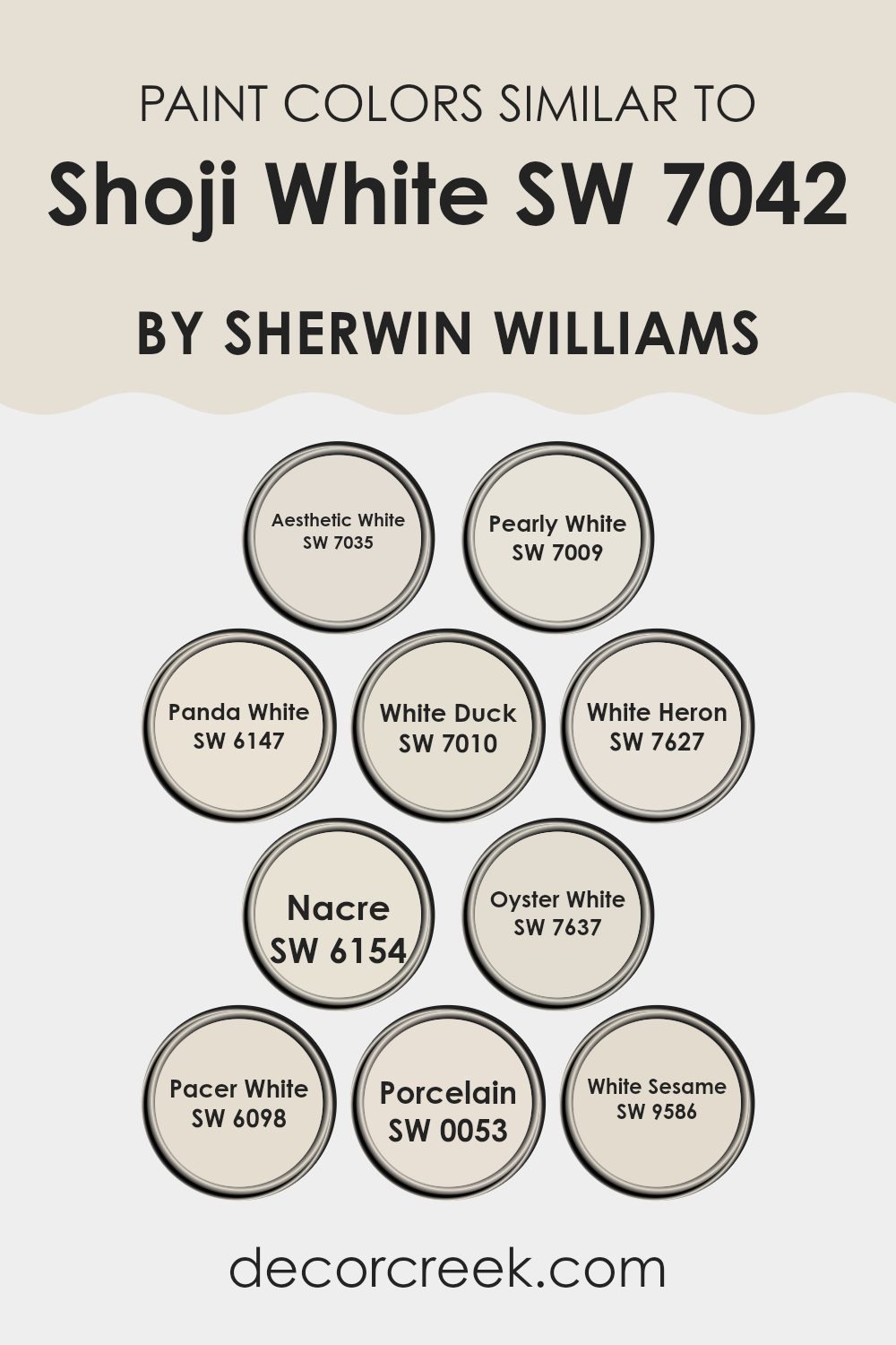
Evergreen Colors Similar to Shoji White SW 7042 by Sherwin Williams
Similar colors, especially those close to Shoji White by Sherwin Williams, play a crucial role in creating a cohesive and harmonious aesthetic within a room. These colors are subtle variations of white that can help achieve a seamless look, important in areas where you want to support a sense of continuity and flow.
For instance, using colors like Aesthetic White and Pearly White provides a slightly varied but still closely related palette that can gently define different zones without creating too stark a contrast. These shades are particularly useful in achieving a professional or calm atmosphere where the focus is on simplicity and reducing visual clutter.
Panda White, White Duck, and White Heron, leaning toward warmer or cooler tones respectively, allow for gentle nuance in a room’s decor. A more personalized touch can be achieved with these shades while maintaining a unified theme. Nacre and Oyster White offer a delicate balance, being neither too stark nor too imposing, which is perfect for areas that benefit from a soft background.
Meanwhile, Pacer White and Porcelain work well in rooms that get a lot of light, reflecting it gently and making the room appear brighter and more welcoming. Lastly, White Sesame brings a unique, almost imperceptible touch of warmth that can make a room feel more inviting without drifting too far from a neutral base. These colors, while similar, each bring their own unique essence to a room, allowing for a variety of designs that still feel connected.
You can see recommended paint colors below:
- SW 7035 Aesthetic White
- SW 7009 Pearly White
- SW 6147 Panda White
- SW 7010 White Duck
- SW 7627 White Heron
- SW 6154 Nacre
- SW 7637 Oyster White
- SW 6098 Pacer White
- SW 0053 Porcelain
- SW 9586 White Sesame
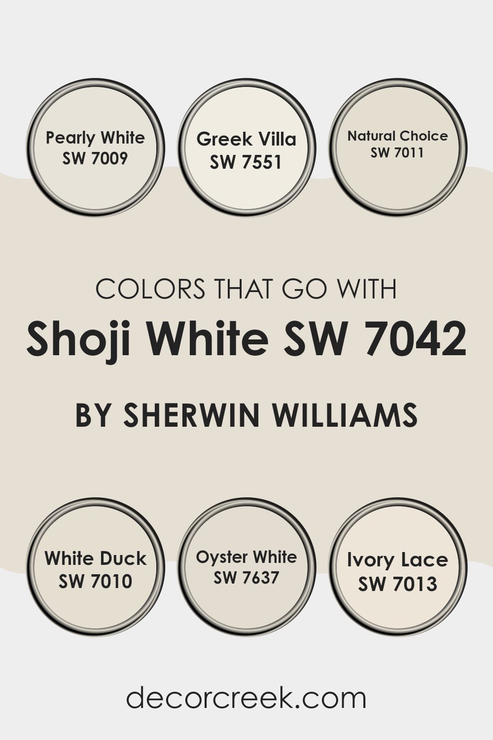
Colors that Go With Shoji White SW 7042 by Sherwin Williams
Choosing the right colors to complement Shoji White SW 7042 by Sherwin Williams is important because it helps create a cohesive and appealing color scheme. Shoji White is a warm and inviting shade that works beautifully as a neutral backdrop. When it is paired with colors like Pearly White, Greek Villa, Natural Choice, White Duck, Oyster White, and Ivory Lace, this combination enhances the overall aesthetic of a room by adding depth and variation while maintaining an adaptable and balanced look. These colors blend seamlessly to establish a calm and welcoming environment, perfect for any room in the home or office.
Pearly White SW 7009 is a soft white with a whisper of warmth, making it an excellent slight contrast to Shoji White. It’s ideal for adding a subtle differentiation without being too much for the senses. Similar to Pearly White, Greek Villa SW 7551 has a slightly creamier tone, providing a gentle richness that complements wood tones and soft textures beautifully.
Shifting to a deeper hue, Natural Choice SW 7011 offers a more noticeable contrast, making it perfect for trims and baseboards to frame Shoji White elegantly. Another warmer neutral, White Duck SW 7010, works nicely with Shoji White, sharing a similar base but with a bit more depth, which is great for creating a layered look.
If you want just a hint of color, Oyster White SW 7637, which has a touch of grey, introduces a clean, soft contrast that is easy on the eye. Lastly, Ivory Lace SW 7013, with its slight yellow undertone, provides a light and airy feel, ensuring the room looks bright and lively. These carefully selected colors support Shoji White’s character by offering complementary shades that enhance and enrich the rooms they are used in.
You can see recommended paint colors below:
- SW 7009 Pearly White
- SW 7551 Greek Villa
- SW 7011 Natural Choice
- SW 7010 White Duck
- SW 7637 Oyster White
- SW 7013 Ivory Lace
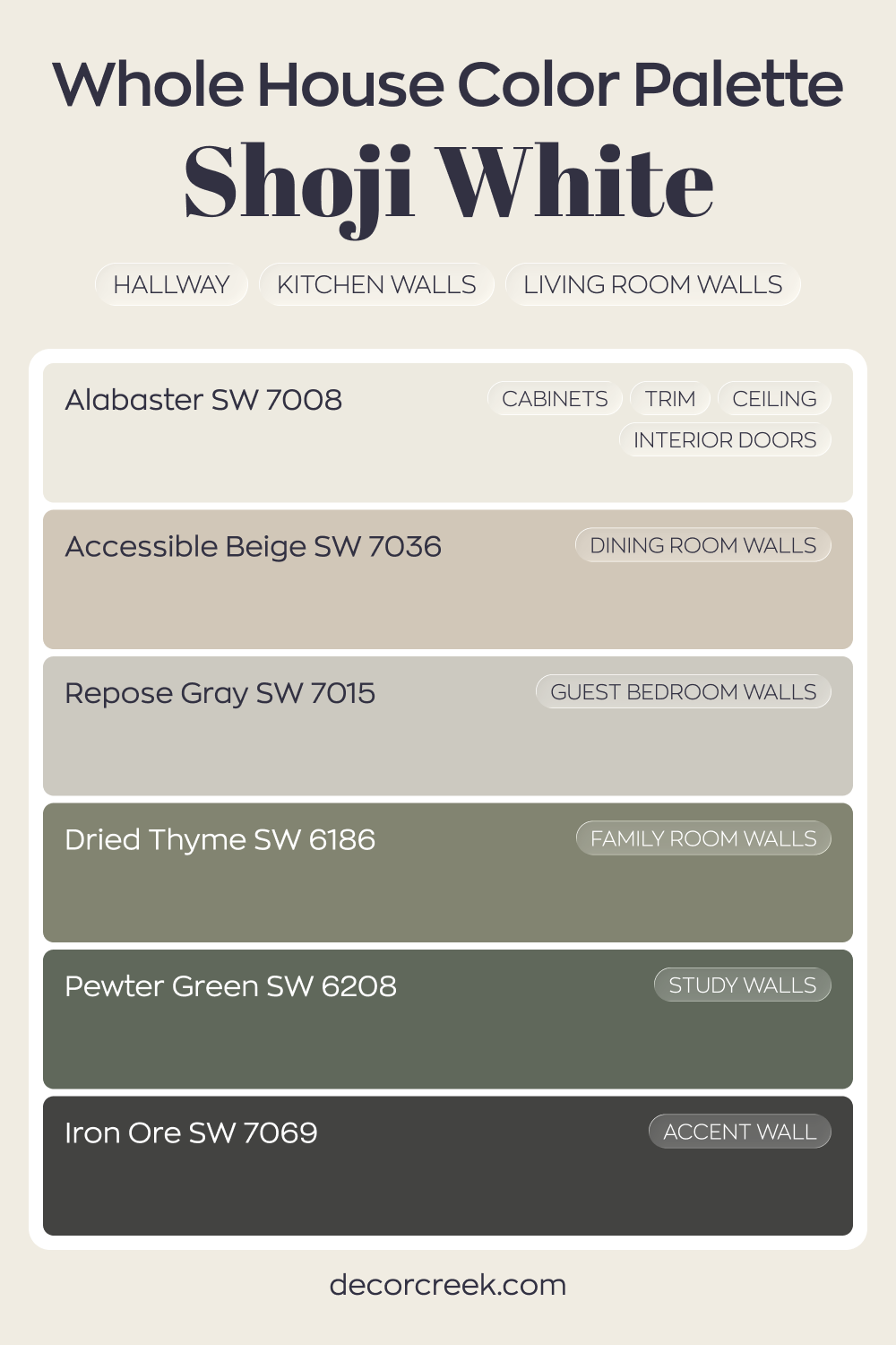
Whole House Paint Color Palette Built Around Shoji White SW 7042
Shoji White SW 7042 carries a soft warmth through the hallway, kitchen, and living room walls. Paired with Alabaster on cabinets, trim, ceilings, and interior doors, the house feels light and cohesive from the start. Accessible Beige in the dining room continues that warm flow without feeling heavy.
Repose Gray in the guest bedroom introduces a gentle gray balance, keeping the palette grounded.
Dried Thyme in the family room and Pewter Green in the study add earthy depth and character. These greens bring a natural note that works beautifully with Shoji White’s creamy base.
Iron Ore on an accent wall finishes the palette with strong contrast. The mix of warm whites, soft neutrals, and deep greens creates a layered house that feels connected and thoughtfully designed.
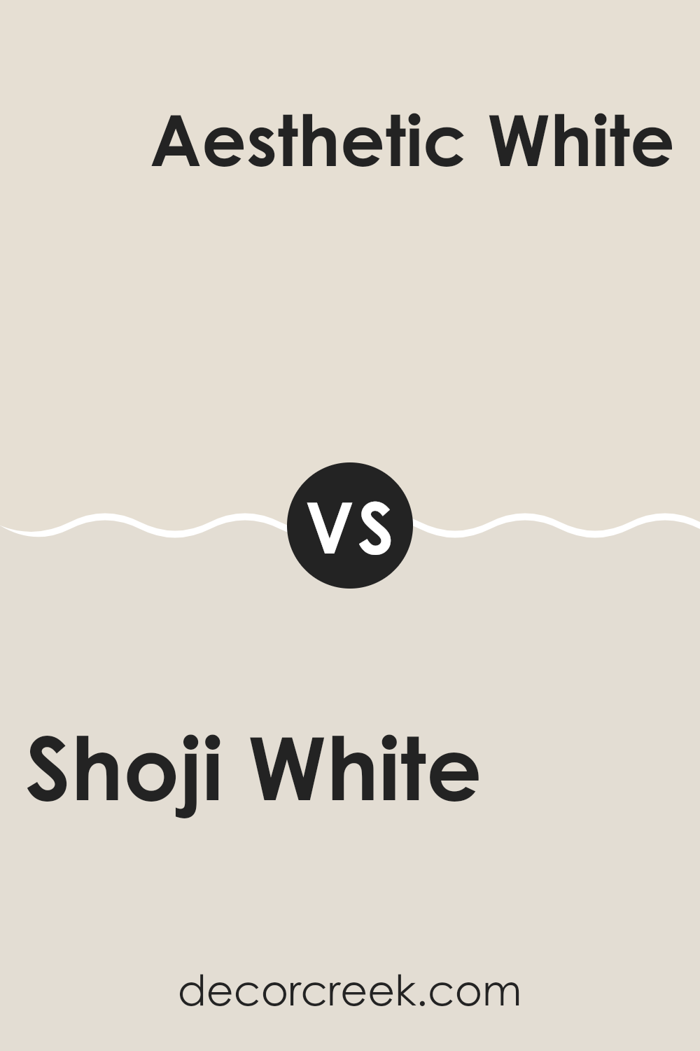
Shoji White SW 7042 by Sherwin Williams vs Aesthetic White SW 7035 by Sherwin Williams
Shoji White and Aesthetic White are two popular paint colors from Sherwin Williams that offer subtle differences for those picking out the right shade. Shoji White has a warmer undertone, making it a great choice for rooms where you want a cozy and inviting feel.
Its hint of greige helps it blend effortlessly with other colors and natural materials like wood and stone. On the other hand, Aesthetic White leans slightly cooler than Shoji White, though it is still considered a warm neutral. This color offers a bit more gray, which makes it flexible for rooms that get a mix of light throughout the day.
Aesthetic White works well in areas where a slightly lighter and softer appearance is desired. Both colors are understated and provide a neutral backdrop that goes well with various decor styles. Choosing between them depends on the specific mood and tone you want to achieve in your home.
You can see recommended paint color below:
Shoji White SW 7042 by Sherwin Williams vs Pacer White SW 6098 by Sherwin Williams
Shoji White and Pacer White are two colors by Sherwin Williams that, while both being whites, have different undertones and vibes. Shoji White has a warm, soft beige undertone that makes it flexible and welcoming, lending a cozy feel to any room.
It’s a great choice for creating a relaxed, inviting area. On the other hand, Pacer White leans a bit cooler, with a slight grayish tint. This makes it ideal for those who prefer a crisper white that still maintains a hint of warmth.
It can help refresh a room while keeping it cozy. Whether you’re looking to brighten up a small room or give a more expansive look to a larger area, each color offers a unique solution, with Shoji White adding a touch of warmth and Pacer White providing a cleaner, crisp backdrop.
You can see recommended paint color below:
Shoji White SW 7042 by Sherwin Williams vs Panda White SW 6147 by Sherwin Williams
Shoji White is a soft and warm white color that carries a hint of beige, making it more inviting and cozy compared to brighter whites. It’s a great choice for creating a subtle, relaxed atmosphere in any room, without feeling stark or cold.
On the other hand, Panda White tends toward a cooler tone than Shoji White, with slight gray undertones that give it a more neutral appearance. Panda White can work well in rooms that aim for a clean and contemporary look, as it pairs nicely with various colors and decor styles without dominating the room.
When choosing between these two, consider the lighting and other elements in your room. Shoji White works well in rooms where you want a hint of warmth, while Panda White is better suited for achieving a crisp, modern feel.
You can see recommended paint color below:
Shoji White SW 7042 by Sherwin Williams vs Porcelain SW 0053 by Sherwin Williams
Shoji White and Porcelain are both neutral colors by Sherwin Williams, but they have different tones and appearances. Shoji White has a warm undertone that makes it cozy and inviting, suitable for living rooms or bedrooms where you want a soft, subtle backdrop. It’s a bit darker compared to Porcelain and works well in rooms with lots of natural light.
On the other hand, Porcelain is lighter and cooler, offering a cleaner and brighter look. It’s a great choice for smaller rooms or areas with less natural light, as it can help make a room feel bigger and more open. This color is also perfect for bathrooms or kitchens where you want a crisp, fresh vibe.
In general, if you’re looking for a color that brings warmth and a hint of coziness, Shoji White is the go-to. For a brighter, more open feel, Porcelain would be the better option. Their differences in tone make each suitable for specific decorating needs and styles.
You can see recommended paint color below:
Shoji White SW 7042 by Sherwin Williams vs White Sesame SW 9586 by Sherwin Williams
Shoji White and White Sesame are both colors offered by Sherwin Williams, tailored for those seeking a subtle nuance in their white paint choices. Shoji White has a warm, soft beige undertone, giving it a cozy and inviting feel. It works well in rooms that aim to have a calming and pleasant ambiance, like living rooms or bedrooms. It pairs nicely with earthy or wood tones, enhancing a natural, homey aesthetic.
On the other hand, White Sesame is slightly cooler compared to Shoji White. It has a hint of gray that brings a more neutral look. This color is great for modern rooms or areas where you want a clean, crisp appearance without starkness. It offers a fresh look and works well in kitchens and bathrooms, where a tidier vibe is often desired.
Choosing between these two depends on the mood you want to create and the specific characteristics of your room, such as lighting and furniture, as each color offers a unique dimension to the interiors.
You can see recommended paint color below:
Shoji White SW 7042 by Sherwin Williams vs White Heron SW 7627 by Sherwin Williams
Shoji White and White Heron by Sherwin Williams are both subtle and elegant shades of white, but each brings its unique character to rooms. Shoji White has a warm undertone, making it ideal for creating a cozy and inviting atmosphere. It blends smoothly with soft, natural colors like beiges and warm grays, and works well in areas where a subtle hint of warmth is desired, without overt yellow or cream hues.
On the other hand, White Heron has a cleaner, crisper feel due to its cooler undertones. It is excellent for rooms that aim to achieve a bright and airy feel. This color complements contemporary and modern decor beautifully, enhancing other cool tones such as blues and greens.
When choosing between these two, consider the mood and functionality of your room. Shoji White works well for a relaxed, warm setting, while White Heron is perfect for achieving a fresh, pure look.
You can see recommended paint color below:
Shoji White SW 7042 by Sherwin Williams vs White Duck SW 7010 by Sherwin Williams
Shoji White and White Duck, both by Sherwin Williams, offer subtle differences in their shades. Shoji White has a warmer tone, giving it a soft and inviting feel that works well in rooms that aim for a cozy atmosphere. It leans slightly toward a beige color, making it adaptable for different rooms, whether you want a comforting living area or a relaxed bedroom vibe.
On the other hand, White Duck has a cooler undertone and appears slightly grayer compared to Shoji White. This color is great for those looking for a neutral that still offers a hint of warmth, but with a fresher, more muted look. It’s ideal for rooms that aim for a modern and clean aesthetic, adding a touch of refinement without being too stark.
Both colors are quite flexible and can blend well with different decor styles and other colors. Depending on your room’s natural light and existing decor, either shade could enhance the room’s overall mood and style.
You can see recommended paint color below:
Shoji White SW 7042 by Sherwin Williams vs Pearly White SW 7009 by Sherwin Williams
Shoji White and Pearly White are two elegant colors from Sherwin Williams. Shoji White has a subtle, soft white tone with warm undertones. It creates a cozy and inviting atmosphere, making it perfect for almost any room in your home.
On the other hand, Pearly White is slightly brighter with a gentle hint of gray. This color provides a clean and fresh look, ideal for areas where you want to introduce a calm and peaceful vibe without making the room feel cold.
The main difference lies in their undertones and brightness. Shoji White offers warmth, which can help make a large room feel more intimate, while Pearly White brings a touch of coolness, which is perfect for enhancing natural light in darker or smaller rooms. Both colors are quite flexible, but your choice might depend on the specific mood or aesthetic you want to achieve in your room.
You can see recommended paint color below:
Shoji White SW 7042 by Sherwin Williams vs Oyster White SW 7637 by Sherwin Williams
Shoji White and Oyster White are both neutral paint colors from Sherwin Williams, but each offers a distinct mood for a room. Shoji White has a warm undertone, radiating a comfortable, inviting feel.
It’s quite subtle, making it very adaptable for different rooms, whether it’s a cozy living room or a bright kitchen. On the other side, Oyster White leans a bit cooler compared to Shoji White. It offers a clean, almost minimalistic vibe, which can make small rooms appear larger and more open, while still keeping the atmosphere cozy and welcoming.
Both colors are fairly light, which can help make a room look more open and airy. When choosing between them, consider the lighting and the size of your room, as Shoji White tends to work well in rooms with plenty of natural light, whereas Oyster White can brighten up dimmer areas.
You can see recommended paint color below:
Shoji White SW 7042 by Sherwin Williams vs Nacre SW 6154 by Sherwin Williams
Shoji White and Nacre are two appealing paint colors from Sherwin Williams, each providing a unique feel to any room. Shoji White is a soft, warm white with a slight beige undertone that gives it a cozy and inviting look. It’s flexible, making it great for any room, maintaining a clean and open feel without being too stark.
On the other hand, Nacre is also a warm color but leans more toward a richer, creamier tone compared to Shoji White. It has a noticeably fuller presence that can make a room feel more grounded and comfortable. Nacre’s deeper color can add gentle depth to walls, offering a more pronounced warmth than Shoji White.
Both colors work well in different lighting conditions, enhancing rooms with their warmth. While Shoji White keeps things light and airy, Nacre brings in a bit more warmth, making it ideal for those wanting a slightly cozier feel. Pairing them together can also create a balanced and pleasing look in your decorating scheme.
You can see recommended paint color below:
After learning all about SW 7042 Shoji White by Sherwin Williams, I can say it’s a really neat paint color to pick if you want your room to feel calm and cozy. This color, Shoji White, isn’t just plain white. It has a bit of a warm touch, making it perfect for nearly any room—like your living room or bedroom! It’s not too bright or too dull, which means it plays nicely with other colors you might want to use for furniture or decorations.
What’s great about Shoji White is that it’s not just for walls. You can use it on cabinets or even outside your house because it’s that good at fitting in with different places and things. If you’re thinking about giving your room a new look, Shoji White is like a friendly color that makes sure everything looks pulled together without working too hard.
So, if you’re thinking about what color to paint next, Shoji White is a reliable choice. It’s simple, pretty, and makes everything around it look even better. Whether you’re giving your room a little update or starting fresh, this color could be just what you need!

decorcreek.com
Ever wished paint sampling was as easy as sticking a sticker? Guess what? Now it is! Discover Samplize's unique Peel & Stick samples.
Get paint samples

