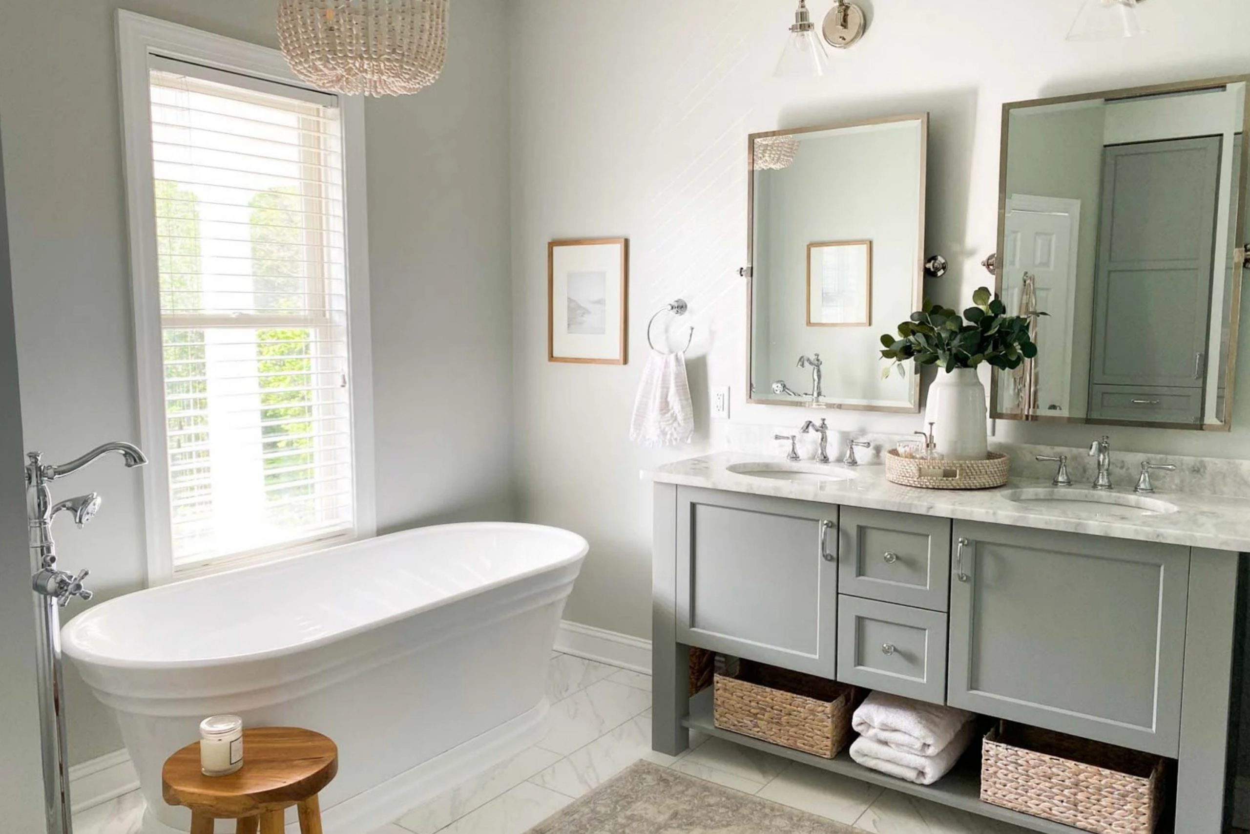
If you’re thinking about giving your space a fresh look with a new coat of paint, you might want to consider SW 7653 Silverpointe by Sherwin Williams. I find this color incredibly versatile; it’s a soft, light gray that can really open up a room and give it a clean, modern feel. From my experience, Silverpointe works wonderfully in various spaces, be it a bustling kitchen or a quiet bedroom.
What I really like about Silverpointe is how it pairs with other colors. Whether you’re looking to create a monochromatic look with other grays or want to contrast it with bolder hues, this color holds its own beautifully.
It’s also really effective in enhancing natural light in a room, making spaces feel more airy and fresh.
Another advantage is its adaptability in different lighting conditions. Silverpointe maintains its charm whether you have a lot of natural light or rely on artificial lighting. This makes it a great choice for almost any room, regardless of the light exposure it gets.
If you’re considering a new interior color, Silverpointe might just be the perfect fit for your home. It’s easy on the eyes and works well with various decors, making it a reliable choice for your next painting project.
What Color Is Silverpointe SW 7653 by Sherwin Williams?
Silverpointe by Sherwin Williams is a subtle shade of gray with a hint of green, giving it a fresh and clean appearance. This neutral color is incredibly versatile, making it an excellent choice for various interior styles, particularly modern, minimalist, and transitional decors.
Its understated elegance provides a perfect backdrop that complements bold colors and softens brighter hues, allowing for flexibility in design choices.
Silverpointe works best in spaces that aim for a calm and collected atmosphere. This color shines in well-lit areas, reflecting light beautifully to make rooms appear more spacious and airy. It’s particularly effective in living rooms, bedrooms, and kitchens where a gentle, soothing presence is desired.
When it comes to pairing with materials and textures, Silverpointe goes well with natural elements such as wood, helping to bring out its warm tones.
It also looks stunning when combined with metallic finishes like brushed nickel or stainless steel, adding a touch of modernity.
For textures, consider soft, plush fabrics to create a cozy environment or smooth, matte surfaces for a more sleek and clean look.
Overall, Silverpointe offers a lovely canvas that supports various decor styles and tastes, making it a solid choice for anyone looking to refresh their space.
Is Silverpointe SW 7653 by Sherwin Williams Warm or Cool color?
Silverpointe by Sherwin Williams is a popular choice for those looking to refresh their home’s interior with a new paint color. It’s a light gray shade that has a slight hint of green, making it a versatile and neutral choice that can work in various spaces.
This color is particularly effective in homes because it provides a clean and subtle background that can complement many decor styles, from modern to traditional. Being a light color, Silverpointe also helps to make rooms look more spacious and open, which is great for smaller spaces or any area that needs a brighter feel.
It reflects natural light well, adding a fresh and airy element to the space. Additionally, its neutrality allows homeowners to easily switch up their accessories or furniture without worrying about clashing colors, offering flexibility in decorating and updating the look of a room with ease.
Overall, Silverpointe is a practical and appealing choice for those looking to give their home a fresh, neat appearance.
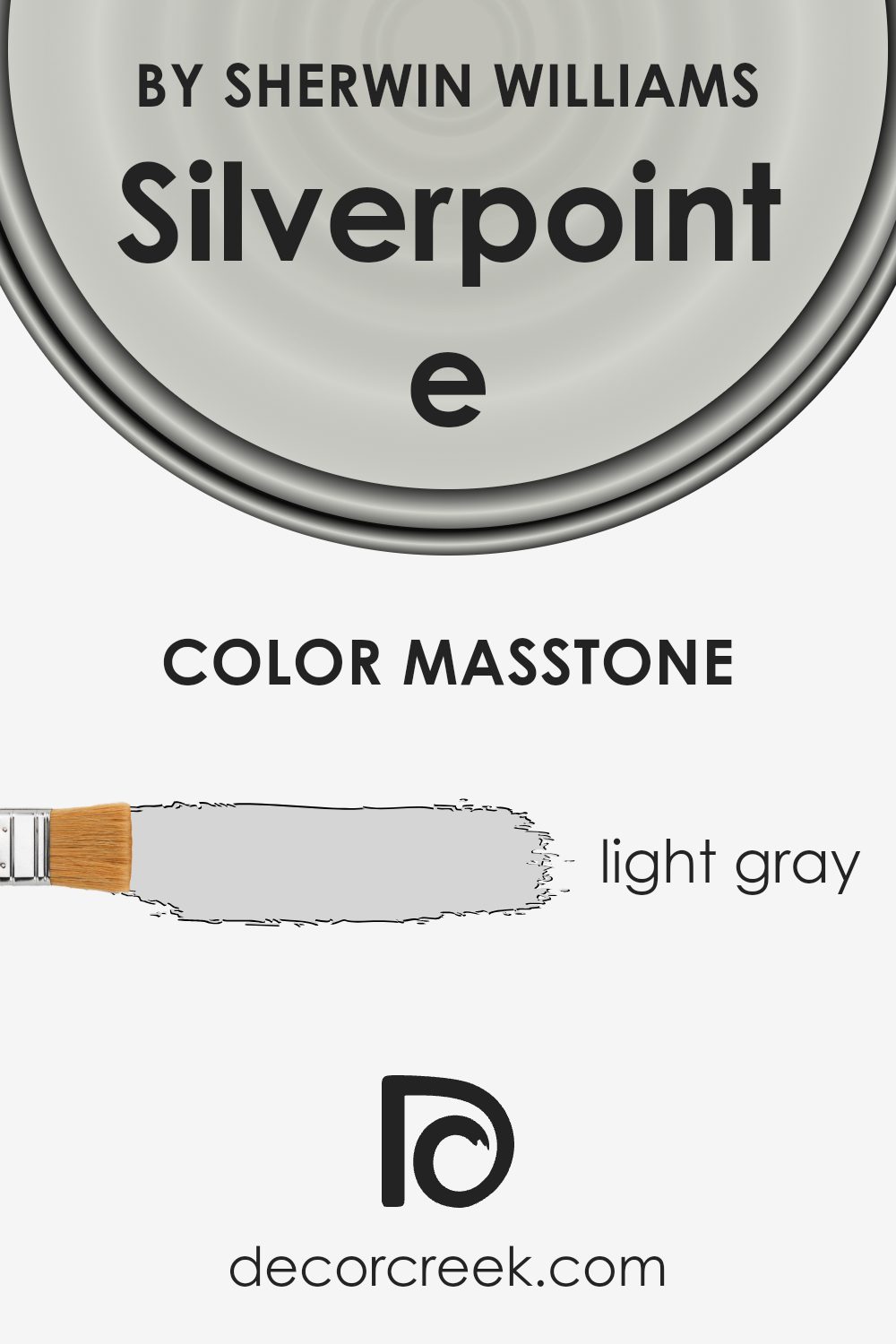
What is the Masstone of the Silverpointe SW 7653 by Sherwin Williams?
SilverpointeSW 7653 is a popular paint color known for its light gray masstone. With a hexadecimal code of #D5D5D5, this color offers a clean and neutral backdrop that can easily complement a variety of design styles and other colors. This lightness makes it a great choice for smaller rooms or spaces with limited natural light, as it can help make them appear brighter and more open.
Additionally, because it is so subtle, it doesn’t tend to clash with furnishings and can adapt to changing decor styles over time.
Homeowners appreciate using it in various rooms, from kitchens and bathrooms to bedrooms and living spaces, because it consistently provides a fresh and tidy look.
This versatility and ease of coordination make it a reliable choice for those wanting a modern yet timeless wall color.
How Does Lighting Affect Silverpointe SW 7653 by Sherwin Williams?
Lighting plays a crucial role in how we perceive colors in our surroundings. When deciding on a paint color like Silverpointe, from Sherwin Williams, it’s important to consider the type of light the color will be exposed to, whether it be natural or artificial.
In natural light, Silverpointe can appear quite differently depending on the direction of the room. North-facing rooms often receive less direct sunlight, which can make Silverpointe look slightly cooler and more muted—highlighting its subtle gray undertones.
This can give the room a calm and gentle feel but might require the use of additional lighting to warm the space up if desired.
South-facing rooms, conversely, get a lot of direct, warm light, which can make Silverpointe appear lighter and more vibrant. This enhances the color’s ability to make spaces feel airy and more open. In these rooms, the paint tends to reveal its warmer tones, softening spaces beautifully during daylight hours.
East-facing rooms get bright light in the morning, which can make Silverpointe look crisp and lively, ideal for bedrooms or breakfast nooks where you start the day. As the light changes throughout the day, this color will gently transition into showing more of its gray qualities by the afternoon.
West-facing rooms experience stronger, warmer light in the late afternoon and evening. In these rooms, Silverpointe can provide a soft, welcoming backdrop that shifts throughout the day. It looks fresh and bright in the morning light, while in the evening, it takes on a cozier, warmer appearance as the sun sets.
Artificial lighting, like LEDs or incandescent bulbs, also affects how Silverpointe is seen. Warmer bulbs can enhance the color’s beige tones, making it feel inviting.
Cooler bulbs will highlight its gray aspects, giving a sharper, more modern look.
Considering both the type of lighting and room orientation can help you decide if Silverpointe is the right color for your space, ensuring it always looks its best.

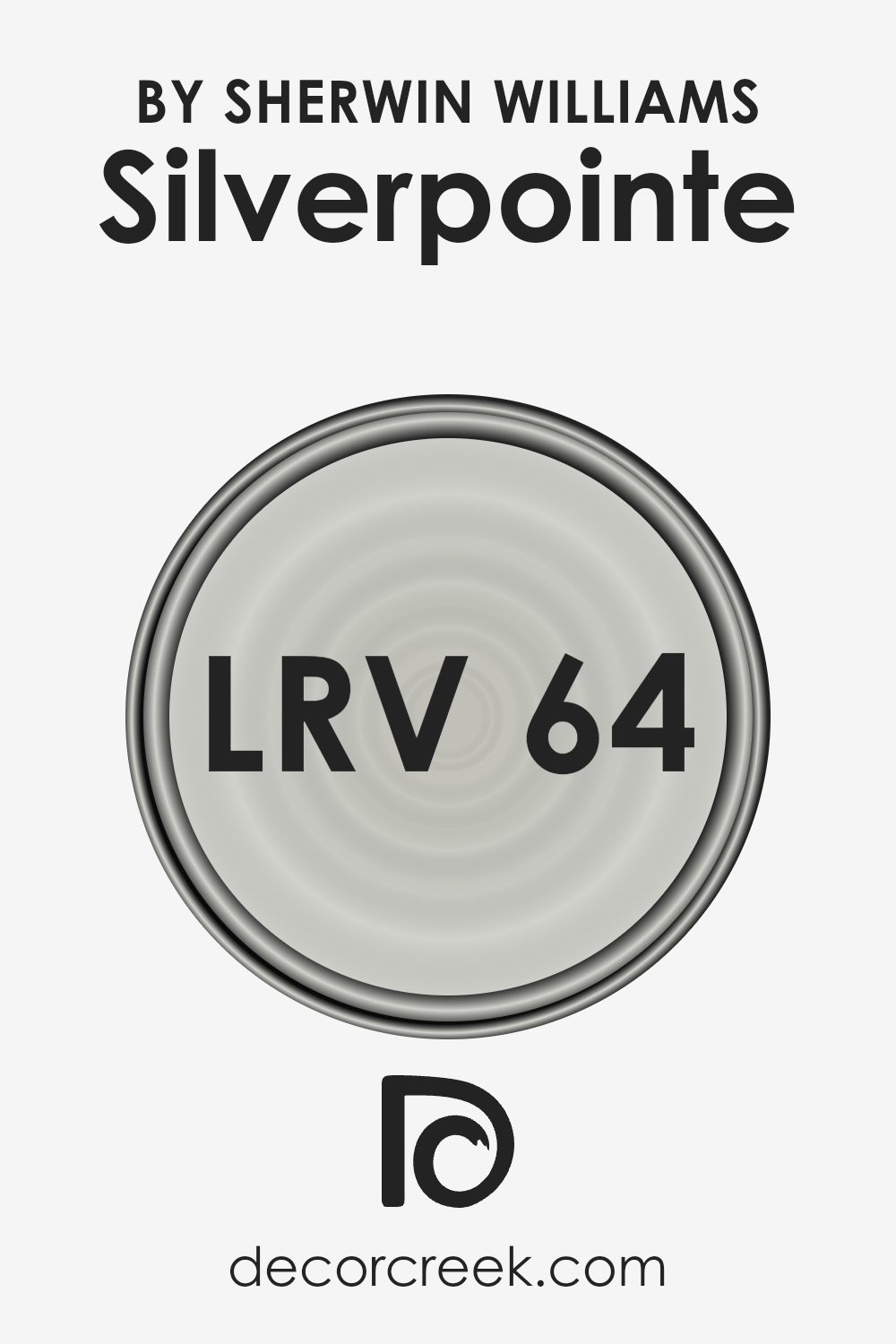
What is the LRV of Silverpointe SW 7653 by Sherwin Williams?
LRV stands for Light Reflectance Value, which is a measurement used to determine how much light a paint color reflects back into a room as opposed to absorbing it. Each color has an LRV on a scale from zero to one hundred, where higher values mean the color reflects more light.
This is crucial when choosing paint because it helps predict how light or dark a color will look on your walls depending on the natural and artificial light available in the space.
A higher LRV can make a room feel more open and airy, while a lower LRV can make it feel more cozy and enclosed.
With an LRV of 63.937, Silverpointe has a relatively high capacity to reflect light, making it a good option for spaces that you want to feel brighter and more spacious. In rooms with less light, this color can help make the environment seem lighter than it actually is, as it won’t absorb much light.
Conversely, in very brightly lit spaces, Silverpointe can help balance the glare, making the room comfortable to be in throughout the day without feeling overwhelmingly bright. This makes it a versatile choice that works well in various lighting conditions.
Coordinating Colors of Silverpointe SW 7653 by Sherwin Williams
Coordinating colors are hues that complement each other while creating a harmonious look within a space. These colors are typically chosen based on their positions on the color wheel, their saturation, or their brightness, to enhance the overall aesthetic appeal.
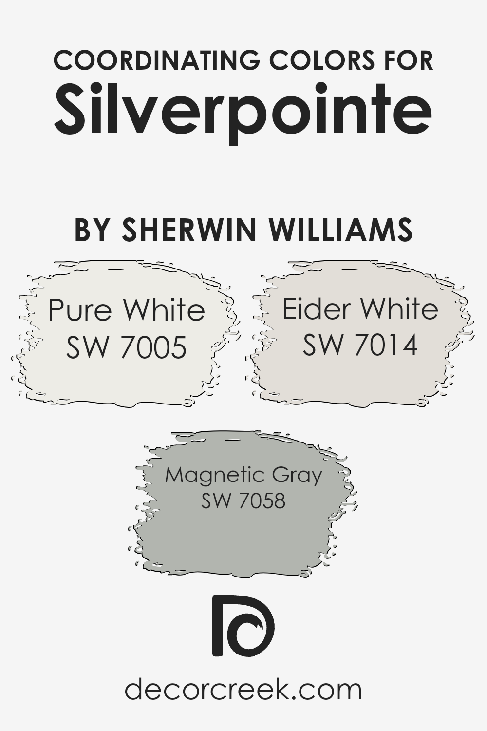
For example, when working with a neutral base such as Silverpointe from Sherwin Williams, selecting coordinating colors like Pure White, Magnetic Gray, and Eider White can enhance the walls’ appearance without overpowering the primary color.
Pure White SW 7005 is a clean and clear color that brings a freshness to any space it’s used in, making it perfect as a contrast for more subdued hues like Silverpointe. Magnetic Gray SW 7058 offers a medium-tone gray that beautifully complements deeper or lighter grays, adding a touch of depth and interest to the design.
Eider White SW 7014 is a softer white with a subtle hint of gray. This color is ideal for those who want to add warmth to their rooms without straying too far from a neutral palette.
Together, these colors work in harmony to create a pleasing and coherent color scheme that enhances the base color while maintaining a balanced look.
You can see recommended paint colors below:
- SW 7005 Pure White (CHECK A SAMPLE)
- SW 7058 Magnetic Gray (CHECK A SAMPLE)
- SW 7014 Eider White (CHECK A SAMPLE)
What are the Trim colors of Silverpointe SW 7653 by Sherwin Williams?
Trim colors play a crucial role in enhancing the aesthetic appeal and defining the architectural elements of a space. By selecting the right trim colors, you can accentuate the subtle undertones of the main wall color and create a cohesive look.
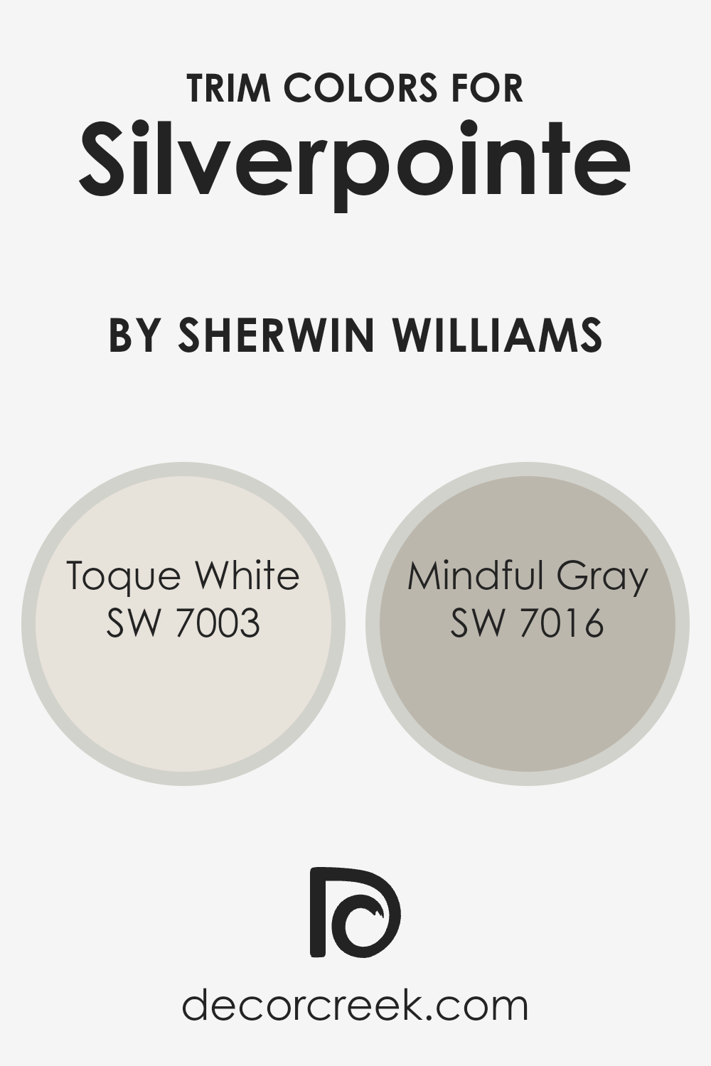
For Silverpointe by Sherwin Williams, trim colors such as Toque White (SW 7003) and Mindful Gray (SW 7016) are excellent choices.
These colors complement Silverpointe’s calm gray hue, providing a clean and distinct boundary that frames the walls beautifully and enhances the overall appeal of the room.
Toque White is a soft white with a slightly warm undertone, which makes it an ideal trim color not just for contrast but also for creating a gentle transition between different spaces. This color reflects light effectively, making it a great choice to use in darker areas or spaces that need a touch of brightness.
Mindful Gray, on the other hand, is a warm, light gray that offers a subtle depth when used as a trim color.
It works wonders in defining space without overpowering the primary wall color, making it perfect for creating a refined look that complements the light and airy feel of Silverpointe.
You can see recommended paint colors below:
Colors Similar to Silverpointe SW 7653 by Sherwin Williams
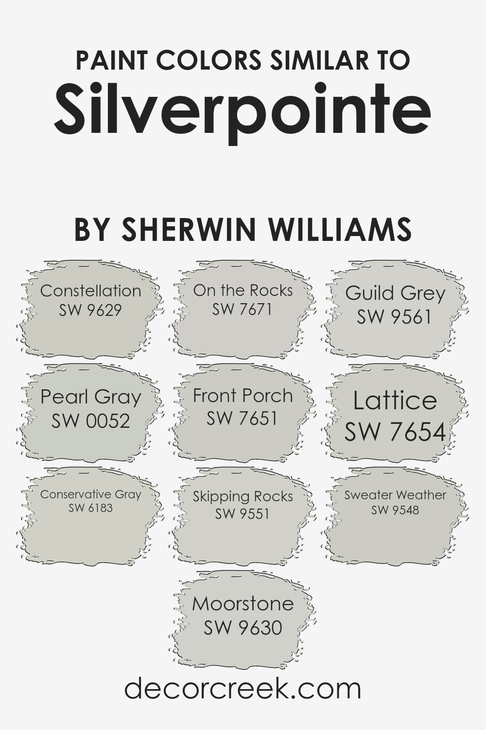
Choosing similar colors for a design project ensures a harmonious and coherent aesthetic that is pleasing to the eye. Colors like SW 9629 – Constellation, a soft, muted blue, and SW 0052 – Pearl Gray, which presents a gentle gray with a subtle hint of warmth, work well together to create a soothing palette.
These hues align closely with the likes of SW 6183 – Conservative Gray, offering a stronger gray tone that still maintains a light, airy feel.
Moreover, colors such as SW 9630 – Moorstone and SW 7671 – On the Rocks provide deeper gray options that add depth to a color scheme without overpowering the lighter tones like SW 7651 – Front Porch, a fresh, pale gray. SW 9551 – Skipping Rocks and SW 9561 – Guild Grey are also excellent choices for adding a slightly earthy yet still neutral touch, blending seamlessly with colors such as SW 7654 – Lattice, which offers a hint of green undertone.
Lastly, SW 9548 – Sweater Weather rounds out the selection with its cozy, more pronounced gray shade, ensuring that all selected colors support each other for a cohesive and stylish finish.
You can see recommended paint colors below:
- SW 9629 Constellation (CHECK A SAMPLE)
- SW 0052 Pearl Gray (CHECK A SAMPLE)
- SW 6183 Conservative Gray (CHECK A SAMPLE)
- SW 9630 Moorstone (CHECK A SAMPLE)
- SW 7671 On the Rocks (CHECK A SAMPLE)
- SW 7651 Front Porch (CHECK A SAMPLE)
- SW 9551 Skipping Rocks (CHECK A SAMPLE)
- SW 9561 Guild Grey (CHECK A SAMPLE)
- SW 7654 Lattice (CHECK A SAMPLE)
- SW 9548 Sweater Weather (CHECK A SAMPLE)
Colors that Go With Silverpointe SW 7653 by Sherwin Williams
When decorating a space, the choice of colors can significantly impact the atmosphere and style. For instance, Silverpointe SW 7653 by Sherwin Williams is a versatile shade of gray that serves as a great base for a color scheme.
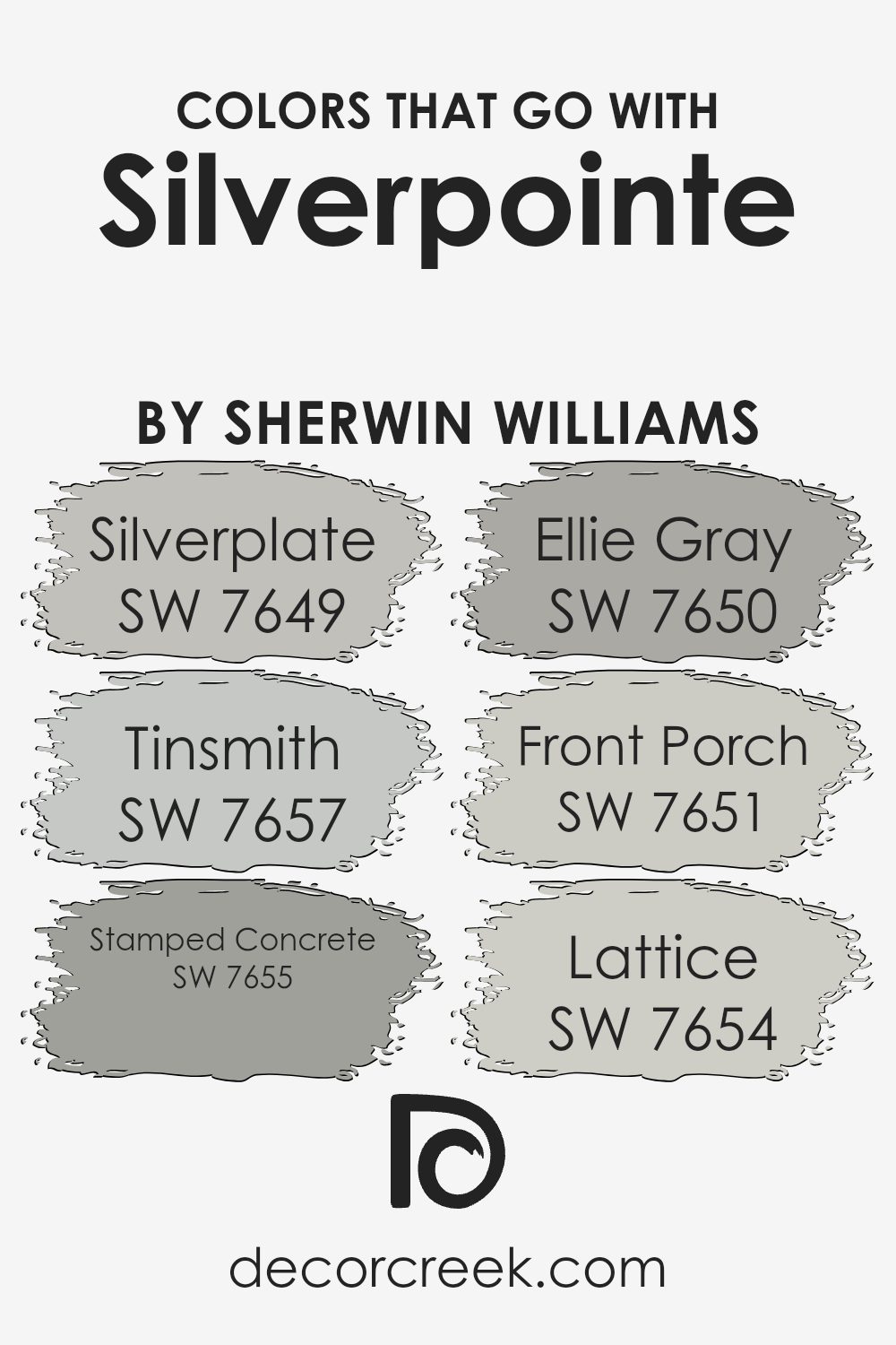
Choosing complementary colors like SW 7649 – Silverplate, SW 7657 – Tinsmith, SW 7655 – Stamped Concrete, SW 7650 – Ellie Gray, SW 7651 – Front Porch, and SW 7654 – Lattice can enhance the overall aesthetic of a room.
Silverplate is a deeper gray that adds a strong ground to Silverpointe, making it suitable for accent walls or furniture pieces. Tinsmith, a lighter, airy gray, helps to keep spaces looking open and bright. It works well in areas that need a subtle contrast against Silverpointe.
Stamped Concrete is a medium gray with a hint of blue, providing a cooler tone that can be used for a soothing feel in places like bedrooms or offices.
Ellie Gray offers a distinctive green undertone, perfect for adding a touch of nature-inspired color to a neutral palette. Front Porch is a very pale gray with calming qualities that make it ideal for creating a relaxing environment in spaces like bathrooms or nurseries.
Lastly, Lattice is a unique gray with slight purple tones, offering an unexpected but graceful color twist that can make any space more interesting. Pairing these colors with Silverpointe can create a harmonious and stylish decor that remains cohesive yet dynamic.
You can see recommended paint colors below:
- SW 7649 Silverplate (CHECK A SAMPLE)
- SW 7657 Tinsmith (CHECK A SAMPLE)
- SW 7655 Stamped Concrete (CHECK A SAMPLE)
- SW 7650 Ellie Gray (CHECK A SAMPLE)
- SW 7651 Front Porch (CHECK A SAMPLE)
- SW 7654 Lattice (CHECK A SAMPLE)
How to Use Silverpointe SW 7653 by Sherwin Williams In Your Home?
Silverpointe SW 7653 by Sherwin Williams is a versatile light gray paint color that gently balances between gray and green, making it perfect for giving any room a fresh, airy feel. Its soft undertones make it an ideal choice for those wanting to create a calm and inviting space without being too bold or overpowering.
Homeowners can use Silverpointe in various ways. It works beautifully in living rooms or bedrooms where a neutral backdrop is desired. This color pairs well with whites for a clean, minimalist look or can be matched with darker greens and blues to add depth and interest.
In bathrooms, pairing it with marble or metallic fixtures can achieve a modern and stylish feel.
For those with smaller spaces, Silverpointe can help make rooms appear larger and more open. Its natural light reflection capabilities ensure that spaces don’t feel cramped.
This color can also transition well in homes with open floor plans, maintaining a cohesive look throughout different areas.
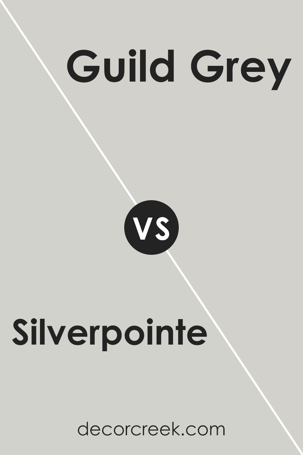
Silverpointe SW 7653 by Sherwin Williams vs Guild Grey SW 9561 by Sherwin Williams
Silverpointe and Guild Grey are both colors by Sherwin Williams, but they have different vibes. Silverpointe is a light gray shade that feels fresh and airy. It’s very subtle, making it perfect for creating a calm, laid-back atmosphere in a room. This color can make small spaces seem bigger and brighter.
On the other hand, Guild Grey is a much darker gray. It has a strong presence, offering a bold and grounding effect. This color works well in areas where you want to add drama or a sense of coziness, like a bedroom or a study.
Overall, Silverpointe is great for someone looking for a light, refreshing gray, while Guild Grey suits those who prefer something deeper and more striking. The choice depends on the mood you want to set and the space you are decorating.
You can see recommended paint color below:
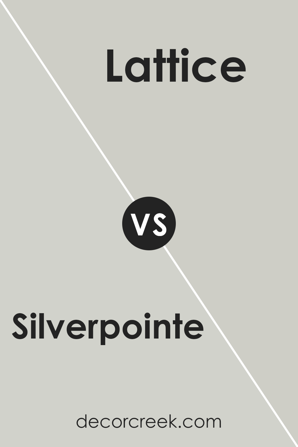
Silverpointe SW 7653 by Sherwin Williams vs Lattice SW 7654 by Sherwin Williams
Silverpointe and Lattice by Sherwin Williams are two neutral colors that have subtle differences. Silverpointe is a light gray that has a soft, almost silvery quality to it. It’s clean and fresh, making it ideal for creating a bright and airy feel in any room. This color pairs well with a wide range of decor, providing a calm background.
On the other hand, Lattice is a shade darker than Silverpointe. It still holds onto its gray base but mixes in slightly more beige undertones. This color gives off a warmer feel compared to Silverpointe, making it perfect for spaces where you want a cozy atmosphere.
Lattice is great for adding a bit of depth to a room without overwhelming it with darkness.
Both colors are versatile and can work well in various settings, whether modern or traditional. Silverpointe is better for achieving a lighter, more open space, while Lattice is suitable for adding warmth and comfort.
You can see recommended paint color below:
- SW 7654 Lattice (CHECK A SAMPLE)
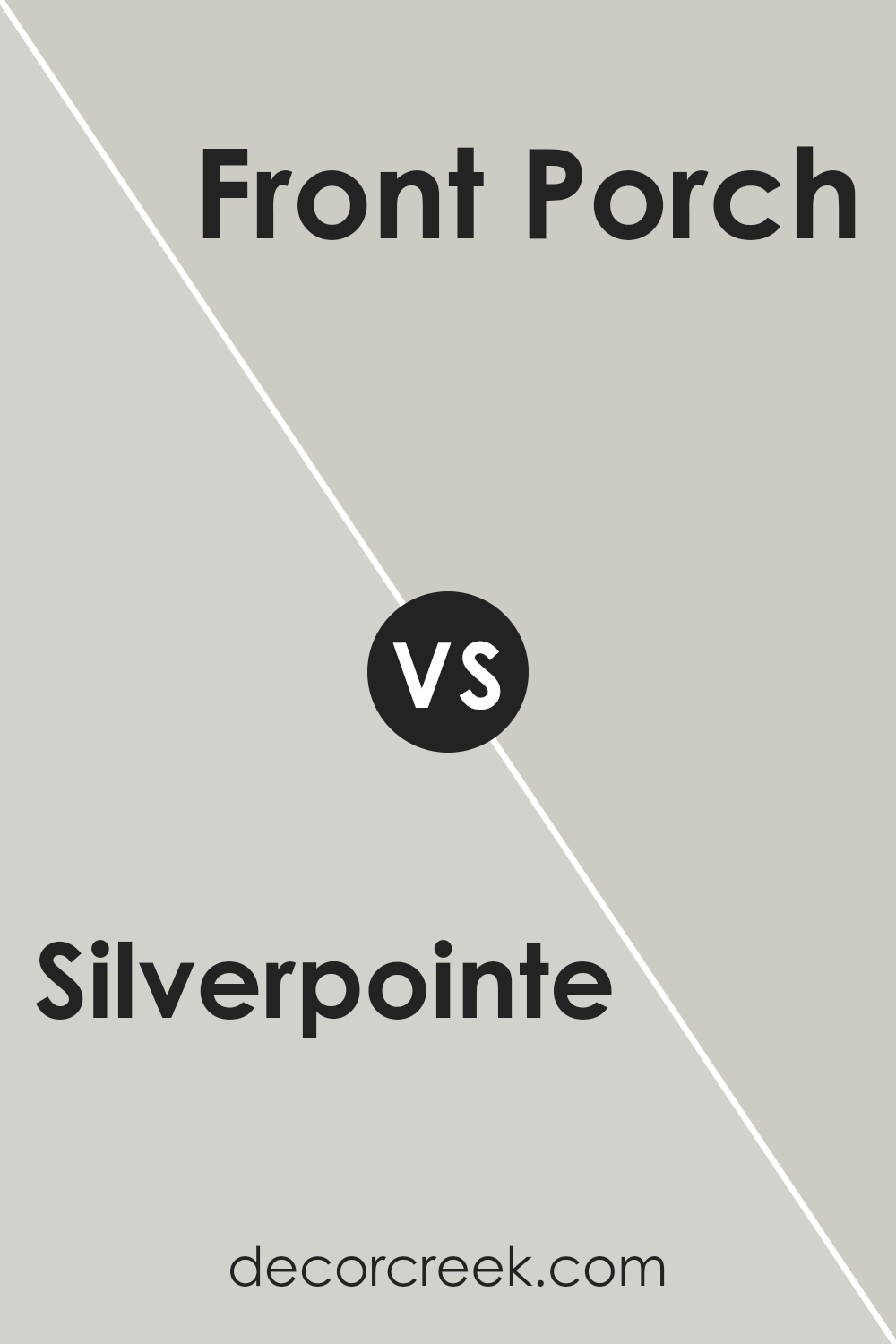
Silverpointe SW 7653 by Sherwin Williams vs Front Porch SW 7651 by Sherwin Williams
Silverpointe and Front Porch by Sherwin Williams are two distinct shades of gray that have subtle differences in their tones. Silverpointe is a lighter gray that provides a soft and gentle appearance, making it ideal for creating a calm and soothing atmosphere in any room.
In contrast, Front Porch is slightly darker and carries a hint of blue, which adds a crisp and cool feel to the space.
While both colors are versatile enough to work in various settings, Silverpointe works especially well in smaller spaces or rooms that aim for a bright and airy feel.
On the other hand, Front Porch is perfect for those who prefer a more defined color presence that still maintains a neutral and relaxed vibe.
Choosing between these two depends on the specific mood and visual impact you’re aiming for in your decorating project.
You can see recommended paint color below:
- SW 7651 Front Porch (CHECK A SAMPLE)
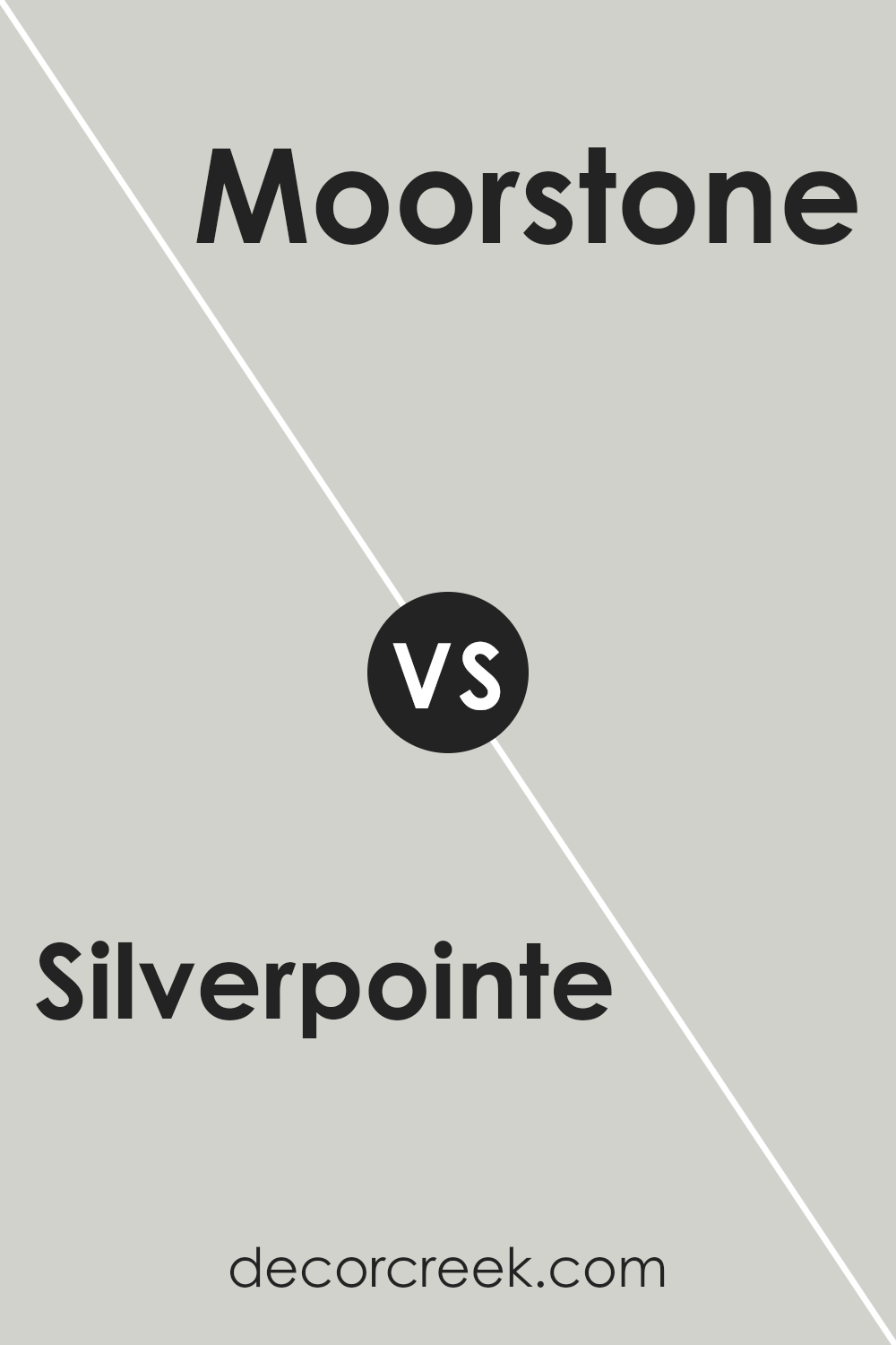
Silverpointe SW 7653 by Sherwin Williams vs Moorstone SW 9630 by Sherwin Williams
Silverpointe and Moorstone are both neutral paint colors from Sherwin Williams, but they have distinct differences. Silverpointe is a light gray that has subtle green undertones, giving it a fresh and somewhat airy feel. This color is great for making small spaces appear larger and is versatile enough to use in any room.
On the other hand, Moorstone is a much darker shade of gray that leans towards a charcoal color. It provides a bold and dramatic look, making it ideal for creating a strong statement in a space.
Because of its deeper tone, Moorstone works well in larger areas or as an accent wall, where it won’t overpower the room.
Both colors work well in a variety of decorating styles, but Silverpointe is better for those seeking a light, bright feel, while Moorstone suits those looking for a more grounded, robust aesthetic.
You can see recommended paint color below:
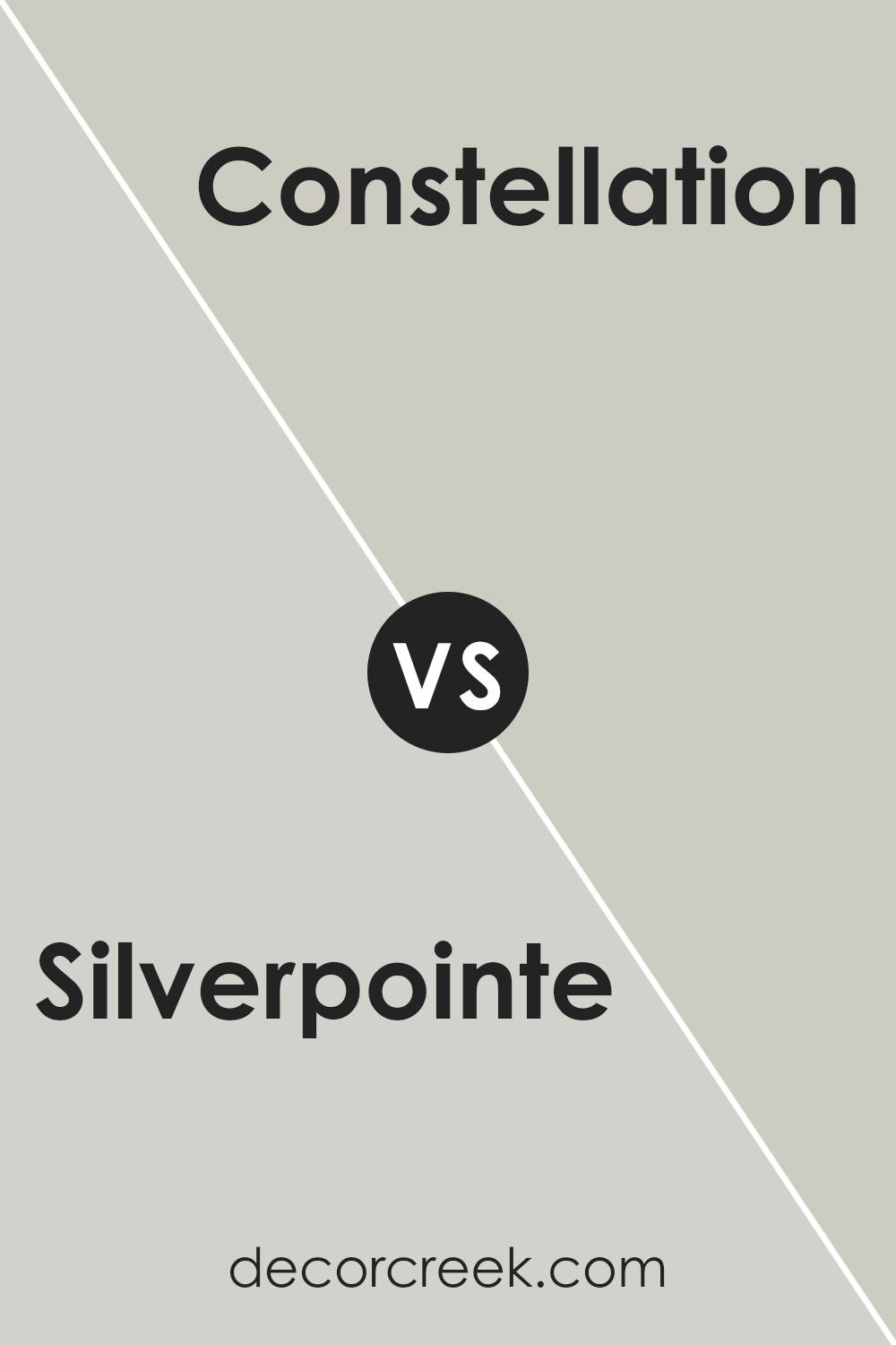
Silverpointe SW 7653 by Sherwin Williams vs Constellation SW 9629 by Sherwin Williams
Silverpointe and Constellation are two distinct paint colors from Sherwin Williams, each setting a different mood. Silverpointe is a soft, light gray with a hint of green. This color is subtle and calm, making it perfect for creating a peaceful and welcoming atmosphere in spaces like living rooms or bedrooms. It pairs well with both bright and dark colors, offering versatility in home decorating.
On the other hand, Constellation is a deeper, more saturated blue-gray. This shade is bolder and more striking, providing a touch of drama while still retaining a sense of calm.
It works well in spaces that benefit from a more pronounced color presence, such as accent walls or bathrooms.
Overall, while both colors share a base of gray, Silverpointe leans towards a lighter, more muted palette, whereas Constellation offers depth and intensity, making each suitable for different aesthetic preferences and room functions.
You can see recommended paint color below:
Silverpointe SW 7653 by Sherwin Williams vs Conservative Gray SW 6183 by Sherwin Williams
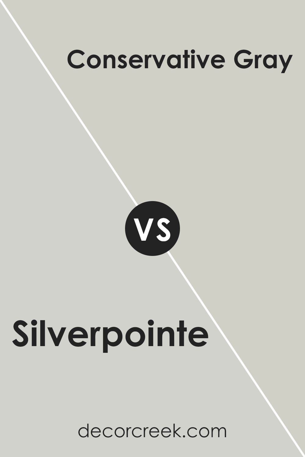
Silverpointe and Conservative Gray by Sherwin Williams are two neutral colors that could jazz up any room, though they bring different vibes. Silverpointe is a light gray that almost hints at silver, giving it a fresh and open feeling. It tends to pull a bit cool, making spaces feel airy and more spacious. Since it’s so light, it can work well in small rooms or areas that don’t get much natural light.
On the other hand, Conservative Gray is a deeper shade of gray compared to Silverpointe. It offers a more grounded and cozy feel, making it perfect for larger spaces or rooms you want to give a warmer, more inviting atmosphere.
This color is still neutral, so it goes well with many different decor styles and colors, but it adds a bit more character and cozy impact.
Both colors are versatile, but your choice would depend on the mood you’re trying to create and the specific characteristics of the space you’re painting.
You can see recommended paint color below:
Silverpointe SW 7653 by Sherwin Williams vs Skipping Rocks SW 9551 by Sherwin Williams
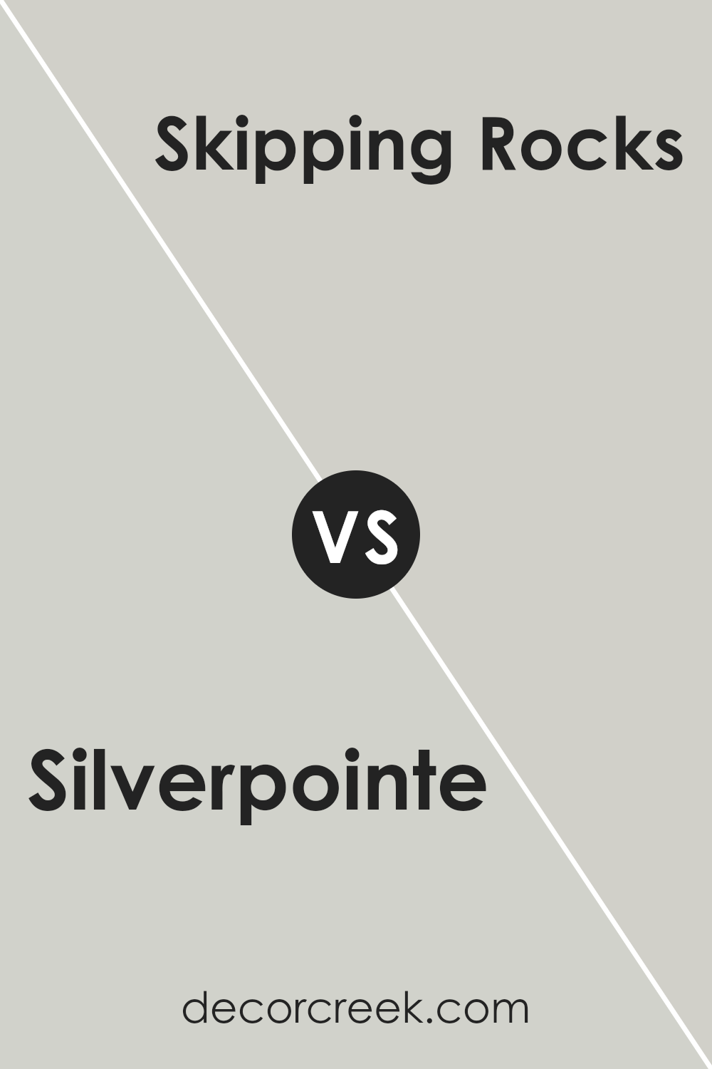
Silverpointe and Skipping Rocks are two colors by Sherwin Williams that offer subtle but distinct tones for any space. Silverpointe is a light gray with a hint of warmth, making it an excellent choice for creating a calm and inviting atmosphere. It reflects light beautifully, which can help make small rooms appear larger and more open.
On the other hand, Skipping Rocks has a deeper, cooler gray tone. This color can add a bit of drama and modern flair to a space without overwhelming it. It works well in areas that need a more pronounced color impact or where you want a contemporary vibe.
Both colors are versatile and can work well in various decorating styles, from traditional to modern. They complement many other colors, including blues, greens, and even vibrant hues, for those looking to add a pop of color. When deciding between the two, consider the mood you want to set and the amount of natural light in your room.
You can see recommended paint color below:
- SW 9551 Skipping Rocks (CHECK A SAMPLE)
Silverpointe SW 7653 by Sherwin Williams vs Pearl Gray SW 0052 by Sherwin Williams
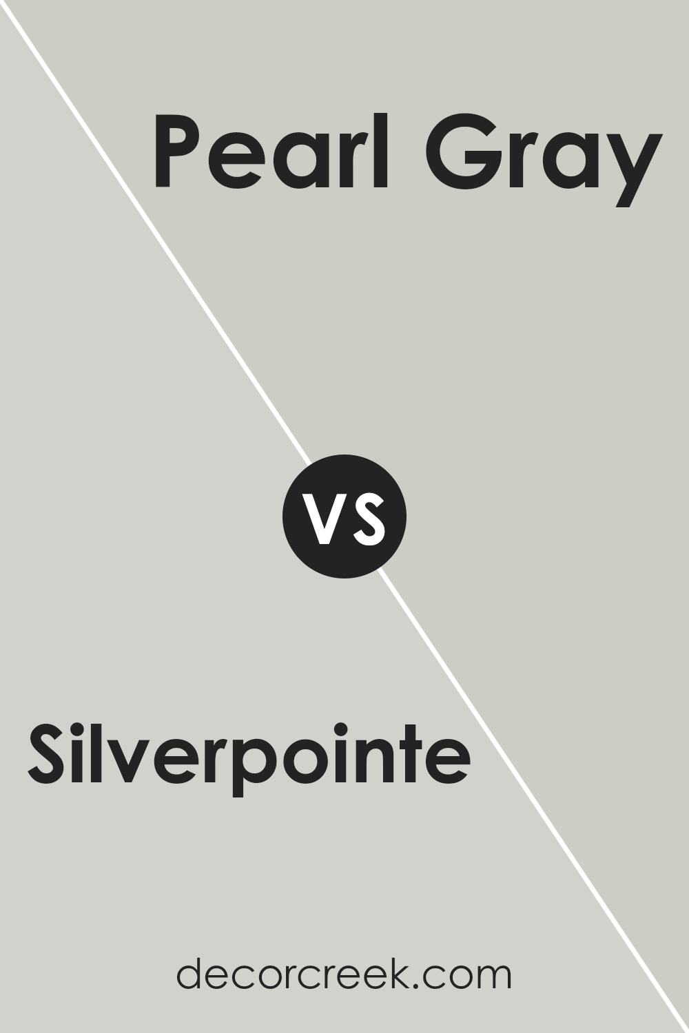
Silverpointe and Pearl Gray by Sherwin Williams are two distinct neutral colors that each bring their own unique feel to a space. Silverpointe is a light gray with subtle green undertones. It’s quite muted, which makes it versatile for any room, providing a calm, gentle background that doesn’t overpower the space. It works well in spaces that have a lot of natural light or in areas that you want to keep airy and open.
On the other hand, Pearl Gray is a deeper shade, characterized by its cooler, more traditional gray tones. This color offers a stronger presence, making it a good choice for creating a more defined look in a room.
It can help to add depth and character, and is particularly effective in larger spaces or where you want to make a more formal statement.
Both colors can blend nicely with a variety of decor styles but serve different purposes depending on the atmosphere you want to achieve. Silverpointe is better for a subtle, low-key backdrop, while Pearl Gray stands out more, giving depth and definition.
You can see recommended paint color below:
- SW 0052 Pearl Gray (CHECK A SAMPLE)
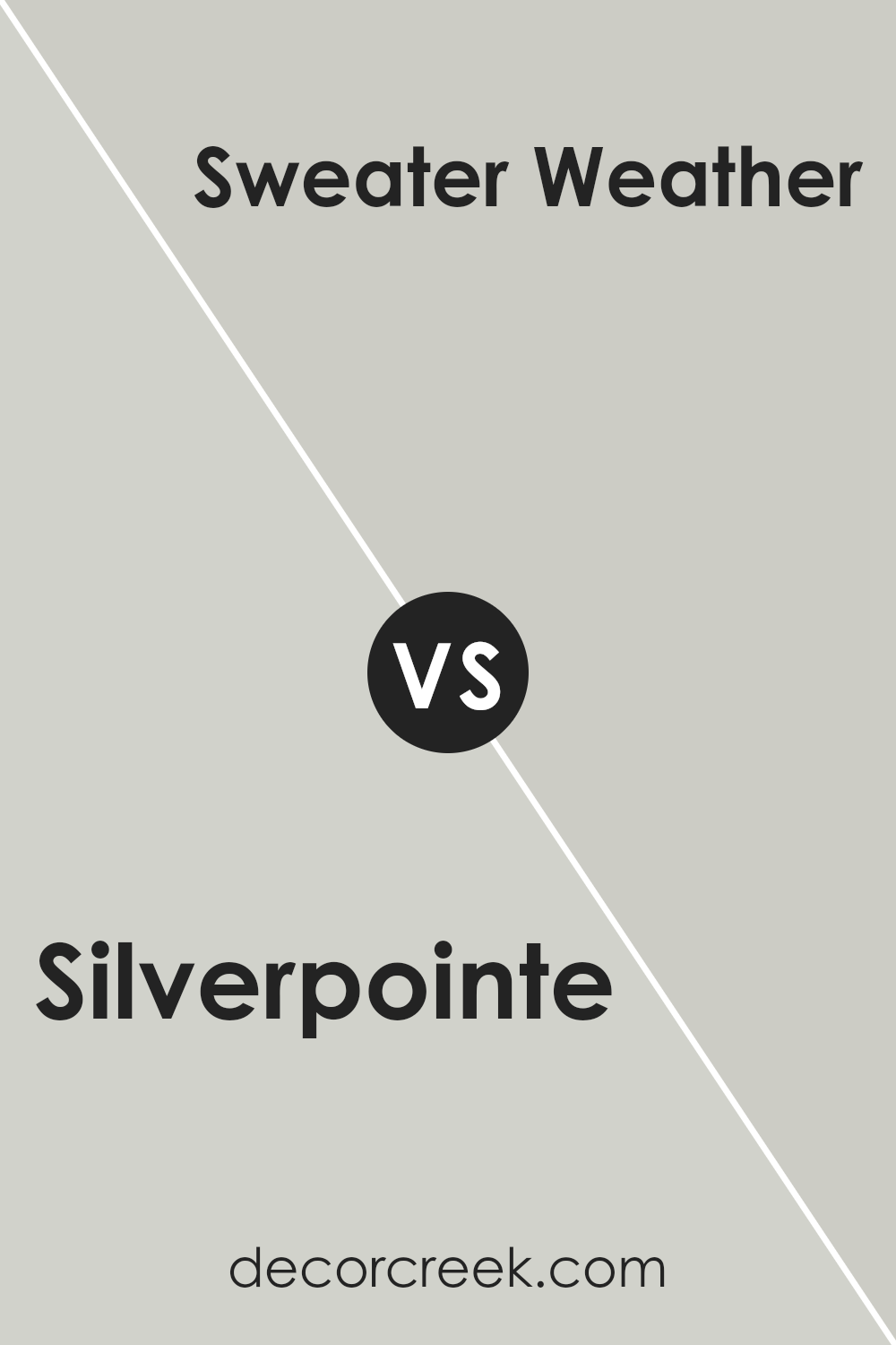
Silverpointe SW 7653 by Sherwin Williams vs Sweater Weather SW 9548 by Sherwin Williams
Silverpointe and Sweater Weather are two distinct colors by Sherwin Williams. Silverpointe is a light gray with subtle green undertones, making it a versatile choice for rooms that need a touch of neutrality with a soft hint of color. It is particularly effective in spaces that aim for a calm and airy atmosphere, as it reflects light well, thereby making spaces appear larger.
On the other hand, Sweater Weather is a deeper, warmer gray that suggests a cozy, welcoming vibe. This color has blue undertones, which can contribute to a more grounded and homelike feel in a room.
It’s a great option for areas where you want to promote comfort and relaxation, such as living rooms or bedrooms.
In terms of compatibility, Silverpointe works well in environments with lots of natural light, whereas Sweater Weather is better suited for spaces with controlled lighting, where its richness can be more appreciated without seeming too overwhelming.
Both colors offer unique qualities that can enhance the overall aesthetics of a home, depending on your desired ambiance and the function of the space.
You can see recommended paint color below:
- SW 9548 Sweater Weather (CHECK A SAMPLE)
Silverpointe SW 7653 by Sherwin Williams vs On the Rocks SW 7671 by Sherwin Williams
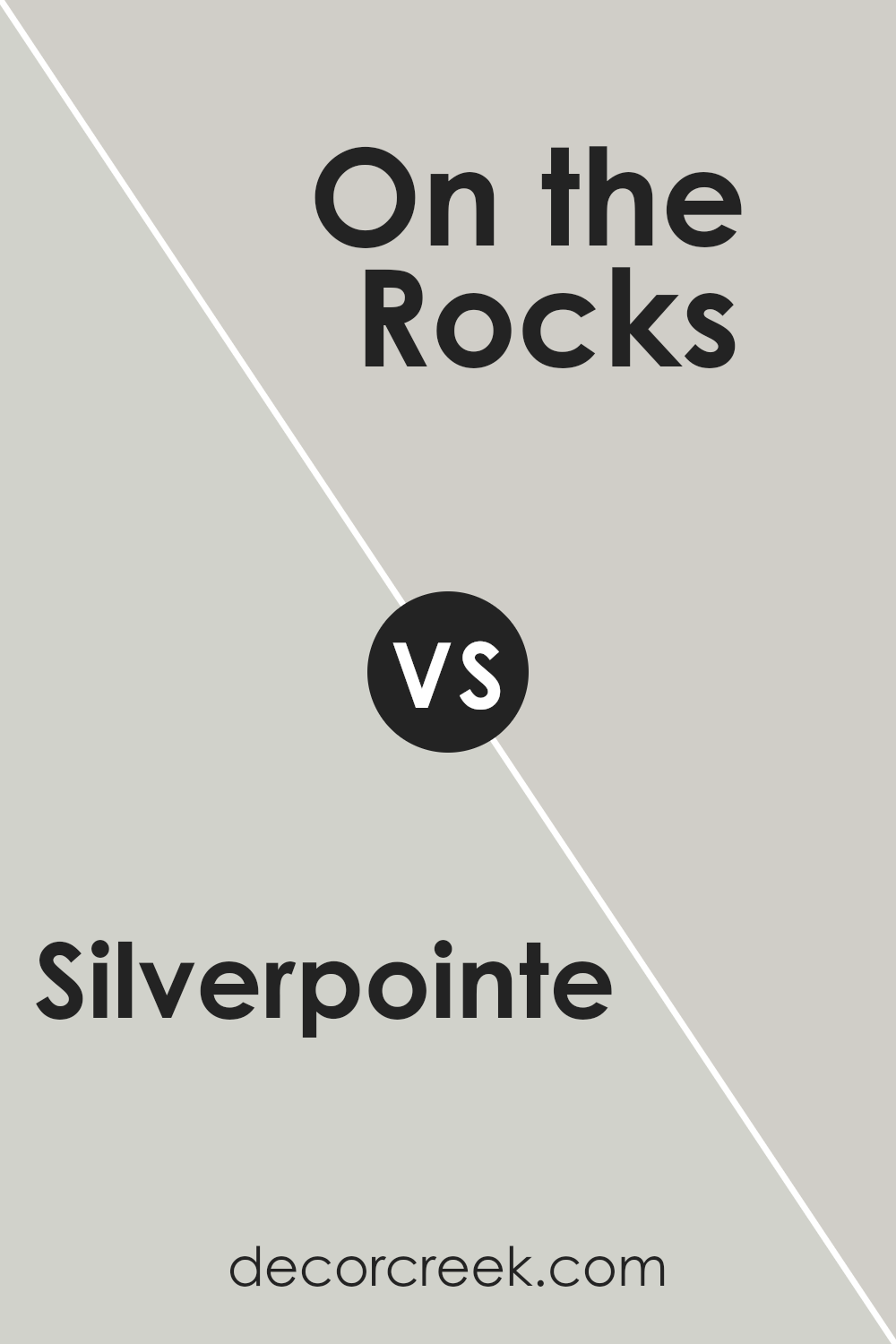
Silverpointe and On the Rocks, both by Sherwin Williams, are popular neutral paint colors, but they have distinct characteristics. Silverpointe is a lighter gray with green undertones that gives a fresh, clean look to a room. Its lightness makes spaces appear larger and more open, making it a great choice for smaller rooms or areas with limited natural light.
On the other hand, On the Rocks is a slightly darker gray and offers a hint of blue undertones. This makes it a bit cooler in tone compared to Silverpointe.
It’s perfect for creating a calm and grounded atmosphere, ideal for areas like living rooms or bedrooms where a subtle, yet impactful, color is beneficial.
Both colors are versatile and can blend well with various decor styles and other colors. However, choosing between them depends on the desired mood and the specific characteristics of the space like size and lighting. Silverpointe’s warmth makes it cozy and inviting, while On the Rocks provides a more neutral backdrop with a modern feel.
You can see recommended paint color below:
Conclusion
After reading so much about Silverpointe, I really think it’s a great paint color. It’s a kind of gray that can make any room look nice and clean. This color isn’t too dark or too light, which is perfect because it means it can fit well in any room, like a living room, a bedroom, or even a kitchen.
What’s really cool about Silverpointe is that it can match with lots of other colors. This makes it easy to use whatever decorations or furniture you like without worrying about things clashing.
Also, because it’s a peaceful color, it makes a room feel like a calm place to be in. Whether you’re doing homework, playing, or just hanging out, a room painted with Silverpointe feels like a nice, quiet spot to spend time in.
If someone asked me whether they should use this paint color in their home, I’d definitely say yes. It’s simple, looks good, and creates a nice environment for any room.
So, if you’re thinking about refreshing your room or even painting a new one, Silverpointe by Sherwin Williams could be a perfect choice.
Ever wished paint sampling was as easy as sticking a sticker? Guess what? Now it is! Discover Samplize's unique Peel & Stick samples.
Get paint samples


