Introducing Moorstone SW 9630 by Sherwin Williams, a color that captures the essence of serenity and robustness, mirroring the timeless beauty of natural stone elements.
This unique hue is part of Sherwin Williams’ diverse palette, reflecting a blend of understated elegance with a grounding presence, perfect for creating serene and welcoming spaces.
Moorstone’s versatility allows it to adapt seamlessly across a variety of design styles, from the minimalist and contemporary to the rustic and traditional.
Its rich depth contributes to an inviting atmosphere while providing a solid foundation for interior and exterior designs.
As homeowners and designers increasingly lean towards colors that bring a sense of calm and comfort into spaces, Moorstone SW 9630 emerges as a top choice.
Its ability to complement a wide range of materials and finishes makes it an ideal candidate for those seeking a cohesive and balanced aesthetic.
Whether it’s the focal point of a room or a subtle backdrop for bolder colors and textures, Moorstone SW 9630 by Sherwin Williams stands out for its adaptability and the warm, grounded ambiance it brings to any project.
Join us as we dive deeper into the nuances of this color, exploring how it can transform spaces and contribute to the harmonious design you’re striving to achieve.

What Color Is Moorstone SW 9630 by Sherwin Williams?
The color Moorstone, marked by its code SW 9630, is a stunning and versatile hue from Sherwin Williams that embodies a rich blend of earthiness with a subtle hint of sophistication.
This particular shade strikes a wonderful balance between warm and cool tones, making it an exceptional choice for various interior styles. Its depth and character can anchor a room, providing a sense of tranquility and stability.
Moorstone’s unique charm works excellently within minimalist, Scandinavian, and contemporary interiors, offering a subtle complexity that can complement a wide range of designs.
Its muted yet impactful nature allows it to serve as both a compelling neutral base or as a serene backdrop for more vibrant pops of color. In minimalist settings, it emphasizes cleanliness and space, while in more rustic or Scandinavian-inspired spaces, it echoes the organic and earthy feel of these designs.
When it comes to pairing with materials and textures, Moorstone reveals a remarkable versatility. It harmonizes beautifully with natural wood tones, from light, sandy oak to deeper walnut shades, enhancing the warmth and organic feel of the space.
Textures such as linen, wool, and other soft textiles complement its understated elegance, adding layers of comfort and sophistication. Moreover, metallic accents in brass or copper can inject a subtle glow, creating an inviting atmosphere that bridges the gap between modern chic and timeless grace.
Moorstone’s adaptability and nuanced depth make it a perfect canvas for a range of interior expressions, encouraging a seamless blend of style and comfort.
Ever wished paint sampling was as easy as sticking a sticker? Guess what? Now it is! Discover Samplize's unique Peel & Stick samples.
Get paint samples

Is Moorstone SW 9630 by Sherwin Williams Warm or Cool color?
Moorstone, a nuanced color by Sherwin Williams, holds a unique position within the palette of home interiors. This sophisticated hue encapsulates a deep, rich warmth, subtly oscillating between the earthy tones of gray and taupe.
Its versatility allows it to serve as both a grounding neutral or an accent, depending on its application and the surrounding palette. When used on walls, it emanates a comforting embrace, making spaces feel secure and enveloping, which is ideal for creating a serene bedroom or a cozy living area.
In homes, this color adapts remarkably well to various lighting conditions, showcasing a softer side with natural light and a more profound, intimate quality under artificial lighting.
It pairs beautifully with natural materials such as wood, stone, and metals, enhancing textures and emphasizing the depth of space. For designers and homeowners looking to infuse their space with a sense of stability and understated elegance, Moorstone offers a timeless backdrop.
It bridges traditional and modern aesthetic preferences, making it a go-to choice for those looking to create warm, inviting environments that feel both refined and accessible.
Undertones of Moorstone SW 9630 by Sherwin Williams
Moorstone is a nuanced paint color that captivates with its complexity and adaptability in various lighting conditions. The presence of subtle undertones significantly influences the perception and ambiance of a space painted in this shade.
Specifically, the pale yellow and light blue undertones embedded within Moorstone add layers of depth and interest, making it more than just a straightforward color choice for interior walls.
Pale yellow undertones bring warmth and a sense of sunlight to the color, infusing spaces with a welcoming and cozy feel. This aspect of Moorstone makes it ideal for spaces where a soft, inviting atmosphere is desired, such as living rooms or bedrooms.
The warmth of the yellow undertones enhances natural light, making spaces feel more open and airy during the day.
In contrast, the light blue undertones introduce a hint of coolness and tranquility, offering a refreshing counterbalance to the warmth of the yellow.
This coolness can make spaces feel more serene and restful, which is particularly appealing in bathrooms or areas meant for relaxation. The interplay between the warm and cool undertones allows Moorstone to harmonize with a wide range of decor styles and color palettes, providing a versatile backdrop that can shift in mood depending on the time of day and lighting conditions.
Overall, the unique combination of undertones in Moorstone affects the way it is perceived on interior walls, delivering a dynamic and adaptable color choice that can enhance the aesthetic and feel of a room in subtle yet impactful ways.
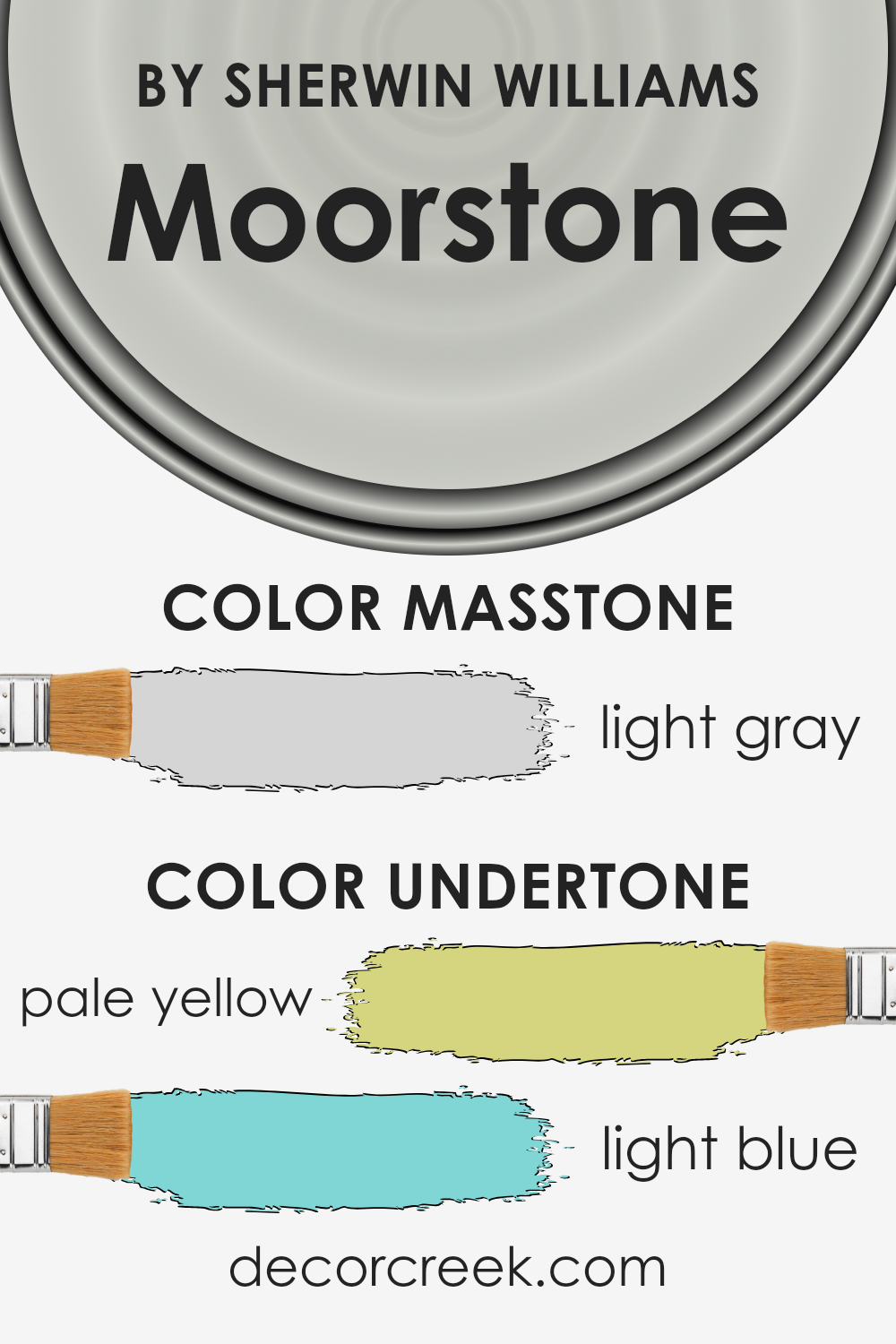
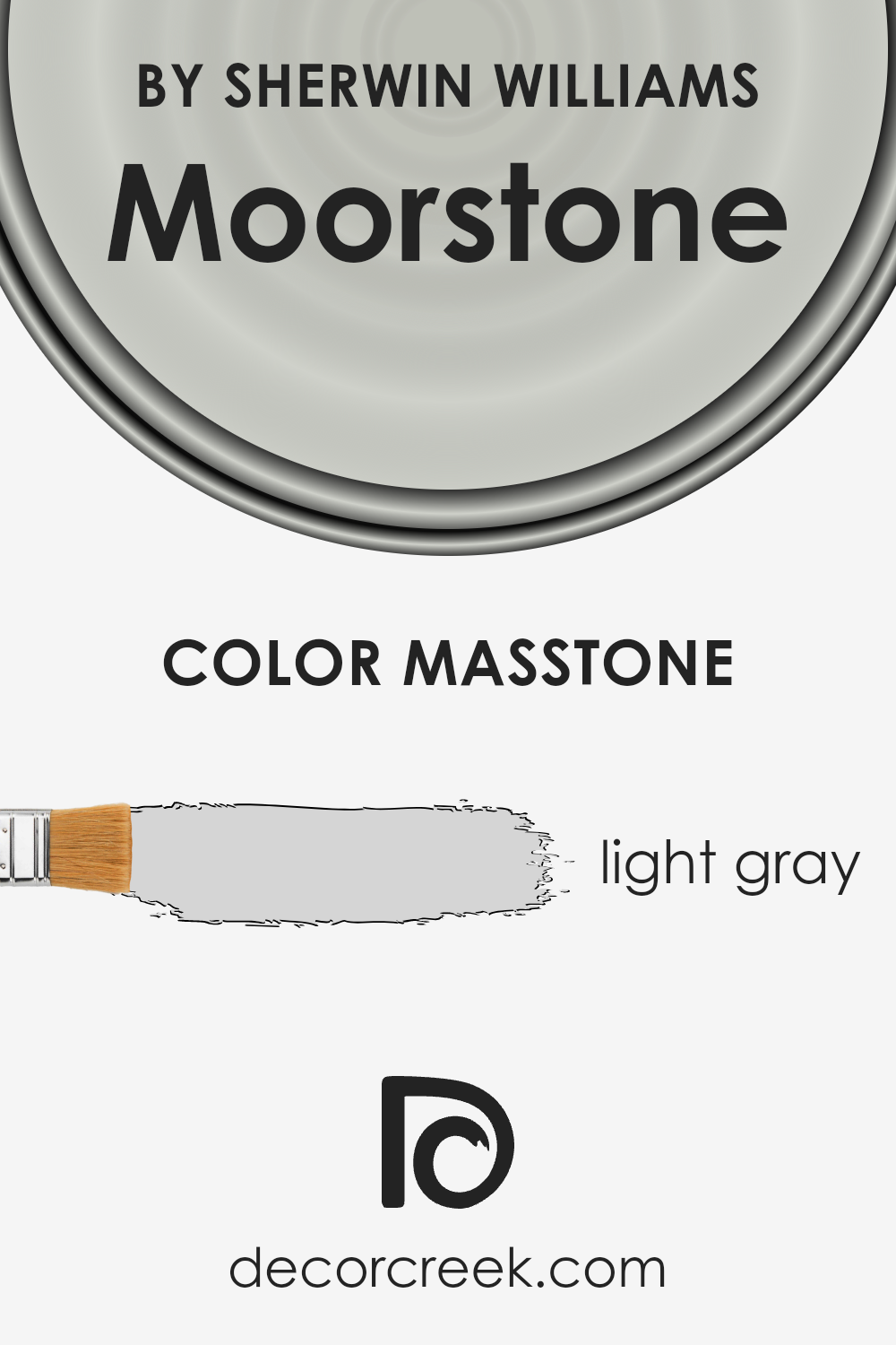
What is the Masstone of the Moorstone SW 9630 by Sherwin Williams?
Moorstone SW 9630 by Sherwin Williams, with its masstone of light gray (#D5D5D5), introduces a serene and versatile backdrop for residential spaces. This specific shade of gray stands as a quintessential neutral, offering a contemporary yet timeless appeal to interiors.
Its lightness ensures that spaces feel more expansive and luminous, making it an excellent choice for small rooms or areas lacking in natural light.
Furthermore, its neutrality allows for great flexibility in design schemes; it can effortlessly harmonize with a wide array of color palettes, from soft pastels to bold and vivid hues, providing a balanced canvas that enhances surrounding colors without competing for attention.
This particular light gray shade fosters an atmosphere of calm and understated elegance, making it ideal for living areas, bedrooms, and even home offices where a peaceful environment is conducive to relaxation or concentration.
Given its adaptability, it aligns well with various decor styles, from minimalist and modern to rustic and traditional, enabling homeowners to craft spaces that truly reflect their personal taste and evolve easily over time.
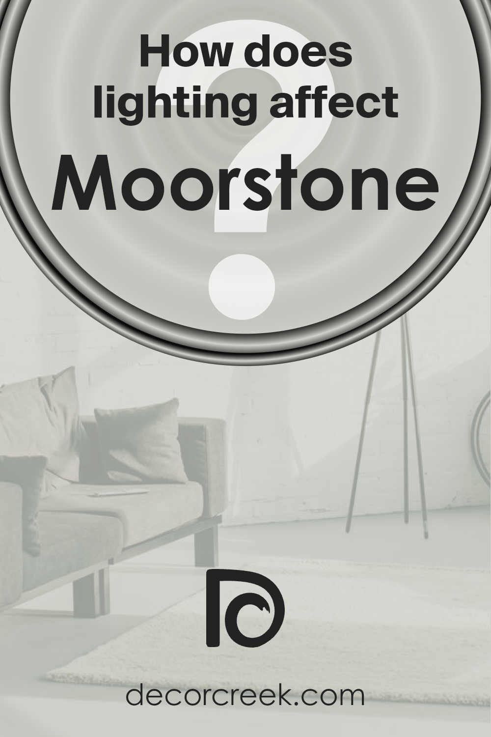
How Does Lighting Affect Moorstone SW 9630 by Sherwin Williams?
Lighting significantly impacts the way we perceive colors, altering their intensity, shade, and overall appearance. The type of light under which a color is viewed can change its aesthetics and ambiance. Moorstone, a nuanced color, serves as a compelling example of how lighting influences the perception of hues.
In artificial light, this color’s depth and undertone can shift based on the light source. Incandescent bulbs, which emit a warmer light, can enhance Moorstone’s warm undertones, giving it a more inviting and cozy feel.
Conversely, fluorescent lighting, known for its cooler tone, can make Moorstone appear slightly more subdued and neutral, potentially emphasizing any cooler undertones within the color.
Natural light reveals the most authentic representation of colors, but its effect on Moorstone varies throughout the day and depends on the room’s orientation.
In north-faced rooms, which receive cooler, indirect light throughout the day, Moorstone can appear more muted, with its subtle complexities coming to the forefront. This makes it ideal for creating a serene and sophisticated space that feels grounded yet airy.
South-faced rooms bask in warm, direct sunlight for most of the day, which can amplify Moorstone’s warmth, making the space feel brighter and more welcoming. This warm glow can bring out the cozy aspects of the color, enhancing its ability to create an inviting atmosphere.
East-facing rooms receive morning light, which is warm and bright but becomes cooler as the day progresses. Moorstone can appear vibrant and lively in the morning light, slowly transitioning to a more balanced and natural tone by the afternoon, maintaining a fresh appearance throughout the day.
Conversely, west-faced rooms are flooded with the intense, warm light of the late afternoon and evening. This lighting can intensify Moorstone, highlighting its warmth and making the room feel cozy and enveloped as the day ends.
In essence, the perception of Moorstone shifts with different lighting conditions, showcasing its versatility and ability to adapt, either becoming more pronounced in its warmth or more reserved, depending on the light it’s exposed to.
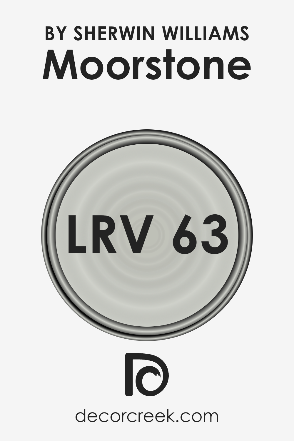
What is the LRV of Moorstone SW 9630 by Sherwin Williams?
Light Reflectance Value (LRV) is a crucial measure used to determine how much light a paint color reflects or absorbs when applied to a surface. The scale for LRV ranges from 0 to 100, with 0 absorbing all light (and appearing as true black) and 100 reflecting all light (appearing as pure white).
This value is not just a technical detail; it profoundly affects how color behaves in a space. Higher LRVs result in colors that appear lighter and more reflective, making rooms feel more spacious and brighter.
onversely, colors with lower LRVs absorb more light, contributing to a cozier, more intimate atmosphere but can make a space feel smaller if not balanced correctly with lighting and other design elements.
With an LRV of 63.283, the color in question sits in the middle-upper end of the scale, indicating it is a moderately high light reflector. This characteristic means it will reflect a good amount of natural and artificial light, contributing to a perception of increased brightness and spaciousness within a room.
It is a nuanced choice for walls, as it holds enough depth to provide warmth and character, yet it’s light enough to keep spaces feeling open and airy. This balance makes it exceptionally versatile, working well in a variety of lighting conditions and complementing both contemporary and traditional decor.
Given its LRV, it can effectively enhance the sense of space in smaller rooms or maintain a light-filled ambiance in larger areas, making it a practical and aesthetic choice for interior walls.
LRV – what does it mean? Read This Before Finding Your Perfect Paint Color
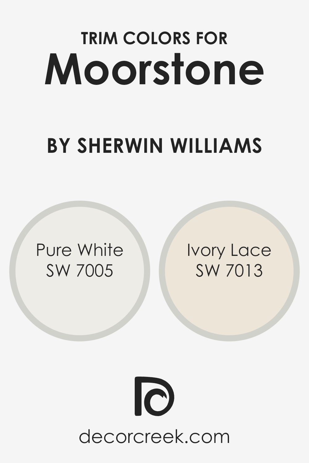
What are the Trim colors of Moorstone SW 9630 by Sherwin Williams?
Trim colors play a crucial role in defining and accentuating the architectural features and lines of a room, effectively framing the space and contributing to the overall aesthetic.
Trim, which includes elements such as molding, baseboards, and window and door casings, serves as a visual guide, drawing the eye to the room’s structure and layout.
The choice of trim color can either subtly complement the wall color, enriching the room’s ambiance, or contrast sharply with it, making a bold statement that defines the space’s character and mood.
When paired with a distinctive hue like Moorstone by Sherwin Williams, trim colors need to be carefully considered to enhance this unique shade’s depth and complexity without overwhelming it.
Choosing Pure White (SW 7005) as a trim color for Moorstone provides a crisp, clean boundary that beautifully contrasts the deeper tones of Moorstone, making the walls appear more vivid and the space more expansive.
Pure White is a timeless choice that brings a fresh, airy feel to any room, especially when used as a trim color, where it acts as a visual palette cleanser. On the other hand, Ivory Lace (SW 7013) offers a softer, warmer alternative for trim, creating a seamless transition that harmonizes with Moorstone’s warmth.
This color lends a subtle, elegant contrast to the walls, adding depth and a sense of coziness to the space without the sharpness of a more stark white.
Both of these trim colors enrich the aesthetic of a room painted in Moorstone, underscoring the importance of selecting the right trim shades to complement not just the wall color but the overall feeling of the space.
You can see recommended paint colors below:
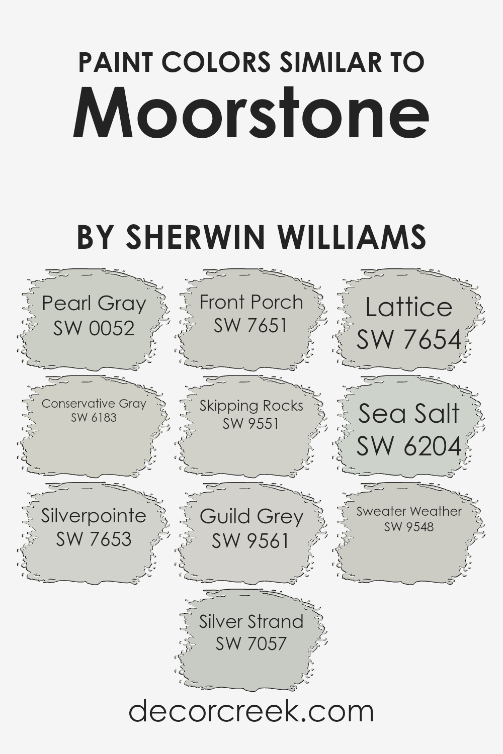
Colors Similar to Moorstone SW 9630 by Sherwin Williams
Similar colors play a vital role in creating a harmonious and visually appealing palette, particularly when considering variations like those of Moorstone by Sherwin Williams.
These colors, though unique, share a subtle connection through their hues, saturation, and brightness, enabling designers and homeowners to craft spaces that feel cohesive yet dynamic.
For example, Pearl Gray offers a soft, muted ambiance that gracefully complements more vibrant or darker shades, making it a versatile choice for serene interiors.
Conservative Gray, on the other hand, introduces a slightly more pronounced depth, adding sophistication and a touch of formality to spaces without overwhelming them with darkness.
Silverpointe is another excellent example, presenting a light, airy feel that captures the essence of spaciousness, making it perfect for smaller rooms or areas where natural light is prized.
Similarly, Silver Strand weaves in a hint of green, offering a refreshingly subtle coastal vibe that’s both calming and invigorating. Front Porch, with its cool undertones, invites relaxation and contemplation, making it ideal for creating a welcoming exterior or a tranquil retreat inside.
Skipping Rocks, Guild Grey, Lattice, Sea Salt, and Sweater Weather each contribute their unique charm, from the earthy, comforting whispers of Skipping Rocks to the clean, invigorating freshness of Sea Salt.
Sweater Weather rounds out this collection with its cozy, enveloping warmth, a perfect backdrop for spaces intended for gathering and leisure.
These colors, while individually distinct, collectively offer a palette that supports a range of aesthetic goals, from creating a serene, unified look to introducing subtle contrasts for visual interest.
You can see recommended paint colors below:
- SW 0052 Pearl Gray
- SW 6183 Conservative Gray
- SW 7653 Silverpointe
- SW 7057 Silver Strand
- SW 7651 Front Porch
- SW 9551 Skipping Rocks
- SW 9561 Guild Grey
- SW 7654 Lattice
- SW 6204 Sea Salt
- SW 9548 Sweater Weather
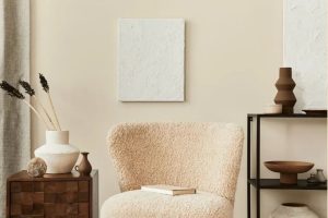
How to Use Moorstone SW 9630 by Sherwin Williams In Your Home?
Moorstone is a versatile hue that offers a unique blend of understated elegance and organic warmth, making it a superb choice for those looking to add depth and character to their home.
This particular shade from Sherwin Williams transforms spaces with its soothing, natural tones that deliver a sense of tranquility and grounding. Its adaptability means it can be employed in a multitude of ways within a home.
For instance, applying Moorstone in living areas creates a serene backdrop that enhances both modern and traditional decor. In bedrooms, its calming effect promotes relaxation, making it ideal for a peaceful retreat.
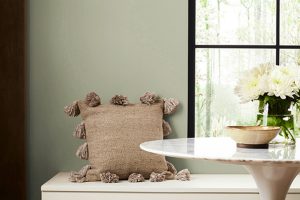
Kitchens and dining spaces benefit from Moorstone’s welcoming vibe, encouraging gatherings and conversations. Furthermore, in bathrooms, this color adds a spa-like feel, turning everyday routines into moments of zen.
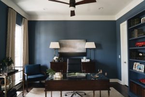
For those keen on exterior applications, Moorstone provides a sophisticated facade appearance, blending beautifully with natural landscapes.
Its ability to harmonize with various textures and materials, from wood to metal, allows homeowners to experiment with different design elements. Ultimately, Moorstone’s versatility supports a wide range of personal styles and preferences, enriching any space it graces.
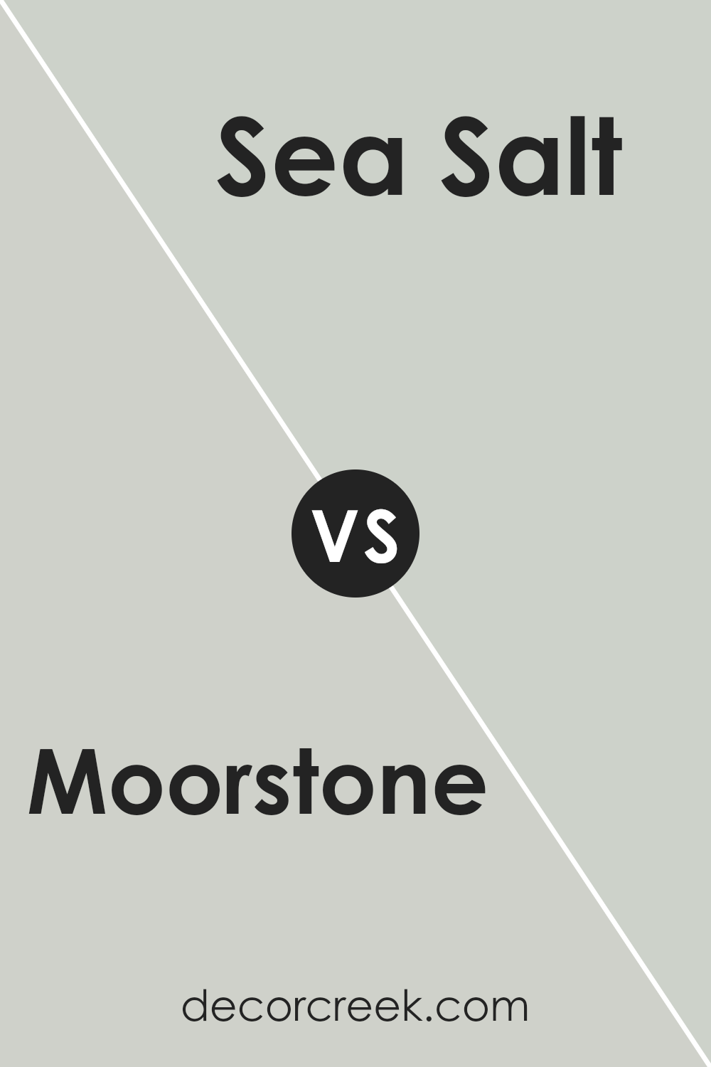
Moorstone SW 9630 by Sherwin Williams vs Sea Salt SW 6204 by Sherwin Williams
Moorstone and Sea Salt are two distinct colors offered by Sherwin Williams, each bringing its own unique ambiance to a space. Moorstone is a deeper, more grounded hue, echoing the serene and earthy tones of stone and soil.
Its richness provides a solid, stabilizing effect, making it ideal for creating a cozy and secure atmosphere in any room. On the other hand, Sea Salt embodies a lighter, airier quality, reminiscent of a gentle seaside breeze and the soothing calm of the ocean.
This color has a refreshing and rejuvenating effect, perfect for spaces intended to be peaceful retreats or serene getaways within the home.
When comparing the two, Moorstone offers depth and warmth, ideal for a sophisticated and enveloping environment, whereas Sea Salt brings an ethereal lightness and openness, promoting tranquility and mental clarity.
Both colors have their unique applications and can dramatically transform a space depending on the desired mood and aesthetic.
You can see recommended paint color below:
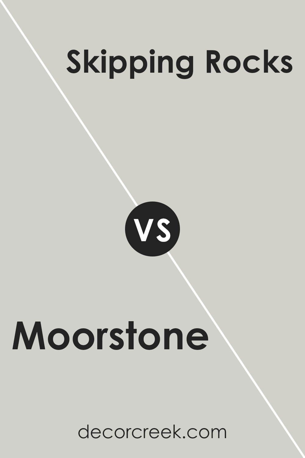
Moorstone SW 9630 by Sherwin Williams vs Skipping Rocks SW 9551 by Sherwin Williams
Moorstone and Skipping Rocks, two elegant hues from Sherwin Williams, present contrasting yet harmonious tones ideal for different aesthetic appeals in interior and exterior spaces.
Moorstone, a deep, warm gray, exudes a sense of stability and sophistication. Its rich undertone offers a solid base that pairs well with a variety of decor elements, making it versatile for spaces seeking depth and warmth.
On the other hand, Skipping Rocks introduces a lighter, airier feel with its gray undertones that lean towards a soft, serene palette. This color is perfect for creating a calming and light atmosphere, enhancing spaces with a touch of modernity and openness.
Together, these colors can establish a nuanced interplay between depth and lightness, offering a palette that can deftly balance boldness with tranquility.
Choosing between them depends on the desired mood and space functionality, where Moorstone anchors a room with its robust charm, while Skipping Rocks breathes life and spaciousness into any area.
You can see recommended paint color below:
- SW 9551 Skipping Rocks
Moorstone SW 9630 by Sherwin Williams vs Pearl Gray SW 0052 by Sherwin Williams
Moorstone and Pearl Gray, both from Sherwin Williams, present an elegant duo of colors, each possessing its own unique charm and ambiance. Moorstone is a rich, deep hue that carries an earthy, natural elegance.
Its depth makes it a perfect choice for creating a cozy and inviting space, offering warmth and sophistication. On the other hand, Pearl Gray is a light, airy gray with subtle undertones that evoke a sense of calm and serenity.
This color is ideal for those looking to achieve a modern and minimalist aesthetic, as it provides a clean and refreshing backdrop that enhances the sense of space.
When comparing the two, Moorstone offers a more dramatic and grounded feel, making it suitable for accent walls or spaces where a strong, nurturing presence is desired.
Pearl Gray, with its gentle and peaceful essence, is better suited for creating bright, open spaces that feel tranquil and spacious. Together, they can complement each other beautifully, balancing warmth and coolness.
You can see recommended paint color below:
- SW 0052 Pearl Gray
Moorstone SW 9630 by Sherwin Williams vs Silver Strand SW 7057 by Sherwin Williams
Moorstone and Silver Strand, both by Sherwin Williams, exhibit nuanced distinctions that cater to different aesthetic preferences. Moorstone offers a deeper, warmer gray tone, imbuing spaces with an earthy, grounded ambiance.
This color has the versatility to complement both contemporary and traditional decor, acting as a strong foundation for bold and neutral accessories alike.
On the other hand, Silver Strand stands out for its lighter, airier quality, with subtle green undertones that bring a refreshing, serene vibe to interiors. It excellently reflects natural light, making it a perfect choice for creating a spacious and calming atmosphere in smaller or dimly lit rooms.
While Moorstone lends itself to a sophisticated, cozy feel ideal for personal spaces like bedrooms and living rooms, Silver Strand shines in promoting a tranquil, open environment, suitable for bathrooms and kitchens.
Both colors demonstrate Sherwin Williams’ knack for crafting hues that enhance the character and functionality of living spaces.
You can see recommended paint color below:
Moorstone SW 9630 by Sherwin Williams vs Front Porch SW 7651 by Sherwin Williams
Moorstone and Front Porch by Sherwin Williams are two distinct shades that offer unique vibes for any space. Moorstone is a deeper, more subdued gray that leans towards a earthy, natural tone.
It evokes a sense of solidity and grounding, making it a perfect choice for those looking to create a refined and stable ambiance. Its richness adds depth to walls, providing a sophisticated backdrop that pairs well with both bright and muted accents.
On the other hand, Front Porch is a lighter, airier gray that carries a hint of blue undertone, offering a fresher, more serene feel. This color is ideal for spaces aiming for a breezy, open atmosphere, promoting a sense of calm and relaxation.
It beautifully enhances natural light, making it a great choice for living areas and bathrooms. While both colors share a base in the gray family, Moorstone offers depth and earthiness, whereas Front Porch presents a lighter, more tranquil approach to spaces.
You can see recommended paint color below:
- SW 7651 Front Porch
Moorstone SW 9630 by Sherwin Williams vs Lattice SW 7654 by Sherwin Williams
When comparing Moorstone and Lattice by Sherwin Williams, one immediately notices the nuanced shift in tone and mood these two colors offer. Moorstone presents as a deep, rich hue with a grounding presence.
It evokes a sense of strength and reliability, making it an excellent choice for spaces that aim to feel cozy, sophisticated, and enveloping. Its deep undertones can add a layer of complexity and warmth to interiors, creating an inviting atmosphere.
On the other hand, Lattice operates in a much lighter spectrum. This color is characterized by its soft, airy qualities, imparting a serene and tranquil ambiance.
It’s ideal for spaces that aim to be refreshing, calm, and luminous. Lattice can make small rooms feel larger and brighten areas with limited natural light.
While both colors share a subtle, elegant sophistication, their application dramatically influences the room’s energy and perceived space.
Moorstone leans towards creating a more intimate, anchored environment, whereas Lattice opens up a space, infusing it with a breath of fresh air and light.
Together, these colors can harmonize within a design scheme that seeks balance between coziness and spaciousness.
You can see recommended paint color below:
- SW 7654 Lattice
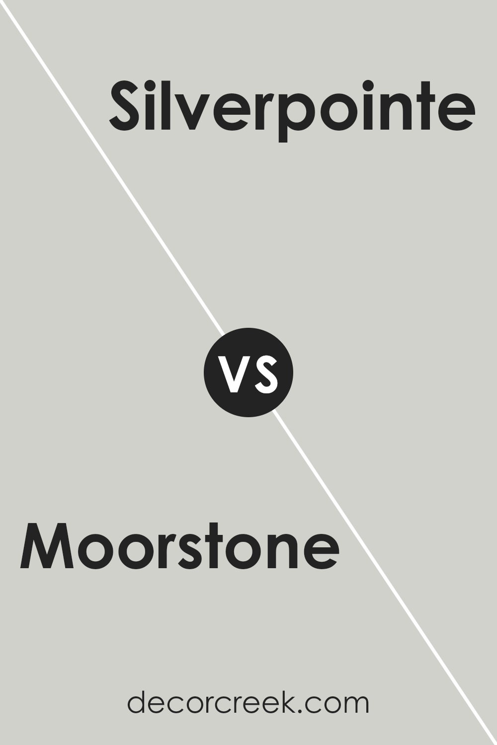
Moorstone SW 9630 by Sherwin Williams vs Silverpointe SW 7653 by Sherwin Williams
Moorstone and Silverpointe, both by Sherwin Williams, offer distinct yet harmonious hues suited for various design preferences and spaces.
Moorstone presents a deeper, more muted tone, reminiscent of earthy elements and natural stone, providing a grounding and calming effect in any room.
It has a robust depth that can make spaces feel more intimate and cozy, making it an excellent choice for bedrooms, living areas, or any place where a sense of comfort is desired.
On the other hand, Silverpointe is a lighter, airier hue that leans towards a soft, silvery gray. This color reflects light beautifully, contributing to a sense of openness and serenity, which can make smaller spaces appear larger and more inviting.
Silverpointe is versatile, working well in various settings, from modern kitchens to tranquil bathrooms, bringing a crisp, clean look that enhances the feeling of spaciousness.
Together, Moorstone and Silverpointe embody a balance between warmth and coolness, depth and light, making them complementary choices for those looking to create a nuanced and sophisticated palette within their home.
You can see recommended paint color below:
- SW 7653 Silverpointe
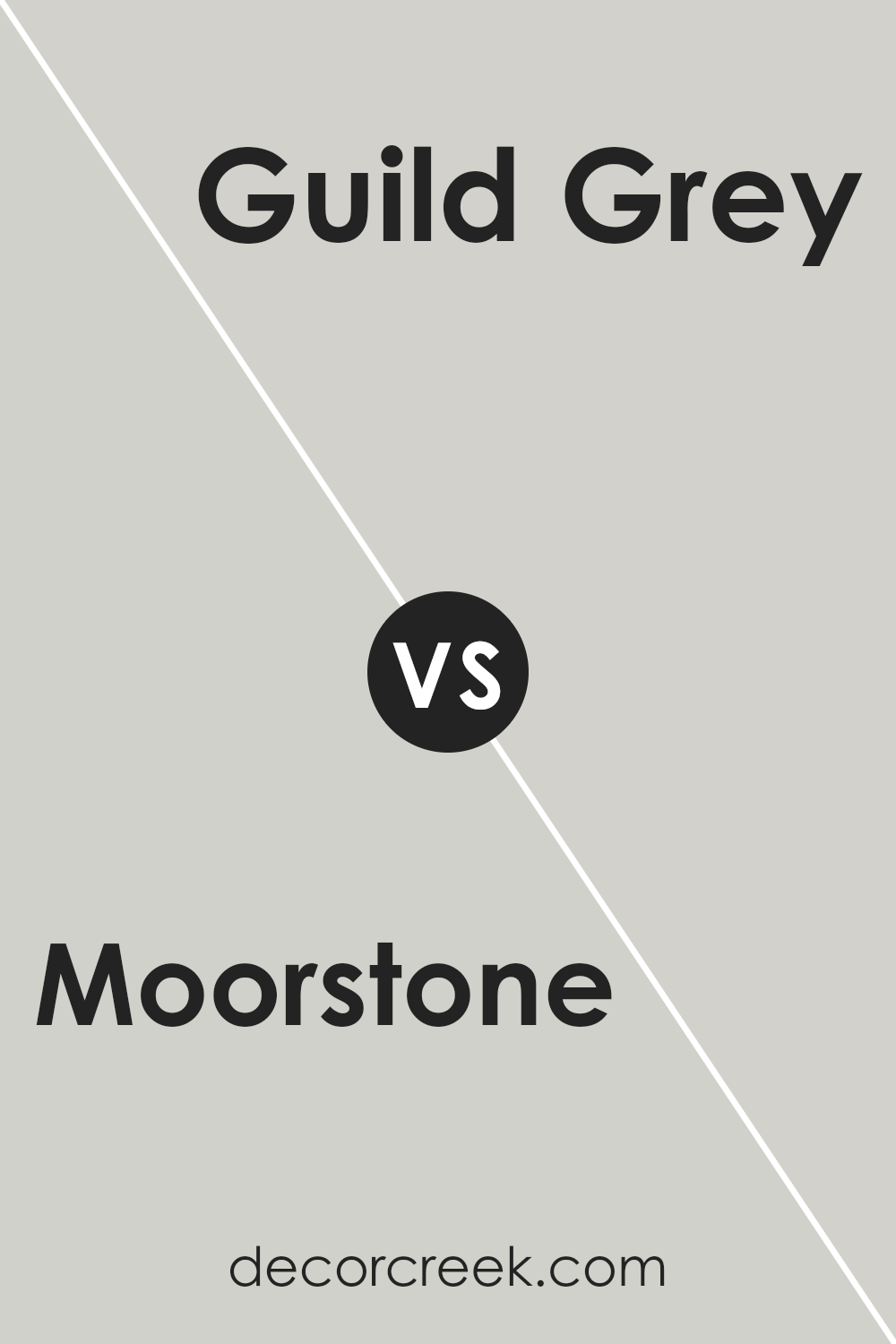
Moorstone SW 9630 by Sherwin Williams vs Guild Grey SW 9561 by Sherwin Williams
Moorstone and Guild Grey, both by Sherwin Williams, present a sophisticated palette for those looking to infuse subtlety and depth into their spaces. Moorstone is a rich, complex hue that suggests the serene, stable essence of earth and stone.
Its depth offers a sense of grounding and calmness, making it ideal for creating a cozy, inviting atmosphere in any room. Its warm undertones can beautifully complement a variety of decor styles, from rustic to modern.
On the other hand, Guild Grey skews cooler, introducing a more contemporary, sleek vibe.
Its lighter tone bridges the gap between traditional neutrality and modern flair, making it versatile for spaces looking for a breath of fresh air without straying too far into the starkness some grays can convey.
The subtle sophistication of Guild Grey offers a canvas that can uplift spaces with a clean, airy feel, perfect for areas that aim to be both tranquil and chic.
Together, these colors can harmonize within a space, Moorstone grounding the environment with its warmth, while Guild Grey adds layers of lightness and modernity, creating a balanced, aesthetically pleasing atmosphere.
You can see recommended paint color below:
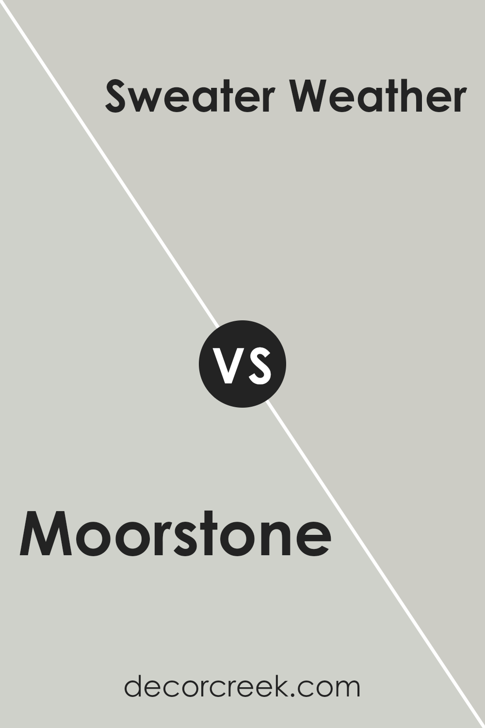
Moorstone SW 9630 by Sherwin Williams vs Sweater Weather SW 9548 by Sherwin Williams
Moorstone and Sweater Weather, both by Sherwin Williams, present unique characteristics. Moorstone leans towards a deeper, more grounded hue, reminiscent of natural stone or a damp forest floor.
Its earthy, rich undertones offer warmth and depth, making it an excellent choice for creating cozy, inviting spaces. In contrast, Sweater Weather has a lighter, more airy vibe. It evokes the feeling of soft, comfortable woolen fabrics on a crisp autumn day.
This color is cooler and leans slightly towards a grayish-blue, providing a serene, calming effect ideal for spaces intended for relaxation and thought.
While Moorstone offers a solid anchor and a sense of stability, Sweater Weather brings a refreshing, light-hearted ambiance.
The contrast between them lies in their ability to invoke different moods and atmospheres within a space, with Moorstone grounding the environment and Sweater Weather lifting it.
Both colors complement each other, perfect for those seeking balance between warmth and coolness in their color palettes.
You can see recommended paint color below:
- SW 9548 Sweater Weather
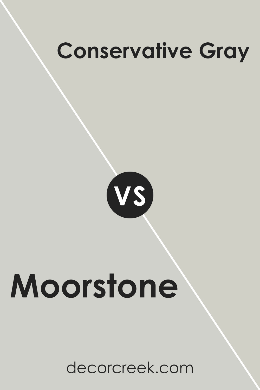
Moorstone SW 9630 by Sherwin Williams vs Conservative Gray SW 6183 by Sherwin Williams
Moorstone and Conservative Gray, both from Sherwin Williams, offer distinct vibes for interior spaces. Moorstone is a deep, grounded hue with a rich, earthy essence. It carries a robust character that can add depth and a sense of sophistication to rooms.
Its warmth makes it ideal for spaces where a cozy, inviting atmosphere is desired. On the other hand, Conservative Gray is a lighter, more neutral shade that exudes a gentle calmness.
This color is versatile, making it an excellent choice for creating a serene backdrop that complements various decor styles without overwhelming them.
It bridges the gap between contemporary and classic, providing a soft, airy feel to spaces. While Moorstone offers a bold statement with its lush, earthen tones, Conservative Gray brings an understated elegance with its soothing, versatile gray palette.
Together, these colors can create a harmonious balance between warmth and neutrality in home interiors.
You can see recommended paint color below:
- SW 6183 Conservative Gray
Conclusion
Moorstone by Sherwin Williams presents itself as a versatile color option that seamlessly integrates into various design schemes.
Its unique blend of cool undertones offers a refreshing yet subtle aesthetic, making it an ideal choice for those looking to infuse a sense of calm and sophistication into their spaces.
The adaptability of Moorstone ensures it can be paired with a wide range of color palettes, from vibrant hues to more understated tones, thus enhancing its appeal to designers and homeowners alike who are seeking a neutral, yet impactful, backdrop.
The popularity of Moorstone can also be attributed to its ability to enhance natural light within a room, creating an airy and spacious atmosphere that is both welcoming and comforting.
Its performance in different lighting conditions demonstrates the paint’s high-quality finish and durability, characteristics that Sherwin Williams is renowned for.
Whether applied in living areas, bedrooms, or external facades, Moorstone stands out as a sophisticated choice that adds depth and character to any space without overwhelming it, cementing its status as a go-to color within the interior design community.
Ever wished paint sampling was as easy as sticking a sticker? Guess what? Now it is! Discover Samplize's unique Peel & Stick samples.
Get paint samples