Black
Black Blue
Blue Brown
Brown Gray
Gray Green
Green Neutral
 Orange
 White
White Yellow
If you’re planning to refresh your room with a new paint color, you might want to consider SW 6212 Quietude by Sherwin Williams. As a soothing shade of green-blue, Quietude has a unique ability to create a peaceful and inviting atmosphere in any room. Deciding on the right color can feel challenging with so many options available, so let me share what I’ve learned about this particular color to help you make an informed decision.
First, it’s important to understand how Quietude behaves under different lighting conditions. Natural light brings out its blue tones, giving a calm, peaceful vibe, while artificial light can draw out more of its green undertones, adding warmth to the room.
The flexibility of Quietude also means it pairs beautifully with a variety of decor styles and other colors. Whether you’re looking to paint an entire room or just an accent wall, this shade can accommodate various design aesthetics from modern to rustic. It works well with neutral furnishings, allowing them to stand out, or it can blend seamlessly with bolder colors to create a more dynamic look.
Before you make a final decision, consider testing the color in your specific area, observing how it changes throughout the day. This small step can make a big difference in ensuring the color meets your expectations and enhances the mood of your home just the way you envision it.
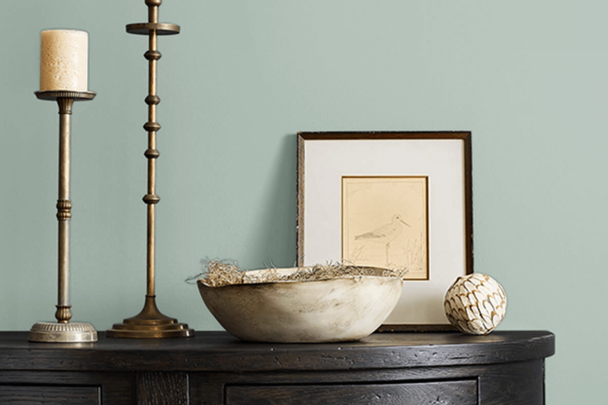
Is Quietude SW 6212 Right for My Home?
One of my go-to paint colors for creating a soothing atmosphere in a room is Quietude by Sherwin Williams. This color is a soft, muted blue with hints of green. It can add a sense of calm and freshness to any room, making it really pleasant to be in.
I find that Quietude works beautifully in a variety of interior design styles. It’s particularly lovely in coastal and Scandinavian-inspired rooms due to its light and airy feel. It also fits well in modern and contemporary settings because of its clean and subtle vibes.
When it comes to pairing materials and textures, Quietude excels with natural elements. Think light wooden floors, linen draperies, and woven rattan furniture, which all contribute to a relaxed and organic look. White trims and molding pop wonderfully against this soft backdrop, and it also pairs nicely with materials like soft wool throws or cushions for added warmth and coziness.
In my experience, Quietude brings in just the right amount of color without feeling too strong in a room. It’s gentle enough for wall colors and also works great for painted furniture pieces. If you’re looking for a color that’s simple yet visually refreshing, Quietude is definitely a contender. It has a way of making your home feel peaceful and welcoming.
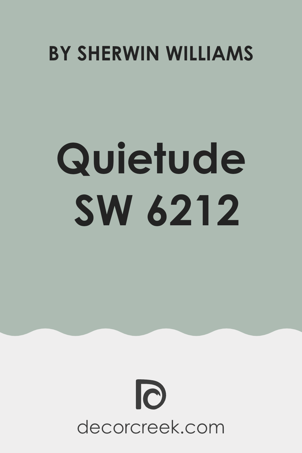
decorcreek.com
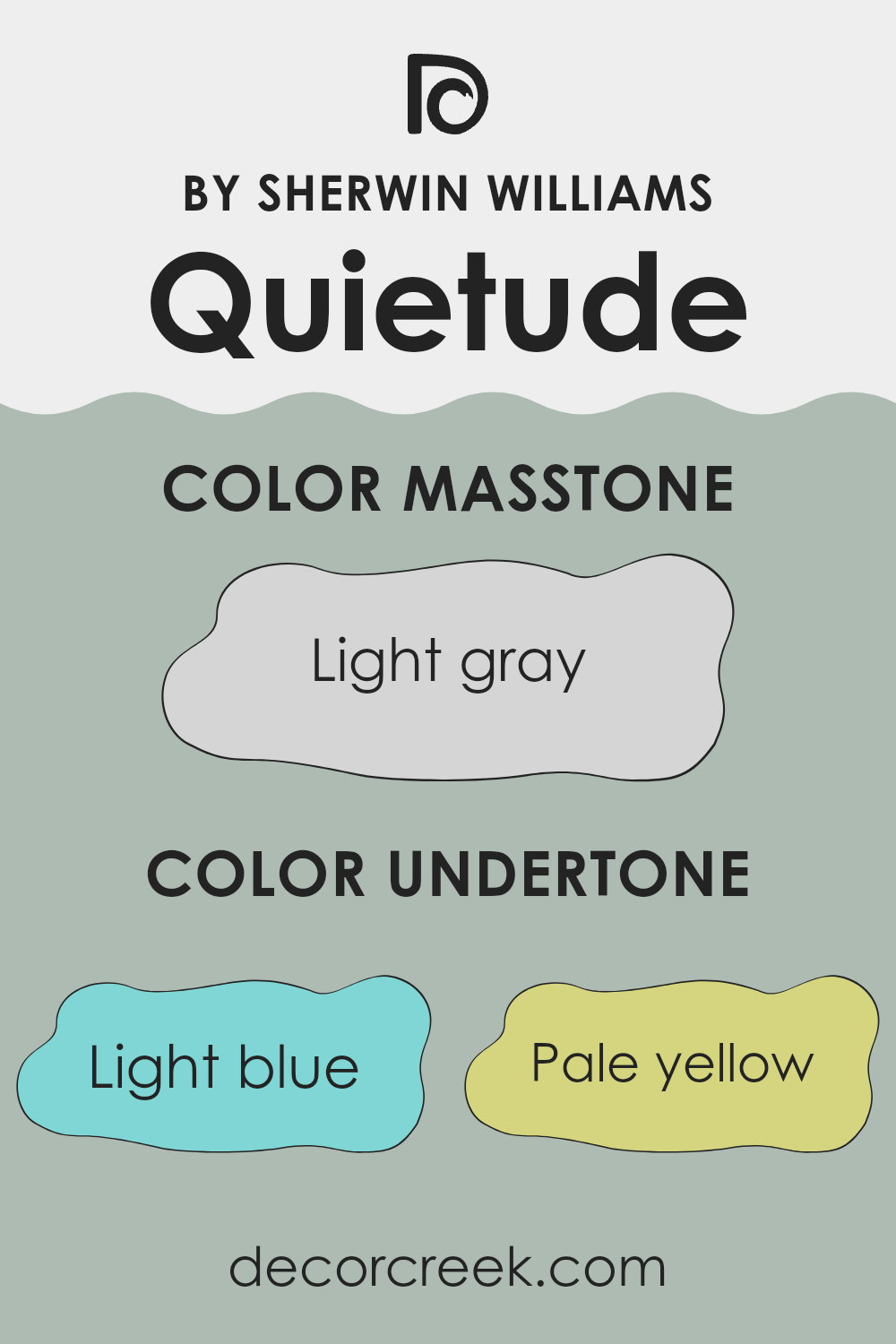
What are the right undertones of Quietude SW 6212 ?
Quietude, identified by the code SW 6212 from Sherwin Williams, is a unique paint color that can subtly change its appearance depending on its surroundings. This happens because of its various undertones, which are subtle colors that lie beneath the primary color. Quietude primarily features undertones of light blue, pale yellow, mint, light purple, lilac, pale pink, and grey.
In simple terms, undertones can make a paint color look different under various lighting conditions or when paired with different décor elements. For example, under bright sunlight, the pale yellow undertone might make the paint seem warmer, whereas in dim, artificial light, the grey undertone could make it appear more muted and cooler.
On interior walls, these undertones influence the mood and feel of a room. The light blue and mint undertones provide a fresh, airy feel, making a room feel more open and light. The pale yellow adds a subtle warmth, making a room feel cozy and inviting. Light purple and lilac undertones add a gentle touch of whimsy and softness, which can be perfect for creating a calming bedroom or bathroom. The pale pink undertone offers a hint of cheerfulness, while the grey undertone keeps the overall color grounded, ensuring it doesn’t become too vibrant or challenging to live with.
Overall, the undertones of Quietude by Sherwin Williams make it a flexible choice, suitable for many different rooms and styles. They help the color adapt to different environments, making it easier for homeowners to use this color scheme across various rooms.
decorcreek.com
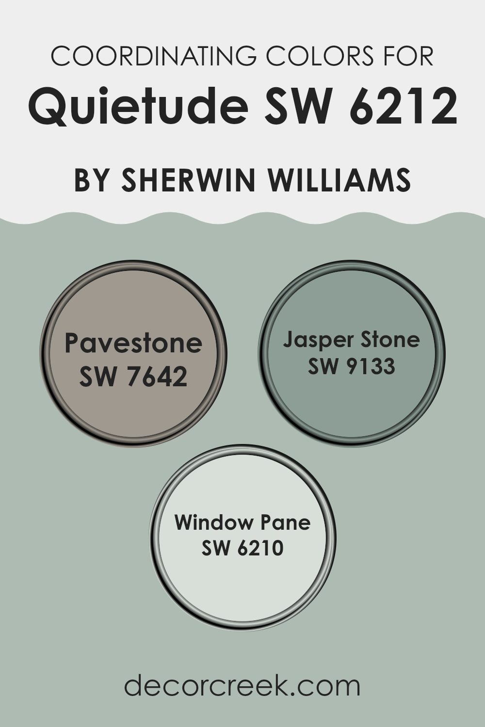
Best Coordinating Colors to use with Quietude SW 6212 by Sherwin Williams this year.
Coordinating colors are hues that complement each other and are often used together to create a visually appealing and harmonious look. These colors work together to enhance the overall aesthetic of a room, taking into account factors such as lighting, room size, and mood you want to set. They usually share either a similar intensity or a contrasting tone that balances the visual experience.
For example, Pavestone SW 7642 is a rich, earthy gray with slight undertones of brown, functioning well as a solid grounding color that can help enhance bolder shades. Jasper Stone SW 9133 offers a deeper, greenish-gray hue, providing a subtle contrast to lighter, airier colors, making it ideal for adding a touch of depth to a room without feeling too strong.
Window Pane SW 6210 is a soft, light green that creates a fresh and clean vibe, perfect for creating a bright and airy feel. These shades are selected to work in harmony with one another, ensuring a cohesive and attractive palette.
You can see recommended paint colors below:
- SW 7642 Pavestone
- SW 9133 Jasper Stone
- SW 6210 Window Pane
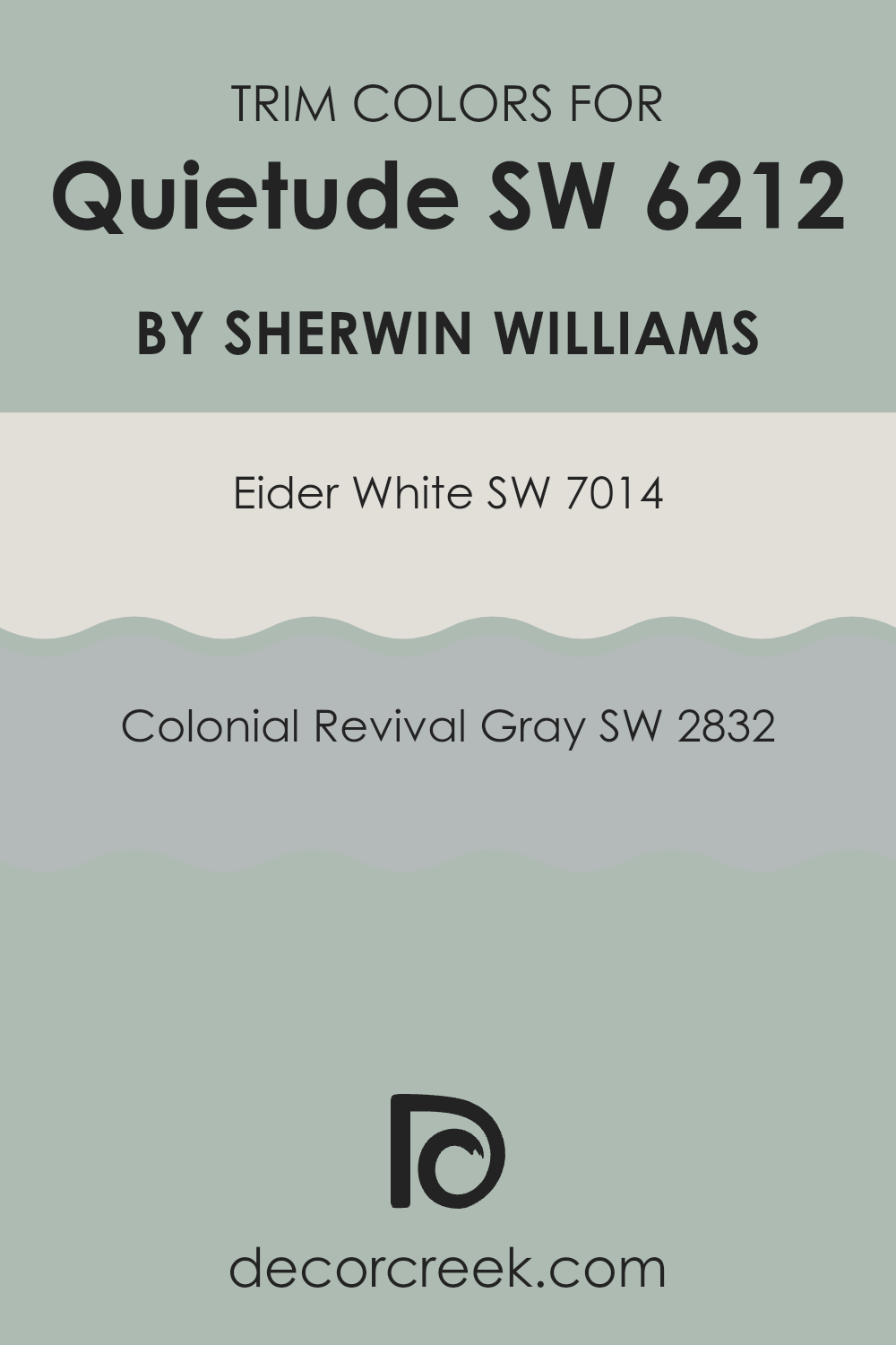
Trendy Trim Colors of Quietude SW 6212 by Sherwin Williams to use this year.
Trim colors play a crucial role in defining the visual appeal and overall aesthetic of a room when paired with a primary wall color like Quietude from Sherwin-Williams. By selecting the right trim color, you can enhance the architectural features of a room, create a clean and finished look, and subtly complement the main color palette.
For example, using Eider White or Colonial Revival Gray as trim colors can provide a subtle contrast that enhances the gentle and calming effect of Quietude, without overpowering its presence.
Eider White by Sherwin-Williams is a light, almost white shade with a hint of gray. This color is perfect for trim as it offers a crisp boundary that can make the wall color, such as Quietude, stand out, giving the room a more open and airy feel. On the other hand, Colonial Revival Gray is a more defined gray that can add depth and definition to trim, creating a slightly stronger contrast with softer wall colors like Quietude. This can help in defining rooms and drawing attention to details such as molding and trims, making them more noticeable and appreciated.
You can see recommended paint colors below:
- SW 7014 Eider White
- SW 2832 Colonial Revival Gray
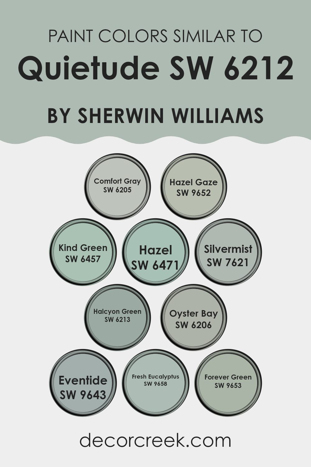
Evergreen Colors Similar to Quietude SW 6212 by Sherwin Williams
In interior design, choosing similar colors can create a cohesive and harmonious environment, which is especially important when aiming to establish a fluid and soothing atmosphere in a room.
Similar colors, such as those related to Quietude SW 6212 by Sherwin Williams, work well together by maintaining a consistent aesthetic without stark contrasts, which can make rooms feel larger and more connected. For instance, using shades like Comfort Gray and Oyster Bay can anchor a room with a subtle touch of nature-inspired grays and greens, providing a calm backdrop for living areas.
Paint colors like Halcyon Green and Forever Green carry gentle green hues that complement wood furniture and natural elements within a room, reinforcing a naturalistic theme. Fresh Eucalyptus and Kind Green offer a slightly more vibrant green that injects life into a room without feeling too strong.
Meanwhile, shades such as Silvermist and Eventide introduce a cool, muted blue that mimics the early evening sky, perfect for creating a quiet nook for relaxation. Lastly, Hazel and Hazel Gaze add a touch of warmer tones to a predominantly cool palette, ensuring that the room retains a welcoming feel even with cooler shades. In essence, choosing similar colors allows for a flexible color scheme that still offers visual interest and style.
You can see recommended paint colors below:
- SW 6205 Comfort Gray
- SW 9652 Hazel Gaze
- SW 6457 Kind Green
- SW 6471 Hazel
- SW 7621 Silvermist
- SW 6213 Halcyon Green
- SW 6206 Oyster Bay
- SW 9643 Eventide
- SW 9658 Fresh Eucalyptus
- SW 9653 Forever Green
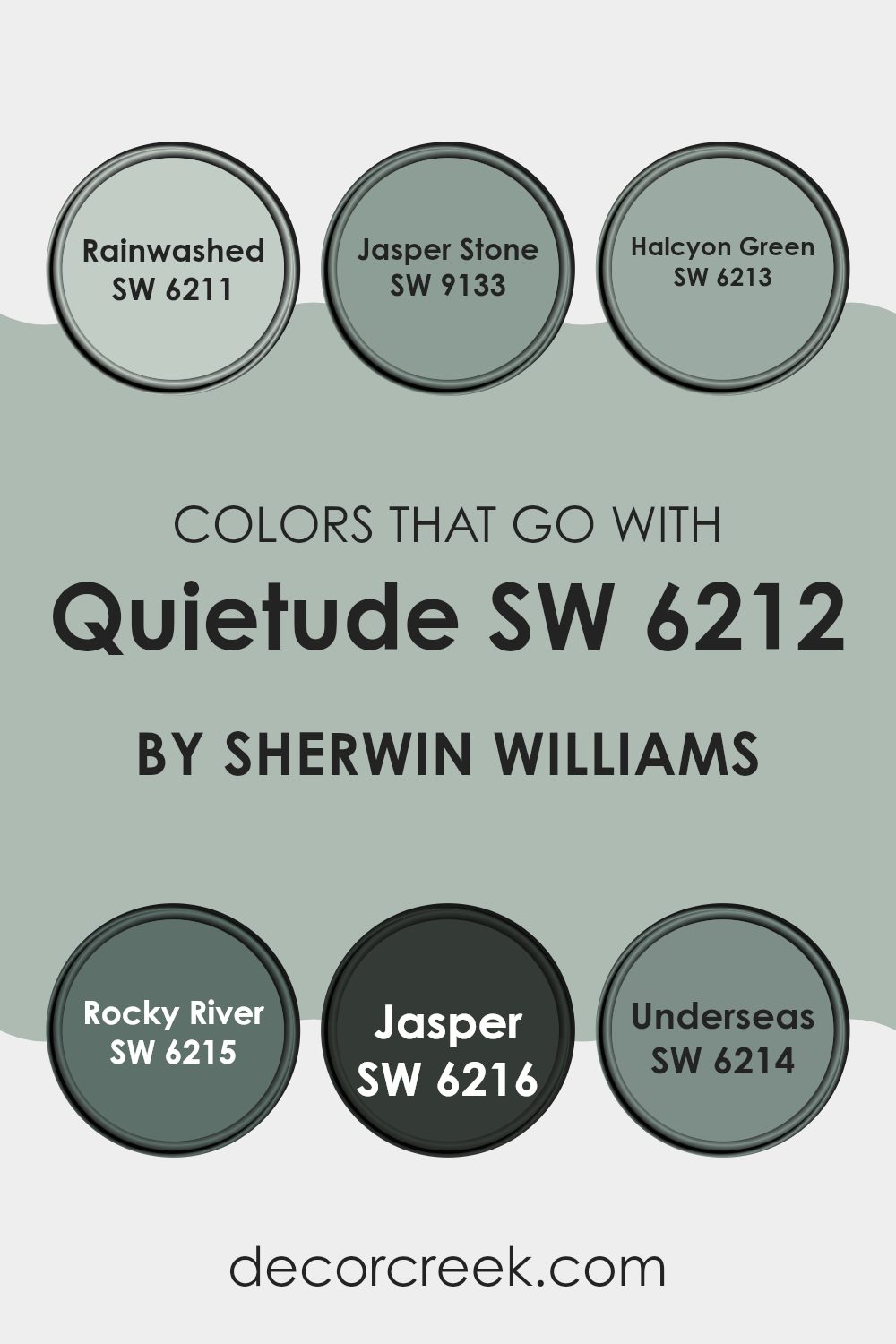
Colors that Go With Quietude SW 6212 by Sherwin Williams
Choosing colors that complement Quietude SW 6212 by Sherwin Williams is crucial because they create a harmonious living area that reflects calmness and ease. Quietude is a soft, muted green with a touch of blue, providing a perfect backdrop for a range of coordinating colors.
When you select colors like Rainwashed, Jasper Stone, Halcyon Green, Rocky River, Jasper, and Underseas, you ensure that every room feels connected yet distinct, maintaining a balance between warmth and freshness that enhances your home’s overall atmosphere.
Rainwashed SW 6211 is a gentle blue with green undertones that resembles the early morning sky, offering a refreshing and gentle look. Close in tone is Halcyon Green SW 6213, a deeper shade that hints at underwater scenes, perfect for a peaceful and cozy room. For those looking to add a bit of earthiness, Jasper Stone SW 9133 serves up a subdued green that recalls the colors of a dense forest, ideal for rooms that need a touch of nature.
Rocky River SW 6215, a darker and richer blue-green, has the intensity of a deep river, suitable for accent walls or furniture pieces. Jasper SW 6216 presents an even darker green, reminiscent of dense foliage at dusk, adding drama and depth to any room. Lastly, Underseas SW 6214 showcases a unique blend of green and blue, suggesting the depths of the sea, perfect for creating a striking impact in any room. These colors together build a fluid and inviting palette that complements the cool, quiet beauty of Quietude, ensuring each room tells its own story.
You can see recommended paint colors below:
- SW 6211 Rainwashed
- SW 9133 Jasper Stone
- SW 6213 Halcyon Green
- SW 6215 Rocky River
- SW 6216 Jasper
- SW 6214 Underseas
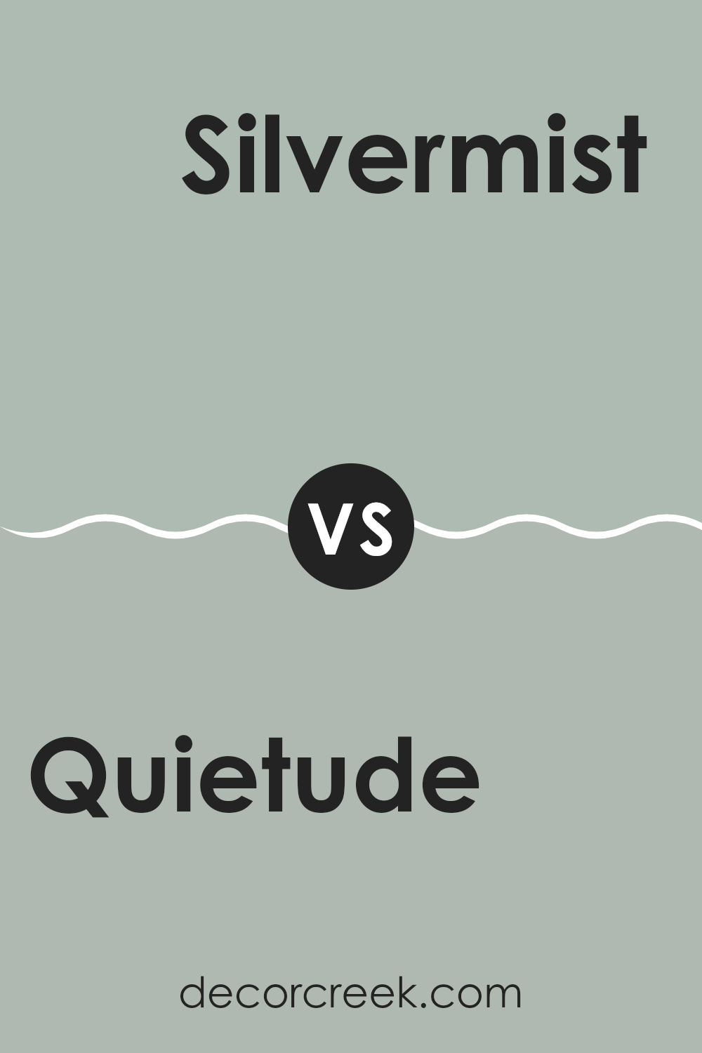
Quietude SW 6212 by Sherwin Williams vs Silvermist SW 7621 by Sherwin Williams
Quietude and Silvermist are both soothing colors by Sherwin Williams that add a subtle and calming presence to any room. Quietude is a soft, pale green with a hint of grey, which gives it a muted and gentle appearance.
It’s perfect for creating a refreshing yet cozy room. On the other hand, Silvermist leans more towards a grayish-blue, offering a cooler tone that reflects a modern and fresh look. While both colors are flexible, Quietude tends to warm up a room, making it feel more inviting and comfortable.
Silvermist, however, has a cooler vibe that works well in settings where a sleek, contemporary feel is desired. Each color has its unique appeal depending on the mood and style you want to bring to your room.
You can see recommended paint color below:
- SW 7621 Silvermist
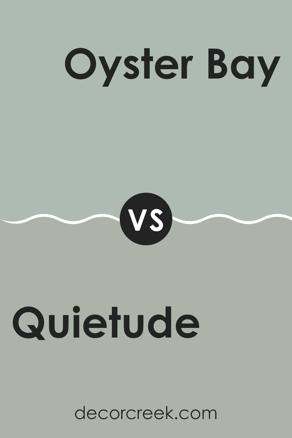
Quietude SW 6212 by Sherwin Williams vs Oyster Bay SW 6206 by Sherwin Williams
Quietude and Oyster Bay are both colors by Sherwin Williams, but they have distinct vibes. Quietude is a soft, gentle green with a hint of gray. It’s a peaceful color that can make a room feel cozy and soothing.
On the other hand, Oyster Bay is a deeper shade that mixes green and gray, giving it a more pronounced presence. It’s less about blending in and more about standing out, although it still maintains a calming effect.
Quietude is perfect for creating a light, airy feel in a room, making it ideal for smaller rooms or areas where you want to relax. Oyster Bay, with its richer tone, works well in larger rooms or as an accent wall, where it can add depth and interest without feeling too strong. Both colors are flexible and can work well in many different types of rooms, from kitchens to bedrooms.
You can see recommended paint color below:
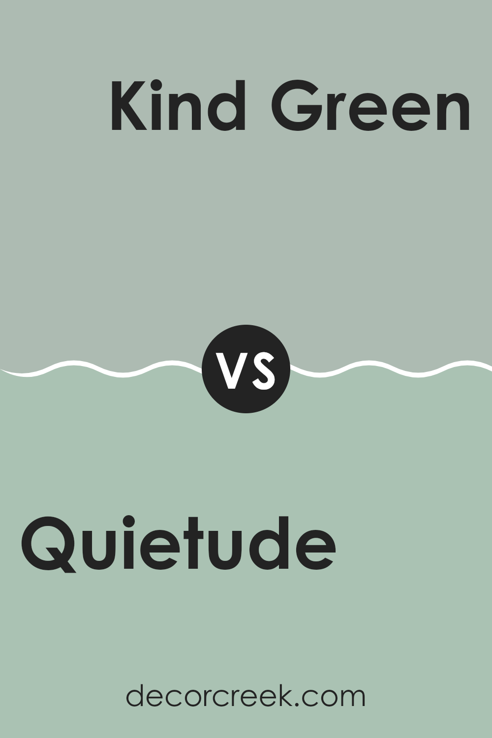
Quietude SW 6212 by Sherwin Williams vs Kind Green SW 6457 by Sherwin Williams
Quietude and Kind Green are two distinct colors by Sherwin Williams, each offering a unique vibe. Quietude is a soft, muted green with gray undertones, providing a subtle and calming effect. It’s ideal for creating a peaceful atmosphere in rooms meant for relaxation, like bedrooms or living rooms.
On the other hand, Kind Green is a much bolder and brighter shade of green. It has a lively and fresh feel to it, making it great for areas that benefit from a splash of energy and vibrancy, such as kitchens or playrooms.
While Quietude has a more understated feel, Kind Green stands out more and can add a happy, energizing touch to any room. Both colors can enhance a room beautifully, but your choice would depend on the mood and energy level you want for the room.
You can see recommended paint color below:
- SW 6457 Kind Green
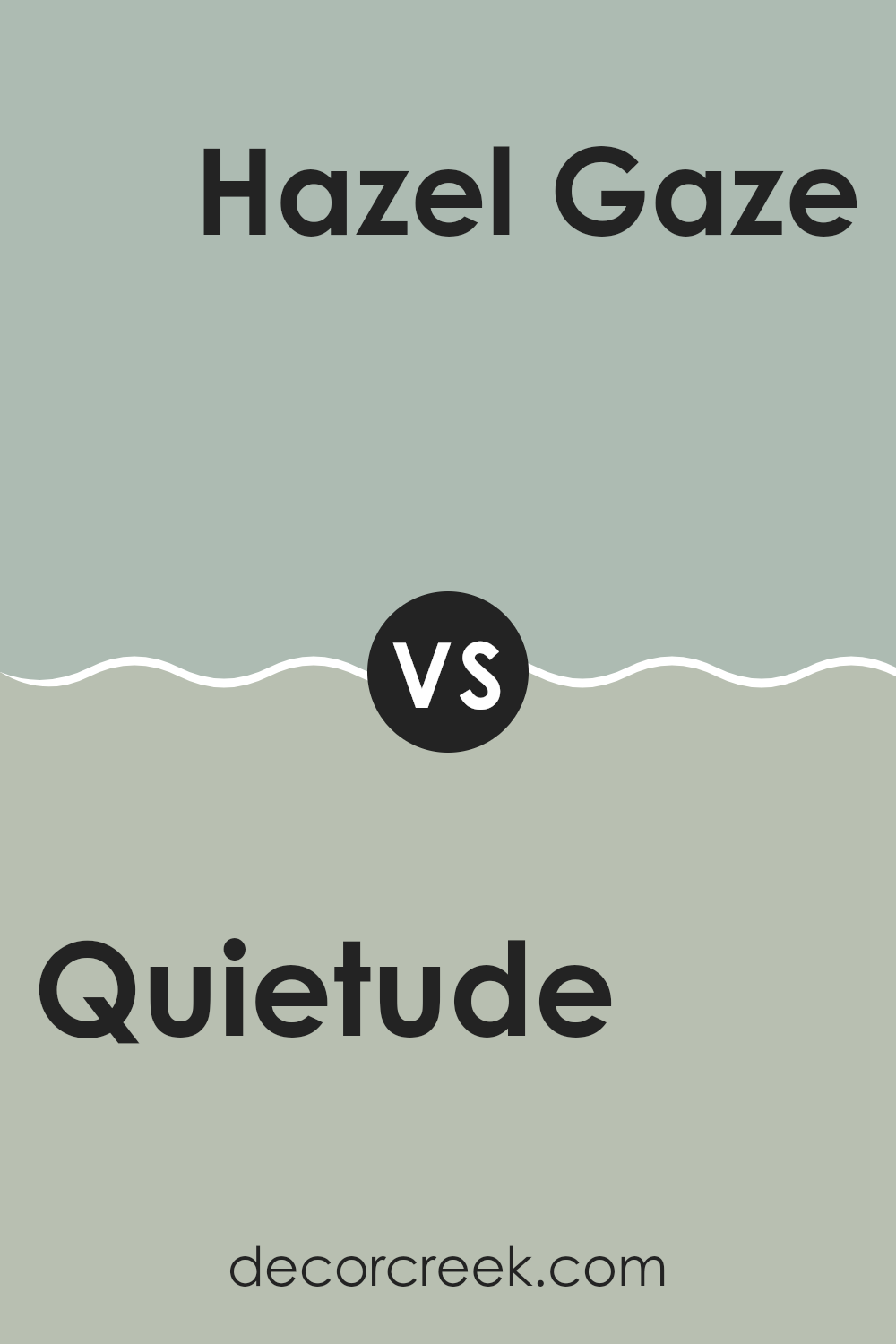
Quietude SW 6212 by Sherwin Williams vs Hazel Gaze SW 9652 by Sherwin Williams
Quietude by Sherwin Williams is a soft, soothing green with a touch of gray that gives it a muted, calming appeal. It’s easy on the eyes and flexible enough to fit in various rooms, providing a peaceful backdrop that is neither too bold nor too subtle.
On the other hand, Hazel Gaze by Sherwin Williams is a warm, earthy hue that leans towards olive, adding a cozy yet lively touch to rooms. This color radiates warmth and comfort, making it ideal for social areas like living rooms or kitchens where a welcoming atmosphere is desired.
While Quietude is more subdued and can help create a relaxed, airy environment, Hazel Gaze offers a hint of vibrancy and depth, lending itself well to rooms that benefit from a richer, more enveloping feel. Both colors have their unique charm, with Quietude offering a breath of fresh air and Hazel Gaze providing an inviting warmth.
You can see recommended paint color below:
- SW 9652 Hazel Gaze
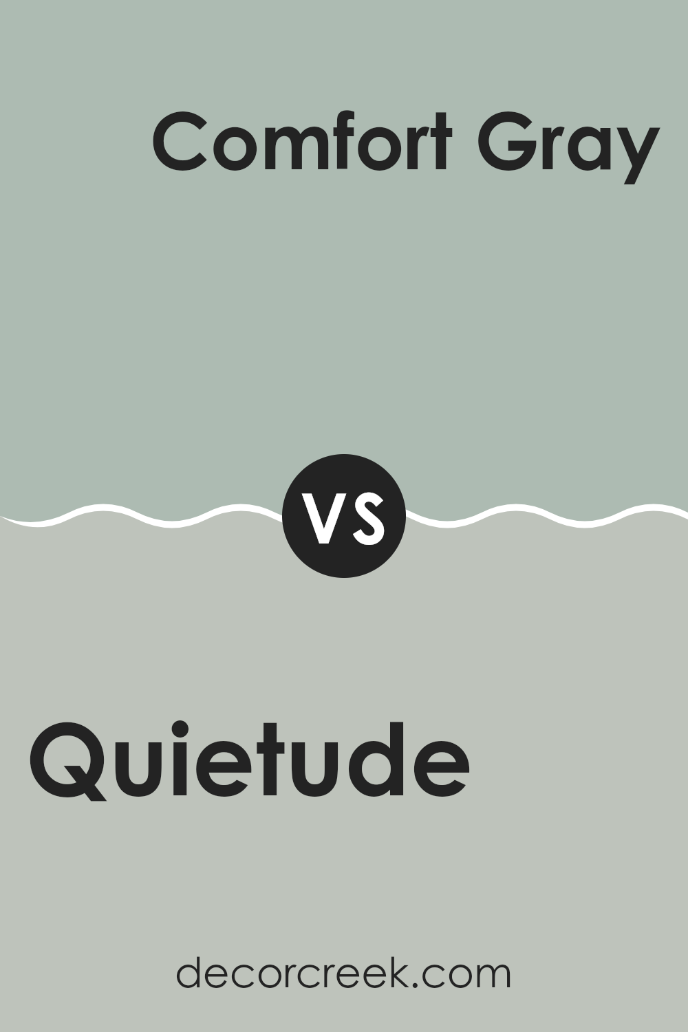
Quietude SW 6212 by Sherwin Williams vs Comfort Gray SW 6205 by Sherwin Williams
Quietude and Comfort Gray are both soothing paint colors by Sherwin Williams, perfect for creating a calm atmosphere in any room. Quietude has a soft green hue with a touch of blue, giving off a fresh and gentle vibe. It’s a bit lighter and can make rooms feel airy and more open.
On the other hand, Comfort Gray is a bit darker and leans more towards a grayish-green, adding a cozy and slightly more grounded feel to interiors.
Both colors work well in rooms that aim for a relaxed mood, but Quietude tends to bring a brighter energy due to its lighter tone, while Comfort Gray provides a sense of warmth, making it ideal for rooms that you want to feel more enclosed and snug. Choosing between them depends on how much light a room gets and what kind of atmosphere you want to achieve.
You can see recommended paint color below:
- SW 6205 Comfort Gray
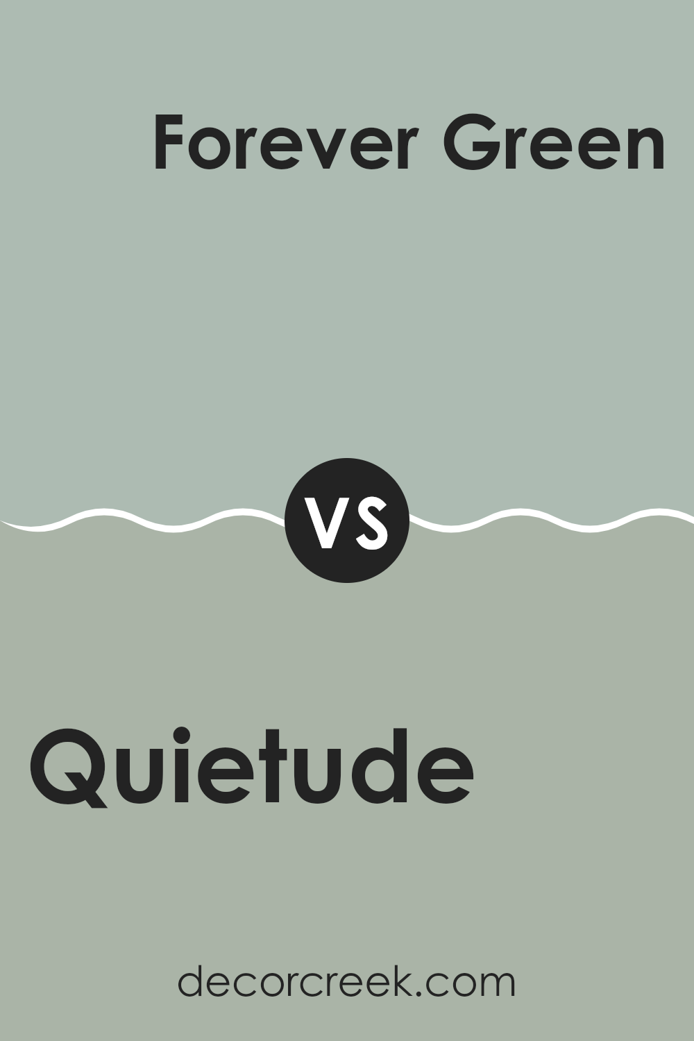
Quietude SW 6212 by Sherwin Williams vs Forever Green SW 9653 by Sherwin Williams
Quietude and Forever Green, both by Sherwin Williams, are distinct in their vibes and tones. Quietude is a soft, muted green with a hint of gray. This color offers a subtle and gentle feel, making it ideal for creating a calm and soothing atmosphere in a room. It pairs well in rooms meant for relaxation such as bedrooms and living rooms.
On the other hand, Forever Green carries a deeper, richer green hue, evoking a sense of freshness and vibrancy. It’s bolder than Quietude and stands out more dramatically when applied on walls. This color works great in areas that could use a pop of natural color, such as kitchens or recreational rooms.
Both colors reflect different aspects of nature but serve unique purposes in home decor. While Quietude leans towards a low-key, neutral charm, Forever Green attracts more attention and could potentially energize a room. Choosing between them depends on the specific mood and style you want to achieve in your decorating project.
You can see recommended paint color below:
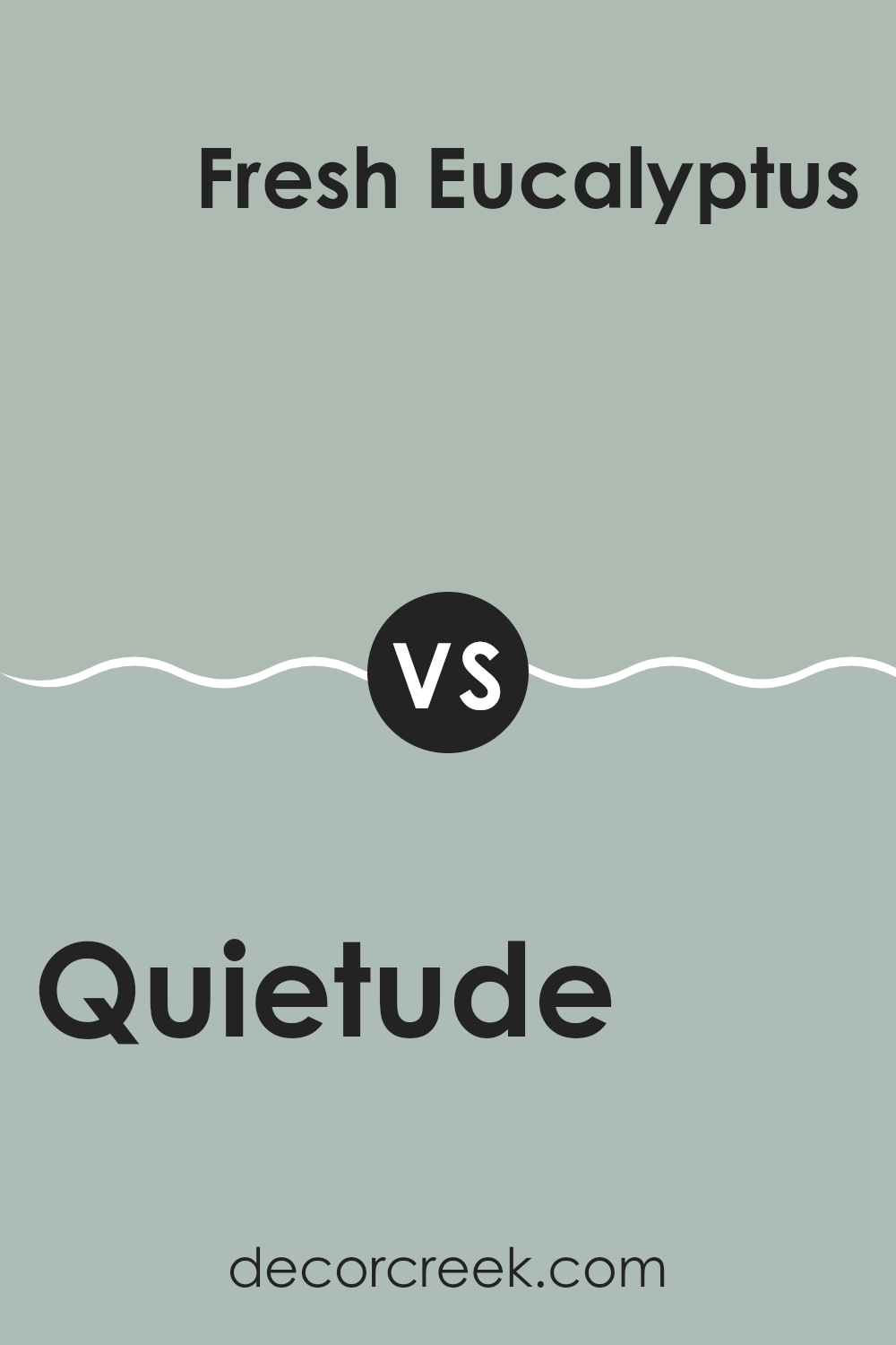
Quietude SW 6212 by Sherwin Williams vs Fresh Eucalyptus SW 9658 by Sherwin Williams
Quietude and Fresh Eucalyptus are both colors by Sherwin Williams, known for their calming nature but they offer different vibes. Quietude is a soft, muted green with a grayish undertone, giving it a gentle and soothing presence, ideal for creating a restful and comfortable room. It works well in places where you want to relax, like bedrooms or living rooms.
On the other hand, Fresh Eucalyptus is a deeper, more vibrant shade of green. This color leans towards a more lively and refreshing green, which can add a touch of vitality to any room. It’s perfect for areas where you want a bit more energy and vividness, such as kitchens or dining rooms.
In summary, while Quietude provides a more subdued and calming atmosphere, Fresh Eucalyptus offers a brighter and more refreshing feel. Both colors bring a touch of nature indoors but in uniquely different ways. Depending on the mood you want to set in a room, you might choose one over the other.
You can see recommended paint color below:
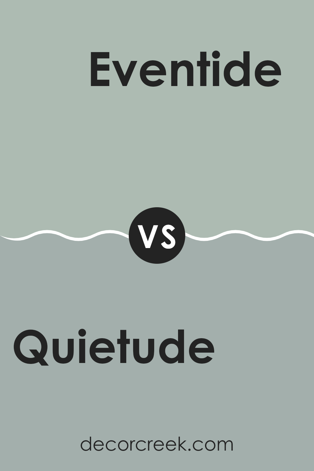
Quietude SW 6212 by Sherwin Williams vs Eventide SW 9643 by Sherwin Williams
Quietude and Eventide, both by Sherwin Williams, present subtle yet distinct moods through their hues. Quietude is a soft green that brings a light, refreshing vibe to any room. It is gentle and soothing, perfect for creating a relaxed environment. This color works well in areas where calm is essential, like bedrooms or bathrooms.
On the other hand, Eventide offers a deeper, grayish-blue tone. This color adds a slightly more grounded and solid feel to a room compared to Quietude. It’s an excellent choice for rooms that aim for a bit of a stronger presence without feeling too strong, such as living rooms or studies.
While Quietude leans towards a natural, airy quality, Eventide strikes with a hint of depth and introspection. Both colors can beautifully complement each other, with Quietude lightening the room and Eventide adding a touch of depth. Their use can define the mood and style of a home, depending on how they are applied in conjunction with other elements in the room.
You can see recommended paint color below:
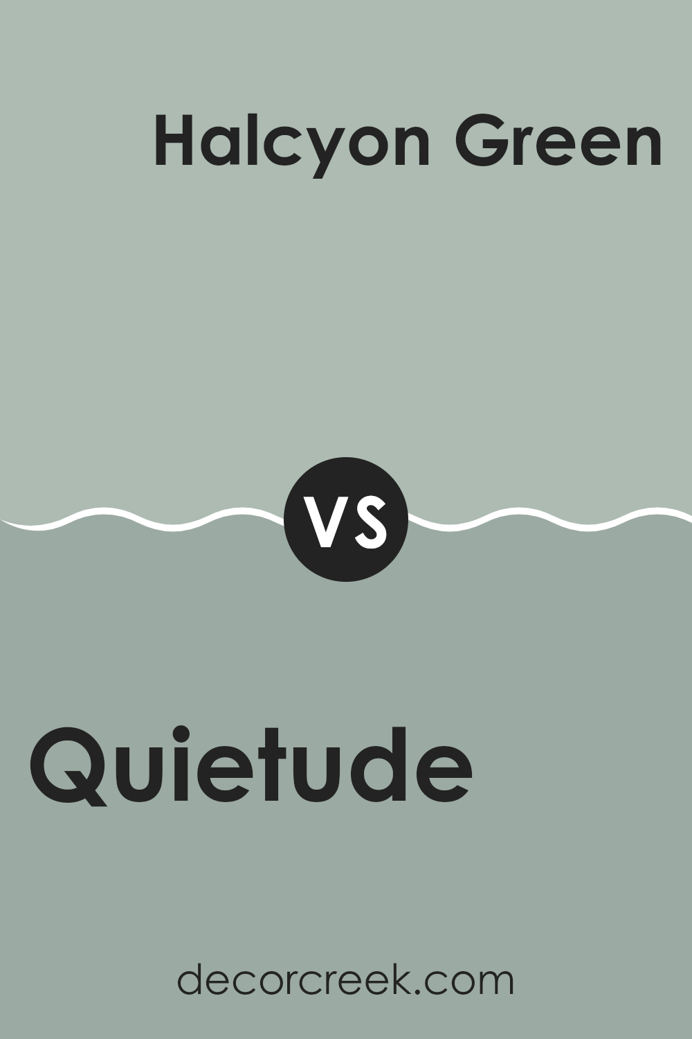
Quietude SW 6212 by Sherwin Williams vs Halcyon Green SW 6213 by Sherwin Williams
Quietude and Halcyon Green are two soothing colors from Sherwin Williams. Both offer a calming feel, but there are noticeable differences. Quietude is a soft, muted green with gray undertones, making it perfect for rooms where you want a peaceful and gentle atmosphere, such as bedrooms or bathrooms. It reflects a subtle, light ambiance that complements well with both bright and dark accents.
On the other hand, Halcyon Green is a shade darker than Quietude and brings in a touch more of a green hue, resembling the color of sea glass. This color is ideal for areas where a bit of color is desired without feeling too strong. It creates a fresh and airy environment, working beautifully in living rooms or kitchens.
When deciding between these two, consider the mood you’re hoping to create and the lighting in your room, as both play significant roles in how these colors will ultimately look on your walls.
You can see recommended paint color below:
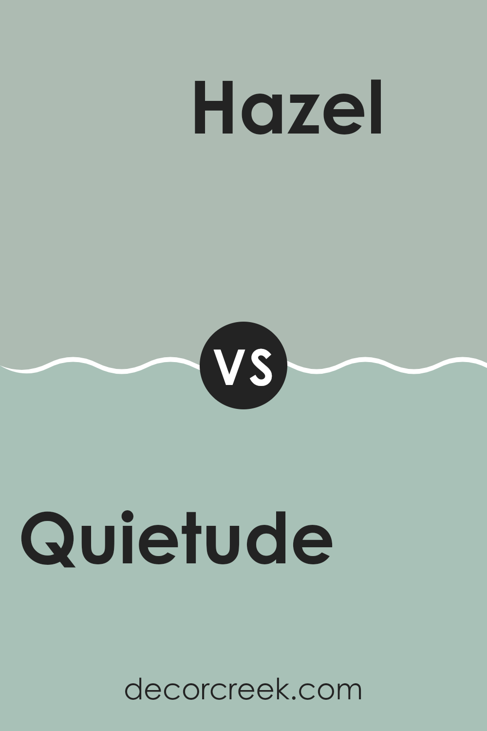
Quietude SW 6212 by Sherwin Williams vs Hazel SW 6471 by Sherwin Williams
Quietude and Hazel are two unique shades offered by Sherwin Williams. Quietude is a soft, muted green with a hint of grey, giving it a calming effect. This color is flexible and pairs well with both light and dark accents, making it ideal for creating a relaxed atmosphere in any room. It’s subtle enough to act as a neutral but still adds a touch of color.
On the other hand, Hazel stands out with its vibrant, fresh green tone that brings a lively energy to rooms. It’s brighter and more energizing than Quietude, perfect for areas where you want to add vibrancy and a nature-inspired feel.
While Quietude lends a gentle, calming air to interiors, Hazel offers a punchier, more dynamic look. Depending on the mood you want to set in a room, both colors have their distinct appeal—Quietude for a softer, understated vibe and Hazel for a bold, fresh presence.
You can see recommended paint color below:
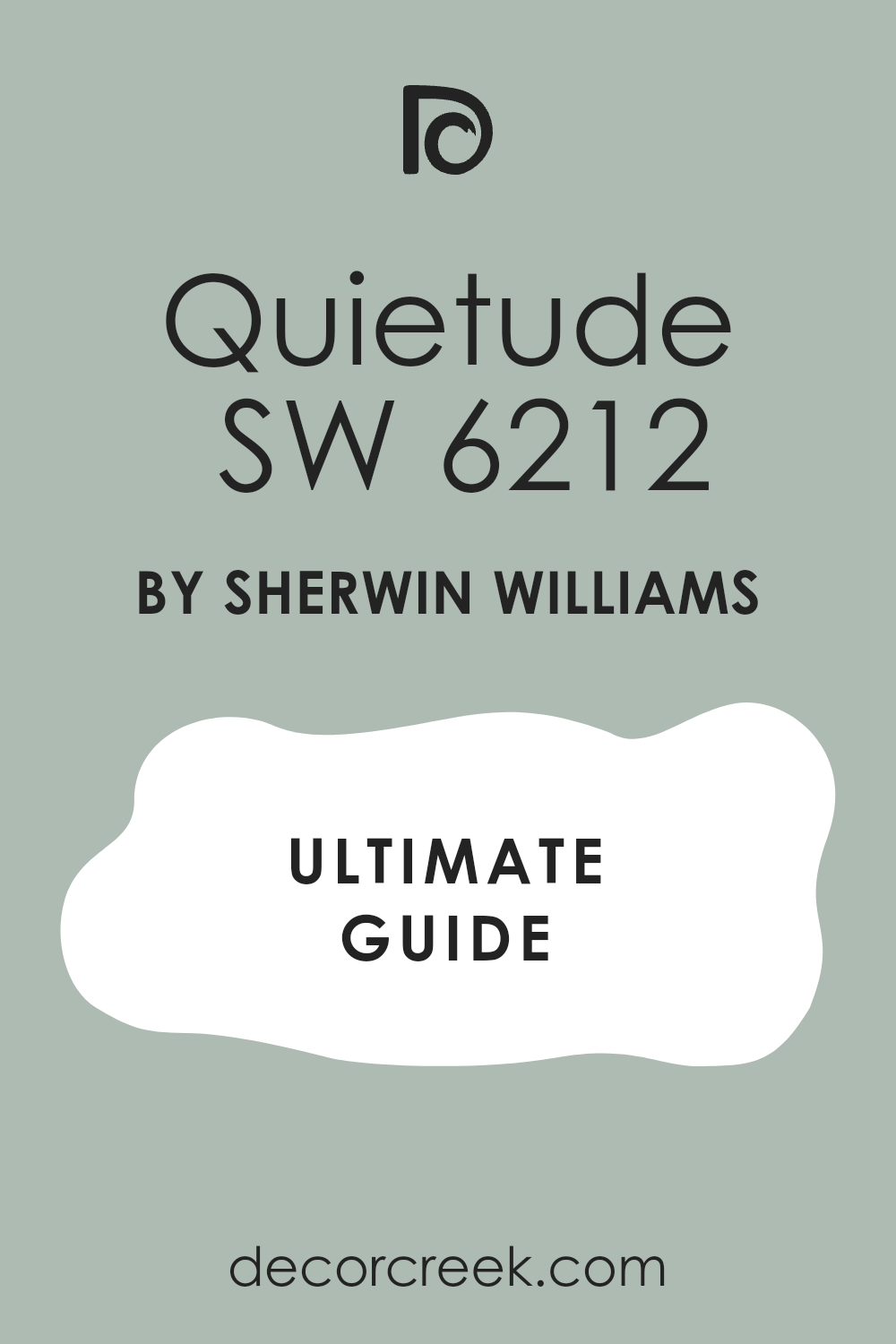
After studying SW 6212 Quietude by Sherwin Williams, I can really say that this paint color is something special! Quietude is a light teal color that kind of looks like the sky on a clear day. It’s not too bright but has just enough color to make a room feel happy and cozy. Whether you’re painting your bedroom, living room, or even your kitchen, Quietude adds a fresh and calming touch that makes your room look great.
You might be wondering how it works with other colors. Well, Quietude goes really well with white, gray, and even some darker colors like navy blue or green. This makes it super easy to use no matter what your room looks like now or what furniture you have.
Plus, using Quietude in your home can make the place where you live look clean and newer. It’s a quiet kind of beauty – it doesn’t shout for attention, but it definitely makes you feel good when you look around your room.
In conclusion, Quietude by Sherwin Williams is an excellent choice if you want to refresh your home with a color that’s calming but also pretty and full of life. It’s simple to match with other colors you might already have, and it helps make any room in your house feel just right.
decorcreek.com
Ever wished paint sampling was as easy as sticking a sticker? Guess what? Now it is! Discover Samplize's unique Peel & Stick samples.
Get paint samples