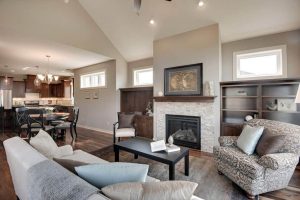
Choosing a color for a space goes beyond mere aesthetics; it’s about setting a tone, evoking emotions, and creating an ambiance that complements the style and function of the room.
Arlington Green 580, a color offering by Benjamin Moore, is one such hue that brings nature’s tranquility indoors and offers a palette for myriad design possibilities.
What Color Is Arlington Green 580?
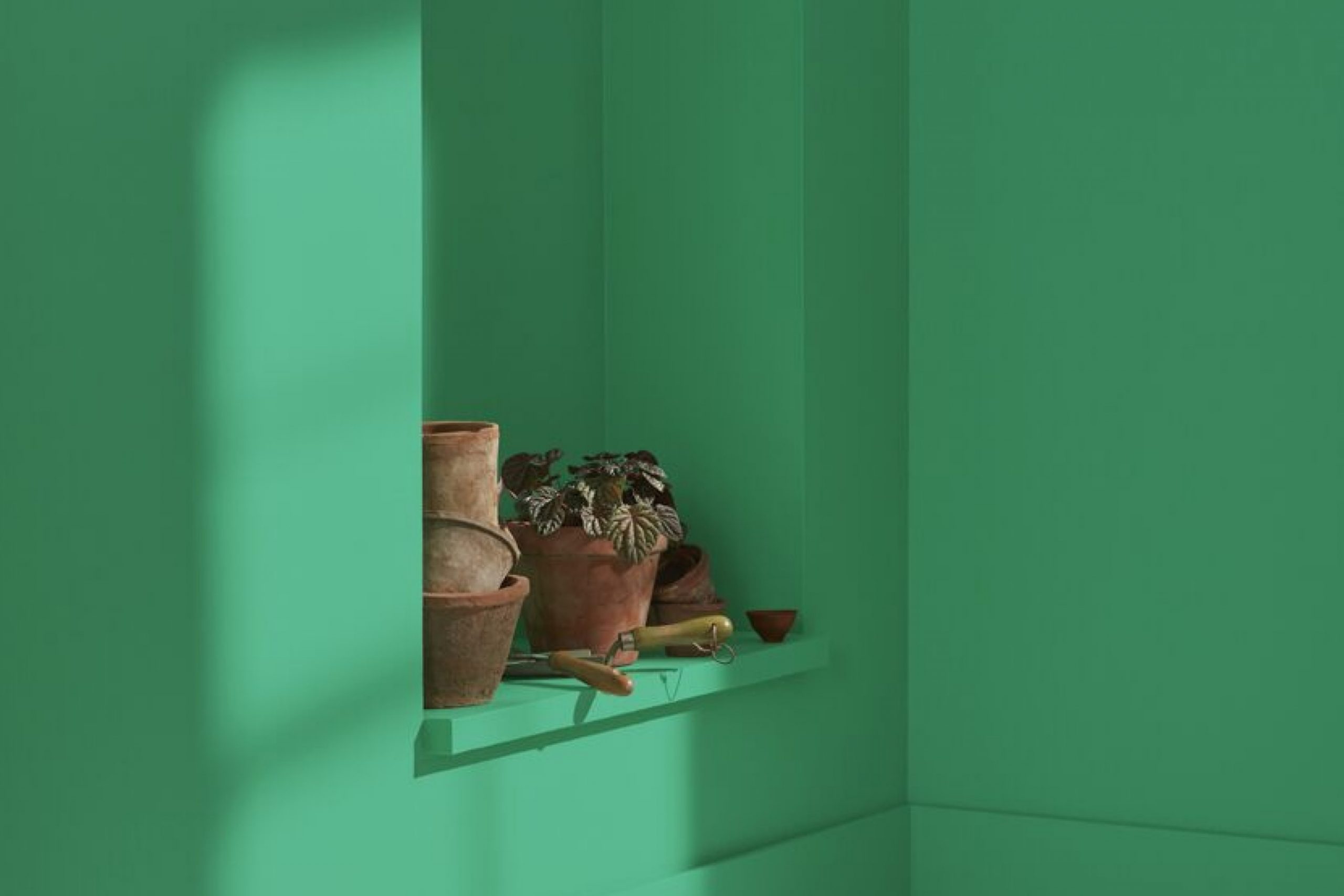
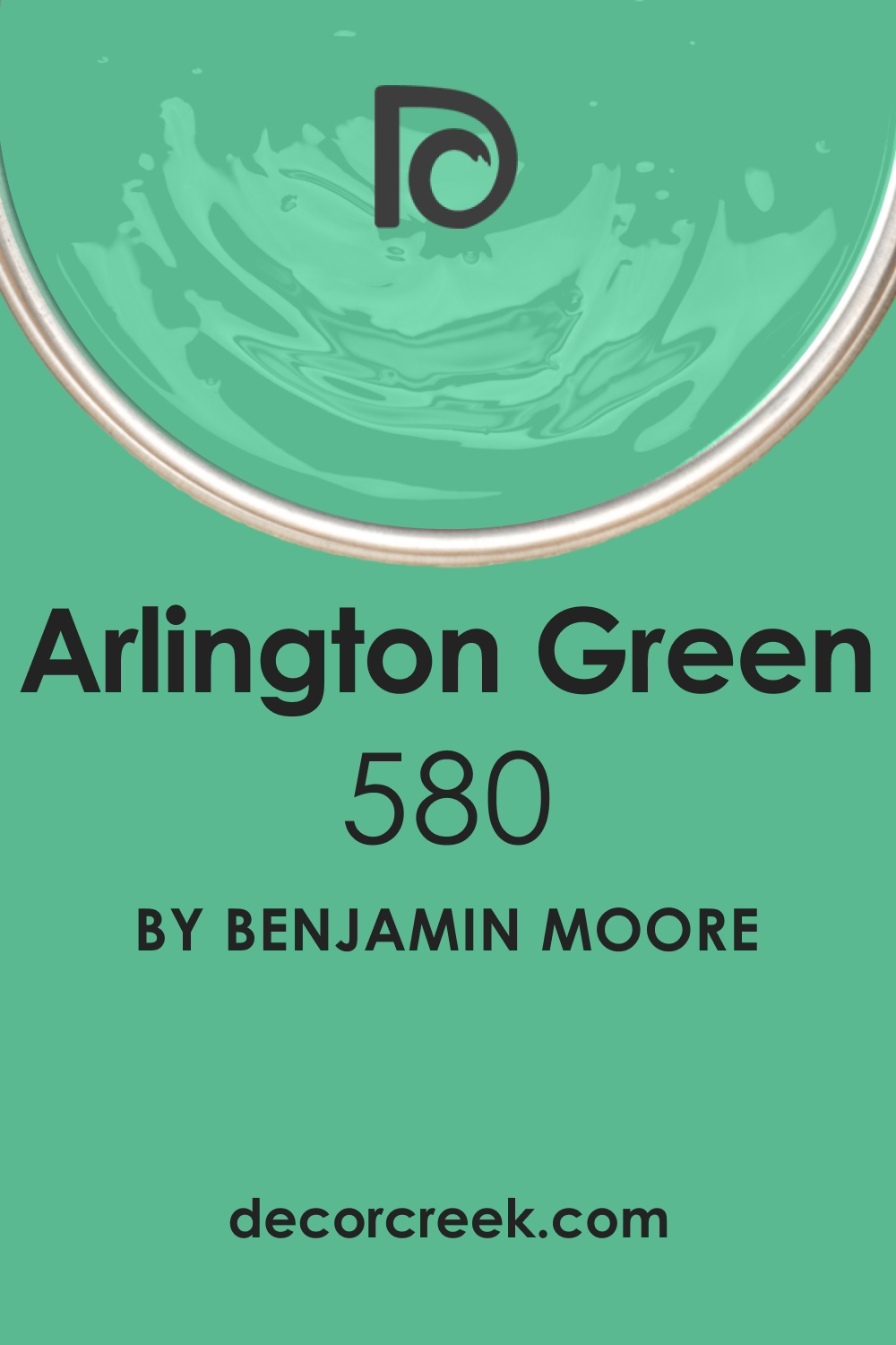
Arlington Green 580, a color by Benjamin Moore, is reminiscent of the lush foliage found in a serene, shaded garden. It is a medium-dark green, with a rich depth that conveys both elegance and earthiness. This color harbors a balance of vibrancy and subdued sophistication, making it versatile in its application.
It pairs exceptionally well with natural materials such as wood, stone, and leather, accentuating their organic beauty. Arlington Green 580 thrives in interior styles that draw from the outdoors; it is perfect for rustic, traditional, and even modern settings that aim to create a statement of refined nature.
Its ability to complement metallic accents, like brass and copper, adds to its versatility, allowing designers to play with a variety of textures and finishes.
Ever wished paint sampling was as easy as sticking a sticker? Guess what? Now it is! Discover Samplize's unique Peel & Stick samples.
Get paint samples
Is It a Warm Or Cool Color?
Despite its green base, Arlington Green 580 leans towards a warm palette due to its yellow undertones. This warmth makes the color inviting and comforting, qualities that are particularly desired in residential interiors. Its warmth enables it to create a cozy atmosphere in homes, wrapping the occupants in a blanket of organic comfort.
The warm attributes of Arlington Green 580 can make spaces feel more intimate and grounded, ideal for living areas and bedrooms where a sense of security and enclosure is often sought.
Undertones of Arlington Green 580
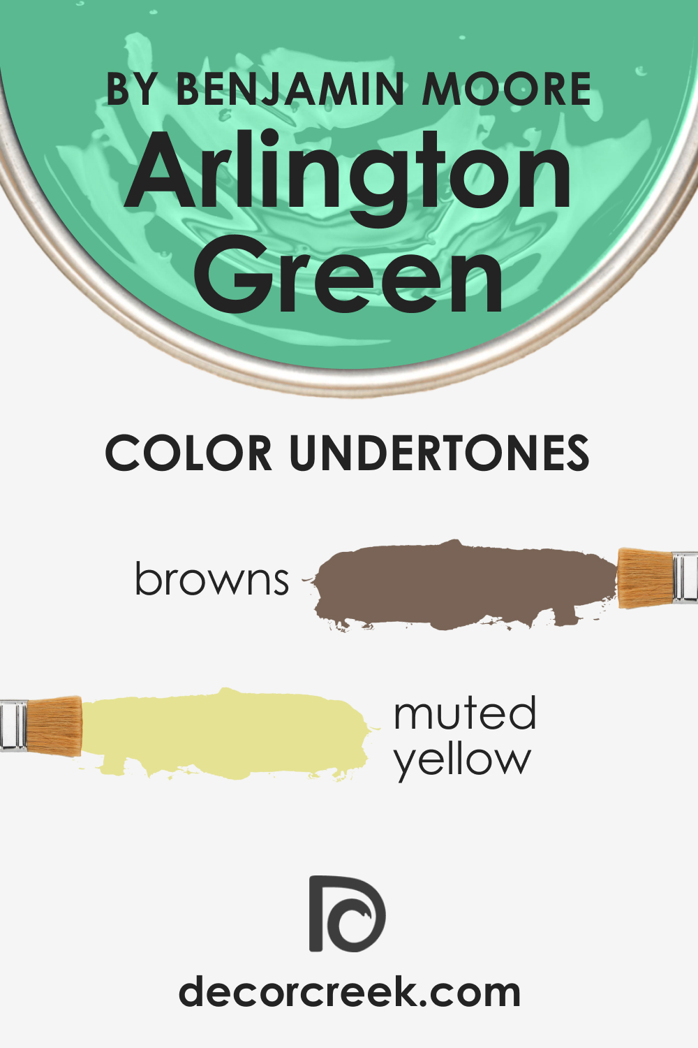
Arlington Green 580 possesses undertones that are a mélange of mossy browns and muted yellows, giving it an earthy base that can appear more vibrant or subdued depending on the lighting. Undertones are critical in color perception; they can alter the dominant shade subtly but significantly. In the case of Arlington Green 580, these undertones contribute to its dynamic nature – under different lighting conditions, the color can shift from a lush meadow green to a more reserved olive tone.
On interior walls, these undertones enable Arlington Green 580 to act as a chameleon, offering a backdrop that can either recede or come to the forefront, making it an excellent choice for rooms that serve multiple purposes.
Coordinating Colors of Arlington Green 580
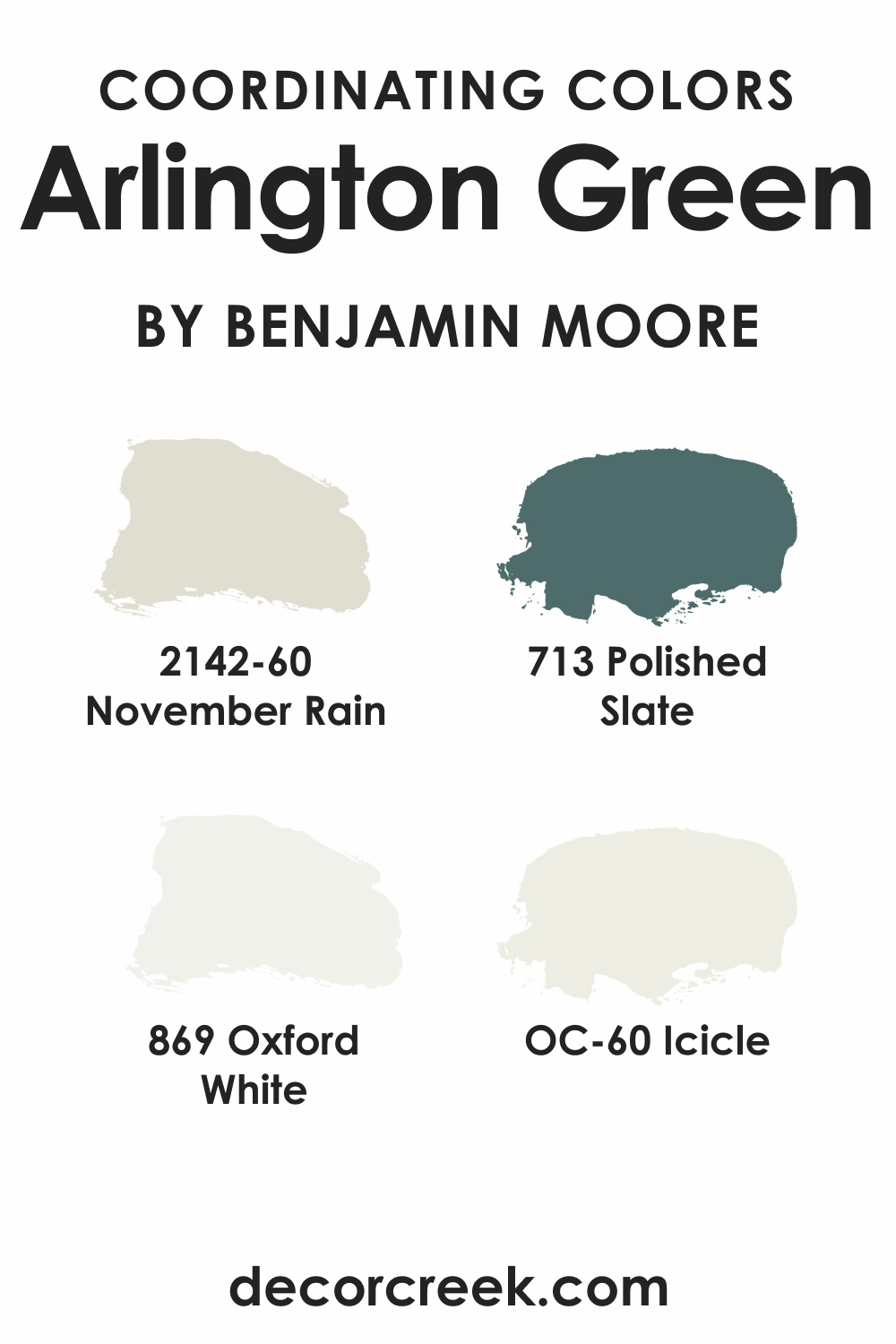
Coordinating colors are those that work in harmony with the primary color, either by complementing or providing an appealing contrast. For Arlington Green 580, the coordinating colors such as OC-60 Icicle , a crisp and airy light blue, and BM 869 Oxford White , a timeless and versatile pure white, highlight its natural essence. BM 713 Polished Slate , a deep gray with blue undertones, can anchor Arlington Green’s vibrancy, while BM 2142-60 November Rain , a soft, neutral gray-green, reflects its calmness.
Additional colors that pair well with Arlington Green 580 include BM 2166-40 Straw (CHECK A SAMPLE), a sunbaked yellow; BM 1055 Smoky Ash (CHECK A SAMPLE), a rich brown with hints of gray; and BM HC-114 Saybrook Sage (CHECK A SAMPLE), a gentle green with a touch of gray, each offering a distinct yet complementary character to the primary hue.
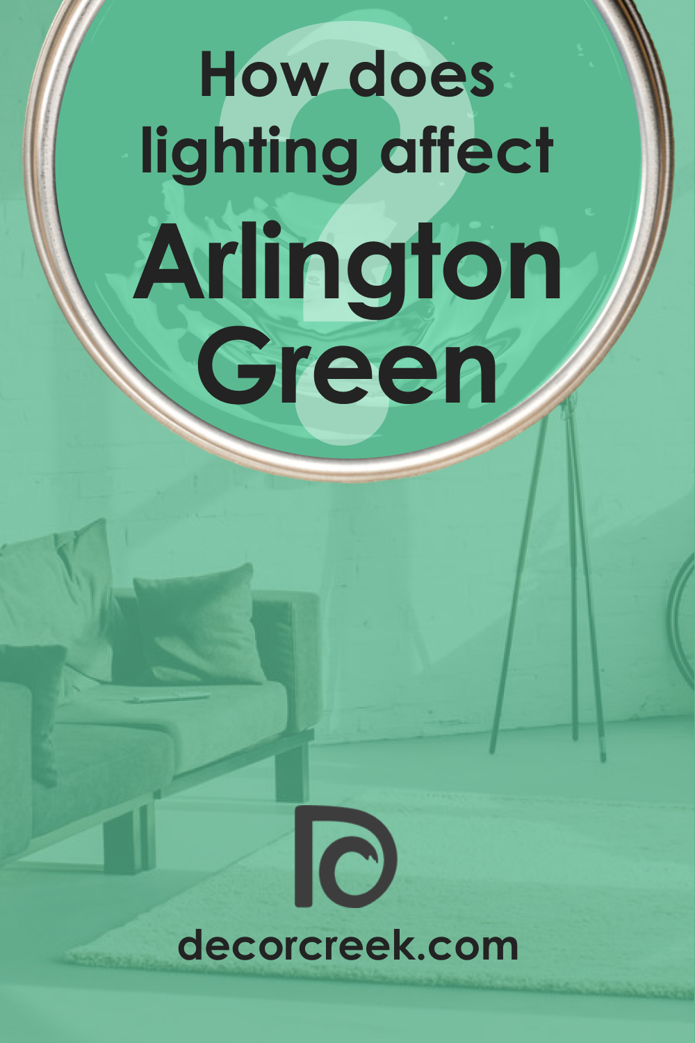
How Does Lighting Affect Arlington Green 580?
Lighting profoundly influences how we perceive color, and Arlington Green 580 is no exception. In natural light, it exhibits a true green that is both invigorating and restful. Under artificial lighting, the type of bulb used can impact its appearance – incandescent lights will enhance its warm tones, while fluorescent lighting may bring out its cooler aspects. In north-facing rooms, Arlington Green 580 may appear more muted, lending a sophisticated touch, whereas in south-facing rooms, it can become quite vivid and lively.
East-facing rooms reveal the color’s brightness in the morning light, transitioning to a more balanced shade in the afternoon. In west-facing rooms, it will bask in a warm, golden glow by evening, creating an enveloping ambiance.
LRV of Arlington Green 580
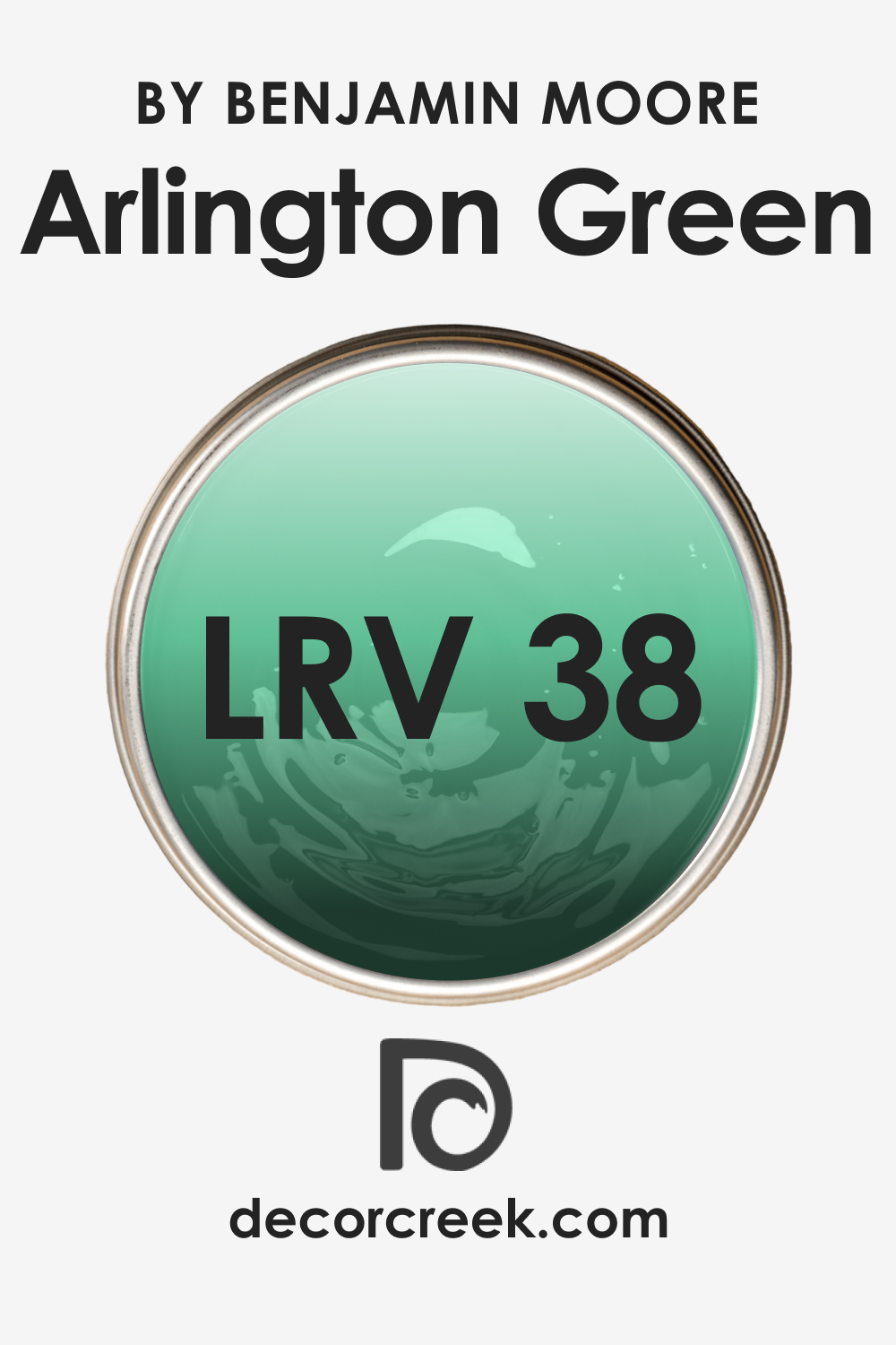
Light Reflectance Value (LRV) measures the percentage of light a paint color reflects, and Arlington Green 580 has an LRV of 38. This places it in the mid-range, meaning it has a balanced interplay of light absorption and reflection. A color with this LRV will neither overpower a room with brightness nor make it feel overly dim. It is significant to consider LRV in color selection, as it can influence the spatial dynamics of a room. With an LRV of 38, Arlington Green 580 can make walls recede or advance visually, impacting the room’s perceived size and ambience.
LRV – what does it mean? Read This Before Finding Your Perfect Paint Color
Trim Colors of Arlington Green 580
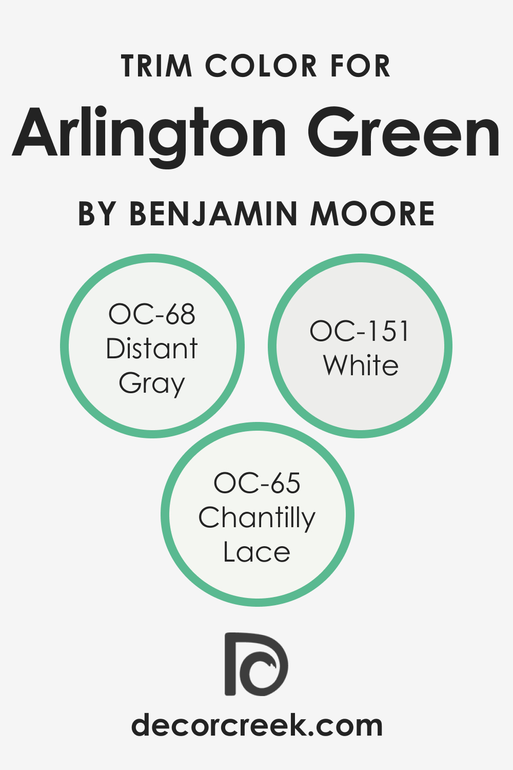
Trim colors serve as the defining lines that can either subtly blend with the wall color or strikingly contrast against it, adding dimension and character to a space. For Arlington Green 580, trim colors in shades of white are excellent for providing a crisp boundary that accentuates its depth.
Colors such as OC-151 White (CHECK A SAMPLE), with its clean and unadulterated hue; OC-65 Chantilly Lace , known for its slight coolness; and OC-68 Distant Gray , with a hint of gray, each enhance the richness of Arlington Green 580 in unique ways.
Colors Similar to Arlington Green 580
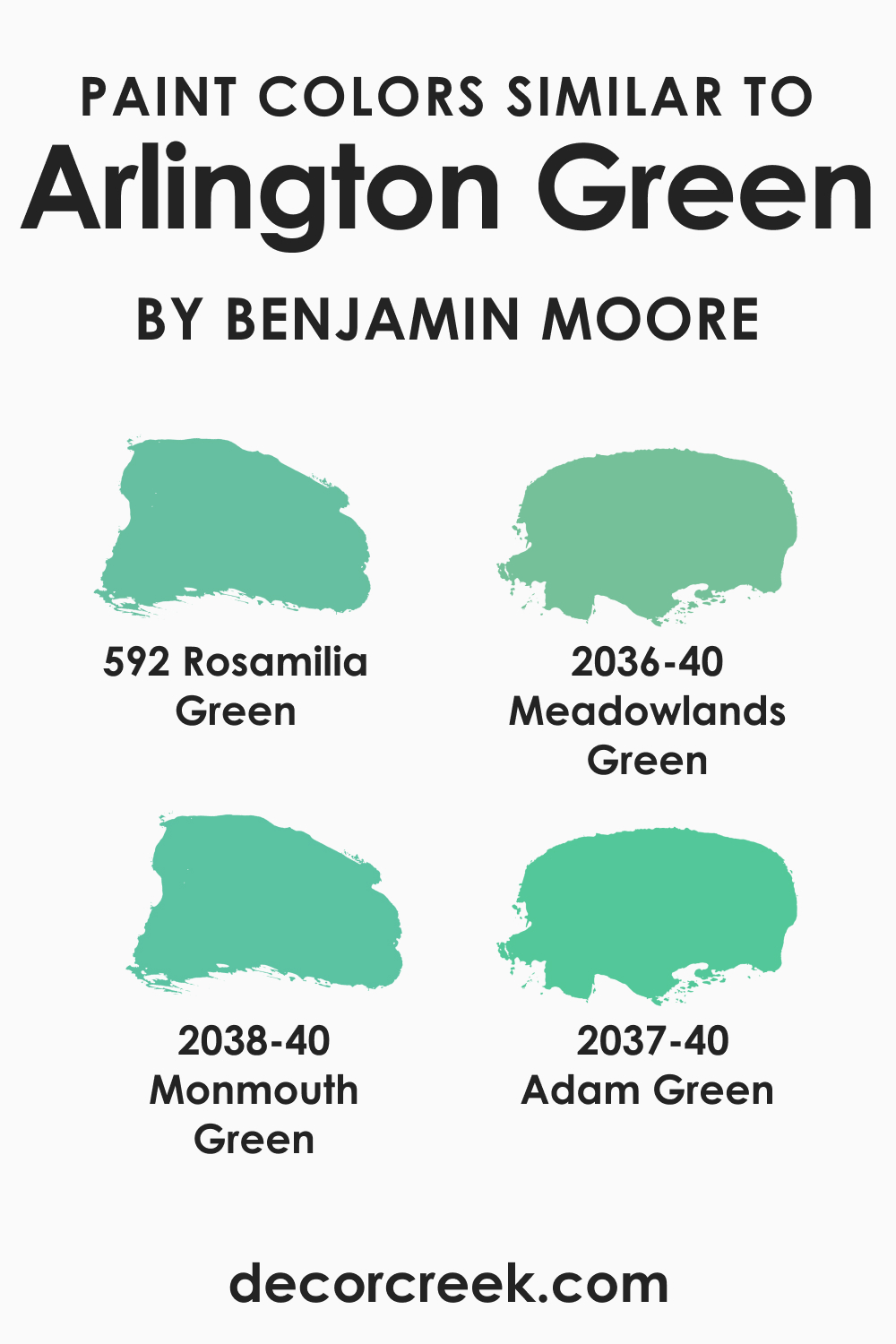
Recognizing colors similar to Arlington Green 580 is beneficial when seeking alternatives or coordinating color schemes. BM 2036-40 Meadowlands Green (CHECK A SAMPLE) is a kin, with a touch more vibrancy; BM 592 Rosamilia Green (CHECK A SAMPLE) offers a slightly dustier version, while BM 2038-40 Monmouth Green (CHECK A SAMPLE) carries a similar depth with a cooler slant.
BM 2037-40 Adam Green (CHECK A SAMPLE) presents a harmonious alternative with an added grayish tone. Each of these bears a resemblance to Arlington Green 580, allowing for a cohesive design strategy with slight variations in mood and tone.
Colors That Go With Arlington Green 580
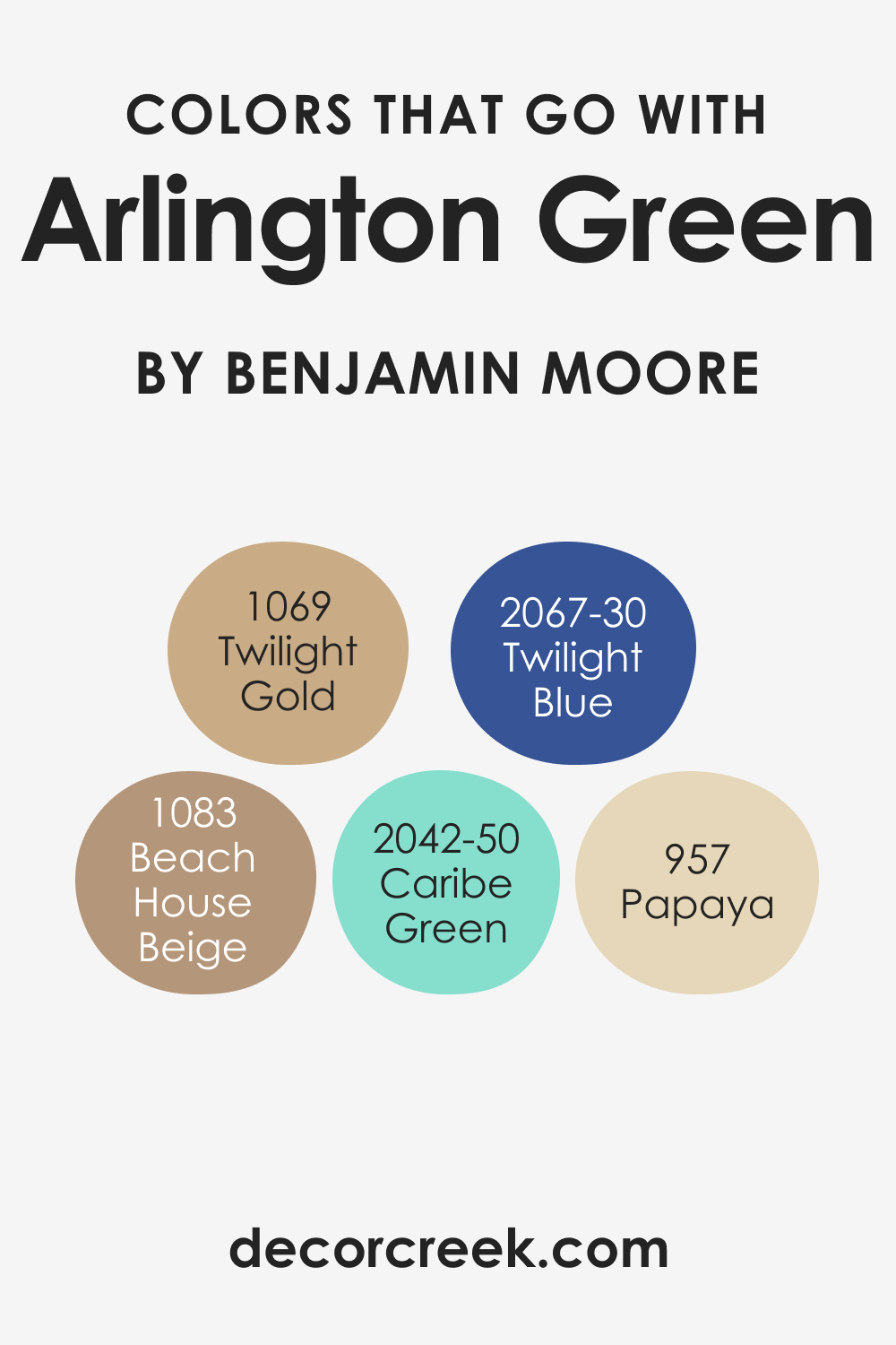
The right combination of colors can enhance the atmosphere of a room, creating a visually appealing and emotionally resonant space. Colors by Benjamin Moore that harmonize with Arlington Green 580 include the warm and inviting BM 1069 Twilight Gold (CHECK A SAMPLE), the soft and sophisticated BM 957 Papaya (CHECK A SAMPLE), the deep and rich BM 2067-30 Twilight Blue (CHECK A SAMPLE), the calming and neutral BM 1083 Beach House Beige (CHECK A SAMPLE), and the crisp and airy BM 2042-50 Caribe Green (CHECK A SAMPLE).
Each color offers a unique element that can complement Arlington Green 580, enriching its natural elegance and bringing balance to the overall design.
How to Use Arlington Green 580 In Your Home?
Arlington Green 580, a deep and enigmatic hue, brings the essence of nature indoors, making it a robust choice for those looking to imbue their home with a touch of the outdoors. This rich color is versatile enough for use in various rooms, including the study, bedroom, or living spaces.
Its earthy quality fits perfectly with rustic and traditional interiors but can also be a striking contrast in modern and minimalist designs. Use it alongside natural materials like wood and stone for an organic feel, or pair it with brass and gold accents for a more luxurious touch.
How to Use Arlington Green 580 in the Bedroom?
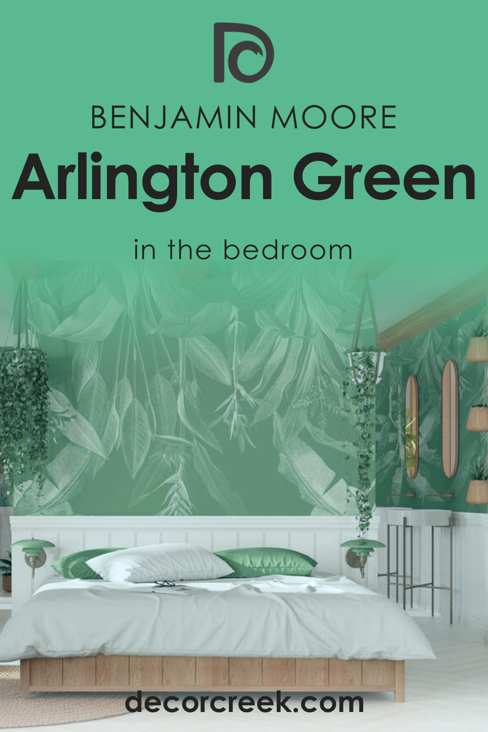
In the bedroom, Arlington Green 580 serves as a grounding backdrop, promoting a sense of tranquility and connection to the earth. This color works well with dark woods and leather, complementing an old-world style, or can be brightened with light linens and curtains for a more contemporary approach.
Use it on a feature wall behind the bed to anchor the space, allowing for softer hues in accessories and bedding to balance the room’s energy.
How to Use Arlington Green 580 in the Bathroom?
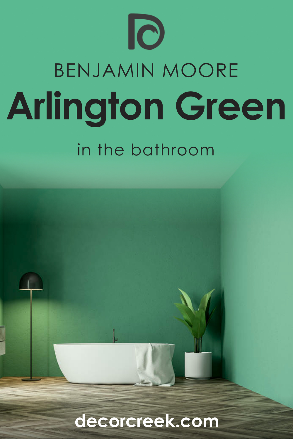
Arlington Green 580 can transform a bathroom into a woodland retreat, offering depth and sophistication. Its rich tone makes it an excellent choice for vanity cabinets or as an accent wall. Balance its intensity with light-colored tiles and fixtures to avoid overwhelming the space. Incorporate elements like bamboo towels and a wooden bath mat to maintain an earthy, spa-like ambiance.
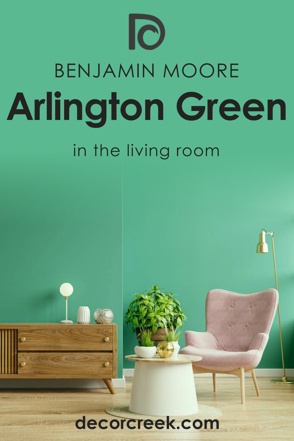
How to Use Arlington Green 580 in the Living Room?
Employing Arlington Green 580 in the living room can create a statement of elegance and comfort. It pairs well with heavy fabrics like velvet for drapes or upholstery, contributing to a luxurious and cozy atmosphere. For a touch of contrast, use it alongside warm neutral tones in your furniture or rugs. This color can also highlight architectural features like fireplaces or built-in bookcases, enhancing the character of the space.
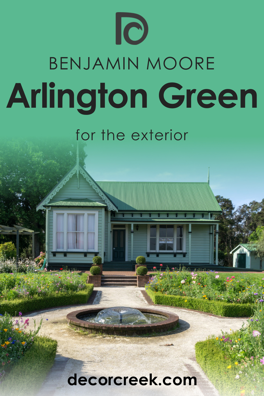
How to Use Arlington Green 580 for an Exterior?
Arlington Green 580 on the exterior conveys a stately presence, complementing natural stone or brick. It’s especially suitable for trim and shutters, offering a timeless look when contrasted with lighter siding colors. For a cohesive landscape design, integrate evergreen plants and shrubbery, which naturally accentuate the green’s depth and add to the home’s curb appeal.
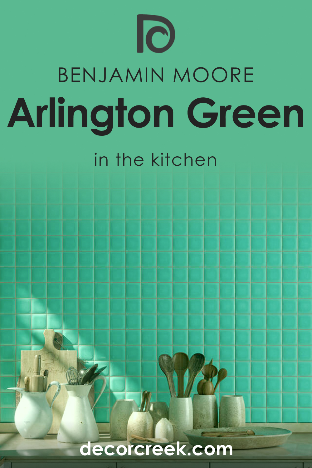
How to Use Arlington Green 580 in the Kitchen?
In the kitchen, Arlington Green 580 introduces a vibrant splash of color when used on walls or as an accent. It works exceptionally well with butcher block countertops and copper cookware, exuding a warm, rustic charm. If you opt for this color on walls, keep cabinetry in lighter shades to avoid a heavy feel, and consider open shelving to break up the intensity of the green.
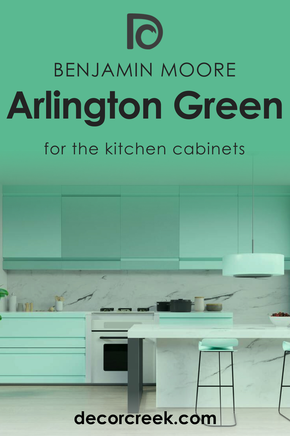
How to Use Arlington Green 580 on Kitchen Cabinets?
Kitchen cabinets painted in Arlington Green 580 can create a focal point in your culinary space. The color’s depth is a beautiful canvas for both vintage-style knobs and modern handles. Complement the green with light wall colors and countertops to ensure the cabinets stand out. Introduce indoor plants as decor, which will thrive visually and literally against this lush backdrop.
Comparing Arlington Green 580 With Other Colors
Comparing colors like Arlington Green 580 with others is vital for designers and homeowners to understand the nuances that different hues bring to a space. A color’s value, saturation, and warmth or coolness can dramatically affect its visual impact and how it pairs with other colors within a design scheme. Such comparisons also help in identifying complementary colors, creating a cohesive palette, or producing the desired emotional and psychological effects in a space.
The subtle variations between shades can influence the atmosphere of a room, dictate the style, and even affect lighting perception.
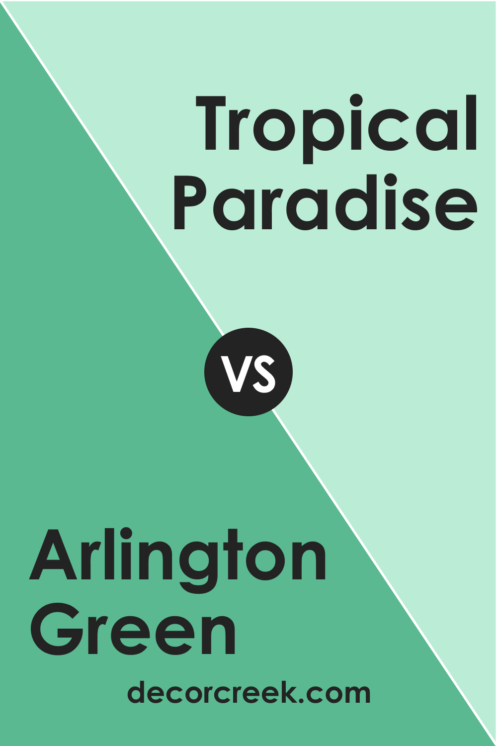
Arlington Green 580 vs. BM 575 Tropical Paradise
While Arlington Green 580 is a deep, muted green, Benjamin Moore’s 575 Tropical Paradise (CHECK A SAMPLE) swings to the lighter, more vibrant end of the spectrum. Tropical Paradise has a luminous quality that can energize a space, contrasting the more subdued and grounding influence of Arlington Green.
In a room, Arlington Green can anchor the design with its darker tone, whereas Tropical Paradise could serve as an invigorating accent, particularly in a tropical or beach-themed decor.
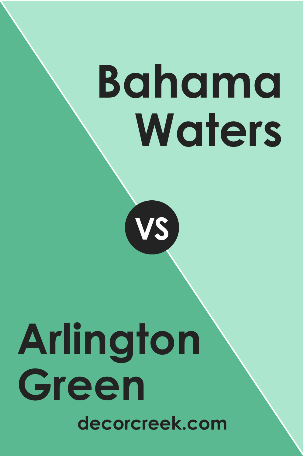
Arlington Green 580 vs. BM 576 Bahama Waters
Arlington Green 580 and BM 576 Bahama Waters (CHECK A SAMPLE) offer two different perspectives on a nature-inspired palette. Bahama Waters is reminiscent of clear, shallow waters, providing a serene and calming effect, whereas Arlington Green draws from the deeper, more mysterious aspects of natural settings. In an interior space, Bahama Waters would brighten and open up the area, while Arlington Green would create a more intimate and cozy ambiance.
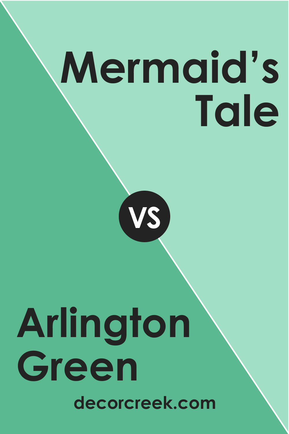
Arlington Green 580 vs. BM 577 Mermaid’s Tale
Arlington Green 580, with its earthy depth, is in stark contrast to the enchanting vibrancy of BM 577 Mermaid’s Tale (CHECK A SAMPLE). Mermaid’s Tale is a bold color that captures the whimsical charm of underwater myths, whereas Arlington Green is firmly planted in the quietude of a forest floor.
They could work together in a space that aims for balance, with Mermaid’s Tale bringing a pop of fantasy to the steadfast nature of Arlington Green.
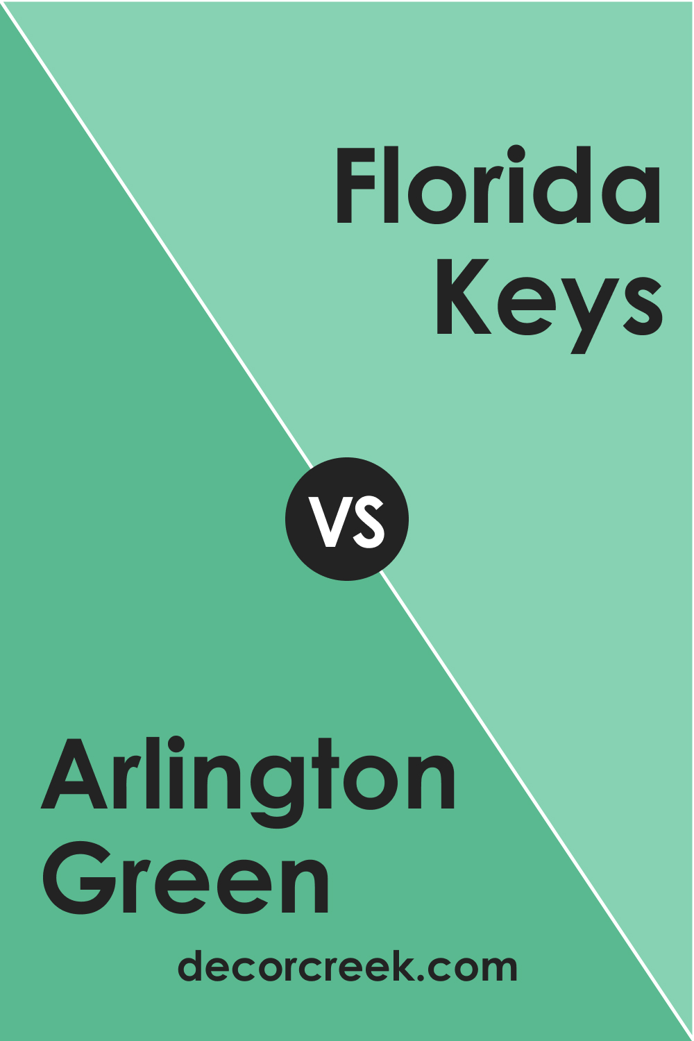
Arlington Green 580 vs. BM 578 Florida Keys
BM 578 Florida Keys (CHECK A SAMPLE) is a bright, cheerful green that can remind one of sunny, palm-lined landscapes, quite the opposite of the reserved and stately Arlington Green 580. Florida Keys would work well in a space that seeks to be uplifting and light-hearted, providing a stark difference to the seriousness that Arlington Green can convey.
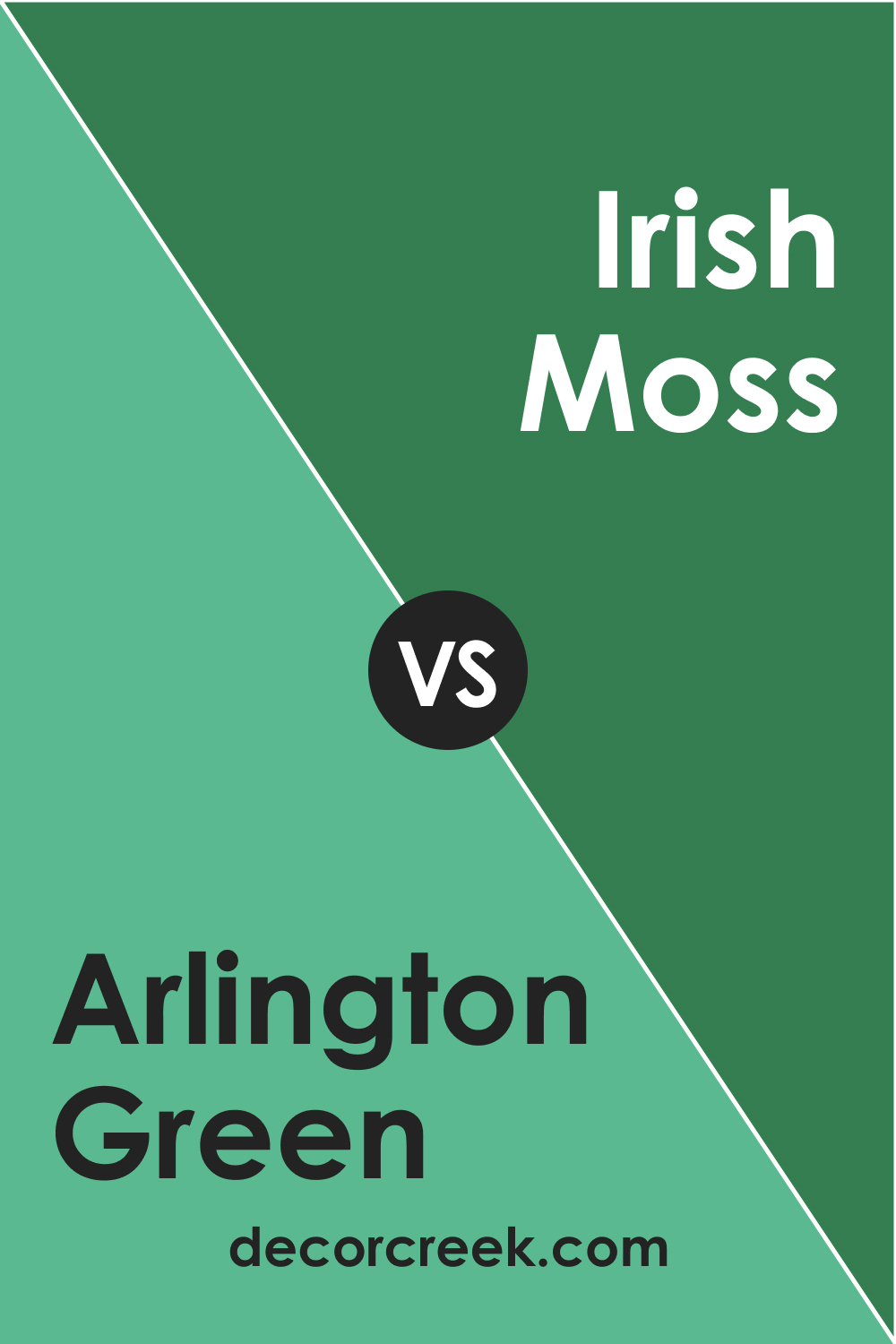
Arlington Green 580 vs. BM 2036-20 Irish Moss
When set against BM 2036-20 Irish Moss (CHECK A SAMPLE), Arlington Green 580 appears as the more conservative and muted option. Irish Moss has a vibrancy that can infuse life into a design, while Arlington Green is more likely to recede, providing a backdrop that emphasizes stability and solidity. Both shades draw from natural elements but express different moods and energies within a space.
Arlington Green 580 vs. BM 581 Floradale Isle
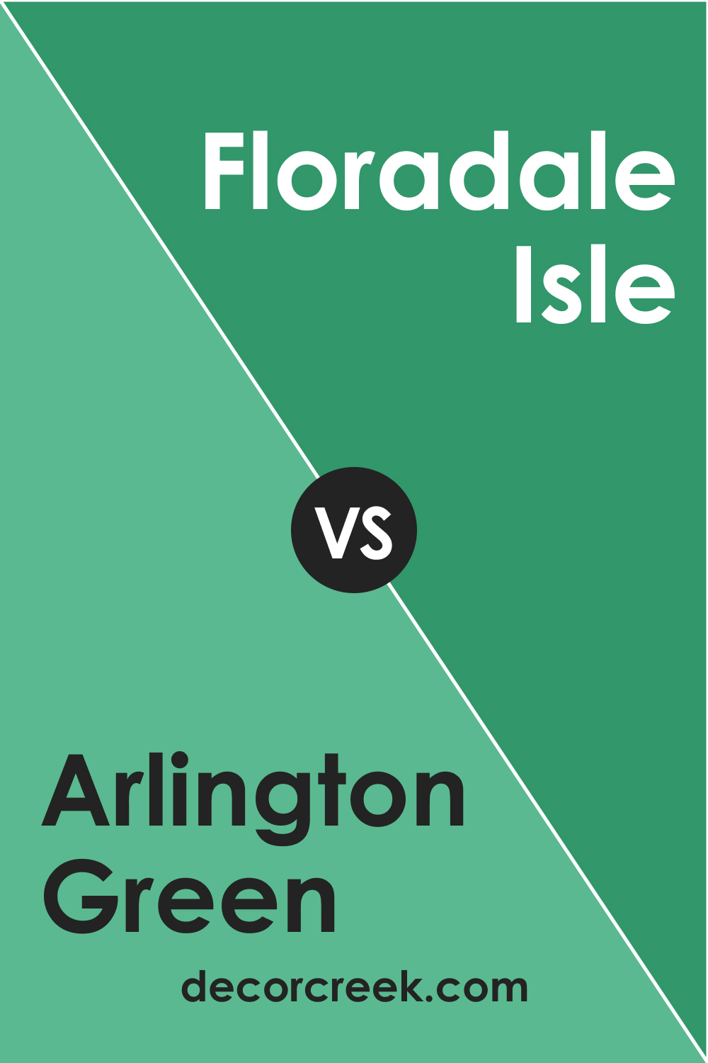
BM 581 Floradale Isle (CHECK A SAMPLE) presents a soft, almost pastel-like green that contrasts with the density of Arlington Green 580. Floradale Isle’s gentle presence can make a room feel airy and light, providing a nice counterbalance to the more substantial feel of Arlington Green.
In a palette, Floradale Isle could soften the gravity of Arlington Green, creating a balanced and harmonious environment.
Conclusion
Arlington Green 580 by Benjamin Moore is not just a paint color but a design statement that invites nature’s palette into the home. Its warm undertones and adaptability to various lighting conditions make it an excellent choice for those looking to create a space with depth and character.
Understanding its LRV, coordinating colors, and potential trim options allows homeowners and designers to fully exploit its potential, crafting environments that are not only visually stunning but also resonate with the desired ambiance.
Whether used as an accent or a focal point, Arlington Green 580 is a color that promises to transform spaces into harmonious havens of comfort and style.
