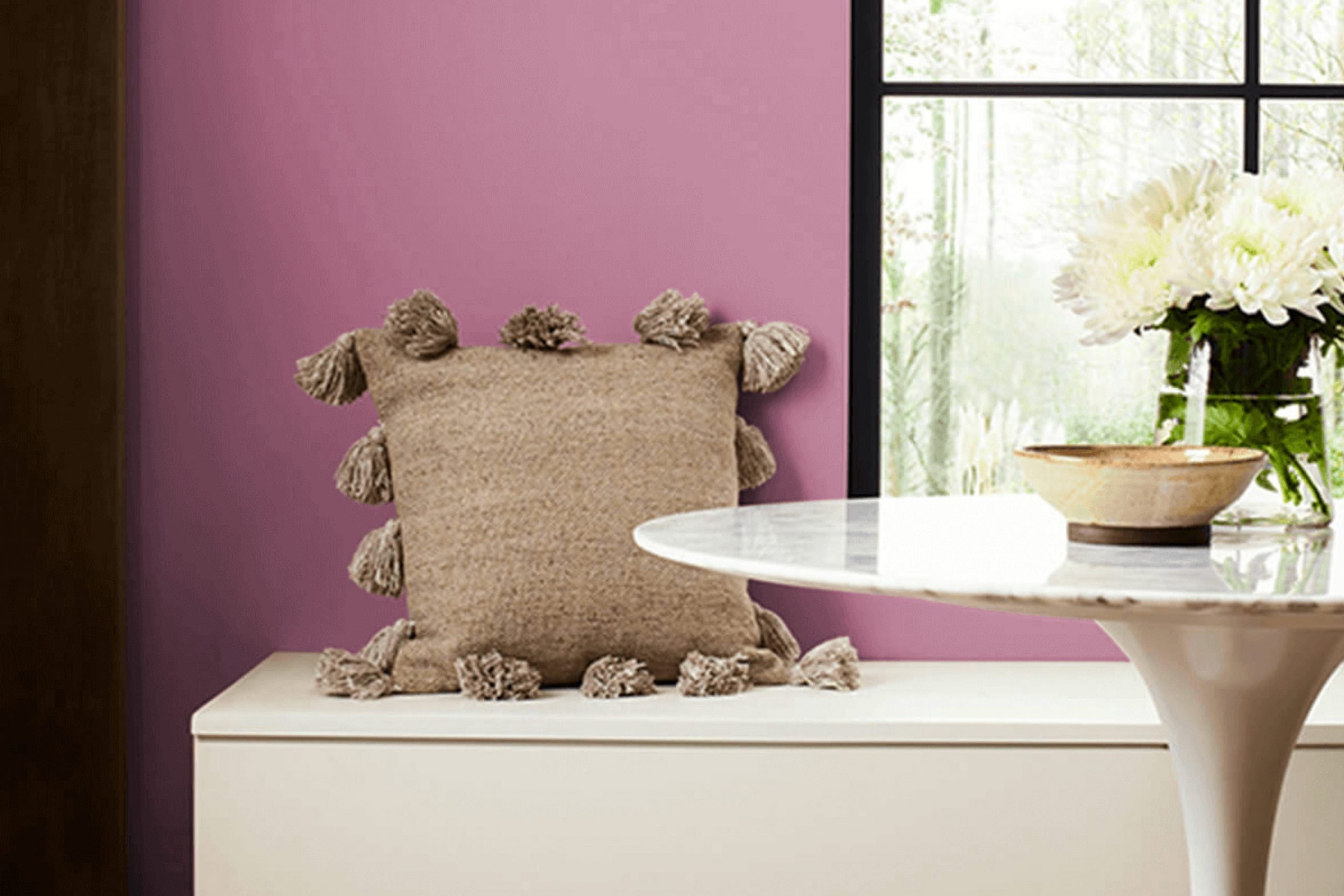
I recently stumbled upon SW 6564 Red Clover by Sherwin Williams, and I must say, its unique charm immediately caught my attention. Red Clover isn’t just any red; it’s a vibrant hue that beautifully balances depth and brightness, making it incredibly versatile for various spaces.
Whether you’re thinking about adding a bold statement wall in your living room or looking for the perfect color to liven up a cozy corner, Red Clover offers a fresh and lively splash of color. This shade particularly stands out because of its ability to adapt to different lighting conditions, showcasing a range of intensities from soft and warm to rich and bold.
In my experience, pairing it with neutral tones or soft pastels can create a soothing yet energetic atmosphere, perfect for areas where you spend a lot of your time. It’s an interesting color choice for anyone looking to bring a sense of freshness and vitality into their home without overwhelming the space with too intense a palette.
So, if you’re curious to see how SW 6564 Red Clover can transform your space, it might just be the time to give it a try.
What Color Is Red Clover SW 6564 by Sherwin Williams?
Red Clover by Sherwin Williams is a vibrant and warm shade that brings a lively burst of energy into any space. This particular hue is a deep, rich variant of red with a subtle hint of pink, making it both playful and comforting. It exudes a cozy, inviting vibe perfect for areas where warmth and conviviality are desired.
Ideal for eclectic and bohemian interiors, Red Clover adds a dramatic flair that pairs excellently with natural materials like wood and leather, enhancing their organic beauty. It also works well in traditional settings, where its depth can complement rich textiles like velvet or silk, adding a layer of plush luxury.
Red Clover is versatile in its application – it can create an eye-catching accent wall or warm up an entire room. When used in the kitchen or dining area, it can stimulate appetite and conversation, while in a living room, it brings a snug and welcoming atmosphere.
For pairing, think of contrast and texture: cool metals like brushed nickel or chrome can offer a striking counterbalance to Red Clover’s warmth. Incorporating woven rugs or chunky knit throws will add tactile diversity, enriching the visual appeal and making spaces feel grounded yet dynamic.
Is Red Clover SW 6564 by Sherwin Williams Warm or Cool color?
Red Clover SW 6564, a paint color from Sherwin Williams, adds a bold touch to any room. It’s a vivacious shade of red with a hint of pink, giving it a fresh and lively feel. This color is great for spaces where energy and warmth are desired.
Used in a living room, it can make the space feel welcoming and vibrant, perfect for gathering with friends or family. It also works well in a dining area, where it encourages a lively atmosphere for meals and conversation.
Because it’s so striking, Red Clover is best balanced with neutral tones like whites, creams, or light grays. This helps prevent the color from overwhelming the space. In small rooms or on accent walls, it can create a focal point without making the area feel too closed in. Careful use of this bright shade can really make your home decor stand out and create a cheerful home environment.
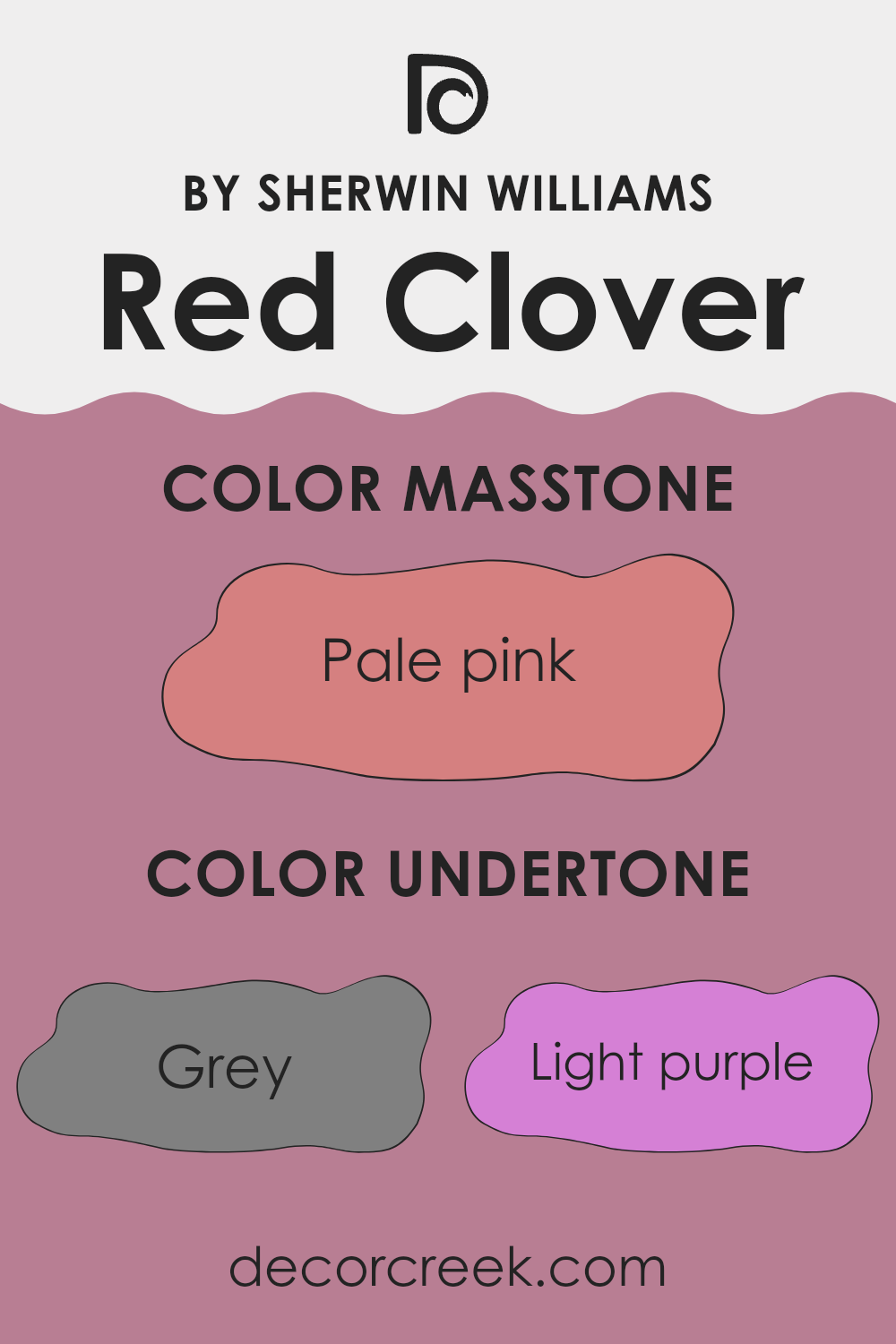
Undertones of Red Clover SW 6564 by Sherwin Williams
The color Red Clover has a unique mix of undertones that can affect how it appears when used on interior walls. Undertones, which are subtle hints of other colors mixed into the main color, play a big role in how we perceive the color overall. For example, the grey undertone in Red Clover can give it a cooler feel, making it fit well in modern or minimalist decors. Light purple and lilac undertones add a gentle, playful touch, making the color softer and more appealing in spaces like bedrooms or family rooms.
Pink and fuchsia undertones bring a vibrant, energetic vibe to the color, which can make a room feel more lively and inviting. This makes it a great choice for areas where you entertain guests or where children play. The pale yellow and light green undertones can help brighten a space and make it feel more open and airy.
When used on interior walls, the various undertones in Red Clover can influence the mood and style of a room. Because the color contains elements of both warm (like orange and brown) and cool tones (like mint and light blue), it can be quite versatile. It can complement a variety of decor styles and furniture colors, from classic wood pieces to more contemporary metal and glass accents.
By understanding these undertones, you can better decide where and how to use this color in your home to create the desired effect.
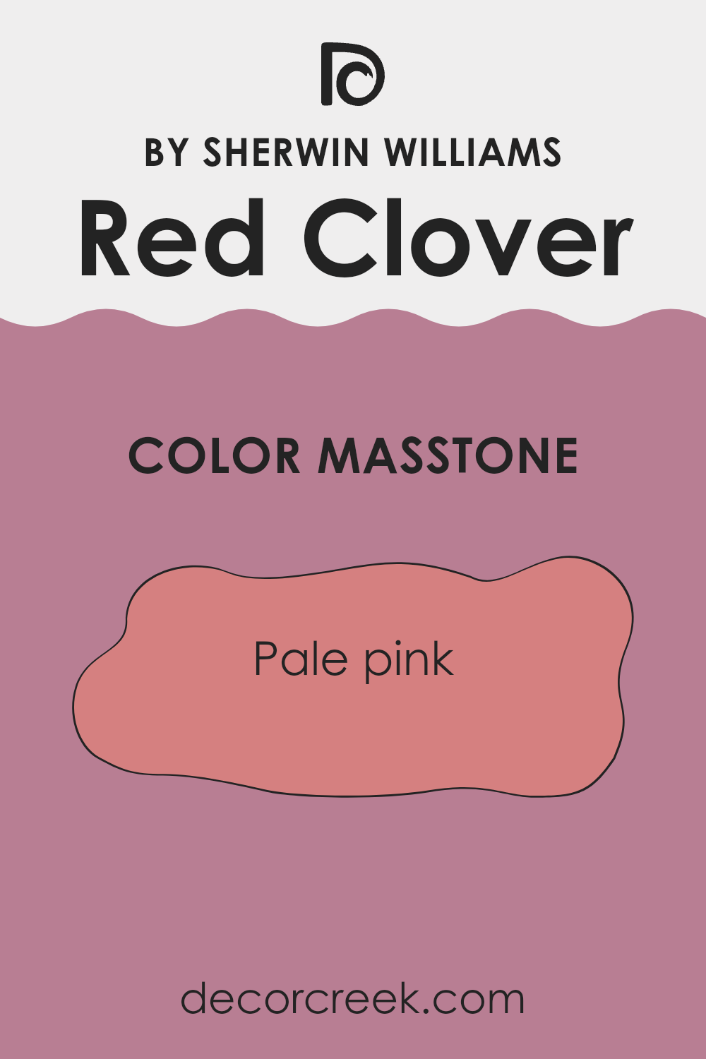
What is the Masstone of the Red Clover SW 6564 by Sherwin Williams?
Red Clover SW 6564 by Sherwin Williams, with its masstone of pale pink (#D58080), brings a cheerful and soft presence to any room. This specific shade of pink is light enough not to overpower a space but has enough color to add a gentle, warm touch.
Such a hue is perfect for spaces intended to have a cozy and welcoming feel, like nurseries or reading nooks. In larger areas, like living rooms, this color can be applied on one wall to create a subtle focal point without making the room look too busy.
The lightness of pale pink also helps in smaller or less-lit rooms, making them appear more spacious and brighter. This color works well in combination with light neutrals such as whites and beiges, which can help maintain a fresh and airy feel. It’s also flexible enough to complement darker colors, adding a hint of warmth and softness to the overall decor palette.
How Does Lighting Affect Red Clover SW 6564 by Sherwin Williams?
Lighting plays a crucial role in how we perceive colors. The color Red Clover, a vibrant shade of red, can exhibit varying appearances under different lighting conditions.
In artificial light, such as LED or incandescent lighting, Red Clover may appear warmer and more vivid. Artificial lighting, especially if it leans towards a warm temperature, can intensify the red hues, making them appear more dynamic and rich. This can make rooms painted in Red Clover feel cozy and inviting during the evening or in spaces without natural light.
In natural light, the appearance of this color can change depending on the time of day and the weather. On a bright sunny day, Red Clover can look very bright and striking, as the natural light highlights its vibrant tones. On a cloudy day, however, it might appear slightly muted but still retains its warmth.
The orientation of a room also affects how Red Clover looks:
- North-facing rooms: These rooms typically receive less direct sunlight, often casting a cooler, bluish light. In such rooms, Red Clover can appear somewhat darker and less vibrant. It could make the room feel smaller or more subdued.
- South-facing rooms: These rooms benefit from plentiful sunlight most of the day, which can make Red Clover look exceptionally bright and warm. The color can really pop in these conditions, making the room feel energetic and lively.
- East-facing rooms: These get sunlight in the morning, which is generally gentle and warm. Red Clover will look bright and cheerful in the morning but might lose some vibrancy as the day progresses and the natural light diminishes.
- West-facing rooms: Evening light, which can be quite warm and golden, will enhance the richness of Red Clover, making it appear more intense and lively towards the end of the day.
Understanding the impact of lighting on this vibrant shade can help in making informed decisions about using this color in different spaces and lighting scenarios.
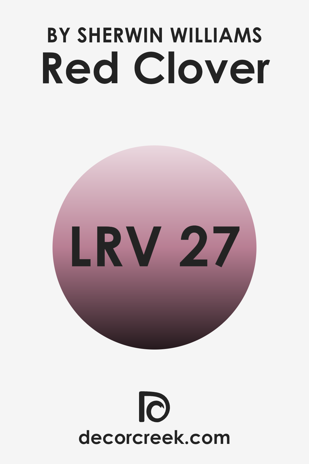
What is the LRV of Red Clover SW 6564 by Sherwin Williams?
LRV stands for Light Reflectance Value, which measures the amount of light a paint color reflects or absorbs when light hits it. LRV is scored on a scale where higher numbers indicate that the color reflects more light, making rooms feel brighter and more open.
Conversely, lower LRV scores mean the color absorbs more light, which can make a space feel cozier but also smaller and darker. When choosing paint colors, considering the LRV helps in determining how colors might alter the perception of a space’s size and lighting.
With an LRV of 27.156, Red Clover by Sherwin Williams is a darker shade that absorbs more light than it reflects. This characteristic makes it a choice likely to add a sense of warmth and intimacy to rooms, especially those that are spacious and get plenty of natural light. In smaller or less well-lit spaces, using a color with this LRV might make the room feel more enclosed.
Therefore, when using this particular hue, lighting should be a key consideration to ensure the space doesn’t become too dark.
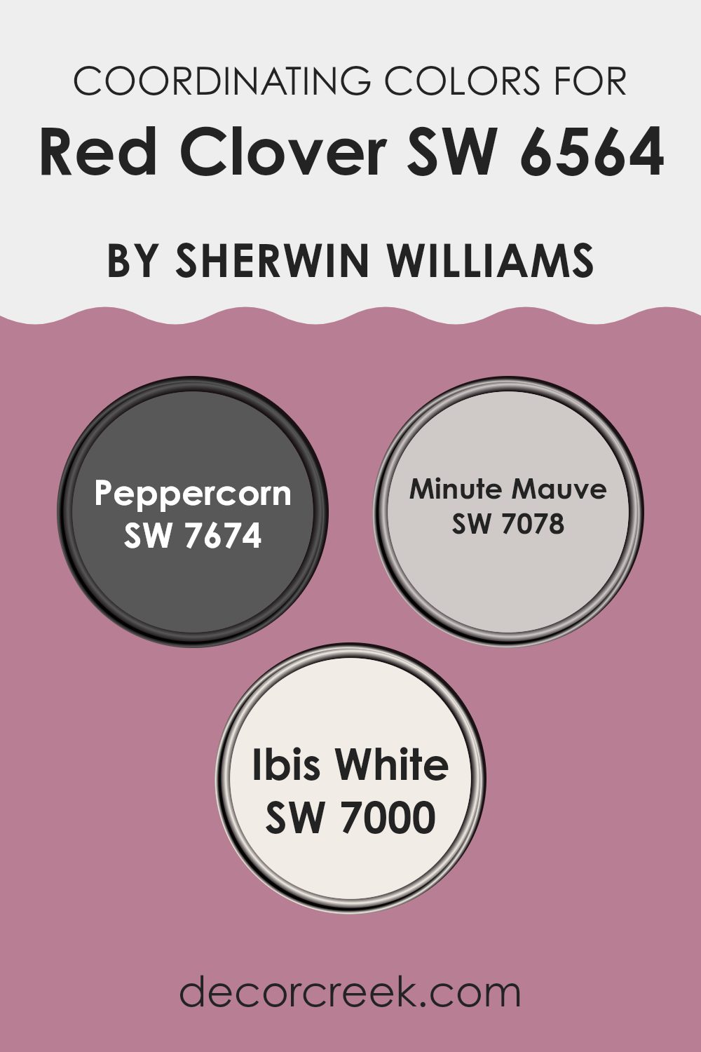
Coordinating Colors of Red Clover SW 6564 by Sherwin Williams
Coordinating colors work to complement a main color, enhancing the overall aesthetic and creating a harmonious blend in any space. Coordinating colors for Red Clover by Sherwin Williams include Peppercorn, Minute Mauve, and Ibis White.
These colors have been carefully selected to work well together, offering a range of shades that support and highlight the depth and vibrancy of Red Clover. This combination can give any room a balanced and inviting look, whether you’re aiming for a subtle backdrop or a striking focal point.
Peppercorn is a deep, almost charcoal gray that provides a strong contrast to the more vibrant Red Clover, grounding the color scheme with its rich intensity. Minute Mauve offers a softer approach, with its gentle blush of purple adding a touch of warmth and softness to the palette. Ibis White acts as the perfect neutral, bright and clean, to lift and illuminate the overall look of the room. Together, these colors create a cohesive and appealing environment and can be used in various ways depending on the desired effect, from highlighting architectural features to crafting a relaxing atmosphere.
You can see recommended paint colors below:
- SW 7674 Peppercorn
- SW 7078 Minute Mauve
- SW 7000 Ibis White
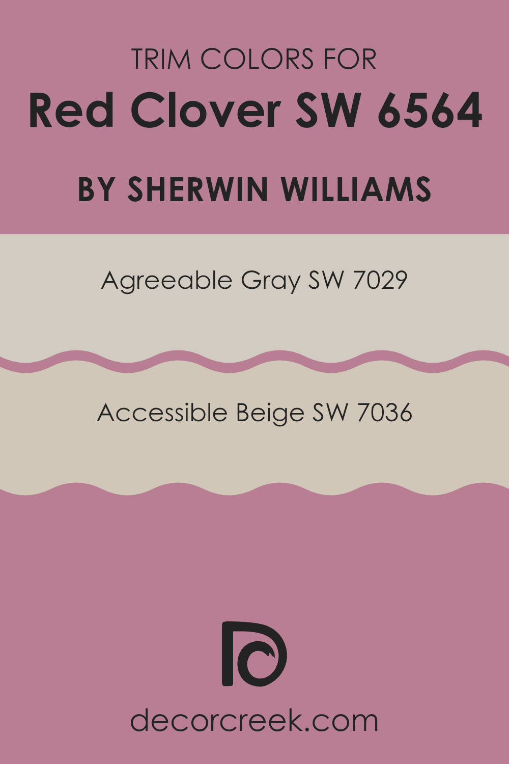
What are the Trim colors of Red Clover SW 6564 by Sherwin Williams?
Trim colors are essential elements in painting as they help define and accentuate architectural features, highlight the lines and contours of a room, and create visual interest. Trim paint, typically used for baseboards, moldings, doors, and windows, contrasts with the wall color to create a polished look.
For Red Clover SW 6564 by Sherwin Williams, a vibrant and cheerful hue, selecting the right trim colors is crucial for balancing its intensity and drawing subtle attention to the details in a space. Using colors such as SW 7029, Agreeable Gray, and SW 7036, Accessible Beige can provide a soft, neutral frame that complements the boldness of Red Clover without overwhelming it.
Agreeable Gray is a warm gray with earthy taupe undertones, providing a muted contrast that is gentle yet distinct against more saturated colors. It works beautifully to soften the impact of a strong color like Red Clover, ensuring the space feels inviting and well-coordinated.
On the other hand, Accessible Beige is a light beige with a grayish tint, making it an excellent choice for those seeking a little warmth in their trim color while keeping the overall aesthetic light and airy.
Both colors serve as versatile backdrops, making them ideal for various design styles and ensuring they enhance, rather than clash with, the bold character of Red Clover.
You can see recommended paint colors below:
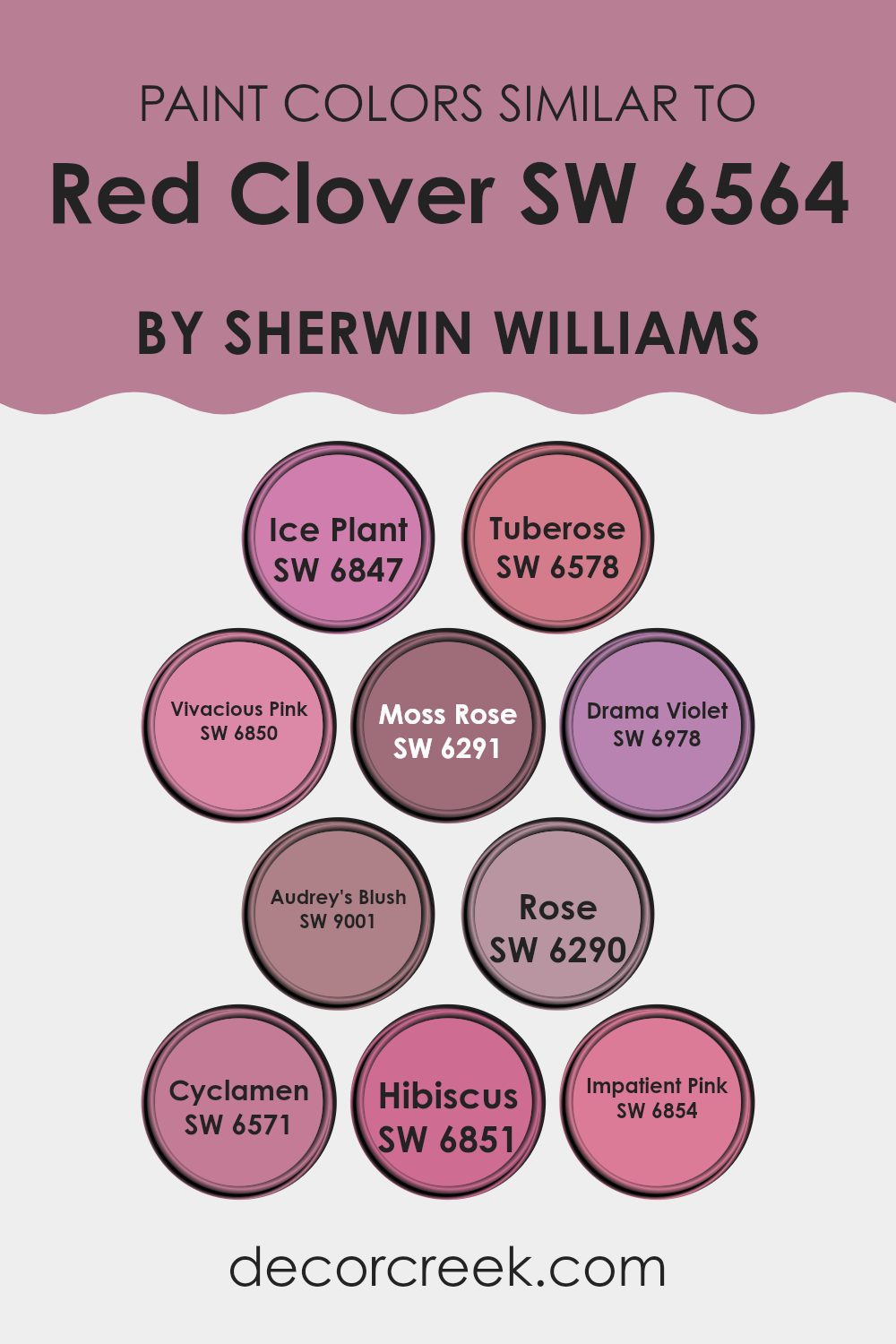
Colors Similar to Red Clover SW 6564 by Sherwin Williams
Using similar colors in design can create a harmonious and cohesive look, especially when the colors interchange subtly. This is true with colors close to Red Clover by Sherwin Williams, a vibrant and lively hue that adds a splash of energy to any space. Colors such as Ice Plant and Tuberose work well in this scheme because they offer a slight deviation in tone which maintains visual interest without straying too far from the primary color theme. Ice Plant provides a cooler, more subdued pink, while Tuberose offers a richer, deeper variation, great for adding depth.
Colors like Vivacious Pink and Moss Rose bring vibrancy and life, perfect for accentuating details or for use in a playful space. Vivacious Pink, true to its name, is bold and bright, while Moss Rose has a more earthy, muted tone that complements wood and natural textures beautifully.
Additionally, Drama Violet and Audrey’s Blush introduce a luxurious feel to the palette; Drama Violet with its deep, intense tone that adds a bit of mystery, and Audrey’s Blush with a soft, gentle pink that’s easy on the eyes and great for creating a soothing atmosphere. Rose and Cyclamen are also lovely; Rose is a classic, rich pinkish-red, and Cyclamen has a more purplish tint, perfect for giving a unique touch to any design scheme.
Lastly, Hibiscus and Impatient Pink provide options for those looking to brighten spaces—Hibiscus with its bold, punchy hue and Impatient Pink with a playful, cheery vibe. Together, these colors create a flexible palette that allows for various design alternatives, suited to bring warmth and excitement to any decorating project.
You can see recommended paint colors below:
- SW 6847 Ice Plant
- SW 6578 Tuberose
- SW 6850 Vivacious Pink
- SW 6291 Moss Rose
- SW 6978 Drama Violet
- SW 9001 Audrey’s Blush
- SW 6290 Rose
- SW 6571 Cyclamen
- SW 6851 Hibiscus
- SW 6854 Impatient Pink
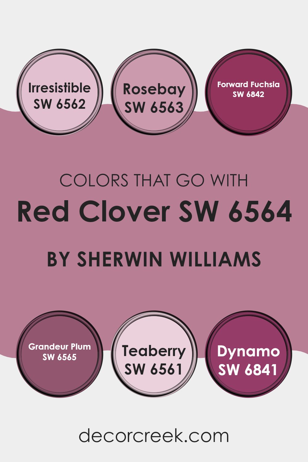
Colors that Go With Red Clover SW 6564 by Sherwin Williams
Choosing the right colors to complement Red Clover SW 6564 by Sherwin Williams can greatly enhance the visual appeal and mood of any space. Colors like SW 6562 – Irresistible, SW 6563 – Rosebay, and similar tones work together to create harmonious and appealing combinations because they can balance or intensify the vibrant hue of Red Clover.
For instance, using shades like SW 6842 – Forward Fuchsia and SW 6565 – Grandeur Plum enriches the space with a sense of depth and dynamism, making it more inviting. Additionally, coordinating colors such as SW 6561 – Teaberry and SW 6841 – Dynamo offer contrasting pops that can make the main hue stand out, giving the room a striking look.
Irresistible is a calming, pastel peach that pairs softly with the boldness of Red Clover, lending a light and airy feel to the environment. Rosebay is a subdued pink that offers a gentle complement, ensuring the space remains bright yet balanced. On the other hand, Forward Fuchsia is a vivid pink that adds a punch of color, which can liven up any area when used alongside Red Clover.
Grandeur Plum is a deeper, more intense purple that adds a luxuriously rich backdrop to the brighter Red Clover. Teaberry is a cheerful, lighter pink that harmonizes sweetly with the main red shade, perfect for creating a playful yet cohesive space. Lastly, Dynamo is an electric purple that offers a vibrant contrast, making any interior instantly more lively and noticeable.
By selecting these complementary colors, you can effectively set the desired mood and style of your room without overwhelming it.
You can see recommended paint colors below:
- SW 6562 Irresistible
- SW 6563 Rosebay
- SW 6842 Forward Fuchsia
- SW 6565 Grandeur Plum
- SW 6561 Teaberry
- SW 6841 Dynamo
How to Use Red Clover SW 6564 by Sherwin Williams In Your Home?
Red Clover SW 6564 by Sherwin Williams is a vibrant and cheerful shade of pink that can add a lot of personality to a home. This color is perfect for those who want to add a splash of brightness and warmth to their spaces. It works wonderfully in a variety of settings, from bedrooms and bathrooms to living areas and kitchens.
Using Red Clover in a bedroom could create a fun and inviting atmosphere, especially when paired with soft whites or light greys. In a bathroom, this color could make the space feel welcoming and cozy, a nice change from more traditional cool tones often used in bathrooms.
In a communal space like a living room, incorporating Red Clover through accent walls or within decorative elements can create a focal point and spark lively conversations. Even in a kitchen, adding this color on cabinets or as part of a backsplash could bring a fresh and cheerful dynamic to the room.
Overall, Red Clover is a great choice for those looking to add a bright touch of fun to their home without going too bold. It’s a paint color that can easily warm up a space and make it feel more vibrant.
Red Clover SW 6564 by Sherwin Williams vs Hibiscus SW 6851 by Sherwin Williams
Red Clover and Hibus SE65-6851 are both vibrant colors by Sherwin Williams, yet they have distinct tones that set them apart. Red Clover has a deeper, more muted feel, leaning towards a dark pink or soft burgundy. This color offers a cozy and warm vibe, making it ideal for spaces where you want a touch of elegance without overly bold contrasts.
On the other hand, Hibiscus is a bright and cheerful pink, noticeably more vivid and energetic. It stands out with its lively hue that can instantly lighten up a room. Hibiscus works well in areas that benefit from a splash of brightness, making spaces feel more open and lively.
In summary, while both colors share a base in the red-pink family, Red Clover provides a subtler, richer experience, and Hibiscus offers a punch of energy with its vividness.
You can see recommended paint color below:
- SW 6851 Hibiscus

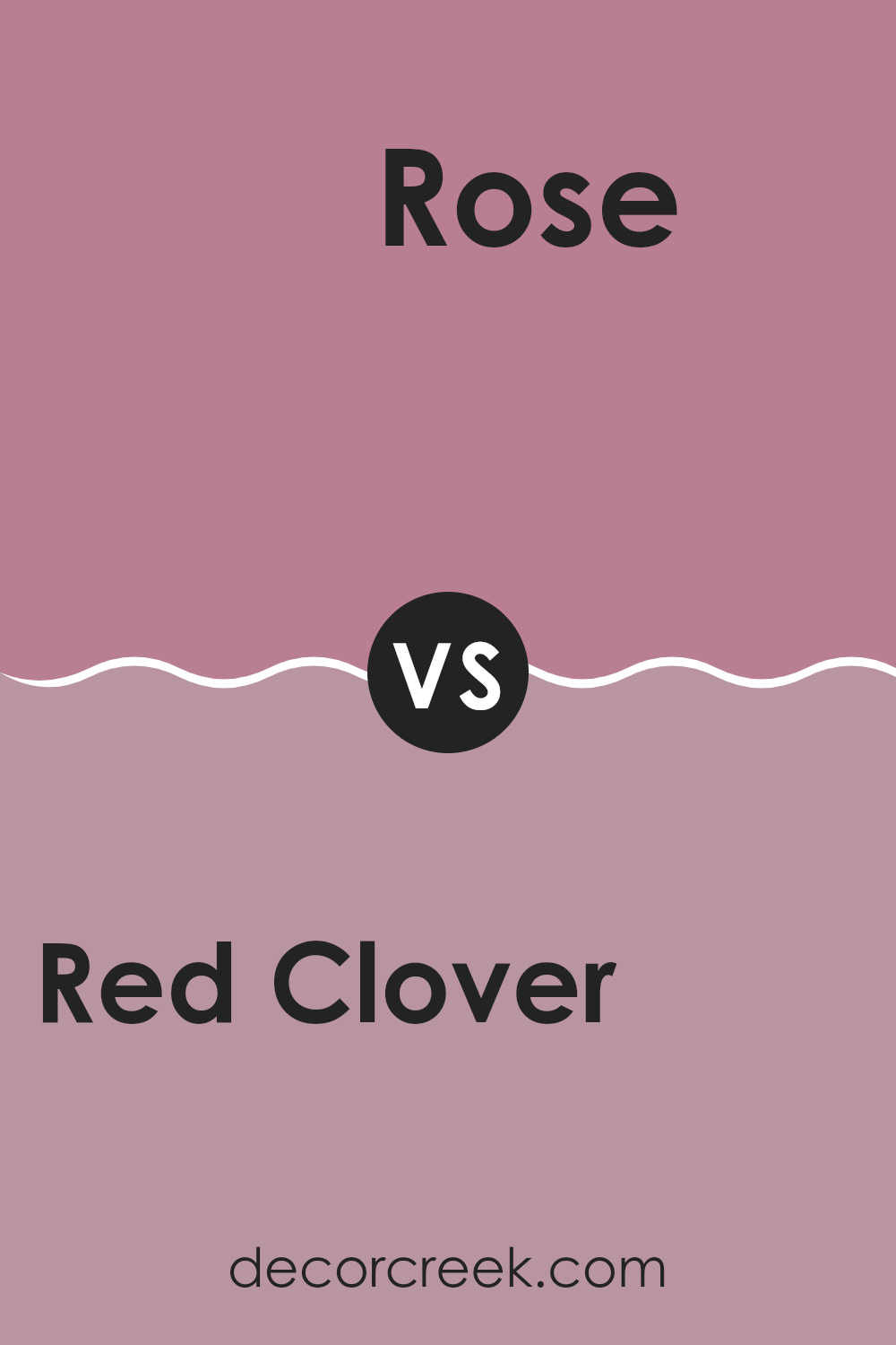
Red Clover SW 6564 by Sherwin Williams vs Rose SW 6290 by Sherwin Williams
Red Clover by Sherwin Williams is a lively, vibrant shade that carries a deep, rich tone. It adds a bold touch to spaces, making it perfect for areas where you want to inject some energy and warmth.
On the other hand, Rose by Sherwin Williams is a softer, more muted color. It leans more towards a romantic and gentle feeling, suitable for creating a cozy and inviting atmosphere.
While Red Clover offers a more dramatic and energetic vibe, Rose is understated and delicate, ideal for those looking for a subtle hint of color. Both colors bring their own unique personalities to a space, with Red Clover being more assertive and Rose providing a softer touch.
You can see recommended paint color below:
- SW 6290 Rose
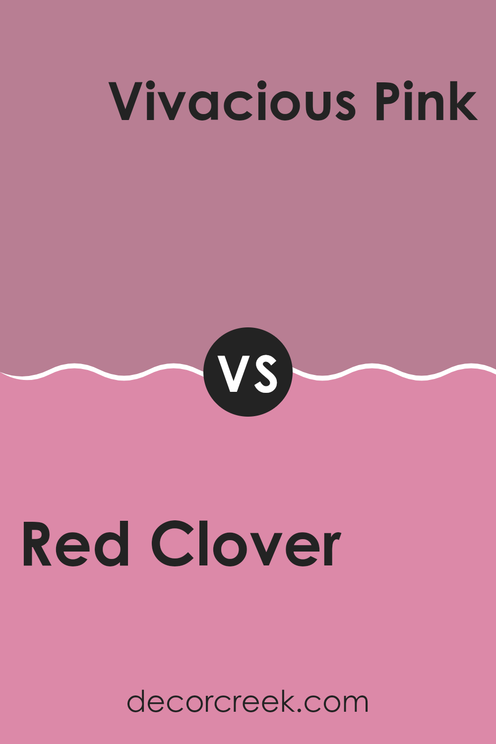
Red Clover SW 6564 by Sherwin Williams vs Vivacious Pink SW 6850 by Sherwin Williams
Red Clover and Vivacious Pink, both by Sherwin Williams, offer distinct personalities for any room. Red Clover is a deep, muted red with a hint of purple, creating a cozy and warm atmosphere. It’s a strong color that can make a significant impact in a space, perfect for fostering a welcoming feel.
On the other hand, Vivacious Pink is a bright and bold pink with a lively vibe. It’s much more intense and playful, making it ideal for spaces where you want to add a pop of vibrant color that catches the eye.
While Red Clover lends a more subdued and calm feeling, Vivacious Pink is all about fun and excitement. Both colors can bring life to a space but in very different ways — Red Clover with its richness and depth, and Vivacious Pink with its energizing brightness.
You can see recommended paint color below:
- SW 6850 Vivacious Pink
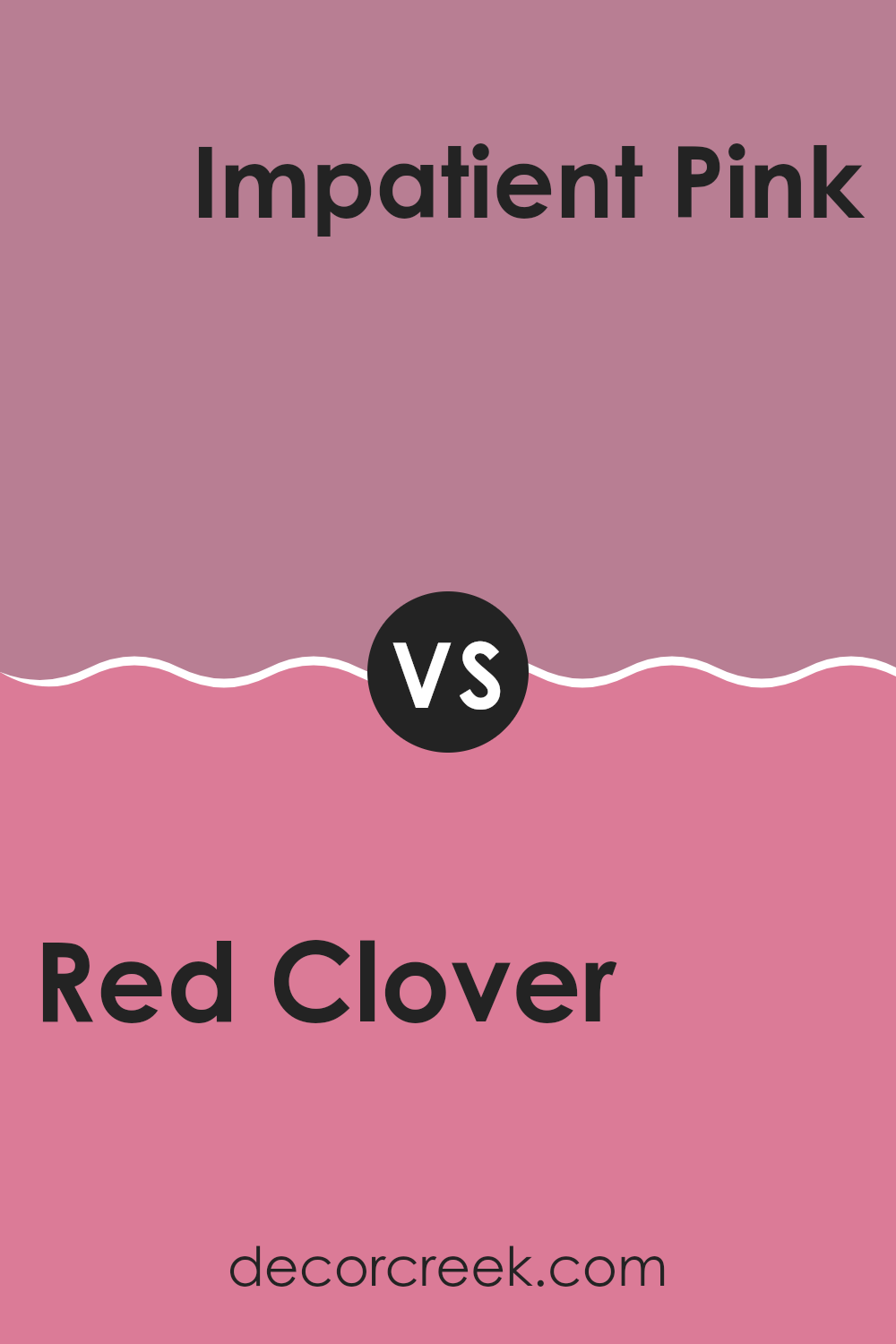
Red Clover SW 6564 by Sherwin Williams vs Impatient Pink SW 6854 by Sherwin Williams
Red Clover and Impatient Pink, both by Sherwin Williams, show distinct vibes. Red Clover presents a rich, deep pink tone veering towards magenta. This deep tone gives a bold feel, making it ideal for spaces where a strong yet warm presence is desired. It works well in living rooms or dining areas, adding a touch of dramatic flair.
On the other hand, Impatient Pink is a much softer, lighter shade. This color leans towards a playful, gentle pink, which feels fresh and youthful. It’s perfect for spaces like nurseries or casual sitting areas where a light, inviting atmosphere is preferred.
Together, these two colors could complement each other in a space that balances intensity with softness, allowing for dynamic yet harmonious interior designs. The darker Red Clover can ground a room while touches of Impatient Pink can add bursts of brightness.
You can see recommended paint color below:
- SW 6854 Impatient Pink
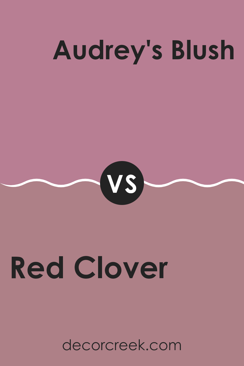
Red Clover SW 6564 by Sherwin Williams vs Audrey’s Blush SW 9001 by Sherwin Williams
Red Clover by Sherwin Williams is a vibrant, energetic shade of red, while Audrey’s Blush by Sherwin Williams is a more subdued, gentle pink. Red Clover stands out with a bold, punchy hue that can add a sense of excitement and dynamic energy to a space.
In contrast, Audrey’s Blush is softer and more subtle, offering a calming and soothing presence that is less overwhelming. This pink shade is ideal for creating a cozy, inviting atmosphere in a room.
While Red Clover can dominate a space, Audrey’s Blush works well as a complement to other colors, providing a gentle warmth. Both colors bring their own unique ambiance, but Red Clover is more about making a strong statement, and Audrey’s Blush is about adding a touch of softness and comfort.
You can see recommended paint color below:
- SW 9001 Audrey’s Blush
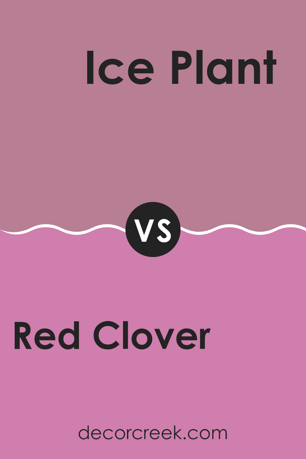
Red Clover SW 6564 by Sherwin Williams vs Ice Plant SW 6847 by Sherwin Williams
Red Clover and Ice Plant are two distinctive colors from Sherwin Williams that each bring a unique vibe to a space. Red Clover is a rich, deep red with a subtle hint of berry. This warm and inviting shade can make any room feel cozy and vibrant. It’s a perfect choice if you want to create a bold statement wall or add some dramatic flair to your decor.
In contrast, Ice Plant is a light, fresh green with a vibrant yet calm aura. This color is much cooler in tone and brings a breezy, airy feel to any area, making it ideal for brightening up a small space or giving a refreshing look to a kitchen or bathroom.
Together, these colors could work well in a space that desires both energy and freshness, with Red Clover accentuating key features and Ice Plant providing a soothing background. They offer a nice balance between warmth and coolness, allowing for creative color combinations in home styling.
You can see recommended paint color below:
- SW 6847 Ice Plant
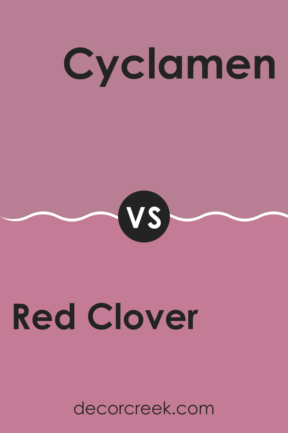
Red Clover SW 6564 by Sherwin Williams vs Cyclamen SW 6571 by Sherwin Williams
Red Clover and Cyclamen are two distinct paint colors by Sherwin Williams that each offer unique vibes for a space. Red Clover is a deep, muted pink with hints of raspberry, making it perfect for creating a cozy and welcoming atmosphere. It’s somewhat subdued, which allows it to be versatile in various settings, ideal for living rooms or dining areas.
On the other hand, Cyclamen stands out with its vibrant, bold pink tone that leans slightly towards purple. This color is livelier and more eye-catching, making it great for spaces where a bit of energy and fun is desired, like a playroom or a creative home office.
When comparing these two, Red Clover offers a more relaxed, subtle background shade, while Cyclamen provides an energetic burst of color. Choosing between them depends on whether you want a more understated look or something that makes a stronger statement.
You can see recommended paint color below:
- SW 6571 Cyclamen
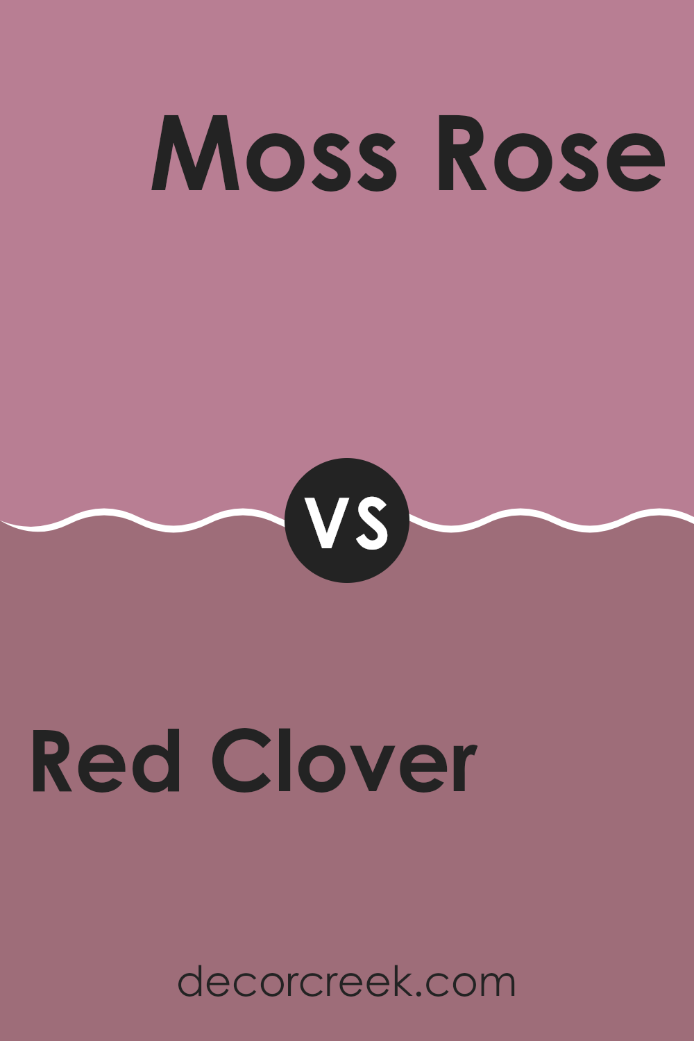
Red Clover SW 6564 by Sherwin Williams vs Moss Rose SW 6291 by Sherwin Williams
Red Clover and Moss Rose are two vibrant colors from Sherwin Williams that add energy and charm to any space. Red Clover is a bold, lively shade of red with a hint of pink that makes it feel warm and inviting.
It’s perfect for areas where you want to create a cozy, cheerful ambiance. On the other hand, Moss Rose is a softer, subtler color, bordering between pink and blush. It has an air of mildness that works beautifully in spaces meant for relaxation, such as bedrooms or bathrooms.
When compared, Red Clover stands out as the more dynamic color, suited for spaces that aim to energize. Moss Rose is better for those looking for a gentle, soothing touch in their décor. Both colors offer unique possibilities, depending on the mood and style you wish to achieve in your room.
You can see recommended paint color below:
- SW 6291 Moss Rose
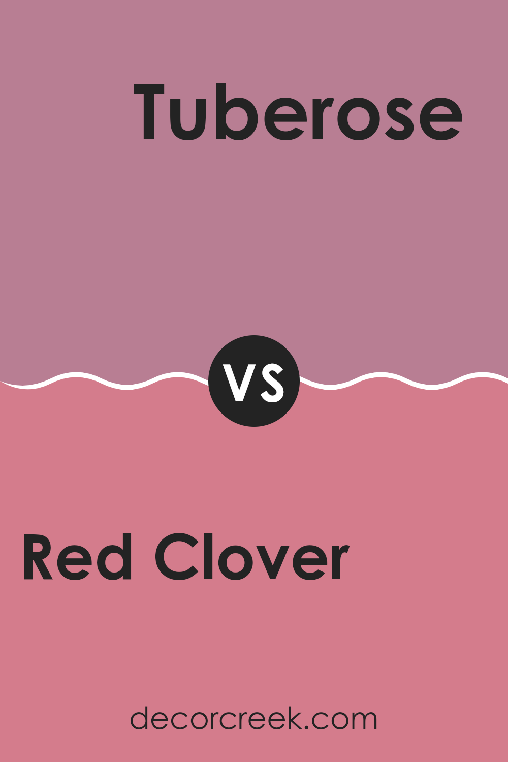
Red Clover SW 6564 by Sherwin Williams vs Tuberose SW 6578 by Sherwin Williams
Red Clover and Tuberose are two distinct colors by Sherwin Williams. Red Clover is a deep, vibrant red with a hint of berry. It’s a rich color that adds warmth and energy to a space. This shade is bold, making it a good choice for an accent wall or a place where you want to draw attention.
On the other hand, Tuberose is a brighter color with a playful pinkish-purple tone. It’s lighter and tends to bring a fresh, cheerful feel to a room. Tuberose is perfect for spaces where you want to create a lively, inviting atmosphere, such as a kid’s room or a casual living area.
Both colors have their unique appeal and can significantly impact a room depending on how you use them. Red Clover works well in settings where you want a sense of drama and richness, while Tuberose is great for adding a touch of happiness and lightness to a space.
You can see recommended paint color below:
- SW 6578 Tuberose
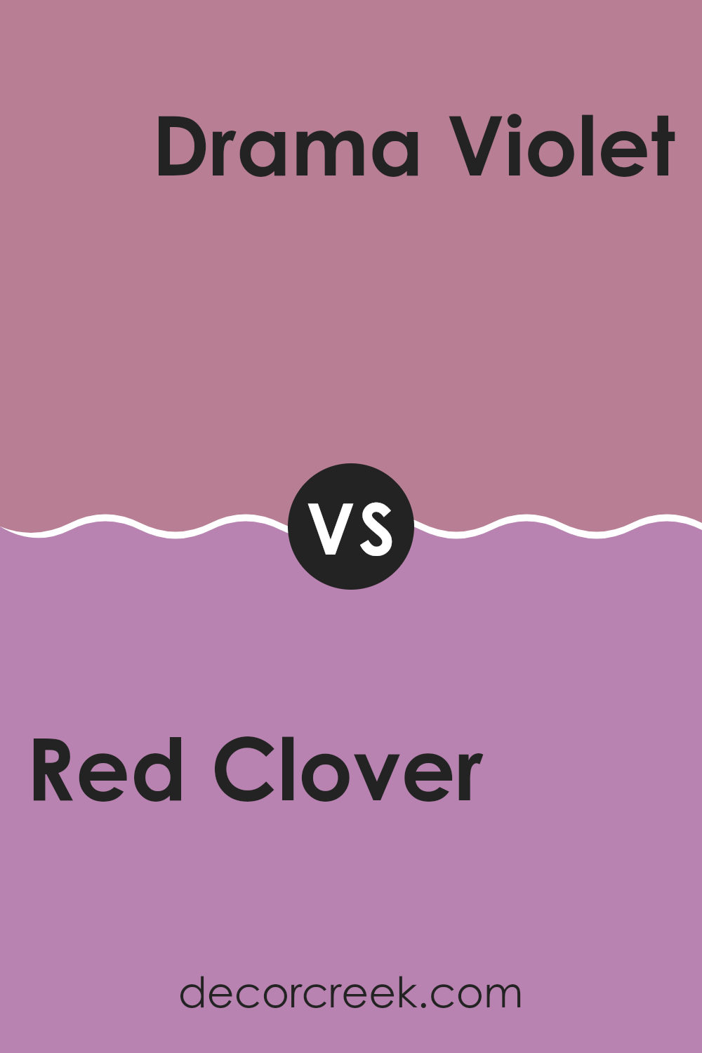
Red Clover SW 6564 by Sherwin Williams vs Drama Violet SW 6978 by Sherwin Williams
Red Clover and Drama Violet, both by Sherwin Williams, present strikingly different tones that can greatly influence the mood of a room. Red Clover is a vibrant red with a hint of berry, offering a lively and enthusiastic aura. This color can energize a space, making it perfect for areas like living rooms or dining areas where activity is common.
On the other hand, Drama Violet is a deep, bold purple that adds a sense of mystery and depth to spaces. It’s more subdued compared to Red Clover, providing a backdrop that’s both rich and a little moody. This makes it ideal for creating a focal point in a room or for accent walls intended to draw attention in a subtle yet profound way.
In comparison, while both colors are bold and can define a space’s character, Red Clover injects a burst of energy and warmth, while Drama Violet introduces a deeper, more introspective vibe. Depending on your room’s needs and personal taste, either color could be the perfect choice.
You can see recommended paint color below:
- SW 6978 Drama Violet
Conclusion
As I wrap up my thoughts on SW 6564 Red Clover by Sherwin Williams, I can’t help but feel excited about the punch of color it brings to any room. This paint isn’t shy; rather, it makes a bold statement with its vibrant, rich shade of red that seems to capture the essence of a blooming red clover flower. It’s perfect for adding a spark of energy and warmth to spaces that might otherwise feel a bit dull.
Painting a wall or even just a single accent area with Red Clover can really liven up your home. It works magic in places where lots of activities happen, like the living room or kitchen, making them feel more welcoming and lively. But, I think it’s essential to balance its boldness with lighter or neutral colors in your furniture or decorations to create a nice harmony.
Overall, SW 6564 Red Clover by Sherwin Williams is more than just red paint; it’s a way to make your home feel more joyful and cozy. Whether you’re looking to jazz up your space or add some character, Red Clover is a color worth considering.
It has definitely inspired me to think about which room in my house could use a little extra pop!
Ever wished paint sampling was as easy as sticking a sticker? Guess what? Now it is! Discover Samplize's unique Peel & Stick samples.
Get paint samples

