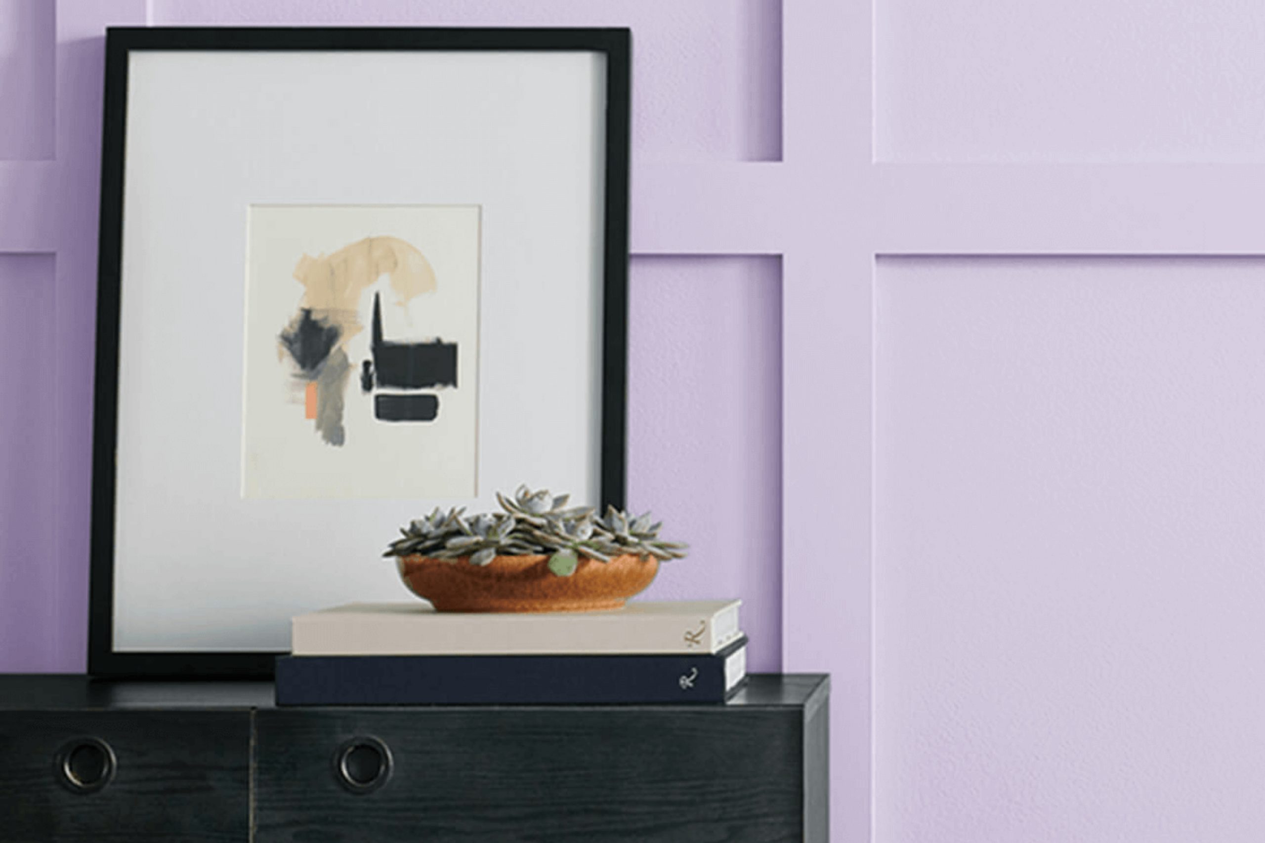
When I see SW 6828 Rhapsody Lilac by Sherwin Williams, the world around me softens. This shade has a way of drawing me in with its gentle, soothing presence. It’s a color that encapsulates elegance without feeling pretentious. The hue is a delicate blend of purple with hints of blue, making it both calming and intriguing.
I find Rhapsody Lilac to be the kind of color that can change a room’s mood with little effort. It’s perfect for creating a peaceful room, whether it’s in a bedroom or a quiet reading nook. Its flexibility is amazing; it pairs well with neutrals, whites, or even bolder accents, giving me freedom to adapt my room to my style.
Using Rhapsody Lilac feels like inviting a little piece of peace into my home. It’s a color that whispers grace and simplicity. Whether basking in natural light or under soft evening bulbs, it maintains its charm and sophistication. My experience with this color is a testament to how a simple shade can make a significant difference in creating an environment that feels just right.
With Rhapsody Lilac, every wall tells a more relaxed, inviting story.
What Color Is Rhapsody Lilac SW 6828 by Sherwin Williams?
Rhapsody Lilac by Sherwin Williams, with the code SW 6828, is a gentle and soothing lavender color. This shade has a soft, light purple tone with hints of blue, making it both calming and elegant. It works beautifully in a variety of interior styles, from modern and minimalist to rustic and shabby chic. In a modern home, Rhapsody Lilac adds a touch of softness to sleek lines and can create a peaceful retreat when used in bedrooms or reading nooks.
In rustic or shabby chic settings, the color pairs well with distressed wood and vintage pieces, enhancing the cozy and inviting atmosphere. When it comes to materials and textures, Rhapsody Lilac matches well with natural elements such as light wood, linen, and cotton.
It looks stunning alongside silver or chrome accents, which highlight its cool undertones. Soft textures like plush rugs, velvety cushions, or flowing sheer curtains can complement the color’s gentle nature. Earthy tones like beige, taupe, and soft grey can balance the lilac and help create a cozy and harmonious room. Whether as a main wall color or as an accent, Rhapsody Lilac brings a gentle, refreshing feel to any room, inviting relaxation and comfort.
Is Rhapsody Lilac SW 6828 by Sherwin Williams Warm or Cool color?
Rhapsody Lilac, also known as SW 6828, is a paint color from Sherwin Williams that brings a sense of calm and beauty to any room. This light purple hue is gentle and inviting, making rooms feel open and friendly. It’s a flexible color that can work well in different areas of the home, from bedrooms to living rooms.
When used in a bedroom, Rhapsody Lilac creates a peaceful atmosphere that’s ideal for relaxation. In living rooms, its soft tone can make the area feel cozy and welcoming. It’s a great color to pair with neutral shades like white or gray, which helps it stand out without overpowering the room.
The gentle lilac tone can also complement natural wood finishes and add a fresh touch to rooms. Overall, Rhapsody Lilac is a beautiful choice for those who want to add a touch of gentle color to their home without it being too bold.
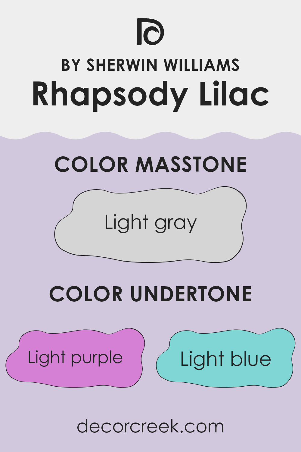
Undertones of Rhapsody Lilac SW 6828 by Sherwin Williams
Rhapsody Lilac by Sherwin Williams is a unique color with several undertones that influence how we perceive it. This paint has hints of light purple, light blue, pale yellow, lilac, pale pink, mint, and grey. Each of these undertones plays a role in shaping the overall appearance of the color on interior walls.
When you first look at Rhapsody Lilac, the light purple and lilac tones stand out, giving a soft and gentle look. These shades bring a sense of warmth and comfort to a room. The hints of light blue and mint add a refreshing and airy feeling, making the color suitable for rooms where you want to feel calm and relaxed.
The pale yellow undertone introduces a subtle hint of brightness and warmth, which can make a room feel cozy and inviting. The pale pink adds a touch of softness, making the color feel approachable and friendly. Meanwhile, the grey undertone offers balance, preventing the color from feeling too vibrant or intense.
These undertones together create a flexible color that can change with different lighting conditions. In natural light, the cooler undertones may be more noticeable, while artificial light might bring out the warmer aspects. Overall, Rhapsody Lilac can give your walls a pleasant and adaptable look that complements various styles.
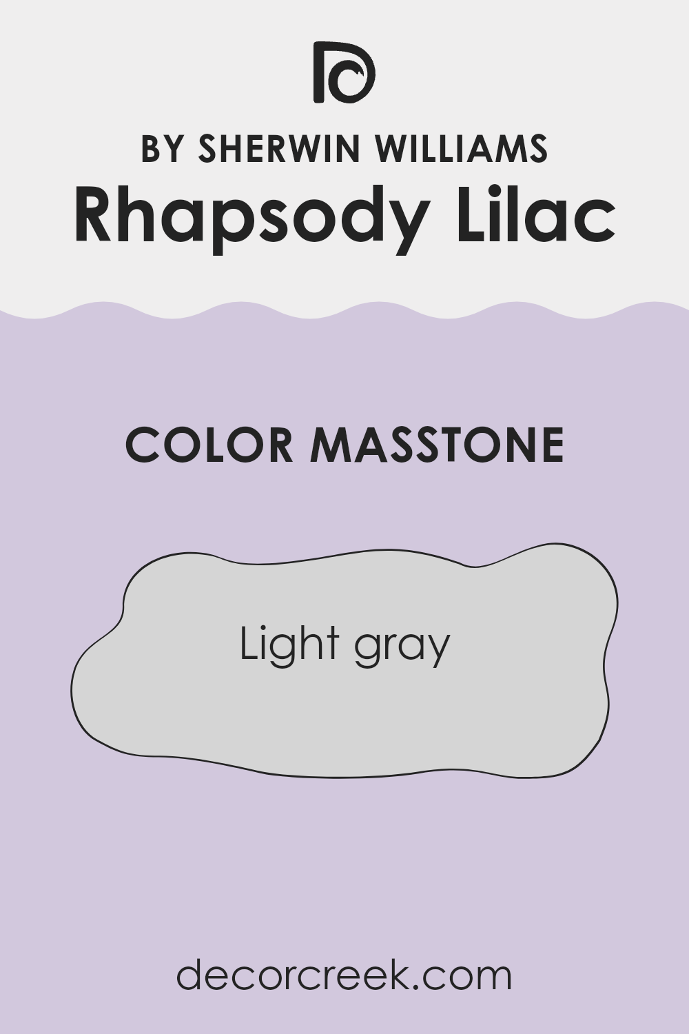
What is the Masstone of the Rhapsody Lilac SW 6828 by Sherwin Williams?
Rhapsody Lilac (SW 6828) by Sherwin Williams is a gentle color choice for homes. Its masstone, Light Gray (#D5D5D5), acts as a neutral base that makes this shade of lilac a flexible option for many rooms.
This subdued gray tint helps balance the soft purple hue of Rhapsody Lilac, giving it a more refined and understated look. This color works well in any room, providing a hint of color without being too bold or overwhelming. In living rooms or bedrooms, it creates a calming atmosphere, while in kitchens or bathrooms, it adds a touch of warmth and coziness.
Its neutral undertones blend nicely with various other colors and design elements, making it easy to pair with both cool and warm tones in furniture and decor. Using Rhapsody Lilac with Light Gray masstone, homeowners can subtly introduce color into their interiors without overpowering the room.
How Does Lighting Affect Rhapsody Lilac SW 6828 by Sherwin Williams?
Lighting can dramatically change the way colors appear in a room. This is especially true for colors like Rhapsody Lilac SW 6828 by Sherwin Williams. When you look at this particular shade, it might seem like a gentle purple with hints of pink. However, the lighting will shift how this color feels in a room.
Under natural light, Rhapsody Lilac can look different depending on the direction the room faces. In a north-facing room, the color might appear cooler and bluer. Northern light is known for being softer and more diffused, often giving colors a muted appearance. So, Rhapsody Lilac might look like a pastel, almost grayish lavender.
In contrast, a south-facing room receives more direct sunlight throughout the day. This warm, bright light can make the color appear more vibrant and warm, enhancing the pink tones in the lilac. The color might seem more energetic and lively in such rooms.
East-facing rooms get bright morning sun that tends to be warm, while the light in the afternoon becomes cooler and softer. In the morning, Rhapsody Lilac might appear warmer and more luminous, and as the day progresses, it might seem softer and more subdued.
West-facing rooms have the opposite effect. They get a cooler light in the morning, where the color might feel softer, but as the afternoon and evening sun sets in, the light intensifies and warms up. This can make Rhapsody Lilac appear richer and more saturated.
Under artificial lighting, the type of bulb you use also affects the color. Incandescent lights, which emit a warm yellowish glow, might enhance the warmer tones, giving it a cozy feel. In contrast, fluorescent lights can make the color look cooler and slightly faded.
Understanding these lighting effects helps in choosing the right shade for your room based on the natural and artificial light conditions.
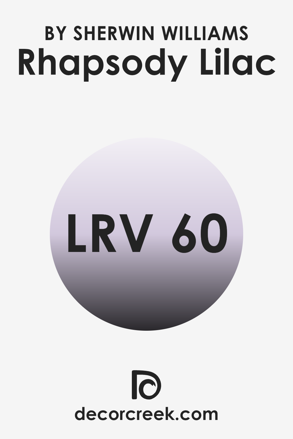
What is the LRV of Rhapsody Lilac SW 6828 by Sherwin Williams?
LRV, or Light Reflectance Value, is a measure of how much light a color reflects. It is usually given as a percentage between 0 and 100. A lower LRV means the color absorbs more light, making it appear darker, while a higher LRV means it reflects more light and looks brighter.
This is important when choosing paint colors because colors with different LRV values will affect how light or dark a room feels. If a color has a low LRV, it can make a room feel cozier but potentially smaller, as it absorbs more light. Conversely, a high LRV can make a room feel larger and more open because it reflects more light back into the room.
Rhapsody Lilac by Sherwin Williams has an LRV of 60.014, which places it somewhere in the middle of the lightness scale. This means that it reflects a good amount of light, providing enough brightness to keep a room from feeling too dark. It won’t make a room feel overly bright like a pure white might, but it will prevent the room from feeling cramped or dim. The soft, light quality of Rhapsody Lilac will add an airy and welcoming touch to a room, making it a good choice if you want a gentle touch of color that maintains a sense of openness.
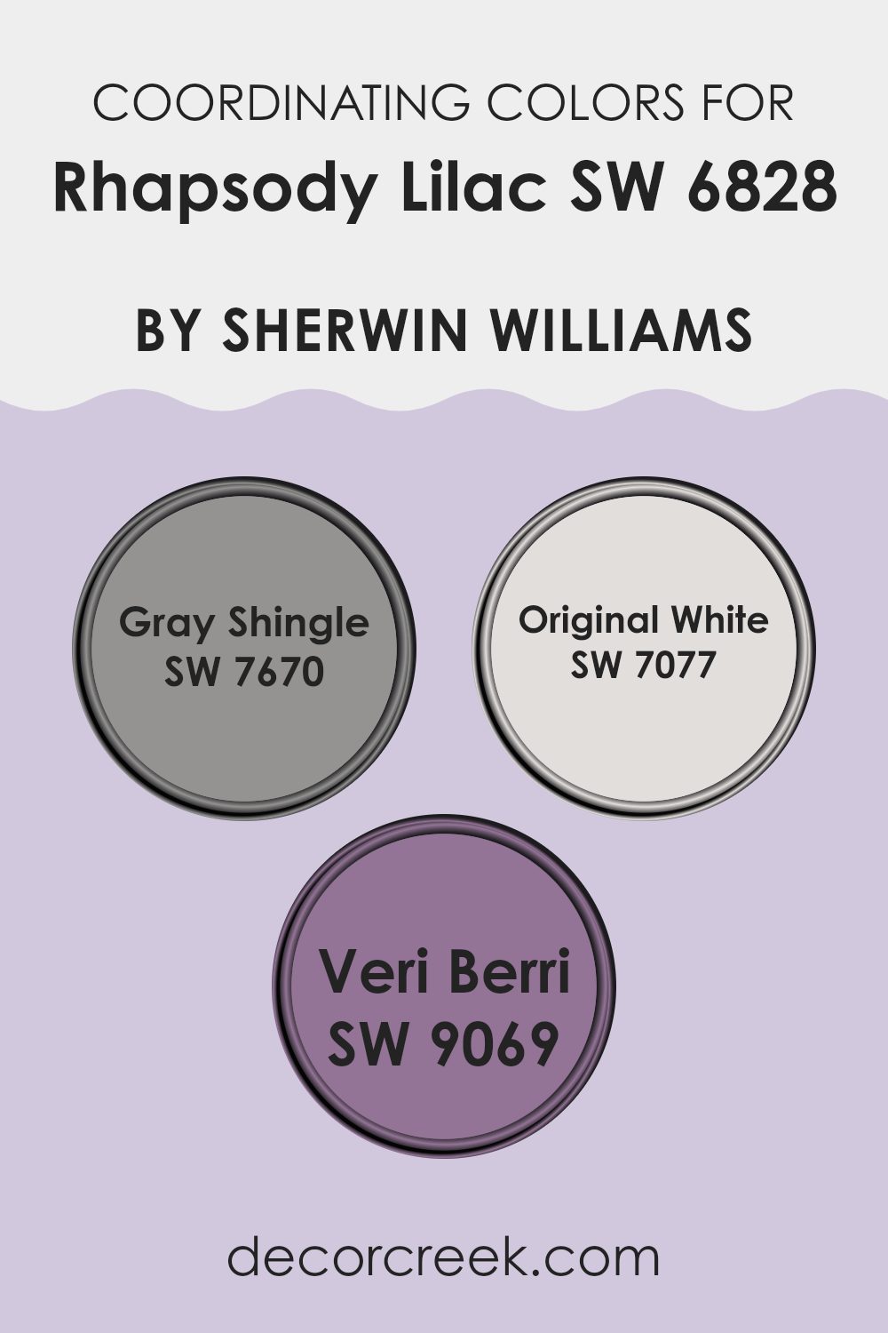
Coordinating Colors of Rhapsody Lilac SW 6828 by Sherwin Williams
Coordinating colors are designed to work harmoniously with a specific shade, creating a balanced and aesthetically pleasing color palette for any room. These colors complement each other, enhancing the overall look without clashing. When paired with Rhapsody Lilac by Sherwin Williams, they create a refined and modern feel. The soft, muted gray of SW 7670 – Gray Shingle adds depth and grounding to the room.
This color provides a neutral backdrop that beautifully highlights the gentle purple tones of Rhapsody Lilac. SW 7077 – Original White brings a fresh, clean brightness to the palette. It offers a crisp contrast against the lilac’s subtle warmth, ensuring the overall look remains light and airy.
Additionally, SW 9069 – Veri Berri can be used for a rich, vibrant punch. This color has a deep, berry tone that adds a touch of drama and elegance, accentuating the other colors and drawing attention to key design elements.
When these colors are used together, they create a seamless flow from one room to another, making each room inviting and cohesive. Whether you are painting an entire room or just accent walls, these coordinating colors provide versatility and style, blending together effortlessly to create a welcoming environment.
You can see recommended paint colors below:
- SW 7670 Gray Shingle
- SW 7077 Original White
- SW 9069 Veri Berri
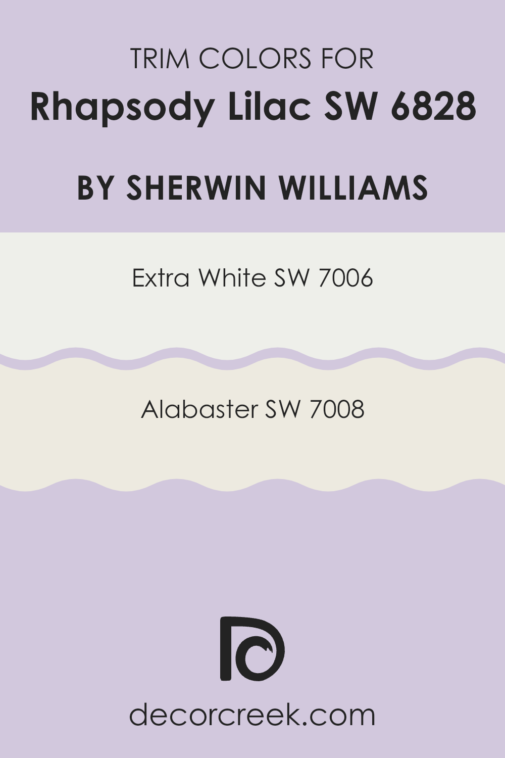
What are the Trim colors of Rhapsody Lilac SW 6828 by Sherwin Williams?
Trim colors are the smaller touches that frame your walls, ceilings, windows, and doors, providing a visual separation and enhancing the overall look of your room. For a color like Rhapsody Lilac SW 6828 by Sherwin Williams, selecting the right trim color is crucial since it impacts the perception of the lilac hue, making it appear more vibrant or subtle.
Trim colors not only define architectural details but also contribute to the harmony of the room by balancing and complementing the primary wall color. Choosing the right trim color can make the purple tones of Rhapsody Lilac stand out and create a welcoming and fresh atmosphere.
In this context, SW 7006 Extra White and SW 7008 Alabaster serve as excellent trim choices. SW 7006 Extra White is a crisp, pure white that offers a clean and modern look. It can make Rhapsody Lilac pop, providing a sharp contrast that highlights the color’s soft purple undertones. On the other hand, SW 7008 Alabaster is a warm white with a soft, creamy feel, perfect for creating a cozier, more inviting environment. This option can subtly blend with Rhapsody Lilac, enhancing its warmth and creating a seamless, gentle transition between walls and trim.
You can see recommended paint colors below:
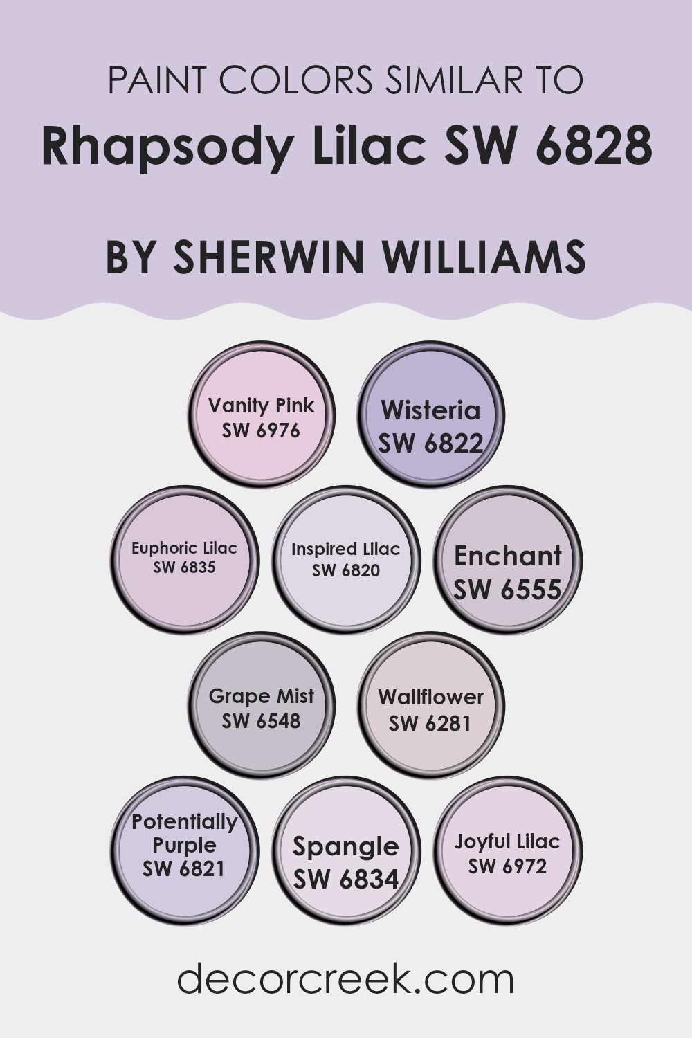
Colors Similar to Rhapsody Lilac SW 6828 by Sherwin Williams
Colors that are similar to Rhapsody Lilac by Sherwin Williams add harmony and cohesion to any design or decor. By using colors like Vanity Pink, a soft and charming pink, or Wisteria, a gentle lavender with a hint of blue, you create a palette that feels connected and soothing. These colors work well together by offering subtle variations that enhance the main shade without overpowering it. Euphoric Lilac brings a cheerful vibe with its lively tone, while Inspired Lilac adds a touch of warmth and depth. Each color complements the others, making areas feel balanced and pleasant.
Enchant is a dreamy, muted lavender that pairs elegantly with the brighter shades. Meanwhile, Grape Mist provides a grounding effect with its deeper hue. Wallflower adds a hint of whimsy to the mix, with its light and airy character.
Potentially Purple has a vibrant energy that injects a bit of fun into the palette. Spangle, with its playful, pinkish-purple hue, works well to add contrast without losing the overall unified feel. Finally, Joyful Lilac creates a bright and happy atmosphere. Together, these colors enhance the main shade by adding layers that are visually interesting yet harmonious, making rooms feel inviting and cohesive.
You can see recommended paint colors below:
- SW 6976 Vanity Pink
- SW 6822 Wisteria
- SW 6835 Euphoric Lilac
- SW 6820 Inspired Lilac
- SW 6555 Enchant
- SW 6548 Grape Mist
- SW 6281 Wallflower
- SW 6821 Potentially Purple
- SW 6834 Spangle
- SW 6972 Joyful Lilac
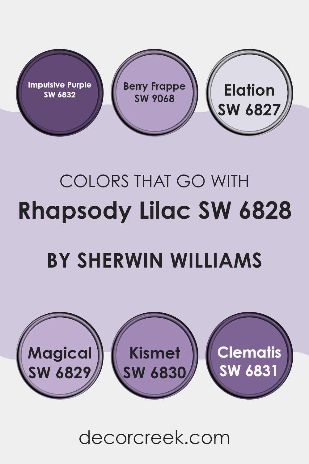
Colors that Go With Rhapsody Lilac SW 6828 by Sherwin Williams
Rhapsody Lilac SW 6828 by Sherwin Williams is a delightful shade of lilac that brings a calming yet lively touch to any room. Choosing colors that complement this hue can enhance the overall feel of a room. Each of the suggested colors shares a harmonious balance with Rhapsody Lilac, creating a pleasing aesthetic.
SW 6832 – Impulsive Purple is a bold and vibrant shade that adds energy and makes a striking pair with the softer lilac. Meanwhile, SW 9068 – Berry Frappe introduces a sweet and inviting vibe with its pinkish undertones, creating a warm and welcoming atmosphere. SW 6827 – Elation captures a dreamy, pastel essence that smooths and lightens the palette, making areas appear more open and airy.
SW 6829 – Magical is a mysterious, deeper purple, which adds depth and acts as a lovely contrast. SW 6830 – Kismet offers a rich, playful feel, injecting life and movement into a room. Lastly, SW 6831 – Clematis has a gentle, muted tone that blends seamlessly, offering a subtle yet cohesive finish to any interior or exterior design. Pairing these colors with Rhapsody Lilac SW 6828 can create a balanced and visually appealing color scheme.
You can see recommended paint colors below:
- SW 6832 Impulsive Purple
- SW 9068 Berry Frappe
- SW 6827 Elation
- SW 6829 Magical
- SW 6830 Kismet
- SW 6831 Clematis
How to Use Rhapsody Lilac SW 6828 by Sherwin Williams In Your Home?
Rhapsody Lilac SW 6828 by Sherwin Williams is a beautiful, soft purple shade that can bring a gentle and calm feeling to any room. This color works well in areas where you want a relaxed atmosphere, like a bedroom or living room. Its light, pastel tone makes it perfect for creating a cozy and welcoming room.
You can pair Rhapsody Lilac with whites or soft grays for a fresh and airy look. Adding this color to your walls can make a small room feel more open and spacious. You can also use it for an accent wall to add a splash of interest without making the room feel too strong.
Rhapsody Lilac complements natural materials, like wooden furniture or floors, and works beautifully with floral patterns or textures. Whether you choose to paint a whole room or just a single wall, Rhapsody Lilac can add a subtle hint of color that is both modern and inviting.
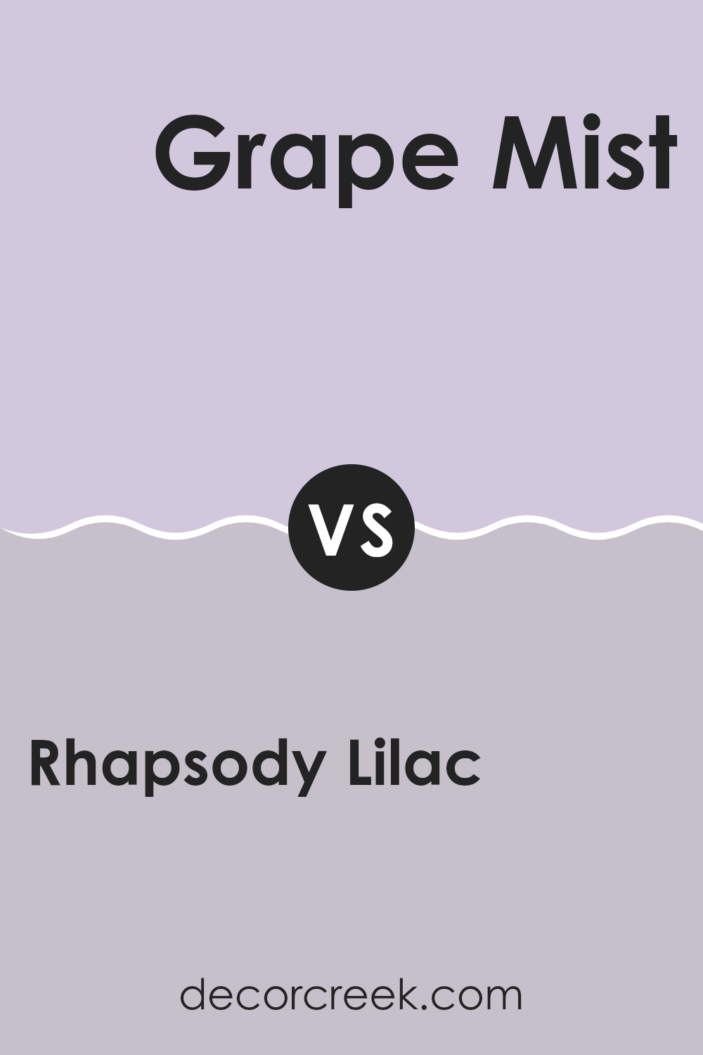
Rhapsody Lilac SW 6828 by Sherwin Williams vs Grape Mist SW 6548 by Sherwin Williams
Rhapsody Lilac (SW 6828) and Grape Mist (SW 6548) by Sherwin Williams are both lovely shades of purple, but they have distinct characteristics. Rhapsody Lilac is a soft, gentle lilac color that has a calming and subtle appearance. It brings a touch of elegance and works well in rooms where a light, airy feel is desired.
On the other hand, Grape Mist is a bit darker and richer. It carries a stronger purple tone that feels more deep and bold compared to Rhapsody Lilac. This makes Grape Mist suitable for creating a more dramatic look, making it perfect for accent walls or room where a stronger impact is wanted.
These colors complement each other well if used together. Rhapsody Lilac can soften a room, while Grape Mist can add depth and richness. Whether you want a light and soft atmosphere or something with more intensity, these shades of purple can meet your needs.
You can see recommended paint color below:
- SW 6548 Grape Mist
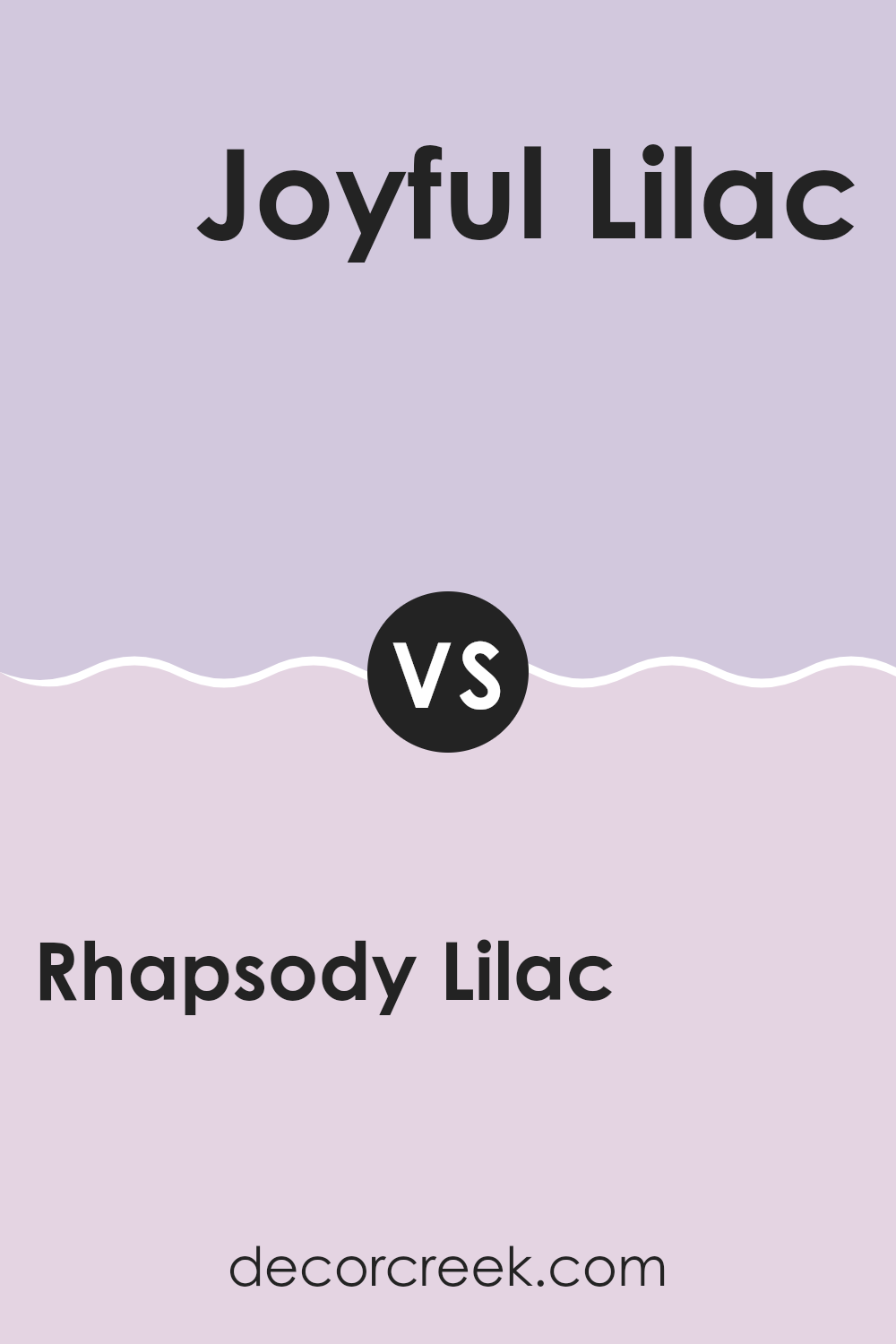
Rhapsody Lilac SW 6828 by Sherwin Williams vs Joyful Lilac SW 6972 by Sherwin Williams
Rhapsody Lilac SW 6828 and Joyful Lilac SW 6972 by Sherwin Williams are two beautiful shades of purple. Rhapsody Lilac SW 6828 is a slightly muted, soft purple with grayish undertones. This gives it a more relaxed and calming appearance. It’s a soothing color, perfect for rooms where you want a gentle touch.
On the other hand, Joyful Lilac SW 6972 is a brighter, more energetic purple. It has a lively and cheerful feel, making it a great choice if you want to add some vibrancy and fun to a room.
In summary, Rhapsody Lilac offers a more peaceful and subtle impression, while Joyful Lilac brings excitement and brightness. Both can be used in various settings depending on whether you’re looking for a calm atmosphere or an upbeat vibe. Whether you prefer the gentle tone of Rhapsody Lilac or the spirited nature of Joyful Lilac, each color tells a different story.
You can see recommended paint color below:
- SW 6972 Joyful Lilac
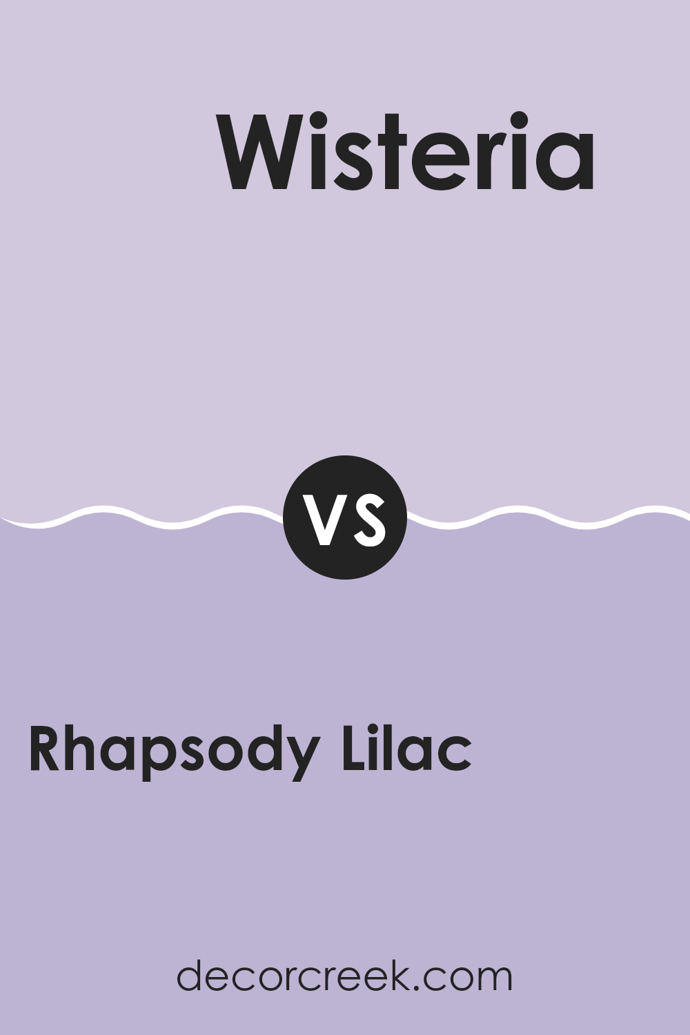
Rhapsody Lilac SW 6828 by Sherwin Williams vs Wisteria SW 6822 by Sherwin Williams
Rhapsody Lilac and Wisteria by Sherwin Williams are both soft, purple hues that can bring a gentle touch to any room. Rhapsody Lilac is a delicate shade that leans slightly more towards pink, offering a warm and inviting feeling. It can make a room feel cozy yet airy, perfect for bedrooms or sitting areas where comfort is key.
On the other hand, Wisteria is a cooler, more muted lavender with subtle hints of blue. This color provides a calm and relaxed atmosphere, ideal for rooms where you want a more soothing environment, such as bathrooms or reading nooks.
When comparing the two, Rhapsody Lilac might be better for those seeking warmth and a touch of energy, while Wisteria is a great choice for cooler, more peaceful settings. Both colors pair beautifully with neutral shades, but the choice depends on whether you want a touch of pink warmth or gentle lavender coolness.
You can see recommended paint color below:
- SW 6822 Wisteria
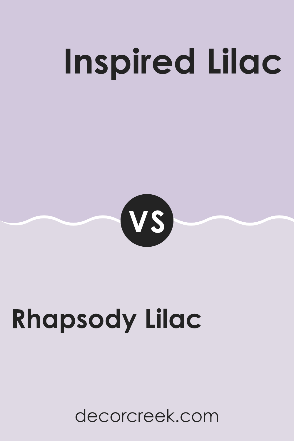
Rhapsody Lilac SW 6828 by Sherwin Williams vs Inspired Lilac SW 6820 by Sherwin Williams
Rhapsody Lilac (SW 6828) and Inspired Lilac (SW 6820) are two beautiful paint colors by Sherwin Williams that share the same purple family but have distinct differences. Rhapsody Lilac is a soft, muted purple with a touch of gray, which gives it a more understated and neutral appearance.
It is perfect for rooms where you want a subtle hint of color without being overpowering. On the other hand, Inspired Lilac is a lighter and brighter shade of purple. It has more of a pastel quality, making it suitable for areas where you want a fresh and airy feel.
While both colors offer a calming effect, Rhapsody Lilac works well in rooms requiring a more mature and gentle atmosphere. In contrast, Inspired Lilac is ideal for areas where a lighter, more cheerful vibe is desired. Both colors can add charm and style to any room.
You can see recommended paint color below:
- SW 6820 Inspired Lilac
Rhapsody Lilac SW 6828 by Sherwin Williams vs Wallflower SW 6281 by Sherwin Williams
Rhapsody Lilac SW 6828 and Wallflower SW 6281 are both lovely shades of purple by Sherwin Williams, but they have distinct personalities. Rhapsody Lilac has a vibrant and energetic feel. It’s a lively shade with a hint of pink that adds warmth and fun to a room. This color is great for making a bold statement or highlighting an accent wall.
On the other hand, Wallflower is a more subdued and muted purple. It carries a gentle, calming quality, with cool undertones that make it soothing to the eyes. This soft shade is perfect for creating a relaxed atmosphere, making it ideal for room where you want to unwind, like bedrooms or reading nooks.
When comparing these two, it’s evident that Rhapsody Lilac is more lively and daring, while Wallflower is quieter and more understated, making them suitable for different moods and purposes.
You can see recommended paint color below:

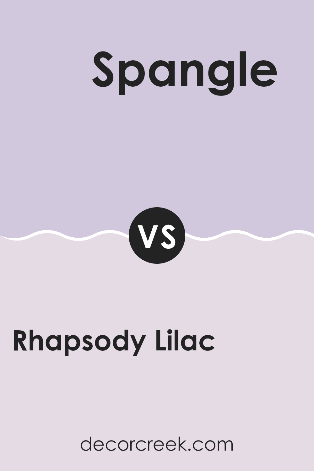
Rhapsody Lilac SW 6828 by Sherwin Williams vs Spangle SW 6834 by Sherwin Williams
Rhapsody Lilac SW 6828 and Spangle SW 6834 are two distinct yet complementary colors from Sherwin Williams. Rhapsody Lilac is a soft, muted purple with a gentle and calming vibe. It can bring a sense of peace to a room, making it a great choice for bedrooms or rooms where you want to relax. Its subtle tone doesn’t feel too strong.
On the other hand, Spangle SW 6834 is a brighter, more vibrant shade of pinkish-purple. It adds a lively and energetic feel to any room. If you want to make a bold statement or add a pop of color, Spangle might be the way to go.
Together, these colors work well in a palette, with Rhapsody Lilac providing a soothing background and Spangle offering excitement and contrast. They can balance each other nicely in a room, keeping it both interesting and relaxing.
You can see recommended paint color below:
- SW 6834 Spangle
Rhapsody Lilac SW 6828 by Sherwin Williams vs Vanity Pink SW 6976 by Sherwin Williams
Rhapsody Lilac SW 6828 and Vanity Pink SW 6976 by Sherwin Williams are both vibrant colors that can bring warmth to a room. Rhapsody Lilac is a soft, muted purple with calming undertones, making it a great option for creating a peaceful environment. It’s perfect for bedrooms or living rooms where you want a touch of color without being too bold.
On the other hand, Vanity Pink is a bright, cheerful pink that adds energy and fun to any room. It is a lively choice that can be great for places like bathrooms or kid’s rooms, where a playful atmosphere is desired.
While Rhapsody Lilac leans toward a subtle elegance with its gentle hue, Vanity Pink stands out with its boldness. Pairing the two can create a balanced look, where the lilac tones down the pink’s brightness, offering a harmonious blend in a room.
You can see recommended paint color below:
- SW 6976 Vanity Pink

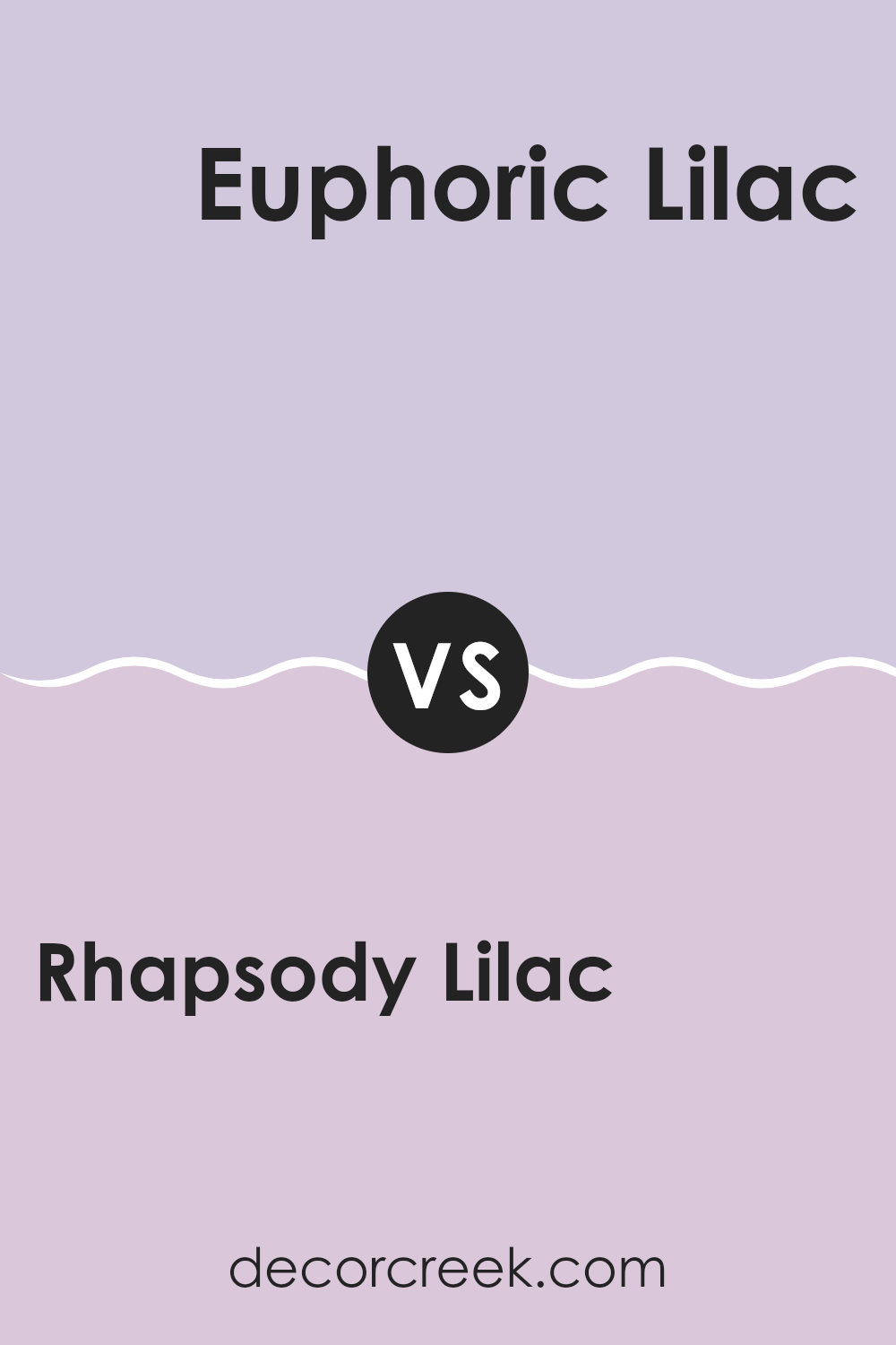
Rhapsody Lilac SW 6828 by Sherwin Williams vs Euphoric Lilac SW 6835 by Sherwin Williams
Rhapsody Lilac SW 6828 and Euphoric Lilac SW 6835 by Sherwin Williams are two beautiful shades of purple that can add charm to any room. Rhapsody Lilac is a soft, muted lavender with a calm and gentle feel. It’s perfect for creating a relaxed and inviting mood.
On the other hand, Euphoric Lilac is brighter and more vibrant. This shade has a lively and cheerful vibe, suitable for areas where you want to spark energy and creativity. While Rhapsody Lilac leans towards a vintage or classic feel, Euphoric Lilac is more modern and bold.
When choosing between the two, consider the mood you want to create. If you prefer a quiet, soothing room, Rhapsody Lilac is a great choice. If you want a room that feels more lively and energetic, Euphoric Lilac is the way to go. Both colors are great options and can be used in various rooms.
You can see recommended paint color below:
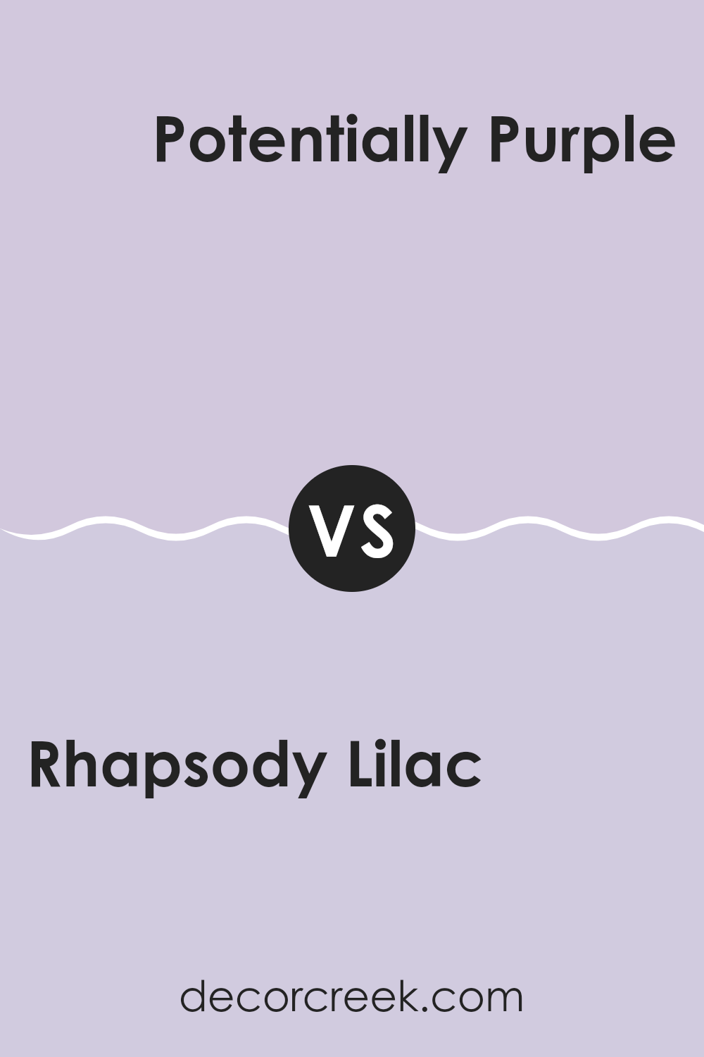
Rhapsody Lilac SW 6828 by Sherwin Williams vs Potentially Purple SW 6821 by Sherwin Williams
Rhapsody Lilac (SW 6828) and Potentially Purple (SW 6821) are both purples from Sherwin Williams, but they have different vibes. Rhapsody Lilac is a softer, lighter shade that feels calm and soothing. It’s like a gentle touch of purple with a hint of pink, perfect for creating a peaceful atmosphere in a room.
On the other hand, Potentially Purple is a richer and deeper shade. It’s more vibrant and bold, making a stronger statement in a room. This color can add warmth and energy to a room, standing out more than the subtle Rhapsody Lilac.
While both colors share a purple base, Rhapsody Lilac is best if you want a soft, calming environment, whereas Potentially Purple suits areas where you want to introduce more intensity and depth. Choosing between them depends on whether you’re looking for something gentle or striking.
You can see recommended paint color below:
- SW 6821 Potentially Purple
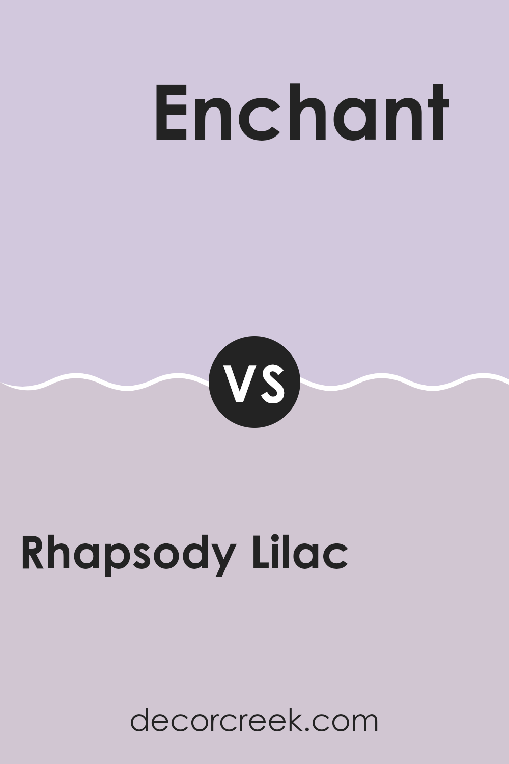
Rhapsody Lilac SW 6828 by Sherwin Williams vs Enchant SW 6555 by Sherwin Williams
Rhapsody Lilac (SW 6828) and Enchant (SW 6555) are two distinct colors by Sherwin Williams that offer different vibes. Rhapsody Lilac is a soft, muted purple with a touch of gray, delivering a calming yet refined atmosphere. This shade is gentle on the eyes, making it suitable for rooms where relaxation is desired, such as bedrooms or reading nooks.
On the other hand, Enchant is a deeper, richer purple with warm undertones. It has a vibrant and bold presence that can add drama to a room. This color is excellent for making a statement, and it’s well-suited for accent walls or areas where you want to highlight certain features.
While Rhapsody Lilac is calming and understated, Enchant is more dynamic and striking. Both colors can be used to create different moods depending on how they are incorporated into a room, catering to both subtle elegance and dramatic flair.
You can see recommended paint color below:
- SW 6555 Enchant
After talking about SW 6828 Rhapsody Lilac by Sherwin Williams, I have a clearer picture of why this color is special. This paint, with its charming purple tone, brings a feeling that’s both calming and cheerful at the same time. It’s like when you see a field of blooming flowers and feel happy just by looking at them.
Rhapsody Lilac is not just another paint color. It is soft but also bright enough to make a room feel lively. Whether you use it in a bedroom where you want to relax or in a living room where family and friends gather, it works well. This color can make one think of magical places and is great for making any room feel unique and inviting.
What I like most about Rhapsody Lilac is how it works with other colors. It pairs nicely with whites, grays, and even some yellows or greens, making it easy to change the style of any room. And, because it’s such a welcoming color, it can be a good choice for both kids’ rooms and more grown-up rooms.
In conclusion, if you’re thinking about changing a room with a splash of paint, Rhapsody Lilac is an excellent choice. It’s cheerful and friendly, and it can help make any room look beautiful.
Ever wished paint sampling was as easy as sticking a sticker? Guess what? Now it is! Discover Samplize's unique Peel & Stick samples.
Get paint samples

