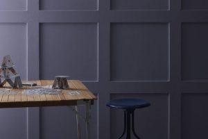
When choosing a paint color for a room or an exterior, finding the perfect shade that matches your aesthetic and decor can be challenging.
One color that has gained popularity for its versatility and understated elegance is SW 7670 Gray Shingle by Sherwin Williams.
This particular shade of gray stands out for its unique balance between warmth and coolness, making it a go-to choice for various spaces and styles.SW 7670 Gray Shingle offers a neutral palette that complements both modern and traditional designs.
Its ability to adapt to different lighting conditions means it can look slightly different and equally stunning in sunlight and artificial light.
Whether you’re updating a cozy corner of your home or giving an entire exterior a fresh look, Gray Shingle provides a solid foundation that works well with a wide range of colors and materials.
Homeowners and designers often select this color for its reliability to create a chic, calming atmosphere. It pairs beautifully with bright whites, soft creams, and even bold hues, allowing for flexibility in design choices.
Moreover, its calming effect makes it a fantastic choice for bedrooms, living rooms, and even home offices, where a serene environment is desired.
In this article, we’ll explore the unique qualities of SW 7670 Gray Shingle by Sherwin Williams and how it can transform any space into a stylish and inviting area.
What Color Is Gray Shingle SW 7670 by Sherwin Williams?
Gray Shingle SW 7670 by Sherwin Williams is a versatile color exuding a balanced blend of warmth and coolness. This shade of gray maintains a soft, understated elegance that works beautifully in various interior designs.
Its unique tone can easily adapt to different lighting situations, presenting a slightly different aspect from dawn to dusk.
This adaptability makes it an excellent choice for living rooms, bedrooms, and even kitchens, creating a soothing backdrop for daily life.
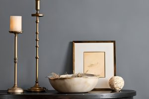
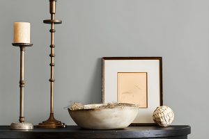
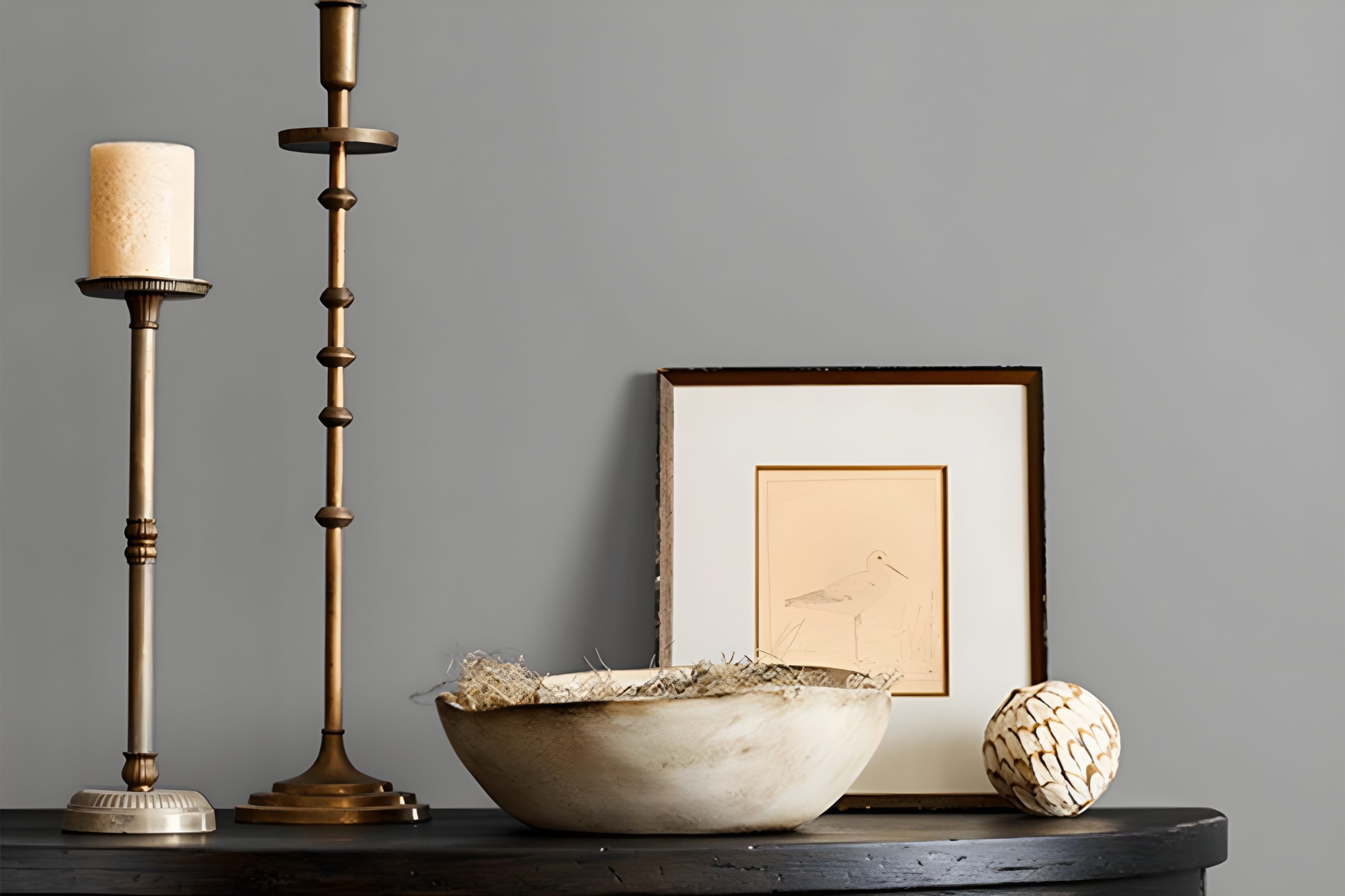
This particular shade of gray pairs wonderfully with natural materials and textures. Think of the warmth of wooden furniture against the subtle coolness of Gray Shingle walls, creating a harmonious and inviting space.
Metal accents, whether brushed nickel, stainless steel, or aged brass, also complement this color, adding a touch of sophistication and modernity.
For those leaning towards a more soft and cozy ambiance, incorporating fabrics like velvet or wool in muted colors can enhance the comfort level, making spaces feel more welcoming and lived-in.
Gray Shingle works best in interior styles that appreciate the beauty of simplicity and subtlety. Modern minimalist, Scandinavian, and even transitional decors can benefit from this color, leveraging its ability to blend seamlessly with various décor elements and color palettes.
Its understated nature allows for creativity in accessorizing and layering different textures and hues, making it a perfect canvas for personal expression.
Ever wished paint sampling was as easy as sticking a sticker? Guess what? Now it is! Discover Samplize's unique Peel & Stick samples.
Get paint samples

Is Gray Shingle SW 7670 by Sherwin Williams Warm or Cool color?
Gray Shingle SW 7670 by Sherwin Williams is a versatile and appealing paint color that brings a unique balance to any home. It’s a medium shade of gray that strikes a perfect harmony between warm and cool tones.
This makes it incredibly adaptable to various decor styles and color schemes. Whether you’re aiming for a modern, minimalistic look or a cozy, traditional feel, Gray Shingle can effortlessly fit into your vision.
Its neutrality allows it to act as a calming backdrop in spaces, offering a sense of serenity and sophistication without overwhelming the room’s other features.
When used in homes, Gray Shingle has a way of enhancing natural light, making spaces appear brighter and more open. It pairs beautifully with crisp whites, adding depth and contrast, or with richer colors, providing balance without clashing.
Its versatility extends to different rooms, from creating a restful atmosphere in bedrooms to a polished look in kitchens or bathrooms.
For those looking to update their home with a color that offers both flexibility and a modern edge, Gray Shingle SW 7670 is a standout choice that can refresh any space.
Undertones of Gray Shingle SW 7670 by Sherwin Williams
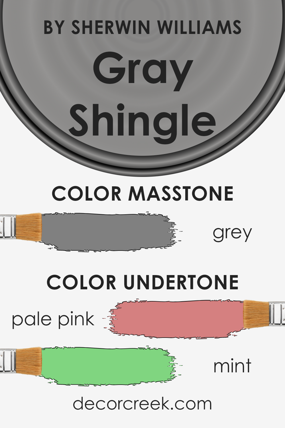
Gray Shingle SW 7670 is a unique color because it has undertones of pale pink and mint. These undertones are subtle colors that hide beneath the main gray shade.
Think of undertones like secret ingredients that can change how a color looks depending on the lighting or what other colors are nearby.
Undertones play a big role in how we see color. They can make a color feel warmer or cooler and can greatly influence the mood of a room.
For instance, a gray with pale pink undertones might look softer and more welcoming, while one with mint undertones could feel fresher and more calming.
When we look at Gray Shingle on interior walls, these undertones have a special effect. In natural light, the pale pink undertones can give a room a gentle, cozy glow, making it feel inviting.
The mint undertones might not be as noticeable at first, but they can help the space feel slightly cooler and more relaxed. This combination makes Gray Shingle a versatile color that can work well in many spaces.
It’s not just plain gray; it has a lot more character because of these undertones. Whether in a sunny living room or a dimly lit bedroom, Gray Shingle can truly change the atmosphere of a room, making it feel just right.
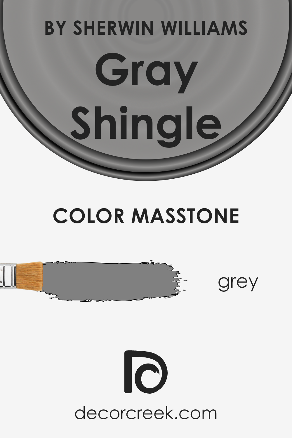
What is the Masstone of the Gray Shingle SW 7670 by Sherwin Williams?
Gray Shingle SW 7670 by Sherwin Williams has a masstone that matches the gray color with a hex code of #808080. This neutral, mid-tone gray offers a balanced backdrop for home interiors and exteriors.
It’s a versatile color that blends seamlessly with various design styles, from modern minimalism to cozy traditional.
Because its base tone is a pure gray, it neither leans too warm nor too cool, making it an excellent choice for spaces where you want to achieve a calm and collected atmosphere.
In a home setting, this particular shade of gray acts as a perfect canvas for both bold and soft accent colors, allowing personal tastes to shine without overwhelming the space.
It’s especially effective in areas that receive a lot of natural light, as the color can shift subtly, adding depth and interest to the rooms throughout the day.
Its neutrality also means it can bridge different materials and textures, from sleek metals in a kitchen to soft fabrics in a bedroom, creating a cohesive look that feels effortlessly pulled together.
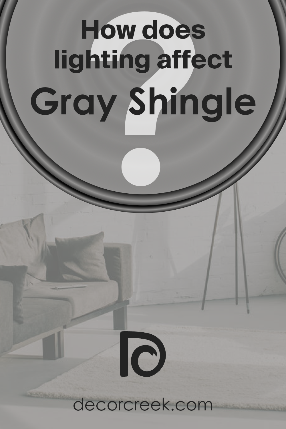
How Does Lighting Affect Gray Shingle SW 7670 by Sherwin Williams?
Lighting plays a crucial role in how we perceive colors. It can change the mood of a room and even the appearance of the paint on our walls.
Different light sources can make a color look entirely different than it does under another type of light. Gray Shingle (SW 7670) by Sherwin Williams is a perfect example to explore how lighting affects colors.
In artificial light, Gray Shingle’s true tone can shift based on the type of bulb used. Under warm, incandescent light, this color might appear softer and slightly more beige, creating a cozy atmosphere.
LED or fluorescent lighting, which is often cooler, could make Gray Shingle look starker and more distinctly gray, bringing out its cool undertones and giving the room a more modern feel.
Natural light brings its own unique impact to Gray Shingle. The quality and angle of natural light vary throughout the day and depend significantly on the room’s orientation concerning the cardinal directions—north, south, east, or west.
North-faced rooms receive less direct sunlight, which can make colors appear cooler and more muted. Here, Gray Shingle might seem a bit more shadowy and subdued, perfect for creating a serene and calm space.
South-faced rooms bask in abundant direct sunlight, brightening and warming colors. In these rooms, Gray Shingle can look lighter and warmer, possibly revealing subtle undertones you wouldn’t notice otherwise.
This makes the color vibrant and lively, great for spaces you want to feel energized in.
East-faced rooms get bright light in the morning, which then softens as the day progresses.
Morning light can make Gray Shingle look warm and welcoming, transforming into a cooler, more balanced gray as the day goes on, suitable for spaces used mainly in the morning.
West-faced rooms enjoy the afternoon and evening light, which can cast a warm glow, especially during sunset, making Gray Shingle appear warmer and richer. This is ideal for living spaces you want to feel cozy and inviting in the evening.
Understanding how Gray Shingle interacts with lighting in different settings can help you choose the ideal room and purpose for this versatile color, ensuring it always looks its best.
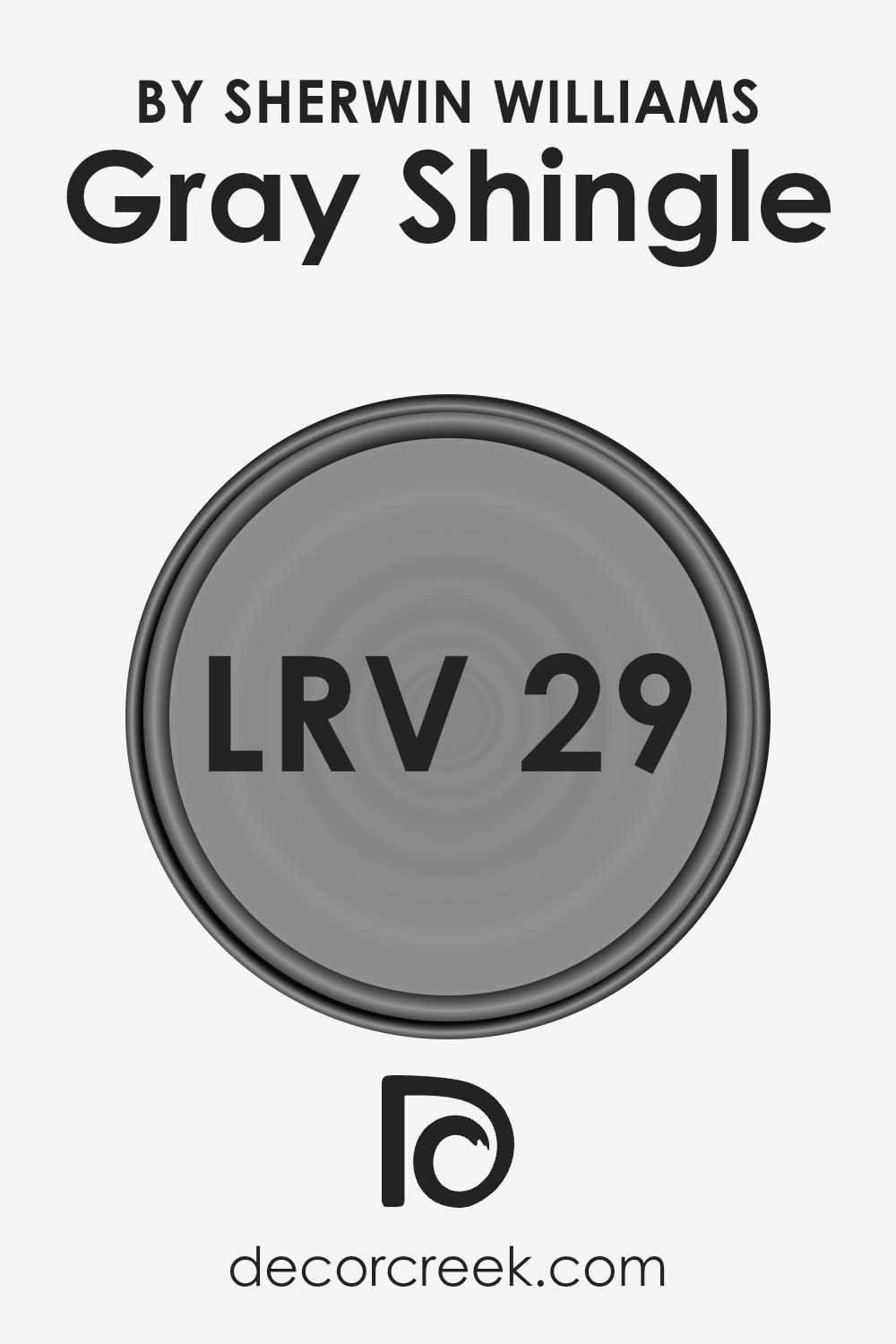
What is the LRV of Gray Shingle SW 7670 by Sherwin Williams?
Light Reflectance Value, or LRV, is a measurement that tells us how much light a color reflects or absorbs. Imagine it on a scale from 0 to 100, where 0 means the color absorbs all the light (making it really dark, like pure black) and 100 means it reflects all the light (making it very bright, like pure white).
This is super helpful when deciding on paint colors for your walls because the LRV can significantly affect how light or dark a room feels.
A higher LRV can make a small or dimly lit room feel more open and brighter, while a lower LRV can make a room feel cozier or smaller due to absorbing more light.
Now, considering the LRV of 29.269 for Gray Shingle, it’s on the lower end of the scale, meaning it doesn’t reflect a ton of light. This characteristic can deeply influence the ambiance of a room, particularly its perceived size and brightness.
In rooms with plenty of natural light, this color could add a nice, sophisticated touch without making the space feel too dark.
However, in a room with limited natural light, it might make the space appear smaller and more intimate.
It’s a beautiful, versatile color, but its effect is majorly dependent on the light available in the room, making it essential to consider the room’s lighting before deciding.
LRV – what does it mean? Read This Before Finding Your Perfect Paint Color
Coordinating Colors of Gray Shingle SW 7670 by Sherwin Williams
Coordinating colors are hues that complement each other well on the color wheel, creating visually appealing combinations that enhance the overall look of a space.
When you pick a paint color like Gray Shingle by Sherwin Williams, finding coordinating colors helps to ensure that your decor, furniture, and other elements of the room work seamlessly together, rather than clashing or feeling out of place.
These colors balance the main shade, adding depth, contrast, or harmony to your space depending on how they are used.
Intimate White, Extra White, and Crushed Ice are beautiful coordinating colors for Gray Shingle. Intimate White is a soft, warm hue that offers a subtle contrast to Gray Shingle, adding a cozy and comforting feel to any room.
It’s perfect for creating a serene and inviting atmosphere. Extra White, on the other hand, is a clean and crisp white that brings out the cool tones in Gray Shingle, making the space feel more open and bright.
It’s excellent for trims, ceilings, or even as a bold accent color. Crushed Ice is a light gray that harmonizes perfectly with Gray Shingle, providing a slight contrast while maintaining the room’s overall neutral palette.
This color is ideal for creating a smooth transition between spaces or as a complementary shade for a sophisticated look.
Together, these coordinating colors work to create a cohesive and stylish color scheme that enhances the beauty of Gray Shingle.
You can see recommended paint colors below:
- SW 6322 Intimate White
- SW 7006 Extra White
- SW 7647 Crushed Ice

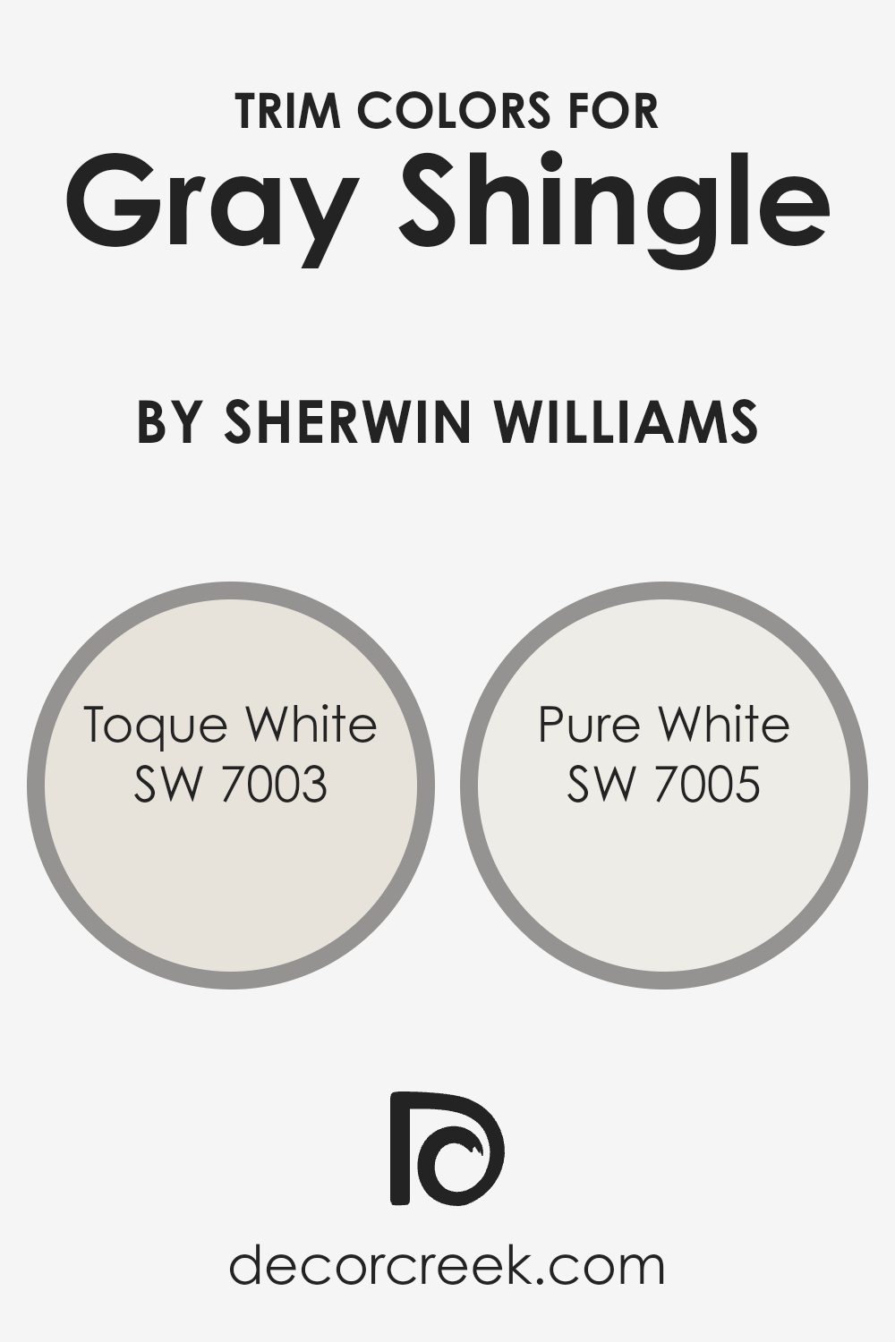
What are the Trim colors of Gray Shingle SW 7670 by Sherwin Williams?
Trim colors are essentially the shades chosen to adorn the borders, edges, and accent areas of rooms, such as door frames, window sills, skirting, and moldings.
When paired wisely with a wall color, trim colors can significantly enhance the overall aesthetic of a space.
For a sophisticated yet understated palette, utilizing trim colors like SW 7003 – Toque White or SW 7005 – Pure White alongside a main color such as Gray Shingle by Sherwin Williams creates a harmonious and appealing look.
These trim colors provide a crisp contrast that can make the wall color stand out more prominently, adding depth and dimension to the room.
The importance of trim colors lies in their ability to frame and define the space, creating visual interest and highlighting the architectural features of a room.
SW 7003 – Toque White is a soft, warm white with a subtle hint of beige, making it an excellent choice for creating a cozy and inviting atmosphere when used as a trim color.
This particular shade is versatile enough to complement the cooler undertones of Gray Shingle, ensuring a balanced and cohesive appearance.
On the other hand, SW 7005 – Pure White is a bright and clean white that offers a more striking contrast against darker shades. Using Pure White as a trim color can bring a crisp freshness to a space, making it feel more open and airy.
Both Toque White and Pure White are excellent choices for trim colors with Gray Shingle, as they can either soften or sharpen the overall look of a room, depending on the desired effect.
You can see recommended paint colors below:
- SW 7003 Toque White
- SW 7005 Pure White
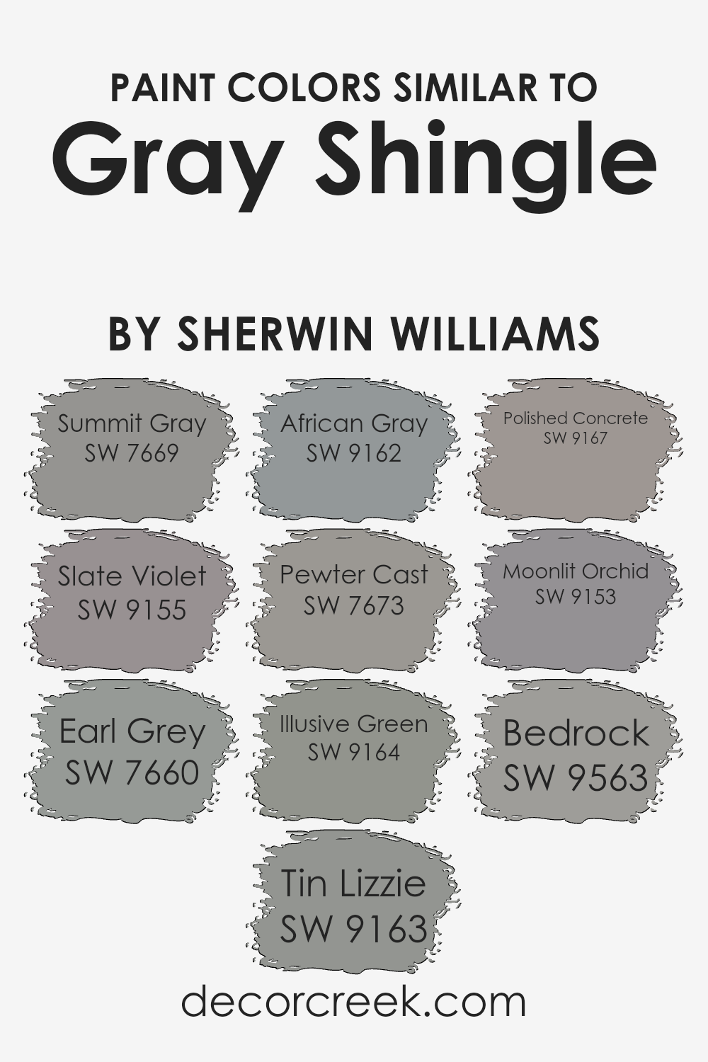
Colors Similar to Gray Shingle SW 7670 by Sherwin Williams
Similar colors play a pivotal role in design, creating a harmonious and cohesive look that can enhance the aesthetic appeal of any space.
When colors are closely related, like those similar to Gray Shingle by Sherwin Williams, they provide a seamless transition from one shade to another, offering depth and complexity without overwhelming the senses.
These colors, while distinct, share a common foundation, allowing them to work together effortlessly.
For example, Summit Gray offers a slightly cooler tone, hinting at a serene atmosphere, whereas Slate Violet introduces a subtle purple undertone, adding a touch of sophistication.
Earl Grey presents a refined, classic look with its deeper, resonant tones, whereas Tin Lizzie leans into a more industrial chic vibe with its metallic undertones.
African Gray brings a hint of the natural world indoors, with a warmth that mimics natural stone. Pewter Cast, on the other hand, offers a sturdier, more grounded feel, perfect for creating a strong base in any design.
Illusive Green adds an unexpected, muted green twist, infusing spaces with a soft, organic touch. Polished Concrete reflects modern trends, providing a sleek, contemporary edge.
Moonlit Orchid softly bridges the gap between gray and purple, offering a dreamy, ethereal quality. Lastly, Bedrock serves as a solid, dependable foundation with its earthier, more pronounced gray qualities.
Together, these similar colors ensure design flexibility while maintaining visual interest and continuity, allowing for personalization and variation within a beautifully unified color scheme.
You can see recommended paint colors below:
- SW 7669 Summit Gray
- SW 9155 Slate Violet
- SW 7660 Earl Grey
- SW 9163 Tin Lizzie
- SW 9162 African Gray
- SW 7673 Pewter Cast
- SW 9164 Illusive Green
- SW 9167 Polished Concrete
- SW 9153 Moonlit Orchid
- SW 9563 Bedrock
How to Use Gray Shingle SW 7670 by Sherwin Williams In Your Home?
Gray Shingle SW 7670 by Sherwin Williams is a versatile paint color that can creatively transform your home spaces. It’s a gentle gray hue that brings a peaceful and modern vibe to any room.
Whether you’re painting your living room, bedroom, or kitchen, Gray Shingle adds a touch of sophistication without overwhelming the space.
It works well in rooms with lots of natural light and complements both contemporary and traditional decor.
You can use this color to create a cozy backdrop for your favorite artwork or to give furniture a fresh, updated look.
In the kitchen, Gray Shingle cabinets could look stunning against white countertops, offering a calm and inviting atmosphere. For those looking to update their exterior, this color also looks incredible on home siding, delivering a timeless appeal.
Because of its neutral nature, it pairs beautifully with brighter colors for accents, like throw pillows or decorative vases, allowing you to easily refresh your room’s look without a full redecoration.
Whether you want a serene retreat or a stylish upgrade, Gray Shingle provides the perfect canvas to achieve your home decor goals.
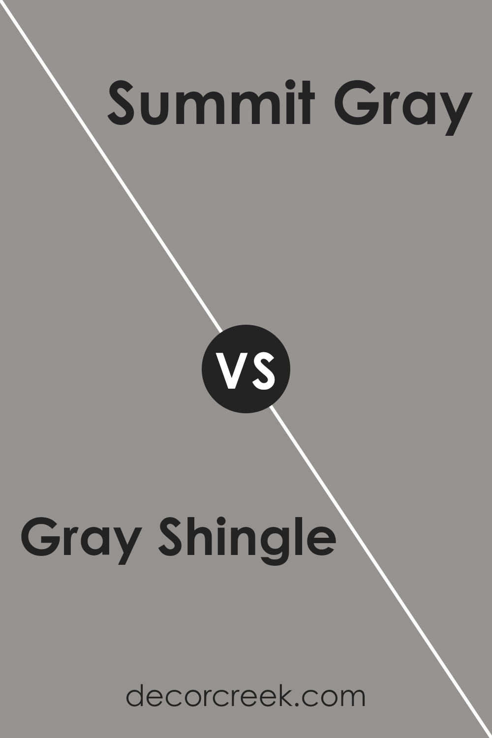
Gray Shingle SW 7670 by Sherwin Williams vs Summit Gray SW 7669 by Sherwin Williams
Gray Shingle and Summit Gray, both from Sherwin Williams, offer subtle yet distinct options for anyone looking to spruce up their space with neutral hues.
Gray Shingle is like a cozy, cloudy day, providing a calm and soothing backdrop that’s versatile for any room. It has a warmth to it that makes spaces feel inviting and homely.
On the other hand, Summit Gray stands a shade lighter, reminiscent of misty mornings. It brings a fresher, airier feel, making it perfect for creating a sense of space and light in smaller or darker rooms.
While both colors share a gray base, Gray Shingle leans towards a deeper, more enveloping feel, whereas Summit Gray offers a brighter, more uplifting vibe.
Choosing between them comes down to the mood you want to set: cozy and secure with Gray Shingle or open and breezy with Summit Gray.
You can see recommended paint color below:
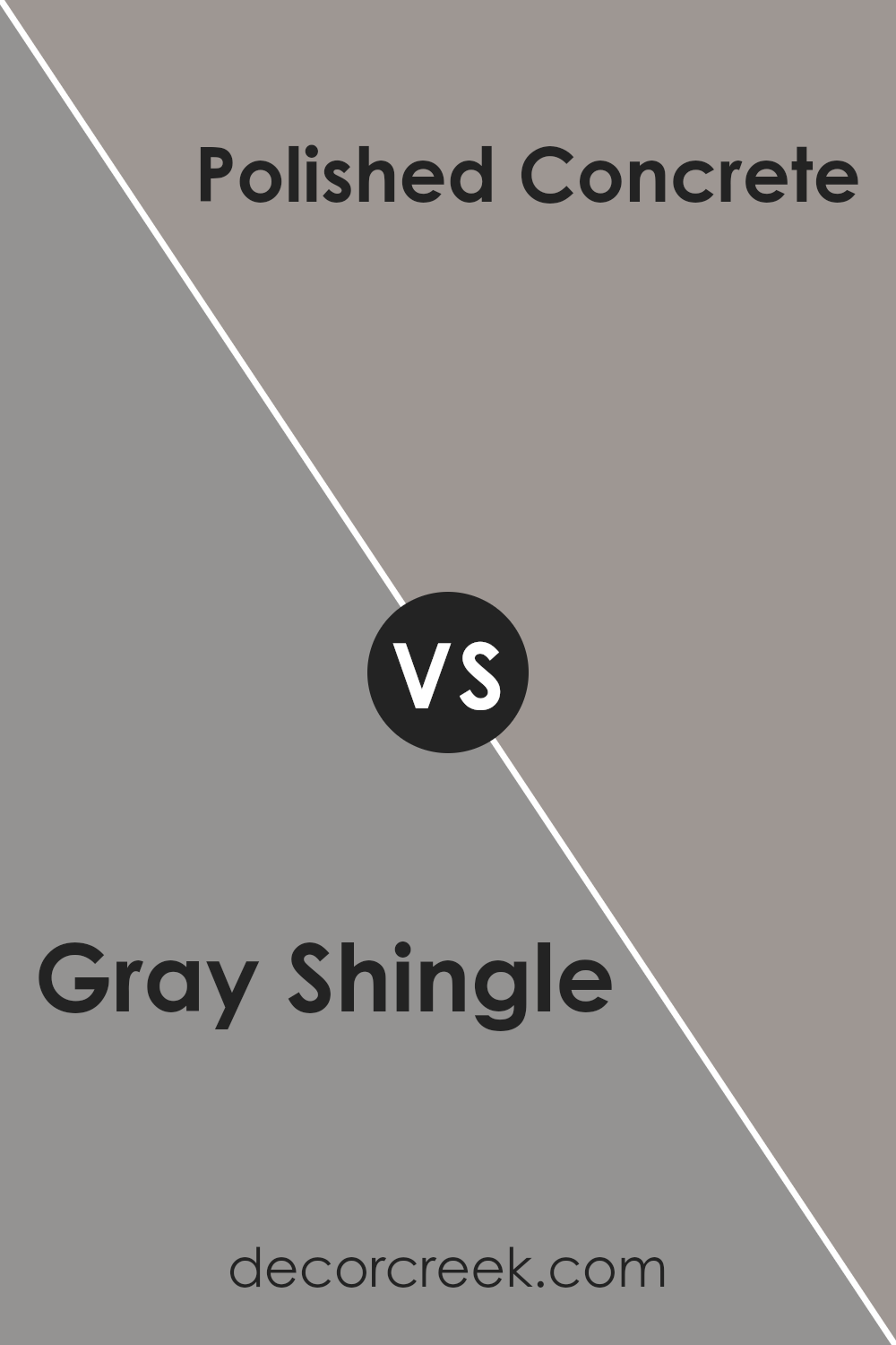
Gray Shingle SW 7670 by Sherwin Williams vs Polished Concrete SW 9167 by Sherwin Williams
When you look at Gray Shingle, you’ll notice it’s a soft, neutral gray with a cozy, welcoming feel. It’s a versatile color that can make any space feel more comfortable and put together.
On the other hand, Polished Concrete is a cooler, more modern gray with a hint of blue undertone. This gives it a sleek and contemporary vibe, perfect for adding a touch of sophistication to any room.
While Gray Shingle brings warmth and a sense of home, Polished Concrete offers a chic, urban feel.
Both are great choices from Sherwin Williams, but they serve slightly different purposes depending on the atmosphere you’re aiming to create.
Whether you’re looking for something homey or more on the modern side, these grays offer appealing options.
You can see recommended paint color below:
- SW 9167 Polished Concrete
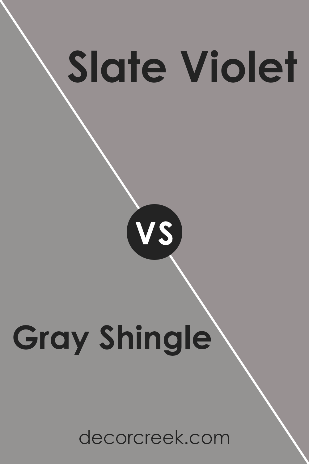
Gray Shingle SW 7670 by Sherwin Williams vs Slate Violet SW 9155 by Sherwin Williams
Gray Shingle is a neutral color that gives off a classic and timeless vibe. It’s like the color of pebbles on a beach – not too dark, not too light, just right for a calm and soothing atmosphere.
It’s flexible and pairs well with a lot of other colors, making it a go-to choice for those wanting a subtle yet sophisticated look.
On the other hand, Slate Violet brings a unique twist to the table. Imagine the soft, mysterious shadows at dusk, when the sky is just turning from day to night – that’s the mood Slate Violet captures.
It’s a bit bolder than Gray Shingle, offering a hint of depth with its understated purple tones, yet it still holds on to that cool, serene feel that makes it surprisingly versatile.
In essence, Gray Shingle is your perfect background color, easy to pair and universally appealing, while Slate Violet adds a touch of intrigue and personality, making spaces feel special without overwhelming them.
You can see recommended paint color below:
- SW 9155 Slate Violet
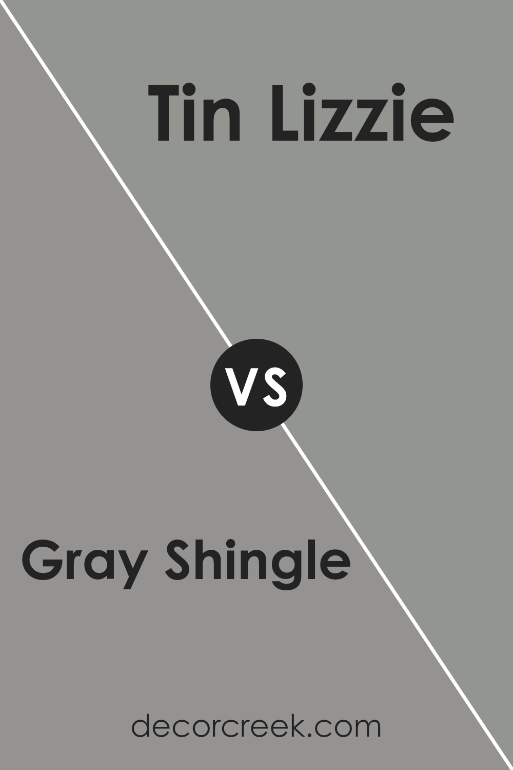
Gray Shingle SW 7670 by Sherwin Williams vs Tin Lizzie SW 9163 by Sherwin Williams
Both Gray Shingle and Tin Lizzie are colors by Sherwin Williams, but they offer distinct tones that could change the mood of a room. Gray Shingle is a lighter gray that brings a soft, airy feel to spaces.
It’s subtle and versatile, making it easy to pair with various decor elements. On the other hand, Tin Lizzie steps into the room with a bit more depth.
This color could be described as a darker, more muted gray that carries an understated elegance. While still in the gray family, Tin Lizzie offers a stronger statement and might be better suited for those looking to add a touch of sophistication or anchor a room without going too dark.
Both colors are beautiful in their own right, but the choice between them depends on what atmosphere you’re aiming to create.
Gray Shingle might be more fitting for a relaxed, bright environment, whereas Tin Lizzie could create a cozier, more refined space.
You can see recommended paint color below:
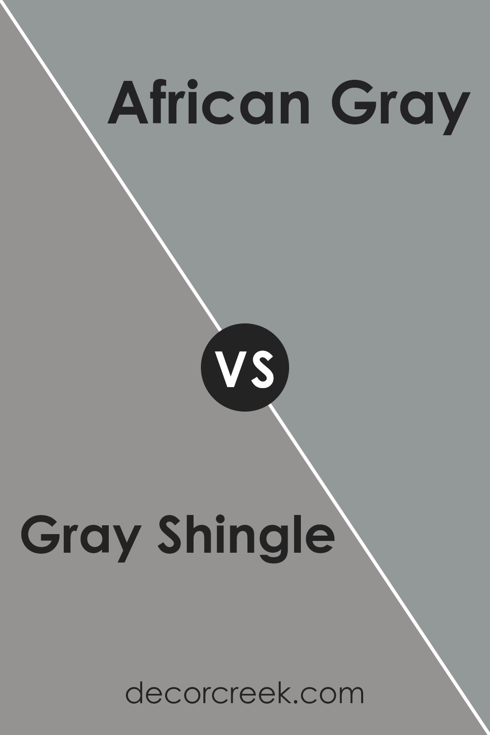
Gray Shingle SW 7670 by Sherwin Williams vs African Gray SW 9162 by Sherwin Williams
Gray Shingle by Sherwin Williams is a nuanced shade of gray that has a balanced, mid-tone quality. It’s a versatile color, easily fitting into a wide variety of decor styles, from modern to traditional.
Its warmth lies in its subtle undertones, making it welcoming and easy to match with other colors.
On the other hand, African Gray by Sherwin Williams steps into the realm with a slightly different mood.
This color leans towards a more neutral, softer presence, making it an excellent choice for spaces intended to have a calming and soothing vibe.
African Gray’s undertone is key to its unique appeal, offering a hint of complexity that enriches its overall presence without overpowering.
When comparing both, Gray Shingle presents itself as the more robust, stand-out color due to its depth, making it ideal for statement walls or accents.
African Gray, with its gentler touch, is perfect for creating a serene backdrop in any room. Each color offers its charm, and the choice between them would depend on the atmosphere one aims to create.
You can see recommended paint color below:
- SW 9162 African Gray
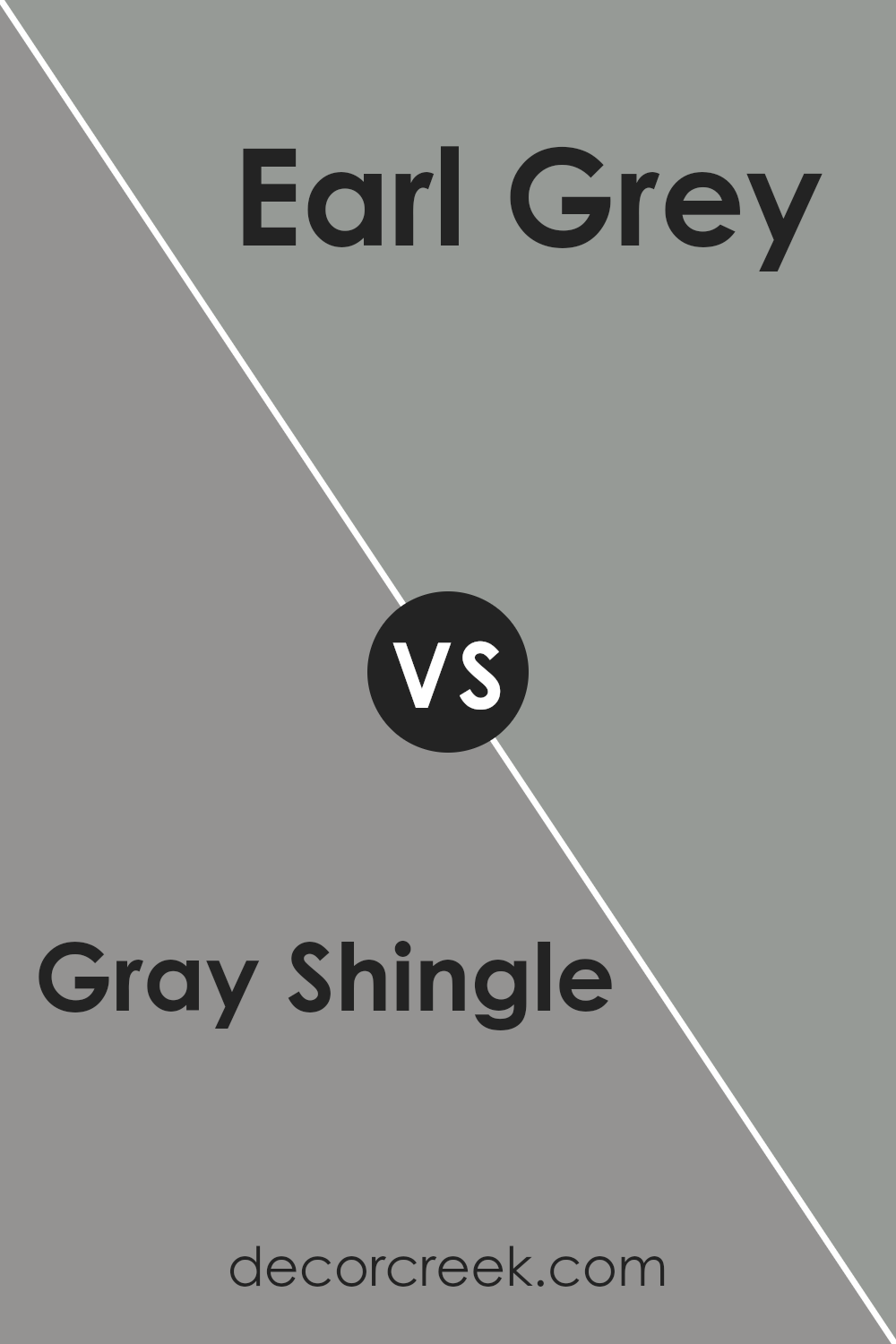
Gray Shingle SW 7670 by Sherwin Williams vs Earl Grey SW 7660 by Sherwin Williams
Gray Shingle (SW 7670) and Earl Grey (SW 7660) by Sherwin Williams offer subtle but distinct differences in the world of gray paint colors. Think of Gray Shingle as a lighter, more neutral gray.
It’s like a soft, cloudy sky, bringing a gentle, airy feel to rooms. This color works well in spaces where you want a touch of modernism without going too dark.
It’s versatile, fitting in with various decor styles and settings, from living rooms to bedrooms.
On the other hand, Earl Grey stands a bit darker and carries a deeper tone, reminiscent of the soothing warmth of a cup of Earl Grey tea.
Its richness adds a layer of sophistication and depth, ideal for creating a more pronounced, cozy atmosphere. It suits areas where you aim for a stronger character or a focal point, like accent walls or cabinets.
In essence, while both colors share a gray base, Gray Shingle lights up spaces with its soft neutrality, whereas Earl Grey brings a warmer, more enveloping feel.
Choosing between them depends on the mood and style you’re aiming for in your space.
You can see recommended paint color below:
- SW 7660 Earl Grey
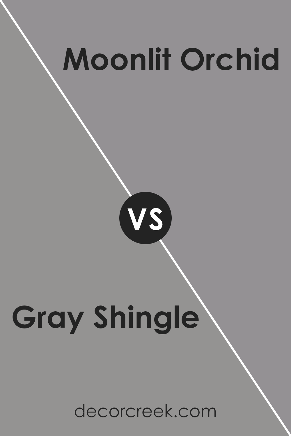
Gray Shingle SW 7670 by Sherwin Williams vs Moonlit Orchid SW 9153 by Sherwin Williams
Gray Shingle is a flexible, mid-tone gray that offers a balanced, neutral backdrop. It’s the kind of color that can fit in almost anywhere, from exteriors to interiors, giving a timeless and sophisticated vibe.
Its strength lies in its versatility; it can match a wide range of decor styles and other colors, making it a solid choice for anyone looking to keep things elegant yet understated.
Moonlit Orchid, on the other hand, brings a much warmer, deeper contrast. This color leans towards a rich, dusky purple that can invoke a cozy and slightly moody atmosphere.
It’s the sort of color that adds depth and interest to a space without overwhelming it with brightness.
While it’s definitely bolder than Gray Shingle, Moonlit Orchid still maintains a level of subtlety, offering warmth and character to rooms without being too loud.
Despite their differences, both colors offer unique ways to add sophistication and character to your space.
Whether you’re going for the cool neutrality of Gray Shingle or the warm depth of Moonlit Orchid, each color has its charm, enhancing the environment in its unique way.
You can see recommended paint color below:
- SW 9153 Moonlit Orchid
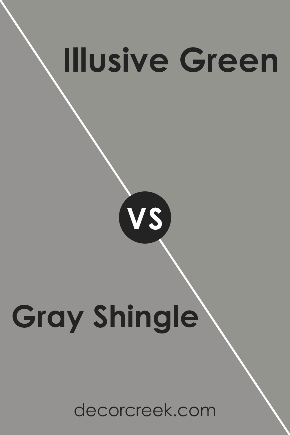
Gray Shingle SW 7670 by Sherwin Williams vs Illusive Green SW 9164 by Sherwin Williams
Gray Shingle by Sherwin Williams is a cozy, versatile gray that carries a calming presence, perfect for creating a serene and elegant space.
It’s a cool-toned gray that pairs well with both bright and muted colors, making it a solid choice for any room looking for a touch of sophistication without being too overpowering.
On the other hand, Illusive Green by Sherwin Williams is a unique, soft green with gray undertones. This color brings a subtle hint of nature indoors, offering a refreshing and soothing vibe.
It’s excellent for rooms that could use a gentle pop of color without going too bold. Illusive Green works beautifully in spaces with a lot of natural light or areas where you want to promote relaxation and tranquility.
Comparing the two, Gray Shingle leans towards a classic, timeless look while Illusive Green introduces a more specific, albeit gentle, splash of color.
Both paint colors offer a peaceful background for various decor styles and preferences, but your choice between them might come down to whether you prefer the understated elegance of gray or the soft, refreshing feel of a green with gray layers.
You can see recommended paint color below:
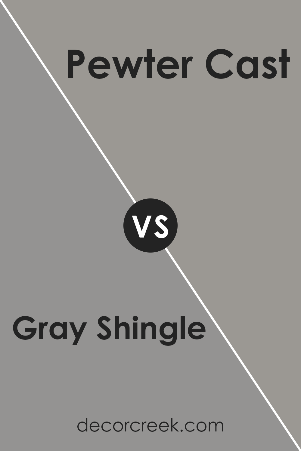
Gray Shingle SW 7670 by Sherwin Williams vs Pewter Cast SW 7673 by Sherwin Williams
Gray Shingle and Pewter Cast, both by Sherwin Williams, have their unique tones that cater to a range of decorating styles. Gray Shingle is a softer, lighter gray that brings a sense of calm and subtlety to spaces.
Its quiet charm works well in areas where you want to create a peaceful and serene ambiance, making it great for bedrooms or living areas.
On the other hand, Pewter Cast has a deeper, more pronounced gray tone that adds a bit of strength and character wherever it’s applied. This color is perfect for creating a bold statement, perhaps in a home office or a dining area, without overwhelming the space.
Both colors offer a modern and sleek look, but where Gray Shingle leans towards a gentle, airy feel, Pewter Cast steps in with more depth and a stronger presence, allowing for a versatile palette depending on the mood and function of the room.
You can see recommended paint color below:
- SW 7673 Pewter Cast
Gray Shingle SW 7670 by Sherwin Williams vs Bedrock SW 9563 by Sherwin Williams
Gray Shingle and Bedrock by Sherwin Williams are two distinct shades that offer unique qualities for different spaces. Gray Shingle is a soft, light gray that brings a gentle, calm feel to a room.
It’s a versatile color that can make small spaces appear larger and brighter.
It works well in almost any space, providing a neutral backdrop that can easily pair with bolder colors or serve as a standalone hue for a minimalist look.
On the other hand, Bedrock is a deeper, warmer gray with earthy undertones. This color adds a bit more depth and character to a room, creating a cozy and inviting atmosphere.
It’s perfect for spaces where you want to add a touch of sophistication without overwhelming the area with too dark a color. Bedrock pairs well with natural materials like wood and stone, enhancing the warmth and texture in a space.
While both colors share the versatility of gray, Gray Shingle leans towards a cooler, lighter tone, making spaces feel airy and open.
Bedrock, with its warmer, richer tone, offers a snug, comforting vibe, ideal for creating a cozy retreat. Choosing between them depends on the mood you’re aiming to achieve in your space.
You can see recommended paint color below:
Conclusion
Gray Shingle SW 7670 by Sherwin Williams stands out as a versatile color choice for those looking to bring a subtle yet impactful aesthetic to their space.
The color, a balanced mix of gray tones, offers a neutral palette that can effortlessly complement a wide range of decor styles, from modern to rustic.
Its adaptability makes it a go-to option for homeowners and designers aiming to create a serene and timeless environment.
The color’s understated elegance ensures it can seamlessly integrate with various color schemes, adding depth and sophistication without overpowering a room’s existing elements.
Moreover, its practicality extends beyond just aesthetic appeal. Gray Shingle is also known for its ability to enhance the perceived size and brightness of a space, making it an excellent choice for both small and large rooms.
Whether applied on walls, cabinets, or exterior facades, this color maintains its integrity, providing a consistent look that can withstand changing trends.
Its durability and ease of application further affirm its position as a preferred choice among paint options. Ultimately, Gray Shingle SW 7670 by Sherwin Williams is more than just a color; it’s a smart investment in creating a welcoming and stylish space that feels like home.
Ever wished paint sampling was as easy as sticking a sticker? Guess what? Now it is! Discover Samplize's unique Peel & Stick samples.
Get paint samples