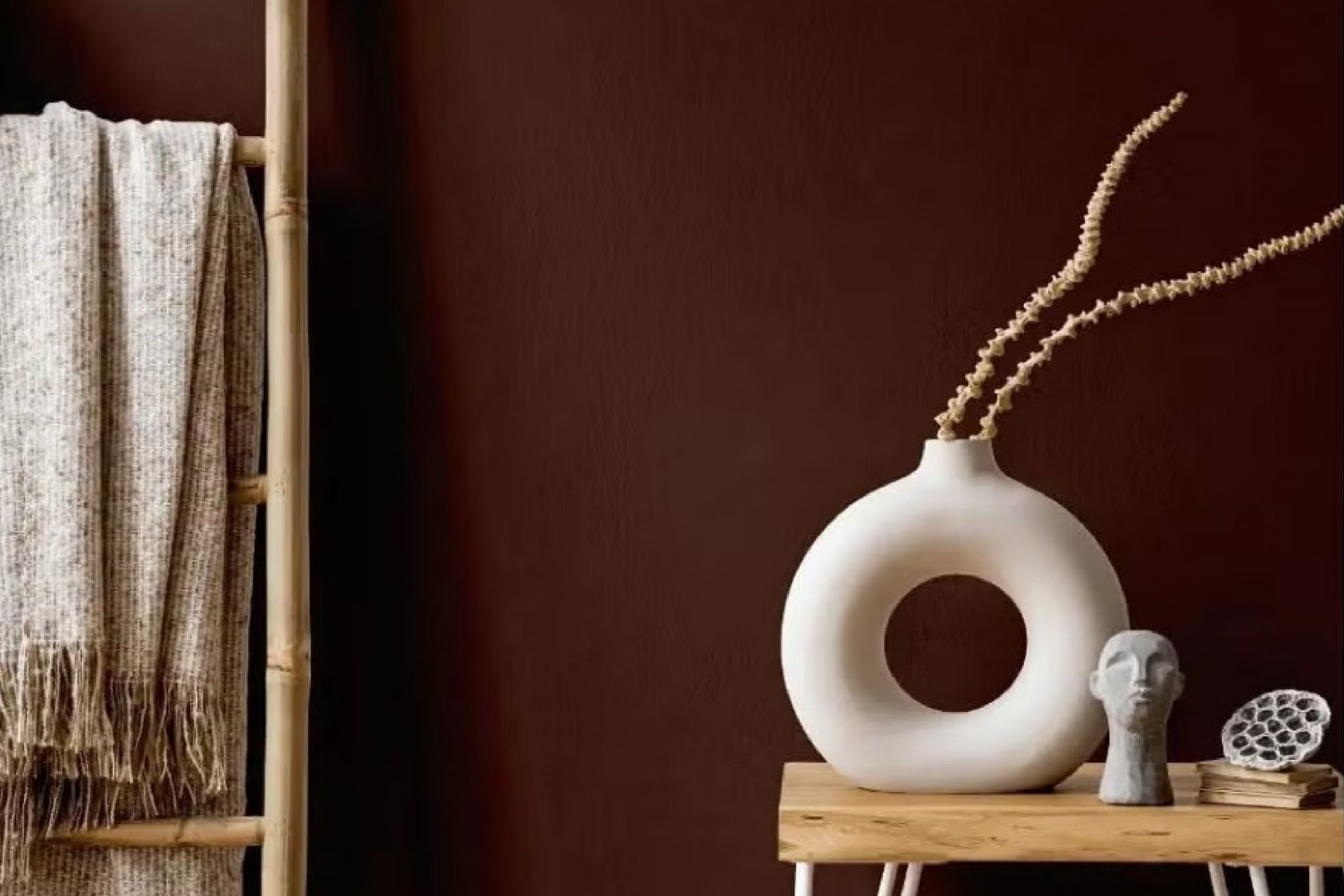
Color can truly set the mood in any space, and when you want to add warmth and a sense of serenity, SW 9182 Rojo Marron by Sherwin Williams is a perfect choice. This rich, deep hue combines elements of brown and red, creating an inviting atmosphere that feels cozy yet sophisticated.
As someone who has always leaned towards neutrals, I was surprised at how this particular shade brought a new dimension to my living room. The versatility of Rojo Marron is impressive. It works beautifully in different areas of a home, from creating a welcoming entryway to enhancing the intimacy of a dining room.
Its ability to complement various decor styles—from rustic to modern—makes it a reliable choice for anyone looking to update their interiors.
Whether you’re planning to repaint a single accent wall or revamp an entire room, using Rojo Marron can provide a refreshing yet timeless look that feels both luxurious and grounded.
What Color Is Rojo Marron SW 9182 by Sherwin Williams?
Rojo Marron, a rich paint color from Sherwin Williams, offers a warm, earthy tone that resembles a blend of deep red and brown. This unique color brings to mind the cozy feel of autumn leaves or a well-worn leather chair, making it perfect for creating a warm and inviting atmosphere in any room.
This color works exceptionally well in rustic and traditional interior styles. It has the ability to add depth and warmth to spaces, enhancing the homey feel that these styles aim to achieve. Rojo Marron is also a great choice for colonial or Victorian interiors, where its deep tones can highlight ornate architectural details.
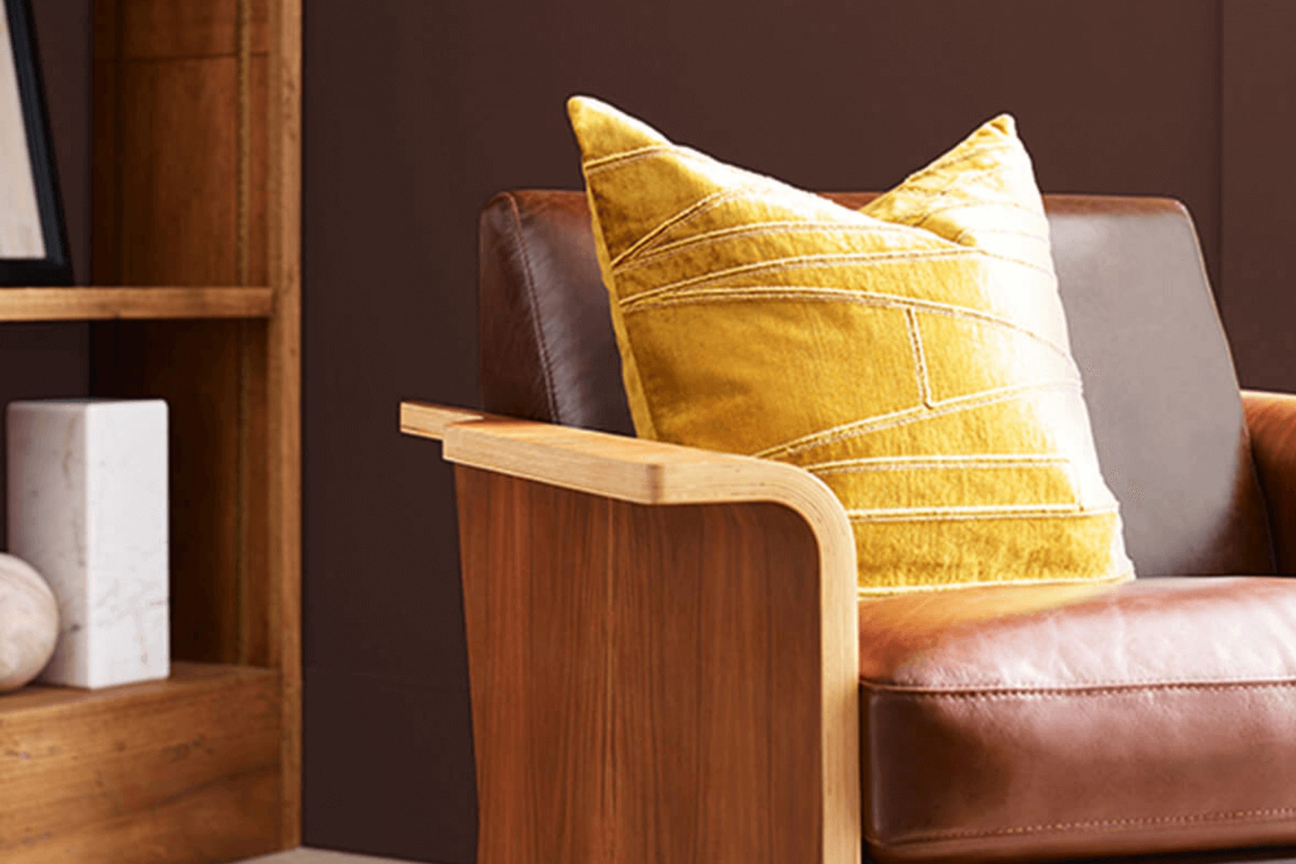
When it comes to pairing materials, Rojo Marron goes beautifully with natural wood, whether it’s a dark stained mahogany or a lighter oak. This combination reinforces a connection with nature and adds to the room’s overall warm feel. Textures like wool, burlap, and tweed also complement this color well, providing a tactile contrast to the smoothness of painted surfaces. For a more luxurious look, pairing Rojo Marron with velvet or silk in darker tones can create a rich and cozy environment. These combinations make it a versatile choice for a variety of spaces, from living rooms to cozy reading nooks.
Is Rojo Marron SW 9182 by Sherwin Williams Warm or Cool color?
Rojo Marron by Sherwin Williams is a warm, deep brown with a hint of red that brings a cozy and inviting feel to any room. This color is perfect for creating a welcoming atmosphere in spaces like living rooms or dining areas where you spend a lot of time with family or entertaining guests.
It pairs well with softer neutrals like beige or creamy whites, which can help lighten the overall mood without taking away from the richness of the brown. Rojo Marron also works nicely as an accent wall color, giving a pop of warmth to a room without overwhelming it.
This shade is versatile enough to blend with various decor styles, from rustic to more modern setups. Proper lighting can really enhance the depth of this color, with natural light bringing out its vibrant undertones, making the space feel more lively and cozy.
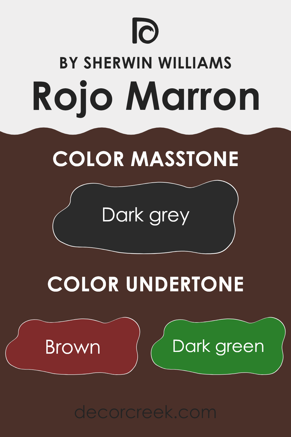
Undertones of Rojo Marron SW 9182 by Sherwin Williams
Rojo Marron is a unique color by Sherwin Williams that holds a complex blend of undertones. These undertones—brown, dark green, navy, olive, purple, dark turquoise, and grey—add depth and versatility to the paint color, affecting how it appears in different lighting and against different decor.
Understanding undertones is crucial because they subtly influence the main hue, resulting in varied perceptions under different circumstances. For instance, in a brightly lit room, the lighter undertones might become more prominent, making the color appear softer or slightly different from its appearance in a dimly lit area.
When applied on interior walls, Rojo Marron’s blend of undertones offers a dynamic visual experience. The brown undertone adds warmth, making spaces feel more inviting. Navy and dark turquoise can give a sense of calm and depth, complementing rooms with natural light or nautical themes. The subtle hints of olive and grey can help in creating a grounded, neutral backdrop that works well with wooden furniture or greenery.
In essence, the undertones enrich the primary color and allow for more creative freedom in decorating. Whether one’s style is more rustic, vintage, or modern, this paint can adapt and contribute uniquely to the overall aesthetic of a room. This versatility makes it a practical choice for those looking to add character to their interiors without overwhelming the space.
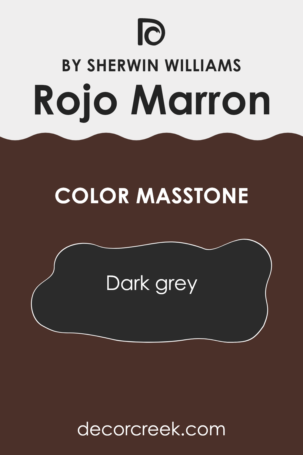
What is the Masstone of the Rojo Marron SW 9182 by Sherwin Williams?
Rojo Marron, known by its code SW 9182, leans more towards a dark grey shade, which is denoted by its masstone, #2B2B2B. The deep, near-black grey color has a solid and grounding effect, making it a popular choice for interior spaces where a sense of stability and strength is desired.
This color is versatile and can work well in various rooms, from living areas to bedrooms. Its neutral yet deep tone helps create a cozy, intimate atmosphere, perfect for spaces meant for relaxation or entertainment.
When used on walls, this dark grey color can make bold decor elements pop or blend smoothly with other neutral shades to form a sleek, cohesive look. Additionally, this darker shade can serve well in creating an optical illusion of smaller rooms appearing larger by adding depth to the space.
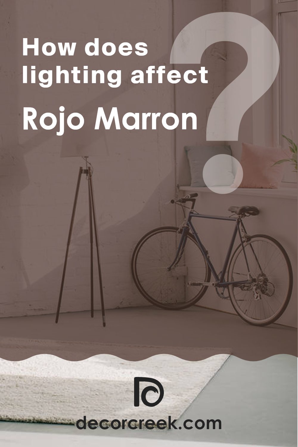
How Does Lighting Affect Rojo Marron SW 9182 by Sherwin Williams?
Lighting plays a significant role in how we perceive colors. The colors of walls or objects can look different under various lighting conditions due to how light interacts with surface pigments. Understanding this interaction can help you make informed decisions about room colors.
Let’s consider a color like Rojo Marron by Sherwin Williams, which falls into the category of deep, rich red-brown hues. Under artificial light, such as LED or fluorescent bulbs, this color may show its deeper, richer brown tones, creating a cozy and warm atmosphere in the room. The specific type of artificial light can affect the color’s appearance: warmer bulbs will enhance its red tones, while cooler bulbs might make it appear more muted.
In natural light, Rojo Marron can look quite different depending on the direction the light comes from. Rooms that face north typically receive less direct sunlight, which may make this color appear darker and more subdued. North-facing rooms often have a cooler light, which could make the color lean more towards its brown tones rather than the vibrant red.
South-facing rooms get abundant light for most of the day. This exposure generally casts a warmer and brighter light, making Rojo Marron look more vivid and rich, highlighting its warmer red undertones. It makes the color feel warmer and more inviting.
In east-facing rooms, the morning light can bring out the brightness in Rojo Marron, emphasizing its red tones in the morning, which could fade to a softer and cooler shade as the day progresses. Conversely, in west-facing rooms, the color may look muted during the morning and become warmer and more intense as the day ends and evening light floods in.
In summary, Rojo Marron’s appearance can vary widely depending on lighting conditions. Whether in natural or artificial light, and depending upon the room’s orientation, the effects of light can significantly alter how this color is perceived, affecting the overall feel of the space.
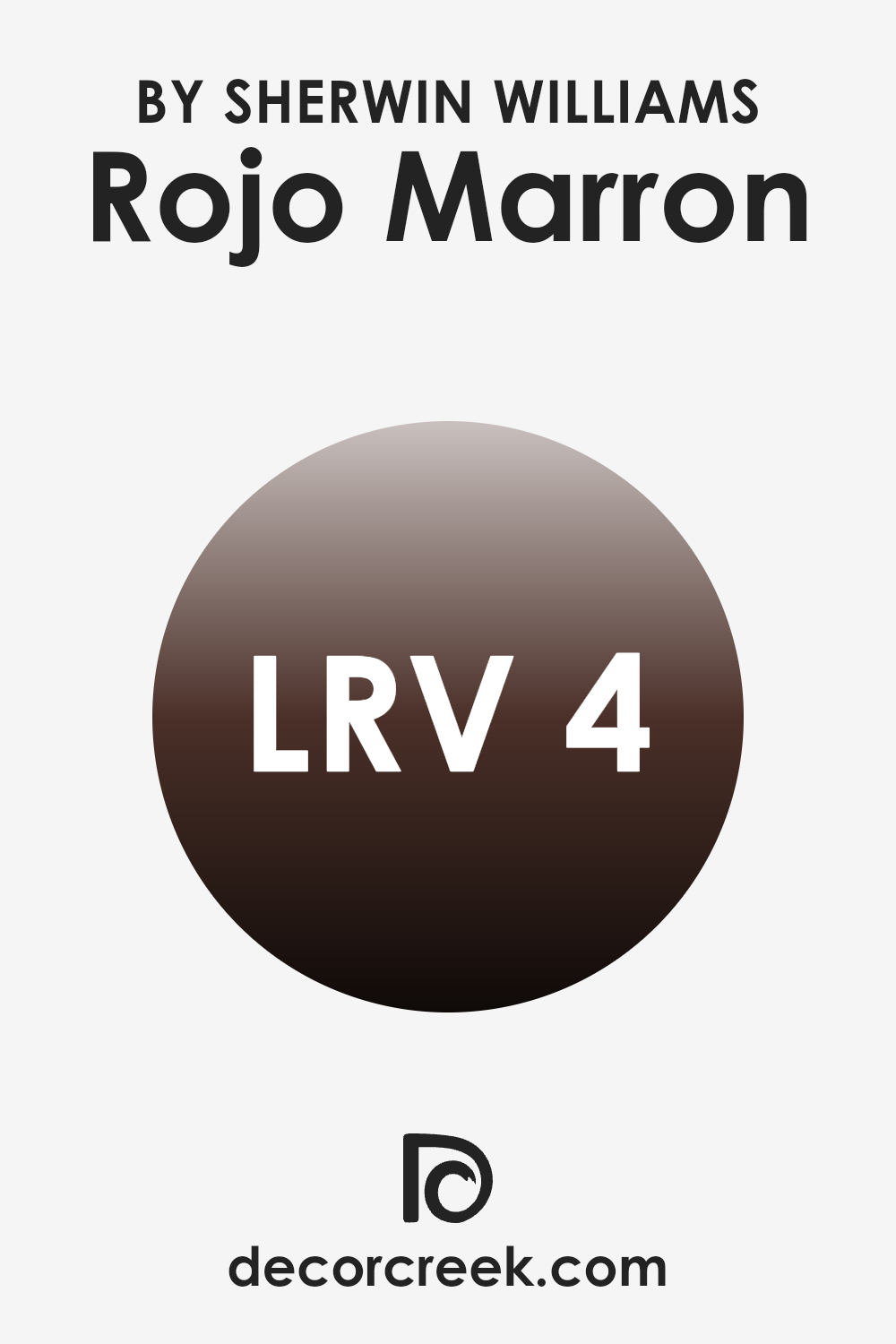
What is the LRV of Rojo Marron SW 9182 by Sherwin Williams?
LRV stands for Light Reflectance Value, a measure indicating the amount of light a color reflects or absorbs. Colors with a high LRV reflect more light, making the space feel brighter, whereas those with a low LRV absorb more light, giving a darker appearance. This measurement is crucial when choosing paint colors as it helps predict how light or dark a shade will appear in a specific environment.
A higher LRV means the color might be more suitable for darker rooms to make them appear lighter, while a lower LRV could be better for a space with plenty of natural sunlight, providing balance by absorbing excess light.
With an LRV of 3.827, Rojo Marron is on the lower end of the scale, meaning it absorbs much more light than it reflects. In rooms with minimal natural light, this deep, rich color could make the space appear even darker. On the other hand, when used in well-lit areas or rooms with ample artificial lighting, Rojo Marron can add depth and warmth, enhancing the overall ambiance without making the room feel small or cramped. This makes it a versatile choice depending on the existing light conditions and the desired effect in the room.
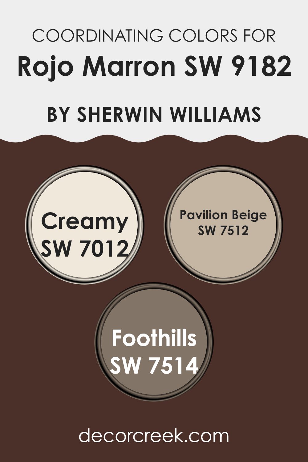
Coordinating Colors of Rojo Marron SW 9182 by Sherwin Williams
Coordinating colors are selected hues that complement a primary color, creating a harmonious and visually appealing palette for any space. When working with a rich color like Rojo Marron from Sherwin Williams, choosing the right coordinating colors can enhance the atmosphere of a room. Colors like SW 7012 (Creamy), SW 7512 (Pavilion Beige), and SW 7514 (Foothills) serve this purpose perfectly, each adding its unique touch while maintaining balance and fluidity with the primary shade.
SW 7012, known as Creamy, is a soft, warm white that adds a gentle brightness when paired with darker, more intense colors. It helps to lighten the room and provides a subtle contrast that highlights the depth of Rojo Marron.
On the other hand, SW 7512, or Pavilion Beige, offers a neutral base that leans slightly warmer, making it an excellent middle ground that bridges the boldness of Rojo Marron with softer accents. Lastly, SW 7514, called Foothills, is a muted brown that complements the deeper red-brown of Rojo Marron by providing a natural, earthy element to the palette. Together, these colors work in harmony to create a welcoming and well-balanced color scheme that enhances the overall aesthetic of any space.
You can see recommended paint colors below:
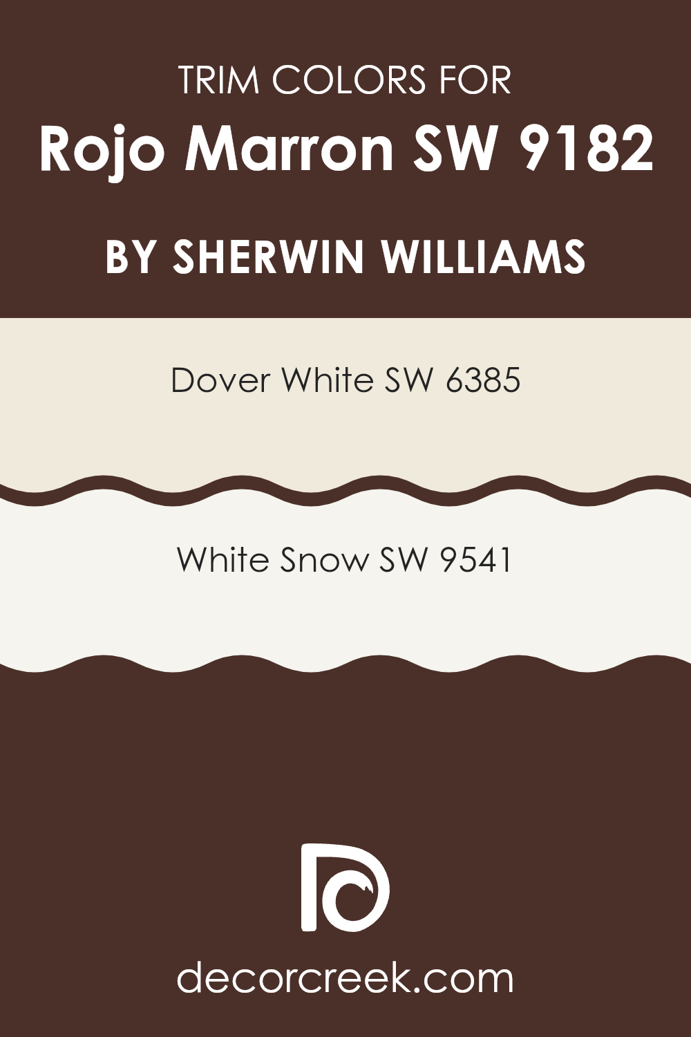
What are the Trim colors of Rojo Marron SW 9182 by Sherwin Williams?
Trim colors are the accents used on the edges or borders of walls, doors, windows, and other architectural elements to create a defined or finished look in a space. By selecting the right trim color, you can effectively bring out the beauty of the wall paint, in this case, Rojo Marron by Sherwin Williams.
Trim colors like Dover White or White Snow can provide a sharp contrast that not only highlights the vibrant, deep tones of Rojo Marron but also adds a clean, crisp edge to the overall visual aesthetic. This is especially important because trim colors help to visually separate different parts of a building or room, making the design look more organized and neatly put together.
Dover White (SW 6385) is a warm, creamy white that offers a soft yet bright contrast to richer and darker hues. Its creamy quality ensures that it doesn’t come across as too stark, which allows it to complement the warm undercurrents of Rojo Marron rather than clashing with them.
On the other hand, White Snow (SW 9541) is a crisp, pure white that provides a fresh and striking contrast, making it ideal for those who prefer a sharper delineation between wall colors and trim. This color works well in highlighting the boldness of a color like Rojo Marron, ensuring that both colors stand out while providing a refreshing balance.
You can see recommended paint colors below:
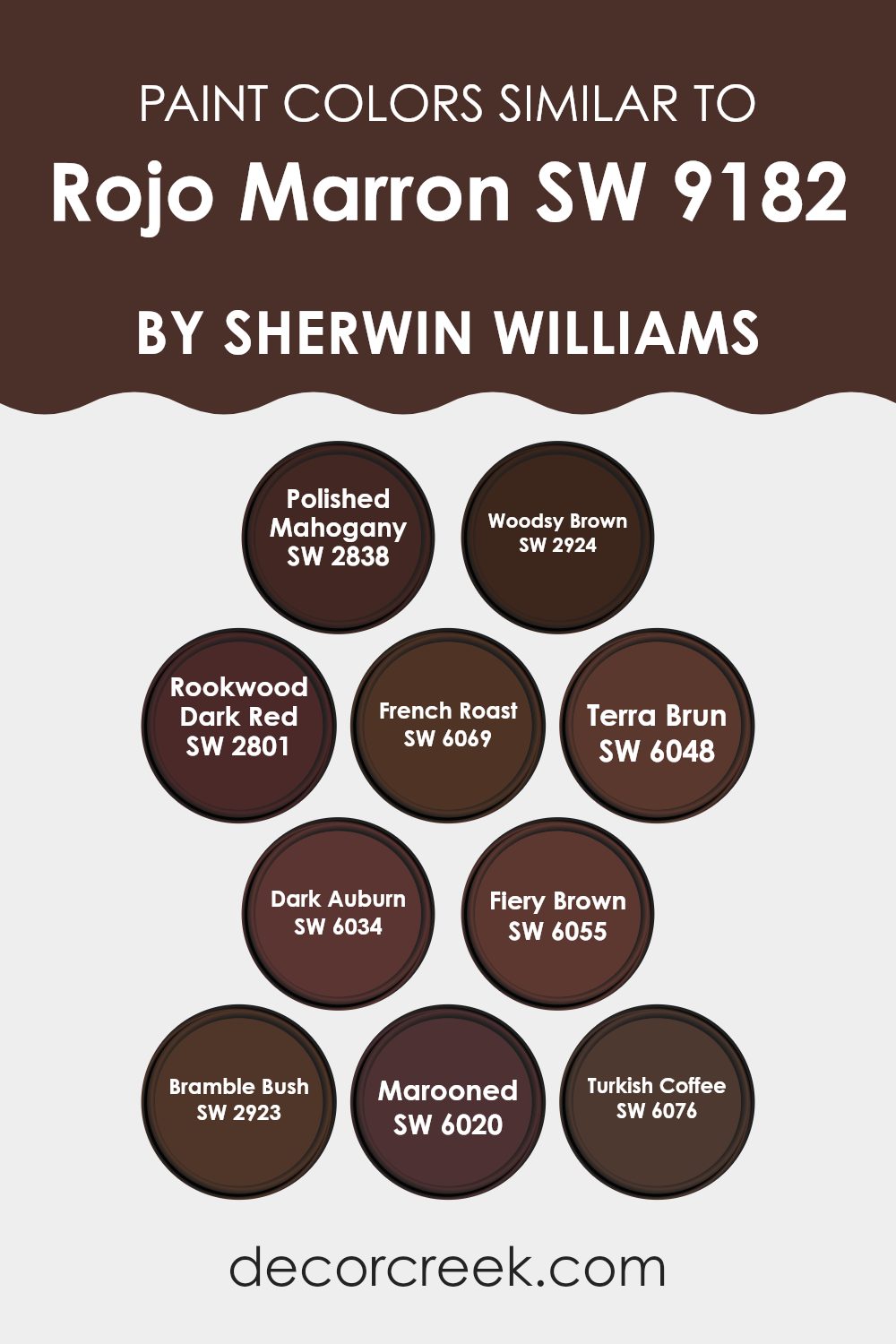
Colors Similar to Rojo Marron SW 9182 by Sherwin Williams
Choosing similar colors can be particularly useful when aiming for a harmonious and cohesive look in your space. Colors that are close in hue and saturation tend to blend seamlessly, creating a soothing effect without sharp contrasts. For example, using shades like Polished Mahogany—a rich, deep brown with a hint of warmth—can add depth to a room while maintaining a consistent color palette.
Similarly, Woodsy Brown offers a robust, earthy presence, complimenting other deep reds and browns. On the other hand, Rookwood Dark Red boasts a darker red tone, perfect for accent walls or furniture, adding a touch of elegance in combination with other close hues.
French Roast and Terra Brun both draw from the darker, coffee-inspired spectrum, providing a strong background that is both grounding and unobtrusive. Dark Auburn, with its deeper red and brown blend, works beautifully alongside such colors, enhancing the richness of the palette. Fiery Brown adds a more vibrant, intense touch with its slightly redder undertone.
Furthermore, Bramble Bush offers a subtle green undertone, giving a natural feel that complements wood elements in decor. Marooned, with its muted maroon shade, and Turkish Coffee, with its almost black richness, are perfect for creating depth and definition, working well to highlight focal points in the decor. Together, these colors create a balanced and visually appealing environment.
You can see recommended paint colors below:
- SW 2838 Polished Mahogany
- SW 2924 Woodsy Brown
- SW 2801 Rookwood Dark Red
- SW 6069 French Roast
- SW 6048 Terra Brun
- SW 6034 Dark Auburn
- SW 6055 Fiery Brown
- SW 2923 Bramble Bush
- SW 6020 Marooned
- SW 6076 Turkish Coffee
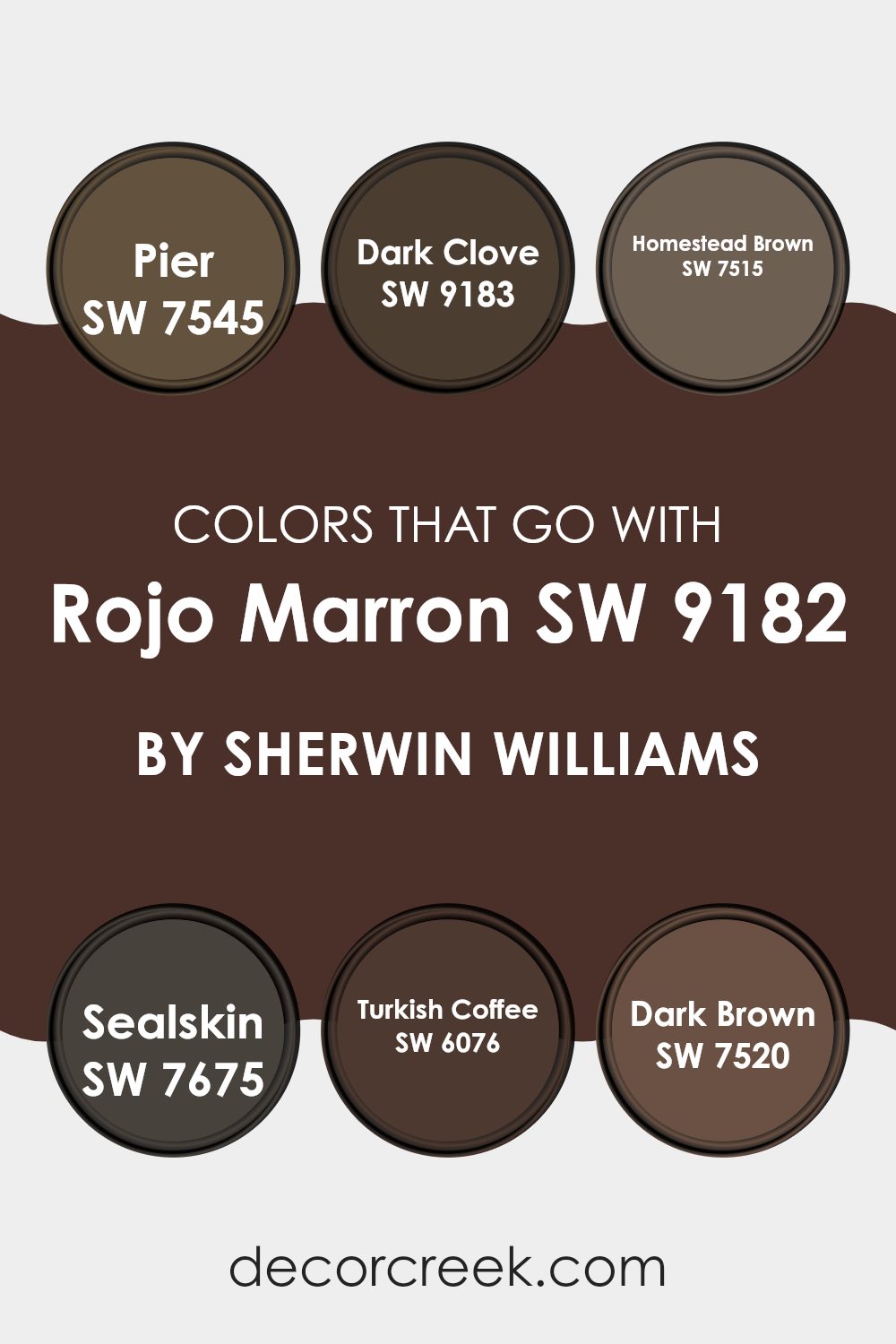
Colors that Go With Rojo Marron SW 9182 by Sherwin Williams
Choosing the right colors to complement Rojo Marron SW 9182 by Sherwin Williams is crucial because it helps create a cohesive and appealing look in any space. Rojo Marron is a deep, warm brown that serves as a robust base for a variety of interior designs. When paired with well-chosen colors like SW 7545 – Pier or SW 9183 – Dark Clove, it enhances the overall aesthetic and sets a welcoming tone.
Pier is a muted taupe color that balances the intensity of Rojo Marron with its light, airy feel. It’s perfect for creating a soft contrast. Dark Clove, on the other hand, is a rich brown with a hint of black that deepens the environment, creating a cozy and inviting atmosphere.
Further expanding the color palette, SW 7515 – Homestead Brown offers a slightly redder tone that warms up spaces without overwhelming them. It’s a great middle ground that doesn’t compete with the dominance of Rojo Marron but instead complements it subtly.
Sealskin (SW 7675) is a darker shade, almost reaching the intensity of charcoal, which provides a striking contrast to the warmth of Rojo Marron, perfect for accentuating features or furniture. SW 6076 – Turkish Coffee is another robust option, adding a mysterious depth with its dark coffee brown hue, ideal for highlighting areas or as a statement wall.
Lastly, Dark Brown (SW 7520) is similar to Homestead but with a deeper, chocolatey essence, making it excellent for grounding the room’s décor or for use in larger furniture pieces. Each of these colors works with Rojo Marron to create rooms that feel complete and balanced, enhancing the room’s aesthetics while maintaining a warm, inviting environment.
You can see recommended paint colors below:
- SW 7545 Pier
- SW 9183 Dark Clove
- SW 7515 Homestead Brown
- SW 7675 Sealskin
- SW 6076 Turkish Coffee
- SW 7520 Dark Brown
How to Use Rojo Marron SW 9182 by Sherwin Williams In Your Home?
Rojo Marron by Sherwin Williams is a warm, deep red-brown paint that brings a cozy feel to any room. This color works well in spaces where you want to create a comfortable and inviting atmosphere, like living rooms or dining areas.
It pairs beautifully with natural wood, adding a rustic touch to furniture or trim. For a modern look, you can contrast Rojo Marron with light colors like soft beige or creamy white, which will make the walls stand out and give your room a fresh vibe. If you’re feeling bold, use it on a feature wall to draw attention and set a mood of warmth and comfort.
This color also looks great in well-lit kitchens or small bathrooms where it can add depth and interest without making the space feel too tight or dark. Rojo Marron is perfect for anyone looking to add a touch of warmth to their home with a color that feels both welcoming and stylish.
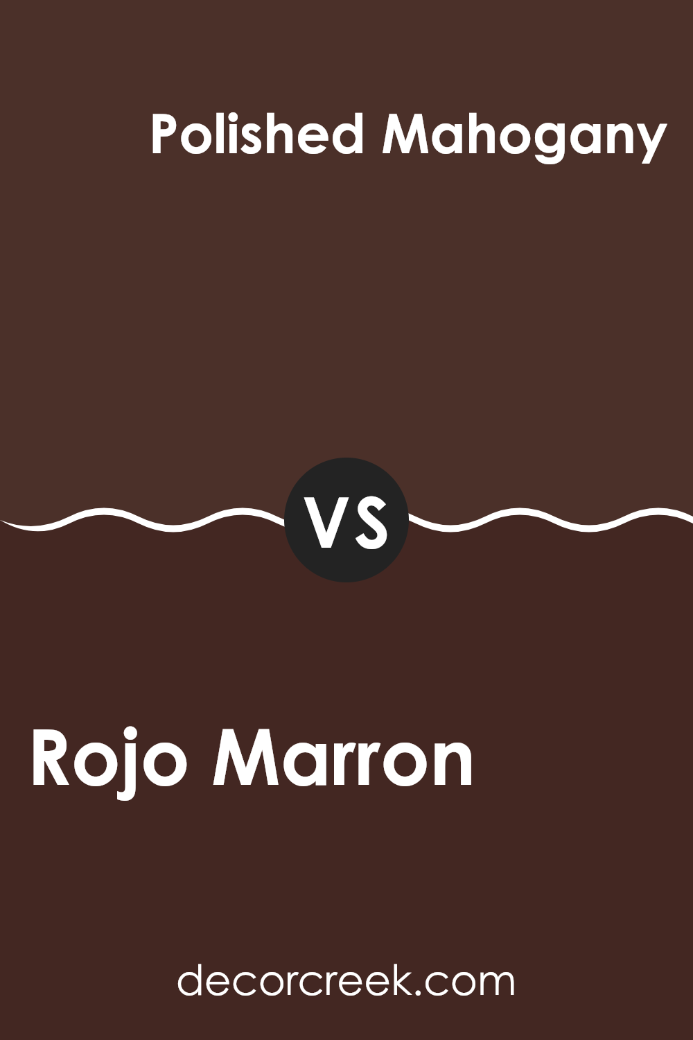
Rojo Marron SW 9182 by Sherwin Williams vs Polished Mahogany SW 2838 by Sherwin Williams
The main color, Rojo Marron, is a rich, deep brown with subtle red undertones, giving it a warm and inviting feel. It’s a versatile shade that can make spaces feel cozy and grounded. On the other hand, Polished Mahogany is darker and has a more pronounced red tone, resembling the classic look of mahogany wood.
This color is ideal for creating a traditional and welcoming atmosphere, particularly in areas like living rooms or dining areas where you might want to add a touch of elegance without being too bold.
Both colors are great for anyone looking to add depth and warmth to their decor, but Polished Mahogany leans slightly more towards a luxurious, classic wood finish, whereas Rojo Marron offers a more understated warmth.
You can see recommended paint color below:
- SW 2838 Polished Mahogany
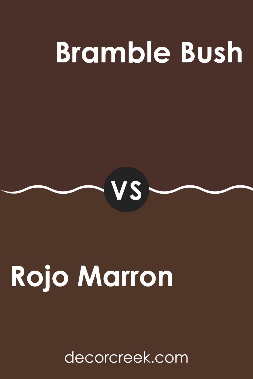
Rojo Marron SW 9182 by Sherwin Williams vs Bramble Bush SW 2923 by Sherwin Williams
Rojo Marron and Bramble Bush are two distinct shades by Sherwin Williams. Rojo Marron is a deep, rich brown with subtle red undertones, giving it a warm, cozy feel that’s perfect for creating a comfortable and inviting space. It’s especially great in living rooms or studies where its depth adds a touch of elegance.
On the other hand, Bramble Bush is a lighter color, showcasing a soft, tan shade that leans towards a dusty beige. This color is excellent for spaces that need a neutral backdrop that still offers some warmth. It’s versatile enough to use in any room, helping to make small spaces appear bigger and more open.
Both colors offer unique attributes but cater to different aesthetic needs. Rojo Marron works well for a bold, warm look, while Bramble Bush is ideal for a subtle, light feeling in a room. The choice between them would depend on the mood and space you want to enhance.
You can see recommended paint color below:
- SW 2923 Bramble Bush
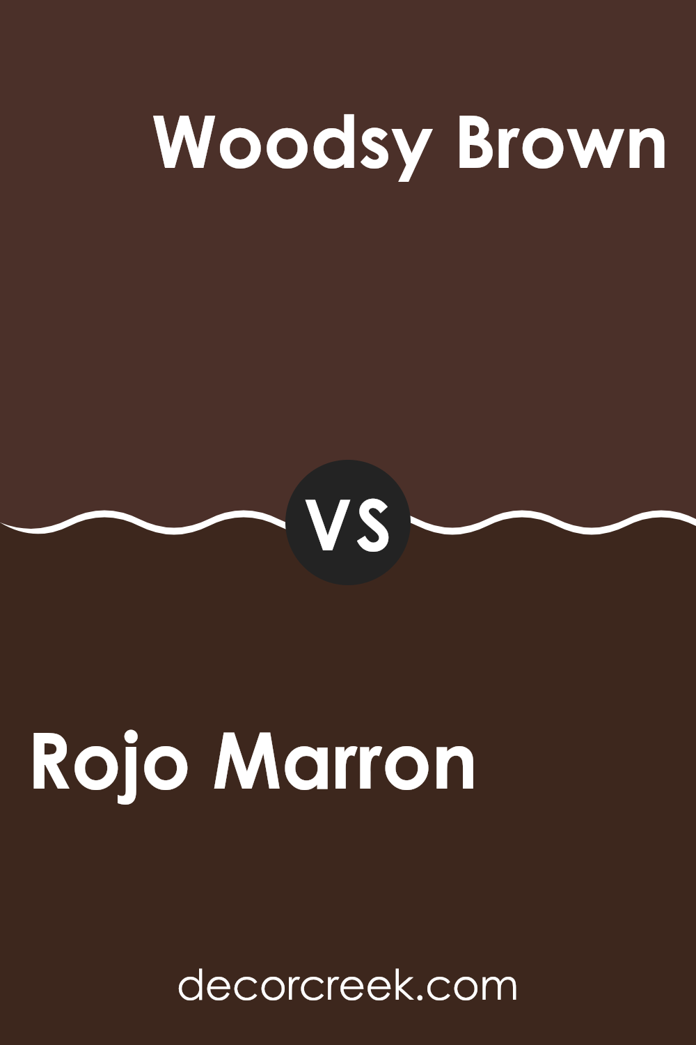
Rojo Marron SW 9182 by Sherwin Williams vs Woodsy Brown SW 2924 by Sherwin Williams
The main color, Rojo Marron, and the second color, Woodsy Brown, are both shades from Sherwin Williams but they have distinct tones. Rojo Marron leans towards a deeper, reddish-brown shade. It has a warm, earthy feel with the richness of red clay.
This makes it a great choice if you’re looking to give a space a cozy and inviting atmosphere, particularly well-suited for places where you might want a sense of warmth, like living rooms or dining areas.
On the other hand, Woodsy Brown is a darker, more traditional brown. It lacks the red undertone of Rojo Marron, giving it a more neutral and grounded appearance. This color is ideal for settings that require a more subtle and sturdy feel, like in an office or library. Both colors provide a sense of warmth but Rojo Marron with its reddish hint feels warmer compared to the more muted Woodsy Brown. This makes each suitable for different tastes and spaces depending on what ambiance you prefer.
You can see recommended paint color below:
- SW 2924 Woodsy Brown
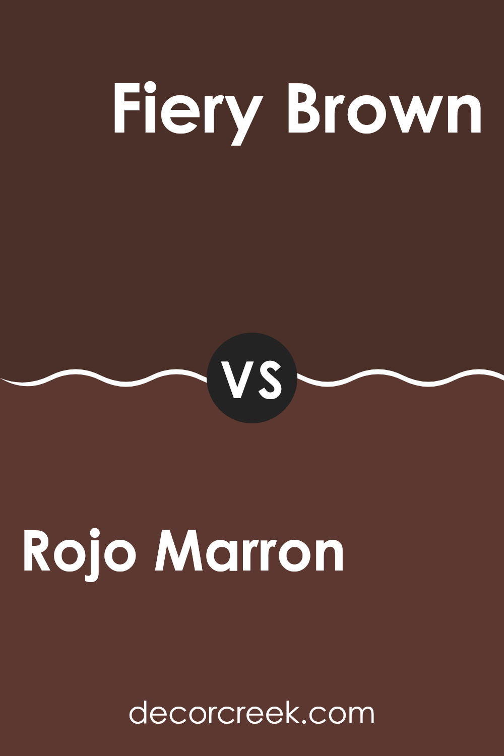
Rojo Marron SW 9182 by Sherwin Williams vs Fiery Brown SW 6055 by Sherwin Williams
Rojo Marron and Fiery Brown by Sherwin Williams are both warm, cozy colors but with distinct tones that set them apart. Rojo Marron leans more towards a deep, dark red with a hint of brown. This color gives a rich and inviting feel, which can make large spaces feel more intimate and welcoming. It is a perfect choice if you’re looking to create a cozy, yet strong presence in a room.
On the other hand, Fiery Brown offers a vibrant, energetic brown tone that contains more red compared to classic browns. This color can really liven up a space and is great for adding warmth and energy. If your room needs a lively boost, this shade could work well.
Both colors are great for creating a warm atmosphere, but your choice depends on whether you prefer a darker, more subdued ambiance with Rojo Marron, or a brighter, energetic vibe with Fiery Brown. These colors would be well-suited for spaces like living rooms or bedrooms where you want a sense of warmth and comfort.
You can see recommended paint color below:
- SW 6055 Fiery Brown
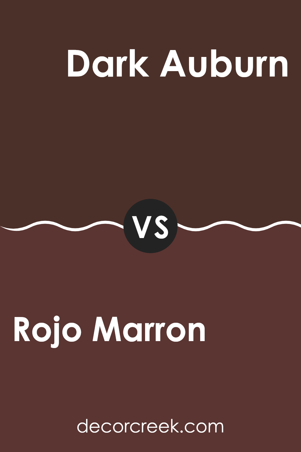
Rojo Marron SW 9182 by Sherwin Williams vs Dark Auburn SW 6034 by Sherwin Williams
Both “Rojo Marron” and “Dark Auburn” from Sherwin Williams are vibrant and warm colors, but they have distinct tones suitable for different preferences and spaces. “Rojo Marron” is a deep, rich brown with a subtle reddish undertone, making it versatile for creating a cozy and inviting atmosphere in areas like living rooms or bedrooms.
In contrast, “Dark Auburn” leans slightly more towards a dark red, resembling the warm, dark reddish brown you might see on autumn leaves or rich wood. This color can add a bold and warm feel, suitable for accent walls or spaces where you want to make a strong impression.
While both colors share a warm base, “Rojo Marron” is more subdued compared to the slightly brighter and more intense “Dark Auburn”. Depending on your room’s lighting and styling, each color can uniquely enhance the space.
You can see recommended paint color below:
- SW 6034 Dark Auburn
Rojo Marron SW 9182 by Sherwin Williams vs Marooned SW 6020 by Sherwin Williams
Rojo Marron and Marooned, both by Sherwin Williams, are distinct shades of red that bring different vibes to a space. Rojo Marron is a warm, deep red with a brownish tint, making it feel cozy and earthy. This color works well in areas where you want a sense of warmth and comfort, like living rooms or dining areas.
On the other hand, Marooned is a more intense and pure maroon shade. It lacks the brown undertones of Rojo Marron, giving it a stronger, bolder presence. This color is great for creating a striking focal point in a space, suitable for accent walls or furniture pieces that you want to stand out.
Both colors offer unique styles and moods, with Rojo Marron leaning towards a softer, more muted environment, and Marooned offering a more vivid and bold aesthetic. Choosing between them would depend on the atmosphere you’re aiming to achieve in your space.
You can see recommended paint color below:
- SW 6020 Marooned
Rojo Marron SW 9182 by Sherwin Williams vs Terra Brun SW 6048 by Sherwin Williams
Rojo Marron and Terra Brun are both warm, earthy colors from Sherwin Williams, but they bring different vibes to a space. Rojo Marron is a deep, rich brown with hints of red, giving it a cozy, welcoming feel that’s very inviting. It’s perfect for creating a snug atmosphere in a room where you might want to relax, like a living room or bedroom.
On the other hand, Terra Brun is a tad lighter compared to Rojo Marron and leans more towards a traditional brown. It doesn’t have as much red in it, which makes it more neutral and versatile for various decorating styles. Terra Brun works well in spaces where you want a solid, grounding color that doesn’t dominate the room but still adds warmth.
Both colors are great choices if you’re looking for something that feels warm and homey, but your preference might depend on how much you want the color to stand out. Rojo Marron makes more of a statement, whereas Terra Brun blends in more smoothly with its surroundings.
You can see recommended paint color below:
- SW 6048 Terra Brun

Rojo Marron SW 9182 by Sherwin Williams vs Rookwood Dark Red SW 2801 by Sherwin Williams
The main color, Rojo Marron, and the second color, Rookwood Dark Red, both by Sherwin Williams, are rich, warm hues perfect for adding a welcoming and cozy atmosphere to any space. Rojo Marron has a deep, reddish-brown tone that feels earthy and grounded. It pairs well with natural materials like wood and leather, making it a great choice for living rooms or studies.
On the other hand, Rookwood Dark Red boasts a more pronounced red shade that leans slightly towards burgundy. This color has a classic, timeless vibe, making it ideal for spaces where you want to create a bold yet inviting statement, such as dining areas or entryways.
Both colors work well in traditional settings but can also fit into more modern decor if used thoughtfully. While Rojo Marron brings a subtle, softer approach due to its brown undertones, Rookwood Dark Red offers a dash of dramatic flair with its richer red. Depending on the mood you want to set and the level of warmth you’re aiming for, either color could be the right choice.
You can see recommended paint color below:
Rojo Marron SW 9182 by Sherwin Williams vs French Roast SW 6069 by Sherwin Williams
Rojo Marron and French Roast, both by Sherwin Williams, are colors that carry rich, warm undertones—perfect for adding a cozy and inviting feel to any space. Rojo Marron is a deep, muted red with hints of brown that give it a rustic yet refined look. It’s a versatile color that works well in spaces where you want a touch of warmth without overwhelming brightness.
On the other hand, French Roast is darker, bordering more on a deep brown with subtle undercurrents of red. This color leans towards the earthier side, making it ideal for areas where you want to create a snug and comfortable ambiance. It pairs well with lighter shades, providing a beautiful contrast that helps other colors pop.
Comparatively, Rojo Marron has a more pronounced red tone, giving it a slight vibrancy, whereas French Roast is predominantly brown, offering depth and a grounding effect. Both colors are suitable for anyone looking to create a welcoming space with a touch of earthy sophistication.
You can see recommended paint color below:
- SW 6069 French Roast
Rojo Marron SW 9182 by Sherwin Williams vs Turkish Coffee SW 6076 by Sherwin Williams
Rojo Marron and Turkish Coffee, both by Sherwin Williams, are rich, deep colors, each with its own unique appeal. Rojo Marron carries a warm, reddish-brown tone that is inviting and cozy, perfect for creating an inviting space. It pairs well with natural light and can make a room feel more intimate and warm.
On the other hand, Turkish Coffee is a much darker shade, verging on a dark brown with an almost black undertone. This color is ideal for making a bold statement in a space, adding depth and a touch of drama. It works well in larger rooms or as an accent wall to ground lighter shades.
Both colors offer distinct vibes: Rojo Marron adds warmth and a hint of rustic charm, while Turkish Coffee provides a strong, defining presence. Choosing between them depends on the mood and style you want to set in your room.
You can see recommended paint color below:
Conclusion
As I finish looking at SW 9182 Rojo Marron by Sherwin Williams, I really understand why it’s a popular choice for paint. It’s quite unique! Rojo Marron is a warm brown color that feels cozy and comforting. It’s like wrapping up in a soft blanket on a chilly evening. This shade is great for anyone who wants to make their room feel welcoming and snug.
I learned that Rojo Marron pairs well with many other colors. You can mix it with lighter colors like cream or beige to keep things light and airy, or you can match it with darker colors for a more snug feel. It’s perfect for places where you relax, like the living room or bedroom.
Overall, Rojo Marron by Sherwin Williams is more than just a brown paint. It adds a touch of warmth to any room, making it feel like a safe and comfy place. Whether you want a calm corner for reading or a friendly space for family, this color makes rooms look lovely.
So, if you’re thinking about changing up a room in your house, Rojo Marron is definitely worth considering!
Ever wished paint sampling was as easy as sticking a sticker? Guess what? Now it is! Discover Samplize's unique Peel & Stick samples.
Get paint samples

