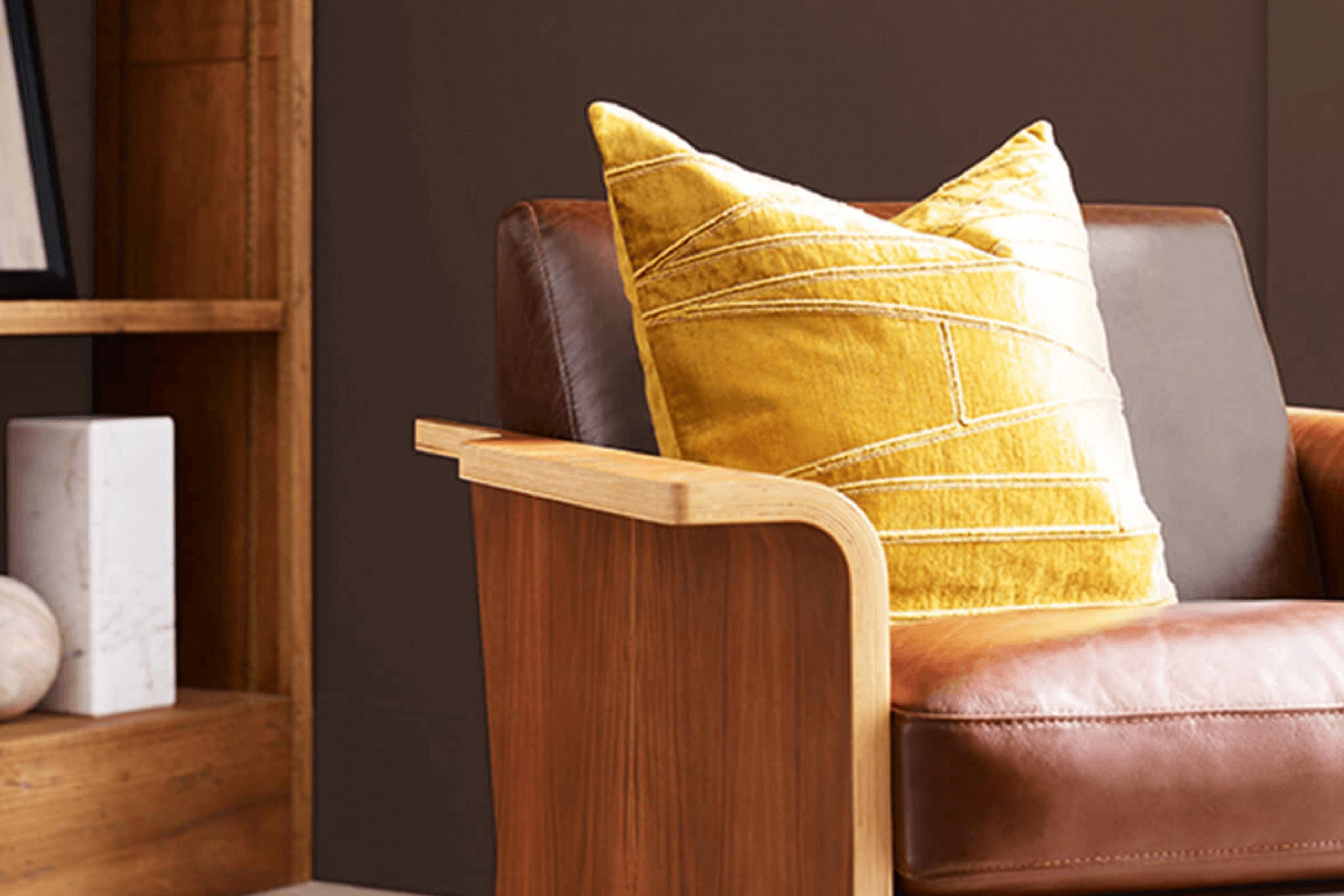
Imagine walking into a room richly painted with the color SW 6076 Turkish Coffee by Sherwin Williams. Right away, the deep, robust brown tones bring a sense of warmth and sophistication to the space. As you look around, you might notice how this color anchors the room, drawing attention to the furniture and artwork, making everything appear more vibrant and interconnected.
Choosing the right paint for your home is a crucial decision, and Turkish Coffee offers a versatile option that complements a wide range of styles and decor. Whether your taste leans towards the contemporary or you have a flair for the traditional, this shade provides a backdrop that enhances other colors and materials you might use in your interior design.
As you consider updating your living space, think about how SW 6076 Turkish Coffee could transform the feel and look of your home.
Its deep espresso hue can create a cozy, inviting atmosphere, making it perfect for spaces where you relax and entertain guests.
What Color Is Turkish Coffee SW 6076 by Sherwin Williams?
The color “Turkish Coffee” by Sherwin Williams is a deep, rich brown that conveys warmth and stability. This shade can be used to create a cozy, inviting atmosphere in any room. It carries a chocolatey depth that pairs exceptionally well with soothing cream or vibrant teal accents, bringing balance and a touch of elegance to interiors.
“Turkish Coffee” works beautifully in a variety of interior styles. It’s particularly striking in traditional settings, where its depth enhances detailed woodwork and classic furniture styles. It also shines in rustic designs, complementing natural elements like stone and wood, and adding a luxurious undertone that feels both welcoming and grounded.
When it comes to materials, “Turkish Coffee” works well with rich, textured fabrics like velvet or wool, which echo its plush, comforting qualities. It also pairs wonderfully with metallic finishes such as brass or copper, which contrast its darkness while highlighting its warmth.
Textures are vital with a color so deep. Combining it with smooth leathers or glossy finishes can prevent interiors from feeling too heavy, instead giving rooms a balanced, refined look. Whether used as an accent wall, for cabinetry, or throughout a room, this color adds a layer of timeless character to any space.
Is Turkish Coffee SW 6076 by Sherwin Williams Warm or Cool color?
Turkish Coffee SW 6076 by Sherwin Williams is a deep, rich brown hue, reminiscent of the robust beverage after which it is named. This color has a warm and inviting quality that makes it perfect for creating a cozy atmosphere in any room of the house.
When used on walls, Turkish Coffee can make a large space feel more intimate and grounded, while in smaller rooms, it adds depth and sophistication without overwhelming the senses. This shade pairs beautifully with lighter colors like creams and soft beiges, which help to balance its intensity and bring out its warmth.
It’s also versatile enough to serve as an accent color, drawing the eye to furniture, trim, or décor items. In homes, this welcoming shade works especially well in living areas, dining rooms, or bedrooms where a touch of comfort is desired. Applying this color can also help to hide marks or stains, making it practical for families with kids or pets.
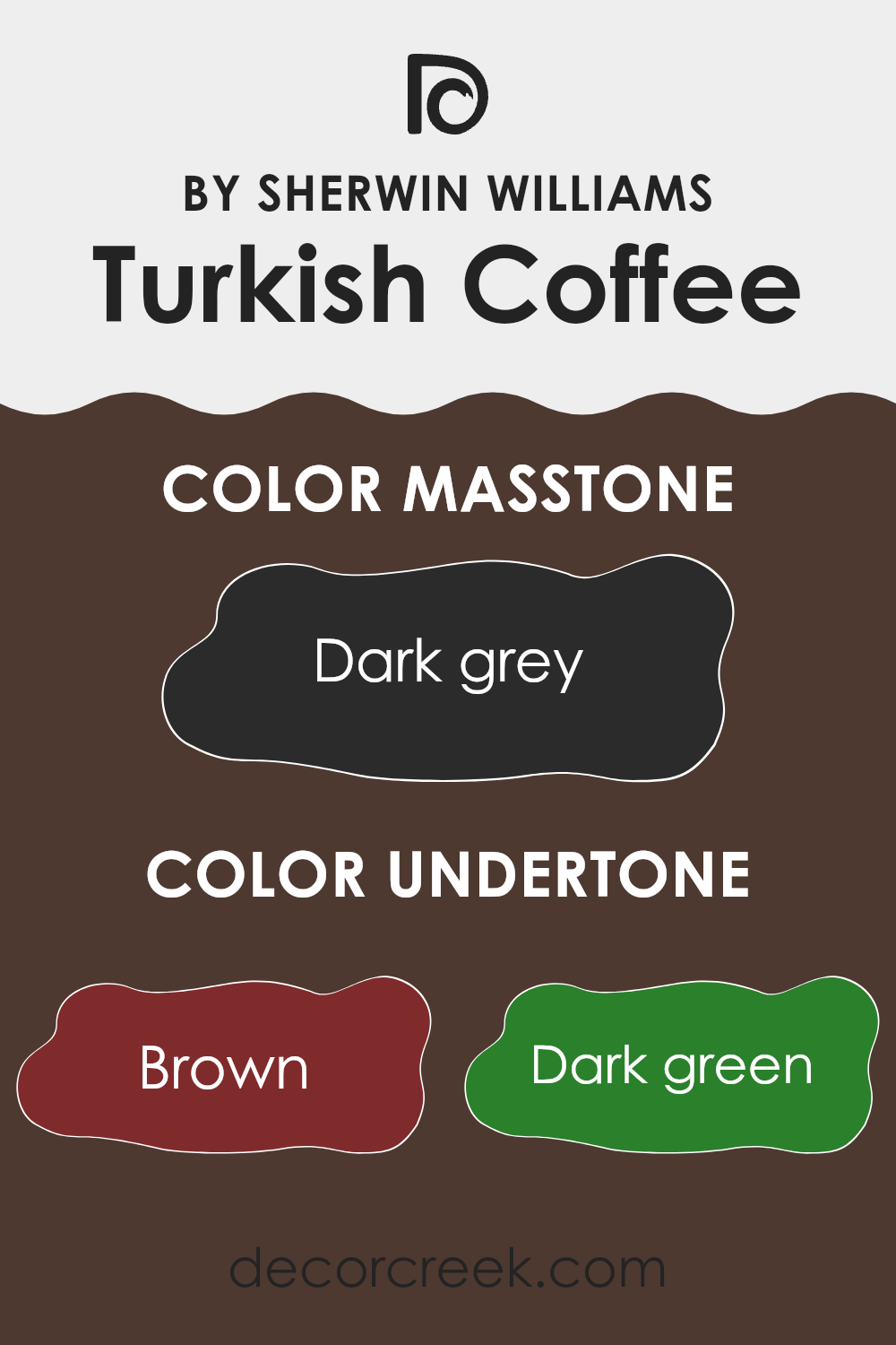
Undertones of Turkish Coffee SW 6076 by Sherwin Williams
Turkish Coffee is a rich, deep color that can dramatically influence the mood and feel of a room depending on its undertones. Undertones are subtle hues that are mixed into the main color, impacting how it looks under different lighting conditions. For Turkish Coffee, these undertones include shades like brown, dark green, olive, navy, purple, dark turquoise, and gray.
Each undertone brings its own flavor to the color. For example, brown undertones can make the color feel warmer and cozier, ideal for living rooms or bedrooms seeking a snug atmosphere. Dark green and olive add a natural, earthy vibe which might be perfect for spaces looking to have a calming, nature-inspired feel.
Navy and purple undertones inject a sense of depth and richness, making the color more dynamic and striking, which works well in a formal dining area or an office. Meanwhile, dark turquoise can add a refreshing hint of coolness, suitable for bathrooms or spaces that you want to feel fresh and clean.
When you use a color like Turkish Coffee on interior walls, the impact of these undertones is significant. In natural light, the color might lean towards its warmer brown or olive undertones, making the room feel inviting and cozy. Under artificial lighting, the cooler undertones such as navy or dark turquoise might become more prominent, giving the space a more defined and sharper look.
Understanding these undertones helps in selecting decor and furnishings as well, ensuring everything works together harmoniously in a room. The flexible nature of Turkish Coffee’s undertones makes it a versatile choice, allowing it to adapt to various styles and preferences. This makes it an interesting choice for anyone looking to paint their walls with a color that’s both dynamic and adaptable.
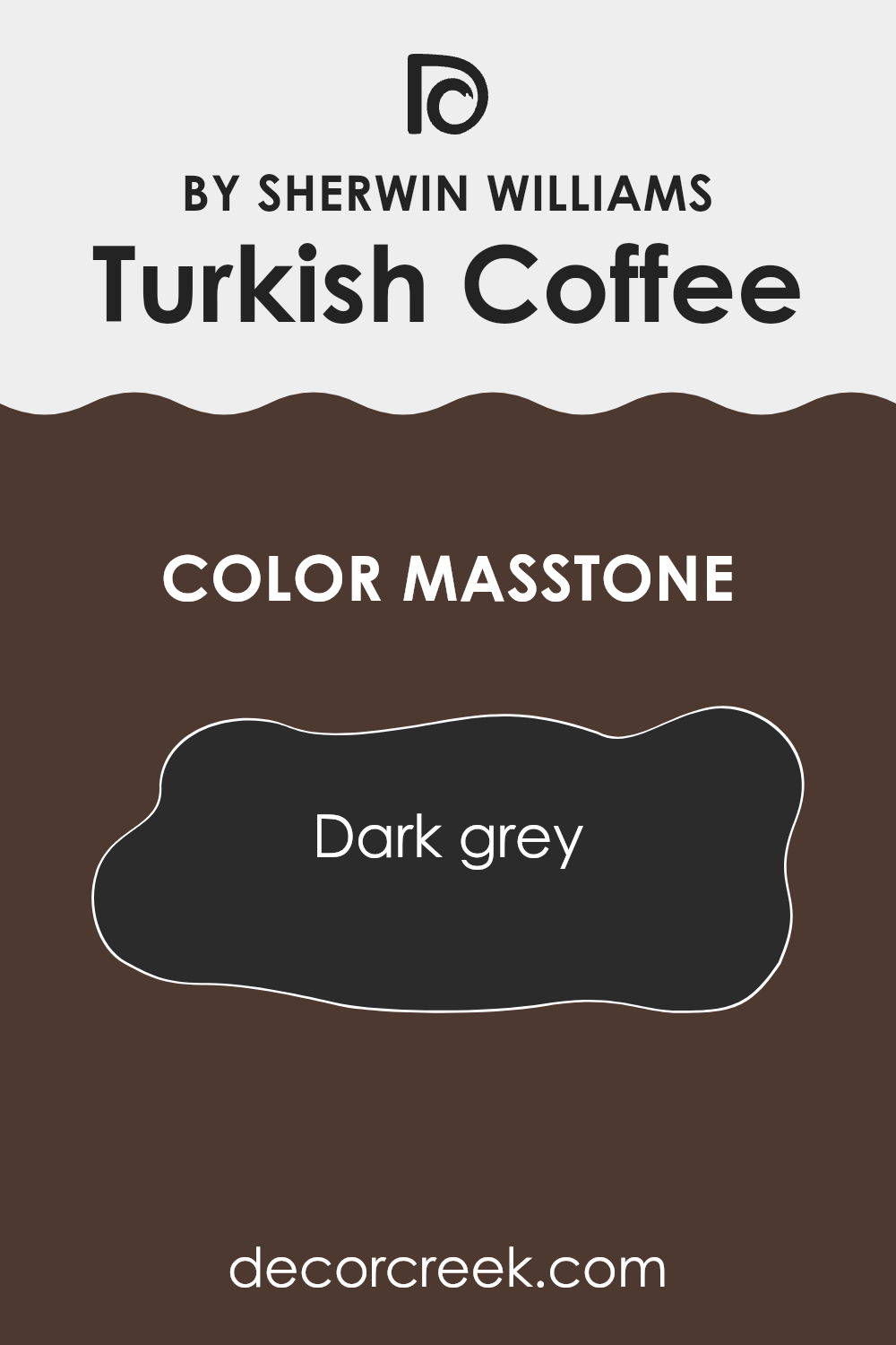
What is the Masstone of the Turkish Coffee SW 6076 by Sherwin Williams?
Turkish Coffee SW 6076 by Sherwin Williams has a rich masstone of dark grey, resembling the color code #2B2B2B. This deep and soothing shade can bring a strong sense of grounding and warmth to any room in your home. Being a darker hue, it works exceptionally well in larger spaces or rooms with plenty of natural light, as it can make smaller rooms feel a bit cramped if not balanced correctly with lighter colors or reflective surfaces.
In a living room or a dining area, this color can add a cozy, inviting feel, making it perfect for areas where family and friends gather. In bedrooms, the dark grey tone can help create a restful atmosphere, promoting a good night’s sleep.
Pairing it with lighter furniture or accents such as whites, creams, or soft pastels can prevent it from overpowering the space. Accessories in bright or metallic finishes also complement this color beautifully, adding a touch of contrast and interest to the environment without overwhelming it.
How Does Lighting Affect Turkish Coffee SW 6076 by Sherwin Williams?
Lighting plays a crucial role in how we perceive colors. The same paint can look different under various lighting conditions because light affects hue, brightness, and saturation. Turkish Coffee, for example, is a deep, rich brown shade that can vary greatly depending on the lighting.
In artificial light, such as from light bulbs, Turkish Coffee tends to appear warmer and more intense.
The yellow or warm white light commonly found in homes can make this shade feel cozy and inviting, enhancing its reddish undertones.
Under natural light, the true color of Turkish Coffee is more noticeable. Natural light provides a broader spectrum of light, allowing all the subtle undertones of the color to show.
In a room with ample sunlight, Turkish Coffee will look lighter and more vibrant. The orientation of a room also affects how Turkish Coffee is perceived. In north-facing rooms, where light is cooler and more consistent throughout the day, this color can appear more muted and slightly cooler in tone. It might even look a bit more grayish or closer to a soft black, making the room feel more restrained.
In south-facing rooms, the warm, bright light throughout the day can make Turkish Coffee appear richer and warmer, bringing out more of its chocolate-like qualities. This can create a warm, welcoming atmosphere.
East-facing rooms get bright morning light, which makes Turkish Coffee look vibrant and alive in the mornings but darker and more subdued as the day progresses. This fluctuation can bring an interesting dynamic to the space.
Finally, in west-facing rooms, the color will experience a reverse effect from east-facing rooms. It starts off deeper in the morning and then becomes exceptionally warm and glowing in the evening light, making the space feel cozy and snug.
Understanding how Turkish Coffee responds to different lighting and room orientations can help in planning interior spaces effectively.

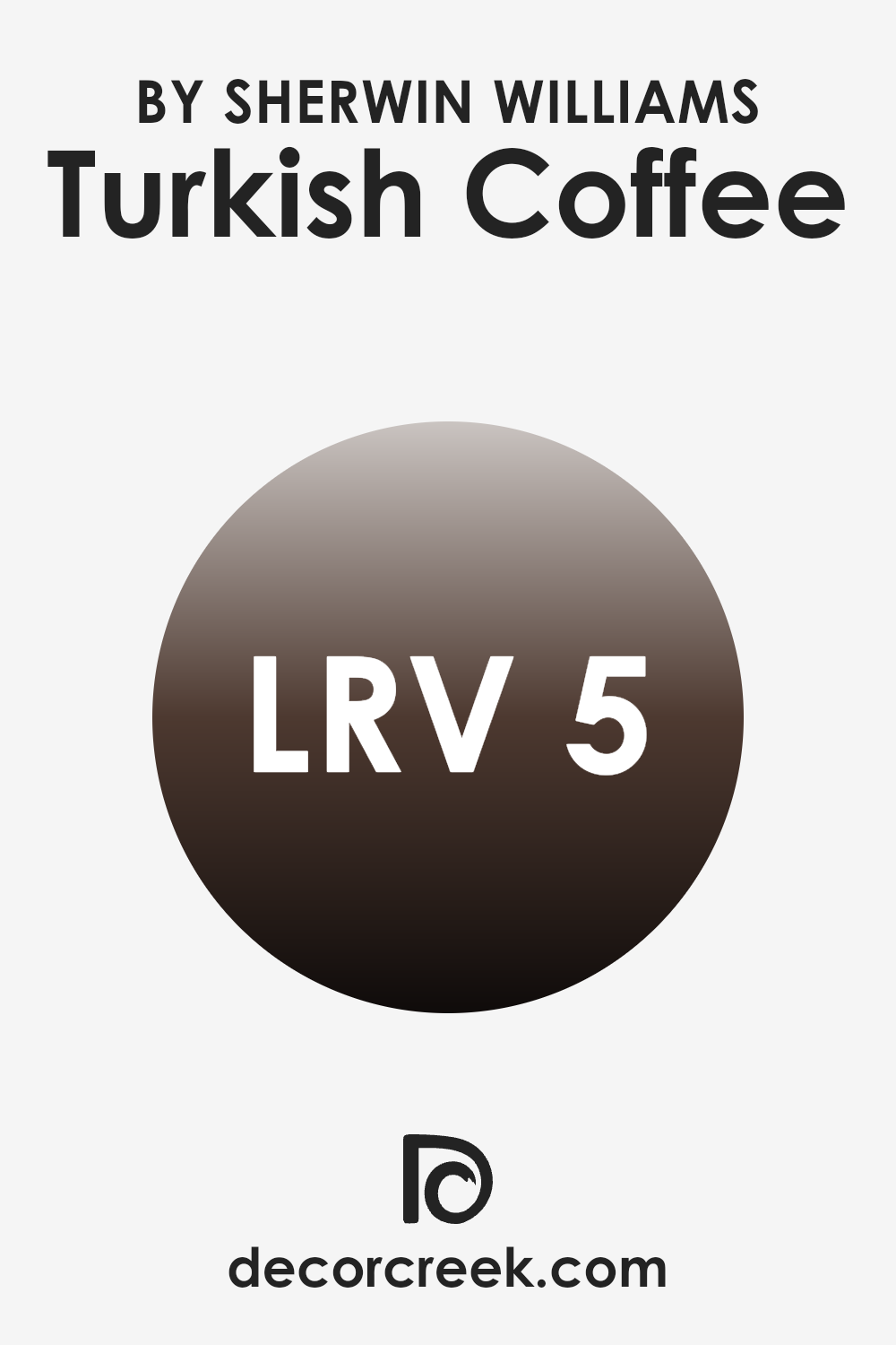
What is the LRV of Turkish Coffee SW 6076 by Sherwin Williams?
LRV stands for Light Reflectance Value, a measure that indicates how much light a paint color reflects or absorbs. This scale runs from 0 to 100, where a lower value means that the color absorbs more light and appears darker, while a higher value suggests that it reflects more light and appears lighter.
The LRV helps determine how a paint color will look in different lighting conditions. For instance, a color with a high LRV will make a room feel brighter and more open because it reflects more light around the space.
The LRV of Turkish Coffee, which is 4.664, indicates that it is a very dark color. Because of its low LRV, Turkish Coffee absorbs most of the light that hits it, making it appear rich and deep in shade. In smaller or poorly lit rooms, using a dark color like this could make the space feel smaller and cozier because of the lack of light reflection.
On the other hand, in a larger or well-lit area, this color can add a dramatic and bold look, creating a strong visual impact without making the room feel enclosed. Therefore, the specific LRV of Turkish Coffee suggests it is best used purposefully to achieve a distinct aesthetic effect in a room’s design.
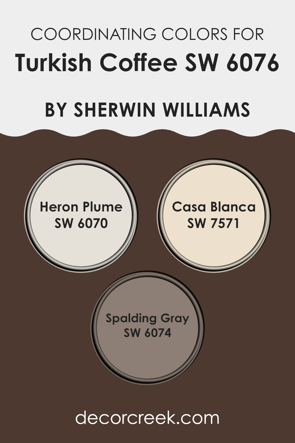
Coordinating Colors of Turkish Coffee SW 6076 by Sherwin Williams
Coordinating colors are essentially a palette of hues carefully chosen to complement each other when used together in designing a space. When looking at coordinating colors for the rich and dark Turkish CoffeeSW 6076 by Sherwin Williams, it’s key to select shades that maintain balance and harmony with this bold color.
One great coordinating color is SW 6070 – Heron Plume, a soft, light gray that provides a gentle contrast and helps lighten the deep tones of Turkish Coffee. Another complementary shade is SW 7571 – Casa Blanca, a warm off-white that offers a subtle radiance, enhancing the richness of the main color without overwhelming it.
As we move towards the middle tone range, SW 6074 – Spalding Gray emerges as an effective coordinating color. This medium gray creates a smooth transition between the darker Turkish Coffee and lighter shades like Heron Plume or Casa Blanca.
The even, understated elegance of Spalding Gray works to connect these colors in a palette that’s visually appealing and cohesive. Integrating these shades can enrich the room’s atmosphere while providing an appealing aesthetic balance, underscored by the interplay of contrast and harmony in the colors chosen.
You can see recommended paint colors below:
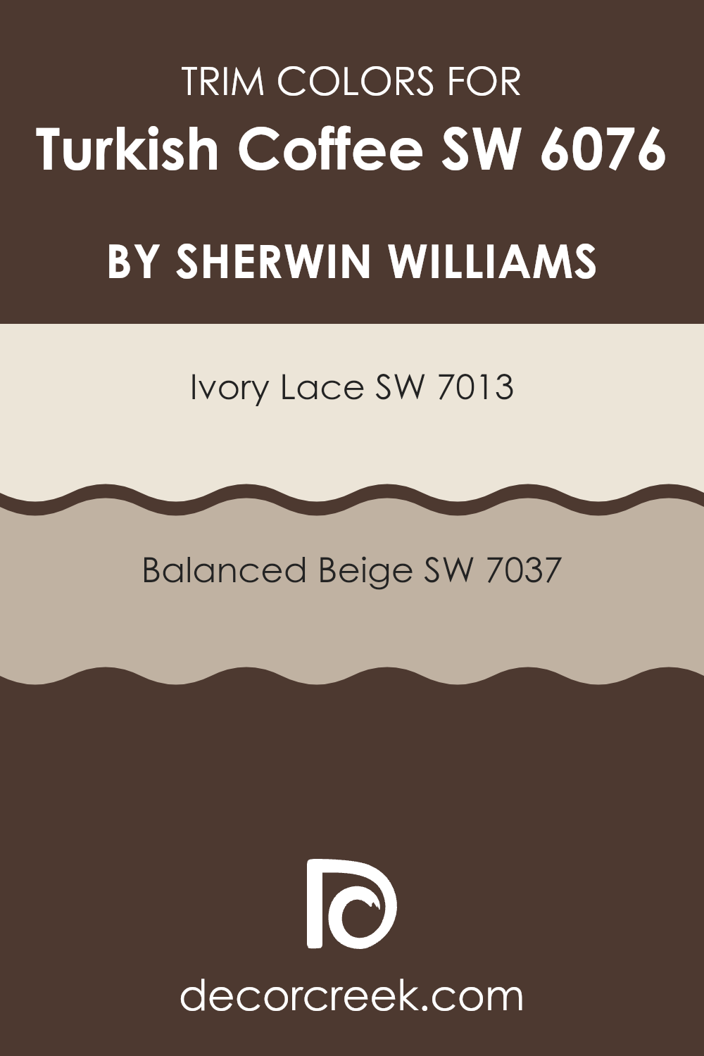
What are the Trim colors of Turkish Coffee SW 6076 by Sherwin Williams?
Trim colors are selected specifically to complement or contrast the main color used on walls, enhancing architectural details and dividing spaces visually. For example, when using a dark shade like Turkish Coffee, choosing lighter trim colors can highlight the walls’ rich tone and create a clean, appealing frame around each room.
This use of trim colors not only defines the space more clearly but also adds an aesthetic finish that increases the overall appeal of the decor. Ivory Lace is a subtle, soft white with hints of warmth that can soften the intensity of darker hues like Turkish Coffee, offering a gentle transition between colors.
Balanced Beige, on the other hand, is a neutral beige that provides a sturdier contrast without overwhelming the senses, supporting the main color by adding depth and warmth to the overall color scheme. Both colors are excellent choices for trim, working together to enhance the visual impact of Turkish Coffee by defining and complementing its deep, rich essence.
You can see recommended paint colors below:
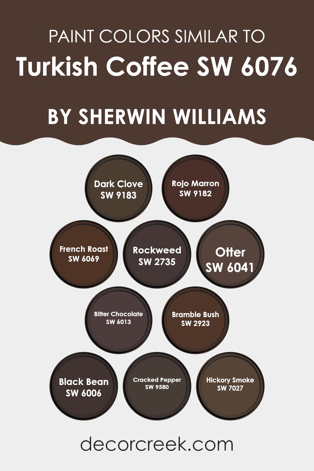
Colors Similar to Turkish Coffee SW 6076 by Sherwin Williams
Choosing similar colors can significantly enhance the harmony and aesthetic appeal of a space. When colors like those similar to Turkish Coffee by Sherwin Williams are used in decor, they create a cohesive look that is visually pleasant and seamless. Similar colors work well together because they share common undertones, making it easier to achieve a balanced and unified interior design.
For example, when decorating a room, using shades like Dark Clove, a rich brown with a hint of spiciness, alongside Rojo Marron, a deep, warm brown, brings warmth and a comforting feel to the environment.
French Roast, which has a robust, dark coffee tone, complements the slightly greenish tint of Rockweed, adding a natural touch to the palette. Otter offers a soft, earthy brown that pairs well with the deeper tones of Bitter Chocolate, providing contrast while keeping the warmth intact. Bramble Bush introduces a more muted brown with subtle green influences, which harmonizes beautifully with the darker, almost black shade of Black Bean.
Cracked Pepper, a nearly black shade with a hint of brown, adds depth and interest, while Hickory Smoke, which presents a lighter, smoky gray, offers a mild and airy feel that can lighten the overall mood of the color scheme. These colors, when used together, can create environments that are welcoming and comfortable, with a seamless transition from one shade to the next.
You can see recommended paint colors below:
- SW 9183 Dark Clove
- SW 9182 Rojo Marron
- SW 6069 French Roast
- SW 2735 Rockweed
- SW 6041 Otter
- SW 6013 Bitter Chocolate
- SW 2923 Bramble Bush
- SW 6006 Black Bean
- SW 9580 Cracked Pepper
- SW 7027 Hickory Smoke
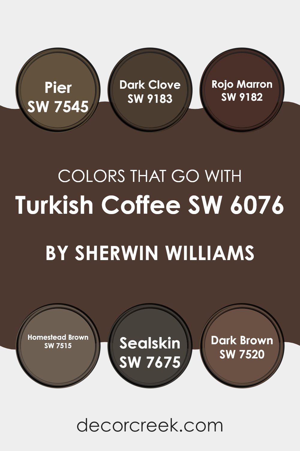
Colors that Go With Turkish Coffee SW 6076 by Sherwin Williams
When decorating a space, the colors chosen to complement a primary shade like Turkish Coffee SW 6076 by Sherwin Williams can significantly affect the room’s atmosphere and aesthetic appeal. Turkish Coffee is a deep, rich brown that can serve as a strong foundation in a design scheme.
Complementary colors such as Pier SW 7545, Dark Clove SW 9183, Rojo Marron SW 9182, Homestead Brown SW 7515, Sealskin SW 7675, and Dark Brown SW 7520 can be used to create a harmonious and appealing palette. These shades range from softer browns and complex neutrals to robust dark tones, providing various options for crafting a warm and inviting environment.
Pier SW 7545 is a gentle gray-brown that provides a lighter contrast to Turkish Coffee, softening spaces with its understated elegance. Dark Clove SW 9183 offers a spicier, dark caramel undertone, adding warmth and depth when paired with darker furniture or fabrics.
Rojo Marron SW 9182 introduces a subtle hint of red, enriching the palette with its warm, earthy tones. Homestead Brown SW 7515 is a sturdy mid-tone brown, versatile for blending with both darker and lighter hues, while Sealskin SW 7675 is a near-black that adds dramatic flair and boldness to the mix.
Finally, Dark Brown SW 7520 acts almost as a shadow to Turkish Coffee, mirroring its intensity in a slightly different hue, perfect for creating a cohesive look in sophisticated settings. Together, these colors work to create visual interest and thematic continuity, making any room feel well-coordinated and thoughtfully designed.
You can see recommended paint colors below:
- SW 7545 Pier
- SW 9183 Dark Clove
- SW 9182 Rojo Marron
- SW 7515 Homestead Brown
- SW 7675 Sealskin
- SW 7520 Dark Brown
How to Use Turkish Coffee SW 6076 by Sherwin Williams In Your Home?
Turkish Coffee SW 6076 by Sherwin Williams is a rich, deep brown paint color with warm undertones, making it a cozy choice for any home. It’s perfect for creating a welcoming atmosphere in living spaces such as the family room or dining area. This color works well as a main wall color or as an accent to highlight specific areas like a fireplace wall or a cozy reading nook.
In bedrooms, Turkish Coffee can offer a comforting backdrop that pairs nicely with lighter furniture and fabrics, bringing a grounded balance to your resting space. Because of its deep tone, it also helps in hiding marks or smudges, making it a practical option for high-traffic areas like hallways or children’s rooms.
To add a touch of elegance, complement it with creamy whites or soft grays for trim and moldings. The contrast with these lighter colors can really make the walls stand out and give your home a fresh yet warm vibe. Turkish Coffee is a versatile color that adds warmth and character to any space.
Turkish Coffee SW 6076 by Sherwin Williams vs Bramble Bush SW 2923 by Sherwin Williams
The main color, Turkish Coffee, is a deep, rich brown that gives off a robust and cozy feeling. It’s perfect for creating a warm and inviting atmosphere in any space. On the other hand, Bramble Bush is a softer, earthy green with a natural, understated vibe.
It’s a great choice for those looking to add a touch of calmness and nature to their surroundings. When comparing these two, Turkish Coffee provides a strong, grounding base that’s ideal for accent walls or furniture, making it a go-to for a bold statement.
Meanwhile, Bramble Bush works well for creating a soothing background, perfect for rooms where relaxation is key. Both colors can work beautifully together, with Turkish Coffee offering depth and focus while Bramble Bush brings in lightness and freshness.
You can see recommended paint color below:
- SW 2923 Bramble Bush

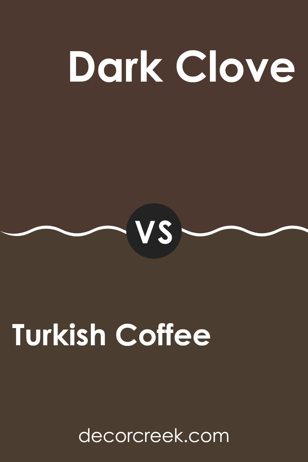
Turkish Coffee SW 6076 by Sherwin Williams vs Dark Clove SW 9183 by Sherwin Williams
Turkish Coffee and Dark Clove are two rich, deep colors that are ideal for creating a cozy atmosphere in any space. Turkish Coffee is a dark, chocolatey brown with a warm undertone that makes it feel inviting and cozy.
It tends to work well in areas where you want to create a sense of comfort, like living rooms or bedrooms. On the other hand, Dark Clove is also a dark shade, but it leans more towards a dusty brown with hints of gray, giving it a slightly cooler tone compared to Turkish Coffee.
This color can be perfect for spaces where you’d like a modern yet warm appearance, such as in offices or dens. Both colors pair well with light creams or vibrant accent shades, allowing for flexibility in decorating choices. Whether you choose Turkish Coffee or Dark Clove depends on the mood you want to set and the existing colors in your décor.
You can see recommended paint color below:
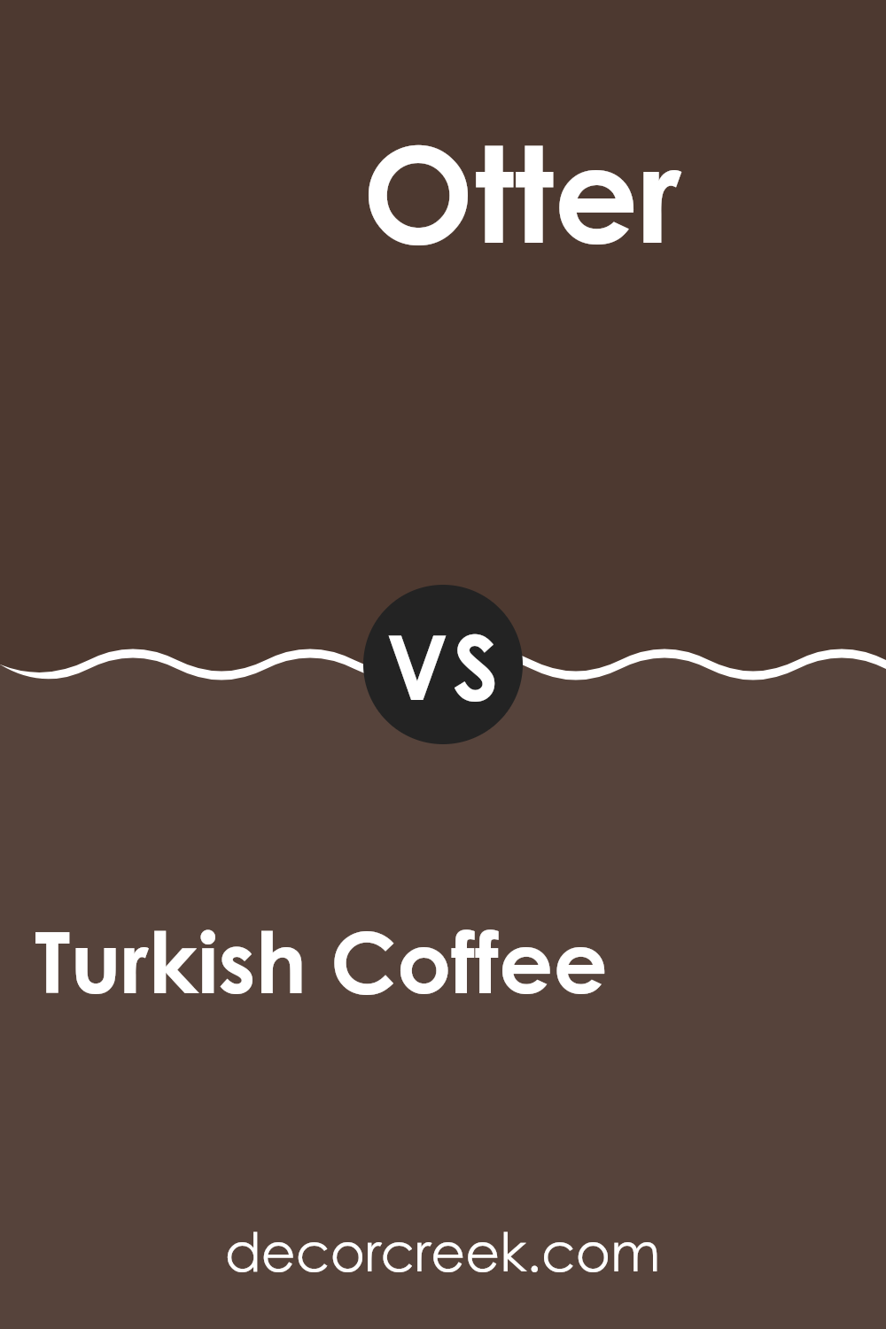
Turkish Coffee SW 6076 by Sherwin Williams vs Otter SW 6041 by Sherwin Williams
Turkish Coffee and Otter, both by Sherwin Williams, are warm, neutral shades that give off a cozy, welcoming vibe. Turkish Coffee is a deeper, darker brown that feels rich and comforting in a space. It resembles the strong, dark brown of an espresso, providing a bold backdrop that makes it ideal for larger rooms or as an accent wall.
On the other hand, Otter is a lighter, softer gray-brown. This color is more subtle and versatile, making it easy to pair with a wide range of decor styles and colors. Otter can work well in smaller spaces or rooms that don’t get a lot of natural light, as it doesn’t absorb as much light as darker shades.
Both colors offer a sense of warmth, but Turkish Coffee offers more drama and depth, while Otter brings a lighter, more relaxed feel. Depending on the mood and size of the room, each color has its unique charm and utility.
You can see recommended paint color below:
- SW 6041 Otter
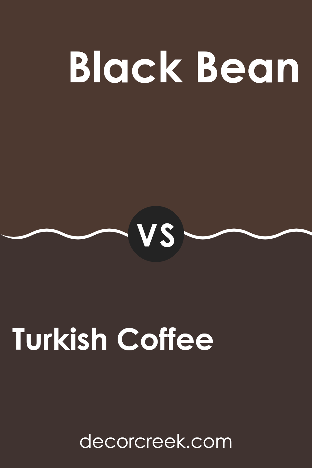
Turkish Coffee SW 6076 by Sherwin Williams vs Black Bean SW 6006 by Sherwin Williams
Turkish Coffee and Black Bean are two dark shades offered by Sherwin Williams, each bringing its unique presence to a space. Turkish Coffee is a deep, rich brown with hints of warm undertones that make it a cozy and inviting color for a room.
It pairs well with soft creams or vibrant teals for a balanced look. In contrast, Black Bean leans towards a very dark brown, almost black, giving it a bold and strong appearance. This color can create a dramatic effect, perfect for making striking contrasts with lighter hues or as a background for brighter colors to pop.
Both colors are suitable for creating a grounded, comfortable atmosphere in living spaces. Depending on the lighting and complementary colors, each can either recede as a background tone or stand out as a primary focus in the decor.
You can see recommended paint color below:
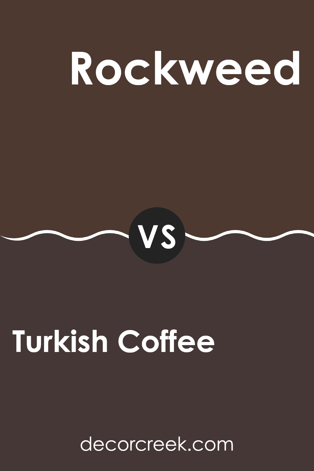
Turkish Coffee SW 6076 by Sherwin Williams vs Rockweed SW 2735 by Sherwin Williams
Turkish Coffee and Rockweed are both rich colors from Sherwin Williams but they offer distinctly different vibes for interior spaces. Turkish Coffee is a very deep, dark brown that approaches the near-black spectrum. This color is powerful and can make a bold statement on walls, potentially making a room feel cozier and smaller, ideal for creating an intimate atmosphere. It’s perfect for accent walls or furniture pieces and pairs well with lighter colors to balance its intensity.
On the other hand, Rockweed is a murky green shade that resembles deep sea waters or dense foliage. Unlike Turkish Coffee, Rockweed provides a strong connection to nature and has a grounding effect.
It’s less intense than Turkish Coffee and works well where you might want to bring in a touch of the outdoors. Using Rockweed can liven up spaces without overwhelming them, making it suitable for larger areas or rooms with plenty of natural light. Both colors offer unique décor potentials, depending on the mood and style you’re aiming for.
You can see recommended paint color below:
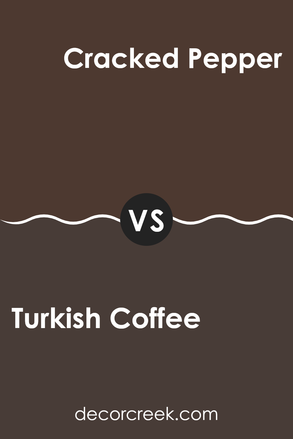
Turkish Coffee SW 6076 by Sherwin Williams vs Cracked Pepper SW 9580 by Sherwin Williams
Turkish Coffee and Cracked Pepper, both by Sherwin Williams, are rich, elegant shades, but they have distinct tones that set them apart. Turkish Coffee is a deep, warm brown with a subtle hint of red, giving it a cozy, inviting feel perfect for spaces where you want to relax and feel comforted, such as living rooms or bedrooms.
On the other hand, Cracked Pepper is a bold, dark gray that leans towards charcoal. It offers a more neutral palette that pairs well with a variety of colors, making it highly versatile for use in different areas of a home or office.
Although both colors are dark and can make a strong statement in any space, Turkish Coffee has a warmer presence due to its reddish undertones, while Cracked Pepper offers a cooler, more straightforward gray that can work as a backdrop for brighter or contrasting decor.
You can see recommended paint color below:
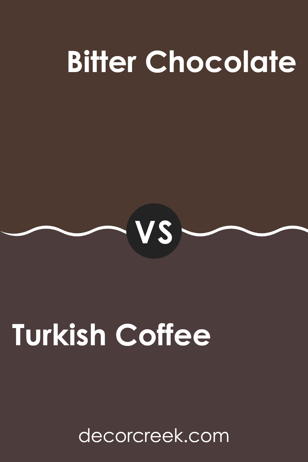
Turkish Coffee SW 6076 by Sherwin Williams vs Bitter Chocolate SW 6013 by Sherwin Williams
Turkish Coffee and Bitter Chocolate are both dark, rich colors by Sherwin Williams, but they offer subtle differences in tone and mood. Turkish Coffee leans towards a dark brown that almost borders on black. This color carries a strong presence and offers a grounding, stable effect when used in a room. It’s perfect for creating a cozy, inviting environment.
On the other hand, Bitter Chocolate is also a deep brown but has a warmer, reddish undertone, giving it a slightly softer appearance compared to Turkish Coffee. This warmth makes Bitter Chocolate ideal for spaces where you want to add a touch of comfort without going too dark.
Both colors are great for accent walls or furniture and can complement a variety of decor styles. However, the choice between them depends on whether you prefer a cooler tone (Turkish Coffee) or a warmer tone (Bitter Chocolate), and the specific atmosphere you want to create in your space.
You can see recommended paint color below:
- SW 6013 Bitter Chocolate
Turkish Coffee SW 6076 by Sherwin Williams vs French Roast SW 6069 by Sherwin Williams
The two colors, Turkish Coffee and French Roast, both by Sherwin Williams, are warm and deep. Turkish Coffee is significantly darker, almost like a dark chocolate shade, which makes it ideal for creating a cozy and inviting feel in a space. It’s a great choice for accent walls or furniture pieces that you want to stand out.
On the other hand, French Roast is a lighter brown. It holds a slight hint of burgundy, giving it a unique warmth that isn’t as intense as Turkish Coffee. This makes French Roast more versatile and easier to pair with other colors, whether in a living room or a bedroom.
Both colors are excellent for adding depth and warmth to a room, but your choice would depend on how bold or subtle you want the color impact to be. Turkish Coffee leans towards a bold, standout option, while French Roast is subtler, blending more smoothly with various decor styles and color schemes.
You can see recommended paint color below:
- SW 6069 French Roast

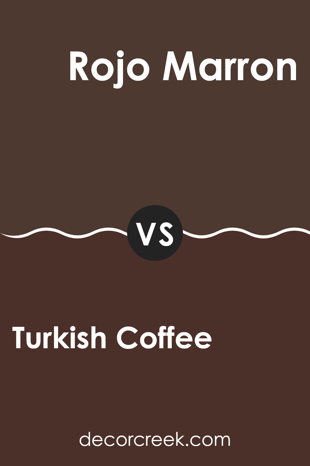
Turkish Coffee SW 6076 by Sherwin Williams vs Rojo Marron SW 9182 by Sherwin Williams
Turkish Coffee SW 6076 and Rojo Marron SW 9182 are both rich, deep colors by Sherwin Williams but have distinct tones and uses. Turkish Coffee is a very dark, almost black shade of brown. It’s perfect for creating a cozy and grounding atmosphere in spaces like living rooms or bedrooms. This color pairs well with light neutrals to balance its intensity.
On the other hand, Rojo Marron leans towards a dark red or burgundy, imparting a warmer and somewhat more vibrant feel. This shade can add a hint of color and richness to spaces, making it ideal for accent walls or to add depth to smaller areas. It works well with warm tones and earthy colors.
Both colors are bold and can make a strong statement in any space. They are best used in areas where you want to create a focal point or add layers of depth. Depending on your decor style, both colors offer unique opportunities to make a space feel more cozy and inviting.
You can see recommended paint color below:
- SW 9182 Rojo Marron
Turkish Coffee SW 6076 by Sherwin Williams vs Hickory Smoke SW 7027 by Sherwin Williams
Turkish Coffee and Hickory Smoke are both neutral shades from Sherwin Williams, but they have distinct differences. Turkish Coffee is a deep, rich brown that mimics the bold, intense tones of its namesake beverage. It’s a warm color, perfect for creating a cozy, inviting atmosphere in spaces like living rooms or studies.
On the other hand, Hickory Smoke is a much lighter gray hue. This color is subtle and airy, making it suitable for modern designs and spaces that aim to feel open and bright. It works well in areas like kitchens or bathrooms where a clean, fresh look is desired.
Both colors offer versatility in terms of decor and pairing with other colors. However, Turkish Coffee tends to add depth and warmth to a space, while Hickory Smoke provides a neutral backdrop that highlights other elements in the room. Depending on the mood and style you want to achieve, each color has its unique advantage.
You can see recommended paint color below:
In wrapping up my thoughts on SW 6076 Turkish Coffee by Sherwin Williams, I must say, it’s a remarkably rich and delightful shade. This color, resembling the famous strong coffee, adds a warm and cozy feel to any room. By using Turkish Coffee on the walls, it makes the place feel inviting and comforting—just like enjoying a warm cup of coffee on a chilly day.
I’ve learned that this shade works wonderfully in rooms that don’t get a lot of sunlight, because it brings in a sense of warmth and depth that lighter colors might not provide. It especially shines in bedrooms or living rooms, adding a touch of elegance without making things too dark.
For anyone looking to refresh their home with a new color, Turkish Coffee offers a beautiful and mature look. It’s easy to match with light colors like creams or tans, which help keep the balance and avoid making the space seem too dark. Adding some green plants or white decorations also looks really good with this color.
Overall, Turkish Coffee by Sherwin Williams is more than just a paint; it’s a way to make your home feel more welcoming and snug. It’s perfect for creating a comfy corner for reading or a stylish area for hanging out with friends. So, if you’re thinking about a change, this color might just be the perfect choice.
Ever wished paint sampling was as easy as sticking a sticker? Guess what? Now it is! Discover Samplize's unique Peel & Stick samples.
Get paint samples

