Black
Black Blue
Blue Brown
Brown Gray
Gray Green
Green Neutral
 Orange
 White
White Yellow
If you’re thinking about choosing SW 7593 Rustic Red by Sherwin Williams for your next painting project, there are a few key aspects you should consider. As someone who has navigated the vast world of paint colors, I understand how important it is to select the right shade that not only meets your aesthetic needs but also enhances the mood and dynamics of your room.
Rustic Red is a deep, warm hue that brings a sense of coziness and comfort to any room. Before you decide to paint your walls with this color, think about the lighting in your home. Rustic Red thrives in well-lit areas where its rich tones can truly shine, potentially making it less suitable for dimly lit rooms unless you’re going for a denser, more intimate ambiance.
Additionally, it’s crucial to consider your current décor and furniture. Rustic Red pairs beautifully with neutral and earthy tones, and it can serve as a bold backdrop for both modern and traditional styles. Reflect on the vibe you want to achieve; this shade can create a welcoming, warm environment ideal for areas where you want to relax and feel at ease.
So, if you like a color that can turn a room into a cozy retreat, Rustic Red might just be the choice for you. However, keep in mind that its bold nature requires confident styling. Make sure it fits with your vision before taking the plunge.
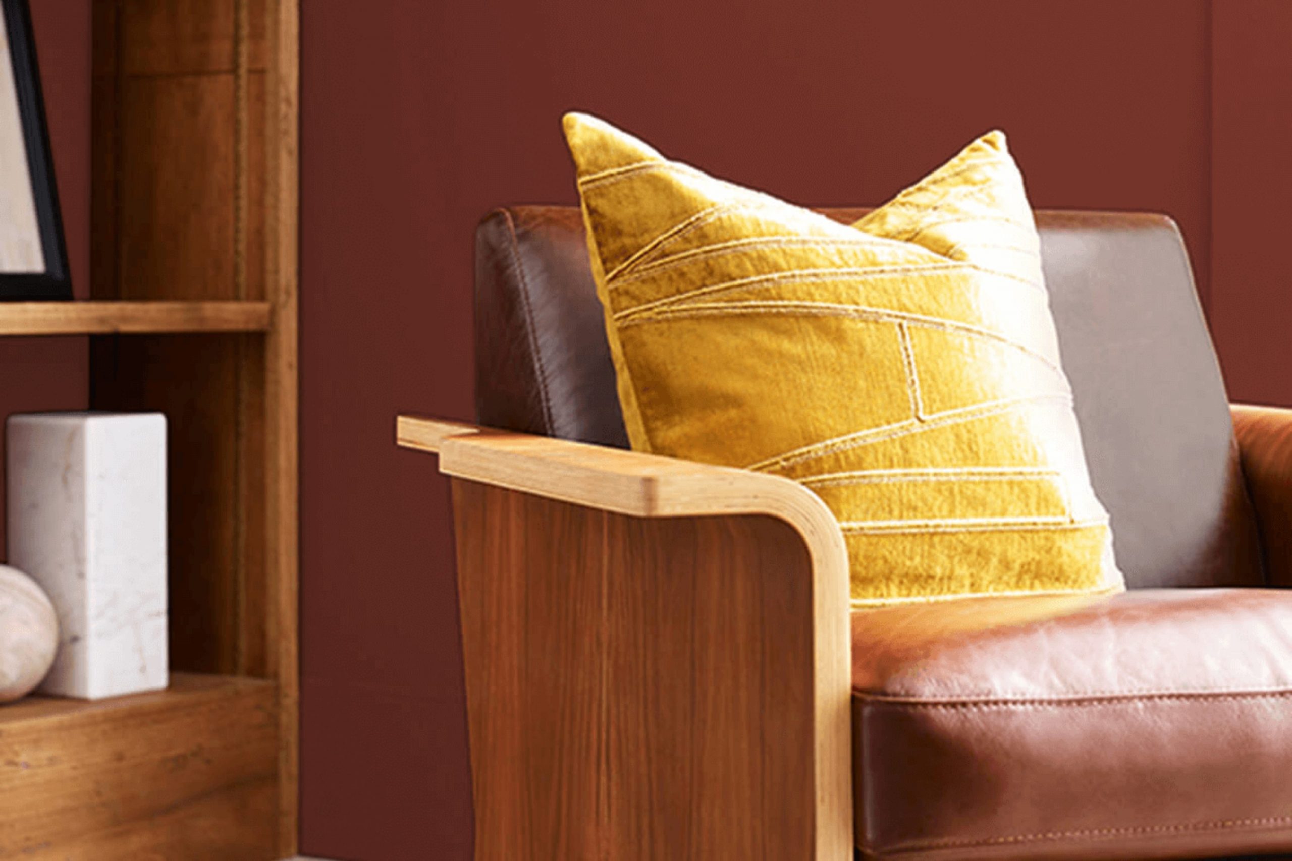
Is Rustic Red SW 7593 Right for My Home?
As someone who loves warm, welcoming interiors, I find Rustic Red by Sherwin Williams a perfect hue to add coziness to any room. This color strikes a lovely balance between vibrant and subdued, making it a rich, earthy shade that reminds me of autumn leaves or a rustic barn door. It’s not too bright, but has enough depth to make a statement.
I’ve found that Rustic Red works beautifully in a variety of interior styles, particularly in traditional, farmhouse, and even modern settings that want a touch of warmth. It’s amazing how adaptable this color is, complementing a wide range of decors.
When it comes to pairing with materials, Rustic Red goes wonderfully with natural wood, which highlights its warm undertones. It also looks stunning against exposed brick or stone, lending a classic charm that feels inviting.
For textures, I love combining it with soft, plush fabrics like wool or chenille in neutral colors to create a cozy, layered look. Metals like brass or copper also pair nicely, adding a bit of shine and elegance to the robust red. Overall, using Rustic Red in my room allows me to create a welcoming atmosphere that feels both grounded and stylish. It’s a color that truly brings warmth and character to any room.
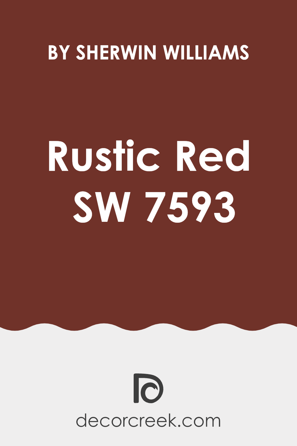
decorcreek.com
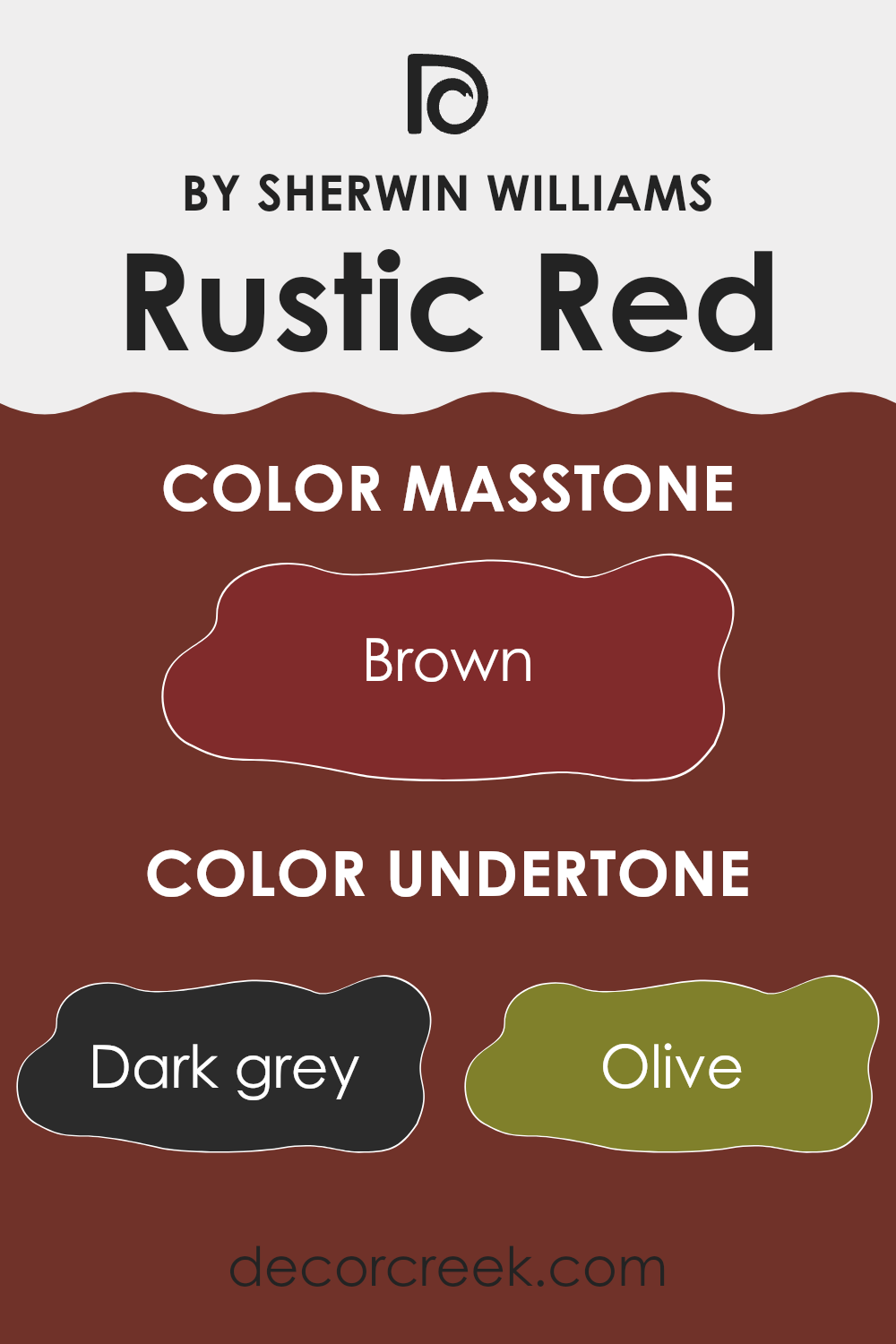
What are the right undertones of Rustic Red SW 7593 ?
The color Rustic Red by Sherwin Williams is a vibrant, warm shade that can bring a cozy and inviting atmosphere to any room. Understanding the undertones of this color is crucial because they can subtly influence the overall feel and appearance of the paint once applied to the walls. Rustic Red contains a variety of undertones including dark grey, olive, purple, red, dark green, navy, grey, orange, pink, dark turquoise, and pale pink.
Each of these undertones can cause the Rustic Red to appear differently under various lighting conditions. For instance, in a room with lots of natural light, the orange and red undertones might make the wall color appear brighter and more vivid. Conversely, in an area with less light, the darker undertones like navy and dark grey might become more dominant, giving the color a more muted or somber feel.
When using Rustic Red on interior walls, these undertones can add depth and complexity to the room. The mix of warm and cool undertones ensures that the color can complement a wide range of decor styles and other colors. It’s important to consider these undertones when choosing furnishings and decorations to ensure a cohesive and harmonious look. For instance, matching Rustic Red with furniture or accessories that highlight its olive or grey undertones can create a balanced and pleasing aesthetic.
decorcreek.com
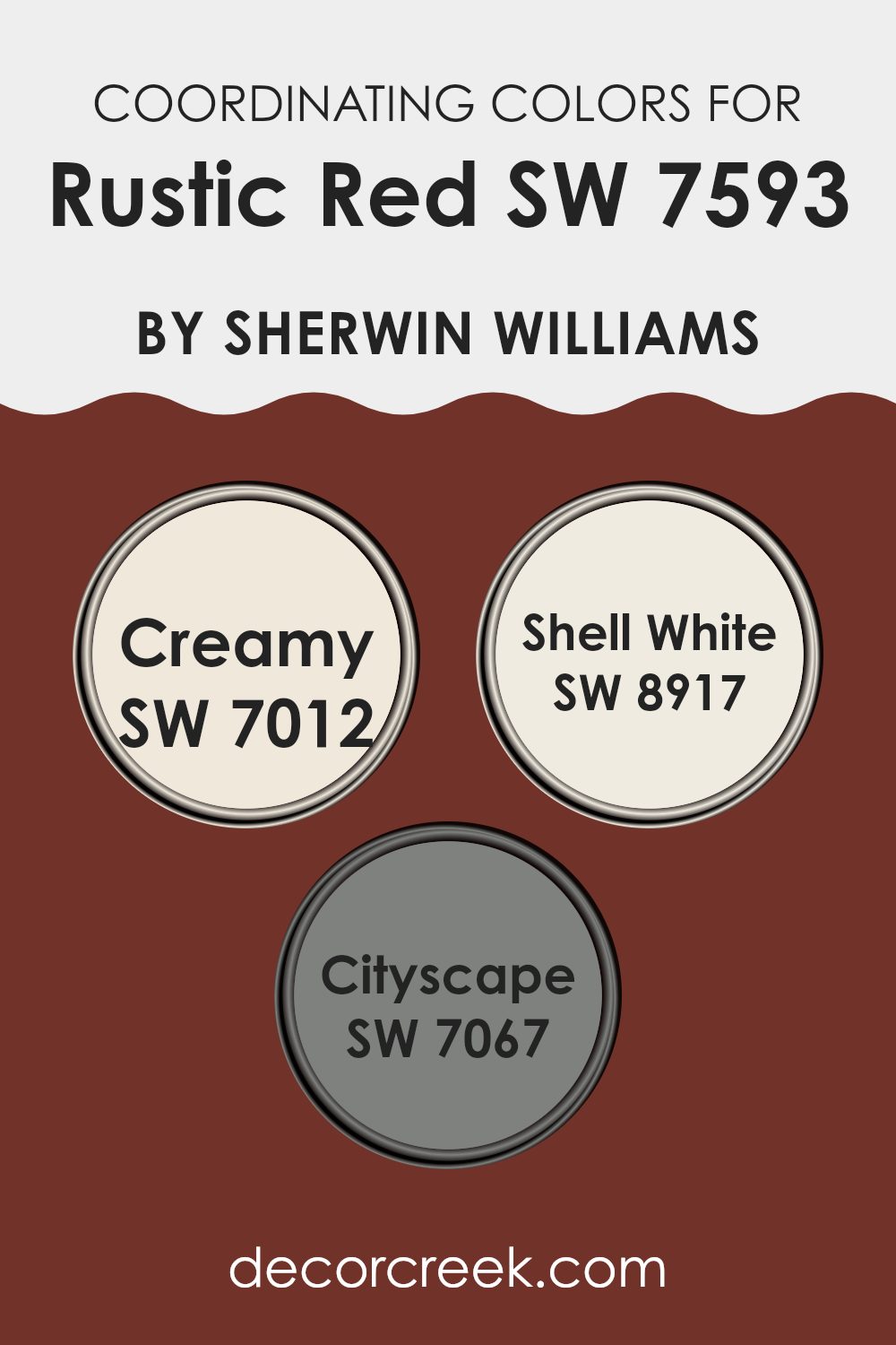
Best Coordinating Colors to use with Rustic Red SW 7593 by Sherwin Williams this year.
Coordinating colors are hues that complement each other and create a harmonious atmosphere when used together in a room. These colors often share an underlying tone that ties the room together, without creating too much contrast. For instance, when decorating with a bold color like Rustic Red, choosing the right coordinating colors can balance the intensity and add visual interest. Similar to selecting accessories for an outfit, choosing paint colors that coordinate helps achieve a cohesive look.
Creamy (SW 7012) is a soft, warm white that offers a gentle contrast to Rustic Red, softening the overall look of a room without clashing. It’s ideal for creating a cozy and inviting atmosphere. Shell White (SW 8917) is another warm white, but with a slightly cleaner look compared to Creamy.
It works well in rooms that need to maintain a fresh and airy feel while still coordinating beautifully with Rustic Red. On the other hand, Cityscape (SW 7067) is a deep neutral gray that provides a modern and grounded effect. This color works wonderfully as an accent or for larger areas, providing an elegant backdrop that allows Rustic Red to stand out attractively. By using these coordinating colors, one can achieve a balanced and pleasing color scheme in any interior room.
You can see recommended paint colors below:
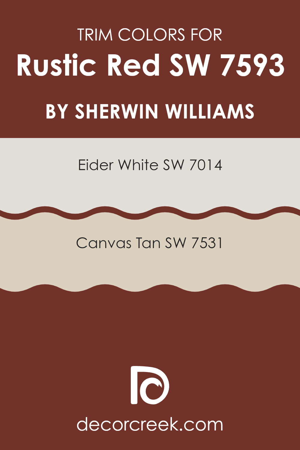
Trendy Trim Colors of Rustic Red SW 7593 by Sherwin Williams to use this year.
Trim colors are used to accentuate the architectural features of a home, like door frames, windows, and moldings, creating a visual frame that complements the primary wall color. When paired with a bold shade like Rustic Red, choosing the right trim colors can enhance the overall aesthetic without creating too much contrast.
Eider White and Canvas Tan are excellent choices for trim colors as they offer a subtle contrast that allows the richness of Rustic Red to stand out while maintaining a cohesive look.
Eider White (SW 7014) is a soft, pale gray with just a hint of warmth, making it an ideal backdrop that softly frames the vibrant red without competing for attention. Canvas Tan (SW 7531), on the other hand, provides a slightly deeper and earthier tone, which can add a hint of natural, understated elegance to the room. Both shades are adaptable and help in maintaining a balanced color scheme that complements the rich tones of Rustic Red.
You can see recommended paint colors below:
Evergreen Colors Similar to Rustic Red SW 7593 by Sherwin Williams
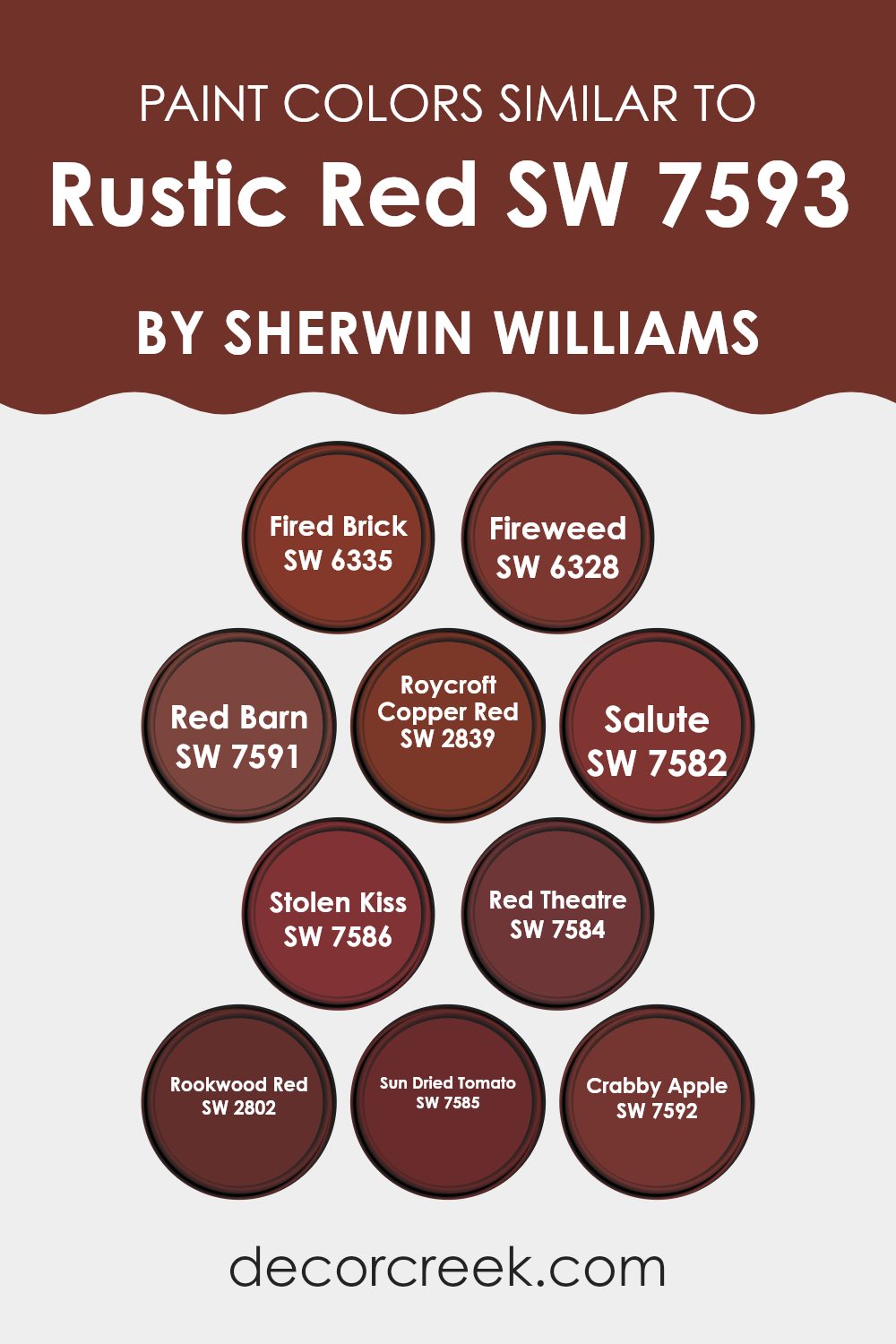
Choosing similar colors to Rustic Red can create a harmonious and cohesive look in a room, enhancing the aesthetic appeal without causing visual distraction. Using a palette of similar colors, like the ones related to Rustic Red from Sherwin Williams, can help in achieving a balanced and unified interior. These similar shades vary slightly in hue and tone but maintain a consistency that complements the boldness of Rustic Red well.
Fired Brick is a slightly deeper shade that offers a robust backdrop, ideal for areas needing a touch of drama. Fireweed has a vivid tone, perfect for adding a lively pop of color in smaller doses. Red Barn shares a warm, welcoming feel, making it suitable for living rooms or dining areas craving a rustic touch.
Roycroft Copper Red provides a burnt, earthy quality that works well in rooms aiming for a historic or traditional vibe. Salute is a darker, more reserved color that pairs nicely with lighter accents for a balanced look. Stolen Kiss reveals a softer, more romantic side, suitable for bedrooms or cozy nooks. Red Theatre adds a rich vibrancy, echoing the luxurious ambiance of a vintage theater.
Rookwood Red offers depth and tradition, excellent for creating an elegant yet inviting room. Sun Dried Tomato has an almost brownish cast, making it ideal for refined, mature designs. Lastly, Crabby Apple is perfect for adding a muted yet strong character to any room needing a solid, but not overpowering, color presence.
You can see recommended paint colors below:
- SW 6335 Fired Brick
- SW 6328 Fireweed
- SW 7591 Red Barn
- SW 2839 Roycroft Copper Red
- SW 7582 Salute
- SW 7586 Stolen Kiss
- SW 7584 Red Theatre
- SW 2802 Rookwood Red
- SW 7585 Sun Dried Tomato
- SW 7592 Crabby Apple
Colors that Go With Rustic Red SW 7593 by Sherwin Williams
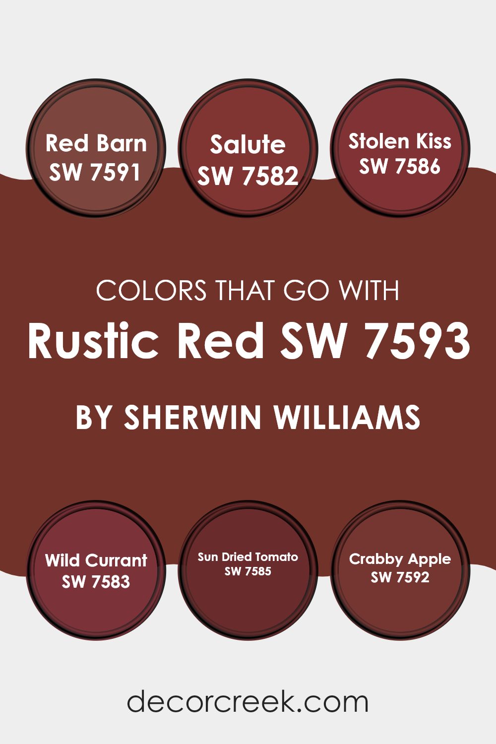
Choosing complementary colors for Rustic Red SW 7593 by Sherwin Williams is crucial because it helps create a harmonious and appealing color palette in any room. Especially when dealing with a strong and vivid color like Rustic Red, the adjacent colors can either enhance its warmth and richness or provide a striking contrast.
For instance, Red Barn SW 7591, being a deep and earthy red, pairs beautifully with Rustic Red by reinforcing the rustic aesthetic without overpowering the setting. On the other hand, Salute SW 7582 offers a more muted and subtle gray tone, providing a gentle balance that softens the intensity of Rustic Red and makes the room feel cozy and welcoming.
Additionally, Stolen Kiss SW 7586 brings a delicate blush tone into the mix, adding a touch of lightness and romance to the robust red hues, while Wild Currant SW 7583, a darker and more mysterious red, enriches the depth of the color scheme, creating an elegant yet approachable vibe. Sun Dried Tomato SW 7585 carries a burnt orange-red shade that complements Rustic Red by adding a warm, earthy touch, enhancing the overall rustic charm.
Lastly, Crabby Apple SW 7592 offers a dusky maroon tint that plays well with darker themes, adding variety and depth, which allows for greater adaptability in decor styles and accent choices. These surrounding colors all contribute significantly to how Rustic Red can be perceived and appreciated in a room, making the choice of companion colors a key aspect of interior design.
You can see recommended paint colors below:
- SW 7591 Red Barn
- SW 7582 Salute
- SW 7586 Stolen Kiss
- SW 7583 Wild Currant
- SW 7585 Sun Dried Tomato
- SW 7592 Crabby Apple
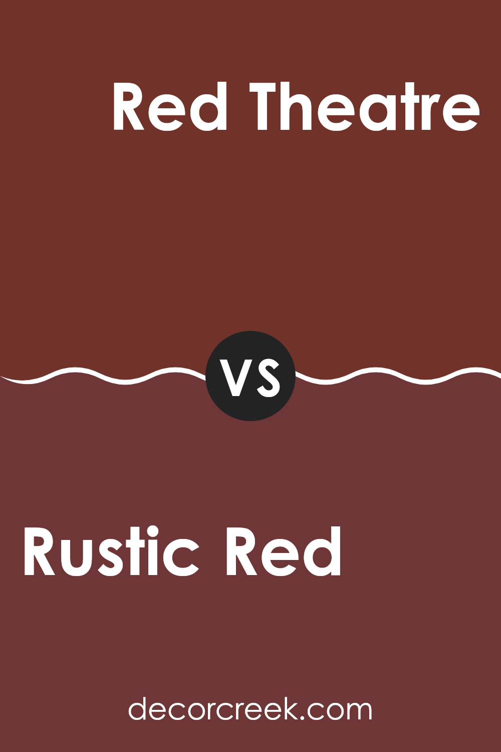
Rustic Red SW 7593 by Sherwin Williams vs Red Theatre SW 7584 by Sherwin Williams
Rustic Red and Red Theatre are two lively shades from Sherwin Williams, each with its own unique appeal. Rustic Red is a warm, earthy hue that resembles the red of autumn leaves or a rural barn. It’s cozy and inviting, making it perfect for rooms where you want a touch of comfort and nostalgia.
On the other hand, Red Theatre is a brighter and more dramatic red. This color grabs your attention and has a bold presence, ideal for an accent wall or areas where you want to make a strong visual statement.
Both colors bring energy to any room, but Rustic Red offers a softer, more subdued touch, whereas Red Theatre stands out with its vibrancy, suitable for more active or creative rooms. Choosing between them depends on the mood and function you wish to achieve in your home.
You can see recommended paint color below:
- SW 7584 Red Theatre
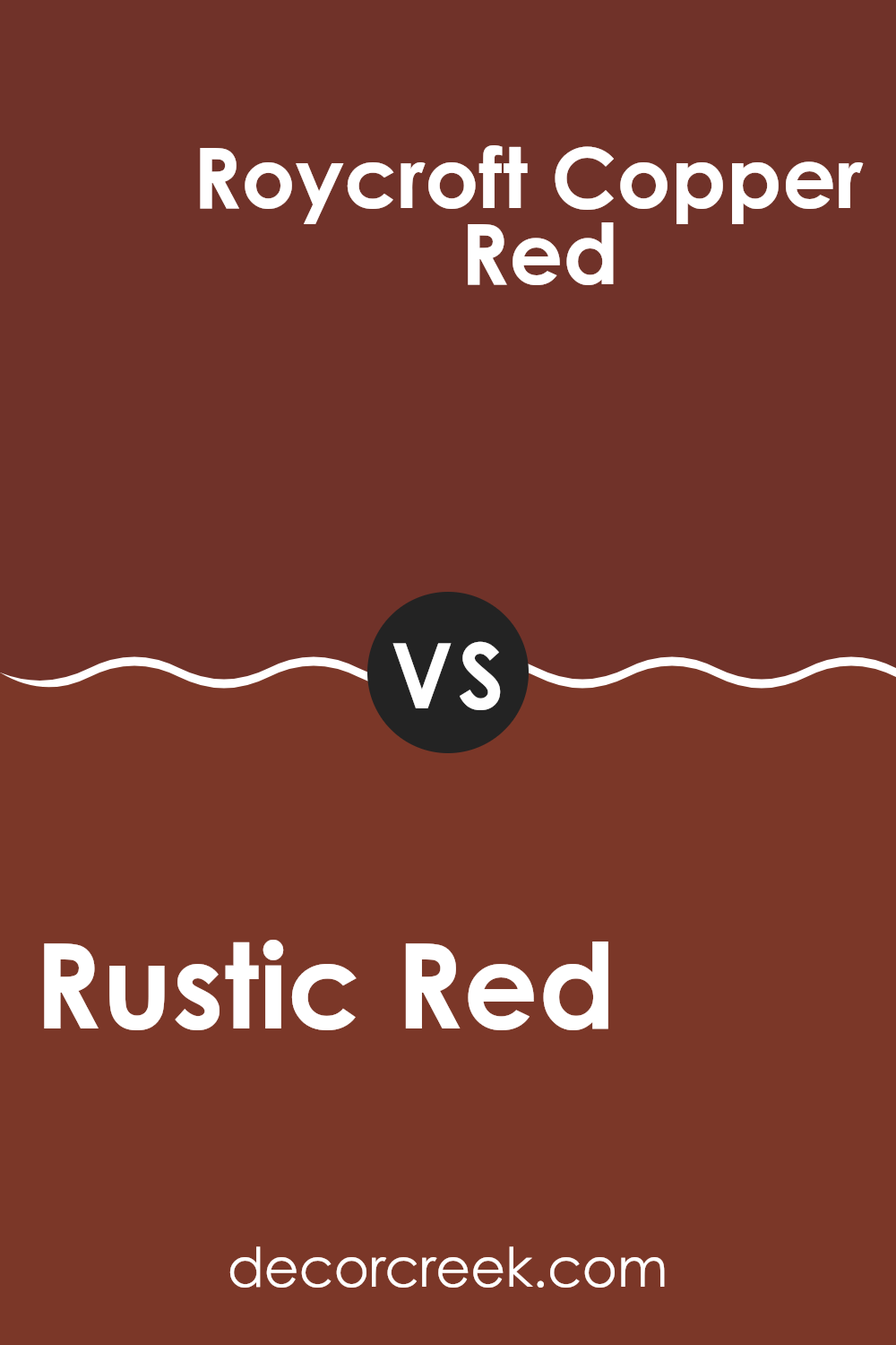
Rustic Red SW 7593 by Sherwin Williams vs Roycroft Copper Red SW 2839 by Sherwin Williams
Rustic Red has a warm, deep tone that brings to mind traditional red barns or earthen clay pots. It’s a comforting color that feels both inviting and cozy, making it a great choice for rooms like living rooms or dining areas where you want a sense of warmth.
Roycroft Copper Red, on the other hand, leans slightly more towards a brownish hue, giving it a subtle, muted quality compared to Rustic Red. This color is excellent for creating a cozy, understated environment, and might be preferred in settings where a less bold red is desirable.
Both colors offer a warm, welcoming vibe, but Rustic Red is more vivid and prominent, while Roycroft Copper Red is softer and more subdued. Depending on the mood you want to set in a room, you could choose Rustic Red for a bolder statement or Roycroft Copper Red for a more toned-down look.
You can see recommended paint color below:
- SW 2839 Roycroft Copper Red
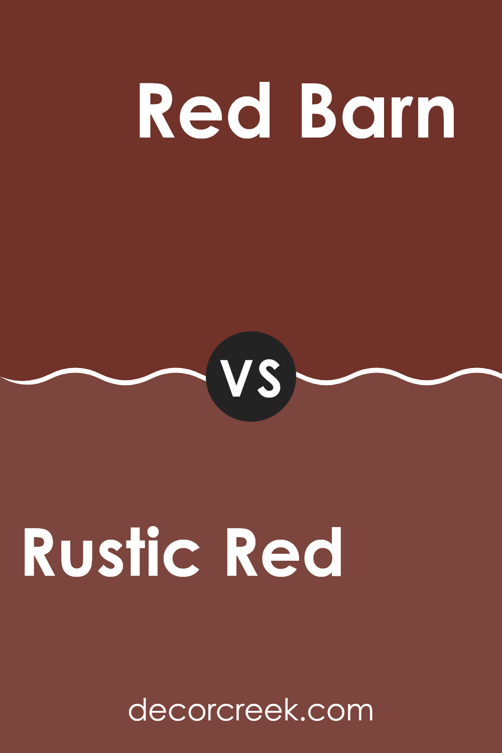
Rustic Red SW 7593 by Sherwin Williams vs Red Barn SW 7591 by Sherwin Williams
Rustic Red and Red Barn are two shades from Sherwin Williams that offer distinct tones for different tastes. Rustic Red has a deeper, more muted tone with a touch of brown, making it ideal for creating a cozy and warm ambience. It works well in rooms like living rooms or dining areas where you want a subdued and welcoming atmosphere.
On the other hand, Red Barn is a brighter and purer red. This color is robust and lively, bringing an energetic feel to any room. It’s a great choice for areas where you want to make a bold statement, such as a front door or a statement wall.
While both colors share a red base, Rustic Red leans towards a more earthy feel, and Red Barn offers a vibrant splash. Depending on the mood you’re aiming for, each color has its unique charm to enhance your home.
You can see recommended paint color below:
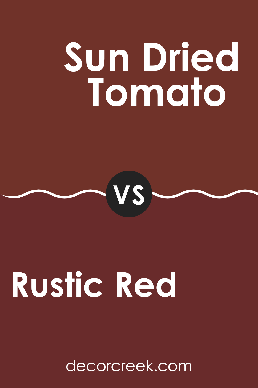
Rustic Red SW 7593 by Sherwin Williams vs Sun Dried Tomato SW 7585 by Sherwin Williams
Rustic Red by Sherwin Williams is a warm, deep red that has a cozy, welcoming feel. It carries undertones of brown, which help mellow the red, making it suitable for various rooms, from a living room to a dining area. It’s great for creating a homey, comfortable atmosphere.
On the other hand, Sun Dried Tomato by Sherwin Williams is also a warm red, but it leans slightly more towards a brick color. It’s a bit darker and richer than Rustic Red, lending it a more intense and bold presence that can make a strong statement in a room.
Both colors have their unique strengths: Rustic Red is excellent for a softer, subtler look, while Sun Dried Tomato stands out more, suitable for accent walls or areas where you want to draw more attention. In both cases, these colors work well in rooms where a touch of warmth and energy is desired.
You can see recommended paint color below:
- SW 7585 Sun Dried Tomato
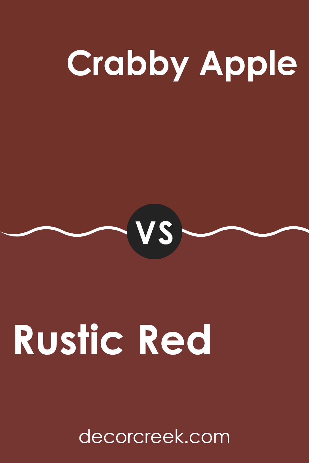
Rustic Red SW 7593 by Sherwin Williams vs Crabby Apple SW 7592 by Sherwin Williams
Rustic Red and Crabby Apple, both by Sherwin Williams, are warm, inviting shades but each offers a unique vibe to the rooms they adorn. Rustic Red is a deep, vibrant red with a slight brown undertone, giving it a cozy, earthy feel that works well in living rooms or dining areas. This color is perfect for creating a welcoming, snug atmosphere.
On the other hand, Crabby Apple is slightly muted compared to Rustic Red, leaning more towards a maroon with richer brown undertones. This color is ideal for someone looking to add a touch of warmth to their room without going too bold. Crabby Apple fits beautifully in rooms that require a subtle yet warm presence, like studies or libraries.
When choosing between the two, consider the mood you’re aiming for. Rustic Red brings more intensity to a room, while Crabby Apple offers a softer, more understated charm. Both colors are excellent choices for adding warmth and character to your home.
You can see recommended paint color below:
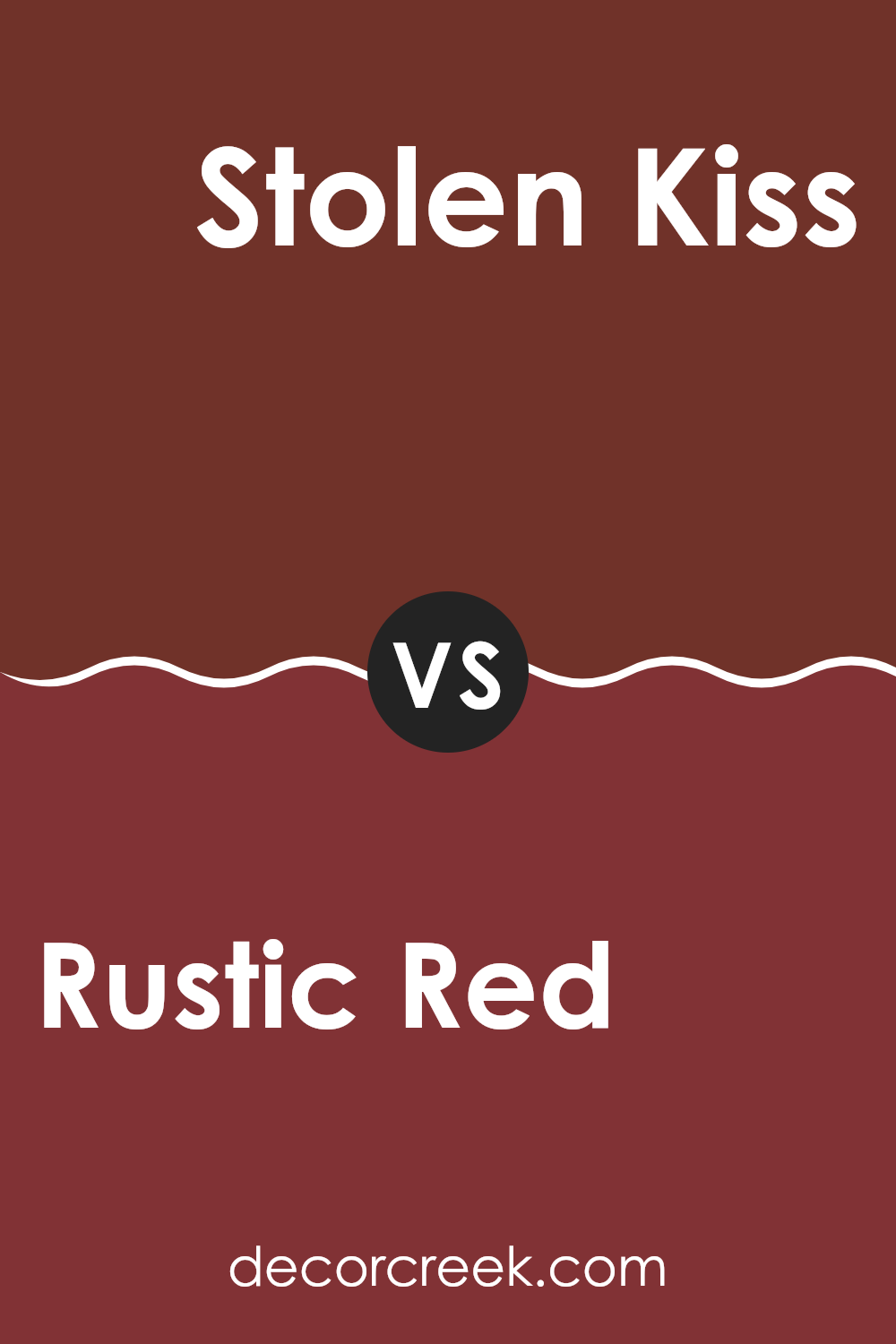
Rustic Red SW 7593 by Sherwin Williams vs Stolen Kiss SW 7586 by Sherwin Williams
Rustic Red and Stolen Kiss are both red paints from Sherwin Williams, but they offer different vibes. Rustic Red is a deep, rich red with some earthy brown tones that give a warm and cozy feel. It’s perfect for making a room feel inviting and comfortable.
On the other hand, Stolen Kiss is a lighter and slightly more vibrant red. This color has a bit more energy and brightness, making it a great choice for adding a lively touch to a room.
While Rustic Red might suit areas where you relax like a living room or bedroom, Stolen Kiss could be better for more active areas of the house where you entertain guests or dine. In short, Rustic Red offers a more subdued, warm atmosphere, whereas Stolen Kiss brings a brighter and more energetic feel.
You can see recommended paint color below:
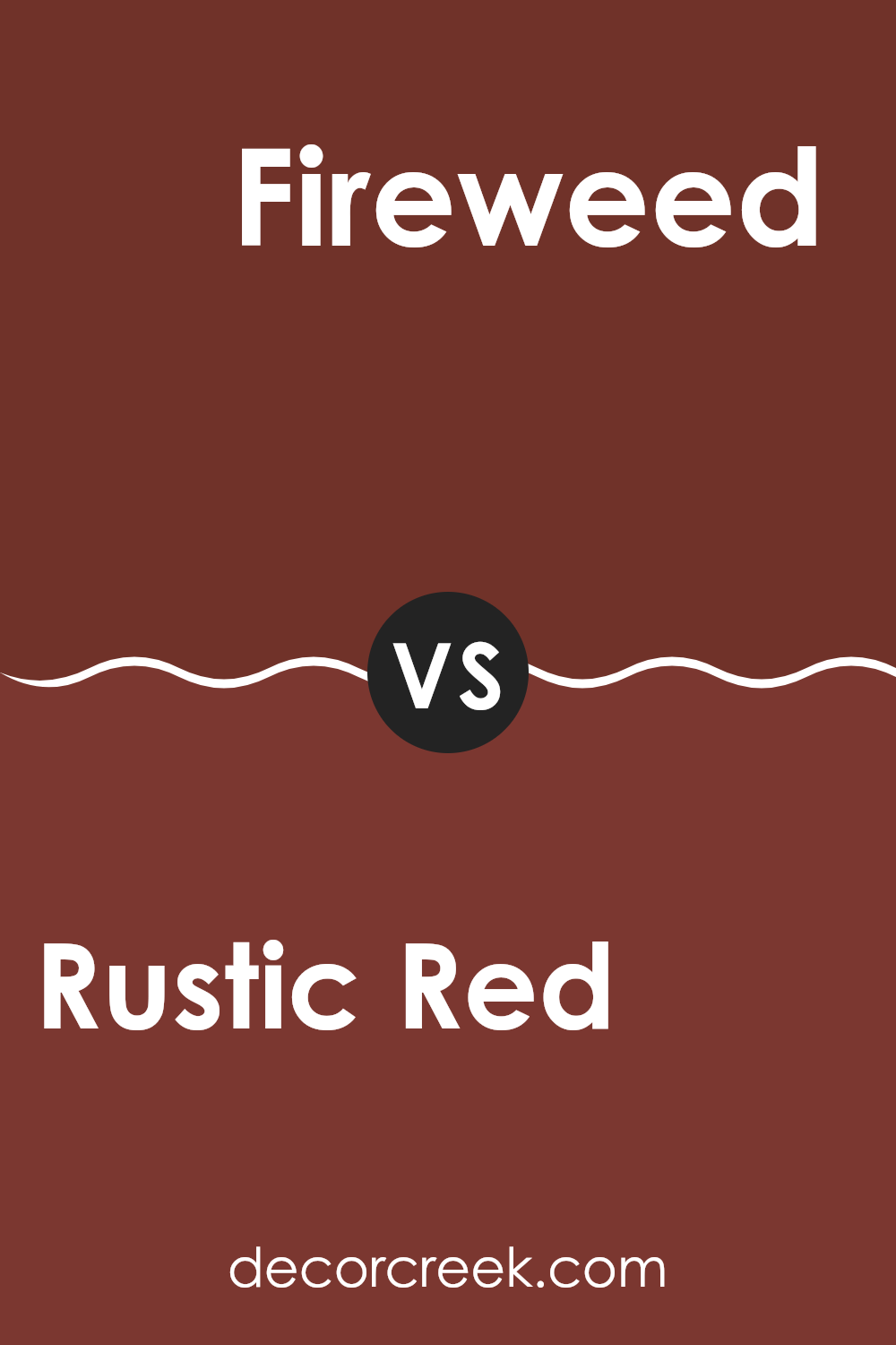
Rustic Red SW 7593 by Sherwin Williams vs Fireweed SW 6328 by Sherwin Williams
Rustic Red and Fireweed are two vibrant shades from Sherwin Williams, each bringing its own unique vibe to a room. Rustic Red is a deep, warm tone that leans towards a brick-like color. It’s perfect for creating a cozy and welcoming atmosphere in any room. This color works well in living areas or dining rooms where a comforting and inviting ambience is desired.
On the other hand, Fireweed is a bold and bright red. It’s much more vivid and packs a punch, ideal for making a statement or accentuating a specific area within a home. Because of its lively nature, Fireweed is great for an accent wall or for rooms that benefit from a pop of color, such as a home office or a playful kitchen.
Overall, while both colors are red, Rustic Red offers a subdued, earthy feel, whereas Fireweed provides an energetic burst, making each suitable for different design intentions and rooms.
You can see recommended paint color below:
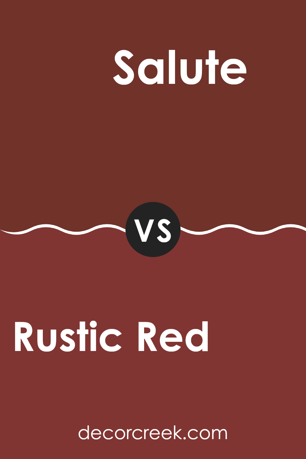
Rustic Red SW 7593 by Sherwin Williams vs Salute SW 7582 by Sherwin Williams
Rustic Red by Sherwin Williams is a warm and cozy shade, perfect for creating a welcoming atmosphere in any room. It has a deep, rich hue that resembles red clay or a sunbaked brick. On the other hand, Salute by Sherwin Williams is a darker and more muted color.
It leans towards a deep charcoal with a slight hint of red, giving it a subtle warmth under its shadowy exterior. While Rustic Red brings warmth and a sense of traditional charm, Salute offers a more understated and modern feel.
Both colors can work well in various rooms depending on the mood you want to set. While Rustic Red might be ideal for lively, social settings like living rooms or dining areas, Salute could be perfect for creating a calm and grounded environment in bedrooms or study rooms. Mixing these colors in adjacent rooms can also create a nice balance between vibrant energy and relaxed elegance.
You can see recommended paint color below:
- SW 7582 Salute
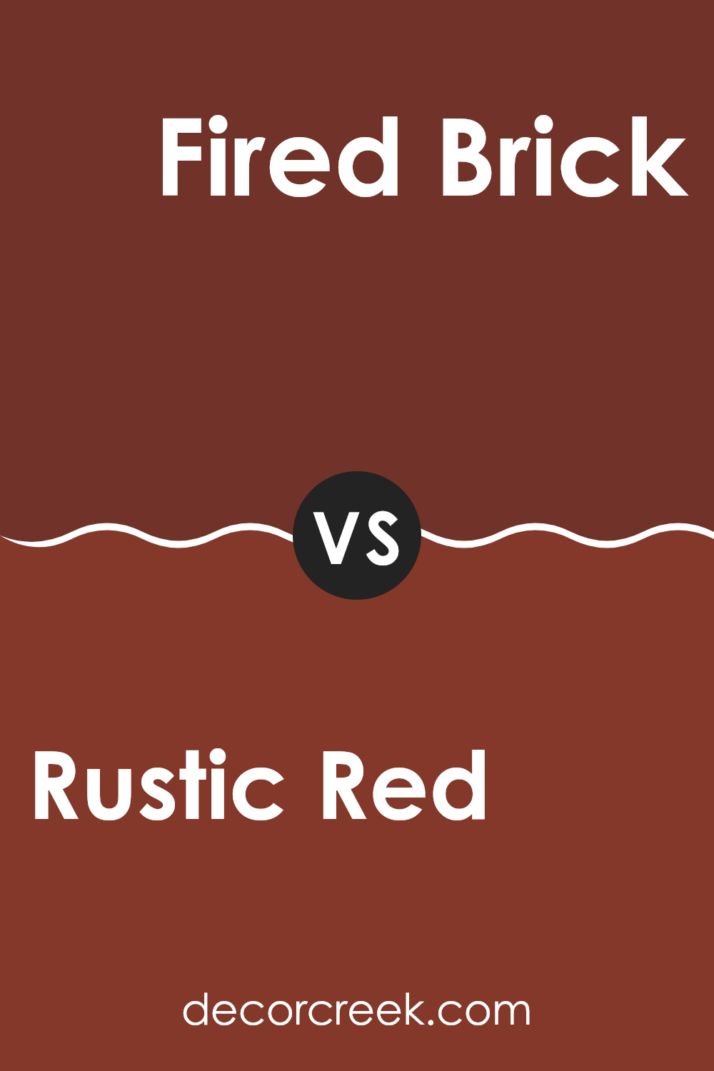
Rustic Red SW 7593 by Sherwin Williams vs Fired Brick SW 6335 by Sherwin Williams
Rustic Red and Fired Brick are both warm, inviting shades, but they differ slightly in their tones and the atmospheres they create. Rustic Red has a more muted, earthy quality, making it ideal for a cozy, understated look. It suggests a sense of calmness and warmth, perfect for rooms where you want a touch of rustic charm without being too bold.
On the other hand, Fired Brick carries a deeper, more intense red that resembles the classic look of a well-fired brick. This color is bolder and can make a strong statement in a room. It’s great for accent walls or areas where you want to add a dramatic flair.
Both colors work well in a variety of settings, but your choice might depend on the mood you’re aiming to achieve—subdued and grounded with Rustic Red, or more dynamic and impactful with Fired Brick.
You can see recommended paint color below:
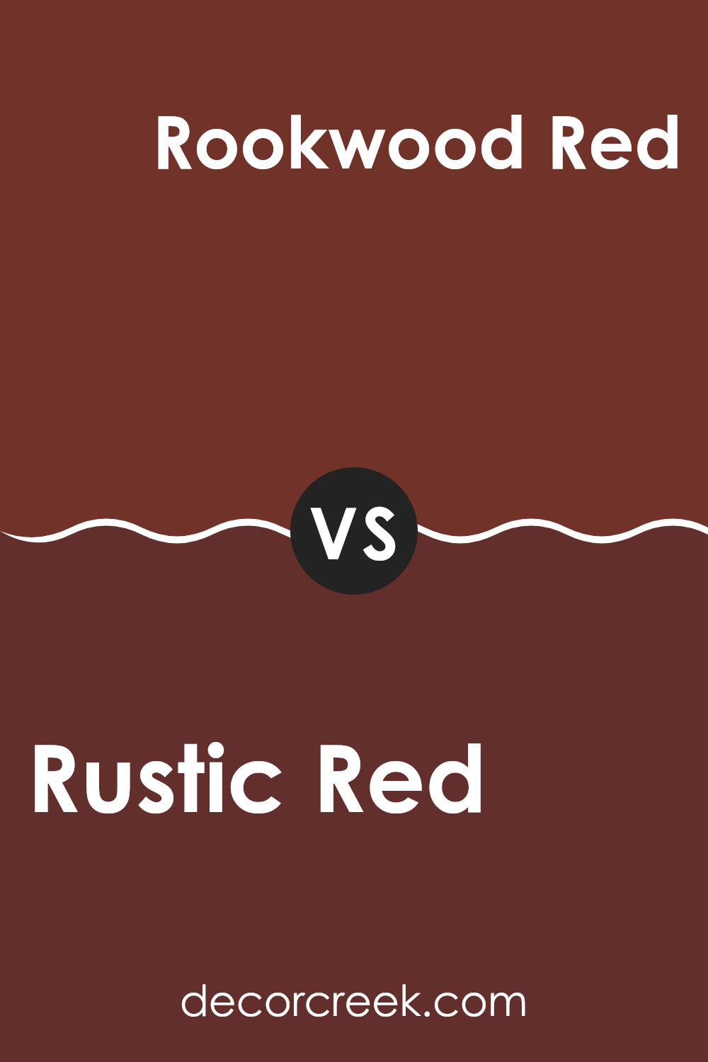
Rustic Red SW 7593 by Sherwin Williams vs Rookwood Red SW 2802 by Sherwin Williams
Rustic Red and Rookwood Red by Sherwin Williams are both warm, inviting colors, but they have distinct differences. Rustic Red offers a brighter, more vibrant tone. It leans more towards a traditional red, making it a standout choice for rooms where you want to make a statement or add a pop of color.
On the other hand, Rookwood Red presents a deeper, richer hue. It brings a sense of depth and warmth to a room, ideal for creating a cozy, welcoming atmosphere. Think of Rookwood Red as a classic red with a dusky, almost earthy quality, while Rustic Red is your go-to for something a bit more lively.
Both colors work well for accent walls or as part of a color scheme that includes neutrals or earth tones. They can add warmth and character to any room, whether traditional or modern.
You can see recommended paint color below:
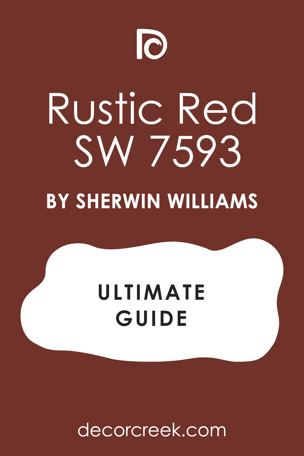
Wrapping up my thoughts on SW 7593 Rustic Red by Sherwin-Williams, I must say, I’m quite impressed. This color truly captures the warmth and coziness one might feel during a pleasant autumn evening. It’s like the color has a magic trick, making any room feel more welcoming and full of life.
Rustic Red stands out because it can make a room feel happier and brighter or more snug and cozy, depending on what you pair it with. It’s perfect for places where you want to feel comfy, like the living room or kitchen. Imagine baking cookies or reading a book in a room with walls this lovely red—it just feels right.
Also, it pairs nicely with many other colors. You can match it with soft creams for a gentle look, or with bold blues for a bit of excitement. No matter what, Rustic Red remains the star, bringing a fresh yet warm feel to the room.
If you’re thinking about painting a room or a piece of furniture and you want something that feels warm and happy, Rustic Red could be a fantastic pick. It’s not just a paint; it’s an opportunity to make your home feel just right for family and friends to gather.
decorcreek.com
Ever wished paint sampling was as easy as sticking a sticker? Guess what? Now it is! Discover Samplize's unique Peel & Stick samples.
Get paint samples