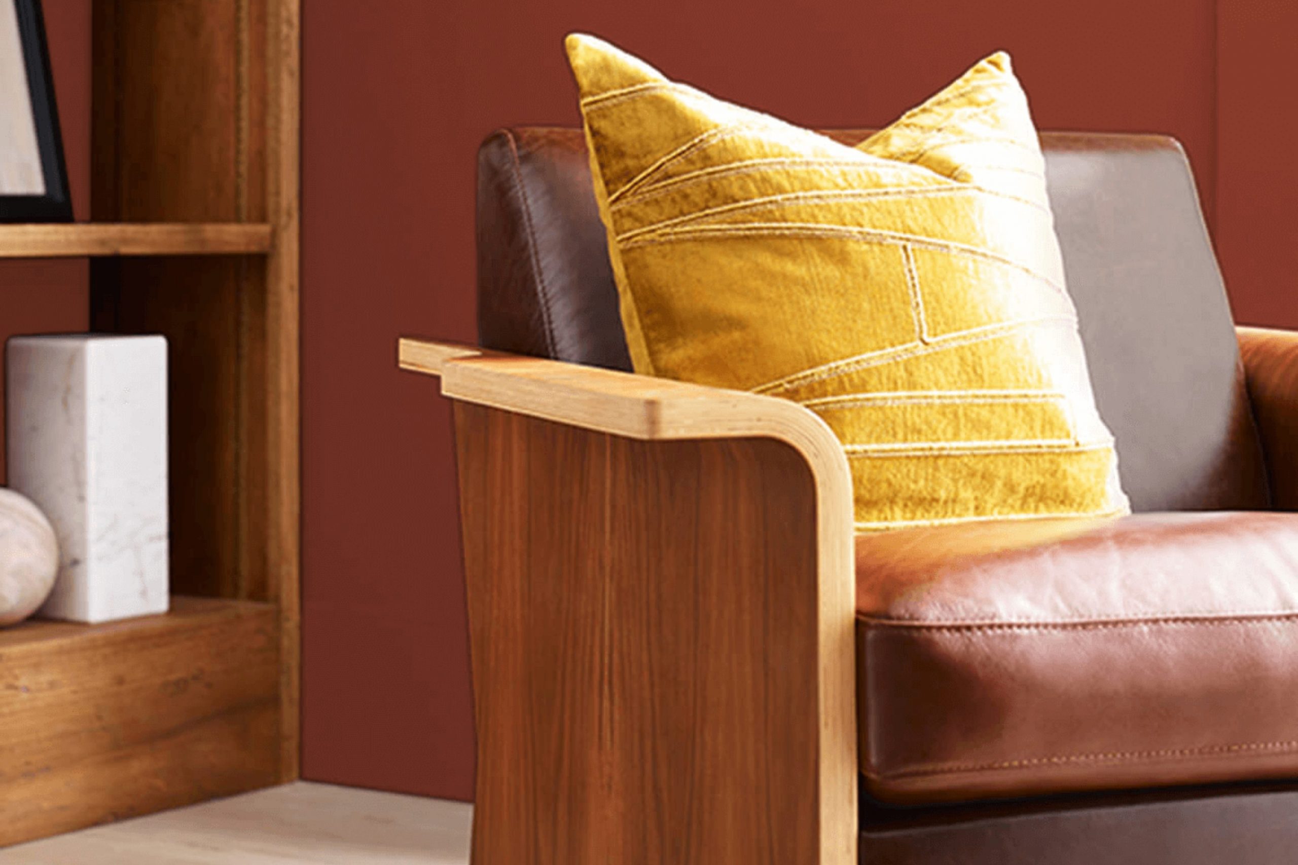
Imagine walking into a room painted with Sherwin Williams SW 6335 Fired Brick. Immediately, the rich, deep red captures your attention, reminiscent of autumn leaves or a cozy brick fireplace. This color is bold yet warm, making any room welcoming and full of life.
As you consider Fired Brick for your next project, you’ll appreciate its flexibility. Whether you aim to create a statement wall in your living room or bring some warmth to your kitchen, Fired Brick can handle it. This shade pairs beautifully with neutral tones, adding depth and interest to your decor. It also works well with natural elements like wooden furniture or green plants, which highlight its earthy qualities.
You might also find that Fired Brick sparks a sense of nostalgia, evoking memories of rustic cabins or cherished clay pots in a sunny garden. It’s a color that feels both classic and grounded, perfect for anyone looking to add a touch of natural elegance to their surroundings.
Let’s see how Fired Brick can enhance your room and reflect your personal style.
What Color Is Fired Brick SW 6335 by Sherwin Williams?
Fired Brick is a warm, deep red hue that adds a cozy and inviting atmosphere to any room. This rich color is reminiscent of autumn leaves and has a classic charm that can enhance various interior styles. It’s particularly effective in traditional settings such as living rooms, dining rooms, and libraries where it adds a sense of warmth and intimacy. This shade also works well in rustic designs, providing a strong and earthy foundation that complements natural materials like wood, stone, and leather.
When pairing Fired Brick with other materials, consider textures that contrast yet complement its depth. For instance, pairing this color with soft, creamy fabrics like linen or cotton can soften its intensity, creating a balanced and welcoming environment. Metallic finishes like bronze, gold, or copper also pair beautifully with Fired Brick, adding a hint of luxury and brightness to the room.
Layering this color with various wood tones from light oak to dark walnut helps establish a well-rounded and cohesive look. Adding elements such as woolen throws or jute rugs can introduce a tactile dimension that makes the room feel more lived-in and cozy.
Overall, Fired Brick is flexible and can be used to create a range of atmospheres depending on the accompanying styling and materials.

decorcreek.com
Is Fired Brick SW 6335 by Sherwin Williams Warm or Cool color?
Fired Brick by Sherwin Williams is a vibrant and warm color that can add a lot of personality to a home. It’s a deep red with a touch of brown, which makes it cozy and welcoming rather than overly bold. This shade can work really well in a living room or dining area, creating a friendly atmosphere that encourages gatherings and conversations. When used on an accent wall, it brings a pop of color that can liven up a room without overpowering it.
Because of its warm undertones, Fired Brick pairs nicely with neutral colors like beige, gray, and white. This combination can prevent the room from feeling too dark or cramped.
In addition, incorporating elements like wooden furniture or natural green plants can balance the warmth of Fired Brick, making the interior feel grounded and harmonious. Whether for a modern or rustic style, this color is a flexible choice for making a home feel more inviting.
Undertones of Fired Brick SW 6335 by Sherwin Williams
Fired Brick is a rich, robust red that brings warmth and energy to any room. Understanding its undertones is key to how it interacts with light and surrounding colors. Undertones are subtle colors that lie beneath the primary color, influencing its overall hue and how it’s perceived in different lighting conditions.
Fired Brick features a variety of undertones, including olive, red, purple, dark grey, orange, grey, dark green, pink, navy, pale pink, and dark turquoise. These undertones add depth and complexity to the paint, making it flexible and dynamic.
For instance, the red and orange undertones bring a warm, welcoming feel, which is perfect for living rooms or dining areas. These warmer undertones make the wall seem cozy and inviting. On the other hand, the cooler undertones like navy and dark turquoise provide a subtle balance that prevents the color from feeling too intense. This makes Fired Brick adaptable to different styles and preferences.
When used on interior walls, the collective effect of these undertones impacts the overall atmosphere of a room. In natural light, the warmer undertones might become more pronounced, giving the room a vibrant look. In artificial lighting, cooler undertones might stand out, lending a more muted elegance to the room.
The flexibility of Fired Brick, enhanced by its rich blend of undertones, allows it to work beautifully in various settings, complementing natural materials such as wood and stone, as well as different types of furnishings and decor. This makes it a popular choice for anyone looking to add a touch of warmth and personality to their home.
decorcreek.com
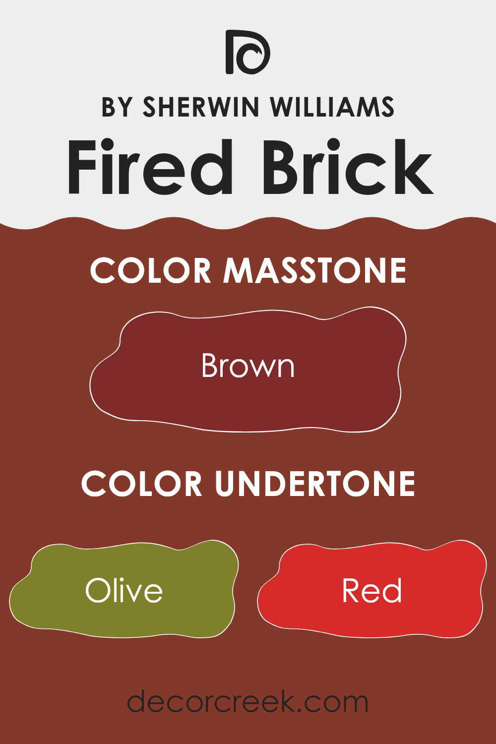
What is the Masstone of the Fired Brick SW 6335 by Sherwin Williams?
Fired Brick SW 6335 by Sherwin Williams, with its striking brown masstone (#802B2B), is a powerful choice for any home. This deep, rich brown shade contributes a warm and cozy atmosphere, making it perfect for living areas or bedrooms.
It pairs nicely with a wide range of colors, from soft creams for a gentle contrast to bold greens for a more dramatic effect. This flexibility means that Fired Brick can be used in various decor styles, whether you aim for a rustic feel or a more modern look.
Additionally, its deep hue helps in hiding smudges and stains, which is especially useful in high-traffic areas of the home. Overall, Fired Brick adds a comforting and earthy vibe to rooms, promoting a welcoming environment.
decorcreek.com
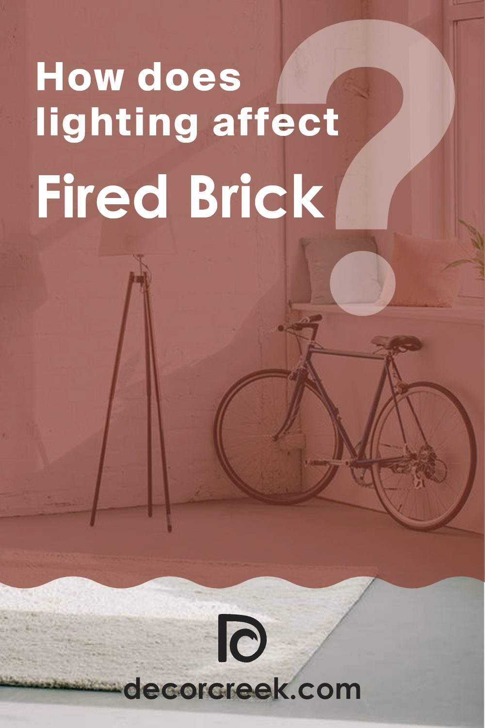
How Does Lighting Affect Fired Brick SW 6335 by Sherwin Williams?
Lighting has a significant impact on how we perceive colors. The type of light and its intensity can make a color look different at various times of the day or in different settings. Take the color Fired Brick, a rich, deep red with a hint of brownish undertone.
In artificial light, such as from bulbs or LEDs, this color can appear more muted, with its red tones becoming slightly subdued and its brown tones more prominent, providing a warm and cozy atmosphere. This is especially true under warm white or yellow artificial lighting, which enhances its depth and warmth, making it ideal for inviting rooms.
Under natural sunlight, Fired Brick reveals its full vibrancy, with the red tones becoming much more vivid. During the day, as the quality of sunlight changes, so too does the appearance of this color. It can look brighter and more dynamic under direct midday sun, while appearing softer and deeper around dawn or dusk.
In rooms facing different directions, the impact of lighting on Fired Brick also varies:
- North-facing rooms: These rooms get less direct sunlight, which can make Fired Brick look more consistent throughout the day but slightly cooler and more muted.
- South-facing rooms: These rooms benefit from abundant natural light, particularly in the middle of the day. Here, Fired Brick will look most lively and richly saturated, enhancing its warm undertones.
- East-facing rooms: Morning light is cooler and can make Fired Brick look bright and fresh in the morning, then gradually more shadowed and subdued as the day progresses.
- West-facing rooms: The warmer afternoon light enhances the red and earthy tones of Fired Brick, making it look especially vibrant and dynamic during sunset.
Overall, the color interplay between Fired Brick and different types of light shows how lighting can dramatically affect the mood and visual impact of a color in any room.
decorcreek.com
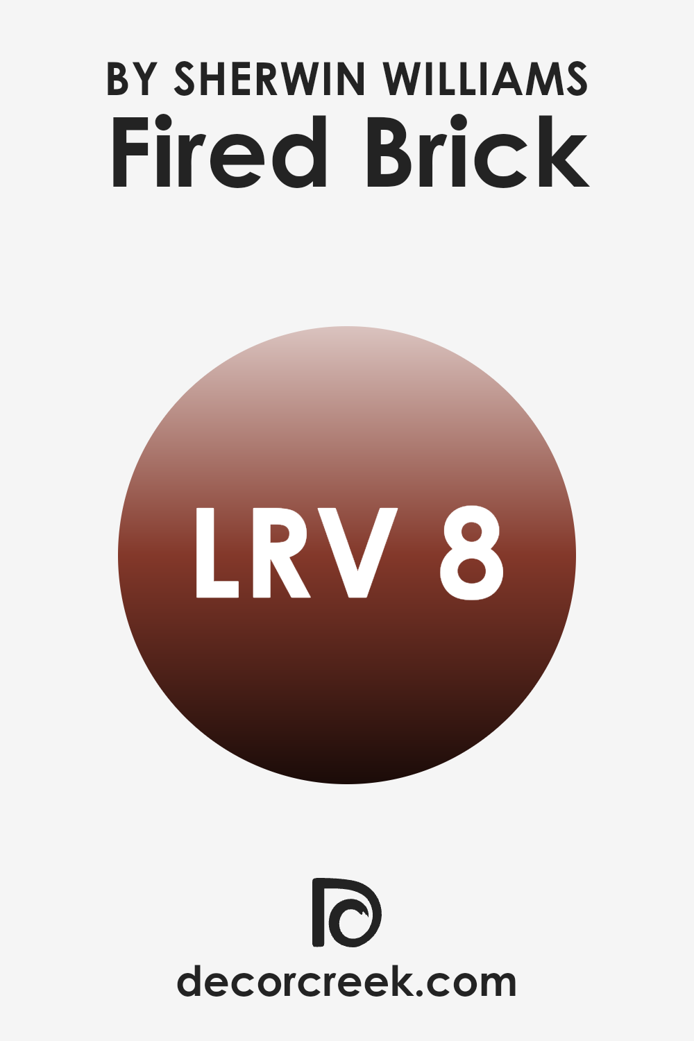
What is the LRV of Fired Brick SW 6335 by Sherwin Williams?
LRV stands for Light Reflectance Value, and it refers to the percentage of light a paint color reflects back into a room. This value is a helpful guide when choosing paint colors, as it gives an idea of how light or dark a color will appear once applied to the walls.
A higher LRV means that the color reflects more light, making the room feel brighter. Conversely, a lower LRV indicates that the color absorbs more light, which can make a room feel cozier but potentially smaller and darker.
For the color Fired Brick, which has an LRV of about 7.873, it’s on the lower end of the scale, meaning it reflects a relatively small amount of light. This characteristic makes it a bold choice that can add depth and warmth to a room.
However, it’s important to consider that this darker shade might make a small room feel even smaller or more enclosed. Using it in a room with ample natural light or good artificial lighting can help balance this effect, allowing the deep, rich hue to create a welcoming, warm atmosphere without overpowering the room.
decorcreek.com
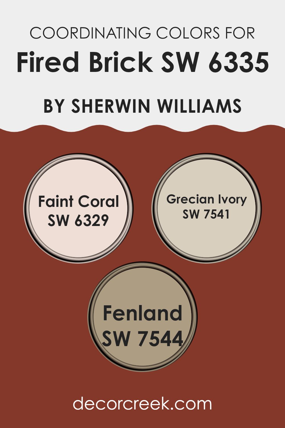
Coordinating Colors of Fired Brick SW 6335 by Sherwin Williams
Coordinating colors are colors that harmonize well when used together in decorating because they complement one another. For instance, Fired Brick by Sherwin Williams can be paired with a range of colors that accent its rich, deep red tone without overshadowing it. Faint Coral, Grecian Ivory, and Fenland are some of the colors that coordinate well with this vibrant hue.
Faint Coral is a soft, muted coral shade that brings a subtle touch of warmth and light to the boldness of Fired Brick. This combination can create a balanced and inviting atmosphere in any room. Grecian Ivory, on the other hand, offers a creamy, almost beige-like appearance that works well as a neutral background, allowing more pronounced colors like Fired Brick to stand out without feeling too intense.
Lastly, Fenland provides a deep, earthy green that contrasts nicely with Fired Brick, adding a natural element that complements the fiery red. Together, these colors can create a harmonious palette that’s pleasing to the eye and easy to live with.
You can see recommended paint colors below:
- SW 6329 Faint Coral
- SW 7541 Grecian Ivory
- SW 7544 Fenland
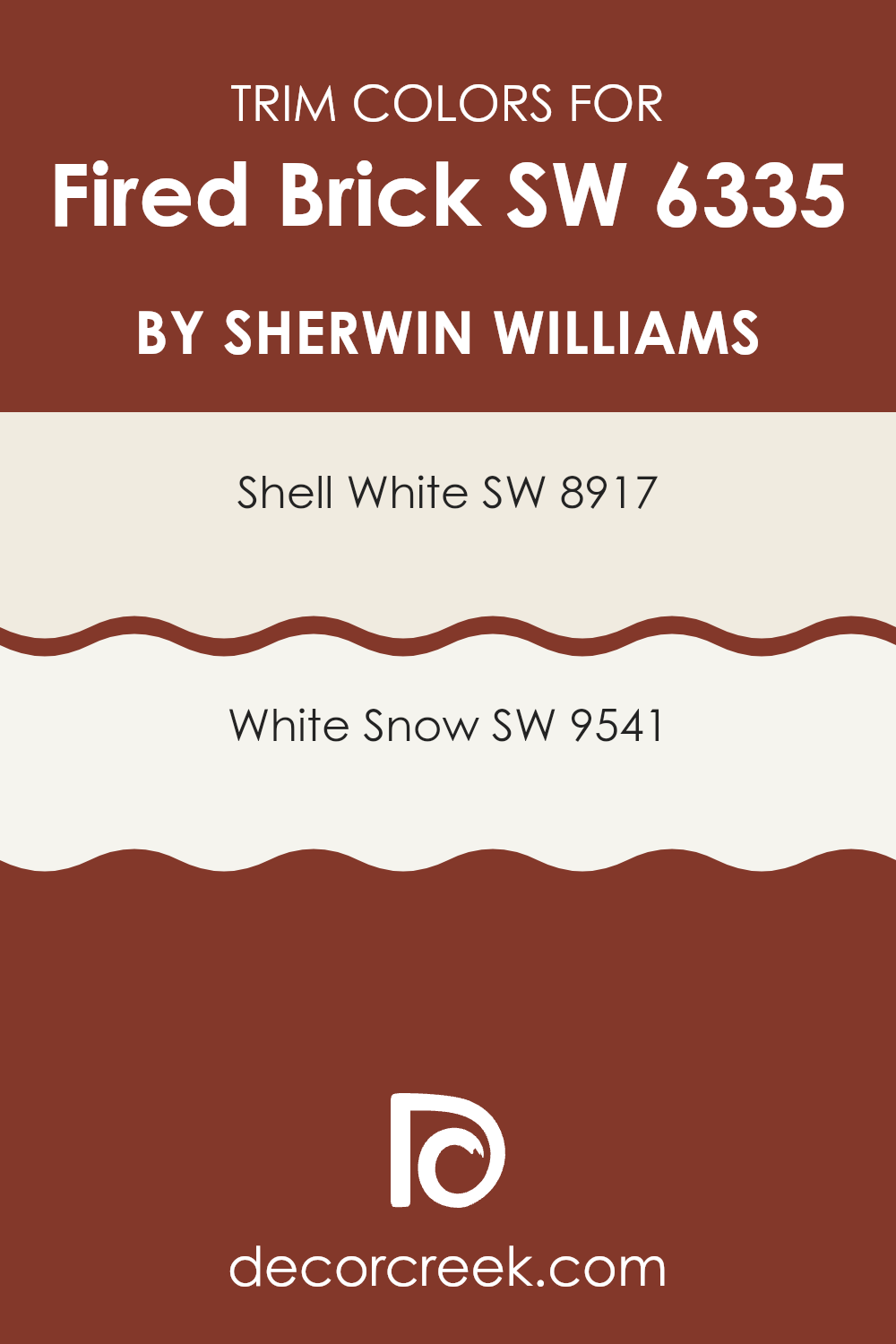
What are the Trim colors of Fired Brick SW 6335 by Sherwin Williams?
Trim colors are chosen to complement or contrast the main color on walls to accentuate architectural details or frame areas like doors and windows. When painting with a rich shade like Fired Brick by Sherwin Williams, selecting the right trim colors is crucial as they help in defining the transitions between different surfaces and highlighting the boldness of the primary color. Particularly, lighter trim colors can soften the intensity of Fired Brick, providing a refreshing visual relief and a cleaner, more defined look to the room.
Using Shell White (SW 8917) as a trim color offers a subtle contrast with its warm and inviting creamy white hue that doesn’t take the attention away from the Fired Brick but gently enhances it. On the other hand, White Snow (SW 9541) provides a brighter and crisper edge, offering a more striking frame to the walls painted in Fired Brick.
This cooler white adds a distinct border that makes the vibrant Fired Brick stand out even more, giving the room a more pronounced and polished appearance. Both colors help in making Fired Brick pop and ensuring the architecture of the room is noticed.
You can see recommended paint colors below:
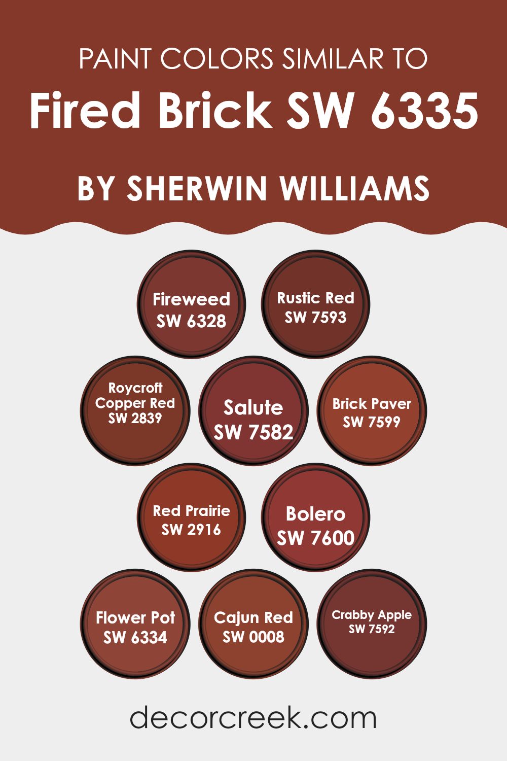
Colors Similar to Fired Brick SW 6335 by Sherwin Williams
Selecting similar colors is crucial in design as it helps create a sense of continuity and harmony within a room. Colors that share a similar hue or tone can seamlessly blend with each other, offering a unified look that is pleasing to the eye.
For instance, SW 6328 – Fireweed, a vivid, slightly orange-toned red, and SW 7593 – Rustic Red, a deeper, more traditional red, both complement the robust warmth of similar colors. SW 2839 – Roycroft Copper Red adds a touch of antiquity with its burnished, almost earthen red, while SW 7582 – Salute is a darker red that borders on maroon, providing a strong anchor in color schemes.
Colors like SW 7599 – Brick Paver and SW 2916 – Red Prairie are excellent for those who appreciate a more muted approach, offering subtle variations that are still within the same color family. SW 7600 – Bolero, with its dusty red hue, and SW 6334 – Flower Pot, a vibrant but earthy red, are great for adding a splash of energy without feeling too intense.
Finally, SW 0008 – Cajun Red presents a deep, spicy red, and SW 7592 – Crabby Apple offers a brownish-red tone, both of which are perfect for creating depth and interest in rooms that call for a touch of elegance without using complex language or concepts. These similar colors work together to create a cohesive look, providing multiple options that can fit various design preferences while maintaining an overall coordinated appearance.
You can see recommended paint colors below:
- SW 6328 Fireweed
- SW 7593 Rustic Red
- SW 2839 Roycroft Copper Red
- SW 7582 Salute
- SW 7599 Brick Paver
- SW 2916 Red Prairie
- SW 7600 Bolero
- SW 6334 Flower Pot
- SW 0008 Cajun Red
- SW 7592 Crabby Apple
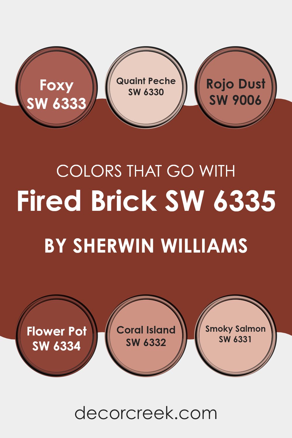
Colors that Go With Fired Brick SW 6335 by Sherwin Williams
Choosing the right colors to complement Fired Brick SW 6335 by Sherwin Williams is key in achieving a balanced and harmonious look in any room. Fired Brick is a rich, deep red hue, reminiscent of traditional brick, which offers warmth and a classic feel. Pairing it with compatible colors enhances its natural beauty and creates a cohesive aesthetic.
SW 6333 – Foxy is a vibrant orange with a playful touch, adding a burst of energy next to the grounded Fired Brick. SW 6330 – Quaint Peche is a soft peach shade, providing a gentle contrast that highlights the richness of Fired Brick without feeling too intense. For a more harmonious blend, SW 9006 – Rojo Dust offers a subdued, earthy red that complements the intensity of Fired Brick, effectively blending the two shades together.
If you’re looking for a color that closely matches yet adds depth, SW 6334 – Flower Pot is an excellent choice; it’s a rusty red that pairs beautifully with the darker Fired Brick. Lighter and more whimsical, SW 6332 – Coral Island introduces a splash of coral, lending a refreshing lightness to the palette. Lastly, SW 6331 – Smoky Salmon, with its muted salmon tone, offers a soft, almost neutral alternative that gently offsets the boldness of Fired Brick, ensuring the room feels warm and inviting.
You can see recommended paint colors below:
- SW 6333 Foxy
- SW 6330 Quaint Peche
- SW 9006 Rojo Dust
- SW 6334 Flower Pot
- SW 6332 Coral Island
- SW 6331 Smoky Salmon
How to Use Fired Brick SW 6335 by Sherwin Williams In Your Home?
Fired Brick (SW 6335) by Sherwin Williams is a warm, deep red paint color that can add a cozy and inviting feel to any room in your home. This shade works well as an accent wall in a living room or dining area, bringing a touch of warmth and charm.
It pairs nicely with neutral colors like beige, gray, or white, which helps to balance its richness. In the bedroom, using Fired Brick for a single wall can create a cozy, intimate atmosphere, setting a relaxed tone that contrasts beautifully with lighter bedding and furniture.
This color can also enhance a kitchen or bathroom by painting the cabinets or an accent area, providing a unique burst of color that adds personality to the room. Additionally, combining it with wooden elements or rustic decor can enhance its traditional feel, making any room feel more welcoming.
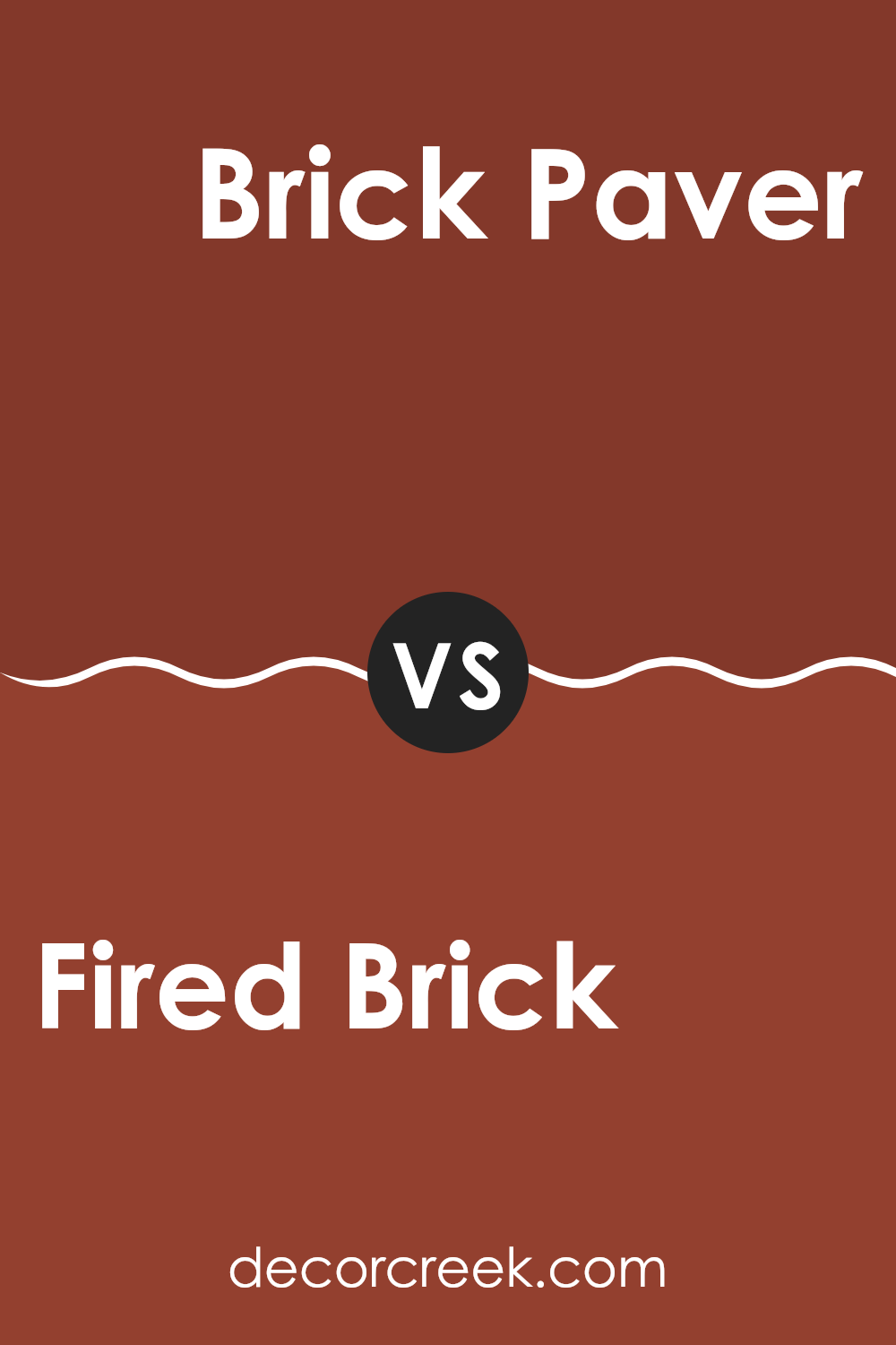
Fired Brick SW 6335 by Sherwin Williams vs Brick Paver SW 7599 by Sherwin Williams
Fired Brick and Brick Paver, both by Sherwin Williams, are variations of red but have distinct tones and moods. Fired Brick is a deep, bold red with a dusky, slightly muted feel.
It’s great for rooms where you want to add warmth without too much brightness. On the other hand, Brick Paver is lighter and has a softer look, containing more orange undertones that give it a warmer, more inviting feel compared to Fired Brick.
This makes Brick Paver an excellent choice for areas where you want a cozier atmosphere, while Fired Brick might be preferred in settings where a stronger, more grounded appearance is desired. Both colors offer unique moods and can significantly impact the feel of a room, depending on what you’re aiming for in your decorating plans.
You can see recommended paint color below:
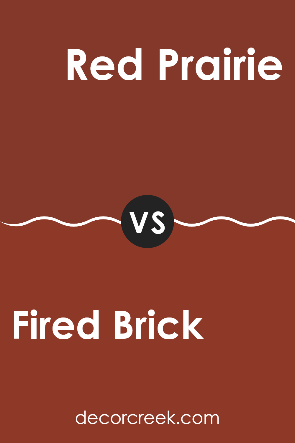
Fired Brick SW 6335 by Sherwin Williams vs Red Prairie SW 2916 by Sherwin Williams
Fired Brick SW 6335 is a rich, deep red that has a warm, cozy feel to it. This color is great for creating a welcoming and comfortable atmosphere in a room. It resembles the color of traditional red bricks, bringing a sense of warmth and familiarity. This makes it an excellent choice for living areas or dining rooms where you want to create a cozy, inviting environment.
On the other hand, Red Prairie SW 2916 is lighter and more earthy compared to Fired Brick. Red Prairie is reminiscent of terracotta and carries a natural, soft look that can make rooms feel airy yet warm. It is less intense than Fired Brick, which makes it more adaptable to various rooms without overpowering them.
Both colors provide warmth, but Fired Brick offers a more intense and traditional red, while Red Prairie offers a softer and more subdued tone that can easily blend with various decor styles.
You can see recommended paint color below:
- SW 2916 Red Prairie
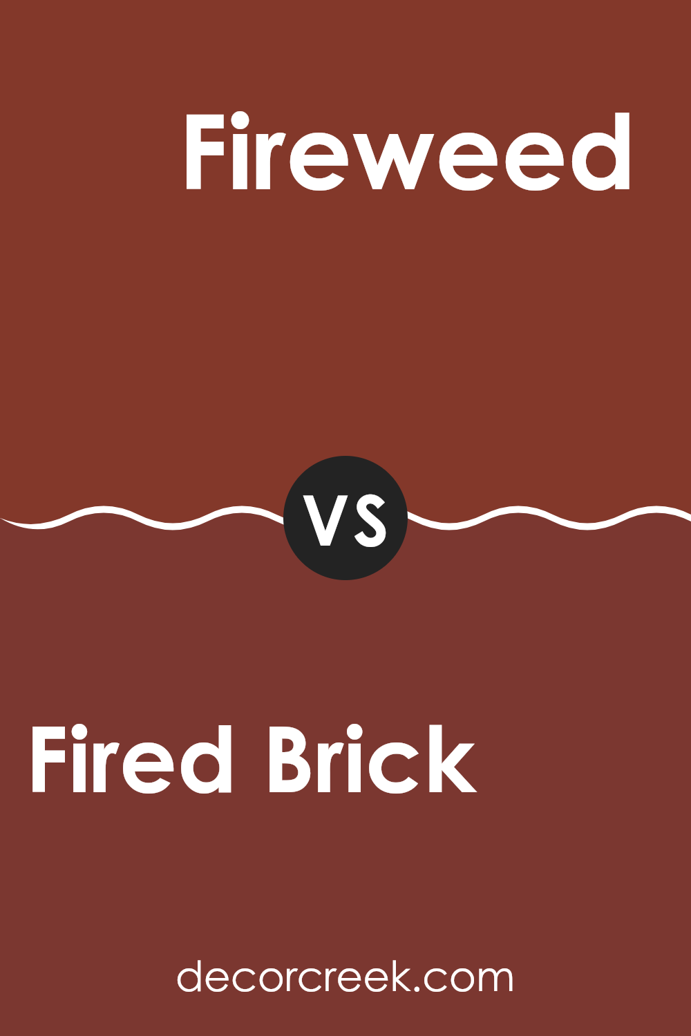
Fired Brick SW 6335 by Sherwin Williams vs Fireweed SW 6328 by Sherwin Williams
Fired Brick is a deep, rich red with a slightly muted tone, giving it a warm yet bold appearance. It’s a color that stands out and can add a striking touch to any room. On the other hand, Fireweed has a more vibrant and slightly pinker shade of red compared to Fired Brick.
It offers a brighter look that’s lively and energetic. While both colors share a red base, Fired Brick leans towards a cozy, inviting feel, ideal for rooms where you want to create a feeling of comfort and warmth.
Fireweed, with its brighter tone, is better suited for areas where a more dynamic and stimulating visual impact is desired. Together, these colors can work well if you’re aiming for a combination of energy and depth in your decorating scheme.
You can see recommended paint color below:
Fired Brick SW 6335 by Sherwin Williams vs Flower Pot SW 6334 by Sherwin Williams
Fired Brick and Flower Pot by Sherwin Williams are two warm, inviting colors, but each has its own unique appeal. Fired Brick is a deeper, more intense color, resembling the classic look of well-baked clay bricks. It’s a rich, red hue with a hint of brown that makes it feel cozy and welcoming, perfect for creating a statement wall or cozy nook.
Flower Pot is slightly lighter and has a softer appearance, closer to terracotta. It carries a more orange-toned red, providing a vibrant yet earthy feel. This color is great for rooms where you want to add a touch of warmth without making the area too dark.
Both colors work well in a variety of settings, including living rooms, kitchens, and outdoor areas, lending a rustic charm to any room. Fired Brick offers a bolder statement, while Flower Pot provides a cheerful and slightly more subdued atmosphere. They can work beautifully together or stand alone, depending on the mood you want to create.
You can see recommended paint color below:
- SW 6334 Flower Pot
Fired Brick SW 6335 by Sherwin Williams vs Cajun Red SW 0008 by Sherwin Williams
The main color, Fired Brick, and the second color, Cajun Red, both offer warm tones but with distinct differences. Fired Brick has a deep, rich quality that leans more towards a dark maroon, making it an excellent choice for areas where you want a touch of elegance without too much brightness. It pairs well with neutral shades and wood finishes to create a cozy and welcoming atmosphere.
On the other hand, Cajun Red has a brighter, more vivid red tone. This color grabs attention and is ideal for rooms where you want to make a bold statement. It’s perfect for accent walls or decor items that should stand out. While it’s vibrant, it still holds a warmth that can make a room feel inviting.
Overall, Fired Brick is more subdued and flexible for various settings, while Cajun Red is bolder and more suited for specific applications where you want a pop of color. Both paint colors bring warmth to interiors but in distinctly different ways.
You can see recommended paint color below:
- SW 0008 Cajun Red
Fired Brick SW 6335 by Sherwin Williams vs Bolero SW 7600 by Sherwin Williams
Fired Brick and Bolero are both paints offered by Sherwin Williams, each presenting a distinct mood for interior rooms. Fired Brick is a deep, rich red with a touch of brown, making it warm and inviting yet bold enough to make a statement in any room. It’s ideal for rooms where a cozy, comforting atmosphere is desired, like living rooms or dining areas.
On the other hand, Bolero is a softer shade, leaning towards a muted, reddish-brown. It’s less intense than Fired Brick and offers a more subdued appearance, perfect for creating a gentle, welcoming environment. Bolero works well in bedrooms and areas where a less vibrant color is preferable to create a calm, relaxed setting.
Both colors have their unique appeal, depending on the room and the feeling you want to create. Fired Brick stands out more and can be paired with neutral tones to balance its intensity. Bolero, being more understated, offers flexibility in pairing with both light and dark colors.
You can see recommended paint color below:
- SW 7600 Bolero
Fired Brick SW 6335 by Sherwin Williams vs Salute SW 7582 by Sherwin Williams
The color Fired Brick is a deep, rich red with a touch of brown, making it warm and cozy. It gives off an autumn vibe and works well in rooms where you want a comforting and inviting atmosphere.
On the other hand, Salute is a dark gray shade that almost borders on a soft black. It’s a flexible color that can be both grounding and dramatic, providing a strong backdrop for bright colors or white accents in a room.
Fired Brick is probably best in areas like living rooms or dining areas where you want some warmth, while Salute might be better suited for modern rooms or accent walls where you want to add some depth. Both colors bring their own unique feel to a room, and choosing between them would largely depend on the mood you’re trying to create.
You can see recommended paint color below:
- SW 7582 Salute
Fired Brick SW 6335 by Sherwin Williams vs Rustic Red SW 7593 by Sherwin Williams
Fired Brick and Rustic Red by Sherwin Williams are both warm, inviting shades, but they have distinct differences. Fired Brick is a deep, rich red with a slightly muted tone that gives it a cozy, subdued look. It has undertones that are somewhat brown, which make it ideal for creating a warm, welcoming room without feeling too intense.
On the other hand, Rustic Red is a brighter, more vivid shade of red. It carries a more traditional red tone, which can add a strong touch of color to any room. Rustic Red has more vibrancy and is slightly more energizing compared to Fired Brick.
In terms of use, Fired Brick works well in rooms where you want a hint of color while keeping a subtle, understated feel. It’s perfect for dens, libraries, or bedrooms. Rustic Red, with its stronger presence, is great for areas where you want to make a statement, like dining rooms or entryways. Both colors offer warmth, but the choice between them depends on the desired impact and mood of the room.
You can see recommended paint color below:
- SW 7593 Rustic Red
Fired Brick SW 6335 by Sherwin Williams vs Roycroft Copper Red SW 2839 by Sherwin Williams
Fired Brick and Roycroft Copper Red are both warm, inviting shades offered by Sherwin Williams, but they have distinct differences in their undertones and depths. Fired Brick is a deep, rich red with a hint of maroon, making it appear bolder and more intense. This color is great for creating a cozy and welcoming environment, often used to make a strong statement in a room.
On the other hand, Roycroft Copper Red has a softer appearance with a blend of red and brown tones, giving it a more muted, earthy feel. This color is less intense than Fired Brick, which makes it easier to use in a variety of rooms without feeling too strong.
While both colors are rich and warm, Fired Brick leans towards a more dramatic feel, and Roycroft Copper Red offers a gentler approach with its subdued, rustic vibe. Depending on the atmosphere you want to create, either color can be a great choice for adding warmth and character to your room.
You can see recommended paint color below:
- SW 2839 Roycroft Copper Red
Fired Brick SW 6335 by Sherwin Williams vs Crabby Apple SW 7592 by Sherwin Williams
Fired Brick and Crabby Apple by Sherwin Williams are two distinct shades that can dramatically change the feel of a room. Fired Brick is a deep, rich red with a hint of brown, giving it a warm, cozy feel that’s perfect for creating a welcoming room. This color works well in living areas or dining rooms where you want a touch of elegance without being too bold.
On the other hand, Crabby Apple is a slightly muted red with a more subdued, earthy tone. It leans more towards a rustic red that can give rooms an inviting, homey vibe. It’s an excellent choice for those who like red but prefer something less intense than brighter shades.
Both colors are great for adding warmth and character to a room. Fired Brick offers a deeper, more traditional look, while Crabby Apple provides a softer and more neutral approach to red. Depending on the mood you want to set and the existing decor, each color offers unique possibilities.
You can see recommended paint color below:
After learning about SW 6335 Fired Brick by Sherwin Williams, I feel like it’s a wonderful color choice for anyone looking to add a warm and cozy feel to their room. This rich, red-brown shade reminds me of autumn leaves and has a welcoming vibe that can make any room feel more like home. It works great on walls, especially in a living room, dining room, or even in a cozy reading nook.
Using this color can really change the mood of a room. For example, pairing Fired Brick with soft cream colors can create a comfortable and inviting room. It’s also quite good at hiding scuff marks or dirt, which can be really handy, especially in a home with kids or pets.
Overall, SW 6335 Fired Brick by Sherwin Williams appears to be a perfect pick if you’re someone who loves colors that make a room feel snug and warm. It’s like the color has its own way of making you want to relax and stay awhile.
Whether you’re looking to paint a new room or just trying to give an old room a fresh look, Fired Brick seems like it would do an amazing job.
decorcreek.com
Ever wished paint sampling was as easy as sticking a sticker? Guess what? Now it is! Discover Samplize's unique Peel & Stick samples.
Get paint samples

