This gentle hue offers a soft, warm ambiance that feels welcoming and timeless. With its light, neutral tones, it works wonderfully as a versatile backdrop, harmonizing with a wide range of styles and accents. Whether you’re considering it for your living room, bedroom, or kitchen, Nacre brings a cozy and serene feeling to any space.
If you like working with colors that adapt to different settings and lighting conditions, you’ll appreciate how Nacre can subtly shift in depth and warmth throughout the day. In daylight, it may appear fresh and light, while under evening lighting, it adds a more intimate and comforting touch. It pairs well with both bold accents and softer palettes, allowing your personal style to come to life easily.
Choosing SW 6154 Nacre might inspire you to rethink your current design schemes. You might combine it with earthy tones for a natural feel or with crisp whites for a more modern look.
Its versatility makes it both a safe and stylish option for anyone looking to refresh their space without overwhelming the senses.
It’s a color that supports and enhances, yet never overpowers, leaving room for your personality and style to shine through.
What Color Is Nacre SW 6154 by Sherwin Williams?
Nacre by Sherwin Williams is a soft and gentle shade that sits comfortably between off-white and light beige. It’s a versatile color that brings a subtle warmth to spaces without overwhelming them. The hue has a calming effect, making it ideal for creating cozy and inviting rooms. It works particularly well in a variety of interior styles, such as modern, minimalist, coastal, and traditional settings.
In a modern or minimalist space, Nacre’s understated elegance helps to create a clean and open feel, making rooms seem more spacious and airy. For coastal or beach-themed interiors, its light and breezy nature complement natural elements beautifully.
The softness of Nacre can add warmth to traditional spaces, maintaining a classic and timeless feel without being too bold.
When it comes to pairing with materials, Nacre goes well with natural wood tones, whether they are light or dark. It brings out the richness of wooden furniture or flooring. Textures such as linen, cotton, and jute enhance its appeal, adding depth and interest through cushions, throws, or rugs.
Metal accents in brass or chrome can also pair nicely, adding a touch of contrast without clashing with the warm undertone of this color.
Is Nacre SW 6154 by Sherwin Williams Warm or Cool color?
Nacre SW 6154 by Sherwin Williams is a soft, neutral shade that brings a sense of warmth and comfort to any room.
This color is a subtle blend of beige with just a hint of gray, making it very versatile. It works well in both small and large spaces, creating a cozy and inviting atmosphere. Nacre can be an excellent choice for walls in living rooms, bedrooms, or hallways, where you want a backdrop that isn’t too bold but still feels welcoming.
In homes, Nacre pairs well with a variety of other colors. It complements darker shades like deep blues or greens, adding contrast without overpowering. It also goes nicely with lighter tones, such as whites or pastels, achieving a soft and harmonious look.
Because of its adaptability, Nacre SW 6154 is a popular choice for homeowners who want a balanced, neutral setting that is easy to decorate around.
Undertones of Nacre SW 6154 by Sherwin Williams
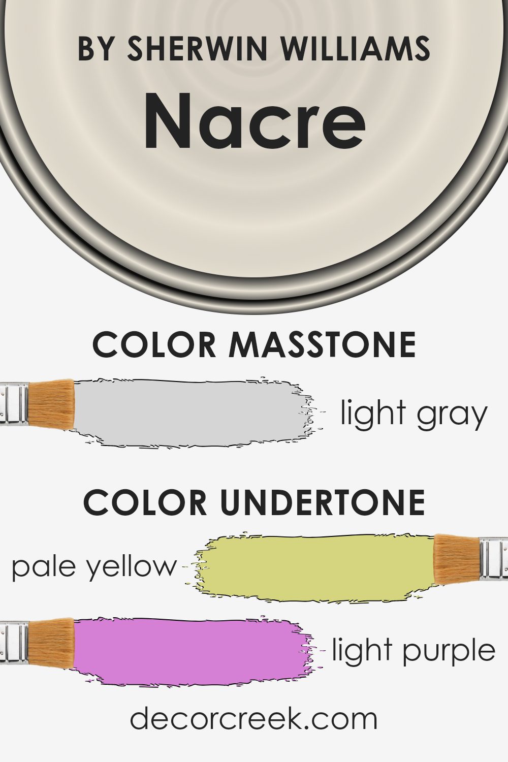
Nacre SW 6154 by Sherwin-Williams has some interesting undertones that can change how it looks in different settings. The main color is a soft, warm neutral, but it has hints of pale yellow, light purple, light blue, pale pink, mint, lilac, and gray mixed in. These undertones give the paint its unique character.
When light hits the wall, it can bring out different undertones depending on the time of day and the type of lighting in the room.
For example, natural daylight might make the pale yellow and mint tones more noticeable, giving the room a fresh, warm feeling. At night under artificial light, the gray and lilac undertones might become more pronounced, making the color seem cooler and more muted.
The effect of these undertones is quite versatile. In a living room with a lot of natural light, Nacre SW 6154 might feel warm and inviting, highlighting the pale yellow and mint shades.
In a bedroom with soft lighting, the lilac and pale pink undertones could create a cozy, calming atmosphere. This variety makes the color adaptable to different spaces, changing subtly with lighting and surroundings, providing a soft, neutral backdrop that can work well with many decor styles.
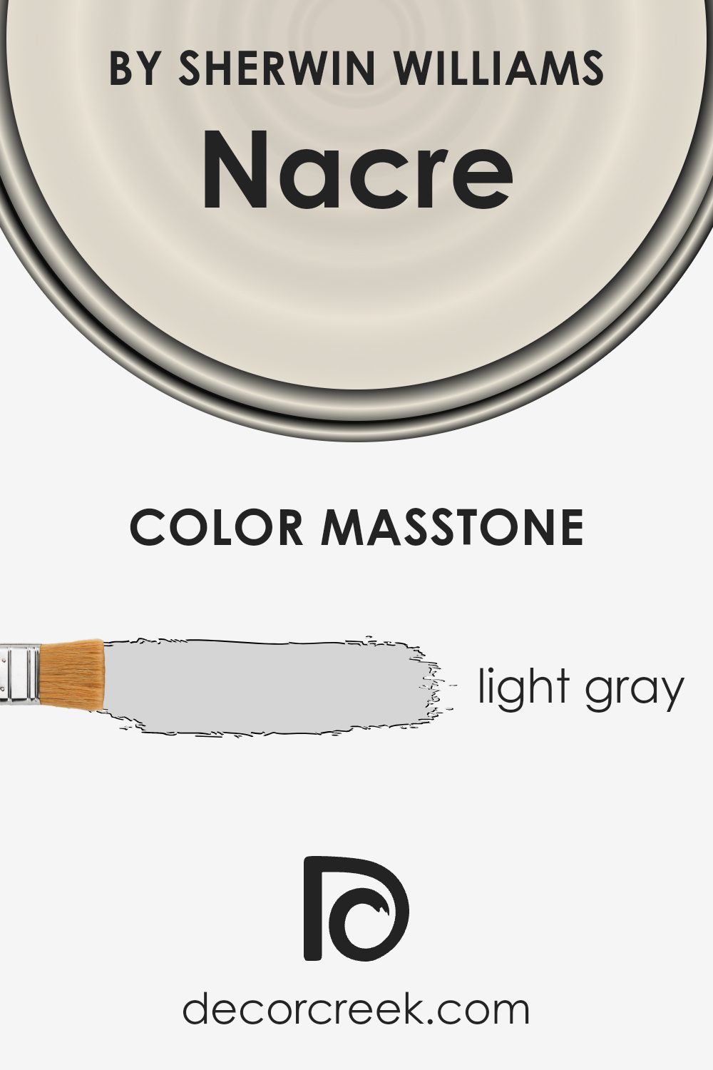
What is the Masstone of the Nacre SW 6154 by Sherwin Williams?
Nacre SW 6154 by Sherwin Williams is a light gray color with a masstone of #D5D5D5. This light gray shade is versatile and works well in different home settings.
It brings a soft and calm vibe to any room, making it a popular choice for spaces where relaxation is key, like bedrooms or living rooms. The lightness of the color helps in reflecting natural light, which can make rooms look larger and more open.
This shade of gray also acts as an excellent backdrop that complements various other colors, whether you pair it with bold accents or keep it neutral with other shades of gray and white. Its neutrality means it can easily blend with different design styles, from modern to traditional.
Nacre SW 6154’s gentle tone makes it a reliable choice for those looking to create a peaceful and welcoming environment in their home.
How Does Lighting Affect Nacre SW 6154 by Sherwin Williams?
Lighting plays a crucial role in how we perceive colors. The same color can look different depending on the type and direction of light it is exposed to. This is particularly important when choosing paint colors for your home, such as Nacre by Sherwin-Williams.
Nacre is a warm, soft neutral with a hint of beige and gray, making it a versatile choice for various spaces. However, its appearance can change under different lighting conditions. In natural light, the color might look brighter and more vibrant.
In artificial light, particularly warmer bulbs such as incandescent or LED lights with a warm tone, Nacre can appear cozier, with its beige tones more pronounced. Cooler artificial lights, like some fluorescent bulbs, might make it seem a bit more muted or bring out its gray undertones.
When considering Nacre for specific rooms in your house, the direction of the natural light is crucial. In north-facing rooms, where the light is cooler and more diffused, the color might lean towards its cooler spectrum, showing more of a grayish tint. This can make the room feel more reserved and calm.
On the other hand, in south-facing rooms, which receive warm, direct sunlight throughout the day, Nacre will appear warmer and more inviting. The natural light enhances its beige tones, making the room feel brighter and more welcoming.
In east-facing rooms, the light is bright in the morning and softer in the afternoon. Nacre will seem brighter and more energizing in the morning light, while in the afternoon, it will mellow out, showcasing its softer side.
For west-facing rooms, the opposite is true. The color will be more muted in the morning and take on a richer and warmer glow in the afternoon and evening as the sun sets, enhancing its warm undertones.
Understanding these variations can help you choose the right lighting and room placement to achieve the desired look with Nacre in your home.
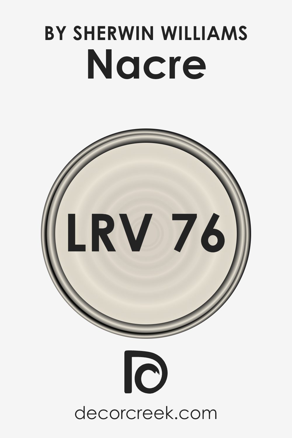
What is the LRV of Nacre SW 6154 by Sherwin Williams?
The Light Reflectance Value, or LRV, is a measurement used to express the percentage of light a paint color reflects. It is a scale from 0 to 100, where 0 represents absolute black, which absorbs all light, and 100 represents pure white, which reflects all light. The LRV of a color can significantly influence how it looks on your walls because it determines how much light the color will bounce back into the room.
A higher LRV means more light reflection, which can make a space feel brighter and more open. In contrast, a low LRV can make a room feel warmer and cozier as the walls absorb more light.
For the color Nacre with an LRV of 76.416, this indicates that it reflects a substantial amount of light, making it a good choice for brightening up a space. This color will help create an airy and open feel in a room due to its high reflectance.
It’s an excellent choice for areas in your home that might need a little more light, like a hallway or a room without many windows. This color’s lightness also means it can act as a neutral backdrop, which works well with a variety of other colors and decorating styles, ensuring it fits seamlessly into your home.
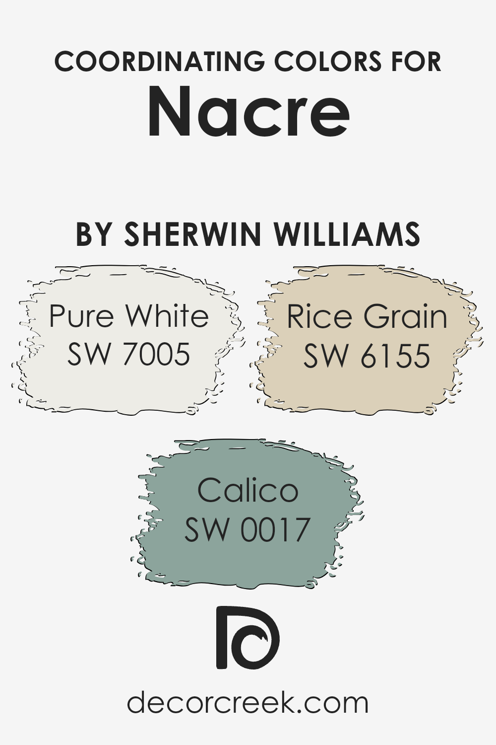
Coordinating Colors of Nacre SW 6154 by Sherwin Williams
Coordinating colors are hues that work well together, creating a balanced and pleasing look when used in the same space.
For Nacre by Sherwin Williams, three colors that coordinate beautifully are Pure White, Calico, and Rice Grain. Coordinating colors complement the main color, working harmoniously to enhance the overall design of a room. They can add depth and interest, drawing attention to different elements in the space and ensuring a seamless aesthetic.
Pure White (SW 7005) is a clean, crisp white that offers a fresh and airy feel to any room. It works well as a base or trim color, offering clarity and brightness that uplift the surroundings. Calico (SW 0017) adds warmth and character with its rich, muted tan, reflecting natural, earthy tones that provide coziness and subtle elegance.
Rice Grain (SW 6155) is a soft, warm beige that pairs easily with other colors, lending a calming effect that feels welcoming and comfortable.
Together, these colors with Nacre create a warm, inviting environment that feels both refreshing and nurturing. The balance of light, warmth, and neutrality ensures the space is both engaging and restful.
You can see recommended paint colors below:
- SW 7005 Pure White
- SW 0017 Calico
- SW 6155 Rice Grain
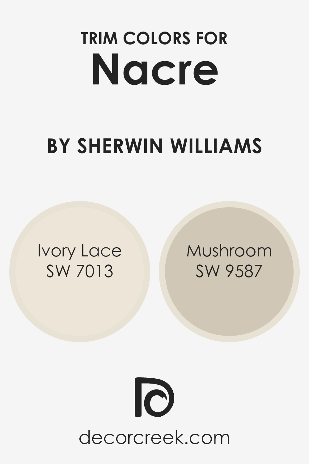
What are the Trim colors of Nacre SW 6154 by Sherwin Williams?
Trim colors are the accent colors used around the edges of walls, windows, doors, and other architectural features in a room. They are important because they highlight the structure and add depth and contrast to a space.
Nacre by Sherwin Williams is a soft, neutral shade that benefits greatly from the right trim colors to enhance its warmth and subtlety.
Ivory Lace, with its gentle creamy tones, is an excellent choice for trim because it adds a light and airy feel that complements the warmth of Nacre. This color helps to create a cozy yet refined atmosphere, allowing the walls to remain the focal point while still adding a touch of elegance.
Mushroom, on the other hand, offers a slightly deeper and earthier tone, lending a touch of grounding richness to the overall design. This trim color combines well with Nacre by providing a soft yet distinctive contrast, enhancing the calming effect of the main wall color without overpowering it.
Using Mushroom as a trim color can create a more intimate and inviting setting, making spaces feel warm and welcoming. Both Ivory Lace and Mushroom work well with Nacre, highlighting its natural beauty while ensuring the design feels balanced and cohesive.
You can see recommended paint colors below:
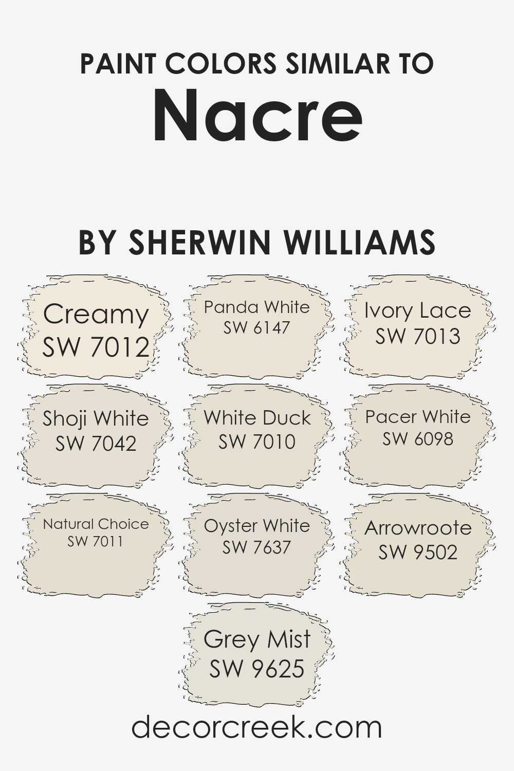
Colors Similar to Nacre SW 6154 by Sherwin Williams
Similar colors play a crucial role in design and decor because they create harmony and cohesion within a space. When colors are close in tone, they blend seamlessly, bringing a sense of unity and balance. Nacre by Sherwin Williams is a warm, versatile color, and its similar shades can offer subtle variations that enrich a room’s palette.
For instance, Creamy offers a soft, gentle warmth, making spaces feel cozy and inviting. Shoji White has a clean, understated elegance, adding a touch of subtle brightness. Natural Choice is a soft off-white that brings an organic and relaxed tone to any room. Grey Mist introduces a hint of gray, offering a modern and refined feel that complements existing decor.
Other shades like Panda White add a muted warmth, perfect for a neutral backdrop. White Duck presents a calming off-white that pairs well with both modern and traditional settings. Oyster White provides a subdued, almost light gray hue, giving spaces a calm and composed atmosphere. Ivory Lace brings in a classic, warm white that feels timeless and sophisticated, merging effortlessly with other neutrals.
Pacer White adds a warmer layer, ideal for enhancing the coziness of any room, while Arrowroot offers an almost ethereal lightness with its soft, neutral touch. Together, these colors weave a palette that invites comfort and versatility, all while maintaining a fresh and cohesive look.
You can see recommended paint colors below:
- SW 7012 Creamy
- SW 7042 Shoji White
- SW 7011 Natural Choice
- SW 9625 Grey Mist
- SW 6147 Panda White
- SW 7010 White Duck
- SW 7637 Oyster White
- SW 7013 Ivory Lace
- SW 6098 Pacer White
- SW 9502 Arrowroote
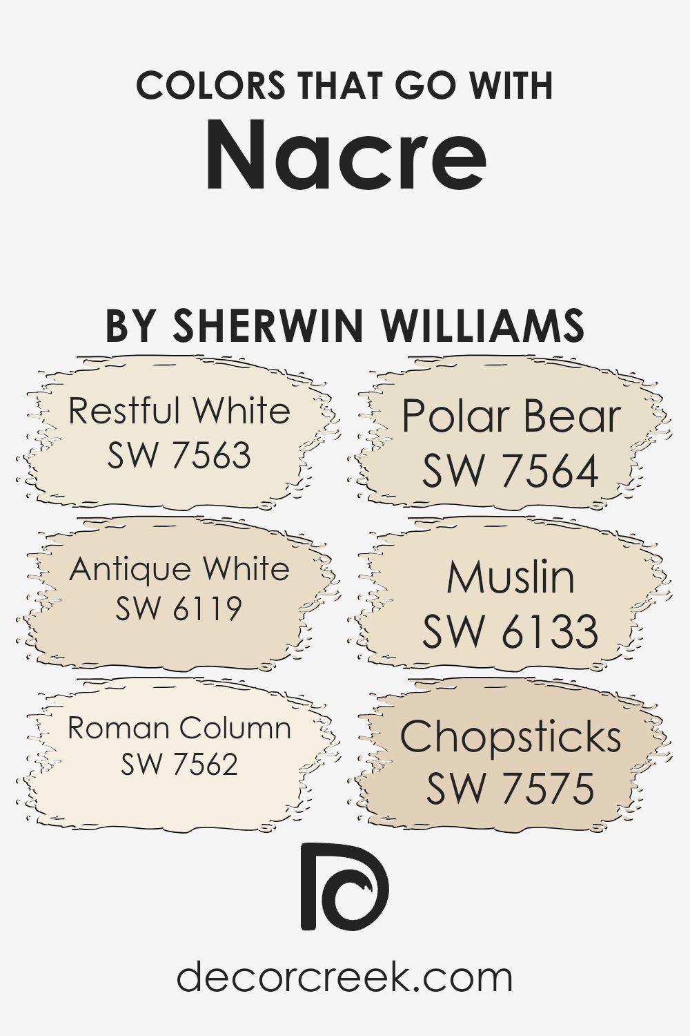
Colors that Go With Nacre SW 6154 by Sherwin Williams
When choosing colors to complement Nacre SW 6154 by Sherwin Williams, it’s essential to think about how they interact to create a cohesive and inviting space. Nacre is a soft and welcoming hue that serves as an excellent canvas for other colors.
By pairing it with SW 7563 Restful White, you add a delicate, airy feel that enhances the subtlety of Nacre, bringing lightness without overpowering it.
SW 6119 Antique White offers a warmer touch, providing a gentle contrast that adds depth, while still maintaining the softness that Nacre portrays. SW 7562 Roman Column walks hand in hand with Nacre, as it is a timeless neutral that supports the central theme of subtle elegance.
Additionally, SW 7564 Polar Bear provides a refreshing touch with its cool undertones that can balance the warmth of Nacre, creating a serene environment. On the other hand, SW 6133 Muslin adds an earthy element that complements Nacre’s softness perfectly, offering a grounded yet light feel.
Lastly, SW 7575 Chopsticks introduces a hint of richness with its deeper tone, which pairs beautifully with Nacre for a warm and cozy atmosphere. Together, these colors work harmoniously with Nacre, ensuring a balanced, pleasing palette that invites comfort and a sense of home.
You can see recommended paint colors below:
- SW 7563 Restful White
- SW 6119 Antique White
- SW 7562 Roman Column
- SW 7564 Polar Bear
- SW 6133 Muslin
- SW 7575 Chopsticks
How to Use Nacre SW 6154 by Sherwin Williams In Your Home?
Nacre SW 6154 by Sherwin Williams is a soft, warm shade that fits well in many home settings.
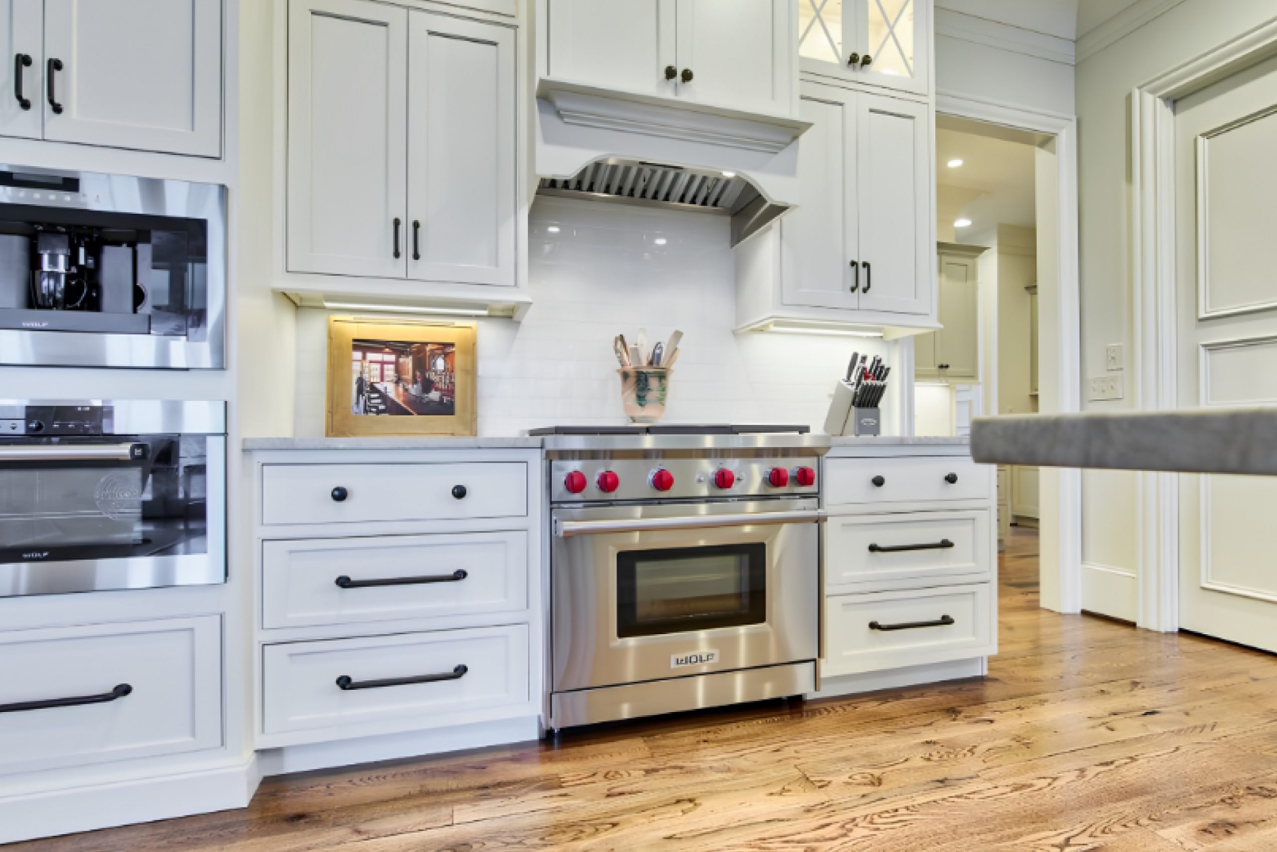
It is a subtle off-white with undertones of gray and beige, making it quite versatile. People can use Nacre in their living rooms to create a cozy and inviting space. This color can also work well in bedrooms, where its gentle tone provides a calming atmosphere. In addition, Nacre is a great option for kitchen walls, where it can complement both modern and traditional cabinetry and fixtures.
Because of its neutral nature, it pairs beautifully with other colors. You can combine it with darker shades for a more dynamic look or with lighter shades to keep things airy and bright.
Nacre’s warmth allows wood finishes and natural textures to stand out, creating a harmonious environment. Additionally, it works nicely with both metal and stone accents, making it a flexible choice for various design styles.
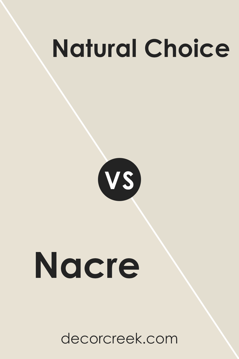
Nacre SW 6154 by Sherwin Williams vs Natural Choice SW 7011 by Sherwin Williams
Nacre SW 6154 and Natural Choice SW 7011 by Sherwin Williams are both versatile paint colors, but they offer different vibes for a space. Nacre is a warm, creamy hue with a touch of beige, making it ideal for creating a cozy and inviting atmosphere. It works well in rooms where you want a gentle, welcoming feel. On the other hand, Natural Choice is a lighter, neutral white with a slight hint of warmth.
It’s perfect for spaces where you want a clean, fresh look without feeling too stark or sterile. While Nacre adds warmth and coziness, Natural Choice provides a brighter, airy feel, making it suitable for modern or minimalist interiors.
Both colors can be paired with various accents and furnishings, allowing flexibility in design. Choosing between them depends on whether you want a touch of warmth or a crisp, neutral backdrop for your room.
You can see recommended paint color below:
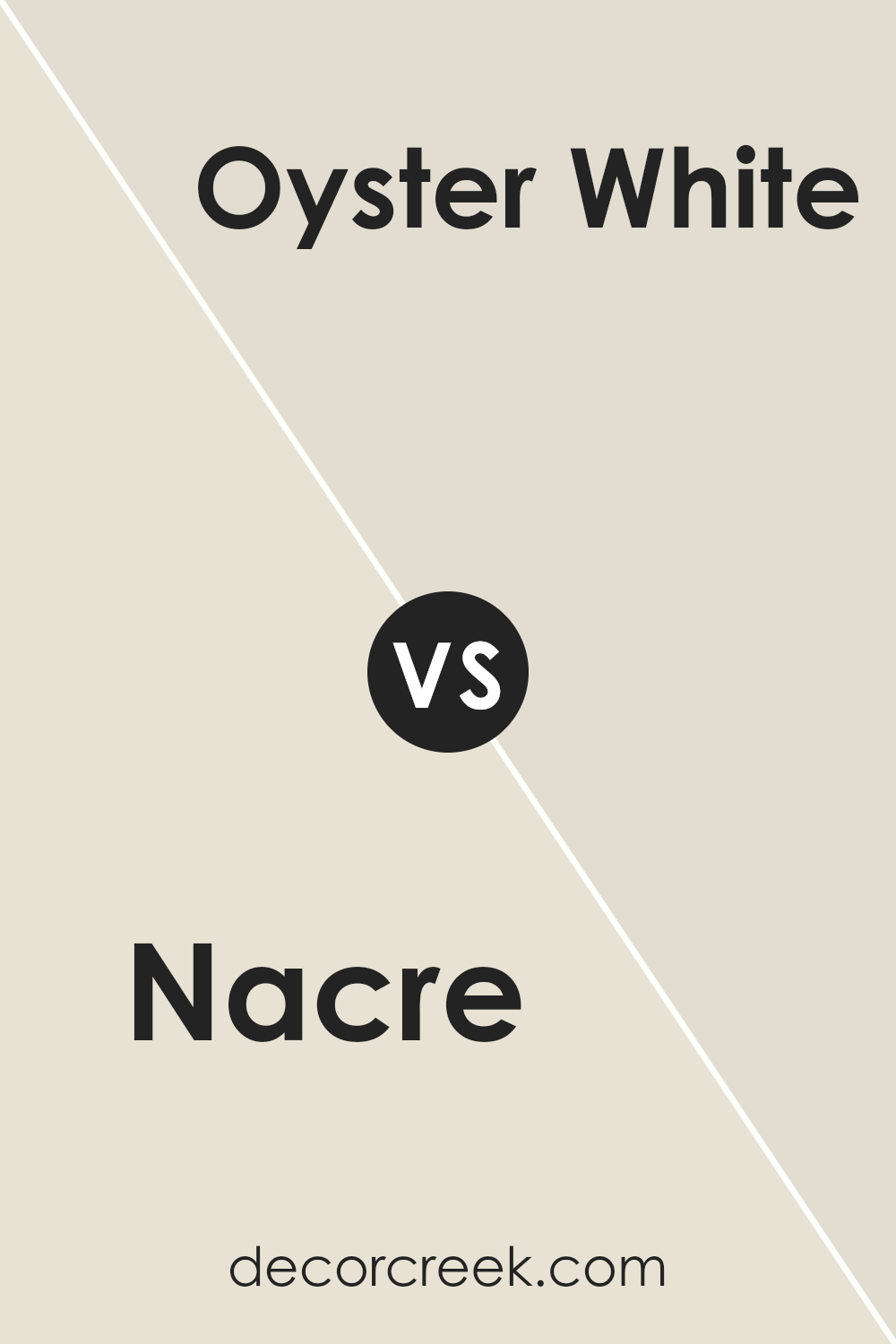
Nacre SW 6154 by Sherwin Williams vs Oyster White SW 7637 by Sherwin Williams
Nacre (SW 6154) by Sherwin Williams is a warm and inviting beige color that creates a cozy atmosphere in any room. It has rich undertones that add depth and warmth, making it perfect for living spaces and bedrooms. This color pairs beautifully with both modern and traditional decor, providing a sense of comfort and homeliness.
On the other hand, Oyster White (SW 7637) is a softer, off-white tone that is more muted and subtle. It offers a neutral backdrop, ideal for creating a clean and crisp look. Oyster White works well in spaces where you want a light and airy feel, like kitchens or bathrooms, and pairs nicely with bolder accent colors for contrast.
While Nacre adds warmth and coziness, Oyster White offers simplicity and brightness. Both colors are versatile but serve different design purposes, depending on whether you want warmth or lightness in your space.
You can see recommended paint color below:
Nacre SW 6154 by Sherwin Williams vs Grey Mist SW 9625 by Sherwin Williams
Nacre by Sherwin Williams is a warm, off-white color with a hint of beige. It gives a cozy and welcoming feel to a room, making it suitable for spaces where you want to create a comfortable and inviting atmosphere. It can work well in living rooms and bedrooms due to its soft and neutral tone.
On the other hand, Grey Mist by Sherwin Williams is a much cooler color. It has subtle gray undertones, making it appear more modern and crisp compared to Nacre. Grey Mist is ideal for areas where you want a clean and minimalist look, such as kitchens or bathrooms.
While Nacre tends to create a warm and homely environment, Grey Mist offers a fresh and sleek appearance. Both colors are versatile, but their undertones determine their best setting. Nacre leans towards warmth, while Grey Mist offers a cooler and more contemporary feel.
You can see recommended paint color below:
Nacre SW 6154 by Sherwin Williams vs Arrowroote SW 9502 by Sherwin Williams
Nacre (SW 6154) and Arrowroot (SW 9502) from Sherwin Williams are two distinct colors that may suit different tastes and settings. Nacre is a soft, neutral beige with warm undertones, making it versatile for any room and creating a cozy and inviting atmosphere. It’s a perfect choice for spaces where you want a subtle and comforting backdrop.
In contrast, Arrowroot is a very light, almost off-white shade with a gentle hint of warmth. This color is excellent for creating a bright and airy feel, ideal for small rooms or areas where you want to enhance natural light and openness.
While Nacre provides a grounded warmth, Arrowroot offers a fresh, clean look. Both colors work well with a variety of palettes; choose Nacre for warmth and coziness, or Arrowroot for brightness and simplicity. Each color brings its own personality, complementing different decorative styles and preferences.
You can see recommended paint color below:
- SW 9502 Arrowroote
Nacre SW 6154 by Sherwin Williams vs Pacer White SW 6098 by Sherwin Williams
Nacre SW 6154 and Pacer White SW 6098 by Sherwin Williams are both versatile neutral colors, but they offer different looks. Nacre is a warm, creamy beige with subtle yellow undertones, making it cozy and inviting. It’s great for creating a warm atmosphere in a room, working well with other warm tones like browns and soft yellows.
In contrast, Pacer White is a soft, off-white with mild beige undertones. It’s lighter and can make spaces feel more open and airy compared to Nacre. Pacer White works well as a backdrop, making it ideal for rooms where you want to highlight other colors or decor.
Both colors blend well with a variety of styles, but their key differences lie in their undertones and the ambiance they create. Choose Nacre for warmth and comfort, and Pacer White for a brighter, more spacious feel.
You can see recommended paint color below:
- SW 6098 Pacer White
Nacre SW 6154 by Sherwin Williams vs Creamy SW 7012 by Sherwin Williams
Nacre and Creamy are two colors offered by Sherwin Williams. Nacre is a warm beige shade with subtle gray undertones that gives a cozy and versatile look to a room. It’s a great choice for spaces where you want a neutral but slightly more complex color. On the other hand, Creamy is a soft, gentle off-white with a hint of yellow. This makes it a bright and welcoming choice, perfect for creating a clean and airy feel.
While Nacre can add warmth and depth to a space, Creamy tends to make a space feel open and light. Nacre works well in areas where you want a bit more character and mood. Creamy, however, is ideal for smaller rooms or to brighten up an area. Both colors are neutral and can easily match various decor styles, but your choice will depend on whether you prefer a warmer or lighter vibe.
You can see recommended paint color below:
Nacre SW 6154 by Sherwin Williams vs Ivory Lace SW 7013 by Sherwin Williams
Nacre (SW 6154) and Ivory Lace (SW 7013) by Sherwin Williams are both gentle, neutral colors, but they have distinct differences. Nacre is a warm, beige hue with a hint of cream, giving it a cozy and inviting feel. It works well in spaces where you want a comforting and relaxed atmosphere.
On the other hand, Ivory Lace is a soft, off-white color with a touch of warmth, making it versatile and perfect for creating bright and airy spaces.
While Nacre can add warmth and depth to a room, Ivory Lace feels clean and spacious. Both colors can serve as great backdrops, with Nacre being better for adding a sense of warmth and intimacy, whereas Ivory Lace offers a fresh and clean canvas. Choosing between them depends on whether you prefer a warmer, cozier feel or a brighter, more open look.
You can see recommended paint color below:
Nacre SW 6154 by Sherwin Williams vs Shoji White SW 7042 by Sherwin Williams
Nacre and Shoji White are both subtle and calming colors by Sherwin Williams, but they have different undertones and vibes.
Nacre is a warm, creamy beige with a hint of yellow. It brings a cozy and inviting feel to a room, making it perfect for places where you want a comfortable atmosphere. It works well with other warm colors and natural materials like wood.
Shoji White, on the other hand, is a soft white with slight gray undertones. It feels fresh and clean, offering a neutral backdrop that adapts easily to different styles. It pairs nicely with cooler tones and can brighten up a space without feeling stark.
While Nacre adds warmth and coziness, Shoji White provides a versatile and airy feel. Depending on the look you want, Nacre can create a snug area, while Shoji White can make a space feel more open and light.
You can see recommended paint color below:
Nacre SW 6154 by Sherwin Williams vs Panda White SW 6147 by Sherwin Williams
Nacre and Panda White, both from Sherwin Williams, are soft, neutral tones that bring warmth to a space.
Nacre is a creamy beige with a slight hint of yellow, making it feel warm and welcoming. It’s versatile, complementing various styles and color schemes. Panda White, on the other hand, leans more towards an off-white with a touch of gray. This gives it a cooler, more subdued look compared to Nacre.
When comparing their use, Nacre can brighten a room while adding a cozy touch.
It’s great for living spaces where you want a welcoming feel. Panda White can make a room feel airy and spacious, offering a clean backdrop that pairs well with bolder colors or dark accents. While Nacre brings warmth, Panda White provides a calm, neutral foundation.
Selecting between them depends on whether you want warmth or neutrality for your space.
You can see recommended paint color below:

Nacre SW 6154 by Sherwin Williams vs White Duck SW 7010 by Sherwin Williams
Nacre and White Duck are two popular paint colors from Sherwin Williams, each offering a distinct vibe for your space. Nacre is a warm, creamy beige with subtle hints of yellow, creating a cozy and inviting atmosphere. It’s perfect for living rooms or bedrooms where you want a soft background that still feels warm and welcoming.
On the other hand, White Duck is a light greige, which mixes gray and beige tones for a more neutral appearance. It has a slight hint of warmth but is less rich than Nacre. White Duck is an excellent option if you prefer a lighter, more neutral backdrop that complements many styles and colors.
While both colors are versatile, Nacre is better if you want more warmth, while White Duck is ideal for those aiming for a slightly cooler, understated look. Each color can beautifully enhance different spaces depending on the mood you want to create.
You can see recommended paint color below:
It’s a very nice, soft shade that can make a room feel warm and welcoming. It’s like a warm hug from someone you love. The color can make walls look clean and pretty without being too bright or too dark.
I also understand that Nacre works well in lots of different places, like in the living room, bedroom, or even the kitchen. It’s like a color that can fit anywhere and still look nice. The color goes very well with other colors, so you can match it with things like colorful pillows, rugs, or bright curtains, and it still looks good.
What makes it more amazing is that Nacre can look a little different depending on the light in the room. In the morning, it might look lighter, and in the evening, it might feel cozier. This makes it really fun because the room feels a bit different throughout the day.
In the end, SW 6154 Nacre is a wonderful color choice for painting walls. It’s simple yet very pretty, and it can really make a room feel like a happy place. If you want to paint your room, Nacre is definitely a color worth considering.
Ever wished paint sampling was as easy as sticking a sticker? Guess what? Now it is! Discover Samplize's unique Peel & Stick samples.
Get paint samples

