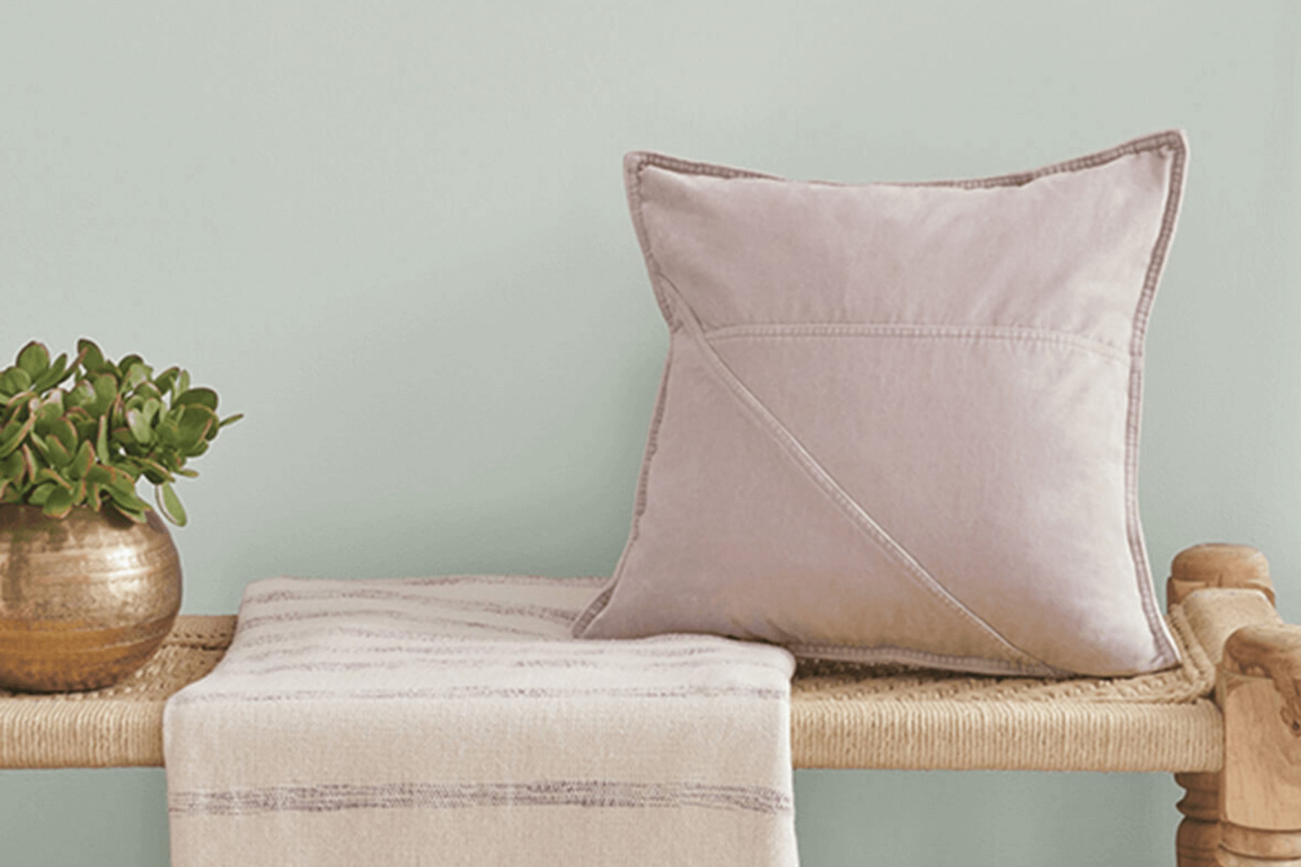
Imagine freshening up a room in your home with a color that breathes a gentle breeze of the ocean into your living space. That’s the charm of SW 9651 Sea Spray by Sherwin Williams. As you look for the perfect hue to refresh a tired room or craft a serene atmosphere, this color offers a subtle nod to the calmness of coastal waters without overwhelming the senses.
Sea Spray is versatile enough to enhance both modern and traditional decor, providing a soft backdrop that amplifies natural light and complements various textures and furniture styles. Using this paint color, you can transform your environment into a peaceful retreat where relaxation meets style.
It invites you to unwind after a long day, enveloping your space in soft tranquility that encourages comfort and calm.
Whether you’re redoing a living room, bathroom, or bedroom, considering SW 9651 Sea Spray could be the gentle touch your home is seeking.
What Color Is Sea Spray SW 9651 by Sherwin Williams?
Sea Spray is a fresh and airy blue-green hue that brings a hint of nature’s calming presence into any room. This color has a cool undertone that makes it ideal for creating a light, breezy feel in your space. It pairs well with soft whites and light grays, making it perfect for achieving a clean and modern look.
When it comes to interior styles, Sea Spray shines in settings that aim for a minimalist or coastal vibe. Its subtle tone works well in spaces that capitalize on natural light, helping to make small rooms appear larger and more open. This color also fits beautifully in a Scandinavian aesthetic where simplicity and functionality are key.
In terms of materials, Sea Spray pairs excellently with natural wood, adding a warm contrast to its cool tone. Textures like linen, cotton, and jute also complement this color, enhancing the relaxed, airy feel of a room. For those looking to create a balanced and peaceful retreat in their home, adding elements like soft throw pillows, light wood furniture, and natural fiber rugs can enhance the overall look and feel when combined with the Sea Spray color.
Whether it’s used as an accent wall or throughout a room, this color is versatile and easy to work with, fitting seamlessly into various design visions.
Is Sea Spray SW 9651 by Sherwin Williams Warm or Cool color?
Sea Spray by Sherwin Williams is a light and airy blue-green hue that brings a fresh vibe to any room. Often associated with the calming feel of the ocean, this color works best in spaces where you want to create a relaxed and refreshing atmosphere. It’s especially popular in bathrooms and bedrooms because light colors can make small rooms appear larger and more open.
You can also use it in a living room or kitchen for a splash of gentle color that complements natural light and enhances brightness. Additionally, it pairs well with whites and creams for a clean, coastal look, or with darker woods for a more grounded, earthy feel.
Whether you seek to refresh a single accent wall or repaint an entire room, Sea Spray offers a versatile palette that adjusts well to various decorations and styles, helping to bring a sense of the outdoors into your home.
Undertones of Sea Spray SW 9651 by Sherwin Williams
Sea Spray is a unique paint color with a complex mix of undertones that significantly influence its appearance in different settings. Undertones are subtle colors that lie beneath the main color of the paint. These undertones can make a color look different depending on the lighting and surrounding colors.
The undertones of Sea Spray include pale yellow, light blue, light purple, mint, pale pink, lilac, and grey. These shades play a crucial role in how the color behaves on interior walls. For example, pale yellow and mint can make Sea Spray seem brighter and more refreshing, especially in a well-lit room or when paired with similar or complementary colors.
On the other hand, the lilac and light purple undertones can add a hint of warmth, making the space feel more inviting. The presence of grey undertone provides a neutral base, balancing the cooler tones and ensuring the color doesn’t feel too overwhelming.
These undertones allow Sea Spray to adapt to various styles and spaces. In a room with natural light, the light blue and mint undertones might become more prominent, giving a calm and refreshing feel. In artificial light, grey or pale pink might stand out more, creating a cozy atmosphere.
Overall, the unique combination of undertones in Sea Spray provides flexibility in design choices, making it a versatile option for many homes. It can work well in many different rooms, adapting to different lighting and decor styles, thus affecting the overall mood and aesthetic of a space.

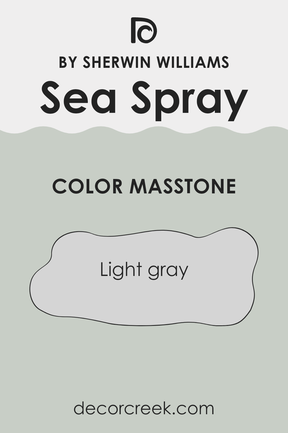
What is the Masstone of the Sea Spray SW 9651 by Sherwin Williams?
Sea Spray SW 9651 by Sherwin Williams has a masstone of light gray, specifically coded as #D5D5D5. This shade is incredibly versatile, making it a popular choice for home interiors. Its light gray tone provides a neutral backdrop that can complement a wide range of décor styles and colors.
Whether you’re looking to set a calm atmosphere in a bedroom or a bright, airy feel in a living room, this color can do the job. It’s particularly effective in spaces that receive a lot of natural light, as the subtle gray tone can help balance the brightness without making the room feel dark or cramped.
Additionally, its neutrality allows for easy pairing with bolder colors or patterns in furniture or accessories, offering endless possibilities for personalizing a space. Overall, the light gray masstone of Sea Spray SW 9651 is a practical and flexible choice for any home.
How Does Lighting Affect Sea Spray SW 9651 by Sherwin Williams?
Lighting plays a crucial role in how colors are perceived in any space. Different types of light can change how a color looks, whether it’s artificial or natural light. Let’s see how a specific color, such as a soft green (similar to Sea Spray by Sherwin Williams), reacts under various lighting conditions.
When using artificial light, the type of bulbs can affect how colors look. Incandescent bulbs, which produce a warm light, can make this soft green appear warmer and more muted, often enhancing the yellow undertones.
Fluorescent lighting, however, emits a cooler hue, making the green look sharper and slightly bluer. LED lights, which are available in warm, neutral, and cool white, offer more control over how the color is displayed, letting you fine-tune how the green appears in your space.
Natural light brings out the truest color, but the amount and angle of the sunlight can shift the appearance throughout the day.
In north-facing rooms, light is cooler and more consistent, making the soft green appear more subdued and slightly shadowy, which can add a calming effect to the room. South-facing rooms get the most sunlight, which brightens the color, enhancing its vibrancy and making the space feel lively and refreshing.
East-facing rooms are filled with bright light in the morning and dimmer, warmer light as the day progresses. This varying light can make this soft green appear bright and cheerful in the morning, gradually becoming more muted and soft by the end of the day. In contrast, west-facing rooms have the opposite effect; the color may appear duller in the morning and gain intensity as the sun sets, creating a dynamic change from morning to evening.
Overall, this soft green is very versatile but reacts differently depending on the light it’s under, greatly influencing the mood and feel of a room.
Whether in natural or artificial light, and depending on the room’s orientation, this color can provide a range of atmospheres from calm and subdued to lively and vibrant.
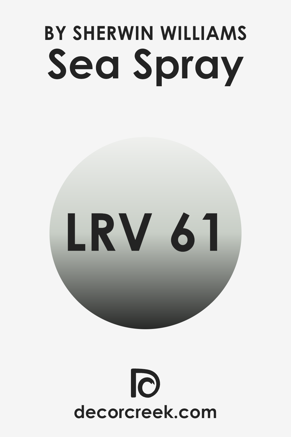
What is the LRV of Sea Spray SW 9651 by Sherwin Williams?
LRV stands for Light Reflectance Value, and it is a measure used to indicate how much light a paint color reflects or absorbs once applied to a wall. Colors with higher LRVs reflect more light, making a room feel brighter and larger. On the other hand, colors with lower LRVs absorb more light, which can make spaces appear cozier but smaller.
Understanding LRV can be very helpful when deciding what paint to use, especially in terms of how it will interact with the natural and artificial lighting of a room. In the case of Sea Spray SW 9651 by Sherwin Williams, which has an LRV of nearly 61, this color is on the lighter side, reflecting a good amount of light. This means it’s a good choice for making a space appear airy and open.
When used on walls, this shade will help to brighten the room, particularly useful in spaces that might not receive a great deal of sunlight. Its ability to reflect light well makes it a versatile color that can be used in smaller spaces without making them feel cramped.
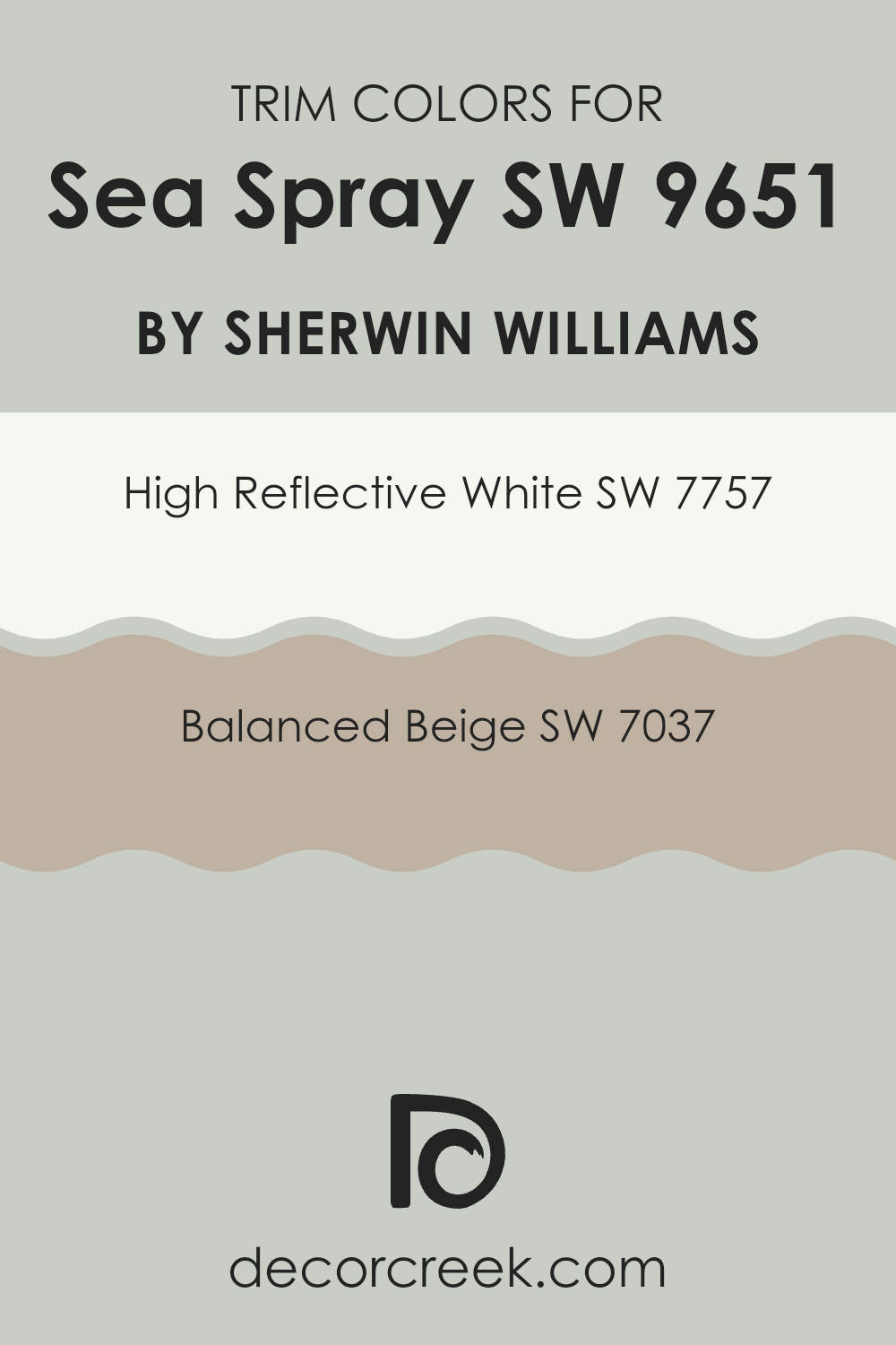
What are the Trim colors of Sea Spray SW 9651 by Sherwin Williams?
Trim colors, such as SW 7757 – High Reflective White and SW 7037 – Balanced Beige, play a significant role in enhancing the aesthetic appeal and overall look of a house when used with a primary paint color like Sea Spray by Sherwin Williams.
Choosing the right trim color helps in defining the edges and fine details of the architecture, making the main color pop and ensuring a neat and finished appearance. Especially with a color like Sea Spray, which has its unique tone, the correct trim color can either complement or provide a lively contrast, giving the walls a more distinct, polished look.
High Reflective White is a brilliant, clean white that works wonderfully to highlight the crisp, refreshing tone of Sea Spray, providing a sharp contrast that can make smaller details stand out in a room.
On the other hand, Balanced Beige is a warm and inviting neutral that offers a softer transition between Sea Spray and the trim, promoting a smooth and cohesive look in spaces looking for a calmer feeling. Both of these colors support different design needs and can be used effectively to enhance the overall vibe, depending on what the decorator aims to achieve.
You can see recommended paint colors below:
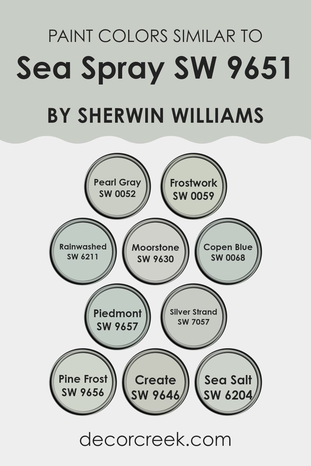
Colors Similar to Sea Spray SW 9651 by Sherwin Williams
Similar colors are crucial in design because they create a subtle and cohesive look, helping to establish a soothing and harmonized atmosphere. When colors like Pearl Gray, Frostwork, and Rainwashed are used together, they form a gradient of tones that blend smoothly without sharp contrasts, which is ideal for spaces aiming for a soft and unified appearance. These shades are closely related in saturation and lightness, making transitions between them nearly seamless, enhancing the overall aesthetics of an environment.
For instance, Pearl Gray is a gentle, muted gray with a soft vibe, while Frostwork presents a slightly cooler hue, adding a calm and gentle touch to spaces. Rainwashed, with its hint of green, brings a refreshing and clean feel to the palette.
Moorstone and Copen Blue introduce an earthy and slightly more saturated tone to the ensemble, contributing depth and character. Colors like Piedmont and Silver Strand sit comfortably in the middle of the spectrum, providing a balanced blend of warm and cool notes.
Pine Frost, Create, and Sea Salt are excellent for adding subtle nuances and pops of color within the same range, maintaining the visual flow and keeping the look coherent. Using these colors in combination allows for a layered yet unified design scheme that is visually soothing and beautiful.
You can see recommended paint colors below:
- SW 0052 Pearl Gray
- SW 0059 Frostwork
- SW 6211 Rainwashed
- SW 9630 Moorstone
- SW 0068 Copen Blue
- SW 9657 Piedmont
- SW 7057 Silver Strand
- SW 9656 Pine Frost
- SW 9646 Create
- SW 6204 Sea Salt
How to Use Sea Spray SW 9651 by Sherwin Williams In Your Home?
Sea Spray SW 9651 by Sherwin Williams is a refreshing paint color that brings a touch of the ocean breeze into any home. This color resembles a very light shade of blue, with subtle hints of gray, making it a versatile choice for living rooms, bedrooms, and bathrooms. It can create a calm and welcoming atmosphere, making it easier for you to relax after a long day.
When painting your walls with Sea Spray, consider pairing it with crisp white trim for a clean and bright look. This color also pairs beautifully with natural elements like wooden furniture or stone accents, enhancing its soft and gentle feel.
If you’re looking to add a little bit of this color without painting an entire room, think about using it on an accent wall or inside shelving units for a subtle pop. Overall, Sea Spray is a flexible shade that helps make your space feel cozy and inviting, reaching the right balance between calming and cheerful.
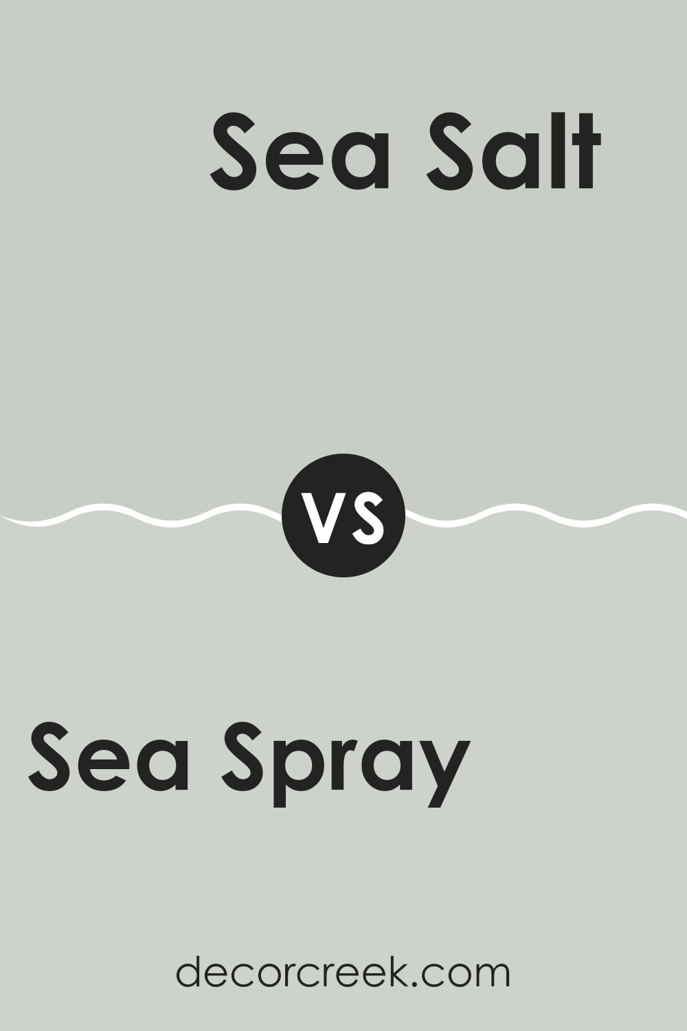
Sea Spray SW 9651 by Sherwin Williams vs Sea Salt SW 6204 by Sherwin Williams
“Sea Spray” and “Sea Salt” are two colors from Sherwin Williams that both draw inspiration from nature, specifically the ocean. “Sea Spray” is a lighter and more muted color, providing a subtle, airy feel to a room. It’s almost like looking at a light fog over the sea early in the morning.
On the other hand, “Sea Salt” has a bit more depth and leans towards a greenish-gray hue. It offers a fresh and clean look, reminiscent of ocean water on a clear day. While both colors promote a calm atmosphere, “Sea Spray” might be better in a space where you want a hint of color without overwhelming the surroundings.
In contrast, “Sea Salt”, with its slightly richer tone, could be more suitable for those looking for a touch of nature while still keeping the room bright and open. These shades are ideal for creating a peaceful and inviting space in your home.
You can see recommended paint color below:
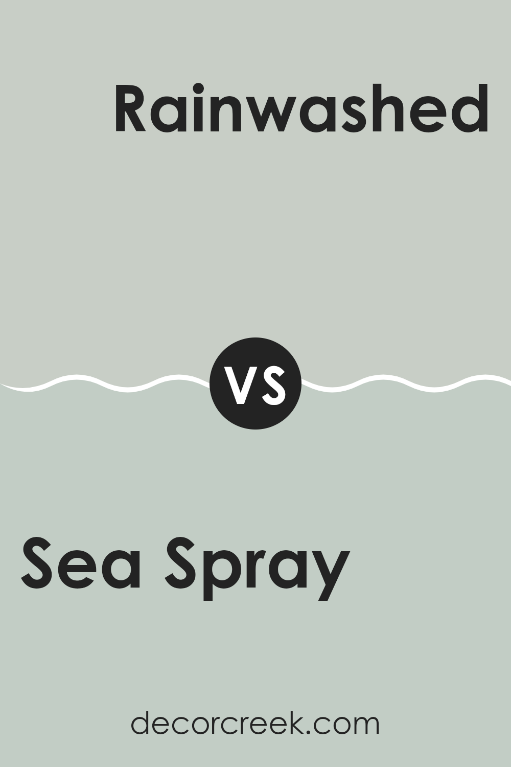
Sea Spray SW 9651 by Sherwin Williams vs Rainwashed SW 6211 by Sherwin Williams
Sea Spray and Rainwashed are two distinct colors by Sherwin Williams. Sea Spray is a calm, muted green with a hint of gray, giving off a soft and gentle feel that works well in spaces meant for relaxation. It mimics the subtle tones one might see on a misty coastal morning, making it quite versatile for use in various parts of a home, including bedrooms and living areas.
On the other hand, Rainwashed is a lighter, more visibly green-blue color. This color leans more towards a cheerful and refreshing vibe, reminiscent of a light rain in early spring that brightens the leaves and grass. It’s an excellent choice for creating a light, airy atmosphere, potentially making small rooms appear larger and more inviting.
Both colors are soothing in their own right but cater to different aesthetic preferences and moods within a space. Sea Spray works well for a gentle, understated look, while Rainwashed offers a brighter, more uplifting feel.
You can see recommended paint color below:
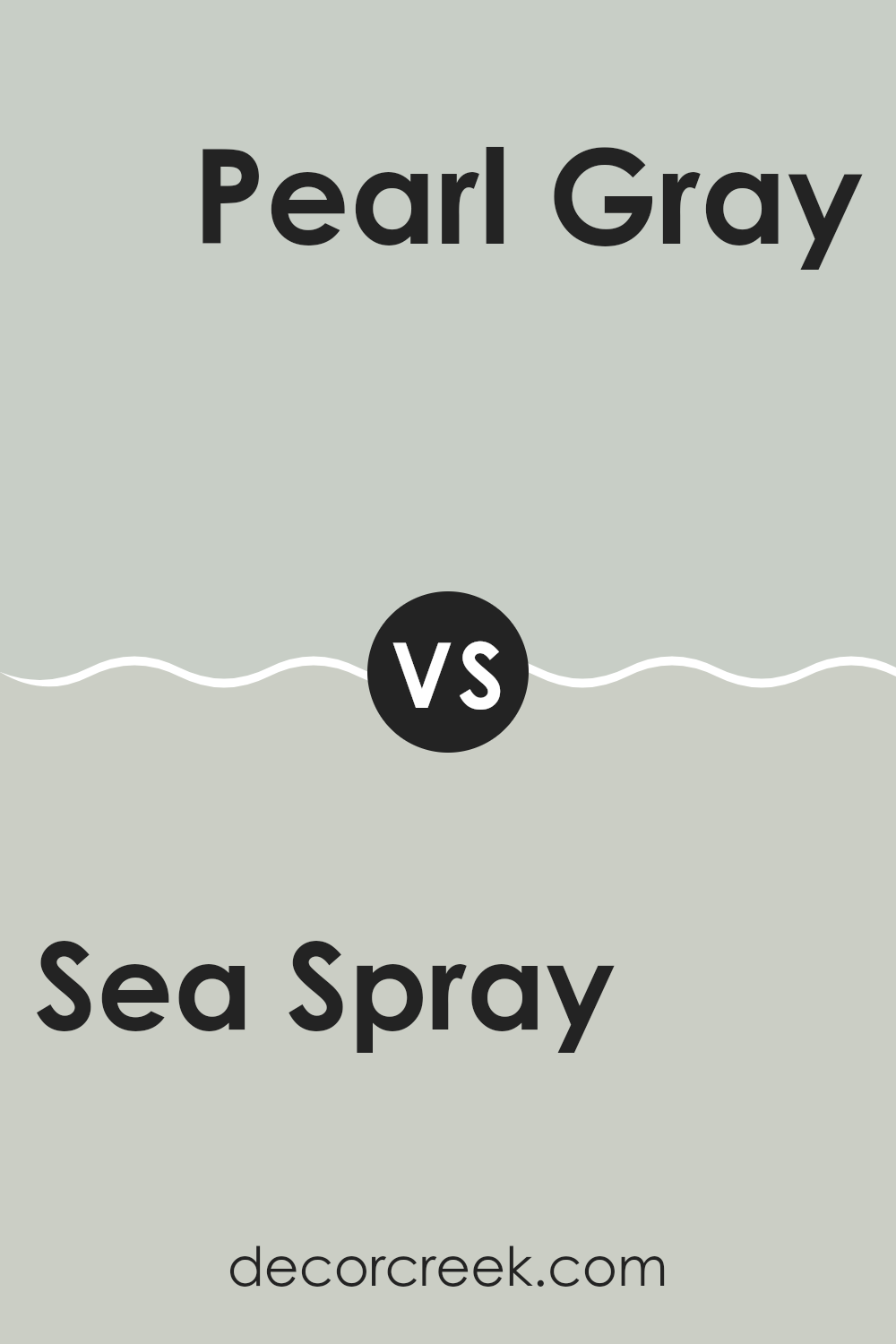
Sea Spray SW 9651 by Sherwin Williams vs Pearl Gray SW 0052 by Sherwin Williams
Sea Spray and Pearl Gray are two distinct colors from Sherwin Williams. Sea Spray has a gentle, soft green tone that’s reminiscent of a calm ocean mist or early morning dew, bringing a subtle, fresh feel to a space. It’s a color that pairs well with natural elements and light woods, adding a refreshing touch without overwhelming a room.
On the other hand, Pearl Gray offers a cooler, more neutral vibe. As a classic gray, it’s versatile and understated, making it an excellent choice for those looking to create a clean and modern look. This color works well in spaces where you might want a backdrop that allows other elements to stand out, like artwork or colorful furnishings.
Both colors are fairly subdued, but while Sea Spray injects a hint of color and freshness, Pearl Gray acts more as a soft, calming foundation. Whether you choose one over the other would depend on whether you prefer a hint of natural vibrancy or a sleek, timeless backdrop.
You can see recommended paint color below:
- SW 0052 Pearl Gray
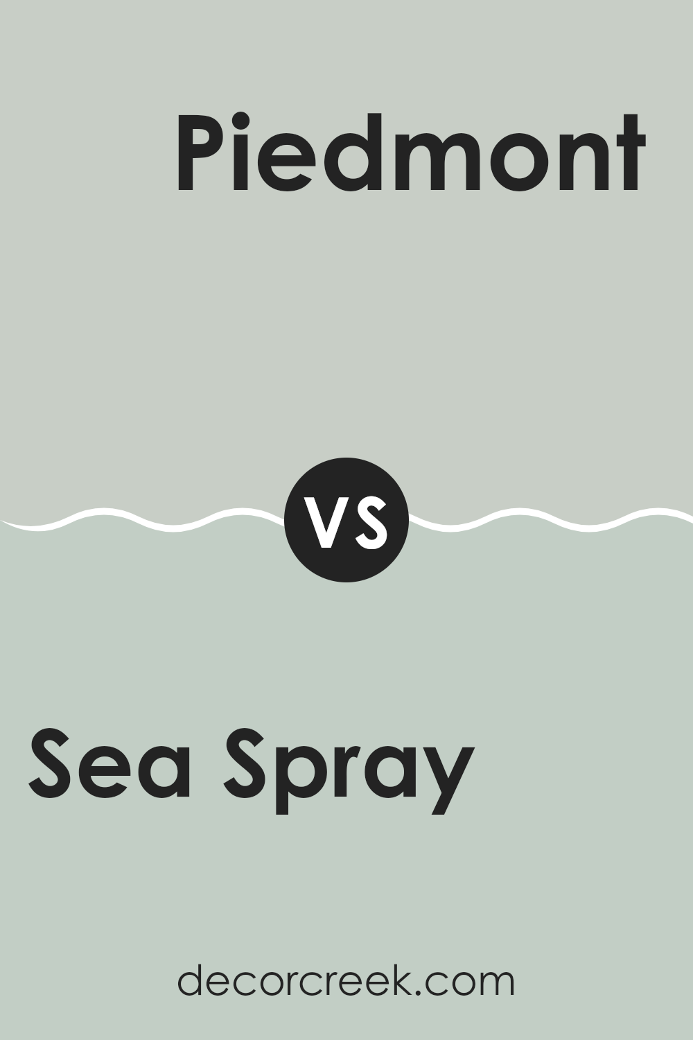
Sea Spray SW 9651 by Sherwin Williams vs Piedmont SW 9657 by Sherwin Williams
Sea Spray by Sherwin Williams is a light, airy shade that gives a fresh feel to any room. This color has a cool undertone that resembles a very soft blue, which is reminiscent of a gentle mist over the ocean early in the morning. It’s perfect for creating a light and breezy atmosphere in spaces like bathrooms or small kitchens, where you want a clean and open vibe.
On the other hand, Piedmont by Sherwin Williams is significantly darker and warmer. This color leans more towards a muted beige with a hint of gray, making it a great choice for areas where you want a bit more warmth and coziness, like living rooms or bedrooms. It’s neutral enough to be flexible with various decor styles and colors.
Together, these two colors can work well in the same home, offering a nice balance between cool and warm tones. Sea Spray can be used in areas with lots of light for a refreshing feel, while Piedmont can anchor larger pieces of furniture or be used in spaces that benefit from a warmer palette.
You can see recommended paint color below:
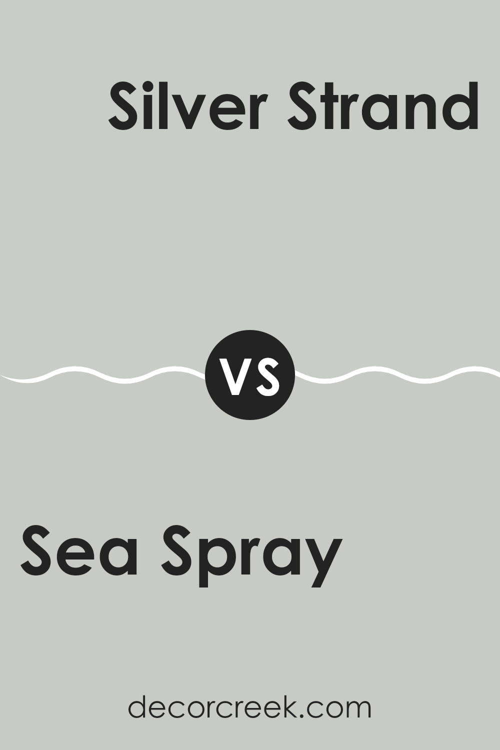
Sea Spray SW 9651 by Sherwin Williams vs Silver Strand SW 7057 by Sherwin Williams
Sea Spray and Silver Strand are two calming colors from Sherwin Williams, each with its own unique charm. Sea Spray is a soft, pale green, reflecting a natural, beachy vibe that reminds you of a misty seashore morning. It has a light, refreshing quality that makes it ideal for creating a calm atmosphere in spaces like bedrooms or bathrooms.
On the other hand, Silver Strand stands out as a muted gray with subtle green undertones. This color is closer to gray than Sea Spray, but its undertones keep it connected to nature, offering a slightly more neutral look. Silver Strand works well in a variety of settings, providing a quiet backdrop that pairs effortlessly with both warm and cool tones in your decor.
Both colors are excellent for those looking to refresh their space with understated elegance. While Sea Spray leans into green, providing a crisp, oceanic feel, Silver Strand offers a more understated, versatile canvas that works in practically any room.
You can see recommended paint color below:
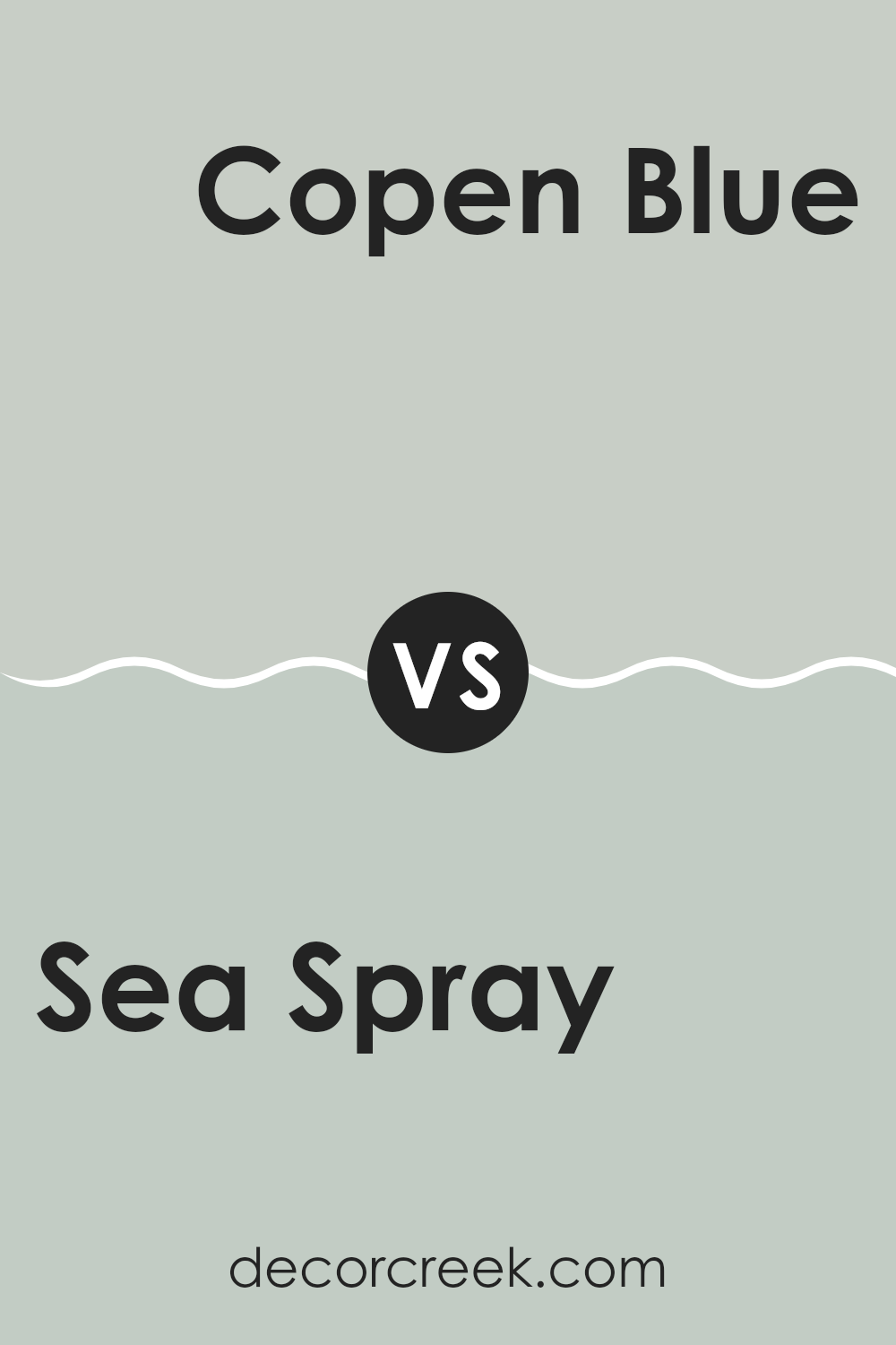
Sea Spray SW 9651 by Sherwin Williams vs Copen Blue SW 0068 by Sherwin Williams
Sea Spray and Copen Blue, both colors by Sherwin Williams, offer distinct tones that cater to different tastes and design needs. Sea Spray is a gentle, light green shade with a hint of grey, giving it a soft and subtle appearance. It’s ideal for creating a calm and light atmosphere in a room, especially suited for spaces like bathrooms or bedrooms where a quiet vibe is appreciated.
On the other hand, Copen Blue is a deeper, more vibrant teal that leans toward a classic blue. This color adds a bit more energy and personality to spaces without being too bold. It’s perfect for areas where a punch of color is desired, such as in a dining area or as an accent wall.
Both colors lend a fresh and airy feel to spaces but cater to different intensities of color preferences. While Sea Spray works well for a muted and neutral palette, Copen Blue is better suited for those looking to introduce a splash of color that still maintains a calm feel.
You can see recommended paint color below:
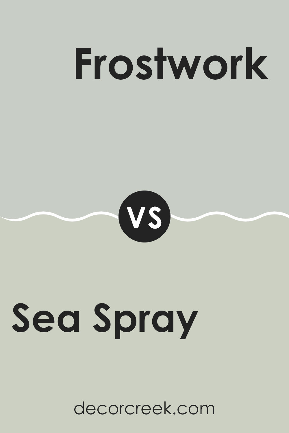
Sea Spray SW 9651 by Sherwin Williams vs Frostwork SW 0059 by Sherwin Williams
Sea Spray and Frostwork, both by Sherwin Williams, are distinct yet subtle colors that work beautifully in various spaces. Sea Spray is a light, airy aqua hue that brings a fresh and calm feeling to a room.
It’s like looking at the gentle waves of the sea, making it perfect for creating a relaxed environment. On the other hand, Frostwork is a cooler tone, slightly gray with a hint of lavender, offering a crisper look. This color can make a space feel more open and clean, giving off a slight modern vibe that is not too overpowering.
Together, these colors can complement each other well in a home, with Sea Spray adding a touch of warmth and Frostwork providing a sleek, contemporary balance. They are ideal choices for anyone looking to refresh their living space with colors that are easy on the eyes and create a subtle, inviting atmosphere.
You can see recommended paint color below:
- SW 0059 Frostwork
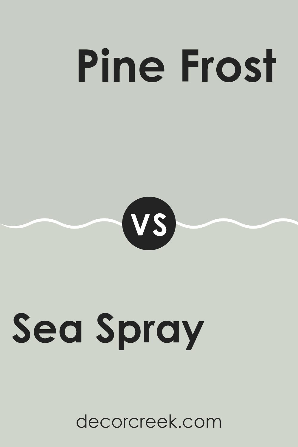
Sea Spray SW 9651 by Sherwin Williams vs Pine Frost SW 9656 by Sherwin Williams
Sea Spray and Pine Frost are both colors offered by Sherwin Williams, each presenting a distinct mood for room decor. Sea Spray is a soft, muted green with a hint of blue, giving a calming effect that’s ideal for spaces meant for relaxation like bedrooms or bathrooms. It resembles the gentle tones found in a misty ocean scene.
On the other hand, Pine Frost is a bit deeper and has a cooler tone, leaning more towards a true green. This color is reminiscent of a foggy pine forest at dawn. Pine Frost might be better suited for areas where a fresh, clean feel is desired, possibly a kitchen or a study.
Both colors stand out for their ability to make a space feel fresh and airy. While Sea Spray offers a lighter, breezier feel, Pine Frost brings a touch of nature’s depth and richness into the home. Choosing between them would depend on your personal preference for either a lighter aqua hue or a deeper, crisper green.
You can see recommended paint color below:
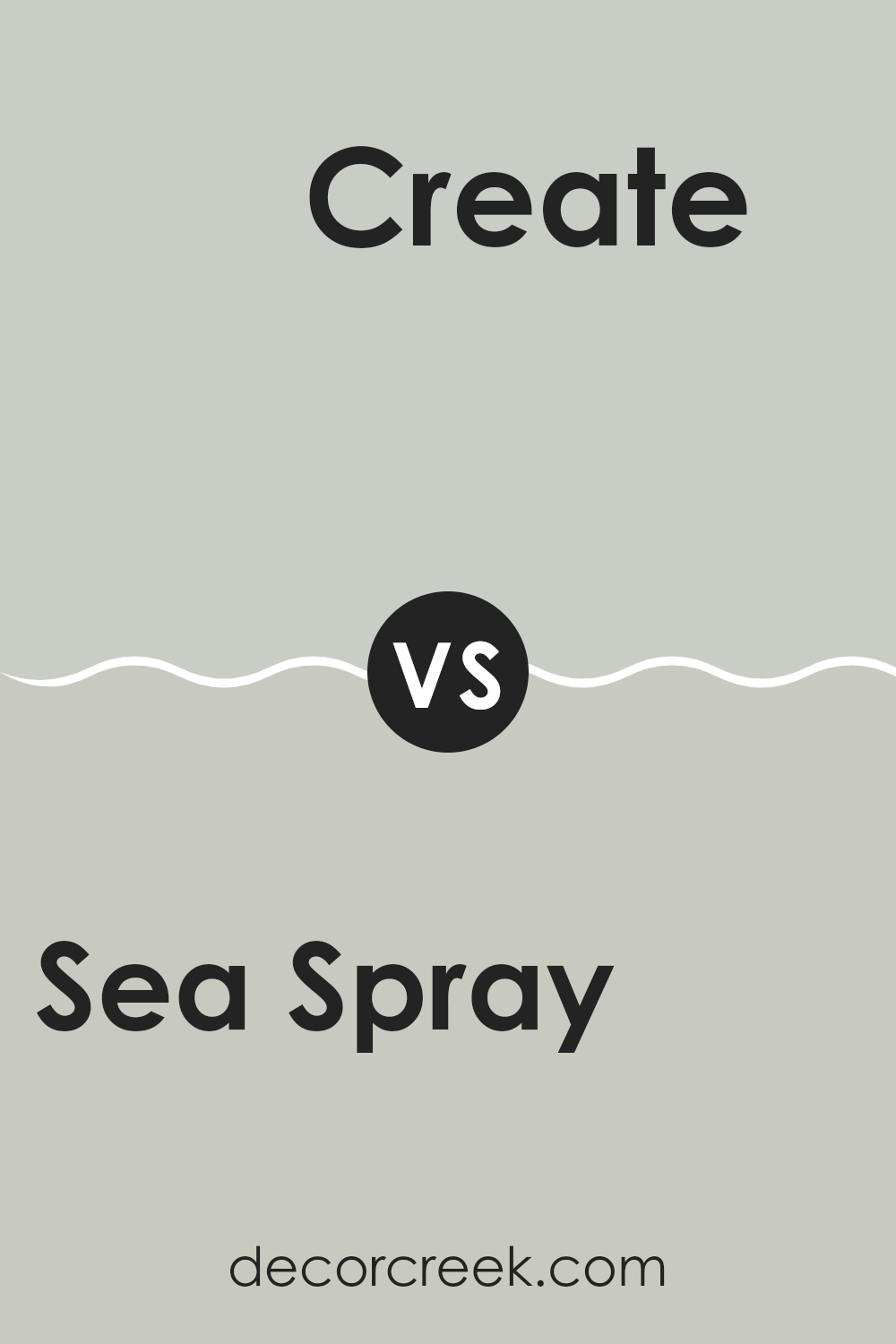
Sea Spray SW 9651 by Sherwin Williams vs Create SW 9646 by Sherwin Williams
“Sea Spray” and “Create” by Sherwin Williams are both unique colors with their own characters. “Sea Spray” is a gentle, soft gray with hints of blue, reminiscent of a misty shoreline. This color brings a calm and peaceful feel to spaces, making it ideal for bedrooms and bathrooms where a soothing atmosphere is usually desired.
On the other hand, “Create” is a deeper, teal blue that leans more towards a vibrant, energetic vibe. This shade is perfect for spaces where you want to add a pop of color without overwhelming the area. It works well in creative spaces or accent walls where the goal is to add a splash of inspiration and joy.
In comparison, while both colors belong to the blue family, “Sea Spray” is much lighter and leans towards gray, offering a subtle, quiet backdrop. “Create,” being richer and more pronounced, stands out more and can dictate the theme of a room. Each color serves different moods and purposes, making them versatile for varying interior designs.
You can see recommended paint color below:
Sea Spray SW 9651 by Sherwin Williams vs Moorstone SW 9630 by Sherwin Williams
Sea Spray and Moorstone, both by Sherwin Williams, offer unique tones for different decorating needs. Sea Spray is a light, airy gray with subtle blue undertones, giving a fresh and clean feel that mimics the lightness of a gentle sea mist. It’s perfect for creating a soothing atmosphere in spaces like bedrooms or bathrooms, where you want to promote relaxation.
On the other hand, Moorstone is a deeper gray with a stronger presence, ideal for those looking to add a bit more richness to their space. Its darker tone provides a grounding effect, making it great for larger areas or accent walls where you want to add some depth and focus.
While both colors share a gray base, Sea Spray leans towards a lighter, more refreshing vibe. In contrast, Moorstone offers a sturdier and more traditional gray experience. Each color works well in its own right, depending on the mood and style you want to achieve in your room.
You can see recommended paint color below:
Conclusion
This color makes you feel like you are close to the ocean. It’s very calming and fun, kind of like a light blue or soft green, mixed with the color of the sea. It’s really good for painting walls in rooms where you want to relax or feel peaceful, like your bedroom or living room.
I learned that this color also goes well with many other colors. You can match it with darker blues or greens, or even with neutral colors like white or gray. This makes it really useful if you want different rooms to look nice together.
What’s great about Sea Spray is that it’s not too bold or too dull, so it makes the room look fresh and welcoming without being too bright. It’s like having a little piece of the seaside at home, which is pretty awesome.
Overall, SW 9651 Sea Spray by Sherwin Williams seems like a fantastic choice if you want to bring some of the ocean’s calmness into your home.
Ever wished paint sampling was as easy as sticking a sticker? Guess what? Now it is! Discover Samplize's unique Peel & Stick samples.
Get paint samples

