If you wonder whether blue paint color can be versatile enough to suit any space in your home, the answer is yes! Sherwin-Williams has a fabulous blue hue that your home will welcome gladly.
This color is called Copen Blue, and today we will tell you more about it. You will learn what makes this color unique and how to use it in your home to help it reveal all of its beauty!
What Kind of Color Is SW 0068 Copen Blue?
Sherwin-Williams Copen Blue is a blue paint color that can offer delicate beauty while being suitable for many spaces in your home. As Encycolorpedia says, this light blue paint color works well for both large and small spaces. Moreover, you can use it indoors and outdoors with equal success!
This paint color also works well with a wide variety of colors, which allows you to adapt it easily to almost any interior design or palette.
Although most people prefer to use this blue hue indoors because of its light appearance, SW Copen Blue will add a home-like vibe to any space you use it.
Ever wished paint sampling was as easy as sticking a sticker? Guess what? Now it is! Discover Samplize's unique Peel & Stick samples.
Get paint samples

Is It a Warm or Cool Color?
To some people, Sherwin-Williams Copen Blue may read somewhat unclear in terms of its tone. If you are not sure whether SW Copen Blue reads cool-toned or warm-toned, know that this blue hue is a cool color.
Since this hue has no yellow or orange tint in it, the temperature of this paint color shifts to the cooler side. This is why its cool-toned appearance will remain like that regardless of the lighting in whichever space you use the color.
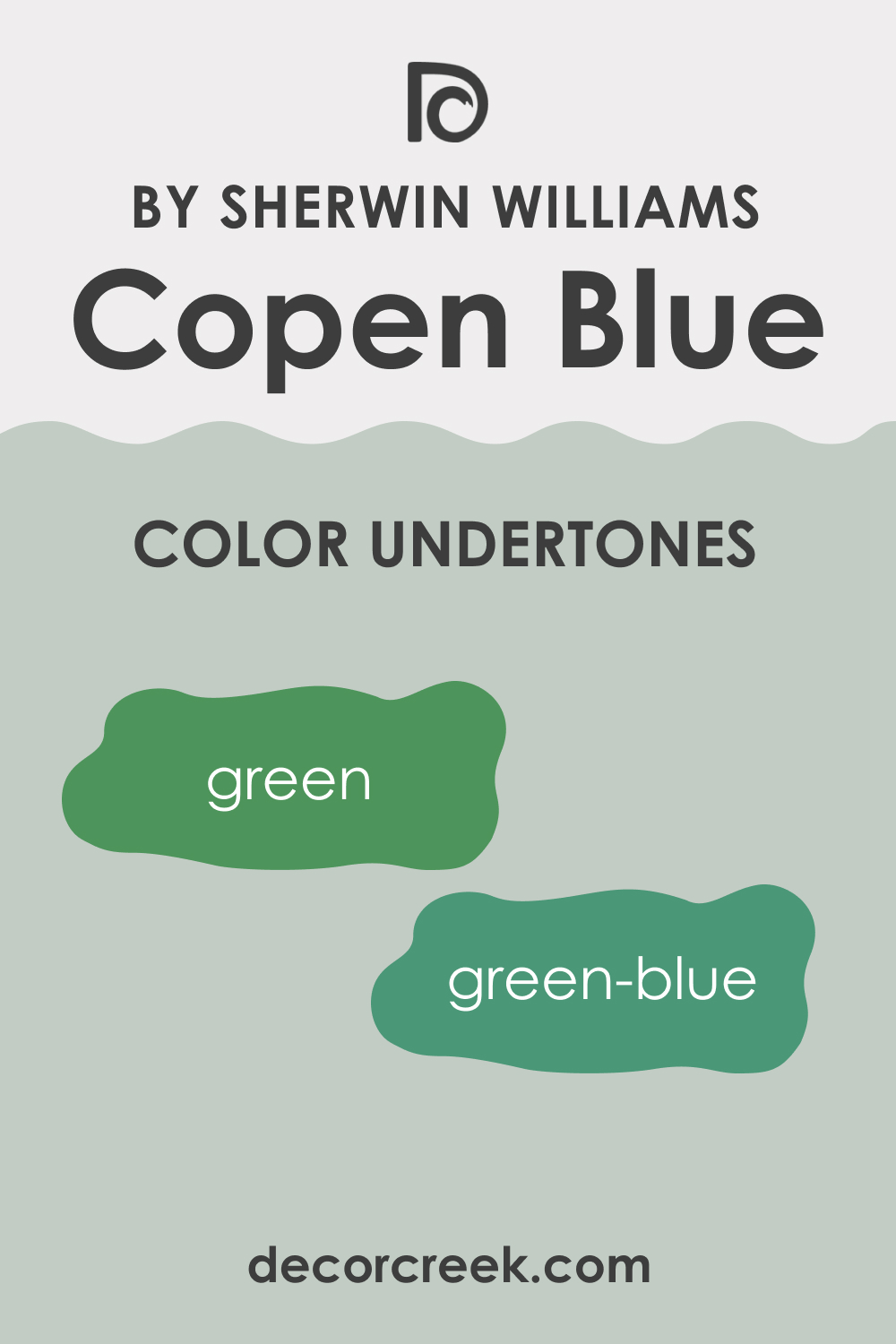
What Undertones Does SW 0068 Copen Blue Have?
Knowing the paint color’s undertones is a must because it allows you to tell in advance how this hue will read on your walls. Sherwin-Williams Copen Blue has a green undertone that can sometimes lean into blue depending on the lighting. This is why this color may look different in your home.
For example, in warm artificial lights and rooms with dim or poor light, this blue color will appear greenish.
The same green hue will show up in dark spaces. On the other hand, if you use SW Copen Blue in large spaces with plenty of natural light, you will see blue undertones.
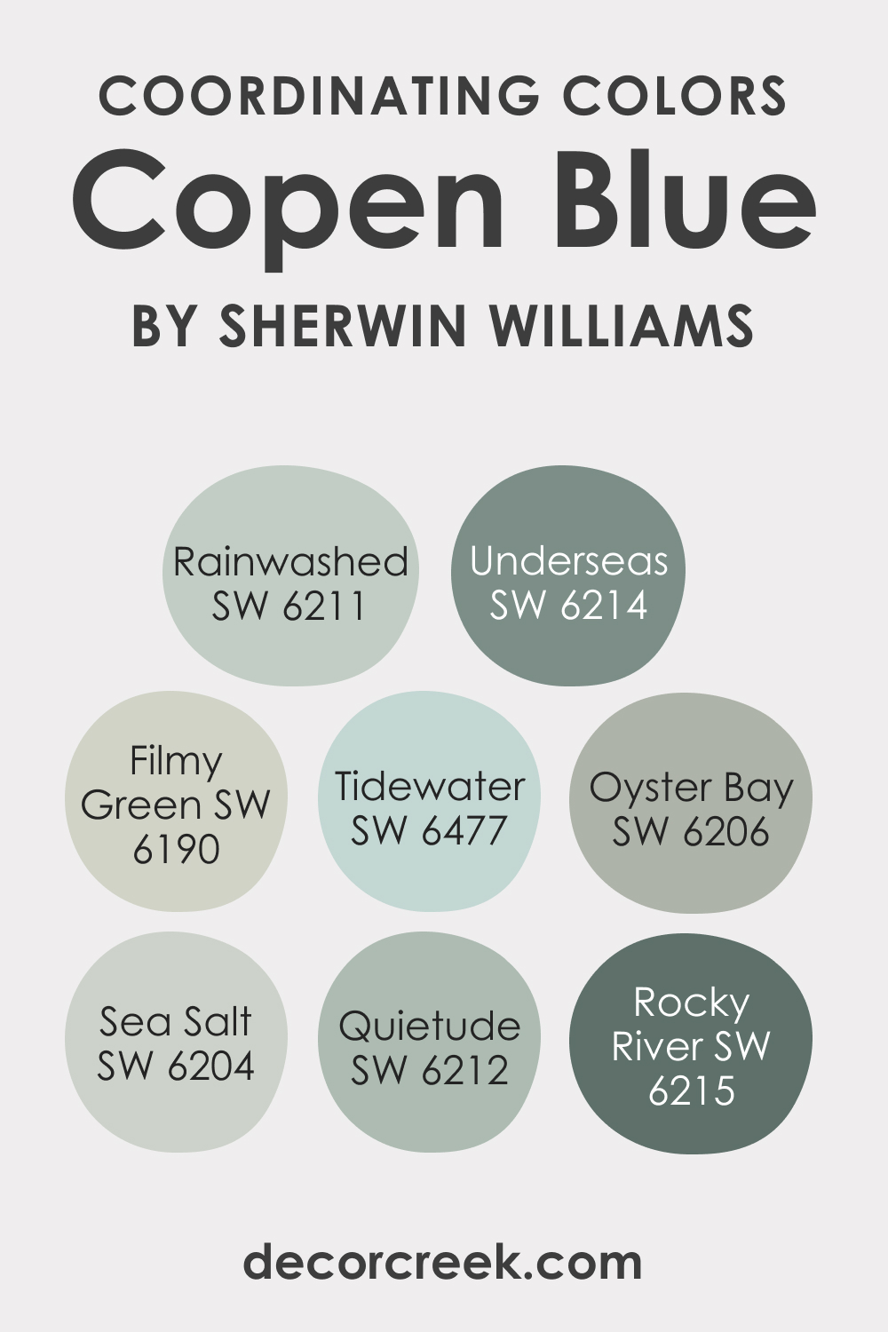
SW Copen Blue Coordinating Colors
With such a shapeshifting color as SW Copen Blue, it can be challenging for you to choose the correct coordinating colors to reveal the true hue of this blue paint. This is why we have prepared several coordinating palettes depending on the color scheme you prefer in your home.
For the analogous color scheme, you might want to use these hues:
- SW 6190 Filmy Green
- SW 6204 Sea Salt
- SW 6211 Rainwashed
- SW 6477 Tidewater
Remember that the analogous color palette consists of three colors situated next to each other on the color wheel. This scheme usually comprises the main color, two tertiary ones, and another that highlights the main color, making it more pronounced.
For the monochromatic color palette, we would recommend you stick with the following coordinating colors instead:
- SW 6206 Oyster Bay
- SW 6212 Quietude
- SW 6214 Underseas
- SW 6215 Rocky River
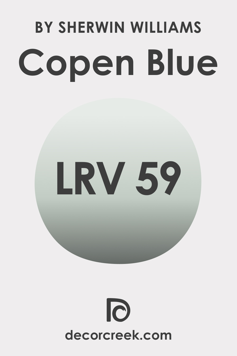
What LRV SW Copen Blue Has and How It Reacts to Light?
LRV means Light Reflective Value. This measurement indicates the amount of light a paint color reflects from the wall. The LRV value is measured in percent on a scale of 0 – 100, where lower values indicate dark colors and high values indicate lighter ones. A color with a higher LRV value will reflect more light and read brighter than a color with a lower LRV value that reflects less light respectively.
The LRV value of SW Copen Blue is 59, which places this blue hue almost in the middle of the light reflectivity scale. Simply speaking, this blue color is neither dark nor light.
It can reflect enough light not to make a room feel moody or enclosed. However, this might not be the best color choice if you want to make the space feel brighter and/or make a room seem more spacious.
LRV – what does it mean? Read This Before Finding Your Perfect Paint Color
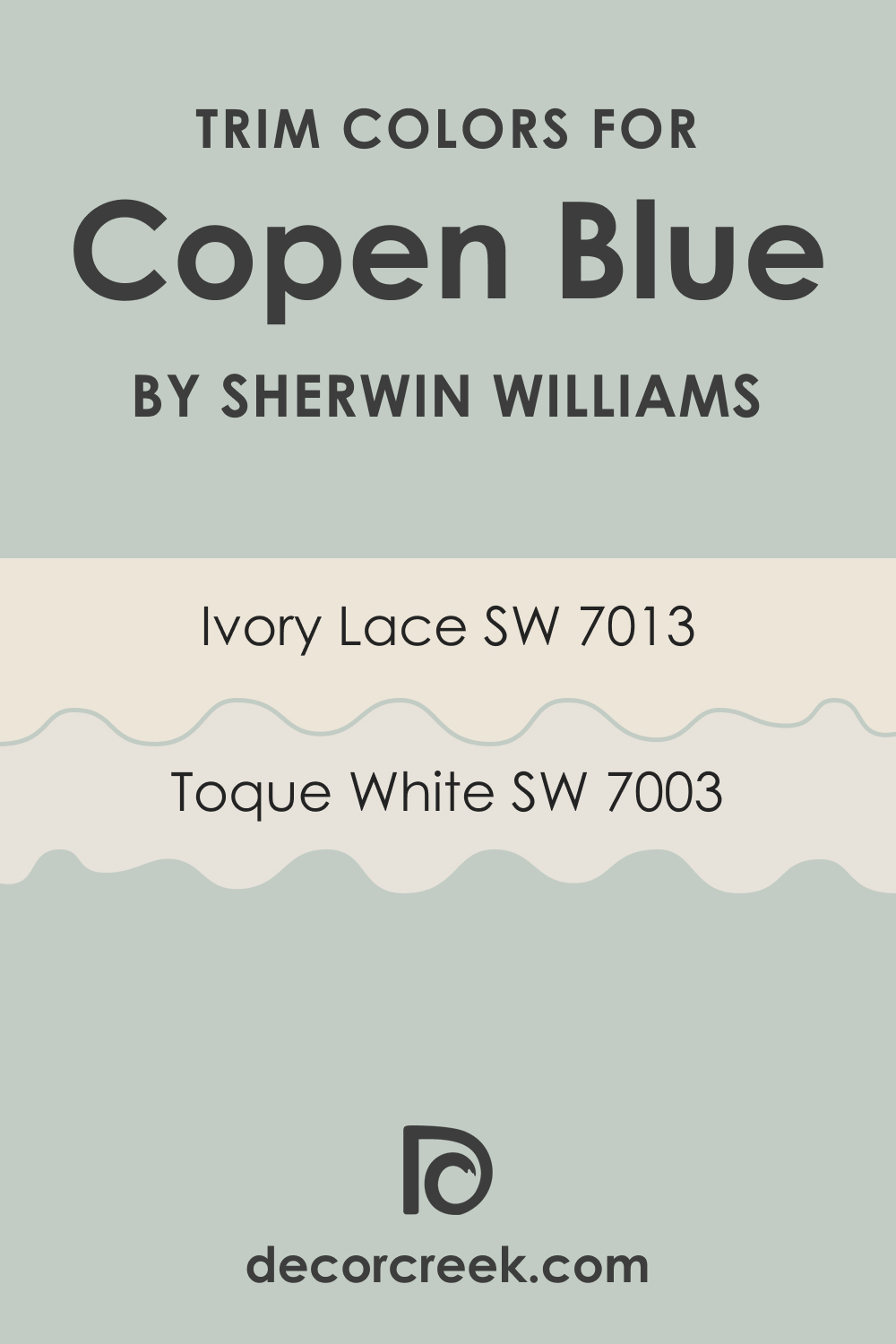
What Is the Best Trim Color to Use With SW 0068 Copen Blue?
White is the best trim color to use with most hues on the wall. White will highlight the hue you use on the walls and create a lovely contrast. Besides, with the help of different shades of white, you can achieve a crisper or a softer contrast between the walls and the trim.
For SW Copen Blue, we recommend you opt for the following whites:
- SW 7006 Toque White
- SW 7013 Ivory Lace
Sherwin-Williams Toque White is a warm white color with yellow undertones that will give a creamy finish to your living space.
This color is bright enough to give the necessary contrasting effect. As for Sherwin-Williams Ivory Lace, it looks soft and creamy with yellow undertones. Also, it is even brighter than SW Toque White.
On the other hand, should you want to try darker trim colors, you might want to check out SW Mega Greige or even SW Status Bronze. Both hues can work as dark trim colors successfully, especially when you use them on door and window frames.
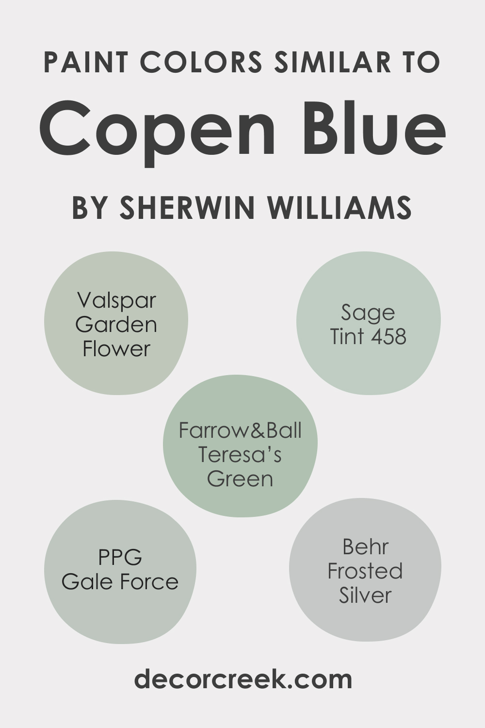
Colors Similar to SW Copen Blue
If you are not satisfied with how SW Copen Blue reads in your living space, it might be a good idea to consider another color that works similarly and has the same or very close hue. In particular, we would recommend you the following paint colors to use instead of SW Copen Blue:
- Behr Frosted Silver
- BM 458 Sage Tint
- Farrow & Ball Teresa’s Green
- PPG Gale Force
- Valspar Garden Flower
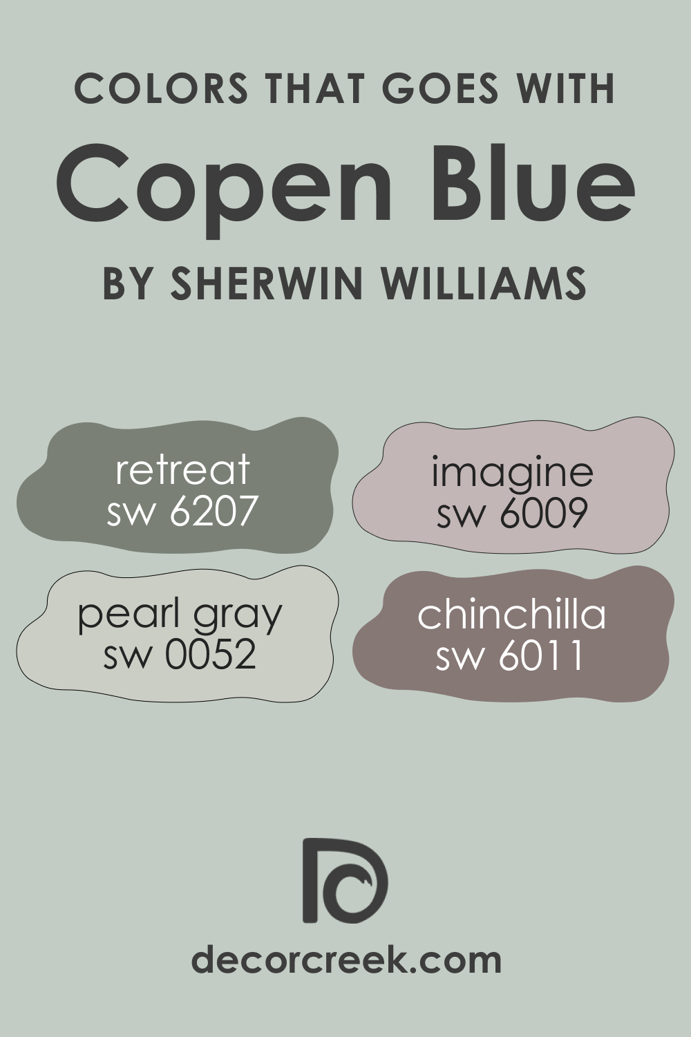
Colors That Go With SW 0068 Copen Blue
To achieve a harmonious and balanced color palette in your home, you need to know what colors will work best with the hue used on the walls. For SW Copen Blue, we recommend you the following paint colors to consider:
- SW 6207 Retreat
- SW 6009 Imagine
- SW 0052 Pearl Gray
- SW 6011 Chinchilla
With these colors, you will make your home read more colorful yet cling to the balanced and calming vibe since all these colors are muted.
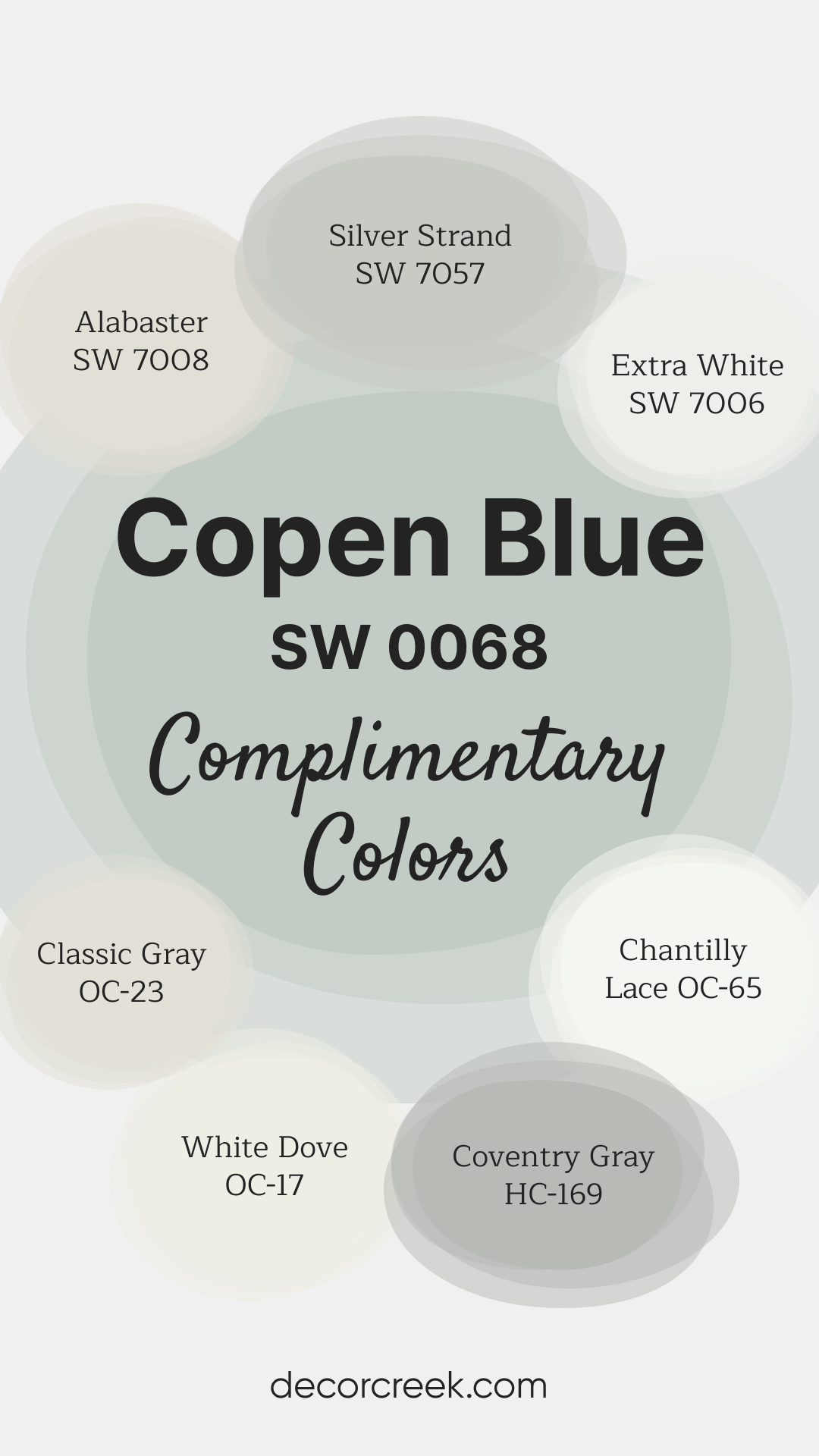
Complimentary Colors for Copen Blue SW 0068 Paint Color by Sherwin-Williams
Copen Blue SW 0068 by Sherwin-Williams is a tranquil blue with a hint of gray, perfect for adding a fresh and calming atmosphere to any space. This gentle shade works beautifully in bedrooms, bathrooms, and living areas, creating a peaceful and welcoming ambiance.
It pairs well with both warm and cool tones, making it versatile for various styles. For a bright contrast, Chantilly Lace OC-65 and Swiss Coffee OC-45 add crisp, clean touches.
Repose Gray SW 7015 and Edgecomb Gray HC-173 provide balanced warmth, while Coventry Gray HC-169 and Silver Strand SW 7057 introduce a cool, complementary element.
Alabaster SW 7008 completes the palette with its soft, warm undertone, ensuring a cohesive
via decorcreek.com
Comparing SW 0068 Copen Blue With Other Colors
Below, you can read how SW Copen Blue differs from other blues that read very close to this color. It will help you better see the distinctions between the hues that are similar in tone.
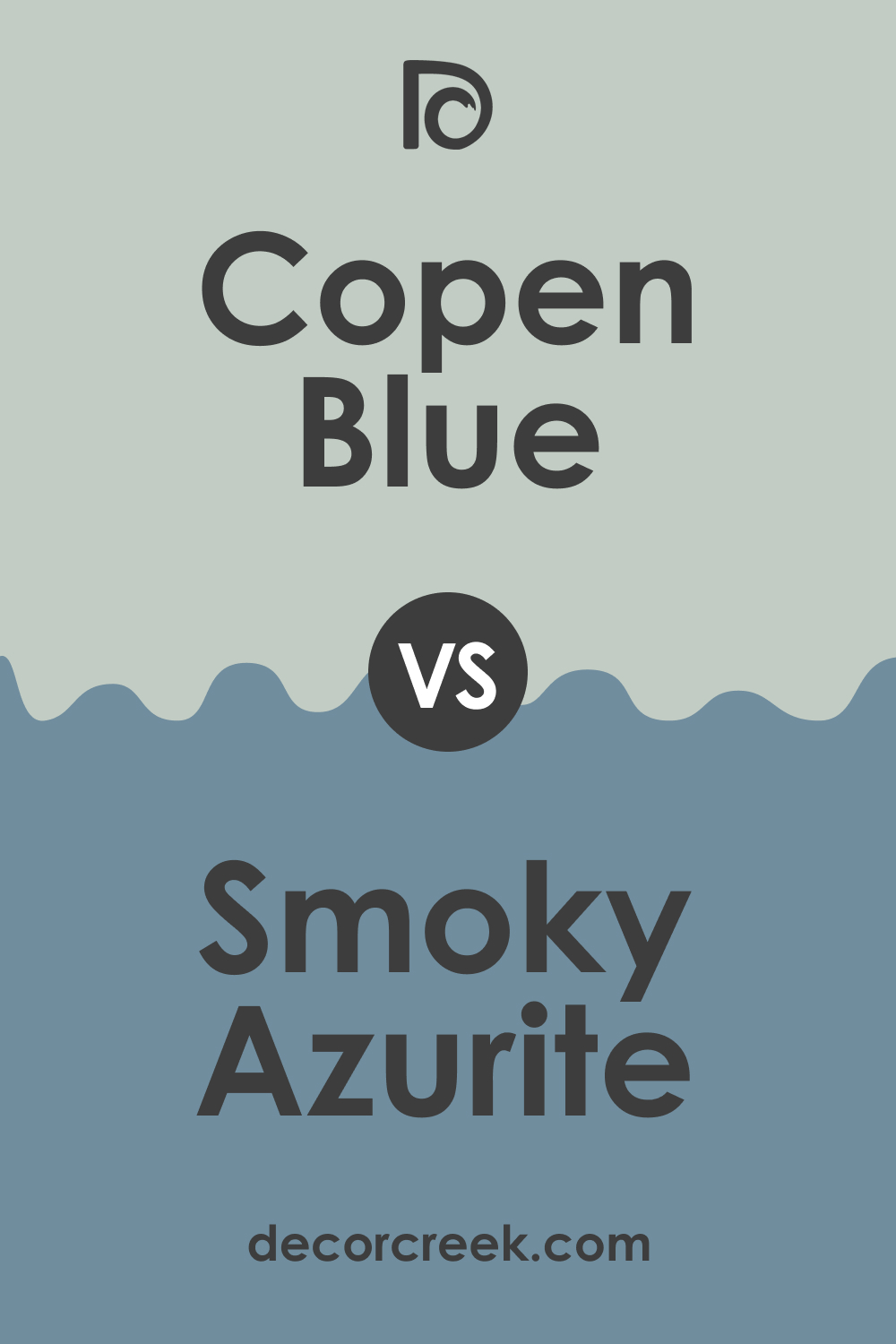
Copen Blue vs. Smoky Azurite
SW Smoky Azurite has an LRV of 25 and yellow-gray undertones. Compared to it, SW Copen Blue reads lighter due to the LRV value 59. Also, SW Copen Blue looks noticeably greenish compared to the saturated blue hue of its counterpart.
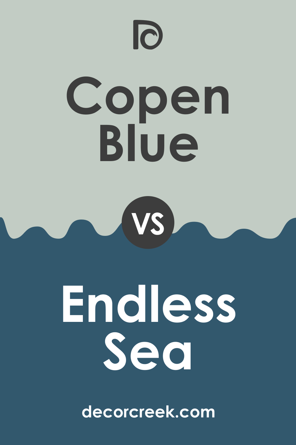
Copen Blue vs. Endless Sea
SW Endless Sea is much darker and deeper than SW Copen Blue. Also, these colors have different undertones. SW Endless Sea has yellow-gray undertones, and this yellowish hue is rather noticeable when you compared this color with SW Copen Blue.
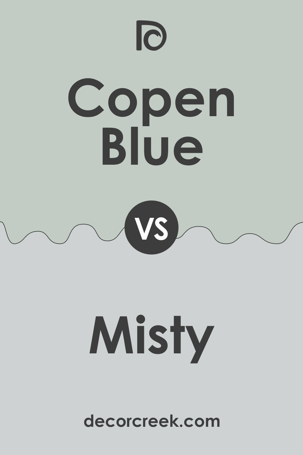
Copen Blue vs. Misty
SW Misty is a light blue-gray color with an LRV of 64. Compared to it, SW Copen Blue reads somewhat darker due to the lower LRV of 59. Also, SW Copen Blue reveals its green undertones very clearly if you place it side by side with its bluer counterpart.
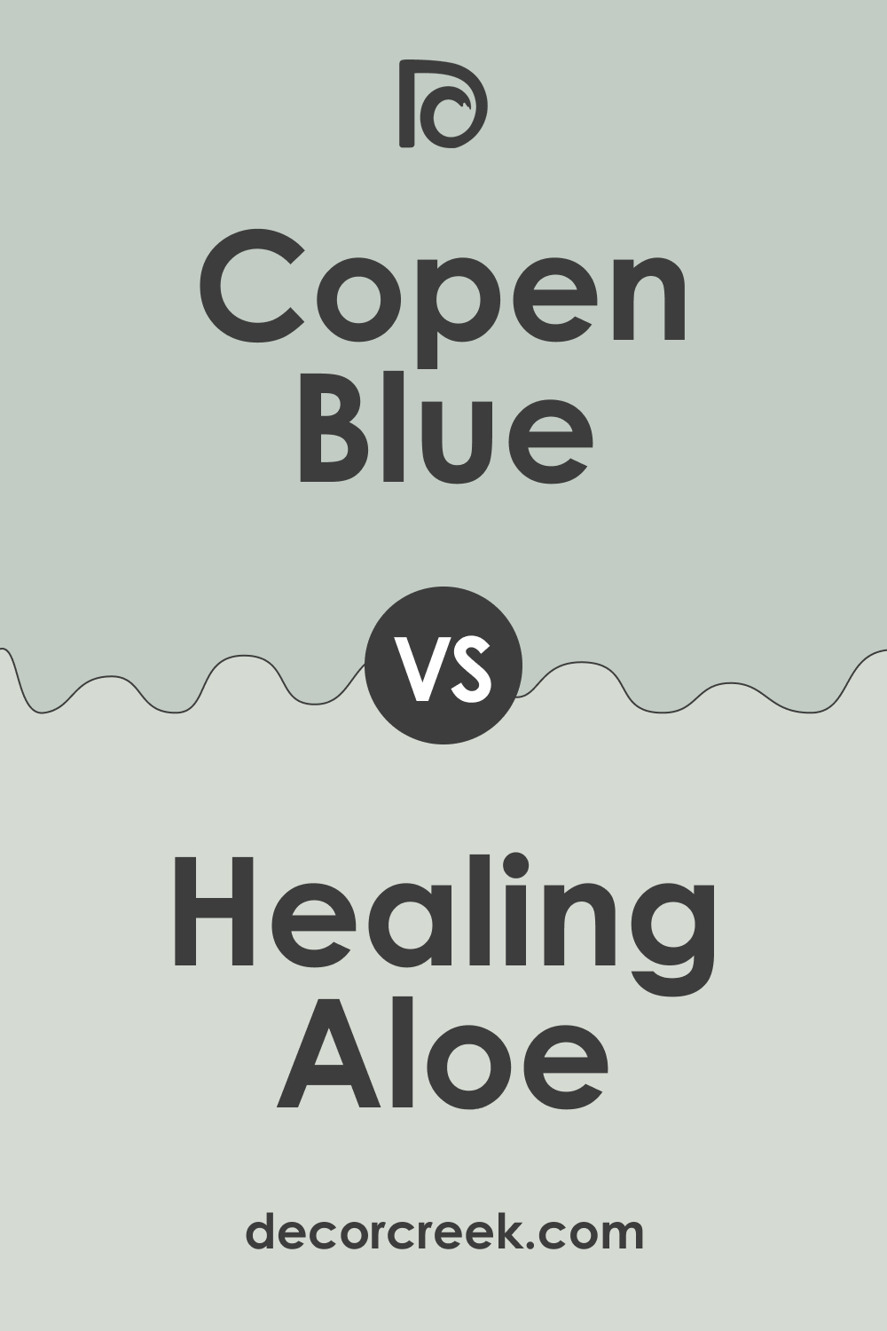
Copen Blue vs. Healing Aloe
BM Healing Aloe is a blue-green color with an LRV of 69. It is lighter than SW Copen Blue, whose LRV is 59, but in terms of tone, these colors are very similar due to the green undertones both share. The difference is that SW Copen Blue reads more saturated.
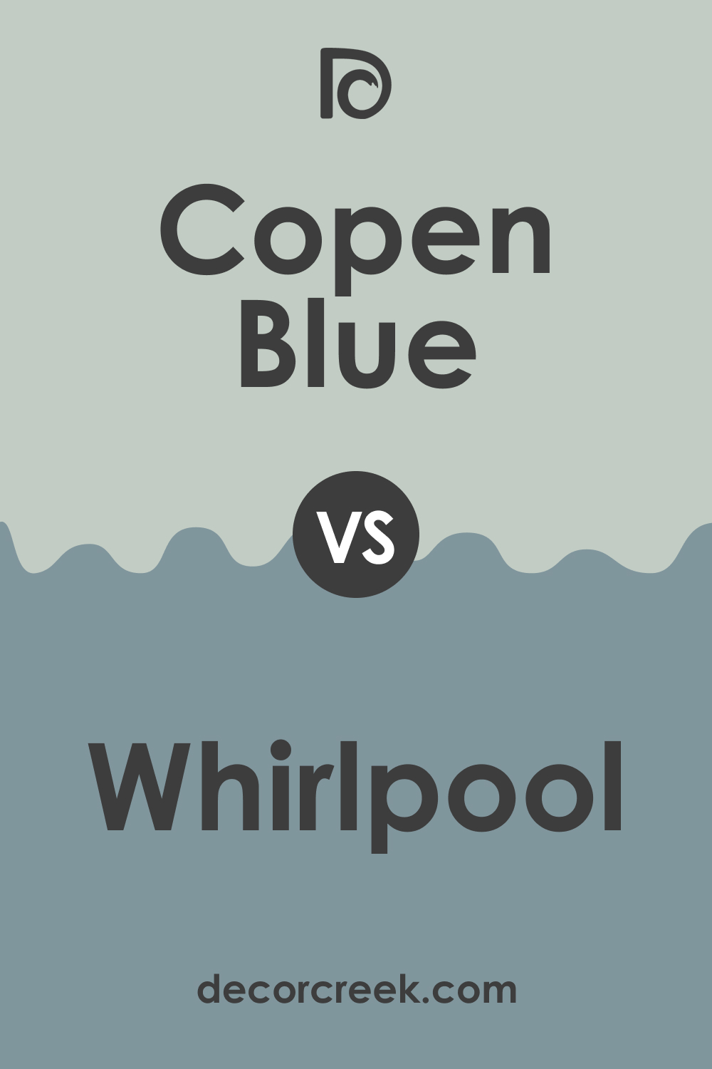
Copen Blue vs. Whirlpool
BM Whirlpool is a pale light gray with very slight violet undertones and an LRV of 78. It is lighter than SW Copen Blue, whose LRV is 59. Also, SW Copen Blue reads noticeably greener compared to its counterpart, with clearly seen gray undertones.
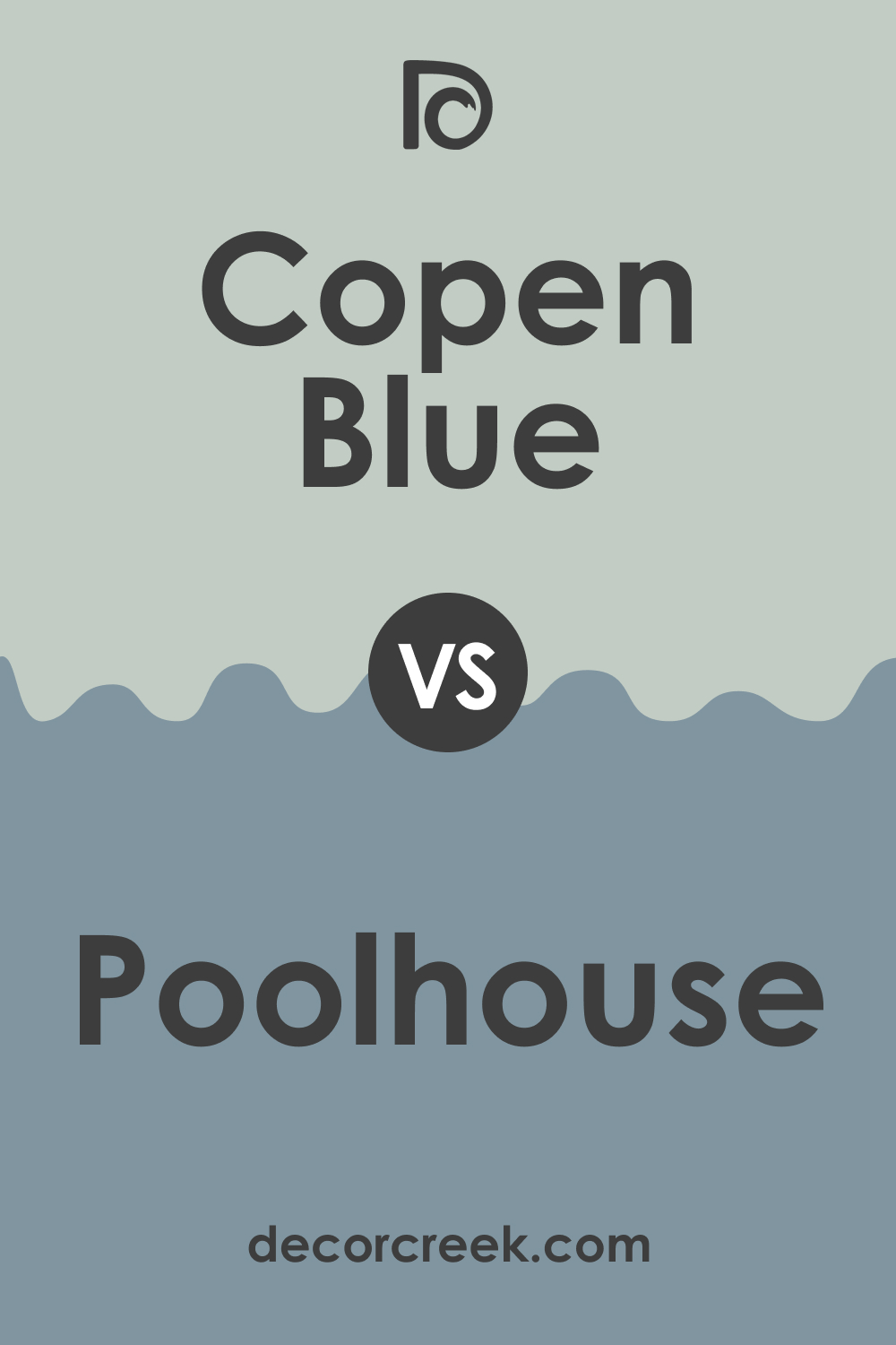
Copen Blue vs. Poolhouse
SW Poolhouse is a cool-toned blue with a slate undertone and an LRV of 29. Compared to SW Copen Blue, it looks darker and deeper and definitely bluer. SW Copen Blue reveals its green hue more prominently compared to its counterpart.
Where to Use SW Copen Blue Paint Color In Your Home?
SW Copen Blue is versatile enough to be used in any space in your home. This color is also suitable for exterior walls. Below, we describe how exactly it can work in different rooms.
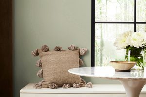
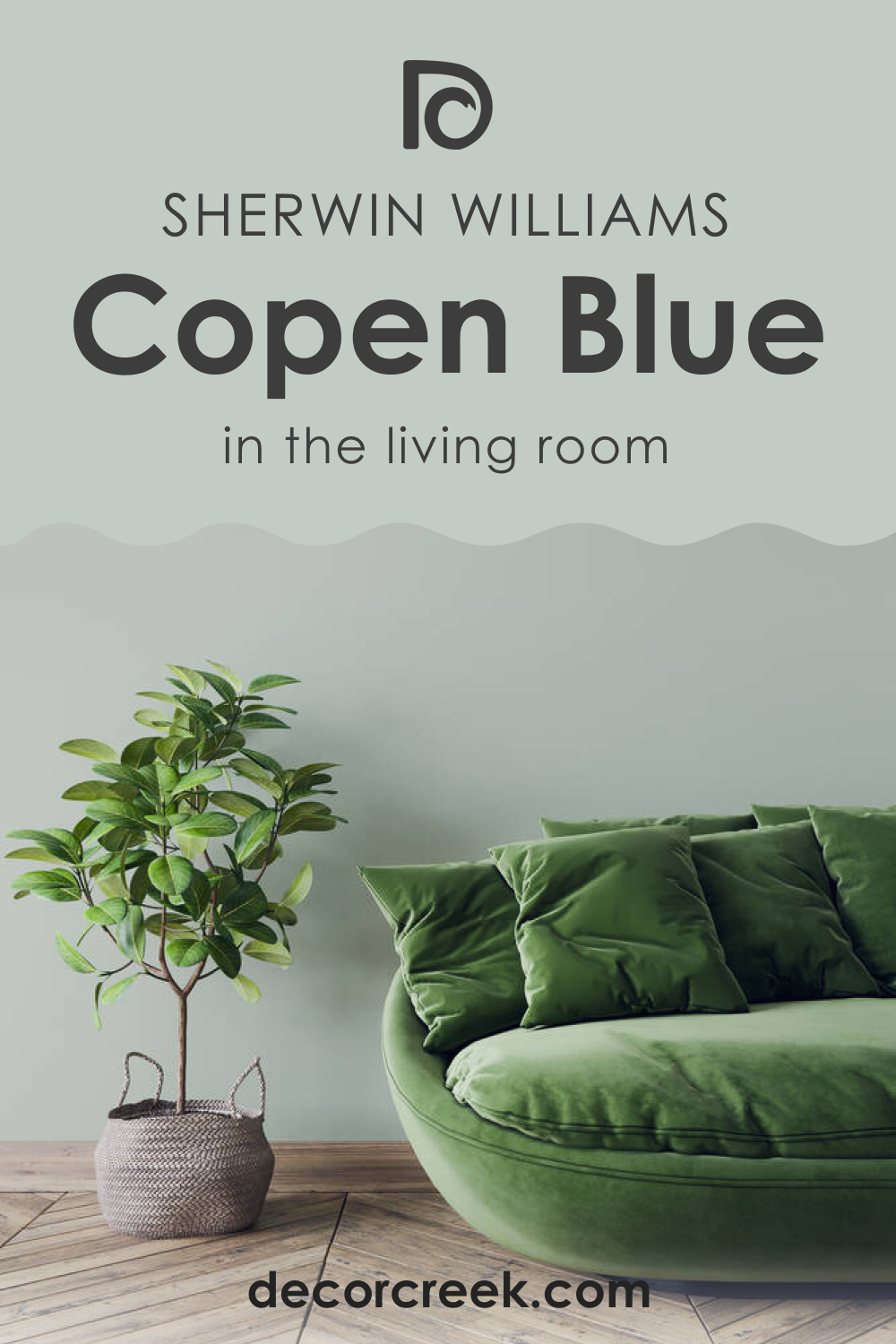
Copen Blue in the Living Room
This color can add a fresh and relaxing vibe to your living room, but you must consider the lighting in it. In warmer light, this blue hue will read warmer and definitely greener. In a room with cool light, SW Copen Blue may seem colder and bluer. Also, note that warm colors may also affect the way this hue reads!
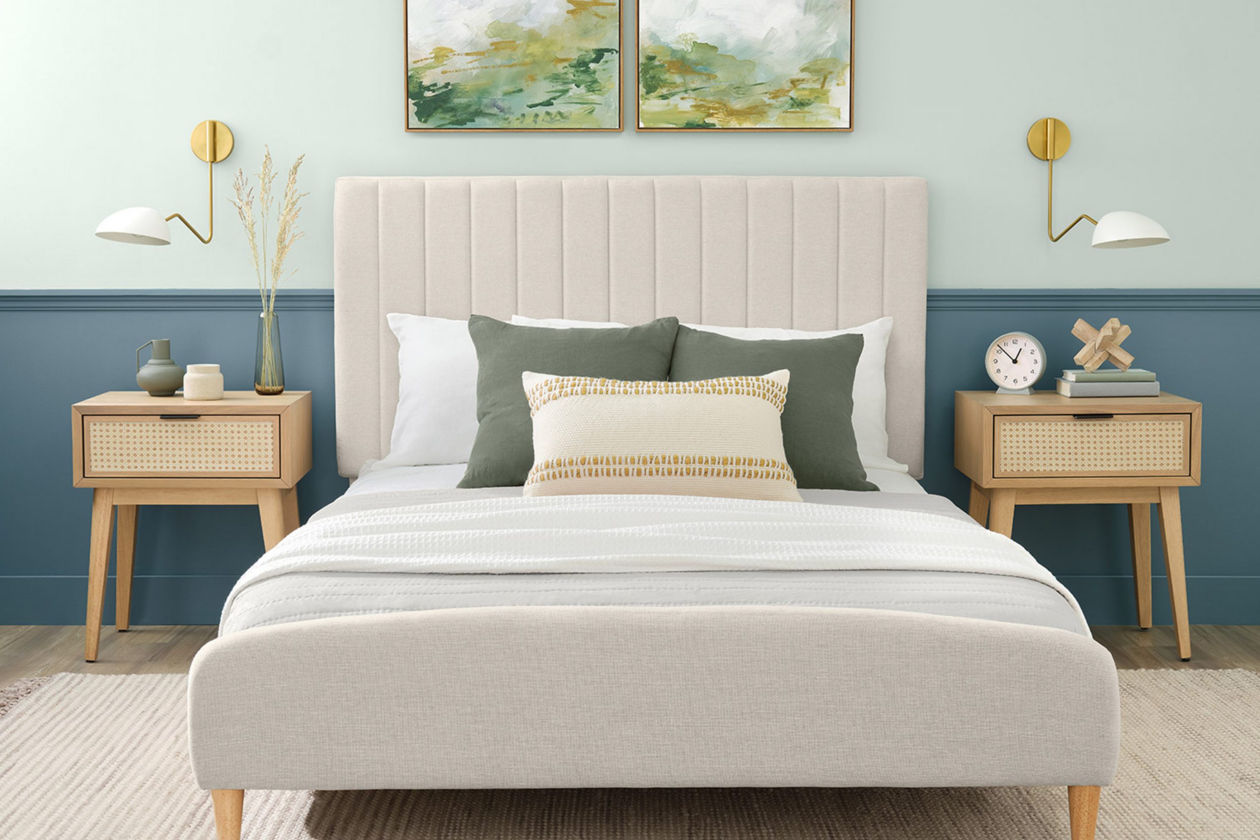
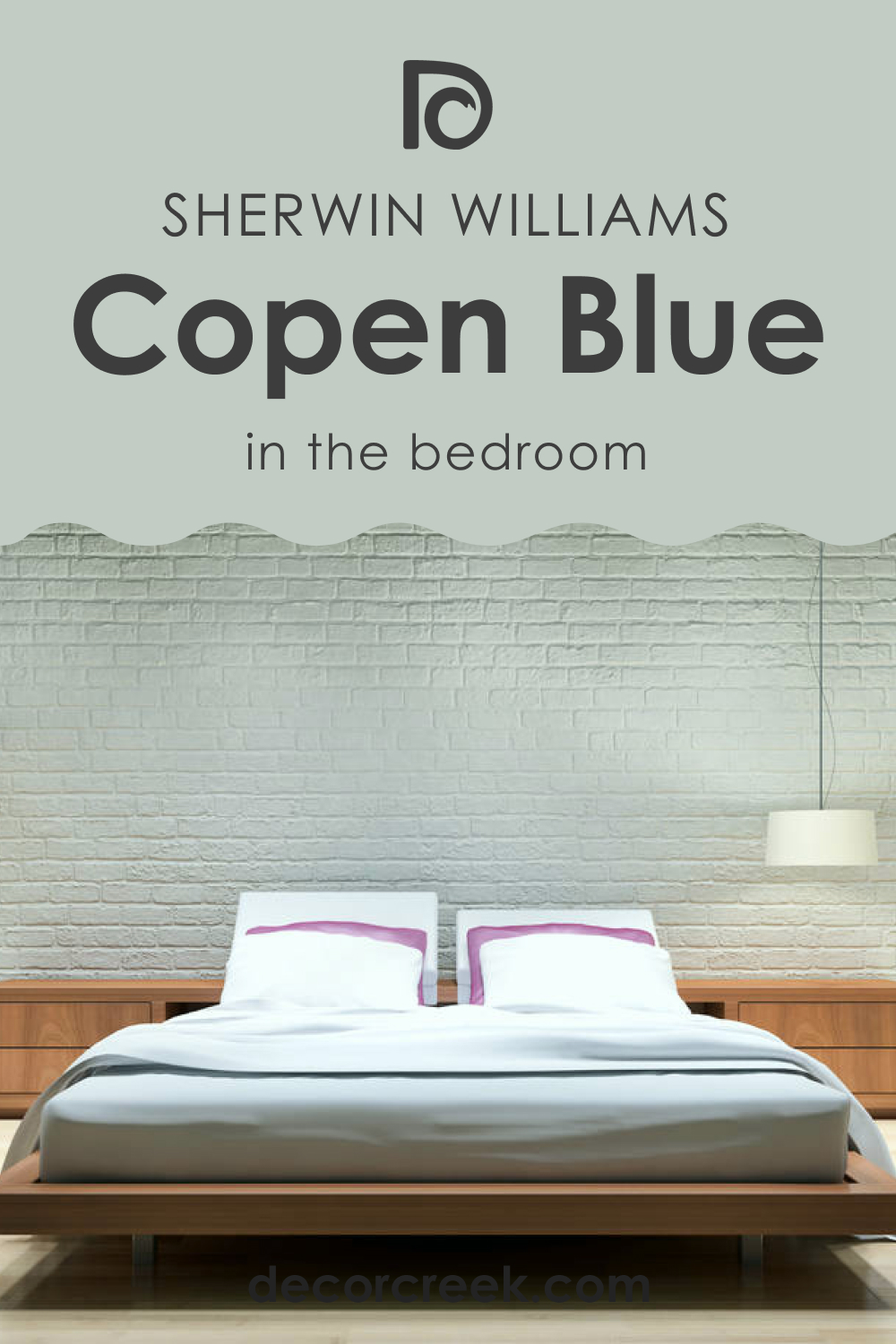
Copen Blue in a Bedroom
If you prefer a crisper atmosphere in your bedroom, opt for SW Copen Blue on its walls. This color will work equally well on all the walls or the accent wall only.
Pair it with white to make the room feel brighter and fresher, and add lighter grays, greiges, or off-white to make the space feel cozier. It’s also ok to use darker, muted blues and add golden accents through the pendant lights/sconces and pillows.
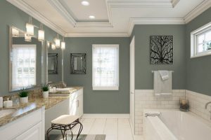
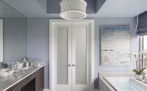
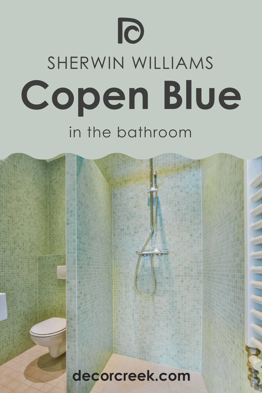
Copen Blue on the Bathroom
In a spacious and well-lit bathroom, this blue may work well on all the walls. But in a smaller room, you’d better use it on the vanity or paint an accent wall in it. The more white the room has, the brighter it will seem, making SW Copen Blue reveal its true hue.
Copen Blue and Kitchen
If you don’t want to make your kitchen look crisp and cool, use SW Copen Blue on cabinets only, or paint your kitchen island in it too. Paired with lighter wooden surfaces and enough white, this blue hue will read more balanced.

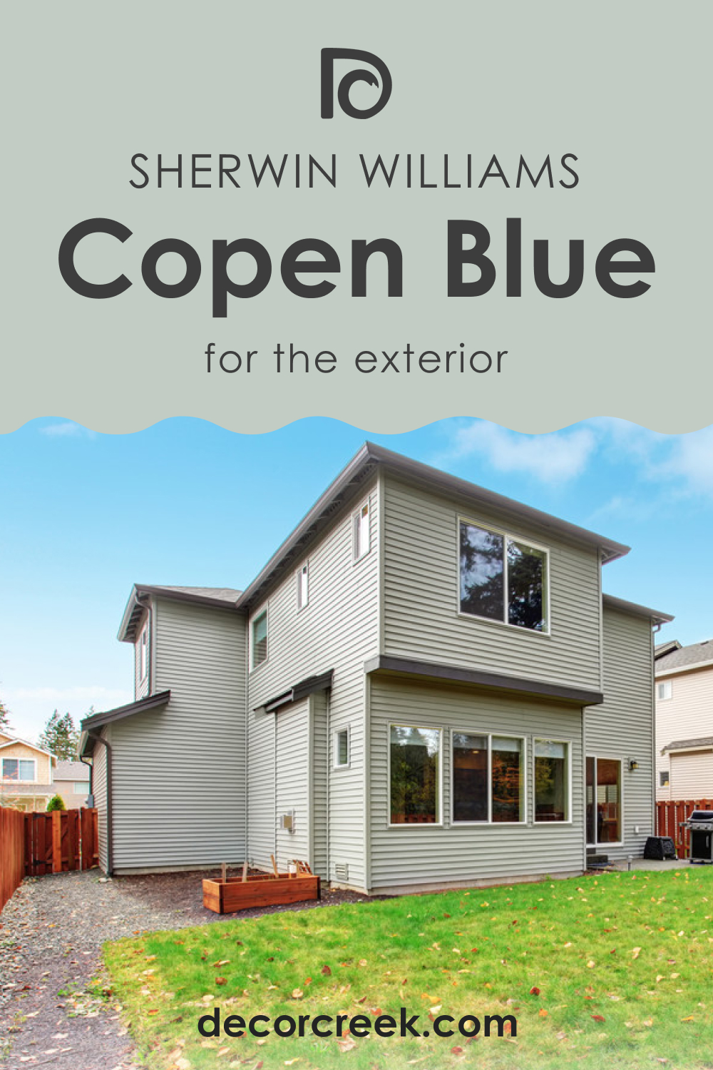
Copen Blue for the Exterior Use
SW Copen Blue can also work as an exterior paint, but you need to know that this color may vary depending on the lighting conditions. If it’s hit by direct sunlight, SW Copen Blue reads brighter and greener, but on a cloudy day with no sun, it will read cooler and bluer.
As you can see now, this color only seems so simple! SW Copen Blue is quite a chameleon, and you need to know in advance how it may behave.
But with the help of this article and the information we shared, you will easily use this beautiful yet somewhat tricky hue in your home!
Ever wished paint sampling was as easy as sticking a sticker? Guess what? Now it is! Discover Samplize's unique Peel & Stick samples.
Get paint samples
Frequently Asked Questions
⭐What color category does SW Copen Blue belong to?
This color belongs to the Historic Color category.
⭐Is this a popular color?
Yes, it’s quite popular. Besides, SW Copen Blue was the 2021 Sherwin-Williams Color of the Month.
⭐What color collections does this blue belong to?
SW Copen Blue can be found in such color collections as Creative and Teen Space collections.