Embarking on a journey to refresh your space often leads you to explore palettes that not only enhance the aesthetic appeal but also resonate with your personal style.
Among the myriad of hues available, SW 9657 Piedmont by Sherwin Williams emerges as a captivating choice for those aiming to infuse their homes with a sense of elegance and tranquility.
This particular shade belongs to the Sherwin Williams collection, known for their dedication to quality and an extensive range of color options catering to varied tastes and design objectives.
As a nuanced color, Piedmont stands out for its versatility and the gentle ambiance it creates. It seamlessly complements a wide array of decor styles, from modern minimalist to rustic charm, proving itself as a sophisticated backdrop for any room.
The beauty of this color lies in its ability to harmonize with both bold and subdued furnishings, making it a popular choice among homeowners and interior designers alike.
Whether you are contemplating a major renovation or a subtle update to your living space, Piedmont offers a refreshing alternative to common neutrals. It exudes a calm and welcoming energy, enriching environments without overwhelming them.
This article delves into the unique attributes of SW 9657 Piedmont, providing inspiration and practical advice on how to best integrate this shade into your home for a timeless and inviting look.

What Color Is Piedmont SW 9657 by Sherwin Williams?
Piedmont is a color that exudes warmth and versatility. Its subtle depth creates a serene atmosphere in any space, making it an ideal choice for those looking to achieve a feeling of understated elegance.
This hue possesses a blend of characteristics that straddle the line between a comforting beige and a gentle gray, providing a neutral foundation that can complement a wide array of design elements.
In terms of interior styles, Piedmont is particularly well-suited for spaces that aim to embody a modern farmhouse aesthetic, Scandinavian simplicity, or even the clean lines of contemporary design.
Its neutral, yet inviting palette brings a sense of calm to minimalist interiors while providing a rich backdrop that enhances the natural beauty of rustic elements.
When it comes to pairing with materials and textures, Piedmont shows remarkable versatility. It pairs beautifully with natural wood tones, from light oaks to rich walnuts, highlighting their inherent warmth.
In spaces that incorporate stone, whether sleek marble countertops or rugged stone fireplace surrounds, Piedmont enhances the natural veining and color variations.
Textiles in soft linen, chunky wool, or even smooth leather also complement this color well, adding layers of texture that make a room feel inviting.
Metals, too, from brushed brass to matte black, can offer striking contrasts that highlight Piedmont’s adaptable nature. Together, these combinations can create a cohesive space that feels both grounded and sophisticated.
Ever wished paint sampling was as easy as sticking a sticker? Guess what? Now it is! Discover Samplize's unique Peel & Stick samples.
Get paint samples

Is Piedmont SW 9657 by Sherwin Williams Warm or Cool color?
Piedmont is a color by Sherwin Williams that wields a unique charm, making it an ideal choice for various settings within a home. It’s not just a paint; it’s a mood enhancer – subtly transforming spaces with its deep and serene hue.
What makes this color stand out is its ability to act as a neutral backdrop while still adding depth and character to any room. Whether applied in living areas, bedrooms, or even bathrooms, it brings a sense of calmness, akin to the tranquil essence of nature.
Moreover, Piedmont’s versatility in pairing with a broad spectrum of accent colors and decorative styles is commendable. It can complement both modern minimalist and rustic, cozy interiors, showcasing its adaptability.
Natural light plays a significant role in how this color is perceived – under the bright daylight, it reveals a soft, inviting warmth, while artificial lighting highlights its richer, more nuanced undertones. This duality ensures that spaces painted in this color remain dynamic and engaging throughout the day.
Piedmont by Sherwin Williams thus offers a sophisticated palette that elevates the aesthetics of a home while infusing it with a balanced, soothing vibe.
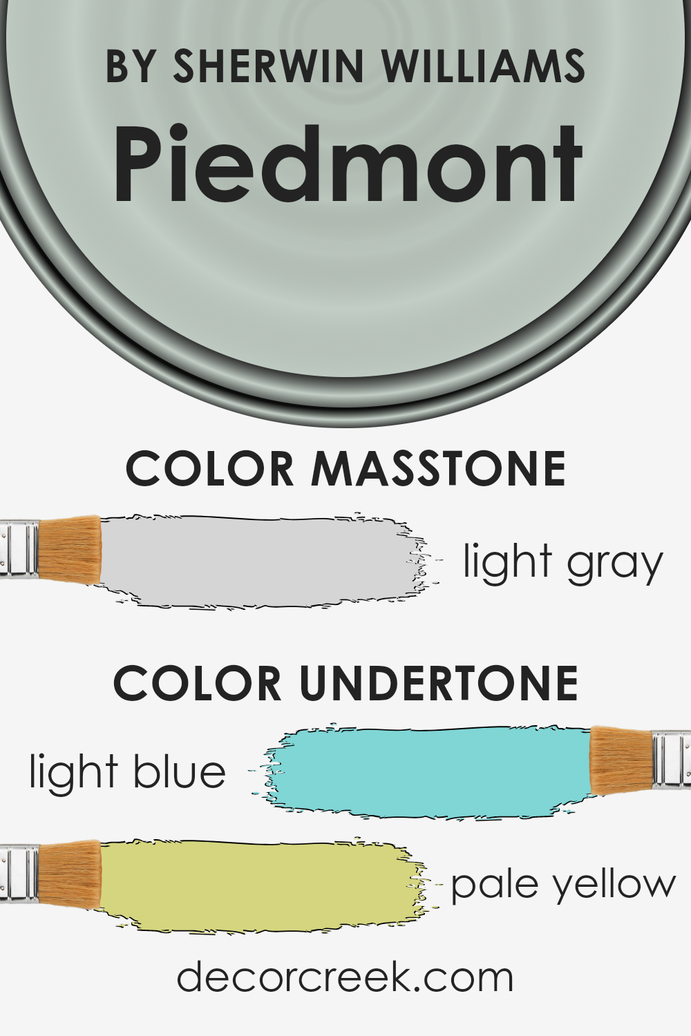
Undertones of Piedmont SW 9657 by Sherwin Williams
Piedmont, a unique paint color, carries subtle undertones that greatly influence its appearance and the atmosphere it creates within a space. The light blue and pale yellow undertones of this hue add a layer of depth and complexity, affecting the overall perception of the color.
Light blue, known for its calming and serene qualities, imparts a cool, refreshing vibe. This undertone can make a room feel more open and airy, encouraging a sense of tranquility and peace.
On the other hand, the pale yellow undertone adds warmth and light, creating an inviting and cozy ambiance.
The interplay between these undertones means that Piedmont can simultaneously offer coolness through its blue aspects while bringing warmth via its yellow hues, lending itself to a balanced and versatile color option for interiors.
When applied to interior walls, the effect of these undertones in the environment is notable.
The color’s perception can shift based on the room’s lighting, the time of day, and even the seasons, moving from a more pronounced freshness during ample daylight, accentuating its blue undertones, to a warmer, more subdued look in artificial lighting, highlighting the yellow undertones.
These shifting undertones make Piedmont a dynamic choice for spaces, ensuring the walls contribute positively to the room’s mood and overall aesthetic appeal.
Engaging these undertones thoughtfully can lead to uniquely beautiful spaces that feel both welcoming and calming.
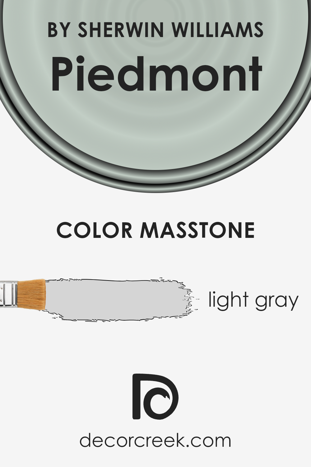
What is the Masstone of the Piedmont SW 9657 by Sherwin Williams?
The masstone of Piedmont, identified by the soft, light gray hue (#D5D5D5), plays a pivotal role in establishing serene and versatile backdrops in homes.
This fundamental characteristic allows it to adapt seamlessly across a wide range of interior styles, from modern minimalism to cozy Scandinavian and beyond.
Light gray, by nature, possesses an inherent neutrality that makes it exceptionally accommodating to various decor elements, enabling colors, textures, and materials to stand out without overwhelming the senses.
In spaces where natural light is abundant, this light gray shade can amplify brightness, creating an airy, open feel that enhances the sense of space. Conversely, in dimmer areas, it contributes to a more intimate atmosphere without the heaviness associated with darker hues.
The adaptability of its light gray masstone also means it can serve as a harmonious base for layering different shades and finishes, facilitating a cohesive look even in rooms that feature eclectic mixes of elements.
Furthermore, its subtle warmth can soften the hard edges of contemporary design, lending a gentle, inviting quality to homes. Whether used as a primary color scheme or as an accent, this light gray hue provides a calming, sophisticated canvas that elevates the aesthetic and mood of any living space.
How Does Lighting Affect Piedmont SW 9657 by Sherwin Williams?
Colors are not just a matter of personal taste but are also significantly influenced by the type and quality of light they are exposed to. This phenomenon affects how we perceive colors in different environments, making lighting an essential factor in color selection for any space.
The way a color looks can dramatically change when illuminated by natural light as compared to artificial light due to the variations in light temperature and intensity.
Taking a nuanced color as an example, which for illustration purposes we’ll refer to as a specific hue of complex gray, this color can exhibit a range of undertones and intensities depending on the lighting conditions.
Under artificial lighting, which can range from warm to cool tones depending on the bulb selected, the color might lean more towards its warm or cool undertones.
Warm artificial light can bring out more of the color’s subtle warmth, making the space feel cozy, whereas cool artificial lighting can highlight its cooler undertones, creating a more serene and tranquil environment.
In natural light, the color’s perception is subject to the room’s orientation. In north-facing rooms, light tends to be cooler and more consistent throughout the day.
This type of light can enhance the color’s cooler undertones, making it appear more mute and sophisticated.
South-facing rooms bask in warm, bright light for most of the day, which can make the color seem lighter and more vibrant, emphasizing its warmer qualities.
East-facing rooms enjoy the morning sunlight, which is warm and bright but quickly turns cooler as the day progresses. This means the color can appear vibrant and warm in the morning, gradually becoming more subdued as the day goes on.
Conversely, west-facing rooms receive the evening light, which starts cooler and becomes warmer and more intense towards sunset. Here, the color could transform from being understated in the morning to rich and warm in the glow of the setting sun.
Understanding the effects of different lighting conditions on colors can greatly aid in choosing the right paint color for a space, ensuring that the chosen hue complements the room’s ambiance at all times of the day.
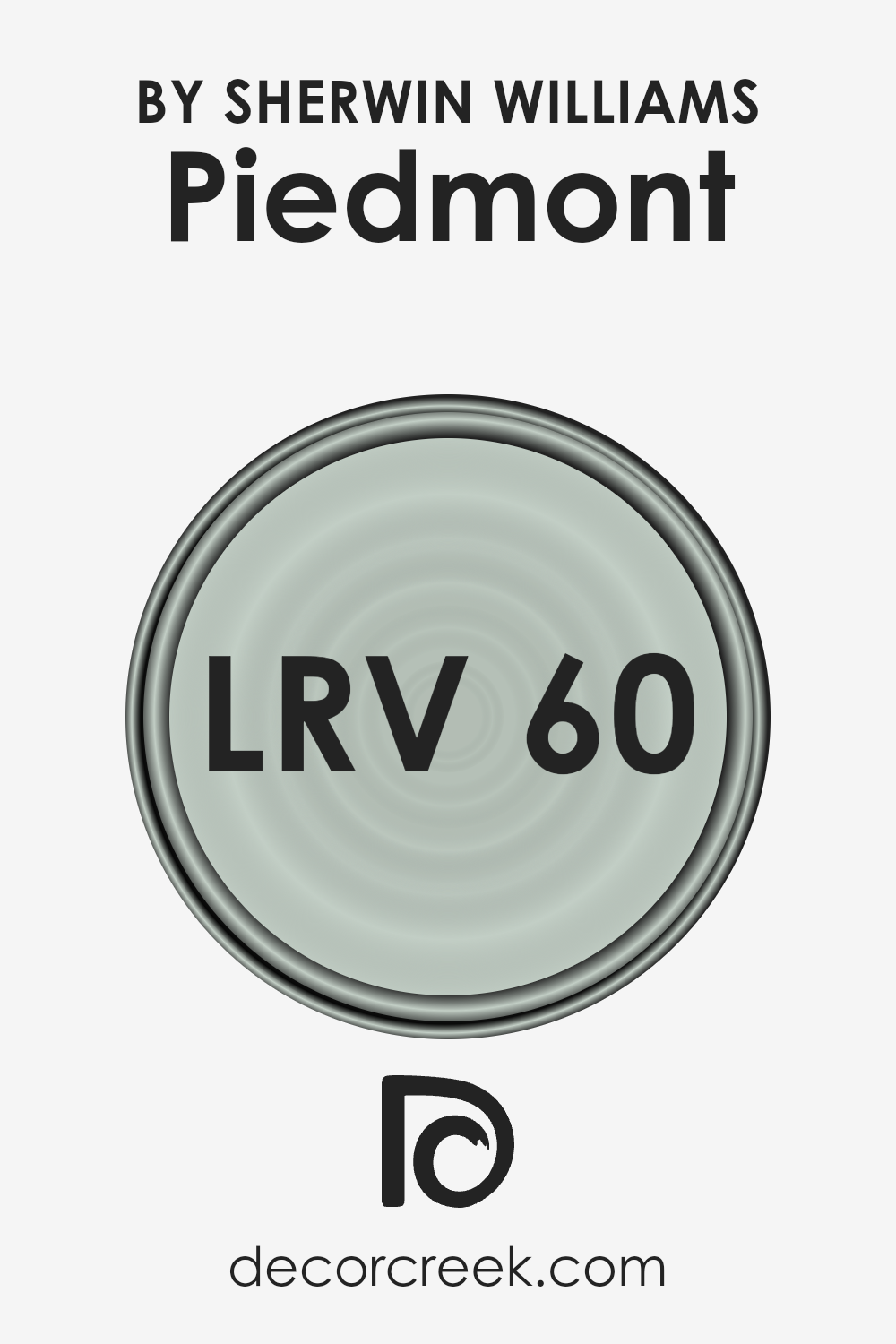
What is the LRV of Piedmont SW 9657 by Sherwin Williams?
Light Reflectance Value (LRV) is a crucial measure used in the design and painting industries to quantify the amount of visible and usable light that a color reflects or absorbs.
Ranging from 0 to 100, LRV helps in determining how light or dark a color appears once applied to a surface. Colors with a high LRV, closer to 100, reflect more light, making them appear brighter and creating a sense of spaciousness in a room.
Conversely, colors with a low LRV absorb more light, contributing to a cozier, more intimate feeling but potentially making a space feel smaller.
Understanding a color’s LRV is essential for designers and homeowners alike to ensure the chosen hues complement the desired ambiance and functionality of a room, especially considering the impact of natural and artificial lighting on color perception.
With an LRV of 59.765, the color in question occupies a middle ground on the LRV scale, meaning it possesses a balanced mix of light-reflecting and absorbing properties.
This particular shade is versatile enough to bring warmth to a room while still reflecting a significant amount of light, making the space feel welcoming and airy.
The LRV indicates that it is somewhat lighter than the midpoint of the scale, which aids in making a room look more spacious than darker colors would, yet without the risk of the color appearing too stark, as might happen with colors possessing a much higher LRV.
This ability to neither overwhelm a space with brightness nor swallow light makes it an excellent choice for those seeking a balanced, sophisticated look.
The LRV value implies that this color can adapt to various lighting conditions, subtly changing in perception from morning to evening, accentuating the dynamic character of the interior design.
LRV – what does it mean? Read This Before Finding Your Perfect Paint Color
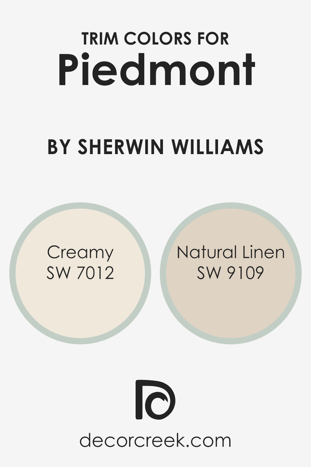
What are the Trim colors of Piedmont SW 9657 by Sherwin Williams?
Trim colors play a critical role in defining and enhancing the aesthetic appeal of any space, acting as a framing or accenting feature that complements or contrasts with the primary wall colors.
In the case of Piedmont by Sherwin Williams, selecting the right trim colors is essential to either subtly highlight the unique tones of this paint or create a striking visual boundary that further accentuates its beauty.
Trim colors such as SW 7012 – Creamy and SW 9109 – Natural Linen are perfect examples of how carefully chosen hues can elevate the overall look and feel of a room painted with Piedmont.
These trim colors are selected for their versatility and their ability to blend seamlessly with Piedmont’s distinctive shader ensuring a cohesive and inviting atmosphere.
SW 7012 – Creamy is a soft, warm hue that provides a gentle contrast against the depth and intensity of Piedmont, creating a soothing transition that enriches the space with a light, airy feel.
Its buttery tone captures the essence of coziness, making it an excellent choice for spaces where comfort and serenity are desired.
On the other hand, SW 9109 – Natural Linen offers a neutral backdrop with a hint of warmth, which can make the vibrant tones of Piedmont stand out even more.
This color, reminiscent of natural fabrics, instills a sense of calmness and earthiness, making it ideal for creating a welcoming and grounded space.
Together, these trim colors not only complement Piedmont but also contribute to a harmonious and beautifully coordinated color palette.
You can see recommended paint colors below:
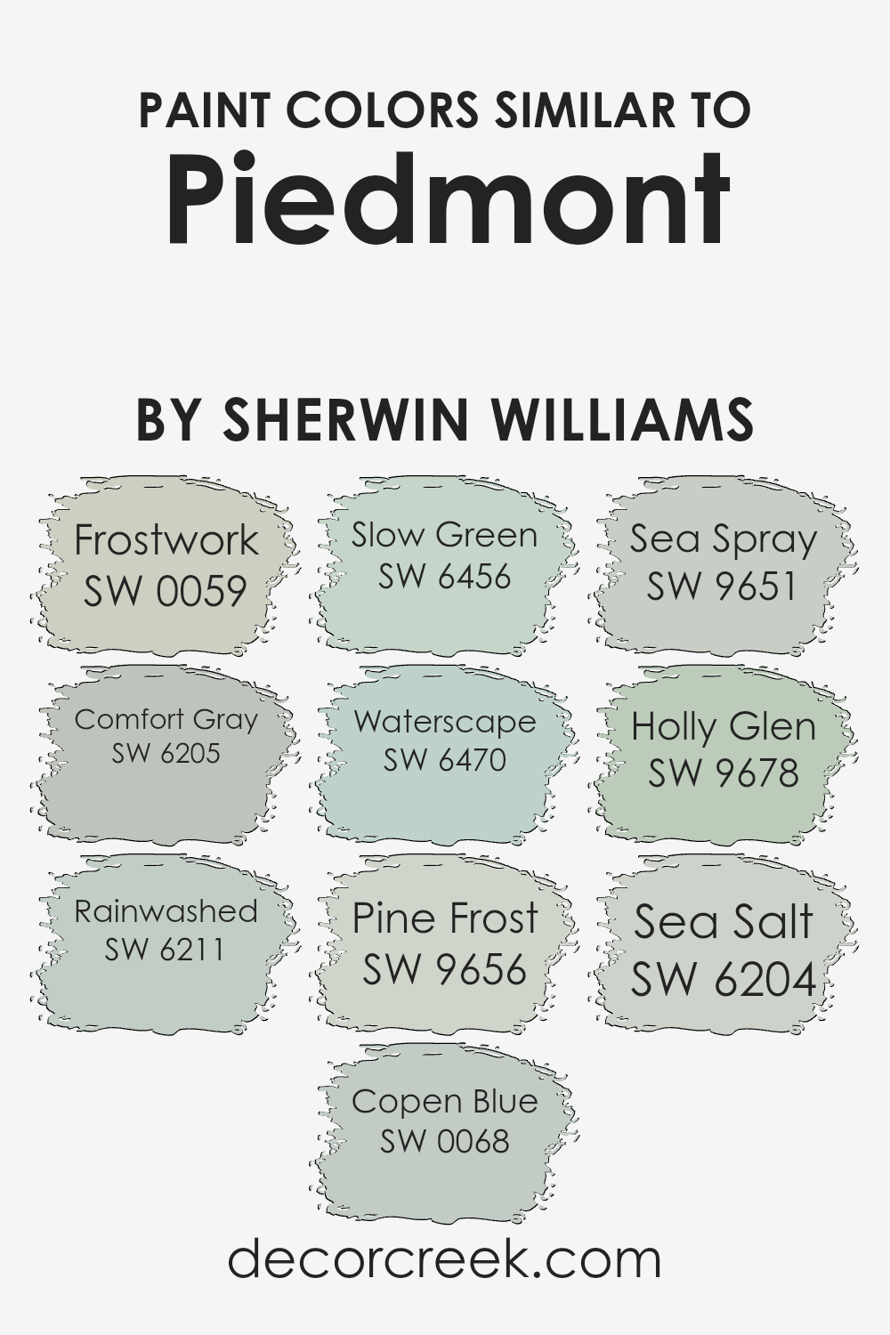
Colors Similar to Piedmont SW 9657 by Sherwin Williams
Similar colors play a crucial role in design and decoration by creating a cohesive and harmonious space.
These hues, despite their subtle differences, share a common base tone that allows them to blend seamlessly with one another, providing depth and character to an environment.
For instance, leveraging a palette of similar colors, such as those akin to Piedmont by Sherwin Williams, offers a versatile foundation for both serene, calming spaces and dynamic, captivating areas.
The art of using these similar colors lies in their ability to balance each other out, ensuring that no single shade overwhelms the space. Instead, they work in concert to foster a unified aesthetic that’s pleasing to the eye.
Frostwork is a delicately optimistic gray that whispers of dawn’s first light, while Comfort Gray provides a soothing, enveloping warmth reminiscent of a serene, overcast sky.
Rainwashed offers a refreshing splash of color, evoking the peacefulness of a gentle rain.
Copen Blue, with its dreamy depth, hints at distant horizons. Slow Green, a soft harmony of nature, brings the calming essence of a lush grove indoors. Waterscape captivates with its tranquil, reflective quality, mirroring a serene water body.
Pine Frost adds a subtle hint of evergreen, conjuring a crisp, forest air. Sea Spray, inspired by the ocean’s mist, offers a breath of fresh, invigorating air.
Holly Glen, with its muted green, suggests the quiet beauty of a shaded glen. Lastly, Sea Salt, evoking the purity and simplicity of the seaside, completes the collection with its understated elegance.
Together, these similar shades form a symphony of colors that enhance and enrich any space, demonstrating the power of nuanced color coordination.
You can see recommended paint colors below:
- SW 0059 Frostwork
- SW 6205 Comfort Gray
- SW 6211 Rainwashed
- SW 0068 Copen Blue
- SW 6456 Slow Green
- SW 6470 Waterscape
- SW 9656 Pine Frost
- SW 9651 Sea Spray
- SW 9678 Holly Glen
- SW 6204 Sea Salt
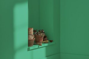
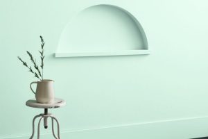
How to Use Piedmont SW 9657 by Sherwin Williams In Your Home?
Piedmont is a versatile hue from Sherwin Williams, encapsulating the serene beauty of a fog-laden landscape with its subtle green undertone.
This color exudes tranquility and natural elegance, making it a perfect choice for those looking to bring a touch of outdoor serenity into their homes.
Its muted quality allows it to seamlessly blend with a variety of decor styles, from minimalist to rustic, enhancing spaces without overwhelming them.
In the living room, Piedmont can serve as a soothing backdrop, encouraging relaxation and conversation, or as an accent wall, it can bring a room to life, highlighting architectural features or artwork.
In bedrooms, its calming effect can contribute to a restful ambiance, promoting peace and comfort.
Kitchens and bathrooms also benefit from this color, where it can introduce a fresh, clean feel. Paired with natural materials like wood or stone, Piedmont truly shines, bridging the gap between indoor comfort and the natural world outside.
Its adaptability makes it an excellent choice for those wishing to create a cohesive look throughout their home, ensuring spaces are not only beautiful but also inviting.
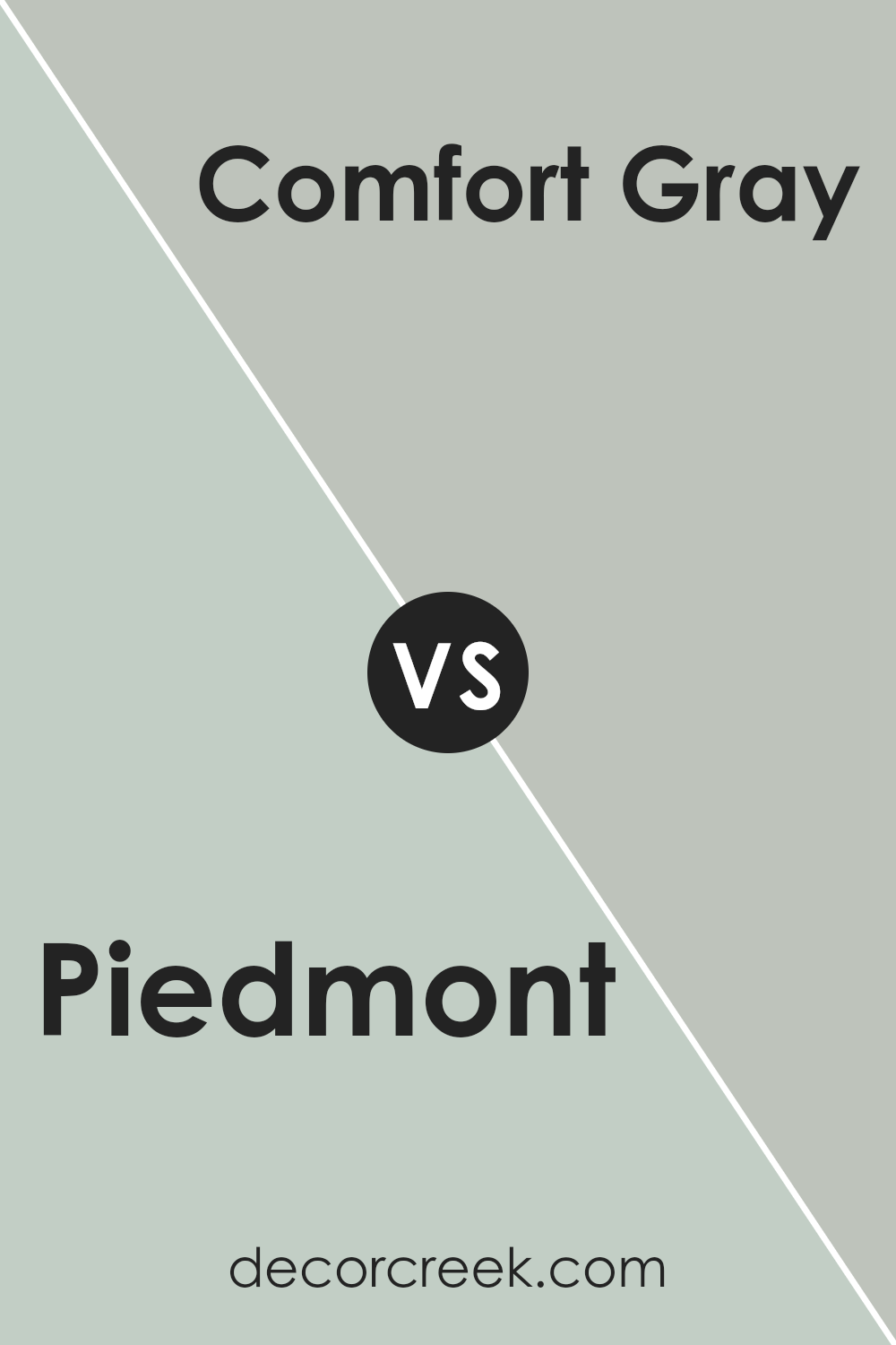
Piedmont SW 9657 by Sherwin Williams vs Comfort Gray SW 6205 by Sherwin Williams
Piedmont and Comfort Gray , both from Sherwin Williams, offer distinct visual experiences. Piedmont presents as a deep, rich blue with a subtle hint of green, evoking the feeling of sophistication and depth.
This color brings an element of serenity and depth to spaces, suitable for creating a striking statement or a calm, reflective ambiance.
On the other hand, Comfort Gray lives up to its name with a soothing blend of gray and green. This color leans more towards a muted, soft palette, promoting a relaxed and comforting atmosphere.
It’s versatile, fitting seamlessly into various decor styles, from coastal to contemporary.
While Piedmont might command attention in a space, adding drama and intensity, Comfort Gray offers a backdrop that’s understated yet equally engaging, promoting peace and tranquility.
Together, these colors could provide a balanced contrast – Piedmont adding boldness and depth, with Comfort Gray softening and soothing the overall feel.
You can see recommended paint color below:
- SW 6205 Comfort Gray
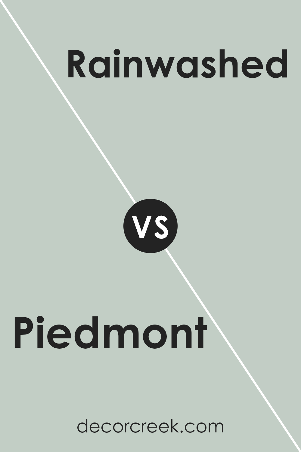
Piedmont SW 9657 by Sherwin Williams vs Rainwashed SW 6211 by Sherwin Williams
Piedmont and Rainwashed , both by Sherwin Williams, present a captivating contrast that highlights their individual appeal. Piedmont emerges as a deeply sophisticated color, offering a rich, earthy tone that resonates with warmth and grounding energy.
Its depth makes it an excellent choice for spaces seeking a touch of elegance and serenity, wrapping rooms in a cozy, inviting ambiance.
On the other hand, Rainwashed embodies a lighter, airier presence. This color brings a refreshing and tranquil vibe, reminiscent of a serene sky after a gentle rain. It’s an uplifting hue that enhances spaces with a clean, soothing, and rejuvenating atmosphere.
Together, these colors create a dynamic palette, where Piedmont’s luxuriant depth can anchor and complement the ethereal lightness of Rainwashed, offering endless possibilities for creating harmonious and balanced spaces that cater to a variety of tastes and moods.
You can see recommended paint color below:
- SW 6211 Rainwashed
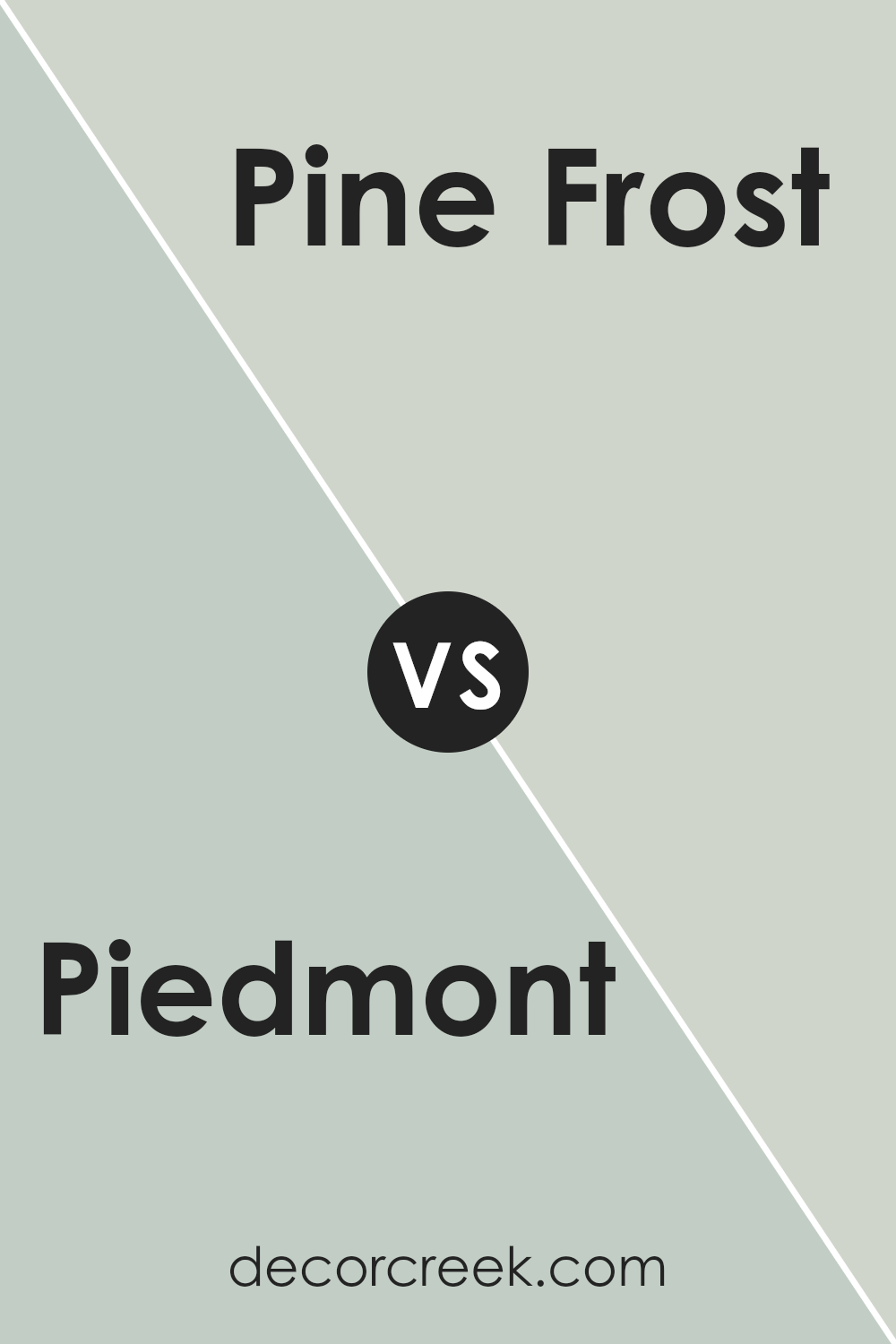
Piedmont SW 9657 by Sherwin Williams vs Pine Frost SW 9656 by Sherwin Williams
Piedmont and Pine Frost , both from Sherwin Williams, offer distinct tones that cater to a variety of design aesthetics. Piedmont presents as a muted yet rich hue, reminiscent of earthy clay.
It embodies warmth and depth, making it an excellent choice for spaces that aim to feel cozy and enveloping. T
his color thrives in natural light, where its full spectrum can truly shine, bringing a grounded yet sophisticated atmosphere to any room.
In contrast, Pine Frost exudes a cooler, more refreshing vibe. It leans towards the lighter, airier side of the color spectrum, offering a breath of fresh air to interiors. Its subtle green undertones mimic the serene quality of frost-covered pine needles, hence its name.
This color can open up smaller spaces or bring a calming presence to a busy environment.
While both colors come from the same collection, their individual characteristics allow them to serve very different purposes in home décor. Piedmont centers spaces with its warmth, whereas Pine Frost introduces a crisp, tranquil ambiance.
You can see recommended paint color below:
- SW 9656 Pine Frost
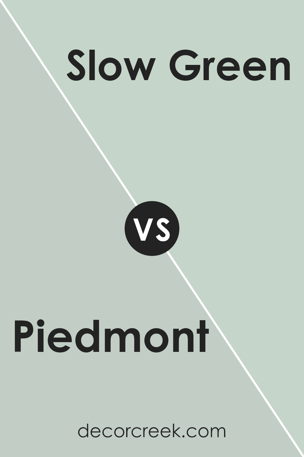
Piedmont SW 9657 by Sherwin Williams vs Slow Green SW 6456 by Sherwin Williams
Piedmont and Slow Green , both from Sherwin Williams, present a captivating contrast that reflects their distinct characteristics within the realm of interior and exterior design. Piedmont stands out with its deeper, richer tone, offering a sense of comfort and grounding.
This color can imbue spaces with a sense of stability and elegance, making it a perfect choice for areas where a cozy yet sophisticated atmosphere is desired.
On the other hand, Slow Green is a lighter, more refreshing hue that embodies tranquility and renewal. Its softer presence brings a natural, calming effect to environments, making it ideal for spaces aimed at relaxation and rejuvenation.
While both colors draw inspiration from nature, Piedmont’s earthy depth provides a strong foundation, contrasting with Slow Green’s airy and uplifting vibe.
This makes them versatile in their own rights, capable of creating diverse aesthetics depending on the setting and complementary colors chosen.
You can see recommended paint color below:
- SW 6456 Slow Green
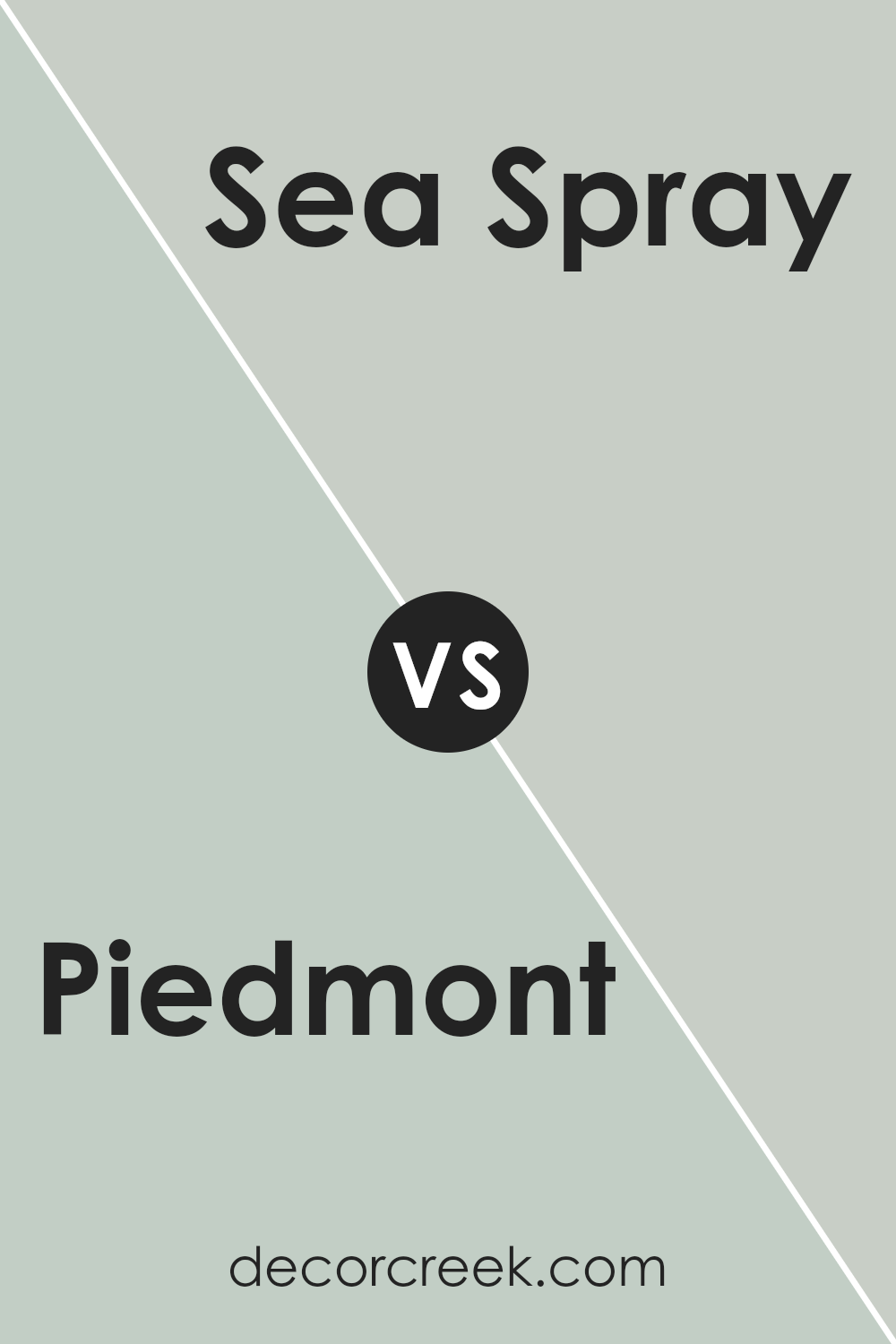
Piedmont SW 9657 by Sherwin Williams vs Sea Spray SW 9651 by Sherwin Williams
Piedmont is a sophisticated hue that leans into the world of serene, pastel greens, with a whisper of grey undertones, providing a sense of calm and restful ambience to any space.
Its muted quality allows it to act as a versatile backdrop, harmonizing with both bright accents and subdued tones for a balanced interior.
On the other hand, Sea Spray plays in a slightly different palette, offering a lighter, airier vibe that evokes the freshness of the ocean breeze. It’s a color that brings a crisp, clean feel to rooms, perfect for creating an invigorating yet peaceful space.
Its subtle blue-green undertones make it ideal for spaces aiming for a refreshing coastal or nautical theme. When compared, Piedmont offers a grounding, earthy quality, anchoring spaces with its richer depth, while Sea Spray provides a lift, elevating interiors with its breezy lightness.
Both colors offer unique avenues for creating serene, inviting spaces but cater to different aesthetic preferences and moods.
You can see recommended paint color below:
- SW 9651 Sea Spray
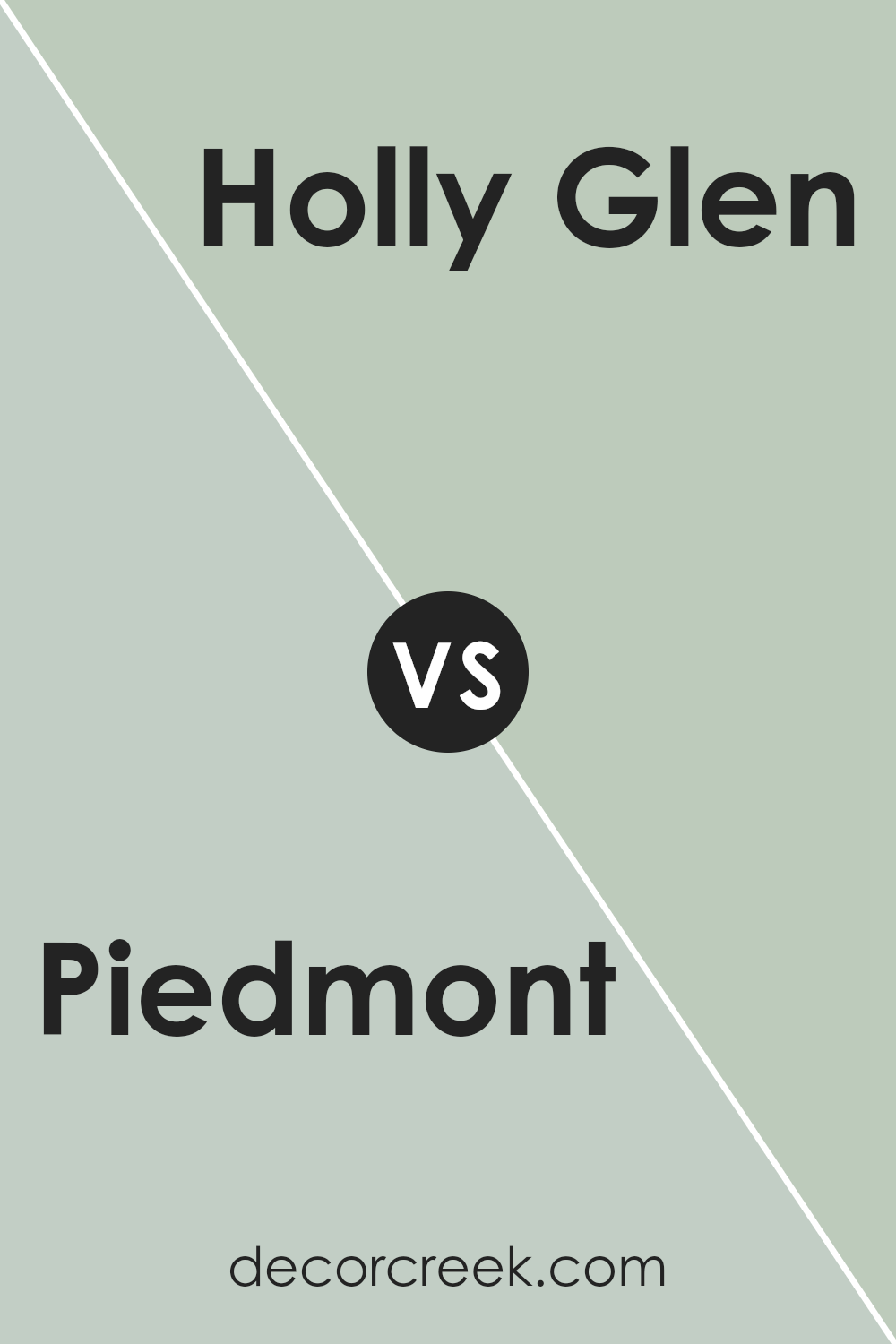
Piedmont SW 9657 by Sherwin Williams vs Holly Glen SW 9678 by Sherwin Williams
Piedmont and Holly Glen , both by Sherwin Williams, present distinctive tones that cater to varied aesthetic preferences and design needs. Piedmont offers a deep, rich hue that evokes a sense of sophistication and calm.
Its depth provides a substantial grounding effect, making it an excellent choice for spaces where a sense of intimacy and serenity is desired.
In contrast, Holly Glen stands out with a lighter, more refreshing vibe. This color brings an airy and open feel to any space, promoting a sense of renewal and tranquility.
While Piedmont leans towards creating a more enveloping and cozy atmosphere, Holly Glen offers a contrasting brightness that can visually enlarge a space and bring a lively freshness.
Both colors exhibit unique qualities: Piedmont, with its depth and warmth, is ideal for creating focal points or cozy nooks; Holly Glen, with its lightness, enhances a room’s openness and light.
Depending on the desired ambiance and functionality of the room, each color offers distinctive advantages.
You can see recommended paint color below:
- SW 9678 Holly Glen
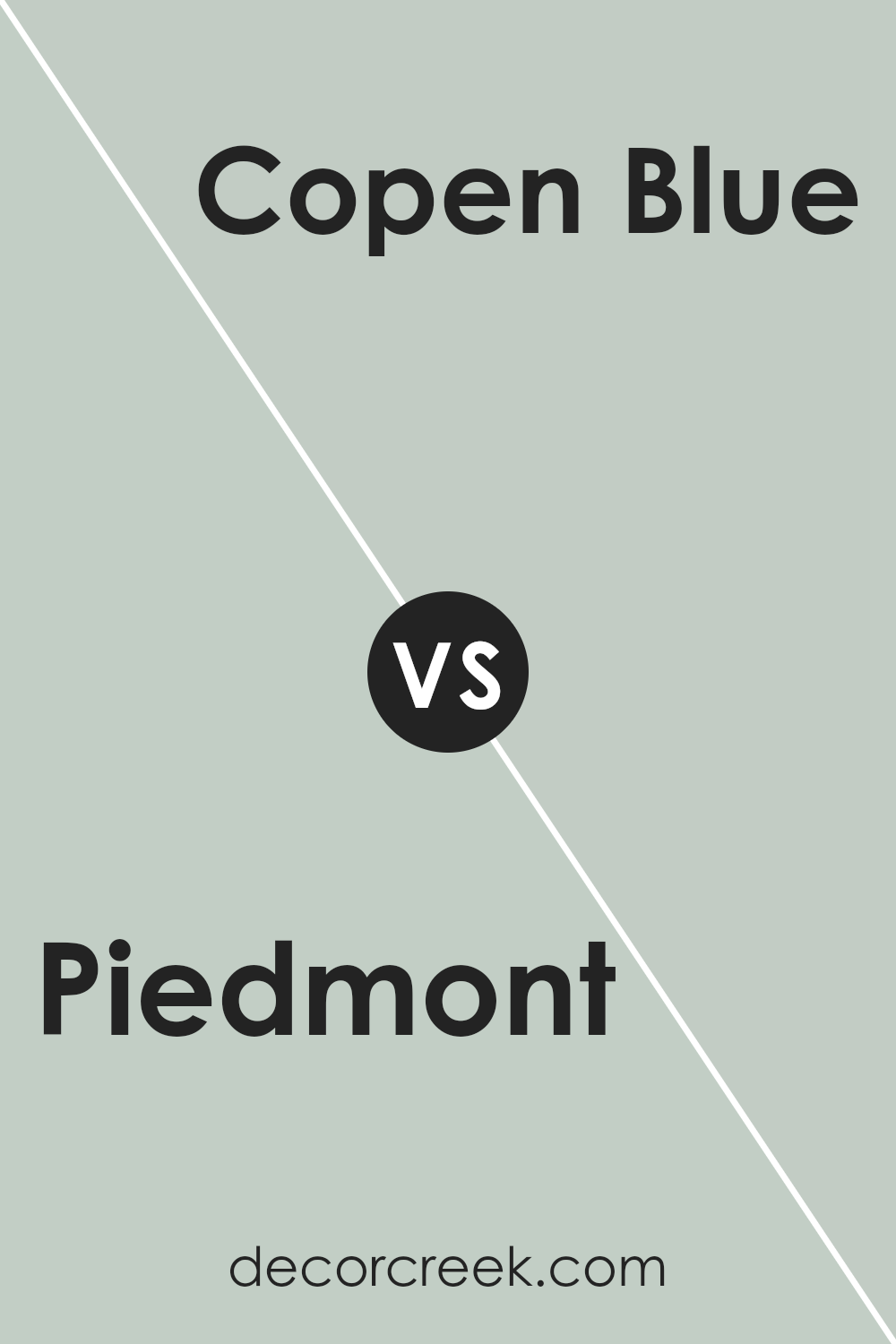
Piedmont SW 9657 by Sherwin Williams vs Copen Blue SW 0068 by Sherwin Williams
Piedmont is a nuanced shade that subtly incorporates earthy elements into its composition, presenting a warm and inviting feel. Its understated elegance can anchor a space, bringing a sense of calm and sophistication.
This color tends to adapt well in various lighting, maintaining its inviting warmth throughout the day.
On the other hand, Copen Blue offers a refreshing contrast. It’s a serene and gentle hue that echoes the tranquility of a clear sky or the calmness of a gentle sea.
Copen Blue has the ability to create a soothing and airy atmosphere, making spaces feel open and revitalized.
It’s particularly effective in areas where a sense of relaxation and peace is desired, such as bedrooms or bathrooms.
While Piedmont leans more towards grounding and warm undertones, Copen Blue elevates a space with its light and refreshing vibe. Both colors offer unique aesthetics; Piedmont creating a cozy, intimate feel, and Copen Blue fostering an open, tranquil environment.
Choosing between them depends on the desired mood and atmosphere of the room.
You can see recommended paint color below:
Piedmont SW 9657 by Sherwin Williams vs Frostwork SW 0059 by Sherwin Williams
Piedmont and Frostwork , both from Sherwin Williams, showcase unique characteristics in their color profiles, setting them apart in the spectrum of interior design choices.
Piedmont presents a deeply rich and welcoming hue, reminiscent of earthen clay, infusing spaces with a warmth that’s both comforting and subtle.
It’s a color that speaks of stability and grounding, making it ideal for creating a cozy sanctuary or adding depth to a sophisticated palette.
Frostwork, on the other hand, offers a lighter, airier presence. This color resembles the delicate touch of frost’s kiss on a winter morning, blending hints of coolness with a soft, almost ethereal quality.
It’s perfect for brightening spaces or adding a serene, calming touch to any room.
The gentle luminosity of Frostwork contrasts with the earthy solidity of Piedmont, providing a versatile option for those seeking a breath of freshness without sacrificing tranquility.
Together, these colors cater to different moods and design visions, from the grounded warmth of Piedmont to the light, refreshing embrace of Frostwork, showcasing the dynamic range and emotional depth colors can bring to our surroundings.
You can see recommended paint color below:
- SW 0059 Frostwork
Piedmont SW 9657 by Sherwin Williams vs Sea Salt SW 6204 by Sherwin Williams
Piedmont and Sea Salt from Sherwin Williams are two colors that bring different moods and atmospheres to spaces. Piedmont is a deep, rich, earthy color, reminiscent of lush landscapes and nature’s depth.
Its warmth and grounding qualities make it ideal for creating a cozy, inviting, and sophisticated environment.
It pairs well with natural materials and can add a sense of elegance to a room.
On the other hand, Sea Salt is a light, airy, and soothing hue. It’s a versatile color that captures the essence of a crisp, breezy day by the shore.
With its subtle green undertones, Sea Salt brings a refreshing and calming presence, making it perfect for bathrooms, bedrooms, or any space intended to be a tranquil retreat.
It reflects light beautifully, creating a sense of openness and purity.
Together, Piedmont and Sea Salt embody the balance between earth’s grounding forces and the liberating, refreshing qualities of the sea.
While Piedmont anchors a space with its depth and richness, Sea Salt introduces a breath of fresh air, offering a harmonious blend for those looking to combine sophistication with serenity.
You can see recommended paint color below:
Piedmont SW 9657 by Sherwin Williams vs Waterscape SW 6470 by Sherwin Williams
Piedmont and Waterscape are two distinct colors from Sherwin Williams, each offering a unique ambiance to any space. Piedmont is a serene and subtle hue, embodying a sense of calmness and tranquility.
Its lightness provides an airy feeling, making it ideal for creating a peaceful and inviting atmosphere in interiors. This color works well in rooms where relaxation and reflection are desired, such as bedrooms and living rooms.
On the other hand, Waterscape stands out with its vibrant and refreshing energy. This color captures the essence of clear, tropical waters, infusing spaces with a sense of rejuvenation and clarity.
Waterscape’s more pronounced vibrancy makes it a perfect choice for spaces intended to inspire creativity and uplift spirits, such as kitchens, bathrooms, or any area that benefits from a splash of vitality.
While both colors share a connection to nature, Piedmont leans towards a muted, earthy palette, promoting restfulness and serenity. Waterscape, conversely, invites an active and invigorating ambiance, reminiscent of oceanic expanses.
The choice between Piedmont and Waterscape ultimately depends on the desired mood and function of the space, making both colors versatile in their own right.
You can see recommended paint color below:
Conclusion
The article extensively delves into the subtle elegance of Piedmont, a paint offering from Sherwin Williams. This color, characterized by its serene and versatile nature, emerges as a favored choice for homeowners and designers alike aiming to create spaces that evoke tranquility and warmth.
Piedmont’s adaptability is highlighted as one of its strongest attributes, allowing it to seamlessly integrate into a variety of design aesthetics, from minimalist to rustic, and everything in between.
It serves as an ideal backdrop, capable of enhancing the visual appeal of interiors without overwhelming the senses, making it a go-to option for those seeking a timeless look.
Moreover, the article underscores the practical advantages of choosing this particular shade for both residential and commercial spaces. The durability and premium quality of the paint guarantee long-lasting beauty and performance, thus offering value for investment.
In terms of styling, Piedmont proves to be incredibly accommodating, pairing well with a wide range of colors and materials, and bringing out the best in furniture and decor.
As a testament to its versatility, the color is celebrated for its ability to elevate the mood of a room, making spaces feel more inviting and comfortable.
Whether applied in large areas or as an accent, Piedmont stands out as a sophisticated choice, embodying both aesthetic elegance and functional excellence.
Ever wished paint sampling was as easy as sticking a sticker? Guess what? Now it is! Discover Samplize's unique Peel & Stick samples.
Get paint samples