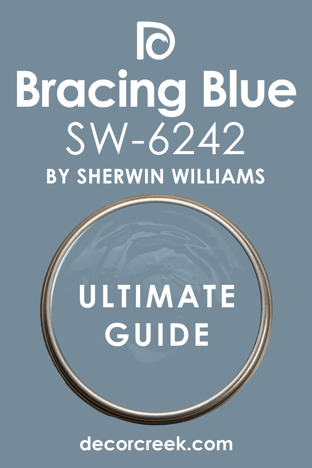
In the wide and vibrant world of color, there is an array of hues that may pique your interest, but few command the same attention and provide the same depth as Sherwin-Williams’ SW 6242 Bracing Blue. This captivating color brings a sense of tranquility, strength, and sophistication to spaces, elevating them from the mundane to the extraordinary.
What Color Is SW 6242 Bracing Blue?
SW 6242 Bracing Blue is a rich and deep blue color that draws inspiration from the powerful ocean depths. It embodies a balance between the freshness of a clear sky and the majesty of a midnight expanse. The color carries a feeling of stability, refinement, and quiet intensity that enhances its allure.
Bracing Blue is also reminiscent of the dark denim hue. The comforting familiarity it carries transforms spaces into welcoming and comfortable areas, providing a versatile option for interior and exterior applications.
This vibrant color blends sophistication and simplicity in perfect unison, making it an excellent choice for both traditional and contemporary settings.
Ever wished paint sampling was as easy as sticking a sticker? Guess what? Now it is! Discover Samplize's unique Peel & Stick samples.
Get paint samples

Is It a Warm Or Cool Color?
Warm-toned colors create homey vibes and make your interiors feel cozier, whilst cooler hues add a note of freshness. SW Bracing Blue is classified as a cool color. Like most cool colors, this blue hue is associated with calming and relaxing effects, with the potential to make a space appear larger.
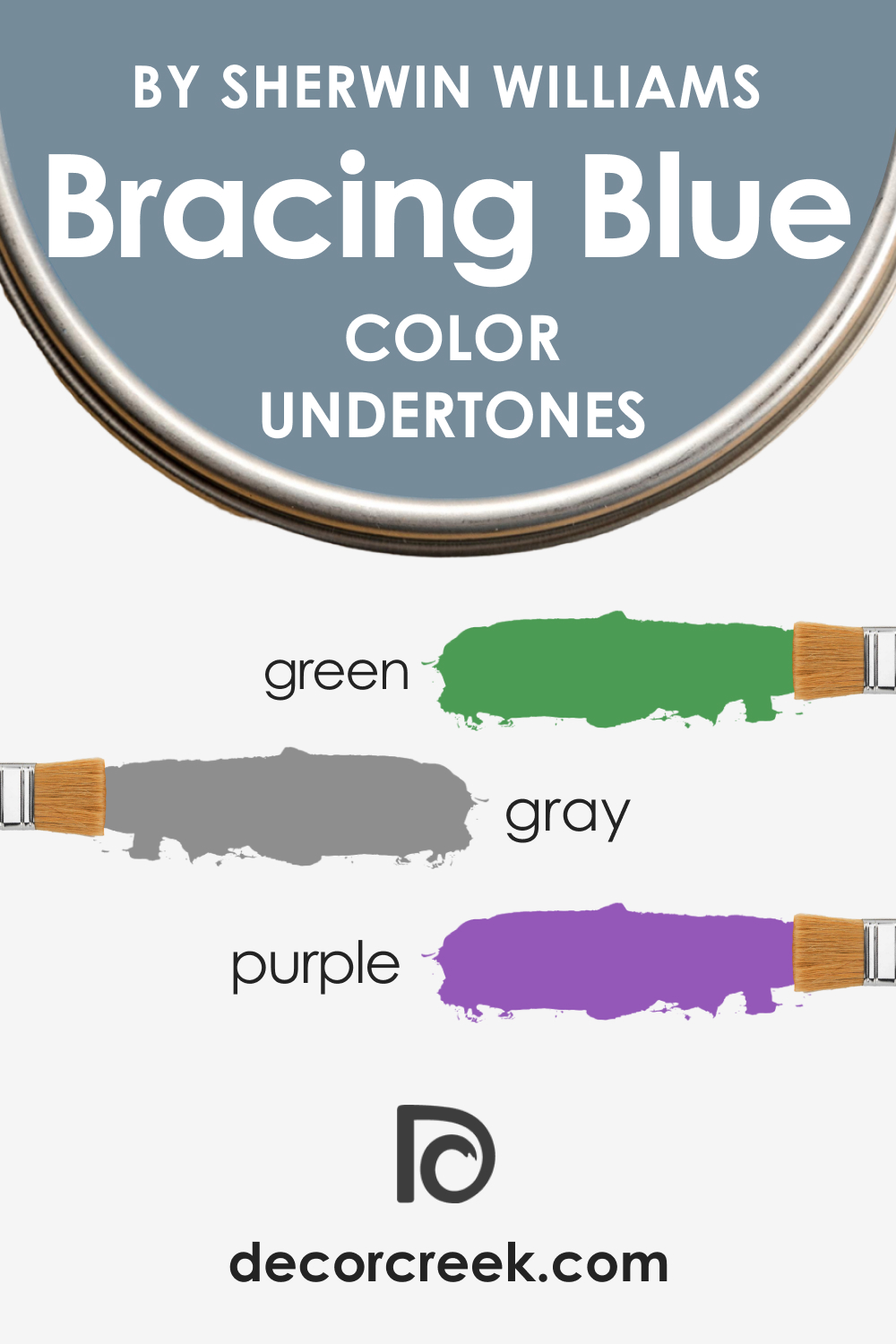
Undertones of SW 6242 Bracing Blue
Undertones are subtle colors present within the main hue that influence how we perceive the primary color. They can affect the color’s warmth or coolness and can shift based on lighting conditions and the colors around them.
SW Bracing Blue can be considered a complex color due to its multiple undertones:
- Grey Undertone: Bracing Blue contains a subtle grey undertone which gives it a muted quality, ensuring that despite its depth, it doesn’t overwhelm a room.
- Purple Undertone: A faint purple undertone provides a hint of warmth, offering an inviting touch to its overall cool demeanor.
- Green Undertone: The green undertone, though not overt, lends a touch of earthiness to this blue, grounding it and preventing it from seeming too cold.
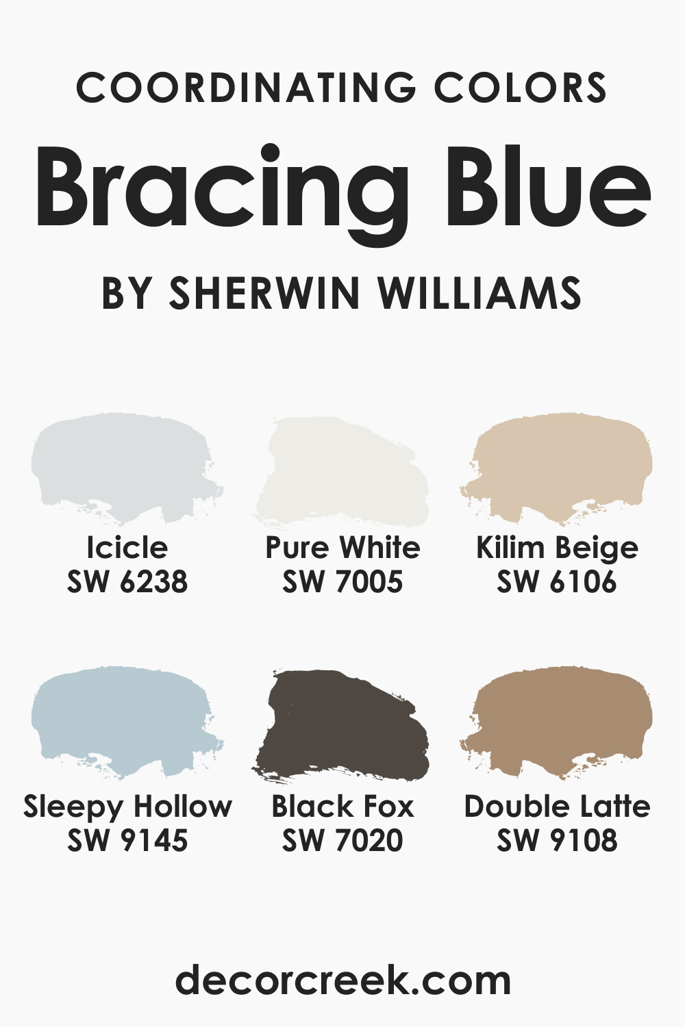
Coordinating Colors of SW 6242 Bracing Blue
Coordinating colors are hues that work harmoniously with the primary color. They help to create a balanced and cohesive color palette, ensuring the space feels unified and pleasing to the eye. SW Bracing Blue is best coordinated by the following colors:
- SW 6238 Icicle: A lighter, softer hue that balances the depth of SW Bracing Blue with its airy freshness.
- SW 9145 Sleepy Hollow: An earthy grey with cool undertones that complements and enhances the richness of SW Bracing Blue.
- SW 9108 Double Latte: This warm neutral beige provides a delightful contrast to SW Bracing Blue, creating a balanced color palette.
Additional colors you might want to consider:
- SW 7005 Pure White: This pristine white brings out the rich depth of SW Bracing Blue while adding a crisp contrast.
- SW 7020 Black Fox: A deep, sophisticated grey that complements and grounds the intensity of SW Bracing Blue.
- SW 6106 Kilim Beige: An inviting beige that offers a soothing warmth to balance the coolness of SW Bracing Blue.
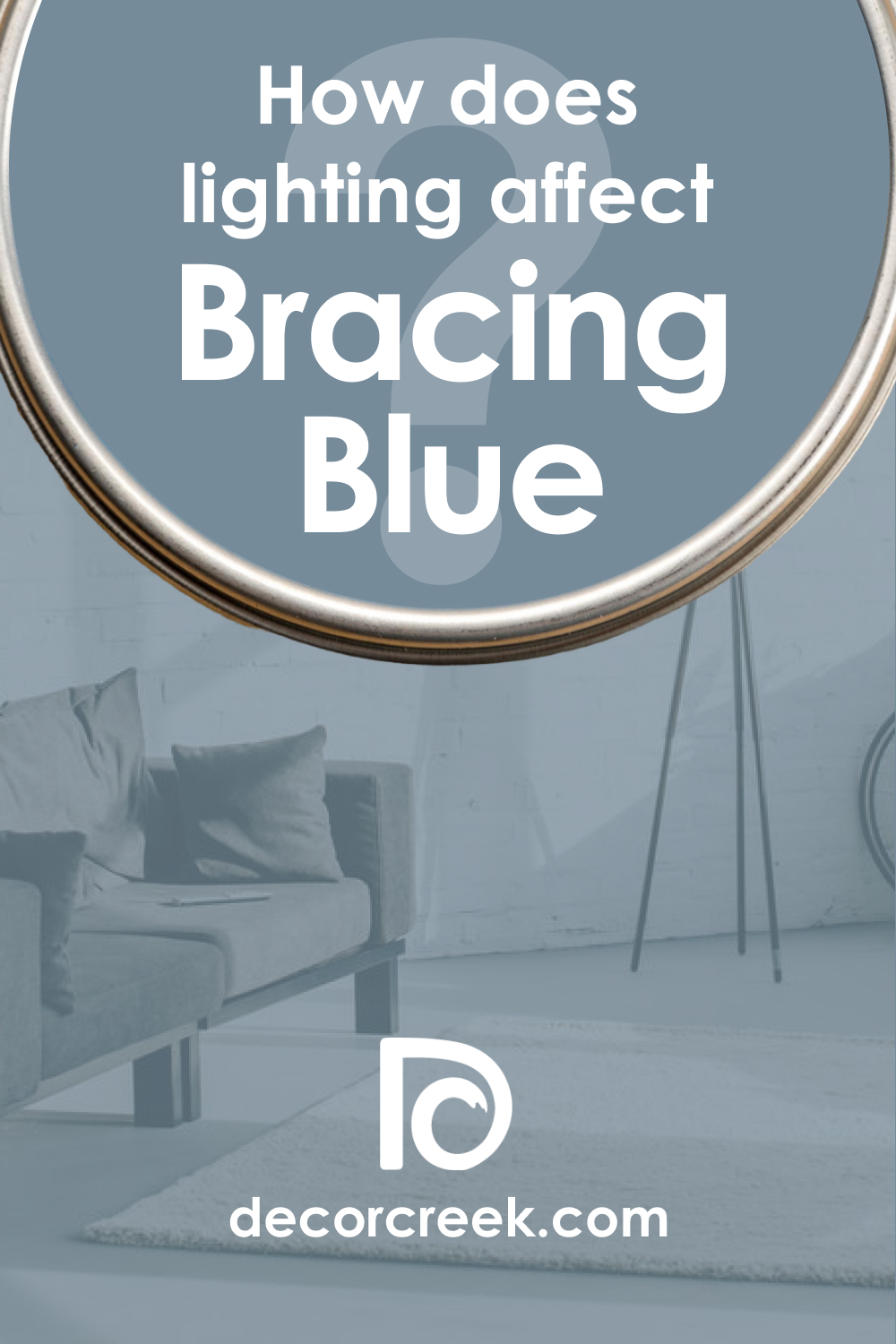
How Does Lighting Affect SW 6242 Bracing Blue?
Lighting can greatly affect the way SW Bracing Blue is perceived. In a well-lit space with abundant natural light, the color can appear slightly brighter, and the grey undertones become more apparent, giving it a softer and more muted look.
In contrast, in spaces with limited natural light or with warmer artificial lights, the blue becomes richer and deeper, and the purple undertones subtly shine through, giving the color a cozy, warm feel.
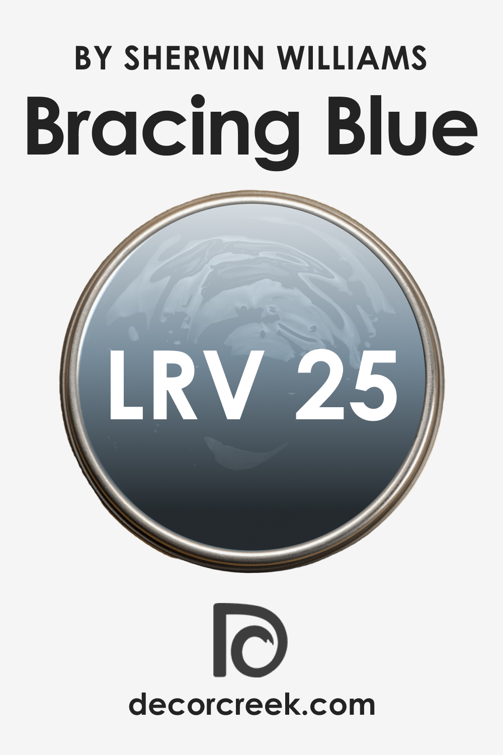
LRV of SW 6242 Bracing Blue
The Light Reflectance Value (LRV) of color indicates how much light it reflects. The LRV is a critical consideration in interior design because it affects how light or dark a room feels. It can influence the mood, perceived size, and overall atmosphere of a space.
SW Bracing Blue has an LRV of 25, meaning it falls in the medium-dark range. It’s not so dark that it absorbs most light, making a room feel small or gloomy, but it is rich enough to provide depth and sophistication.
A color with an LRV of 25 can bring warmth and intimacy to a spacious room, preventing it from feeling too stark or cold. Alternatively, in a smaller space, this depth of color can make a strong and bold statement, particularly when used sparingly or as an accent.
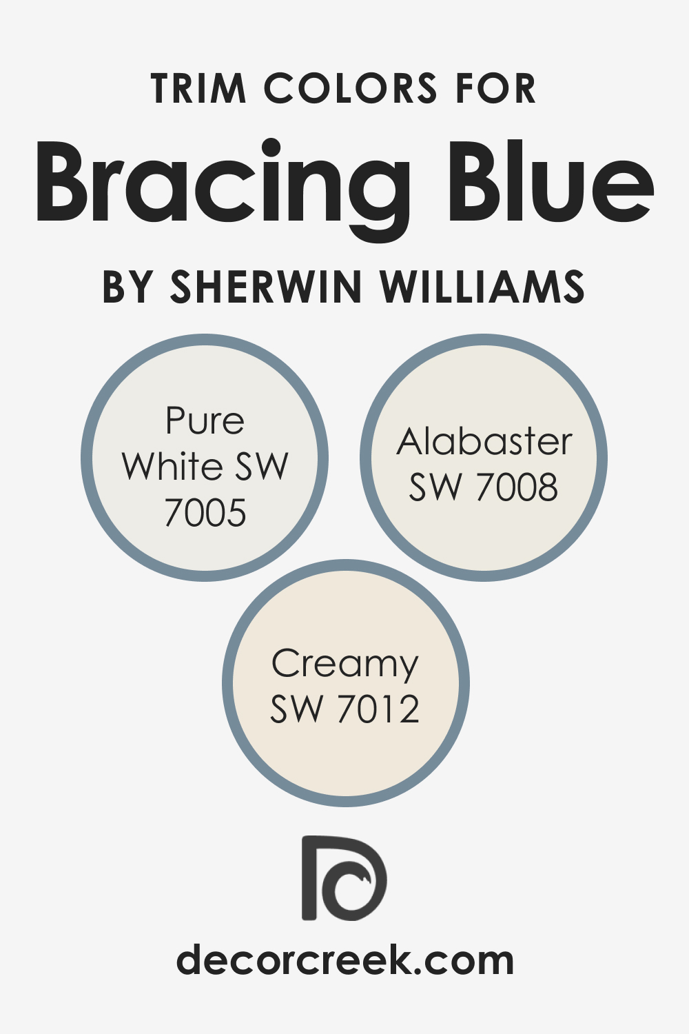
Trim Colors of SW 6242 Bracing Blue
Trim colors are typically used on baseboards, window and door frames, and crown molding. They can either contrast with or complement the main wall color. By properly selecting the trim color, it can enhance the overall color scheme, highlight architectural details, and unify different colors used in space. SW Bracing Blue works best with the following trim colors:
- SW 7005 Pure White: For a crisp, high-contrast look, Pure White makes the Bracing Blue pop and adds a modern touch.
- SW 7008 Alabaster: A slightly creamier white, Alabaster brings out the warmer undertones in Bracing Blue for a cozy feel.
- SW 7012 Creamy: This off-white shade with a hint of beige softens the intensity of Bracing Blue, providing a harmonious transition.
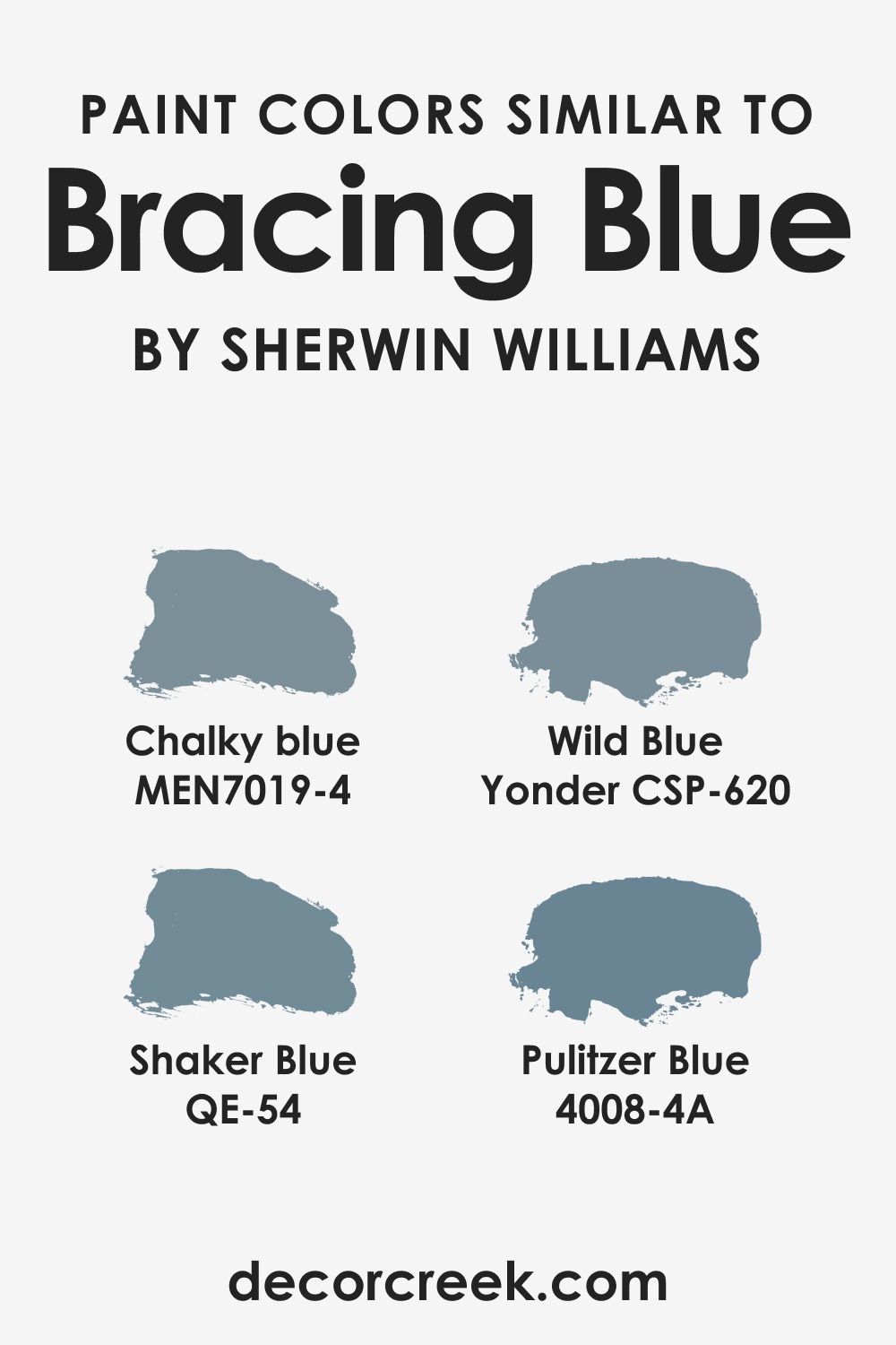
Colors Similar to SW Bracing Blue
Knowing similar colors will help you create a more balanced and eye-pleasing atmosphere in your home, as well as find substitute colors should you decide to change the current hue. SW Bracing Blue can be substituted with the following shades of blue:
- Behr Shaker Blue
- BM Wild Blue Yonder
- PPG Chalky Blue
- Valspar Pulitzer Blue
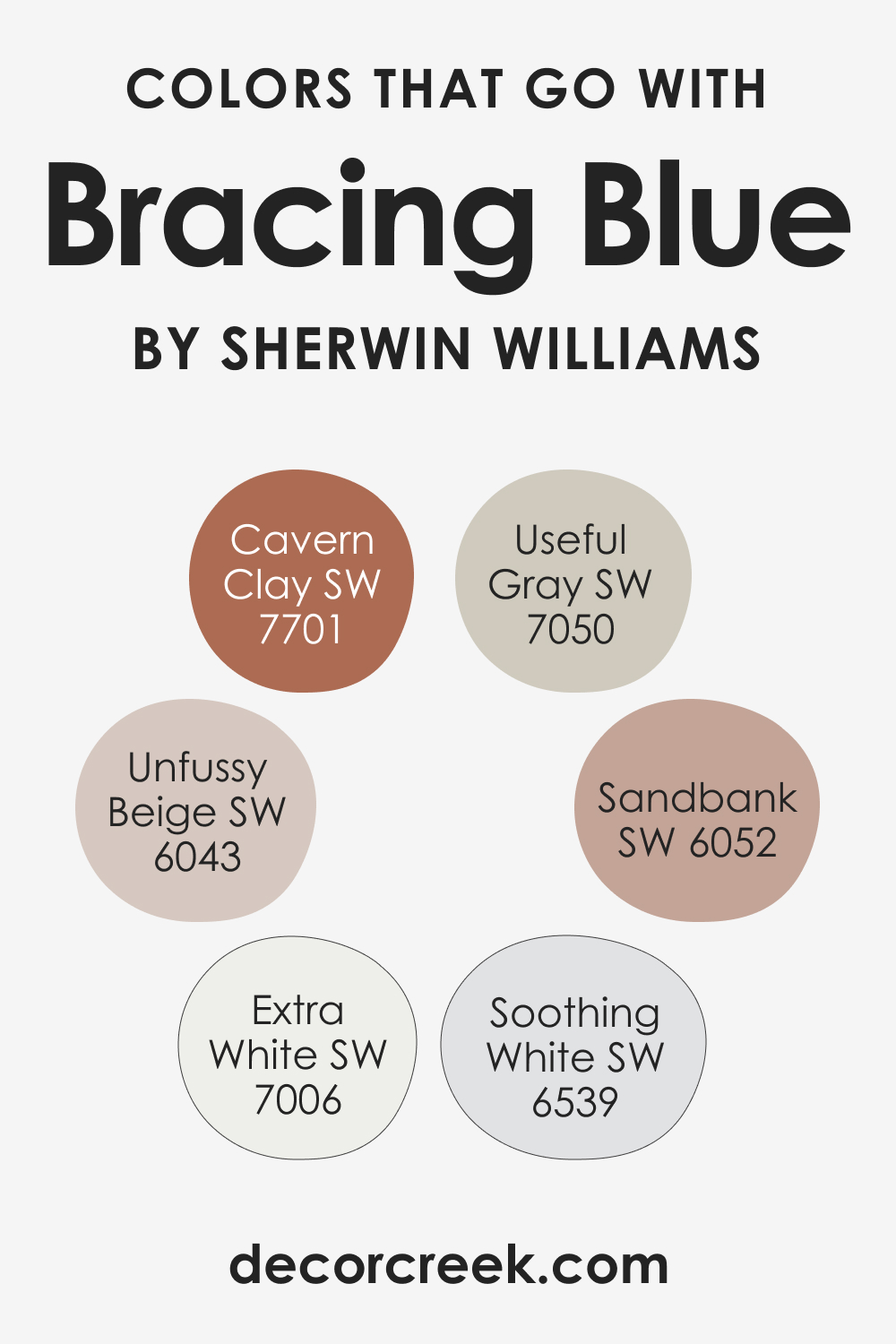
Colors That Go With SW 6242 Bracing Blue
Choosing colors that work well together is crucial for creating a visually pleasing environment. They can complement each other, create contrast, or balance out the overall color scheme. Speaking of SW Bracing Blue, this hue can work well with the following colors, for example:
- SW 7050 Useful Gray: This neutral gray pairs perfectly with Bracing Blue, providing balance.
- SW 7701 Cavern Clay: This warm, earthy color contrasts and warms up the coolness of Bracing Blue.
- SW 6043 Unfussy Beige: This neutral beige offers a soft and calming backdrop to the bold Bracing Blue.
- SW 6052 Sandbank: A taupe-based color that lends a grounded, earthy vibe.
- SW 7006 Extra White: An absolute white that creates a dramatic and clean contrast.
- SW 9029 Soothing White: A warm white that complements the Bracing Blue with its creamy undertone.
How to Use SW 6242 Bracing Blue In Your Home?
SW Bracing Blue is versatile and can be used in various rooms and in multiple styles. Whether you prefer the coastal vibes, transitional style, or even a modern look, Bracing Blue can fit perfectly. It works as a bold statement on all walls or as a striking accent color.
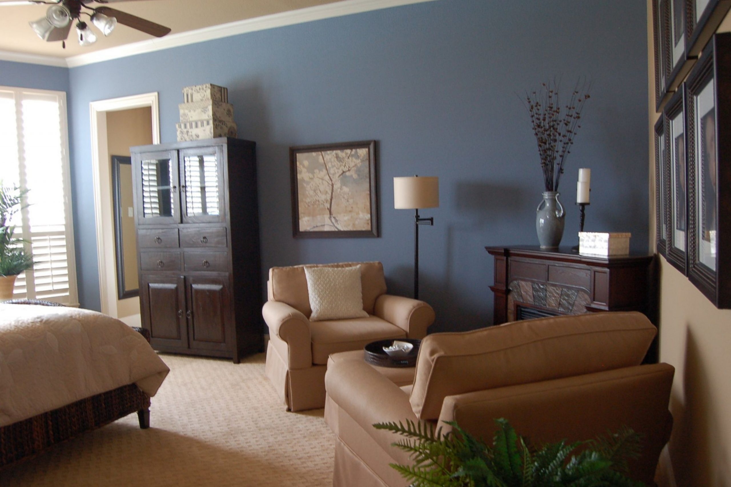
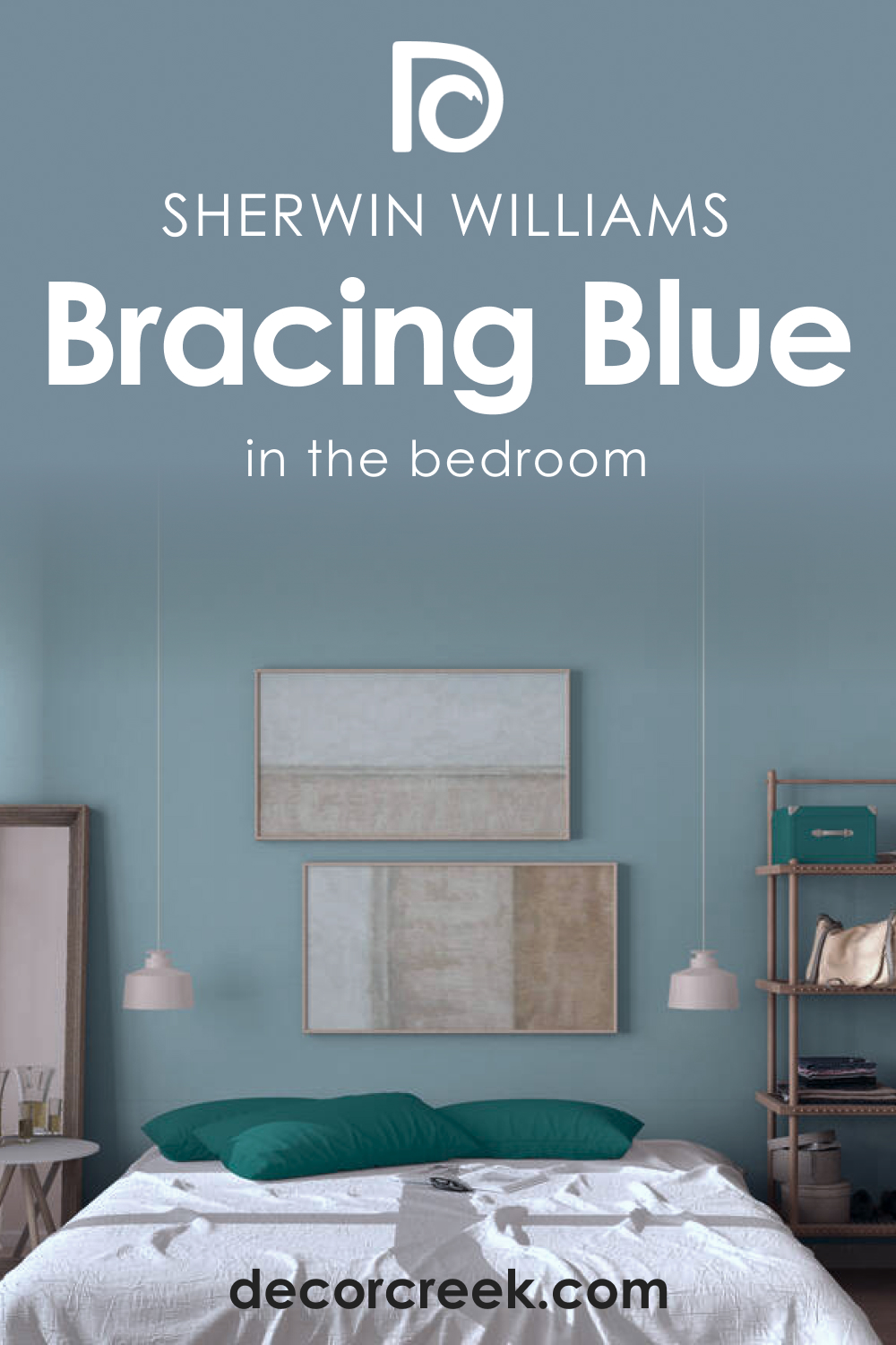
How to Use SW 6242 Bracing Blue in the Bedroom?
The relaxing and calming properties of Bracing Blue make it an excellent choice for bedrooms. On all walls, it can create a serene and restful ambiance, perfect for a good night’s sleep. Alternatively, it can be used on a feature wall, behind the bed, for a more dramatic and modern look. SW Bracing Blue also works well with wood tones, from light pine to dark mahogany. Combining it with warm textiles and soft lighting can enhance the cozy feel of the bedroom.
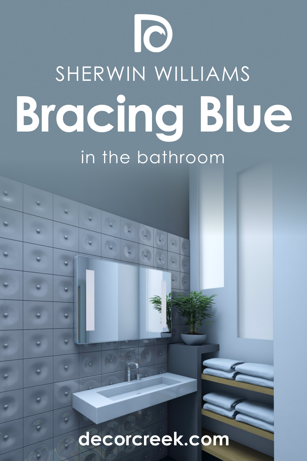
How to Use SW 6242 Bracing Blue in the Bathroom?
In a bathroom, SW Bracing Blue can bring a touch of luxury and depth. It is reminiscent of the deep sea, evoking a spa-like atmosphere that promotes relaxation and rejuvenation. Paired with white fixtures and accessories, SW Bracing Blue makes a striking statement.
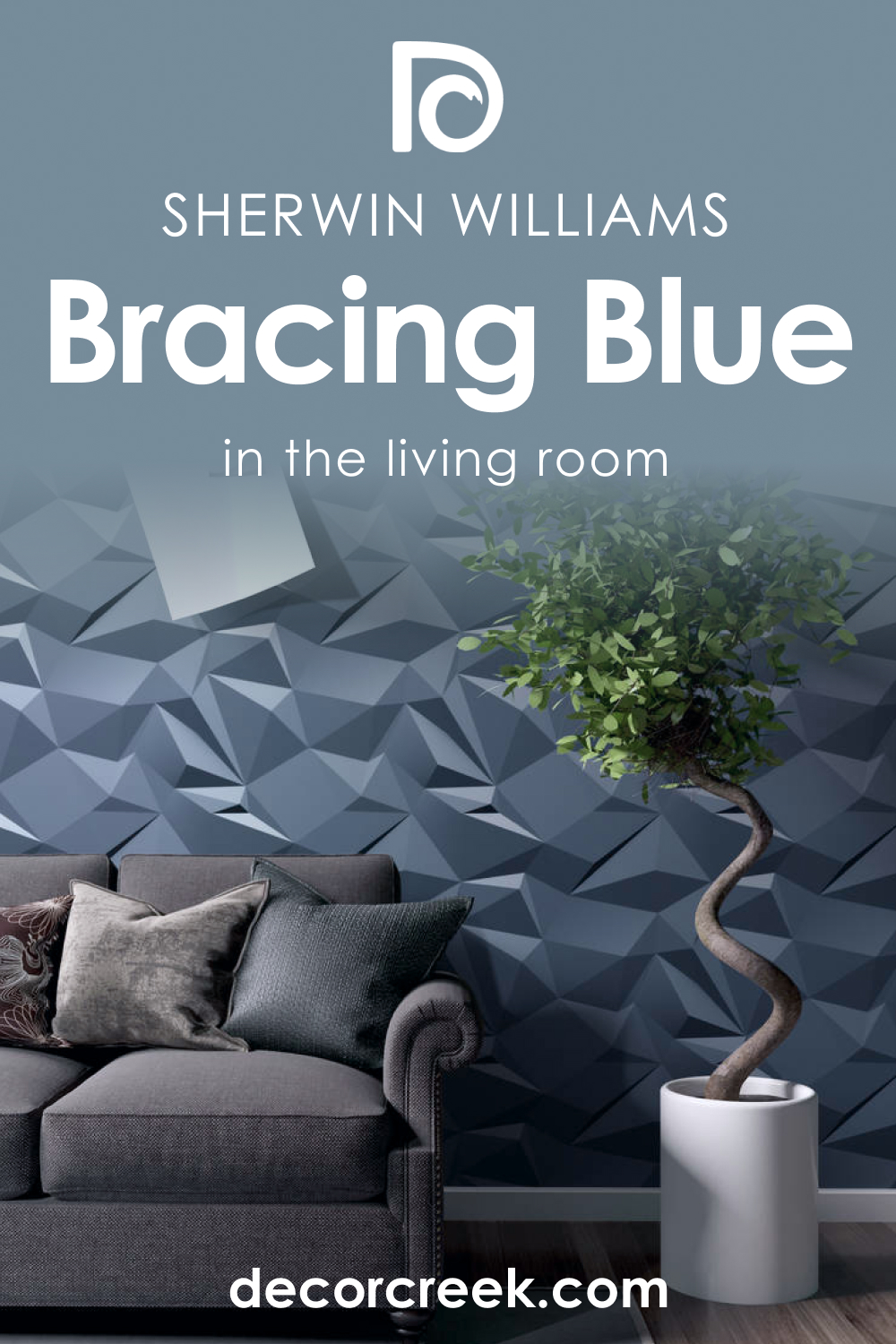
How to Use SW 6242 Bracing Blue in the Living Room?
In the living room, SW Bracing Blue can be used to create a sophisticated and welcoming environment. Whether on all walls or just an accent wall, this color adds depth and richness. Paired with soft neutrals and warm wood tones, the room becomes a perfect blend of comfort and style.
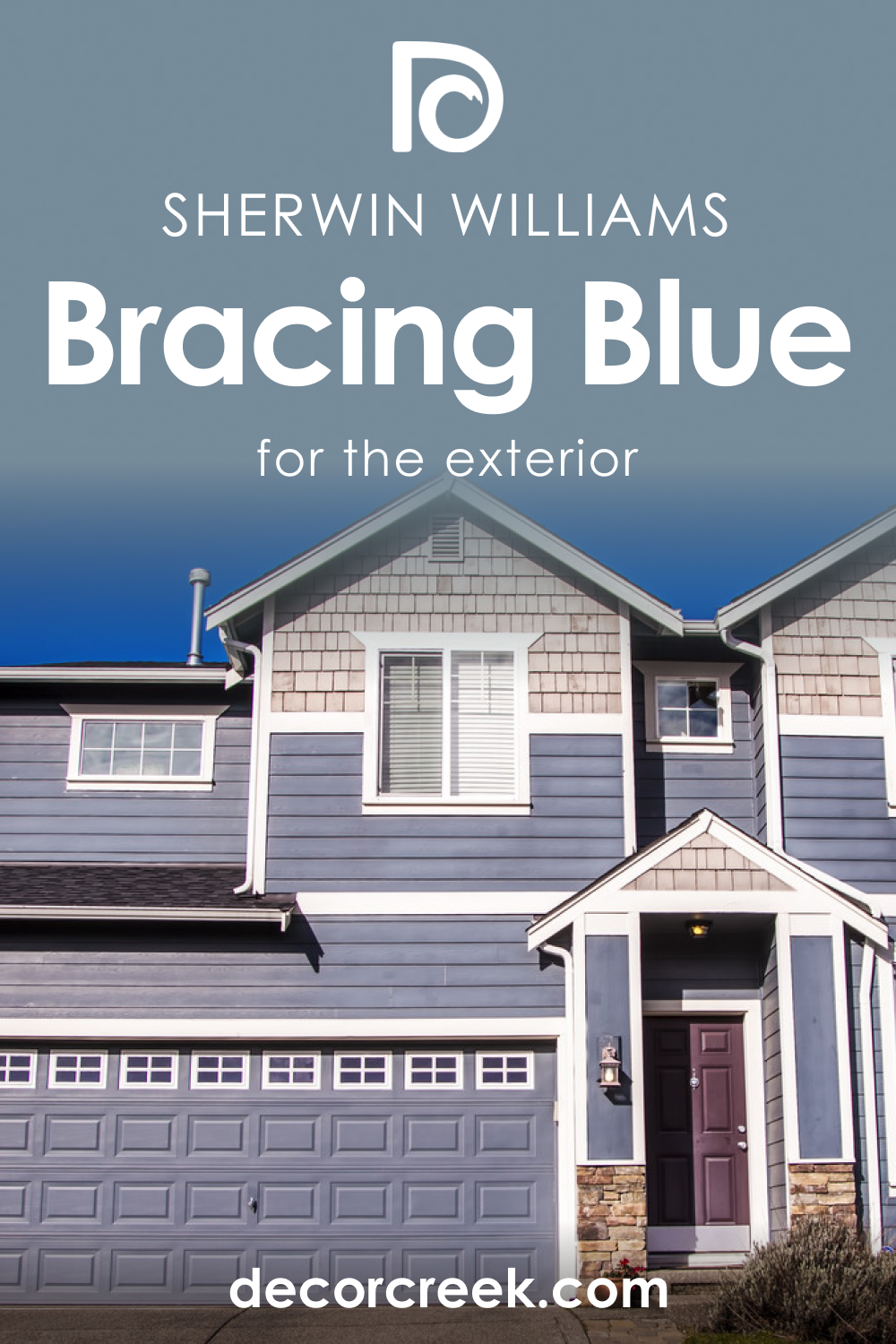
How to Use SW 6242 Bracing Blue for an Exterior?
SW Bracing Blue is a fantastic choice for exteriors. It’s deep enough to make a bold statement but not too dark to become overwhelming. Paired with white trims and a warm-hued front door, it creates an inviting and elegant facade.
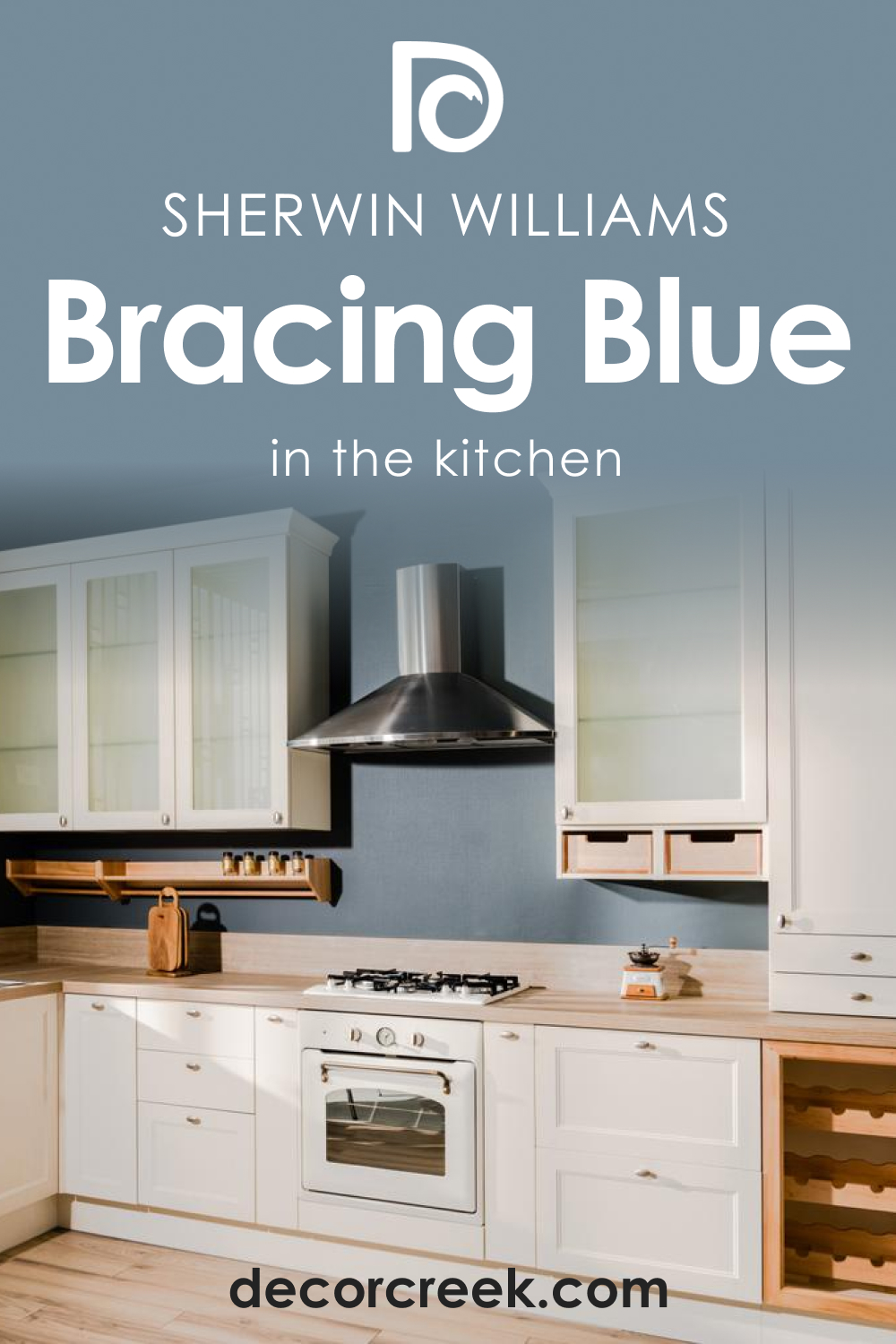
How to Use SW 6242 Bracing Blue for the Kitchen?
SW Bracing Blue can bring a unique touch to the kitchen. Used on cabinets, it provides a bold contrast against a light-colored backsplash and countertop. The depth of the color also works well with stainless steel appliances and fixtures.
Comparing SW 6242 Bracing Blue With Other Colors
When compared to other blues, SW Bracing Blue stands out due to its depth and sophistication. It is deeper and richer than lighter blues, for example. At the same time, it is more vibrant and energetic than dark navy blues or grays. This makes it a perfect in-between for those who want a striking yet inviting color. Below, you can read how this color compares to several other hues.
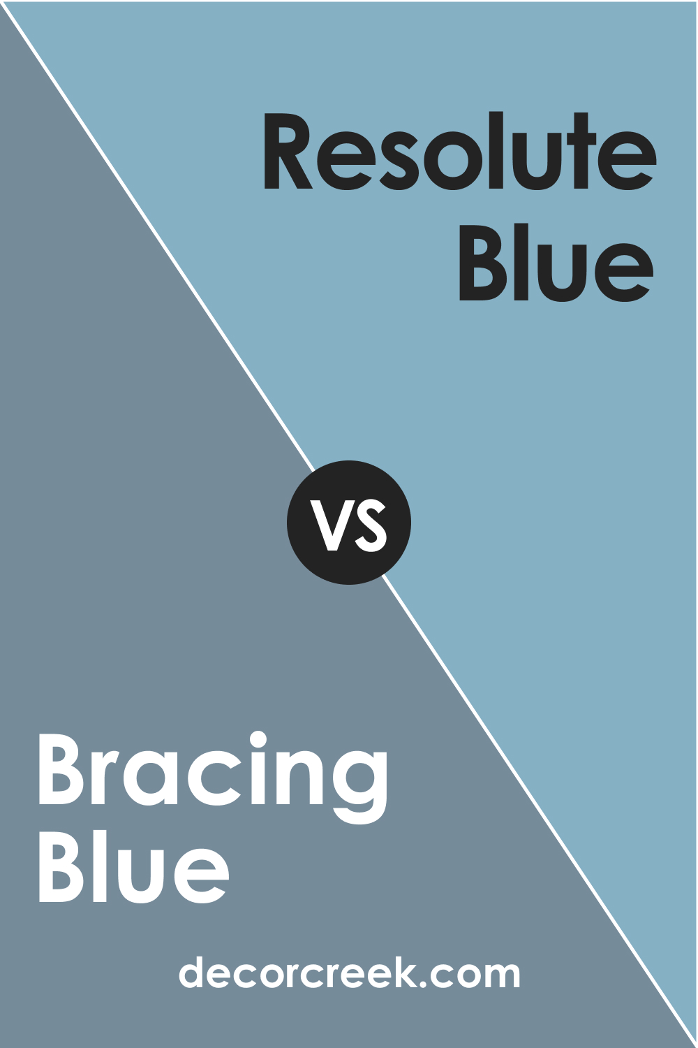
SW 6242 Bracing Blue and SW 6507 Resolute Blue
SW 6507 Resolute Blue, while still in the realm of cool blues, has a more vibrant, upbeat feel compared to the subdued depth of Bracing Blue. SW Resolute Blue can act as a fantastic highlight color in a room predominantly painted in SW Bracing Blue, creating dynamic visual interest while maintaining a harmonious palette.
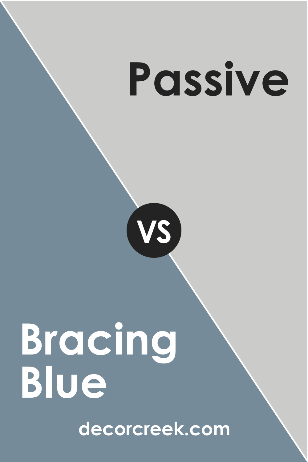
SW 6242 Bracing Blue and SW 7064 Passive
When compared to the light and neutral gray of SW 7064 Passive, SW Bracing Blue reveals its true depth. The muted undertone of Passive highlights the rich and complex nature of Bracing Blue, creating a compelling contrast that draws the eye. Pairing these two colors can achieve a modern and refined aesthetic in any space.
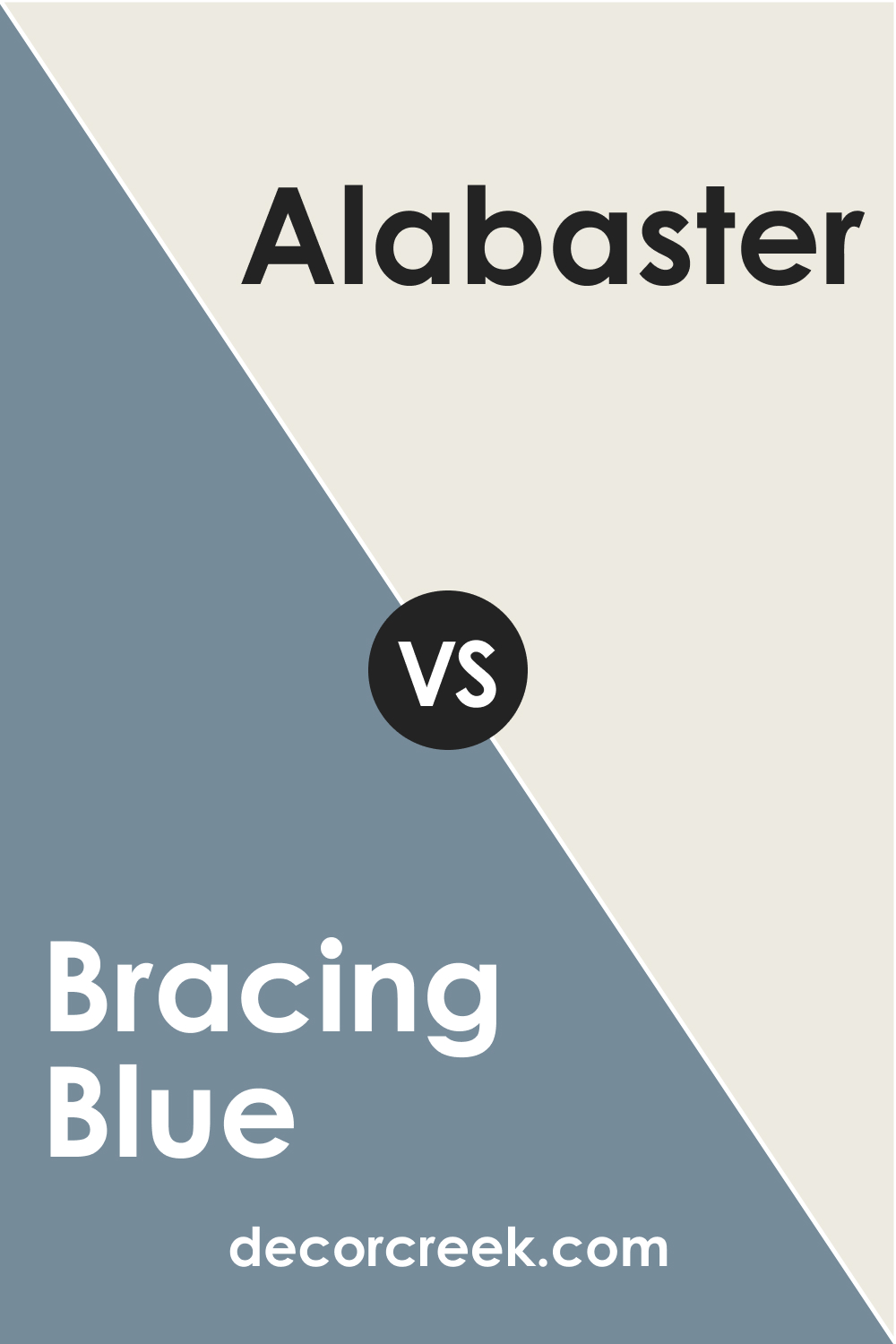
SW 6242 Bracing Blue and SW 7008 Alabaster
The off-white shade of Alabaster, with its warm undertones, presents a striking counterpoint to the cool sophistication of Bracing Blue. Used as a trim or accent, Alabaster can make Bracing Blue pop, emphasizing its richness and depth while also providing a soothing balance to its intensity.
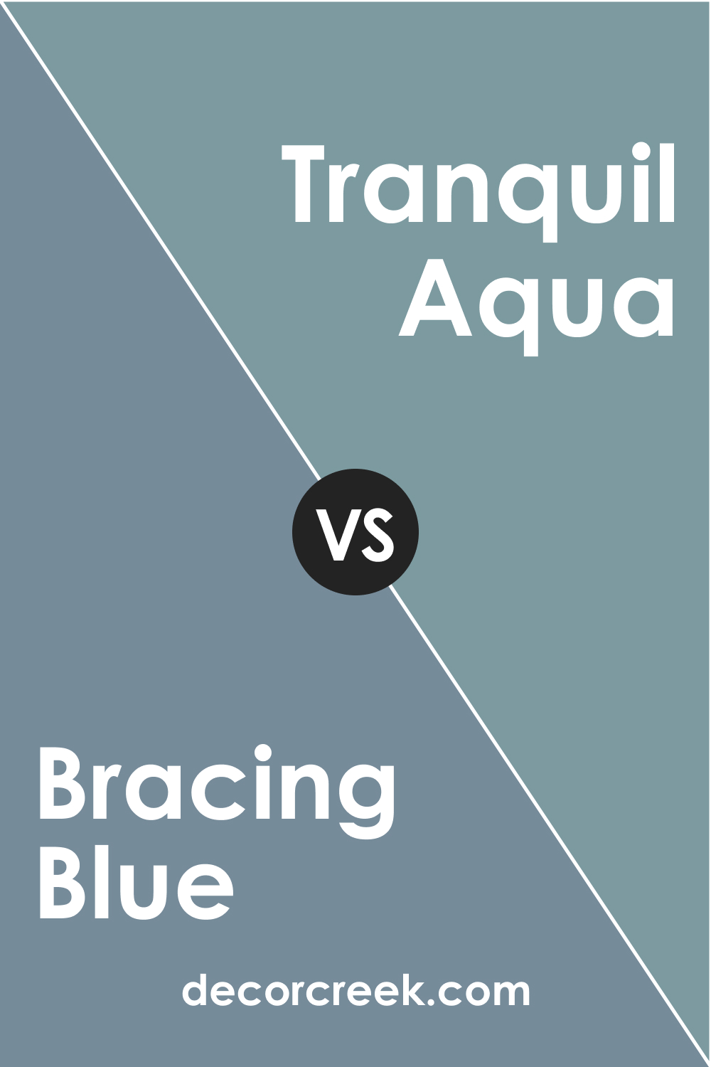
SW 6242 Bracing Blue and SW 7611 Tranquil Aqua
SW 7611 Tranquil Aqua, with its serene blue-green hue, brings a different take on tranquility when compared to the commanding calm of SW Bracing Blue. In a room with Bracing Blue as the main color, SW Tranquil Aqua could serve as a refreshing accent, offering a sense of coastal ease and freshness.
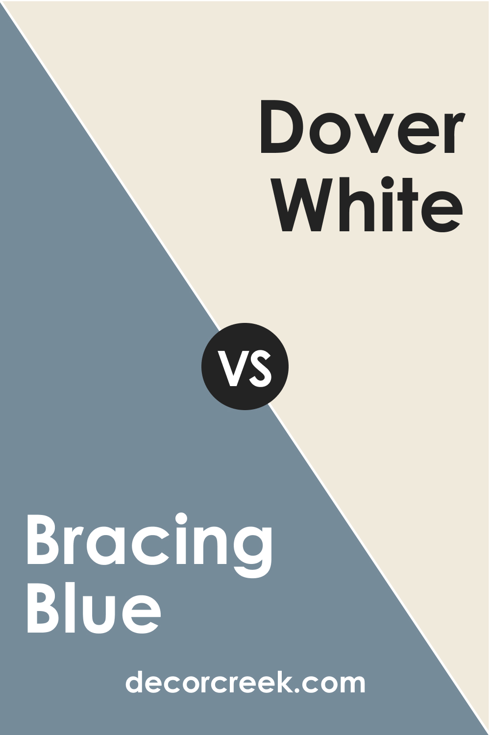
SW 6242 Bracing Blue and SW 6385 Dover White
The Dover White color, a warm white with a subtle yellow undertone, contrasts with SW Bracing Blue in both color and mood. While Bracing Blue carries a sense of depth and calmness, Dover White provides a light, airy feel that can brighten a room. The balance between these two colors creates a timeless, classic color scheme.
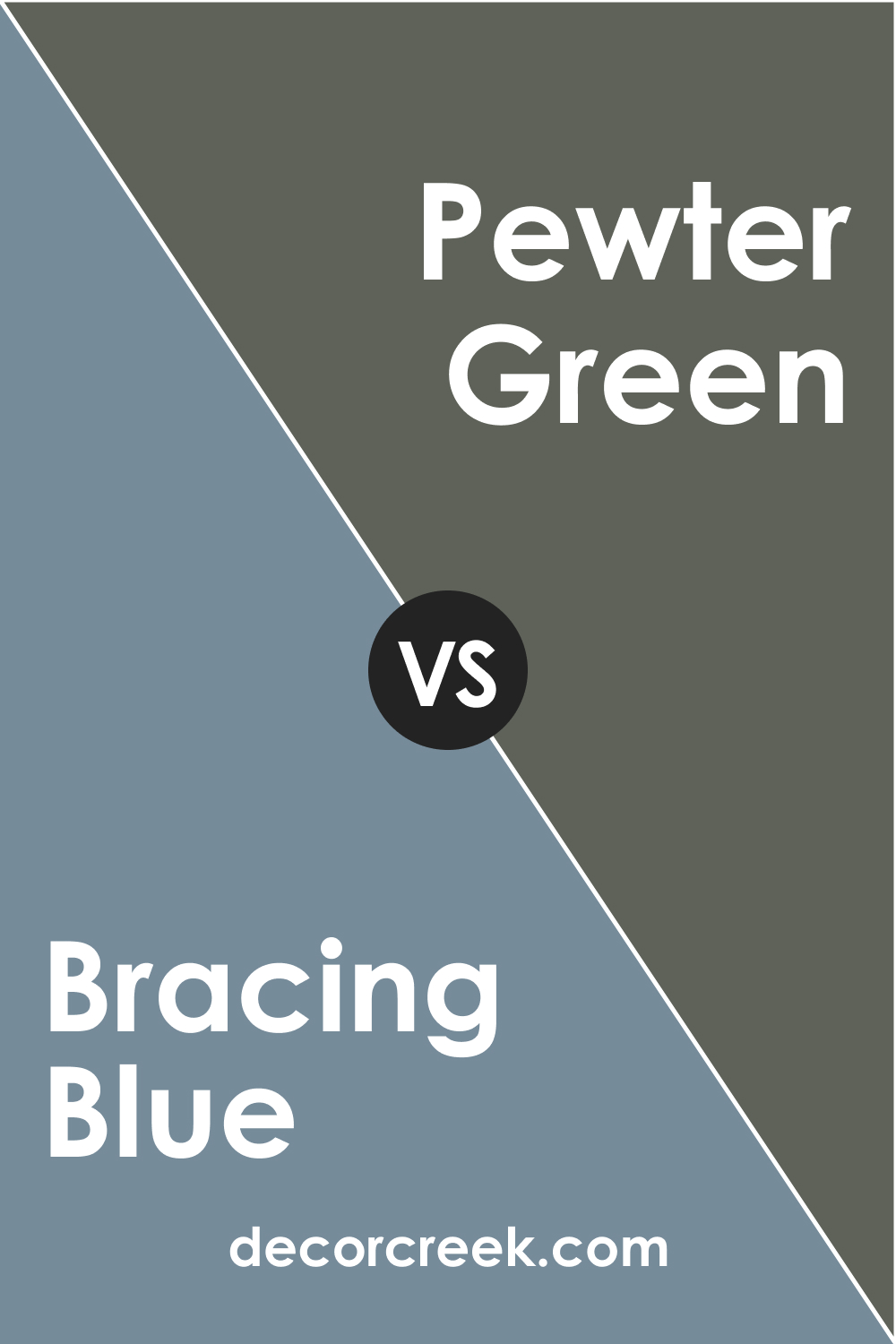
SW 6242 Bracing Blue and SW 9083 Pewter Green
Pewter Green is a deep, muted green-gray color that shares the same level of depth and sophistication as SW Bracing Blue. Though both colors are deep and somewhat moody, their distinct hues make for an intriguing combination. Together, they create a space with a rich, layered look, full of nuance and character.
Conclusion
SW 6242 Bracing Blue is more than just a color. It’s a statement, a mood, and a style all in itself. Its versatile nature makes it a perfect choice for various applications, be it a bold exterior, a calming bedroom, or a striking kitchen cabinet. Combined with the right coordinating and trim colors, Bracing Blue can transform any space into a sophisticated and stylish area.
With this unique and captivating hue, you can bring a piece of the serene ocean or the tranquil midnight sky right into your home.
Ever wished paint sampling was as easy as sticking a sticker? Guess what? Now it is! Discover Samplize's unique Peel & Stick samples.
Get paint samples
Frequently Asked Questions
⭐What is the Light Reflectance Value (LRV) of SW 6242 Bracing Blue, and what does it mean?
The LRV of SW 6242 Bracing Blue is 25. This value indicates that Bracing Blue is a medium-dark color that reflects a moderate amount of light. An LRV of 25 makes this color versatile, suitable for a range of room sizes, and able to contribute to different moods and atmospheres depending on how it's used.
⭐Is SW 6242 Bracing Blue a warm or cool color?
SW 6242 Bracing Blue is considered a cool color. It has undertones of blue and gray, which are typically associated with calmness and tranquility.
⭐What are some coordinating colors for SW 6242 Bracing Blue?
Coordinating colors include a range of hues such as SW 6238 Icicle, a light cool gray; SW 9145 Sleepy Hollow, a mid-tone cool gray; and SW 9108 Double Latte, a warm, rich beige. Other complementary colors might include soft neutrals, warm whites, or earth tones.
⭐How does lighting affect the appearance of SW 6242 Bracing Blue?
The appearance of SW 6242 Bracing Blue can change significantly under different lighting conditions. Under bright, cool light, the color will appear more vibrant and bluish. Under warm, dim light, it may appear more subdued and slightly grayer.
⭐How can I use SW 6242 Bracing Blue in my home decor?
SW 6242 Bracing Blue is a versatile color that can be used in any room of the house, from creating a tranquil bedroom to a sophisticated living room. It pairs beautifully with a range of colors and can work well in various interior design styles. For specific recommendations, consider the room's size, the amount of natural light, the other colors and materials in the space, and the overall look you want to achieve.


