When it comes to transforming a space, the power of paint cannot be underestimated. Among the myriad options available, SW 7615 Sea Serpent by Sherwin Williams stands out as a unique and striking choice.
This color, a profound and dynamic shade of blue, offers a sense of sophistication and depth to any room.
Sea Serpent is not just any blue; it’s a shade that combines the mysterious depths of the ocean with a modern edge, making it perfect for those looking to add a statement to their walls.
Whether you’re updating a bedroom, giving new life to a living space, or adding character to a kitchen, this color brings a sense of calm and style that’s hard to match.
Being a part of Sherwin Williams’ collection, Sea Serpent benefits from the brand’s commitment to quality and durability. It means not only does this color look beautiful, but it also lasts, maintaining its depth and complexity over time.
This guide aims to provide a comprehensive overview of SW 7615 Sea Serpent, including its characteristics, best uses, and how it compares to other hues in the palette.
If you’re considering a fresh look for your space, here’s why Sea Serpent might just be the perfect choice for you.
What Color Is Sea Serpent SW 7615 by Sherwin Williams?
Sea Serpent by Sherwin Williams is a rich, deep blue color with a touch of green, creating a unique shade that adds a modern and sophisticated touch to any space.
This color is perfect for those looking to add a dramatic flair to their interior without overpowering the room. It’s a versatile shade that works well in a variety of decor styles, including contemporary, coastal, and even industrial designs.
In terms of interior styles, Sea Serpent shines in modern and minimalist spaces where its boldness can be a focal point without the clutter of too many competing elements.
It also pairs beautifully with natural materials and textures, such as wood, metal, and leather, adding warmth to its cool tones and creating a balanced and inviting environment.
For those who love a coastal vibe, pairing Sea Serpent with soft neutrals, driftwood textures, and linen fabrics can create a serene and welcoming space reminiscent of the sea.
In more industrial or urban settings, combining it with exposed brick, concrete, and metallic finishes can add depth and interest to the decor.
Overall, Sea Serpent is a striking color choice that offers both flexibility and elegance, making it a great addition to various interior projects looking to make a statement.
Ever wished paint sampling was as easy as sticking a sticker? Guess what? Now it is! Discover Samplize's unique Peel & Stick samples.
Get paint samples

Is Sea Serpent SW 7615 by Sherwin Williams Warm or Cool color?
Sea Serpent by Sherwin Williams is a unique and rich paint color that adds depth and character to any space in a home. This shade is a deep, dramatic navy with a hint of teal, making it a versatile choice for many decorating styles.
Whether it’s applied in a cozy study, a serene bedroom, or as an accent wall in a living room, Sea Serpent brings a sense of sophistication and style.
In homes, this color works wonders by creating a striking contrast when paired with lighter shades like whites or soft greys, offering a bold yet balanced look.
It also pairs beautifully with natural elements such as wood or metal, adding to its versatility. Its deep hue is perfect for creating a focal point in a room without overwhelming the space, making rooms feel more inviting and cozy.
Furthermore, Sea Serpent can make small spaces appear larger when used thoughtfully, thanks to its ability to recede when viewed, which can visually expand a room.
This color is ideal for anyone looking to add a touch of elegance and depth to their home without sacrificing warmth and welcoming vibes.
Undertones of Sea Serpent SW 7615 by Sherwin Williams
Sea Serpent is a fascinating color by Sherwin Williams that can truly transform a room depending on how it’s used. At first glance, it may just seem like a deep, rich shade.
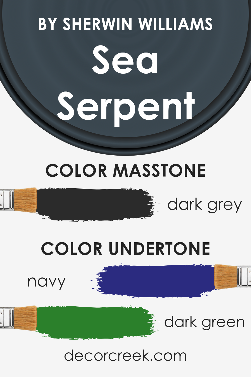
However, its beauty lies in its complex undertones of navy and dark green. These undertones aren’t immediately obvious, but they play a crucial role in how the color is perceived and how it interacts with lighting and other elements in a room.
Understanding undertones is essential because they influence the overall vibe of the color. For Sea Serpent, the navy undertone adds a sense of sophistication and depth, making it ideal for creating a statement wall or an atmosphere of quiet elegance.
The dark green undertone, on the other hand, introduces a touch of nature and freshness, which can make a room feel more serene and inviting.
When applied to interior walls, the impact of Sea Serpent’s undertones becomes even more pronounced. Depending on the lighting, the navy might become more dominant, giving the room a cooler, more formal look.
In natural light, the dark green might shine through, warming up the space slightly and linking it to outdoor elements.
This chameleon-like quality means that Sea Serpent can adapt well to different styles and themes, whether it’s grounding a light and airy space or adding richness to a darker, moodier one.
Its unique combination of undertones ensures that the color remains dynamic and versatile, offering endless possibilities for enhancing the character of any room.
What is the Masstone of the Sea Serpent SW 7615 by Sherwin Williams?
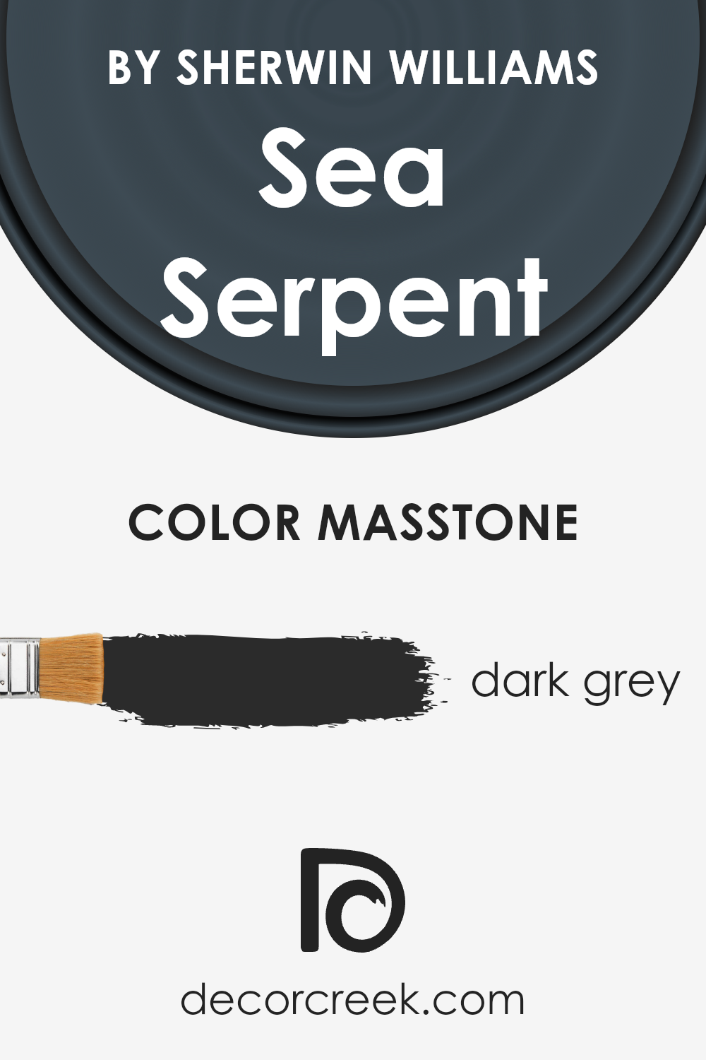
Sea SerpentSW 7615 by Sherwin Williams has a masstone, or main color, that is dark grey, almost like the color of charcoal.
This specific shade might seem quite bold at first, but it’s actually really versatile and can bring a modern and sophisticated touch to any home.
When used on walls, this color can make rooms feel cozy and intimate, perfect for creating a snug living area or a peaceful bedroom retreat. Because it’s a darker shade, it does a great job at hiding marks or smudges, which is great for homes with kids or pets.
Moreover, pairing it with bright whites or soft pastels can add a beautiful contrast, making spaces feel more open and airy. Furniture and decor in lighter colors really stand out against it, allowing for some really eye-catching interior designs.
On the flip side, if you match it with metallic accents or rich textures, it can give a room an elegant and luxurious vibe.
So, despite its dark appearance, Sea SerpentSW 7615 can work wonders in making your home look stylish and welcoming.
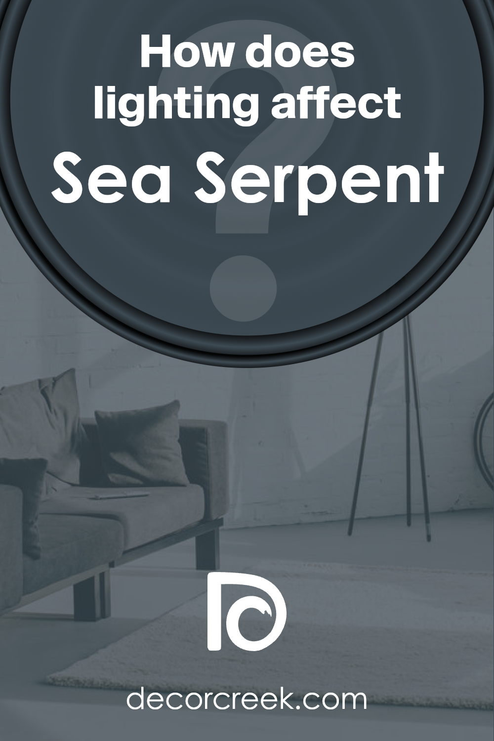
How Does Lighting Affect Sea Serpent SW 7615 by Sherwin Williams?
Lighting has a significant impact on how we perceive colors. This is because different light sources can make the same color look different.
The time of day, the direction a room faces, and whether the light is natural or artificial all play a role in how a color appears.
Taking a look at a specific color, such as Sea Serpent by Sherwin Williams, we can explore how it adapts to various lighting conditions. In artificial light, Sea Serpent appears richer and deeper.
This is due to the controlled nature of artificial lighting, which can be more consistent and intense than natural light. The color might look bold and more vivid under LED or fluorescent lights, providing a cozy atmosphere in the evening.
In natural light, Sea Serpent’s true character shines. Natural light brings out the depth of the color, revealing subtle undertones that may not be as noticeable under artificial lighting.
In a room with plenty of sunlight, the color can appear softer and more dynamic, changing subtly throughout the day as the intensity and angle of the sunlight change.
Rooms facing north receive less direct sunlight, so Sea Serpent may appear more muted and cooler in these spaces. This can create a serene, calming effect, perfect for spaces where you want to relax.
In south-facing rooms, which get abundant sunlight, the color can look warmer and more lively. South-facing natural light can enhance the vibrancy of Sea Serpent, making the space feel inviting.
East-facing rooms get bright light in the morning when the sun rises. Here, Sea Serpent will look soft and welcoming in the morning, potentially shifting towards a cooler tone in the afternoon as the natural light fades.
West-facing rooms experience the opposite, with softer light in the morning that grows brighter and warmer towards the evening.
In these rooms, Sea Serpent may display a soothing quality in the morning, transforming into a dramatic and energetic backdrop by sunset.
In summary, lighting plays a crucial role in how we perceive the color Sea Serpent. Whether under artificial lighting or influenced by the direction of natural light, the mood and appearance of the color can change, affecting the overall feel of the room.
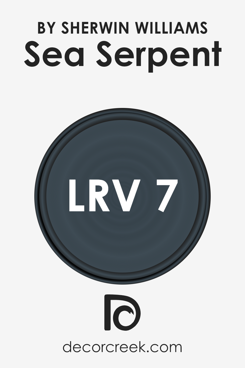
What is the LRV of Sea Serpent SW 7615 by Sherwin Williams?
LRV stands for Light Reflectance Value, which is a measurement used to describe the percentage of light a paint color reflects back into the room.
It’s a scale from 0 to 100, where 0 means the color absorbs all light (making it pitch black) and 100 means it reflects all light (making it pure white).
This number is crucial for understanding how a paint color will look on your walls, as it affects the brightness and mood of a room.
A higher LRV can make a room feel more open and airy, while a lower LRV can make a room feel more cozy and enclosed.
For the color Sea Serpent SW 7615 by Sherwin Williams, with an LRV of 6.7, it’s a dark shade. This means it reflects very little light, absorbing most of it.
In practical terms, using it on your walls can make a room feel smaller or more intimate, and it can dramatically change the room’s ambiance, especially in areas with limited natural light.
It’s ideal for creating a bold statement in a space, but it’s important to consider lighting and room size when using colors with low LRV values, as they can significantly affect the overall look and feel of your room.
LRV – what does it mean? Read This Before Finding Your Perfect Paint Color
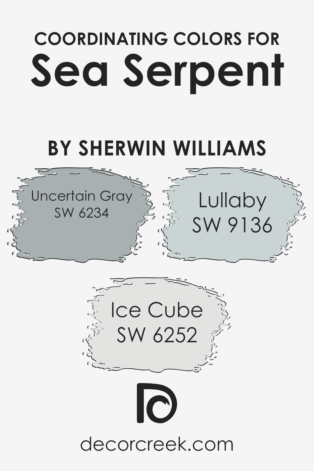
Coordinating Colors of Sea Serpent SW 7615 by Sherwin Williams
When talking about coordinating colors, we’re referring to a set of hues that pair well together, creating a visually pleasing palette. This concept plays a critical role in design and decoration, ensuring that the colors in a space harmonize without clashing.
The idea is to choose colors that complement each other, either by belonging to a similar shade range for a more subtle and cohesive look or by contrasting nicely for a bold, dynamic effect.
For instance, Sea Serpent by Sherwin Williams, a deep and serene blue, can be beautifully complemented by specific coordinating colors.
Among these coordinating colors is Uncertain Gray, a nuanced gray with subtle blue undertones that echoes the depth of Sea Serpent without overpowering it, providing a soothing backdrop that enhances the richness of the blue.
Ice Cube presents a lighter, airier option, offering a crisp and clean look that brings out the cooler tones in Sea Serpent, making for a fresh and contemporary pairing.
Then there’s Lullaby, a soft, muted hue that introduces a gentle, calming energy into the mix, creating a perfect balance with Sea Serpent’s more dramatic character.
These colors work hand in hand, either grounding the boldness of Sea Serpent with their subtlety or lifting the space with their lightness, making them ideal companions in design.
You can see recommended paint colors below:
- SW 6234 Uncertain Gray
- SW 6252 Ice Cube
- SW 9136 Lullaby
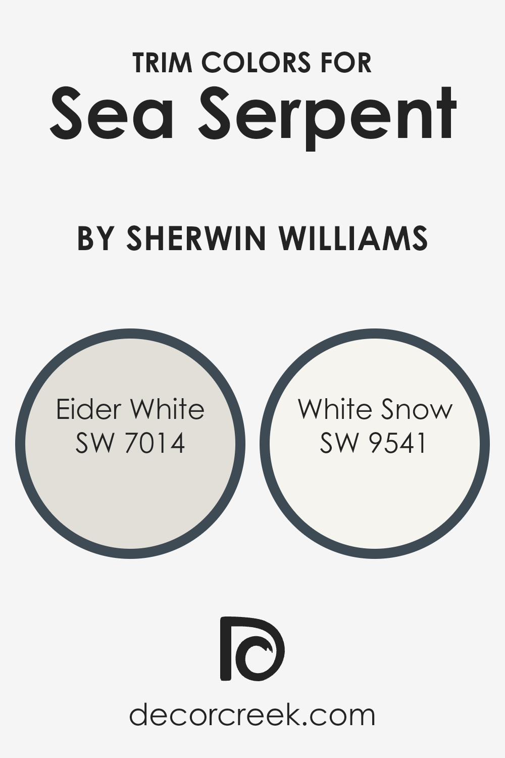
What are the Trim colors of Sea Serpent SW 7615 by Sherwin Williams?
Trim colors play a crucial role in the overall look of a space, especially when paired with a vibrant hue like Sea Serpent by Sherwin Williams. Choosing the right trim color can frame the wall color, accentuating its intensity and character.
It’s akin to picking out the perfect accessories to complement an outfit; it can transform the feel of a room from standard to stunning.
Trim colors help in creating a cohesive look, ensuring that the wall color doesn’t overwhelm the space but instead, enhances its aesthetic appeal.
Eider White SW 7014 is a soft, pale gray with warm undertones that provides a subtle contrast against the deep, rich tones of Sea Serpent. This gentle contrast allows the wall color to stand out, while also ensuring the space feels open and airy.
White Snow SW 9541, on the other hand, is a bright, clean white that offers a sharper contrast, giving any room a more dramatic and defined look.
Both these colors lend balance and sophistication to the boldness of Sea Serpent, ensuring that the overall design feels harmonious and thoughtfully curated.
You can see recommended paint colors below:
- SW 7014 Eider White
- SW 9541 White Snow
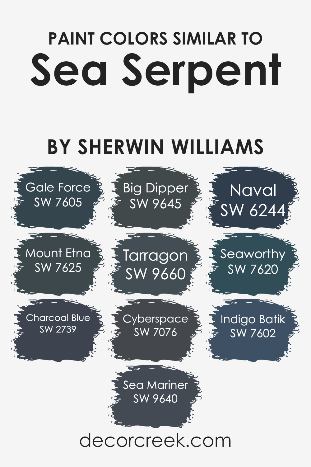
Colors Similar to Sea Serpent SW 7615 by Sherwin Williams
Choosing similar colors for your space can significantly impact the overall look and feel. Similar colors, like those close to Sea Serpent by Sherwin Williams, offer a harmonious and soothing palette that can create a cohesive and serene environment.
By using shades like Gale Force, a deep, stormy blue, or Mount Etna, an intense, brooding gray-blue, you can add depth and sophistication to your rooms.
Charcoal Blue brings a smoky depth, whereas Sea Mariner offers a splash of vibrant, classic blue, enhancing spaces with a lively yet refined touch.
Big Dipper and Tarragon introduce a subtle variety with their unique tones; the former leans towards a softer, lighter blue, providing a calming effect, while the latter introduces a greenish hue, adding a hint of earthiness to the mix.
Cyberspace and Naval continue the theme of depth and elegance, with Cyberspace presenting a nearly black, deep blue for striking accents, and Naval offering a rich, traditional navy that’s both timeless and modern.
Seaworthy and Indigo Batik further showcase the versatility of blue, with Seaworthy presenting a robust, maritime blue and Indigo Batik offering a blend of blue with a touch of purple for a sophisticated and cozy ambiance.
These similar colors work together to create a space that feels interconnected and thoughtfully designed, allowing for a seamless transition from room to room while maintaining a unique character in each.
You can see recommended paint colors below:
- SW 7605 Gale Force
- SW 7625 Mount Etna
- SW 2739 Charcoal Blue
- SW 9640 Sea Mariner
- SW 9645 Big Dipper
- SW 9660 Tarragon
- SW 7076 Cyberspace
- SW 6244 Naval
- SW 7620 Seaworthy
- SW 7602 Indigo Batik
How to Use Sea Serpent SW 7615 by Sherwin Williams In Your Home?
Sea Serpent SW 7615 by Sherwin Williams is a bold and beautiful color that can add a unique touch to any home. With its deep blue tone, it creates a striking look that can be used in various ways to enhance your living spaces.
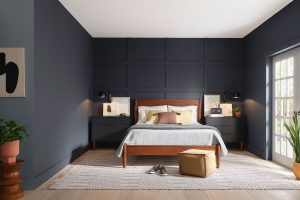
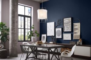
For those looking to make a statement, painting an accent wall in Sea Serpent can transform a room into a visually interesting space.
This deep blue hue pairs well with light neutrals like whites or beiges, making it easy to fit into most color schemes. It also works great in bathrooms or bedrooms, offering a cozy and calming atmosphere.
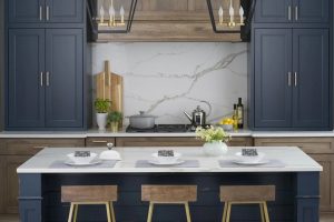
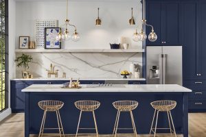
For a modern, sleek look, you could paint kitchen cabinets or a kitchen island in this color, contrasting with lighter walls for a stunning effect.
Beyond walls, this versatile shade can be used on furniture or decorative accessories, bringing a touch of elegance and sophistication. With Sea Serpent by Sherwin Williams, the possibilities to beautify your home are endless.
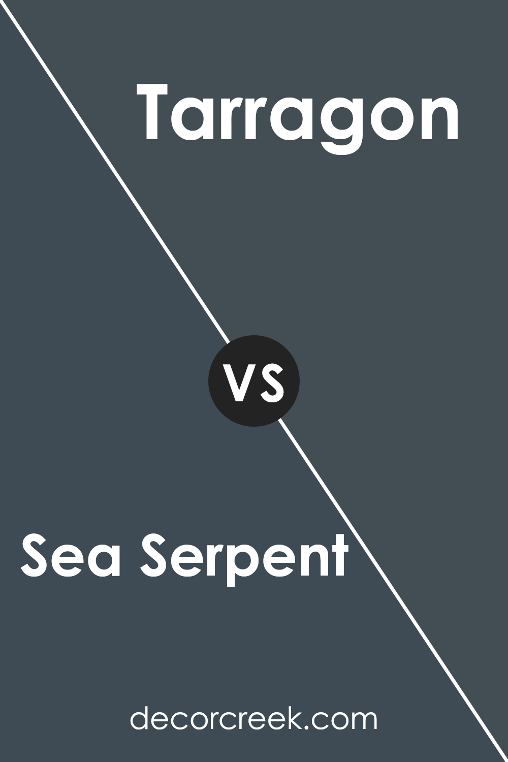
Sea Serpent SW 7615 by Sherwin Williams vs Tarragon SW 9660 by Sherwin Williams
Sea Serpent is a rich, deep blue that brings to mind the quiet depths of the ocean. It’s a powerful color, sure to make a strong statement wherever it’s used. On the other hand, Tarragon is a much lighter, soothing green.
It’s the kind of color you might see in a peaceful garden or a soft meadow. While Sea Serpent adds a sense of drama and intensity to a space, Tarragon offers a calming, relaxing vibe.
If Sea Serpent is like the deep, mysterious ocean, then Tarragon is like a gentle, sunlit field. Each color has its own unique mood and can set a completely different tone in a room.
Whether you’re looking for something bold and striking, or soft and comforting, these colors offer distinct choices.
You can see recommended paint color below:
- SW 9660 Tarragon
Sea Serpent SW 7615 by Sherwin Williams vs Naval SW 6244 by Sherwin Williams
Sea Serpent and Naval, both by Sherwin Williams, are two striking colors with their unique charm. Sea Serpent is a muted shade, blending blue and green to create a calm, soothing presence, much like the ocean on a peaceful day.
It’s a versatile color that brings a touch of tranquility to any space, making rooms feel more spacious and relaxing.
Naval, on the other hand, is a bold, deep blue that exudes confidence and sophistication. It’s reminiscent of the night sky just before it turns black, offering a sense of depth and mystery.
This color works well in spaces where you want to add a touch of drama or create a focal point.
While both colors share a blue base, Sea Serpent leans towards a softer, more serene vibe, making it ideal for creating a calm and inviting atmosphere.
Naval, with its deeper tone, commands attention and stands out more, ideal for making a strong statement. Whether you’re looking for a backdrop that’s quietly supportive or boldly front and center, these colors offer options for different tastes and design needs.
You can see recommended paint color below:
Sea Serpent SW 7615 by Sherwin Williams vs Mount Etna SW 7625 by Sherwin Williams
Sea Serpent and Mount Etna, both by Sherwin Williams, are two unique colors that bring different vibes to a space.
Sea Serpent is a rich, deep teal that has a subtle hint of green, making it stand out with a cool and refreshing look. It’s perfect for creating a serene and calm atmosphere in any room.
On the other hand, Mount Etna is a much darker shade, almost like a charcoal gray with a hint of green.
This color is ideal for adding a touch of elegance and sophistication to your space, giving it a bold and dramatic flair.
While Sea Serpent adds a vibrant and lively energy, Mount Etna offers a grounded and intense mood. If you’re looking to brighten up a room with a cheerful yet peaceful ambiance, Sea Serpent is the way to go.
However, if your goal is to make a strong statement with a color that exudes class and depth, Mount Etna will not disappoint. Each color has its unique appeal, and choosing between them depends on the atmosphere you wish to create.
You can see recommended paint color below:
- SW 7625 Mount Etna
Sea Serpent SW 7615 by Sherwin Williams vs Indigo Batik SW 7602 by Sherwin Williams
Sea Serpent and Indigo Batik by Sherwin Williams are two beautiful colors that offer unique vibes to any space. Sea Serpent is a deep, serene blue-green shade that brings to mind the mystery and charm of ocean depths.
It’s a cooler tone that leans more towards green, offering a refreshing yet sophisticated feel. On the other hand, Indigo Batik is a strong, navy-like blue that leans towards a traditional look.
It’s closer to a classic indigo, providing a feeling of stability and strength with its rich depth.
When comparing these two, it’s clear that Sea Serpent offers a more relaxed and slightly nature-inspired ambiance, perfect for creating a calm and inviting space.
Indigo Batik, meanwhile, has a more formal touch with its darker, more saturated blue, ideal for spaces that aim for a bit of drama or formality.
Both colors are versatile and can beautifully complement a variety of decor styles, but your choice might depend on the atmosphere you want to create.
Sea Serpent brings a fresh, tranquil vibe, while Indigo Batik adds a bold, confident statement.
You can see recommended paint color below:
Sea Serpent SW 7615 by Sherwin Williams vs Charcoal Blue SW 2739 by Sherwin Williams
Sea Serpent and Charcoal Blue, both by Sherwin Williams, offer unique shades that are quite distinct when compared. Sea Serpent presents as a deep, almost mystical green-blue hue, evoking the depth and mystery of oceanic waters.
It has a rich, yet calming quality, perfect for spaces where a touch of sophistication mixed with tranquility is desired.
On the other hand, Charcoal Blue leans more towards a darker, navy-inspired blue with a hint of gray, giving it a strong, almost formal vibe.
This color is ideal for creating a sense of elegance and seriousness in a room.
While Sea Serpent brings in more green, making it somewhat lighter and more vibrant, Charcoal Blue offers a heavier, more grounded feel due to its closer affinity with traditional navy colors.
In essence, Sea Serpent could be seen as the choice for a lively yet serene space, whereas Charcoal Blue suits areas meant for reflection or formal gatherings.
You can see recommended paint color below:
Sea Serpent SW 7615 by Sherwin Williams vs Gale Force SW 7605 by Sherwin Williams
Sea Serpent and Gale Force are two colors from Sherwin Williams that offer distinct vibes for any space. Sea Serpent is a deeper, dark blue that has the power to add a serious and mysterious touch.
It’s like looking into the depths of the ocean, bringing a strong and bold atmosphere to rooms. Imagine it in a cozy study or making a statement on a feature wall.
On the other hand, Gale Force is also dark but leans more towards a smokey navy. It has a softer edge compared to Sea Serpent, making it versatile for spaces that aim for a sophisticated but inviting feel.
It could be perfect for a bedroom or living room, adding depth without the intensity of Sea Serpent.
Both colors share a dark base, but Sea Serpent feels more profound and intense, while Gale Force brings a gentler, yet still powerful aura.
Whether you choose the intriguing depths of Sea Serpent or the adaptable elegance of Gale Force, both colors offer unique possibilities for transforming spaces.
You can see recommended paint color below:
Sea Serpent SW 7615 by Sherwin Williams vs Seaworthy SW 7620 by Sherwin Williams
Sea Serpent and Seaworthy are two paint colors by Sherwin Williams that are quite different when you put them side by side. Sea Serpent is a deep, rich color that some might say feels like a dark, mysterious part of the ocean.
It’s not quite navy but has a cool, dark blue vibe that stands out in a room. Think of it as a strong background color, perfect for creating a bold statement.
On the other hand, Seaworthy is also a blue shade, but it’s lighter compared to Sea Serpent. It has a more noticeable ocean feel to it, reminding you of the sea but in a more welcoming and lighter way.
It’s still bold but in a friendly, inviting manner, making spaces feel cozy yet significant at the same time.
While both colors draw inspiration from the sea, Sea Serpent leans towards a darker, more intense look, and Seaworthy offers a brighter, cheerier atmosphere.
Depending on what vibe you’re going for in a room, these colors can make a big difference in setting the mood.
You can see recommended paint color below:
- SW 7620 Seaworthy
Sea Serpent SW 7615 by Sherwin Williams vs Big Dipper SW 9645 by Sherwin Williams
Sea Serpent and Big Dipper are two interesting colors from Sherwin Williams that stand out in their own unique ways. Sea Serpent is a deep, rich teal that seems to bring a sense of mystery and depth to any space.
It’s the kind of color that can make a strong statement, whether on a feature wall or as an accent in a room. It has a certain elegance to it, swirling between blue and green tones, offering a cool and serene vibe.
On the other hand, Big Dipper is lighter and leans more towards a pure, soft blue. This color feels airy and refreshing, bringing a sense of calm and openness to a room.
It’s much less intense than Sea Serpent, making it more versatile for larger areas without overwhelming the senses.
Think of Big Dipper as a gentle sky blue that’s easy on the eyes, offering a clean and inviting atmosphere.
When comparing the two, Sea Serpent offers depth and drama, while Big Dipper brings lightness and a breath of fresh air. Both colors have their charm, depending on the mood and style you want to achieve.
You can see recommended paint color below:
- SW 9645 Big Dipper
Sea Serpent SW 7615 by Sherwin Williams vs Sea Mariner SW 9640 by Sherwin Williams
Sea Serpent and Sea Mariner by Sherwin Williams are two appealing shades, but they have distinct vibes. Sea Serpent has a dark, rich teal base that leans towards a deep aquatic feel.
It’s similar to the mysterious depths of the ocean, offering a bold and serene backdrop for spaces that aim for a bit of drama. This color makes a statement and is great for creating a focal point or an accent wall in a room.
On the other hand, Sea Mariner steps in with a brighter, more vibrant energy. It’s a lively shade of blue with a hint of green, reminiscent of the sparkling surface of the sea under the sun.
This color brings freshness and vitality to a space, making it ideal for areas that benefit from a cheerful and inviting atmosphere.
Both colors, while sharing aquatic inspirations, cater to different moods and settings. Sea Serpent stands out for those who prefer a darker, more enveloping environment, while Sea Mariner is perfect for those looking for a brighter, uplifting space.
Whether you lean towards the tranquility of deep waters or the cheerful vibrancy of the sea’s surface, both colors offer unique possibilities for revamping a space.
You can see recommended paint color below:
- SW 9640 Sea Mariner
Sea Serpent SW 7615 by Sherwin Williams vs Cyberspace SW 7076 by Sherwin Williams
Sea Serpent and Cyberspace, both from Sherwin Williams, have their unique charm. Sea Serpent is a deep, rich teal that gives off a cool, calm vibe. It’s like looking into a deep forest lake, serene and inviting.
It’s perfect for spaces where you want a bit of color without it taking over the room. On the other hand, Cyberspace is a strong, dark gray with a hint of blue. It’s more like the color of a stormy sea or the modern steel of city architecture.
This one is great when you want to add a bold, sophisticated touch to your space. While Sea Serpent brings a fresh, natural feel, Cyberspace offers a sleek, contemporary look.
Both colors are versatile, but the mood they set can be quite different depending on how they are used. Sea Serpent lights up a room with a splash of color, whereas Cyberspace grounds a space with its dark, moody tone.
You can see recommended paint color below:
Conclusion
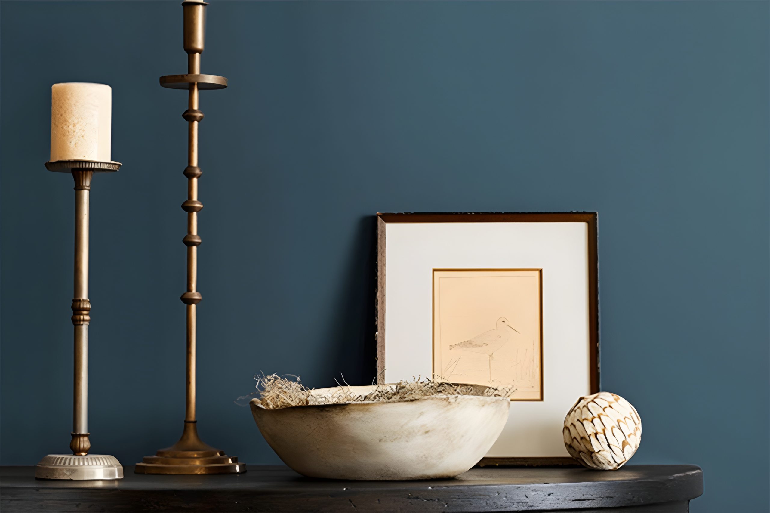
Sea Serpent, a color by Sherwin Williams, presents a versatile and striking option for those looking to add a sophisticated and bold touch to their spaces.
Its deep, rich hue lends an air of elegance and mystery, making it a perfect choice for accent walls, exterior trims, or even full rooms where a statement is desired.
The color has the unique ability to blend well with various decor styles and palettes, adding depth and intensity without overwhelming the senses.
Homeowners and decorators appreciate Sea Serpent for its adaptability and the dramatic flair it brings to interiors and exteriors alike.
Whether aiming for a modern, sleek look or a cozy, intimate atmosphere, this color proves to be an excellent pick, enhancing architectural details and complementing a wide range of materials and finishes.
The lure of Sea Serpent lies in its capability to transform a space into a stylish and inviting haven, proving that a bold color choice can indeed elevate a home’s aesthetic.
Ever wished paint sampling was as easy as sticking a sticker? Guess what? Now it is! Discover Samplize's unique Peel & Stick samples.
Get paint samples