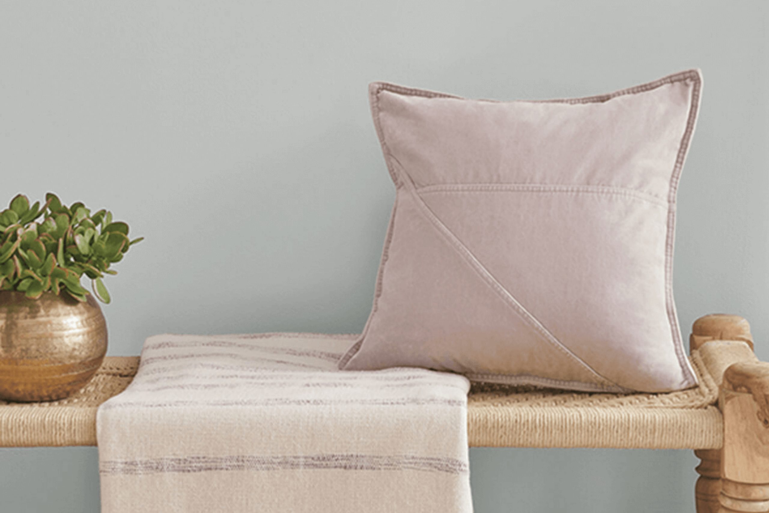
As you consider refreshing your living space or giving a room that much-needed makeover, you might find yourself searching for the perfect color to set the mood. That’s where Sherwin Williams’ SW 9642 Silver Tipped Sage comes into play.
It’s a unique shade that beautifully balances gray with soft hints of green, lending a subtle, natural touch to any room. Whether you’re aiming to achieve a serene atmosphere in your bedroom or a peaceful vibe in your home office, this color could be a lovely choice. What’s more, Silver Tipped Sage adapts flexibly to different lighting situations, revealing more of its green undertones in natural light while presenting as a calm, muted gray in dimmer, artificial settings.
This quality makes it an excellent choice for spaces that serve multiple purposes at different times of the day. Plus, its versatility extends to pairing well with various decor styles and color palettes, making it a practical addition to your home if you appreciate colors that harmonize without overpowering.
From modern to rustic, the adaptability of Silver Tipped Sage ensures it complements your furniture and accessories, forming a cohesive look throughout your living space.
What Color Is Silver Tipped Sage SW 9642 by Sherwin Williams?
Silver Tipped Sage by Sherwin Williams is a subtle and versatile gray-green hue that brings a fresh and airy feel to any space. This color has a gentle touch of sage, lending it an earthy quality without overpowering the room’s design. The muted nature of this shade makes it ideal for creating a light and relaxing environment, making it a perfect choice for various interior styles.
This color pairs wonderfully with natural materials such as wood, stone, and linen, enhancing its organic vibe. In a living room, combining Silver Tipped Sage with wooden floors and furniture can create a harmonious and inviting space. In bathrooms, pairing it with white marble or ceramic adds a refreshing contrast while keeping the room bright and open.
Silver Tipped Sage works exceptionally well in Scandinavian, modern farmhouse, and minimalist interior styles due to its clean and understated look. It complements the simple lines and natural elements often found in these designs, adding a touch of color without overwhelming the senses. When used in these settings, it helps to establish a calm and cozy atmosphere, perfect for spaces aimed at relaxation and comfort.
Overall, Silver Tipped Sage is a flexible color choice that easily adapts to different styles and pairings, bringing a fresh perspective to traditional and contemporary interiors alike.
Is Silver Tipped Sage SW 9642 by Sherwin Williams Warm or Cool color?
Silver Tipped Sage is a unique paint color from Sherwin Williams that adds a soft and subtle touch to any room. It’s a blend of gray and green, which gives it a fresh, earthy feel without overpowering a space.
This color works great in homes because it serves as a neutral backdrop that can complement various decor styles, from modern to traditional. Whether you’re looking to paint your living room, bedroom, or kitchen, Silver Tipped Sage is versatile and can mix well with different colors and textures. It’s especially effective in areas where you want to promote a calm and relaxing atmosphere, like a bedroom or a home office.
The muted tones of this color can help spaces appear larger and more open while providing a gentle pop of color that’s easy on the eyes. This makes it an excellent choice for those looking to refresh their home with a new coat of paint that’s both stylish and understated.
Undertones of Silver Tipped Sage SW 9642 by Sherwin Williams
Silver Tipped Sage by Sherwin-Williams is a unique color that shows different undertones depending on the lighting and surrounding colors. An undertone is a subtle color that lies beneath the primary color you see. These undertones can greatly influence how a color appears in different environments and can either enhance or diminish the overall look of a room.
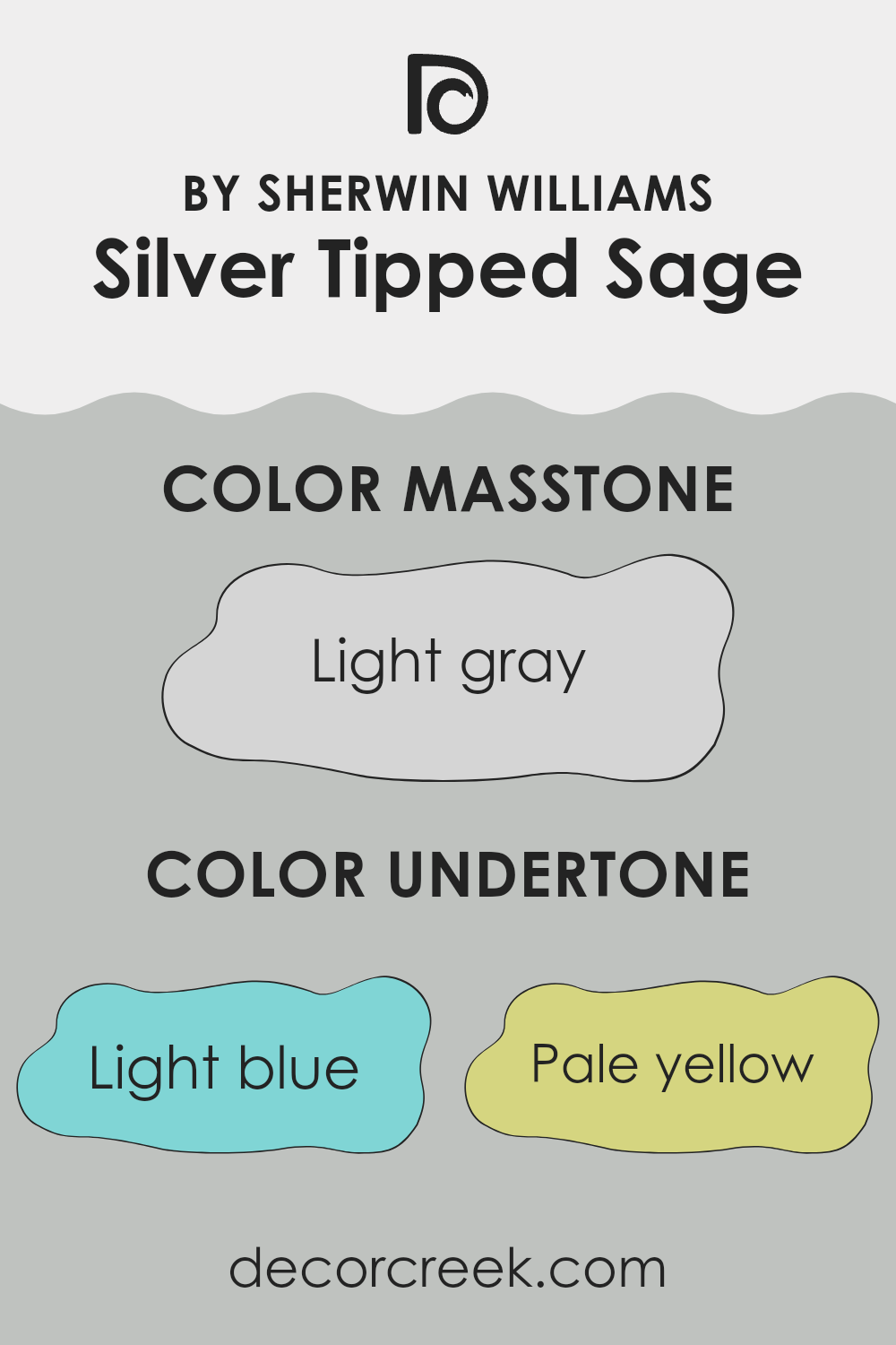
The undertones in Silver Tipped Sage include light blue, pale yellow, light purple, mint, lilac, pale pink, and grey. Each of these undertones can come into play under different lighting conditions. For example, in a room with a lot of natural light, the pale yellow or light blue might become more visible, giving the walls a cheerful and airy feel. In artificial light, the grey or light purple might stand out more, adding a slightly cooler and gentler vibe.
When using Silver Tipped Sage on interior walls, the room’s lighting and the colors of the furniture and decorations can draw out different undertones. For instance, pairing it with blues can enhance its blue undertones, making the room feel more calming. Similarly, using yellow decor elements might highlight the yellow undertones, creating a warmer atmosphere.
This ability to shift in appearance makes Silver Tipped Sage a versatile color choice for many spaces, fitting well with various styles and tastes. Understanding these undertones can help you decide if it’s the right color for your room, ensuring it complements the other elements in the space.
What is the Masstone of the Silver Tipped Sage SW 9642 by Sherwin Williams?
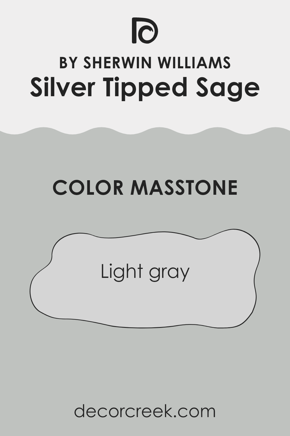
Silver Tipped Sage (SW 9642) by Sherwin Williams has a masstone of light gray, represented by the hex code #D5D5D5. This neutral and versatile shade is perfect for home interiors because it pairs well with virtually any color scheme.
Its light gray tone provides a clean and subtle backdrop that allows other colors in the room to stand out. Whether used on walls, trim, or accents, this color helps to create a cohesive look without overwhelming the space. In homes, using this light gray can make small rooms feel larger and more open.
It reflects light, brightening spaces naturally, which is especially beneficial in areas that receive less natural sunlight. Additionally, this shade is less prone to showing small marks or dirt compared to darker colors, making it a practical choice for busy households. Overall, Silver Tipped Sage in its light gray masstone offers a fresh and adaptable option for creating stylish and welcoming home environments.
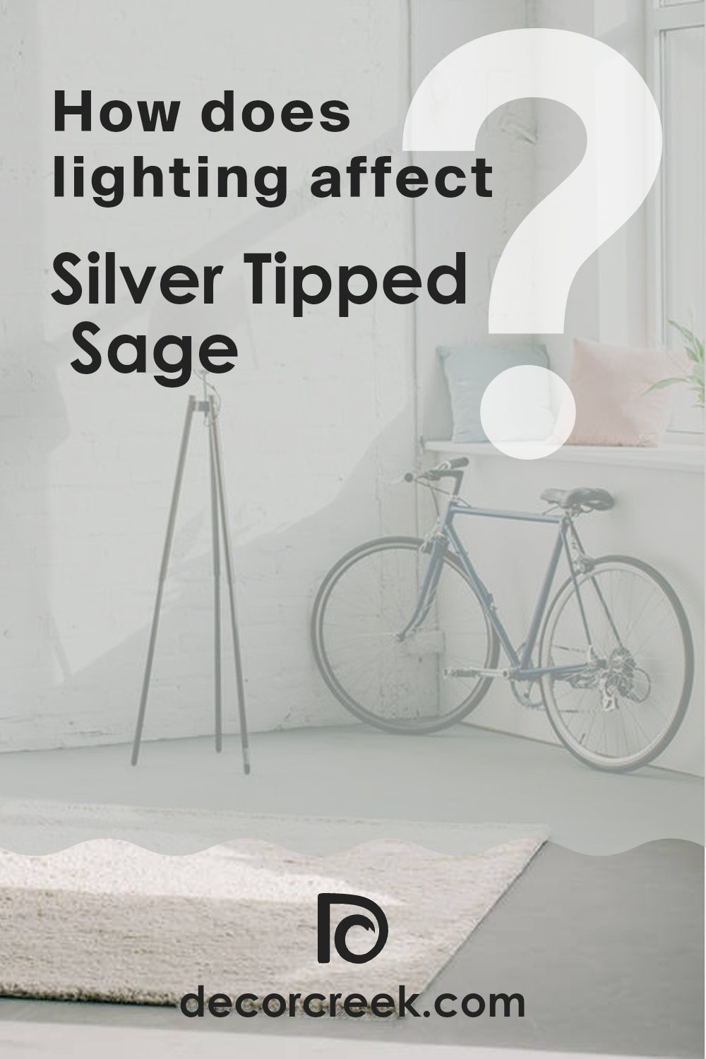
How Does Lighting Affect Silver Tipped Sage SW 9642 by Sherwin Williams?
Lighting plays a significant role in how we perceive colors. The type of light and its intensity can dramatically change the appearance of a paint color, such as Silver Tipped Sage from Sherwin Williams, a subtle blend of green and gray. Understandably, this color will look different under various lighting conditions, including artificial and natural light.
In artificial light, Silver Tipped Sage tends to exhibit its undertones in a more pronounced way.
Depending on the type of bulb used—whether it’s warm or cool—the color can shift.
Natural lighting brings out more of the green hues, making the color appear slightly warmer and more welcoming.
Cool lighting, on the other hand, can enhance its gray qualities, giving the room a sharper and more modern look.
– North-facing rooms: These rooms often receive less direct sunlight, which can make the Silver Tipped Sage appear more muted and cooler, with its gray tones becoming predominant. This can make the room feel calm and relaxed but slightly darker.
– South-facing rooms: Here, the abundant natural light can warm up the color, enhancing its green undertones and giving the room a brighter, more lively appearance. This is ideal for spaces where you want to feel energized and refreshed.
– East-facing rooms: With the morning light, Silver Tipped Sage will appear brighter and greener in the morning, creating a cheerful ambiance. As the day progresses and the natural light diminishes, the color cools down, which is perfect for a room used mainly in the mornings.
– West-facing rooms: Evening light causes this color to look quite warm in the afternoon and early evening, emphasizing the soothing, earthy green aspects. This setting works well in spaces designed for relaxation later in the day.
Understanding how Silver Tipped Sage will likely appear and feel under different lighting can assist you in deciding how and where to use it most effectively in your home.
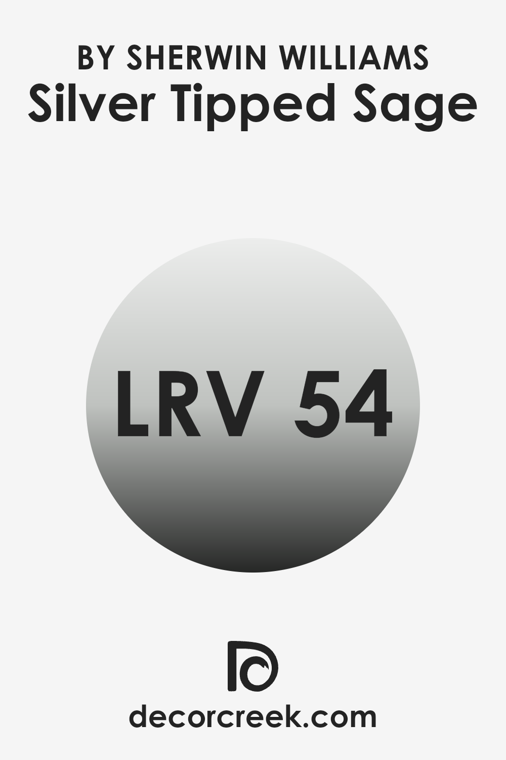
What is the LRV of Silver Tipped Sage SW 9642 by Sherwin Williams?
LRV, or Light Reflectance Value, is a measurement that tells us how much light a paint color reflects compared to the amount it absorbs. This value is expressed on a scale from 0 to 100, where the lower end means the color absorbs more light and appears darker, and the higher end means it reflects more light and appears lighter.
Understanding LRV is crucial when choosing paint colors for your space because it helps you predict how light or dark the color will look on your walls under different lighting conditions.
Silver Tipped Sage has an LRV of 53.523, which places it in the mid-range of the scale. This means it neither reflects nor absorbs light excessively, making it a versatile choice for many spaces. This LRV suggests that Silver Tipped Sage will bring a balanced light into a room, creating an environment that feels neither too bright nor too dim. Whether the room is illuminated with natural or artificial light, this color will maintain a consistent look without dramatic changes in appearance, making it a reliable choice for both sunny and less-lit rooms.
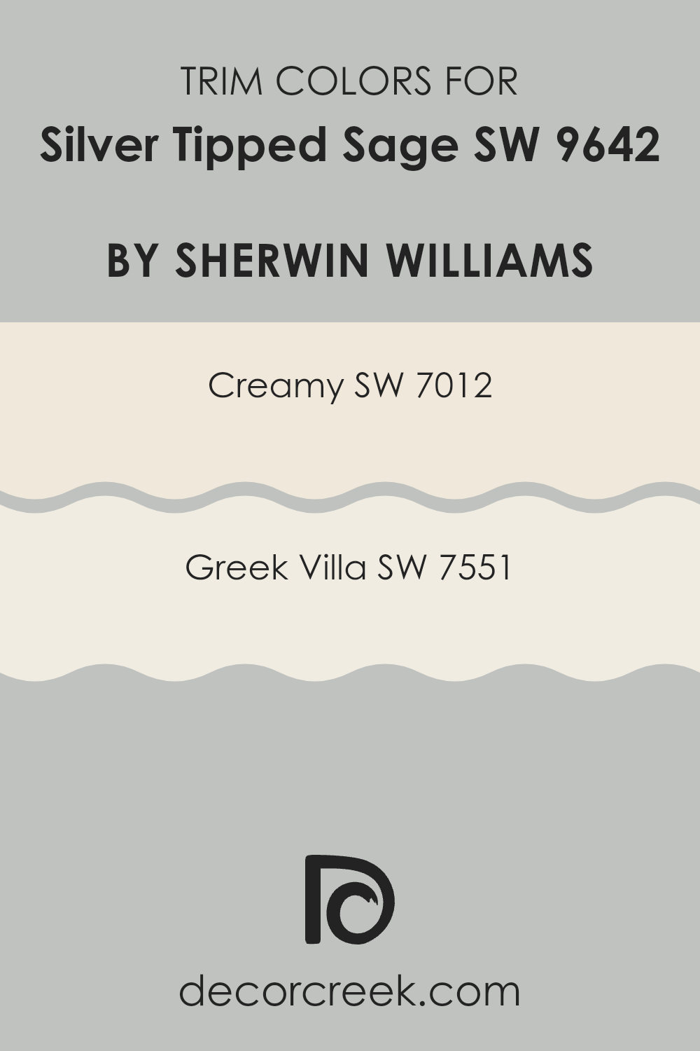
What are the Trim colors of Silver Tipped Sage SW 9642 by Sherwin Williams?
Trim colors are those used on the architectural details of a room, such as baseboards, moldings, and door frames, to define and accentuate the structural features of a space. For Silver Tipped Sage, a subtle and airy green-grey shade, selecting the right trim color is essential to create a harmonious and visually appealing contrast that enhances the overall look of the painted area.
Trim colors like Creamy and Greek Villa are excellent choices for complementing Silver Tipped Sage by offering a crisp, clean boundary that highlights the wall color without competing for attention.
Creamy SW 7012 is a soft, warm white with a hint of yellow, providing a gentle contrast that wonderfully frames Silver Tipped Sage, adding a touch of warmth to the surroundings. On the other hand, Greek Villa SW 7551 is a slightly off-white with a neutral base, creating a subtle delineation that complements the cooler undertones of Silver Tipped Sage. Both colors offer a smooth transition from the richer hue of the walls to the trim, enhancing the depth and dimension of the room while keeping the overall aesthetic light and inviting.
You can see recommended paint colors below:
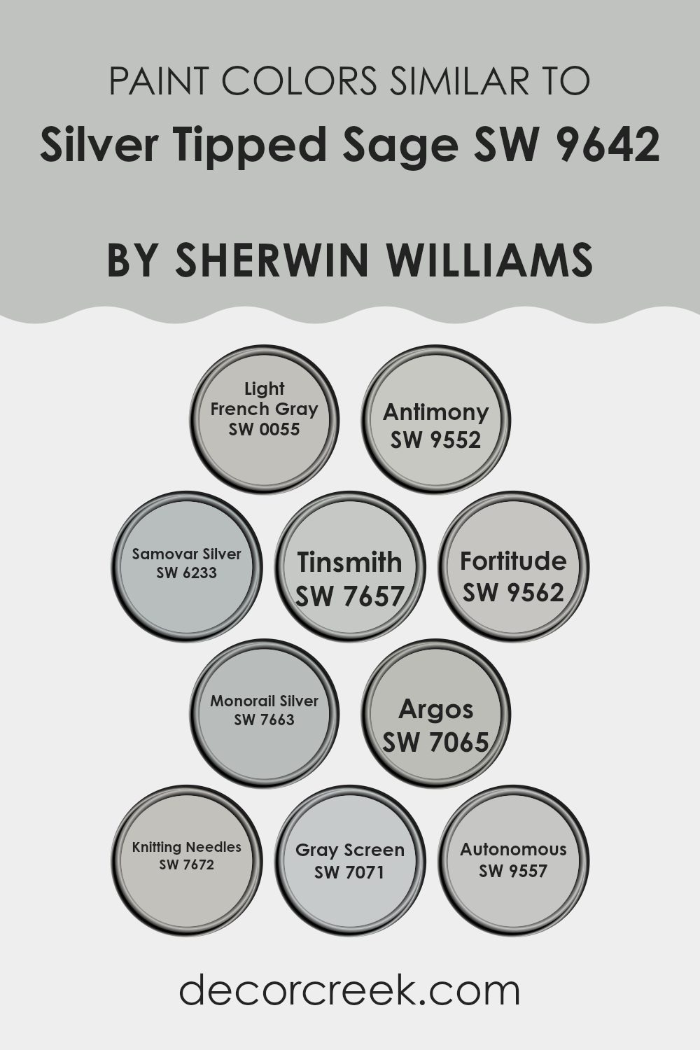
Colors Similar to Silver Tipped Sage SW 9642 by Sherwin Williams
Similar colors are crucial in design because they create a sense of harmony and balance. When colors closely relate to each other, like the shades similar to Silver Tipped Sage by Sherwin Williams, they help unify a space without stark contrasts that can sometimes feel jarring. This gentle blend of hues can enhance the aesthetic flow from one room to another or within a single space, ensuring that all elements work together cohesively.
For instance, Light French Gray is a gentle gray that emits a clean and clear vibe without overpowering a room’s ambiance, making it ideal for peaceful settings. Antimony is a slightly darker shade that offers a subtle depth, adding character while maintaining a light feel throughout the space.
Samovar Silver has a hint of metallic sheen that reflects light beautifully, enhancing the sense of space. Tinsmith, another soft gray, complements various decor elements by providing a neutral backdrop that is both inviting and calming. Fortitude, a bit bolder, brings a dash of drama while still fitting comfortably within a muted palette.
Monorail Silver offers a modern twist with its sleek, almost futuristic appeal. Argos stands out as a deeper, more pronounced gray that can anchor lighter tones. Knitting Needles strikes a balance, being neither too light nor too dark, ideal for those seeking a middle ground.
Gray Screen projects a crisp, clean look that can brighten darker corners of a room. Lastly, Autonomous offers a unique blend of gray undertones, perfect for creating a cohesive look when paired with similar shades.
You can see recommended paint colors below:
- SW 0055 Light French Gray
- SW 9552 Antimony
- SW 6233 Samovar Silver
- SW 7657 Tinsmith
- SW 9562 Fortitude
- SW 7663 Monorail Silver
- SW 7065 Argos
- SW 7672 Knitting Needles
- SW 7071 Gray Screen
- SW 9557 Autonomous
How to Use Silver Tipped Sage SW 9642 by Sherwin Williams In Your Home?
Silver Tipped Sage by Sherwin Williams is a unique paint color that can add a special touch to any room in your home. This color has a subtle greyish-green tone that works wonderfully in spaces that benefit from a calm and inviting atmosphere, like bedrooms and living rooms. It’s gentle enough to be used on all walls without overwhelming the space, yet distinct enough to make a decor statement.
Pairing well with natural materials such as wood and stone, Silver Tipped Sage can also be a fantastic choice for kitchens and bathrooms. It brings a clean and fresh feel to these areas, especially when combined with white trim or cabinetry.
If you’re not ready to commit to painting an entire room, consider using it for an accent wall or on kitchen cabinets for a modern, refreshing look. Overall, Silver Tipped Sage offers a versatile option for those looking to refresh their home with a hint of color while keeping the overall vibe relaxed and welcoming.
Silver Tipped Sage SW 9642 by Sherwin Williams vs Tinsmith SW 7657 by Sherwin Williams
Silver Tipped Sage and Tinsmith are both colors by Sherwin Williams that can make any room feel fresh and modern. Silver Tipped Sage has a hint of green, giving it a natural and calming vibe, similar to the soft tones of a garden sage plant. It’s a subtle color that can make small spaces appear bigger.
On the other hand, Tinsmith is a cooler, gray shade that provides a clean and neutral backdrop for any room. It’s perfect for contemporary spaces and works well with both bright and dark accents. While Silver Tipped Sage adds a touch of nature, Tinsmith offers a more classic gray look that matches easily with different decorating styles.
Both colors are versatile, but your choice depends on the mood you want to set: natural and soft with Silver Tipped Sage, or sleek and straightforward with Tinsmith.
You can see recommended paint color below:
Silver Tipped Sage SW 9642 by Sherwin Williams vs Knitting Needles SW 7672 by Sherwin Williams
Silver Tipped Sage and Knitting Needles by Sherwin Williams are two distinct colors that can greatly influence the mood and style of a space. Silver Tipped Sage is a soft, muted green with a hint of gray, giving it a calm and subtle feel. It has an earthy quality, making it a great choice for those looking to bring a touch of nature indoors without overwhelming the space with too bold a color.
In contrast, Knitting Needles is a cooler gray that leans more towards a modern and minimalistic look. This shade is versatile and can be used in a variety of spaces, from kitchens to bedrooms, providing a clean and crisp background that allows other colors or decor items to stand out.
Both colors provide a neutral base, but Silver Tipped Sage offers a touch of warmth with its green undertones, while Knitting Needles keeps things cool and straightforward with its starker gray tones. Depending on your decor goals, either can be a fine choice to create a calm, welcoming environment.
You can see recommended paint color below:
Silver Tipped Sage SW 9642 by Sherwin Williams vs Monorail Silver SW 7663 by Sherwin Williams
Silver Tipped Sage and Monorail Silver, both from Sherwin Williams, show distinct characteristics that set them apart. Silver Tipped Sage is a gentle, muted green with a hint of gray, giving off a calm and natural feel. It reflects a soothing vibe that’s perfect for creating a restful environment in spaces like bedrooms or living rooms.
On the other hand, Monorail Silver presents as a cooler, true gray color that leans slightly toward dark silver. This shade is more neutral and versatile, making it an excellent choice for modern spaces that require a clean, minimalistic look.
While both colors share a base of gray, the green undertones in Silver Tipped Sage add a touch of warmth, contrasting with the stark neutrality of Monorail Silver. Depending on the room and lighting, Silver Tipped Sage might appear more organic and inviting, whereas Monorail Silver works well in settings that benefit from a sleek, contemporary touch.
You can see recommended paint color below:
Silver Tipped Sage SW 9642 by Sherwin Williams vs Antimony SW 9552 by Sherwin Williams
Silver Tipped Sage and Antimony are two distinct colors from Sherwin Williams. Silver Tipped Sage is more of a muted green with hints of gray, giving it a subtle and calming look. It’s a great choice if you want a color that feels natural and unobtrusive in a space.
On the other hand, Antimony has a darker, blue-gray tone, which provides a stronger presence. It’s ideal for creating a bold statement in a room without becoming overwhelming. Both colors lend themselves well to modern decors but serve different purposes based on their depth and intensity.
Silver Tipped Sage works well in spaces that need a touch of color without overpowering other design elements, while Antimony is perfect for accent walls or areas where a touch of drama is desired.
You can see recommended paint color below:
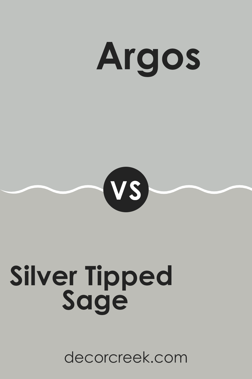
Silver Tipped Sage SW 9642 by Sherwin Williams vs Argos SW 7065 by Sherwin Williams
Silver Tipped Sage and Argos, both by Sherwin Williams, present unique tones ideal for various spaces. Silver Tipped Sage offers a cool green shade with a subtle hint of gray, conveying a natural, refreshing atmosphere. It’s perfect for creating a calm and welcoming vibe in areas such as bedrooms or living spaces.
On the other hand, Argos is a soft, neutral gray that provides a clean and modern look. This color is incredibly versatile, blending well in numerous settings, from kitchens to offices. Its understated elegance makes it a great choice for those who prefer a more minimalist décor, enabling other elements of the room to stand out.
Both colors provide a fresh and contemporary feeling, yet Silver Tipped Sage brings in a touch of nature with its green undertones, while Argos keeps things straightforward and modern with its pure gray tone. Each color has its charm, depending on the mood and style you want to achieve in your space.
You can see recommended paint color below:
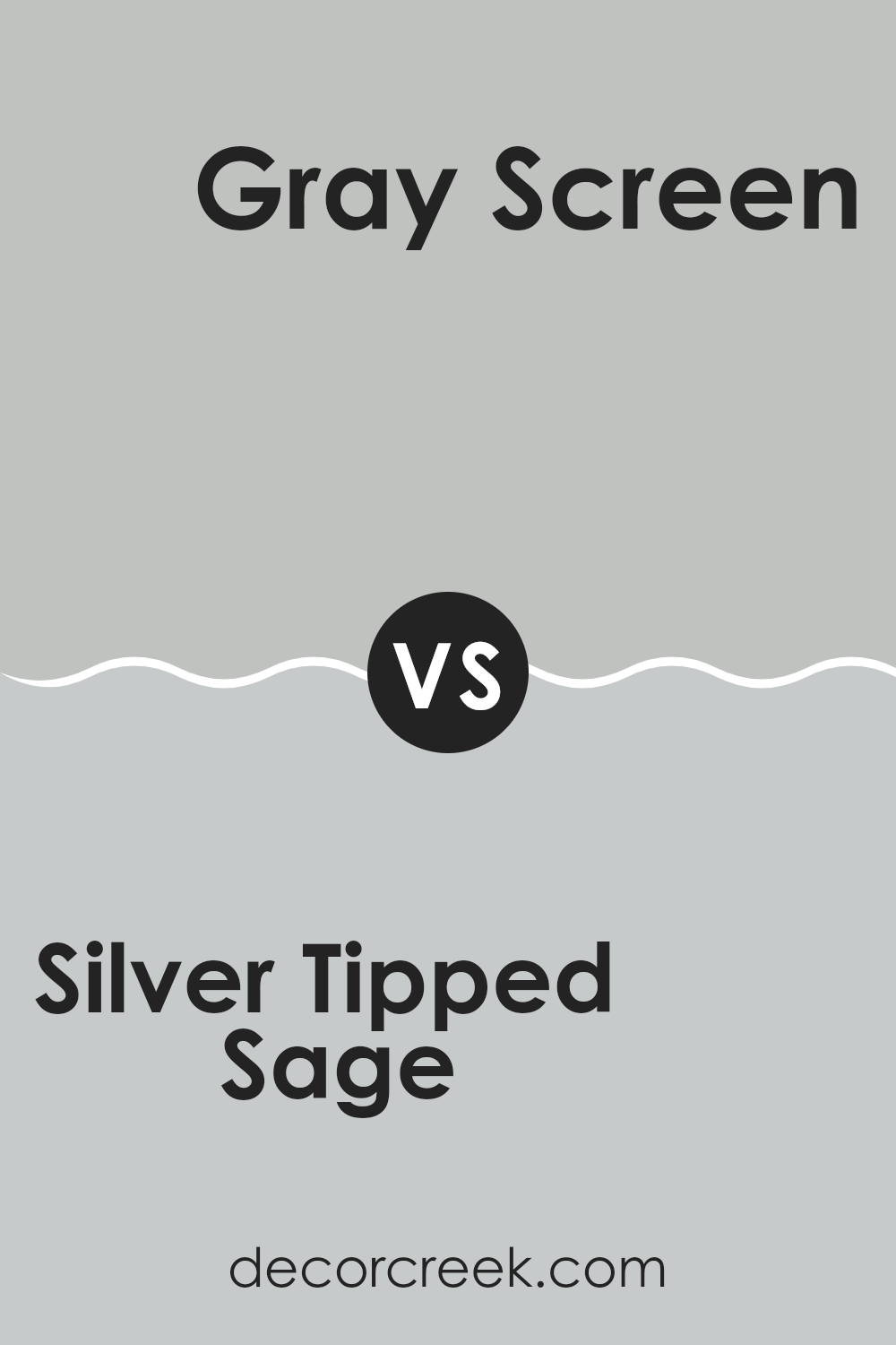
Silver Tipped Sage SW 9642 by Sherwin Williams vs Gray Screen SW 7071 by Sherwin Williams
Silver Tipped Sage and Gray Screen, both from Sherwin Williams, offer unique shades for different tastes. Silver Tipped Sage is a light green with a hint of gray, giving it a fresh, natural feel ideal for creating a calm and welcoming atmosphere. This color works well in spaces that aim for a light, airy vibe, like living rooms or kitchens, where you want a touch of nature’s calmness without overwhelming the senses.
On the other hand, Gray Screen is a true gray that leans on the cool side, offering a crisp, clean look. It’s perfect for modern spaces or any area where you want a neutral backdrop that pairs easily with other colors. This shade is particularly useful in bedrooms or offices where a straightforward, subtle color is beneficial for a focused, calm environment.
Both colors are versatile but serve slightly different aesthetic purposes: Silver Tipped Sage infuses spaces with a gentle hint of color, while Gray Screen keeps things cool and understated.
You can see recommended paint color below:
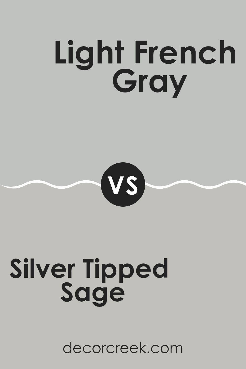
Silver Tipped Sage SW 9642 by Sherwin Williams vs Light French Gray SW 0055 by Sherwin Williams
Silver Tipped Sage by Sherwin Williams is a soft, muted green with a hint of gray, giving it a subtle and calming presence. It works well in spaces where you want to add a touch of nature-inspired color without overwhelming the room. This shade pairs nicely with natural materials like wood and stone.
Light French Gray by Sherwin Williams, on the other hand, is a gentle gray that has a warm undertone. It’s versatile and very popular for interiors, providing a neutral backdrop that complements a wide range of decor styles. This color is ideal for those looking to create a clean and uncluttered look in their space.
Both colors are quite neutral, but Silver Tipped Sage brings a hint of color that can make a room feel more grounded and cozy, while Light French Gray offers a classic simplicity that can help make a small space appear larger and brighter. These colors can work beautifully together or separately, depending on the mood and style you want to achieve.
You can see recommended paint color below:
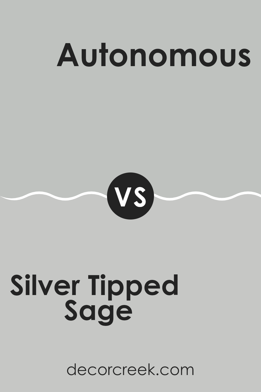
Silver Tipped Sage SW 9642 by Sherwin Williams vs Autonomous SW 9557 by Sherwin Williams
Silver Tipped Sage and Autonomous by Sherwin Williams are two distinct paint colors that can each create a unique vibe in a room. Silver Tipped Sage is a light gray-green that gives off a fresh and clean feeling. This color is subtle and can help make a space feel open and airy.
On the other hand, Autonomous is a darker shade that combines deep blue with traces of gray. It’s a stronger color that brings a sense of calmness and might be better in a study or bedroom where you want a cozier, more enclosed feel.
While Silver Tipped Sage is lighter and can make a room look larger, Autonomous, being darker, does the opposite but adds a richness and depth to spaces instead. Depending on your style and the function of the room, either color can work well. Overall, picking between these hues depends on what kind of atmosphere you’re looking to create.
You can see recommended paint color below:
Silver Tipped Sage SW 9642 by Sherwin Williams vs Fortitude SW 9562 by Sherwin Williams
Silver Tipped Sage and Fortitude are both unique paint colors from Sherwin Williams, but they bring different vibes to a space. Silver Tipped Sage is a subtle gray with a hint of green. It’s light and can make a room feel open and airy, perfect for creating a calm, relaxing atmosphere. It works well in spaces where you want a touch of color without overwhelming the room.
On the other hand, Fortitude is a much darker shade. It’s a deep blue with gray undertones, giving it a strong presence in any area it’s used. This color is ideal for making a bold statement, whether on an accent wall or throughout a room. It pairs well with bright whites or light grays for a crisp look, or can be matched with warm tones for a more enveloping feel.
Both colors have their unique appeal and can be used effectively depending on what mood or style you’re aiming for in your space.
You can see recommended paint color below:
Silver Tipped Sage SW 9642 by Sherwin Williams vs Samovar Silver SW 6233 by Sherwin Williams
Silver Tipped Sage and Samovar Silver are two paint colors by Sherwin Williams that each have their unique appeal. Silver Tipped Sage has a muted green undertone, giving it a natural, soft look that feels calming and light. This color works well in spaces where you want a touch of nature without overwhelming green tones.
On the other hand, Samovar Silver is a cooler, more neutral shade that leans towards a gentle gray. It’s a great choice if you’re looking for a color that blends well with modern décor and can act as a subtle backdrop for bolder colors and designs.
Both colors bring a fresh and airy feel to any room, but Silver Tipped Sage adds a hint of earthiness, while Samovar Silver offers a clean, contemporary vibe. Depending on your style and the atmosphere you want to create, either one could be an excellent choice.
You can see recommended paint color below:
- SW 6233 Samovar Silver
What I really like about Silver Tipped Sage is how it brings a calm and gentle feel to a room. It’s not just green; it has a hint of gray that makes it unique and super pretty.
This color is easy to match with lots of other colors. Whether you have soft white furniture or dark wood shelves, Silver Tipped Sage will work well with them. It’s perfect for a bedroom where you want to feel relaxed or a living room that needs a touch of nature without going overboard.
Also, it seems like this color could hide small marks or dirt better than a very light color, which is helpful in spaces used often, like a family room. From what I’ve seen, this paint goes on the wall smoothly, and it keeps looking good even after some time.
Choosing the right color can be hard, but Silver Tipped Sage is a safe and pretty choice that could make any room look and feel nicer. Whether you’re redoing your whole house or just one room, I think this color is definitely worth considering!

Ever wished paint sampling was as easy as sticking a sticker? Guess what? Now it is! Discover Samplize's unique Peel & Stick samples.
Get paint samples

