In the world of interior design and home renovation, color selection plays a pivotal role in creating the desired ambiance and mood within a space. Sherwin Williams, a renowned name in the paint industry, offers an extensive palette of shades catering to diverse aesthetic preferences and design requirements.
Among their wide array of colors, SW 9552 Antimony, stands out as a unique and versatile option for homeowners and design professionals alike.
Antimony by Sherwin Williams is not just a color; it’s a statement of sophistication and elegance. This particular shade can add depth and character to any room, making it feel more inviting and nuanced.
Its versatility is one of its strongest attributes, allowing it to be seamlessly incorporated into various design styles—from modern and minimalist to cozy and traditional.
Whether you’re aiming to refresh a single room or looking to execute a comprehensive home makeover, Antimony provides a solid foundation around which to curate your decor and accessories.
Choosing the right color is paramount in achieving the intended aesthetic effect in your living spaces. With SW 9552 Antimony, Sherwin Williams offers a solution that combines timeless appeal with contemporary sensibility, making it a popular choice for those looking to strike a balance between trendiness and classic elegance.
This article aims to explore the distinctive qualities of Antimony, providing insight into how it can transform and elevate any interior design project.

What Color Is Antimony SW 9552 by Sherwin Williams?
The hue known as Antimony, from Sherwin Williams, embodies a delicate balance of understated sophistication and welcoming warmth. This color projects a soft, versatile essence, subtly captivating with its gentle depth.
Envision a pale, dusky violet, whispering stories of serene early mornings and the tranquil transition to twilight. Its muted character allows it to act as a nuanced neutral, making it remarkably versatile for interior design.
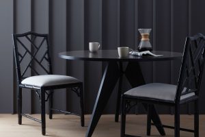
Antimony shines in interior styles that seek to evoke calmness and understated elegance. It pairs beautifully with minimalistic and Scandinavian designs, where its subtle presence adds depth without overwhelming.
In modern farmhouse settings, its warm undertones complement rustic wood textures and natural fibers, enhancing the homely feel.
For a contemporary twist, incorporating this color into Art Deco or Bohemian interiors introduces a layer of sophistication that bridges the bold and the whimsical.
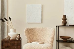
In terms of materials and textures, Antimony works exceptionally well with a range of pairings. It complements natural wood, from light oak to rich walnut, highlighting the warmth in both. When juxtaposed with metallic finishes like brushed bronze or matte gold, it creates an exquisite contrast.
Soft, plush textures in fabrics, such as velvet or linen, bring out its cozy undertones, making spaces feel inviting.
Moreover, its adaptability with stone surfaces, from sleek marble to rugged slate, showcases its versatility. This color’s gentle depth provides a perfect canvas for integrating varied materials and textures into a cohesive and tranquil interior space.
Ever wished paint sampling was as easy as sticking a sticker? Guess what? Now it is! Discover Samplize's unique Peel & Stick samples.
Get paint samples

Is Antimony SW 9552 by Sherwin Williams Warm or Cool color?
Antimony, assigned the code 9552, is a captivating hue offered by Sherwin Williams that truly transforms spaces with its unique charm. This color straddles the line between a deep, moody gray and a whimsical, light blue, offering a versatile palette that can suit varied interior themes, from modern minimalist to cozy traditional.
Its ability to reflect and absorb light depending on the time of day means it can create dynamic shifts in a room’s ambiance, adding depth and interest to walls without overwhelming the senses.
In homes, Antimony serves as a sophisticated backdrop that can elevate furniture and decor, allowing vibrant accents to pop or providing a serene base for a more muted, elegant aesthetic. Its cooling undertone makes it especially suited for rooms that aim to be a sanctuary for relaxation, like bedrooms and bathrooms.
Additionally, because of its balanced saturation, it works seamlessly in spaces with natural light or in areas relying on artificial lighting, maintaining its distinctive character without skewing too dark or too light.
Incorporating Antimony into a home invites a blend of tranquility and refined style, making it a standout choice for those looking to infuse their space with a modern yet timeless touch.
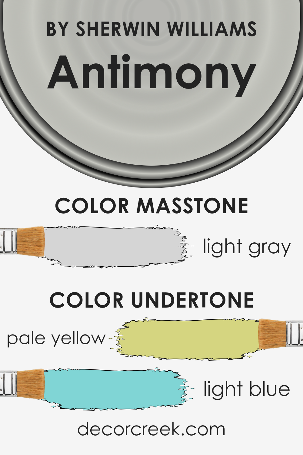
Undertones of Antimony SW 9552 by Sherwin Williams
Antimony is a unique and versatile color that draws its depth and complexity from its subtle undertones. The interplay of pale yellow and light blue undertones contributes to its dynamic character. These undertones are not immediately obvious but play a crucial role in the color’s perception and its impact on interior spaces.
Pale yellow undertones bring a sense of warmth and light. They can make spaces feel more inviting and cozy, adding a touch of brightness without overwhelming the senses. This quality is especially appreciated in rooms that aim for a comfortable, welcoming atmosphere.
The light blue undertones, on the other hand, provide a counterbalance. They introduce a cool, serene vibe, which can make spaces feel more spacious and tranquil. This cooling effect is particularly valued in environments where relaxation and calm are priorities.
The combination of these undertones in this color results in a highly adaptable paint choice for interior walls. Depending on the natural and artificial lighting, as well as the surrounding colors and décor, the undertones can shift in prominence, influencing the room’s ambiance.
In bright, sunlit rooms, the pale yellow might become more pronounced, enhancing the warmth of the space. In contrast, in rooms with cooler, artificial light, the light blue undertones might dominate, creating a more serene and restful environment.
Understanding the role of these undertones is essential for utilizing the color to its full potential in interior design. They allow for flexibility and creativity, enabling designers and homeowners to evoke different moods and styles within a single space.
Through strategic lighting and pairing with complementary colors, one can manipulate these undertones to achieve the desired effect, making this color a fascinating choice for those looking to infuse their homes with depth and character.
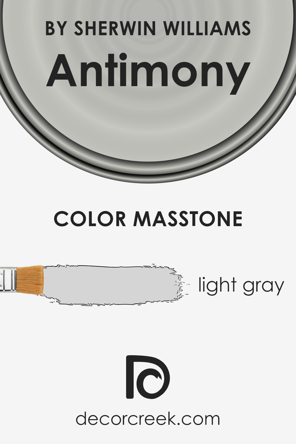
What is the Masstone of the Antimony SW 9552 by Sherwin Williams?
Antimony by Sherwin Williams is a captivating hue, encapsulating a light gray masstone that exudes a serene and sophisticated ambience in any space. This particular shade, marked by its delicate balance, operates as a versatile canvas in homes, seamlessly complementing a wide array of design styles and colors.
Its subtle undertone ensures that it integrates well with both warm and cool palette elements, making it an ideal choice for those seeking to create a cohesive look throughout their home.
The light gray masstone not only serves as a neutral background, enhancing the vibrancy of accent colors but also contributes to a sense of spaciousness and openness in rooms. It is particularly effective in areas with abundant natural light, where it adopts a luminous quality, further elevating the sense of airiness.
Because of its understated elegance, this shade is perfect for creating a tranquil retreat in bedrooms or a productive atmosphere in home offices, demonstrating its broad utility across various living spaces.
In essence, its masstone ensures it is a harmonious choice, fostering a peaceful and balanced home environment.
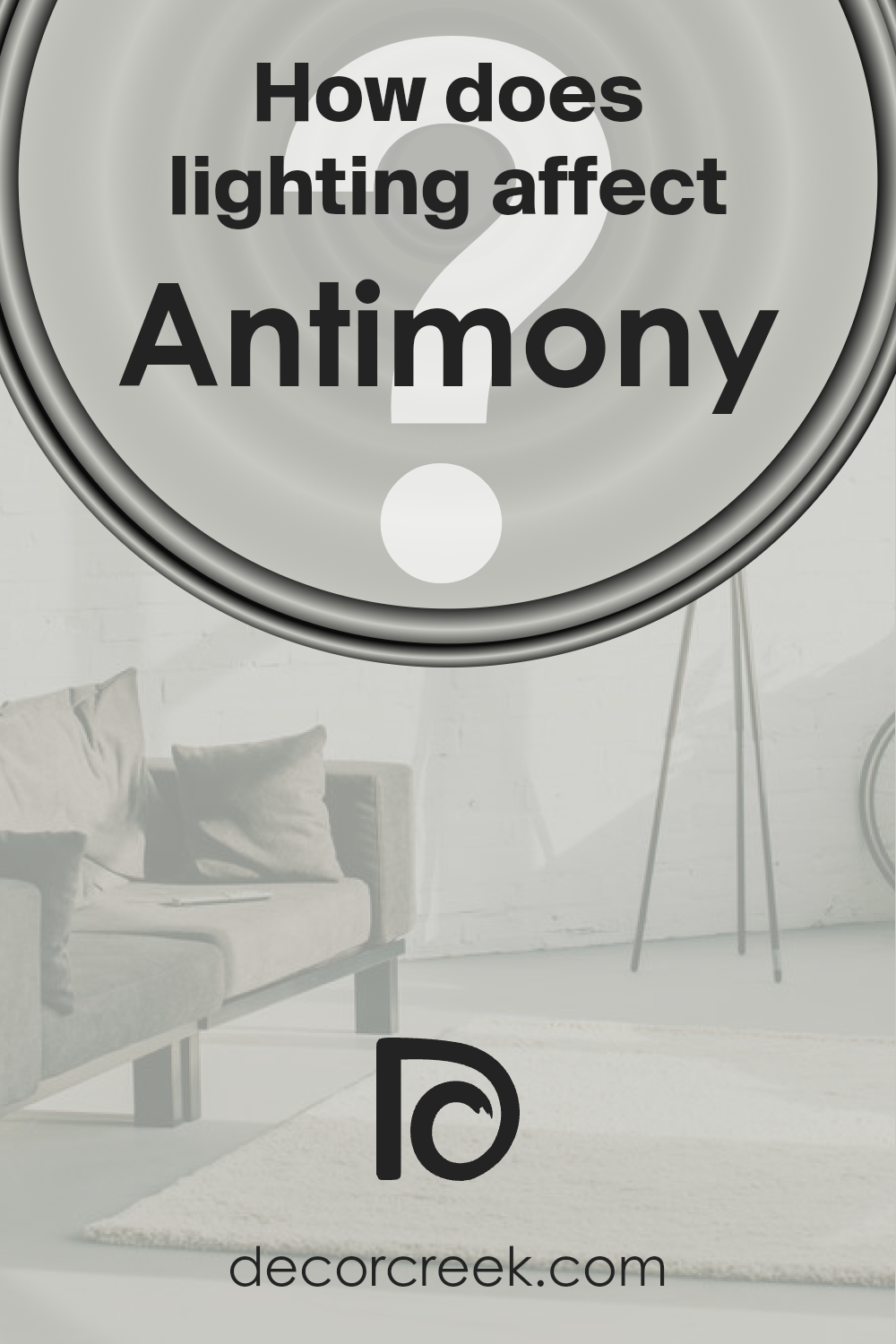
How Does Lighting Affect Antimony SW 9552 by Sherwin Williams?
Lighting plays a critical role in how we perceive colors, significantly impacting their appearance and the ambiance they create.
This interplay between light and color is essential when considering a paint color for any space, such as a nuanced shade from Sherwin Williams.
Lighting can alter the appearance of this color, making it appear differently under various light sources or at different times of the day.
In artificial light, the color’s true essence can either be enhanced or muted depending on the type of bulb used. LED lights with a cooler temperature can make the color appear slightly more vibrant, mirroring its appearance in natural daylight.
In contrast, incandescent bulbs, which emit a warmer glow, can deepen the color, giving it a richer and more intense look.
The specific lighting conditions in a room can, therefore, dramatically affect how this color is perceived, potentially altering its visual impact and the mood it creates.
Natural light brings out the purest form of the color, but the direction of the light source (i.e., which way the room faces) plays a significant role in its final appearance.
In north-facing rooms, light is typically cooler and more consistent throughout the day, potentially causing the color to appear more muted and subdued.
This subtle variation can enhance the tranquility and calmness of a space.
Conversely, in south-facing rooms, the abundance of warm, bright light throughout the day can amplify the warmth and depth of the color, making it appear more vibrant and dynamic. This can create an inviting and energetic space.
East-facing rooms receive the warm, yellow light of the morning sun, making colors look softer and slightly warmer in the morning, then cooler in the afternoon. This shift can bring a gentle, refreshing energy to the morning, subtly transitioning as the day progresses.
West-facing rooms bathe in the intense, warm light of the evening, dramatically changing the appearance of the color from morning to night. In the morning, the color may appear cooler and more shadowed, gradually warming up and becoming more vivid towards the evening.
Understanding how lighting affects color, particularly how a specific shade interacts with the direction of natural light and the type of artificial lighting, is crucial for creating the desired ambiance in any space.
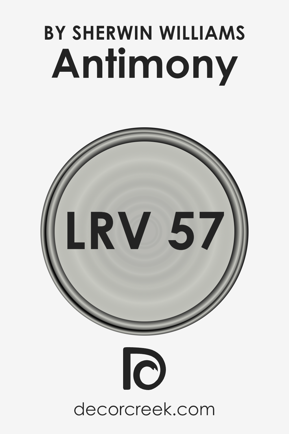
What is the LRV of Antimony SW 9552 by Sherwin Williams?
Light Reflectance Value (LRV) measures the amount of visible and usable light that a color reflects or absorbs. Basically, it’s a scale from 0 (absolute black, absorbing all light) to 100 (pure white, reflecting all light).
The LRV is an essential factor in selecting paint colors because it can significantly affect the appearance and ambiance of a room.
Higher LRVs make spaces appear larger and brighter as they reflect more light, while lower LRVs create a cozier, more intimate space by absorbing light.
This value is particularly helpful in determining how a paint color will look in varying lighting conditions throughout the day and in different seasons, ensuring the chosen hue meets the desired aesthetic and functionality.
Regarding the specific color with an LRV of 57.23, it sits in the mid-range of the LRV scale. This means it has a balanced reflectivity that neither overly brightens a room nor makes it excessively dark.
Such an LRV is versatile, creating a warm, welcoming space that retains a sense of airiness without being stark or cold.
The color can adapt well to different lighting conditions, from natural daylight to artificial lighting, maintaining its unique hue without significant alteration.
In spaces with lower light, it can bring warmth and depth, while in well-lit areas, it can enhance the sense of openness and comfort.
Overall, this LRV makes the color an excellent choice for a variety of spaces and styles, offering a sophisticated and adaptable backdrop to any decor.
LRV – what does it mean? Read This Before Finding Your Perfect Paint Color
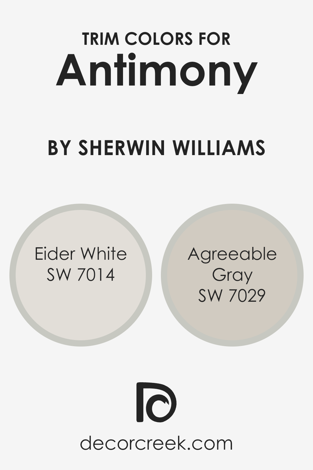
What are the Trim colors of Antimony SW 9552 by Sherwin Williams?
In the world of interior design, trim colors play a pivotal role in defining and accentuating the architectural features of a space.
These are the colors chosen for the trimmings around doors, windows, skirting boards, and sometimes ceilings, offering a frame that can either subtly complement or strikingly contrast the primary hues of the walls.
When considering Antimony SW 9552 by Sherwin Williams, a vibrant and bold choice, selecting the right trim colors becomes essential.
Trim colors not only serve a functional purpose by protecting the edges and corners of surfaces but also have a significant impact on the overall aesthetic and feel of a room.
In this context, colors such as SW 7014 – Eider White and SW 7029 – Agreeable Gray emerge as popular choices for their versatility and ability to harmonize with such a distinctive wall color.
Eider White, with its soft and warm undertones, offers a subtle contrast to the more dynamic Antimony, creating a serene and inviting atmosphere.
This color possesses a hint of gray, making it an excellent choice for a trim color that adds a sophisticated and elegant touch without overwhelming the space.
On the other hand, Agreeable Gray brings a warmer, mid-tone gray to the mix, providing a balanced backdrop that enhances the depth and complexity of Antimony without stealing the spotlight.
Its versatility allows it to complement a wide range of color palettes and design styles, ensuring a cohesive look that ties the elements of the room together harmoniously.
Together, these trim colors ensure that Antimony stands out as a focal point while still being grounded within the space’s overall design scheme.
You can see recommended paint colors below:
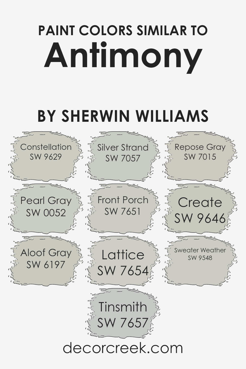
Colors Similar to Antimony SW 9552 by Sherwin Williams
When designing a space, achieving a harmonious and aesthetically pleasing environment is crucial. Similar colors play an essential role in this process, as they ensure visual consistency and create a seamless transition between spaces.
For example, when considering colors in the same family as Antimony by Sherwin Williams, one can explore a variety of harmonious hues that complement and enhance the primary color choice.
These similar shades, varying from cool grays to gentle blues, offer a subtle yet sophisticated palette that can bring depth and complexity to interiors without overwhelming the senses.
By carefully selecting these allied tones, designers can craft spaces that feel cohesive and thoughtfully arranged.
Colors like Constellation and Pearl Gray introduce a soft, ethereal quality to spaces, gently diffusing light and adding a serene calmness. Aloof Gray and Tinsmith, with their subdued elegance, provide a neutral backdrop that complements contemporary and traditional decor alike.
Silver Strand and Front Porch veer towards cooler tones, offering a refreshing and crisp ambiance that echoes the tranquility of seaside landscapes.
Lattice and Repose Gray balance warmth and coolness, making them versatile choices for creating a sophisticated and inviting atmosphere.
Meanwhile, Create and Sweater Weather introduce a depth and richness that anchor spaces, adding character and a sense of coziness.
Each of these colors, by echoing elements of Antimony, ensures a design that is both coherent and rich in visual interest, demonstrating the power and importance of similar shades in the world of design.
You can see recommended paint colors below:
- SW 9629 Constellation
- SW 0052 Pearl Gray
- SW 6197 Aloof Gray
- SW 7657 Tinsmith
- SW 7057 Silver Strand
- SW 7651 Front Porch
- SW 7654 Lattice
- SW 7015 Repose Gray
- SW 9646 Create
- SW 9548 Sweater Weather
How to Use Antimony SW 9552 by Sherwin Williams In Your Home?
Antimony by Sherwin Williams is a captivating paint color that embodies both the strength and subtlety necessary for diverse home styling. Its unique hue, a blend of deep gray with undertones that can hint at a silvery sheen under certain lighting, provides an elegant backdrop for any room.
This versatility makes it an ideal choice for creating a statement in living areas, offering a sophisticated canvas that complements both modern and traditional decor. In bedrooms, Antimony can evoke a serene, calming atmosphere, especially when paired with soft textiles and warm lighting.
For kitchens and bathrooms, its resilience against changing trends ensures a timeless appeal, harmonizing with various materials from marble countertops to wooden cabinets.
Moreover, because of its neutral yet profound depth, Antimony can serve as an accent wall, bringing depth and focus to spaces, or be used on all walls for a more immersive experience.
Utilizing Antimony in your home means embracing a blend of elegance and adaptability, allowing for a myriad of design possibilities.
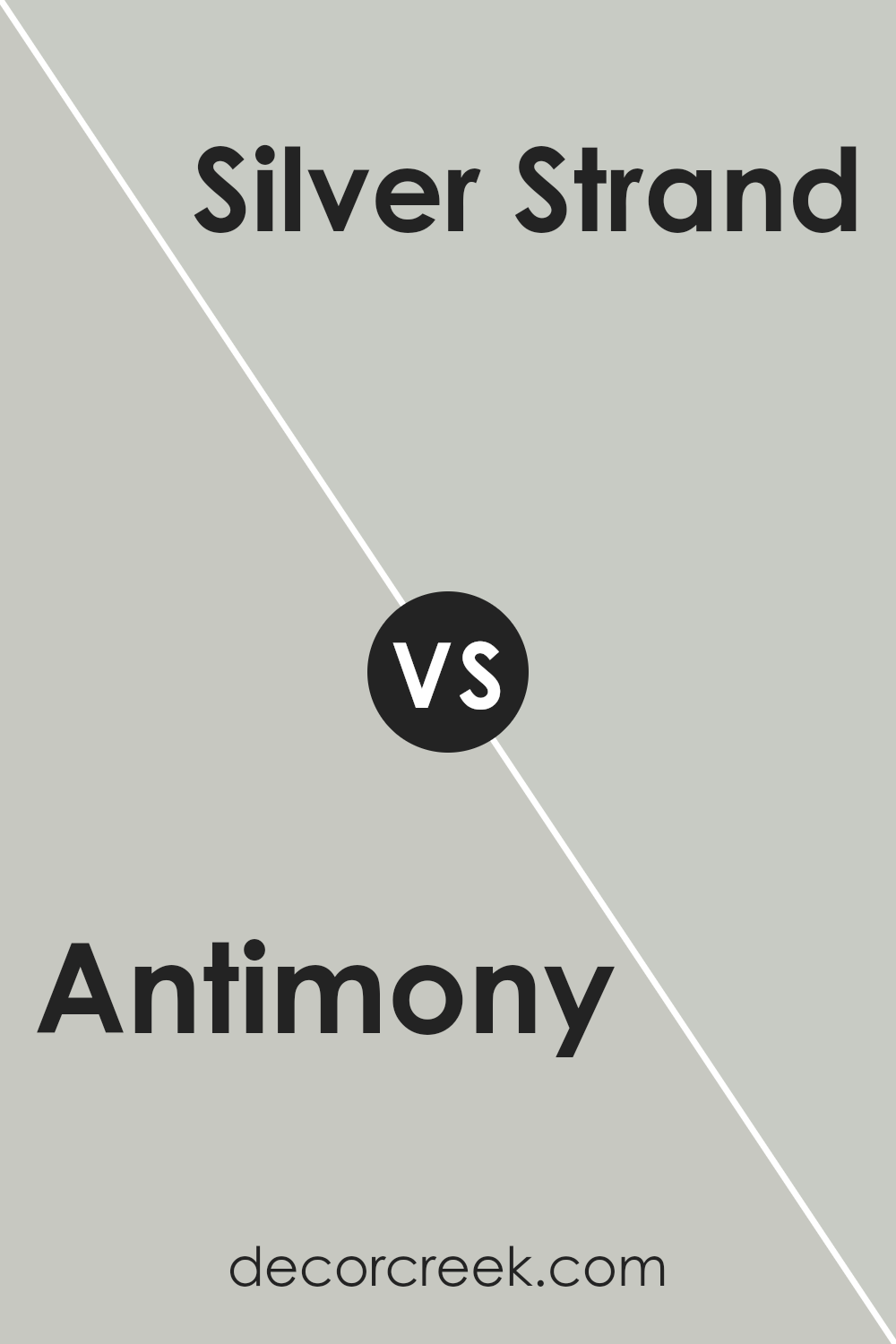
Antimony SW 9552 by Sherwin Williams vs Silver Strand SW 7057 by Sherwin Williams
Antimony is a striking shade that possesses an intriguing depth, offering a rich and luxurious feel to spaces. This color has a unique presence, with a subtle warmth that makes it versatile for various design styles, from modern to traditional.
It can bring a sophisticated edge to interiors, enhancing the ambiance of a room with its distinctive charm.
On the other hand, Silver Strand stands out as a serene and soothing hue. It’s a beautiful blend of gray with soft, green undertones, giving it a tranquil and airy feel. This color is exceptionally adaptable, easily complementing a wide range of decor.
It provides a calm and restful vibe, ideal for bedrooms and living areas where a peaceful atmosphere is desired.
While both colors are from the same manufacturer, their applications and effects on room ambiance are markedly different.
Antimony injects a bold and elegant touch, whereas Silver Strand exudes calmness and adaptability, making each suited to different tastes and spaces.
You can see recommended paint color below:
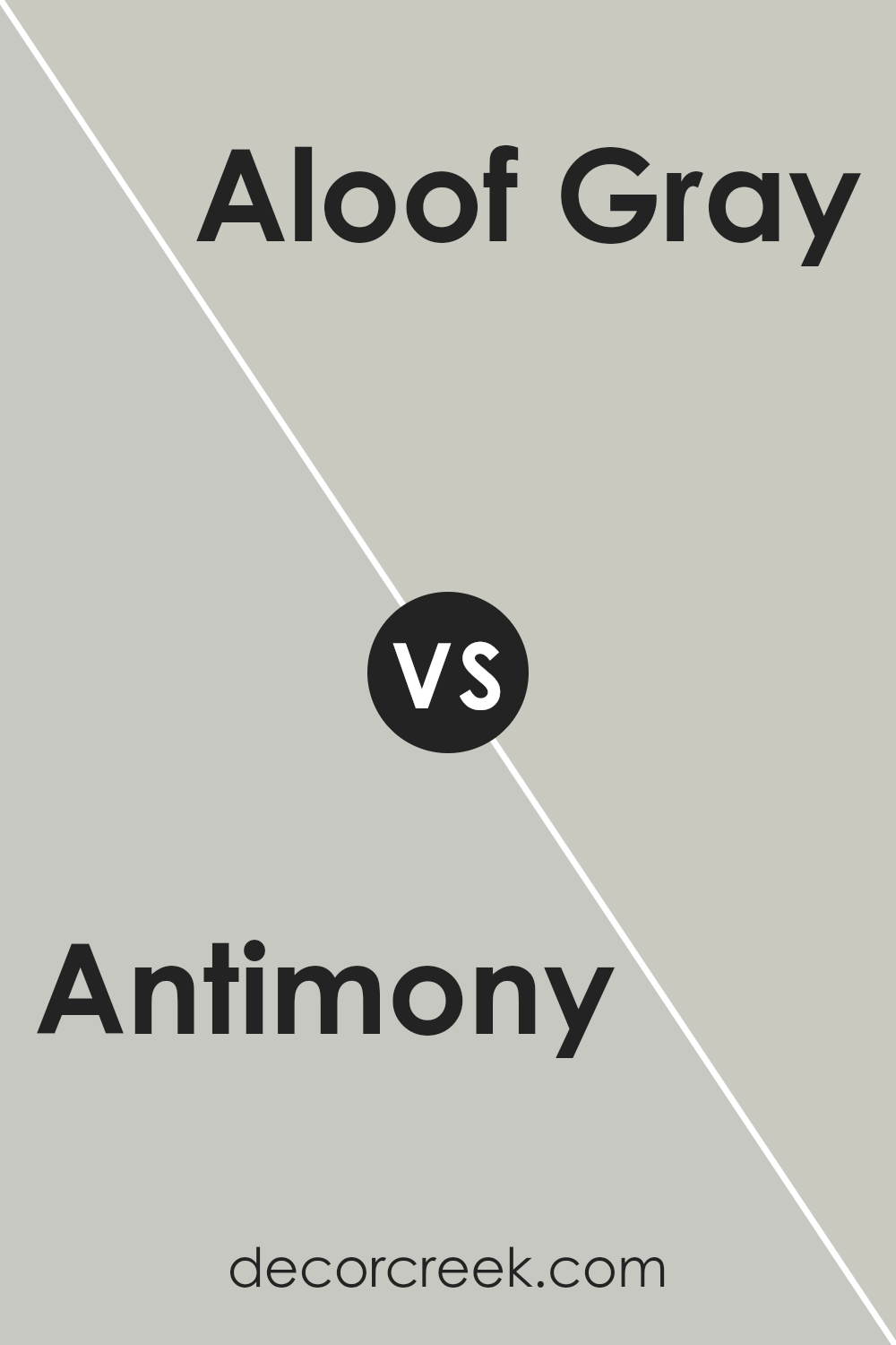
Antimony SW 9552 by Sherwin Williams vs Aloof Gray SW 6197 by Sherwin Williams
Antimony and Aloof Gray , both from Sherwin Williams, showcase distinct tones that cater to varying design aesthetics. Antimony presents itself with a subtle, earthy essence, a hue that breathes warmth and comfort into spaces.
Its ability to blend seamlessly with both modern and traditional decors makes it a versatile choice for those seeking a touch of elegance without overwhelming a room’s atmosphere.
In contrast, Aloof Gray stands out for its cool, understated elegance. This color offers a tranquil backdrop, ideal for contemporary settings where the aim is to create a serene, inviting ambiance.
It’s a color that pairs wonderfully with a wide range of accent colors, providing a foundation for design flexibility.
When considered side by side, Antimony and Aloof Gray offer two divergent paths in the realm of interior design. Where Antimony brings a cozy warmth reminiscent of sunlit afternoons, Aloof Gray evokes a calm, reflective mood akin to a serene, overcast morning.
Both colors, however, share a sophisticated subtlety, capable of transforming spaces into refined, welcoming environments.
You can see recommended paint color below:
- SW 6197 Aloof Gray
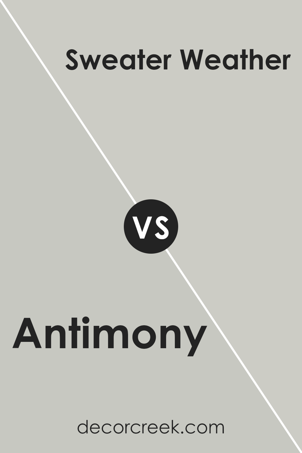
Antimony SW 9552 by Sherwin Williams vs Sweater Weather SW 9548 by Sherwin Williams
Antimony and Sweater Weather , both by Sherwin Williams, offer a subtle yet distinct palette for any space. Antimony presents itself as a soft, muted pink with warm undertones, creating an inviting and soothing atmosphere.
Its gentle hue is perfect for spaces that aim for a serene and cozy ambiance, blending well with both light and dark accents to foster a balanced environment.
On the other hand, Sweater Weather steps in as a cool-toned gray, exuding a sense of calm and sophistication. This color provides a versatile backdrop that complements contemporary and traditional decors alike, making it an excellent choice for those seeking a neutral with depth and character.
While Antimony envelops a room in a tender embrace, Sweater Weather offers a crisp, refined aesthetic.
Together, these colors can harmonize opposites within a space, allowing for creative expression that ranges from the warm, tender touch of Antimony to the cool, understated elegance of Sweater Weather.
You can see recommended paint color below:
- SW 9548 Sweater Weather
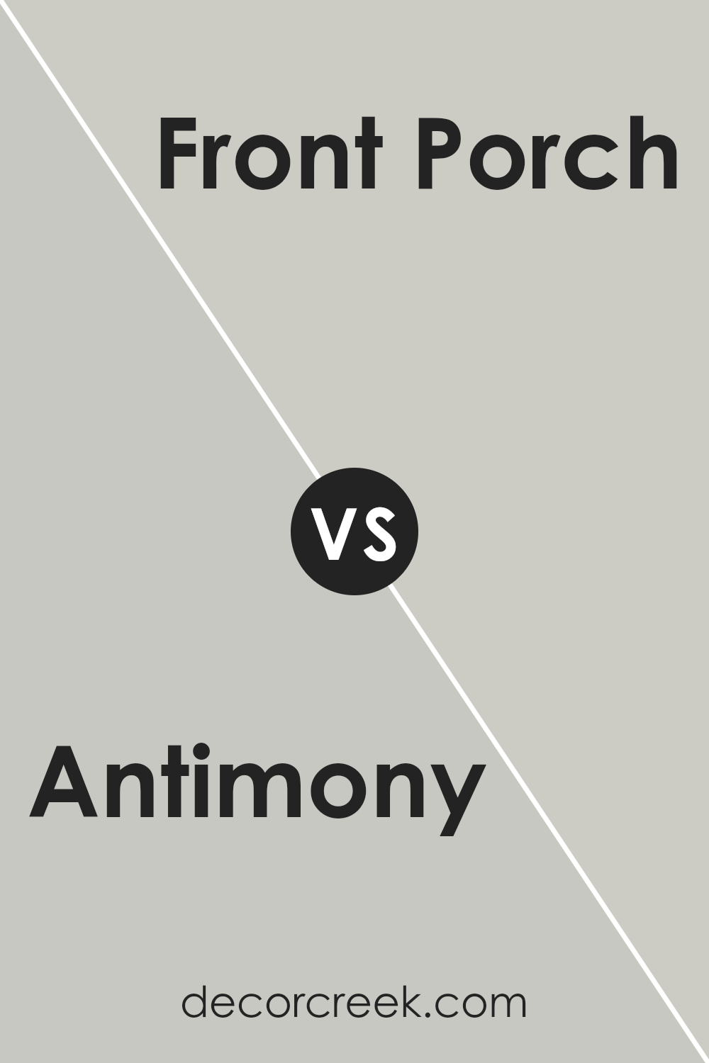
Antimony SW 9552 by Sherwin Williams vs Front Porch SW 7651 by Sherwin Williams
Antimony and Front Porch , both from Sherwin Williams, offer distinct atmospheres for any space. Antimony is a serene, mid-tone blue with a calm and reflective essence, bringing a sense of tranquility and depth to rooms. Its subtle vibrancy can accentuate spaces with a refreshing pop of color.
On the other hand, Front Porch is a gentle, light gray shade that exudes a soft, airy quality. It has an understated elegance, providing a versatile backdrop that complements a wide range of décor.
This color has the unique ability to make spaces feel larger and more open, infusing them with a peaceful, welcoming vibe.
While Antimony draws inspiration from the natural serenity of the sky or water, offering a soothing retreat, Front Porch leans towards a minimalist, contemporary feel, gracefully balancing warmth and coolness.
Together, these colors can harmonize beautifully, with Front Porch acting as a neutral foundation enhanced by the deeper, reflective accents of Antimony.
You can see recommended paint color below:
- SW 7651 Front Porch
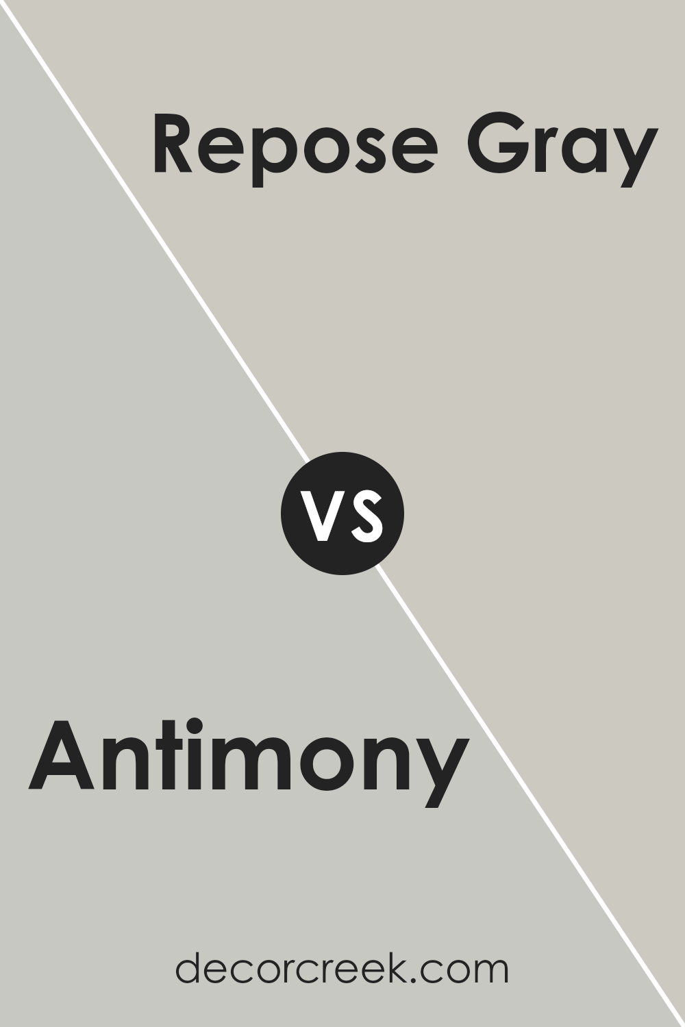
Antimony SW 9552 by Sherwin Williams vs Repose Gray SW 7015 by Sherwin Williams
Both Antimony and Repose Gray are intriguing colors from Sherwin Williams, each offering a distinct personality for space. Antimony presents as a lighter, subtly nuanced gray with an almost ethereal quality to it.
This color has the power to make spaces feel more open and airy, imbuing them with a gentle, sophisticated ambiance. Its softness allows for versatile application, seamlessly fitting into a variety of decorative styles.
On the other hand, Repose Gray sits deeper on the color spectrum. It’s a warm, inviting gray that strikes a delicate balance between gray and beige, oftentimes referred to as “greige.”
This characteristic makes Repose Gray exceptionally adaptable, capable of bringing warmth to spaces while maintaining a contemporary edge.
It’s the kind of color that can anchor a room, providing a solid foundation for decorating with a wide range of colors.
Ultimately, the choice between Antimony and Repose Gray hinges on the desired atmosphere. Antimony is perfect for those seeking a light, airy vibe, while Repose Gray suits those aiming for cozy warmth without sacrificing modernity.
You can see recommended paint color below:
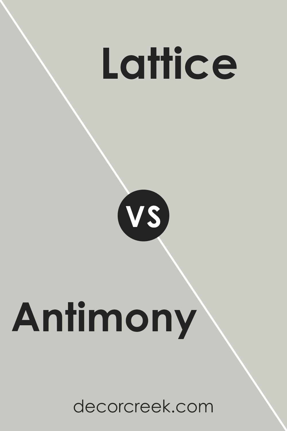
Antimony SW 9552 by Sherwin Williams vs Lattice SW 7654 by Sherwin Williams
Antimony is a distinctive, warm-toned color that draws inspiration from the beauty of natural minerals, echoing a sense of earthiness and warmth.
Its unique shade is poised somewhere between a deep beige and a soft gray, offering a sophisticated yet inviting ambiance to any space.
In contrast, Lattice presents itself as a cooler, more neutral gray that leans towards the lighter end of the spectrum. This color embodies a serene and airy quality, making it exceptionally versatile for various design aesthetics.
When comparing these two Sherwin Williams colors, one can appreciate the warmth and depth Antimony brings, which is ideal for creating a cozy, welcoming environment. It pairs beautifully with rich woods and textured fabrics, enhancing a space’s overall warmth.
On the other hand, Lattice offers a crisp, clean backdrop that serves well in modern, minimalist, or Scandinavian-inspired interiors, providing a soothing neutrality that complements a wide range of accent colors.
In essence, while Antimony infuses spaces with warmth and depth, Lattice offers a light, refreshing counterpoint, showcasing the beauty of restraint and serenity in interior color palettes.
You can see recommended paint color below:
- SW 7654 Lattice
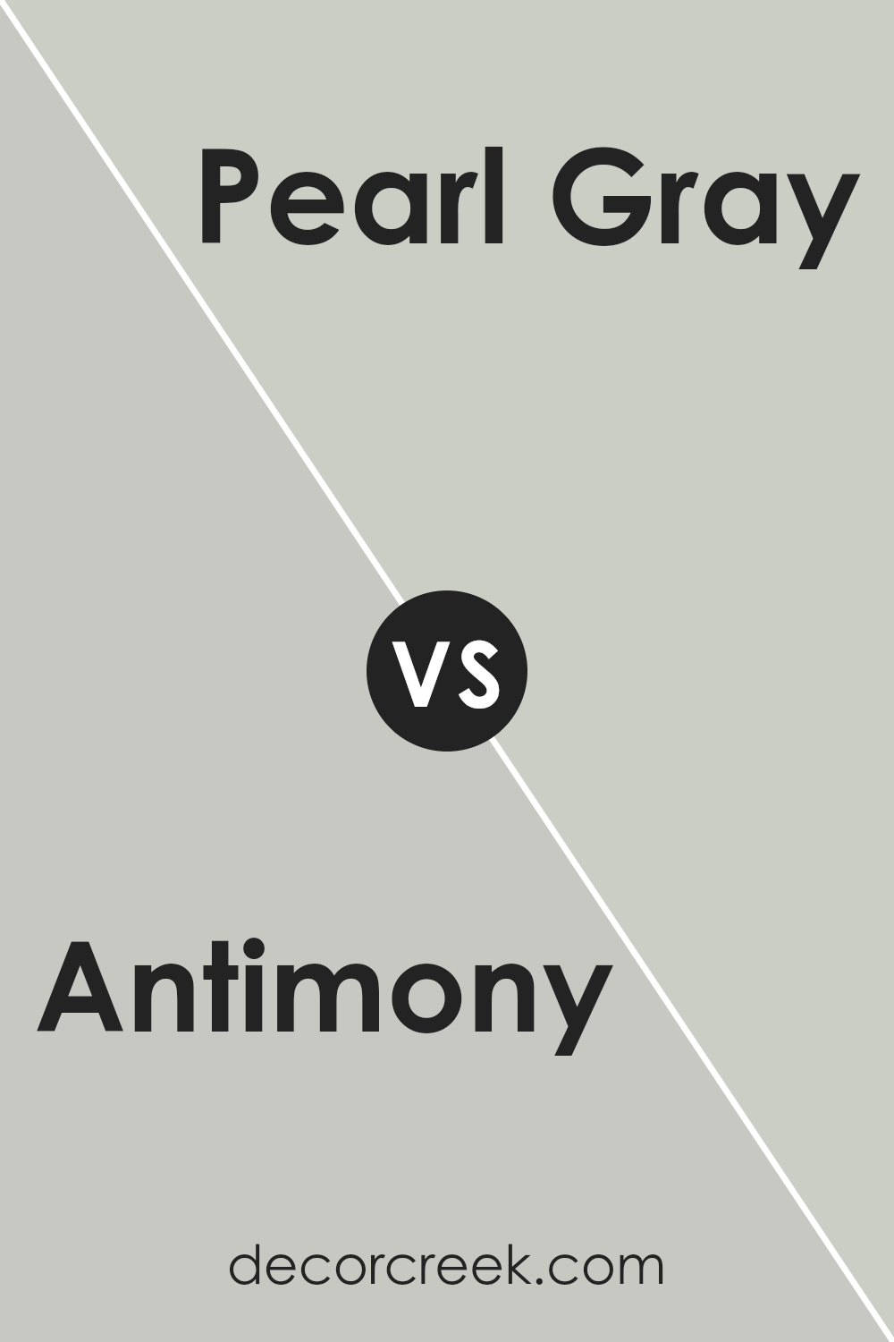
Antimony SW 9552 by Sherwin Williams vs Pearl Gray SW 0052 by Sherwin Williams
Antimony and Pearl Gray , both from Sherwin Williams, present a fascinating study in subtle contrasts, embodying the nuanced dance between warmth and coolness in interior spaces. Antimony, with its gentle, muted gold undertones, radiates a soft, inviting warmth.
This hue captures the essence of a subdued sunrise, offering a cozy ambiance that can make spaces feel more intimate and welcoming.
It complements natural light beautifully, making it ideal for living areas or bedrooms seeking a touch of understated elegance.
On the other hand, Pearl Gray stands as a testament to understated sophistication. Its cool undertones provide a serene, calming effect, reminiscent of a cloudy, overcast sky. This color exudes tranquility, making it perfect for bathrooms, kitchens, or any space aiming for a fresh, airy feel.
It pairs well with crisp whites and deep blues, offering versatility in design schemes.
Together, Antimony and Pearl Gray embody a harmonious balance, perfect for those looking to blend warmth with serenity in their decor. Each brings its unique flair to the table, enabling a range of aesthetic expressions from cozy comfort to minimalist elegance.
You can see recommended paint color below:
- SW 0052 Pearl Gray
Antimony SW 9552 by Sherwin Williams vs Tinsmith SW 7657 by Sherwin Williams
Antimony and Tinsmith , both by Sherwin Williams, present a fascinating duo for anyone interested in subtle yet distinct color variations. Antimony sits confidently in a zone that whispers elegance with its warm, understated grayish hue.
This color has a soothing presence, capable of making spaces feel inviting and cozy, yet maintains a sophisticated edge. In contrast, Tinsmith marches down a cooler path.
It is a lighter, more neutral gray that veers towards a silvered sophistication, offering a breath of fresh air and a contemporary pulse to interior spaces.
While Antimony provides a grounding effect with its slightly warmer undertones, ideal for creating a snug and welcoming atmosphere, Tinsmith illuminates and expands spaces through its crisp, clean vibrancy.
Both colors harmonize well within a palette, yet their individual strengths allow them to stand proudly alone.
Antimony’s depth enriches environments with a serene stability, whereas Tinsmith’s lightness introduces an energizing clarity, making them varied tools in a designer’s arsenal for sculpting mood and character within a room.
You can see recommended paint color below:
- SW 7657 Tinsmith
Antimony SW 9552 by Sherwin Williams vs Create SW 9646 by Sherwin Williams
Antimony SW 9552 and Create SW 9646 are two distinct shades offered by Sherwin Williams that cater to different aesthetic preferences.
Antimony presents a deep, profound gray that carries an undertone of warmth, making it versatile for use in a variety of living spaces.
Its depth allows for a sophisticated backdrop that can make colors pop or serve as a standalone statement of elegance. On the other hand, Create is a vibrant, almost whimsical green with a vivacity that energizes spaces.
Its brightness brings a sense of renewal and life, suitable for areas within a home or office looking to stimulate creativity and openness.
While Antimony leans towards creating a refined, serene environment with its muted yet rich character, Create aims to inspire with its lively hue.
The choice between them depends on the atmospheric goal: the subtlety and sophistication of Antimony is perfect for those seeking a classic look, whereas Create is ideal for spaces intended to spark imagination and energy.
You can see recommended paint color below:
- SW 9646 Create
Antimony SW 9552 by Sherwin Williams vs Constellation SW 9629 by Sherwin Williams
Antimony and Constellation , both from Sherwin Williams, are intriguing in their unique appeal and character, offering distinct feelings and ambiances for any space. Antimony presents as a subtle, gentle beige with warm undertones, evoking a sense of calm, comfort, and simplicity.
This color is versatile, seamlessly blending with various decor styles and serving as a perfect neutral background for both bold and muted color palettes. On the other hand, Constellation strides into the cooler end of the spectrum, offering a fresh, airy light blue that hints at the expansive sky or a soft morning haze.
This color exudes tranquility and serenity, making it ideal for creating a peaceful retreat in bedrooms or bathrooms.
While Antimony provides a warm, embracing foundation, Constellation lightens and refreshes the space, offering an uplifting sense of openness and purity. Together, these colors could complement each other, with Antimony grounding the space and Constellation bringing in lightness and a breath of fresh air.
You can see recommended paint color below:
Conclusion
In conclusion, Antimony by Sherwin Williams is a versatile and appealing color option for those looking to add a touch of sophistication and depth to their space. Its unique hue provides a perfect balance between warmth and neutrality, making it an excellent choice for a wide range of design aesthetics.
From contemporary to traditional settings, this color can enhance the ambiance of a room, offering a backdrop that both complements and elevates existing decor and architectural features.
Furthermore, the adaptability of this color in various lighting conditions adds to its appeal, allowing it to seamlessly transition from a subtle, soothing presence in natural light to a more pronounced and cozy hue under artificial lighting.
This characteristic ensures that spaces painted with this shade maintain their charm and appeal regardless of the time of day. Whether employed in living areas, bedrooms, or even in exterior applications, Antimony proves to be a dynamic and enriching choice, reflecting a keen sense of style and an appreciation for timeless elegance.
Ever wished paint sampling was as easy as sticking a sticker? Guess what? Now it is! Discover Samplize's unique Peel & Stick samples.
Get paint samples