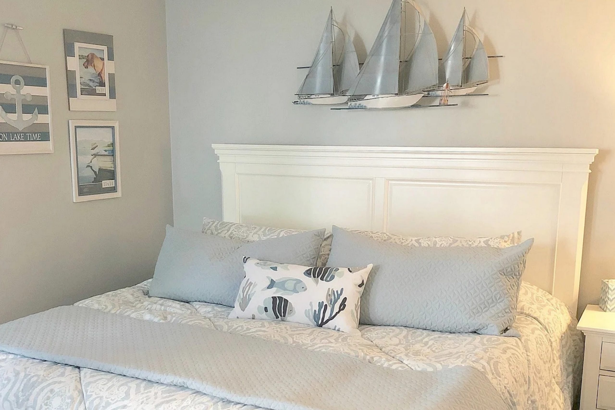
SW 7657 Tinsmith by Sherwin Williams is a color that brings a quiet strength to any space. When you see this shade of gray, it’s like a walk through a serene landscape, where everything feels calm and quietly confident. Tinsmith isn’t bold or overpowering, and that’s where its beauty lies. It serves as a versatile background, making it easy to pair with a range of other colors to create a balanced design.
What I appreciate about Tinsmith is its ability to feel both modern and classic. It’s adaptable, whether you’re going for a sleek, contemporary look or something more traditional. The color works well in various rooms, adding a sense of sophistication without being overwhelming.
It’s perfect for those who want to refresh their surroundings with a hue that’s subtle yet still distinct.
Incorporating Tinsmith into your home can bring about a sense of stability and simplicity. It’s a shade that works well with natural light, reflecting it in a way that makes spaces appear larger and brighter.
There’s something comforting about having a color that feels reliable, one that provides a peaceful backdrop to your daily life. If you’re seeking to create a serene atmosphere, Tinsmith might just be the perfect choice.
What Color Is Tinsmith SW 7657 by Sherwin Williams?
Tinsmith by Sherwin Williams is a soft and cool gray with subtle blue undertones. This shade offers a neutral backdrop that can complement many interior design styles. Its gentle tones make it a great choice for creating a calm and inviting atmosphere. In modern and contemporary interiors, Tinsmith provides a sleek and clean look, enhancing the minimalist elements often found in these spaces.
Tinsmith also works well in coastal and Scandinavian styles, where its understated color can reflect the natural light, adding to the airy feel of a room. This paint color pairs beautifully with natural materials like light woods, offering a nice contrast that highlights wooden textures.
Metals, particularly brushed steel or chrome, can also complement Tinsmith’s light gray, adding an industrial edge to the overall design.
For fabrics and textiles, consider pairing Tinsmith with soft cotton or linen in light colors, which can maintain the room’s brightness and comfort. Adding in textures like knitted throws or woven baskets can provide depth and visual interest.
Overall, Tinsmith is a versatile color that pairs with various materials and styles, making it suitable for different spaces in your home.
Is Tinsmith SW 7657 by Sherwin Williams Warm or Cool color?
Tinsmith SW 7657 is a paint color by Sherwin Williams that presents a soft, neutral gray hue. It sits comfortably between light and medium gray, giving it the versatility to fit various home settings. The color’s subtlety allows it to blend seamlessly with both modern and traditional interiors.
Tinsmith can enhance natural light, making spaces feel open and airy without overwhelming the eyes. This makes it a great choice for living rooms, bedrooms, and kitchens.
When used on walls, Tinsmith provides a calm backdrop that supports other colors, making furniture and decorative elements stand out. It’s compatible with whites and off-whites, adding a gentle contrast or creating cohesion in spaces with multiple gray tones.
In darker rooms, it can brighten spaces just enough to avoid looking too stark. Tinsmith’s understated presence in a room allows for flexibility, as it complements both warm and cool color schemes without clashing.
Undertones of Tinsmith SW 7657 by Sherwin Williams
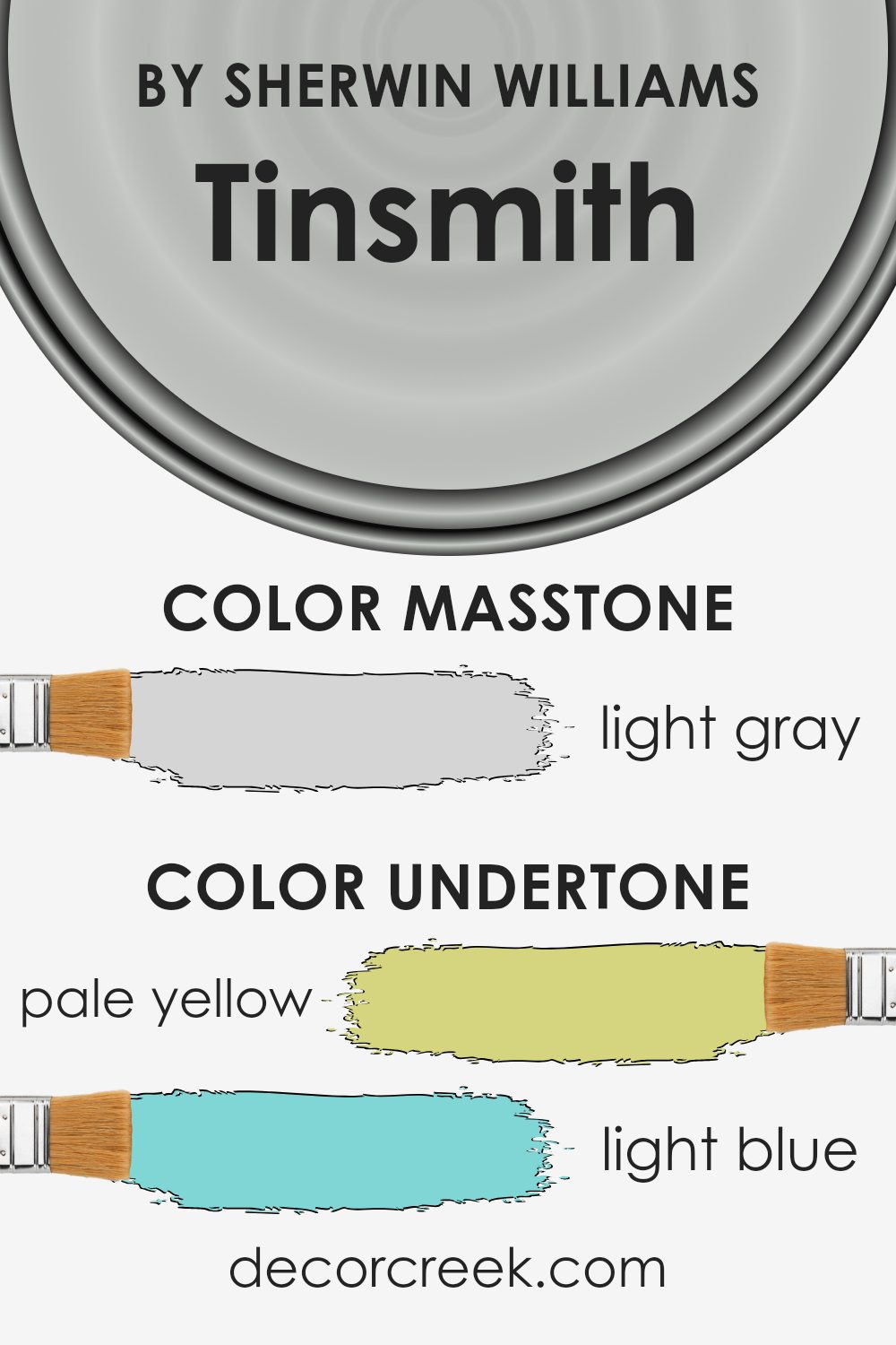
Tinsmith by Sherwin Williams is a color that might seem simple at first glance, but it holds an interesting mix of undertones. These undertones are subtle colors that influence the way we see the main color. In Tinsmith’s case, you’ll notice hints of pale yellow, light blue, light purple, mint, pale pink, lilac, and grey. Each of these undertones plays a role in how the color looks in different lighting.
For instance, in a room with natural light, Tinsmith might appear slightly cooler because of the light blue and grey undertones. On the other hand, in a room with warm, artificial lighting, the pale yellow undertones might become more noticeable, giving the color a warmer and cozier feel.
The pale pink and lilac undertones can add a sense of softness, making walls feel more welcoming without being overwhelming. Mint undertones can bring a touch of freshness. The effect of these undertones can make Tinsmith look different at various times of the day.
Overall, Tinsmith’s mix of undertones makes it versatile for many spaces. It fits well in living rooms, bedrooms, and even kitchens. The color can adapt to both modern and traditional interiors, offering a neutral backdrop that still holds interest.
What is the Masstone of the Tinsmith SW 7657 by Sherwin Williams?
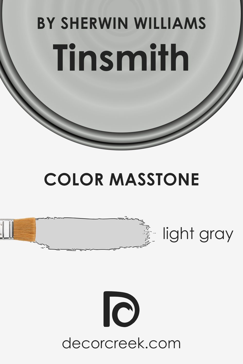
Tinsmith SW 7657 by Sherwin Williams is a light gray with a masstone of #D5D5D5. This color works well in homes because it is versatile and neutral. Its soft gray tone makes it an excellent choice for walls, as it complements both modern and traditional décor.
Tinsmith can give a room a bright and airy feel, especially in spaces with good natural light. It acts as a clean backdrop that enhances other colors and textures in the room. For instance, in a living room, it can make colorful furniture and accessories stand out, while in a bedroom, it creates a calm and restful environment.
Tinsmith’s subtle shade doesn’t overwhelm, making it a top option for those who want a simple yet stylish look. It pairs beautifully with whites and deeper grays, allowing for a cohesive and balanced design throughout the home.
How Does Lighting Affect Tinsmith SW 7657 by Sherwin Williams?
Lighting plays a huge role in how we perceive color. Different types of lighting can change the way colors appear in a room, affecting the mood and feel of a space. Let’s talk about the paint color Tinsmith by Sherwin Williams and how it looks under various lighting conditions.
In natural light, Tinsmith, a soft gray with blue undertones, can appear more vibrant and true to its color. However, in artificial light, the color can shift. If you’re using warm, yellow-toned bulbs, Tinsmith might take on a slightly warmer appearance, muting its blue undertones. On the other hand, cool, white-toned bulbs can enhance the gray and blue tones, making Tinsmith look crisper.
The orientation of a room changes how natural light affects color. In north-facing rooms, the light tends to be cooler and more subtle, which can make Tinsmith look a bit darker and bring out its blue undertones. This might make the room feel cool and calm.
In south-facing rooms, there is a lot of sunlight throughout the day, which can make Tinsmith appear lighter and warmer. The sunlight intensifies the gray aspect, making spaces feel bright and airy.
East-facing rooms get warm, direct sunlight in the morning and cooler light later in the day. In the morning, the warm light can soften Tinsmith, making it look more inviting. Later in the day, the color can appear more subdued as the light becomes cooler.
West-facing rooms have the reverse situation, with cooler light in the morning and warm, orange-toned light in the afternoon and evening. In the afternoon, Tinsmith can take on a warmer hue, while in the morning, it might look more muted and cooler.
Understanding these effects helps in choosing the right paint color for your space, influencing how the color fits the overall feel and function of the room.
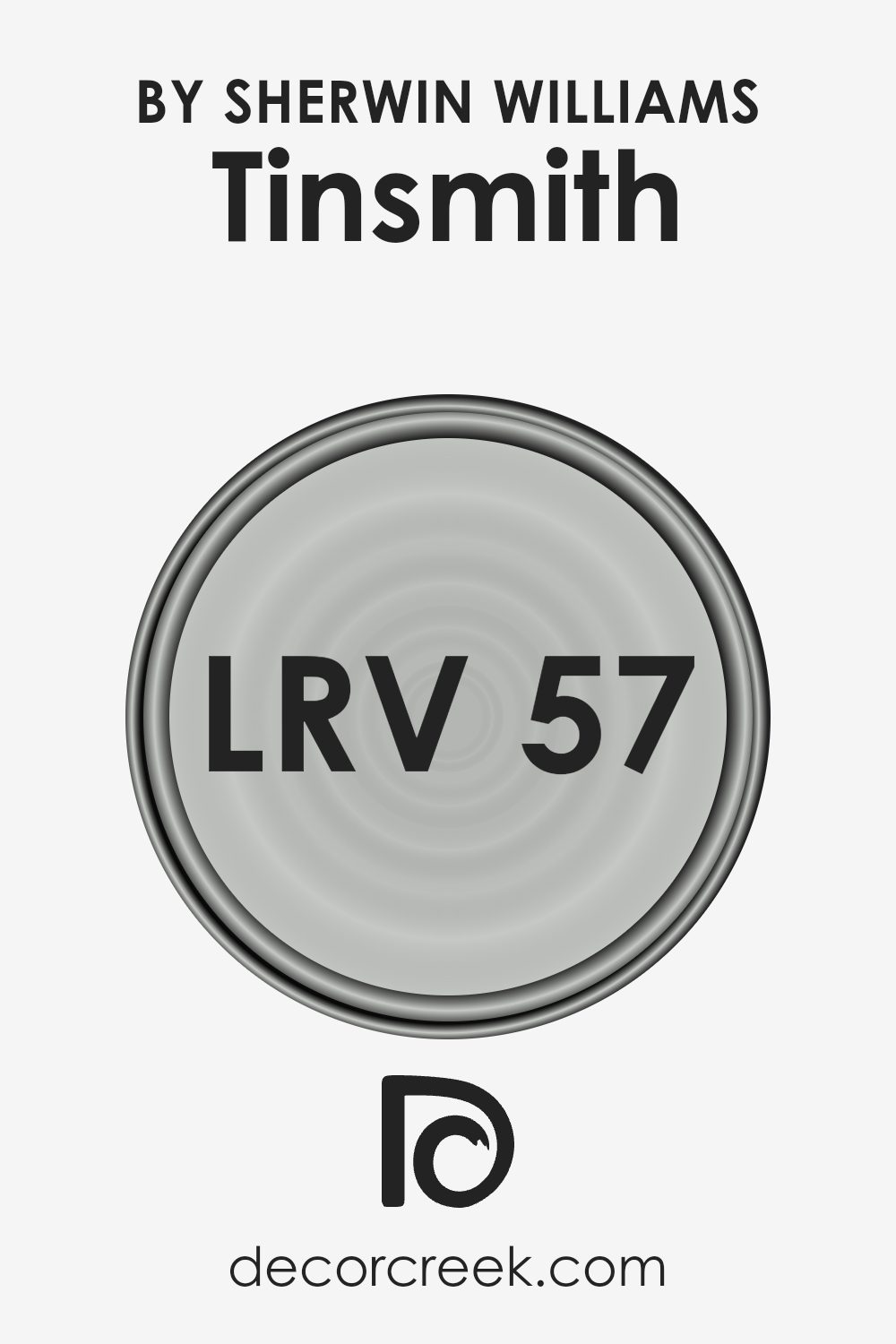
What is the LRV of Tinsmith SW 7657 by Sherwin Williams?
LRV stands for Light Reflectance Value, which measures the amount of visible and usable light reflected by a surface. It is a scale that ranges from 0 to 100, where 0 represents absolute black, reflecting no light, and 100 represents pure white, reflecting all light.
When we talk about a color’s LRV, it tells us how bright or dark the color will appear. Colors with high LRVs, closer to 100, are lighter and reflect more light, making rooms feel brighter and larger. In contrast, colors with low LRVs absorb more light, making spaces feel cozier but sometimes smaller.
For the color Tinsmith from Sherwin Williams, which has an LRV of 57.141, it sits in the mid-range on the LRV scale. This means that Tinsmith reflects a moderate amount of light, helping to strike a balance in a space. It neither makes a room intensely bright nor overly dark.
Because of this balance, Tinsmith can make a room feel open and airy without being too stark or sterile. It works well in spaces where you want to create an environment that is both inviting and bright, making it a versatile choice for different lighting conditions and room sizes.
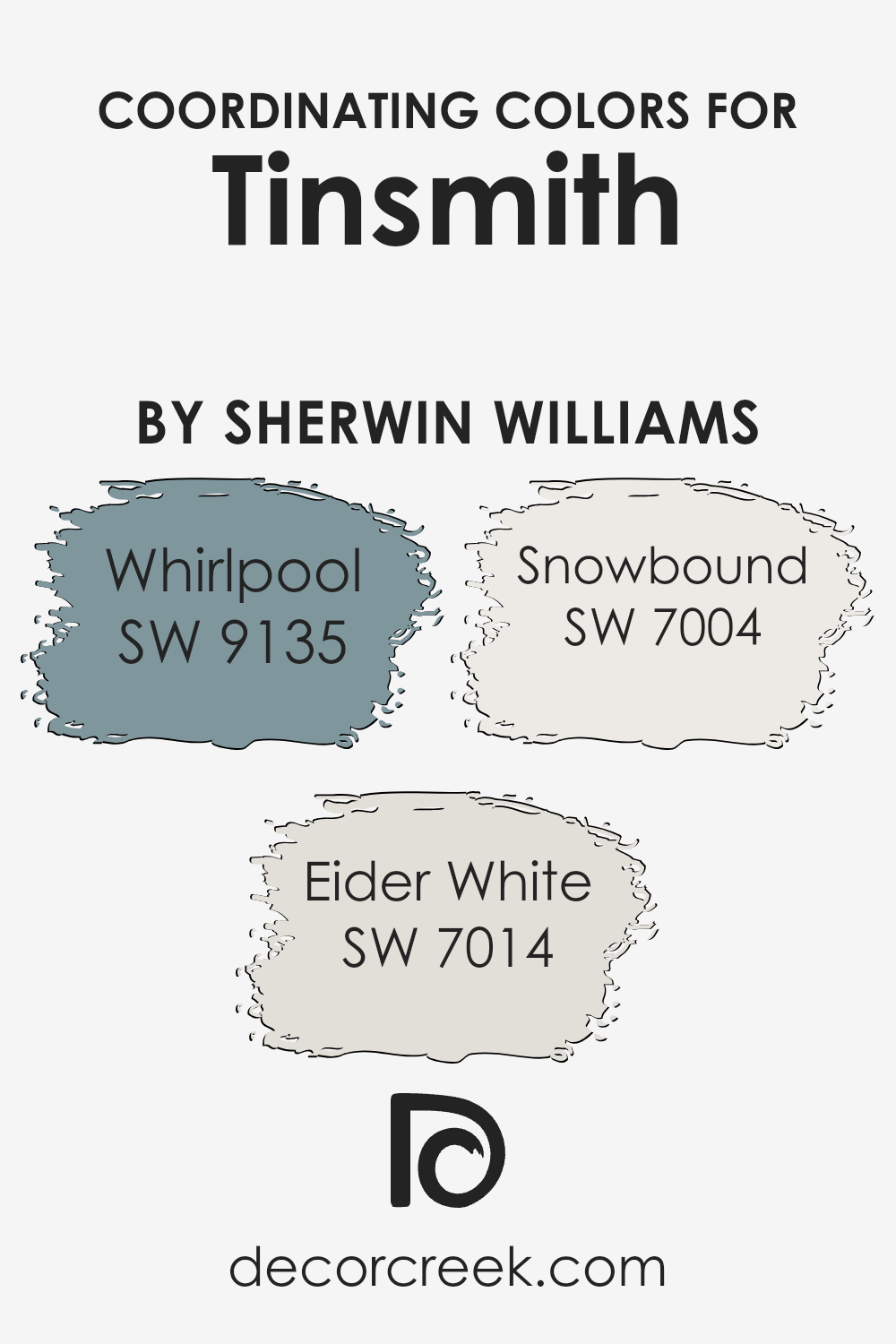
Coordinating Colors of Tinsmith SW 7657 by Sherwin Williams
Coordinating colors are hues that complement or enhance one another when used together in a space. They can create a cohesive look, making a room feel balanced and aesthetically pleasing. By using coordinating colors with Tinsmith by Sherwin Williams, such as Whirlpool, Eider White, and Snowbound, you can achieve a harmonious color palette for your home.
Each color brings its own unique quality while still maintaining a sense of unity with the overall theme.
Whirlpool SW 9135 offers a calming blue-green tone that brings a touch of freshness and subtle energy to any room. It pairs beautifully with Tinsmith, adding depth without overpowering the primary color. Eider White SW 7014 provides a soft, warm off-white backdrop that enhances the lighter features of Tinsmith, creating a gentle contrast that is perfect for open, airy spaces.
Snowbound SW 7004 is a crisp, clean white that highlights the other colors and adds a bright, modern touch to the palette. Together, these coordinating colors work to create a seamless and inviting look that can make any room feel more complete and welcoming.
You can see recommended paint colors below:
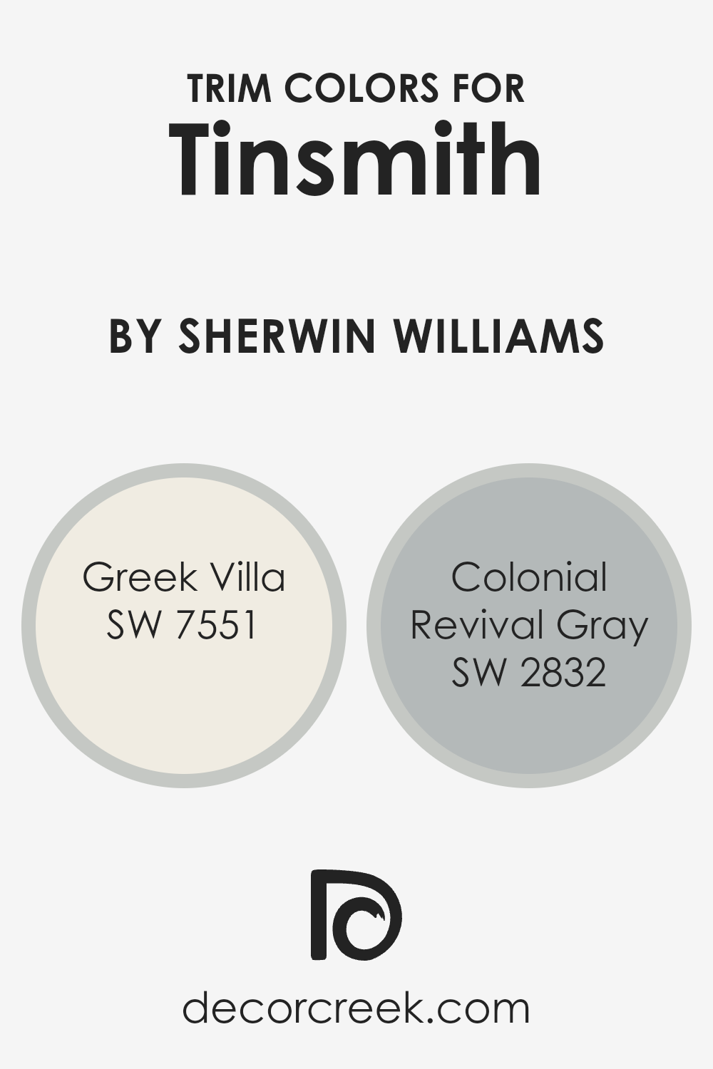
What are the Trim colors of Tinsmith SW 7657 by Sherwin Williams?
Trim colors are the shades used to highlight the edges and details of a space, such as door frames, window trims, and baseboards. These colors are essential for Tinsmith (SW 7657) by Sherwin-Williams because they add definition and contrast, enhancing the overall look of the room.
By pairing Tinsmith, which is a soft gray with subtle blue undertones, with complementary trim colors, you can create a more finished and polished appearance.
Trim colors help to break up the wall color, making the space look more dynamic and intentional. Greek Villa (SW 7551) and Colonial Revival Gray (SW 2832) are excellent choices for trim when using Tinsmith because they offer a cohesive yet contrasting element that makes the room stand out.
Greek Villa is a warm and creamy white that exudes a sense of calm and cleanliness. It provides a fresh, bright touch that pairs beautifully with the cooler tones in Tinsmith. On the other hand, Colonial Revival Gray is a medium-toned gray that carries a hint of sophistication and tradition.
Its subtle depth complements Tinsmith while providing a gentle contrast that adds interest without overwhelming the space. Both of these colors work well in bringing out the unique qualities of Tinsmith, making rooms feel inviting and harmonized.
You can see recommended paint colors below:
- SW 7551 Greek Villa
- SW 2832 Colonial Revival Gray
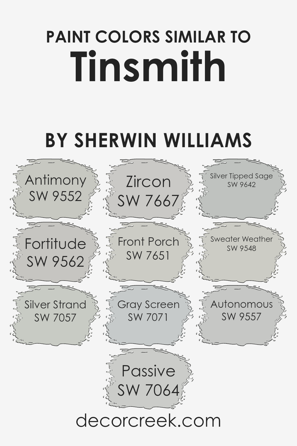
Colors Similar to Tinsmith SW 7657 by Sherwin Williams
When choosing paint colors, similar shades can create a harmonious and balanced look in a space. For the calming blend of gray and blue found in Tinsmith by Sherwin Williams, selecting colors with similar undertones can enhance the overall feel of a room.
Colors like Antimony and Fortitude bring a subtle depth, offering cool, mineral-like qualities that complement each other. Silver Strand and Passive introduce gentle, silvery hues that add light without overpowering other elements in the room.
Zircon delivers a delicate mix of gray and blue, which can give any space a refreshing touch. Front Porch moves slightly toward the warmer side of gray, which can help soften some of the cooler-toned options.
Gray Screen provides a straightforward and reliable gray that acts as an anchor for design, offering balance among the different shades.
Silver Tipped Sage introduces just a whisper of green, pairing beautifully with the other gray-based colors for added interest. Sweater Weather combines warmth and sophistication, yet remains neutral enough to work in a variety of settings. Finally, Autonomous offers a modern, sleek finish with its cool, clean tone. Each of these colors works well with the others to help shape rooms into cohesive, soothing environments that are both versatile and inviting.
You can see recommended paint colors below:
- SW 9552 Antimony
- SW 9562 Fortitude
- SW 7057 Silver Strand
- SW 7064 Passive
- SW 7667 Zircon
- SW 7651 Front Porch
- SW 7071 Gray Screen
- SW 9642 Silver Tipped Sage
- SW 9548 Sweater Weather
- SW 9557 Autonomous
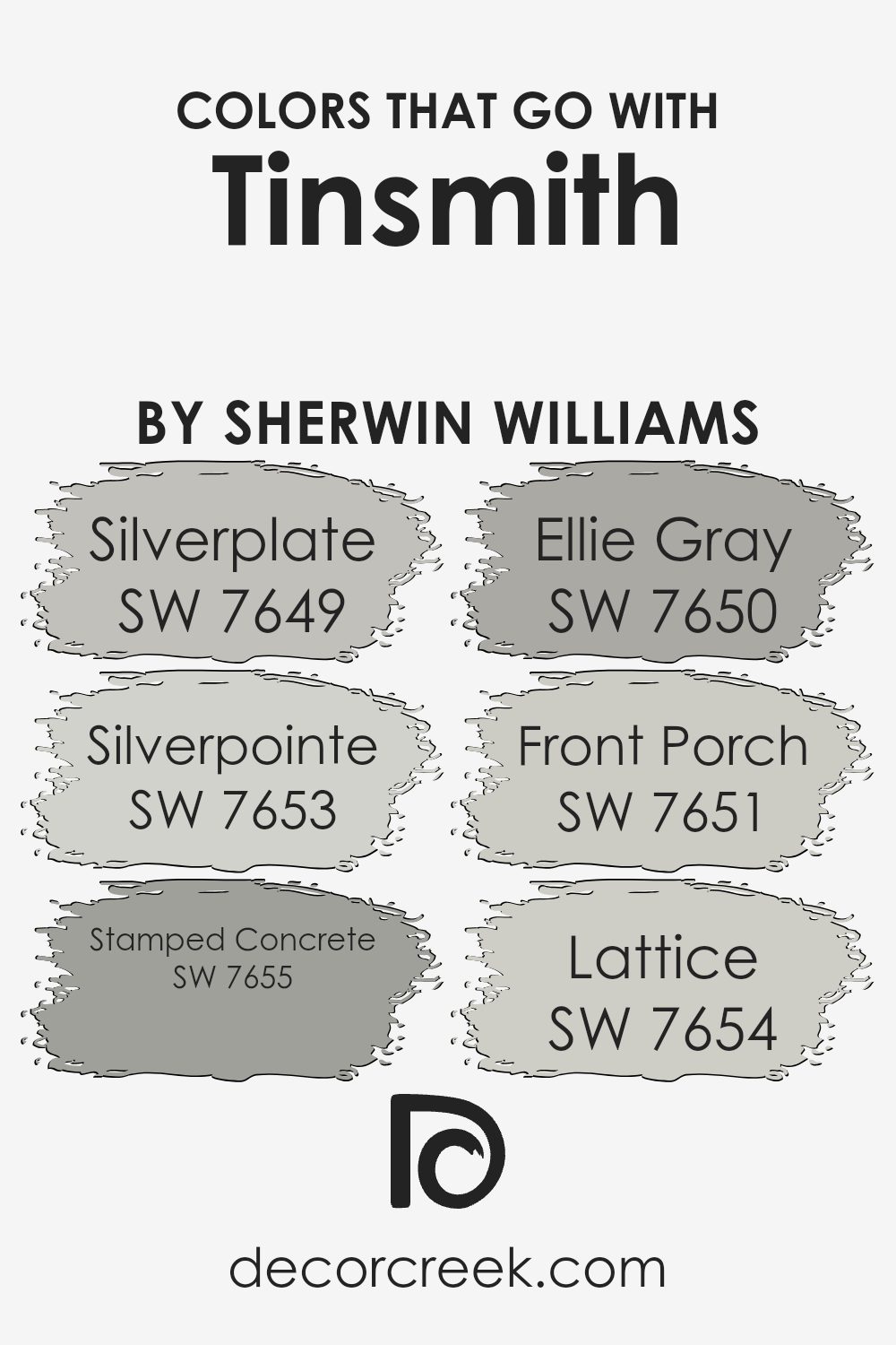
Colors that Go With Tinsmith SW 7657 by Sherwin Williams
When designing a space, choosing colors that complement each other is essential, much like when pairing with Tinsmith SW 7657 by Sherwin Williams. This light gray shade serves as a versatile base, allowing the accompanying colors to enhance the overall aesthetic.
Each of these colors brings something unique to the palette. SW 7649 Silverplate is a soft, neutral gray with a hint of warmth, making it perfect for creating subtle contrast. SW 7653 Silverpointe has a slight touch of beige, adding coziness and depth without overwhelming the senses.
These colors work well because they maintain harmony while introducing different shades of gray and subtle undertones.
SW 7655 Stamped Concrete is another excellent partner for Tinsmith, as it offers a grounded, darker gray tone that provides strong visual interest.
SW 7650 Ellie Gray is a bit richer and darker, which can anchor a design and offer depth. SW 7651 Front Porch is a light, breezy gray with a slight undertone of blue, adding a refreshing touch to the palette. Finally, SW 7654 Lattice is a crisp, clean gray with a slight greenish hue that can brighten up any space. Together, these colors create a cohesive and inviting atmosphere, making any room feel balanced and well-designed.
You can see recommended paint colors below:
- SW 7649 Silverplate
- SW 7653 Silverpointe
- SW 7655 Stamped Concrete
- SW 7650 Ellie Gray
- SW 7651 Front Porch
- SW 7654 Lattice
How to Use Tinsmith SW 7657 by Sherwin Williams In Your Home?
Tinsmith SW 7657 by Sherwin Williams is a soft, muted gray paint color. It’s a great option for those looking to add a neutral and calming touch to their home. This shade works well in many spaces, making it versatile for different rooms. In the living room, Tinsmith provides a pleasant backdrop that allows furniture and decor to stand out without overwhelming the space. In the bedroom, it creates a peaceful atmosphere, perfect for relaxation.
If you’re updating your kitchen, Tinsmith pairs nicely with both modern and traditional styles. It complements stainless steel appliances and can balance bold countertop choices. In bathrooms, it provides a clean and fresh look, working well with crisp white fixtures.
This color is also ideal for accent walls or to add subtle contrast in hallways and entryways. Tinsmith’s adaptable nature makes it suitable for various home styles, from contemporary to classic.
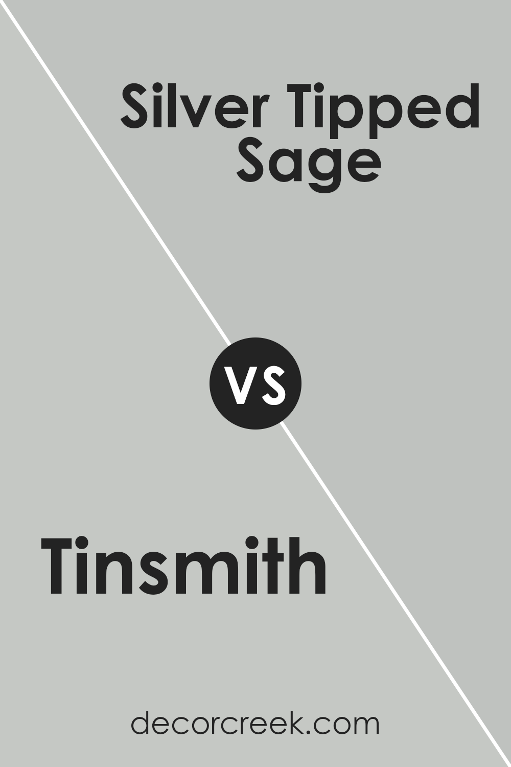
Tinsmith SW 7657 by Sherwin Williams vs Silver Tipped Sage SW 9642 by Sherwin Williams
Tinsmith SW 7657 and Silver Tipped Sage SW 9642 are two distinct yet beautifully subtle shades by Sherwin Williams. Tinsmith is a soft, cool gray with a hint of blue, making it perfect for a modern, clean look. It pairs wonderfully with both darker accents and crisp whites, adding a touch of elegance without overwhelming a space.
On the other hand, Silver Tipped Sage offers a delicate balance of green and gray, giving it a soothing, natural vibe. This shade works well in areas where you want to incorporate a hint of nature while maintaining a neutral feel.
While Tinsmith leans towards the industrial and contemporary, Silver Tipped Sage brings a subtle warmth and earthy tone to any room. Both colors are versatile and can be used in various settings, but they each bring their unique character to your walls.
You can see recommended paint color below:
- SW 9642 Silver Tipped Sage
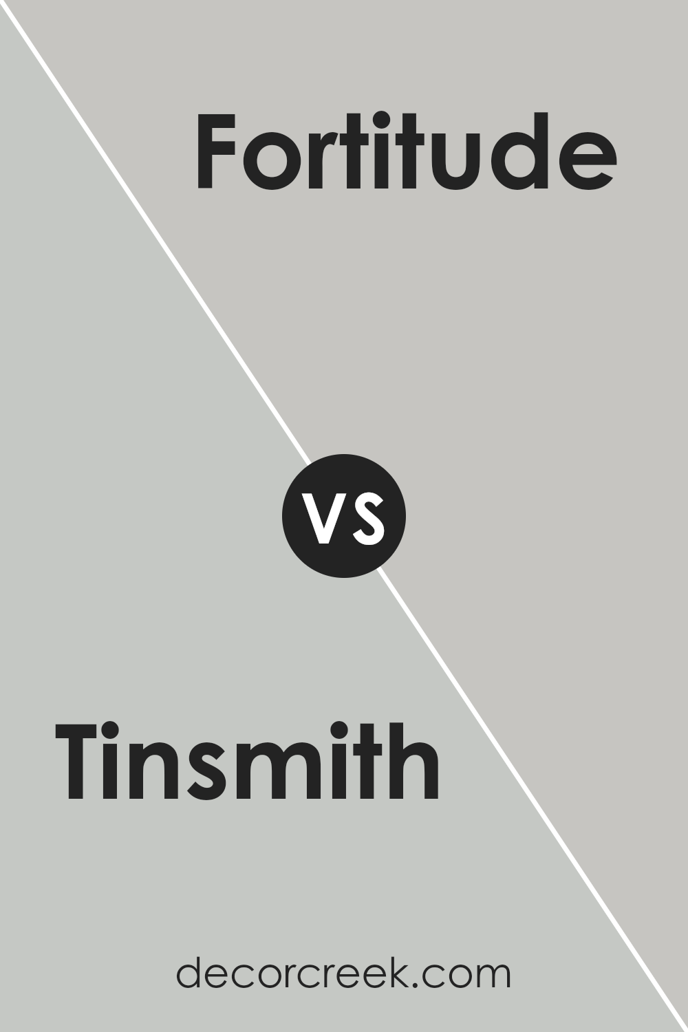
Tinsmith SW 7657 by Sherwin Williams vs Fortitude SW 9562 by Sherwin Williams
Tinsmith SW 7657 by Sherwin Williams is a soft, cool gray with subtle blue undertones. It is a versatile color that gives spaces a calm and modern feel without being too stark or cold. This makes it ideal for living rooms or bedrooms, where you want a peaceful atmosphere.
On the other hand, Fortitude SW 9562 is a warm beige tone. It carries a mix of brown and yellow pigments that make it a welcoming and cozy choice for almost any room. It’s perfect for areas where you want to create a more intimate and warm environment, like a family room or dining area.
While Tinsmith adds a crisp, sleek touch with its cooler tones, Fortitude provides a more comforting and inviting vibe with its warmth. Both are neutral, but they set very different moods, allowing for creative choices depending on the desired ambiance of your space.
You can see recommended paint color below:
Tinsmith SW 7657 by Sherwin Williams vs Front Porch SW 7651 by Sherwin Williams
Tinsmith (SW 7657) and Front Porch (SW 7651) are both soft gray hues by Sherwin Williams, yet they have distinct characteristics. Tinsmith is a cooler, more neutral gray, which can give spaces a crisp and clean look. It has subtle blue undertones that make it appear slightly more modern and can work well in spaces that benefit from a hint of coolness without being stark.
In contrast, Front Porch is a warmer gray with more beige undertones. This color provides a cozy and inviting feel, making it suitable for rooms where you want a more comfortable and welcoming atmosphere.
Because of its warmth, Front Porch works excellently in living rooms and bedrooms where a softer ambiance is desired.
Both colors are versatile and can be used in various settings, but the choice between them often depends on whether a cooler or warmer tone fits better with the overall design and lighting of the room.
You can see recommended paint color below:
Tinsmith SW 7657 by Sherwin Williams vs Antimony SW 9552 by Sherwin Williams
Tinsmith (SW 7657) and Antimony (SW 9552) by Sherwin Williams are two colors that might seem similar at first, but they have their unique features. Tinsmith is a light gray with a cool, steel-like tone, making it a versatile choice for almost any space. It brings a clean and modern touch without overwhelming the room.
On the other hand, Antimony is also a gray, but it carries a slightly warmer, taupe-like shade. This gives it a cozier feel compared to the more industrial Tinsmith.
When choosing between the two, consider the mood you want to create. Tinsmith works well in spaces where you want brighter, cleaner lines, like kitchens or bathrooms. Antimony suits living rooms or bedrooms where you might want a softer, more inviting atmosphere. Both colors are neutral, which means they pair well with various other colors in your home.
You can see recommended paint color below:
Tinsmith SW 7657 by Sherwin Williams vs Autonomous SW 9557 by Sherwin Williams
Tinsmith and Autonomous by Sherwin Williams are both subtle gray shades, but they have unique qualities that make them different. Tinsmith is a cool, neutral gray with a soft, balanced tone. It provides a calm, understated look that is perfect for modern spaces. It works well as a general wall color and pairs nicely with whites and other neutral tones.
On the other hand, Autonomous is a slightly lighter gray with a touch more warmth compared to Tinsmith. It has a hint of beige, making it a bit cozier and softer than Tinsmith. This makes it a great choice for spaces where you need a welcoming feel, such as living rooms or bedrooms.
While both colors are versatile and can work in various settings, Tinsmith leans more towards a contemporary style, whereas Autonomous, with its slight warmth, offers a more inviting atmosphere. They both offer different vibes while maintaining a modern and neutral palette.
You can see recommended paint color below:
- SW 9557 Autonomous
Tinsmith SW 7657 by Sherwin Williams vs Zircon SW 7667 by Sherwin Williams
Tinsmith by Sherwin Williams and Zircon by the same brand are both neutral shades but bring different feels to a space. Tinsmith is a soft gray with a hint of blue, offering a calm and modern touch. It’s great for a contemporary look, creating a comfortable yet stylish atmosphere.
On the other hand, Zircon is a lighter gray with a subtle cool undertone. It’s bright and airy, making rooms feel more open and larger. Zircon works well in small spaces or areas that need more light, as it reflects light beautifully.
While both are versatile and understated, Tinsmith offers more depth, making it ideal for creating cozy environments. Zircon, with its brighter tone, is perfect for adding freshness and a clean look. Both colors complement a wide range of decor styles and can be excellent choices for various rooms in a home, depending on the desired ambiance.
You can see recommended paint color below:
- SW 7667 Zircon
Tinsmith SW 7657 by Sherwin Williams vs Silver Strand SW 7057 by Sherwin Williams
Tinsmith SW 7657 and Silver Strand SW 7057 are two beautiful colors by Sherwin Williams that offer different moods and functionalities. Tinsmith is a medium-light gray with a cool undertone, making it a versatile backdrop for various styles. It’s a more neutral and straightforward choice that pairs well with a wide range of colors due to its simplicity.
On the other hand, Silver Strand offers a subtle green undertone, giving it a soft, calming vibe. This hint of green can add a touch of warmth and personality, making it a pleasant choice for spaces where relaxation is a priority, such as bedrooms or bathrooms.
While both colors are understated and elegant, Tinsmith leans more towards a true gray, providing a neutral canvas, while Silver Strand introduces a slight color variation with its green undertones. Each has its unique charm depending on the desired atmosphere of the room.
You can see recommended paint color below:
Tinsmith SW 7657 by Sherwin Williams vs Sweater Weather SW 9548 by Sherwin Williams
Tinsmith and Sweater Weather, both from Sherwin Williams, offer unique vibes for any space. Tinsmith is a soft, cool gray with a subtle blend of blue undertones. It gives a room a gentle, calm feel, perfect for a soothing environment. It’s versatile and can easily pair with a variety of colors, making it a great backdrop.
On the other hand, Sweater Weather has a slightly warmer touch compared to Tinsmith. It’s still within the gray family but leans towards a greige tone, combining gray and beige. This makes it cozy and inviting, suitable for spaces that need a bit more warmth.
Both colors are neutral and adaptable, but Tinsmith is cooler and more airy, while Sweater Weather brings a bit more warmth and coziness. Depending on whether you prefer a cooler or warmer ambiance, you can choose one that fits your space best.
You can see recommended paint color below:
- SW 9548 Sweater Weather
Tinsmith SW 7657 by Sherwin Williams vs Passive SW 7064 by Sherwin Williams
Tinsmith SW 7657 and Passive SW 7064 are two popular gray shades by Sherwin Williams. Tinsmith is a cool, light gray with subtle blue undertones. It offers a clean, fresh look and works well in spaces where you want a hint of color without being too bold. It pairs nicely with both cool and warm colors, making it versatile for various design styles.
Passive, on the other hand, is a medium gray with a slightly warmer tone. It has a touch of warmth, making it a more neutral choice compared to Tinsmith. Passive can create a cozy atmosphere, and its balanced tone allows it to work well with a wide range of colors and materials, from wood tones to bright accents.
In comparison, Tinsmith feels crisper, while Passive has a more muted, inviting presence. Both colors are versatile and can suit different preferences depending on the desired mood and ambiance of a space.
You can see recommended paint color below:
Tinsmith SW 7657 by Sherwin Williams vs Gray Screen SW 7071 by Sherwin Williams
Tinsmith SW 7657 and Gray Screen SW 7071 are both neutral colors by Sherwin Williams, but they offer different feels. Tinsmith is a light, cool gray with blue undertones. It’s subtle and calming, making spaces feel airy and open. It works well in modern or minimalistic settings due to its clean appearance.
Gray Screen, on the other hand, is a true gray, also with blue undertones, but slightly darker compared to Tinsmith. It adds a bit more depth to a room, giving a cozy yet modern vibe. It’s versatile and can suit a variety of decor styles.
While both colors are gray and have blue undertones, Tinsmith is lighter, providing an open, fresh feel, whereas Gray Screen has a richer tone, offering a slightly more intimate ambiance. Depending on the lighting in your space, each can look different, highlighting its unique properties.
You can see recommended paint color below:
Conclusion
Tinsmith is a soft, gentle gray that feels calm and pleasant. It’s like the perfect mix of light and shadow, making it not too dark and not too bright. This makes it a good choice for many rooms in your home, whether it’s the living room, kitchen, or bedroom.
This color is like a cozy sweater for your walls. It goes well with lots of other colors, so you can have furniture and decorations in many shades, and it will look great. It’s like when your favorite shirt matches everything else you wear.
If you like a room that feels organized and neat, Tinsmith helps with that. You could say it’s a friendly color that makes you feel good. When the sun shines in, Tinsmith can make the light look soft and pretty, kind of like the way the sky looks on a gentle cloudy day.
Overall, SW 7657 Tinsmith is a good choice if you want your home to feel cozy and welcoming. Whether you’re choosing paint for a new room or thinking about redoing an old one, Tinsmith is like a trusted friend that can help make your home feel just right.
Ever wished paint sampling was as easy as sticking a sticker? Guess what? Now it is! Discover Samplize's unique Peel & Stick samples.
Get paint samples

