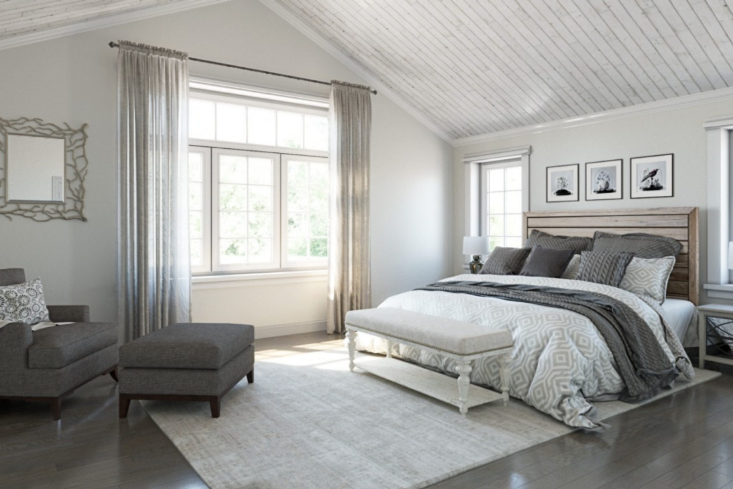
When you look at SW 9557 Autonomous from Sherwin Williams, you encounter a world bathed in color and imagination. This shade offers a gentle balance, straddling the line between bold statement and understated elegance, perfect for any room that needs a touch of sophistication without being overpowering.
As you think about redecorating or simply refreshing a space in your home, give this color a chance to set the tone. Whether you’re styling a cozy bedroom or giving life to your office, SW 9557 Autonomous provides a backdrop that complements both modern and traditional designs.
It adjusts beautifully with different lighting, showing off subtle shifts that keep the space lively. In your journey with SW 9557 Autonomous, you’ll find that it’s not just a color, but a cornerstone for creativity, offering a versatile canvas for your furniture and decor.
Join me in seeing how this color can bring a fresh perspective to your living environment.
What Color Is Autonomous SW 9557 by Sherwin Williams?
Autonomous by Sherwin Williams is a gentle, soft gray color that carries a hint of blue. This subtle blend creates a calming atmosphere in any room, making it ideal for spaces where relaxation is key. The color is versatile enough to work well in modern, minimalist, and Scandinavian interior designs due to its clean and crisp nature.
This particular shade pairs beautifully with natural materials like light woods, which help to bring out the warmth in the gray, while white accents can create a fresh and airy feel. Combining it with metals such as silver or brushed nickel can add a sleek, contemporary look.
In terms of texture, it complements soft, plush fabrics like cotton or linen, adding a cozy vibe to the décor. For those looking to add a bit more interest, incorporating elements with a subtle shimmer, such as silk curtains or velvet cushions, can introduce a sense of depth and comfort.
Due to its calming hue, it is perfectly suited for bedrooms and living rooms where a peaceful environment is essential. It’s also an excellent choice for bathrooms, offering a clean and timeless backdrop that’s easy to accessorize with different textures and materials.
Overall, Autonomous is a flexible color that works seamlessly with various styles and elements to create a harmonious space.
Is Autonomous SW 9557 by Sherwin Williams Warm or Cool color?
AutonomousSW 9557 from Sherwin Williams is a versatile grey shade that can be a great choice for various spaces in a home. This neutral color works well in rooms that need a calm and understated backdrop.
It’s particularly effective in living areas and bedrooms where you want a soothing environment without getting too bold. The grey tone of Autonomous is adaptable, making it easy to match with different decor styles and color schemes.
Since it doesn’t dominate a space, you can use it as a base color and add brighter colors through furniture and accessories to create a lively atmosphere. Or, you can pair it with similar neutrals for a more cohesive and refined look. This flexibility makes it useful for people who like to change their home’s style without repainting the walls. Additionally, its neutrality helps in selling a home, providing a blank canvas for potential buyers. Overall, Autonomous is a practical and effective choice for creating a pleasant home environment.
Undertones of Autonomous SW 9557 by Sherwin Williams
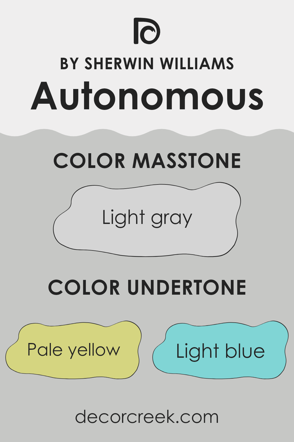
AutonomousSW 9557 has a unique combination of undertones that makes it versatile and adaptable for various interior spaces. The undertones in a paint color are subtle colors that influence the main hue and can affect how the color appears under different lighting conditions. For AutonomousSW 9557, these undertones include pale yellow, light blue, light purple, mint, pale pink, lilac, and grey.
These various undertones help the main color to adapt and blend with different decor styles and themes. Pale yellow brings a hint of warmth, making spaces feel more welcoming, while light blue adds a fresh and calm feel, perfect for creating a relaxing environment. The touch of light purple can add a gentle, playful aspect to the area.
Mint and lilac undertones provide a cooler tone, which can make a room feel more spacious and airy. These cooler tones are particularly useful in smaller spaces or rooms with limited natural light. The grey undertone helps balance out the brightness of the other colors, providing a neutral base that makes the color easy to coordinate with a wide range of furniture and accessories.
On interior walls, AutonomousSW 9557’s complex undertones can subtly change depending on the amount of natural and artificial light in a room. For instance, in a brightly lit room, the pale yellow might become more pronounced, enhancing a sunny, cheerful atmosphere. In contrast, in a room with cooler light, the mint and blue undertones might stand out, giving the room a cooler, more relaxed vibe.
Ultimately, the diverse undertones of AutonomousSW 9557 allow it to work beautifully in many interior settings, providing a flexible backdrop that can complement various decor elements and personal styles.
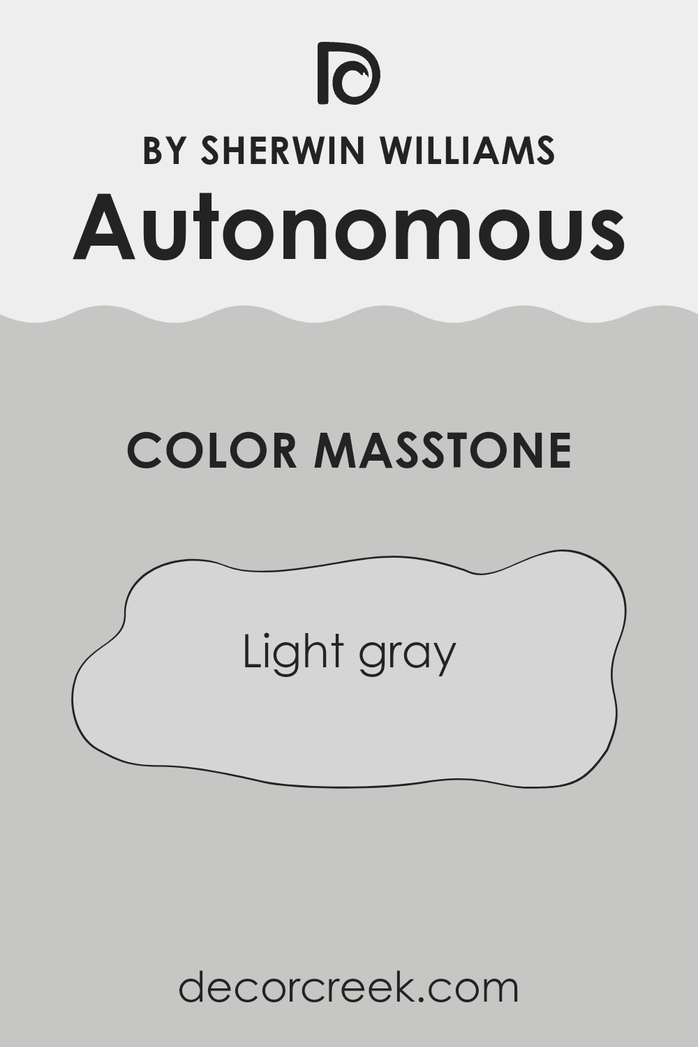
What is the Masstone of the Autonomous SW 9557 by Sherwin Williams?
AutonomousSW 9557 by Sherwin Williams has a masstone of Light Gray, a color that is incredibly versatile for use in homes. This light gray tone lends itself well to creating a calm and clean atmosphere in any room.
Since it’s not a heavy or dark shade, it helps make small spaces appear bigger and brighter, giving a fresh and airy feel. This shade of gray is easy to match with many other colors, making decorating simple. Homeowners can pair it with bold and bright accents, like cushions or artworks, to add pops of color, or keep the space muted with similar soft shades for a more cohesive look.
Furniture in natural wood or white also looks fantastic against this light gray backdrop, enhancing the overall aesthetic of the room without overwhelming it. Its neutrality and lightness make it a smart choice for walls, especially in living areas and bedrooms where a gentle and welcoming environment is desired.
How Does Lighting Affect Autonomous SW 9557 by Sherwin Williams?
Lighting has a significant impact on how we perceive colors. Colors might look different under various light sources due to their wavelengths and the light’s color temperature. The way a specific color appears can change dramatically depending on whether the light is natural or artificial.
For instance, consider the color AutonomousSW 9557 by Sherwin Williams. In artificial light, which typically has a yellow or warmer tone, this color can appear softer and slightly more muted.
- The warmth of the artificial light brings out the cozy aspects of the color, making it ideal for living rooms or bedrooms where a gentle and welcoming atmosphere is desirable.
- On the other hand, under natural light, which is cooler and often considered more neutral, AutonomousSW 9557 looks truer to its original hue.
Natural light provides a vivid representation of the color, highlighting its true character without alteration. This makes it an excellent choice for areas like kitchens or home offices where clarity and true color perception are appreciated.
The direction a room faces also affects how colors like AutonomousSW 9557 are perceived:
- North-Faced Rooms: These rooms get less direct sunlight, often making colors appear cooler and somewhat grayish. The cool undertones in AutonomousSW 9557 might become more pronounced, giving the room a more formal ambiance.
- South-Faced Rooms: With more direct sunlight, colors in these rooms are illuminated and can appear brighter and more vibrant. AutonomousSW 9557 will look warmer and more inviting, perfect for creating a cheerful space.
- East-Faced Rooms: These rooms enjoy bright light in the morning, which means AutonomousSW 9557 will start the day appearing lively and vibrant and gradually transition to a softer tone as the day progresses due to the decreasing intensity f light.
- West-Faced Rooms: Light in these rooms grows stronger in the afternoon, creating a dynamic change in how AutonomousSW 9557 appears throughout the day; it might look more subdued in the morning and then gain vibrancy towards the evening.
Understanding how lighting affects color can help in making informed decisions about paint selections based on the orientation of the rooms and the quality of light they receive.

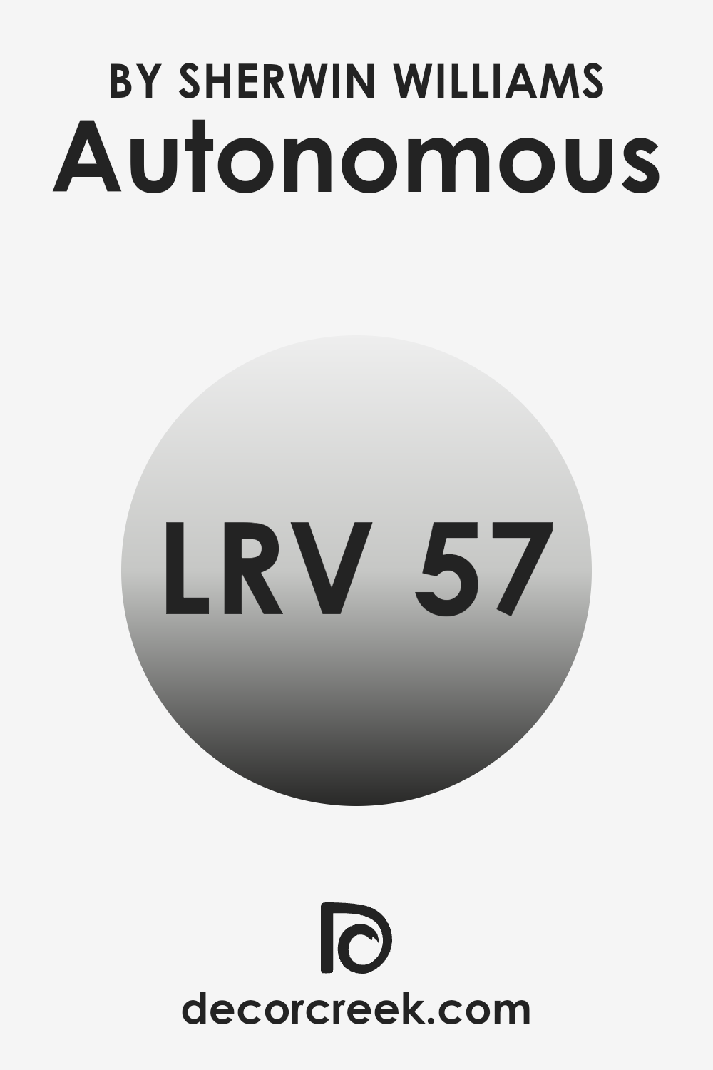
What is the LRV of Autonomous SW 9557 by Sherwin Williams?
LRV stands for Light Reflectance Value, a measure used to describe the percentage of visible and usable light that a color reflects from or absorbs into a surface. Essentially, it shows how light or dark a color will look once applied to the walls of a room.
The higher the LRV, the lighter the color appears, making the room feel more open and airy. Conversely, lower LRV values mean the color absorbs more light, which can make a space appear smaller and cozier.
For Autonomous by Sherwin Williams, which has an LRV of around 57, the color is somewhat in the middle range. It reflects more than half of the light that hits it, making it neither too light nor too dark. This balance allows it to be versatile enough for various applications, providing a neutral backdrop that offers a sense of warmth. In spaces with moderate natural light, this color can help brighten the room moderately, while in well-lit areas, it maintains a steady, understated presence without washing out.
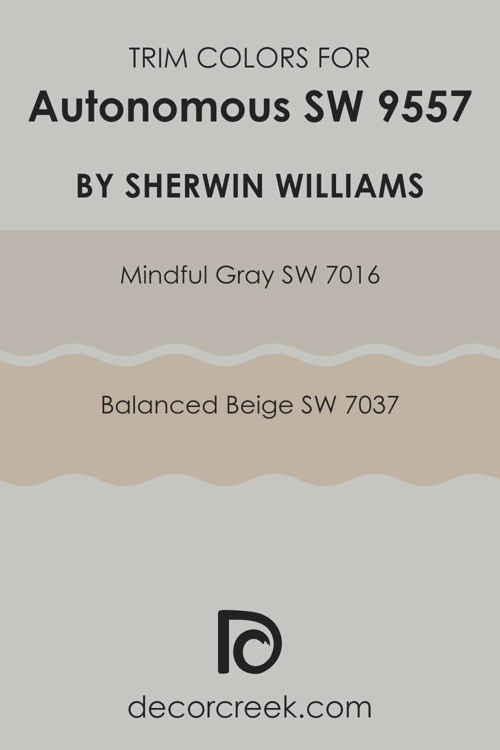
What are the Trim colors of Autonomous SW 9557 by Sherwin Williams?
Trim colors, such as Sherwin Williams SW 7016 – Mindful Gray and SW 7037 – Balanced Beige are used in painting to highlight distinctive features like door frames, window sills, and baseboards, enhancing the architectural details of a space.
Using these colors, especially when contrasted with wall colors, can significantly impact the aesthetic and feel of a room by drawing the eye to these details, adding depth and definition. SW 7016 – Mindful Gray is a neutral gray that works well in various lighting conditions, making it versatile for any space.
It serves as a subtle backdrop that complements brighter colors or acts as a stand-alone hue to foreground vibrant decorations. On the other hand, SW 7037 – Balanced Beige provides a warm, inviting tone that pairs beautifully with a range of decorating styles from contemporary to traditional, adding a cozy, yet polished look to any room. These trim colors, when used thoughtfully, play a crucial role in completing the overall look of a room, providing a finished, cohesive appearance.
You can see recommended paint colors below:
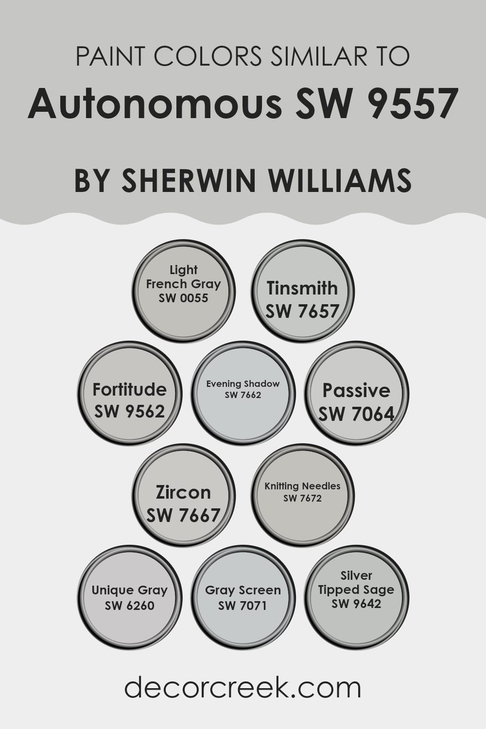
Colors Similar to Autonomous SW 9557 by Sherwin Williams
Using similar colors in a design scheme, such as shades related to Autonomous by Sherwin Williams, can create a cohesive and harmonious look in your space. Colors like Light French Gray and Tinsmith provide a subtle variance in hue while maintaining a unified feel, making them excellent choices for connected spaces or flowing open floor plans. Gentle shifts in color can be achieved with Fortitude and Evening Shadow, enhancing depth without creating stark contrasts. This approach ensures visual comfort and a pulled-together look.
Passive and Zircon are great examples of colors that work effortlessly with others to offer a soft, uniform appearance to a room. Shades like Knitting Needles and Unique Gray can pair well with a variety of decor elements without overwhelming them with color intensity.
Additionally, Gray Screen and Silver Tipped Sage are perfect for adding a gentle splash of uniqueness while keeping the overall palette subtle. This technique of using similar colors allows for a professional-looking interior that feels intentionally designed and visually relaxing.
You can see recommended paint colors below:
- SW 0055 Light French Gray
- SW 7657 Tinsmith
- SW 9562 Fortitude
- SW 7662 Evening Shadow
- SW 7064 Passive
- SW 7667 Zircon
- SW 7672 Knitting Needles
- SW 6260 Unique Gray
- SW 7071 Gray Screen
- SW 9642 Silver Tipped Sage
How to Use Autonomous SW 9557 by Sherwin Williams In Your Home?
Autonomous SW 9557 by Sherwin Williams is a versatile paint color that can add a fresh look to any space in your home. This shade is a soft, subtle gray that works well in a variety of lighting conditions, making it a great choice for both small and large rooms.
You can use it in your living room for a clean and modern feel, which pairs nicely with both bright accents or more muted decor. It’s also an excellent option for bedrooms, as its calming tone helps create a relaxing atmosphere.
If you’re looking to refresh your kitchen or bathroom, Autonomous can help brighten these spaces without being too stark. Because it’s a neutral color, it complements different types of cabinets and countertops. Additionally, this paint can be used for exteriors, providing a stylish and contemporary look that enhances curb appeal. Overall, Autonomous SW 9557 offers a simple yet effective way to update your home’s style.
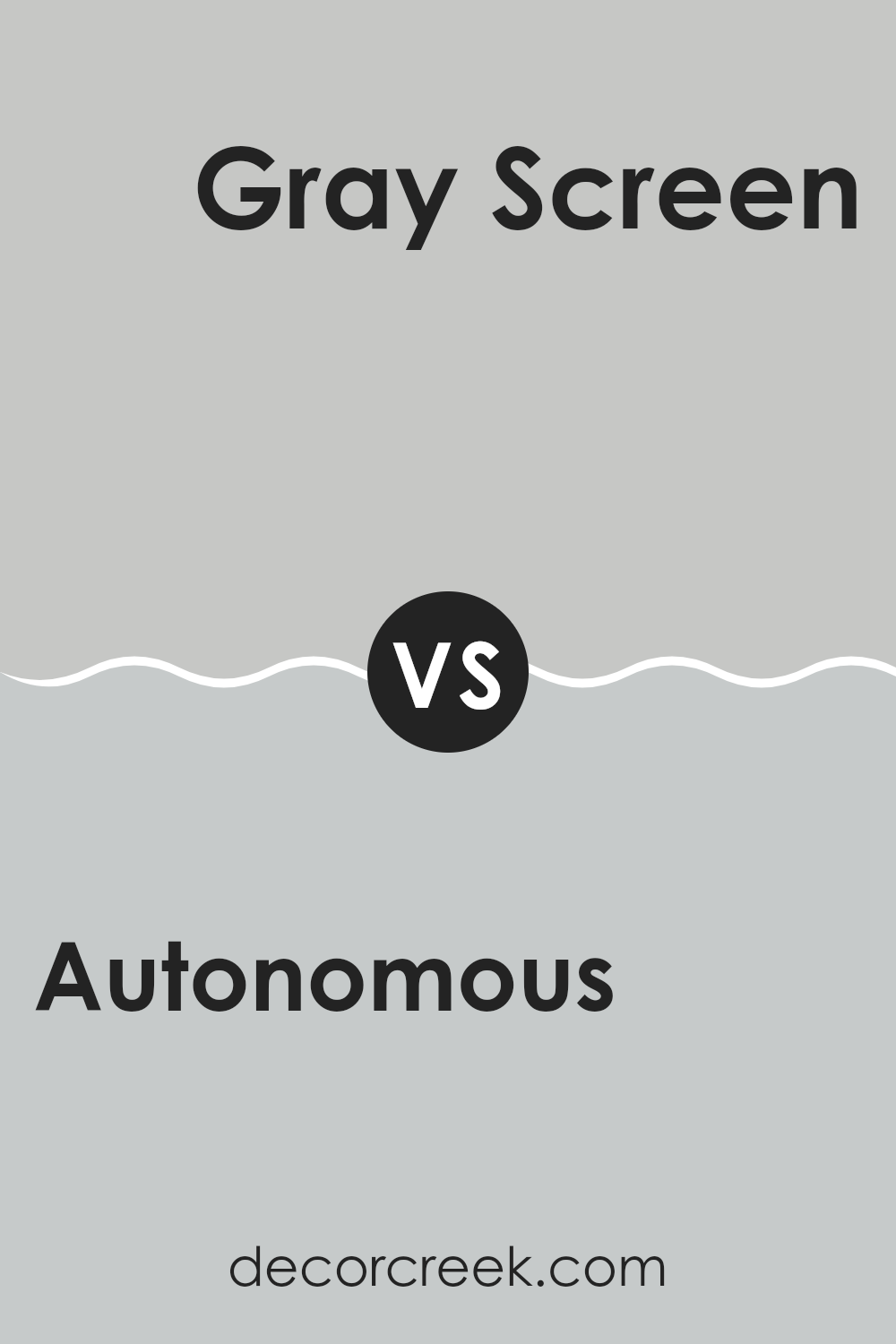
Autonomous SW 9557 by Sherwin Williams vs Gray Screen SW 7071 by Sherwin Williams
Autonomous SW 9557 and Gray Screen SW 7071 by Sherwin Williams are both unique shades of gray that each offer a distinct atmosphere to any space. Autonomous is a deeper, bolder gray that brings a strong and steady presence.
It’s ideal for creating a focused and grounded environment, making it perfect for home offices or study areas. On the other hand, Gray Screen has a lighter, airier vibe due to its cooler undertones.
This color works well in spaces that aim to be calm and open, like bedrooms and living rooms. It reflects more light, making it feel more spacious and refreshing. Overall, while both colors are grays, Autonomous leans towards a more solid, pronounced look whereas Gray Screen offers a softer, more refreshing touch.
You can see recommended paint color below:
Autonomous SW 9557 by Sherwin Williams vs Tinsmith SW 7657 by Sherwin Williams
“Autonomous SW 9557” and “Tinsmith SW 7657” are two unique shades by Sherwin Williams. Autonomous is a deep gray with a hint of blue, making it a strong and bold choice for spaces.
It’s ideal for creating a prominent backdrop in a room, offering a sense of steadiness and calm. On the other hand, Tinsmith is a much lighter gray that feels airy and spacious. It’s a versatile color that can make small spaces appear larger and is easy to match with various decor styles.
Both colors share a gray base, but while Autonomous adds depth and definition to a space, Tinsmith provides a subtle, clean look. Depending on your room’s needs and lighting, each color has its own charm to offer.
You can see recommended paint color below:
Autonomous SW 9557 by Sherwin Williams vs Light French Gray SW 0055 by Sherwin Williams
Autonomous SW 9557 by Sherwin Williams is a deep, bold shade with a robust character, perfect for making a strong statement in a room. It is darker and tends to draw more attention because of its intensity, ideal for accent walls or furniture pieces that you want to stand out.
On the other hand, Light French Gray SW 0055 is a soft, light gray that offers a clean and calm look. This color is versatile and works well in various spaces, providing a subtle backdrop that complements different decor styles. It also helps to make small rooms feel larger and brighter.
When comparing both, Autonomous is more commanding with its darker tone, while Light French Gray is subdued and acts more as a neutral base in interior spaces. While they cater to different design needs, both colors offer unique possibilities for decorating a home or office space.
You can see recommended paint color below:
Autonomous SW 9557 by Sherwin Williams vs Evening Shadow SW 7662 by Sherwin Williams
Autonomous SW 9557 by Sherwin Williams and Evening Shadow SW 7662 by Sherwin Williams are both unique shades that cater to different tastes and spaces. Autonomous is a deep, dark blue that almost appears navy. It’s a strong and bold color, perfect for creating a statement in a room like a striking accent wall or a cozy reading nook. This color can also give a feeling of steadiness and strength in a space.
Evening Shadow, on the other hand, is much lighter, a soft gray with a hint of blue. It’s a gentle color, great for rooms that you want to feel calm and peaceful, like bedrooms or bathrooms. This shade reflects light well, making spaces seem larger and more open.
Pairing these two colors can work well as the deep tone of Autonomous provides a great contrast to the light, airy feel of Evening Shadow, making them ideal for a balanced and visually appealing color scheme.
You can see recommended paint color below:
Autonomous SW 9557 by Sherwin Williams vs Silver Tipped Sage SW 9642 by Sherwin Williams
The main color, Autonomous, and the second color, Silver Tipped Sage, both by Sherwin Williams, offer distinct tones suitable for different decorating styles. Autonomous is a deep, bold gray that adds a strong base to any room, providing a sense of stability and understated elegance.
It pairs well with brighter colors and heavy furniture, making it ideal for living rooms or offices. On the other hand, Silver Tipped Sage is a lighter, more subtle green with silvery undertones that give it a fresh and clean look.
It’s perfect for spaces that you want to feel airy and bright, such as kitchens or bathrooms. While Autonomous offers a more striking and dramatic feel, Silver Tipped Sage brings a calm and refreshing vibe, suitable for relaxing spaces. Both colors can work beautifully depending on the atmosphere one aims to create in their space.
You can see recommended paint color below:
- SW 9642 Silver Tipped Sage
Autonomous SW 9557 by Sherwin Williams vs Zircon SW 7667 by Sherwin Williams
When comparing Autonomous and Zircon, both from Sherwin Williams, you’ll notice that each color has its unique appeal and application. Autonomous is a deep, almost navy blue that exudes a strong and bold vibe, making it perfect for spaces that aim to feel grounded and pronounced. It works well in areas where you wish to make a statement, such as an accent wall or a room with substantial furnishings.
On the other hand, Zircon is a light gray color with cool undertones. It’s much more subtle than Autonomous and offers a clean, calm look ideal for creating a fresh and airy space. Zircon works exceptionally well in smaller rooms or spaces that get plenty of natural light, as it can help the area feel more spacious and open.
Both colors provide distinct atmospheres, with Autonomous leaning towards a more dramatic impact and Zircon serving as a gentle backdrop that blends easily with various decor styles. The choice between the two depends on the mood you want to set and the space you are decorating.
You can see recommended paint color below:
Autonomous SW 9557 by Sherwin Williams vs Passive SW 7064 by Sherwin Williams
The two colors, Autonomous SW 9557 and Passive SW 7064 from Sherwin Williams, each have a unique appearance and feel. Autonomous is a deep gray that might remind you of the color of a stormy sky or slate. This shade has a boldness to it that can make a statement in any room by drawing the eye and making strong contrasts with lighter colors.
On the other hand, Passive is a soft, light gray that gives a clean and calm look. It’s more subtle than Autonomous, making it easier to pair with a variety of décor styles and colors. This lighter shade can help make a small space appear bigger and brighter.
When comparing these two, it’s clear that they could work well together in a space where you want a balance of bold and gentle touches. Autonomous would do well as an accent wall or on cabinetry, while Passive could be used for the remaining walls to maintain a light environment.
You can see recommended paint color below:
Autonomous SW 9557 by Sherwin Williams vs Unique Gray SW 6260 by Sherwin Williams
Autonomous SW 9557 is a deep, dark gray that carries a strong presence. It’s a robust color that can make a bold statement in a space, ideal for creating a dramatic and cozy atmosphere in rooms like home offices or dens. This shade can also lend a modern look to exteriors, providing a striking contrast against lighter trims or accents.
On the other hand, Unique Gray SW 6260 is much lighter, sitting comfortably in the mid-tone range of grays. It’s versatile and works well in various settings, offering a neutral backdrop that’s easy to match with a wide array of decor styles and colors. Because of its lighter tone, Unique Gray is excellent for making smaller rooms feel more spacious and open.
While both colors are grays from the same manufacturer, their different shades can influence the mood and perceived size of a space significantly. Lighter Unique Gray is better for a bright and airy feel, while darker Autonomous provides depth and drama.
You can see recommended paint color below:
- SW 6260 Unique Gray
Autonomous SW 9557 by Sherwin Williams vs Knitting Needles SW 7672 by Sherwin Williams
Autonomous SW 9557 by Sherwin Williams is a rich gray color that creates a bold statement when used in interior spaces. It has a strong presence and can serve as a striking backdrop for various decor styles, making it suitable for both modern and traditional settings.
On the other hand, Knitting Needles SW 7672, also by Sherwin Williams, is a lighter shade of gray that offers a softer look. This color is incredibly versatile and works well in many different types of rooms, from bedrooms to living spaces, providing a calming neutral base that pairs easily with a wide range of colors and finishes.
When comparing the two, Autonomous tends to add more drama and depth to a room because of its darker, more intense tone. Meanwhile, Knitting Needles is great for those aiming to create a more airy and gentle atmosphere. Both colors share the underlying gray tone but have distinct effects due to their varying intensities.
You can see recommended paint color below:
Autonomous SW 9557 by Sherwin Williams vs Fortitude SW 9562 by Sherwin Williams
Autonomous SW 9557 and Fortitude SW 9562 by Sherwin Williams are quite different in their visual impact and mood setting. Autonomous is a lighter, soft gray that gives a calm and clean feel to a room. It’s versatile, working well in various settings like kitchens or living rooms, and serves as a gentle backdrop that complements brighter colors and bold decor.
On the other hand, Fortitude is a deeper, more intense gray with slight blue undertones. This color adds a stronger, more distinctive presence to a space, making it ideal for creating a more dramatic look. It suits areas where a touch of formality or a stronger visual statement is desired, like dining rooms or home offices.
Both colors offer unique possibilities for decorating. While Autonomous is more about creating a subtle, soothing environment, Fortitude provides a robust and dynamic aesthetic. Depending on your room’s purpose and desired atmosphere, each color has its special appeal.
You can see recommended paint color below:
Conclusion
The paint itself offers a strong and striking color that can instantly bring a room to life. It’s bold and doesn’t crowd the room, making it perfect for creating a standout feature wall or for adding a touch of personality to furniture.
I found that this paint fits well in different kinds of rooms, whether it’s a lively playroom for kids or a stylish living area. It’s particularly useful for areas that are meant to have a modern feel due to its cool tone. What was really special about this paint is how it shifts under different light conditions. It has the magical ability to look slightly different during the day than at night, which can keep a room feeling fresh and engaging.
Using this paint could also be a great way to refresh old spaces without having too many new decorations. Just a coat or two could make an old room feel like a completely new place! Based on everything I’ve seen and tested, SW 9557 Autonomous by Sherwin Williams is a good choice for anyone looking to make a change at home that feels new and exciting.
It’s easy to see why it could be a favorite for both DIY enthusiasts and professional decorators alike.
Ever wished paint sampling was as easy as sticking a sticker? Guess what? Now it is! Discover Samplize's unique Peel & Stick samples.
Get paint samples

